#but my pen name has the best general palette
Explore tagged Tumblr posts
Text
I was not tagged for this but I don’t care this is so fun!!
I did the same thing as Tori: Real Name, Pen Name, Blog Name.
My real name has my actual favorite color in it I’m so happy!!!!!!
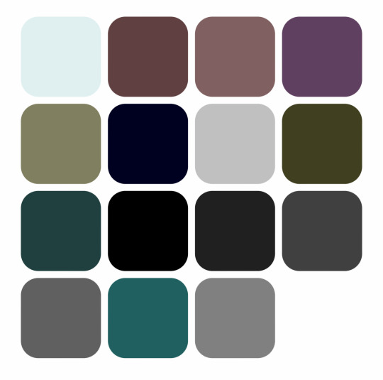


Name Color Tag
Thanks @primroseprime2019 for the tag!
No pressure tagging: @minutiaewriter @midnight-clover @briannaswords & my open!
I did three: my nickname, my pen name, and my blog name. Gotta say, pen name for the win!
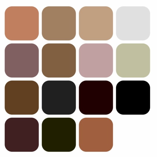


#tag game#all of my names are brown?#interesting#I think I like my real one the best#but my pen name has the best general palette
16 notes
·
View notes
Text
Traditional art materials I like!
❤️🧡💛💚💙💜🤎🖤
Pens:
1. Tombow brush pens will never let you down. These suckers are good for EVERYTHING. You know I keep that mf thang on me. You can get a pack of 3 on amazon for about 6 bucks I think! Worth every penny. I own like,,,, 10. The black ink is nice and dark. The blue case has a slightly firmer tip, while the black one is ever so slightly softer. If you prefer tighter line control, I’d go with the blue.
2. Pentel duopoint flex. Just discovered this bad boy when shopping for pens at Michael’s. It’s 2 sided like the name suggests, with a wide brush and thin brush. The wide brush is a little looser and can make some pretty broad lines, while the thin side is firmer and is easier to control. The line variety you can get outta this thing is Insane. It’s a little on the pricier side at $10 at Michael’s, but the website literally always at least has a 20% off coupon, and it’s completely worth it. Not sure how long it lasts yet, but as soon as I saw how well that badboy performs, I bought 2 more. I’ll report back if they wear out quickly.
3. You can never go wrong with a good ol’ ballpoint pen. Bic is usually the way to go. Penmate smears like Hell, especially the blue ones.
4. Micron PN. This one is a firm brush point, and the lines are pretty fine, but you can still press a little harder to get that variation in there. I’ve been using it to illustrate my book a lot lately. Microns also tend to be a little pricey, but if you stock up a little at a time when you can, it’s worth it.
5. Pentel sign pen. These are similar to tombow, but have a slightly wider base of the nib. They work great, but if you prefer darker black ink, go with the tombow.
6. Speedball dip pen. If you’re looking to get started with dip pens, you can get a set at michael’s with a single black pen and several different nibs, from thin to flat calligraphy, for around $11. They’re pretty reliable and last a while! Just remember to clean around the base of the pen where the nib goes in so that the ink won’t clog the entry port and get stuck in there, and you’re golden! You can clean off india ink with ammonia, or glass cleaner like windex. Speedball india ink is also pretty nice, with a lovely dark black.
Paints:
Watercolors:
1. Kuretake gansai watercolors. These guys are the most bright, pigmented, beautiful watercolors I’ve ever used. If you’re looking for a bolder watercolor, this one is for you. Look for the long green box. Japanese watercolors in general tend to vary from so opaque that it almost acts like gouache, to transparent, and have the most bold colors I’ve seen from the medium.
2. Watercolor confections. These guys have wonderful little portable tin cases, and come in a wide variety of color themes. I own the tropical set, and wow is it beautiful. The colors are easily activated, beautifully granulated, and lightfast. They also have a lovely skin tone set I haven’t personally tried yet but that I’ve had my eyes on for quite a bit!
3. HIMI jelly gouache. Yes, this is the super trendy one that everyone uses, but it’s trendy for a reason! I don’t reach for it as often as I do my gansai palette, but if you like the opacity of gouache but don’t wanna fiddle with tubes, this is for you. I know it’s not exactly watercolor, but it’s in the same neighborhood!
Acrylic:
1. Crayloa. Yes, you read that right. Crayola acrylics have downright beautiful mixing colors, and are just really good affordable acrylics. Crayola isn’t always the best choice for professionals, but they’re reliable, and these acrylics never miss. Most of the time if you see me post an acrylic painting, it was made with those paints!
2. Windsor and newton. W&N is generally a pretty reliable company, and their supplies are pretty high quality, and often worth the slightly higher price tag. Their acrylics in particular are around $5 each, which is more affordable than say, golden or liquitex. Funnily enough, they perform similarly to crayola acrylics, but they feel more… luxurious, somehow. Wish I had a better way to describe it, but I just got myself a pretty good sized set and am looking forward to wearing it out. Oh, and they also dry nicer than crayola, in which different colored paints tend to have slightly different finishes. W&N doesn’t do that, and from what I’ve seen so far they all dry a nice smooth matte.
(I don’t know enough about oil to recc paints for that lol but I hope to in the future!!)
Canvas: I tend to just get whatever cheap canvas I can find, but I must say, if you’re lacking in space to store your art, I recommend getting a roll of unprepared canvas. If you want to start out white like a lot of pre-made canvases are, just pick up some gesso and prepare the surface yourself. You can cut out any size piece to your liking! When you’re done with the painting, you can roll it up for safekeeping! I’ve got canvases stockpiled, but I’m going to start the habit of working with the plain fabric much more often, since I still unfortunately live at home and my bedroom also essentially doubles as my studio.
Pencils:
1. Prismacolor ebony. These babies are much more affordable than their colored pencils, and you can get a 12 pack for around 10 bucks on amazon. These guys, like their name suggests, are super soft and dark, so you can get wonderful line variation and contrast. They tend to smudge easily though, so if you have trouble with that, be careful!
2. General’s layout pencils. These guys are also super dark, and lay down almost black. They’re also very soft graphite, so you can get some good line variation and contrast just like ebony, but they have a much less shiny finish, which can be nice!
3. Palomino blackwing. Yes, THOSE pencils. I cannot recommend them enough. They will make you feel so fancy. They lay down soft, dark, and come with this cool little rectangular eraser you can adjust. They’re famous for a reason! They were Chuck Jones’ weapon of choice!! If you feel like paying slightly more, then these are absolutely worth the tag. Depending on where and when you get them, they can set you back around $25-30 for a pack of 12, and they are absolutely worth every penny. The only thing I’d suggest is to be careful when sharpening, since they can wear down more quickly than regular pencils. It helps to carefully sharpen with an x-acto blade, and to only sharpen the lead itself when possible, and not the wood right away. It’ll make them last much, much longer, and make the price tag even more worthwhile.
Woodburning/pyrography tool:
I’ve only ever used one woodburning tool thus far (that’s about to change!) and that’s the walnut hollow creative versa-tool. It’s a wonderful tool to start out with, and you can get one at michael’s for around $30, and even less if you use a coupon. (Can u tell I work at michael’s lmao. Hmu for michael’s tips, you can save a lot of money really easily there!) The tool gives you a nice variety of tips to choose from. The universal chisel nib is probably the easiest to start with. You can shade with the flat end, and get thin to thick lines depending on how hard you press with the edge. It’s a little hard to get curves on it, but with practice and patience it comes easier! If you draw pretty fast, like me, it can take some getting used to, since pyrography tends to be a slow and steady kind of a process. The slower you go, the deeper it will burn, the thicker/darker lines you’ll get, and the quicker you go the more likely it’ll be that you’ll just scar the wood and not get very far.
As for the thinner tips in the walnut hollow kit, don’t be fooled! If you’re looking to get thinner lines, these won’t always work the way they seem they will. It’s kinda confusing if you go in blind like I did, but I learned that the thinner the metal, the less heat that you get coming out of it, and the longer it takes for a line to appear. You can still use them for tiny details, but it takes a bit. You’re better off getting a good handle on the universal chisel nib and making thinner lines that way, since it tends to go much quicker, and with the higher heat you’re able to get from that, you’re less likely to scar or stab the wood.
The shader tip is also a pretty good tool to learn. I’ve seen artists who only use the shader tip and create photo realistic stuff! As soon as you get used to the odd shape, you learn to kind of work with it like a paint brush. Angling it to the side can also get you some nice thin painterly lines. And of course, like the name suggests, holding it flat and moving it gently over the wood (longer for darker burn, shorter for lighter) can get you a lovely range of values.
Choosing your wood; make sure to choose soft, light wood. Darker wood is generally fine as long as it’s soft, but it’s harder to get the image in there since you can’t add highlights with just the burner or leave any blank spaces for the highlights. It’s best to choose a lighter wood, like pine, which I believe is what the plaques at michael’s are made of. In the wood section there you can get pre-made plaques for $1-5 each, and they’re basically perfect for the task. I know less about getting wood slices, but the ones in that same section are also pretty nice, have nice light wood in the center, and it’s got a built in frame around it by way of the bark. They tend to be a lot more expensive though, so make sure you wait for a sale or use a coupon unless you wanna shell out $10 or more for a single piece of wood, even if it is a little nicer. Or just befriend a lumberjack!!
You can also color your woodburnings with watercolor. I unfortunately don’t have much experience with this, since I’ve pretty much only painted on mine with acrylic, which can be fun just as long as you don’t paint over all the lines you made by accident, but I just wanted to throw that out there for all my homies that like color.
💗 That’s all I’ve got for now! I hope anyone who likes my art and wants to try something similar is able to try the supplies I use, and get just as much joy out of these supplies as I do! My inbox is always open if you have any questions about a piece or how I did it. I adore answering any inquiries, so it’s no bother! I’m no professional, but I have been making art for most of my life, so if I’m ever able to provide any help or advice for another artist then I’m happy💗
20 notes
·
View notes
Text
Tu... torial? Pt. 3
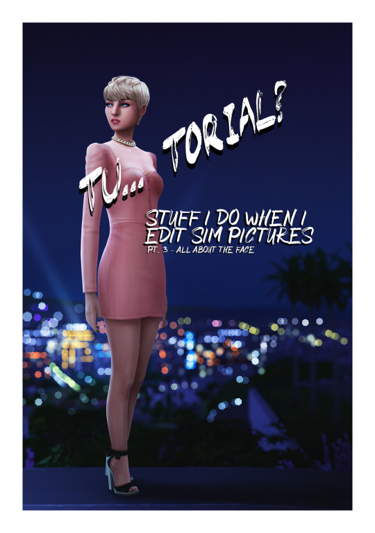
Welcome back to part 3 of my tutorial for anon. In this I will go over perhaps my favourite part - the face. Did you used doodle eyes in your notebook when you were in school? This has the same energy.
This is where things get a little harder to explain because it involves a lot of drawing. I hope you get the general idea though.
Open this in dashboard for best view of the screenshots.
Disclaimer: I have no formal training for any kind of graphics stuff, I work in an office as a receptionist - I serve coffee for a living. I am absolutely self taught and while I consider myself pretty comfortable with photoshop, that doesn’t mean that there isn’t about a gazillion of other things that can be done that I have no idea about. There are people far superior than me in the Sims community. This is just how I do it, with techniques I have picked up through the years. Some things I go over in these will be pretty basic, some things a little more unorthodox. Disclaimer 2: My edits take time. This is what I do to relax, one edit takes several hours for me. Sometimes days :))) Disclaimer 3: My photoshop is in Swedish, which is my first language. I tried my best to find the English translations for every step that I do.
Tools used: The Sims 4, Adobe Photoshop 2020, One by Wacom Pen Tablet (very basic and unfancy).
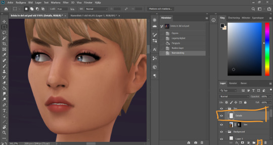
I start by adding a new empty layer in my Sim layer group, above my base Sim layer.
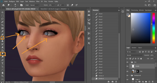
I use the smudge tool (I always keep my smudge tool on Strength around 30%) on the Sim layer to smudge and soften the eye whites a bit. I only redraw my sim's eyes if I'm changing the direction that they´re lookin, otherwise I just refine the existing eyes. In this case I didn't want her eyes quite as far left as they were. On my Details layer, I use the brush tool, hard small brush with opacity around 70-80%, and start drawing the eyes a little bit further to the right.
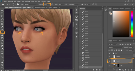
I realized I wanted the eye whites to be even whiter, so I added a new layer inbetween the Sim layer and the Details layer. Using a soft brush with lower opacity (29%) I go over the eye whites. The lower opacity allows me to build up the color by going over multiple times, creating a better blend. I then merge this new layer with the Details layer because there’s no reason for having these on separate layers going forward.
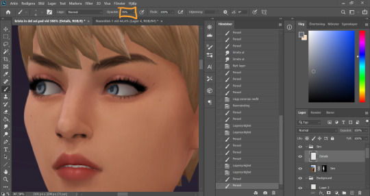
I turn the opacity of the brush tool back up and continue to draw the eyes. At this point they're looking rather creepy...
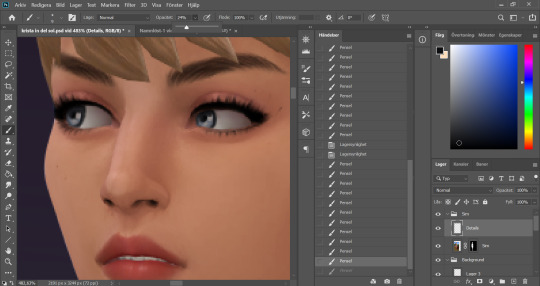
But looking much better after some added dots of “shine” with a white color (not full on white, slightly muddier)
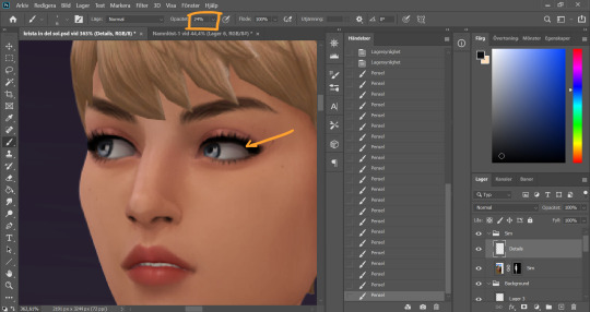
I turn down the opacity of the brush again, take a soft brush and a dark grey color and go around the whole eye to add some shadow.
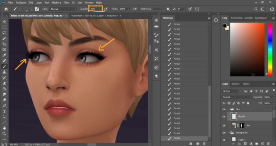
Turn up the opacity of the brush again (I know it’s a lot of back and forth with this, it’s just how I work) and work around the eyes. I clean up the make up and add some lashes. I also add some dept to the eyebrows using a slightly darker color than the existing strands and draw in some new ones here and there.
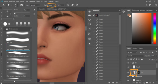
Time to clean up the nose (eeeew). I start with the Smudge tool on the sim layer, strength around 15-20%, and smudge the pixels a little.
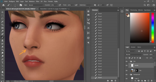
On the details layer, I clean up the nose further by drawing in the nostrils a bit, and even out the colors around and on the nose, picking up color with the eyedrop tool and going over with a low opacity brush wherever I think the color is a little uneven.
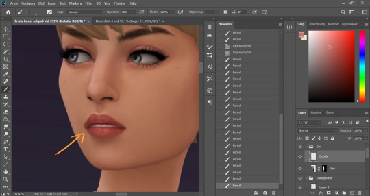
With the lips I sharpen the shape, add some highlights on the top of the lipline, clean up the corners of the mouth, redraw the teeth and add those squiggly circles on the top and bottom lip. They look a bit weird up close but zoomed out it will look glosssssy :) I pick up existing colors on the lip with the eyedrop tool and work with both lower opacity soft brushes and higher opacity hard brushes here.
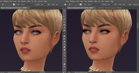
Now I feel happy with the face details. Here is a comparison of the face before and after. A little bit cleaner and smoother now!
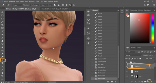
Time to throw some shade. I always start under the chin (because for some reason that's the most fun). I create a new layer in the Sim group, name it shadows, and I use the pen tool again and make a path along the jawline, sectioning off the neck from the face. I went over the basics of using the pen tool in pt 1. This is.…may be an unortodox way to do it. I'm sure a lot of people would see this as an unecessary tricky step. It is however my favorite way of doing it.
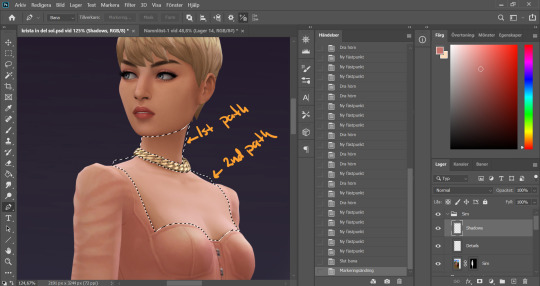
I made two paths for this first work area. Meaning I first made a full path on the neck above the necklace, closed that path and then started a new one below the necklace to include the chest area where the skin is showing (separating it from the clothes). When both my paths were closed I pressed ctrl + Enter to turn them both into selections at the same time. As you can see I didn’t bother following the “edge” of the sim, you will see why later.
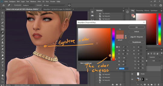
I eyedrop a color from a darker area of her skin, then I choose a darker, more saturated color in the palette that comes up.
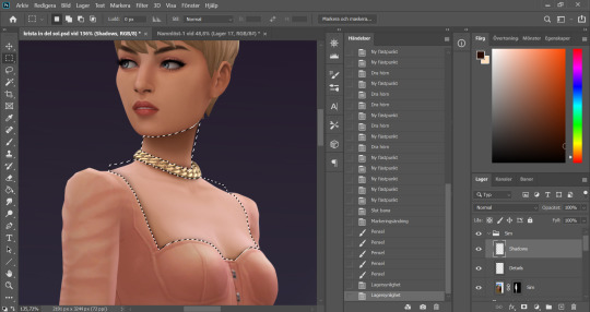
I use a big soft brush with opacity around 30%. I start to build up the shadow under the chin, with more color right under the jawline and less further out. This is where my pen tool selection comes to good use, it keeps the jawline nice and sharp even though I'm using a soft brush to get the fading effect on other parts of the shadow. As we already decided, the light comes from the left in this picture, thus the chin shadow ends up to the right. I use a smaller brush to go around the clothing line, and under the necklace. The tighter the clothes, the smaller the shadow.
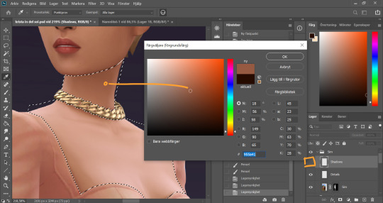
I noticed the neck was lighter on the very side of the neck, and that interferes with my shadow. Now of course I could go over with the shadow color a couple of more times in that spot, but I prefer to correct the color on the base Sim layer instead for a more even result. So I hide the shadow layer, eyedrop the slightly darker area on the neck (and keep it this time).
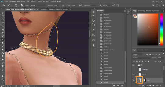
It's important to keep the selection while I do this, so I don't paint over something else. You could put this on another layer and just erase if you accidentally go over something you're not supposed to, but since I already have the selection I can just put it on the base Sim layer. I brush over the area a couple of times until the color is how I want it.
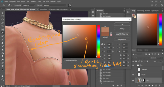
While I am at it I also thought the chest area is a little too white and colorless. This often happens on my sim pictures if I’m using a sim with lighter skin. Again I eyedrop a darker color of the skin, but this time I choose a more vibrant version of the color to avoid muckyness when I go over the white.
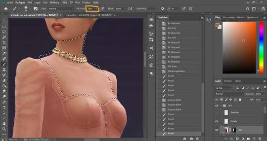
I set the opacity of the brush to super low and then very carefully go over the whiter areas of the chest a couple of times, avoiding the areas where there are details such as collarbones or cleavage.
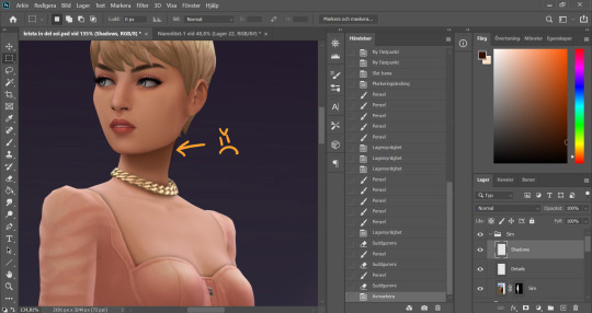
I make the Shadow layer visible again and deselect. Now you see how I have painted a little outside the skin area on the neck, because I didn’t follow the edge of the sim with my selection? I quickly fix that by holding Alt and grabbing the layer mask from the base Sim layer, and dropping it onto the Shadow layer.
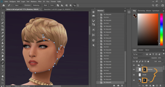
Now these two layers have the same layer mask! And it's time to bring out the pen tool again, and make a path around the face.
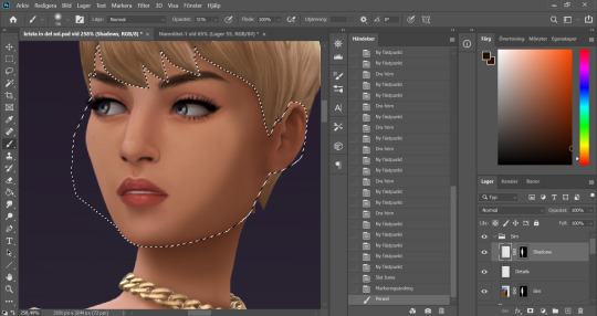
With the face selected I start painting my face shadows. I put shadow on the side of the face that´s away from our imaginary light source.
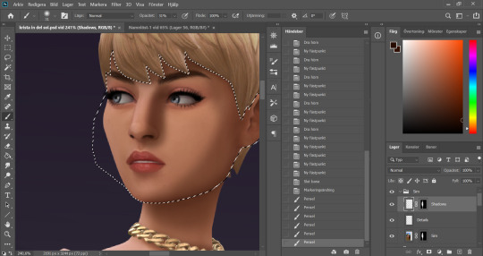
I paint shadows under any hair that covers the face, and add a shadow on the side of the nose that´s facing away from the light. This usually takes me a couple of tries to get right, like this here wasn’t it...
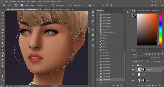
I use a 30something % opacity on my brush and then 30something % opacity on a soft eraser brush and go back and forth with these until I get a nice blend.
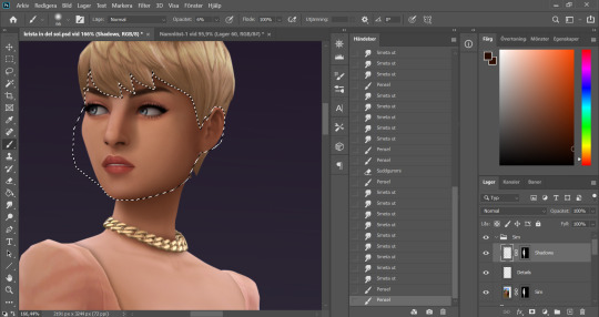
Got the nose shadow looking decent, and add a little shadow in the eye… socket?… closest to the nose. I make sure that this doesn´t go over the eye itself and interferes with any colors there. I want to keep the eyes clear.
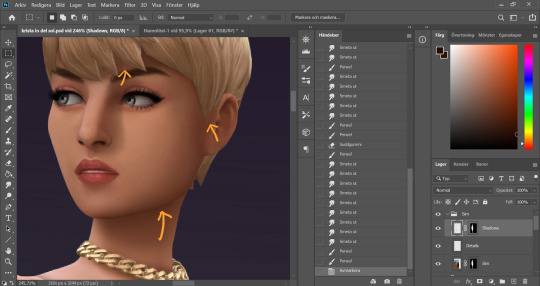
I deselect. Now we´ve got some little flaws here and there because my selection didn’t line up perfectly. I blend these with the smudge tool.
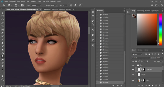
Better!
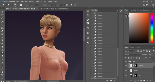
Looking fine gurl!
As I mentioned it’s a little hard to explain some steps, like the eyes and the lips, because it is just drawing until I like the result. I hope you find this useful though, and please send me an ask if you’re wondering about anything!
81 notes
·
View notes
Text

So you’ve officially created your Tumblr blog. What now? In this post I’ll cover graphics and setting up your navigation! I’ll also mention what you should do before you start posting your own content or before you have content to post at the end!

Graphics!
Icons
Your icon is how most people will recognize your blog on their dashboard. An easy way to do icons is to use a manga cap or an anime screenshot! Alternatively there are people who make icons that you can find it by searching Tumblr, but please check whether or not these people require you to re-blog the icons you use or give them credit in your description! If you’re using art, make sure that the artist either gives you explicit permission to use it or has stated publicly that it’s OK to use their art. (please note that if the artist is OK with repost of their art they are generally OK with you using their art in icons but make sure you credit them!) PicCrew is also another popular source to make icons but make sure you credit the artist/link the picCrew!
Headers/banners
As far as using an artists work the same rules that apply for icons apply here! Either get the explicit permission from the artist or make sure they’re OK with their work being used for these things/being re-posted. Generally I don’t use work from the artist and I just use manga caps (which you can find just by googling or searching on Pinterest for [insert character here] manga caps)
You can search Tumblr for headers because there are people who make headers and other graphics. Just make sure you pay attention to peoples rules!
If you want to try your hand at making your own banners or headers. You can use Canva to make gifs and plain banners/headers. I personally use PicsArt to make my post banners. Mainly just because I can do it on my phone and can work on it really easily. Generally any photo editing app should work. PicsArt just has a lot of stickers and effects that can really pull together a banner.
Dividers
Once again there are people who make dividers on Tumblr! But you can also use PicsArt again to do your own personal dividers so they’re more custom to your blogs theme. Although it’s important to note that you won’t be able to do those super thin line dividers on PicsArt because there is a minimum pixel width!
(If you’re iffy on the size of things I’d actually advise you to download somebody else’s banner/divider and use that as a template for sizing!)

Setting up navigation!
Your navigation will be the place where the theme or aesthetic or color palette for your blog should really shine through!
(Edit: I forgot to mention this when I originally wrote this. But when I personally created my navigation I drafted everything in one very large Google Docs file. I recommend that you have everything with its links set up in a Google Docs file. Just because Tumblr has a habit of deleting posts and if you have it in a Google Docs file at the very least that auto saves and you have a back up.)
Your navigation should be broken into at least four parts! You’re about me, rules, master list, and tags (tags are optional technically but is a nice added touch). Remember this is not a Bible for what your navigation is supposed to look like, you can add and subtract to this general structure as you feel necessary!
About me!
Give as much information or as little information as you’re comfortable with. Generally you want to have your name or pen name, The pronouns you use and your time zone if you’re comfortable with it. Most people also have fun facts about them in there about me section. If you are a Black or Neurodiverse writer it’s good to have that also in your about me! A lot of people put their astrology stuff in there about me section, also the results of personality tests and things like that! This is also where you should put your BYF (before you follow) and DNI (Do not interact)
Rules
What do you put in your rules it’s really up to you. I’d advise you to look at a lot of other people’s rules to get a general idea of what you might wanna put in yours. The only thing you want to include in your rules is that you reserve your right to reject asks/request! Be sure to also include what characters you right for. Here are some things to consider in making your rules!
What demographics do you write for?
What demographics do you not write for?
Are you comfortable writing touchy subjects (things like eating disorders or self harm)?
Do you write NSFW content? Or do you cap it at mildly suggestive content?
How many characters will you limit per request?
Do you write Angst?
Do you write for ships or do you only write reader inserts?
Masterlist
Another portion of your navigation I would recommend you look at other peoples to get an idea for. There are tons of ways to organize a masterlist. The way you organize your master list will depend on the series you write for and the content you make. So look at the way people who run similar blogs to yours organize their masterlist.
Tags
So you do not need a tags portion for your navigation! The main reason people have a tags section in their masterlist is so people can blacklist tags related to anything they don’t want to see on the dashboard!
If you run both a NSFW and SFW blog (that you allow minors to follow you on) you need to tag your NSFW things so minors can block that tag. Your tags can be themed, but they don’t have to. The best way to create tags is to create things that you’re going to remember!
I stress that you create a writing tag that you put on every single piece you publish. You can also create character tags or series tags outside of the standard tags used in that fandom. (for example your character tags might be a nickname you have for a character instead of their actual name)
You can make tags for the asks you get sent and for your mutuals or named Anons! (if you get emoji anons it’s best to write out the name of the emoji instead of putting the actual emoji. Just so it’s easier to search because Tumblr does not recognize emoji‘s in it search!) you might also want to create a tag that you put on everything you re-blog for the people who only want to see your content, A tag you put on all your posts that aren’t writing (for example my “Morpho talks” tag), and a tag for the fics that you would recommend to your followers!

What if I don’t have any of my own content to post?
So this is a pretty easy one. Re-blog stuff, I didn’t start posting my own content until a month after I started this blog and at that point I already had a few followers. Bye setting yourself up as a fandom blog you’re letting people who are interested in that fandom know what you’re going to post. Don’t be afraid to shitpost and don’t be afraid to do things that show your personality! This is also a good way to practice getting into the habit of using your tags!
Don’t only re-blog art but also re-blog fics with comments in the tags! i’ve literally made a handful of mutuals just by re-blogging their stuff and the things they write with comments in the tags! Writers do not get a lot of comments on this platform but comments really encourage writers to keep on writing!

So this is a really long post. Please tell me if there’s anything else specifically you’d like me to talk about in this series!
#writing on tumblr#writing#writing tumblr#writing fan fiction#start writing on tumblr#writing for fandoms#series: writing on tumblr#Morpho writes#long post#I think I’m going to write about actually making posts next?#and I’ll talk about things like the best times to post and how to utilize the tagging system!#also also talk about how the length of a fic might impact its reach#because I’ve noticed that longer fics tend not to do as well on Tumblr
50 notes
·
View notes
Text
Anonymous asked: I noticed you did post to acknowledge the death of Uderzo, the co-creator of the Asterix comics. I have to ask Tintin or Asterix? Which one do you prefer?
It’s like asking Stones or Beatles? I love both but for different reasons. I would hate to choose between the two.
Both Tintin and Asterix were the two halves of a comic dyad of my childhood. Whether it was India, China, Hong Kong, Japan, or the Middle East the one thing that threads my childhood experience of living in these countries was finding a quiet place in the home to get lost reading Asterix and Tintin.
Even when I was eventually carted off to boarding school back in England I took as many of my Tintin and Asterix comics books with me as I could. They became like underground black market currency to exchange with other girls for other things like food or chocolates sent by parents and other illicit things like alcohol. Having them and reading them was like having familiar friends close by to make you feel less lonely in new surroundings and survive the bear pit of other girls living together.
If you asked my parents - especially my father - he would say Tintin hands down. He has - and continues to have in his library at home - a huge collection of Tintin comic books in as many different language translations as possible. He’s still collecting translations of each of the Tintin books in the most obscure languages he can find. I have both all the Tintin comic books - but only in English and French translations, and the odd Norwegian one - as well as all the Asterix comic books (only in English and French).
Speaking for myself I would be torn to decide between the two. Each have their virtues and I appreciate them for different reasons.
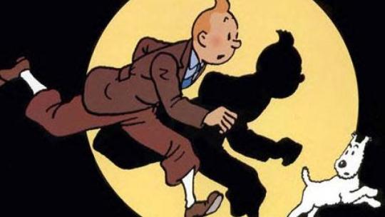
Tintin was truly about adventure that spoke deeply to me. Tintin was always a good detective story that soon turned to a travel adventure. It has it all: technology, politics, science and history. Of course the art is more simpler, but it is also cleaner and translates the wondrous far-off locations beautifully and with a sense of awe that you don’t see in the Asterix books. Indeed Hergé was into film-noir and thriller movies, and the panels are almost like storyboards for The Maltese Falcon or African Queen.
The plot lines of Tintin are intriguing rather than overly clever but the gallery of characters are much deeper, more flawed and morally ambiguous. Take Captain Haddock I loved his pullover, his strangely large feet, his endless swearing and his inability to pass a bottle without emptying it. He combined bravery and helplessness in a manner I found irresistible.
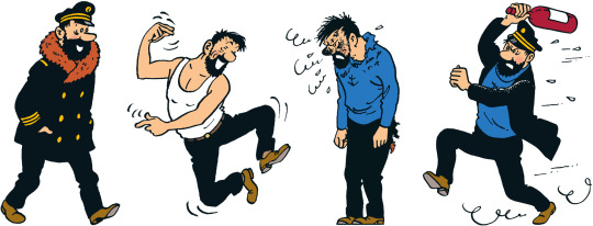
I’ve read that there is a deeply Freudian reading to the Tintin books. I think there is a good case for it. The Secret of the Unicorn and Red Rackham's Treasure are both about Captain Haddock's family. Haddock's ancestor, Sir Francis Haddock, is the illegitimate son of the French Sun King – and this mirrors what happened in Hergé's family, who liked to believe that his father was the illegitimate son of the Belgian king. This theme played out in so many of the books. In The Castafiore Emerald, the opera singer sings the jewel song from Faust, which is about a lowly woman banged up by a nobleman – and she sings it right in front of Sir Francis Haddock, with the captain blocking his ears. It's like the Finnegans Wake of the cartoon. Nothing happens - but everything happens.
Another great part is that the storylines continue on for several albums, allowing them to be more complex, instead of the more simplistic Asterix plot lines which are always wrapped up nicely at the end of each book.
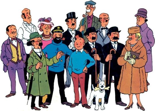
Overall I felt a great affinity with Tintin - his youthful innocence, wanting to solve problems, always resourceful, optimistic, and brave. Above all Tintin gave me wanderlust. Was there a place he and Milou (Snowy) didn’t go to? When they had covered the four corners of the world Tintin and Milou went to the moon for heaven’s sake!
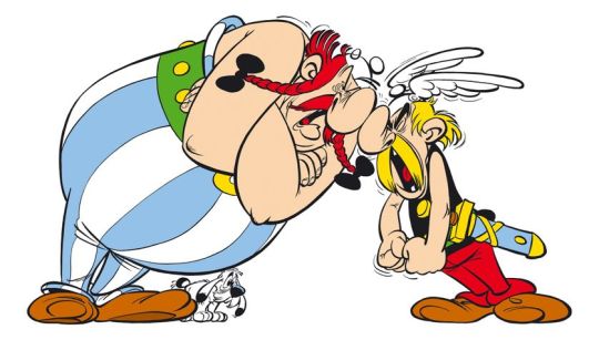
What I loved about Asterix was the style, specifically Uderzo’s visual style. I liked Hergé’s clean style, the ligne claire of his pen, but Asterix was drawn as caricature: the big noses, the huge bellies, often being prodded by sausage-like fingers. This was more appealing to little children because they were more fun to marvel at.
In particular I liked was the way Uderzo’s style progressed with each comic book. The panels of Asterix the Gaul felt rudimentary compared to the later works and by the time Asterix and Cleopatra, the sixth book to be published, came out, you finally felt that this was what they ought to look like. It was an important lesson for a child to learn: that you could get better at what you did over time. Each book seemed to have its own palette and perhaps Uderzo’s best work is in Asterix in Spain.
I also feel Asterix doesn’t get enough credit for being more complex. Once you peel back the initial layers, Asterix has some great literal depth going on - puns and word play, the English translation names are all extremely clever, there are many hidden details in the superb art to explore that you will quite often miss when you initially read it and in a lot of the truly classic albums they are satirising a real life country/group/person/political system, usually in an incredibly clever and humorous way.
What I found especially appealing was that it was also a brilliant microcosm of many classical studies subjects - ancient Egypt, the Romans and Greek art - and is a good first step for young children wanting to explore that stuff before studying it at school.
What I discovered recently was that Uderzo was colour blind which explains why he much preferred the clear line to any hint of shade, and it was that that enabled his drawings to redefine antiquity so distinctively in his own terms. For decades after the death of René Goscinny in 1977, Uderzo provided a living link to the golden age of the greatest series of comic books ever written: Paul McCartney to Goscinny’s John Lennon. Uderzo, as the Asterix illustrator, was better able to continue the series after Goscinny’s death than Goscinny would have been had Uderzo had died first, and yet the later books were, so almost every fan agrees, not a patch on the originals: very much Wings to the Beatles. What elevated the cartoons, brilliant though they were, to the level of genius was the quality of the scripts that inspired them. Again and again, in illustration after illustration, the visual humour depends for its full force on the accompaniment provided by Goscinny’s jokes.
Here below is a great example:
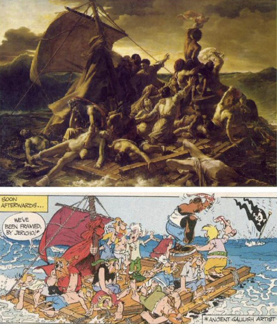
There’s a lot of genius in this. Uderzo copied Theodore Géricault’s iconic ‘Raft of the Medusa’ 1818 painting in ‘Asterix The Legionary’. The painting is generally regarded as an icon of Romanticism. It depicts an event whose human and political aspects greatly interested Géricault: the wreck of a French frigate, Medusa, off the coast of Senegal in 1816, with over 150 soldiers on board. But Anthea Bell’s translation of Goscinny’s text (including the pictorial and verbal pun ‘we’ve been framed, by Jericho’) is really extraordinary and captures the spirit of the Asterix cartoons perfectly.
This captures perfectly my sense of humour as it acknowledges the seriousness of life but finds humour in them through a sly cleverness and always with a open hearted joy. There is no question that if humour was the measuring yard stick then Asterix and not Tintin would win hands down.
It’s also a mistake to think that the world of Asterix was insular in comparison to the amazing countries Tintin had adventures. Asterix’s world is very much Europe.
Every nationality that Asterix encounters is gently satirised. No other post-war artistic duo offered Europeans a more universally popular portrait of themselves, perhaps, than did Goscinny and Uderzo. The stereotypes with which he made such affectionate play in his cartoons – the haughty Spaniard, the chocolate-loving Belgian, the stiff-upper-lipped Briton – seemed to be just what a continent left prostrate by war and nationalism were secretly craving. Many shrewd commentators believe that during the golden age when Goscinny was still alive to pen the scripts, that it was a fantasy on French resistance during occupation by Nazi Germany. Uderzo lived through the occupation and so there is truth in that. Perhaps this is why the Germans are the exceptions as they are treated unsympathetically in Asterix and the Goths, and why quite a few of the books turn on questions of loyalty and treachery.
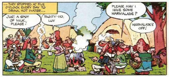
Even the British are satirised with an affection that borders on love: the worst of the digs are about our appalling cuisine (everything is boiled, and served with mint sauce, and the beer is warm), but everything points to the Gauls’ and the Britons’ closeness. They have the same social structure, even down to having one village still holding out against the Romans; the crucial and extremely generous difference being that the Britons do not have a magic potion to help them fight. Instead they have tea, introduced to them by Getafix, via Asterix, which gives them so much of a psychological boost that it may as well have been the magic potion.
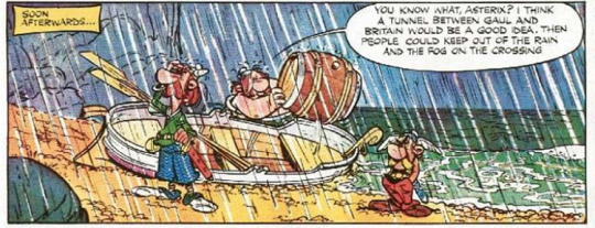
I re-read ‘Asterix in Britain’ (Astérix chez les Bretons) in the light of the 2016 Brexit referendum result and felt despaired that such a playful and respectful portrayal of this country was not reciprocated. Don’t get me wrong I voted for Brexit but I remain a staunch Europhile. It made me violently irritated to see many historically illiterate pro-Brexit oiks who mistakenly believed the EU and Europe were the same thing. They are not. One was originally a sincere band aid to heal and bring together two of the greatest warring powers in continental Europe that grotesquely grew into an unaccountable bureaucratic manager’s utopian wet dream, and the other is a cradle of Western achievement in culture, sciences and the arts that we are all heirs to.
What I loved about Asterix was that it cut across generations. As a young girl I often retreated into my imaginary world of Asterix where our family home had an imaginary timber fence and a dry moat to keep the world (or the Romans) out. I think this was partly because my parents were so busy as many friends and outsiders made demands on their time and they couldn’t say no or they were throwing lavish parties for their guests. Family time was sacred to us all but I felt especially miffed if our time got eaten away. Then, as I grew up, different levels of reading opened up to me apart from the humour in the names, the plays on words, and the illustrations. There is something about the notion of one tiny little village, where everybody knows each other, trying to hold off the dark forces of the rest of the world. Being the underdog, up against everyone, but with a sense of humour and having fun, really resonated with my child's eye view of the world.
The thing about both Asterix and Tintin books is that they are at heart adventure comics with many layers of detail and themes built into them. For children, Asterix books are the clear winner, as they have much better art and are more fantastical. Most of the bad characters in the books are not truly evil either and no-one ever dies, which appeals hugely to children. For older readers, Tintin has danger, deeper characters with deep political themes, bad guys with truly evil motives, and even deaths. It’s more rooted in the real world, so a young reader can visualise themselves as Tintin, travelling to these real life places and being a hero.
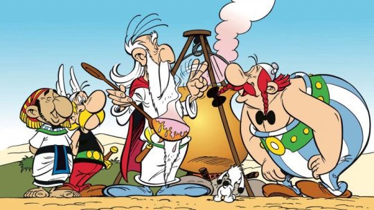
As I get older and re-read Asterix and Tintin from time to time I discover new things.
From Asterix, there is something about the notion of one tiny little village, where everybody knows each other, trying to hold off the dark forces of the rest of the world. Being the underdog, up against everyone, but with a sense of humour and having fun, really resonated with my child's eye view of the world. In my adult world it now makes me appreciate the value of family, friends, and community and even national identity. Even as globalisation and the rise of homogenous consumerism threatens to envelope the unique diversity of our cultures, like Asterix, we can defend to the death the cultural values that define us but not through isolation or by diminishing the respect due to other cultures and their cultural achievements.
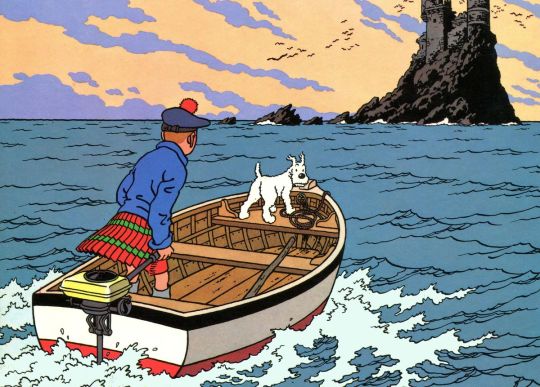
From Tintin I got wanderlust. This fierce even urgent need to travel and explore the world was in part due to reading the adventures of Tintin. It was by living in such diverse cultures overseas and trying to get under the skin of those cultures by learning their languages and respecting their customs that I realised how much I valued my own heritage and traditions without diminishing anyone else.
So I’m sorry but I can’t choose one over the other, I need both Asterix and Tintin as a dyad to remind me that the importance of home and heritage is best done through travel and adventure elsewhere.
Thanks for your question.
297 notes
·
View notes
Photo

a n t i g o n e k e n n e d y g r a v e s
basics:
name: antigone kennedy graves. pronunciation: an·ti·guh·nee keh·nuh·dee grahvs. meaning: antigone- in place of a mother, unbending, against, compared to, like. kennedy- misshapen head or fierce headed. birthday: september 13th. age: nineteen. pronouns: they, she & her. sexuality: pansexual. siblings: archibald graves (triplet), ajax graves (triplet). parents: john graves & elaine graves nee kennedy. other family: darcy kennedy (grandmother). languages: english. current residence: the graves triplet’s london flat. hometown: boston, massachusetts; new york city, new york.
wizard fun:
hogwarts house: ravenclaw. year of graduation: 1979. occupation: intern at the department of mysteries. pet: none. tig does bring home many strays to care for, though. blood status: pureblood. species: witch. patronus: goldfish. it symbolizes prosperity. it brings good luck and good fortune. with its golden scales and colorful patterns, they are associated with much wealth which it will share to those it guides. the gold fish is naturally strong. a big fish for its kind, it swims powerfully to get to where it wants. it also symbolizes a dragon in ancient eastern and oriental traditions, with legend holding that it can transform into a water dragon. its transformative powers make it a sign of power and virility. they exist in naturally serene environments. to view the goldfish and koi is to be reverted into a meditative state. this brings about a feeling of calmness and peace to those that see this animal as a guide. it causes those that see it to be still as well, easing their worries and letting their minds work more freely. boggart: the memory of her parents bodies in their caskets. the idea of her brothers there with them. amortentia: candy apple. one of tig’s favorite treats that reminds her of the best memories of carnivals and festivals with her brothers back at home. lavender. lavender has always been tig’s favorite scent. her mother wore it in her perfume and tig also wears it. they used to grow small planters of lavender in their back yard too. sea salt. antigone loves the ocean. she always has. it is a life long dream of hers to live her life on the beach next to the ever present waves. wand type: 9″ willow wood, thunderbird tail feather, springy. willow is an uncommon wand wood with healing power, and I have noted that the ideal owner for a willow wand often has some (usually unwarranted) insecurity, however well they may try and hide it. while many confident customers insist on trying a willow wand (attracted by their handsome appearance and well-founded reputation for enabling advanced, non-verbal magic) my willow wands have consistently selected those of greatest potential, rather than those who feel they have little to learn. It has always been a proverb in my family that he who has furthest to travel will go fastest with willow. thunderbird wands were powerful but difficult to master, and were good for transfiguration work. wands with thunderbird tail feather cores, like the birds the feathers are taken from, are able to sense danger and can cast curses on their own. wands with thunderbird tail feather cores have been known to fire curses pre-emptively when supernatural dangers are present. affiliation: neutral.
appearance:
height: 5′4″. hair color: strawberry blonde. eye color: teal. typical hair style: antigone wears her hair long. it has soft curls that almost look beach like in their waves. she often wears her hair up in a simple ponytail with a big bow. fashion style: tig wears sneakers, straight lined skirts or dresses, peter pan collars, and sweaters. she likes a soft palette of pastel colors. she occasionally wears overalls and high waisted shorts. her skates are always on her person. she loves floral patterns, simple colors, and plaids. [ fashion ] distinguishing features: tig has a look of otherness about her. her eyes are never quite focused on what is in front of her. she has a sprinkling of freckles on her face and a few scars on her arms from being caught in a rose bush as a kid.
personality:
positive traits: contemplative. amiable. open-minded. negative traits: unreliable. naive. nervous. theme song: something wild by lindsey stirling ft andrew mcmahon
headcanons:
tig doesn’t usually have pockets, actually. if she does, it’s because she’s wearing her overalls and if that’s the case, she has rocks and sticks in her pockets. she usually wears a dress or skirts that lack pockets, but she makes up for it by almost always having a pink knapsack with her. it was a gift from her brothers on one of their birthdays. in her bag, she almost always has a deck of tarot cards, a tiger’s eye and turquoise, bandages, dice, mints, bubblegum, an ink pen, a quill and ink pot, colored pencils, ribbons, sheet music, and there is always an assortment of sticks, leaves, and flower petals.
antigone has always been partial to the spring. she likes to watch the world bloom. tig has always had a special and loving connection with nature and it certainly feels the most powerful during the spring. the air is refreshing and breezing, and she will spend hours just laying in the grass on those days.
she’s a rainy day kind of girl. is there anything better in this life than being caught in a spring shower? antigone graves thinks not. rain is even more beautiful to her because it can make her divinations decidedly more clear. she will stand letting the raindrops in her face for hours and has been caught doing it before. as a younger girl, her grandmother would chide her for coming home soaking wet and catching colds from it.
biography:
TW: death, parental death
The Graves family is one of the most well-known and revered pureblooded families in America and has been so for generations. John and Elaine met through an arranged engagement. However, unlike many who found themselves in a similar position, the couple fell deeply in love. They took up residence in a large colonial house right outside Boston. John focused on climbing the political ladder at MACUSA while Elaine delved into a promising fashion career.
Their pregnancy came as a bit of a shock several years into their marriage. That is, to everyone but John’s mother, a well-known seer who had long said they would have a rare miracle arriving. While they hadn’t planned it, they were both very pleased to begin a family. The surprises continued when they were told that they would be having triplets. Elaine opted to take a step away from the world of fashion so that John might continue his work in Congress. His career was at a crossroads that could not be put on hold. In fact, the choices he made during this time would change the course of his entire family.
The triplets were born just as the Massachusetts leaves had begun to change color and fall. Autumn welcomed them to the world. Antigone was born the middle of the three. A brother on either side and all born just before midnight.
Their childhood was one filled with incredible privilege and opportunities. The triplets were very well educated. Even before they started school at the Salem Institute for Witches, they were well versed in both general education and magical theories. From the beginning, Antigone showed a particular proclivity towards divinations, herbology, and care of magical creatures. Her grandmother was happy to groom her seeing abilities. She always had an innate curiosity. Her wonder for the world often drove her to study anything that she could care for, whether it be flora or fauna. No one could deny that she had a desire to care for things. A trait that was always praised and encouraged by her family.
It was in the triplet’s third year that rumors began to swirl about her father’s political dealings. He had obviously been angling to become President for some time. However, his staunch belief in pureblood supremacy and ties to controversial movements left the public torn in opinion of him. Antigone struggled to believe that her father, one of the most loving and kind men she knew, could ever be how these people described him. They even portrayed her mother as some sort of icy woman. That’s how she knew it all to be untrue. Her father even publicly stepped back from his more controversial views, appeasing most.
What she thought of the rumors would cease to matter as they ended their fourth year of school. An owl came to their headmistress in the dead of night. John and Elaine Graves had both been found dead in their Boston home. An angry citizen who disagreed with his views was the final word, but Antigone certainly didn’t believe it. It didn’t feel right, and all seers knew to trust their instincts above everything. There were too many signs that indicated it was not any wizard. It had to have been a hitwizard, although there was no telling which side ended up hiring them.
While their mother had no siblings or much family to speak of, John had a previously estranged sister in Europe who agreed to take in the now orphaned triplets. It was a large paradigm shift for Antigone and her brothers, who had always been taught that halfbloods and purebloods who did not remain so were dangerous to their way of life. Their father had not said more than a few sentences on his sister for the entirety of their lives. Frankly, Antigone forgot that she had an aunt more often than not. For the woman to show such open kindness and hospitality has her questioning everything that she’d ever been taught growing up.
Moving to a new country and beginning school in an entirely new place still feels like the carpet was pulled out from under her. However, Antigone realized her potential for change here. The last thing she wanted was to end up like her father and mother. Perhaps there was more she could learn from being more open-minded. That being said, she is realizing that there is more to learn and unlearn than she ever realized before and at times, it was all impossible to keep up with.
Hogwarts held its own set of challenges. The curriculum was different, there were people who had known each other for a lifetime that she’d barely remember, Antigone never knew who she could trust and who she couldn’t. What’s more, the world outside was storming. There was a brewing war that they had all been thrust into, and she had no idea where to stand. What she did know was that the images in the leaves told her horrible stories of the future. Stories that terrified her.
Graduation came before she knew it. With her father’s name in politics and her grandmother’s reputation as a seer, Antigone was offered several jobs off the bat. Finally, she decided to take on an internship in the Department of Mysteries as it felt like where she was most needed and useful. Working inside a government that she barely understands in a job that is nearly impossible to explain is a trial in and of itself. Luckily, it does the job to distract her from everything which wants to pull her towards either side of the conflict surrounding her.
2 notes
·
View notes
Text
im really truly grateful for everyone who’s said such nice things about my art recently, cuz this gal has had a rollercoaster of a time on here, and a PRETTY bumpy start with digital art lol. so i wanna take a stroll down memory lane for a second!!
(also i was sorting old art on my laptop and saw these!! ha)
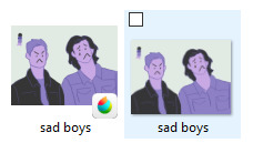
a bunch of old/new art under the cut for length reasons
(also like. this is 80% for me cuz it’s satisfying to see some improvement over time!!! 2018 seems so long ago but also like. no lmao)
sam and dean, april 2018 vs march 2020
i got so mad at this first one that i quit at the faces!
also i was basically tracing the screencap i based this off of (which is actually a great way to get shapes down!! also blocking and proportions, but using that to go straight into lineart was Not The Best Look here)
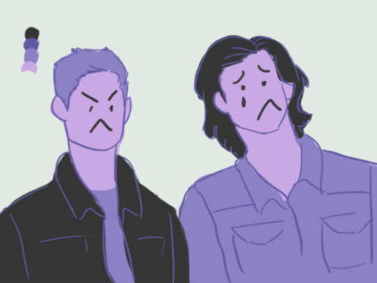
but hey!! look at that improvement. an actual style. coloring inside/outside the lines on purpose! HA.
while i definitely have more detailed stuff of sam and dean now, the pose struck out to me when i was going through my old art today! so i had to compare lol
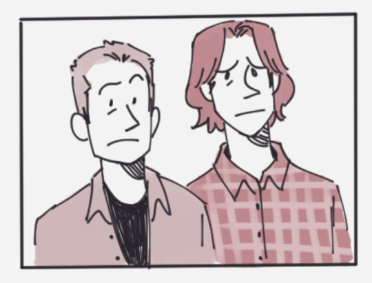
neeeext UP: patience
september 2018 vs march 2020
i used to just use a ton of color palettes because i didnt know how colors worked really... which was good practice for like, color tones and stuff, but i rly didnt know how colors worked very well until GENERALLY pretty recently!
this first patience im still content with, her likeness is there but there’s not much style, and i don’t really like the stiff lines anymore
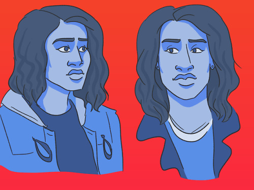
now this!! i tried a new coloring stule and i rly enjoyed it! i also know how to use colors better (maybe???)
at some point i do wanna get back into doing some color palette things again tho! those were really fun

alex :0
september 2018 vs january 2020
i remember i DEFINITELY traced the one on the right, or tried to. and there look at me trying to blend colors on the left how cute....
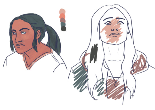
these lil wayward drawings are probably some of my favorite!!!
and look at the change, still using a color palette but i THINK i figured out how to use the color to my advantage for the emotion of the pic rather than just. slapping it on (which i sometimes still do lol)
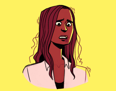
sastiel!
november 2018 vs february 2020
baby’s first sastiel... me just picking out canon moments of them how cute!! also peak how i could not draw sam’s nose right at this point (or cas’ BUT SAM’S POINTY NOSE IS SO IMPORTANT!!!)

this hug.. is probably my favorite thing i’ve drawing recently. i just love them a lot!!!
posing has gotten a lot better . lines too obviously (also the kind of brush helps so so much) also i was gonna color this but i merged the lines with the background like a doofus :/

jack time baybey!
may 2018 vs march 2020
very very obviously tracing/basing off of a pic?? i think. anyways im filled with good emotions still looking at these cuz this was right when i got back into spn and first fell in love with this tiny nephilim CHILD but also. there is improvement to be had ..... (also used a color palette again here)
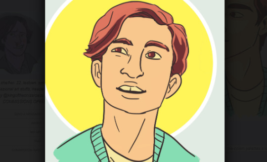
again with the halo motif. i’ve always loved a good halo motif. SO let’s get into it. the lines!! with the old one they’re very shaky (understandable. i was v new @ digital art) also extremely stiff. no room to breath
new art! while the lines i used could be considered similar (bold lines all the same color, not much pen pressure) things have changed!
i’ve been using brown for my lines recently, makes it look less harsh sometimies, also here i’ve figured out what works for me with where to put less lines, namely the hair! i got the shape, put down some bangs, but not everything is blocked off by a line between skin / hair
also just. another note. ive figured out how to find good highlights/shadows with colors recently and i just! theyre good and bright and im happy abt it (also light purple??? is a good skin shadow???? fun fact)

ok. that all got a bit lengthy but this was very fun for me! if you made it this far I COMMEND YOU ALL THE LOVE FROM ME
#sea talks#oh god what a long post im so SORRY#for real dont read the whole thing if u dont want to obvs#its just me rambling about old and new art#shout out if you've been here since yee olden days#POSTS GETTING 3 NOTES.... LOVE YALL
34 notes
·
View notes
Text
The Royal Invitation, Pt.1
Aerowyn Matilde George Rothchester might seem like a very long name, but it definitely is not for a royal in the Kingdom of Dalewin.
After her grandfather, the beloved king, passed away, Aerowyn (also known as Winny) is called back from her art school in New York. She's thrown back into her royal duties, expected to know what to do.
But with the Royal advisor on tour with the new king, Winny is left to figure things out with his stepson. The only problem, he has no idea what he's doing, after all he's only the lead singer in a band.
Co-written story with @scream-tears.
Chapter 1
Winny's POV:
I dipped the brush lightly into the bright orange paint. After carefully brushing it up against the palette to remove the excess I didn't need, I looked back up at the canvas. By now, some parts of the painting had dried down while other areas were still tacky to touch, leaving an uneven patch of different levels of luster. It was almost done, there were just a few touches left.
The mix of bright oranges and yellows against the blues and greens were supposed to make the atmosphere light. The faint hints of abstract people were supposed to feel breezy. But all I wanted to do was grab a paint brush and smudge it all with a dark blood red.
This whole place felt too heavy. It felt wrong. I wasn't supposed to be here.
This was my library, but it wasn't my library. Yes, I was painting here, I had been painting here since I was a little girl. As soon as I could hold a felt-tip pen and imagine things, I would climb up on that heavy leather chair behind the desk and start scribbling away. It always felt like home, but now I could feel the cold air moving over my skin.
The library did not feel the same.
I let my brush push up against the painting I was working on. Slowly, I dragged it down, ending the stroke so that it was tapered. The light hitting it through the large floor-to-ceiling window highlighted exactly what I had just done. I should have been satisfied, and I was, but the constant monotone view was constantly nagging in the back of my mind.
I leaned backwards to try and view the entire picture as a whole. Although it did what I wanted it to, there was still something missing. I sighed and put the paint brush between my teeth before running my fingers through my blonde hair to put it up in a messy bun. There was no doubt that I had gotten some paint on the ends and from tucking locks behind my ear while working. But what was paint in my hair if it was all over my hands and clothes as well?
I knew that my appearance technically wasn't acceptable, but it was practically a constant state I lived in whenever I was working on a piece. Did it really matter? I was by myself in the library. Nobody was just going to walk in and it wouldn't suddenly disgrace my entire family. And even then, everybody who worked at the castle was sworn to secrecy. It was part of their contracts.
After I managed to get my hair to stay out of my face, I cocked my head to the side, hoping to find what was missing. But maybe it wasn't the painting. Maybe it was me.
Here I was in the library, my grandfather's library.
But now it was mine.
It had only been two days since he passed away mere rooms from here. While it had been expected for quite a while now, it was still a shock when my parents called me to come home. The entire country was in mourning. People from all over were trickling into our home. Some had never even met my grandfather but were obligated to come.
It was too strange. The passing of my grandpa, my best friend, wasn't supposed to be such a public thing. Yet that was just how our family worked. It had been like this for generations. That's what happened in a monarchy. The king's funeral wasn't a thing for just friends and family, it was a thing for anybody with any type of status and-slash-or relation. To me, my grandpa had died, to everybody else their king had died.
My dad was busy taking over duties, my mom was swamped with funeral planning she had taken on to reduce the pressure on my dad, my little brother still had his classes to go to, so I was here all by myself. I had my painting, I had all my art. Technically I was supposed to get ready to take over more responsibilities as well, getting ready to one day take over from my dad. But I never wanted any of that. Or at least definitely not now. All I wanted was to live in a small studio and pursue my art forever now.
But then again I also realised that my position was the reason why I was able to do what I was. Back in New York I was Matilde George, art student who occasionally gets paint all over herself and it able to go to the coffee shop on the block in her pajamas without too much judgement. But in the Kingdom of Dalewin I was Princess Aerowyn Matilde George Rothchester. I was expected to make appearances, act and dress a certain way, be around particular people.
There wasn't much I could do, but having gotten a taste at normal life had spoiled everything for me.
I was hoping painting would make me feel a little better. And it did, it truly did. But still. This room just felt so cold. Especially when the cool breeze from an opening door hit the back of my neck. I immediately turned around. Nobody was supposed to come in here. It was my granddad's personal space, then it was our shared space, and now it was my hideout.
Some guy with brown shaggy hair and the most casual clothes was standing in the doorway. He looked like somebody I would come across in New York, like a 'commoner'. It was pretty rare to see anything of the like in the castle, especially at times like this when there was so much company.
"Can I help you?" I raised an eyebrow as his eyes looked around all the shelves full of books in bewilderment with a hint of stress.
His gaze fell upon me and the glimmer of uncertainty was replaced with a confident smirk. "Well, I was lost, but it seems like I came to just the right place."
I cringed internally as he winked and closed the door behind himself. This was my place, though, I wasn't going to let him drive me away. "Who are you?"
"Alex," he responded and started walking in my direction. His accent was way too American to be from here, "Alex Gaskarth."
"Huh," I frowned and pressed my paintbrush into my palette to grab some more paint, "never heard of 'Gaskarth' before."
"It's my dad's name," he started explaining as he sat on the desk that my grandpa had chosen himself many years ago, before I was even born. "My step-dad is advisor to the new king. Mom married him many many years ago, when I was six."
"Your step-dad is Garry?" I looked past my canvas to see Alex was already staring right at me and made accidental eye contact with him.
"Yeah! So you've heard of him!"
"I didn't know Garry had a step-son," I shrugged and turned my attention back to my painting.
"I am the one and only!" He threw his hands up as if it were some great achievement.
Garry was one of the most humble people I had ever met and had the pleasure of working with. It was strange to think this boy leaving his butt print on my grandpa's desk was raised by him.
"So what are you doing here?" I asked, still not understanding why in the world Garry's step-son would suddenly be here now. I had never met or seen him before, unlike many other children the other advisors had.
"Well, somebody's gotta help keep things running smoothly here while Garry is out of the King's coronation tour," he said so matter-of-factly that it made me feel incompetent, while I knew that wasn't true.
"You?" I snorted.
"I'm the only one Garry trusts with all his heart. I've still got a few days before I've gotta straighten up. Now, I can still have as much fun as I could possibly want."
"I'm glad to hear that you won't be acting like this when you start the job. Doing this around the wrong people can get you in serious trouble."
"What's your name anyways?" He asked, confirming the suspicion I had that he had no idea who I was.
"Some people like to call me Aerowyn Matilde George Rothchester," I said as nonchalantly as possible.
"I've heard that name somewhere before." He jumped back up and clapped his hands together. "As much as I enjoyed this, I do actually need to go somewhere. Can you tell me which direction the west wing is?"
"The west."
"Well, yeah, but would you be able to point me in the right direction?"
I pointed straight ahead of me, meaning he'd have to turn to the left as soon as he left the room.
"Thanks, princess," he winked as he slipped out of the room.
#all time low#all time low fanfiction#alex gaskarth#alex gaskarth fanfiction#all time low imagine#fanfiction#The Royal Invitation
7 notes
·
View notes
Text
Del Water Gap on Smash Mouth, Quarantine and “Ode to a Conversation Stuck in Your Throat” [Premiere + Q&A]
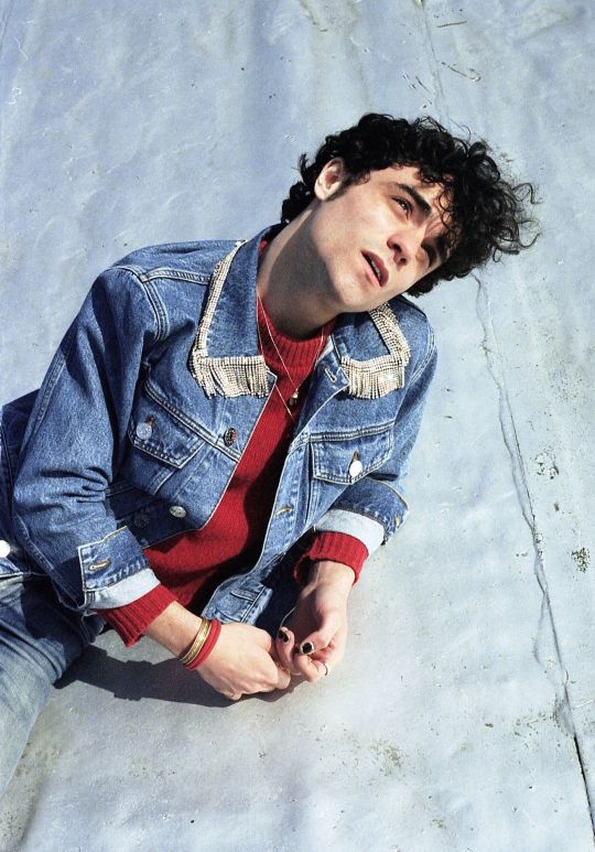
Photo: Angela Ricciardi
Some music is just so vivid that when you hear it, you see it. In the same vein, some songs are so personal that when you listen, it’s like peering into someone's innermost thoughts. Each one of Del Water Gap’s songs possess that power. The artist’s newest single, “Ode to a Conversation Stuck in Your Throat,” effectively peels back the curtain on a wandering mind’s thoughts.
“Ode To a Conversation Stuck in Your Throat” explores feelings of apprehension and angst at the possibility of a lover finding love somewhere else. Frontman S. Holden Jaffe’s soft-hearted vocals flounce over folksy guitars with rock-leaning layerings. The song’s undercurrent is akin to Del Water Gap’s previous classic singer-songwriter style displayed on his Don’t Get Dark EP. But Del Water Gap’s 2020 sound is becoming more and more accented by contemporary touches and heightened tempos.
We caught up with the man behind the project to find out more about “Ode to a Conversation Stuck in Your Throat,” his obsession with Smash Mouth, and how his quarantine is going.
youtube
Ones To Watch: So you’re from rural Connecticut, but moved to Brooklyn during your young adult years. How have or haven’t your surroundings aided in creating your sound?
Del Water Gap: At the time I moved to the city, there was still a really vibrant indie scene happening. CMJ was in full swing, and I was out every weekend seeing bands like The Virgins, Public Access TV, The Drums… The Arctic Monkeys, The Antlers, Diet Cig. Bands and bands. Running into Fabrizio Moretti by the NYU library. I was spending a lot of time at St. Dymphna’s and borrowing electric guitars from my friend Dylan. I loved the music I was ingesting and the scene that came with it.
Did you choose music or did music choose you?
Music chose me - but I was an ardent enabler. I remember standing on my living room table and playing harmonica along with the radio as a kid. Everything in C major sounded decent...? I figured out what one-four-five felt like years before I knew the words for it, just staying quiet and listening. My relationship with music has been a bit of an abusive one in recent years, but I know I’m here for life. I’ve fantasized about quitting and doing something simpler hundreds of times, but i know that's not going to happen any time soon.
What was it that made you decide to grow Del Water Gap from a personal project into a full blown touring band?
I put out an EP in 2012 under the name Del Water Gap because all of my heroes at the time were solo artists using monikers; Bon Iver, Tallest Man on Earth, St. Vincent… and so on. I moved to NYC without any aspirations of being a performer, but the record started performing a bit on local blogs and my best friend at the time basically forced me to play a show. She said “these are songs to fall in love to.” I refused and refused until she offered to play the show with me, and I finally gave in and booked a slot at Sullivan Hall in the village. I think we nearly sold it out.
Who would you say your music is for?
People who have run out of podcasts.
You’ve released “My Body,” featuring Claud, and now “Ode to a Conversation Stuck in Your Throat,” both of which admittedly sound a little different from your previous work. The newer singles still have a folksy charm but seem more electronic-leaning or even more pop-leaning. What’s leading this explorative venture?
As I was finishing college I started producing some indie pop artists with my friend Mike Adubato. It was really just a way to help make ends meet, but I spent a year looking over Mike’s shoulder as he built out arrangements. I really got a holistic education in pop production that way. As artists, I think that our work is defined both by our strengths and our limitations, and as my limitations broke open, my work changed. I would simply sit down to make a song and reach for different colors. I also started consuming more indie pop records, and I eventually made the realization that I could take influences from those records without sacrificing any part of myself as a writer or protagonist.
We love how tender “Ode to a Conversation Stuck in Your Throat” not only sounds, but actually feels. There’s a ton of intimacy there. It feels like we’re reading a diary entry. Can you give us some more insight into the song’s origin?
The song came out of a slow night in the studio with my good friend Gabe Goodman. We had been in a secret boy band that broke up in 2017, and it was our first time really writing together since things ended. I programmed some drums, and Gabe put most of the music together - we were just getting into a flow when a friend invited us to dinner with one of our musical heroes. We looked at each other and said “Should we go? Do we stop now?” “No, no, no we stay,” we decided. So we kept writing and had a spiked seltzer or two.
I came back to the studio the next day and moved a few things around and wrote most of the words. I was seeing someone at the time who I really liked, and we had both been walking up to the line of asking the other to be with each other and no one else. Finally, we were sitting together one day and it got all quiet and she goes, “I’ve had this stuck in my throat all day…” And that was the start of our togetherness and the inspiration for the song.
We were creeping on your Twitter. What’s going on with you, bowl cuts, and Smash Mouth?
I thought you’d never ask - a few months ago, I was having a coffee playdate with my friend Charlie Burg and he was sketching me from the across the table. He’s really a very good artist, so I was feeling a little competitive and decided I would try my hand at sketching as well. So I grabbed a pen and a napkin from the table and drew this ridiculous line drawing of a horse with a bowl cut and a human face. It looks like something a six year old would draw in art class. It also has this disturbing and surrealist quality to it. We were laughing and laughing at my ridiculous creation and I turned to Charlie and said, “Do you think I could sell this online?” So I threw the napkin on my web store and it sold in five minutes and the whole event was so delightful to me that I made “commemorative” t-shirts and a Horse With Bowl Cut fan club account on Instagram. So a lot of bowl cut content makes its way to me these days.
Not much to say about Smash Mouth other than the 2001 Smash Mouth self-titled LP is one of the greatest records ever made, and I will gladly teach a college level course on it if any university will lend me a classroom space.
I read that you draw inspiration from what you eat, But when it comes to flavor, how would you describe your musical palette?
I would describe a musical cheese plate; sweet and savory. Trou Du Cru, a truffle Moelleux des Alpes, a hard Beaufort. Some honey and jam on the side, olives and cornichon. With a generous pile of those really expensive fig crackers they have at Whole Foods.
What’s been one of the defining moments of your artistic career so far?
My dad FaceTimed me the other day from quarantine wearing a Del Water Gap mock turtleneck and listening to my song “Theory of Emotion.” That was pure power.
What’s next for you?
I’m putting out the best work of my life so far - a few songs now and a few over the summer and into the fall. I’m touring with girl in red. I’m surviving this pandemic and everything that has come with it. I am trying to be a better friend and take better care of my brain and my body.
We of course hope you’re staying safe during this time. But how are you keeping quarantine interesting? Or are you?
I am very lucky to be safe and comfortable - I’ve run away to a friend’s house by the ocean, so I have some fresh air and light, and I get to say hi to a seal once in a while. I’ve been journaling and cooking and trying to run twenty miles a week. I’ve been coloring a lot and watching Nashville. The excess of free time has not led to an excess of creation, but I’m trying to be gentle on myself. I think the collective anxiety has taken a toll on all of us. We’ll be writing about this for years to come, but we may have to wait a few years before we start. I shot a music video for “Ode” from quarantine, and have been finishing up my record remotely with Mike and Gabe. One of my best friend’s dad is a practicing buddhist, so he’s been sending me some really powerful literature each day, helping me move towards a more organized spiritual practice. All we can do right now is sit in this and keep in touch with the ones we love, so that’s my work.
Lastly, who are your Ones to Watch?
I love Rosie Tucker’s record Never Not Never Not Never Not. Miss Grit played one of my favorite shows of the year opening for Daisy the Great at Rough Trade in August. Briston Maroney is making really powerful records. and Claud of course! One of my friends has a new project called Honeywhip, which I have been literally playing on repeat.
3 notes
·
View notes
Text
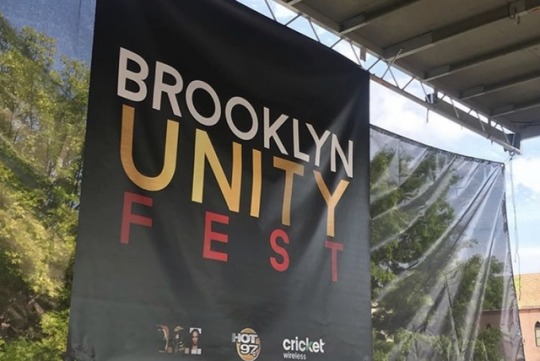
BROOKLYN UNITY FEST:
There is strength in numbers and the Brooklyn Unity Fest went ahead to prove that theory in their 8th annual event. If someone were to question "Where Brooklyn at?" the proof would be front and center. Ultimately the Brooklyn Unity Fest gave back to its community in a major way!
Aside from its free giveaway on Summer Jam tickets, bikes and t-shirts — there was also a Fabolous Way 3 Point Contest and Stomp the Violence Dance Contest.
From the basketball courts, vendors, face painting, multiple stages and even a bouncy house — the festival made sure to bask in its pride.
Overall, everyone was very accepting. Once the performers went onstage their was a common ground shared between the younger and older generation.
Not only were their crowds of kids doing the Stanky Leg, but there was all smiles and a fascination towards the new age sound. Many of the artists recieved new fans but their main focus was giving their all in the name of hip-hop. The genre has taken them to new heights and for that matter they encourage others to follow their dreams. In a word, there was no other place that I wanted to be! The Brooklyn Unity Fest had great vibes. No wonder Brooklyn is the Most Thorough Borough! Their community is willing to give a lending hand if needed be.
Although I wasn't able to interview all of the performers, here are some brilliant creatives that I had an opportunity to speak with:
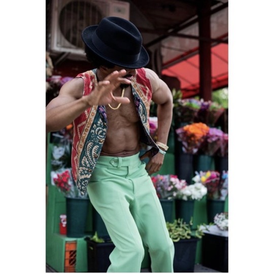
1. MARLEE HENDRIX: Known for being authentically dope, Mr. 70's cared to elaborate not only through his super fly assemble of jet-black boots (with flowers on the heel) fedora and lime green pants — but also through his genre-defying style of soul and hip-hop. At most, Marlee's palette for music brings his sound to life but what drives it even further are the artist that he's moved by. As said by Hendrix, the Temptations (and even Eminem) inspire him because of the different things they bring to the table. "Music is in my bones." Hendrix says.
INSTAGRAM: @marleehendrix
MUSIC LINK: https://m.youtube.com/channel/UCg05CAoXgpKWMbv9bDSRIJQ?itct=CBoQ6p4EIhMI86S32v7g4gIVbYacCh0JNQ0h&csn=dGP_XPKQEoPR8wSt94XwAw&wlfg=true
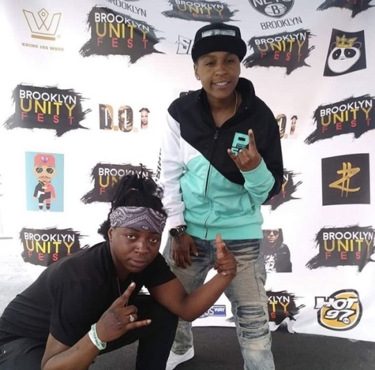
2. SOULJIASPAIDE and EVELINASOWAVY: Two who share a bloodline, Souljiaspaide and Evelinasowavy do it to perfection. Even when they've been through the wringer, they're above it all and venture into money missions. Starting off her music journey when her mom bought a computer, Souljiaspaide began to record her own songs. Then as time passed, Evelinasowavy came in and did a solid 16 which left Souljiaspaide in awe. "I didn't even know she could rap." Likewise they share a love for hip-hop. For them it's everything and it all comes down to Tupac because he's an artist who educates. With this in mind, they want upcoming artist to stay positive. "Don't get annoyed," Evelinasowavy says. "It can happen. Don't let anything get in your way." Souljiaspaide adds.
INSTAGRAM(S): @souljiaspaidedwa + @evelinasowavy
MUSIC LINK:
A) SOULJIASPAIDE: https://soundcloud.com/souljaspaide
B) EVELINA: https://soundcloud.com/evelinamusic

3. D.CHAMBERZ and D.MCCRO: D.Chamberz and D.MCCRO wear a lot of hats in the music industry. While D.Chamberz brings the ruthless bars, D.MCCRO makes the soundscape so D.Chamberz can freely express himself. On a whole, D.Chamberz gained something from hip-hop and it helped him control his emotions. He puts his pen to the pad and works with a music group whereas D.MCCRO works in the hottest studios in New York. He is an engineer and producer. Motivated by money, both keep a green thumb. They’ve got their Benjamin’s aligned,
INSTAGRAM(S): @dchamberzciw + @iamdmccro_ondatrack
MUSIC LINK:
A) D.CHAMBERZ: https://linktr.ee/dchamberzciw
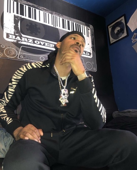
4. DATWINPRINCE: Swagful with the drip on his neck and wrist — DATWINPRINCE rode his own wave at the festival. As he gave the crowd a boost of energy when he performed "Drip 3X" DATWINPRINCE gleamed from ear-to-ear because it really just comes easy. Off the rip, DATWINPRINCE identifies as a professional Milly Rocker, dedicated singer and rapper. Still, the grind never stops. Every year he pushes even harder because it's all just preparation and practice. Good music goes a long way, "It made me realize I had a way to express the things I felt, but was always scared to say." DATWINPRINCE says. In the same way he is the voice for those who feel the same. The dope vibes never end. *Make sure to check out his latest single, "DRIP3X", it's on all streaming platforms.*
INSTAGRAM: @datwinprince
MUSIC LINK: https://ampl.ink/dbPxp

5. JX and BIG DAWG K: Real recognizes real & when I spoke to them I just knew they were it. Even though the two exinguish the blaze in their 16's alone, they create a mine field when facing their competitors. As an outsider, I could sense the energy they both share and I've got to say it's very inspiring. At just 9 years old JX was writing and so the pen manifested them into rhymes. Even at a young the first song he sung was"Hip-Hop Hurray." But JX hopes that his music inspires and encourages others to be themselves. In the same way Big Dawg K wants his music to say that dreams are achievable. "If you put your mind to it, you can achieve anything." Middle school was where his music journey started and for the MC, when he's onstage it's another day in the office. On the other hand, JX says to himself "let's go kill it". However they both just aim to have fun. Expect a mixtape from JX on DatPiff in July. For now check out Big Dawg K's album, Soul Food (on all streaming platforms) and JX's video "730 Freestyle" on Worldstar.
INSTAGRAM(S):
@therealjx + @bigdawgk_fnf
MUSIC LINKS:
A) JX: https://m.youtube.com/watch?feature=youtu.be&v=kTWP_mVkESg
B) BIG DAWG K: https://snd.click/SSNCTWI

6. ZOE E ROSEGOLD: A 9-to-5 chick with a ride-or-die soul, Zoe stands for all the women in her sound. As she test all of the genre-elements, Zoe makes sure that her music is for self-enjoyment. Before she gets onstage, the star plans to deliver a message. However she really leaves it up to God. Aside from herself, she's really moved by the rap game because it's now given women a turn to dominate! Even though she just started her journey a year ago, music has always had a place in her heart. "I went to school and graduated with my nursing degree but the music just kept caling." she says. while you're on the road listen to her single, "Coke Music". It defines what her sound does to you.
INSTAGRAM: @officialzoeenyc
MUSIC LINK: https://distrokid.com/hyperfollow/zoeerosegold/zoe-e-rose-gold-ii
7. FEE DOLLAZ: With swag on a mf'ing 1000, Fee Dollaz rap style goes untouched. She's really her best self on and off the stage so it's safe to say that she's going places. Although she's from D.C, the rap star felt right at home when entering the Greater New York. Hip-hop has always been a passion of hers and when she says she is tired of a 9-to-5, many "100" emojis go up in favor. Likewise, hip-hop for Fee is bouncy, fun and real. Expect a 90's twist in her sound along some personable rhymes. Her message to the upcoming artist is to be you and follow your dreams. Make sure to bump "Set it Off" on the road. But the best is yet to come! Stay tuned for her album "World of My Own."
INSTAGRAM: @feedollaz
MUSIC LINK: http://hyperurl.co/pwtl9q

8. LIVELIKEDAVIS: The epitome of the fire emoji, LIVELIKEDAVIS brings the flame in 2019 and for many years to come. An avid fan of his, it was only right to tell him how amazing "Choppa For Advice" was but what I came to learn is that LIVELIKEDAVIS has been getting spins from the DJ off the rip. LIVELIKEDAVIS has been pursuing music since he was 13 years old but it really got far once he blew up on Vine in 2013. LIVELIKEDAVIS says that hip-hop is for self-expression and allows one to put it all on the table. But what inspires him the most is hip-hop's ability to paint a vivid picture of the artist's backstory. His advice for all upcoming artist is to stay constistent and to never listen to anyone but yourself. Take his word for it. LIVELIKEDAVIS plans on releasing a project soon. My question is: Will the fans get to hear a Lil Tjay feature? Maybe so. Go and stream “BEYBLADE” now. It’s available on all platforms
INSTAGRAM: @livelikedavis
MUSIC LINK: https://ffm.to/qm7v17k

9. SANTOS: Santos has a larger than life personality. Not only does he carry the same influential power that music does, but he also has an business man mentality, because he’s about his business, man. Starting off with his own marketing company, Santos was blessed with the opportunity to showcase his talents to BET. In turn, Santos shined through the lights and now is apart of the show, Hustle in Brooklyn. Besides this Santos also has his own record label. When he scouts out for talent, they must have a vision and ambition. Really it just shows that they’re ten toes down for the long haul. Santos list women and his mother as personal inspirations. On the road Santos likes to shuffle between 50 Cent, Jay-Z, 2Pac and Biggie. His word of advice to any upcoming artist is to spend the same amount of money you would on Jordan’s on an LLC. If you can’t invest in yourself how do you expect for others to?
INSTAGRAM: @tosmoney
#bkuf2019#brooklynunityfest#freshfinds#music#musicblog#rap#listen#banger#musicians#hip hop#follow#thesource#complex#fader#xxlmagazine#hypebeast#undergroundhiphop#unity#consciousrap#rapperswithmeaning#hiphopblogger#artistreviews#eventreviews#hot97#djmelo#vina
3 notes
·
View notes
Text
Legacies 1x14, Let's Just Finish the Dance -- Review
Coming at you all with another Lega-Trash review. This week is 1x14, Let's Just Finish the Dance...and my sentiments exactly. This episode was so boring, I too wanted the dance known as this episode to just end. Please, let's just hurry up and finish this season.
You all know the drill, hopefully. Do I really need a disclaimer anymore? Lega-Trash is a trash show, I'm super critical of it. If you love Legacies, this is not the review for you, move along. There will be spoilers.
So welcome to the obligatory Miss Mystic Falls episode of Legacies. And in typical Lega-Trash fashion, they managed to make one of the most iconic events within the TVD show super bland and super dull. What happens in this episode? Well, the Salvatore School has to host this year's Miss Mystic Falls pageant and to no one's surprise, Hope wins. Also, Josie and Lizzie have a falling out which I've been waiting for all season, Hope and Landon have a falling out, Penelope spelled a bunch of pens to tell her everyone's secrets, Medusa makes an appearence and at the end of episode, Landon gets kidnapped by the evil government organization.
Yeah, this episode was just a sequence of events. It was super boring but as it turns out, there were a few scenes I didn't completely mind. Namely, all the Lizzie and Hope scenes. This might be the first relationship on this entire show that I legitimately believe. Seeing Lizzie and Hope bond together over their anger fueled magical tendencies was really nice to see. And the friendship is legitimately believable. And then it ends in these two making a pinky promise that they'll help each other get Josie and Landon back whom they've recently had falling outs with. Although, if Lizzie wants to help get Landon back with Hope, she's first going to have to rescue him from the evil government organization that kidnapped him.
Speaking of which, what a huge coincidence that apparently MG's mother also works for this shady government organization.
And can I just say that everyone in this school are idiots. So apparently around Christmas time, Penelope, I guess, gifted pens to everyone but really the pens were spelled so anything they wrote ended up in her own notebook so she knows all of the Salvatore inhabitants' secrets. Penelope, at best is The Mean Girl, and at worst, she's a psychopath. No one at all thought it was strange that Penelope of all people was giving away pens and they never once considered it was for nefarious purposes? Also, it's super convenient that apparently not a single person lost one of these pens and just used a regular pen to write down their secrets in their diary. I mean, I have like a dozen pens in my apartment at any given time because I'm ALWAYS losing them. It's also super convenient that everyone in this school has a diary. Of all the unbelievable and convenient things that have happened in this show so far, this is the worst. So Penelope knows all sorts of juicy details like that Hope is keeping secrets from Landon and that there's something called a merge that Alaric has been writing about. Penelope is actually leaving the school now but she gives the notebook to Josie and warns Josie about the merge. Caroline and Alaric really should have told the twins about the Gemini merge before. And this whole falling out Lizzie and Josie are currently in isn't going to help.
What is this falling out? Well, Josie has finally realized that Lizzie is very self-centered and rarely thinks about anyone but herself. This all started when Lizzie drops out of the pageant because Dana, the mean girl who died in I think the 3rd episode of this season, well her mother is one of the judges and Dana was notorious for her dislike of Lizzie so Lizzie realizes there's no way she could possibly win with Dana's mother on the judge's table. And can I just say real quick how incredibly weird it is that Dana's mother can talk so nonchalantly about her own daughter's death? I don't get the feeling that a whole lot of time has passed. At best, maybe six months and that's pushing it. You don't talk about your daughter's death as if your daughter is off traveling abroad or something. Like I said, it was weird. But then again, this show is really weird with death, in general. Even in this episode, Hope just kind of casually talks about her parents' deaths which really wasn't that long ago and in the previous episode, MG makes a speech to the school and makes this off-handed remark nonchalantly talking about the majority of the students who have nowhere to go for the spring holidays on account of their families being dead and it's really insensitive. These are adolescents and you're just nonchalantly bringing up their trauma in passing? But anyway, Lizzie decides that if she can't compete and she's so sure she was going to win, she's determined to make sure someone from the Salvatore school wins. She chooses Hope since Hope's an orphan and will have the sympathy vote. This understandably hurts Josie and it just kind of festers on from there. But I don't particularly understand Lizzie's logic in Hope being the winner because she's an orphan, though. Caroline went against an orphan as well and she won. But I suppose Lizzie is thinking her mother was amazing so that accounted for her victory. Which I would agree with Lizzie on that. Caroline was pretty amazing and she worked her ass off to get that crown. I suppose in a room of people who weren't necessarily training their entire lives for this moment, an orphan would be the best bet. But by the end of the episode, Josie realizes she wanted that crown and is angry at Lizzie for giving that opportunity to Hope instead, for giving Hope the dress that Klaus gave Caroline without any regard to Hope's feelings on the matter. But in Lizzie's defense, up until this point, Josie had never been vocal about the things she wanted (I'm not excusing Lizzie's behavior, just simply saying it's not as if Josie was ever being bullied into doing these things for Lizzie, she did do those things because she wanted to) and Lizzie didn't know the dress had come from Klaus and it's kind of understandable why she didn't. I think it would be pretty awkward for Caroline to tell her daughters that Hope's father was once obsessed with her but with that said, I have no idea why Josie knows and not Lizzie but whatever. It's probably just a plot contrivance to show why Lizzie is awful. But once Lizzie realizes the implications of that dress and Hope wearing a reminder of her father, she instantly feels terrible about it. And Hope conveniently finds out in the middle of the dance where the dress came from because her ex-vampire boyfriend can hear Josie and Lizzie's conversation, I also don't understand why Hope can't hear them though, she is a hybrid, I thought werewolves had that ability as well. But her ex tells her about the dress, she starts to freak out about it and as she's announced the winner, her magic is about to go on the fritz again so Lizzie, noticing the signs, immediately walks up to Hope and hugs her and tells her to cry it out because that's what she needs. A great moment for Lizzie and Hope by the way and I think this was the first time this show illicited genuine emotion from me that wasn't despair over how bad this show is.
Speaking of the dress, let's play Who Wore It Better. Let me know what you think. I think it looks better on Candice. I feel like her blond hair contrasted better with the blue and brought the blue in the dress out more. But Danielle also looks gorgeous in it, too, her hair just doesn't quite bring out the colors as well as Candice's did. Or maybe they used a slightly different color palette on Danielle's dress.
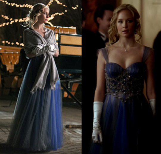
But anyway, ultimately, this episode was more of the same. Just very boring, no real structure to it. Once again, this show is hanging on the coattails of TVD success and it cannot stand on it's own. There were some nice scenes in it, thoughand we are at last getting some character progression. However, I'm not a huge fan that it's taken 14 episodes to get some character development. This episode gets a C+ from me.
5 notes
·
View notes
Photo

@logicheartsoul Thank you so much for the kind words ^^ And certainly - thank you for your interest and for asking! I love working with ink so I’m happy to talk about it :D
How I got into it
It's only been in the last maybe five or so years that I've actually started to pay more attention to art supplies. In the case of ink, it really started with fountain pens. Long story short, one of my professors was really into them and let me try one of his vintage pens, and I was vaguely interested. Then my best friend really got into them, and I tagged along to a fountain pen show (shoutout to Scriptus Toronto!!). From there it was a slow burn over a period of months from “this is neat” to “WOWWW OKAY I GUESS I’M REALLY INTO THIS NOW”. It was a (relatively, for me) quick entry once I discovered the online fountain pen community. These people are incredibly passionate, highly articulate, and best of all, document EVERYTHING. I found the ink reviews especially spectacular and that’s probably what hooked me the most.
A few other things that helped in the appeal factor:
I have a tendency to grip writing implements excessively hard and exert a lot of unnecessary pressure when writing or drawing with more conventional pens (ballpoints etc.) A number of people mentioned that fountain pens helped them to alleviate this because generally you don’t need/want to apply pressure when using them. I’ve found it has helped.
I've always been interested in forms that combine words and images, and this merges literary and artistic worlds in a very clear way.
I’ve been on a long personal journey of wanting to incorporate much more Chinese/Taiwanese/East Asian heritage and cultural traditions into my work. Thus, I've been gravitating towards things emphasizing brush, ink, water, elements of calligraphy and... not sure if spontaneity is the word I want, but things that help me overthink less when I draw, and get better at letting go.
How I work with ink
My (main) tools
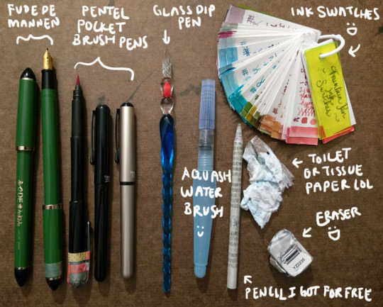
Fude de mannen: This is basically a fountain pen that mimics a brush for Asian calligraphy. It has a bent nib that enables you to change stroke thickness by varying your hand angle. I love this pen so much I got a second one so I could have a different colour; the washi tape helps me tell which one it is. You can see more of it in the video interview I did with PindotPress.
Brush pen: A pen that is a brush. lol. A number of companies make them; I use the Pentel Pocket Brush because it's the first one I tried and I liked it a lot. It's smooth, has great line variation, and the tip has yet to fail me. (Although the cap started falling apart, hence all the tape on my first one lol.) I currently have three: one for permanent black, one for permanent red, and one because I couldn’t resist buying a coloured version of the pen (I have Diamine Earl Grey in it right now).
Glass dip pen: These dip pens are pretty but what is super awesome is that they are super easy and fast to clean. I can quickly switch between multiple colours of bottled inks. The grooves in the nib hold ink, so you need to slightly turn the pen as you go to access all the ink. You can also get a wider stroke by slanting the pen and using the side of the glass nib. It's not that easy to control your lines, but I actually like this because it creates a lot of happy accidents. And “oops well damn" accidents, but like I said I’m trying to cultivate the whole “learn to let go" mindset.
Waterbrush: Basically a brush that carries its own water reservoir. I’ve used a few different brands but I find I like the Pentel Aquash small the best. Some people fill them with ink like a brush pen, but I’ve not really done that. (I did it once with a different brand that was harder to open/refill and I got mad.) I use it to paint with the inks.
Pencil I got for free: Unless I really am just doodling, I usually draw base pencils of some sort, even if it’s just a very rough, light sketch or a quick thumbnail on another sheet of paper. Every so often I get an inquiry asking what special kind of pencil I use, but I’m afraid they’re just normal pencils rolled with recycled newsprint. I got free samples like a million years ago and I have been using them forever. (I think I’m finally down to my last three.)
Eraser: I’ve been trying a few different ones but it takes me forever to work through an eraser. You want it to be able to pick up the lines without requiring you to scrub and take the ink too or destroying the fibres of your paper. This one actually works pretty well. If you’re really curious you can see the non-destroyed packaging here! lol
Toilet or tissue paper: Something to pick up the water. This is my "undo button” in real life when I’m painting/using the waterbrush. Also I drown everything with water so it’s very important.
Ink swatches: Every time I get a new ink I make a sample and add it here. It’s great for colour palettes and when I’m looking at other inks and trying to decide whether to get it or not (e.g., is it different from everything I already have? My definition of “different” is very generous...). I don’t actually have all these inks; some were samples from friends. I’ve found I tend to gravitate towards very complex, nuanced neutrals. (This sounds so sophisticated but when you see them all it once it's like. Oh. Apparently I like shades of grey, brown, and other hard to classify "muddy" or in-between colours lmao. But more on that in a bit.) Lately I've been getting glittery inks because they're fun and they add a magical dimension to the physical piece.
Here is my current selection of inks - on the shelf to the immediate left of my laptop and my head as I am typing this right now. The box at the bottom left is all the samples.
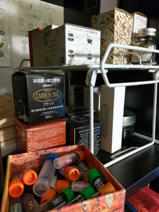
My approach
In my mind, I broadly classify my approach into two categories: “dry” and “wet”.
"Dry" - ink only, no water. I have pretty unsteady hands and hate "inking" - if we think of inking as an exercise in achieving a "clean", controlled line drawing with consistent line width/stroke thickness, neatness, etc. So I love pens that support me in what I think of as controlled loss of control - wide variations in brush width and stroke character. Brush pens and fude de mannen pens are perfect for this. They have lines that offer a wide range of dynamic, organic, and textural opportunity. My Inktober illustrations fall into this category. A few examples below, followed by links to the full set.
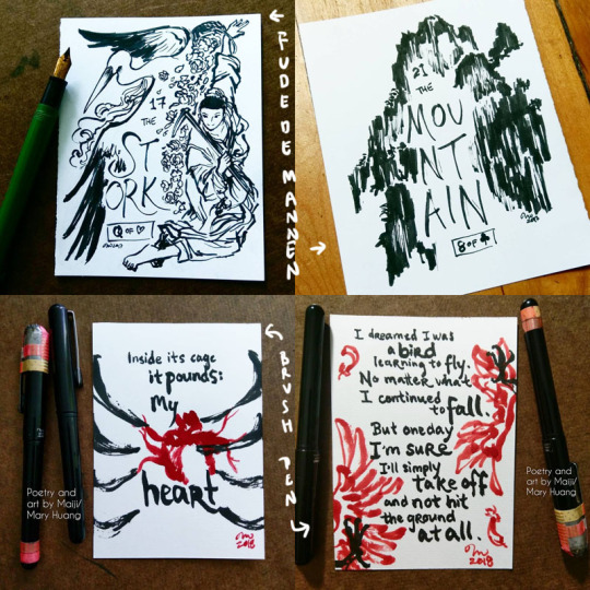
Inktober 2017 - fude de mannen
Inktober 2018 - brush pen
"Wet" - Basically I blob water around. Depending on when I do it (before, with/during, after the application of the ink), you can get different results. The water causes the ink to bleed, semi-watercolour-like, and can be used for shading, environmental effects etc. For obvious reasons, this works best with non-waterproof inks (which the vast majority of fountain pen inks are), but you can do this even with waterproof inks. Just let the ink hit water before it has a chance to soak into the paper and you can get cool effects :D. And you can also do it with other pens too, not just fountain pen inks. Examples:
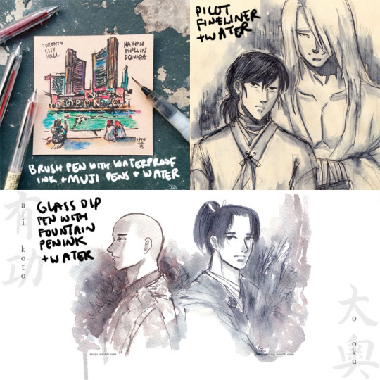
Tiles of Toronto urban sketch series
Raizen and Hokushin doodles
Arikoto from Ooku
As you might imagine, this is really great for on-the-go drawings, because you just need a pen (or a couple of pens) and a waterbrush.
The “wet” approach is also where the very complex inks that look "boring" (greys, taupes etc.) are just complete magic. When the dye elements separate, other colours emerge, and you get really wonderful textural effects and rings of colour where the ink pools and dries. Diamine Earl Grey is a colour I've mentioned several times that I LOOOVE because it separates into blues, browns, purples, even pinkish tones. It's a gorgeous ink. You can see some examples and closeups here.
Another colour that does this really powerfully is Sailor Rikyucha. It’s a dark tea brown-green that separates very easily into pale blue-greens and more and has amazing tonal and textural qualities. The Tendril Wreath illustration here really shows this.
For the most part I look at things I like and then experiment to figure out what happens. After working with the same tools for a while, you get a sense of how the different elements might react and respond naturally. The Genjimonogatari series employs both dry and wet extensively and is an example of the experimenting and playing I’m doing - I keep finding new aspects to the inks I thought I knew, and making “interesting” mistakes. And trying to fix them as I go with varying levels of success, haha. But I’m always learning!
One more thing about this hobby
I feel compelled to finish with some talk about the pure aesthetic appeal, or the MULTIPLE LEVELS OF FUN I get out of these inks. Not just the colour, not just how the ink behaves, but... the name of the ink as well! Some inks do this more effectively than others. Similar to how the presentation of a dish is part of the experience, the name of an ink adds so much to my enjoyment of it. My least favourite ink names are [standard adjective]+[standard colour name]. My favourite ones are really convoluted with literary and poetic references, I just love them hahaha. Asian fountain pen inks I find tend to do this especially well - partly because of how much you can pack into how few syllables, I suppose. It makes me sad that a lot of sites don’t include the original names, often referencing them with just a number, though I understand it is difficult to translate. But I learn a lot with these names as a starting point! For example, Zhenjing, which I mentioned recently in the Kurama “Light” illustration, took a bit of back and forth with my parents to look up the source and then to interpret the complex line of poetry. It was a fun and fascinating exercise.
A great name can’t save an ink I don’t like, but a good name elevates an ink I do like even more, and it can be really inspiring for making stuff. For example, take Pen BBS Mirrorflower Watermoon. I adore the colour of this ink - it's a very subtle grey-pale green with silver flakes. I used it heavily in the Hokushin fanart “Northern Deity” (you can see it here with photos of the sparkly).
The name is actually highly recognizable if you're familiar with classic East Asian literature/poetry. I read it out loud to my parents with no context other than "this is the name of one of my favourite ink colours" while they were eating dinner and they both said at the same time, "I know this! DREAM OF THE RED CHAMBER!" lmao. It's a very Buddhist idiom or phrase referring to the illusory nature of things, likening it to the reflection of a flower in a mirror or the reflection of the moon in water.
I hope this was interesting and helpful! ^^
#art supplies#logicheartsoul#replies#reply#fountain pen ink#ink#waterbrush#brush pen#fude de mannen#art by Maiji/Mary Huang#how I work#process
21 notes
·
View notes
Photo
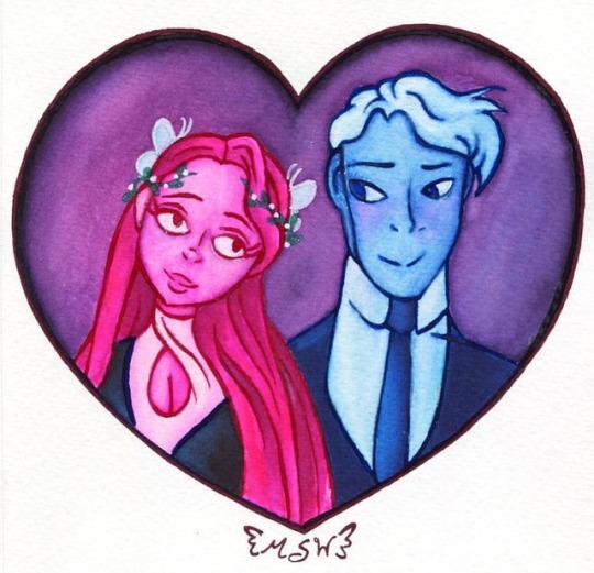
Lore Olympus (Mermaid Marker Test)
So my IRL friend introduced me to this AMAZING comic the other night, called "Lore Olympus," which is sort of a retelling of the Greek Myth of Persephone being kidnapped by Hades: www.webtoons.com/en/romance/lo… I read the whole thing in about two hours. If you like Greek Mythology or even just rom-com comics with super pretty art styles, please go check it out and support it! It updates on Saturdays and is still on-going! So since my friend was fangirling, and then I was fangirling, and we had to wait a whole week for the new chapter/installment, I sketched up a piece of fanart of Persephone and Hades just looking at each other cutely, in outfits from a couple of later chapters. I didn't color it right away because I had just ordered the entire collection of 32 Jane Davenport Mermaid Markers off eBay (For $30 after a $10 off coupon, I might add; had I purchased the individual sets off of Amazon that same night it would've been about $60!) and I was half-waiting for them to come in, half testing my patience to see if I could wait or if I would just cave and color it with colored pencils or alcohol markers before then. Luckily, I held out and they came in that Thursday. So I got to priming and swatching as quickly as possible! Calling them Mermaid "Markers" is a bit misleading; as they're essentially water brushes pre-filled with water-soluble ink. But I kind of understand why they're called that, as the "Mermaid" part insinuates their relationship with water, and they are more like markers that straight-up watercolors, in the sense that you don't technically need water to use them. Still, I think a more accurate name might've been helpful to people that have never heard of these before and have no idea what they're actually going to be like. Fortunately, I had seen these floating around and in a video before considering purchasing them, so I knew pretty much what I was getting, how to prep them, and what to do with them already, and at that point I wasn't even sure I'd want them. But after getting a set of Viviva watercolor sheets back in December and then the Arteza Woodless Watercolor pencils for my Birthday last month, the Mermaid Markers finally piqued my interest enough to want to buy them. I actually felt very lucky to find the eBay listing that I did, as $40 for the whole lot, in new condition (all the boxes still had their little round tapes intact and undisturbed, as well as their sealing rings, which I'll talk more about in a second) was already a great deal compared to buying the individual sets, before I even knew that I had the $10 coupon. Honestly, I was so sure someone was going to buy it before I had the funds, but luckily I was able to buckle down on some commissions and took the opportunity when it presented itself. The only issue I had straight out of the box was that, for some reason, my "Byron Bay" in the 12 set is miraculously missing its label. The best I can figure is it was just a factory oversight, as, like I said before, the boxes were still sealed and the sealing rings on each individual "marker," totally undisturbed, and there is no evidence there ever was one on the marker at all (no lingering bits of adhesive, etc.). It's not a huge deal as it was only one marker, the color names are all available online, and the solution is just as simple as either writing the name on the marker (which is what I've done for now) or printing out a new label. It'd be different if it had been multiple markers, making it difficult to tell which was which. It did take a little while to properly prime each marker; each one had a yellowy-green sealing ring between the screw-on brush tip and the squeezable ink cartridge that had to be removed and some gunk in the brush tip to preserve the shape during shipping, which you just gently wash off in water. And I will note here that it is important to make sure you screw the brush tip portion all the way back on! I had done quite a few and been left with a slight gap between the two sections before one went all the way down with less effort, so I had to go back and use a gripper like you would use to open jars to be able to turn the others the rest of the way down. I think this is important to mention because the one complaint I've seen over, and over, and over again in the Amazon Reviews is about them leaking, and I think in some (but not all) cases this might have been the problem! If one of them hadn't gone on with less effort, I wouldn't have known the difference! The other thing of note, the instructions/tips in each box specifically mention to store them with the brush tip up! Because I'm paranoid, I'm being extra cautious about this, but I suspect in a few cases this may have also been a problem causing leaks--as in people were storing them horizontally or with the brush tip down. I'm not a huge fan of the thin plastic boxes, but it's not a huge deal (as Copic markers use the exact same packaging). I think I would like to procure a case or stand to keep them all together in, though. I've been looking, but I want the case to naturally fit with keeping them upright and be able to sort them in whatever order I like. (Because I have to keep my art supplies organized or my entire world will fall apart). Now, when it comes to the drawing itself, I almost immediately ran into an issue with the line art. I didn't want to do just black, but the watercolor nature of the Mermaid Markers means that water-based ink will run when they touch. The only guaranteed water-proof liners I have are Copic multiliners in black or cobalt. That would've worked for Hades, but not Persephone. (The comic is very color-oriented for the character designs, so it just seemed more natural to do it this way; And besides, I use black lines all. the. time.) So I had to figure something else out. Originally, I tested both my Prismacolor and Polychromos pencils to see what water did to them (as I did plan on using a regular water brush with these to help with blending and stuff), and either one would've worked, as you had to be trying to pull the pigment out like I was to really get noticeable results, especially with the Polychromos, which are advertised as being water-resistant. I almost used them, but then I looked over and remembered: I have Dr. Ph Martin inks! In a variety of colors, that are supposed to be water-proof and lightfast (not that that means that much in this situation since most watercolors aren't lightfast anyway) when dry! So I got really crazy and broke out my dip pen and did the lines with that in red-violet, blue, and violet. Veeeeeeery carefully. Then I set it aside to dry for a couple of hours. (For the record, the red-violet lines are a couple shades darker IRL, the scan lightened them and seemingly them alone for some reason.) In hindsight, I might have done better to let it dry for a full 24+ hours. I say that because, while the ink was definitely dry enough to open and close the sketchbook with no issue, there were a few spots, particularly with the blue, that did bloat/bleed a little after I started going in with the Mermaid Markers and some water. Mind you, I wasn't like, drowning those spots with water or anything. Fortunately, I was able to sort of "push" and move the color around so that it didn't ruin anything. Beyond that, the pigment just willingly pulled out about as much as the colored pencils did when I was testing those, but that wasn't a huge issue since the characters are monochromatic and I was able to use it to my advantage. However, that definitely would've been an issue if I had lined with a color that didn't blend with the fill-in colors. So I will be more cautious of that sort of thing going forward. The Mermaid Markers themselves were actually kind of fun to work with, aside from the slight learning curve, since watercolors, in general, are mostly unfamiliar territory for me. The biggest issue I had was just trying to blend the right purple for the background, but that has more to do with my inexperience and the overall color selection. In general and just swatched out, the entire color collection of all 32 Mermaid Markers has a really interesting color family, with a number of shades that I think are fairly unique. (Or at least they seem unique to my eyes that are more familiar with color pencil palettes). The tradeoff is that there are some shades that are pretty, but might be a little "off" from the colors I'm used to working with. In this case, there is a muted lavender color called "Jellyfish" that I was using primarily to fill in the heart. However, it was a bit on the warm/pink side for my liking, including pairing with the "Deep Sea" darker purple, which was more of a neutral, maybe slightly blueish purple. It turned out okay with my attempts to "cool it down," but I still have some things to learn with watercolor, and until I really get the hang of it, I know the slightly unusual color choices with these might be a bit of a challenge to work through. The other thing is there are two "specialty" sets of the Mermaid Markers; one called "Celestial Sky" and one called "Shimmering Sky," which are metallic and glitter effects, respectively, and meant to be shaken up before use a bit like paint pens. The effects for both sets are really beautiful, I just wish there were more colors! There are only 4 of each; the Celestial Sky is more neutral/traditional metallic colors, and the Shimmering Sky colors are two pinkish and two blueish colors that look like they would pair well with the "Shipwrecked" set of 6. This isn't necessarily a bag thing--I want more colors of a product I like. I just thought I'd point it out while I was on the color thing. Still, they blended really nice and smoothly, and fortunately, they didn't argue too much with me when I made a mistake and tried to take some off/lighten it, etc. Once I was done coloring, I obviously went back and did Persephone's little leaf crown and outlined the butterflies on either side of her head with gel pens. Surprisingly, the pens went over this noticeably easier than the Arteza Woodless Watercolor Pencils, which I found odd. I did have to do a bit of tapping, but I pretty much always expect that no matter what I'm working with. Not sure what to make of that. (Though if I had to guess I suspect it had something to do with the fillers used in the pencils). I tried to use the glittery Mermaid Markers to give Hades a bit of pink blush and Persephone a bit of blue blush, but while Hades' worked out pretty okay, I think the blue was just too dark for Persephone as it didn't really blend out properly and, as you can see, to keep it from looking like she was bruised or I'd made a massive mistake, I ended up lifting most of it off entirely. But, at the very least, some of the glitter is still there so when you see it in the light it still sparkles a bit to tie in with the glittery gel pen I used for the crown. The only real thing I'm truly not happy about is that between the sketch and inking, Persephone's face slimmed down/got a little more angular than what I wanted. In the comic, she usually has a very round face to me. But it's not the end of the world; the art style is pretty fluid most of the time (which ends up adding to its charm and really lends itself to the characters' expressiveness) anyway, so drawing the characters "accurately" can only go so far, I think. (Compared to something where the characters are pretty much always 100% on-model, anyway). I think it did turn out very sweet though And now if you'll excuse me, I'll be waiting with bated breath for the next chapter to go up. The second-to-last one was a major plot doozy! ____ Artwork (c) me, MysticSparkleWings Lore Olympus & Characters belong to Rachel Smythe ____ Where to find me & my artwork: My Website | Commission Info + Prices | Ko-Fi | dA Print Shop | RedBubble | Twitter | Tumblr | Instagram
2 notes
·
View notes
Text
Today on should have listened to the internet after stalking and obsessing over this palette (a palette that smells like lemonade? Yes please!) I finally bought it. The usual excitement of receiving a parcel came when I got the email from Amazon that it had been delivered (I was extra excited because the parcel also had chocolate and pens in. But that another story). Right now, I take my best camera and 3 lenses. It helps me slow down and I have my best gear with me. It a lot to carry. 태백출장마사지 One of the very first steps to beginning a muscle mass routine or weight loss program should come in the form of a good colon cleansing product. Over the years of one's life, the colon builds up a toxic layer that tends to cast off a lot of the healthy nutrition we take in on a daily basis, or, just acts like a glue and holds onto it leaving the brain telling us that we need more food while what we have already eaten is being slowly absorbed before the harder working intestines twist and squeeze out the toxic mess like trying to squeeze out half dried up toothpaste from a battered tube. The end result is unsightly fat. Look for real laser not ipl, google the name of the machine they have to see if it laser. I had ipl done last year and it didn work great. It can take a year or two of treatments but it worth it. I was able to move into a share house with great roommates. I didn do much for the first year, but then in 2015 I applied to a bridging course at a university. I didn even have a year ten certificate. You have a lot of resources available. In general, any information in the course syllabus is a trump card: you will always get credit on exams / practicals if your answer is consistent with it. Beyond that, I would rank the assigned course text next, then the instructor, then common sense, then wiki. This means that Hearthstone, there a HUGE amount of low tier players using incomplete and inefficient decks, yet, still decks that resemble the decks they want them to be. Maybe someone doesn have all the 태백출장마사지 pirates or charging cards. Maybe someone is using some really bad neutrals just to fit into the All Even requirement of the Legendary modifier they running. At the end of the day if someone is lighting up on snapchat or has a blunt in their hand i don't even notice/care. Same with how people showcase that they're at a bar, have drinks are in hand when they take photos with their friends, "i'm so drunk! i'm so hungover!" all over Twitter etc. I'm just not at all affected by it and don't really see what the big deal is.. It part of development for them. You pretty much supposed to introduce your kid to new things all the time, it what teaches them flexibility and curiosity and not to be afraid of new things. But I mean I guess that their prerogative.. GNG head doctor, Dr Seong, is an expert at revision rhinoplasty. For breast augmentation, I heard good things about Opera. Many Korean clinics are good for blepharoplasty, but I would recommend Opera and Marble. The reason it got remade is that Streisand showed it to be a great vehicle for a singer to act in a film. The audience is sure to be entertained by the music and the story's drama is sure to move them. No matter what, the lead will be viewed positively, making this film a safe choice for a star to add acting to her repertoire.
1 note
·
View note
Text
Hi guys, my name is Angela Emsen-West. I am a watercolour and mixed medium artist. I was born and bred in the fantastic city of Liverpool, UK. I moved over to County Mayo Republic of Ireland 13 years ago. It was the best decision I have made to develop my art! Here in Ireland life is so much slower, people chat to you and life is good. My studio, which is my pride and joy, is 4 steps outside my back door (which is used as the front door by most people in Ireland).
Primmy
Aines Jam
Somebody must have put a paint brush in my hand and glued it on at around the age of 3 years. I never let go, even through the general trials and tribulations of life it stuck, and I am so blessed it did. I left school at the age of 15 years, and after working in a sewing factory, I met my then husband and had three beautiful daughters very young in life. Not once in these times did I let that paint brush go, although it was an oil painting brush in those years.
As my youngest daughter went to school I decided to chase my own dreams of being a professional artist. I took my “O” and “A” levels then my first-year art foundation in Liverpool polytechnic. It really did not suit me. I was looking for art techniques to learn. I was like a sponge and I wanted to learn techniques of all kinds and the foundation was a “feel your way” course.
4 Bandits
I ended up taking fashion and design which, to be fair, did help me pay my way in life more so than I could have imagined my art to have done at the time. Through all those years that paint brush, now a watercolour brush, stuck fast to me. At one point, I became ill and now I do say to myself there is always a blessing in even the bad, it gave me the time to develop my watercolours and it also became a therapy for me.
My inspiration comes from the every day, I suppose it began when I was ill and unable to go out much. I found real enjoyment in seeing the regular every day things in life with colours that are so complimentary to each other without even trying and without all of the effort of setting up a composition. It seemed so simple to use what was around me, so I used it.
Willow Jugs
My appreciation is of the ordinary everyday objects that we miss in this very busy life that people lead now.
My work generally focuses on still life arrangements and animals however, more recently, I have been working on portraiture. My thrust for learning always pushes me further and keeps me moving forward in my own way and at my own speed. I like to push my boundaries, even if it’s only “how many more glazes can I achieve to how loose can I be”.
Merlin
I love wandering around art shops to see what new inventions they have in the watercolour department and if I see something I fancy it is always kept in the back of my mind for the future. The good thing is, when I have new equipment it usually lasts some time.
My favourite water colour paints are Winsor & Newton artists paint tubes, I find that the colours are so vibrant and great to work with. I could start going in to lightfastness and a few technical things but, to be honest, I like these paints and if the cap fits! I must say though, I have bought myself some Daniel Smith paint tubes. I haven’t had a chance to try them yet but hopefully soon. Polychromos pencils are one of my favourite pencils to use. Their very bright colours add greatly to my work when a bit of depth or drama is required.
Cheese And Olives
I just love my pencil holder. Mike, my husband, made it for me from a Lazy Susan that I had never used. Also, in my arsenal of equipment that I regularly use are watercolour pencils, Water-based inks for their bright pronounced colours and Pitt pens for my looser work. I use them to “map” out areas of colour, not necessarily around the subjects I am painting but more so around the differing colours that I drop into the painting just to highlight areas.
I buy tubes of paint because I love the feelings when I push the paint into the palette. Well, yes, I do realise this sounds strange. I also think that they last longer because I use the dried paint in the wells after wetting them slightly.
Oringo
I do feel that too much store is put on to what paints we use and what paper we use. My own thoughts are, if you feel comfortable with what you are using then stick with it until you feel like a change. Most paints and watercolour paper are of such a good standard now that there is little to choose between them. I am sure I will cause a fury over these comments, but life is too short and wasting it thinking of what paint and paper to use when you are happy with what you have seems like wasted painting time to me, just saying.
Paper comes in so many ways, but my own choice is Sanders Waterford 300lb weight sheets. They are expensive but my reasoning behind this is with multiple glazes on my still life works and lots and lots of water and flowing paints on my experimental work Saunders Waterford paper takes all the punishment I can give it. Although when I teach a class I would suggest that students (if they don’t already have paper) to buy Langton cold press by Daler Rowney 140lb weight as it is quite forgiving for beginners and professionals alike. Another paper I like is Cornwall 210lb weight rough by Hahnemuhle, it can give such lovely effect to the paint because of the roughness of the paper.
11 In Bed
Brushes can be a minefield, but most of the new synthetic brushes are practically as good as sable. You can see sizes from 0 to 12 round brushes in my collection of sables plus a 2“ flat for washes. I have been painting for such a long time now and I suppose it’s a natural progression to move on to sable when one can afford them. I do look after them well so I hope they will last me a long time.
Generally, for beginners to my classes I suggest buying only two main brushes size 6 and 10 round synthetic as most, if not all, paint jobs could be achieved with theses, it just takes a little care. As my students progress they tend to find out the brushes that suit their needs and slowly add to their equipment.
Onions
My techniques can vary, however one thing I do with every painting I work on, no matter what style I’m painting, I will always draw out my piece on to plain drawing paper. I am finicky I would not transfer the drawing on to my watercolour paper until I am totally comfortable with it. My reason being, you may ask, is because I am heavy handed, unfortunately. I am not a delicate soul, and the process of drawing and re-drawing on to watercolour paper can ruin the paper.
The paper can get undulations and ridges in it from a heavy hand and then if I rub out, which I do a lot, whilst trying to get the image right, the effects of the rubber can sometimes be picked up by the paint which can leave the colour looking grubby. There is one advantage to working like this, for me anyway, I get to know the image, its curves, straight lines, circles and all the features of the subject. It helps me when I get to the painting stage.
My main work of still life develops through constant glazes of many, many colours even in my onions” peeling back” which took some time to paint, has so many colours in it that you most probably cannot see them but trust me they are in there. The depth has been achieved by allowing one glaze to completely dry before adding another, which as you can imagine, makes painting one picture a long journey. Although it’s what I love to do.
Vain Glory
When I need a change of rhythm I play with my paints, pencils and inks to see what I can achieve and how one paint mixing with other mediums reacts. Vain Glory came from one of my play times. Looking closer you may see my mapping with Pitt pens and the wiggly lines used to break up the edges of the subject to defuse things a bit. You would most probably notice just how loose and free the paint has been applied on as well.
My paintings are selling all over the world for which I am truly grateful. But, with the thought of a less expensive adornment for our walls, I do hold a selection of my work in limited edition prints of 25 never any more than this. You can find more information on my paintings, prints and workshops at the links below.
Afternoon Tea
I have personally gained so many benefits from painting, both mentally and physically. I love to share my love for watercolours with others that’s why my teaching is a big part of my art. Truthfully teaching for me is not a one-way process. I learn so much from my students as I hope they do from me. I teach one evening a week from my studio at home. Then, I also have one day, two day and a four-day workshops throughout the year.
I do hope I have not bored you silly with my tales of becoming an artist? I suppose we are all struggling to find our gift in this world and I wish for you, the joy of finding a gift that makes you happy.
Angela Emsen-West Website Facebook Instagram
GUEST ARTIST: "Controlled And Expressive Painting With Watercolour" by Angela Emsen-West - #doodlewash #WorldWatercolorGroup #watercolour #watercolor Hi guys, my name is Angela Emsen-West. I am a watercolour and mixed medium artist. I was born and bred in the fantastic city of Liverpool, UK.
#WorldWatercolorGroup#artist#doodlewash#England#featured#hyperrealism#inspiration#painting#realism#watercolor#watercolour
1 note
·
View note
Photo
Based on my fanmade season ‘Sketched Artistry Pretty Cure’
Kind of a shame that Elena AKA Cure Soleil is the only dark skinned Pretty Cure so far, so here I am to change that, and maybe even count as two of them if you count Cure Teal.
Akemi Gina is the fifth and ‘final’ member of this Pretty Cure team. (I say that in quotes because Pretty Cure almost always has a sixth ranger, and I don’t really want to make a profile of that character because its a spoiler) Like Midori, she is an older Cure than the others, as she is known as one of the most popular actresses of her age in their area. Akemi herself is a massive perfectionist, as a calm and elegant girl who always dedicates her attention to working for her actress position. (Yeah, the red Cure is a calmer figure, and the yellow is the hot head, what is this?!) She can be a doormat at points due to her fame preventing her from genuine friendships, and she never seems to have the same social skill as she does on stage, as everyone seems to judge her for her acting skills.
Akemi may be famous, but she’s mostly left to work on her own. Her parents are almost always on trips, meaning she hardly ever gets to see them, and she’s left under the care of her grandfather Homare, who is one of the few people who actively understand her and love her for herself. Despite her status as an actress and how it tolls her interests outside of it, she loves her job, and only wishes to perfect her skills and make it to better fame.
On her way to class, Keiko Sakura and the bird fairy Orenji catch Akemi privately practicing her singing. Entranced by her skill, Keiko introduces herself to her, and Akemi simply brushes it off as an everyday routine, thinking Keiko is only talking to her to congratulate her talent. Keiko later converts with the rest of her teammates about their last team member they needed to collect, and that she had a suggestion for their fifth member. The Cures catch Akemi in a dance rehearsal, and they all agree that she was perfect for the role, so they straight up converse with her privately and ask her to join their team, even showing that Orenji can talk to prove that they’re being serious. “You can talk-” “YES! The parrot can talk! I thought this was normal!” -Orenji. (I don’t know why I added this) However, Akemi, though believing them, calmly rejects the offer, as she has more things to focus on that are important to her. Keiko however, wasn’t giving up on her plans. The Cures learn about Akemi’s obligation in a play across from town, one that a familiar face Jiro was filming, and Keiko suggests that they all help her rehearse. They all do so, and they get to witness Akemi’s perfectionist nature when setting up, and meet her grandfather, where Akemi starts to form a genuine bond with the Cures, with Akemi even taking a neon pen to help Keiko trace a set. Unfortunately before the day could come, Keiko tries to jump the gun again and privately talk to Akemi about the Pretty Cure, and how perfect Akemi would be for the role, where Akemi sternly shuts it down, as she already told her why she wasn’t doing it. Keiko later feels guilty for this, as she was putting unnecessary pressure on the actress as is, and that she simply wasn’t the best at making plan Bs. Midori assures her that Akemi isn’t one to stay mad at her, and that Keiko can and probably should apologize once her next rehearsal was over.
Unfortunately as the rehearsal is going on, a general appears to ruin it and they make a monster out of one of Akemi’s audience members. The Pretty Cure take it on, but in the process one of the sets they worked on with Akemi gets destroyed, and that sets off some things for Akemi, as she doesn’t appreciate hard work going to waste like this. Once all the Cures get in a pinch after the monster multiplies, Akemi decides to step in and shield people she considered to be her new friends, regardless of their faults, awakening her power to make the broken set her PreCure Palette, and join the team as the red star, Cure Crimson.
But once she manages to defeat the Inkling (Yeah I finally decided the monster of the week names, you’re welcome) And Keiko properly gets to apologize to Akemi and welcome her to the team, Anka, the general from Keiko’s past, finally makes a proper appearance. She had been waiting for the five Cures to awaken and be in the same place so that she could quickly dispose of them all at once, along with Orenji, and trap them in the remains of Canvas Corner, with no known way to escape...
So I kind of created an art themed Pretty Cure. Add it to the list of Wattpad stories I claim I’m going to make, but never do. And if you know me, I love this concept of literal creativity, and since I’ve been on a magical girl run lately, why not make an art themed Pretty Cure. Seriously, I only briefly made this about a year ago, forgot about it, and bought it back in just two weeks with characters and their story arcs. So let me know if you want me to do actually make the season.
1 note
·
View note