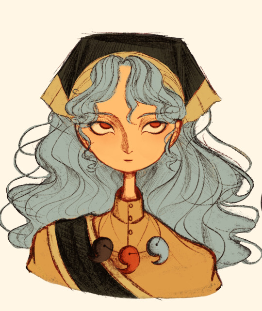
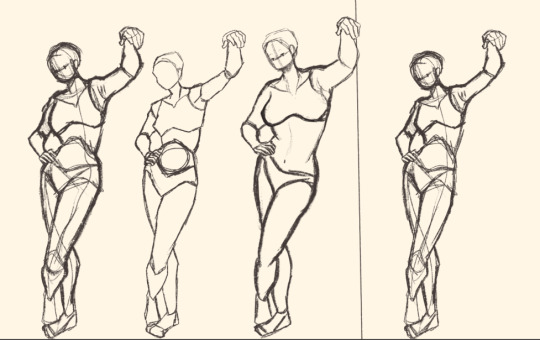
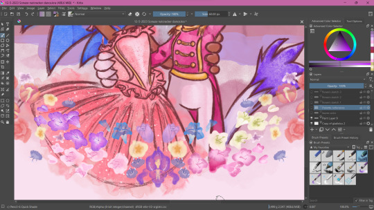
#but it was fun to experiment with a more cartoony style
Text

♥️ some things never change ♥️
saw this meme going around a little decided to corabelle it for the OP Marines Week! i think this fits nicely for the prompt “belonging” ❤️🩹
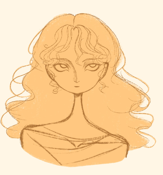
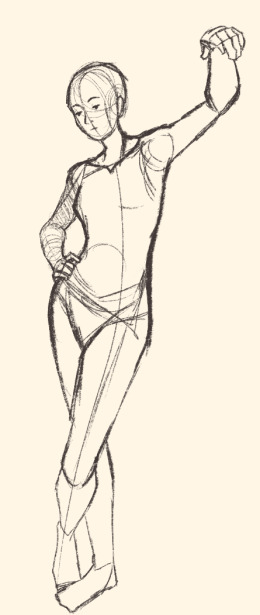
here’s the original template and the individual frames

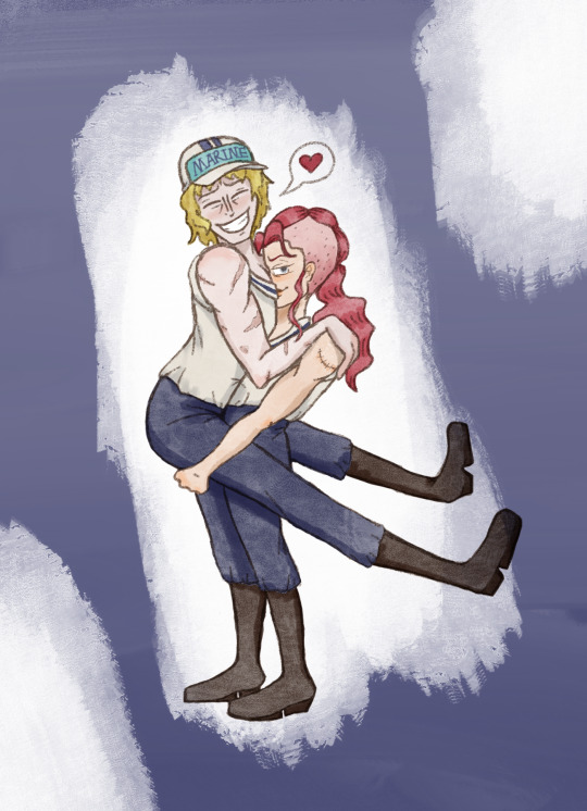


#corabelle needs more love#and this looked fun#the proportions are a little goofy#but it was fun to experiment with a more cartoony style#even more cartoony than i usually am#one piece fanart#one piece#donquixote rosinante#corazon one piece#bellemere#bell mère#bell mere#corabelle#corabell#gensart#digital art#anime gif#one piece marines#donquixote corazon#ship art#OPMarinesWeek#flash warning#flashing
47 notes
·
View notes
Text
did the “evil artstyle” trend that’s been going around twitter. this. this hurt me.
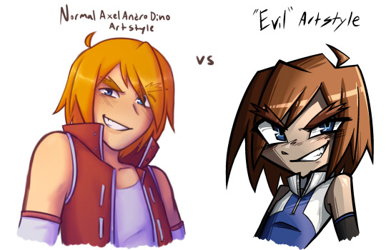
+ some bonus alts with overlays that made the colors brighter bc it feels illegal to draw like this and use such desaturated colors


#mfb#metal fight beyblade#beyblade metal fight#beyblade metal fusion#dan sodo#reiki sodo#the stylization itself is basically just how I drew a few years ago#briefly when I wanted to experiment with a more cartoony style#it’s fun I gotta bring it back every now and again#the colors however. hurt me.#this also made me realize how hard the sodo twins’ canon hairstyle is to draw#you wouldn’t think it would be but it’s oddly specific in a way that’s hard to make look right#ALSO#MY FIRST TIME USING PURE BLACK LINEART IN LIKE 5EVER#EVEN WHEN JTS REALLY DARK ITS USUALLY A SLIGHT OFF BLACK IT FELT WEIRD GOING ALL TEH WAY TO THE BOTTOM OF THE COLOR SELECTOR THIS TIME
35 notes
·
View notes
Text
very funny to me that my art is associated with cartoony doodle style/sketchy stuff now when in my last community like, 4 years ago, my art was known more for detailed stuff
my art has done a wild 180 over the last few years!! (and i'm having a blast with it😌)

#most of my art used to be more along the lines of the feast of the rose art i did in february#and it was almost never as exaggerated as it is now...definitely not as over the top at least#and i only started using hatching and textured brushes like. 2-3 years ago#in fact you can kinda tell bc my intro post art here#twitch & grace look way more.normal#i fucked them up so bad. grace got so square. idk what happened to twitch#they turned into a cartoon character#none of this is a negative btw i am having SO much fun experimenting 😌#i just get hit sometimes when people call my art cartoony and i'm likr oh yeah that Is my vibe now huh xD#i should go crazy with art styles again soon#but right now i should really be going to bed#fredspeaks
15 notes
·
View notes
Text
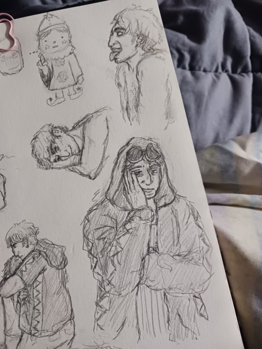
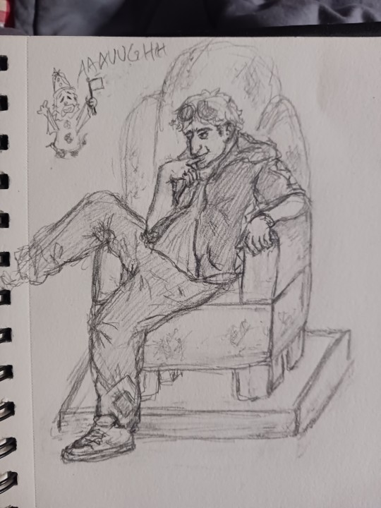
forgive the uncropped photos but cropping wasn't working for me
here's some of the sketches from the last couple nights, art is NOT working well for me lately (as shown by the wailing white-flag-waving sona) but nothing stops me from drawing the mans !!!
refs under the cut, CW blood for one of them
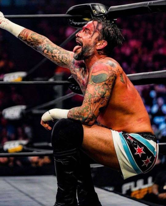

CM Punk and Hook from AEW, and then some random guy that showed up when i was looking at how to draw people sitting in chairs and i liked the pose too much to pass on drawing it LOL
#i actually like the first page drawings for the most part but dhdkls u know when u just. cannot make drawings turn out the way u want#experiencing that lately fjdkdl#also idk why my art style is going into more realism territory but i gotta steer it back into cartoons asap otherwise im gonna crash n burn#its fun to experiment w this for now but fjskls i wanna do cartoony stuff !!!#dandy.cmd#doodlebug.png#💜so good at being in trouble
2 notes
·
View notes
Note
Holy shit I am now just connecting the dots that you’re the one who made that Irrational animatic, it’s still so amazing!
(Forgive me for not properly checking out links in your tumblr or youtube before)
Oh, yes, I made that Logan angst animatic so long ago, I'm sometimes amazed that I still get likes and comments on it pretty frequently to this day! I'm glad so many people continue to really enjoy it!!
Let's just hope my newer stuff will end up looking a lot better, especially since I no longer have to draw every frame on my phone, haha
#im experimenting a little with some of what im doing for the new short animatics#like in some of these im emulating different animation styles bc i want to make it more cartoony to match the song#its been fun so far but it kind of just makes me want to fully animate things rather than make an animatic with fewer frames#oh well guess thats not a bad problem to have haha#orbs speech bubbles
0 notes
Note
How did you learn to draw fat bodies but still keep it cartoony? I love how you draw different types of bodies and make them all seem normal instead of certain body types sticking out like a sore thumb next to others. I struggle to draw fat bodies without it looking weird with the rest of my art. Do you have a specific tutorial you followed or something?
This is a really good question! I'm glad you like my depictions of different body types, i worked really hard to get better at that so im happy folks enjoy em!! I didn't actually learn from a book or tutorial, it was mostly looking at fat bodies IRL and learning to incorporate those features onto what I already drew. As it turns out, we're all human, so if you understand the anatomy enough to draw a skinny person, you have the tools to understand the anatomy of a fat person.
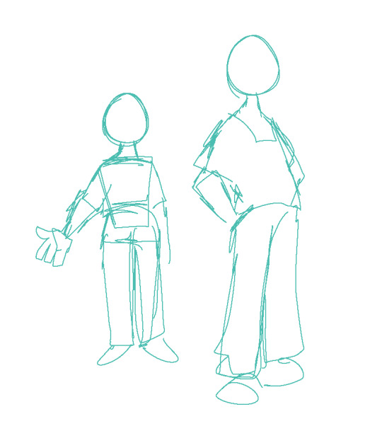
So, like, here, this is my sketch of someone with a very average build. If I were to draw a fat body, I would still use all the basic principles I use here. One mistake I think folks run into is "isolating" parts, which can lead to things like this
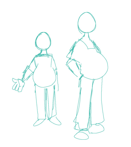
which isn't necessarily bad, but if its not what you're going for, the issue is pretty apparent. Weight affects ALL of the body, not just the stomach or the face or the limbs. If you think about how that weight affects everything in tandem then you can start drawing fat bodies that work more in your style.

for this, this is the same quick sketch using the same pose and principles as the first one. but! I allowed the weight to be distributed across the body. Notice how the legs, belly, arms, etc all got thicker? The key to drawing fat bodies and making them look like they fit is allowing that weight to affect everything. without it, it just looks like you're adding on features to someone rather than considering everything at once.
my other tip is: don't be scared! things like fat arms or chins or bellies or stretch lines are not something that's bad to depict. if you want to draw fat bodies, you gotta not be scared to draw things the way they are. someone having a fat body is not bad, and you drawing that fat body is not bad either. Experiment! To me, art is about representing ideas, and the only way to get better is to experiment with how you represent those ideas. I'm by no means an expert, and I think you can also get a ton done by looking for resources aside from me, but I hope this helps, and have fun!!
4K notes
·
View notes
Text
Here's a digital sketch dump of some pose/anatomy practices and some 2hu doodles, I think from now on if I don't have any big final piece to post, I'll just post sketches I liked that I did digitally (might also reblog some drawings of mine that I want more people to see, maybe idk).
Artist's Notes:
Ok so after the recent Hifuu fanart I did, I've been hoping to experiment more with how I draw faces, how I render, as well as how I stylize things. In some of the earlier sketches I did, I had an idea for a pose that I wanted to try drawing, so I took a ref pic of myself doing said pose (the leaning one btw) and then did a sketch over top of it just to get an idea for the shapes, negative space, and silhouette. After that, I wanted to do some simpler breakdowns of the shapes so I can get better at simplifying the body (these ended up being the bottom right sketches in the post). I also did some experimenting with how to push certain parts of said sketches to create a different body type (via liquify and then a more refined version based on that sketch), as well as figuring out what makes a pose feel natural and not stiff. This was also a bit of a foreshortening practice just so I can get more confident with it, and I ended up using the arms from the liquified version for the coloured Zanmu sketch I did since I liked them so much (dw I'll get to that).
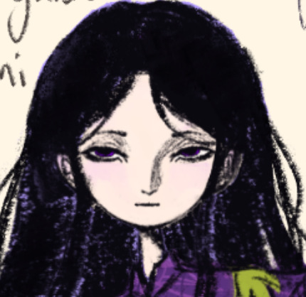
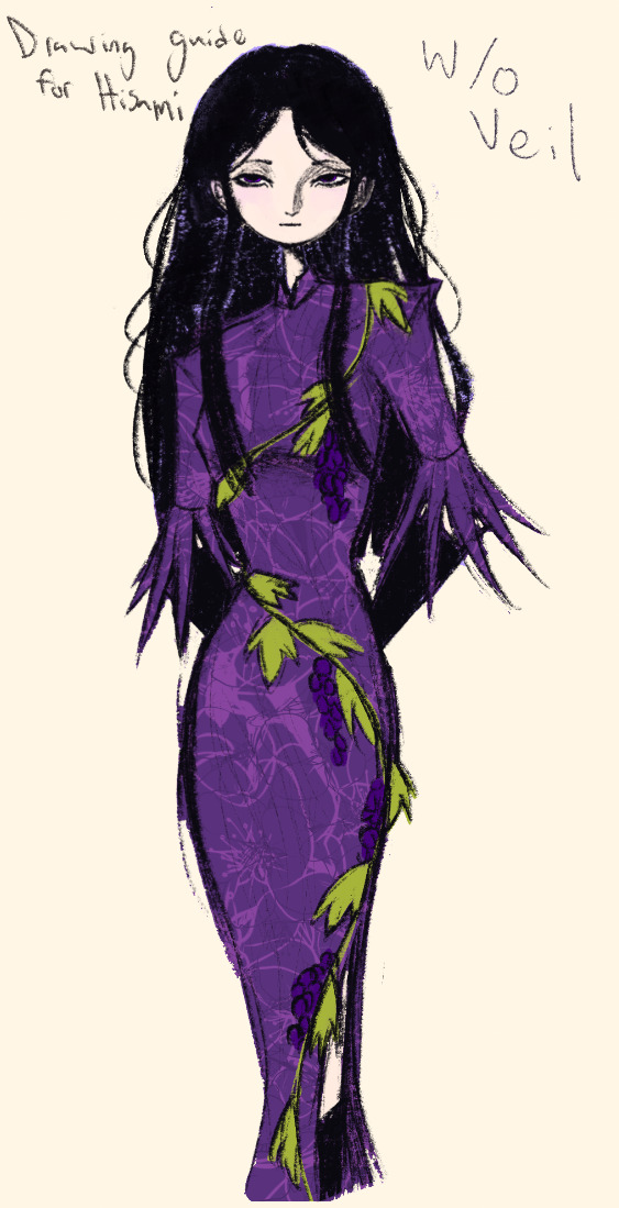
The next thing I wanted to try and draw was Hisami, mainly because.... I am very bad at drawing her in my style. Last time I drew her I made her look really creepy and spindly, and it is my headcanon now that she can switch between a more human, and more creepy look whenever she wants. I'm liking where the face is going a lot, might have to refine a few things about it in the future, but it's cute (I also made the blush purple which I think is what I'm gonna do with her face from now on). I also like how her hair in the sketch turned out a lot, but the outfit..... not as much... Ever since I started changing my style to something less cartoony, I've had a hard time drawing her outfit in my style. Especially the flower veil thing she has on, which, I did try to find a way to draw, but I ended up deleting that sketch because I didn't like it. I'm also not a fan of using the colour purple, like, pure purple, magentas are fine, indigos are fine, but not strict purple. I also have a hard time with drawing all the little pattern details on her dress. I also need to find a way to draw the flower veil in a way that looks good because everytime I try it ends up just looking off (very similar to whenever I try to draw Zanmu's blue spears). I think the only solution to this problem is to do what I normally do and make my own version of the outfit, but with adjustments to suit my style while still trying to keep core elements from the original design intact (like I do with Zanmu and Keiki, and yes I am going to get to that Zanmu drawing just gimme a minute).
Ok next up is Keiki, my favourite Touhou character who I haven't drawn since the beginning of the year. Since my style has changed a lot, I wanted to just do a face sketch of her to get a hang of drawing her again, and I..... really really like how it turned out! When I drew her eyes, I realized that a good way of keeping faces too same facey can be via varying the sizes of their pupils, so that's an idea I'm gonna keep in mind from now on. I had a lot of fun with her hair, I initially was gonna do it like how it is in the official art, but I ended up not liking it, so now I'm gonna draw Keiki with wavy heir like this because it's fun and it looks nice. I also included my base sketch for Keiki's face since I was initially struggling with drawing her bandanna, and in the coloured sketch I added some more detail into her hair.
Now to finally talk about the sketches for Zanmu. Good lord was I having a tough time with her face. I also did this sketch before I figured out how I wanted to draw hair, so that's why the rendering on her hair is different (I did this soon after the Hisami sketch actually). Since I changed my art style a lot, I had to find a way to translate her face from my more cartoony style to my more detailed style, so while the face shape, nose shape and mouth was fine, I was really struggling with the eyes. I did get somewhere eventually though, and I am super happy with how it turned out. I wanted to lean more towards the androgynous side of the gender presentation spectrum, mainly because I think that makes sense for her character. Also made sure to include the silver hairs and some wrinkles just to bring some signs of her aging into her face because those are just staple features of how I draw Zanmu at this point lol. You will also notice that I gave her some scars on the right side of her face, and that's because I am a Zanmu-with-scars truther, I fucking love it whenever I see someone give Zanmu visible scars like that it just adds so much omg (I also tried to put a wolf bite mark on her arm in the full body drawing but idk if it reads well). While you can argue that her not having scars sells the idea of her being this "powerful, untouchable mastermind who is impossible to defeat," I'd say that instead of those scars representing times she got injured, they represent everyone who has failed to defeat her.
As I was drawing Zanmu's face, I referenced my sketch of to help with contrasting their features since I made Keiki's face more traditionally feminine. I also didn't mention this in my commentary on Keiki's face because I wanted to save it for here, but giving Zanmu scars also plays into the fact that she used to be human, wheras Keiki doesn't have any scars because she's a god who doesn't follow the rules of normal human biology. Plus I'm thinking about the two of them interacting again (return of Zan/Keik??? (I'm a multishipper btw) maybe???) so drawing their faces together will definitely help me in the future if I wanna draw them together (again, maybe as a ship? I've kinda been ironing out the kinks in their potential interactions (romantic and non-romantic) for a while now so idk maybe expect that in the future lol).
And now for the full body drawing, when I was doing the face sketch I did this little snippet of an outfit, had a vision, and the made it into a reality. I'll admit, part of me was worried that it would end up looking too much like Yuugi's outfits in the spinoffs and mangas, but I feel like I made enough changes to differentiate them. I tried to keep a few of the major details in Zanmu's design (i.e. the red tassles and yellow lining on her shirt) while putting a new spin on it. I also dialed up the scars to 11 since without them the whole thing kinda looked incomplete. Also, while I could say that the leaves on her kimono are "a nod to the fact that technically she should be a tengu because back then people belived that corrupt monks would turn into tengu but no Zanmu is an oni and they're maple leaves because...tengu...ahahahaha" what really ended up happening was that I looked up clothing patterns from Sengoku era Japan, liked the leaves the most because the red picked up on the red from the rest of her design and just ran with it. I also always had the idea to put Zanmu in men's clothing from Sengoku era Japan and while the accurate thing to do would be to put her in a Buddhist's clothes from that era.... from a character standpoint, I don't think Zanmu is pious enough to strictly wear the proper monk uniform, and also since she's basically the king of Hell, she would probably dress herself like royalty from that era. TBH, I probably could've been a bit more historically accurate, but again, this was mainly for conceptual purposes because I had a vision and I needed to see it through.
If I were to draw her in this sort of outfit again, I should probably try and use more references, although now that I look at it, if she were to wear it properly this would maybe, probably look a bit closer to a Kyūtai sugata (a very huge stretch, but it just kinda reminds me of that) just without the layers under and over the main piece of clothing (In the website that I searched up to try and compare the outfit in my sketch to, they name the outfit pieces but don't label them on the image, so I don't know 100% what everything is called) so I will definitely have to use that style of clothing as a reference going forward.
Also, I was kind of inspired by the ToTK design for Ganondorf since I have finished the game a while ago and I absolutely love what they did with his design (it's just so fucking cool omg) and I thought that sort of look would look good on Zanmu, so yeah got some inspo from that.
And those were all the notes for each of the sketches, I'm motivated to draw rn but kinda art blocked, so doing these little coloured sketches helps a lot.
#touhou project#art#fanart#sketches#sketch dump#zanmu nippaku#keiki haniyasushin#hisami yomotsu#touhou 19#touhou 17#unfinished dream of all living ghost#wily beast and weakest creature
304 notes
·
View notes
Text
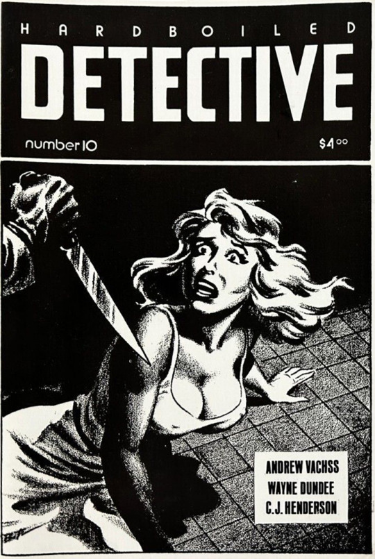
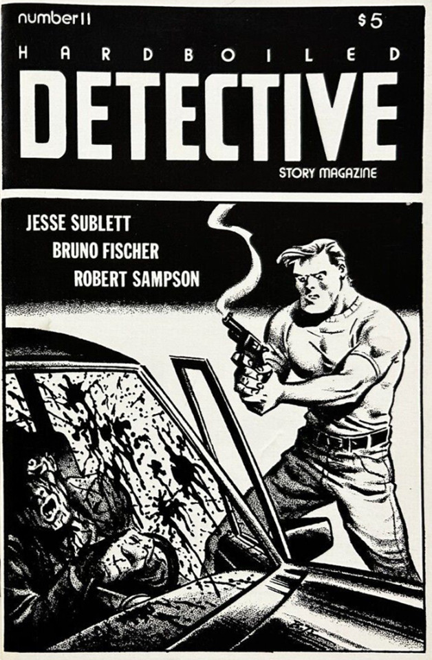
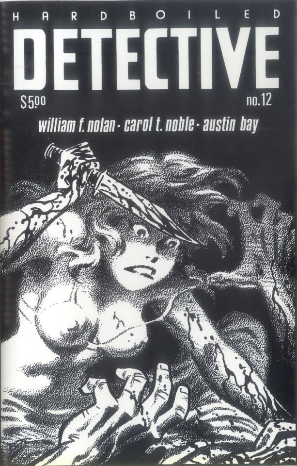
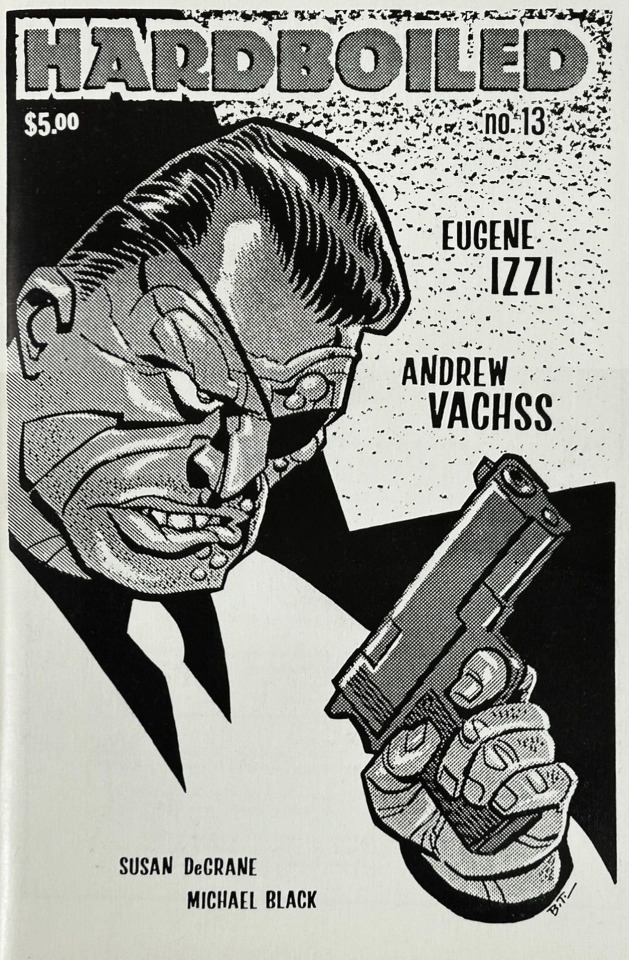
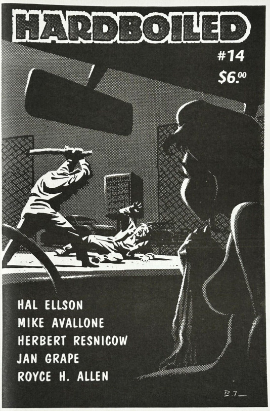
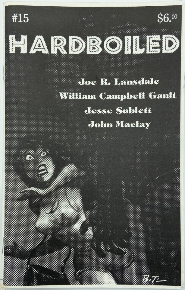
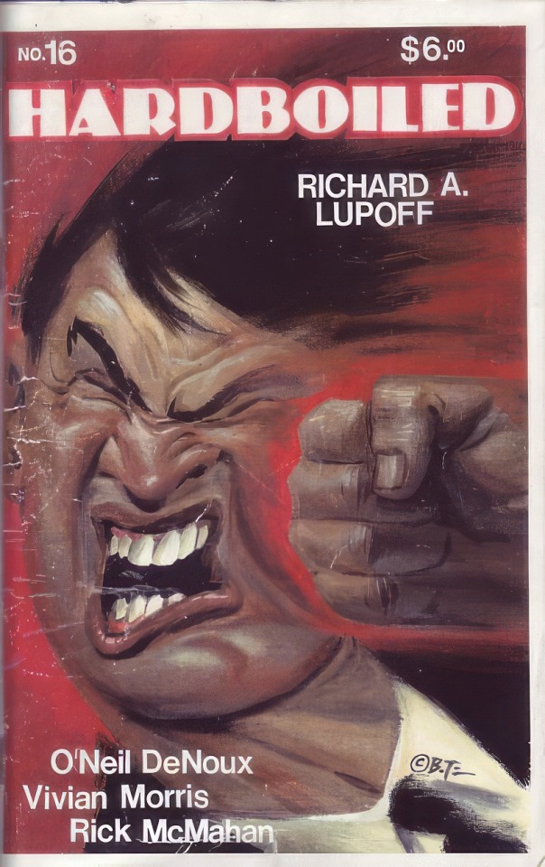
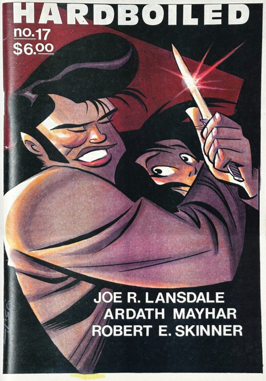
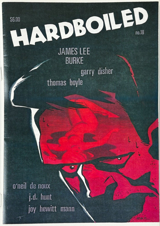
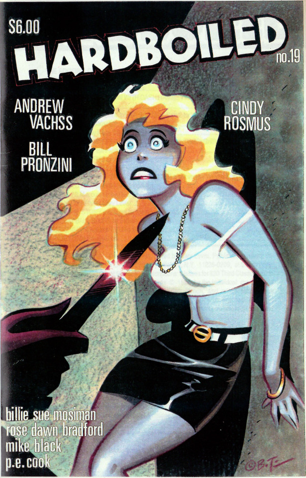
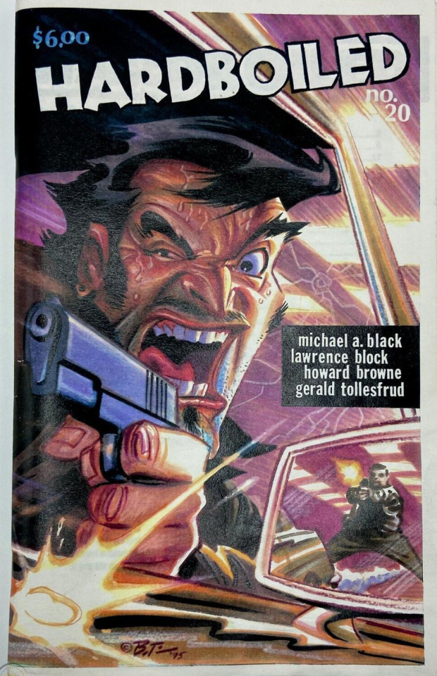
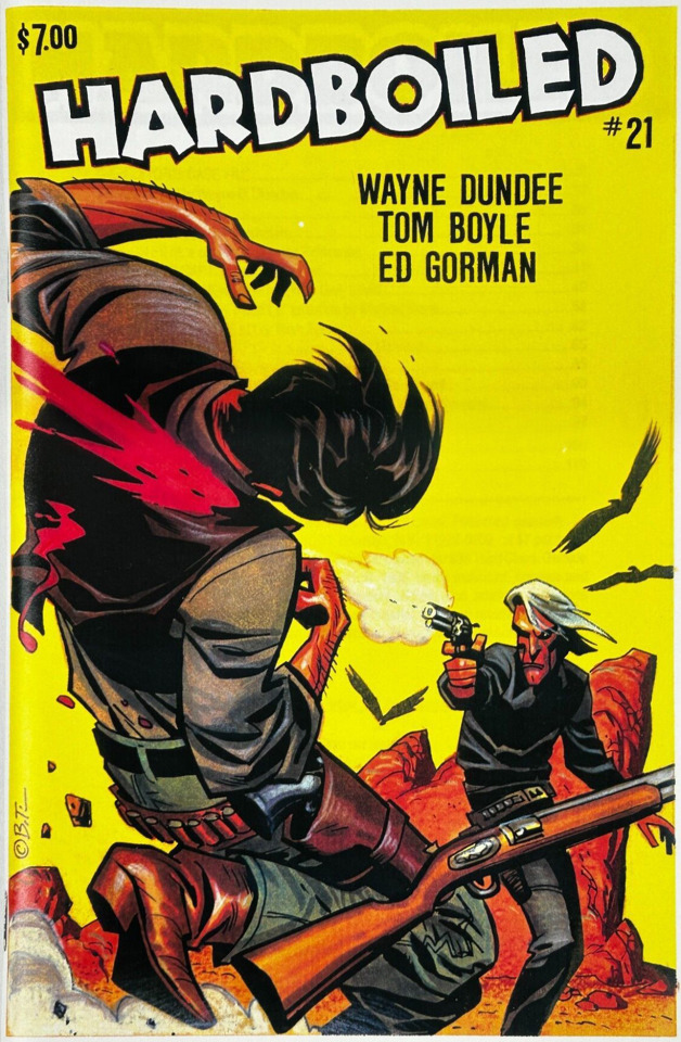
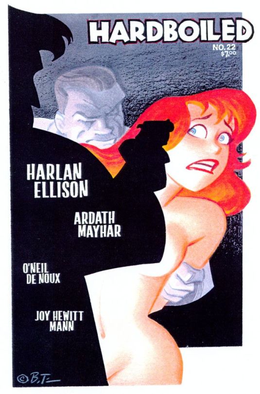
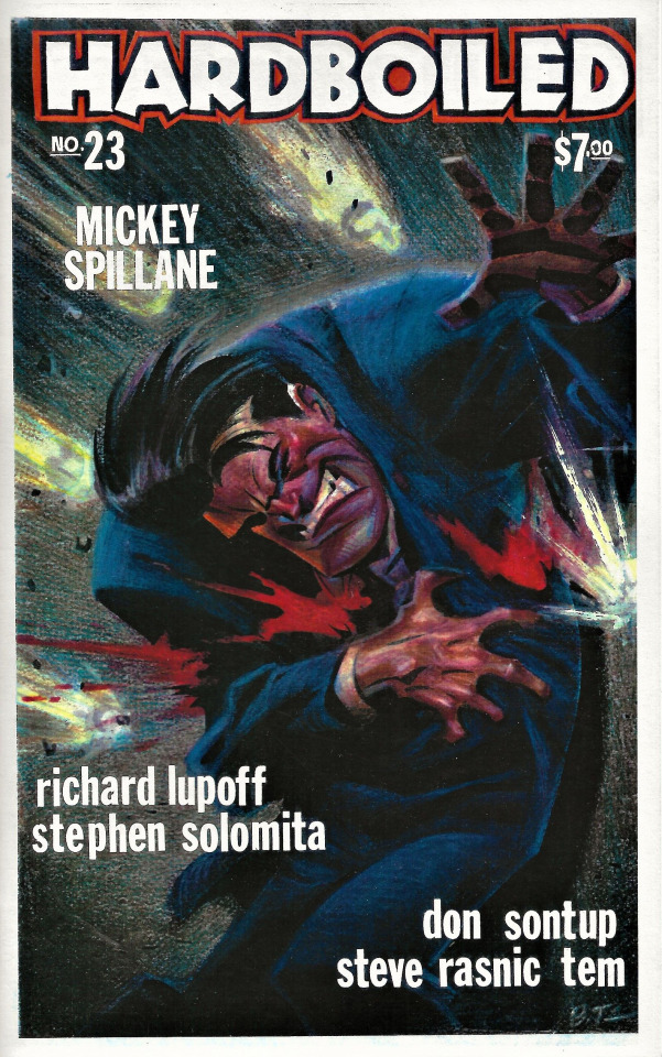
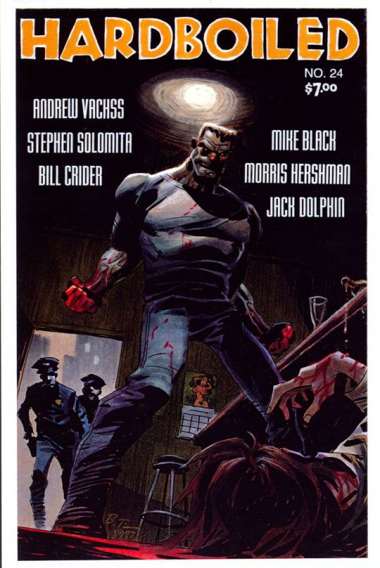
Hardboiled #10-25 (1990-98) cover artwork by Bruce Timm
Interview from Cool Stuff Magazine #1 (1995):
Gary Lovisi: Much of your work is characterized by raw, intense energy and action, or beautiful women in stylish, dangerous settings. Some is obviously influenced by the pulps.
Bruce Timm: I’m big pulp fan, have been since the early 70s, when I started reading Doc Savage and Avenger reprints. I can’t really say how they’ve influenced my artwork much, except when doing pulp-homage stuff like the Bob Price books. But I do sometimes wish I was born decades earlier so I could have worked for some of the old pulps, which was why it was so much fun doing the Price stuff, and the «mock 50s» paperback covers for your Gryphon Books.
The hero pulps — Doc Savage, The Spider, The Shadow, etc — did have a big impact on my approach to the Batman cartoons. It’s something I tried to inject into the show from early on, the atmosphere, danger and illicit excitement, and especially that Norvell Page-type feeling of impending doom — the «doomed city» mood. It’s also why I set the sense in a timeless, 40s-styled world of big cars, padded shoulders, gangsters, shadowy streets, etc. I only wish we’d gone farther with it.
For instance, my original version of Batman himself was actually close to the Shadow: rarely seen close-up, speaking in short, clipped phrases, more mysterious, literally. I wanted to play him cold and remote, almost unhuman. But the network and our various story editors would have none of that! «We need to humanize him», «He needs to have a sense of humor», «We need to more about Bruce Wayne, the person», etc! Whereas I could care less about Bruce Wayne! He’s much more fascinating if you don’t know what he’s thinking, or what drives him.
A few «Shadowy» touches did survive. Batman is rarely seen be the public, almost never on TV. Even when dealing with the police, he’s usually off in shadows conferring with Commissioner Gordon only. And when he’s in the Batcave, he’s almost always in costume. My way of saying he’s Batman, not the other guy, not Bruce Wayne. Like Lamon Cranston, his true, «legal» identity is a facade.
I’ d love to do straight-ahead pulp hero adaptation someday. Doc or The Shadow or The Spider, either in comics or animation, without the senseless updating and over-explaining «character development» like in the Alec Baldwin-Shadow-fiasco-film.
Gary Lovisi: Your stunning covers for my Hardboiled mag are very popular with everyone who sees them. What are your feelings on hardboiled crime-related art?
Bruce Timm: It’s hard, actually, to define «crime-fiction» art. There’s pulp crime-fiction art, and digest crime-fiction art, both of which cross over with paperback crime-fiction art. Basically, I’m a fan of good illustration. Period. Regardless of subject matter. Composition, emotionally intensity, color and lighting effects are what I look for. And pretty girls, of course!
My favorite pulp crime artist is H. J. Ward, hands down. Gorgeous gals in twisty curvy poses, painted in luscious, creamy, wet-on-wet oil technique. My favorite paperback artists include Robert McGinnis, Robert Maguire, and Mitchell Hooks, the usual suspects.
My approach to the Hardboiled covers is different from my earlier «homage» work. When the covers were black and white, I used to experiment with different b&w textures, coquille board, zip-a-tone, xeroxed newsprint, whatever worked. Now that I’m doing them in color, I’m trying to make them as exciting and eye-catching as possible, with loud color, sexy gals, exaggerated action, and simple, graphic, almost cartoony styling.
253 notes
·
View notes
Text

art summary through the years! i saw this going around and i wanted to play too, i always love doing these summaries.. template 🌹
my art became "i discovered the joy of drawing drapery and fabric in 2021 and never looked back" HAHA
looking at the early stuff, sometimes i really miss stylizing and drawing cartoons!! 2015 was the first year i started drawing cartoony stuff, pre-2015 was purely anime style. an updated art summary from 2010+ for me would be fun.
going back to the 1st sentence, stylizing just doesn't give me what i want from art anymore, it doesn't satisfy my art hunger haha (dungeon meshi joke.. iykyk). although it's still fun to experiment once in a while (e.g. merch). even if my current personal art is not very animation industry friendly or "hireable", i think i have a stronger notion of my "artistic" voice now more than before. (again, at least for personal art)
2020-2022 were rough years during the pandemic... i wanted to stop drawing so many times. i always say this, but during that time i went back and touched base with things i used to love as a teen, such as old anime (fma, pandora hearts, etc) that inspired me to pick up a pencil in the first place, and it helped to revitalize my love for art. and then i discovered drawing and studying fabric and i could never go back! i think my art is now more inspired by fine art history than cartoons hence the more realistic drapery...
one reason why i always change up my art style or technique every 2 ish years is that i kinda get bored of the same brushes easily... ive worried that using the same brushes gets boring and stale to people, but i think my art values are more or less consistent with how it was 3 years ago. i cycle through a set of like, 3 different brush sets (watercolour, pastel/lineless, and regular shading) depending on the mood of the drawing. different drawings call for different techniques you know?? and i think it's okay to use different tools for each drawing, art isn't meant to all be the same.
#art summary#bit early for art summary but a half year/through the ages one is fun once in a while#my art
87 notes
·
View notes
Note
It's sad how people ignore/downplay Luffy blushing only at the sight of faraway Zoro to keep maintaining "Luffy is aroace"... when the evidence for Luffy being "100% aro" is not really there,
it's just Luffy (& Zoro) reasonably rejecting anyone suddenly romantically proposing to him in canon & Luffy (& Zoro) wanting to keep adventuring + having his style of fun + find One Piece. & Zoro + Luffy having many more meaningful, weighty experiences together & stronger attachment than average would make them liking each other more than just friends have a higher probability of happening than most ships with either of them.
& people keep "forgetting" both aro and ace are spectrums like why? I suspect just to keep Luffy away from Zoro?? (who's more popular to be shipped with other characters than Luffy due to being more classically appealing in a mature/less cartoony way, when Luffy is so much less childish & silly than he seems, he does have that deep-seated emotional maturity, like not caring for power + knowing how to motivate Laboon & downtrodden people to keep living/let the Strawhats help, & confidence + cheeky intelligence/sharpness to him that Zoro really resonates with)
I’m constantly metaphorically knocking on ppls doors at night w a big printout of luffy blushing bc HELLO? we seeing this???? from what I’ve gathered, it was only the second time he’s blushed (the first being when robin said she has strong friends). and it’s just. it’s a big deal. i will be reading into it. Insane. insane that he took one look at zoro from a distance and starting blushing like that. “oh he’s just happy to see him” luffy???? BLUSHING LIKE THAT!!???
#zolu#also mood to the other things u said I just get distracted by the ‘luffy blushing’ bit#lmaooo woops#one piece#also I respect all interpretations of his sexuality#important to remember aro & ace are a spectrum#and if he was blushing bc of feelings for zoro it would not invalidate that bc there is no one way to love#I tried entertaining other zoro x ships but after seeing his relationship w luffy there was no way
156 notes
·
View notes
Text
DCA style experiment !! (ft. Lunar)
I tried to draw the DCA in a bunch of different styles, and I may KEEP doing that just for fun. Does anyone agree with me that the DCA can only have SO MANY cute features, but we just can’t fit all of them in? I want my boys to have freckles and more eyelashes SOOO BADDD 😭😭😭
Not gonna lie guys, I love cartoony styles ,, I am but a silly cartoonist that likes to keep my characters simple … but there’s just something I absolutely LOVE about the DCA artists that draw him closer to biblically accurate . So much so that I am being tempted towards their side … GRRRR
tHis will be a debate in my head for a while :] change my style for him, or only draw him partially biblically accurate whenever I feel like it / think it’s right for the piece? we shall find out
#fnaf sundrop#fnaf moondrop#fnaf sun#fnaf moon#fnaf daycare attendant#daycare attendant#sundrop#moondrop#dca#fnaf security breach#fnaf sb#security breach#k’s art#traditional#doodles
316 notes
·
View notes
Text

wanted to try this out too
I hope it's okay to do more of these since I want to experiment with many styles
I like the source image a lot bc he's just so :D happy and cartoony
would be fun
152 notes
·
View notes
Text

slowly getting back into drawing that old man (not that I ever really stopped, but still)
unnecessarily lengthy art thoughts under the cut
started with that more realistic portrait in the corner but then I tried doing this new exercise where I just drew him as fast as I could without really thinking, trying to just be really quick and confident with my strokes, and I actually really love how those couple doodles turned out!! they have this really fun stylized quality that I enjoy a lot, like as someone who tends towards a more realistic style?? I feel like I don’t really allow myself to experiment with more cartoony/dynamic styles but this was a really effective way of forcing myself to make it happen naturally. anyways, I highly recommend trying it if you’re like me and maybe have a hard time stylizing faces, or if you just wanna do a fun exercise! just don’t overthink it and see what shapes you naturally chose to exaggerate :)
sorry for rambling sghshsh I just had a lot of fun with these doodles and izzy has always been so fun to stylize for me :) he just naturally has this sort of silly cartoonish quality to him, it’s so easy to exaggerate all his shapes <3
#like he’s just… he’s just so shaped#i love him#i love exaggerating his nose and his goatee#and I especially love exaggerating his hair poof of course#and the flowy flicks at the back of his neck#he’s so so fun to draw it truly never gets old <3#izzy hands#ofmd#art#my art#doodles#my little guy <3#i love that even after like a year and a half I’m still drawing him and having fun with it#truly the muse of all time
139 notes
·
View notes
Text
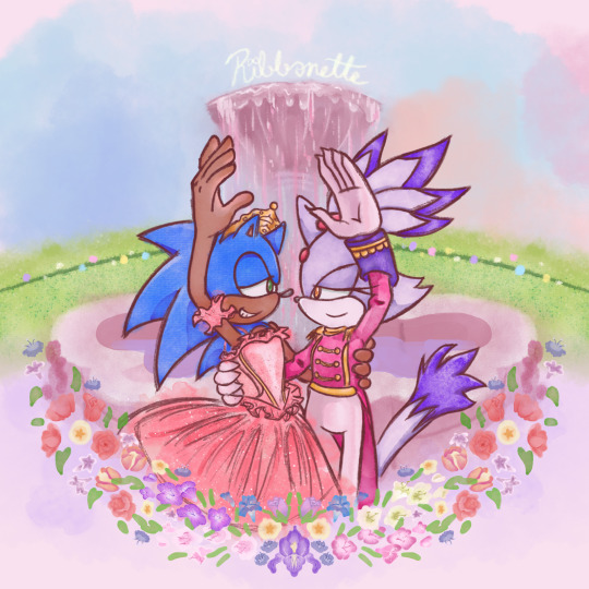
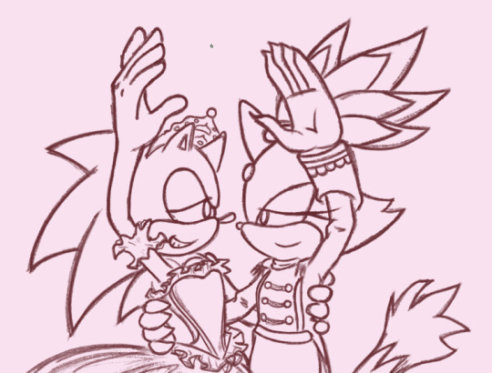
Tribute to one of my favorite movies of all time + the franchise that has me in a death grip 💖
a bit late for Christmas but at least Valentine's day is around the corner ^^;;
Process below if that interests you:
AS I SAID EARLIER, I had been working on this piece as early as December of 2021 😱!!!
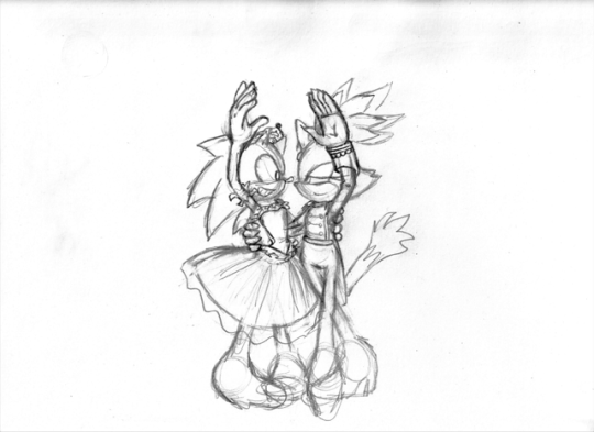
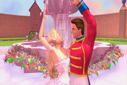
This was the original sketch! I was inspired after learning about Blaze's own design inspiration coming from Takarazuka theater, as well as it being the Nutcracker season so this film was in bouncing around in my head.
and this was allllll the way back in 2021 ^^; I had put the idea to paper to capture the image in my head immediately. But the idea in my head was extravagant and beautiful and would certainly take time to complete, as well as the patience and skill to work with watercolor 😔 I've certainly done my share of watercolor, both physical and digital, but I still feel like my physical watercolor work is a fluke, and I was still a novice digital artist at the time of this sketch.
In short, I wasn't confident my skill could live up to the vision.
So I would put this on the back burner. It wouldn't be ready in time for Christmas, and I could use this as an opportunity to hone that digital art experience so it could be ready next year!
2 Years Later...
It's December 5th. Fuck it. Let's crack this open again, I tell myself.
SO starting with the line art, it's actually 2 different brushes layered over one another.
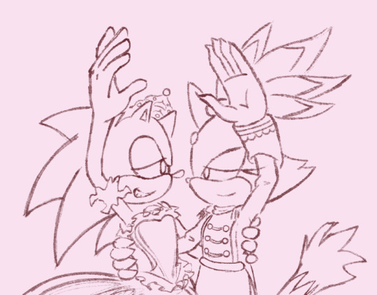
I also changed Sonic's expression to be more love struck-looking, because I'm a sucker for romance.
The image on the left is a watercolor line brush, while the right is a pencil brush. The reason I wanted a water color look was because I thought it would make the illustration look dreamy and fantastical, and I wanted that to extend to the line art as well. However, my usual lines on traditional usually veer more towards thick and cartoony from years of studying the Sonic art style, so I really felt like I was working against myself here. I had also asked friends for their input and they preferred the lines on the right as well. If my followers actually do read these blog posts, I'd love if you could comment which line art style you prefer drawing or looking at.
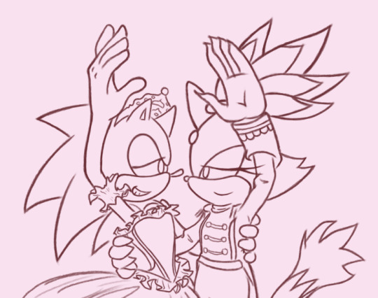
The happy medium was to just combine the 2. Here's a better look at that:
I like it! I think it combines the solid line with the rustic water color grain. Best of both worlds :]
For the actual painting, The most notable thing I can say is that getting the right pastel-y color was VERY difficult to achieve for someone like me who often loves to use bright and saturated colors in her art. I feel like I really set myself up to do one of those "evil art style" or "opposite art style" challenges I've been seeing around. I had to repaint Sonic at one paint because the blue of his fur was WAY too saturated for the style I was going for:
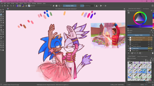
I started with painting Sonic and Blaze in first and then working on the background. I think that's probably the backwards way of doing it but one of the perks of digital art is you can do stuff any order you want when you have layers.
The background wasn't actually as difficult as I thought it would be. I wasn't going for any difficult perspective, and I was using a reference so that could be it. I'm usually averse to backgrounds but I really wanna tackle more of my weak points in art. I actually had way more fun than I was expecting, painting the sky and adding texture to the grass. I think I had the most fun rendering the water coming from the fountain (which you can't even see too well anyway, lol).
Funny enough, I had just about finished painting the characters and background by early January. So why am I posting this in February?
The Flowers...
In case you don't know. I love flowers. I love looking at them, I love learning about flower languages, I love drawing them. so seeing that my reference image showed flowers circling the fountain, I was excited! I was already having more fun than I expected to be having (working against my usual style, rendering a background), so how could this be a pain in the ass?
Well, I am my own worst enemy 😞I couldn't exactly identify each flower offhand from this screenshot alone. The texture of the flowers is kinda grainy, since I don't think the animators were expecting viewers to look too closely at the set piece to use as reference for my lovingly crafted crossover fanart. If anyone has this in high quality though, please tell me.
(I think I actually got this reference from a tumblr post but I can't find it on my blog for the life of me nor can I find it in the tags I'm so sorry)
I'm a huge stickler for details so I really wanted to be as "accurate" as possible in my illustration. I can hardly identify some of these flowers with confidence. I think there are roses in there? or tulips? I'm not sure if those yellow flowers are roses or some kinda petunia or if I'm way off.
I'm sure these details won't matter to most viewers but it was EATING AWAY AT ME. Eventually I decided to try drawing in flowers that might look similar to the ones in the reference. Or some based on their flower languages. I was certainly overthinking it ;;;; It led me to going "fuck it" and just throwing in whatever I wanted. There are no irises visible in that screenshot but I made it the centerpiece of the flower ring. Who give a shit.

I made some guides for me to follow: The blue ring was so I could make sure the flowers make a half circular border around Sonic and Blaze. I was envisioning how it could look as like an icon or sticker or something, which is why it's framed this way. then the second guide is the sketch of the flowers I made. I always do line art and I'm not great at just improvising with color to paper, or color to screen in this case.
The rest of this process is then just working on each flower piece by piece (with the help of the mirror tool of course) with varying degrees of detail. Some flowers are more abstract than others, and I had debated if that would look jarring and disrupted any kind of harmony I was trying to maintain with the style parameters I set for myself. And then I decided I was overthinking it once again which is why this was taking me nearly 2 months to complete.
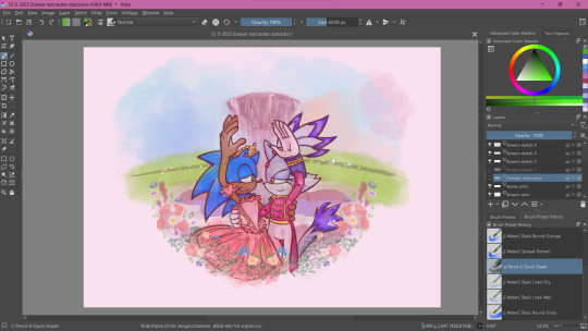
At some point during this process, my wifi went out for a whole week! Of course, I could still work on this illustration offline, but I had a lot of tabs open with a bunch of reference images on there (plus I like to listen to music while I draw otherwise I lose focus and I had neglected to download a varied selection on my phone or laptop 😭 Learn from my mistakes).
The most tedious of this process was making each set of gladioluses a unique color.
Was it worth it? You tell me! I think they're pretty, at least.
Along the way, I repainted the grass because it wasn't symmetrical (It didn't need to be but I had been using the mirror tool for a lot at this point and it was bugging me). I made other little final adjustments, like color adjusting the leaves on the flowers, lowering the flower ring border, and so on.
Ultimately, I'm extremely satisfied with the final product. I had my heart set on doing something like this for a long time. I had so much fun just experimenting throwing on color or not worrying about technical stuff. Of course, I did do what I usually do and overthink it at some points, but I'm working on it!
I've wanted to do an extremely indulgent AU illustration and other drawings for a Sonic x The Nutcracker story for a long while. I will be totally honest, I'm still a little embarrassed to share stuff like this, even after years of posting fan art online. It feels like the more self indulgent something is, the more people might judge me for it ^^; But I wanna practice what I preach and kill the thing inside me that cringes at my harmless attempts at joy and whimsy.
I would love to do some more drawings for this AU, but maybe post them around December when it would be more seasonally appropriate. I hope you'll stick around for it!
If you read this whole thing to the end, thank you. Whether you follow my blog or not, I hope you have a lovely day :3💝
#Barbie in the Nutcracker#Sonic the Hedgehog#Blaze the Cat#Sonaze#Jess's Digital Odyssey#Sorry for not posting frequently it may happen again
67 notes
·
View notes
Note
SHAZAM SHAZAM SHAZAM pls tell us about billy batson. ive only ever seen the movies o great comic knower
Very very very VERY far from comic expert (that's brawltogethernow) but I have read a lot of Shazam. His history is actually really, really fascinating and involves more than one lawsuit that really defined very early comics. I'll focus on one thing, though.
There are two Captain Marvels: One from the 1940s to around 2013, and one from 2013 til now. The Captain Marvel you're familiar with (who is named Shazam) is from 2013. He's a more realistic, grounded character. He was created to be pretty much the polar opposite of his original version. The best summary is to say that the Wizard chose Billy Batman 1940 because he had the purest heart, and the Wizard chose Billy Batson ~2013 because he was there. My personal 'best' Shazam story is the "Shazam: The Monster Society of Evil" graphic novel by the guy who made Bone. It's good because it's for elementary schoolers yet acknowledges this small child as homeless. Which, don't get me wrong, you shouldn't always do. My personal favorite is the 1970s ones.
As some background: Otto Binder was the creator/main writer of the very early Captain Marvel comics. He was by far and away the best writer of the early Superman Silver Age comics, because all of his comics were batshit insane. Shazam has a complicated and legal history with Superman, so the 1970 run was a super fun high camp tongue in cheek reinvention of the best Silver Age stories.
So the 1970 Captain Marvel comics are insane.
I can't even summarize them without sounding crazy. Basically the conceit is that Captain Marvel, Captain Marvel Jr, and Mary Marvel (Billy, Freddy, and Mary) are having 1940s Golden Age Adventures when they get somehow in suspended animation and are basically time travelled to the 1970s. This don't bother them too much. Why would it bother them. Nothing bothers these people. Nothing. I don't think anybody experiences a negative emotion in these comics. Not bc they were twee. Bc they were insane.
Many of the comics basically had three shorter comics inside it: one Billy story, one Mary story, one Freddy story. Interestingly, they all had different art styles, artists, types of story, genre, etc. Billy's stories had a cartoony art style with very over-the-top and silly plotlines that involved supervillain bad dudes. Freddy's art was slightly more realistic and was slighty more grounded, but still had some classic Marvel indescribable scifi that can best be summarized as that one meme panel people have seen where Sivana recites a science equation that lets him walk through walls. Mary's stories were much more realistically drawn and featured the most banal shit, like her starting a club with her friends. Somehow Mary Marvel gets involved in those.
Sometimes they worked together and did superhero things and fought bad guys. The average fight looked like this:

Billy was a twelve year old who lived by himself, in his own apartment, had his own radio show, a full-ass job, a whole thing as Captain Marvel. He paid fucking taxes. Everybody knew this and nobody cared. He's the most affable, good natured kid on the face of the planet. Nothing bothers him. Nothing. Nothing bothers any of these people. Sivana shows up and he's BIG MAD so he's creating another death ray and Captain Marvel shows up like "Oh you rascal! Time to punch this and go back to helping my friend eat his infinite Jello."
He has a friend named Talky Tawny, who is a talking tiger wearing a suit. He also has a friend named Sunny Smiles, a person of indeterminate gender who everybody falls in love with, for unexplained and unknown reasons. Not to be confused with Freddy's friend Gregory Gosharootie, the "World's Dullest Mortal", who is so boring that nobody notices him and he keeps accidentally comitting crime. There is also an old guy named Uncle Marvel who pretends he has superpowers, which they all find funny so they just roll with it. Freddy is a disabled orphan who has to sell papers on the street corner to make a living. Mary lives in a middle class suburban home with loving foster parents. It never once seems to occur to Mary's parents to adopt Billy, for Freddy to live with Billy. Everybody is happiest this way.
I do think this is partly why a good Shazam comic has to be aimed at the 6-12yo demographics. They have to be for small children, because Billy is living a complete and utter power fantasy that only a ten year old would think is a good idea. He's a kid, and he doesn't have drag parents or a lame family, but he can turn into Superman, and he can also do magic, and everybody loves him and thinks he's the nicest person, and his supervillains are Dr. Doofenschmirtz and a worm, and his supporting cast is like okay my sister if she HAS to be involved, but also my best friend who is a paperboy! but cool because he's disabled, and….
Look, you could engage with that seriously. You could go "holy shit this is a homeless child". That's fine. That's what they do these days, and that's what they did in the movies. Nothing wrong with that. Take the story more seriously.
But also they don't give a worm the electric chair in those stories, so.
To actually give some commentary on these comics: these comics really love people. I've never seen comics that were so entrenched in their community. The kids just know everybody they meet on the street. Freddy delivers paper up and down every block, so an average story for him is just talking to a butcher or baker or old man or grumpy housewife and helping them out with some batshit problem. Mary's a sweet girl who's always starting clubs with her friends and taking on neighborhood projects. Many Billy stories involve one of his many friends falling into some trouble and Captain Marvel helping them out - or just exploring some fun with Billy hanging out with Sunny Smiles, who is a person of indeterminate gender who for some reason has magic love brainwashing powers -
This isn't the biggest #Shazam take, but I think a good Shazam story stays grounded in that. These are poor street kids who love Fawcett City so damn much. They love fighting their supervillains, but they love helping out the random guy off the street with their problems even more. Way more so than Spider-Man or a lot of other guys, I think of the Marvel family as the friendly neighborhood superheroes. They're both larger than life and street level. They're Superman level powers but they just use the powers for wrapping up their hijinks. Isn't that nice? Aren't you tired of going apeshit? Don't you just want to be nice?
#captain marvel#shazam#mary marvel#freddy freeman#billy batson#captain marvel jr#mary batson#i pulled open the old comics to review to write this#and as a kid I was like.#“hah! silly old silver age comics! they don't know how dumb they are!”#but reading it now im like#“holy shit i think they're doing it on purpose. holy shit. i think this is the most sarcastic comic ive ever read.”#“I don't think this is the funniest thing ever on accident. I think these were jokes. This comedy is sublime.”#genuinely they hold up SO well. they're fucking delightful.#high camp.#my writing#my asks
242 notes
·
View notes
Text

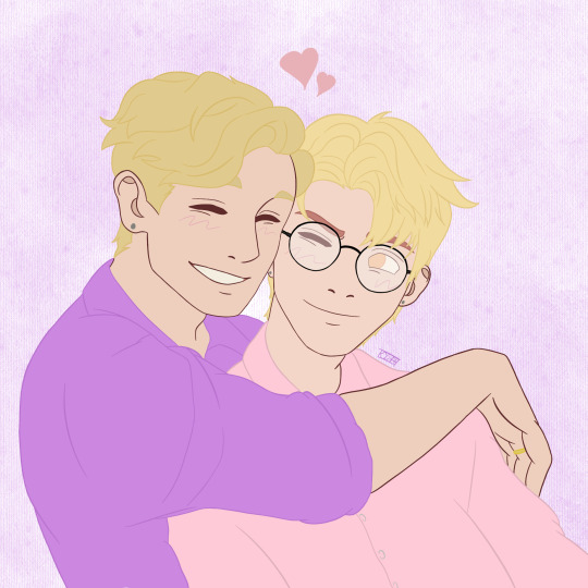
"my bunny hubby is the most huggable person alive!"

i had a lot of fun drawing this 👉🏻👈🏻 experimented around w/ colors n all . tried to get the cartoony style down some more . . we‘re gettin there folks !! >:]]
taglist: @alenveikko | @mahitoslittlebird | @satoruswaifu | @cassmeeks | @scissorleaf | @solban | @lumibye | @blorbosfrommyhead | @ratchs | @eternally-smitten | @sailing-selfships | @arsene-fixates | @kylars-princess | @little-miss-selfships | @verykissablepixels — lmk if you want to be added or fill out my tag form !! 🫶🏻
#🖊️🐸 ; clifflix#⭐️ starry soulmates ✨💙#🖊️ | felix#🖍️ ; art#🪄 ; cliffs creations#my art#safeship#safeshipping#self ship#selfship#self shipping
63 notes
·
View notes
Last Seen Blogs

motchacream-blog
m.o.o.c.h.i.e.s

qawilabovi
Untitled

rogue-feeder
Feeder Twink

spyro
rf4ff322

hopemymomdoesntseethis-blog
Christina