#but I know no one here would wanna see my original character art. Which is so okay im not lamenting that!
Explore tagged Tumblr posts
Text
Happy Easter if yall celebrate it!!!!! Otherwise I hope yall have an absolutely fantastic Sunday!!!!
Aaaa I feel like I'm not as chatty as I once was on here. Been a bit all over the place! Also feel silly making a ton of text posts with no art so I try and limit how often I blab on here.
But just know I still appreciate all of you who follow and like my art! Every bit of interaction I still see and it still baffles me to see such kind words. It means the absolute world to me!!!! 💖💖🌻
#plus Ive been drawing other things between wh art#but I know no one here would wanna see my original character art. Which is so okay im not lamenting that!#this blog was always meant for fandom stuff! but ya know. if im drawing other stuff it means my fandom art slows down slightly#still need to get back in the groove with drawing Dandy#really hard not to feel discourage ever since dealing with them being used without my permission (Which has already been long since handled)#but I havent shaken off that upset I felt. Made me all tol hesitant to even post Dandy anymore.#course also kinda put a damper on my fun#OH IM RAMBLING! venting??? this isnt about that#shaking my head and clearing clouds!!! anyway! needless to say im trying. i hope you guys dont mind being patient with me#happy easter!#or uh happy sunday!!!! if you dont celebrate!#OH AND HAPPY TRANS DAY OF VISIBILITY!!!!!!#Wow my tag rambles are all OVER THE PLACE#text post#just rambling#ill shut up now 💖
34 notes
·
View notes
Text
Filter lists and block button my beloved, I will forever appreciate the work you do to help keep me browsing / sane.
#ramble#I have filtered so many “(fandom) oc” tags that keep poping up when Im trying to look at original art and characters#users really don't know the difference between oc and fc and it shows in the misuse of tags#if you have to put “(fandom)” in front of “oc” then its a fan character (fc)#Ive tried thinking of anyway “(fandom) oc” could be a thing but the only thing I can think of would be if you took an actual oc#and inserted it into a fandom setting for funsies#but as an outsider looking in thats almost impossible to pick up on unless you add a disclaimer and no one adds disclaimers so#its driving me insane how many tags I need to filter#my only solace is the fact I'll eventually get to the point where only the nichest fandoms remain#there's only so many fandoms before I filter them all#anyway this is brought to you by this undeads terminology petpeeve#I just wanna see original art and characters man#I know tumblr is more fandom orientated and thats why I only post fandom shit here#but misusing the tags isnt strictly a tumblr thing#tumblr just happens to be one of the main roots of the problem and as a result it spreads to other sites#which makes browsing for shit ya wanna see impossible bc no one is tagging correctly#its painful#the only time I have any tolerance for the misuse of tags is when its a grey area#bc there's definitely characters or art that fall into a grey area and its really difficult to label them correctly#at that point I go by how strong their connection - both visual and textual - is with the fandom#my personal limit is 2 or more fandom connections = not original but thats an opinion and most users seem to be more lenient *shrugs*#on the bright side this sparks my desire to fill the void that is original characters and art#especially for things like dragons or other creatures#especially dragons#I miss browsing the internet as past-me and seeing all the dragon ocs users had they were all so fun#I miss when things werent fandom or species#DISCLAIMER 01: this isnt directed at anyone specific Im just trying to browse the oc and original character tags#filter list open in the next tab over#DISCLAIMER 02: Nothing against fanart or fan characters ofc I literally dedicate this account to fanstuff thats why I post here#Hell Im considering drawing more ultrakill fanstuff like my two shitpost fancharacters again lmao
0 notes
Note
i enjoy ur bird abode thoughts! I was a genuine enjoyer of the show when it was airing, I’m no die hard fan though and love to see ppls personal takes on the overall story/plot. Im curious if you also would agree or have any thoughts on the impacts The Mouse’s cancellation had on the shows ability to be more than it was? srry im not super eloquent with my words, but basically ur response to that ask got me wondering if part of the reason the show like genuinely wasnt all that ground breaking or unique in the end plot wise (other than the villain faces consequences in the end ig) as far as YA/Teen animation goes, was because of The Mouse’s inability to let the writers flesh out the show before gutting it? i have a negative bias toward The Mouse franchise and obviously dont know anything about how writing a show under the eyes of a franchise that big would work, its just smth that rattles around in my head and wanna know what u think!
Well to an extent, but I think it's much more the effect the studio had on how the owl house started out as rather than it not getting a full season at the end - It didn't escape my noticed that the show was initially announced as being a "horror comedy" when it doesn't really seem like either, especially by the second season, and yeah, the original pitch bible is obviously aiming for that much more than the show proper is as it goes along (and is honestly seems quite a bit more funny, weird, and dark, with an overarching plotline about a giant bug being used to religiously suppress people, eda able to cure her curse by killing luz, and one of the major characters being a teen boy awoken from a sleeping curse who ends up being a weird little bigot because he's from the 13th century, among other things)
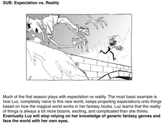
(side note, i just noticed they actually specifically describe the thing i assumed the show was gonna be about here. huh.) but ultimately the bulk of the show that was actually made seems very influenced by a writing team that was genuinely interested in making a tropey YA fantasy story rather than just being mandated to. I mean even in what aired you can see the show sort of settle in ways that feel less like studio interference and more like, you know, art students creating their ideal fantasy show, like how King is clearly Eda's roommate who's funny because he looks like and sounds like a little dog despite being an adult man at the beginning but by the end they've made him her adopted sad backstory son who's explicitly a child. While I think a third season would have made the show as it existed better, because they clearly didn't get to finish the plot they wanted to (frankly to the point where some major aspects of the show are a bit confusing, I'm still not sure what a grimwalker is), I don't really fault the show for that but also don't think that hypothetical season (which pretty clearly would have been mostly about the magic school teens going to normal school) would suddenly flip around into something that I personally found interesting and subversive. Nor should it, really; again, it being Queernorm Harry Potter thing is clearly the intended appeal of the show, it's not really a flaw but just not a genre I'm personally interested in when compared to what I initially expected the show to be.
HOWEVER I will say they robbed little weird girls of their representation and that can't be forgiven
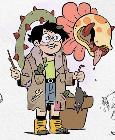
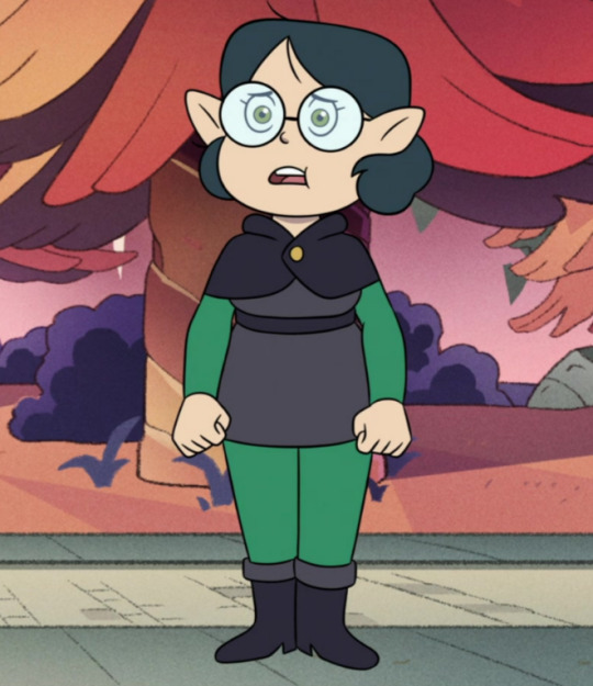
#does this not make sense or sound mean. I'm not trying to sound mean. it's fine. you'll like it if queernorm magic school sounds appealing#which it will to many many people#I think what happened is that they were studio mandated to make some changes that weakened the initial idea#but then the writers#all again tumblr art students#were just as interested if not more in making their own played entirely straight YA magic school thing#probably more than i even grasp as according to a friend who loves the show there's like.#cassandra claire harry potter fanfic references I'm not picking up on
237 notes
·
View notes
Text
I need you all to understand. I've seen so many people talk about how Eridan would be slaying the fashion scene. How his fashion sense is awesome and epic, or whatever. NO! Firstly, I wanna preface this by saying that Pesterquest falls under the category of "Dubiously Canon." so his massive closet isn't actually canon. But secondly, LOOK AT HIS FUCKING FIT, MY GUY!
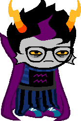
THE DEEP BLUE WITH THE PURPLE??? THE CAPE??? THE HAIR??? BROOOOOTHER!!! THEY EVEN CHANGED THE COLORS OF HIS SCARF AND PANTS TO LOOK BETTER IN PESTERQUEST!
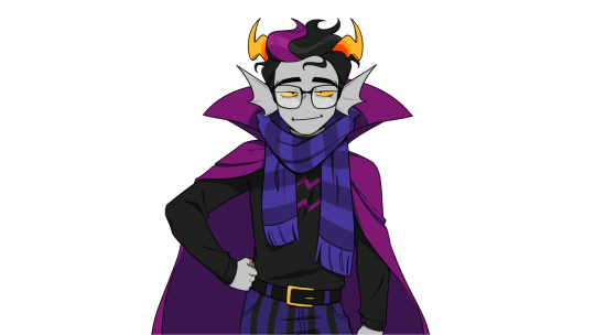
It's subtle but the color shifts towards indigo/cobalt rather than royal blue. "B-But what about March Eridan? March Eridan looks good and is canon!" I don't know how brainrotted you are from buying all your clothes from shien (derogatory) and temu (derogatory) to think that March Eridan looks good, but let me just show you what it looks like again to refresh your memory.
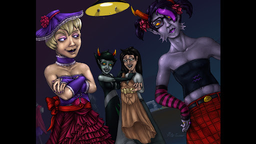
Ignoring the insanity that's even happening with this image in the first place, this IS the Original March Eridan image. Now let me tell you why this fit is more atrocious than Kankri Vantas' takes on feminism. 1. THE COLORS DO NOT WORK!!! His VIOLET symbol combined with MAGENTA arm warmers and thigh highs and a RED SKIRT???? AUUHHG NONE OF THESE COLORS LOOK AESTHETICALLY PLEASING TOGETHER IN A FASHION SENSE!!! NAME ONE TIME RED AND PURPLE HAVE EVER LOOKED GOOD TOGETHER IN TERMS OF FASHION??? 2. STRIPES AND FUCKING PLAID??? WHAT??? IN CARTOONS, MUSIC, BOOKS, AND EVEN FUCKING GAMES, DO YOU KNOW HOW MUCH "Ew stripes and plaid." IS SAID??? THAT IS LIKE THE NUMBER 1 NONO IN ANY FASHION WORLD!!! 3. AND WHILE THIS ONE IS A BIT OF A STRETCH, THERE IS NO CONVINCING ME THAT ERIDAN AMPORA WOULD WILLINGLY WEAR THIS SHIT! IT JUST DOES NOT MAKE SENSE FOR HIS CHARACTER TO WEAR THIS OUTFIT! FASHION IS A WAY OF EXPRESSING ONESELVES! FASHION, AS A MEDIUM OF ART, IS A WAY A PERSON CAN EXPRESS HOW THEY FEEL ON THE INSIDE! March Eridan as an outfit, artistically expresses confidence, empowerment and a general "I'm a bad bitch you can't kill me" energy. Here's the problem. Eridan at his base components is envious, closed off, emotionally volatile, and a massive fucking nerd, which the old outfit actually does express.
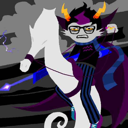
His clothes are long-sleeved, showing the least possible amount of skin he can, which usually can represent being closed off. His cape is large and grandiose, showing that he likes to be exaggerated and theatrical. His scarf indicates his nerdiness, with it being a reference to Harry Potter and how it could be a tie-back to his nerdy love of wizards. The only other outfit he's shown wearing is with a flashback to when he and Vriska were a kismesis.
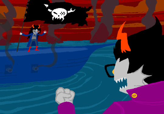
Here the outfit, even with as little as we see of it, is big and intense. Unlike Vriska, who essentially doesn't change outfits, Eridan puts time and effort into each theatrical performance he considers himself to be a part of. He adores intricate and exaggerated outfits. Things that are fancy, complex, and over-the-top. So that even though he doesn't feel great on the inside, even though he feels as though he's "wworse than evverybody. all the bodies." He can still look well put together. And that's WHY I don't think March Eridan as an outfit works. It's too casual for him. It's not big or flashy in a way he likes. There's not enough for him. It doesn't cover him up and because of that, he'd feel exposed. He's not closed off anymore. It doesn't exude "Eridan Ampora". Who's "most casual" piece of apparel is probably a sweater vest.
Even in the original image, he looks uncomfortable, like he doesn't actually LIKE wearing it. The only way I can find this artistically working from a writing standpoint is if Kanaya made it for him because, in the story, it is shown time and time again that Kanaya doesn't understand Eridan, so by making him this outfit, she'd take it a step further by not even understanding what he likes. Kanaya doesn't understand that Eridan is terrified of being culled, because Kanaya doesn't have to worry about that. Kanaya doesn't understand the pressures Alternian society is forcing upon him, as an Orphaner. Because Kanaya's only societal expectation is raising the new mother grub. Kanaya doesn't think about how he's most likely going to live the longest out of all his friends. Eridan has the second highest lifespan out of every troll blood color, but even then with Feferi, she's most likely going to get culled by the Condense when she's the proper age to inherit the throne. So in Eridan's mind, he's going to be alone, expected to be an Orphaner until the day he dies, utterly alone to feed Feferi's lusus until he eventually succumbs to old age or dies in war. That's why he's so closed off, yet so emotionally grand. That's why March Eridan doesn't suit him from a fashion-artistic standpoint. It's not what Eridan Ampora embodies as a character. Envy.
#homestuck#beta trolls#eridan ampora#march eridan#outfits#fashion#art#fashion art#fashion design#maybe I'm just weird#kanaya maryam#started as a rant post but turned into an analysis post#i'm too passionate about art#character design#character dynamics#character analysis
79 notes
·
View notes
Text

Day 100
One hundred fuckin’ days. God. Actually happened.
I spent 3/4ths of the year drawing more Junkan art than I think anyone else on the internet ever has. Which might be presumptuous of me, maybe i’m just looking in the wrong places y’know? I’m a solid second place bare minimum.
And like, that’s still pretty funny right? This whole event is something I’m gonna cherish forever, the memories, the art itself, the friends I made because of it. But like, c’mon. I drew 100 fucking pieces, learned new skills like digital painting, animation, all that shit, for a ship that I used to hate, and a ship that for the longest time I thought was gonna get me fuckin banished to the deepest depths of the internet just for drawing a poor sketch of them kissing. This ship has become more deeply entwined into who I am as a person that it’s passed up Tokomaru, the ship that literally made me realize I’m a woman.
It’s gotta be at least a little funny, right?
Ah but enough of that, I can talk more on that subject a bit later. For now I reckon I should focus on our art piece for today! Wouldn’t you agree?
Yeah it’s the Wedding. I’d say even before Day 60 I decided the final pic of the Project would be The Wedding, even before I decided to draw a comic of the proposal. Because like, c’mon, it’s basic but how the fuck else was I supposed to end of the project? With something that ISN’T a wedding????
And very shocking to hear after this entire project has gone by, but I did in fact scale back this pic massively. You wanna know what the original idea was?? 22 images, each one depicting different parts of the wedding and afterparty, including the kiss at the end. And the kiss at the end? I was gonna feature every character from the 3 main classes + Ruruka, Seiko, and Yasuke. Fucking why??? Because Excess is all I know people ITS ALL I KNOW.
However I had decided that I wanted this project finished and ready before October, because I wanted to do the Vampire Fic to coincide with Day 30. And again, say it with me here, “Jem was severely burnt out on the project!”
So it went from 22 images, to “However many I can get done in time + the big group shot” and then that became “Just the big group shot,” and then finally, i cracked and just drew The Kiss.
Speaking of which before I divulge some more info about the original plan, i’ll get all the fun things about the actual art I did go through with.
As you can tell I shaded this differently from anything in the project. I normally have two different ways of shading art, I don’t think these are the proper words but I call them Soft Shading and Hard Shading. If you need immediate examples, Day 95 was Soft Shaded, and Day 94 was Hard Shaded. Generally speaking I prefer to do Hard Shading, as I think it works better with the rest of my style, and also just looks better in general. Soft Shading is what I do for pics with like, a very specific tone and energy to them that I can’t really put to words. It’s also significantly easier to do compared to Hard Shading.
A few months back for a commission of Kaede and Marceline from Adventure Time hanging out (yes this is relevant) I was trying to capture a very specific aesthetic that I’m obsessed with called Frutiger Aero. This mostly was in the background, however when lighting the pic I needed a very specific aesthetic that I didn’t know how to capture with just one of my shading styles. So . . . I fuckin did both. And in my opinion (which is crazy because this requires I compliment myself) it looked fuckin great. That said it was significantly harder.
I think I’ve done it only one other time after this, but I don’t remember what the pic was if it exists at all. But obviously as you can see, I decided that to really commemorate the occasion I’d go all out and do both shading styles again. It was very worth it, but fun fact! Doing this style on Roses is a fucking pain in the ass and if I ever have to do it again I will fucking SCREAM!
Anyway, the pic was definitely a lot harder to work on because of that stylistic choice, but the end result makes up for it by a massive margin.
Hope ya’ll like the dresses because they were the hardest part of this! Fun fact, Val (She’s back!) did a chapter for her legendary Year of Love and Despair fic where the gals are in wedding dresses. And the designs she came up with are amazing! I still really wanna draw em when I get a chance! However! I woulda felt bad if I just yoinked em for this, so I had to do everything in my power to come up with completely different designs. And given that I am a perfectionist, that was significantly more difficult than it probably shoulda been. But I did it! I really like how Mikan’s dress turned out specifically, I thought giving her a fit that covered up more skin than a normal wedding dress would be fitting for her. Also I really like drawing Mikan’s hair in a bun, I never had a chance to say that so I’mma say that now.
Wow fuck I just realized there’s probably a lot of random details or thought processes I have on this ship that I just never got an opportunity to talk about, either because I had a different topic to cover on previous posts, or I just forgot, or I just didn’t have a good segway! Crazy right?
Also yes! Shading Junko’s hair was heavenly~
Okay i’ve run out of words on the art. Time to tell you about everything I cut! Now I’m sad to say but no, I didn’t actually cut 22 planned images. I never got far enough to actually figure out each individual pic. Only a small handful, which I almost speedily sketched out for this post, but I don’t have it in me, especially on my current schedule. So i’ll just do my best to describe what I had in mind!
First piece would have been Mukuro being on Security for the Wedding, because of course. She would have also enlisted the help of Mondo and his entire gang, because that combination in this context sounds funny. Don’t worry though they were well behaved.
Ruruka was gonna handle the Wedding Cake, with Teruteru on the rest of the food. Either Ruruka or Mukuro would have been giving him a death glare during the process of course.
Behind the scenes Mikan would be getting prepped for the Wedding. And by prepped I mean Seiko, Ibuki, and Sayaka would be trying very hard to keep Mikan from crying as a result of how happy and overwhelmed she is (Ruining her makeup). Seiko trying to blow air into her eyes to keep them dry while Sayaka and Ibuki desperately try to find an outlet to plug in a hairdryer in because that would be significantly more efficient.
On the reverse, Junko would be doing all of the work on prepping herself for the wedding, with Ruruka, Yasuke and Tsumugi standing in the background, questioning why they’re even there. Junko would yell at them that they’re morale support in this instance.
Warriors of Hope would of course be there being scamps of course, Kotoko would be the Flower Girl because I play favorites. Toko and Komaru would probably be there trying to keep them in line.
I didn’t have anything in mind with the afterparty but I more than likely would have drawn the drunkest Junko I possibly could. Maybe even Mikan too!
For the Bouquet Throwing I was gonna have Syo jumping at it like a feral animal, and thinking about it now I’d probably also have Tenko jumping for it with killing intent in her eyes.
And I think that’s it for ideas I had prior to cutting them. Which means it’s time for me to get sappy about the fact that the project is finally ending! Fuck! Usually when I write these I try to have a decent idea ahead of time of what I’m gonna fucking say, this time however I’m just gonna talk, and i’m gonna keep talking until I’m either struck down by nature or I run out of things to say. Sorry!
This is going to get silly, sappy, and maybe even a little venty, jump in at your own risk.
If you told me at the beginning of 2024 that I was going to draw 100 days worth of Junkan related art, including a gif and a music video, 2 comics, and also get back into writing to make gay fanfic, I’d be so god damn confused. Because what the fuck right? And that’s not even counting everything I drew AFTER I fuckin finished! Like hold on a minute i’m gonna count up how many times i’ve drawn these two, including the individual comic pages from the three i’ve made.
204.
Fucking, I. I didn’t even know we passed 200 by this point.
And that’s not counting the sketches I’ve drawn on paper in my sketchbook. It’s also not counting unfinished pics. It ain’t counting the art I might draw WHILE writing this! It’s not counting the stuff I probably forgot about while searching my files cause I suck at naming the aforementioned files!
AND I’M STILL NOT BURNED OUT EITHER?
I got burned out on the project sure but the moment I had the freedom to do whatever I wanted I fucking IMMEDIATELY drew a Junkan pic for Halloween. And then I kept going, and then I didn’t fucking stop, and I don’t think I CAN stop! I don’t even WANT to stop but you’d think by now I’d be like “Well I don’t have any ideas right now-” NO I HAVE TOO FUCKING MANY IDEAS! I KEEP FUCKING THINKING OF MORE IDEAS, AND THEN I COME UP WITH AN AU AND THAT COULD HAVE LIKE 10,000 MORE IDEAS. JUNKAN IS A MENTAL HYDRA YOU DRAW ONE PIC 2 MORE POP UP IN ITS PLACE!
I can draw these pieces in like a few hours if not shorter, because I don’t have to fucking sketch them properly anymore. I feel like I shouldn’t be able to do that! This ship has done unspeakable things to both my mind and body! And i’ve said it before but i’m not trying to complain here, as you’ll see when I start talking about this ship like it saved me from falling into the grand canyon. But it’s just, so, absurd???
Danganronpa is only like my third favorite piece of media behind Bo-bobo and Fairy Tail and yet I’ve drawn more art of JUST THIS SHIP than I have of just general art of those series! That’s not even counting all the other ship art I’ve done! Like Tokomaru! Remember Tokomaru? The ship that is responsible for me being a woman and being able to find the happiness of being my true self? I think i’ve drawn that and Syomaru a combined like, 20 times across my entire life as a DR fan. ALL OF THIS JUNKAN ART SAY FOR LIKE, 5 OF THEM WERE IN ONE YEAR.
And bare minimum for 2025, assuming I don’t make ANYTHING ELSE OF THEM (Which I will. You know I will.) I’m gonna draw 21 pics for Junkan Week, because you know I’m gonna just draw EVERY prompt from all three lists. And then 30 more for the Month of Junkan (Will try to have that prompt list up soon btw!). So that’s 51 I’m going to do. That’s over half of what I realistically was supposed to do bare minimum for this project. That’s so fucking much, and I’m gonna do it, because I love this ship, and also it sounds REALLY funny if I did that.
I think genuinely the only other ships I could fucking do this for are like, Toko/Syomaru or Flarelu. Maybe Togachako if I did a reread of MHA to get me back in the spirit for that series. And even then i’m not sure I physically have it in me to go that distance even for those ships. I certainly want to draw a lot of them, especially Flarelu because that’s a ship so rare that it makes Soft Junkan (before I fucking flooded the tag on tumblr) look like a bustling city.
Speaking of tags, I still think about sometimes how like, the Junkan Tag maybe got like, a post like, a few times every month. The normal amount for a ship of this general Rarity. And now it’s like, for so many pages, just half of it is me. Because I was asked to bring something to eat to the function for the buffet table and I fucking crashed a Food Truck through the wall. I feel bad about it sometimes, sometimes. I’m imagining the scenario in my head where someone who likes Junkan but didn’t check the tag super often because it wasn’t like, a super commonly updated one, and then pressing it for the first time in a year and being like “What the fuck happened here?” You know what still shocks me? Not once have I gotten hate for any of this. I was so fucking scared for like half of this projects creation that I was going to get bombarded with people angry at me for shipping this, and NOTHING. I’m not complaining I’m just confused. I have to at least have had a few people block me right? It’s just so eerily quiet. And it’d be one thing if it’s just a thing of like “Why would people who hate Junkan check the Junkan tag” because yeah, that makes sense. But also I’ve been putting at least one Junkan pic in both characters tags every day for 3 fucking months, there had to be at least one Mikan super fan who is eternally fed up with my antics. Like, awesome that I didn’t get harassed over a ship, that actually gives me a little hope that nature is healing, just. Crazy right???
So like. Fuck.
I guess I’ll get to the sappy shit now?? I think I ran out of things to be confused about in terms of what I did this year because of this ship. So I guess I’ll just start talking about how much it means to me, both the ship, and this project.
(trigger warning, mentions of abuse, nothing super graphic in my opinion but could be mildly uncomfortable. Either skim ahead or stop here)
2024 kinda, fuckin sucked for me to be honest?? I have like 2 good things I can speak for it in terms of major positive points (Obviously I had other good experiences but if I just said “Oh I read a I Love Amy and it was one of the greatest things ever” it lacks the same impact). Not counting getting this project to like, work, obviously.
I finished the 5 chapters of my webcomic that I wanted prepped so I could actually make a website and start posting (ignore how I didn’t make the fuckin website yet). And I started dating my darling Yves and Rivette. Who I cherish deeply. I made other friends this year, a lot of them in part cause of this ship. And I went through a lot of emotional change.
But to get that change it required I unpack a lot. And by a lot, I mean one bag that was filled to the brim. Gonna try real hard not to like, talk about this in excessive detail or turn this post into some woe is me bullshit, but I feel like I should at least make mention of it.
At the beginning of the year, I asked Yves (who I wasn’t dating yet) about my previous romantic relationship. And she confirmed to me that, based on everything I had told her about it overtime, that yes, it was abusive.
During 2021-2022 I was in a relationship with a girl I won’t name here, you wouldn’t know her of course, it was a completely different community. It started out as friends, I got a crush, jumped at it because I was still inexperienced with feelings, and it didn’t work out. And that’s the simple way of putting it, and that’s how I viewed it till Yves opened my eyes.
From the getgo it wasn’t healthy. She was manipulative, constantly had outbursts towards me, and yanked me around emotionally constantly. I would later find out that she had a previous history of just, generally being an awful person. Even after we broke up we still stuck around each other, mostly because I felt guilty for breaking up with her, and was also just generally terrified of her. The abuse was all mental of course, it was long distance so she couldn’t hurt me physically at all.
I of course, didn’t process any of that as me being abused, I even viewed myself as being at fault for a lot of it. The experience was so bad that I identified as Aromantic because just convinced I wasn’t able to feel proper romantic feelings for someone. It wasn’t till much later when I got another crush that I realized that I’m Panromantic, and me being Aro (and very briefly Aegoromantic) was basically just a coping mechanism to write off my trauma. I still feel guilty about that since it feels like I devalued the importance of people who do identify on the Aro spectrum, but that isn’t relevant here.
Point is, a lot of bad shit happened to me because of that woman, and even after a year and a half of us not talking because we both mutually decided it would be better for us to not stay in contact, she still found ways to worm her way back into my life. One conversation we had just by chance, to catch up, that’s all it took and I was thinking of her again. I never talked to her after that, and I have her blocked now, but I didn’t need to for shit to hit the fan.
So I asked Yves that question, she answered, and I now suddenly had to deal with the fact that I was abused, and that I was traumatized as a result. And like, I never really viewed myself as a traumatized person up till that point, I viewed myself as someone who wasn’t very smart but tried her best to do good by people who didn’t have too much baggage beyond some sucky school memories.
When I had to unpack what happened that kind of spiraled into severe Self Confidence Issues and even more Self Hate. I struggled to accept even the slightest compliment if it wasn’t directed at my art. The reason I even quit weed is because I used it almost exclusively to suppress all of the negative emotions I felt.
I’m in a somewhat better place now, I’m trying to give myself more breaks from artwork, rather than overworking myself constantly just to feel something (and being fully open, I realized near the end of december that I pretty much used Overworking as a form of self harm). I’m gonna really try this year to like, actually let people be nice to me, and in turn try to be nicer to myself. And I have goals to work towards for this year. But I wouldn’t have gotten to this point without two things. One, my girlfriend Yves, who even before we started dating helped me through multiple breakdowns and has helped/allowed me to grow into a (I hope) better, healthier person. And even after I got over most of my feelings related to my Ex, has continued to help me cope with my self hatred. I cherish every moment we share and wouldn’t trade her for anything.
And the other thing, which I know will sound silly right after I talked about my girlfriend, is well. Junkan.
Let me say this, I didn’t get into Junkan to cope with my abuse. I have toyed with the notion in my head before and the idea of it pisses me off to a quite frankly irrational degree. I was into Junkan before I realized my issues. If you want my coping mechanism it’s Alex from Minecraft and no I’m not explaining that right now.
That said, it, like all the yuri ships I like, was a source of comfort for me. Originally I read stuff like Tokomaru fics just to help me reduce stress, back when I dealt with really severe anger issues due to the online spaces I occupied. And to this day reading a nice, fluff fic can calm me down a bit. But now they can serve a much deeper sense of comfort, away from all the bullshit, and obviously, gave me a way to distract/calm myself from the storm of negative emotions and memories that filled the brain.
I see myself in Mikan more than I’d like to personally admit, obviously not to the extreme, but in aspects. So it’s just, nice to see a better timeline for her with Junko, ones where she gets to be happy and maybe even heal as well. It just so happens that I also think there’s a lot of genuinely good potential for the ship from either a canon or non-canon perspective, and Junko’s just a really enjoyable character.
Working on this project helped too. It gave me a way to dive deeper into my love for this ship, and gave me a sense of purpose and validation that helped me work through the rough. Whether it was the really bad mental health days, or just a shit streak of commission work that tore away at me because my job even if I love drawing can be a real drag at times, and i’m unfortunately a workaholic (Trying to work on it though).
I think i’ve said it before but even something simple as Val showing her excitement over the art pieces I was prepping could genuinely brighten my day even while I was at my lowest.
And then when I really started pursuing this as a project, rather than just a secret stash to satiate myself and one other person minimum, I realized I could do something good here. For the people like me who loved this ship but might have been too nervous about expressing it, the people who were just really craving it, and the people who had already made all of the fics and art that sent me into this spiral of obsessive passion in the first place! A gift to all of them, to make ya’ll happy.
In hindsight, may not like, the healthiest mindset for setting off this whole project. But hey it all kinda circled around into eventually helping my mental health recover. So like, win?
And i’ve already spoken on how Day 60 allowed me to feel a lot more emotionally free as an artist even if I still have my struggle days. I’ve gotten better just in general as an artist as I improve more at stuff like expressions, posing, linework, etc. And I’ve even managed to make friends with some of the people I used to look up to as idols and can finally just view em as normal people now. (Even if I might still be a bit excessive in my praise, I swear I’m normal about ya’ll besties I just don’t have like, a middleground for showing my appreciation and affection for my friends. It’s maxed out unless I’m tired as shit)
I find myself comedically terrified of how this ship has affected me over the course of 2024, and how it will likely continue to affect me through 2025 even as I try to move onto other projects not related to Junkan. I wanna show off my love for Fairy Tail on my main blog, and I really think that with a full years time and the first five chapters done I really can get my comic off the ground and focus on that for the foreseeable future.
But hey, 2025 at least we got two whole Junkan Events. And with Junkan Week I’d like to keep that going for as long as I can, unless someone else takes the reins way down the line. So this ol�� blog’ll keep going for a good while I imagine, even if it’s a lot smaller. Maybe I’ll find other ways to keep this place active, I’ve considered just making it a one stop shop for all things Junkan though I don’t think I’m really suited to manage that. Maybe someone’ll read this and try there hand at it down the line, maybe someone’ll do their own 100 Days of Junkan!
Oh hey did I ever tell ya’ll I was gonna make a comedic video just making a guideline for how one could make their own 100 Days Project. It was gonna be like, pretty obvious points just framed in a very exaggerated and comedic tone.
Alright anything else I should cover? Fun facts? Deep personal anecdotes? Sappy stuff?
Lemme check my files, maybe i got another dumb joke image-
. . .
Oh . . . Well there’s somethin.
Alright, don’t get to excited ya’ll, but just for a bit of fun, how about one last day in the project. I know 101 days doesn’t roll of the tongue as well, but I think this is vaguely interesting enough to make up for that! Tune in tomorrow. Same time, same place.
As always, Reblogs, Comments, and Little Notes in the Tags are appreciated!~ They always make my day!~
#danganronpa#junkan#junko enoshima#mikan tsumiki#junkomikan#enomiki#junko x mikan#enoshima junko#tsumiki mikan#shipping
51 notes
·
View notes
Text
Discussing Hide and Seek Pilot Tapes
So the Hide and Seek Pilot tapes are apparently canon too. So let's discuss. Note: I know I probably already mentioned some of these points in a previous post but I'm bringing it all up again.
First off I think "pilot" implies that these came first, before anything else. So that's where I'm gonna assume they take place in the timeline.
So here's what I notice in the first tape:
youtube
First off, Amanda and Wooly are still clearly friends at this point. Amanda and Wooly were still best friends at this point. "Right now I'm playing with my best friend Wooly." She says in a way that does not feel forced at all, like she means it.
When looking for Wooly, she says the box is a "good hiding spot" which is foreshadowing that it was supposed to be her hiding spot. More on that later.
I gotta say the art style of the storyboards after Wooly is found is ABSOLUTELY ADORABLE AND MY FAV BY FAR. It's so cute!

Just look at them! Look at their little faces! I just wanna hug them!
When Wooly starts talking the song "I'm An Animal, and I Ta-" from the game's original soundtrack starts playing. It kind of feels like it was meant to be a leitmotif for Wooly. I noticed it mainly because it's one of my favorite compositions on the soundtrack heh heh... is it just me or is it a little messed up that they chose the song from when Wooly turns into a literal sheep to be his leitmotif? Is that symbolic in any way or am I just reaching? Either way I think it's pretty funny!
I didn't really understand in the music video why Wooly kept asking for it to be his turn only to get really scared when he actually got it. Now that I've rewatched the pilot tapes... I think I have a better idea about it. It's because that's the script and Wooly likes to stay on script. But that clearly doesn't mean he LIKES the script.
Also, while the scene where Wooly asks "what comes after one?" is pretty funny I also find it a bit weird. Like, does Wooly actually not know how to count? Like he could just be sticking to the script but far as I recall from being a little kid myself once (I know, shocking). Usually they'd simply ask the viewer to count with them, I don't recall any characters legitimately NOT knowing what comes after one. Like sometimes they'd say something like: "Can you help me count all these rubber duckies?" or something but I don't think I'd ever seen a show where the character simply doesn't know how to count. And I also had to watch a LOT of these type of shows with my younger siblings and cousins growing up (Mickey Mouse Clubhouse is permanently SEARED into my brain thank the universe for Bluey).
So like genuine question... does Wooly actually straight up not know how to count? He even sounds really unsure the entire time he's counting like... it's just a possibility but like does he really not know? Because that would genuinely be really interesting.
Wooly calls the tree a really good hiding spot, you know cuz it's HIS hiding spot. Side note: It's really neat to see them having so much fun with this in the first tape. Like they are genuinely having a blast.
Moving on, Wooly got REALLY startled when Amanda jumped out at him. Can I make it a new headcanon that he startles easily? (TBF that's the same reaction I have whenever people try to startle me. I'm not scared, just really caught off-guard).
But what happens next is really interesting because Wooly points out that Amanda went off script and he's unsure how to feel about that. He seems really confused. It made me wonder if Wooly likes staying on script because that way you always know what's going to happen and how to react to it. Amanda was out here going off script and changing the episodes for her own amusement from the very start. Wooly also seems a lot more okay with going off script a little "as long as your having fun." but he doesn't seem to like it still.
Amanda and Wooly playing and messing around with each other as they run off screen is just so sweet! I wonder what happened to Grandma?? One of the biggest things I wonder is if this particular pilot happens before or after they get trapped. Like are they recording these lines in a recording booth? Or are they already trapped and haven't gotten their memories/awareness back yet? I think it might be option 2 just because Amanda was able to go off-script and Wooly seemed genuinely confused about it.
Anyway onto part 2!
youtube
Right off the bat Amanda seems confused and unsure about this episode.
Also I find it interesting how she hears out name and says: "Oh really I think we've met before" before getting cut off. This is yet another example of what seems to be the shows built-in censor system for when Amanda goes off-script. When she says "box" the tape glitches and says something else. It sounds like she says "tree" again. I wonder why? When the mouse clicks on the box Amanda seems uneasy. Could this be foreshadowing for Mr. Fox's death? Or does she already know he's not going to be there. Now whenever she says: "This is a good hiding spot" I think of the music video and I think Yeah, to hide a body Amanda?
Wooly still doesn't know how to count... Wooly's part isn't really different but when he says that she's not behind the tree there's this weird intense glowing from the left side of the screen. Wonder if that means something?
The only difference is now when he lifts the box he says: "You're not Amanda." Like... really Wooly I didn't notice a difference? <- sarcasm/joking.
Amanda's eye twitches when Wooly says he hopes he'll see us again soon. Then she says: "Let's play tag next time." which is obvious foreshadowing for her both not wanting to play any more hide and seek and wanting to play tag so badly. They also don't run off playing together in this ending... odd.
Anyway that's all the stuff I noticed! Hope you enjoy the post!
#play my way#jakeneutron#amanda the adventurer#amanda the adventurer 2#maddykpost#ata 2#wooly the sheep#amanda the adventurer wooly#Youtube
39 notes
·
View notes
Note
i wanna start reading abt dick / robin / nw / why does he have so many names. do you have any recommendations..... ;;; ??
Well, yes!!
If you want to start with what's important, I recommend:
Robin v2 Annual #4: One of the many versions of Dick Grayson's origin and my personal favorite.
Robin - Year One: I think it's a great comic since it's short and a good introduction to Dick Grayson's Robin once he's settled into the role.
The Brave and The Bold v1 #54 & #60: First introductions to the Teen Titans!! This origin hasn't been changed much nowadays, so you'll be good starting from here to learn about the team.
Teen Titans 1966 #53: Teen Titans origin and break up. Their adventures in this comic are all fun to read, so the full comic is recommended, but it isn't something essential to read, so you can skip it if you'd rather do that.
New Teen Titans v1 #1: Introduction of the new Teen Titans! After this issue you can read the rest of the comic, but that'll be up to you.
New Teen Titans #39: Robin leaves the mantle. In newer comics it's Batman who fires Robin and forces Dick out of the costume, but originally it was Dick's decision to stop being Robin and become his own hero. However, if you want to read the "Batman fires Robin" version, for that you'd have to read Batman v1 #408 or Nightwing v2 #101 (the latter being much harsher than the prior).
That's what I'd recommend to read about Robin Dick Grayson if you're just starting. After that, you can begin exploring any comic you want.
Now, moving on to Nightwing:
Tales of the Teen Titans #44: Nightwing introduction!! This would be the first time we get to see Dick in his new costume.
Nightwing - Secret Files and Origins: More about how Dick becomes Nightwing and the Kryptonian origin of the name, plus some other stuff that happen in this short comic.
Batman #416: Dick Grayson meets Jason Todd, the new Robin! Can't miss this one. It's nice to see how Dick confronts Bruce and ends up getting along with Jason.
The New Titans #55: Dick finds out Jason died and confronts Bruce about it. It doesn't go very well, and it's probably one of the moments that strains their relationship the most.
Batman #436 - #441: 5 issues in which you'll get the first look at Tim Drake's character, lots of Dick and Bruce angsty interactions after Jason's death, a new version of Dick Grayson's origin and then some more about Tim's character.
Robin v4 #0: Dick & Tim, Robin Dick Grayson flashbacks and finally Dick taking on the Batman mantle just as Bruce goes away for a while.
Nightwing 1996 #1 - #3: Nightwing and Bludhaven. Not my favorite issues, but they are important to learn more about Bludhaven and why Dick decided to stay and protect the city.
These are the comics and issues I recommend to start reading about Dick Grayson. Anything more you want to learn will be up to you, and you can start with whatever you like, this is just my personal suggestion.
A few extra recommendations I'd give you are:
Robin & Batman 2021: Beautiful art and a very nice approach to the start of Bruce and Dick's dynamic. And since it's a short comic, you can read it in one evening, which is always convenient if you don't have a lot of time to read comics.
Flash plus Nightwing: Dick and Wally have one of my favorite friendships in DC, so I recommend this comic about one of their adventures together during one of their annual vacations.
Secret Origins v2 #13: Dick in this one basically retells many things that's happened to him over the years while talking to Jericho and it's, overall, a very enjoyable issue.
Teen Titans 1966: I know I said it earlier, but it really is a very fun comic. I recommend to read when you're in the mood for something lighthearted. Each issue has it's own plot, so you can read one and then leave it until you're in the mood again.
Hope this helps you, anon!
#dick grayson#nightwing#robin#dc comics#dc#comic recs#anon ask#thanks anon!#batman#bruce wayne#jason todd#tim drake
46 notes
·
View notes
Text
Current plans (rambles and ideas) for the DCTL redrawn project
First off, I just came up with that title on the spot and it works super well so I'll stick with that probably pffh. Follow the tag if interested in participating !! Anyways, here's my rambles.
I wanna do some more research on Chris Hastings. Fellow Bendy wiki staff have pointed out that he adapts the books rather than illustrate them, which I didn't realise had any difference beforehand. Basically means directing stuff like backgrounds, setting, etc from my knowledge. They sourced this user that seems to know a thing or two about him and his work, along with getting an early copy of the graphic novel. I'll do proper research and make a seperate post soon for this.


Moving onto the project itself, I've got some jumbled thoughts I'll try and make sense of-
I'll reread DCTL to understand the book properly, all work going foreward from there
Design work will start after this, all characters will have set, universal designs based off of canon, official (such as meatly's word), book descriptions and more, such as racecoding (I'll do justice for Thomas and Norman) and time period. I'll likely be designing them alone, but I may listen to other participant inputs and ideas to make sure they're the best they can be.
This novel will be drawn from scratch !! We won't base or reference anything off of the original graphic novel, we'll only be using the original DCTL book and its word.
Every page will act as a "map part", basically having one artist do an entire page/pages. Some may want to collaborate with others (such as one person doing the backgrounds with the other doing characters) for their pages which is more than welcome.
Newer/less skilled artists are more than welcome to offer to participate, please don't let your skill level or own perception of your art discourage you !! I'd love to give you all a chance.
I may be pinging those who said they'd be happy to participate once I make the call post. Once ready to make that post, I'll be starting a discord server for communication. This will also include a google doc or something similar so we can get full quality pages from everyone rather than compressed images from the app.
The project's novel will begin with foreword. This will include background for why it was started, clearly state it was made as a protest against the original graphic novel, Mike's view of minorities in fiction and will also state it was made because we care and love this series, and want it to do better. It will credit and link to the artist who drew the original and explain why we believe the artist was mistreated and should've had more time and pay. Stuff of that sort.
Every page will have the artist's signatures/@'s in the margins, and the novel will have a glossary of all who participated.
Things may change, we'll see, but these are the rough plans I've got so far. Would love to hear your thoughts and ideas as usual !!
#dctl redrawn#dreams come to life redrawn#batim#bendy and the ink machine#batdr#bendy and the dark revival#bendy#dctl#dctl bendy#bendy dctl#dctl graphic novel#bendy dreams come to life#dreams come to life#dreams come to life graphic novel
44 notes
·
View notes
Note
Genuinely I would give anything to hear your thoughts or read more critical analysis of yours on other webcomics writing (*slides you Marionetta* I like the webtoon but there are some things in the writing that I'd like to see be discussed critically more often but the fandom focuses way too much on shipping. sighs..)
Anyway, you probably have been asked this before but are there any webtoons in particular you would recommend? :D
Oh lord, you don't know how many times a week I get asks in my inbox asking for my opinions on webtoons they're reading. It's really sweet that people wanna hear me talk about other works outside of LO, but unfortunately I just don't have the time to read as much as I used to, even keeping up on LO lately is getting really difficult 😅 I'm definitely keeping a list though of works to check out!
That said, I try not to read series on the basis of criticizing them because frankly I just... don't want to spend time reading something if people are only looking for me to rag on it? 😆 Of course I know that's not the only reason, I know there's also just the element of seeing me talk extensively about other works the way that I do with LO, but it's not really something I can turn on and off like that, I have to get really into a series to want to talk about it to that extent. So it often comes down to just luck of the draw :'0
Right now the series I'm keeping up the most on (or have completed and would absolutely 100% re-read):
Alfie (18+, it's porn with plot but the plot is REALLY GOOD , I SWEAR LMAO the art is gorgeous, the characterization is IMMACULATE, and it ironically tackles the subject of purity culture way better than LO ever has lol)
Theia Mania (the creator is often in my comment section / neck of the woods, she's been working on an Abduction of Persephone retelling for a long while now and has also tackled other myth retellings in her style! I always love seeing new pages of her work in my feed :' ) <3)
Tales from Alderwood (if you like fantasy and comedy, this one's great, the plot's really starting to get interesting and it's just got this really great sense of humor about it)
The Black Parade (this one's REALLY interesting, it's a comic-stylized version of My Chemical Romance's The Black Parade, using the songs as narration and sometimes even dialogue to tell a visual story, it's really cool and the art matches beautifully with the lyrics and style of MCR!)
A Tale of Two Rulers (this is a Legend of Zelda fancomic that poses the question, "What if Zelda and Ganondorf got married to solve their political crisis?" It updates a lot slower than most of the other comics I follow but the art and writing is so worth it <3)
Dogs of Future Past (and p much all of Lynx's Undertale comics which can be found in the link, seriously, THESE are the comics you wanna read if you wanna get into Undertale fanworks, they are PEAK)
Tamberlane (this one's an anthro comic, I normally don't read anthro but this one actually gripped me by the throat, the art is gorgeous and the character arcs so far have been great!)
The Mafia Nanny (okay it's legit so funny that I'm including this one here but I've been reading it the last couple days after seeing it basically beat out LO at the top of the trending tab for a couple days, so I figured I'd give it a shot, at first I was like "great more tropey shit" but the more I read it the more it's actually started to get pretty good, I'm holding out and hoping to god it stays that way LOL it's not especially deep or anything like that, but it's really fun and cute to read and the shipping of the main character within the narrative isn't too self-absorbed which I can always appreciate, I'd honestly be 100% fine with it if it didn't turn into a romance)
City of Blank (I talk about this one a lot here, but it's one of my favorite Originals right now, the art is super polished and the writing has gotten INTENSE, go check it out if you want some fun action / sci-fi storytelling!)
Time and Time Again (a time-travelling vampire and his werewolf boyfriend get into all kinds of misadventures, what more could you ask for?)
Touch of Divinity (like the Mafia Nanny, this is one I just started reading, it's got a very interesting premise so far and I'm looking forward to seeing where it goes!)
#if i ever do read marionetta then y'all will definitely hear about it LOL#ask me anything#ama#anon ask me anything#anon ama#recommendations#reading reccs#reading recommendations
88 notes
·
View notes
Text
2024 Fic Round Up
Tagged by @princessfbi (thank you! so thrilled to have discovered your work this year!)
2024 Word Count: 661,417
JANUARY
FEBRUARY
Safe In Certainty Started in 2023, Completed in Feb 2024 | Fast & Furious | Marked in Trust Series | 223,657k
Part four finished! Still stunned to be here story after story with the most amazing commenters I could have ever asked for. Not bad for a story I had never intended to share!
MARCH
Marked in Faith 10 chapters posted in 2024 | Fast & Furious | Marked in Trust Series | Roughly 60k posted in 2024
I'm putting this in for March because this is the month I began posting one story a month until Reckless in Devotion started. Some of those babies are longer than my oneshots, lol. Forever love exploring other POVs in the Marked in Trust world!
APRIL
MAY
The Ex 911 | Bucktommy | 17.5k
My first 911 story! My first Bucktommy story! Buck as a character totally captured me this year. I haven't been taken by a new fandom in so long so this was so exciting! Of course I beat the crap out of Buck right in my first fic for him :)
JUNE
Eyes On Me 911 | Bucktommy | 18k
Post lightning strike cataracts, I had so much fun with this one. I constantly think about extending it or maybe doing a Buddie version of it, I just loved the storyline so much and other scenes popped into my head after I posted
Doctor/Warlock Confidentiality Shadowhunters | Magnus-Centric | 17k
My first Shadowhunters of the year! Magnus Bane gets therapy against his wishes. I felt very clever for the title, lol
Heart & Universe 911 | Buddie | 6.8k
My first Buddie story! Why be stuck in a ship war when you can have BOTH?? I love writing them realizing they're in love :)
JULY
The King of the Dark Storm Shadowhunters | Malec & Chairman Meow | 5.8k
I've had this stray headcanon about Chairman being an old god trapped as a cat floating around in my head for fun for so long and finally I wrote it!
Not Sexy 911 | Bucktommy | 7k
Listen, I need more fics about Buck using sex in unhealthy ways. It's catnip for me. Tommy got a glimpse behind that particularly miserable door in this one
Invasion 911 | Buddie | 10k
Nakedperil!Buck and protective!Eddie - a match made in heaven, in my opinion
AUGUST
SEPTEMBER
Over the Cliff 911 | Gen 118 Fam | 6k
This was originally supposed to be how Buck got injured in Not Sexy but I was having way too much fun with the cliff rescue which wasn't even the point of Not Sexy so I chopped them in half to make a gen 118 family/Buck whump story and gave a much more to the point explanation for Buck's injuries in Not Sexy
Away From Us 911 | Buddie | 76k
My first 911 multichapter story! A presumed dead lawsuit era story full of angst. I fully anticipate more lawsuit era angst in my future, lol
OCTOBER
Art Class and Earthquakes 911 | HenRen/Gen Buck & Karen | 5.5k
Karen Wilson is awesome and needs more stories
NOVEMBER
DECEMBER
Reckless in Devotion Fast & Furious | Brian/Dom | 33k posted in 2024
The 5th installment in Marked in Trust series!! This took me so much longer than I thought it would but it's finally up and running and I am so excited for everyone to see what's to come :)
To Be Bonded Shadowhunters | Malec & Parabatai | 30k posted in 2024
I still literally cannot believe that this is finally being shared. I started this story in 2019 - I know I keep saying that but like this thing took me 5 years. It is my nemesis, finally vanquished. And people are enjoying it??? What? I've been cursing its name and people are now enjoying it. Wild. Wonderful
2024 has been kind of a crappy year for me irl but in fic it as been wonderful. A new fandom, so many words shared and, best of all, such amazing support and kindness from readers. You're all so wonderful and you have truly been one of the brightest pieces of my year. I cannot thank you all enough.
Tagging: You know the drill, if you saw this and thought "I wanna do that" then you're tagged. Literally @ me so I can read yours, that's how tagged you are.
22 notes
·
View notes
Note
ok i actually desperately need you to elaborate on the whole kissing outside/'art thou ashamed of me'/'no but ashamed to kiss' kantbison post you made bc it's genuinely stuck with me. like i know there's Something there but i don't have the context to figure out exactly what it is but i know you do so please. im begging you to finally put me out of my misery and tell me what it all means.
first of all i love you and thank you SO MUCH FOR ASKING. though, i don't know that the context will be as satisfying for you to learn skdhfsk
so, the funny thing about that scene (parallels found here and here) is that in the play, the full context is actually awful and disgusting and makes me wanna kill petruchio with a gun.
cause like, you have to understand that this scene takes place during the final act of the play. katherine and petruchio are already married by this point, and while you may have seen me mention that he is extremely abusive in his courtship of her, that does not stop when they are married. if anything, petruchio's tactics in order to break katherine and turn her into a dutiful wife become even more ruthless. he starves her for days and refuses to let her go visit her family until she goes along with anything and everything he says - and when i say anything and everything, i mean that if he says it's night time when it's actually day time, she has to agree with him or she'll be punished for it.
eventually, katherine submits completely and just sort of goes along with anything and everything petruchio says, like he wants her to. they've made it to visit her family and come to find out, bianca and lucentio have just eloped! katherine, rightfully so, wants to stay and celebrate with her family, especially after spending days on end locked away and not able to interact with anyone outside of her abuser.
so, katherine tells petruchio exactly that, let's follow them into the house and celebrate! but petruchio says we will... if you kiss me. katherine protests that they're outside, and then he asks if she's ashamed of him, and she says no, she's ashamed to kiss. and petruchio tells her okay. then we'll go home. and katherine is forced to kiss him anyways. it's a nail in the coffin in so many ways, that she doesn't even have the autonomy of choosing when they're intimate - it's all up to him. it's less about whether or not she actually is ashamed to kiss him outside and why as it is about the fact that she doesn't get a choice regardless.
and as much as i absolutely hate the original scene, i adore the way that jojo and the writing team made it sweet. like, yes, arguably kant and style took away bison and fadel's choice to kiss them or not by having them be the one kissing the other, but bison, in the very least, actually seems happy and pleased by it. he seems more hesitant of being kissed surrounded by people - ashamed to kiss! - than he is unhappy that kant kissed him. which, i think if we're ignoring the icky parts of the scene, in context, katherine in particular, is a character that does care what other people think - even if most wouldn't think that given her reputation as a shrew. katherine does get embarrassed, it's how petruchio courts her in the first place. she doesn't actually like drawing attention to herself, and she wants to be in control of it if it's on her. which would explain why she might feel awkward about being kissed when other people are around, especially since back then it was a far more taboo thing to kiss in public (still is in many places!).
i've said the same thing about fadel before, that despite being the shrew and an assassin, he does care about social norms and it's why style's tactics of embarrassing him in ep2 work so well. and given that they are both similar to katherine in their own ways, i think it makes sense that bison would be embarrassed at the idea of other people seeing them kiss, especially when we know how much he likes control. so, it makes sense that while he likes it when kant kisses him, he is also gonna scold him a little for doing it in public and also not asking first, yknow? even if it's only in a playful manner. and it's also just a very sweet way of referencing a not-so-sweet scene from the play!
the fadel and style version is honestly even more interesting, because instead of it being about style taking away fadel's autonomy, it turns into a conversation of style trying to give fadel autonomy. he wants fadel to be himself, to not worry about anyone else, for this one night. and that's suuuuch a meaningful and impactful way of flipping the original scene on it's head!
#god i love talking about this shit. can you tell#the heart killers#the taming of the shrew#kantbison#fadelstyle#my analysis#mine#asks#lauren 🤎
19 notes
·
View notes
Text

GF: Stanford Pines
Well, probably one of the fastest drawings I have been drawing xD
The original art style is pretty easy to work with, but I think I will keep doing it in mine after Fidds. Unless you want to see me draw more in the original style. Let me know! :D
Now to my thoughts on the book of bill and Stanford as a character. (SPOILERS)
The missing Journal Pages in this book are probably the ones that I found the most interesting and disturbing. We learn more about Ford as a person and what kind of friendship he had with Bill.
I just wanna say this, I really don't see how so many people saw them as "lovers" which I (imo) found very problematic and disturbing.
I think it is pretty clear Bill only uses Ford for his own gain. His property. Ford was the perfect human for his plans.
Take everything Bill says in the book with a whole spoon of salt.
"Even his lies are lies"
-Code from TBOB
"The ego of a king. The insecurity of a circus freak. And totally isolated from anyone who might steer him clear of my plans "
-Bill, TBOB
Ford has very low self esteem, isolates himself, bad at social interactions and even had a shotgun pointed at him. He describes himself "six fingerd freak".
So when a god like figure shows up in a dream one day, tells you how great you are, you will change the world, ect, You would buy it. Especially when others around you have made you feel like an outcast through your whole life (except for Stanley and Fidds).
Bill is basically love bombing Ford. Making Ford feel very special and reminding him of the project that will change everything.
Now there is a difference between self esteem and self confidence. (I'm adding the links if you wanna know more :) ) Ford absolutely have a strong self confidence. He believes strongly in his research. He belives he CAN achive and complete his research. This is also something Bill takes advantage of. He knows Ford is desperate. This is where is self confidence turns a little bit more to narcissism (again caused by Bill by manipulation). Bill does everything to make sure Ford continues the work.
As soon Ford realizes the betrayal, Bill shows his true colors.
He takes over Fords body multiple times. Takes his body on top of the roof in the middle of the winter, taped a rattlesnake into his journal, recorded a video of him being in Fords body "Puppet Hour with Bill" and will cut to something more disturbing scene. Left a lot of polaroids of him humiliating and torture his body in different ways.
Scaring Ford with one scene where he pretended to call Stan that he was gonna kill himself. This part of the book was probably the one that made me actually shiver. Think about it, You see video and pictures of yourself doing all of this, knowing that this is not you doing all of these things. And having no memory of it at. Too scared to fall asleep because you have no idea were your body is going to be next. That would make any person as paranoid Ford was at the end.
Fidds and Ford.
There is a lot of things that I wanna talk about when it comes to these two, but I will save most of it to the Fidds drawing.
Fidleford is Fords only true friend during this time. He is very supportive but also honest with Ford.
Ford haven't had any other friends during his early life. Stanley was his only friend, and the one who protected him until that one mistake that separates them. When Fiddleford comes in to the picture, (a person who also seemed to have problems making friends) he's probably the first person who doesn't even notice at first that Ford has six fingers. I really wish here we had some more backstory of their college years to know what their friendship looked like, but it seems they were very close.
"I am overcome with emotion. The sight of my old classmate upon my doorstep this morning filled my heart with such joy and gratitude."
-Stanford, Journal 3
Ford was obviously very happy to not be alone anymore in his home. To have his best friend (who also left his family behind) to work with him on this massive project. Now comes the question, what does Ford see Fidds as? I think Fidds shows some kind of feelings towards Ford escpecially when it comes to giving presents (Not only in TBOB but also in Journal 3). I think Ford does deeply care about Fidds, but his mind at this point is so focused on the project (and Bill making sure he is) that he pushes away a lot of feelings. Probably a lot of feelings that are necessary to have as well.
Something I do notice tho is when Bill isn't present, Ford becomes more like himself. Decorating the portal to make make Fidds happy after the failed family reunion (which I don't think he normally would have done if Bill was present during the holidays).
After Bill torture and threatening Ford in the nightmare, the only man he could think of in that moment who could help him was Fiddleford. When he went through Fidds notes for any hints of where he was now, he finds the 5 failed knitted 6-fingered gloves and the ripped photo of them. I can't imagine what that must have felt...
The closest person he had in his life at that point, who has tried to warn him. Tried to give Ford another option for success in his research instead of the portal. The regret of not listening to his warnings.
When they reunited after Weirdmaggedon, seeing how Fiddleford lived now and what the aftermath of the portal incident did to him, must have been a punch in the gut.
"...but when I saw that he was living at the dump, it became clear how deeply I had hurt this man that I had once held so dear."
-Stanford Journal 3
So...Is Ford a jerk? The question and discussions that I've seen so many times here xD
Honestly, this man is complicated. Especially when it comes to understand his thoughts and feelings. However, Stanford is a type person that I personally have encountered irl. Sometimes too smart for his own good, sometimes not understanding how others may feel about certain things/topics and a person who constantly try to prove to themself and to others. A man lost in his own insecurities and very isolated. He his the main character in his life. Now that doesn't exscuse his negative actions at all. But more like a explanation to what might had led to the certain events.
Alright, this took way longer to write than actually make the drawing xD But did wanna share somethings that has been on my mind. When trying to search for analyses of the characters, it has been difficult to find one that is a middle ground. It's either: Stanford is a jerk and doesn't deserve anything good or Here is why everyone is wrong type of stuff. I'm not here to tell how we should think about certain characters. This is just how I look at all of this. The only problem I have with all of this is the thing between Ford and Bill. Maybe it's just me, but I really don't see any type of romance there. I know a lot of people went off on the "one thing led to another" part. I do not know what to say to that honestly. That page was super hard for my eyes to read for some reason lol. And i know, Yes, I did a video of Fidds being cucked by a triangle. I don't mind some of the jokes around it...I mean i did myself xD
I think the reason Bill is a bit obsessed over Ford is because after so many attempts with making deals with other humans to help Bill build a portal, this one was sooo close to success and ALMOST succeeded. He had all the tools and the right human to make it, but failed. He must feel so bitter.
Anyway, that's it for now! Next is Fiddleford :D
#gravity falls#the book of bill#stanford pines#gf fanart#digitalart#fanart#digitalartist#2dart#artists on tumblr
33 notes
·
View notes
Note
i've been considering doing an AJ au but then i found out that AJC and AJPW are somehow connected and it confused me so I considered rebuilding my au lore from the ground up but then i was wondering if it was doing too much and if i should just make sense of canon i'd like some advice ^w^'
In my personal opinion, I think aus are somewhat meant to be a lot of things; whether it's changing the main story line almost entirely or adding things that you want in there to help the canon out a little. There's not really a right or wrong, as long as it stays true to the canon somehow. Okay let's yap
For example, you could literally go off the canon story entirely and base a whole oc around that canon world, just make sure for others who might wanna look into it know it's still that canon world!
For animal jam however, it's a bit more hard, but it gets easy! Then hard again— it's like a rollercoaster with barely any stops
For my au, P&F, it's a mix of both animal jam worlds (classic and play wild) because even if they're both separate and sometimes the same, they're technically more different than anything story ish wise
But I manage to combine certain elements from each game, making what I truly want from it
But it can't stay like that forever sometimes if the story gets officially updated or adds something that might ruin a plot in your story. So don't really be afraid to make changes if you're wanting to stick with more updated AJ content
Another thing I do for my au is to establish certain characters, events, and most pop-out stories I find intriguing!
I can't say much about this one since my au is still technically a WIP but it's out there.. :]
But anyways, if you're gonna go with what I do, which is use most of the canon story lines and combine it into one just with a pinch of more creativity and some original stuff, I would suggest developing the canon characters and their settings
Depending on what you wanna make for your au, the canon character could have more personality then it's original
I will have to admit, I have done that with some but I keep it close to what their personality is as possible
What I also like to add to canon characters is their own story! Especially for animal jam when you don't really get the right answers.
A good example of what I mean is Greely's adopted family!
It's not much, it barely impacts the story for Jamaa, but it impacts him and his choices later on when he grows :] which is always fun to do!
Let's see... Another thing to help get an au going is by looking at things that would inspire you!
Like other people's aus, songs, even books, hell even the canon stuff might help out!
There is a lot of "canon" animal jam stuff that a lot of people don't really know about like the comics and books for animal jam!
And yeah, there's not a lot of animal jam aus but I have seen some around here and there! Best ones I would look into art pieces for is @bootleggreely , @prztails , and @vioblu-star, they're all really cool artists with interesting stories for animal jam stuff :]
(probably forgetting a whole bunch but yet I wrote this at like 2 am)
Then there's music/songs, the reason why I mentioned such is because it helps me create a scenario in my head when I listen to them! It even help me discover some new ideas I barely knew I could develop!
Another thing to keep in mind is that you don't really have to go all the way with aus, take your time!! It helps a lot, even when you feel stressed over it. Take breaks, you don't always need to focus on animal jam stuff for the au! You don't even need to make a whole book for it, you can just do what I most of the time do and just draw out stuff you like from your stories so far! Even if people don't know the full context!!
Change is always good too! Let me tell you, when I was younger in my animal jam little brain, I had such a mess of a story, now look where it is now! A bit better!
But let's give little me around of applause for predicting Moku'ahi 👏 (this thought still scars me)
Ooo and another thing, if you ever feel doubt in yourself with writing for the au, don't worry about it! You're doing great, but if you want a second opinion or two, ask for it! I'm sure people around you would provide answers if they know animal jam and care about some of the story :] it's always okay to ask for help! Don't be like me who hides in the corner and just writes and draws a lot 🌟
At the end of the day, this is your au, your story, your art pieces, your fun
Enjoy it and always be creative :]
#animal jam#jamblr#art#my art#animal jam lore#animal jam au#phantoms&fireflies aj#artists on tumblr#oc#animal jam oc#lets talk#yap#yapping#woo#artist#i really do hope this wasn't a lot to swallow#and i hope this is all readable#im not really good at writing when im tired lol#i hope this helps out! my explanations aren't probably the best but hey#gonna hope this actually posts and doesnt get shadow banned again#but if it does thats okay:]#gonna test out the schedule post thing so i can sleep and not worry about forgetting to respond hehe
17 notes
·
View notes
Text
The DoD Cast but my Version | Part 01

(Wanna see Part 2? You can click here)
This is part one of the cast of DoD by my ver/AU designs of them.
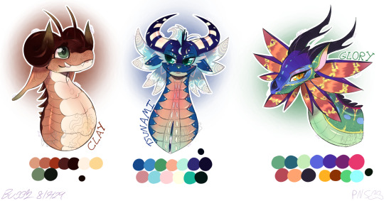
From left to right we have: Clay, Tsunami, & Glory.
These designs are based on what I would I have done if I made the designs for the tribes (bcs I think the Canon designs for the tribes just look... kinda boring imo? Plz dont attack me plz, i just wanna be creative + THESE ARE MY VERSIONS! Not redesigns.)
Anyways some changes I made to them:
Clay now has a grey-ish brown tint which can become even greyer if in contact with water or a bright red color if he goes into contact with heat.
Clay now has droopy ears (bcs you don't want mud in yur ears do u?) & strange antennas to feel the air when going into mud. They're meant to Mimic cattails or rice plants but whatever I was lazy as hell.
Tsu now has a orange underbelly due to the fact that water can also be a orangey brown. (Alos bcs it felt weird to just have a sea dragon only be blue & green with out taking in the fact the same is pretty colorful)
Tsu has semi-squidish eyes. Don't ask why I gave her these i just thought it be neat to give her the eyes of a squid which are round. (Also gave her more head fins bcs well.. FISH!)
Didn't change much about Glory other than her coloration which is slightly based on the moring glory. I did however give her some more patterns & whiskers. (Bcs of what a frend told me)
I did infact swap the eye color of both Clay & Glory since well... Idk I just like it when the eye is a different color from the main body itself.
Thats really it for the changes of these designs.
Anyways here's a bonus of a non-glowy Tsu:
(Also lil Spoiler for anyone who has NOT read any of the WoF books which includes the first book)
Yeh.. Nothing changed much other than the glowy stuff being there.
I know that they look kinda Goofy, especially Tsu, but I HAVENT DRAWN DRAGONS IN AWHILE, ONLY HUMANOID CREATURES, SO OF COURSE THEY WOULD BE A BIT GOOFY!
Anyways uh... Imma prob gonna draw Starflight & Sumby (Sunny) now & maybe make a Skywing fella afterwards named Sulfer who deff isn't gonna be the Skywing that was supposed to be in the prophecy but then his egg got smushed so in this AU of mine imma make it so the egg he was in was STOLEN from Hutvr (I can't spell his name help-) & was raised as a thief. (Bcs in the original Hutvr fracking dies also)
Anyways uh CreMbiTs.
Characters belong to Tui T. Sutherland but designed by me.
Art is mine.
Program: IbisPaint
Bub's TOS: Plz don't repost/steal, trace, or recolor my art WITHOUT MY PERMISSION! If you do, I'll take yur femur and pelvis.. SO, DON'T THINK ABOUT IT! (The PNS on my profile's bio clearly means "Please No Steal" plz follow that rule.)Also plz only remix this project with a project of the same topic... Unless said otherwise by me.
#neptuniadoesstuff#art#WoF AU?#WoF#wings of fire#au design#dragonets of destiny#Part 01#Clay (WoF)#Tsunami (WoF)#Glory (WoF)#Not a redesign by my vers for this weird “AU” of mine
35 notes
·
View notes
Note
want to join the fandom cause it seems fun seeing fanarts and you and others interacting but I don't know how...and with the whole ai thing im scared...
my advice: just do it
really! sometimes all you really need is a leap of faith, and that was exactly how I dropped into the cod fandom. When I joined the ghoap discord server I talked to one of the artist I really like and respected from my lurking time (hi @bressynonym) aaaand the rest is history
I didnt know how to draw properly, nor digitally, all I did was scribbling on OneNote (yeah!) and rambled about cod characters, it is daunting and it is scary to interact but after a while? you may just be able to find someone to brainrot together with
start small, like commenting, reblogging, talking, chatting- doesn't have to be towards artist/writers, it could be the art/fic enjoyers!
you need to put yourself out there if you want something
as to if you want to start in the fandom as a creator, here's some more tips (which are all based on my experience, I am no pro at doing this, hell Im still learning myself, and I am by no means speaking these on behalf on others!)
establish a goal: what are you making? fandom based? original creations?
as with starting new, everything may take a while for stuff to happen, you'll feel like you're speaking to the void at times (esp with original arts, but do know that your stuff do get perceive by others as time goes, I would advise to draw fandom stuff as a beginning to get that boost going if you want! or else it's going to be quite hard to get things rolling)
imo this is hardest part of any new creator, you'll have to bear with it and try not to give up (but I understand how incredibly demotivating it could get, there were times when I stopped posting about Raven entirely, but eventually I post it anyway cuz surely someone out there will like them, it just takes a lot of patiences and perseverance)
btw, engagement can also vary from time to time, you may be booming for a bit, then suddenly you dont, it is a cycle that will bound to happen
take rest regularly, and I mean a break from social media because numbers, discourse and everything can get to you, very quickly (I cannot emphasise this enough)
the numbers are not worth it over your mental health (comes with practice to really solidify this thought)
study the algorithm (pain): see what other creators are doing to get where they are, what tags are they using in their post? what features/niche do people like?(this is, if you really want to grab some form of engagement, bcuz reminder in the end you are creating art for yourself first!)
example: I think posts would get more reach if you tag it with the ship name first, followed by the characters' name (doesn't work all the time tho)
that's the thing about algorithm, it is ever-changing, and you'll have to learn to adapt with it when it does!
expanding on that, studying algorithm could be about ships (for example, ghostsoap is most popular in the fandom), or really good rendered art/flashed out fic that leaves your jaw on the floor, or ships that gets lesser attention in general which puts you, who make content about them, easier to be brought into the light (like Faralex)
bUT, it can also be personality!
(again, not saying this is meant for everyone and strictly from my own experience + what I observe) for me, I made up the lack of my art by establishing a personality: a wild panda who yaps about price and their oc and also kinda everywhere in the place (just like this post LOL), OR you're the person who named themselves after Soap's ash particle number OR you're the one who likes bottom Ghost- literally anything goes, you want to make an impression in different ways, some more funny/goofier than others but it works (be mindful and stay respectful tho, dont wanna be the asshole in the fandom now do ya?)
efforts ≠ engagement (not all the time, but most time) and this is a fact. Sometimes, you can't expect a piece you did for 10+ hours to get thousands views and likes, especially in a fandom space. You need to understand algorithm is that wonky. (very disheartening, but again, you make the art for you and the few others who genuinely likes them, and those people can go a long way) be mentally prepared for such events, and try not to beat yourself up too much for it
ultimately tho, do it, do it scared but do it anyways and again, draw the things that bring you joy, I hope these could be helpful in some ways!
#sorry this got longer the more i typed#i met bressy bcuz i love their oc stuff and we just kinda clicked after a while#and then? i met gog and tappy bcuz of our oc interest like holy shit...someone like MY OC??#it is all a process- the bad and good#but you'll never know these processes until you start making a step towards it#anyways sorry for the tag bressy LOL#gummmyspeaks#ask response#thanks for the ask <3#i should be studying HAHSKJDH
27 notes
·
View notes
Text
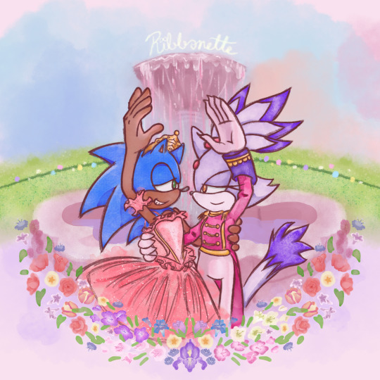
Tribute to one of my favorite movies of all time + the franchise that has me in a death grip 💖
a bit late for Christmas but at least Valentine's day is around the corner ^^;;
Process below if that interests you:
AS I SAID EARLIER, I had been working on this piece as early as December of 2021 😱!!!
This was the original sketch! I was inspired after learning about Blaze's own design inspiration coming from Takarazuka theater, as well as it being the Nutcracker season so this film was in bouncing around in my head.
and this was allllll the way back in 2021 ^^; I had put the idea to paper to capture the image in my head immediately. But the idea in my head was extravagant and beautiful and would certainly take time to complete, as well as the patience and skill to work with watercolor 😔 I've certainly done my share of watercolor, both physical and digital, but I still feel like my physical watercolor work is a fluke, and I was still a novice digital artist at the time of this sketch.
In short, I wasn't confident my skill could live up to the vision.
So I would put this on the back burner. It wouldn't be ready in time for Christmas, and I could use this as an opportunity to hone that digital art experience so it could be ready next year!
2 Years Later...
It's December 5th. Fuck it. Let's crack this open again, I tell myself.
SO starting with the line art, it's actually 2 different brushes layered over one another.
I also changed Sonic's expression to be more love struck-looking, because I'm a sucker for romance.
The image on the left is a watercolor line brush, while the right is a pencil brush. The reason I wanted a water color look was because I thought it would make the illustration look dreamy and fantastical, and I wanted that to extend to the line art as well. However, my usual lines on traditional usually veer more towards thick and cartoony from years of studying the Sonic art style, so I really felt like I was working against myself here. I had also asked friends for their input and they preferred the lines on the right as well. If my followers actually do read these blog posts, I'd love if you could comment which line art style you prefer drawing or looking at.
The happy medium was to just combine the 2. Here's a better look at that:
I like it! I think it combines the solid line with the rustic water color grain. Best of both worlds :]
For the actual painting, The most notable thing I can say is that getting the right pastel-y color was VERY difficult to achieve for someone like me who often loves to use bright and saturated colors in her art. I feel like I really set myself up to do one of those "evil art style" or "opposite art style" challenges I've been seeing around. I had to repaint Sonic at one paint because the blue of his fur was WAY too saturated for the style I was going for:
I started with painting Sonic and Blaze in first and then working on the background. I think that's probably the backwards way of doing it but one of the perks of digital art is you can do stuff any order you want when you have layers.
The background wasn't actually as difficult as I thought it would be. I wasn't going for any difficult perspective, and I was using a reference so that could be it. I'm usually averse to backgrounds but I really wanna tackle more of my weak points in art. I actually had way more fun than I was expecting, painting the sky and adding texture to the grass. I think I had the most fun rendering the water coming from the fountain (which you can't even see too well anyway, lol).
Funny enough, I had just about finished painting the characters and background by early January. So why am I posting this in February?
The Flowers...
In case you don't know. I love flowers. I love looking at them, I love learning about flower languages, I love drawing them. so seeing that my reference image showed flowers circling the fountain, I was excited! I was already having more fun than I expected to be having (working against my usual style, rendering a background), so how could this be a pain in the ass?
Well, I am my own worst enemy 😞I couldn't exactly identify each flower offhand from this screenshot alone. The texture of the flowers is kinda grainy, since I don't think the animators were expecting viewers to look too closely at the set piece to use as reference for my lovingly crafted crossover fanart. If anyone has this in high quality though, please tell me.
(I think I actually got this reference from a tumblr post but I can't find it on my blog for the life of me nor can I find it in the tags I'm so sorry)
I'm a huge stickler for details so I really wanted to be as "accurate" as possible in my illustration. I can hardly identify some of these flowers with confidence. I think there are roses in there? or tulips? I'm not sure if those yellow flowers are roses or some kinda petunia or if I'm way off.
I'm sure these details won't matter to most viewers but it was EATING AWAY AT ME. Eventually I decided to try drawing in flowers that might look similar to the ones in the reference. Or some based on their flower languages. I was certainly overthinking it ;;;; It led me to going "fuck it" and just throwing in whatever I wanted. There are no irises visible in that screenshot but I made it the centerpiece of the flower ring. Who give a shit.

I made some guides for me to follow: The blue ring was so I could make sure the flowers make a half circular border around Sonic and Blaze. I was envisioning how it could look as like an icon or sticker or something, which is why it's framed this way. then the second guide is the sketch of the flowers I made. I always do line art and I'm not great at just improvising with color to paper, or color to screen in this case.
The rest of this process is then just working on each flower piece by piece (with the help of the mirror tool of course) with varying degrees of detail. Some flowers are more abstract than others, and I had debated if that would look jarring and disrupted any kind of harmony I was trying to maintain with the style parameters I set for myself. And then I decided I was overthinking it once again which is why this was taking me nearly 2 months to complete.
At some point during this process, my wifi went out for a whole week! Of course, I could still work on this illustration offline, but I had a lot of tabs open with a bunch of reference images on there (plus I like to listen to music while I draw otherwise I lose focus and I had neglected to download a varied selection on my phone or laptop 😭 Learn from my mistakes).
The most tedious of this process was making each set of gladioluses a unique color.
Was it worth it? You tell me! I think they're pretty, at least.
Along the way, I repainted the grass because it wasn't symmetrical (It didn't need to be but I had been using the mirror tool for a lot at this point and it was bugging me). I made other little final adjustments, like color adjusting the leaves on the flowers, lowering the flower ring border, and so on.
Ultimately, I'm extremely satisfied with the final product. I had my heart set on doing something like this for a long time. I had so much fun just experimenting throwing on color or not worrying about technical stuff. Of course, I did do what I usually do and overthink it at some points, but I'm working on it!
I've wanted to do an extremely indulgent AU illustration and other drawings for a Sonic x The Nutcracker story for a long while. I will be totally honest, I'm still a little embarrassed to share stuff like this, even after years of posting fan art online. It feels like the more self indulgent something is, the more people might judge me for it ^^; But I wanna practice what I preach and kill the thing inside me that cringes at my harmless attempts at joy and whimsy.
I would love to do some more drawings for this AU, but maybe post them around December when it would be more seasonally appropriate. I hope you'll stick around for it!
If you read this whole thing to the end, thank you. Whether you follow my blog or not, I hope you have a lovely day :3💝
#Barbie in the Nutcracker#Sonic the Hedgehog#Blaze the Cat#Sonaze#Jess's Digital Odyssey#Sorry for not posting frequently it may happen again
84 notes
·
View notes