#because I didn’t (and don’t) have a consistent artstyle doesn’t look good
Explore tagged Tumblr posts
Text
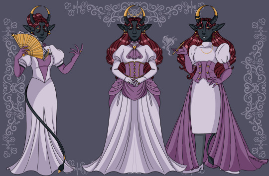


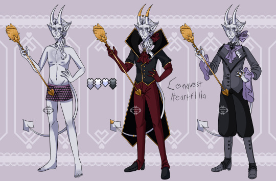


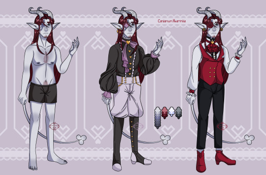

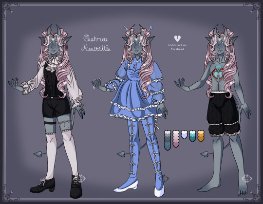
I don’t think I ever posted a side by side comparison of my old (left side) character sheets vs recent (right side) ones for Cashmere and their fam! I think I’ve deffo improved since I made the first ones but there’s still a lot I could improve on as well!
♡ if you like my art please consider buying me a kofi ♡
#deity’s doodles#my art#artists on tumblr#dnd#d&d#dungeons & dragons#dungeons and dragons#character design#dnd oc#d&d oc#tieflings#tiefling#cake#cake heartfilia#conquest#conquest heartfilia#cassiopeia#cassiopeia heartfilia#calliope#calliope heartfilia#cardamom#cardamom heartfilia#cashmere#cashmere heartfilia#for the old ref sheets you’ll notice I for god knows what reason decided to do diff poses for each outfit which was just unnecessary and#because I didn’t (and don’t) have a consistent artstyle doesn’t look good#I also did them all with gaps of time between them which may or may not be noticeable idk#whereas for the new ones I did them all in like the span of a like a couple of months#I’m still most unhappy with how cake’s newest ref sheet turned out I feel like it’s just. ugly#I’m also not proud of calliope’s
109 notes
·
View notes
Text
Thomas Astruc Newest Interview:
Thomas Astruc and Zag recently had an interview which they talked about things from season 6 specials and so on…
I am not 100% sure how official they are, so, don’t take this 100% seriously.
Spoilers below:
1- Vesperia isn’t forgotten by the writters.
They said that she hasn’t appeared in any posters yet because her model isn’t complete, and that she is important, and that the team does care about her…
(Wow, the team cares about Zoe/Vesperia? The girl that they added in season 4 and threw under the bus the moment they got rid of Queen Bee? The girl that didn’t even get a Kitty Noir transformation? The girl whose plot in Representation about getting a girlfriend that I forgot the name was deleted due to the runtime? Keep telling your lies, Astruc… keep telling your lies…).
(No, I don’t agree with the hate she gets. I like Zoe. But Astruc saying he cares about her, even after all he did is a bit… annoying to me).
2- The Japan Special is the next one:
They haven’t confirmed anything, but, since Zag said that Lady Tiger will be very important, cause she will be their first hero with cancer, and that we will meet her very soon, it’s very clear that this teasing indicates Japan special is next. And Rio Special is forgotten once again (wow, as a Brazillian, “thanks”, Thomas).
(I am also worried about how they will handle cancer, considering they didn’t even make what Rose’s sickness clear).
3- Samg won’t be returning:
Yeah, that’s it. Their lost work is the London Special. The artstyle will change, and they will try to keep the animating on France only due to the leaks.
4- Season 6 will be filled with hints that the audience will look with new eyes on Season 7:
They said that, once we start seeing season 7, out view on season 6 will change completely, and that these hints will be bombastic.
(right, they are “very good” with foreshadowing. And by “foreshadowing” I mean either blatant teasing for future events, or retcons).
5- They are considering a Live Action for Miraculous… again:
They said they still need to rethink and see if their budget can handle it… I hope not, it would be probably really bad with bad CGI.
6- Other Magical Creatures:
They said that there probably are other magical creatures besides kwamis and renlings out there.
(wow, we barely know 10% of the kwamis that exist, and they want to create more magical creature. I will just say I hate when people create more and more elements before flashing out their older ones. It’s lazy, it leaves many questions open and, summing up, just not nice).
7- The reason why Lila has become a villain and wants the miraculi was already revealed:
They said that they have already left enough hints to why Lila has become the new Hawk Moth, it’s just that we, the audience, didn’t pay enough attention to it.
(I wonder this time what will be the retcon. Lila is as old as Master Fu and is a rebel from the Order of Guardians? She is Manon from the future? Either way, I doubt it will be convincing. Except if it is that she is an orphan that wants her parents back).
8- Thomas Astruc already created many miraculous AUs:
Yeah, even the show’s own creator likes to make AUs about it. His favorite one is where Ladybug is similar to Sailor Moon and she leads her own super hero team. In this AU, there is also no romance.
(I wonder if any of his AUs are better than the canon he writes).
9- The Melody Movie I back on production I guess:
Zag explained about the movie synopsis, which is about a girl needing to learn how to trust herself with the power of music (yes, it’s pretty generic), and the main character will be voiced by Katy Perry.
10- Chloe will be back:
And no, she won’t be getting a redemption. Astruc said that they try to write their characters on a logical way, so that they are consistent. And, no matter how hard they try, they found no way of Chloe regretting her actions and be like “Oh, Marinette, I was so mean to you!”, so, it doesn’t matter what he wants, it’s Chloe’s fault she doesn’t want to get better…
(I am not even a Chloe stan and this angers me beyond relief. First, they try to write their characters with consistence. WHEN? ‘Kagami’s friendship with Lila, Felix’s redemption, the whole amok plot, anything related to Lila on season 5, the fact they changed why Marinette broke up with Luka, the concept of the bee’ are anything but consistent. And say that Chloe can’t get a redemption? There are many ways for a character to get a redemption. Amity and Hunter from Owl House, Peridot and Lapis from SU, Sasha from Amphibia, and Zuko from Avatar all got a redemption. If you guys don’t want to give her a redemption, fine, but don’t try this whole “she can’t”, she is a character! And you guys are writing her!)
(Also, bringing Chloe back? I though you guys were trying to break the formula with the season 5’s wish, not go back to it).
11- The Story will change:
Not because of a reboot or anything, they just want to make it more serious and gradual.
(No comments here).
12- The Team has ideas for how 12 series of miraculous would be like:
They know for sure the 6, 7, 8 and 9 arc, and are also still unsure of what to do with the opening.
(12 seasons… when shows like Steven Universe gets 5, the Owl House gets 3, and many others get only 1).
13- Andre will get a redemption arc:
Thomas said that, unlike Chloe, he clearly wants to change, and the scene in Collution was a big character point for him. They also want to, someway, somehow, tell about his and Gabriel’s backstory someday.
14- Fun Facts:
The Supreme (the bad guy from Shadybug’s universe), will make a comeback at the series; Zoe’s crush at Marinette was due to love at first sight at the bakery (I think this is cute); the writers love Rolland because he was inspired by Thomas grandfather (and Simplifier is their favorite episode due to this fact); Akumatized!Marinette is a possibility; the writing for season 6 is at is peak, and a better version of season 5 (wonder which criminal boy will be redeemed and which girl won’t get the same treatment and be sent to live with her abusive parent).
15- The whole story we saw until now is only 5% of all he showed Zag when he pitched the show:
You heard that right, miraculous has still 95% of stories to give to us.
(I know that Superheroes usually have many arcs and stories they face, but that’s mostly because they are usually on comic format. I am not sure if it’s worth telling so many stories in a cartoon series).
Now, I leave to my miraculous mutuals @natedogx15 @nerd-chocolate and @artzychic27
to share their opinions. They might even change my mind for season 6.
9 notes
·
View notes
Text
#10: Felix, Part 1: Introduction
Well, here we are. This is the big one.
This is what I consider be the worst episode of Miraculous Ladybug, because it is a complete microcosm of everything wrong with the show. Poor romance shenanigans, cheap recycling of past characters, Adrien and Gabriel whining about the loss of their mom/wife, and all of it driven by Astruc trying to push his agenda against a fictional character that he created. Well, sort of. Yeah, rather than talk about the episode itself, I want to to over the history of the character it's focusing on first, because you need to know to understand how insulting this episode is.
youtube
For those who don't know, one of the earlier drafts for Miraculous Ladybug gave it an anime-esque style as opposed to the CGI animation we got today. The dynamic between the characters who would become Marinette and Adrien was a lot different. Instead, the crush Marinette had on “Adrien” was much more blatant, with “Adrien” verbally turning down Marinette's advances instead of simply being oblivious to her crush.
Likewise, Ladybug and Cat Noir's dynamic was different than the final project. Instead of creation and destruction, Ladybug and Cat Noir's Miraculous has the powers of good and bad fortune respectively. Naturally, Cat Noir didn't want to wear a walking bad luck magnet, so his pursuits of Ladybug were motivated to get a kiss from the heroine so he can remove the ring, which he can't unless he gets said kiss.
The short preview is referred to by the Miraculous fandom as the PV, and has become the subject of several fanfics and AU's using the characters featured. While Marinette's counterpart was named Bridgette by the fans, Astruc officially named Adrien's counterpart Felix on Twitter. They're both like OC's shared by the fandom and are still popular to this day.
And ever since the official show started airing, Astruc had several opinions on Felix as a character. At one point, he said that even if he wasn't fit to be a main character, Felix was still an interesting character.

And then a month later, he said he wasn't an interesting character.

And then almost a year later, he said his dynamic with Marinette wouldn't work at all because Felix is a “weak character with cliché psychology”.

And a few weeks before the episode I'll be talking about aired, he said that Felix was flat-out evil.

Way to be consistent, Astruc.
Whenever someone asks about the PV, Astruc usually responds with scorn, saying how much he feels it wouldn't work like what we have now. I understand why Astruc doesn't like to talk about the PV, as nobody ever looks back fondly on their rough draft, but he always acts so negatively around PV fans as if they said they think Chloe isn't evil incarnate.


Yeah, about that last one...
Now, remember at the end of my “Animaestro” post, where I said I had a huge tangent saved for a later post, specifically on the footage used for the Ladybug movie?

Yes, despite saying how much he hated the PV, its artstyle, and the supposedly darker tone it was planning to take for years, he used footage of the PV for the in-universe Ladybug movie and framed his self-insert in “Animaestro” as being proud of his work that he supposedly spent three years on. There is no way that Astruc actually meant what he said in that episode all about his work, and the only reason he even touched the PV was so the animators didn't have to animate anything new for the movie footage.
Astruc, you really think you can claim that you actually like the PV after years of insulting anyone who brought up? Because after watching “Felix”, I don't think you're being honest here. You hate anyone who even mentions the PV because you see it as Miraculous Ladybug's awkward puberty phase. We're all embarrassed of the past, and we try to forget it, but it's not like someone mentioned an old girlfriend you had a bad breakup with. It's a simple animated short that shows a different way Miraculous Ladybug could have turned out. I have never heard of a creator who hates his own work like you do, Astruc.
As usual, I get that he doesn't like it, but Astruc just has to act like a jerk to anyone who brings up the PV because he didn't like it, yet is more than willing to take credit for it so he can look good.
So yeah, now that I've gotten that out of the way, I'm finally going to talk about “Felix” in my next post. Please pray for me as I try to explain how awful this episode really is.
Here’s Part 2
#immaturity of thomas astruc#thomas astruc#thomas astruc salt#miraculous ladybug#miraculous ladybug salt#felix agreste#felix graham de vanily#felix salt#bridgette
255 notes
·
View notes
Text
pokemon rant time
this one’s about the 2 new things, and is at least slightly intended for people actually excited/interested in them, click keep reading or perish
Gonna try and keep stuff short cus there's a lot of topics this time and I've already gone off about how pokemon Isn't meant for me or meant to be a good video game anymore, but gamefreak is right back on their bullshit, so I feel I need to at least point it out.
I'd like to preface all this with, if you are a fan of pokemon still, please realize you can ask for more out of this series. Expect perfection, even if you don't think you'll get it anytime soon. Pokemon won't go anywhere, the old games won't go anywhere, and gaming is a hobby, not a necessity; don't accept low quality products from a company just because you feel like you're supposed to.
With this next wave of pokemon games, gamefreak is clearly testing how little they can put in to a $60 game while still keeping the 2 major audiences they've cultivated. By responding to the most obvious and vocal complaints from the community, gamefreak is aiming to make games that seems like what most players want, without having to put in the work on quality products.
GEN 4 REMAKES Pokemon BS (I am not calling this shit BDSP) is intended for the audience that put up with let's go and RS remakes. The most vocal and obvious complaints for these games is their failure as definitive versions of the games they are remakes of, such as missing features/content, or drastically changed story/dialogue/style. In a way, the recent remakes are inferior versions of incredibly old games, which shows a lack of improvement in pokemon as a whole.
To address these issues, BS is very, very, VERY clearly aiming for a more 1-to-1 recreation of the DS games, but with fully 3d graphics. Clearly the map layout has been transferred exactly, and gen 4 already had mostly 3d environments to begin with, and everyone knows about the future-proof pokemon models at this point, so the amount of effort required to create something like this is absolutely minimal. Assuming dialogue, trainer teams, move lists, etc. are also lifted directly from DP, then this game could be developed in basically no time at all, leaving the team time to ensure the product is of decent quality and includes ALL of the content of the originals, if not more, like the earlier pokemon remakes did to ensure they were truly definitive versions of the games. That being said, it is unlikely the team behind BS has been making use of this saved time to improve the game.
One failing already clear is that the quality is not very good, at least graphical quality. The footage we have shows environments lacking in color compared to the original, with messy, unpleasant textures that contrast poorly with the simplistic environments. The characters especially do not work. As cute and fun the fanart of tiny dawn has been, BS dawn and all other characters look awful. They have gorilla arms that reach down to the floor and lifeless faces, as well as incredibly stiff/simplistic animations. As it stands, BS is a visually inferior game to DP, though most consumers will simply see it as 3D>2D without any understanding of what an artstyle is, so this might not be a problem for many, but that doesn't mean you should accept it.
What remains to be seen is what content will be added/missing from pokemon BS. It is very possible that massive parts of the game, such as the underground, variety of online modes, postgame areas, and content from platinum could be missing entirely. We also do not know if pokemon from after gen 4 will be worked into the region, or even supported. Gen 8 still currently does not support a large number of pokemon, and the remakes may continue this limited dex trend.
Even assuming the remake includes everything from the DS games and doesn't add anything that slows down the story or harms the experience, it will still only be an exercise in forced obsolescence. The main reason people can't really play DP still is that the online isn't supported anymore. If BS turns out to be exactly the same as DP, then you're buying the same game for at a higher price, only to play it until the online service goes away again, or the next game comes out, if both don't happen at the same time.
Don't let yourself buy a 13 year old game at twice the original price.
GEN 4 NOT-REMAKE KIND OF NEW THING On to legends now, gamefreak is targeting the people who put up with sun/moon and sword/shield. The obvious problem with those games to most people was simply a lack of change from the standard pokemon formula. Even when changing the gyms to trials or stadiums, most people still understand that the format and story structures are mostly unchanged. Of course, this problem has seemingly been addressed by changing the game structure a fair bit, but almost entirely by removal.
Trainer battles, and by extension, gyms and tournaments/elite 4 have been confirmed to be absent, meaning all battles are only vs single pokemon, in spite of the player likely having a team of 6 pokemon. Even if battle difficulty is increased to compensate (doubtful), this will still drastically increase the simplicity of combat and make it even less likely for the game to include any meaningful challenge. Exploring towns and meeting NPCs is also seemingly missing, as the game is confirmed to have only a single village, which frankly looks incredibly boring and we've yet to see a single NPC inhabiting the village.
Battles now use an ATB format instead of a turn-based format (for those of you who don't know what that means, it basically means nothing, it's still turn based, it just means the speed state determines who gets more turns instead of who goes first, that's it), but beyond that there seems to be no noteworthy changes, pokemon learn 4 moves with limited PP, type advantage will still definitely be the most important aspect to battle, and the player being able to walk around during battle provides no meaningful impact. While the little dash the pokemon do to approach each other is cool, it is already a sign that gamefreak will not be addressing the issue of lacking animations for pokemon battles, as they can't even be assed to animate and program pokemon walking around the environment during combat, and lucario doing 1 kick for a move described as a series of punches isn't a great sign either.
On the topic of lacking animations, the new "pet simulator feature" for legends seems to be an advancement on the ride system from sun/moon, which presumably people missed from sword/shield. Being able to ride on your pokemon to do stuff sounds cool, but in all likelihood, this system will be limited to only a select few pokemon who will each do a select few actions, and is not a reasonable replacement for all the other pet raising features that have been removed in the past. Similar to BS, the total number of pokemon included may also be limited arbitrarily, in spite of the fact that no new pokemon need to be added, as these games are not claiming to be a new generation.
The largest issues I personally have with this new game is the horrible technical quality and gameplay quality shown in the initial trailer. Unfortunately, these types of problems seem to be difficult to explain to the average consumer, even though the issues seem incredibly obvious and inexcusable to people like me. Most people were able to understand the problem with the berry trees in gen 8, because it was easy to explain, "this tree doesn't look like the other trees, and it sticks out, isn't that weird?", and so gamefreak has eliminated any immediately obvious issues like that, sticking with a very consistent artstyle for legends, making it almost impossible to easily explain its faults to the average pokemon fan.
People have been really quick to compare legends to BoTW; the game that invented grass, trees, and mountains. In spite of these comparisons, nobody seems to point out that legends looks dramatically worse than that almost 5 year old game from the previous generation. Plants are stiff and lacking in energy, draw distances are poor, colors are drab, and textures are messy. Many parts of legends seems to ape BoTW on just the surface, essentially just following market trends. Even the controls seem to follow after modern 3rd person shooters/stealth games, including a seemingly pointless roll and a clunky looking ball lobbing arc that feels unfun before even getting to play it myself.
The largest issue, painfully obvious to some, and impossible to explain to others, is the framerate. The trailer clearly was ran on actual switch hardware, and not prerendered, which would be a good mark for gamefreak if it didn't result in a trailer that never once hit 30fps. Even with empty fields, with only 1 or 2 characters on screen, the game was incapable of meeting the target speed, and had to resort to optimizations like reducing the frame rate of pokemon only inches away from the player to stop-motion levels of choppy. If situations with almost nothing going on result in slow-down, how will the game perform during actual gameplay? Even though slow-down is something everyone can feel, many people aren't capable of identifying it.
The major things to wait and see for legends is if the removed aspects of the series are made up for by some additional systems or content, and definitely wait to see if the performance improves. As with BS, preordering a game like this only shows that gamefreak only has to market the game by saying it's different, not improved, like they've been doing for years now.
TL;DR FUCK GAMEFREAK One major thing of note is that gamefreak is releasing 2 games based on gen 4 at the nearly the same time, meaning they have no obligation to design new pokemon or even include pokemon not from sinnoh, and also that the sales of each game can be used as an indicator for which of their 2 audiences is more loyal to them. Both BS and Legends are in a position to be pushes aside if they fail, but if either succeeds, gamefreak can continue in the direction of the more successful game and reap the benefits, without any need to innovate, improve, or adapt to criticism.
The last thing I feel I have to remind people about is that gamefreak is a company; you don't need to be "grateful" to them. I've seen that word thrown around far too much by people who seem to buy pokemon games like its a tax, and not something they want to do. You don't have to suck up to a company that made games you liked as a kid if the games aren't what you want anymore. Pokemon is so wildly successful that it can't possible die, so don't buy the games out of pity, or out of some feeling of obligation. Buy the video games you want to play and nothing more.
Basically, if you are considering getting any of these new games, please wait until the games are out before purchasing them, and decide for yourself if they are worth your money, and more importantly, your time. Preordering these games only lets gamefreak know their audience will buy and put up with anything. They have no real competition at the moment, so the only thing the audience can do to encourage improvement is show some of restraint.
#juvenile rant#pokemon#if you read all that then good job cus jesus that got long#please just respect yourself#you deserve better games#you arent weird for wanting things to be good#anyway have a good night
58 notes
·
View notes
Text
Another 5 underrated Halloweeny cartoons
Last year I make post like this about 5 very obscure spooky cartoons that needed more love. This time Im gonna talk about some cartoons that are quite known but could also be more popular. As I said last year, if like me, you wanna watch every cartoon in existence, here are some 5 underrated cartoon series to watch in halloween.
1) The Real Ghostbusters
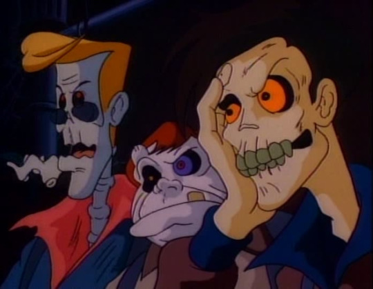
This one was actually one of the most popular things back in the day, and to this day you may find some remains of its once huge fandom lurking on the Internet, but the idea of this post is to make new people interested in it, specially young ones.
As you may know, most 80s cartoons were practically long commercials for selling toys and this was no exception, HOWEVER, the execution here was so great you easily forget it. Sure it was quite cheesy at times and the script got worst past the first couple seasons (this because some of the best writers quit after some pretty terrible and misogynist decisions the producers made), but trust me, the main reason to watch this is because it was WACKY as hell. Some scenes really catch you off guard, you don’t expect a lot of things to happen, either because the writers were master minds... or they just didn’t care and wrote the first thing that came to their minds.
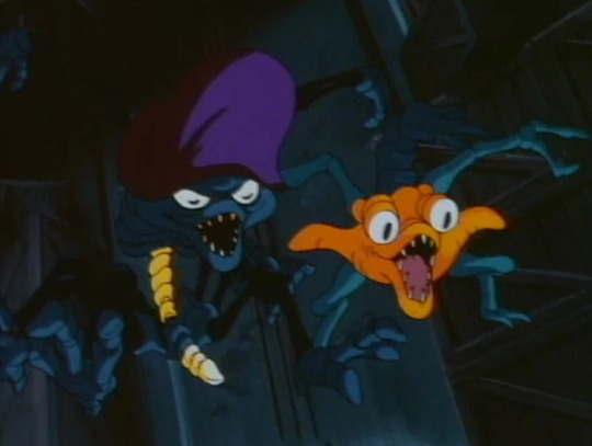
And then, there is also the ghost designs. Just look at those things in the image above! What the hell are those supposed to be? the ghost of aliens? They dont look like death people at all! There are so many good ideas in this show that are incredibly inspiring, specially if you like to design creatures like me. And the animation for its time was pretty cool too!
I would also recomend the sequel show, Extreme Ghostbusters, which was a pretty good follow-up and also counts with wacky creatures designed by the amazing Fil Barlow!
2) Aaahh!!! Real Monsters

Another one that was pretty popular back in the day, basically Nickelodeon’s gold mine along Rugrats and Ren & Stimpy. This one also had a lot of incredible monster designs so full of personality and an incredible voice cast that goes from Charlie Adler to Tim Curry himself. At least for me this show seriously did better work recreating “monsters as a kid would imagine” than Monsters Inc or Foster’s Home for Imaginary Friends.
The Gromble specially steals the show with its Dr. Frank-N-Furter-like personality, every single of his lines could be your seniour quote. Really so much thought in these creatures, making multiple gags about their appearances or abilities, rather than just being randomly designed monsters.
Is kinda sad that modern shows wouldn’t try an artstyle like this, specially because people nowadays would label it as “too ugly”.
3) Garakuta or Mr. Stain on Junk Alley
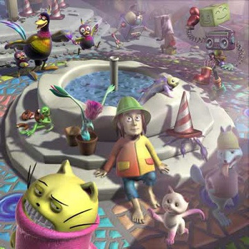
A pretty obscure one! Shall have probaly saved it for another list? Anyway, a lot of you may know Popee the Perfomer, a creepy cartoon by Ryuji Masuda that usually makes into “topz 10 mast disturbenz car2ns lol”, and it was indeed pretty unsettling. But before that one Mr Masuda make other interesting cgi projects that really deserve some recognition too.
One of those was Garakuta (also know as Mr Stain on Junk Alley), and used to air on Adult Swim (at least where I live >:( ). It consisted in short 10-minute episodes about a hobbo living an alley full of garbage as well as a lot of creepy crawlers. It may wasn’t really “halloweeny” or “spooky”, but at least half of the episodes revolved around scary stuff and creatures, but somehow always fnishing in a funny gag or almost ghilbi-like tear jerking ending. The uncanny 2000s cgi just adds to the creepy factor, aswell as being a silent show with no dialogue at all adds to the “classic fairy tale” feel.
I do actually consider this one an anime since is totally japanese ^^.
4) Making Fiends

Oh god! one of the saddest ones! And not because of the show itself but because of the story of its production. Basically, this one started as a series of internet shorts by Amy Winfrey on early 2000s, you know, the time for internet stuff like this (ie: Salad Fingers). Nickelodeon noticed it was kinda popular so decided to buy the rights to young and inexperienced Amy and make a full series. It sadly didn’t do well enough, and as is law on Nick: if its not a inmediate sucess... them cancel it and replace it for more crappy sitcoms or moar Spongebob. Poor Amy was left alone with no work and not being able to make more Making Fiends on Internet since the rights didn’t belonged to her anymore.
The premise is basically what the title or theme song tells you: a Mandy-like girl called Vendetta has a whole city scared under her control, she has the ability to make creatures that follow her orders and like to terrorize the citizens, but then another girl called Charlotte came, with a totally opposite personality to Vendetta she tries to be everybody’s friend, and of course, worlds collide! Unlike other shows of this kind, Charlotte doesn’t try to make Vendetta a “good” person, she is just being herself while Vendetta is also being herself, 2 different queens wanting to rule their world in 2 different ways.
At least the show kinda generated a little cult following with time!
5) Warau Salesman

I already talked about one anime here so lets talk about another! Literally meaning “The Laughing Salesman”, this show got a little more popular this year after some review on youtube came sometime ago. However, IT CAN BE MORE POPULAR RIGHT!???
As practically every other show on the list, this one is also episodic, which is kinda weird for an anime, isn’t it? It just doesn’t tell a continuous story, is more like... gotta quote that one review... The Twilight Zone, every episode we know about some random person who wants something in life, till sometime its complaints are heard by this humble gentleman called Moguro Fukuzou, who promises to solve all his/her problems free of charge!!! Just... do exactly what he says, really...
We really never know what’s the deal with this guy, the main attraction, the show itself, is he a demon? just a horrible person? what are his ambitions? is he actually evil or just like to do awful pranks?
This show actually actually got a decent remake recently! but didn’t do good since an anime that is not about school teenagers with superpowers is not profitable these days.
PS: this is one of those anime that I would actually consider “adult” since most of its episodes revolve the adult working life, alcoholism, money, taxes and how hard the life of the average japanese businessman is.
Let’s finish with a bonus of some specials mentions that also deserve a watch, may talk about some of these shows in the future!
Martin Mystery, The Drac Pac, Gravedale High, Mr Meaty (mostly gross and unsettling than spooky), Monster Farm, Toonsylvania, Hilda, Victor and Valentino, The Funky Phantom, Legend Quest, Creepy Crawlies (1987), Gegege no Kitaro and of course YOUR SUGGESTION HERE and the Moomins, yeah THE MOOMINS, because 1) is not really underrated, became pretty popular again this year after the new series premiered and 2) While most tumble talks about how the 90s show was pretty cute and how gay Snufka and Moo-man were and all that...
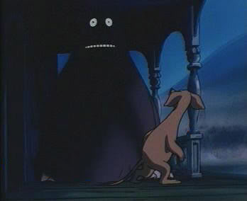
the show itself wasn’t always cute...
#Ghostbusters#Warau Salesman#Making Fiends#Aaahh!!! Real Monsters#Garakuta#Moomins#cartoons#Halloween#Halloween 2019#the real ghostbusters#spooky cartoons#halloween cartoons#laughing salesman#Groke#Ryuji Masuda#Mr Stain on Junk Alley#cult cartoons#cult animation#klasky csupo#top 5 cartoons
84 notes
·
View notes
Text
Radiata Stories review! (spoiler free - long post!)
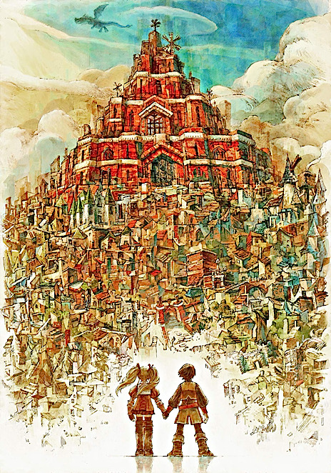
I am SPEECHLESS. I can't believe I spent so many years without knowing about this game. My friend thoroughly recommended it to me but with my ps4 and many other pc games, I just wasn't in the mood for a ps2 oldie. But here I am, and I want to spread the word: play Radiata Stories.
In the world of Radiata, the land is divided into regions that belong to different races: elves, dwarves, orcs, humans (and ronsos – no, sorry, wrong game – but you can't fool me there's a lion guy who looks like Kimahri from FFX). These species have been at odds since time immemorial, and thus the dragons – Earth, Water, Fire, Wind, Silver and Gold – have guarded their beings from above.
We follow Jack Russell, a 16-year-old who dreams of becoming a knight. We accompany him to the entrance exams, only to see him fail miserably against a girl, Ridley Silverlake. Despite his clumsiness and obvious embarrassment for having been defeated, he's allowed to join the Radiata Knights, alongside Ridley, only because he's the son of an important late knight. They form a new brigade called Rose Cochon, under Captain Ganz Rothschild's leadership.
This trio will be sent into action in no time. Their dynamics are fun and there's a bit of rivalry between the two new knights, but they get things done. Ganz is proud to finally be able to be captain of his own brigade, and regards his two pupils with care and wisdom. This seems to be the flow the story is going to follow.
An important quest arrives: Rose Cochon brigade must reach the Elf Region and ask the Light Elves leader for a favor. However, things get tough in their journey there: a blood orc attacks the Dark Elves village, and the brigade plunges in to fight and defend.
In the battle, Ridley gets mortally wounded. Jack gets all frantic and desperate, and the brigade asks for the Elves' help. Lord Nogueira, the Dark Elf leader, decides to do the unthinkable for non-humans: the only way to save Ridley is to perform the transpiritation ritual, a spell only available for elves that allows them to take the soul of a dying fellow and use it to heal another one who might still live.
The ritual is successful, and Ridley's soul is fused with that of a small elf who'd died in the battle. Everything seems to settle down for a bit, with Jack and Ganz returning to Radiata City filled with good hopes for Ridley.
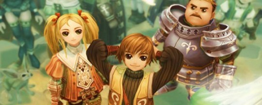
The next day, you're fired from the Knights.
This is where the game opens up for you!
From now on, it's just you, Jack, in the middle of a big city, paving his way to the top of the Vancoor Theater guild, the guild of warriors. Since the only thing you can do is fight, better to put it to good use and earn some money in the process!
The game offers a variety of things to do. You can start recruiting people as party members. You know, like, in Dragon Age, you can recruit characters into your team? Or, in any other rpg, that you have a team of five or six characters, maybe some more? Yes? Ok, here in RS you can recruit (listen to me) over 170 characters. Yep, you read right. Mind you, you can't recruit them (catch 'em all) in your first playthrough, but just so you know, yes, this game is that big.
Some people will ask you for a favor before they're added to the 'friend list', but others will join your right off the bat. Once you have a respectable team of four party members that you choose, you can begin doing solo missions, which are the guild's assignments to you and will redound in money and goodies. You get to know the other guild's members, you get to fight alongside them, you get to know and care for the civilians in the city. With a night-day system, if this game is anything, is alive.
NPC's have their own schedule: following the clock in the top left corner, they do and say different stuff depending of the moment of the day you approach them. They're walking around the city, performing random things, making them seem alive. Some events are only available at night, some others only during day. Some people will be nice, others not so much. Some parts of the city will shine, others will look depressing and dirty. Birds chirp, trees are swept by the wind's fine breeze, mosquitoes swarm around – this game breathes life into its pixels in every corner.
Now that we're on the aesthetic aspect, I must admit, this game looks gorgeous. With a very prominent anime artstyle, still it aged pretty well for today's standards: sometimes the lighting was too real, the sunlight pouring from the mountain's side, the character's long shadow stretching onto the road. The animations are good as well, as are the physics: I am beyond amazed by how well clothes and hairs move as flawlessly as if they were real. Each of the recruitable characters have a different victory pose and they have different lines for everything. Some particle effects are really nice, since I didn't think there existed the technology for it back then. The main city is huge, and when I say huge, I mean, every door you see, you can enter, and inside you'll find at least a two-floor building with objects to interact with and people to talk to. And don't even get me started on how BIG the Vareth Institute is in itself – and all that stuff is optional! The world is also vast and filled with brimming elements, although don't be fooled by the illusion of 3D: this game is, mostly, a 2D experience when you want to go from point A to point B.
You'll spend a good chunk of your game doing tasks for the guild. In the meantime, Ganz is somewhere playing the bandit and Ridley is hearing voices in her head. In this 'middle' part of the game, the story seemed to drag on forever for a bit: I wanted to go on with the main plot, and, while you can actually do that (just hit the sleep option over and over until a cutscene appears), the game tends to make you go through long and tedious solo missions to get that Grind™ you need. Dungeons are not long or too big in reality, but the number of encounters (which are forced on you since you can't avoid enemies by circling around most of the times for the 2D aspect) turns what should've been a walk in the park into a dragging hell. This portion of the game, I'm not going to lie, seemed a bit too long for me. And since the gameplay mostly consists in pressing the circle button and hearing Jack yell "Ha! Haiiyaah! Ha! Haiiyaah!" for ten hours straight, yeah, it can get boring.
But I guess the game was trying to make you feel at ease, comfortable around these walls. You're training your fave party members, you go with them everywhere to play the warrior and earn some money, you get occasional messages from Ridley telling you everything's fine – until the plot makes a halt and suddenly you must choose.
I'll keep this spoiler free, but this game is almost fifteen years old, so these are no news: there will come a point where the plot branches into two possible paths, the Human side, and the Non-Human side. I can't tell you which one is right, for there seems to be pros and cons in both, so I'll let your heart decide. For what we care now, I chose the Non-Human side, completely convinced with my decision, only to see myself doubt in many instances.
At this point, your plot shakes. Your comfort zone breaks. Suddenly, things are changing: your team is not there anymore, Ridley acts weird, where the hell is Ganz, what's going on with the dragons? Who am I supposed to trust in this world full of people who just want to exterminate each other?
I won't spoil it. I'll just say, that whatever you choose, please stand firm by your decision. You'll need that conviction, because the game is going to make your ground tremble a few times. And with those endings that await you – man, I don't know if I want to finish either path.
So, to avoid spoilers, I'll talk about the characters a bit!
Jack is your main protagonist, as you could've guessed. He's your average shonen main guy, at least in the beginning hours. He's clumsy, he wants to be a hero, and he even mocks shonen protagonists by saying that he'll awaken to a dormant power and save the world with his friends. But life hits him hard, accuses him of things he hasn't done, and so Jack evolves across the story. His character development is subtle, but it's there: he starts off as a brat who wants to fight, ends on a mature note, with some quite insightful thoughts and reactions I haven't expected from him. Normally, the shonen guy remains a shonen guy; this doesn't happen here. Jack ends up being an adorkable character, worthy of respect, sympathy, and a force to be reckoned with.
Ridley remains a calm force during the game. She's collected, she's well-educated, and she knows her way around. At the beginning, she can't stand Jack much, but as days go by, she starts to consider him as an equal and true friend. In the Non-Human path, her romantic feelings towards him are crystal clear: there's a small spark between them, that flickers every now and then when the plot allows them a moment's respite. Only them and a handful of other characters know the truth behind the transpiritation event, and as such there's a profoundly deep connection that keeps them together, although they're separated most of the story.
Ganz is ma fave boi and he must be protected at all costs. A young and promising man, Ganz was created to be likeable. You can't help but sympathize with his funny appearance: chubby, huge armor, huge sword, and funny moustache. But he's also a man of wisdom, with a golden heart. He's righteous and wants to do good. And he deserves all the love in the world.
Other notable characters are Genius, a scientist who's obsessed with the transpiritation thing that went down, and may know more about the plot than it seems at first glance; Natalie, a guarding woman who works as Ridley's not-so-secret bodyguard; Larks¸ the leader of the Knights and whose motivations remain a mystery to me even to this day – I can't read into this character at all!; Lord Zane, the leader of the Light Elves, who laughs maniacally when no one is watching and I can't bring myself to like him; Gawain, Ganz's father, who disappeared 16 years ago since his best friend died; and Cross, Ridley's fiancé, who just wants to be the best hunter and paves his way to the top of the knight ranks by any means necessary. I hate this guy so much, his only trait is 'I am a bad person' and that's it, he's so cartoonishly evil it makes me want to punch the screen. Probably you see more of him in the Human path, but unless he has a very tragic backstory to redeem him, he's not likeable at all. I mean, you can say that he has ambition and he gets s*it done, but still, damn him, and his voice actor, UGH.
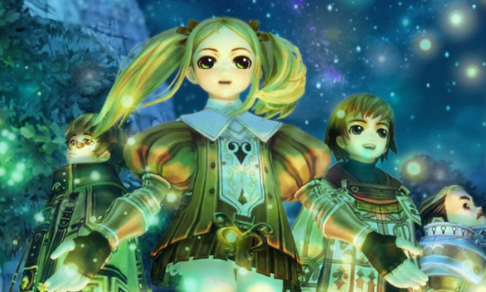
Despite some minor thingies, the relationship between the characters is gold. Jack and Ridley are cute and make me wanna draw the meme of NOW KISS every two seconds. Jack and Ganz are companion goals. Ganz and his father – I loved that they kept their interactions personal and off screen. Idk why, but this story is about Jack, and yes, I care for Ganz as well, but his trouble with his father was his own, not Jack's, so I guess this is a director's decision which I'm 100% behind.
The plot can get predictable at times, but there's also a healthy amount of plot twists that made my jaw drop in a few occasions. I mean, I guessed who the bad guy was since the beginning, but let's face it, it's pretty obvious and the game doesn't hide it. There are other things that made the plot unfold worth my time, like trying to recruit that awesome character, or like what is the deal with Jack's late father, or what the hell is going on with Ganz, and what will happen to the city now that I'm on the Non-Human side? And the game answers them all (I read that the manga answers even more questions, so treat yourself).
All in all, RS is a vast jrpg experience, with high replay value and tons of things to explore. The world seems small, but it isn't. There's always a reward for those who wander off. For a ps2 title, this game is giant. And in the good sense. I thought I had seen the pinnacle of the ps2 era with Final Fantasy XII, but I'm highly considering changing my view on that one.
The endings are bittersweet in both paths. There's not a complete happy ending, I warn you. Things get darker towards the end, and the story knows how to subvert expectations in the good way. Remember Jack saying he wanted to be the hero like in a shonen anime? Well, not happening in this game guys. At the end of the day, this isn't a shonen story: this is a Radiata Story (roll credits), and like in every country's history, sometimes blood must be shed for events to take place and situations to unfold.
I am beyond pleased with this game. I'm considering playing through the Human side now – but first I need to recover myself from this Non-Human ending. I'm not ready to face more tragedy yet.
Go play it. Just do it. You won't regret it.
And pray that Tri-Ace develops ONE DAY a decent sequel.
#radiata stories#tri ace#jack russell#ganz rothschild#ridley silverlake#square enix#videogame#videogame review#review#ps2#valkyrie profile
39 notes
·
View notes
Text
More Thorough Thoughts on Mystery Dungeon Rescue DX Demo
Intro
When I was a kid, the Pokemon Mystery Dungeon series was peak hype. You could actually play as a Pokemon, going on adventures in randomly-changing environments so nothing is ever exactly the same. The story blew me away, surprising me with how emotional video games could be. And that was just the first game, as the second improved upon so many things.
Here we are again, remaking the first games. I’m really excited for people who never played Red Rescue Team and Blue Rescue team to experience the story of the Ninetales curse for the first time. It’s a great story in a great game and it deserves to be seen by more people.
Graphics/Art Style
In addition, this game fixes something I never imagined would be fixed: the art style. When the Mystery Dungeon games transitioned to 3D, they lost the series’ original art style to be replaced with the generic cartoon art style every 3D cartoon game feels like it has. With these filters, it not only regains what the drawn graphics of the original imply, it recreates the concept art with its hatched shading and bold lines. Look at any screenshot of the game, and everything other than the Pokemon looks like a drawn picture, not a 3D environment. It is so pretty and it works so well.
Aside from the Pokemon, though. The filters make them fit in for the most part, but it is very clear that these 3D models (the same ones used in everything since Gen V - GameFreak, you taking notes?) are not made specifically for this game. It’s not bad that they stick out, since in a way, they should, but it does break the concept art look that everything else has.
It does keep Super’s walking animations, too, unfortunately. They animated four-legged Pokemon very generically and it doesn’t look great. The originals had unique animations for every Pokemon, mainly because every Pokemon had unique sprites. Now the uniqueness is largely gone. It’s not a dealbreaker by any means, but I miss Skitty’s pounces as it wanders around town.
Changes from the Originals
The personality quiz will sometimes suggest Pokemon from the opposite gender compared to the original. I haven’t tested it thoroughly, but when I took it, I chose girl and it gave me the Pokemon that used to be male-exclusive for that personality trait.
And now you can choose your starter regardless of the test results. I like the best-of-both-worlds approach here. You can also choose Partner Pokemon that used to be exclusively Heroes in the original, so that’s very neat.
Dungeon mechanics have been updated to be an evolution of Super’s mechanics. The demo ends too early in the game for me to form a full opinion on this. So far, I haven’t noticed it change the difficulty, as moves didn’t really have Base Power in the original as far as I noticed, so Tackle was just as good as Slam. Better even, as it has more PP. Now, you start with better moves, but it doesn’t seem to make it all that much easier. It was already easy.
I can’t say I’m the hugest fan of “press A and the game chooses the best move for you to use,” but if you use Super’s move button combo, you can choose a move yourself, anyways. And there is a “do nothing” button combo, so I’ll just have to get used to using that rather than pressing A when I want to do nothing.
Overall, though, moves are handled a lot better than they were in the originals, at least on the accessing them front. Some people are upset about the lack of a Basic Attack, but I made my farewells when Gates to Infinity came out and made them useless. It makes Max Elixirs less useless.
Story-wise nothing has changed so far other than Diglett being introduced slightly earlier, while also making you a shortcut to the Pelipper Post Office. Not sure if that means more story additions are on the way (I hope so!) or if it’s just a convenience thing with an in-universe explanation.
Really small thing that bothers me, though, is that wandering NPCs in town have zero weight to them. In the originals, NPCs had set ranges and you couldn’t move them. Now, you so much as brush up against them and they slide away from you. Even Gates and Super did it the original way. It feels wrong and cheap the new way; at least in most games that let you move NPCs, you need to exert some force. As it is here, I try to talk to them and push them away in the process.
Conclusion?
As far as I’ve seen so far, I’m pretty excited. But there’s still more to talk about that I will under the cut! It involves mild spoilers found out through the game’s Help Menus.
Pokemon Availability
Here’s something that’s neutral-to-negative: all signs point to these games consisting of only Gens I-III, evolutions/pre-evolutions(?) of Gen I-III Pokemon, Megas and Primals of Gen I-III Pokemon, and Lucario. More than the original? Yes. But in this day and age, it’s not very many. We criticized Sword and Shield for cutting the cast, and even before the DLC those games have more than this game does.
I understand it as an artistic choice. It’s the same reason Let’s Go, Pikachu and Eevee only have Kanto Pokemon. But when I get a new Pokemon game, especially Pokemon Mystery Dungeon, I want to use Pokemon I’ve never used before in that context. And I’ll be shocked if any of the newcomers are available before the post-game.
And not even Alolan Formes are in. The game’s TMs indicate that this game was developed to release during Gen VII, but they didn’t even do the obvious and make the Ninetales that lives on an icy mountain ice-type.
Shiny Pokemon Exist
That’s all we know, but that’s really cool. Apparently the Friend Bow helps recruit them.
Exp. All
Something that started in Gates to Infinity and continued into Super Mystery Dungeon is the fact that every recruited Pokemon gains experience along with you, regardless if they are on the adventure or not.
They changed the name of Friend Areas to Rescue Camps, and one of the Rare Quality descriptions seems to indicate that Pokemon in Rescue Camps gain experience with you.
Unlike with the main series, I don’t really mind it. I find the game more fun when I’m bulldozing my way through everything than I do when I’m struggling. But that’s just me.
I can see this being a disappointment for some. It’d be nice to be able to turn this on or off, especially since it would be funny considering the main series took away that option. But I’m just speculating now.
IQ Replaced
Instead we have Rare Qualities, which it seems some Pokemon come with, but others can be obtained through gummis. Gummis now only come in two varieties rather than the type-based ones, and thus are likely a lot rarer. Likely. I’ve got a job sitting in my Accepted Jobs list that rewards one so maybe they’re not all that rare.
Absolute Mover has an equivalent, so that’s all I really care about here. If I can have a Caterpie that crashes through walls, I’m happy.
Six Additional Story Beats?
The original Red/Blue Rescue Team had 12 total story portraits on the loading screen. DX has 18. This could mean one of two things:
One, it could have more actual events in the story. This I’m hoping for, but...
Two, more of the game’s story could have portraits. The original only showed the Legendaries you encountered, but there’s important events that happen that don’t involve Legendaries. Plus not all of the post-game events had portraits.
So, I want to be excited, but at the same time, I can’t get my hopes up.
Conclusion
I’m still excited, but it’s not exactly what I wanted from another Mystery Dungeon game. The gameplay’s still fun, of course, and I’m excited to see the rest of the game in this beautiful artstyle, but I have to temper my expectations. This isn’t Gen VII Mystery Dungeon where I can play as a Litten, nor Gen VIII Mystery Dungeon where I can have a Sobble partner.
This is Gen III+. It’s the original but prettier and with new mechanics. I’ll definitely love it, but it won’t be what I was hoping for.
8 notes
·
View notes
Text
February 12th-February 18th, 2020 Reader Favorites Archive
The archive for the Reader Favorites chat that occurred from February 12th, 2020 to February 18th, 2020. The chat focused on the following question:
When applicable, what about a creator’s art might convince you to check out their comic?
carcarchu
I like a wide range of art styles so it's hard to pinpoint specifics but if an artist is able to draw very attractive looking characters (recognizable character designs, outfits that don't look like they came out of 2004 gap catalogue, characters that can still be recognized even when they change their hair style) then i find that very appealing. beyond that how well an artist can integrate the characters with the actual space they exist in is something i find very important as well. a bunch of floating heads can only carry a series so far. if the artist can make the characters feel like they properly exist in the space i think it can really elevate the series although in practice this is something very difficult to do.
Deo101 [Millennium]
For me, honestly some art styles are very inspiring to me and that will sometimes get me to read just because I want to see the art more and learn from it. Things like textures, colors, character design... It can draw me in just by exciting me as a learning opportunity
chalcara
For me art‘s the hook and story the line. Come for the art, stay for the story, you know?
Funnily I‘m looking less for pretty art and more for good visual story telling. I want the art to show whats going on without having to rely on dialogue.
Cronaj (Whispers of the Past)
I'm honestly very picky about art styles when it comes to comics, and that's a personal issue It has some to do with art styles being attractive to me, but honestly, the most important aspects of a creator's style to me are (1) consistency of style and anatomy, (2) level of completion, and (3) clear communication of what's happening. When it comes to whether or not I check out the comic initially, the main things that come into play with the promotional materials, covers, and/or thumbnails are contrast of the image and cleanness of the rendering. Of course, obviously, my personal tastes play into it. (I tend to like semi-realistic styles, sort of anime-ish but with a twist, or painted styles that may resemble concept art.) But honestly, probably more important than grabbing me initially to begin reading is readership retention. And that's where the 3 qualities I look for come into play: (1) Consistency of style and anatomy: This is probably the most important part for me as a reader. If I can't tell who is who because the characters change appearance from panel to panel, I'm ducking out, because that affects the clarity of storytelling. I also cringe everytime I see a particularly egregious anatomy error. I know what people look like. I see them every day. If I feel pain from looking at an artist's work, I'm not sticking around. (To be fair, everyone makes some kind of anatomy mistakes, but really it's if the anatomy mistakes are really awful to me and aren't as a result of a deliberate style CHOICE. Keyword, C H O I C E.) (2) Level of completion: This really just means that if it looks like the artist rushed through the panels or they were being lazy, I feel like their comic isn't worth my time. I mean, if an artist themselves doesn't care about their work, why should I?(edited)
. (3) Clear communication of what's happening: Once again clarity of storytelling is absolutely essential. If the composition of a large portion of the panels don't clearly show the actions of the characters, I can't follow the story. Aaaaaand as a bonus: Please, please, for the love of all powers that be, please, make your fonts legible. If I can't read the comic without squinting because your text is too tiny or hard to read, I'm not going to try. I have bad eyesight as it is. Take pity on your readers. I'm not going to suffer for your work. I have dropped far too many comics to count because the creator didn't care enough to make sure that the font was legible. And this applies to both desktop view, mobile view, scrolling format, and page to page format. Just.... Make your fonts big and clear.(edited)
sssfrs (JOE IS DEAD)
That's interesting to think about how recognizable characters are when their hair style changes. I might try to use that as a character building exercise
Deo101 [Millennium]
Solid excercise: can you tell them all apart when they're bald and naked?
Cronaj (Whispers of the Past)
OoooooooOOOOOOOOOOHHHH
I
Might partake that challenge
Deo101 [Millennium]
Also it's really fun to draw characters in all sorts of hair and clothes so idk what id do if I couldn't tell them apart when doing that!!! That's like 40% of my art!
Cronaj (Whispers of the Past)
This just convinces me more and more to do AU art
Deo101 [Millennium]
Yeah aus are another 20% of what i draw LOL
Look im drawing the comic most of the time so I wish to partake in non canon things the rest
carcarchu
@sssfrs (JOE IS DEAD) i've read series before where the character gets a hair cut / dyes it and i'm like WHO ARE YOU? IS THIS A NEW CHARACTER?
Deo101 [Millennium]
Oh another good excercise is drawing your Characters in many different styles and seeing if they remain unique when not in yours.
Cronaj (Whispers of the Past)
I want to do all of this
This is stuff I hardly ever have time for
So I am extra attracted to it
Also, there IS a time later in the comic where a certain character's hair gets partially burned off
And then he cuts it pretty short to get rid of the singed edges
And I feel like his hair is like 80% of his character design
So I'm just a little scared about that
Deo101 [Millennium]
Also, @Cronaj (Whispers of the Past) , I am unsure what you mean by "readership retention" with something that makes you interested in a comic, could you explain?(edited)
Cronaj (Whispers of the Past)
By readership retention, I mean aspects of the art that decide whether I'll continue reading past the first few pages
(obviously story comes into play as well, but I won't pretend that the art in the first few pages of a comic don't contribute)
Deo101 [Millennium]
Oh okay, I thought you meant like how many readers have unfollowed or something
Cronaj (Whispers of the Past)
Nah
More like, "oh cool! Your cover and blurb seem interesting. Lemme check out the comic!"
And then after reading the first few pages/chapter:
"ah... Not for me." Or "Nice, I'll keep reading!"
Deo101 [Millennium]
Gotcha
Capitania do Azar
Ohh I don't feel like dissing particular artsyle choices, but I know a few aren't for me. I'm no big fan of ultra realistic, hyper detailed stuff you usually see in super hero comics (other genres pick that style too sometimes and I still don't really appreciate). I particularly like artstyles that are distinct and recognizable, I have a hard time with stuff from different authors that just looks... Like a carbon copy (sometimes, the style being referenced is waaay too obvious and that is always a big no for me) Good use of color is key. Give me some good values too. I want colors to make sense and I am very tired of pink. I also appreciate consistency. If you give me artwork with a more paintery style but then the comic is cellshaded, that might tip me off. But not necessarily (tho I appreciate inner consistency inside the comic itself). Rushed stuff, like mentioned above, is also not a good look, but only insofar as it distracts me from what's happening in the story. Consistency is a very important word here, because I love seeing a common line that is able to take in all the differences that are necessary in character design and backgrounds, but also make me believe that they all could live in the same world.
Oh! And also: if the artstyle involves using lineart, I am really fond of sharp, clear lines with weight variation
sagaholmgaard
I'm curious about what you guys mean with consistency- do you guys not like if an artist's art style changes over the several years it might take to make a finished webcomic? Is it that it peeves you when the backgrounds are done in, say, a painterly style while the characters are done with lineart? Is it when the artists makes ordinary illustration work in a completely different style from their comic pages? (This is genuine curiosity I hope no one's feeling attacked rn ^^)
carcarchu
i personally really like seeing an artist's skills improve and evolve over the many years it takes to draw a series
even at the expense of a more "consistent" final product
sagaholmgaard
Yeah me too, it's one thing i really like about webcomics
chalcara
Can‘t talk about the others, but I get thrown off when one page is sprite comic, the next painterly, third cell-shaded without having a in-story-reasons for those style changes, like flashbacks or pov-changes. But more commonly, the issue’s the classic „comic‘s usually coloured, but oops, this time you only get the pencils because I had no time to update“. If that happens too often and/or doesn‘t get fixed for the archive I just lose investment in the comic.
Art evolution is natural, both in webcomic and published work with a dedicated artist.
Ah, that‘s another source of inconsistency - people switching colourists or even artists around. Once in a while is fine, but if it happens every month or so, I tend to get annoyed by it. It‘s actually why I killed my first webcomic twenty years ago; it was a collaberation and life kept getting in the way forcing me to switch colourists every five pages or so.
carcarchu
oh actually i have read a webcomic where they changed artist's 18 chapters in. i really fell in love with the magical and dark tone of the original artist and was engrossed in the world that they set up. they had a painterly style and it really set the atmosphere of the entire series but then the new artist had a super clean and cutesy art style and the sudden tonal shift really threw me off. in the long run the new artist was actually extremely consistent and better at actually releasing long chapters and very good quality chapters and the writing actually improved too because of it but it was never able to recapture what it was that i really loved about the original art style. also the new artist changed the character designs a little so the heroine was no longer even recognizable as the same person
since it was relatively early in the series i definitely would have preferred if they just got the new artist to actually redraw the first 18 chapters in the new style just so the change wouldnt be so incredibly jarring
chalcara
Any harsh breaks like that will cause some people to break away from the comic, I found. I dumped one of my favourite-for-years comic because the creator got bored by their main character and completely sidelined her in favour of a group of minor characters I had absolutely no interest in.
Didn‘t mean the comic got worse - by all accounts its still beloved by quite a sizable audience - it just wasn‘t for me anymore.
sagaholmgaard
Ahh that I can relate to. I get super attached to the main character and usually have a hard time getting into any spinoffs with the rest of the cast, even if I want to (and im a hypocrite because i also want to make spinoffs for ever side character in my own comic LOL) i guess if the style changed a LOT from page to page that would throw me off too. that feels like the artist is trying to experiment, maybe making sort comedic comic strips would be more acceptable then? Every style would at least be contained to one strip at least
DanitheCarutor
That's... actually a really good question. I don't really go for a specific aesthetic. Sometimes what's going on in the thumbnail attracts me, or it could be the use of color, the style, a character design. I'll check out a comic with just about any art style. I guess maybe if I have an idea of what the creator is going for with their art? Like, the art may have a lot of kinks, but maybe being able to tell what style they're trying to go for makes me want to check out their work? Honestly, I don't have a really strong art bias, as long as the comic is readable I'll go for almost anything. Maybe I won't check something out if the style looks extremely uninspired... like if it were the most generic, based off Japanese cartoons, style ever then I might give it a pass. But even then I do sometimes check it out anyway, so I really don't know! This question is surprisingly hard to answer! To give my last quip about last week's topic, since I don't want to derail the current one. I feel the creator's personal life is no one's business. I understand if they're a legit bad person, but digging into a creator's life to see if they qualify to be supported is... I dunno. This mindset makes me feel that if someone who liked my work ever tried to get to know me, they would be doing it solely to see if I'm good enough for them, which feels really invasive and predatory. I fully understand most people can't just enjoy something, that's how the world is, it just kinda sucks sometimes. The world kind sucks sometimes. Alright! I'm doing with giving my final thoughts on that subject.(edited)
Deo101 [Millennium]
The question is specifically about what draws you to art, rather than what turns you away so if you don't want to rag on any art styles that's not what it was asking for I think! Though yes it's very closely related (and it's not bad to say what you don't like)
Eilidh (Lady Changeling)
I definitely am more likely to read a comic that has a distinctive style - no particular style preferences, really. Interesting use of colour/value is definitely a bonus. But as long as it's engaging and the composition is good/readable, I don't really mind whether the art is "good" or not.
DanitheCarutor
@Deo101 [Millennium] I wasn't trying to rag on anything. I couldn't specify what about someone's art would draw me to their comic, it was easier to the one thing that might not, but I still said that I may be drawn in regardless. Sorry if I came off like a douchebag, totally not my intention. <_<'
Deo101 [Millennium]
No I know, someone earlier said "I don't feel like dissi g particular styles" I'll be honest I was typing my post as you were and so I didn't even read yours til after I said something(edited)
Just kind of a general thing! Feels like it went to what turns us away instead of what draws us in so just kinda a reminder of the op
sagaholmgaard
Readability is definitely important for me to want to continue following a comic, but what about the art that makes me want to read something...? I definitely have a preference toward cartoony styles overall. A solid character design will make me wanna check out a comic. If the main character has a recognizable silhouette and interesting shape language. I also love really bold lineart, especially if it's used to create shadow and contrast. Interesting color schemes too. I think how the background is drawn can really make me want to read something as well. I know BGs aren't people's favorite thing to draw but to me if the setting looks very well though out and designed, that definitely motivates me to check something out. And awe-inspiring sceneries are always hella cool! I read a lot of things outside of my artistic preferences though, but I think these are the things that might make me pick something up based only on the art itself.
keii4ii
I think I tend to find more appeal in certain compositions, which is a more subtle aspect of style. I am a major sucker for evocative use of backshots/ not-showing-the-(whole)-face, for one thing. Compositions that make full use of the three dimensional space around the figure(s) is another (this doesn't necessarily mean putting a lot of stuff around the character; you can have a mostly empty space and still make it feel very 3D).
(I hope both of those things show in my own works... I just love those things soooo much )
Deo101 [Millennium]
Oh I LOVE when a panel like... Cuts a face. Something about it makes me lose my mind every time
DanitheCarutor
@Deo101 [Millennium] Ooh! Lol sorry about that! I was so caught up with off computer stuff that I didn't notice anything else typing while I was. I haven't read the whole conversation yet, but I can see how it would turn to that. "What draws you in" is a hard topic to stay on. At least I imagine it would be since it's hard for me to talk about.
Ah! I admit I really like shots focused on scale, specifically ones were you can feel how tiny the MC is compared to what the camera is focused on. Does that make sense? Like the panel shows this ginormous thing, and it has the MC in it to show how massive it really is. That's awesome when done right.
Deo101 [Millennium]
Tiny little person. Yes. Very good
DanitheCarutor
Tiny people in giant worlds are the best!
keii4ii
I love those too!
DanitheCarutor
Oh, also this isn't a webcomic, but I've been interested in reading Vinland Saga after seeing this page on Twitter.(edited)
Something about extremely hideous expressions on semi-realistic faces jives with me.
FeatherNotes(Krispy)
What draws me in easiest is the design aspect of characters, environment and the webcomic title! It's a bit of a turn off when the title doesn't look polished. That's one of the main draws for me is an intriguingly designed logo with a catchy name that follows through their chosen aesthetic. I've seen many comics that stand apart from the title image they chose and it's a bit jarring to see! Great examples of wonderful execution of these aesthetics are BlackOut City, O'Sarilho, Sink Your HookTeeth and Shadrunners(obvs there are many more) I have to agree with @sagaholmgaard about backgrounds! There are quite a few creators who avoid them and stick to simple colours and gradients that just dont keep me in the comic- though my fave genres include a lot of world building, so BGs in a romance may not be emphasized as much. Lastly, dynamic character design!! I love a wonderfully crafted cast that allows me to read the characters easily no matter what setting or outfit they're in. Also it's really random but i do love an artist who can draw really good shoes?? That is always a draw in for me (edited)
Capitania do Azar
Oh I meant it in the way that if you spend a lot of time experimenting with different styles and techniques, you'll never be good at any of them. Style and approach changing over time is, imo, inevitable and good :) @sagaholmgaard(edited)
@@FeatherNotes(Krispy) I constantly think my logo looks like crap next to other webcomics', so thank you (edited)
DanitheCarutor
Oh god, @FeatherNotes(Krispy). Titles and logos are legit my weakest point, that part of the comic creation process is the worst! I have this cosmic-horror/fantasy comic I've been developing since 2005, and it took me till just last year to come up with a decent title. It'll probably take another 14 years to come up with a passable logo. Lmao!
FeatherNotes(Krispy)
It is really hard! Because that image/logo and name represents the body of work so firmly, its also got to stand strong with what it's representing and stand up to other titles too! Basically, i like to think of something that will help generate top results when i search on google for the title, which to me helps it stand on its own on the web, and sound catchy enough for pitches in person! I don't want to steer the convo away too much from the prompt, but there is definitely more to discuss about titles and their chosen aesthetics
varethane
@DanitheCarutor have you read Golden Kamuy? If you love hilariously hideous expressions in manga, it seems like it may be your jam lol
(it's also set in a specific historical period and contains a lot of really interesting material about the time/place it takes place in)
Also I feel like I have never, even one time in my life, come up with a good title for anything-- both Chirault and Wychwood are placeholder titles that I used just to kinda name the story for myself, which I initially intended to change when something better came along, and then nothing ever did
LadyLazuli (Phantomarine)
I know I'm generally drawn into a comic if it's just... generally a visual feast? And it doesn't even have to be a beautiful feast - just... a feast! A super intriguing artstyle, beautiful or not, is something for my brain to pick apart and enjoy. Detailed backgrounds, intricate costumes, fascinating presentation/layout... all the way to crazy expressions and fun asides, and even some gory or scary bits to make me go EEK. Basically, if I'm reading it, and my hand is twitching with the prospect of drawing fan art, then I'm in for good.
DanitheCarutor
@FeatherNotes(Krispy) Urg that is such a nightmare! And there are only so many different styles you can do for a logo, and so many variations of words, it's like how there aren't any truly original stories anymore. I got lucky with the title for my current comic, it's the most generic thing ever, but fits in a tongue-in-cheek way. @varethane I've never heard of it, but the face compilations I'm seeing are intriguing! Man, I love stupid facial expressions.
Capitania do Azar
@varethane golden kamuy, I see you are a fellow of taste as well
varethane
(I love it so much)
Capitania do Azar
@DanitheCarutor oh idk about the "only so many things you can do with logos", I've seen amazing things in this world, if there's a limit I'm not seeing it
varethane
(I can always tell exactly when I was binging it because there's a big chunk of my phone's photo gallery that's all screencaps of Asirpa making dumb faces)
Capitania do Azar
@varethane guys shooting each other in the woods? I'm always in for that
DanitheCarutor
@Capitania do Azar Lol I guess? I can't see how you can have an infinite number of designs for writing, while still trying to keep it vaguely readable. But I really don't like lettering, so my imagination is hardcore lacking in that department.
Capitania do Azar
Lettering and logo design are their own fields of expertise, it's ok
meek
Hmm I'm similar to a lot of previous responses where I can't pinpoint a specific style or trend of art work that draws me in because the styles of comics I read differ incredibly. That being said, there are some things that I do look for to keep me coming back: 1) Consistency of style/anatomy: unless there's a specific reason for the general art style to change (not including semi-deformed or chibi versions of characters), I appreciate characters staying proportionate or just otherwise consistent throughout the comic. And art evolution isn't something that's at odds with consistency, it can actually help that by making characters more distinct and easier to distinguish from each other. 2) Potential for art evolution: Almost the opposite of the previous point lmao but if I find a new comic and I see the latest page is of a much higher skill level than the first page, I'm immediately hooked. I want to see the journey. And I want to see how far that journey goes, even past the point where the art "gets good". There's at least one comic that I can think of where once it hit the style that it wanted to, the art has stayed consistent for the past several years but so much so it's almost plateaued and become stagnant. It's still good art, by all means! But I want to see it grow and evolve more. 3) Good panel/speech layout: Okay it's not quite art in the same sense but someone else mentioned this above and I think it's important too? There are so many comics I can think of that I couldn't read or I dropped off at a point because reading was a chore, either because of giant or unsightly speech bubbles, tiny or ill-fitting font, a combination of the two, etc. Sure, graphic design and layout is a skillset completely different from pure illustration, but it's one worth knowing because otherwise you could do a disservice to your art and your story.
Cronaj (Whispers of the Past)
@meek Seriously, the text is so important to me, and I consider it a large part of page layout and design
meek
Agreed!! It's something that bothers me with printed comics all the time. I've tried to read so many "classic" graphic novels and I just.. I can't get past the giant text boxes with small font with miniscule kerning and ESPECIALLY if they then add color to it. Please, keep in mind your readers with reading difficulties But to turn this into a positive One of my favorite things that also helps make a comic feel more personal is when the creator turns their handwriting into a font or otherwise have FUN with the speech bubbles
Cronaj (Whispers of the Past)
YES. As someone with bad eyesight, typography is one of my favorite aspects of finishing a comic page.
Deo101 [Millennium]
It also is super important for me with ADHD, reading is hard enough as is! so bubble layout and clarity can really bring the whole thing together and elevate a comic
Eightfish (Puppeteer)
I tried that but got the feedback that my text is hard to read and the way i format my speech bubbles is distracting (: But some people have said they really like it so ¯\_(ツ)_/¯ Though I do think I could have done better with the font. I have good eyesight and bad handwriting do I think i have a much easier time reading weird text than many. Since you guys care so much about text, would you mind taking a quick glance at my comic and telling me how readable it is? It'd be nice getting feedback from random people as opposed to only my readers who felt strongly enough to leave a comment unprompted
meek
Oh man I have this specific panel in mind from some early 2006 Avengers comic of like.. what not to do Basically it was a bright yellow text box with this white/light blue font. It was just. It was a nightmare to read Oh sure!! Definitely send me a link
Cronaj (Whispers of the Past)
Yep! Send me a link too! I'd love to help you out
I also have a good typography book to recommend if you're interested. I can drop it into #art_resources(edited)
Eightfish (Puppeteer)
Here is link: https://www.webtoons.comen/challenge/puppeteer/list?title_no=290620
Thanks for taking the time to give me critique!
Cronaj (Whispers of the Past)
The link's not working, but I can probably find it on Webtoon
Eightfish (Puppeteer)
And I think i dould find a typography book interesting, so yes please do send the link
Sorry, i think the link is missing a slash
Did we both delete the link
Deo101 [Millennium]
did we both delete a
yah
i got it
Eightfish (Puppeteer)
Lol
Deo101 [Millennium]
https://www.webtoons.com/en/challenge/puppeteer/list?title_no=290620
Eightfish (Puppeteer)
Thanks
Cronaj (Whispers of the Past)
I found it
(The font is a bit small on mobile, but the font is fine?)
Eightfish (Puppeteer)
Wait can we move to shop talk?
FeatherNotes(Krispy)
(maybe we can have this discussion on shop talk channel? )
Cronaj (Whispers of the Past)
Sure
FeatherNotes(Krispy)
OH LOL
DanitheCarutor
@Capitania do Azar Oh god, they so are! I envy anyone who enjoys that craft, I'm a lot better than I was, but lettering is still so hard. ;v; At least the fancy stuff is hard, regular speechbubble lettering is easy as long as my hand cooperates.
Cronaj (Whispers of the Past)
There's a book I had to read for a web design course I took, and it is seriously a life saver
It put text in a whole new perspective
DanitheCarutor
I do all my lettering traditionally, but maybe that book would be helpful, I legit hate doing it no matter what medium I use. (sorry for continuing to derail the channel.)
Capitania do Azar
@DanitheCarutor i used a website that converts handwriting to fonts + font forge for tweaks to get personalised fonts
DanitheCarutor
I used to type bubbles out, and I've thought about it for my current comic but I mix up words and letters really bad, and I forget to add words entirely while typing. It wouldn't be so bad if my brain saw the mistakes while rereading everything, although sometimes it takes a couple days or another set of eyes for me to actually see them. When I write the bubbles in with a pen I make a lot less mistakes since it takes more effort to write out each letter, also my brain can keep better track of the ones I do make. I feel like that's an excuse that makes no sense.
Deo101 [Millennium]
no it totally makes sense
snuffysam (Super Galaxy Knights)
I can't say I'm ever especially drawn in by art? Besides the sense of "it looks like a lighthearted action story and I like lighthearted action stories", not much catches my eye. Though, I will drop a comic if I'm put off by the art. Like I can forgive if some things look janky at the start of the comic, but if that jankiness doesn't improve over time, I'll drop the comic. I'll also drop the comic if the character designs are bad (i.e. indistinguishable from each other, or in rare cases just too gross to look at). But again, I can't exactly say "good character designs draw me into the comic" because a lot of comic banners/thumbnails don't really show off full character designs.
chalcara
Varied bodytypes are catnip for me. And I like comics with expressive characters over comics that limit expressiveness to keep the characters pretty.
Eightfish (Puppeteer)
Oh, definitely agree with that second part. Comics where it looks like everyone has had a ton of Botox is a huge pet peeve of mine
Like, eyebrows are not the only part of the face that can move.
Do more
renieplayerone
Yeah i agree with the janky art thought. I think it helps me follow through the jank if i see that the later pages, the artist has shown growth, and i dont want to force anyone into a "gotta redraw it" loop if thats not something they want (of course everyone has their reasons and theyre also valid af) Ill tend to be more forgiving about the jank if i know its someones first webcomic or first comic in general, because you cant learn how to make comics without actually sitting down and making the dang thing. So yeah, the jank can be a double edged sword(edited)
What super draws me in is comics with a great sense of color. While i love anything vibrant, if the softer watercolors are done well, they're chefs kiss. Prime example of that is Stand Still Stay Silent
mariah (rainy day dreams)
I've been thinking about this question all week and I think I finally boiled my answer down to something short, sweet, and to the point. It's gotta be some kind of spooky and some kind of cute I have a pretty broad range of art styles I like and I definitely also read stuff that doesn't fall under those categories, but I think my favorite stories or artists are some blend of those two things. I don't really have a preference between color and greyscale. Like I definitely love a good color feast comic, but if you know how to use your grey tones or even just black and white well it's just as good for me. Maybe that's also just me trying to justify being mostly a greyscale artist to myself TuT
FeatherNotes(Krispy)
@mariah (rainy day dreams) devils candy would def be up your alley then!
mariah (rainy day dreams)
Devil's candy v good
renieplayerone
Devils Candy is amazing
mariah (rainy day dreams)
I love to combination of cute monsters and action also.
DanitheCarutor
@renieplayerone I'm not sure if it fits totally with your preference, but if you're looking for watercolor Lost Honey is gorgeous! https://www.losthoney.com/
mariah (rainy day dreams)
Lost Honey is another great comic great to look at, really interesting world
DanitheCarutor
It's one of my faves! ;v; There is another comic that was half watercolor half digital that I used to love reading (if I remember right pages set in the current time were digital, and backstory stuff was in watercolor.), but it has been discontinued for years now. It was called Toilet Genie/D00R, a comic about a genie who was locked in a public toilet and was awakened by a pug that got thrown out by her owners. It was so pretty, with such an interesting style!
mariah (rainy day dreams)
Oh wow I haven't thought about that comic in 5 years! X'D I didn't read much of it, because I don't think there was much of it available at the time, but yeah, that one was also very pretty (edited)
renieplayerone
Oh those colors are really pretty!!
DanitheCarutor
Right? Lost Honey is total eye candy. @mariah (rainy day dreams) Yeah, it's sad the creator never got to finish it. I think about it every so often since it's one of the extremely rare (semi)watercolor webcomics out there.
Also I'm extra attached to traditional mediums since I work in a traditional medium myself.
mariah (rainy day dreams)
Same. Got that ink wash/watercolor bias.
Eilidh (Lady Changeling)
My current comic is marker shaded but I so want to do something with ink wash after this one...
DanitheCarutor
Yeah, right now I'm working with color pencils since they're cheap but I want to give gouache or acrylic a try for my next project, depending on which story I do.
Kabocha
Hm, the question is... a lil' challenging to answer. I think in a lot of cases, the art isn't necessarily what gets me, but when it does -- Sometimes it's when someone uses a resource I like/made and I can go "OOOH! I know that thing you used!" Screentones are another one that gets my attention pretty quick. Sparkles... And probably effective spot color use. As much as I enjoy many full color webcomics, there are many that get tiring to try to read for one reason or another (usually it's either a font or a saturation issue - too many similarly saturated colors near one another gets tiring to read). Also, soft coloring. Oooh, just... when the art feels like it ought to be printed on those soft-touch covers... Yeah, that gets my attention. ...and watercolor/inkwash, too. ... okay that's a lot of things that grab my attention, but tl;dr: oh hey look at all that cool stuff that people can do!
mariah (rainy day dreams)
That was part of what was so hard for me thinking about this question cuz really, a lot of things get my attention X') and the more I thought about it the more I was like "I like when a comic is like X, but oh also Y is great and I do really enjoy Z as well!" I just ... like so many things. But I think that's better than being really picky. I've meet some folks that are super picky about art and basically only like one style and I'm just like... you're missing out on so many amazing things!
Kabocha
Right? And heck, even in some comics where the style would normally be unappealing (to me), there's just something about the art and the aesthetic that clicks to make it all work together for that project.(edited)
I do think, though, that there's always going to be a special place in my heart for greyscale or screentoned comics. There's just something about art that knows how to effectively make use of shading and contrast to make their work... well, work for me.
kayotics
Art is probably the first thing that draws me in to read a comic. The top, top tier thing that gets me to pay attention to a comic is really strong inks. I love inking, and unusual inking styles. To those who know me, that's probably incredibly unsurprising. I also love really angular styles. Some other stuff I gravitate towards: cartoony styles, expressive faces, and kind of ugly characters. I enjoy seeing characters that might be described as plain or are drawn in a bit of an ugly way. The last thing that draws me in? Hands. If an art style pays attention to hands, then I'm all for it.
mariah (rainy day dreams)
Does a comic have characters with big, crooked, toothy grins? I'm down for the count X'D https://media.tenor.com/images/618576ebcc4f6d2a12438624be77c54f/tenor.gif
varethane
oh hey, did someone mention webcomics done in ink wash/marker?
Chirault was that!
1367 pages of..... ink with greyscale marker..........
FeatherNotes(Krispy)
honestly blows me away that you toned it traditionally like, all of GJS is inked trad, but to ink AND tone in marker is just.....damn
sssfrs (JOE IS DEAD)
I love ugly characters
RebelVampire
When it comes to art, I'd say there are about four factors that will draw me in. First, readability. Can I visually follow wtf is going on in the comic? I have no interest in the visuals if I can't understand what action characters are taking. So the first point is always for if that is true. Second, character distinguishability. Can I tell one character from another? I am notoriously bad even in real life at being able to tell people apart, so when reading for fun, it's super important to me that I don't have to put a lot of effort into telling characters apart (exceptions for identical twins, of course). Third, personal appeal. Do I think the art is pretty or cute? Like, obviously this is subjective so I can't really put into words why I'd find one style appealing and the other not. But ya know, I like stuff I think is pretty to look at. Fourth, backgrounds. If a creator puts a lot of effort into their background scenery, I'm very sold on it. I love beautiful backgrounds, and the effort put into them give me an overall better impression of the comic as a whole. Since it takes some real passion to take care with backgrounds. All this being said, I'm not much of a stickler for art. If a comic is well-written enough, they can fail all these points and I'll still read it. This is just a list of what aspects have to be in the art for it to draw me in.
Eightfish (Puppeteer)
My points are pretty much the same as Rebel's, with the addition of a few things: I adore comics with dramatic facial expressions and consistently excellent anatomy. Also, if the art style is unique? If I feel like I've never seen someone draw that way before? That's ++. So good. I've read comics where I thought the art was good but the story was mediocre, but I've never read a comic where the art met all my points (and Rebel's), where it made me go, "holy fuck," audibly, and then had the story disappoint. Comics where the art made me go "holy fuck" audibly: Excecutioner's Academy: The art is so pointy and colorful and detailed and weird. It's full of personality and life and so are the characters. Warning: hiatus comic ): https://tapas.io/series/Ex-Ac Ava's Demon: You guys know about Ava's Demon, right? With original music and animations ending every chapter, this might be the most effortful comic I've ever seen. https://www.avasdemon.com/pages.php#2611 Sfeer Theory: Everyone looks so different from each other, it's fantastic. Some characters are not conventionally beautiful, yet they're still so appealing. And backgrounds! And a thought-out and unique magic system! https://sfeertheory.com/comic/01-00/ Electric Bones: Backgrounds! Banter! http://electricbonescomic.com/index.php/comic/page-001/ I also loved Prague Race, but unfortunately it was cancelled ):
If anyone else has recommendations for comics with amazing art, I'd love to hear them!
Cap’n Lee (Flowerlark Studios)
For me, it just has to be an art style I like to attract my attention. I generally like realistic art, stylised art, or pretty much any style that hasn’t been done to death (like generic anime art; much as I love manga, I’m really tired of the over-saturation of bland and soulless anime-inspired art). Pretty much anything unique and well executed will grab my attention. I especially like greyscale and limited palettes.(edited)
And just to clarify, I do like anime-style art when it has expression and/or skill behind it; just not when it looks generic and manufactured. Overall, though, it’s the writing that’s ultimately the most important thing to me in a comic, so I’ll enjoy comics for their writing even if I’m not a fan of the art.
#ctparchive#comics#webcomics#indie comics#comic chat#comic discussion#comic tea party#ctp#reader favorites
1 note
·
View note
Text
a little bit o’ spring anime season retrospective, a little late 👇
I’ve only watched 2.5 series involved in the Isekai Quartet but I was thirsty for Re: Zero content so I tuned in to this. I’mma be honest: this was fun. Crossovers are fun. I really enjoyed seeing funny skeleton man and Goddess of Dumbass interact, and I think equal time and attention was given to all parties involved, and that made it fun, too. It was accessible for someone like me whose knowledge of these shows was only tertiary and even if it had its questionable moments (Darkness I hate you so much), the sum is an enjoyable package. I question if this show could work with any other quartet of isekai heroes because all other isekai protagonists are boring af.
Watching Fruits Basket again makes me realize that I absorbed too much of Tohru Honda into my personality when I was impressionable and wee and never figured out that it was bad. Anyway this was a nice new coat of paint on a beloved series. The updated designs are nice to look at and the care given to the new material is evident. But it is considerably less…fun than the first incarnation and can I be honest? As a manga reader, knowing what I know about how the little love triangle pans out and watching it from the beginning? I just don’t like Kyo like I did when I was 12. Which, uh, wasn’t that much to begin with. Tohru deserves the world and the anime has a lot of work to do to convince me that Kyo can give that to her.
Fairy Gone takes its place alongside The Lost Village for being the biggest waste of time. In its favor: I liked the main character’s design and that she wore pants. Its sins: horrible clunky CGI I could not make out, way too many proper nouns, infodumps every episode, butt rock, a general disinterest in its main cast and their secrets. It expected me to care about a bunch of stuffy old men and their machinations when there were friends-to-enemies girlfriends in the background they weren’t even considering. I don’t remember who the assistant attorney general prime minister of Not-England is and I don’t care. The fact that this gets another 12 episodes is baffling, how anyone could anyone listen to another 12 episodes of dull political cud-chewing is beyond me.
Carole and Tuesday makes La La Land look like a plastic bag tumbling underneath a highway. Carole and Tuesday should win the Oscar for best everything. Carole and Tuesday is the best contemporary musical by a mile. Watanabe has been waiting 25 years just to make this show, and it’s a delightful cross section of everything that’s made his shows successful in the past—the slice of life futurepunk of Cowboy Bebop, the zaniness of Space Dandy, the ensemble cast of Samurai Champloo. It’s a pleasure to watch. I love seeing these girls underestimated and then blow everyone out of the water, it’s a consistent delight. The soundtrack is amazing and everything on it sounds genuine and legitimate—probably because it is. Netflix shouldn’t be keeping this one all to itself.
Hitoribocchi was a sweet little gem of goodwill. Strange, anxious Bocchi’s quest to make friends with her equally strange classmates was funny, empathetic, and endearing. I love this cast of weirdo misfits and who among us doesn’t secretly hope their friends don’t forget about them when they’re sick oh thank goodness it’s not just me.
Senryuu Shoujo was a little cute, a little funny, a little heartwarming. It’s forgettable but a nice kind of forgettable, where you fondly remember it for five minutes and then move on with your life. It’s a short form series so if you’re in the mood for a quick n’ light shoujo about pining and misunderstanding, this is an easy recommendation.
I think I set my expectations too high for Sarazanmai. I wanted it to be the takedown of yaoi tropes like Yurikuma so gleefully pitchforked yuri tropes, but that wasn’t its project at all. It was Ikuhara’s most visceral work, but also, I feel, his most grounded in reality, which is a weird fucking thing to say about a show wherein three boys turn into kappas to go up the concept of someone’s butt. This was, decidedly, my least favorite Ikuhara title, which isn’t to say it’s bad. It’s just not Penguindrum or Yurikuma. Its scope felt smaller, its commentary less biting, its reveals less….revealing. Stand By Me is a bangin’ ED, though, I will Stand By That.
Kono Oto Tomare suffers from not knowing who its main character is. Surely it’s Megane Senpai, who starts the show off? But it’s not, it’s most assuredly Delinquent Guy, who is the emotional heart of the show and who definitely has something going on with our third main character, Prodigy Girl, leaving Megane Senpai the third wheel. This show just doesn’t start with its feet underneath it—it hobbles along an ungainly fusion of shoujo and sports anime and doesn’t do either tremendously. It does, however, have a heart, and this cast did eventually grow on me and I want to see them succeed. Protip: if your show is about an activity, please feature the activity. There is very little actual koto playing in this show and this is one of its biggest missteps. It’s a serviceable show, but not a great one.
I don’t drop a lot of anime but I dropped Cinderella Nine at episode 5 because it was just too ugly. It was so bad that I began to doubt there was an “on model”. There was just nothing going for it—the character designs were awful, the animation would pass as a power point, and the sportball was nonexistant. Non Non.
Dororo really let me down. I didn’t care for its ending at all, and in fact, sort of felt as if it nullified all the hard work of the prior 23 episodes. Having Dororo and Hyakkimaru part is a terrible decision. Nothing was learned. The payoff was not rewarding. Would have to point to Aldnoah to find an ending in recent memory I disliked more than this one. >:(/10
The show I was most hyped for every week was Demon Slayer. It didn’t start out swinging—Tanjiro’s origin story is unfortunately pretty par for the course in terms of shonen heroes, and the years-long training arc and time skip right after it was not the most inviting beginning. In fact, that’s where I dropped the manga when I tried reading it a couple of years ago. But ufotable makes this serviceable and by the fourth episode or so, I was completely sold. Something I loved about the manga was its unique artstyle and use of patterns and gradients—any other studio would have sacrificed both. Watching a fight scene in Demon Slayer is a joy. Characters ping pong around each other and footwork is fancy and weapons feel dangerous and the techniques look cool and require Tanjiro to puzzle them out. Also, Tanjiro is such a good boy. He drinks so much respect women juice. Every time an episode ends I’m disappointed I don’t have more to watch.
5 notes
·
View notes
Text

if you want: slice-of-life / some really sweet romance without much drama / insight into manga creation and getting serialised / mostly realistic characters
Bakuman came out in 2011, around the time I actually started watching some anime on the internet and created my MAL. The premise itself was interesting to me even back then but the main reason I remember being excited about this is because it was created by the duo behind Death Note. Well, I sure am glad I only just watched this now.
Why? Because I’m almost completely sure that I would’ve expected something vaguely similiar to Death Note. Not the same, obviously, the premise was just too different but Bakuman has basically 0 similiarities to their first work besides the artstyle but even that is a bit different.
Bakuman follows 2 high school boys, Takagi and Mashiro, as they try to make their dream of being mangakas a reality. They’re unique as they work as a duo, much like the creators themselves. This also creates an interesting situation where the viewer might wonder what is complete fiction and what is something that actually happened to the mangakas themselves.
The anime dives heavily into the subject, manga creation. Almost the entirety of the anime is taking up by the boys coming up with stories, drawing, submitting their work for critisism and then waiting on the result by the editing department. This is tricky, and even I worried that the anime was going to lose steam after the first 2 mangas were finished but it didn’t. The pair starts out almost completely from the bottom and we see them improve and achieve victories step by step, making every new creation feel somewhat fresh and unique.
The first half of Bakuman mostly just has our main duo and their love interests. It’s very...shoujo-ey which I really wasn’t expecting. The romance is a bit cliché and overtly dramatic for my tastes but most slice-of-life fans enjoy that kinda stuff so I won’t say much more. To me, it was the latter half of the anime where it really picked up as we’re introduced to multiple rival mangakas who have the same dream as our main characters. All of the characters feel unique and their interactions and dynamics are refreshing to watch.
Bakuman does have some drawbacks. After their first manga, we don’t get much insight into the works Takagi and Mashiro make later on which I thought was a missed opportunity. The female characters all feel a bit weak compared to the male ones and could’ve been expanded upon much more. There’re many time jumps but we don’t really know about it just when the charcters drop info about how much time has passed in conversations which was a bit confusing. Later on they do start showing the dates on the screen but I wished they started doing that earlier. The music if fine but felt a bit too energetic and wild for the things we were seeing on screen.
Bakuman is a fine anime for slice-of-life lovers who’re interested in the world of mangakas. Don’t get discouraged by my score. As much as I had good time with Bakuman, SOL just really isn’t my genre so this is the best I can give. [7/10] (x)
Recommend: HELL Yeah! | Yes | Eh??? | Nope | This anime killed my parents

if you want: CGDCT (Cute Girls Doing Cute Things) / Slice-of-Life / raging lesbians (but they’re babies so it’s cute) / human obsessed with vampire dynamic
"Ms. vampire who lives in my neighborhood.” is a very cute CGDCT SOL with a shitton of yuri “subtext”.
Our set-up is that Akari wonders into a forest at night, in search of a haunted “dollhouse” her classmate told her about. There, she meets Sophie out on her daily stroll and she introduces herself as a vampire. Akari is fucking HYPED and immediately attaches herself to Sophie and then moves in with her. From then on we see the cast going about their mundane daily lives with the vampire aspect mixed in to make something interesting.
So, why did I put the subtext in quotiation marks? Well, our main cast consists of 2 vampires, Ellie and Sophie, and 2 humans, Akari and Hinata. Yuu and Sakuya, the 2 humans classmates and friends show up at times as well. And they’re all. lesbians. Harold!
Akari is completely smitten by Sophie and her doll-like complexion and is just absolutely in love with her. Hinata, Akari’s childhood friend, is in soft baby lesbian love with her best friend, constantly fantasizing about Akari’s attention towards her. Ellie, Sophie’s long time vampire friend, cannot stop talking about “young healthy looking maidens” and how much she wants to suck their blood. And when it comes to our 2 background characters, Sakuya is really in love with Yuu and keeps blushing around her when she says SoFt things. The only person who seemingly doesn’t care about all the lesbian nonesense going on is Sophie as she is just trying to be a Big Weeb in peace but even her has some soft moments.
So usually we’d be smacking a huge Shoujo Ai tag on this but alas it remains subtext as the recipients of the affection are oblivious to it and so there’s nothing to bring this from “girls love as fanservice” to “actual girls love”. Which is a shame imo but if you don’t go in expecting anything serious in that department you’ll be fine.
The art isn’t anything incredible but remains consistent and well-drawn throughout the whole thing. The music didn’t leave any lasting impression but it’s typical for this genre. If you like CGDCT and SOL and don’t mind some girls being smitten by other girls, you’ll enjoy this a lot! While I found the characters charming and loveable, again, SOL isn’t my genre so I had some trouble not falling asleep during episodes. But if you like this kind of stuff, I 100% recommend! [6/10] (x)
Recommend: HELL Yeah! | Yes | Eh??? | Nope | This anime killed my parents
#dusty reviews#Bakuman.#Bakuman#Bakuman. season 1#Bakuman season 1#Bakuman. s01#Bakuman s01#Bakuman. s1#Bakuman s1#Tonari no Kyuuketsuki san#Ms. vampire who lives in my neighborhood.#Ms vampire who lives in my neighborhood.#Ms. vampire who lives in my neighborhood#Ms vampire who lives in my neighborhood#third review turning out to be longer than i anticipated so only posting these
1 note
·
View note
Text
“Along For The Ride”, a reasonably complex demo
It's been a while since I've been anticipating people finally seeing one of my demos like I was anticipating people to see "Along For The Ride", not only because it ended up being a very personal project in terms of feel, but also because it was one of those situations where to me it felt like I was genuinely throwing it all the complexity I've ever did in a demo, and somehow keeping the whole thing from falling apart gloriously.
youtube
The final demo.
I'm quite happy with the end result, and I figured it'd be interesting to go through all the technology I threw at it to make it happen in a fairly in-depth manner, so here it goes.
(Note that I don't wanna go too much into the "artistic" side of things; I'd prefer if the demo would speak for itself on that front.)
The starting point
I've started work on what I currently consider my main workhorse for demomaking back in 2012, and have been doing incremental updates on it since. By design the system itself is relatively dumb and feature-bare: its main trick is the ability to load effects, evaluate animation splines, and then render everything - for a while this was more than enough.
Around the summer of 2014, Nagz, IR and myself started working on a demo that eventually became "Háromnegyed Tíz", by our newly formed moniker, "The Adjective". It was for this demo I started experimenting with something that I felt was necessary to be able to follow IR's very post-production heavy artstyle: I began looking into creating a node-based compositing system.
I was heavily influenced by the likes of Blackmagic Fusion: the workflow of being able to visually see where image data is coming and going felt very appealing to me, and since it was just graphs, it didn't feel very complicated to implement either. I had a basic system up and running in a week or two, and the ability to just quickly throw in effects when an idea came around eventually paid off tenfold when it came to the final stage of putting the demo together.

The initial node graph system for Háromnegyed Tíz.
The remainder of the toolset remained relatively consistent over the years: ASSIMP is still the core model loader of the engine, but I've tweaked a few things over time so that every incoming model that arrives gets automatically converted to its own ".assbin" (a name that never stops being funny) format, something that's usually considerably more compact and faster to load than formats like COLLADA or FBX. Features like skinned animation were supported starting with "Signal Lost", but were never spectacularly used - still, it was a good feeling to be able to work with an engine that had it in case we needed it.
Deferred rendering
During the making of "Sosincs Vége" in 2016, IR came up with a bunch of scenes that felt like they needed to have an arbitrary number of lightsources to be effecive; to this end I looked into whether I was able to add deferred rendering to the toolset. This turned out to be a bit fiddly (still is) but ultimately I was able to create a node type called the "G-buffer", which was really just a chunk of textures together, and use that as the basis for two separate nodes: one that renders the scenegraph into the buffer, and another that uses the buffer contents to light the final image.
The contents of a G-buffer; there's also additional information in the alpha channels.
Normally, most deferred renderers go with the tile-based approach, where they divide the screen into 16x16 or 32x32 tiles and run the lights only on the tiles they need to run them on. I decided to go with a different approach, inspired by the spotlight rendering in Grand Theft Auto V: Because I was mostly using point- and spot-lights, I was able to control the "extent" of the lights and had a pretty good idea whether each pixel was lit or not based on its position relative to the light source. By this logic, e.g. for pointlights if I rendered a sphere into the light position, with the radius of what I considered to be the farthest extent of the light, the rendered sphere would cover all the pixels on screen covered by that light. This means if I ran a shader on each of those pixels, and used the contents of the G-buffer as input, I would be able to calculate independent lighting on each pixel for each light, since lights are additive anyway. The method needed some trickery (near plane clipping, sphere mesh resolution, camera being near the sphere edge or inside the sphere), but with some magic numbers and some careful technical artistry, none of this was a problem.
The downside of this method was that the 8-bit channel resolution of a normal render target was no longer enough, but this turned out to be a good thing: By using floating point render targets, I was able to adapt to a high-dynamic range, linear-space workflow that ultimately made the lighting much easier to control, with no noticable loss in speed. Notably, however, I skipped a few demos until I was able to add the shadow routines I had to the deferred pipeline - this was mostly just a question of data management inside the graph, and the current solution is still something I'm not very happy with, but for the time being I think it worked nicely; starting with "Elégtelen" I began using variance shadowmaps to get an extra softness to shadows when I need it, and I was able to repurpose that in the deferred renderer as well.
The art pipeline
After doing "The Void Stared Into Me Waiting To Be Paid Its Dues" I've began to re-examine my technical artist approach; it was pretty clear that while I knew how the theoreticals of a specular/glossiness-based rendering engine worked, I wasn't necessarily ready to be able to utilize the technology as an artist. Fortunately for me, times changed and I started working at a more advanced games studio where I was able to quietly pay closer attention to what the tenured, veteran artists were doing for work, what tools they use, how they approach things, and this introduced me to Substance Painter.
I've met Sebastien Deguy, the CEO of Allegorithmic, the company who make Painter, way back both at the FMX film festival and then in 2008 at NVScene, where we talked a bit about procedural textures, since they were working on a similar toolset at the time; at the time I obviously wasn't competent enough to deal with these kind of tools, but when earlier this year I watched a fairly thorough tutorial / walkthrough about Painter, I realized maybe my approach of trying to hand-paint textures was outdated: textures only ever fit correctly to a scene if you can make sure you can hide things like your UV seams, or your UV scaling fits the model - things that don't become apparent until you've saved the texture and it's on the mesh.
Painter, with its non-linear approach, goes ahead of all that and lets you texture meshes procedurally in triplanar space - that way, if you unwrapped your UVs correctly, your textures never really stretch or look off, especially because you can edit them in the tool already. Another upside is that you can tailor Painter to your own workflow - I was fairly quickly able to set up a preset to my engine that was able to produce diffuse, specular, normal and emissive maps with a click of a button (sometimes with AO baked in, if I wanted it!), and even though Painter uses an image-based lighting approach and doesn't allow you to adjust the material settings per-textureset (or I haven't yet found it where), the image in Painter was usually a fairly close representation to what I saw in-engine. Suddenly, texturing became fun again.

An early draft of the bus stop scene in Substance Painter.
Depth of field
DOF is one of those effects that is nowadays incredibly prevalent in modern rendering, and yet it's also something that's massively overused, simply because people who use it use it because it "looks cool" and not because they saw it in action or because they want to communicate something with it. Still, for a demo this style, I figured I should revamp my original approach.
The original DOF I wrote for Signal Lost worked decently well for most cases, but continued to produce artifacts in the near field; inspired by both the aforementioned GTAV writeup as well as Metal Gear Solid V, I decided to rewrite my DOF ground up, and split the rendering between the near and far planes of DOF; blur the far field with a smart mask that keeps the details behind the focal plane, blur the near plane "as is", and then simply alphablend both layers on top of the original image. This gave me a flexible enough effect that it even coaxed me to do a much-dreaded focal plane shift in the headphones scene, simply because it looked so nice I couldn't resist.
The near- and far-fields of the depth of field effect.
Screen-space reflections
Over the summer we did a fairly haphazard Adjective demo again called "Volna", and when IR delivered the visuals for it, it was very heavy on raytraced reflections he pulled out of (I think) 3ds max. Naturally, I had to put an axe to it very quickly, but I also started thinking if we can approximate "scene-wide" reflections in a fairly easy manner. BoyC discovered screen-space reflections a few years ago as a fairly cheap way to prettify scenes, and I figured with the engine being deferred (i.e. all data being at hand), it shouldn't be hard to add - and it wasn't, although for Volna, I considerably misconfigured the effect which resulted in massive framerate loss.
The idea behind SSR is that a lot of the time, reflections in demos or video games are reflecting something that's already on screen and quite visible, so instead of the usual methods (like rendering twice for planar reflections or using a cubemap), we could just take the normal at every pixel, and raymarch our way to the rendered image, and have a rough approximation as to what would reflect there.
The logic is, in essence to use the surface normal and camera position to calculate a reflection vector and then start a raymarch from that point and walk until you decide you've found something that may be reflecting on the object; this decision is mostly depth based, and can be often incorrect, but you can mitigate it by fading off the color depending on a number of factors like whether you are close to the edge of the image or whether the point is way too far from the reflecting surface. This is often still incorrect and glitchy, but since a lot of the time reflections are just "candy", a grainy enough normalmap will hide most of your mistakes quite well.

Screen-space reflections on and off - I opted for mostly just a subtle use, because I felt otherwise it would've been distracting.
One important thing that Smash pointed out to me while I was working on this and was having problems is that you should treat SSR not as a post-effect, but as lighting, and as such render it before the anti-aliasing pass; this will make sure that the reflections themselves get antialiased as well, and don't "pop off" the object.
Temporal antialiasing
Over the last 5 years I've been bearing the brunt of complaints that the aliasing in my demos is unbearable - I personally rarely ever minded the jaggy edges, since I got used to them, but I decided since it's a demo where every pixel counts, I'll look into solutions to mitigate this. In some previous work, I tried using FXAA, but it never quite gave me the results I wanted, so remembering a conversation I had with Abductee at one Revision, I decided to read up a bit on temporal antialiasing.
The most useful resource I found was Bart Wroński's post about their use of TAA/TSSAA (I'm still not sure what the difference is) in one of the Assassin's Creed games. At its most basic, the idea behind temporal antialiasing is that instead of scaling up your resolution to, say, twice or four times, you take those sub-pixels, and accumulate them over time: the way to do this would be shake the camera slightly each frame - not too much, less than a quarter-pixel is enough just to have the edges alias slightly differently each frame - and then average these frames together over time. This essentially gives you a supersampled image (since every frame is slightly different when it comes to the jagged edges) but with little to no rendering cost. I've opted to use 5 frames, with the jitter being in a quincunx pattern, with a random quarter-pixel shake added to each frame - this resulted in most edges being beautifully smoothed out, and I had to admit the reasonably little time investment was worth the hassle.
Anti-aliasing on and off.
The problem of course, is that this works fine for images that don't move all that much between frames (not a huge problem in our case since the demo was very stationary), but anything that moves significantly will leave a big motion trail behind it. The way to mitigate would be to do a reprojection and distort your sampling of the previous frame based on the motion vectors of the current one, but I had no capacity or need for this and decided to just not do it for now: the only scene that had any significant motion was the cat, and I simply turned off AA on that, although in hindsight I could've reverted back to FXAA in that particular scenario, I just simply forgot. [Update, January 2019: This has been bugging me so I fixed this in the latest version of the ZIP.]
There were a few other issues: for one, even motion vectors won't be able to notice e.g. an animated texture, and both the TV static and the rain outside the room were such cases. For the TV, the solution was simply to add an additional channel to the GBuffer which I decided to use as a "mask" where the TAA/TSSAA wouldn't be applied - this made the TV texture wiggle but since it was noisy anyway, it was impossible to notice. The rain was considerably harder to deal with and because of the prominent neon signs behind it, the wiggle was very noticable, so instead what I ended up doing is simply render the rain into a separate 2D matte texture but masked by the scene's depth buffer, do the temporal accumulation without it (i.e. have the antialiased scene without rain), and then composite the matte texture into the rendered image; this resulted in a slight aliasing around the edge of the windows, but since the rain was falling fast enough, again, it was easy to get away with it.

The node graph for hacking the rainfall to work with the AA code.
Transparency
Any render coder will tell you that transparency will continue to throw a wrench into any rendering pipeline, simply because it's something that has to respect depth for some things, but not for others, and the distinction where it should or shouldn't is completely arbitrary, especially when depth-effects like the above mentioned screen-space reflections or depth of field are involved.
I decided to, for the time being, sidestep the issue, and simply render the transparent objects as a last forward-rendering pass using a single light into a separate pass (like I did with the rain above) honoring the depth buffer, and then composite them into the frame. It wasn't a perfect solution, but most of the time transparent surfaces rarely pick up lighting anyway, so it worked for me.
Color-grading and image mastering
I was dreading this phase because this is where it started to cross over from programming to artistry; as a first step, I added a gamma ramp to the image to convert it from linear to sRGB. Over the years I've been experimenting with a lot of tonemap filters, but in this particular case a simple 2.2 ramp got me the result that felt had the most material to work with going into color grading.
I've been watching Zoom work with Conspiracy intros for a good 15 years now, and it wasn't really until I had to build the VR version of "Offscreen Colonies" when I realized what he really does to get his richer colors: most of his scenes are simply grayscale with a bit of lighting, and he blends a linear gradient over them to manually add colour to certain parts of the image. Out of curiousity I tried this method (partly out of desperation, I admit), and suddenly most of my scenes began coming vibrantly to life. Moving this method from a bitmap editor to in-engine was trivial and luckily enough my old friend Blackpawn has a collection of well known Photoshop/Krita/etc. blend mode algorithms that I was able to lift.
Once the image was coloured, I stayed in the bitmap editor and applied some basic colour curve / level adjustment to bring out some colours that I felt got lost when using the gradient; I then applied the same filters on a laid out RGB cube, and loaded that cube back into the engine as a colour look-up table for a final colour grade.
Color grading.
Optimizations
There were two points in the process where I started to notice problems with performance: After the first few scenes added, the demo ran relatively fine in 720p, but began to dramatically lose speed if I switched to 1080p. A quick look with GPU-Z and the tool's internal render target manager showed that the hefty use of GPU memory for render targets quickly exhausted 3GB of VRAM. I wasn't surprised by this: my initial design for render target management for the node graph was always meant to be temporary, as I was using the nodes as "value types" and allocating a target for each. To mitigate this I spent an afternoon designing what I could best describe as a dependency graph, to make sure that render targets that are not needed for a particular render are reused as the render goes on - this got my render target use down to about 6-7 targets in total for about a hundred nodes.

The final node graph for the demo: 355 nodes.
Later, as I was adding more scenes (and as such, more nodes), I realized the more nodes I kept adding, the more sluggish the demo (and the tool) got, regardless of performance - clearly, I had a CPU bottleneck somewhere. As it turned out after a bit of profiling, I added some code to save on CPU traversal time a few demos ago, but after a certain size this code itself became a problem, so I had to re-think a bit, and I ended up simply going for the "dirty node" technique where nodes that explicitly want to do something mark their succeeding nodes to render, and thus entire branches of nodes never get evaluated when they don't need to. This got me back up to the coveted 60 frames per second again.
A final optimization I genuinely wanted to do is crunch the demo down to what I felt to be a decent size, around 60-ish megabytes: The competition limit was raised to 128MB, but I felt my demo wasn't really worth that much size, and I felt I had a chance of going down to 60 without losing much of the quality - this was mostly achieved by just converting most diffuse/specular (and even some normal) textures down to fairly high quality JPG, which was still mostly smaller than PNG; aside from a few converter setting mishaps and a few cases where the conversion revealed some ugly artifacts, I was fairly happy with the final look, and I was under the 60MB limit I wanted to be.
Music
While this post mostly deals with graphics, I'd be remiss to ignore the audio which I also spent a considerable time on: because of the sparse nature of the track, I didn't need to put a lot of effort in to engineering the track, but I also needed to make sure the notes sounded natural enough - I myself don't actually play keyboards and my MIDI keyboard (a Commodore MK-10) is not pressure sensitive, so a lot of the phrases were recorded in parts, and I manually went through each note to humanize the velocities to how I played them. I didn't process the piano much; I lowered the highs a bit, and because the free instrument I was using, Spitfire Audio's Soft Piano, didn't have a lot of release, I also added a considerable amount of reverb to make it blend more into the background.
For ambient sounds, I used both Native Instruments' Absynth, as well as Sound Guru's Mangle, the latter of which I used to essentially take a chunk out of a piano note and just add infinite sustain to it. For the background rain sound, I recorded some sounds myself over the summer (usually at 2AM) using a Tascam DR-40 handheld recorder; on one occasion I stood under the plastic awning in front of our front door to record a more percussive sound of the rain knocking on something, which I then lowpass filtered to make it sound like it's rain on a window - this eventually became the background sound for the mid-section.
I've done almost no mixing and mastering on the song; aside from shaping the piano and synth tones a bit to make them sound the way I wanted, the raw sparse timbres to me felt very pleasing and I didn't feel the sounds were fighting each other in space, so I've done very little EQing; as for mastering, I've used a single, very conservatively configured instance of BuzMaxi just to catch and soft-limit any of the peaks coming from the piano dynamics and to raise the track volume to where all sounds were clearly audible.
The final arrangement of the music in Reaper.
Minor tricks
Most of the demo was done fairly easily within the constraints of the engine, but there were a few fun things that I decided to hack around manually, mostly for effect.
The headlights in the opening scene are tiny 2D quads that I copied out of a photo and animated to give some motion to the scene.
The clouds in the final scene use a normal map and a hand-painted gradient; the whole scene interpolates between two lighting conditions, and two different color grading chains.
The rain layer - obviously - is just a multilayered 2D effect using a texture I created from a particle field in Fusion.
Stuff that didn't make it or went wrong
I've had a few things I had in mind and ended up having to bin along the way:
I still want to have a version of the temporal AA that properly deghosts animated objects; the robot vacuum cleaner moved slow enough to get away with it, but still.
The cat is obviously not furry; I have already rigged and animated the model by the time I realized that some fur cards would've helped greatly with the aliasing of the model, but by that time I didn't feel like redoing the whole thing all over again, and I was running out of time.
There's considerable amount of detail in the room scene that's not shown because of the lighting - I set the room up first, and then opted for a more dramatic lighting that ultimately hid a lot of the detail that I never bothered to arrange to more visible places.
In the first shot of the room scene, the back wall of the TV has a massive black spot on it that I have no idea where it's coming from, but I got away with it.
I spent an evening debugging why the demo was crashing on NVIDIA when I realized I was running out of the 2GB memory space; toggling the Large Address Aware flag always felt a bit like defeat, but it was easier than compiling a 64-bit version.
A really stupid problem materialized after the party, where both CPDT and Zoom reported that the demo didn't work on their ultrawide (21:9) monitors: this was simply due to the lack of pillarbox support because I genuinely didn't think that would ever be needed (at the time I started the engine I don't think I even had a 1080p monitor) - this was a quick fix and the currently distributed ZIP now features that fix.
Acknowledgements
While I've did the demo entirely myself, I've received some help from other places: The music was heavily inspired by the work of Exist Strategy, while the visuals were inspired by the work of Yaspes, IvoryBoy and the Europolis scenes in Dreamfall Chapters. While I did most of all graphics myself, one of the few things I got from online was a "lens dirt pack" from inScape Digital, and I think the dirt texture in the flowerpot I ended up just googling, because it was late and I didn't feel like going out for more photos. I'd also need to give credit to my audio director at work, Prof. Stephen Baysted, who pointed me at the piano plugin I ended up using for the music, and to Reid who provided me with ample amounts of cat-looking-out-of-window videos for animation reference.
Epilogue
Overall I'm quite happy with how everything worked out (final results and reaction notwithstanding), and I'm also quite happy that I managed to produce myself a toolset that "just works". (For the most part.)
One of the things that I've been talking to people about it is postmortem is how people were not expecting the mix of this particular style, which is generally represented in demos with 2D drawings or still images or photos slowly crossfading, instead using elaborate 3D and rendering. To me, it just felt like one of those interesting juxtapositions where the technology behind a demo can be super complex, but at the same time the demo isn't particularly showy or flashy; where the technology behind the demo does a ton of work but forcefully stays in the background to allow you to immerse in the demo itself. To me that felt very satisfactory both as someone trying to make a work of art that has something to say, but also as an engineer who tries to learn and do interesting things with all the technology around us.
What's next, I'm not sure yet.
3 notes
·
View notes
Text
Sonic 25th Anniversary Artbook by Cook & Becker
I think I should've wrote this maybe sooner but... the Sonic artbook by Cook & Becker simply sucks compared to stuff like the Japanese Splatoon artbook or the Mega Man Complete Works. And I love Sonic more than both of these franchises. So let me list the things about this book that really, really bothered me.
The size
I hate this size. It’s 32 H x 28 W cm. Who'd want to use this? It's heavy too; 2.2kg/4lb. Most shelves aren't even this tall. It can't fit in! I have it constantly laying there on my table, collecting dust. Why couldn't be the size of a book like the Japanese Splatoon one or the Mega Man Complete Works artbook. Coffeetable size is horrible.
Reference images
That's something a bit odd but I really would've loved to see. There's some reference art for the classic renditions of the characters... but the Adventure-style has no reference images (the reference image it does have is a Sonic X one). And I really hate that because there are some reference sketches floating online but all the Japanese notes are untranslated and it would've really helped me at figuring out how the heck I can draw these renditions.
Too much text, it's not a documentary, idiots.
Cook & Becker, hear me out. No one gives a crap about the history of a video game franchise in an artbook. Unless you got together the artists of these images and interviewed them to get some kind of information about the art, cut the text out. You're wasting ink and the writer's time here. People who bought an art book about the video game franchise they love, don't need to hear about what a particular title is about. Or what a fucking ring is. We already know that if we're such nerds to buy a damn artbook about it.
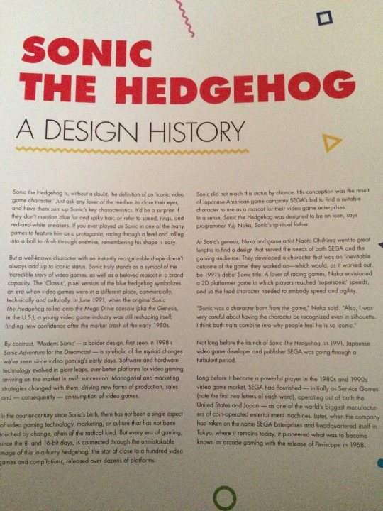

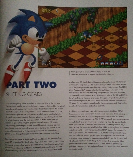
Take some notes from the Mega Man Complete Works artbook. That one does have some text but it’s actually kinda needed sometimes. It explains the game in a couple of short sentences and then quickly goes onto what the artists have to say about some of the art they made.
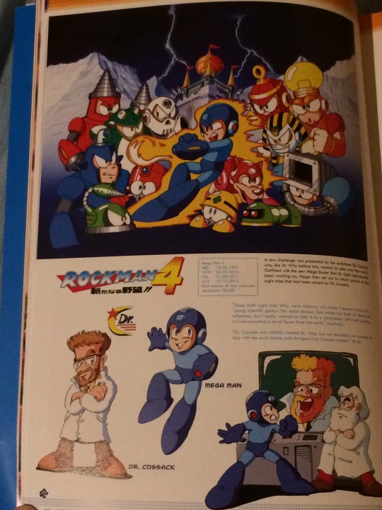
The layout
I hate this layout. Sometimes, they made the art often span across 2 pages which might sound cool for one second until you realize that you can't see the flipping middle of the art! Yeah! Great! Who cares about looking at the art without troubles? Making the user have a hardtime seeing the art is way better than looking at it without problems on one page! And sometimes they just decide to overlay one image on top of another so all that time finding the rare art was for nothing because some moron thought that this layout was a great idea.
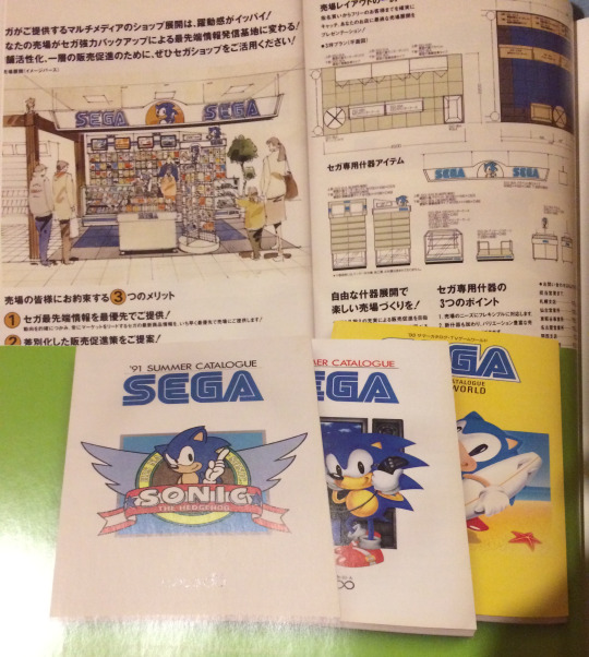
Sometimes they go with a chronological character art layout, then they'll switch to art from games. Have some consistency here! Oh, what am I talking about? This is something Sonic related from 2016, it won't have consistency. Even if it's an artbook!
Wrong facts
Sonic 3D Japanese art dates
Hey, guys, you goofed up. Knuckles' page lists dates and the Japanese Sonic 3D art says "1996". Yet the Tails one says "1997". And both are wrong. Sonic 3D released 1999 in Japan. That's why they have their Adventure artstyle here. You could've looked this up in 20 seconds by googling "Sonic 3d release dates".
Sonic X being on the same page as Adventure Sonic
They accidently put Sonic X-Sonic on the same page as Adventure Sonic art.
Stuff missing (X-Treme? Saturn?)
The book mentions the cancelled game title "Sonic X-Treme", yet it never shows art from it. I don't get why, it's not like there's no concept art from other cancelled games in there, like Crackers. And why isn't there much Saturn era stuff? I know that Sonic didn't have many games during that but there's a lot of stuff missing. Like the Sonic Jam pre-rendered models or the wallpaper art. Heck, throw in some Sonic the Screensaver concept art too. It's like they gave up at archiving the art one third-way through.
Other missing stuff
Chao concept art
During the unveiling of Sonic Adventure, there was concept art of the Chao shown. Why is the only thing on there 3 very common Chao artworks?
Sonic Adventure art in general Yo, Sonic Retro has a ton of Adventure art archived. Why don't you guys put that in the book? Or that weird looking Sonic art from the front of Sonic.
Sure, it looks kinda bad but it's very rare. Something that you guys said was that you were looking for a lot of rare images to archive in that book. I only see a couple of them here. Most of the time, it's either stuff I've seen 100 times before or something rather recently discovered.
Environmental concept art I would've loved to see more concept art for Sonic's levels. Things that happen in the level, what the level looked like, level design sketches... That should've been in the book.
Rare art I'll just put a ton of low quality images on there that are pretty much either lost, uncommon or rare which you guys could've put in the book. For shame, for shame! https://imgur.com/a/IDc3r
"What the actual shit"-part
This is the part where I can just go "What were they thinking?!". I can't find a reason why they did this and it makes no sense why they did it.
Pages that fold out which are just screenshots of the fucking games
Do I have to point that out why this is such a bad idea to begin with? If I want to look at the game, I'll play the actual game. And why do these pages fold out? None of the other pages do this, heck, the art that spans across pages would've needed that instead of these images.
Anyways...
Transparent pages that don't line up with the art on the other page
Just look. This is a transparent page... where you can look through it to view another page... And it doesn't line up or has anything identical in the slightest. So... why make it transparent?
Sonic 2's Japanese box art
You photoshopped American Sonic and Tails on top of the Japanese Sonic 2 boxart. That's disgusting, you know that?
Pages that show sprites Look. Pixel art is still art. I get that, it takes time to put something complicated in a restricting format. But... you can look up sprite sheets online and you'd get the same expierence as looking at this book. I bought this book to look at rare or even unpublished art of Sonic. Some may have bought it to see high quality images of Sonic's art. I doubt that anyone bought this to look at pixel art because you can look at that online for free. Wasting pages with something that you can look up online for free in 20 seconds is not a good thing in your artbook to have.

Even Mega Man Complete Works artbook has 0 pixel art. The franchise known for being in the 8-bit pixel form for 8 out of 11 games.
A page about the ring
This page is pure filler. How did they get away with this? Someone at SEGA and at Cook & Becker had to look at this and think "This is great. Ship it.". I now should either have no faith in SEGA in Quality Assurance checking now or won't trust Cook & Becker as a company ever. Maybe both.
With that said, I wouldn’t ever recommend this book to anyone. This artbook is the Sonic Forces of artbooks. I bet if a lot of fans would come together and find and scan all the Sonic art they could find, they’d make a much better artbook than this atrocity. So get the Kirby artbook instead, I guess? Ugh...
28 notes
·
View notes
Text
Saekano: How to Raise an Atrocious Anime
I’ve seen a lot of shitty harems, but Saekano might be the most masturbatory, self-gratifying waste of my time I’ve ever had the displeasure of sitting through. Normally in a harem you get the standard character archetypes that aren’t any more than their cliché because the rest of the direction of their personalities are “I love the main character, he’s so cool.” And yet in Saekano, the author somehow finds a way to make such a bland, whiny, painfully obvious self-insert as the main character, and direct the entirety of the other girls’ personalities into revolving around him and him alone. The god complex on this author must be insane, driven mad from “being an otaku” or whatever the shit Tomoya says to be #relatable to the audience.
The egocentric nature of the show, funny enough, is so prominent it’s how the show starts, and oh boy is it how it ends. The entire plot – the central, organizing premise is that Tomoya sees Kato one day and wants to make her into his ideal heroine. Immediately, her entire personality is now subject in the viewers’ mind with what Tomoya will make of her. In the first season’s beginning she plays the normal terse, little-patience archetype, but alas not even her gruff personality could hold out to the wiles of a constantly whining otaku caught already in the middle of a cat fight between two other girls, both inexplicably successful and inexplicably head over heels for him.
Even moreso as the show moved into its second season, they apparently looked in a book of “bad anime clichés” (that’s assuming the author didn’t also pen it) and found that being self-referential is really hip. So now the characters mention screen time and episode count, and yet the show doesn’t know what it wants to be – a wacky comedy about a guy stuck in the middle of mindless containers of fanservice or a serious romance dealing with the emotional struggles of a socially anxious high schooler and how wanting to put time into his hobby brings him closer to people he didn’t realize were so close already. No, no instead, Saekano takes the worst of both, and bookends the melodrama with sparse fourth-wall breaks at the beginning and end of the season. As if consistency in tone was this show’s biggest problem.
And finally, after so many blatant fanservice episodes, angry tsundere-talk, and talking about doujin games, we reach the final episode – the culmination of my detestation for this trash. Prior to the finale, Eriri and Utaha undergo some actual development, realizing they must put their own goals over Tomoya’s to succeed in their respective careers and dump his doujin team to work together on a AAA title, any and all hope I had for that to continue disintegrated. Firstly though, the end of the penultimate and beginning of the final episode are all about how Kato is now the true love, the girl that will stay with Tomoya, because even though he completely ignored her in favor of winning over Eriri and Utaha to work on his game, she still loves him just the same, as I guess “thanks” for mercilessly crushing any other personality she had into her final form as Tomoya’s ideal visual novel heroine. The author has molded Kato into what he wants, through the paper-thin veil of Tomoya as the main character. And because Tomoya is the harem main, he can’t not be loved, right? So after Eriri and Utaha make this decision, the end of that episode is Kato inviting Tomoya on a date, because there’s no way he could be without a heroine fawning over him, right? He’s the main character for crying out loud! It’s only natural! Flexing his power over the heroines in the story, he turns them away or brings them back to the main character as he absolutely pleases, with zero regard for any discussion of emotion or changes in character along the way.
And then we have the finale. Eriri and Utaha with their newly determined personalities almost got to leave the show less tainted then when they entered, and yet, of course, (following the first half of the episode being the date with Kato, with lots of #relatable “I’m a geek who doesn’t know anything about fashion!”), Tomoya stops the pair at the train station, as they’re preparing to leave for their new job. At this point I was honestly wondering what could make me detest the show even further, and then Utaha grabs Tomoya and deeply kisses him, bringing stunned reactions from both Eriri and me, sitting in silence with my head in my hands. Seriously – it’s not like I’m an upstanding white knight fighting for strong female characters – my favorite part of the show is the thigh shots anyway – but are you fucking kidding me? This is my central point in all of this: no character is anything but a romance choice - the entire show is a power fantasy apparently meant to satiate the otaku like Tomoya, but I would think all but the most disconnected NEETs could see this as nothing but attempting to gratify the main character and his creator. It’s pointless. Every other part of any character is just pointless.
Washed away in a torrent of spit and lipstick is any and all development Utaha (and of course Eriri) went through, confirming my view that this show is literally just masturbation material for its creator, dreaming of being an otaku who can also have a harem. While that itself might sound like a claim levied at any harem author, this is some next level writing, when you can not only make every girl in the show hopelessly obsessed with the main character around, but pointedly, specifically, directly make them sacks of the author’s favorite clichés and push them all on the absolute deification of the “self-insert harem main character” that is Tomoya Aki. Saekano is not for the fans, it is for the creator, and is that not a betrayal of what the industry about? I don’t claim to be a creative type in any capacity, but writing something so detailed to satisfy your own desires, and then marketing it in a mass-market a fashion seems to me like he should just write porn for himself if he wants to jack off to them. Hell, I’ve read porn that gives me more character development in 22 pages.
I despised every goddamn second of watching this show, and yet I stuck around for the artstyle, and because I’ve compulsively finished every anime I’ve ever started. Even with the stellar animation in both seasons, it wasn’t worth it. Not one bit. Sitting in fuming silence following that painful 24th minute at last ticking down, I was actually angry enough to put my frustration into words. This show is good for the gifs that show anything but the characters’ faces, so I don’t have to be reminded the disgusting motivations and empty personalities that lie behind their eyes. What utter filth.
#saekano#saekano: how to raise a boring girlfriend#saenai heroine no sodatekata#how to raise a boring girlfriend#冴えない彼女〈ヒロイン〉の育てかた#tomoya aki#katou megumi#eriri spencer sawamura#utaha kasumigaoka#studio: a-1 pictures#spring 2017 anime#my anime reviews
3 notes
·
View notes
Text
Artist Interview #3 - Joliz Dela Peña
Wanda: When did you start making art? Or considering yourself an Artist?
Joliz: I think everybody started when they’re young but for me I took it seriously when I was around 15 years old. Because in my school they really encouraged doing art because there’s murals in the plazas in my country [Philippines] and they ask students to come in and draw on those big walls.
William: With paint?
Joliz: Yeah yeah with paint, making anything they wanted. It’s not like Graffiti or vandalism. So I was inspired by that but I wasn’t really into the mural thing because of the artstyle I guess. I was more into trying to improve in drawing and painting portraits at the time. But it spiraled down to doing landscapes in the end because in the Philippines I wasn’t allowed to paint inside the house so they made me a table in our garden and I painted there most of the time. I was really influenced by all this organic stuff that surrounded me and also I was really into landscapes and not into the trend at the time in the Philippines with murals and Hyperrealistic portraits.
Wanda: When was this?
Joliz: Around 2013. So that’s how I started, I wanted to make something different that’s not the same as my friends and other students work at the time. So I focused on landscapes and seascapes since that’s what I would mostly see around me.
William: Do you sometimes miss having an outdoor studio versus an indoor studio?
Joliz: Actually yes! That’s why I kinda hate Winter because around this time I won’t be able to go out and just paint in plein air. But a lot of things have changed since I moved to Canada, like I wasn’t able to paint landscapes like I used to back in the Philippines so moving here changed and evolved my artstyle. From being an impressionism Artist to what I do now which is all over the place.
Wanda: Do you think that has something to do with the move and adapting? Because you were used to always making art outside and painting things around you, now you’re in a country where you have to be indoors so the things around you don’t change as much unless you manipulate them. So do you think your artwork is reflective of the place where you make your work currently?
Joliz: Yeah I think so. My previous apartment I was sharing my bedroom with my sister and it was really cramped. I didn’t have a proper desk. Like that dresser was my desk at the time. So I was sitting in an uncomfortable position trying to paint. I was enjoying the work I’d make at the time but I was making art for people to see and not for me to feel better. So I stopped and took a really long break. I didn’t do any art, I just shut myself out from the world. Forced myself to find a new artstyle that will make me happy but I realised that’s not the point and to just release art that you feel good about. So I started painting random stuff, it’s not really my kind of artstyle but I enjoy doing it. All the stuff I’ve been doing I really like, I know it’s not consistent and I really liked that [impressionistic] art style for two years because I felt that I could build it and improve it and people would soon like it. But that didn’t happen. I was creating to make social media like me but not making myself feel better. Art for me is almost therapeutic and an escape so I wanted to force myself out since I’m restricting myself from happiness I guess. Just making it worse. So I stopped doing it.
Wanda: What year was this?
Joliz: Well between 2015 and 2017 I did that impressionism style.
Wanda: And during that time you were sharing your space with your sister?
Joliz: Yeah in a small room. Really cramped.
Wanda: So you clearly arranged your room to work around art. When you were arranging it, what were your considerations?
Joliz: I was considering more space for me to explore. Because back then I wasn’t really able to make bigger art and paint bigger spaces. I wasn’t allowed to use chemicals or oil paints because I was sharing a bedroom with my sister and she doesn’t like that. Having a small space really restricted me to explore other mediums, and now I’m able to do all of that because I have this bigger space. I have a window that I can open up. It’s really nice to have your own room to do more things. But again it’s not really ideal for me to use a lot chemicals because I’m trying to get into screenprinting and sometimes I want to develop my own films. I’d need a bigger space to do that, right now I’m content with how the space looks like and the mediums I can do in here. But if I could have an opportunity to get a studio I’d be happy to take that. I miss the fact that in the Philippines I’m out in the open and I used to paint in oils, ventilation was really nice and you don’t have to worry about inhaling the fumes.
Wanda: So how do you organise your studio space to match the mediums you practice?
Joliz: I’m not sure. I mean everything is all over the place. I said I have a second personality. I don’t touch her stuff because sometimes she would go over into my things. It’s really hard to explain because when I’m not active this other personality is active and she doesn’t her thing. I don’t really get to see how she does it. But whenever I wake up things are all over the place. I’m a really organized person, right now it isn’t because I was working with stuff. But now if I’m not doing anything or not doing a project at the moment this would all be really tidy I would organize it in a way in which every medium is in their own storage space.
Wanda: Which part of the room belongs to your other personality?
Joliz: This part of the right. My things are in the cabinets [and desk]. So all this stuff on the right is hers though the paintings in the box are mine. But I don’t really let paint of paper pads, I just gave her this wall to paint on. One time I woke up and the papers were blank and there was this note saying this is my space now. I’ve never really told anyone about my DID, my mental illness. Because I’m really scared about how people would perceive it. Like even my sister knows little about it. She only knows this part of my room.
William: Would you want us to omit that?
Joliz: No it’s ok. At some point I feel that I should tell people about it. It’s just recent that my depression crumbled into this and at first it’s just scary. Like this painting right here really scared the shit out of me. I never really do anything like this and there’s something engraved in here saying “do not touch”. It’s just different from my own art style and that if I post this anywhere on my social media or tell this to any of my friends they wouldn’t think that it’s me. I mean it’s not really me it’s the other personality in me.
William: Have you ever thought then about making a separate social media presence for the other personality?
Joliz: I would love to, I think she has one but I don’t really know. Because whenever I wake up I just see some stuff and I’m just like oh this is something new here. Like I just painted a picture of me so I put paint over it and the next day she did this green thing on here. I would love it if she had a different social media but again that would be really confusing with people because we have the same face but we have different art styles.
Wanda: Well people don’t need to know everything. Like you can always do… If you allow me to say it but you should always do what you feel comfortable with. Like this work is beautiful and you should do with it what you want to do with it and fuck everyone else. Like who’s the ultimate judge out there? Random kid with 5 billion likes but at the end of the day this is very real, it’s very human, and it’s very you. It’s a part of you in one way. But yeah it’s beautiful I love it.
William: I agree... even though it scares you.
Wanda: So how long did it take for your space to get to where you wanted it to be?
Joliz: It took me from day one of moving here… I mean it’s not like what I wanted. Before I wanted to have a really long table so it’s definitely not yet what I wanted it to be. Still a work in progress but right now I’m pretty happy with what I have. But I would love to expand my space more but ever since she came up… I mean I still like it, I don’t want to be selfish and make her do art on the floor so I’m making her have this space.
Wanda: So it’s like if you’re sharing a studio essentially
Joliz: Yeah that’s true.
Wanda: Do you feel that there was a difference in your art before you started sharing your studio?
Joliz: Oh yeah definitely. This [pointing to right of the room] is very abstract. Now I’m starting to incorporate it into my own work like. I started doing the transfer with the acetone. It’s so boring and I needed to do something to do with it. So I try to incorporate what I’m seeing here and use the same colour palette and the gesture and brushstrokes onto my type of artstyle. I’m still trying to stay in my lane because she does acrylic and I do watercolour. Sharing with this type of art it influences me and whatever I make and it really translates to whatever I’m doing currently.
Wanda: If you could change anything about your space right now what would it be?
William: Like you have full omniscient power, you can literally change anything.
Joliz: Oh damn, I would break this wall and just expand it. I really want a bigger space. I’m now sharing with another person or personality and I think that it’s not big enough for the two of us. I kind of like her stuff and I want to see her do it on a proper surface like a canvas, not just on drawing paper and stuff on the wall.
Wanda: Do you think it’s important to have a specific recurring space in which you produce your work or do you personally feel capable of working in a multitude of locations?
Joliz: In my preference I would love to work in different places and I think I’ve already experienced it before, moving from the Philippines to this small apartment to having this space now. I realize that I don’t like settling down in one art style. Seeing all the evolution in my art… the journey is really nice for me. Seeing that I could improve in some ways is…
William: Gratifying?
Joliz: Yeah exactly.

Wanda: Do you feel that you work better in a situation of controlled chaos or neat tidiness in your space?
Joliz: I like a neat and tidy space. I find things when I leave them where they’re supposed to be so I really like organizing my stuff. But I think it’s inevitable to be chaotic in some sense. I feel that it will give you raw emotions when you let it go and be loose.

Wanda: Do you find yourself stressed out when working in here or do you feel that the space is relaxing?
Joliz: I feel that the space is really relaxing. As I said it’s an escape for me. I don’t do art in school that much, I’m only taking a complimentary. So outside this apartment I’m not doing art. So whenever I come back home I get to sit down and do whatever I want, paint and draw. It’s really relaxing for me and it’s like a stress-reliever.
Wanda: And what are you studying right now?
Joliz: I’m just in general sciences right now. I don’t really like the idea of going to an art school. I feel that you get restricted in some ways. I have friends that are taking studio arts at Concordia and they’re saying things like it’s not making them find their art style. My true essence. They’re making rules to be in the norm and fit in the system of art nowadays. I don’t really want to be a part of that. I just want to do my own thing in my own space. So I’m pursuing animal health tech. I don’t feel like I need validation, I don’t need to graduate in Fine Arts to be called an Artist.
William: I feel targeted, I’m the only Fine Arts student in here!
Wanda: We had a conversation about this before
William: Oh I know I know, I don’t take it personally
Joliz: I mean art school is fine it teaches you different techniques and stuff but I feel you can research about it on your own before.
William: I just like the aspect of seeing all of my classmates’s work. Like I like being in the space that everyday when I go to school it’s all people doing their work.
Joliz: Because everybody has their different perspective and how they approach art yeah.
William: Like most people in my classes do portraiture which is not at all what I do well. So some of them are doing like fashion photography, I have no… like I don’t do that. That’s not my style. So it’s cool to see. And a lot of my professors, I mean I can only touch on photography but like my prof Jérôme, he’s an artist resident. He’s not like a tenured teacher. So like when you’re doing an artist residence they pay you but you also have to teach some classes.
Wanda: And he’s badass.
William: So yeah I think that’s one of the advantage of art school, you kind of have to push back when people tell you to do a certain kind of work but I feel that the advantage is just being around people that are doing cool shit. But I don’t know if, like I can only really talk about photography.
Wanda: Yeah it’s as long as what you’re doing makes you feel good.
William: Yeah like I don’t think… like Art school is definitely not for everyone
Wanda: I would one hundred percent suck in art school. I love art but I like just spitting it out when I’m feeling something
William: I think like some people strive, like I know I strive when I have a deadline. People tell me ok do this by then. Or else I just do a series forever and I never finish it. It’s kind of hard to end my series with the type of photography that I do. Because I do a lot of documentary and historical stuff. It can go forever, so having someone tell me “no you have to hand it in now.” is really beneficial for me.
Wanda: Yeah I don’t really strive doing that
William: I think it just depends. Sorry for the tangent though!
Wanda: No no it’s ok
William: Just had to defend myself!
Wanda: But it’s really cool. Like you have to know yourself as a person. Will feels really comfortable doing that.
William: Like I know it’s for me and you also know that it’s not for you and it’s just as good and valid.
Wanda: And being an artist it’s equally hard being in any subject you take, like going business school I start to realize that everyday more and more because you’re an outcast to the artists and then you’re also an outcast to the business students.
William: Especially in business!
Wanda: Especially! I feel that when you’re an artist and you do things that you love you’re going to be an outcast, like the world is not a competition. Everyone has their own essence and brings little things to the table and do things a certain way. Whether it’s art school or the middle of the street, outside, in your room. It’s all dope. Like look at you [Joliz], like your book! You haven’t been living here for that long, you’re in science, you’re a woman, you’re an immigrant… there’s so many things that unfortunately could work in your disadvantage but you make beautiful work so more power to you
Joliz: Thank you, hell yeah
William: I mirror that

Wanda: On that note! What do you use the most in your studio?
Joliz: Oh that’s a tough question…
Wanda: Your chair!
Joliz: Well yeah! I guess… It would be super obvious if I say like a brush… but I would say masking tape. I love sticking shit on my wall as you guys can see. Masking tape is everywhere. Before you guys came here I cleaned up my room and I had a big ball of masking tape on my table. It’s an essential for me. I can’t properly make my art without it. I make clean borders, even with my watercolour paper.
Wanda: So universally, what do you think it a must for any studio?
Joliz: I’d say…
William: Masking tape?
Joliz: Yes! But no! Good lighting. And good ventilation! Because I love painting with natural light. I’m so happy I have this room with big windows. But working with an artificial light like this it really changes the way I paint and my mood. And yeah also good ventilation, I’m doing acetone and I don’t want to die here.
Wanda: So what is the prevailing emotion when you’re in your studio space?
Joliz: A lot of emotions. Basically whenever I walk in here now, I’d see this [Other personality’ work on the wall] and get sad but at the same time, also happy that she exists. I’m sharing a space with her now and not just looking at my own art every damn day whenever I wake up, whenever I go home. So yeah mixed emotions. I can’t really pinpoint what it is because it changes every time. Every time she adds or changes something in this space it would really give me a different emotion.
William: So do you think it inspires you in some way to have someone else’s work to be able to draw from?
Joliz: Yeah. Because my sister [and family] she doesn’t really do art so I wasn’t surrounded by artists. Having this now in my room, I get excited everyday, she probably did something different on her wall and I’m excited to see that and examine it.
William: Having been through building a studio for yourself, is there anything you could warn other artists? Like oh I messed up here don’t do this or just advice
Wanda: Like what would you recommend to other students that might be in a similar situation. Putting a studio space within their room or even having a studio space in your room while living with parents.
Joliz: I guess just build your space and don’t give a fuck because they don’t sleep in that room. They don’t sleep in that room. It’s your own heaven I suppose. If you want to put stuff on your wall, if you want to paint on your wall it’s up to you. Do whatever makes you comfortable and happy because it’s a space that you’re going to be making a lot of art in. Might as well drown your room with art.
Wanda: Did you have any inspirations for arranging your studio space?
Joliz: I actually don’t have any… I’ve never been to another studio or artist’s room. I kind of just build this based on how I feel. Back in my old apartment I didn’t even put up some of my artworks because I think it would look more cramped. Not really spacious. Now I have my own room and I’m free to do whatever I want basically.
Wanda: I’m just wondering, you do different styles and you’ve shown us different pieces that change through time. Has changing your painting style and techniques, has it made you change your room to properly accommodate exploring those different techniques and mediums?
Joliz: Yeah, yeah.
Wanda: Ok hit us!
Joliz: Most of the time I would take all the stuff away from that table and put my easel there, start painting bigger pieces. Sometimes I’d paint on the floor if the painting surface is too big. And also with the acetone, there’s just so many fumes in here that… like I’m still conscious that I’m going to sleep in here and I don’t want all the fumes to be stuck in here. So I kind of cheat and go outside on the patio to do that. Basically I’d love to have a separate room to do art because I feel that I’m really limited in here.
William: And a strong ventilation system! Maybe that’s something you could change about your room; put like a big kitchen hood just suck everything.
Joliz: That’d be nice, I’m going to write that down.

#Artist Interview#artresidency#artist series#art residence#art residency#montreal#montreal art#montreal artist#artstudio#art studio#artist studio farr concordia concordia university
0 notes
Text
Girls’ Last Tour 8 - 9 | Houseki no Kuni 8 - 9 | Netjuu no Susume 8 - 9 | Mahoutsukai no Yome 8 - 9 | Juuni Taisen 9 - 10
Girls’ Last Tour 8
Why do I get the feeling the girls will lose the camera soon?
I noticed the names on the drawers before the girls did. I just never mentioned it.
That snow transition to Chi was…weird…
I think at least a small part of the problem with this show is that it’s drab. Another part is that your appreciation of the show depends on how you view it as relaxing or mind-numbing when you watch it week-to-week. Yet another aspect is that it rides upon, also, your appreciation of the philosophical content that you’re allowed to wade in as part of the show.
“Pumped up” doesn’t seem to be the right word, subbers. I don’t know why (maybe context?), but I don’t feel pumped up when I see the moon. The moon, to me, would be motivating if I were in their situation, but it sure wouldn’t pump me up…
“Magic power”? Judging from the mouthflaps, the word was mahou which just translates to “magic”, and would’ve done decently here too.
Please don’t ship the lolis…
Please don’t make the lolis drunk, either…
Underage drinking! Censor it, censor it! (half-joking tone)
Huh? There’s a small after-credits segment. Keep watching…
Uhh…*thinks about a compulsive habit involving hair eating* Yeah, no thanks.
Girls’ Last Tour 9
If humans are the only living things left, what about the fi-yeah, spoke too soon.
Why did a robot want to protect a fish anyway?
Yuu has discovered the human capacity to float after kicking.
Chi’s favourite conversant is a box. A grey box. Amazing… (sarcasm dripping)
Chi has discovered the thing from One Piece known as Super Drowning Skills.
As they said in Finding Nemo, “fish are friends, not food”! Hahaha.
These robots look like something out of a Shaun Tan book, yeeps. (Didn’t see the construct-o-bot too clearly the first time he appeared.)
It’s like a mother talking to a daughter, only this time it’s in robot-speak. All 1s and 0s…
I did not come here to watch robots explode. But these robots exploding…cool! Like an action movie!
What was that last part with the robot communication circles and patterns for? I guess it made more sense with the volume on, huh…
Houseki no Kuni 8
Why do I get the ominous feeling the biting “ice floe” was Aculeatus or someone like that (and not Ventricosus, the king)?
I love how grumpy Antarc is when they’re like, “Tha failure is all mine” and they’re just holding their hand like it’s no problem. The hand really is no problem, especially in contrast to Phos, come to think of it.
It’s hard to convince someone when you literally have no hands to do it with…
“I raise my hands in defeat.” – Phos in on my level of puns. I was going to make a hand pun and then they come up with this, which is much better than what I could think up on the fly.
Notice Phos is the only colour in this winter world…
I knew gold was soft and platinum too, but…what does that have to do with-oh wait. Never mind.
It’s like something out of a horror film…it’s sheer genius.
Oh dear. It seems I’ve fallen for a sensei-only yandere. What a problem…
Hey, doesn’t this look familiar? Like a kagune, for instance?
U---uwahhhhhhhh…My boy Antarc was taken and now he’ll be Lunarian weapons…Plus with those cracks, Phos looks sadder than usual…
Huh? ED change? “Liquescimus”?...Oh, I see.
This next ep preview…is weird. Especially because you see Kongou-sensei smash his head into a wall…
Houseki no Kuni 9
When they said spring was a time for change, I’m betting they didn’t mean this…(what happened to Phos)
Interestingly, the gold looks like a rapier. Or some other old-timey sword. Then it becomes a spider lily, which is a symbol of death.
Phos’s eyes look like Antarc’s used to…plus they’ve gained a personality like theirs too.
Crying? A defect? No, no…
A bit of a mess? No, Phos, you’re more than a mess.
Phos is still wearing the old uniform, huh. Mourning clothes.
Ah, so that’s where Phos mentions it’s gold and platinum. No wonder Karandi knew…
So it’s not “with great power comes great responsibility?” Or is it just the subbers having fun?
Cinnabar seems to be a lot like Bakugo. Just without the extreme “I’ll beat you up!” stuff.
Phos’s jerk face, LOL. Haven’t seent that in a while…
Netjuu no Susume 8
I’m really unsatisfied with the fact I’ll have to say goodbye to this show in 2 episodes…It’s been my favourite for this entire season, and when the competition is strong, that means this show – with all its fluff and misunderstandings – has done itself more than enough to deserve a spot on my favourites list.
This is Netjuu no Matome (Summary of an MMO Junkie). Honestly, my translation works a lot better than CR’s this time don’tcha think?
Hayabusa (Falcon) Moving Company. Makes sense if Amazon is its RL counterpart…
…then it turns out they wrote Hayabusa backwards on the moving van (Sabuyaha). LOL wut.
The ep title seems to be “[I] took a step forward”.
Harth? Well, spoilers. You just ruined my life…sort of.
I half-expected Yuki’s hat to blow off, but hey, this is an MMO. Hats don’t blow off unless you want them to.
Notice Sakurai uses keigo.You use keigo with people you don’t really know, by the by.
Dammit! Sakurai’s hot but Harth is better! Argh, such a simple artstyle. I shouldn’t be worked up over hot guys when there’s such a simple artstyle…
The eyecatches are so good. Why would you get rid of them in this episode, of all episodes???
T-They could’ve been lying to each other, like in And You Thought There Is Never a Girl Online? ??? Gah, but this show is so sweet, I’ll forgive it.
As soon as Sakurai’s battery died, I swear I just heard The Entertainer in my head. As if it’s all some big dream I’m bearing witness to. But of course, it’s fiction. It’s basically a shared dream for the lot of us who know about it. A sweet shared dream we can access anytime.
Every time I look at that credit list and see Maeno as Harumi…yeah…not gonna think about it. But it seems double-Sakurai even got Harth as a role. Wowee, Sakurai!
Netjuu no Susume 9
One episode and one OVA to go before these guys are gone…
“I Call That Feeling Marble” – Why “marble”?
Sono Kimochi Ma-buru…so they weren’t quite lying when they said “marble”, eh? Sono Kimochi would translate to “that feeling”. However, ma-buru could be “marvel”, so it could be “I Call That Feeling [a] Marvel” (which makes a lot more sense).
I swore Morimori-chan would’ve asked to be partners! The fact that she didn’t was so disappointing…
There were some ducks drifting along in the foreground of one shot.
What happened to Harumi, come to think about it?
Is there an equivalent to TGIF in Japanese???
*Morimori-chan jumps out of chair* That’s me whenever I get a text, hahaha.
The show shows its Comico roots – that park background looks like it came out of a visual novel, which is a sort of trademark of Comico series like ReLIFE and it. Nanbaka, on the other hand…if you’ve seen it before, you’ll be aware of what that show’s visual quirk is.
So the woman’s name isn’t Sendai, but Yashiro? Okay then.
I want a Fujimoto-centric thing now. Please, someone? Do it for me?
I feel like Sakurai and Tenya Iida would be good brothers in an AU. They act in similar ways to each other.
Mahoutsukai no Yome 8
The shot to the head (Cartaphilus received) was so brief, I actually found it funny.
“This girl [Chise] has strange taste.” – Indeed, she does. But that’s why we follow her.
“But you don’t hate it, do you?”
Joseph…?
Mahoutsukai no Yome 9
(looks at shop sign when Chise sits down) Someone can’t spell “biscuits”…
How did Ruth learn the familiar binding spell anyway? Does Elias have a familiar, too? Or does he not have one since he’s part fairy?
It’s really hard to see what Elias’s monster form no. 3 (or is that no. 2?) looks like.
The humour in this show is somewhat unwarranted. It doesn’t always work, either. (I like a majorly consistent show best. Incongruous mood whiplashes don’t always work, after all.)
Is it Silver or Silky? I still don’t understand…
These roses must mean something in flower language…
Apparently there used to be an old trend of lesbian vampires. It’s a pretty old-fashioned trope, so it feels quite at home here. Update: Scratch that, a Leanan Sidhe is apparently more of a succubus, which was the exact vibe I was getting from her. Lesbian succubi? That’s a new concept.
That dragon!!!
Juuni Taisen 9
I think I’ve seen some spoilers saying Rabbit dies. I already knew everyone bar one *eyes Rat* will die anyway, but the game is in seeing how they die.
Were CGI models the best for this moment? Probably not, but there was some good movement from Usagi there.
Did you notice the shining light when Ox repositioned his sword (after he jumped)?
100-person…that reminds me of the SekaTsuyo “Hundred Throws” thing, but please don’t talk to me about SekaTsuyo…
Of course Kanae’s backstory has drinking in it. Her tagline has to do with “drunken rage”…(half-sarcastic)
Hey, this episode is titled after Rabbit. Isin’s genre-breaking strikes again. Also the scribbles on the faces is a nice touch, but not as good as the marionettes from Rampo Kitan.
I swear they’re relying on CGI models for the Ox and Tiger in this episode...
I’d like to headcanon Eiji is good at soccer. Not as the Ox, but just as himself.
Well, “CGI models” was definitely true right there when the Tatsumi bros attacked.
Those ice effects got put to good use, at least.
If you sit a bit of a distance from the screen, you can see they really are CGI models, the Ox and the Tiger. Graphinica’s really pulling out the stops – after all, didn’t they just say “don’t do what you’re unused to doing”?
Juuni Taisen 10
*as some insigificant sniper falls to his death* Yeah, let’s ignore the bad quality of that…
Dangit, Ushii hasn’t been given a birth year! No, why Isin??? Why??? (But does Kanae use Chrome on her iPad?)
Slicing the bridge is a bit much, y’know, Ushii - even for my suspension of belief.
Who knew a stab to the heart could be more touching than any other death in this show? Maybe it’s a stab…to my feels. (You’re all groaning now, aren’t you?)
So…no explanation for home boy Usagi, then?
I think two of the kanji from “To Treat A Man Beef From His Own Cow” (the title, not the episode) are from Gobouken (the name of Ushii’s sword, and the name also means “bayonet”), which is interesting.
#simulcast commentary#juuni taisen#houseki no kuni#mahoutsukai no yome#netjuu no susume#girls' last tour#shoujo shuumatsu ryokou#zodiac war#land of the lustrous#recovery of an mmo junkie#ancient magus' bride#Chesarka watches Juuni Taisen#Chesarka watches MahoYome#Chesarka watches Shoujo Shuumatsu Ryokou#Chesarka watches Houseki no Kuni#Chesarka watches Netjuu no Susume
0 notes
Text
Spyro Reignited Countdown - Shadow Legacy
And with this we reach the final Classic Spyro game, but with all the gameplay differences, can we really call it part of the Classic series?
It’s a game I often come back to thinking I must have forgotten part of the plot, and always I come out of it going, “nope, I remembered everything. It’s really that short.” I consistently beat it in two days with long (but not too long) play sessions. It’s short, ends on a cliffhanger, and makes you wonder what would have happened if they actually decided to continue from it.
Gameplay
Take the GBA Digital Eclipse games, with their isometric point of view. Take out most of the platforming, and make what little’s there confusing because the art style doesn’t differentiate height nearly as well. Make Flame and Charge do nothing to most opponents and add some new melee and magic attacks. Do all that and you’ll get this game.
The actual combat is... okay. Different opponents require different strategies but most can be beaten by spamming one attack. In the real world, that attack is normally Flame. In the Shadow Realms, that attack is the Tail Swipe (and don’t upgrade the Tail Swipe to the point where it does the spin attack. It makes it so it’s no longer spammable).
Also there’s that dual-world gimmick that adds some but not much to the game. Change realms, go through obstacle, change back. It’s bare-bones as far as that mechanic can go. It’s cool that it’s there, though.
Additional Playable Characters/Game Modes
For the first time since Spyro 3, we get none. No minigames, no other characters, nothing.
Collectables
What collectables?
Oh right, there’s a couple.
Gems are still a currency rather than a real collectable though. And even worse, now how many you can collect is limited by the size of your wallet. This basically just means that certain sidequests can only be done after a certain point.
The only real collectable is Dragon Eggs. They’re scattered around and are given to you as rewards for sidequests. Once you get all of them, you learn a spell that turns you into an egg. You can roll around using the touch screen. Yay?
Sidequests usually involve finding or buying a thing and taking it to someone. They feel a bit pointless for the most part. But hey, you can get Ember off your back by introducing her to Bandit the armadillo and they’ll fall instantly in love.
Oh and there’s those shard/crystal/whatever thingies. Some wear out, some don’t, but really if you see one wearing out you just drop it and grab it again and it’ll be good as new. They have different useful effects so just find some that you like and keep them forever. Or don’t use glitches and buy the infinite ones, your call.
Breath Abilities
You get Ice Breath just like any other upgrade, by leveling up. It’s used in a few places to make towers of ice, and for a boss fight. It’s only really worth mentioning since Breath Abilities are so prevalent in the series.
But yeah, you level up and get different/stronger attacks. We’ve got health counts and everything in this game. Some are a lot more useful than others. Again: Tail Swipe>Everything except in certain circumstances (like those foes with the long slapping tails, or flipping over the roly-poly type things. It’s so spammable.
Bosses
Ice Minion and Fire Minion are really similar. You just use Fire against the Ice one and Ice against the Fire one. You just attack when they stop attacking to rest, fairly standard boss procedure. Their personalities are nonexistant and their designs are not very Spyro-y.
Red appears here and is the most pathetic boss. Is he really a boss? Well, to Blink he is, as Blink is just sitting there being thrown around. But for Spyro, he can just use the Shock spell twice (which the Professor specifically tells you to do) and it’s over. Turns out Red was being mind-controlled by someone else! (Was this the case in A Hero’s Tail?)
The Sorcerer is the final boss. He appears as a lizard-man throughout the game but reveals that he’s “a real purple dragon” at the end. This boss fight is a bit more involved, but the game tells you exactly what to do.
TLoS fans might find these guys very familiar. In fact, they may find the whole game familiar.
Levels
For some reason they take the names of levels in the Insomniac trilogy, but change who lives there and what themes it has. Except Wizard’s Peak; that has the exact same wizards as always lived there. Except now they aren’t enemies but guys who worship dragons. Skelos Badlands isn’t too bad, either.
Just... Treetops is in the Avalar and houses Fairies. Lost Fleet is a farm where Bianca’s family lives. And the Dragon Realms, Avalar, and the Forgotten Realms are all a boatride away from one another. And the levels themselves are within walking distance of one another. There’s also just as many original locations as reused ones.
It’s like, I’m glad you’re acknowledging existing lore, but either be consistent completely or make all the levels your own.
Actual level design is fine. It’s not amazing, but it works for what the game is. Except those random holes. I’ve played the game several times and I still have no idea what the purpose of them is. I wish some dataminers cared enough to see what they’re all about - they’re either completely empty or have enemies and there’s some sound effects when you enter but... what do they do?
Story
Spyro and friends are at Dragon Shores for vacation, but it’s time to go. Spyro, however, is staying behind to be trained by the Dragon Elders. Everyone commentates on school as they leave for their homes.
But, that night, a darkness fills the land and everyone is thrown into the Shadow Realms! Enemies are unaffected by Spyro’s regular moves, so he can only run, as directed telepathically by Tomos, one of the Elders. Turns out that since Spyro’s a purple dragon, and purple dragons are particularly magical, he has the ability to escape through use of the Shadowstone, as well as save others.
After saving the Elders and learning Dragon-Kata from them, Spyro goes out to save everyone else. The Elders suspect that Red’s behind this, but eventually Spyro corners Red and defeats him and it turns out that Red’s being mind-controlled by someone called the Sorcerer.
The Sorcerer is draining magic from all the realms, and he wants to fuse the Shadow Realms and the real world. Spyro confronts him and he reveals himself to be a fully-realized purple dragon. Spyro manages to seal him away, but he will return someday...
If this sounds like The Legend of Spyro: A New Beginning except with more rescuing people and the ending of Dawn of the Dragon stuck to it, it does to me, too. I always call Shadow Legacy “TLoS in the Classic Universe” for a reason.
The Sorcerer even looks like Malefor. They’re the same. It’s all-but canon. And it provided so much fanfiction fuel for me as a young teen.
And that’s really the only reason why I approve of this story, despite the fact that this is so much not Spyro-y. I want to see this mentioned, if not resolved. I want the three worlds to collide, and Malefor is the perfect bridge. As he claims, he is eternal.
So yeah. I think on its own this story is pretty strange and doesn’t seem related to Spyro at all. With the context of TLoS, though, it’s intriguing and I want to see more. Unfortunately, I don’t think we ever will. How many people played this game? I almost didn’t.
Unique in the Series?
Spyro’s moveset and the whole Dragon-kata concept definitely is, but other than that, it takes from other games and is taken from all throughout later games. It has the Season Trilogy perspective, the A Hero’s Tail artstyle and character interpretation, and a story that will be seen again very soon.
As far as Classic Spyro goes, this game is very unique, but as for the series as a whole, it’s a bridge that shows how Spyro is moving in a very different direction.
Conclusion
If you’re an avid fan of the entire Spyro series (or at least Classic and TLoS), Shadow Legacy is definitely worth checking out. It’s an oddity that bridges the two in a unique way.
As for someone just looking for a good game, look elsewhere. I never play this game for the gameplay. It’s not challenging enough to be fun.
So I don’t know where to stick this other than I’m glad I have it, glad I’ve played it, but it’s one of those games I have that I know isn’t good.
2 notes
·
View notes