#and try it out with better proportions and a better sketch
Explore tagged Tumblr posts
Text
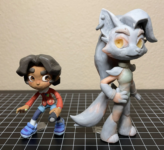
Abandoned wip Cassie & Roxy figures. From ~2023
They’re about to go into storage, so I took some photos. And I figured I might as well post them since they’re never getting finished. So yeah
More photos & notes below the cut :)
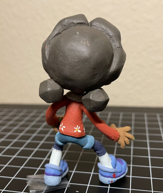
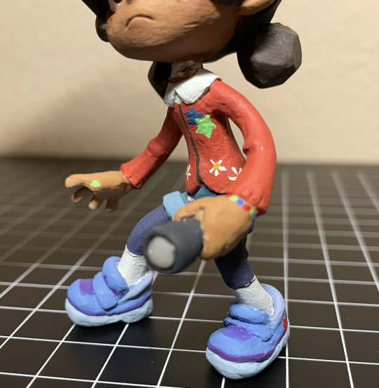
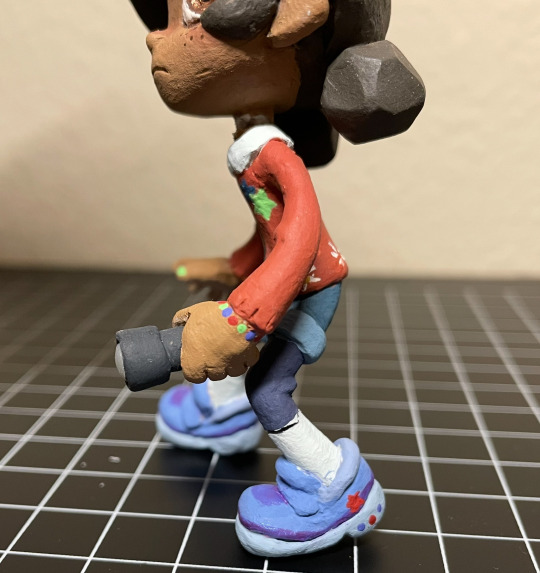
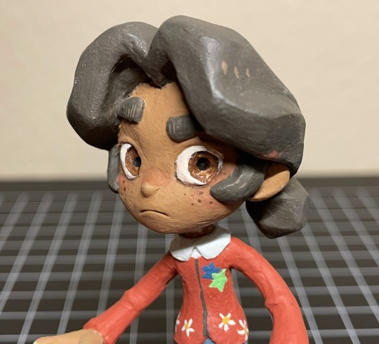
Cassie! Her design is sooo cute. I enjoyed translating her into my style + into 3d. I was (& still am) really happy with how I sculpted her face and hair. Up until this point I rarely sculpted human faces, so I was surprised how well it turned out (then again it’s very stylized so. Whatever). And her hair came out almost exactly like my reference drawing! Which doesn’t happen as often as I would like it to. The paint job came out nicely as well, I’m especially proud of the sneakers and the tiny stars & flowers on her cardigan. Anyway, She was looking really good overall! That is until she fell off my shelf and broke her neck. Unfortunately, that was the breaking point (lol) for me, as I was already having problems with Roxy, and I didn’t want to go through the trouble of repairing her tiny little neck after she was almost fully painted, so I scrapped the project entirely.
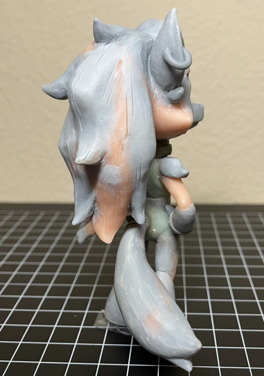
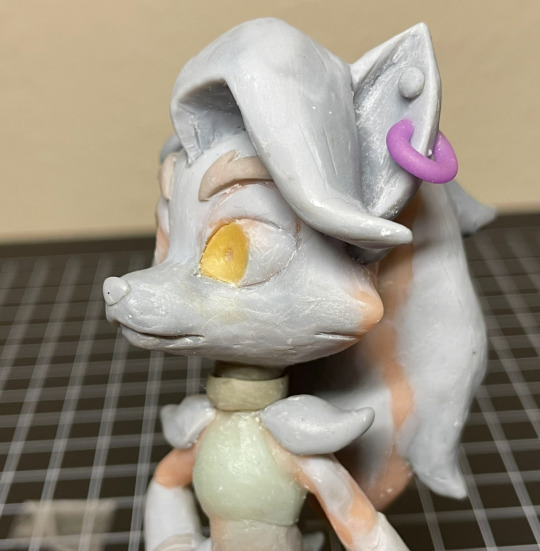
Only a few Roxy photos since she wasn’t painted. I had made her before cassie, (I was originally going to only make Roxy) but never managed to get to the painting step for mainly one reason: Her neck kept breaking. (I have bad luck when it comes to necks, it seems. Probably because I like chibi proportions.) I had to repair her neck, like, 5 times, before finally deciding to use apoxie sculpt instead of my regular polymer clays. (Which I probably should’ve done sooner) But then the apoxie dried in the wrong position, so she couldn’t stand on her own anymore (she needed to be in a very specific pose to stand. her hair is heavy!!). Thinking back on it, I’m really sad I never got to paint her, because I think her form ended up looking really nice. If you’re wondering why neither Cassie nor Roxy have eyelashes, that’s because I was planning on doming both of their eyes with resin, then sculpting eyelashes on top. But I never got to that step. Fun Fact!: Roxy’s eyes are glow in the dark :) so is Cassie’s flashlight
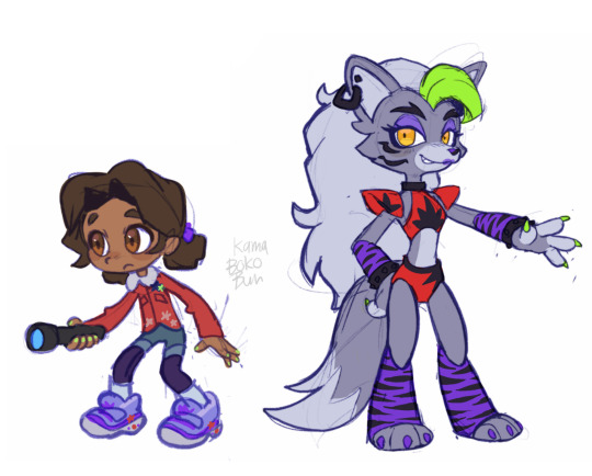
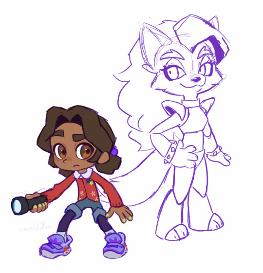
And lastly, here is the art I made for me to reference. Left is the original sketches, and right is the revised poses/designs + traced off of the figures I had already started making. Fun fact: halfway through sculpting (after baking in the pose) I realized that, in-game, cassie holds her flashlight in her left hand and not her right, so I had to completely remove & remake her hands.
I really want to try remaking these two someday, not only because I think I can make them better than I did before, but because Cassie & Roxy are probably my favorite SB characters and I still want to have cute figures of them to display on my desk lol.
Alright that’s all bye bye
60 notes
·
View notes
Text

Unfinished concept for a beast Brador. The proportions are all weird, but I REALLY liked the way I envisioned him in my head. The Bloodletter plunged into his stomach was one last attempt to draw the "tainted blood" out of himself, which he knew wouldn't work but tried anyway... now it's forever active.
#bloodborne#brador church assassin#I should probably revisit this concept#and try it out with better proportions and a better sketch#there's a surprising lack of artistic renditions of transformed characters and NPCs#both beasts and kin tbh#kinda surprising for a setting like Bloodborne's lmao#val-arts
18 notes
·
View notes
Text
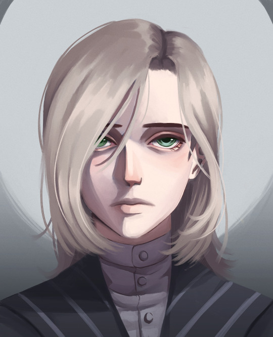
shout out to my boy lampwick
#lies of p romeo#lies of p fanart#art tag#this was seriously just supposed to be a sketch but alas. i took it too seriously#i'm not happy with the part of his hair going over his ear#it's supposed to look like it's falling down. like i Was tucked in but now his hair is falling out of place#i still haven't color corrected the monitor i draw on btw but this turned out way better than my last one did#i also still don't know what proportion i want the eyes to be but i did try to make them smaller this time
107 notes
·
View notes
Text
observation post but ive found myself doing a lot of "problem solving" for commissions in my sketchbook because it helps me in a way that drawing digitally does not... Now im trying to figure out why that happens and how to bridge that disconnect because well why would it be different. Why is it so different 😭
#like why does it happen#whys it difficult to do thumbnails for stuff digitally#why did i draw 5 hyena heads digitally and not get anywhere but when i did them on paper it made more sense#why can i get proportions down nicely when doing thumbnails on paper but not digitally#i dont get it! ive been using digital for longer too and i always run into these issues#i guess the case could also be made that i think the traditional stuff looks better bc i never make complete pieces in there#like maybe if i drew a full detailed body on paper id struggle just as much#but idk. trying to figure out variations of a character digitally feels so suffocating even if i do it the same way#idk what it is. i want to figure it iut#*out#talkys#i also have always had this insurmountable issue where ill sketch proportions nicely#but as soon as i go to add detail suddenly the head feels too small or something feels off#and when i adjust it it just becomes More Off#i think this just is worse digitally? messes with sense of scale? i really dont know!!! idk how to fix it
25 notes
·
View notes
Text

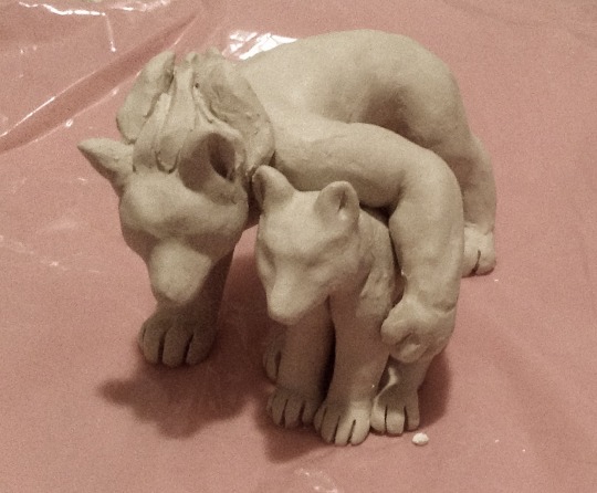
ok I'm not subjecting my poor ceramics blog followers to 2 JoJo sculptures in a row, so for once I'm putting a ceramics post only on main. hi friends :] I am OBSESSED with the pose potential of sculpting a guy as a wolf and his soul as a wolf that's twice as big and fancier and has no sense of personal space
#once again I am saying: Star Platinum my BELOVED#which really means: Jotaro Kujo my BELOVED#sorry for the really bad photo <3 I finished the sculpture only half an hour before midnight#I'll paint these eventually and then they will be very beautiful but for now they're just Fresh Clay#live jojoblogging#ceramics#sighhhh I didn't get the pose exactly right on EITHER of my JoJo double wolf sculptures. I kind of want to try Again#I like the proportions and vibes of the first Star better but the second Jotaro was better#and the 2nd pose was cooler if I could get it to work properly#Star's hips gave me GRIEF#also I was working Too Big on the second sculpture-set. the porcelain was drying out on me and it started cracking#might not survive firing actually. Fingers Crossed#anyway next time I'll sculpt them a bit smaller and see if that helps. the sheer size of Star's back legs made it difficult to ''sketch''#and figure out how I wanted them positioned before I committed. which led to this like B-grade pose#this concludes your essay on my process alsdflskdflksdfj
13 notes
·
View notes
Text
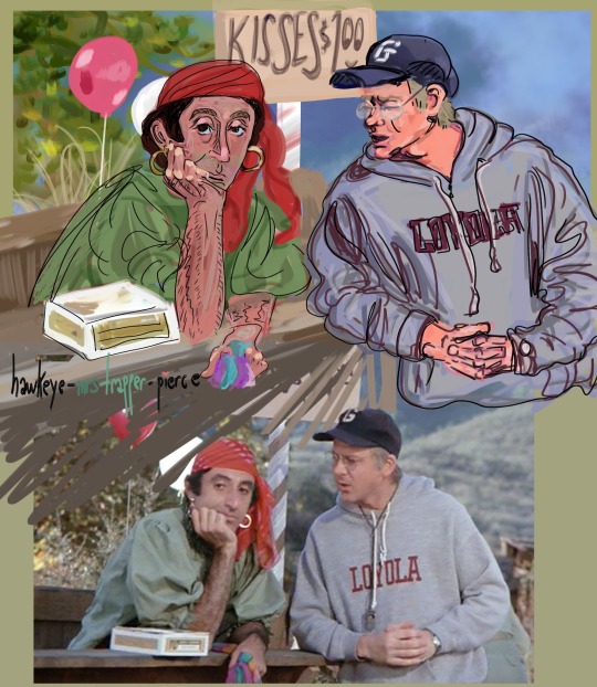
after a long hiatus: Klinger & Mulcahy Version 2, Digital only. Bonus reference pic included below for fun
July 6, 2023
(version 1 where Klinger is different but Mulcahy is the same will be linked here)
#well so i usually sketch and/or ink out the drawing but just did digital for this one#this one is version 2 - which i call it that bc it's the later version of klinger of layer a billion as i tried to get better proportion.#whereas the 'version 1' was from far far earlier in the process#and i feel like the version 1 klinger suits the mulcahy Way WAY better as a pairing but klinger 2 as a standalone isn't so bad#but i'll post version 2 as well bc i like his bored expression in that (bored bc no kisses for klinger 🥺)#anyways i'll link them both#i think i'll try to redraw klinger after i have more practice. coming back from a LONG art hiatus and diving into this was fun but uhh well.#next time i'm doing 1 character at a time i think. at least until i remember how to set up my referrence station better so i can draw easier#hawkeye-mrstrapper-pierce#mash fanart#klinger#father mulcahy
59 notes
·
View notes
Text
Because a few have asked
Teaboot's Super Okay Guide To Developing A Brain That Makes Art Work
Or: How to get your eyes to talk directly to your hands without your brain micromanaging you
Or: How to draw better
⚠️ Warning for super fast gifs cause they all gotta be 5 seconds or less or else my phone shits the bed ⚠️
1. Do the following exercises. Don't just think about doing them or figure out a clever way to not do them, just do them. Yes even the boring ones and the ones that look ugly
2. If you have any pride, crush it. Kill it. Crunch it up into itty bitty bits and feed it to the ducks at the park. You have no talent and don't know anything and everything you make is hot garbage. Believe that. Make yourself believe that. That is where you live now. Surrender any indignation or shame you have to the void and embrace rock bottom.
3. Read step 2 again and actually do it this time. My methods will not work if you try to make this process pretty. Don't.
4. No drawing from your imagination on these. Actually draw from real life. If it's boring like eating day old oatmeal in in beige room but your usual art still feels wonky then I'm talking to you specifically. You can't write poetry until you learn words and yes learning words is as dull as horseshit sometimes but do you wanna be Robert Frost or not
5. Pick up some cheap paper and a ballpoint pen. Grab a small object, between the size of your hand and the size of a microwave. Set a timer for fifteen minutes. Put the tip of your pen to the paper and press "start".
Now without looking at your paper, only looking at the object, draw the object in as much detail as you can. Do not break contact between the paper and the pen tip until the timer goes off.
This is a continuous line drawing, and you're doing it in pen because you need to know what rock bottom looks like and rock bottom looks like no eyes no erasers no shading no do-overs.

6. Sit down in a public place. As someone walks by, draw their their body in as much accuracy as you can before they are no longer in view. Once you can't see them anymore, the drawing is done. No adding details. Pick someone else and do it again. No "base sketch". Just them. If it barely looks human you're doing great

7. Get a black pen. Put a small object on a dark, flat surface. Now draw the surface without drawing the object. Don't draw the outline of the object. Don't do a sketch. Just draw the surface that is visible around the object until only a silhouette remains. No time limit just do it.
The ability to draw accurate proportions from sight comes from learning to see what exists between a thing and the absence of a thing and if that hurts to think about then you need to do it more

8. Keep doing these until you are Ready.
9. You will know when you are Ready. It will make sense when you are Ready. You will Understand.
10. Unwind with some goofy shit so you don't forget why you wanna improve to begin with
5K notes
·
View notes
Text
During my brief stint in an animation college we had a sketching class and the instructor used a phrase that stuck with me more than any of the actual lessons: "Edge-of-Paper Anxiety".
It's when you find out too late that you've been drawing too large to fit the subject in the canvas and so you consciously or subconsciously shorten your lines as you approach the edge or the paper.
The end result is a squeezed distorted mess, and it would've looked a lot better if you ignored the edge of the paper and let your sketch be cut off but properly proportioned.
I think you can extend this lesson metaphorically to a lot of things. You often find yourself in life short on something (time, money, energy, paper) and you're tempted to try to squeeze as much as possible into what you have left instead of pacing yourself and doing things properly.
413 notes
·
View notes
Text
Ok! I've finally decided to put together a (somewhat) comprehensive tutorial on my latest art~
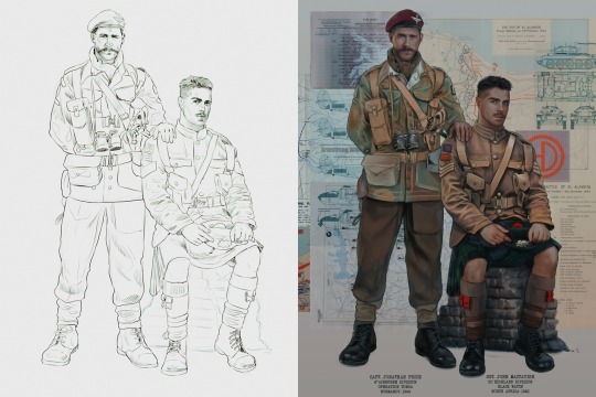
Please enjoy this little step-by-step 💁♀️
First things first--references!
Now I'm not saying you have to go overboard, but I always find that this is a crucial starting point in any art piece I intend on making. Especially if you're a detail freak like me and want to make it as realistic as possible 🙃
As such, your web browser should look like this at any given point:

Since this is a historical piece, it means hours upon hours of meaningless research just to see what color the socks are, but...again. that isn't, strictly, necessary 😅
Once I've compiled all my lovely ref pics, I usually dump them into a big-ass collage ⬇️
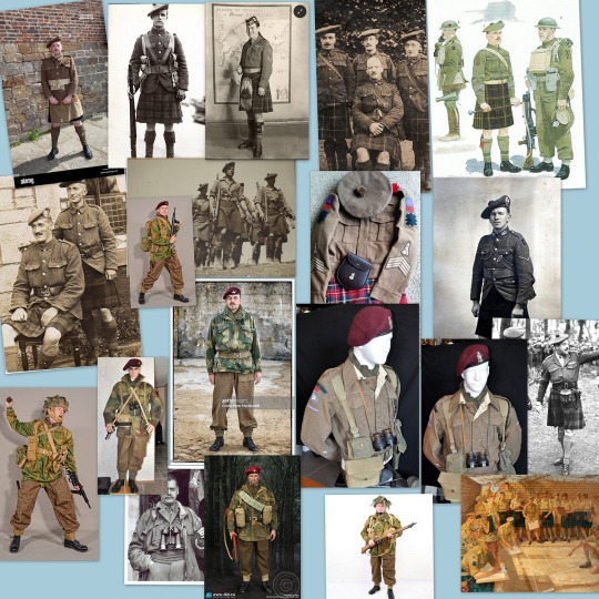
(I will end up not using half of these, alas :'D)
Another reference search for background material, and getting to showcase our models of choice for this occasion~
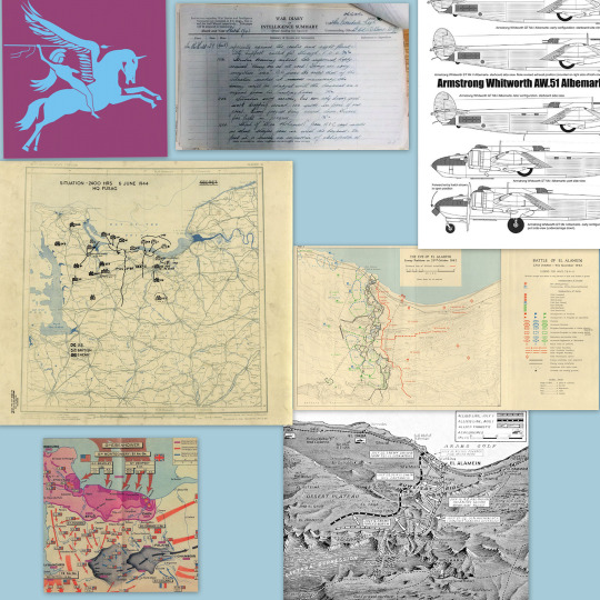
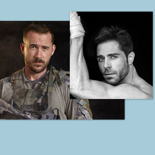
When picking a reference for an actor or model, the main thing I keep in mind (besides prettiness 🤭) is lighting and orientation. Because I already kinda know what pose I'm gonna go with for this piece, I can look for specific angles that might fit the criteria. I should mention that I am a reference hound, and my current COD actor ref folder looks like this:

Also keep in mind, if you're using a ref that you need to flip, make sure you adjust accordingly. This especially applies to clothing, as certain things like pants zippers and belt buckles can be quite specific ☝️
Now that we've spent countless hours googling, it's time to start with a rough sketch:
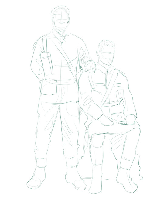
It doesn't have to be pretty, folks, just a basic guideline of where you want the figures to be.
The next step is to define it more, and I know this looks like that 'how to draw an owl' meme, but I promise--getting from the loose sketch above to below is not that difficult.
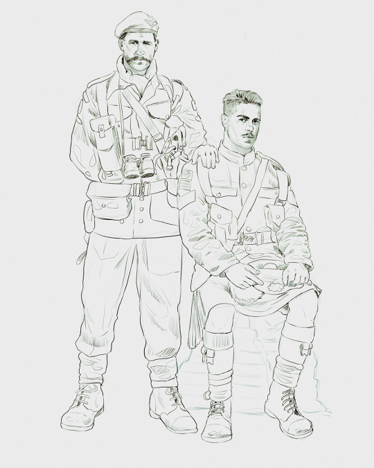
Things to keep in mind are--don't go too in-depth with the details, because things are still subject to change at this point. In terms of making a suitable anatomically-correct sketch, I would suggest lots of studying. This doesn't even have to be things like figure drawing, I genuinely look at people around me for inspiration all the time. Familiarize yourself with the human form, and things like weight, proportions, posing will seem a little more feasible.
It's also important at this stage to consider your composition. Remember to flip the canvas frequently to make sure you're not leaning to one side too often. I'm sure something can be said for the spiral fibonacci stuff, which I don't really try to do on purpose, but I think keeping things like symmetry and balance in mind is a good start ✌️
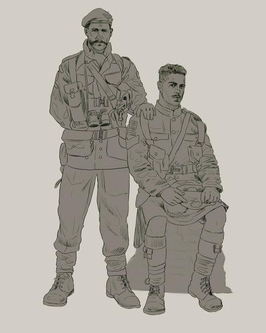
Next step is just blocking in the figures. Standard. No fuss 👍
Now onto the background!
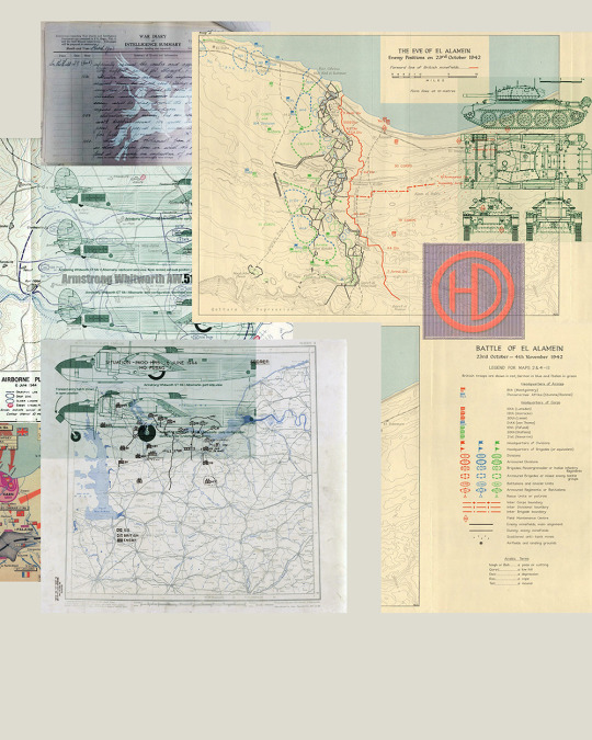
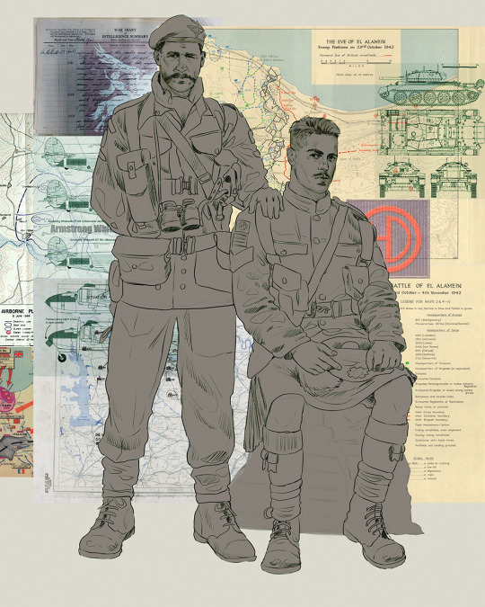
It's frankly hilarious how many people thought I was *hand-drawing* these maps and stuff 😂😂 I cannot even begin to comprehend how insanely difficult that would be. So yeah, we're just taking the lazy copy and paste way out 🤙
I almost always prepare my backgrounds first, and this is mostly to get a general color scheme off the bat. For collage work, it's really just a matter of trial and error, sticking this here, slapping this there, etc. I like to futz around with different overlay options until I've found a nice arrangement. Advice for this is just--go nuts 🤷♀️
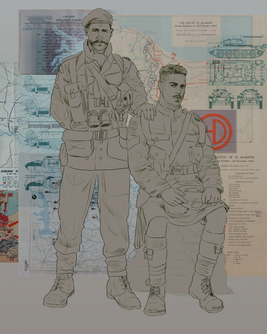
Next, I add a few color adjustments. I tend to make at least 2 colors pop in an art piece, and low and behold, they usually tend to be red and blue ❤️💙There's something about warm/cool vibes, idk man..
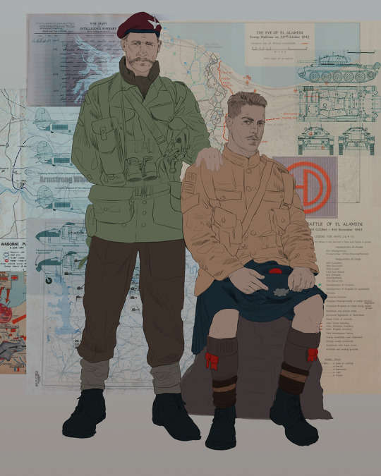
Now we move on to coloring the figures. This is just a basic block and fill, not really defining any of the details yet.
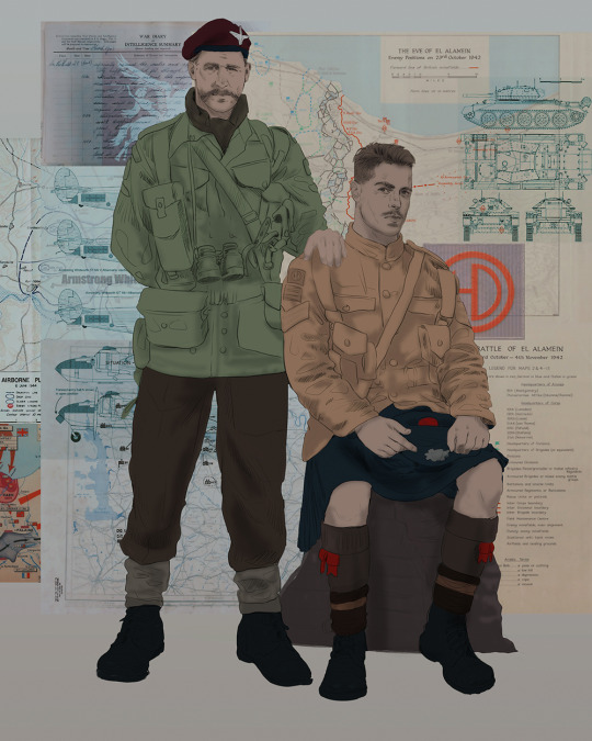
Next, we add some cursory values. Sloppy airbrush works fine, it'll look better soon I promise 🙏
And now--rendering!
I know a lot of beginner artists are intimidated by rendering, and I can totally understand why. It's just one of those things you have to commit to 💪
I've decided to show a brief process of rendering our dear Johnny's face here:
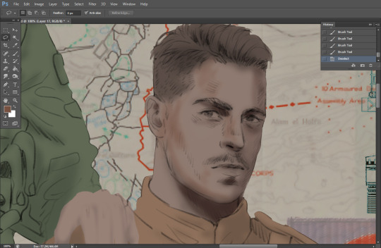
Starting off, I usually rely on the trusty airbrush just to get some color values going. Note--I've kept my sketch layer on top, but feel free to turn it on and off as you work, so as to not be too bound to the sketch. For now, it's just a guideline.
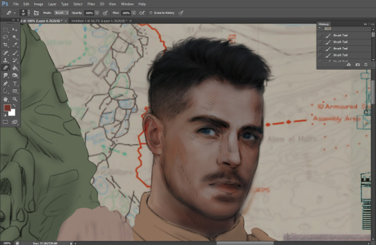
This next stage may look like a huge jump, but it's really just adding more to the foundation. I try to think of it like putting on make-up in a way~ Adding contours, accentuating highlights. This is also where I start adding in more saturation, especially around areas such as ears, nose and lips. Still a bit fuzzy at this point, but that's why we keep adding to it 💪
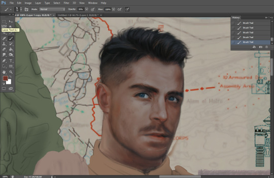
A boy has appeared! See--now I've removed most of the line layer, and it holds up on its own. I'll admit that in order to achieve this realistic style, you'll need lots and lots of practice and skill, which shouldn't be discouraging! Just motivate yourself with the prospect of getting to look at pretty men for countless hours 🙆♀️
I'll probably do a more in-depth explanation about rendering at some point, but let's keep this rolling~
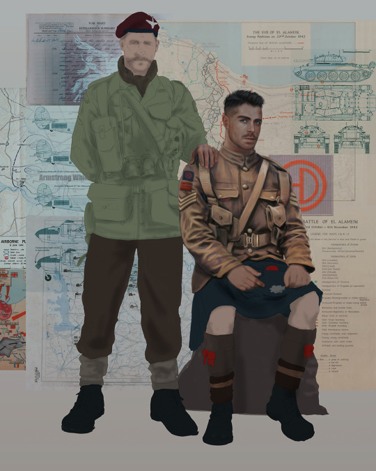
Moving forward is just a process of adding to the figures bit by bit. I do lean towards filling in each section from top to bottom, but you can feel free to pop around to certain parts that appeal to you more. I almost always do the faces first though, because if they end up sucking, I feel less guilty about scrapping it 😂 But no--I think he's pretty enough to proceed 😚
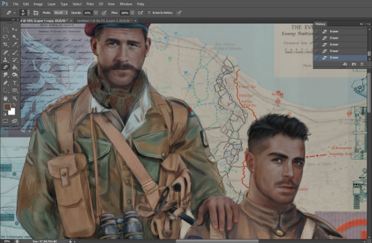
They're coming together now 🙆♀️ Another helpful tip--make sure you reuse color. By that, I mean--try to incorporate various colors throughout your piece, using the eyedropper tool to keep a consistent palette. I try to put in bits of red and blue where I can
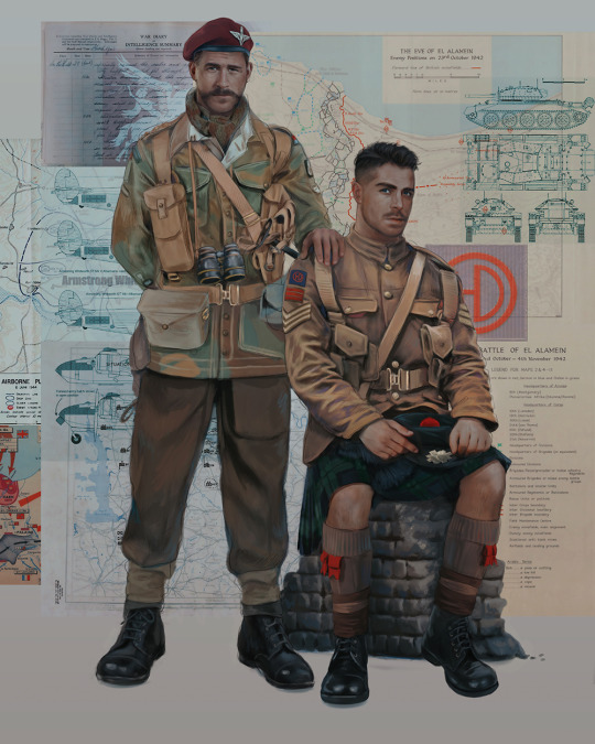
Here they are fully rendered! Notice I've made a few subtle changes from the sketch, like adjusting the belt buckles because I made a mistake 😬 Hence why you shouldn't put too much stock in your initial sketch~
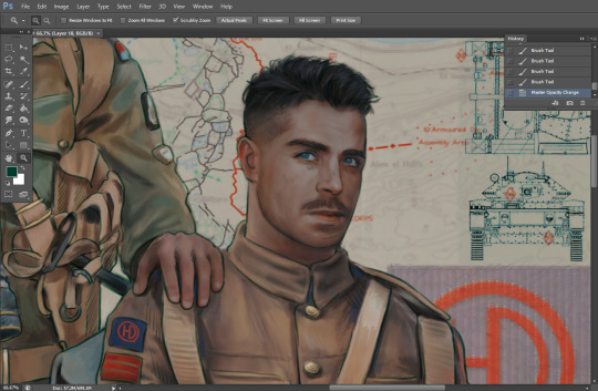
The next step is more of a stylistic choice, but I usually go over everything with an outline, typically in a bright color like green. Occasionally, I can just use my initial line layer, but for this, I've made a brand new, cleaner line 👍
And the final step is adjusting the color and adding some text:
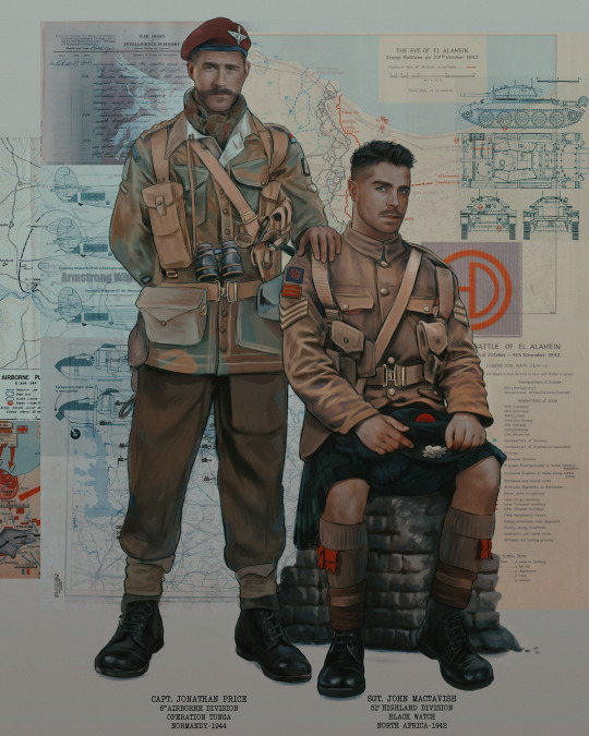
Tada!! It's done!
All in all, this took me the better part of a week, but I have a lot of free time, so yeah ✌️
I hope you appreciated that little walkthrough~ I know people have been asking me how I do my art, but the truth is--I usually have no clue how to explain myself 😅 So have this half-assed tutorial~
As a bonus, here is a cute (cursed) image of Johnny without his mustache:
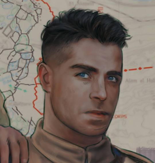
A baby, a literal infant child !!! who put this wee bairn on the front lines ??! 😭
Anyway! peace out ✌️
#tutorial#my art#art tutorial#since people have been asking#I remembered to save my process from this latest work~#enjoy 🙆♀️
1K notes
·
View notes
Note
your work is so beautiful!! can you share a little bit about your process when working with gouache and india ink?
thank you so much! and of course I can!!!
it’s a long one…details below!
I use gouache just because it’s what I have to hand, but watercolour would work well, if not better.
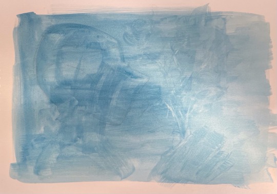
I start with a sketch, then a wash of the blue, covering the whole page - it can be messy because most of it will be covered with the black ink. at this point I like to go over the shapes with the blue just to vaguely define the forms.
I like to start with the darkest areas! usually this is around the studs, or the ‘seams’ (if there are technical names pls let me know 🙏). I try not to focus on one area too much at once just to keep everything proportional and remind myself of the overall form! India ink is fab because it dries so quickly, and as far as I’m aware it doesn’t lift once dried, so I can go over the fine details to add reflections and shading! when I do the shading, I treat the ink like watercolour - I dilute it heavily, going from light to dark. you can always add more pigment later!
I always forget to take photos as I go along, but hopefully this kind of illustrates what I’m yapping about
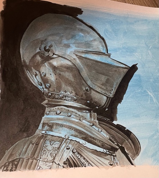
I was very silly and forgot to take my brushes with me to uni… buuuut from memory, I think it’s a ‘round’ brush? it can carry a lot of ink but tapers to a very fine point at the end, allowing for the teeny tiny details on the armour, as well as the larger washes of pigment. this is a4 paper for scale (I think that’s around 8.5 x 11 inches!) I use a bigger round brush for bigger areas! I also loosely sketch out the details in pencil before painting but the drawing is usually more ambitious than what I can realistically achieve at this scale - the squiggly lines were the hardest! I tended to depart from the reference at this point and make up some organic shapes. basically the smaller scale means it’s no biggie if you do make a mistake!
I use bristol paper - super smooth surface that holds the ink really well!
it’s a little different for my first knight though (below)! still started with the blue gouache wash, but I used fine liner pen. I think it’s either 0.5 or 0.3 - leaning towards the latter just because of the smaller details! this is a less forgiving medium imo, but super satisfying. I used black gouache to fill in the background for this one - I didn’t have any inks at this point. I’m working on a5 paper here in a moleskine notebook, so it wasn’t really meant to be damp.
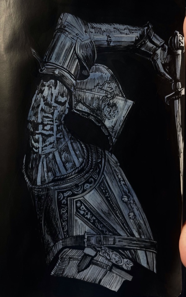
also I am still bad at taking photos of my art - but I am getting better! I scanned the painting, then adjusted the shadows (just using the photos app). literally the only edit is turning ‘shadows’ down to -100, but you can see how much of a difference this makes! I’m including this because it’s always so disheartening when the camera doesn’t pick up the artwork properly. something I struggle with when using ink is getting an even surface with large areas of undiluted black, which is why I tend to adjust the contrast. if anyone has any tips on this I would appreciate it!

apologies for the very long post - if there’s anything else I can clarify please let me know!! I’m quite new to tumblr so sorry if the formatting of this post is a little off.
unfortunately I have just gone back to university, so it will probably be a while before I have some art to post - I also left all my art supplies at home… whoops! maybe this is a chance to improve my digital art!!
and thank you so so much for all the notes on my previous post! I read every tag on reblogs and they always make my day <3
63 notes
·
View notes
Text

Word count: Just under 1k Warnings: NSFW, MDNI, buggy x GN!reader, no use of Y/N, mentions of masturbation, sex, and oral.
˗ˏˋ ★ ˎˊ˗ ✩ ˗ˏˋ ★ ˎˊ˗ ✩ ˗ˏˋ ★ ˎˊ˗ ✩ ˗ˏˋ ★ ˎˊ˗
Buggy who is surprisingly good at drawing.
Buggy who doodles all the time. Ugly little caricatures of people who piss him off. Goofy scribbles of bits that make him laugh. Potential skits.
Buggy who scrawls on the margins of paper, the corner of napkins, anywhere he can relieve the itch in his hands.
Buggy who designs costumes for his crew. Colored pencils and oil pastels bring the flashy couture to life.
Buggy who carries a small sketchbook in his coat. Deckle edged paper wrapped in leather, perfect for practicing pencil sketches and graphite drawings as he observes the crew.
Buggy who doesn’t share the drawings in his sketchbook, though. Some had to learn the hard way not to look over his shoulder.
Buggy who realizes too late that you are overtaking his personal pages. What started as small forms to study pose and movement grew larger, capturing more of your essence.
Buggy who becomes obsessed with capturing the small details. How your nose crinkles when you laugh. The sneer in your lips when you’re pissed. The way you rake your fingers through your hair when you try to calm yourself.
Buggy who gets curious late one night. Curious and desperate.
Buggy who draws you from memory and fueled by his filthy imagination. The soft sound of pencil scraping along the paper is comforting.
Buggy who fills a page with you in compromising positions. The lewd expressions you might wear. What he thinks you’d look like split on his cock. Or mouth open, begging to have your face fucked. His hands gripping your plush thighs.
Buggy who fucks himself to the hand-drawn porn and cums all over the page.
Buggy who feels guilty and burns the soggy drawings, as best he can. It takes a few frustrating tries and he panics, even though no one is around.
Buggy who tries to ignore those feelings. Trying to draw anything except you. But everything looks like shit now. Proportions are off. He presses too hard when sketching, unable to erase the stark lines. Even his doodles lack life.
Buggy who gives in and scribbles you in the corner of his sketchbook before moving on to something else. And it works. His movements flow better. A weight is lifted off his chest.
Buggy who eventually caves to the nighttime muse once more. Filling another perverted page with the obscene images flooding his mind. This time, he doesn’t ruin the drawings with jizz or fire.
Buggy who revisits that page frequently. Adds to that page. Convinces himself that it’s okay, it’s not hurting anyone. In fact, it helps him by taking away other urges.
Buggy who eventually manages to misplace his sketchbook. He fucking lost it.
Buggy who doesn’t want to bring attention to his lost treasure. If he says it’s missing, some freaks might find it and look through the pages. They’ll realize what a pathetic loser he is.
Buggy who frantically retraces his footsteps, barking orders to keep everyone away from him.
Buggy who finally finds it in the hallway just outside his room. The book must have fallen out of his pocket and laid mostly out of sight with the brown leather blending into the wooden floor.
Buggy who is relieved. It doesn’t look like the book had been touched or moved. Even the leather string is still wound around the sketchbook tightly.
Buggy who needs to get back to other duties after sloughing them off most of the day. He’s still on edge, reading into everyone’s interactions. No one acts differently, adding to the relief that no one knows about his perversions.
Buggy who doesn’t open the sketchbook until the end of a very long day. Who waits until he’s alone and in his room.
Buggy whose stomach lurches at the note peeking out of one of the pages. A page devoted to your smile. A note with your handwriting. “This is so impressive! I look so happy”
Buggy who slams the sketchbook shut and starts to pace around the room. Fuck. Did you find it first? Did you look through it? Why? What else did you see? What else did you see?
Buggy who freezes at the thought. Who stares at the awful book, as if it would pipe up and tell him in a fluttery voice.
Buggy who grabs the book and roughly throws it into a drawer, ready to lock up his feelings. Ready to deal with his unhealthy actions with more unhealthy actions.
Buggy who tries to go to bed but can’t sleep. He lays in bed surrounded by a carousel of thoughts. Of fear. And anxiety.
Buggy who sends over a hand to retrieve the damn book. He has to know. He’ll die if he doesn’t find out.
Buggy who can feel his hands shake with each heartbeat as he thumbs through the book, looking for more notes.
Buggy who feels both calmed and excited as he finds your commentary on a few more innocuous pages. Praises for his skill and appreciation for scenes he captured.
Buggy who finally flips to the page. That one.
Buggy who’s afraid to read the note you left there. But he does. “Want to collaborate one day?”
Buggy whose stomach and heart are in knots.
Buggy who keeps reading. “I’d like to see what you look like too.”
Buggy who shows up at your door, panting and red faced. Sketchbook in hand.
Buggy who trails his fingers along your face as he fucks into you, commiting each detail to memory. The shape of your mouth with each moan. Your lust-filled eyes. The little teeth marks left after you bite your lips.
Buggy who can’t help but stare at your sex-tired body. Chest heaving. Glistening.
Buggy who still wants to taste you. To taste himself on you. Who uses his mouth and tongue to memorize more of your body.
Buggy who is surprisingly good at drawing and collaborating.
˗ˏˋ ★ ˎˊ˗ ✩ ˗ˏˋ ★ ˎˊ˗ ✩ ˗ˏˋ ★ ˎˊ˗ ✩ ˗ˏˋ ★ ˎˊ˗
A/N: Just want to highlight this line bc I love it "This time, he doesn’t ruin the drawings with jizz or fire."
#buggy smut#buggy x reader#buggy the clown x reader#buggy x you#x reader#buggy op#opla buggy#one piece buggy#buggy the clown#buggy the clown smut#one piece smut#buggy x gender neutral reader#gender neutral reader#hey-august buggy fic
387 notes
·
View notes
Note
hi I love your sketchbook art sm! your lines look kinda messy in the best way possible and i rlly wanna achieve that same look!! also i wanted to ask, do you sketch everything out in pencil beforehand or just go directly in with the pens?
Thank you! I used to hate how not clean my stuff looked compared to other’s stuff but I eventually came to really like messy inky things! Makes me feel better about my mistakes and it stops me from being a perfectionist.
As for my process I do both!! I’ll either go straight in with pens, or sketch first in pencil- OR if you want it to look messy but also kinda sick?? Do your under drawings in a super light pen/marker (like yellow or blue or gray) and then lineart on top. Maybe make that color you use something to add to shading later on. I’ve also done under drawings with dried out pens before to get a gritty texture, if you have any dying pens, they can still be put to use!
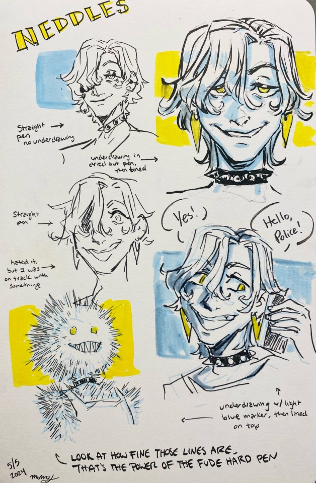
I just broke into a new sketchbook so I labeled what I did what with for these Needles Concepts. Fineliner pens can get you consistent line weight but BRUSH PENS can be thin or thick or flex to get some nice line variations. There’s soft brush pens and harder ones too if you’re worried about control.
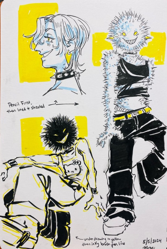
The stuff where I went pencil first and then pen is FAR neater in general, and I can plan more. It’s pretty difficult to go just straight pen but I encourage you try it out a few times. It makes you plan and think about posing and proportion all in your head but boy it can be fun!
253 notes
·
View notes
Note
How do you get so good at perspective and proportion and everything honestly... 😭😭 I've always wanted to draw a whole scene in a room or something but I just can figure out how to perspective
to be Completely honest, i usually am looking at a bunch of references for almost everything i draw, either in batches for background or specific poses, etc. it speeds me up a lot! i also recommend sketching quickly and not worrying about things being super accurate, since i prefer to refine over time while making sure you have a good base. for example for the aventurine art that's like my most popular on here lol, i used a pose ref while changing a few things to suit my artstyle (proportions, pose, bg, etc.) it's really just about tweaking stuff until you find things that better fit your style imo

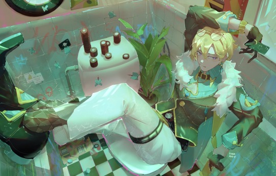
What i do highly recommend trying out if you're having trouble drawing scenes and placing objects (especially if adding characters without a strict reference) is to draw the characters first. this is usually frowned upon but ive found that it really helps imagine the scene and then draw everything around it to fit the poses and mood you want, and also provides a better frame of reference to place the angles of the objects
66 notes
·
View notes
Note
This is perhaps a strange question, but do you have the sketch/lineart/framework/whatever the heck it's called that you use when you draw Tango? I decided I want to learn to draw, and my thought process was, "Ah yes, the easiest way is to try and copy my favourite Tangos cause I know how they look," and it is going... poorly xD.
Alternatively, do you have any advice on how to learn and develop a style, or how to get/keep going?
A reference sheet? I have a couple various ones, though at this point i don't really use a reference unless I need to sample colours, and I'm currently working on a colour reference for myself. Besides the point I suppose... I'll put them at the very bottom of the cut so scroll right past my ramblings if you want to.
As for advice. My advice is do not try developing a style if you are just starting out. style is the last thing that should be on your mind if you're just starting out. Style is something that happens naturally as you grow and learn what you like and get used to your tools, and being able to intentionally create a style is an advanced skill that requires the skill to draw in various styles, strong basics, self-awareness, and proper self-critique.
The rest of this is going to be very incoherent and long winded and backwards so I apologize.
The most important thing to improving is to get over yourself. You need to look at someone else's art and be able to admit it's better than yours or has a quality you wish yours had without that being a statement of self-deprecation. You need to be able to look at your own art and pick out what it is you don't like about it without using it to beat yourself up. You can't improve if you get demotivated by the information required to adjust your course.
If you must, find something in each drawing that you like and focus on learning how to recreate that. If you find yourself with a drawing that you genuinely find nothing you like about it you stop drawing and restart, because that drawing is worthless to you once you recognize that. Analyze why you don't like it, figure out what's causing you to draw that way, ask what you might prefer instead and what the difference between them is, and figure out how to draw what you want instead. The important thing is that when you examine your art and other's art you're using as inspiration you don't instead use it as a tool to put yourself down.
My shadows are flat and poorly angled, and I draw everything lopsides, and I can say those things as simple facts of my art. These are things I still do, and I use tools to fix them, like turning my tablet or using editing tools, or looking up references. If I want to know a certain technique I reach out to other artists I see using said technique and asking, or I research it myself. In the meantime I experiment and accept this flaw in my art. There's other things to like. The important thing is you don't allow your lack of knowledge to demotivate you from correcting that lack of knowledge.
The best thing you can do is ask yourself what you like about art, and what you want to do. It's a bit difficult for me to help with this sort of thing because I've literally always drawn my whole life, so helping someone who is actively choosing to take up drawing isn't my realm of expertise. But art is communication and connection and self-expression. What do you want to express through your art and what medium is that expression best done in, what do you want to convey, what do you want to share that you simply cannot without art.
It's a bit daunting, those sound like profound questions, but honestly they're not. When I draw fanart usually what I wanna communicate is "I like these characters when they do this", and more often than not it's "I really liked this line/palette".
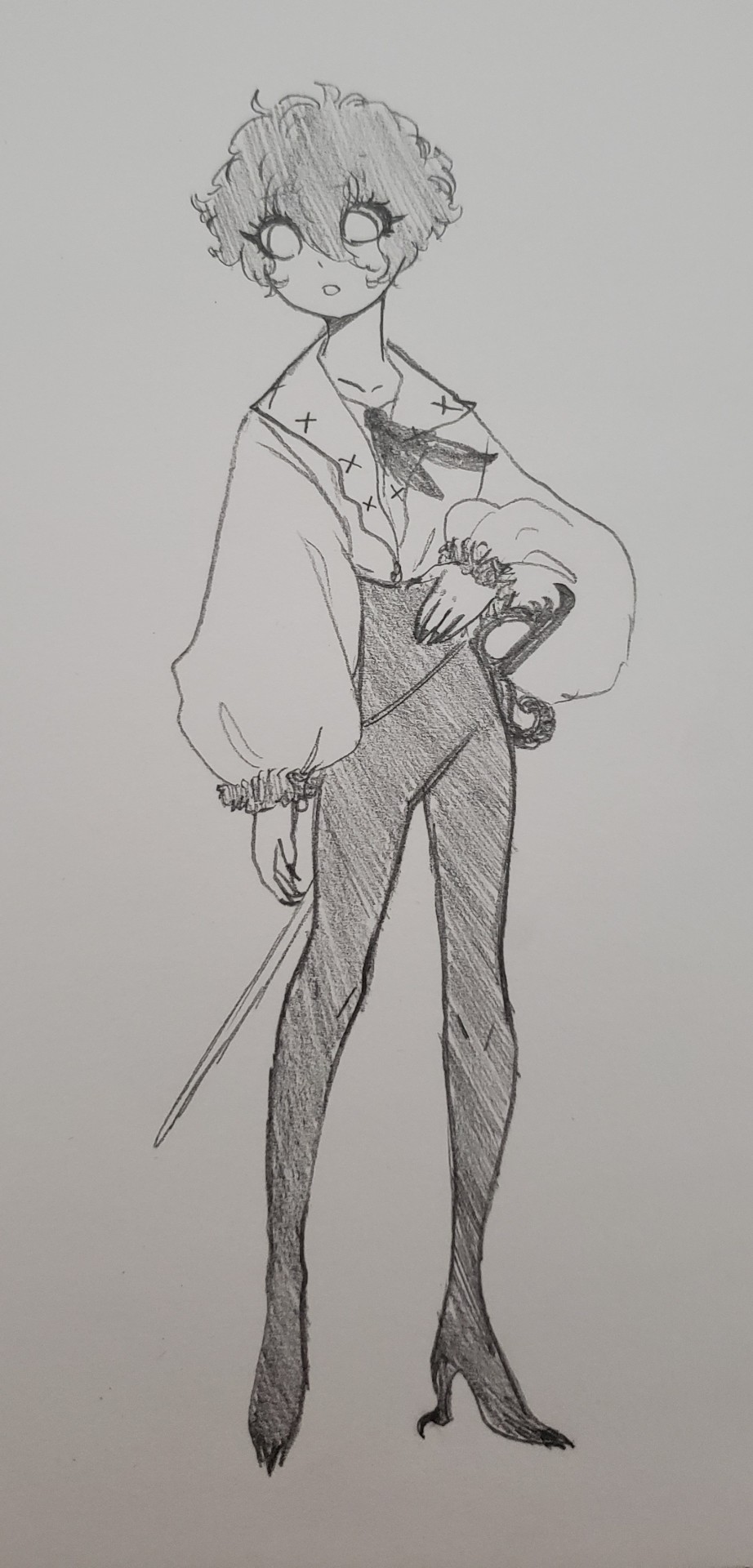
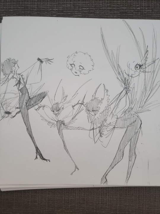
These incomplete character sketches have sat in my main D&D folder and I think about him at least once a month entirely because I was so happy with his proportions and the concept of a dewclaw heel. I ended up reusing the heel in these Jimmy designs.
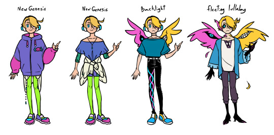
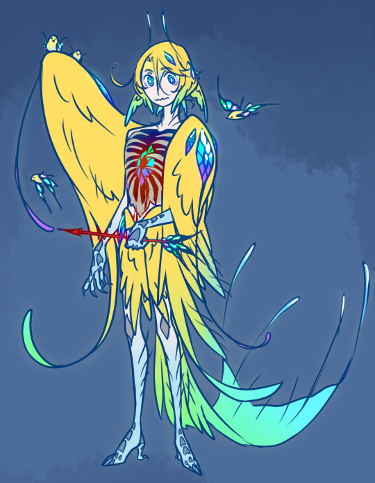
It can be anything and changes with each piece. Drawing let's me express what I love and emphasize what I love about it or show it from my perspective. I'll use this raau page as an example.
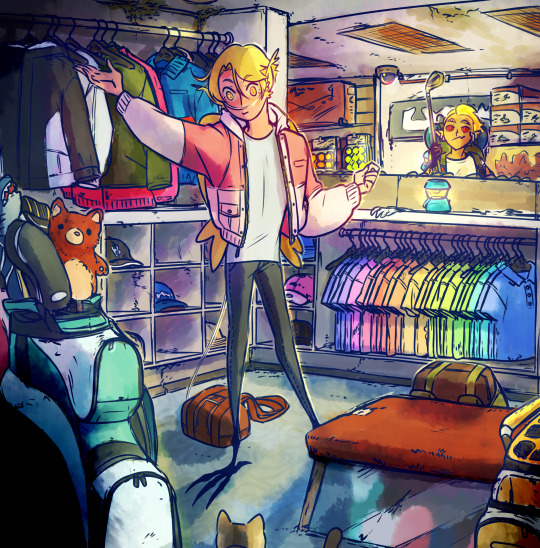
This is actually based on a shop that I've gone to since I was a child, so it's a space that I've seen and thought about many times. Though it's changed, for ease of drawing and to fit into the setting of raau and for the sake of composition, but the things that are important to me are still here. The ceiling that feels slightly claustrophobically low, the rainbow coordinated shirts, the club covers shaped like animals, every inch of the shop being utilized for merchandise until you can barely see the walls, the nook shape of the section, the fluorescent lights with this specific covering that's very "soulless office job" but to me is also the playroom at my grandma's house and how both have no windows.
I wanted to preserve particular qualities of the atmosphere of the place, in order to express that in this image. That vibe that I could not describe in words to anyone who hasn't experienced it themselves so the best I could normally do is describe it and hope it sparks a similar enough memory. But with visual art I can use lightning, context, and composition to simply express it better. I can create the experience for someone else.
Sometimes writing is better at it than words, and sometimes both are needed, so I learned both. Sometimes music is better than either and I'm screwed because I can't do music. That's besides the point though.
When you're starting out you can have a hard time grasping what about a piece compels you. That's why you need to learn to critique art as you learn to draw, and that's also why tracing and copying is good.
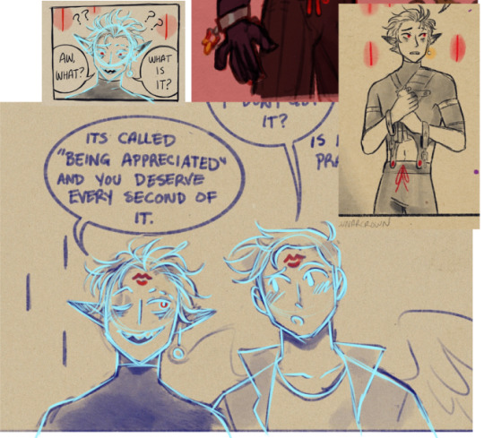
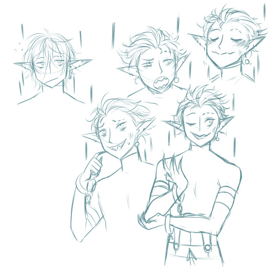
Here's an example of me trying out @lunarcrown's art style. I made a collage and traced my favourite frame's shapes to "get my hands on it", if you will, before trying it out on my own, starting with similar poses usually. What I learned from this is I really like how Lunar does hair, actually even though this was a study of Tango I took notes on how she does Jimmy's hair and applied it to my Scar, Impulse, and Skizz, because I'm awful at short men's hairstyles.
I also cemented one of the reasons I love her art is because it does have some qualities that I already incorporate into mine, like the streamlining between flushed materials such as her Tango's skin and skin-tight shirt, or my Tango's sleeves and gloves.
If you know what you like about something it's easier to work towards incorporating it into your own art without simply copying someone else's. And starting out by copying as a way to play around with someone's art the same way an engineer pulls something apart is helpful in doing so.
Which leads me further back into simply go somewhere and draw what you see. The drawing does not have to be good, but being able to just take a sketchbook and see something that scratches your brain and mimic it is important to developing the above skills. Being able to translate reality into an image is important to developing your skills and understanding the fundamentals of breaking things down. Being able to look at something moving or possibly far away and look down and draw it anyways by breaking down its shapes is important in developing your ability to use references.
Drawing is also mostly muscle memory. So it's important to draw things over and over again. You can do this how you want, you're always going to hit a wall where you end up having to sit there and draw circles 50 times on a page to remember how to draw circles like you're trying to get a dry pen to work. You will do this before almost every serious picture. Find a way for you to enjoy this process.
The biggest most important rule about art, though, is that there is not rules. Go about things however you want for whatever reason you want. If you enjoy doing something a certain way do it that way, if you hate a particular process eliminate it. Sometimes the result outweighs a miserable process, if having something look a certain way is more important then suck it up and do so. If you care more about enjoying a motion than what the end result is then do so. You have to ask yourself what you care about in art.
For now, though, if you're just starting out. The best thing you can do is draw a lot of circles and cubes and fruit. It's an unfortunate truth that the best foundation is learning realism, because it's just going to teach your the fundamentals the best, and all abstraction is... well, an abstraction.
Of course, as just said, there is no rules, and if you genuinely do not enjoy drawing those things like me, then you can simply not. It helps improvement the fastest but if it makes you miserable in a way that isn't backed by passion then that's counterproductive. Forcing yourself only really works if you're passionate enough about what you're doing to overcome the temporary discomfort of learning, so if you're satisfied with just being able to mimic something more abstract in the beginning do exactly that and explore what would make you passionate enough to be willing to draw things you aren't stoked about for an end result. You might never be, but that's also fine, you don't have to strive to be the world's greatest artist to justify drawing.
Also accept that you're absolutely going to change your mind on things. What felt like a great line to draw you're going to hate the next day. It's up to you if you leave it be or fix it, neither's the right answer. I tend to lean towards leaving it personally, even when it drive some up a wall, simply because I have very momentary inspiration and don't like returning to old pieces once I'm done with them. Some people will return to a picture over and over again fixing it every time they think of something. Whatever floats your boat.
tl;dr figure out what you enjoy doing with art and just do that as much as you like. Improve by finding new things you want to do with art. Combine as you see fit to create art.
...
okay time for references:
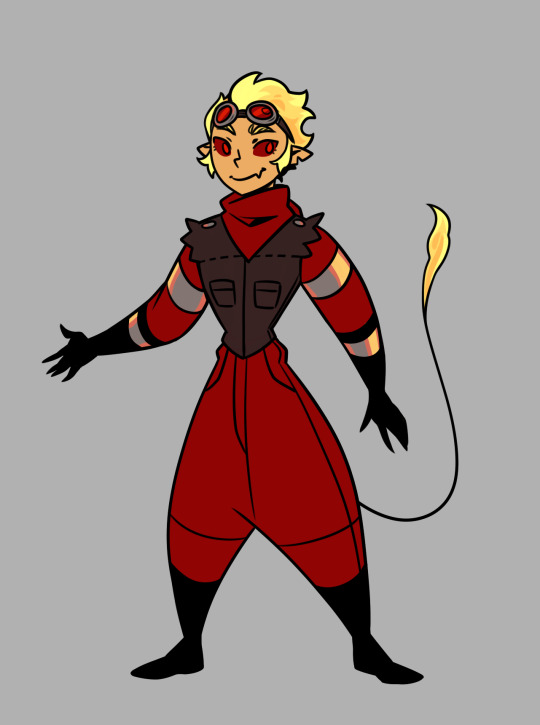
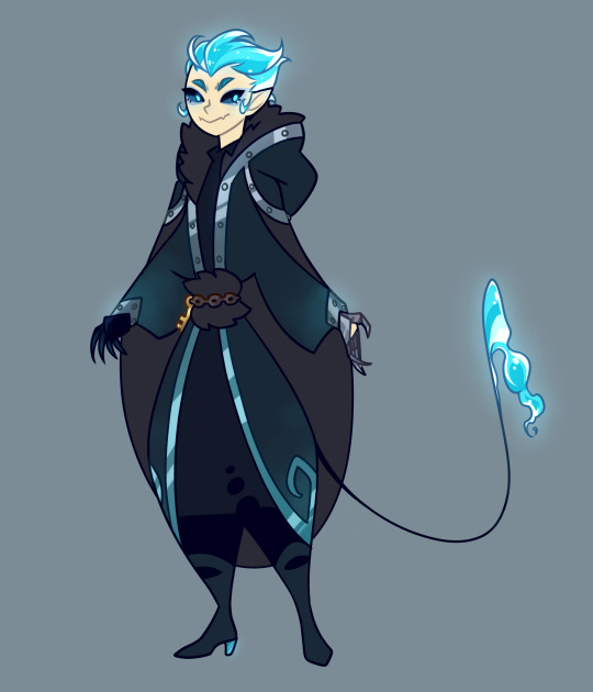
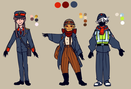
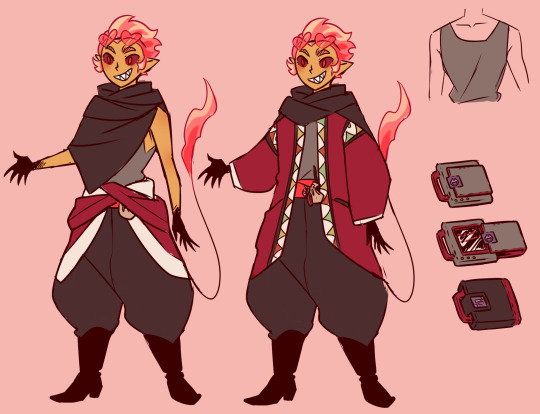
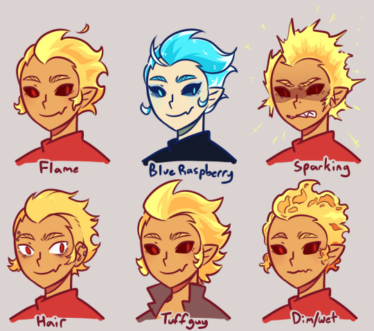
I try to keep my designs simple because the style I developed for mcyt art was intended for animations. I've drifted a bit but in general I keep to simple shape-defined designs with long lines, flat colours, and minimal wrinkles. It's intentionally flat in many ways in order to create more satisfying lines, like the collar of his shirt or the way his hands ' gradient is done with the line art.
Tango is both round and angular, basically he's an almond. His shape is ambiguous in much of his clothing, with very understated joints. This gives him a move cartoony elastic sort of vibe, like he's just a pipe cleaner that can bend any which way, or a piece of rubber that might stretch.
I avoid bogging him down with logic for that reason, his hair is styled like hair but it has the appearance and moves like fire. Which is it? Who knows. Where are his organs? I haven't drawn them so they don't exist.
68 notes
·
View notes
Text
How I draw: Proportions/sketching
The first response to a few art questions from @johnny-and-clyde :))
sketching:
So I honestly used to be a lot more…intentional about my sketching?? Up until a few months ago I would draw out actual sketches that I’d then cleanly ink on top of in a separate layer, like this:


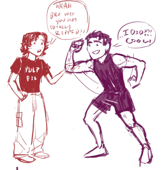

I’d try to keep things loose and easy, but I’m not fantastic at that lol
I have a tendency to over complicate sketches- It’s not super obvious here, but I did semi-map out the anatomy under the clothes and fabric folds. That’s probably a good thing to do, generally, especially since I was and am still learning anatomy.
I don’t do it much anymore tho, because I often got caught up in little details that just wound up covered by clothes 😭 So I generally focus on mapping out the clothing shapes over the proportions/ anatomy. Definitely study anatomy anyway tho- this only works for me nowadays because I did and still do study anatomy a lot lol
These days though, I don’t r e a l l y sketch that much. I mean, I do- but instead of making another layer and inking it, I kinda just clean up the sketch the way I would if I were using pencil and paper. I don’t have a lotta example images of this, because it goes from the sketch to the final lineart in one layer?
tried to reverse-engineer it here on this Angela drawing. idk how helpful that is tho lol.

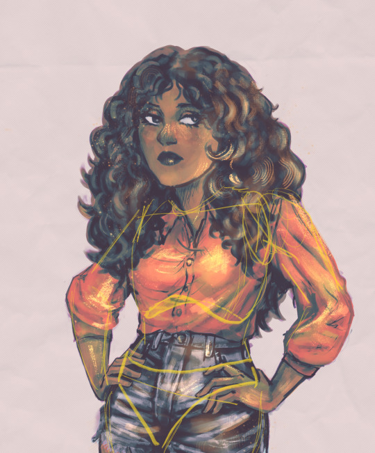
Idk, most important thing for me while sketching is remembering that everything has a 3D form, and also to FLIP MY CANVAS FREQUENTLY so that it stays balanced lol. -also- I almost always take note of the ribcage, the clavicle angle, and the hip angle when planning poses
-And I consciously try to keep things from getting stiff, and think of the pose as an intentional composition. I actually struggle most with plain standing/walking poses, because I very often can’t think of ways to make them look…idk, interesting? That’s why it’s taken me so long to finish pt.2 of my Outsiders character designs- I can’t find good dynamic-but-also-stagnant poses for them
proportion:
Honestly man idk I just sorta say “fuck it we ball” and hope for the best. I used to think a lot more about this one but as it’s become more and more natural to me I become less and less able to define/describe it?? I dunno lol.
My art style is semi-cartoony, and honestly kinda inconsistent in terms of proportions. I generally aim for the hands to be similar in size to the face, and for the shoulders/chest area to have enough space to fit the clavicle…but none of this is really a conscious decision? It just sorta happens. The heads/eyes of my characters are usually stylized, and so the hands end up a bit bigger to match the faces, and I tend to exaggerate muscle mass but not really muscle definition…And I also stylize things for characters to better contrast each other. For example, I’ve noticed I draw Steve Randle stockier/bulkier than he is to better highlight Soda’s slenderness.
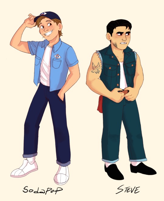

(see how they’re not as drastically different in build as I draw them? Steve seems bulkier mostly cos he’s shorter but has a similar amount of mass I think) (don’t quote me on that tho idk how to put this shit into words lol)
I have a pretty decent idea of how proportions are supposed to work from years of studying them, and I have no idea how to explain any of it. Just…do a lot of figure and gesture drawing, use a lotta refs, and it’ll make sense eventually 😭
#ask#how i draw#digital art#art tips#rambling#long post#< I mean not very long really but yk just in case
67 notes
·
View notes
Text

So I did some more Transformers drawings, and I figured page was full enough
I mean, it isn’t really, I could have fit more in the corner if I wanted, but I can’t think of anything else to draw there, so might as well post it now
So I suppose, let’s talk through all this
First off we have an Optimus I never finished, because I couldn’t get that bending shoulder to look right. It just looks off, and I can’t finish it until it looks right. So I never did
I think he’s supposed to be sad and yearning after the breakup with Megatron, and talking about it with someone
Anyways, then we move on to the Dinobot section, which I made because I started Beast Wars and like Dinobot, and had been attempting to draw him at work the previous day
I think I draw him too skinny, which is why I made that middle one, to be more accurate. But I also kind of like drawing him skinnier? I know it isn’t accurate, but I like making him so. Like he’s got muscles, but has a lean body type. I don’t know
Then today, I wanted to draw a happy, smiling D-16, who’s doing so at something Orion did for him (this isn’t supposed to be a recreation of the race scene)
I was going to do it more like the Dinobot style, but then I ended up going back to 3D boxes anyways
Honestly I think it’s one of the ones I’m most proud of, look at him and his sweet little face
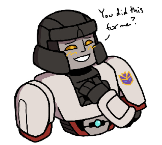
Still can’t get the sticker right though
But anyways, on to the last thing, the Bee and Elita
Honestly I think the two of them need some ships in this universe too. Megatron and Optimus got their whole situation, but what about them? Elita doesn’t really have any options presented right now outside of maybe Arcee and I guess Airachnid (but personally I’m not here for the toxic yuri right now), and I don’t really know about Bee
The sequels should give them new characters to have subplots and shipping with. It can’t all be Megatron and Optimus hogging the spotlight (even if I do like them)
As for the drawings of the two themselves, I mean it’s alright. I think Elita came out better though. But it’s also my first time drawing them, and it takes some practice for me to get them right
I’m realizing as I type this that I have a sketchbook, and I got good at drawing Dinobot after drawing him on sauce paper a few times. So like, I could just do that to try and practice the characters without needing to be at work, and having a handy place to keep those references. Hm, well that’s a solution for later
It also does not help that I don’t have good references for them, especially in their cogged forms. These are about the best I got, and they aren’t the best quality either, I do not know how to draw their heads (well mostly Bee’s)
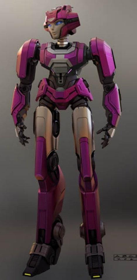
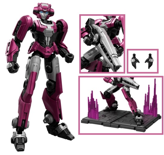
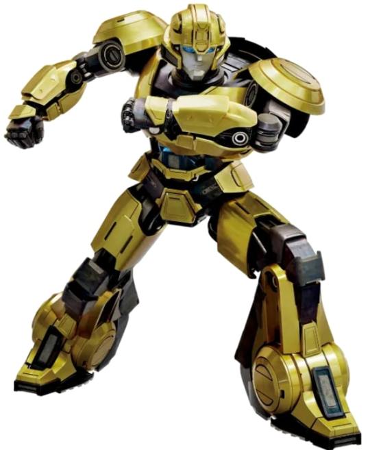
I also don’t think I’m drawing the Transformers One cast right. Like their bodies and general proportions I mean
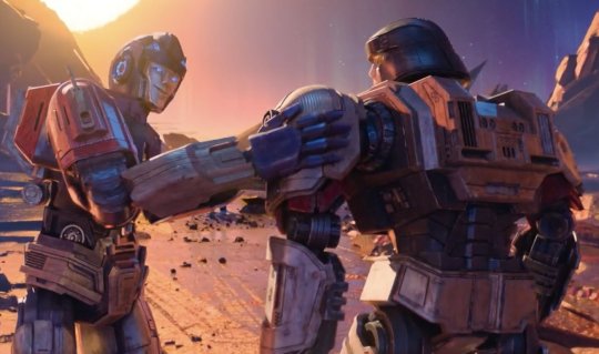
Like, I noticed from this random screenshot I saw today that D-16’s noticeably wider than Orion
And I also know that the quartet have their own distinct face shapes from one another
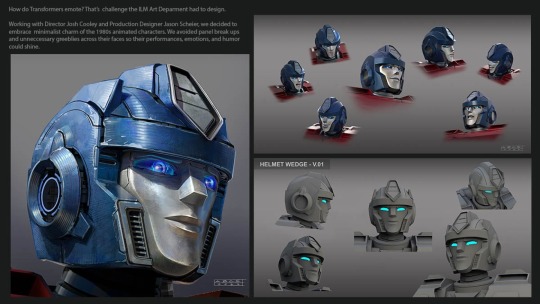
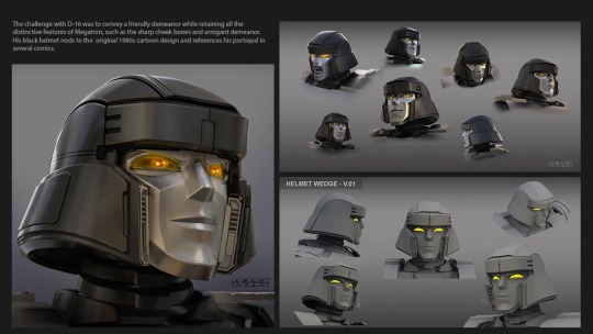
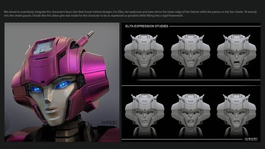
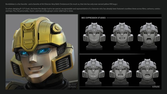
I just don’t know how to convey those things in my drawing of them, it doesn’t want to work
Also I don’t think I have the basic structure of how their bodies work down either. I noticed today that almost all of them have more cylindrical shoulders than the rectangles I sketch, and also they have those middle circle joints
This is an observation I’ve had before, but the Transformers One designs to me really feel like action figures/toys with the way they’re built and designed. I don’t really know how to explain what I mean, but it’s how I see these designs in particular, which I can’t say with Animated or I think Beast Wars either. If this makes sense
But yeah, that’s the drawings. I don’t really know how to end this
#I should probably try drawing more Beast Wars characters as well#I think Blackarachnia looks pretty cool#but I fear Dinobot was the easiest to design and the rest will feel like too much of a hassle#but back to TF One how do you people do it?#I don’t know how to draw them#but yeah#transformers#transformers one#beast wars#my art#d 16#optimus prime#dinobot#elita one#b 127
68 notes
·
View notes