#and overlay it on a teal background
Explore tagged Tumblr posts
Text

^ tensely deliberating whether or not i want to separately gradient dye every piece of fabric on this mans outfit. I think i already own denimy blue and black fabric dyes which would work for the skirt and outer cape, and i could get purple dye for the inner cape. How hard is gradient dyeing fabric tho?
Also i already own shoes that are the same shape and color as his but theyre like swirly florally burnt velvet, so not totally accurate but might add to the vibe
BTW if anyone knows of anyone whos already cosplayed eugene and wants to namedrop them, pls let me know!
#for his collar im thinking theres probably a sparkly glittery gold mesh out there#and it might work to dye that teal (blue over gold colored mesh?) to get a fabric thats tealish with gold sparkles#and overlay it on a teal background#might have some nice dimension and variation in color#also part of me genuinely considered getting his cartilage piercing LMAO but ill probably just glue some baubles on my ear#i do want to get a septum piercing but the con is in abt a month so no i do not have time to heal it and change out the jewelry#so fake septum will do#oh also i know the gradients are probs just shorthand for silky fabric or adding dimension but i love accuracy and going overboard#drawtectives
13 notes
·
View notes
Text
✦ ˑ ִֶ 𓂃⊹ 𝐎𝐊𝐀𝐘 𝐆𝐔𝐘𝐒... 𝐈𝐓'𝐒 𝐀𝐁𝐎𝐔𝐓 𝐓𝐇𝐀𝐓 𝐓𝐈𝐌𝐄. Choose a new 𝓽𝓱𝓮𝓶𝓮 for me please!!!!! Changes include: Theme, new tags, new pinned post, new masterlists - about me - dividers page etc., new profile pic.
-- ₊˚⊹♡ 𝐏𝐀𝐒𝐓 𝐓𝐇𝐄𝐌𝐄𝐒 ୧˚-- 𝒑𝒊𝒏𝒌 𝒑𝒂𝒓𝒂𝒅𝒊𝒔𝒆 & 𝒇𝒂𝒊𝒓𝒚 𝒈𝒂𝒓𝒅𝒆𝒏
-- ₊˚⊹♡ 𝐂𝐔𝐑𝐑𝐄𝐍𝐓 𝐓𝐇𝐄𝐌𝐄 ୧˚-- 𝑴𝑨𝑮𝑰𝑪 𝑶𝑭 𝑷𝑬𝑮𝑨𝑺𝑼𝑺

That’s right guys, I’m changing absolutely everything with this new theme. It’s gonna be amazing, crazy, and cute. But this time I’m giving ya’ll the choice to choose which theme you want next! Theme descriptions will be below the poll so read through each one and choose your favorite ♡
-- ₊˚⊹♡ 𝐓𝐇𝐄����𝐄 𝐎𝐏𝐓𝐈𝐎𝐍𝐒 ୧˚--
.𖥔 ݁ ˖𓂃. 𝑴𝑶𝑶𝑵𝑳𝑰𝑻 𝑩𝑨𝑳𝑳𝑬𝑻 ⋆˙⟡౨ৎ
˚₊ · »-♡→ satin ribbons and beauty in the lake. the curtain is closed but the dance goes on. ethereal ballerina meets gothic lolita. dusty rose, faded ivory, antique gold, soft plum. tragic beauty in motion, the last dance before the fall.
.𖥔 ݁ ˖𓂃. 𝑯𝑬𝑨𝑽𝑬𝑵𝑳𝒀 𝑩𝑶𝑫𝑰𝑬𝑺, 𝑩𝑳𝑬𝑬𝑫𝑰𝑵𝑮 𝑯𝑬𝑨𝑹𝑻𝑺
˚₊ · »-♡→ angelic heartbreak meets cosmic softcore. cloud white, baby blue, scarlet. broken halos, cherub gifs, fluffy white wings, blood stained beauty. prayers written in lip gloss, even heaven doesn’t want her.
.𖥔 ݁ ˖𓂃. 𝑽𝑬𝑳𝑽𝑬𝑻 𝑯𝑬𝑨𝑹𝑻𝑺 𝑨𝑵𝑶𝑵𝒀𝑴𝑶𝑼𝑺 ⋆˙⟡౨ৎ
˚₊ · »-♡→ secret admirer coquette + poetic longing and hopeless devotion. rose red, petal pink, soft wine. ripped up valentines cards, anonymous love letters, silk ribbons. you left them a love letter in every book they borrowed but never signed your name. written confessions & heart doodles.
.𖥔 ݁ ˖𓂃. 𝑨𝑹𝑪𝑻𝑰𝑪 𝑪𝑶𝑸𝑼𝑬𝑻𝑻𝑬 ⋆˙⟡౨ৎ
˚₊ · »-♡→ winter lolita with a polar bite. marshmallow, soft grey, muted robins egg blue. sweetness hiding behind lace mittens and fuzzy ear muffs. lace-edged snow globes, sugar-frosted eyes, satin bows on boots and icicles on heart shapes.
.𖥔 ݁ ˖𓂃. 𝑯𝑬𝑳𝑳𝑶 𝑲𝑰𝑻𝑻𝒀 𝑨𝑳𝑶𝑯𝑨 𝑪𝑳𝑼𝑩 ⋆˙⟡౨ৎ
˚₊ · »-♡→ tropical y2k girlhood meets soft sanrio vacationcore. sunset pink, coconut cream, hibiscus red, ocean teal. glittery flip flops, souvenir diaries, postcards that never got sent. hello kitty in a grass skirt, ukulele’s, my melody in a halter top collecting sea shells & secrets.
.𖥔 ݁ ˖𓂃. 𝑺𝑰𝑵 & 𝑺𝑾𝑬𝑬𝑻𝑵𝑬𝑺𝑺 ⋆˙⟡౨ৎ
˚₊ · »-♡→ crushed roses meet crushed velvet. this theme drips with dark romance and soft rebellion—sanrio sweetness wrapped in a black corset. pink and crimson. sparkling crosses, silver chokers, diary entries in glitter gel pen, and bubble baths full of rose thorns.
.𖥔 ݁ ˖𓂃. 𝑺𝑾𝑬𝑬𝑻 𝑺𝑼𝑹𝑹𝑬𝑵𝑫𝑬𝑹 ⋆˙⟡౨ৎ
˚₊ · »-♡→ the war never stopped sweetness. pale satin ribbons and camouflage. baby pink, dusty camo green, muted taupe, gunmetal gray, snow white. pink camo backgrounds & heart overlays, soldiers with hello kitty shields, bows on bullets, hearts on dog tags. bubblegum on battlefields.
#`✦ 𝓫𝓸𝓫𝓫𝓵𝓮𝓼ˑ ִ⊹#help me choose a theme pls#ya’ll are getting a lot of power#aesthetic#pink themes#pink#pinkcore#cute
90 notes
·
View notes
Note
your rendering is so good how do you do it
Thanks, I love your rendering too!! Gonna try and make a tutorial ^^
To start off, I'm on Clip Studio Paint and these are the brushes I use! First two for rendering characters (round brushes) and the other two for mostly backgrounds (square brushes)


I used to do lineart, but it takes too long >:( now I just make a sketch and sorta clean it up!

Next I fill it in with a gray color. For simpler pieces I just put in the flat colors, but for more paint-y pieces I do grayscale -> color! I'll be doing that here :)
Also, I make 3 clipped layers on top of the gray - two are multiply, and the top one is screen. On the first multiply, I do a soft gradient using an airbrush
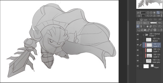
On the next multiply layer, I fill everything in with either a cool-ish or warm-ish gray, depending on the mood ^^
I also determine a light source, and use the lasso tool on the screen layer to block out where (I think) the light hits! Tbh I just do wherever feels right lmao, but I recommend having a reference! I like doing it in triangle patterns
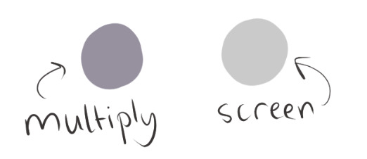
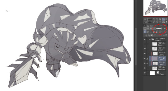
Then adjust the opacity of each layer to whatever feels right, and merge everything (I don't merge the sketch/lineart yet, I do it before adding colors in!)
Now... rendering. Some tips I have are color pick (greys) off of the canvas and use them to paint! Clean up the sketch more, erase edges, but I save details (like Galaxia's red gem, his eyes, etc.) for the end, or during coloring.
After I'm sorta happy with it, I merge the sketch layer, then duplicate it, and add a gradient map! I did this sunset-y one but changed the hue to yellow-ish, then lowered the layer's opacity ^^
Play around with the hue-saturation-luminosity setting!
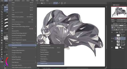
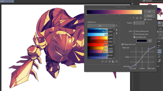

Now go crazy with blending modes! Multiply, overlay, color, glow/color dodge, etc. Feel free to layer them up on top of each other too, and this is to add the character/piece's actual colors in. For example, I used a white-blueish overlay layer for his mask and glove, blue for his cape, blah blah
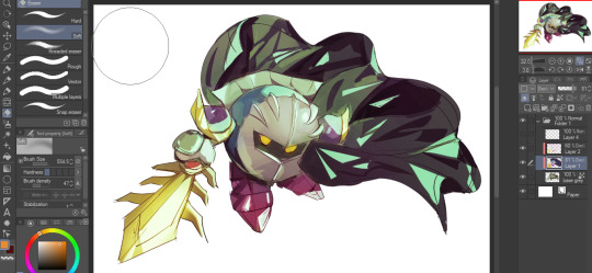
Now I clean the sketch up/refine it more. Also, to "harmonize" the color palette, you can add a colored gradient on top. Then set it to multiply, and add overlay/glow dodge layers with any colors you see fit! I like using teal and light/warm orange! Here is an example of a colored gradient:
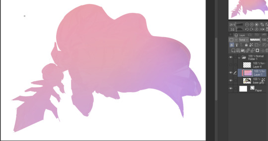
Another tip is to add saturated colors on the edges of both lighting and darker shadows, before blending it:

Also I usually add in a light blue/grey in shadowy areas, and lower the opacity for reflective light:

Also! You can lasso + use an airbush with a light blue to block out parts of the background (his cape here, for example). It helps with more depth!
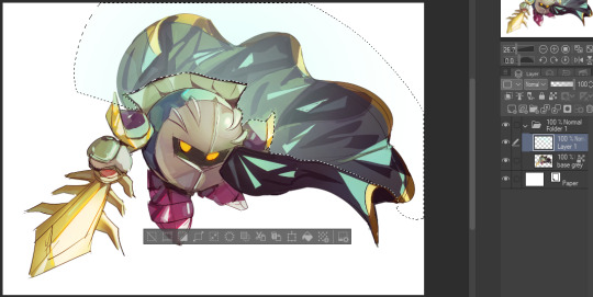
Finally, I like adding sparkles on low opacity :3 And gaussian blur to certain areas! I'm using radial blur on this piece though ^^

For the background, I like doing blocky shapes!! I use my square brush on 90% ish opacity, to color pick different hues from the piece. For lighting I use a glow dodge layer, here's a mini timelapse as well as the finished art!
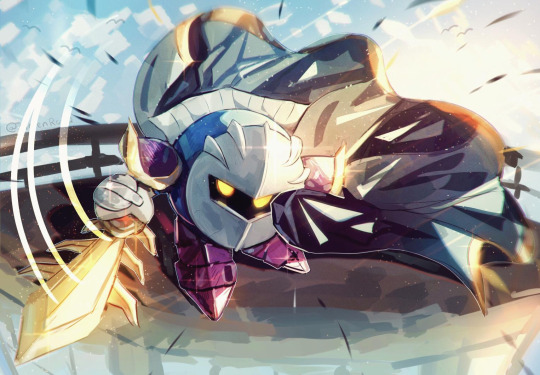
At the very end, play around with the hue/saturation and contrast tools to change the colors :)
#iiii hope this helped??#first time making a tutorial sorry!!#art tutorial#kirby meta knight#meta knight fanart#meta knight#nintendo kirby#kirby nintendo#kirby fanart#kirby series
589 notes
·
View notes
Text


[ID: A five page comic, centered on Aryox as he has a dream of Melora's future as a goddess. ID in alt text, and full description under the cut.]
@operationslipperypuppet hi alli.

higher than you'd think, apparently! um.... happy hoglidays, merry crickmas, i don't think i've laughed harder than when i saw the little message pop up that said my giftee was you, and i'm sorry for lying to you for a month.
this gift is in two parts. this comic, and the accompanying fic, which i've posted here! i hope you enjoy both, i'm really glad i got to make something about our guys. thank you for being a wonderful friend <3
for the @naddpodgifting exchange!
[ID: A five page comic, centered on Aryox as he has a dream of Melora's future as a goddess. Everything is drawn in bright colored outlines against a black background.
First page. Aryox (in light blue) opens his eyes slowly. Mist cuts across the top of the page behind the panels. The bottom half of the page is frameless, and shows Aryox standing at the base of steps leading up to a large temple, with mist swirling around it. Green vines wrap around the temple, with everything else being drawn in Aryox's blue.
Next page. Aryox walks up the steps of the temple, his hand briefly resting on one of its columns next to a green vine, then snaps his fingers and summons a light which he raises above his head, parting the mist. He stares into the distance, where within the mist a pale green light shines back. Grinning, he remarks "towards the light, then. Morbid." The next sequence shows Aryox walking through the temple, the edges of each panel just the columns of the temple itself. By the second, faint speech bubbles appear in the background. One is unreadable and yellow, and then in the third, as Aryox steps off-panel behind the column, a green text box faintly says "i'm sorry". Aryox stops and turns, saying "hello." Then a yellow (for Telaine) speech bubble appears isolated, reading "So THAT'S how little WE mean to YOU?" Aryox looks shocked, then looks away as his light extinguishes, looking hurt and guilty, and turns away. He marches forward as a green speech bubble (for Melora) echoes behind him: "how could you…"
The entire next page shows Aryox walking, then running through the mist, with speech bubbles and words echoing all around him. They start more spaced out, but by the end of the page crowd and overwhelm him. First, he walks with purpose. A text box in his blue shows that he's thinking "It's alright." The words he hears as he walks forward are: "(Melora) Aryox, don't do this, PLEASE." "(Telaine) I have nothing to say to you" "(Melora) I can't let you--" A closeup of his face is shown, just the bottom half, with his mouth set in a frown. His own voice, in the style of the other echoes, reads "I'm sorry Mel." Then, he starts walking quicker. Behind him is Telaine's speech bubble yelling "If you want my heart, you can do what [scribbled out] did and break it yourself". He walks through Lumi saying "She seems to have inherited Aryox's penchant for cold, calculating actions. They don't make for the best parents. At times, they don't make for the best friends." Melora says "Aryox". Next there are more of Aryox's thoughts: "if I betray them…", followed by a drawing of Telaine (in yellow) and Melora (in green) laughing together, "I have a reason." A speech bubble in gray offsets this, reading "[illegible], I pray to your indifference." Telaine says "Aryox al-- broke our-- pact and--" Finally, Aryox runs through a mass of speech bubbles. One panel overlayed on top of them is a closeup of his eye, staring forward. His thought cuts through them too-- "It's for their sake. For the future. Because I saw--" The speech bubbles are overlapping, and cutting each other off. They are: "(Aryox) --ell Telaine --'m sorry" "(Telaine) That is why I think [illegible]'s indifference is WRONG" "(gray/Mira) Saved --ed, but at the cost of betraying" "(Telaine) Aryo--" "(Callie, teal) I don't think even he was on his own side." "(Aryox) I know. I had to. If there had been any other way, I would've…" "(Melora) --about the world, I needy you, Aryox." "(Melora) I am not neutral. I protect the--" "(gray) May [illegible]'s indifference protect me." The last speech bubble is just behind Aryox as he runs-- Melora's voice begging "please."
The first half of the next page is entirely taken up by a drawing of a statue of Melora, in slightly faded green. She stands in a column of light, stepping forward, smiling softly with one hand extended towards the viewer. She's looking down, towards whoever is looking at her. Green vines wrap around her, and she carries a green branch in her other hand with yellow, blue, and green flowers on it. Below the statue, a tiny Aryox stands across from it, on top of the border of the next panel, as he says "Mel?" Aryox stares up at her in shock.
The last page shows Aryox staring up at Melora from the front, his ears drooping and text bubbles echoing behind him. They are mostly illegible but some words can be made out: "(Aryox) Mel" "(Telaine) Goddess" "(Melora) I need you, Aryox" "(gray) Melora's indifference" Melora is shown laughing, with the panel fracturing into ice below her and cracks running through the vision of her as Aryox things "no." He is then shown stepping forward raising a hand towards Melora, ice crumbling away from the border of the frame, with Melora's statue still standing across from him. Text echoes behind him: "(Aryox) I know. I'm sorry. If there had been any other--" "(Telaine) Melora's indifference is WRONG" "(gray) Melora, I pray ---ence" "(Telaine) THAT'S how-----tle WE--- YOU" "(Melora) Please." "(Aryox) If I betray them, I have a reason." The ice is cracking below them, too, as Aryox thinks "not you." Mist begins to swirl into the page, and very faintly in the background Aryox's name in light green begins to appear. Aryox reaches up towards Melora, then stares up at her with a frown, putting his hand on her cheek. It is small against her face, and mist cuts across the corner of the panel. It is cut off in the corner by Melora yelling "Aryox!", the tail of this speech bubble parting the mist on the page. The speech bubble leads to Melora in the only colored panel of the comic-- Melora and Telaine leaning over Aryox from his Pov, with his hand on Melora's cheek, bigger against it than the statue's. Melora frowns as she speaks, and Telaine smiles softly, her eyebrows furrowed.
The discord DMs after read: discord dms between me (stonestars) and alli from november. I say "I'm hoping. What are the chances one of us gets the other since we both put the eladrin." Alli responds "possibly high"]
57 notes
·
View notes
Text
Just a colour experiment 🌈
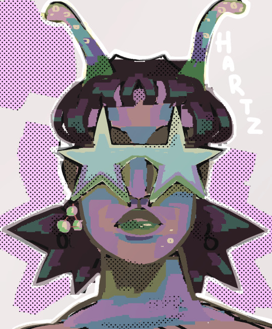
[ID: A woman, wearing star shaped sunglasses, with short baby bangs and very spiky hair below the ears. She seems to be an alien to some degree, having two antennas sticking out of the top of her head. She wears an earring on one side but not on the other, the earring is three pearls in a triangle shape. Her light skin is shaded in greens, pinks, blues and yellows. Her lips shades of greens. Her dark hair is shaded in desaturated purples, brighter purples and teals. Her sunglasses in pale yellows, blues, purples and greens. The background is a light grey, with splotches of pink around the character and halftones overlayed in places. The name, "Hartz" is next to the character. /end ID]
#art#described#described art#digital art#oc#original character#image described#original art#alien#alien art#hartz (oc)
107 notes
·
View notes
Text
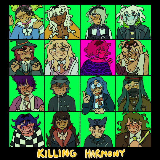
who killed rantaro amami? and a series of related mysteries.
[ID: a digital drawing of the student cast of danganronpa v3: killing harmony. all of them are arranged on a 4x4 grid. the background of the squares are all a bright neon teal, aside from rantaros square, which is bright pink with a heavy pink overlay. the rest of the background is black. towards the bottom of the image, the text reads "killing harmony" in bright yellow.]
#drv3#v3#danganronpa#danganronpa v3#killing harmony#oh boy time to tag all the characters#kaede akamatsu#rantaro amami#ryoma hoshi#kirumi tojo#tenko chabashira#angie yonaga#korekiyo shinguji#miu iruma#gonta gokuhara#kaito momota#kokichi ouma#kiibo#tsumugi shirogane#maki harukawa#himiko yumeno#shuichi saihara#joeys art#image described#this was a really big one but im so happy with how it turned out!#i have a lot of ideas for v3 art i cannot wait to finish this game#despite my issues with this game i do enjoy it! im having a good time!
155 notes
·
View notes
Text
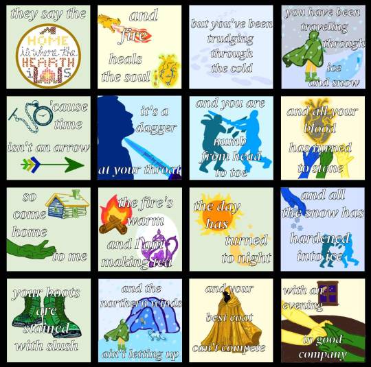
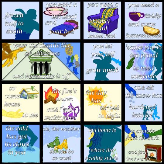
Home is Where the Hearth Is - Emily Axford (2024)
they made a pact. they broke the pact. they spent tens of thousands of years alone. and now, perhaps, they can start to be whole again.
image description under the cut:
[ID: two images that are show comic panels.
the first image is 16 comic panels showing words and drawings to correlate with the words.
from left to right, top to bottom, they are:
1: a light green background with the words "they say the" and then a gold circle with a cross stitch inside it, with the words "home is where the hearth is" stitched in, with a roof above "home" and a fireplace between the i and s of "is".
2: a light yellow panel showing a gold dragon breathing fire and a large yellow divine heart with blue and green veins with a humanoid with yellow hair, yellow skin, green pants, a brown tunic, and brown boots, (Telaine, the gold dragon) reaching out to touch it. there is a green and gold overlay to both so they appear to be glowing. the words over it say "and fire heals the soul".
3: a light blue panel with darker blue footprints moving through the panel, as though walking through snow. the words read "but you've been trudging through the cold".
4: a wintry scene with a humanoid in a green cloak with yellow pants and green, leaf-covered boots (Melora), cloak blowing in the wind. the sky is gray and the ground in front of her shows a blue patch of ice. blue snow overlays the entire scene. the words read "you have been traveling through ice and snow".
5: a light green panel showing a teal pocket watch and a green arrow with green, yellow, and blue feathers. the words read "'cause time isn't an arrow".
6: a light blue panel with a dark blue man, Aryox, with his chin tilted upwards, a blue knife pointing at his throat, lifting his chin upwards. the blue knife is inscribed with runes. the words read “it’s a dagger at your throat”.
7: a light blue panel showing two figures, frozen statues, one teal (Aryox) and one a different shade of light blue (Raedak). Raedak’s arms are extended and he is holding a sword, which has intercepted Aryox’s head. Aryox’s elbows are bent and shards of ice, the same color as him, extend into Raedak. the words read “and you are numb from head to toe”.
8: a light yellow panel showing a gray divine heart with golden veins. three hands; one blue, one green, and one yellow, extend toward the heart, as though to take it. the words read “and all your blood has turned to stone”.
9: a light green panel showing a log cabin with one side blue, one side green, a yellow roof with a green chimney, and a green window and door. below it is a green hand reaching out to the right as though to take another hand that is not there. the words read “so come home to me”.
10: a light green panel with a small fire on two logs and a purple and white tea pot with leaves as part of its design and steam coming out of the spout. the words read “the fire’s warm and I am making tea”.
11: a light green panel showing an image of the sun with an orange center and yellow rays surrounding it and a cream yellow crescent moon below it, surrounded by stars. the words read “the day has turned to night”.
12: a light blue panel showing a blue hand turned downward and blueish gray snowflakes extending down from the hand. below it is a smaller image of the frozen statues from panel 7, one teal (Aryox) and one a different shade of light blue (Raedak). Raedak’s arms are extended and he is holding a sword, which has intercepted Aryox’s head. Aryox’s elbows are bent and shards of ice, the same color as him, extend into Raedak. the words read “and all the snow has hardened into ice”.
13: a light green panel with an image of a pair of green boots with leaves drawn into them that have green laces, the boots Melora is wearing in panel 4. the toes and bottoms of the boots are speckled with light blue water stains. the words read “your boots are stained with slush”.
14: an outdoor scene with Melora, clad in her green cloak and green boots which are blowing in the wind approaching a light blue cave with a different blue interior. in front of the mouth of the cave is a light blue arctic fox, Lumi, who is glowing with a blue aura. the wall of the cave immediately inside of it is carved with an image of a gray divine heart with golden veins. three hands; one blue, one green, and one yellow, extend toward the heart, as though to take it, from panel 8. the sky is a grayish blue and snow overlays the entire image. the words read “and the northern winds ain’t letting up”.
15: a light yellow panel showing an image of an intricate gold cloak with a hood and many shades of yellow to create shadows and an intricate pattern. the words read “and your best coat can’t compete”.
16: a light green panel with a wooden window showing a purple night sky with the cream yellow crescent moon and stars from panel 11. in the foreground is a dark wooden table with two pairs of arms and hands on it, one pair is yellow and the other pair is green. the arms are resting on the table and the people are holding hands. the words read “with an evening in good company”.
the second image is 15 comic panels showing words and drawings to correlate with the words.
from left to right, top to bottom, they are:
1: a light blue image showing the teal head and torso of the frozen statue of Aryox from panel 7 of the above image. halfway down the torso, the color changes to the dark blue color he is in panel 6 of the above image (when he was alive). the dark blue is giving way to the teal. the words read “frozen half to death”.
2: a light blue panel showing an image of a pink bowl of hot soup on a matching pink plate with a spoon resting on the plate. the broth in the bowl is tan and has green onions floating on its surface. there is gray steam coming out of the bowl. below it is an image of a bed with a brown wooden frame. the made is made with purple sheets and pillows under a royal blue blanket. the words read “you need a hot meal and your bed”.
3: a light blue panel showing an image of a cushioned purple armchair. draped over the chair is a flannel blanket, the majority of which is yellow but has dark blue vertical stripes and dark green horizontal stripes. there is a fringe at the edge of the blanket that is alternating with the blue, green, and yellow of the rest of the blanket. the words read “you need a blanket and some rest”.
4: a light blue panel showing an image of a small purple teacup with brown liquid inside and steam coming off the top. there is a lemon wedge on the rim of the cup. below it is an image of a piece of brown bread with a layer yellow butter covering its surface. the words read “you need a toddy and some buttered bread”.
5: a panel that is twice the size of the other panels, separated into three triangles by gray lines. the left triangle shows a gold dragon flying upwards with its mouth open with a light green background. the center and largest triangle shows a temple with dark and light green stones constructing it, and large columns at the front. the top of the temple has a craving of a wavelike swirl at the center, the symbol of the goddess Melora. the right triangle shows a gray divine heart with golden veins. three hands; one blue, one green, and one yellow, extend toward the heart, as though to take it, the image from panel 8 of the above image, on a blue background like the cave wall in panel 14 of the above image. there are a pair of blue hands in front of it, holding a chisel and mallet, carving that image into the cave wall. the words across the top of the three triangles read “wear the mantle like an albatross” and across the bottom read “and never take it off”.
6: a light blue panel showing an image of the teal torso and head the frozen statue of Aryox from panel 7 of the above image, with the light blue sword of Raedak overlaying his head, as it does in the statue. the words read “you let yourself grow numb”.
7: a light blue panel showing a green hand reaching out to the back of the frozen teal statue of Aryox from panel 7 of the above image. between the statue are layers of blue and purple energy, keeping the hand away from being able to touch the statue. the words read “‘cause you’re too proud to need someone”.
8: a light yellow panel showing a log cabin with one side blue, one side green, a yellow roof with a green chimney, and a green window and door. below it is a yellow hand reaching out to the right as though to take another hand that is not there. the words read “so come home to me”.
9: a light yellow panel with a small fire on two logs and a purple and white tea pot with leaves as part of its design and steam coming out of the spout. the words read “the fire’s warm and I am making tea”.
10: a light yellow panel showing an image of the sun with an orange center and yellow rays surrounding it and a cream yellow crescent moon below it, surrounded by stars. the words read “the day has turned to night”.
11: a light blue panel showing a blue hand turned downward and blueish gray snowflakes extending down from the hand. below it is a smaller image of the frozen statues from panel 7 of the above image, one teal (Aryox) and one a different shade of light blue (Raedak). Raedak’s arms are extended and he is holding a sword, which has intercepted Aryox’s head. Aryox’s elbows are bent and shards of ice, the same color as him, extend into Raedak. the words read “and all the snow has hardened into ice”.
12: an image showing the blue cave wall with an icy blue floor and the feet and legs teal statue of Aryox. there is an additional layer of blue ice overlaying the feet of the statue. the words read “the cold has got its claws in you”.
13: an outdoor scene of two figures walking together through the snow up a light blue hill. on the left is Melora, in her green cloak, green boots, and yellow pants, braid peeking out from the cloak which is blowing with the wind. to her right is Telaine, with a golden yellow cloak, brown boots, and light blue pants. the sky is a slightly darker blue than the ground. snow overlays the scene. the words read “oh, the weather she can be so cruel”.
14: a light blue panel showing the torso of the teal frozen statue of Aryox. on the part of his leg that is visible is a pair of snowdrops, white bell shaped flowers drooping off of green stems. at his back are two hands, a yellow one above a green one, both of which are touching him. dark blue emanates from both hands, spreading throughout the rest of him in concentric circles. the words read “but home is where the healing starts”.
15: a light yellow panel with an image of 4 arms and hands, one yellow and one green each holding the hands of the two blue arms, as though to guide them somewhere. below that is an image of a fireplace, with brick walls, a stone border, and wooden mantle and baseboards. there is a fire at the center with two logs, the same one from panel 9 of this image. the words read “so come in from the dark and find the hearth”. /end ID]
#naddpod#not another dnd podcast#ba2mia#bahumia#aryox#telaine#melora#crumb mountain#3x60: peregrine#my art
117 notes
·
View notes
Text
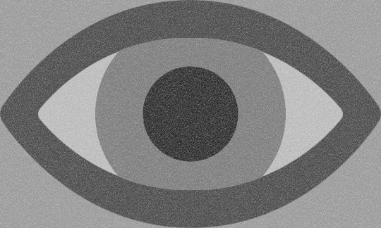
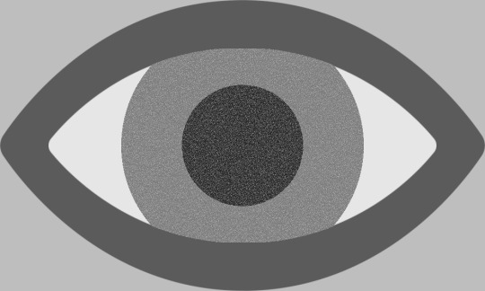
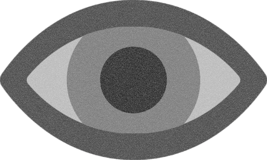
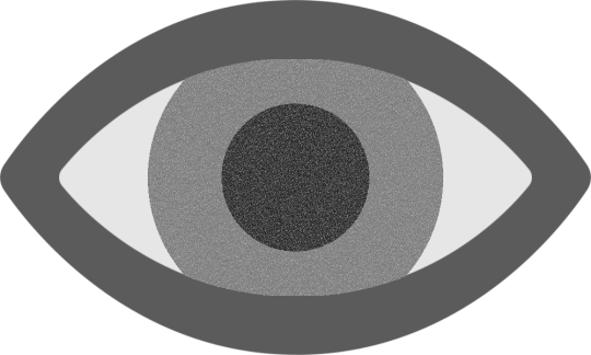
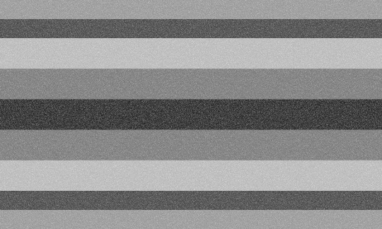


flag id: the top two flags each have a light grey background. over the background, as tall and wide as the flag itself, is an eye symbol with a dark grey outline, off-white sclera, a grey iris, and a near-black pupil. the top left flag is overlaid with static. in the top right flag, only the iris and pupil of the eye are overlaid with static.
the middle row has the eye symbols from the above two flags; these images are identical to the above images except for the lack of a light grey background. in the left image, the transparent background does not have a static overlay, but the entire symbol does.
the bottom two flags have 9 stripes, with the first, second, eighth, and ninth being smaller than the rest. the stripes are light grey, dark grey, off-white, grey, near-black, grey, off-white, dark grey, and light grey. the bottom left flag is overlaid with static. in the bottom right flag, only the fourth, fifth, and sixth stripes are overlaid with static. end id.
banner id: a 1500x150 teal banner with the words ‘please read my dni before interacting’ in large white text in the center. end id.
eye flag with full static | eye flag with partial static eye symbol with full static | eye symbol with partial static striped flag with full static | striped flag with partial static
alternate visual snow syndrome flags for @thatonefurryartist!
they suggested using dark and light greys and white with a static overlay. i decided to make some flags with an eye shape, isolate that eye shape as a potential visual snow syndrome symbol, and also provide striped flags as an alternative!
the left versions of the eye flag/symbol have static over the entire image, while the right versions only have static over the pupil and iris (since i thought it looked cool). i also made versions of the striped flag with static over the entire flag and static only over the colors taken from the iris and pupil.
tags: @radiomogai | dni link
#visual snow syndrome#vss#my flags#flag redesign#new flag#disability pride#disability pride flag#disability flag#liom flag#liom#scopophobia
43 notes
·
View notes
Text

[Image description: The screenshot of ilythedude's comment that read, "My request was politely stolen cough (in cap locks, next to emoji of clown and rolling eyes) how about some herrance instead, haven't made or seen art of them two in a while." Dated back to 07/04/2025. End image description.]
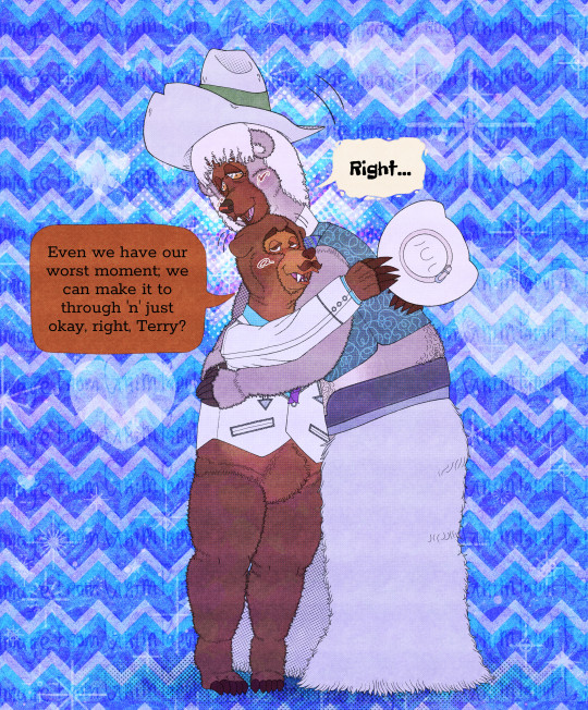
[Image description 1: Henry and Terrance from Disney's Country Bear Jamboree with tint of violet and blue, which exclude to their speech balloons, their clothes are from the Musical Jamboree Show. They're hug, content with droop eyebrows, half-close eyes, and make eye contact with each other. Henry and Terrance's ears go lower; the difference is that Henry goes lower more, while Terrance doesn't. Henry also holds his hat. The blush is more visible. Henry said, "Even we have our worst moment; we can make it to through 'n' just okay, right, Terry?" Terrance replies simply, "Right." Henry's left speech balloon is depicted as square with rounded corners, the point is the curve, coloured as medium brown; and the font's name is Rokkitt. Terrance's right speech balloon is depicted as slightly wobbly with a bit of rock; the point is curved, coloured in ivory, and the font's name is Freckles Face. The background has two spotlights as hearts and halftones on their head, four chevrons consisting of pale purplish-blue, azure, blue, and almost dark blue; while the retro heart is extremely opacity. The sparkling, stars, fireworks, and heart; many have a little dot around it, also many are designed as white minimal then overlay opacity. The black text that's repeated as overlay opacity reads, "I'm stolen the image from GrimPapuff". Henry is drawn as a brown face, the darkest brown eyes and eyebrows, eyelashes and a walrus moustache in dark brown; meanwhile, eyelashes and moustaches are also faded light, and coated in medium brown with brownish orange on the cheeks through the crotch. Henry has donned a white 10-gallon cowboy hat trimmed with a beige belt, and bolo tie as sliver metal tips has a little "CB" and purple ties. He wore a white suit with embellishments of flowers, lines, and an arrow as sliver shimmer; and one button, and azure shirt underneath it with wing collar. Terrance is drawn as a black face, amber eyes with beaded eyelashes, neck-length ivory curly hair, and coated in khaki with beige with slightly reddish as outline on the ears, the neck through the crotch. He has donned an upturned beige cowboy hat, wore a dark teal vest with light squiggly lines, white collars with a string tie composed of blue-green stripes, and a brown belt with white woolly chaps. End image description 1.]
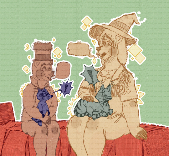
[Image description 2: Henry and Terrance sat on the bed, eye contact with each other, and have a talking with speech balloons show but no text. Meanwhile, Sammy is held by Henry's arms and stands on Henry's lap while an unnamed cat lays on Terrance's lap and gets petted; Sammy and the cat are making eye contact and shocked by this. Sammy and the cat's speech balloons are depicted as an explosive shape with one exclamation mark. Henry, Sammy, Terrance, and the cat are coloured in one colour. Henry is pale brown, Terrance is pale greenish-yellow, Sammy is dark greyish-violet, and the cat is pale greyish-green. The background is pale green, with a pale yellow rhombus around Henry and Terrance, and the ribbon triangle on Sammy and the cat. The repeated texts in overlay opacity reads, "I'm took the image from GrimPapuff". Henry has donned a tophat trimmed coonskin cap and dark ribbon, bibs with a bowtie. Terrance has donned a flattened pointed hat trimmed with dark ribbons, a necklace combining strings and dots with a single claw. Furthermore, he's wearing an indigenous cowhide vest with no pattern and above-elbow sleeves; his fringe is depicted as thick lace. There's the twin decoration on the shoulders. The cat is coated in dark stripes, with a light shade on the ears, face, and stomach, and is wearing a collar with a bell. End image description 2.]
The school made me slow process but, @ilythedude your wish is my command. 🫡 (I forgot that I wasn't supposed to render in the first image in too much 🫢)
#disney#country bear jamboree#the country bears#cbj#henry#terrance#herrance#male love male#mlm#achillean#digital artist#digital art#digital doodle#digital#doodle#artist#fanart#fan art#art#artists on tumblr#clips studio paint#csp#described image#described
18 notes
·
View notes
Text
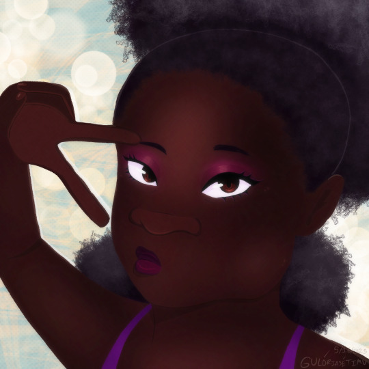
[ID: A bust illustration of a dark skin Black woman with coily/kinky pulled up black hair and cystic hygroma at the right side of her face. She is pursing her lips and doing a peace sign at her eye. She is wearing pink/purple makeup and a pink top. The background is desaturated teal yellow bokeh and swirl patterned overlays. In the bottom corner is my signature and the date 5/16/2025. (End ID).]
One more piece for Face Equality Week - a random woman based off some practices I was doing - but I like her so maybe I’ll use her design for something in the future
#black artists#black artist#face equality week#accessible art#described art#gs.misc#may 2025#2025#gulóriasétimu#described
18 notes
·
View notes
Note
sorry for a repeat question, but how do you add texture to your artwork again?
hi sorry this took so long! i was waiting until i had a good example drawing but i haven't been drawing much lately lol.
tl;dr: add the texture file as a new layer. then change its layer mode to something you like; i use "overlay" most often and "soft light" occasionally, but it's fun to play around with other stuff too. then adjust the opacity until you like it. repeat with as many textures as you want. then look at the finished piece to make sure the final color of everything feels correct, especially skin tones, and if anything seems wrong, adjust the base color until it seems right.
here's a download link for my watercolor textures.
now here's a detailed step-by-step of how i did the textures for this piece!
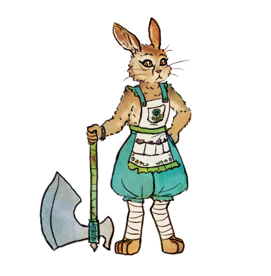
OK first here's my base flats. historically i usually use a plain circle brush to do neat flats, but lately i've been going sloppy using the same textured brush that i line with, which is a ton faster and the messy bits end up looking nice with the watercolor textures.
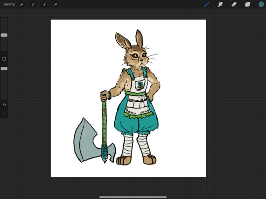
then i pick out a watercolor texture png that i think will compliment the artwork, and add it to the canvas. i use pink/purple/golds a LOT because they tend to look best with human skin tones (vs anything green-adjacent can make people look sickly, as one might expect). but sometimes i try to match a mood instead, like a cool teal-green forest or warm orange-yellow sunshine. in this case there's no scene so there's no lighting to consider, and it's sort of a ref sheet so i didn't want to get too whacky with it. so i thought that a yellow-orange would nicely compliment both the brown and the teal. however, i've found that using watercolors that are entirely bright red-orange-yellow turn out kind of flat, like everything is brightened to the point of not having much contrast within itself? so if i want yellow i usually go either yellow-green or yellow-pink or something, and in this case green seemed like the natural choice.
so, a predominantly yellow and green watercolor! i add it to the canvas, turn the layer mode to "overlay", and move it around until i think it looks okay — no stark high-contrast edges right across a character's face, for example. if there's a background i need to make sure it covers the whole canvas, but "overlay" layers don't effect white so it's fine to only cover the bunny here.
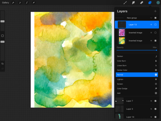
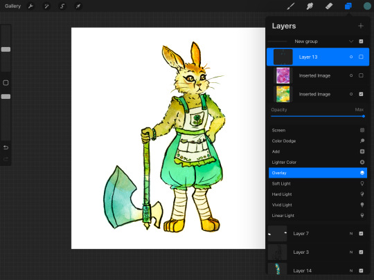
then i slide the opacity around until i think it looks nice — high enough to create visible variation, but not so high that i lose the original colors too bad. sometimes i'll change the layer mode to "soft light" for a softer effect, or "multiply" if the drawing has gotten too washed out and i want to darken it instead of brightening it, or even "hard light" or something if i want to get funky. but i use "overlay" like 95% of the time. my opacity usually ends up somewhere in the 20-50% zone.
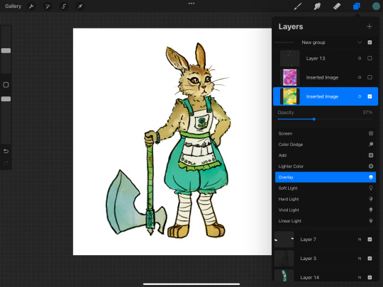
sometimes at this point i'll notice a section that seems funky. if there's a hard high-contrast edge across somewhere distracting, i'll go in with a textured smudge tool to soften up that bit of the watercolor layer. or if the colors are bad in a spot, i'll lightly paint on the watercolor layer with a textured semi-opaque brush — like hey, this shoulder is way too bright orange compared to the rest of the body, so i'm gonna even it out with some cool green. however, if you do either of these things too much you'll lose the watercolor vibes, so i only do it in one or two spots if it really seems necessary.
depending on how it's turning out, i'll add more watercolor layers, probably averaging 2 or 3 but sometimes up to like 10. in this case i decided i wanted a little more texture and the colors were a little too yellow-green. so i tried a blue to cool it down but that was too cool, so then i tried like a pink-orange as well, but it still wasn't turning out so then i was like fuck it back to trusty purple. so i ended up with just the yellow-green layer and the purple-pink layer! same process here with adjusting the opacity, and then fixing any bits that were distracting. (the versions shown here are already fixed bc i didn't think to screenshot beforehand — i can't even tell where i did the fixes, which goes to show how subtle it is — i'm using low opacity and high texture brushes for these fixes)
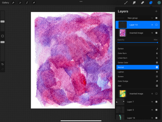
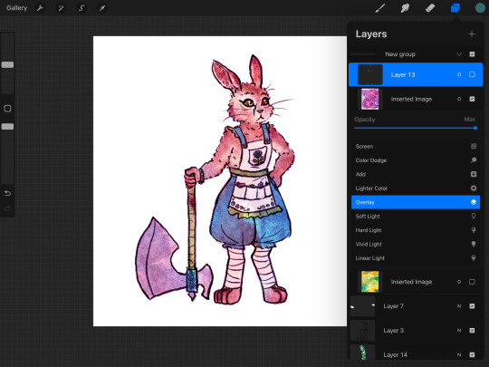
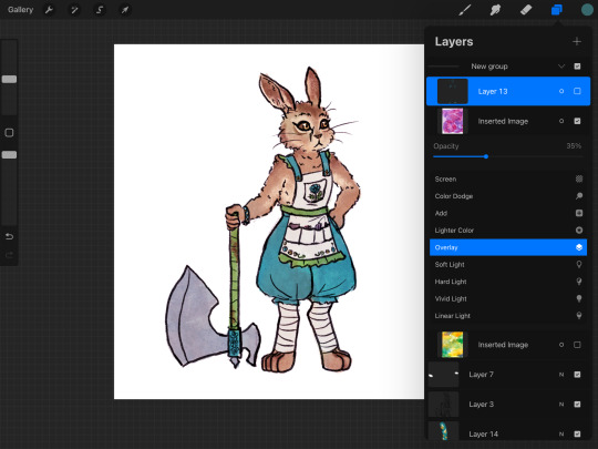
at this point i liked the amount of texture and the balance of colors, so i was almost done. but my last step is always to take a look at the final colors of the objects and make sure they turned out right — sometimes a color will end up too light or too saturated or something. in some cases it doesn't really matter, like these teal pants would be fine as any shade of teal, but it's super important with skin tones, and it's common for blacks to end up quite washed-out. final colors definitely don't have to be eye-dropper-identical to the element's official, objective color, but you want it to look right within the context of the piece! if anything needs adjusting, i'll either go back and change the actual flats, or i'll add an overlay or multiply layer of a flat color.

this time, i thought the dark browns of her fur turned out a bit too bright orange-brown, when they're supposed to be a cooler grey-brown. so i made a new layer and roughly colored in some grey-blue splotches over the darker browns, and set that to overlay. it's a subtle difference but i was happy with it!
in pieces with backgrounds, i'll often add some additional texture layers to only the background, for a couple reasons. first, tinting the bg with a different color helps the character's colors pop out. second, bgs tend to contain more elements that are inherently varied and textured, like bricks and bushes, as opposed to character elements like skin and fabric that are mostly one smooth color irl. third, heavier textures de-crisp the details of linework and base color, turning it all into a more-consistent mush; i don't want to do that to a whole piece, but it really helps when i want the bg to, well, fade into the bg; and if i was sloppy while drawing and coloring the bg bc i don't care about it as much, that messiness feels more purposeful when it's messily textured as well.
sometimes i'll even add a texture layer to just one element, like if i want to make the shirt look rough and dirty. to make the texture apply to only one element, you can either use a "mask" on the texture layer and color in the mask shirt-shape, or use "clipping mask" to clip it to a layer that contains only the shirt's base colors. look up a tutorial for your program to see how to use masks and clipping!
i use watercolor textures most often, but i'll also sometimes use a paper texture or a "grunge" texture. i don't remember where i got these so you'll have to search for your own, but to give you an idea of what i find useful, these are my favorite non-watercolors:
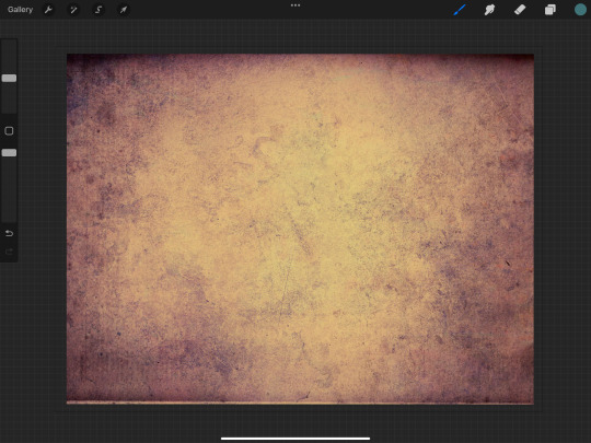

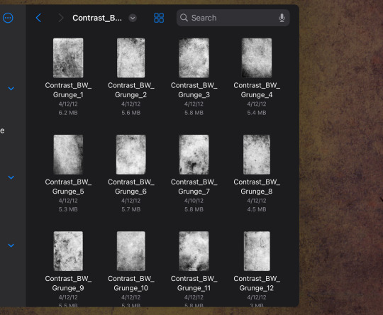
i like the colors of the yellow/purple paper and it does give a nice parchment feel, the dark blue grunge is great for caves and stones and dramatic lighting, and the black/white grunges are good for adding a more consistent noise-like texture as opposed to a dramatic blotchy texture.
and here's the link again to all the watercolor textures that i made! not every watercolor texture i use was made by me, but, i do use mine the most often bc i have good taste.
18 notes
·
View notes
Text
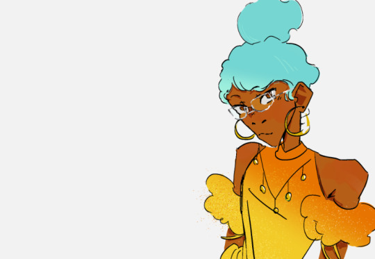
[ID. A drawing of Sei, a young woman with brown skin and very curly teal hair tied in a large bun over her head. She has silver ring earrings and glasses, a bright smile and wears a sparkly golden dress with shoulderless puff sleeves and some gold accents. End ID.]
princess! i heard you have a date?
(@aromanticsky 's Sei)
OH WAIT LAST MINUTE EDIT:
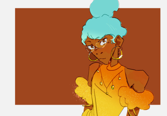
[ID: The same drawing, but now there is a brown square as the background and the lineart is more vibrating. /end ID.]
overlay lineart ily
#hmmmmmmmmmmmmmmmmmmmmmmmmmmmmm ok so i know we know sei is fashionable but what does this MEAN in the context of-#-the fantasy empire of rāmia. sky has some nice drawings on hir blog + a descroption of the fashion so i cpuld get a sense of what shed wea#but then i sorta messed around to my personal taste wpuld she actually wear this who knows not me#not...100% happy with her face i mightve messed up the angle but its okay!#others ocs#fanart#my art#edit: yup! adjusted her face i had mmessed uo the volume of her cheek and lips!#edit 2: okieee changed the color of her dress#it was green but it ended up looking like the brazilian flag and that is a forbidden color pallette no thank you i cannot unsee it#brazilian sei. XDDD then i tried like a teal but it was too cool and i wanted warm colors so yay golden! and her bun was way bigger#and tilting to a side#so i decided to make it right on the top of her head (which on this angle isnt rlly the top but shhh) and make it smaller she didnt have-#-that much hair did she#also sparkles bc i can#sei!#ok now i like it im glad i did more adjustments b4 posting#also i took a peek into her profile for aro week 2024 and it mentiosn she has#*checks notes* fragile x syndrome and that was the only one i had never heard of so i googled it-#-in case it was like idk down syndrome which influences the appearence and bingo!#i tried to make her ears properly big and her jaw properly long but idk if it reads that way or as stylization#anyways!
10 notes
·
View notes
Text
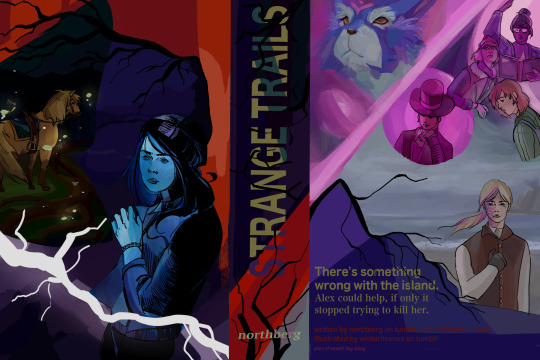
my piece for ssoblr big bang 2024! i'm very happy to share with everyone ! I worked with @northberg with their accompanying fic, strange trails, which is on ao3! please read it it's wondrous and amazing i really cannot sing enough praises for it ! i tried my best to reflect its energy as much as possible in this cover <3
alt text under cut
[ID: digital art: a faux book jacket cover of star stable online characters
on the left/the cover: tincan is standing 3/4 away from the viewer. fireflies surround him, illuminating the hollow woods behind him. some of the grass is visible and large roots are illuminated on the ground. this scene is in the shape of a moth.
above the moth shape is a spiky tree, framing the top part of the cover in red/orange. underneath the tree, the background fades from a indigo blue scene of a lake to alex, who is a teal blue and seems to be recoiling. white lightning flashes over her.
the center/spine: the title text "STRANGE TRAILS" with the font noto sans myanmar. the text is a lime green, with a streak of teal running through it, before shifting to a light purple. the background is a dark purple before transitioning to a red. black branches emerge out of the sides, obscuring some of the text/background color. at the bottom are small thin branches, growing vertically, with the author's name northberg being overlayed on top.
the right/back-cover: on the top-left is fripp and elizabeth, who is more of glowing silhouette. the background is pink and they are diagonally separated from the other characters on the right. on the top right is linda, lisa, and maya; linda and lisa are pink and look distressed, with linda casting a spell with a book in her hand, while maya is in natural colors and looks relaxed. ydris in pink is beside them; he is framed in a circle, looks mischievous, and has his hand tucked under his chin. beneath them is anne in a grey beach scene. anne has a solemn expression with her left hand over her chest. thin branches grow out to her left before transitioning to the text to the summary at the bottom of the image. the text is in lime green and the background is indigo and purple. the summary text: "There's something wrong with the island. Alex could help, if only it stopped trying to kill her." below is the credits: "written by northberg on tumblr and archiveofourown illustrated by winterlleaves on tumblr part of ssoblr big bang" /end ID]
49 notes
·
View notes
Text
happy anniversary to "Mane Mane Psychotropic" (マネマネサイコトロピック) by Kairiki Bear (かいりきベア)! this song came out 11 years ago today.

art by Shiomizu | youtube upload | august 23rd, 2024.
[Image description: A screenshot from the official music video for "Mane Mane Psychotropic". It depicts GUMI, holding her head with a worried look on her face. She's wearing a white short-sleeved button-up shirt, a yellow vest, a teal bow, and a red scruchie with stars. The background is a black and red gradient. Overlayed, at the bottom, is large text with a black and red gradient that read the japanese title of the song. End image description.]
16 notes
·
View notes
Text

It is a lovely day in Garlemald, and you are a horrible goose....
Many thanks to a wonderful friend of mine for asking me to draw her not her own Warrior of Light as a goose, but my (the purple and grey goose) and a mutual friend of ours (the black goose)'s Warriors of Light as geese, ready to attack Zenos, Untitled Goose Game style. This was an absolute delight to do, and I'm so happy I could deliver
Image ID under the cut!
[Image ID: A drawing of two geese and a man done in a lineless style inspired by that of Untitled Goose Game. The first goose is grey and purple, standing upright wearing a teal wizard hat, and holding a sword. The second goose, slightly behind the first, is black, lunging forward, and holding a wizard staff with a crescent and purple orb at one end. Both geese have an anime-style glint in their eyes indicating they’re on the offensive. The head of a man, Zenos, is partially visible in the lower left corner of the image. He has long blond hair and pale skin, though much of it is obscured by a faded blue overlay over where his eyes would be to indicate dread. While his eyes themselves are not visible, his Garlean eye (a pale, smooth protrusion in the center of his forehead) is. The background consists of a grey stone pathway in snow, with the brown roots of a tree visible in the upper right corner. There are some small tufts of pale green grass visible through the snow, particularly near the tree roots. A square, stamp style logo reading “Alex Tir Zeng” in red watermarks the image in the lower right corner. /End ID]
#ffxiv#ff14#untitled goose game#fanart#digital art#original character#my ocs#but also#not my ocs#Fandom OCs#paint tool sai#commission
12 notes
·
View notes
Text
Hi I made a miku design
I'm not drawing it but like it would look like this
Hair:
Iconic long twin tails, but upgraded with glowing neon streaks (like teal, pastel pink, and electric blue)
Holographic (what's her hair tie things called) hold them in place, projecting tiny floating stars or emojis.
Outfit:
'futuristic' take on the schoolgirl uniform: cropped silver top with a translucent overlay, and a pleated skirt that shifts colors
The sleeves are sheer with pixel-heart patterns running down them.
Her tie? Glows with soft LED light and syncs with her voice tone (like it she was singing low we'll say it's on the redder side and the higher the complete opposite on the color wheel)
Accessories:
Cute headphones cat-ear shaped and blinking lights.
Shoes:
Platform boots with digital wings that flicker like glitchy butterflies.
The bottoms light up when she dances.
Face:
Soft blush under her eyes
Her eyes look like animated screens—sometimes pixelated or showing little loading icons when she’s “thinking.”
Background (if visualized):
A dreamy neon city with floating jellyfish drones and pastel billboards playing snippets of her music videos. Or a digital stage with pixel confetti falling around her.
---
Idk chat draw it if you want but I just wanted to put it somewhere
4 notes
·
View notes