#and most of my coloring i do just by lowering opacity anyway
Explore tagged Tumblr posts
Text
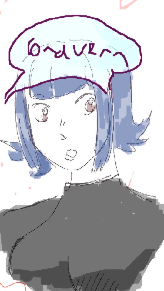
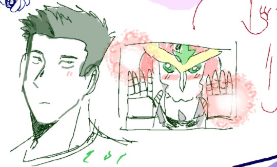
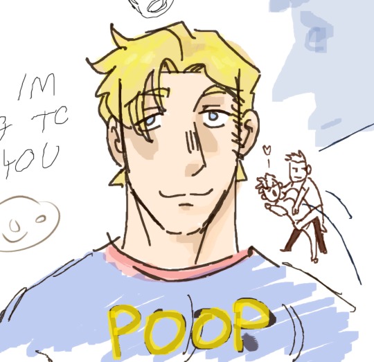
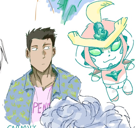
assorted ones from various draw togethers ive done over the past 2 weeks
#my art#bravern#i feel like im spamming the tag im sorry pls forgive me#magma drawpiles are like my native habitat i love drawing with no pen presssureee#and most of my coloring i do just by lowering opacity anyway
15 notes
·
View notes
Text
csp mini guide: edge eraser!
@lunasun hihi!! i tried to make an visual and wrote an explanation i hope this makes sense but if not then i failed LOL i hope you don't mind the tag
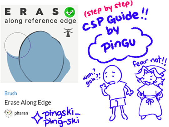

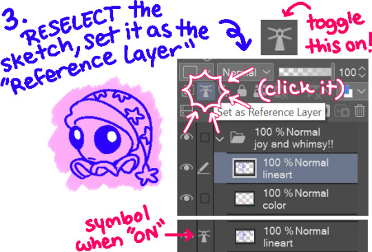
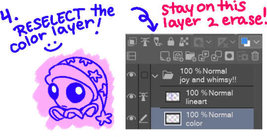

Erase Along Edge (Edge Eraser) text version!
1. Sketch or line as normal on one layer. 2. On a separate layer, below the lineart, color as normal. 3. Return to the lineart layer, and set it as the "Reference Layer". (Toggle ON by clicking on the lighthouse icon!) 4. Return to the color layer, select the "Erase Along Edge" tool, and erase the offending overlap! Aaand then you're done! Try stick to the outside of your lineart to avoid accidently erasing what's inside. As long as your brush size is reasonable, it shouldn't erase what's inside too much or at all unless if your cursor is inside of the lineart!
Quick Troubleshoot
"It won't erase properly?" "My lines aren't opaque and/or is too messy." That's OK!! While I do recommend solid lines (few gaps or none) or opaque lines (at 100% opacity), it's NOT necessary! It just makes using the tool easier! Most of the time you can get away with it, so don't worry about having to change your style or anything. If the lines are not solid (have gaps) or aren't opaque (lower than 100% opacity), please refer to the tool properties/settings! You may need to experiment here. Adjust the "Tolerance" and "Area Scaling" settings and repeat the process until you reach your desired result! Please note: If lines intercept (creating small "pockets) or opacity is still an issue you may have to manually erase anyways (sorry lol). By all means, it isn't perfect BUT it is a BIIIGG time saver once you have it down! The creator (pharan) makes more specific points and fixes in their guide that is far more in depth! I just want this to be easy to understand for anyone who's never used it before or is trying it for the first time! :)
#clip studio paint#csp ex#csp pro#fnaf daycare attendant#dca fandom#moondrop#pingdoobles#god i HOPE this makes sense#please tell me if it doesn't!!!#im not used to making guides or anything and i DO NOT claim to be a professional#im also happy to answer more questions or help further explain if there's still confusion!#ok i need to sleep i have to work and it's almost 6am awkughaw#will make a 2nd guide on the lasso fill tool “ice cream man” thing sometime l8r#idk when later is but at some point#my eyes are drooping while i type god#i am the eeper gn!! (or gm??)
160 notes
·
View notes
Text
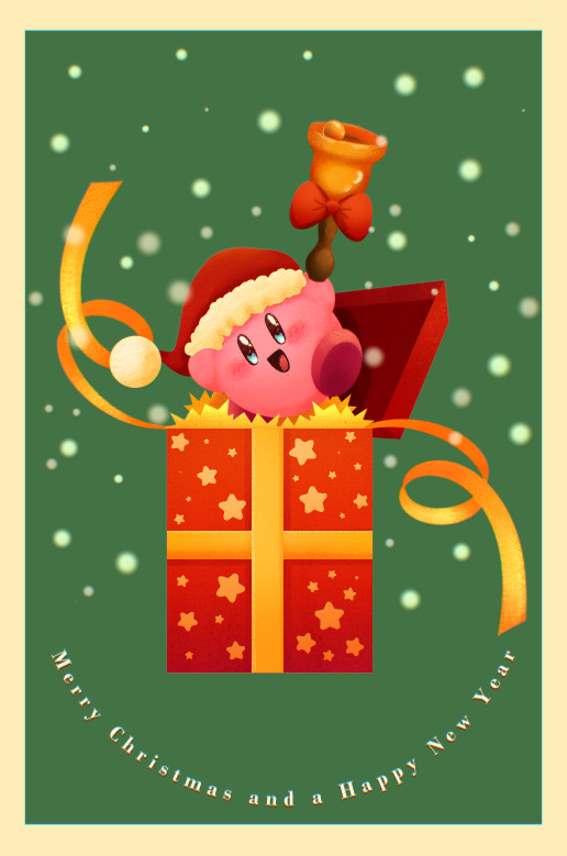
Merry Christmas and a Happy New Year!!!
Fun fact, in making this image it was surprisingly my most easiest yet visually pleasing work. I've always viewed at as a graph like this
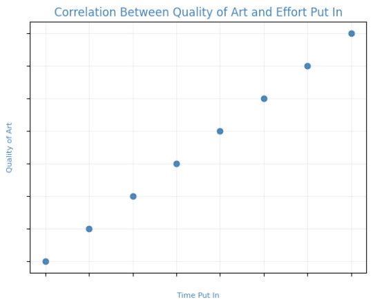
Of course, that isn't true! It's more like this
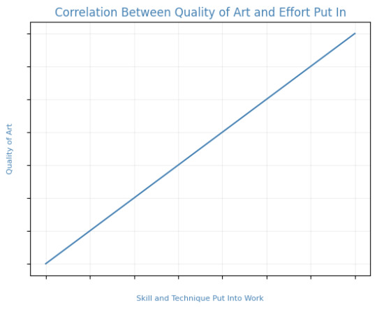
That is to say, I believe this illustration allowed me to focus on the efficient fundamentals I built!

Everything here was rendered with only three brushes. All of them the default brushes that come with CSP. Which includes Pastel, Airbrush, and Mechanical Pencil. Because it was a lineless style, that means I could be a lot more forgiving of mistakes here and there. Something doesn't look right? All I gotta do is add a little more with the GPen to the shape. Or can I just draw an outline in the color I want and fill it in with the bucket tool with a area scaling of 0.10! I have to practice more with lineless styles, it is fun! Rendering was a breeze too.
Which was a simple process of:
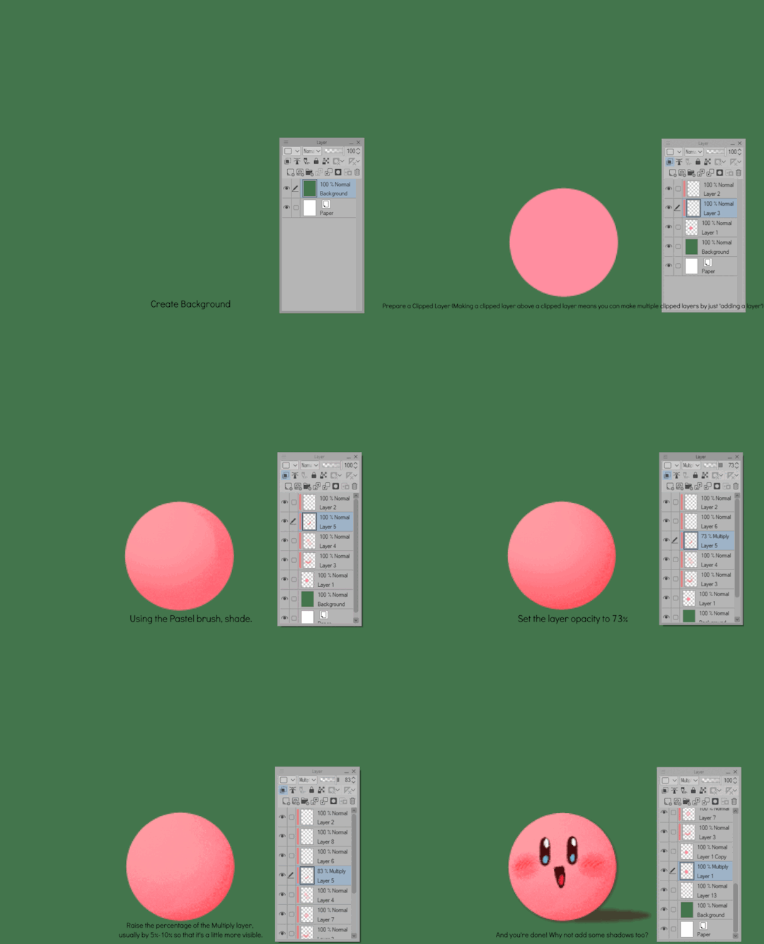
Create shape > Shade with Airbrush > Highlight with Airbrush > Shade with Pastel > Multiply Shading > Lower Multiply Layer Opacity > Overlay with Textured Fill > Move Textured Fill Layer > Finished!
It's a few steps, but once you get into the groove, it becomes very efficient. I'm sure there's ways I could shave off a few layers, like combining the Airbrush process into two layers instead of one but ehhh sometimes I do it, sometimes I don't. Usually, the bigger the shape the more likely I'll use more layers and the smaller the shape the less likely I'll use more layers! Of course, this process isn't a concrete ruling. Sometimes, I'll use more layers for extra things like the bell required more layers for rendering the shininess of metal! Anyways, I would like to believe I did a decent job at recreating the feel, the vibe, and or general look of an old Christmas Card that's more retro in nature. With a focus on simple shapes, a lineless rendering style, and using textured brushes to render, I think I got it down packed. I used a tiny bit of Chromatic Aberration to give it a little bit of a visual pop, and brighten up the colors. It's subtle, but it works.
Oh, and here's something cool! To get a more embossed Christmas Card feel, I used a new tool that came with Clip Studio Paint!
N O R M A L M A P !
Cool, right? I use a pirated copy of Clip Studio Paint 3.0 and it comes with a tool that allows you to create normal maps from illustrations. Which, from what Google tells me: "A normal map is a texture mapping technique used to add surface details to 3D models without altering their geometry" ...Neat!
Anyways, here's what it looks like
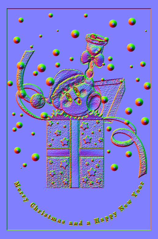
Freaky, right?
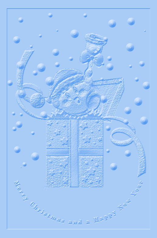
It looks like an embossed letter when you set a layer color to it too!
Anyways, I overlayed it on top of the finished illustration, set it to multiply and set the layer color to a warm yellow and it gives it not only texture but a sense of depth too! It's super cool, if you digitally paint you should try it!

With Normal Map Overlay Effect
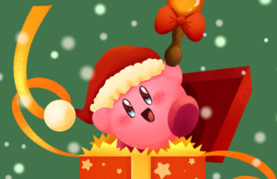
Without Normal Map Overlay Effect
It's subtle but it's there.
Anyways, that's enough blathering from me! Merry Christmas everyone! I'll be answering some asks this week, so stay tuned!!!
59 notes
·
View notes
Note
How do you color in your art?? I can never make mine look right, i’m still relatively new to procreate and I just wish I could instantly know how to use it because AGEGGS
I don't use Procreate and I'm not sure what you're personally having problems with, so I'll just go through my process using some of my old drawings and try to give some general advice that might help
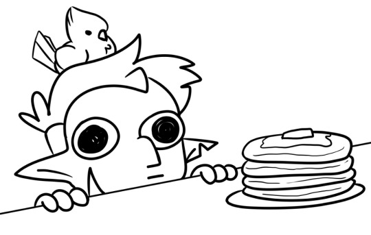
So I have the line work of "Hunter wants pancakes" here. I usually copy images from screenshots of the show and paste them onto the canvas so that I can eyedrop the colors, but I probably had it on a different canvas there.
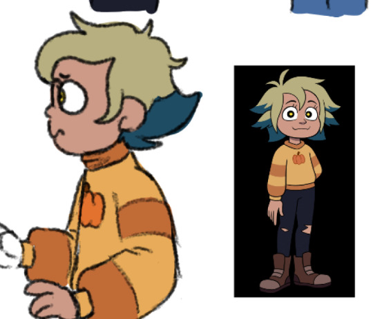
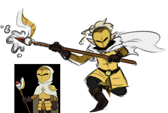
Sometimes I'll change the colors a little bit for clothes to make them a bit brighter or less saturated (depends on what I think looks better), but really for fan art of characters that already have a color scheme, I just copy the colors.
But your line work is going to be your topmost layer the majority of the time. All the coloring stuff should be underneath the line work so that if you do color into the lines, the linework isn't impeded
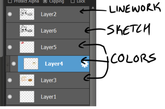
I typically put all my colors on the same layer, but feel free to use layers in whatever way is more convenient for you. (When I'm doing lineless, I'll typically make a new layer for each color so that I can shade them individually later on. Idk if that's at all smart or convenient but it's just a thought)
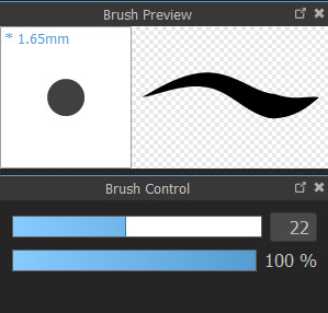
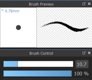
As for the actual act of coloring, I pick a large, textureless brush. You could use whatever you want depending on what kind of look you're going for, but for my finished pieces I usually like the coloring job to look cartoonishly clean. Like you can see that the second brush changes opacity as it reaches the end of the stroke (or with lighter pressure, since I use a pen), which I don't want, since I prefer the colors to be uniform in shade and texture. So I use the first one instead. Also less texture helps keep the color in the lines from my experience.
I don't use the paint bucket tool very often because it typically won't fill in all the white space, especially when your work is more detailed (which would lead you to have to go back and go over all of the edges again with a brush anyway), so I color most everything manually now. But for "Hunter wants pancakes" I think I did use a paint bucket and then probably went back to fill in some of the gaps since there are clean white gaps where the line work would be.
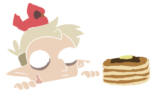
That is to say you should color with your line work visible (I don't know who wouldn't but I'm trying to cover all the bases here). You made yourself a coloring page, now you get to enjoy it. Without the lines it can look pretty silly and very messy, but it doesn't really matter if it's going to be covered up by your line work anyway.
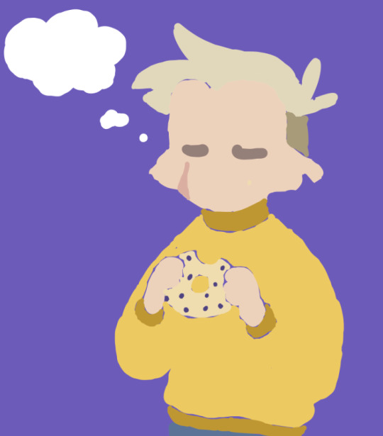
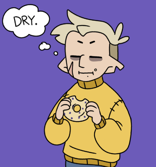
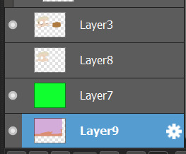
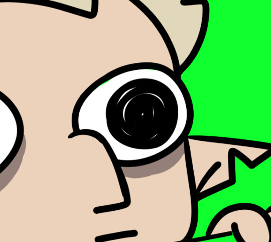
Sometimes when you're coloring with lighter shades on a light background, it's hard to tell if you're missing a spot. I like to use a really REALLY saturated color like neon green or red to see any gaps in the color. Put the layer of neon green under the color layer and it will become very obvious where you missed haha. Sometimes I'll look at the neon color for too long and will need to change it to refresh my eyes
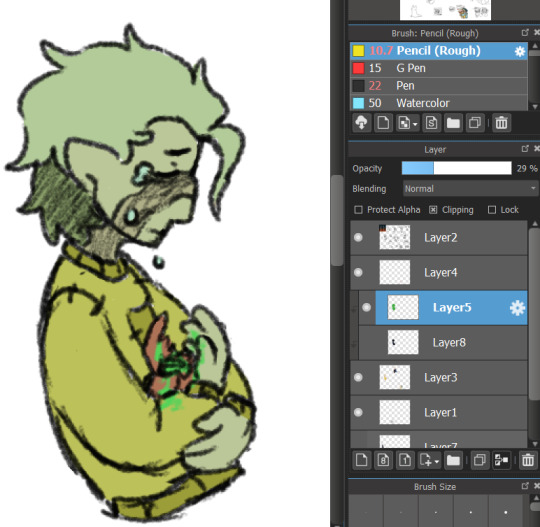
This colored sketch isn't very clean but it shows that you can also make a clipping or masking layer (if you don't know what that is the Internet could honestly probably explain it better than I could), color over the whole thing with a different color, and lower the opacity to give it a cool-looking tint
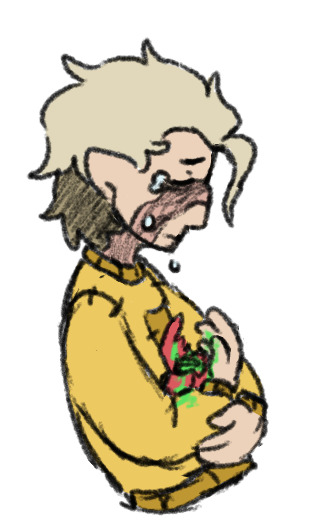
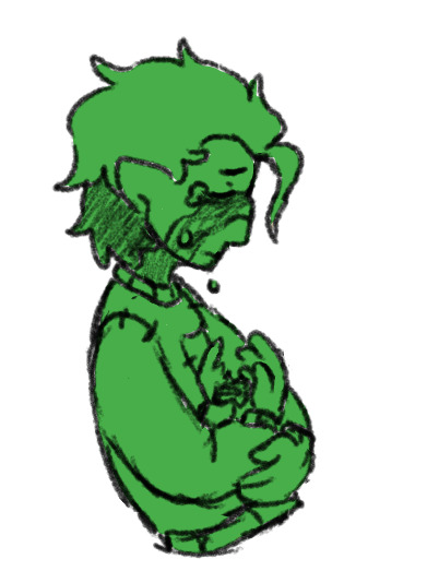
I don't know what your specific issue was but hopefully I was able to clear at least something up for you
19 notes
·
View notes
Text

Gradient Maps For Dummies <3
— as written by a dummy
it’s been a while! hello gracious reader and welcome back to the series where yours truly fails at explaining things: photopea for dummies. if you’re unfamiliar, this is a series where the admin of this blog tries to explain how photopea works. whether or not the series is successful is yet to be determined.
today, we’re attempting to tackle yet another one of photopea’s adjustment layers: gradient maps. gradient maps have become more popular in the editing community lately, so i’ve been meaning to make this one for a while. apologies for the delay!

what is a gradient map? a gradient map is a form of layer that adheres a gradient to a photo’s dark and light values. a gradient fill is something different altogether, wherein a gradient is made atop the image without regard for the image’s original form.
think of it as a bedsheet. when held upright, a shield is just a rectangle, but if you lay it on something three dimensional, you can see the object beneath, because gravity causes the sheet to adhere to whatever is beneath. in our case, your image is two dimensional, but a gradient map applies different colors to the dark, light, and middle values.
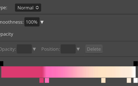
this is the gradient map used on all of the icons above. i made this one by experimenting with different colors. to add colors to a gradient map, double tap below the line, and you’ll see a small square appear. click the square to choose the colors you desire, and feel free to adjust it as you wish.
in photopea’s gradient maps, the colors closest to the left will adhere to the darkest parts of your image, while the colors closest to the right will adhere to the lighter parts of your image. the saturation and lightness values of your color itself don’t affect this at all—for example, here’s the same gradient map applied in reverse.

(to reverse a gradient map, toggle the reverse button as seen above. to undo it, just click the button again.)

pretty different, right? especially with no blending modes or adjustments in opacity, this gives your images a spooky negative look. if that’s what you’re going for, go crazy. if you want something a little more plain, set your darker colors on the left, and your lighter colors on the right.
exactly how the editor utilizes a gradient map is up to personal preference. some editors use gradient maps in lieu of complicated psds, while others like myself use gradient maps as one of the pieces of our complicated psds. gradient maps often go hand in hand with blending modes—for more on that, see here.
personally, i use a gradient map as a base for most of my psds.

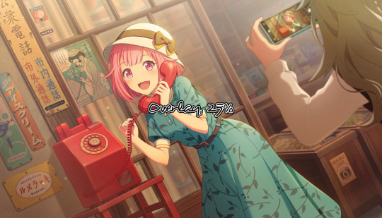
the exact settings are up to you, but i typically use either blending mode soft light with 50-75% opacity, or blending mode overlay with 10-25% opacity. the gradient map i use is one of the default ones available in photopea, a simple black and white set to reverse.

i like to use this gradient map to soften the colors and as a simple, easy to do base for all of my psds. if you look in some of the psds i have posted, you usually see this at the bottom or close to it.
how else can i use a gradient map? anyway you want, really! as you can see in my example image, gradient maps can be used to completely change the colors of your project, or to add a little bit of spice. something else you can use is a noise gradient map for texture.
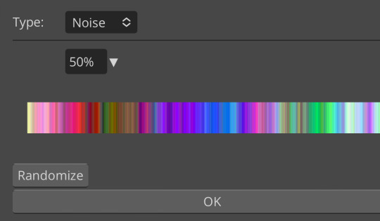
go to the gradient map itself as if you’re going to adjust your colors, and switch the type from normal to noise. then click randomize until you land on something you like!

it looks something like this. set to normal is pretty chaotic and janky looking, but set to soft light or to a lower opacity hue setting, this can be a great way to add some flare to your psds!
like with a lot of things in photopea, it’s best to experiment on your own and figure out what works best for you. i recommend playing around with opacity and blending modes, as well as what color combinations you personally like. every editor’s style is different, and the sky’s the limit with what you can do!
yours truly, canarysage
#i have a migraine so i sincerely apologize if this is incomprehensible#photopea for dummies#ʚɞ — tips.
73 notes
·
View notes
Text
My Paint Tool Sai Brushes/Painting Process Tutorial!
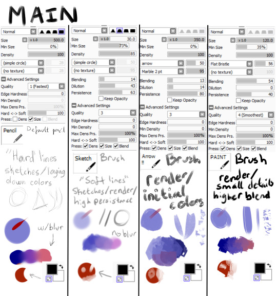
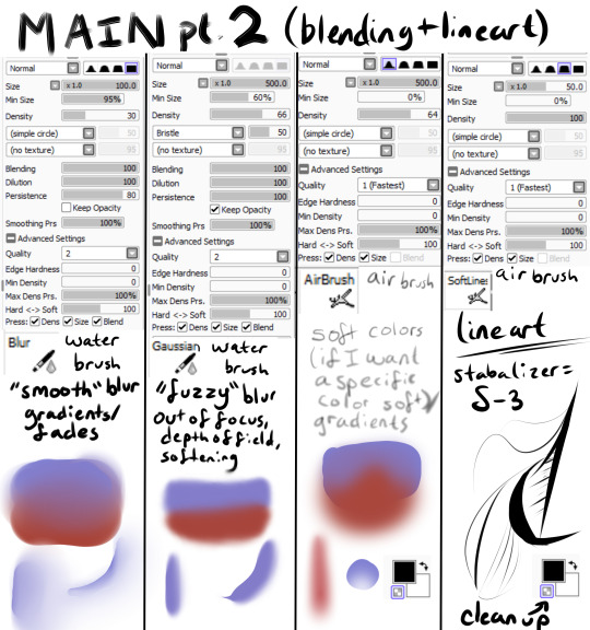
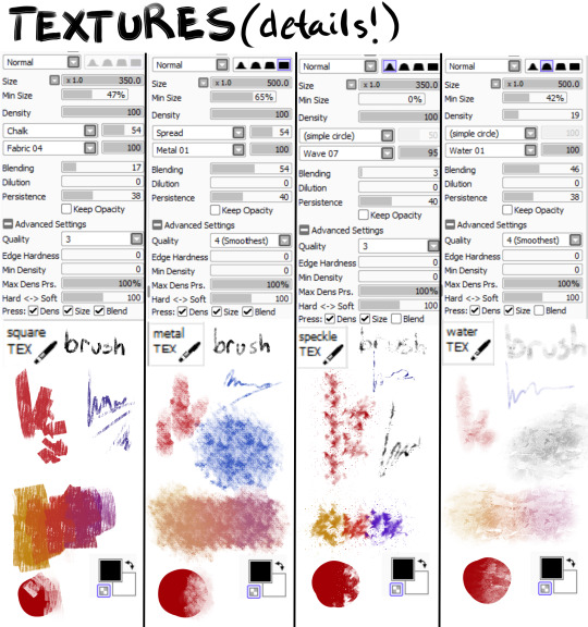
Explanations and Examples down below
Disclaimer: long post
Hello! I wanted to first thank everyone for liking/reblogging my most recent art piece (the Darkiplier one) It has become my first post with over 1000 notes which is just insane for me. I just wanted to do something to thank you guys for that.
Anyway, this post will be divided like this, so scroll to the title if you want specific things
Introduction
Brush textures/shapes for download
Overall process -> Terms and Definitions
How I use each brush (+ examples) -> Sketch -> Lineart (only do this sometimes) -> Rendering -> Textures + Post Processing
Conclusion
Introduction
This post is mainly for me in the future to look back on how my painting process was. My process changes ALL the time, sometimes I use lineart, sometimes I paint, sometimes I don't use textures, sometimes I have 100 layers, sometimes I have 1. It just changes depending on the piece. There is no "correct" way to do art. Do what you want!
Second of all, I feel I should point out you don't need fancy brushes or many brushes to make good art. I painted this piece with 1 brush.
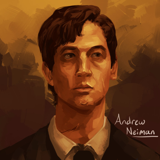
That's right, 1 brush (it was the P A I N T brush shown in main). I didn't have a sketch, I didn't have any lines, I started with big shapes and went from there.
Third of all, I use Paint Tool SAI (the first one). So this will be specific to that program. I'm sorry, it's just what I know how to use.
Brush Textures/Shapes
You may see in my brushes that there are textures/shapes that don't come with the standard SAI program. I tried to find the links for you to download them yourself.
Arrow: https://www.deviantart.com/digikat04/art/Custom-SAI-Brush-I-265506547
All texture brushes: https://painttoolsaibrushes.splstc.com/painttool-sai-textures/
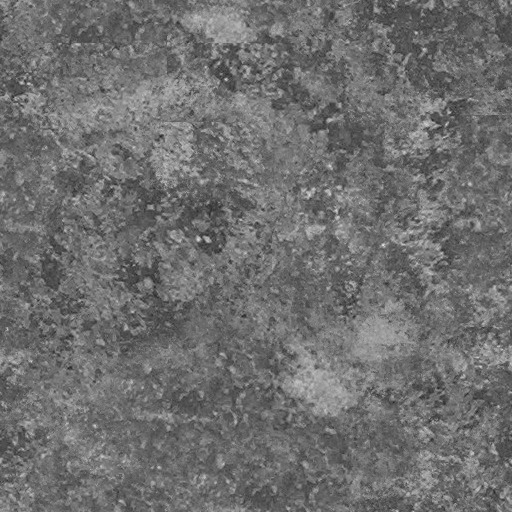
For some reason I can't find where I got marble pt. 2 or chalk so here's the png files. (You can convert them to .bmp files) (Hopefully that works!)
Chalk : Marble pt. 2

Overall Process
Before I go over my process I'm going to define some terms I'll be using and what I mean by them:
Flats - base colors
Rendering - Includes shading, lighting, small details, and texturing to define a form
Blending - mixing two separate colors together
Reduction - Once you've made a line/shape, reduction is the act of erasing part of it -> At the bottom of my brushes (in the images up above) you can see a checkered box which makes your brush transparent. I use the erasing brush to Reduce the red circle.
Persistence - How well the brush can create a new shape/color on top of pre-existing colors (If the brush blends a lot on top of other colors it has low persistence)
"Hard" vs "Soft" brushes - How well defined an edge is on a brush
Stabilizer - Turns trembly lines into smooth lines
So, I draw a different way each time. My canvas size is normally between 2500 pixels and 4000. I usually do around 3000 though. In general for my paintings I usually do
A sketch
Flats
Hue Shifts
Lighting/Shadows
Brighter Light/Deeper Shadows (Highlights/Ambient Occlusion)
Smaller Details
Texturing
Post Processing
For my bigger compositions, I make thumbnails. And for my "comic book" style I use lineart and layer modes (like multiply, luminosity)
How I Use Each Brush (+ Examples!)
Sketch
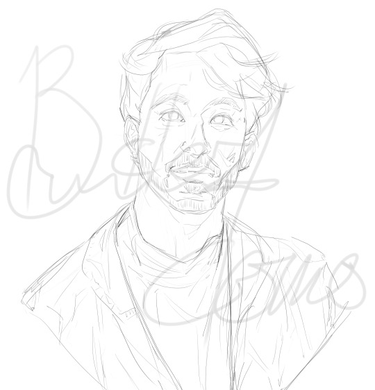
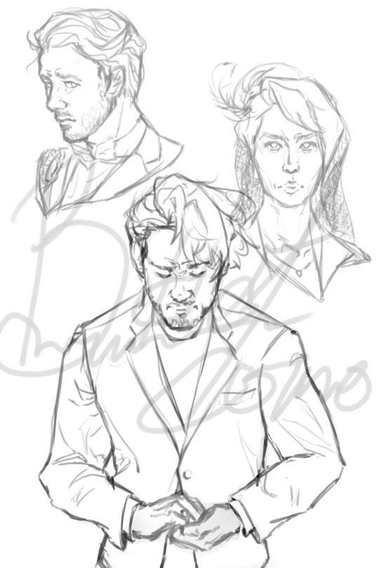
I have 2 sketch brushes. "pencil" and "sketch" For most of my life I have been using the default pencil brush on size 1. But recently I have been using this softer "sketch" brush on size ~20 or so. Either way works, but I find that the "pencil" brush is easier for linework and the "sketch" brush is easier to blend into paintings
"Pencil" : "Sketch" examples
Lineart (opt.)
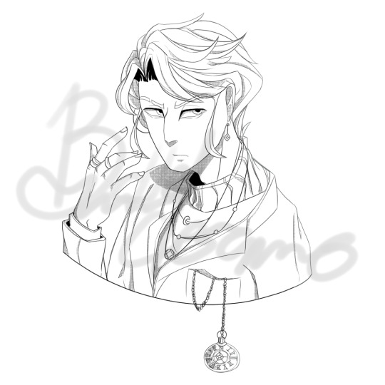
Nowadays I don't use lineart that often, but if I do it's with my "Softlines" brush. It's great for both very thick and very thin lines. I lower the opacity of my sketch and put lineart on a new layer on top of it
"Softlines" brush examples

Flats
With lineart I seperate each new color with a new layer. For painting I'm now using one color as an underpainting color and working on top of that layer. So I render one thing at a time while working on the same layer.
I lower the opacity of the sketch and create a new layer under my sketch. I use my "pencil" brush to lay out the underpainting color and "blur" for hue shifts. And then I reduce it to the silhouette using my "sketch" brush (This gives a softer outline)

Rendering
This would take way too long to explain every step of how I do it. So I'll explain how I use my brushes in this step.
"Arrow!!!" - I use this brush for laying out intial shapes, big areas of color, shading, lighting. The arrow shape has a point on the end that's really great for triangular shapes. It's not very good at small details because of the texture applied to it.
"Sketch" - I use this brush during the rendering as well. It's great for small details that you want a softer look of. It has a high persistence so it's great for working on the same layer.
"P A I N T" - This is a brush that's good at very many things. It has higher blending than "sketch" or "Arrow!!!" and it's shape is square. Great for blending, general painting, small details, reduction, etc.
"blur" - great for gradients or to smooth something out a lot
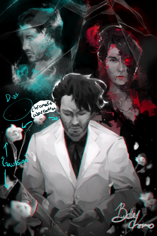
"Gaussian" - is a gaussian blur. Great for making things out of focus or fuzzy
"square TEX" - texture brush that has high persistence with some blending
"metal TEX" - texture brush with high blending and a spread shape.
"speckle TEX" - texture brush for kind of a sparkly look. High persistence
"water TEX" - texture brush that works kind of like a glaze. You can use for flair/fun
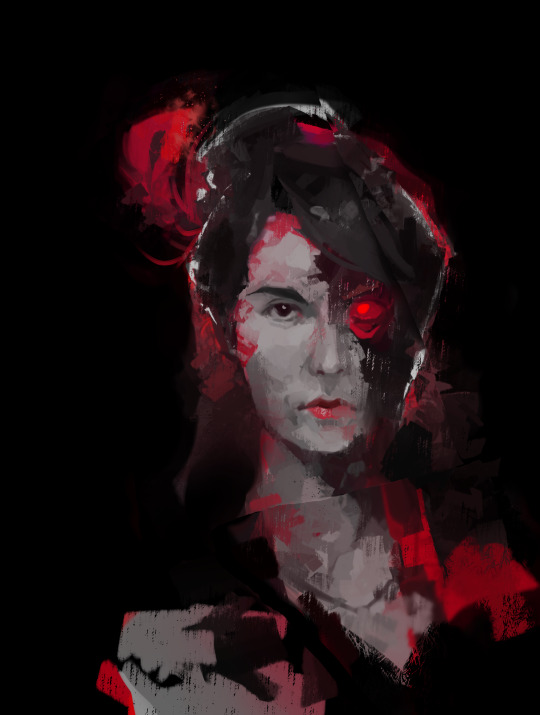
example

Post-Processing
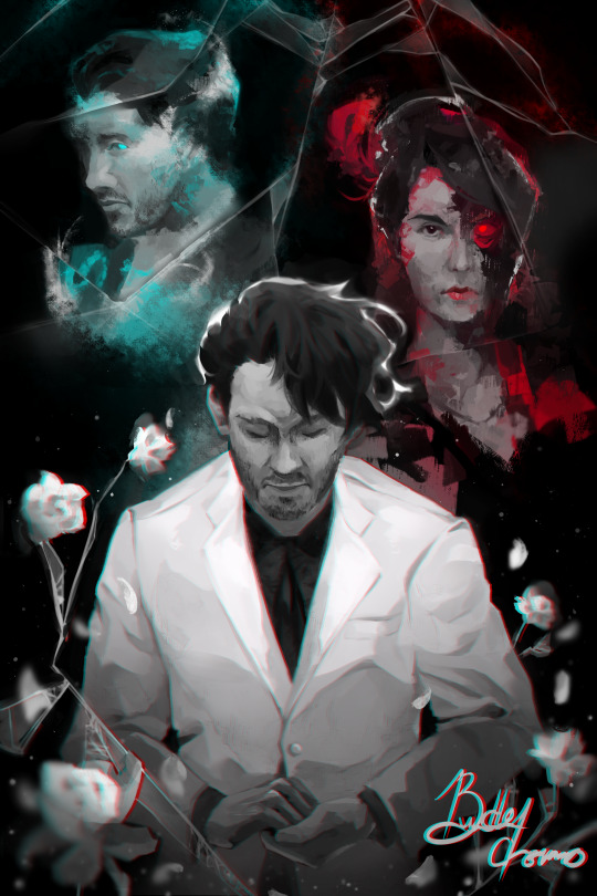
Typically I use more filters for this. Paint Tool Sai has sliders to change hue, saturation, brightness, contrast, luminosity, and color deepen. So I tend to mess with those. I also add effects like chromatic aberration
The tutorial I follow for chromatic aberration in Paint Tool Sai: https://www.youtube.com/watch?v=thmaephD9Ec&t=169s
I also add particles like dust and other objects.
Finally I use my Gaussian blur to make things out of focus/motion blur
Conclusion
I hope this helps! I feel like I'm at a point in my art journey where I'm good enough to give advice. So hopefully this helps someone out there with their art journey! Obviously I have a long way to go, but I'm pretty proud of where I've come. I remember watching speedpaints and tutorials trying to become better at art. So I kind of want to add to that cycle for artists. :D Have a great day!
33 notes
·
View notes
Note
Hello hello! Your artwork inspires me a lot and I was wondering if you could share the rough process of how you go about creating a work?
Your tango design is also my everything /pos :)
Helloooo. Well thank you very much, mate!! I very appreciate it!!!
I will provide the rough outline of my process, however, I do not think I have anything super special in it. Also I work CPS and pretty much use the same brush for almost everything.

It's very simple round brush with pressure opacity on and no pressure size.

Stage 1: The sketch. I start however rough it happens and then just work through it, cleaning up stuff that needs cleaning up or do not really care. I raaarely do lineart, it's very annoying and feels like a waste of time to me personally, so I use this same sketch as a lineart. I will get rid of most of the lines in the rendering anyway, so I do not particularly care for it's looks, just clean enough and with clear shape language so I can do understand what for everything is.

Stage 2: Silhouetting
Here I chose the color of a background and fill it with a bucket tool. And then using magic wand tool I select the negative spaces, invert selection and fill it in with one colour to separate a character from background. And doing it in the fastest for me way too. It's important part of my process, because I work later by selecting this silhouette by ctrl clicking on the layer (which selects the entirety of filled space) and it allows me to not paint outside the lines. Also I clean it up a bit, because this method can be a bit choppy.

Stage 3: Flat colours
As described above, I select the character and on separate layers I fill colours in with a hard brush with 100% opacity and size pressure. Here I care only how colours within a character harmonize with each other, tweaking colours via Hue/Saturation/Luminosity sliders in Ctrl+U if I am not satisfied with initial colour choice. When I'm happy with a palette I merge all layers together.

Stage 4: Establish surrounding
Regardless of the background, you need to have one before you start the shading. We place character INTO the place, not building places AROUND characters. Therefore be it flat colour or something more detailed I always do it first to get the mood and lighting of the scene.

Stage 5: Blending mode layers.
And many of them. For shadows I use Multiply with the midtone of background. I just dump the whole thing with a bucket and then make lower opacity to the parameter that satisfies me that puts the character IN the scene. Then I merge that and add new multiply layer to add occlusion shadows. And different Add(Glow)/Overlay/Colour or Glow dodge for lights and stuff. And merge all that together.

Stage 6: Rendering
For me, rather controversially, This is The Fun Part. you just established established the structure now you doing the details, making it look nice, fixing up some stuff, add texture you want to, all the jazz. It's important on this stage to let go for a time some details and add them later. Downside: I can forgor.

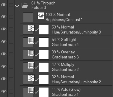
Stage 7: Gradient maps
Optionally I touch up my work with gradient maps by copying the layer and then applying blending mode and a gradient map. Can really help if you feel that character and background do not really mach each other.
And that's it! I hope this was somewhat helpful!!
6 notes
·
View notes
Text
Ein's Art Log #1
@lixenn!! Here's the timelapse I recorded for my rarepair week submission! I'm just gonna start this log series because I wanna study art more and take notes of it here in this blog. And maybe it will help people with their drawings? I'm putting my notes below ↓↓↓
Draft & Lineart
First, for this art, I used a base made by Ging (깅). Using bases like these are always useful for a lot of things and it also forces me to draw things (like poses, hands, etc) I wouldn't normally draw by myself (if its up to just my hand with zero braincell input, I would just draw the characters facing 3/4 to the left over and over). Also a lot of them are just so *chef kiss*, god bless Korean artists. They're so good, especially with how they do the figures and anatomy!
I just adjusted the base a bit to match the characters' heights, since Kurumi is taller than Chrome by like 6cm.
Then when making the drawing a draft layer over the base, I usually use bright colors like green, red or blue (most often green). I usually don't think about the draft too much even if it turns out ugly, I think it's actually better that it turns out ugly and messy.
Otherwise, if the draft looks slightly more decent than expected, then I'd become too lazy to draw a more proper lineart. Whenever I remember to do so, I also use a gray-colored background so it's easier on my eyes, especially since I drew this after work.
For the "lineart", I used a brush called 촉펜 (MTL says it's "Touch Pen" in English; Content ID: 2050169). I recently started using this for doodles/sketches, it feels nice. It was free when I downloaded it, but it costs 10 Clippy now.

Anyway, I used a little bit more braincells for the "lineart" now after the draft, but then I didn't really try that hard to make it look clean, since I'm rushing to finish it as fast as I can. I just made sure that the outside lines are connected just enough for easier selection & coloring later.
Coloring & Shading
The coloring is where my experiment actually started! I usually go ahead and color them one-by-one per each color and part, but to be quicker, I used the Magic Wand selection tool to select the area outside the background, then inverting it so now the selection is at the characters *except* the background.

I then used the the bucket tool to fill the selection with the color I use as the base skin color. I still keep the selection there for further coloring purposes.

Just from here, I added another layer on top for the shading of the skin! For the shading, I used a brush called Yuri Watercolor (Content ID: 1889385). This one's really a paid brush, but I liked it a lot so I got it hahaha.

I do plan on replicating on doing this on IbisPaint one of these days! My plan so far is to use the free watercolor brush there, lower the brush opacity to around 60-70% and then draw the shading on a clipping layer set to the Multiply layer effect.

After shading, it looks like this now! I didn't mind the colors bleeding through the non-skin parts (except for two parts: the neck shading that would bleed to the face and thigh shading that would bleed to the skirt). I also used this brush to color Chrome's eye. Huhu I can't remember how I did it, helpskjfbjsbf
Then for the coloring of the hair and clothes, I just used the soft airbrush! I tried using the Yuri Watercolor brush for it too, but I couldn't quite grasp it yet on how to use it for coloring/shading those parts. I guess I know what to study next hahaha
When coloring the hair (and clothes), I did color the middle parts but didn't really full-on color till the edges to make that fading effect at the edge.


For the shading, I added clipping layers above and used the watercolor brush again!
For the hair highlights, I used the soft airbrush again. I just used a white color on a Soft Light layer effect to add a faint highlight on their hair (showed on picture on the left). Afterwards, I added another layer above with the Add/Glow effect and turned down the opacity to around 50%, to put more shine to it (showed on picture on the right).


Additionally, I also added a paper texture layer at the bottom! I also grouped up all the lineart and color layers into one folder and set the layer effect to Linear Burn.
Finally, after a bit color corrections/adjustments, blur filters (post-processing stuff, maybe for a different post?) and adding some decorations, the drawing is finally done! KuruKuro my beloved 💖

That's the process I'm playing around with so far, but I think I can still improve on it. I'm also planning on making a page on my wiki to compile my resources, references and such (maybe some free to use assets too). But anyway, that's all for now!
7 notes
·
View notes
Note
hey, just some art questions if you don't mind?
1. is nsfw art in anyway different to draw compared to non-spicy art? Do you find the process easier or harder? More fun maybe?💀
2. do you start your pieces with the guidelines, and shapes as a base before you outline for the specific positions/poses?
3. how long have you been drawing for? Do you prefer digital or pencil?
Apologies if that is too much, I love art, especially fanart 🥹 and I love your art style so much.
yea I don't mind, I'm honestly very flattered!
1: Yes, NSFW is way harder for me because I am so new to it! I have to look for more references and spend longer sketching than usual. The process is usually easier because,, it's just naked bodies rather than having to deal with clothing/fabric. I don't do anything too arduous for the stuff I'm posting here
2: I will show u!
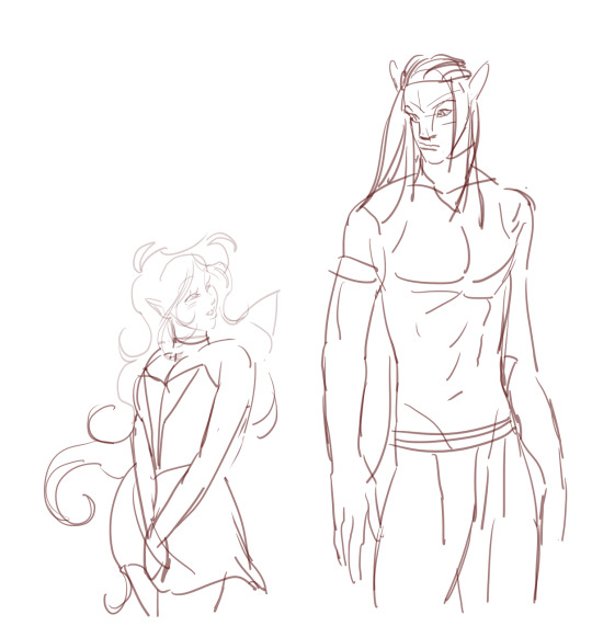
I start with a v rough sketch. If I'm feeling lazy, it could look even simpler than this, but usually I would refine it to this level
I put in color flats and shadow flats, and put the shadows on multiply and lower opacity

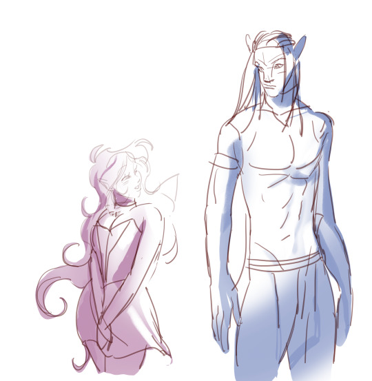

And then I just paint on top! I prefer making corrections and adding details in this stage, it's the most fun part. I add further corrections and add other things like eye shines and Neteyam's stripes and then it's done 👍👍👍
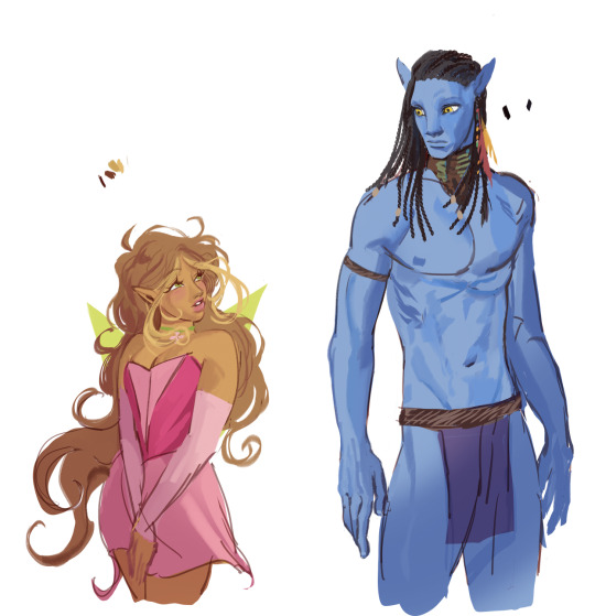
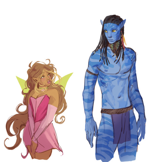
3. I've not drawn for long, I've just graduated art school earlier this year! Now I'm recuperating at home for a bit as I deal with my post-grad depression 👍👍👍 I prefer digital but for works that need more preparation/ideation, I start with pencil.
hope this helps and keep loving art! It is hard but it can be fun 👍
51 notes
·
View notes
Note
ok im silly and obsessed with your art so i wanted to ask you about it!
i really love your shading on art, the layering and different colors is very well done! do you have any feedback on how to do rendering and shading? cause i know nothing about it
im also curious about your anatomy, its accurate but also very unique between characters! do you mind doodling like... how your format it? u know what i mean???
NEXT I WANT TO ASK! ABOUT YOUR OUTFIT IDEAS!! where do you get your inspiration for those beautiful fucking designs?
on the drawing you made of shrimp mariana being held by charlie, im curious about how you did the filtering to make it like. fuzzy but still clear???
last but not least, what application do you use for drawing, and which pens do you use?
sorry for all the questions but your art is a very big inspiration for me and i want to be as talented as u ^^💦
this got really fucking long and i don’t even know if it’s particularly helpful but LETS GO
—
OKAY SO. shading, thing i am apparently accidentally really good at. it’s probably the thing i’ve gotten compliments on the most over the years which is funny because it’s probably the thing i’m Least confident that i can do well. therefore i can’t really give a tutorial but i can give a bunch of disjointed notes

(shown above is my Default Shading, further examples of different lighting below)
everything else under the cut or this is gonna be a mile long
i like using blue for shading, yellow/orange for lighting but generally you can just make them opposite/complimentary colours to each other and that’ll work. cool shadows, warm light or warm shadows, cool light. you get it. that’s a general rule there’s probably exceptions. i will say i hate using purple for shadows but that’s a personal preference (as is every colour i use being so saturated lol)
the orange around the edges is supposed to be subsurface scattering on skin but i put it on all the edges because i like how it looks 👍
yes there’s two different bounce lights. idk why i do this. i also just think it looks nice. i guess the one on the shading layer is more for form and the one on the lighting layer is more for the yk. lighting? anyways the first one is just a lighter version of the shading colour the second one is darker and slightly hue shifted (depending on the lighting scenario — it can be brighter if the situation calls for it)
the reason i don’t just shade around the edges is because it can make things look very flat which is the opposite of what you want when shading. sometimes it can just go on the edges in some specific scenarios but i like my shadows Chunky. basically having it go over the form instead of just along it can help show that form more
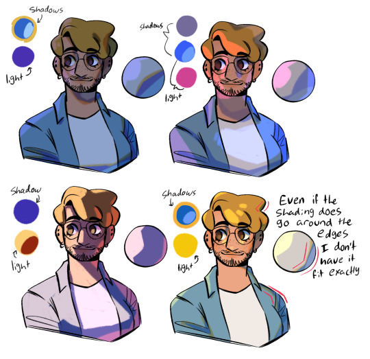
top left - night time | top right - bisexual? | bottom left - spotlight i guess? | bottom right - default/daylight again, just wanted to show a shape example
something i’ll also do a lot is have a separate multiply layer that’s just one colour and i’ll throw that over the whole thing to get the base colours correct for the lighting scenario. some people do it by eye but i am lazy so i cheat 👍 often it’ll be the same as the more detailed shadow colour but as with the top right example sometimes it’s different
shadows are either on multiply or linear burn, lights are either on add (glow) or glow dodge. depends on what looks best. same with opacity, i don’t have any real rules there
i also LOVE harsh lighting but that’s just a me thing. UMMM i can’t think of anything else to say
—
so next is ANATOMY okay this is also something i’m not super confident with lol but i can give some more disjointed notes by just redlining my own sketches lol

the uuuh “bottom of boobs is 2/3 down the ribs” isn’t technically correct? if ur drawing someone with big boobs and no bra on they’re probably gonna go lower but that’s kinda. where they come out from i guess. i also don’t think the “ribs” i draw are technically accurate but it works for a reference point
arms are a diamond (the shoulder.. muscle.. thing… idk what it’s called) and then some Tapered Tubes idk they’re not super complicated. if you wanna get more into it go google buff people and trace/redline their arms that’s how i learnt orz and uuuh i kinda also have the taking up 2/3 of the ribs but a bit Above. the way i’ve worded that makes no goddamn sense i’m bad at explaining this
ANYWAYS yeah bodies are just shapes if you want ppl to look unique just squash or stretch out the shapes 👍 and also learn actual anatomy stuff that always helps. my final message: learn to draw fat people it is no more difficult than drawing thin people
—
OUTFITS i love outfits. i have a pinterest board where a lot of my inspo comes from and it’s a section within a bigger board so ig i’m just giving you my whole inspo board. here (it’s the one called character fashion) (i do not condone art being reposted on pinterest without artists permission just ignore how much i have saved)
pinterest in general is good for outfit design stuff as long as you know where/how to look. u could also try fashion blogs and stuff
ummm a lot of stuff does just come from my own head tho, like based on clothes i like or vaguely inspired by stuff i’ve seen before. if you look through the board you can also see that like i rarely ever copy stuff directly i kinda just use whatever stuff i find as a base to work from. just find stuff you like and go from there i guess, i sometimes like picking a specific subculture or fashion style for a character and seeing what i can make from that (like missa is emo/scene, slime is like some kinda ravecore thing?? idk)
—
OKAY i’m assuming you mean like the glowy effect? makes everything look Soft?
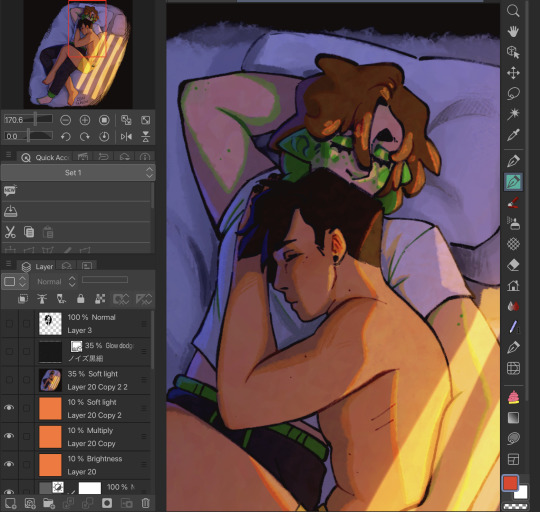
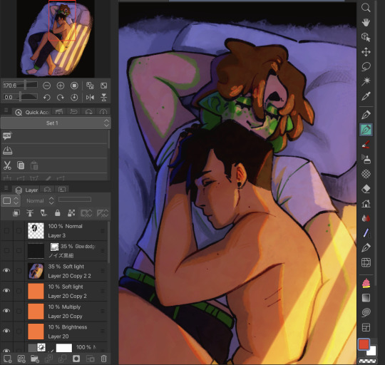
(idk if u can even see the difference here orz also ignore how many fuckin layers i use i’m a mess) (the top layer is that catboy missa doodle i did ignore that too)
this is something i do on Most drawings to the point i have an auto action set up for it. duplicate the entire drawing (on csp the easiest way is to just merge visible to new layer), gaussian blur to like ? idk i think it’s 40% or something? i don’t remember, set that layer to soft light and lower the opacity
if that’s NOT what you meant feel free to send a follow up question LOL
OH actually if u mean the colour jitter stuff on the . colours. that’s not a filter i was just using a brush with slight hue jitter on i was Experimenting
—
AND FINALLY i use clip studio paint on my ipad and most of the brushes i use on the reg can be found here
favourites are the ones i made (i actually have more of those i need to upload—) and the raz sketch ones 👍 namely raz sketch (thick) with the density turned up a bit from the default, been using that a lot for lineart
#.qna#.jpg#art tips#idk how to tag this#i really hope this is any kind of coherent LOL#where’s that post like ‘don’t ask self taught artists SHIT they don’t know how they did that either’
43 notes
·
View notes
Note
I love all your edits!
Do you have any favorite psds that you are willing to share? Or tips on how to make gif colorings looks as nice as yours? 🥹
Hi, anon! Thank you so much! I am really happy that you love my edits. I really appreciate it! (°◡°♡)
To answer your question, I only use one PSD file nowadays for all the edits I make so sharing this one PSD I got for myself would be a bit uncomfortable. I hope you understand. Hehe. ( ̄▽ ̄*)ゞ
But no worries, because I thought of sharing LUT files that you can use as a basis for your color grading. I will only share one LUT file for this post but I might try sharing other LUT files as well in the future. In that way, you can achieve coloring with your own style. I will also be sharing which adjustment layers I use and what are the typical settings I apply.
SOME REMINDERS THOUGH:
I use PS 2021 but all adjustment layers are also available on older versions.
I AM NOT A PS EXPERT. I learned to use PS by reading/watching tutorials. All the things I will include in this post are just my preferences for my coloring. Take anything I said with a grain of salt.
I applied and tested my coloring on anime edits only. You may use it for real-life GIFs/photos but you may want to reduce the opacity or use a different blending mode to make it work.
My coloring deviates a lot from the original coloring most of the time. Some people may find my coloring weird so always keep in mind that this is not the best coloring practice.
ALSO WARNING: BAD ENGLISH AND LENGTHY EXPLANATIONS XD
To start, you may download the LUT file HERE.
This file is basically a compilation of adjustment layers that you may want to apply to other images. So when you use it again on another project, you can simply load this single file instead of the multiple adjustment layers. The disadvantage of using LUT file is that there's no room for further adjustments of the colorings within that file. In my case, I used it as an advantage. You may call it my secret recipe for my coloring. LOL. You can use it but there's a limit to the modifications. Anyways, this LUT file contains multiple layers which is a product of my trials and errors for the past few years since I started editing again.
You may consider using this LUT file as your training wheels. Once you understand further the complexities of the adjustment layers, you may no longer rely on this coloring file. I also did this when I started wanting to develop my own coloring style. And once I understood the basics of the adjustment layers and how to replicate the colors that I had in mind, I got rid of the LUT files and started making my own.
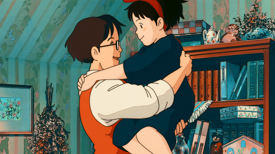
Now, let's use this image for coloring sample:
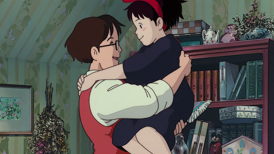
You can also download the image so you can follow my steps easily. This version is already sharpened.
So when I apply the LUT file for this image, this is how it's going to appear.

This color grading has the teal & orange effect. Of course, this is not the final output. This will be the backbone of our coloring as we add more adjustment layers. In my case, I always start with cyan and orange and then make the necessary changes depending on the series and the atmosphere of the image used.
But before we proceed with the adjustment layers, I want to emphasize two things you can explore when it comes to adding adjustment layers. Being aware of these two features of PS actually expands your coloring options exponentially [don't get fooled, I may sound like an expert but this is just really based on my personal experience. XD] Anyways, below are the two:
Opacity - It doesn't have to be black and white when it comes to coloring. You may choose the grey side. If you think the adjustment layer you are trying to add is causing an unpleasant effect on your image, maybe try to lower the opacity first and see if that will help.
Blend Modes - you may want to explore blend modes other than the Normal mode. If you are not used to changing the blend modes, you can check videos posted by Unmesh Dinda on his YouTube Channel. He explains really well when it comes to Photoshop features. I learned a lot from his tutorials and I am now applying these learnings to my current coloring style. You may check this video for starters. He has other videos about blending modes, too.
ADDING ADJUSTMENT LAYERS:
Levels Adjustment Layer - this is always my first adjustment layer but I also modify this in the last part. There are presets available but I am not utilizing those. Instead, I go to Auto Options. This feature is very helpful in heavily dark or bright scenes. Depending on what color correction you used, you may have extremely varying results.
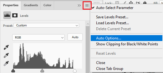
Once you click Auto Options, another dialogue box will appear:
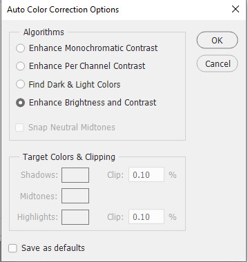
The default option is Enhance Brightness and Contrast. We will choose that option for now then click OK. [We will go back to this layer once we are done with the other layers.]

Color Lookup Adjustment Layer - this is where the LUT file comes in. Once you add the layer, click Load 3D LUT then click Load 3D LUT again on top.
Select the LUT file I shared.
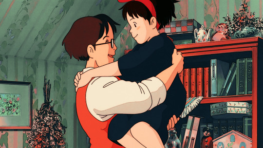
Selective Color Adjustment Layer - for this layer, I always separate my adjustments for different colors and don't do the adjustments for all colors in one layer.
First Selective Color - I will rename the layer as RED and set the following values: CYAN: -100, MAGENTA: -11, YELLOW: -32, BLACK: 15
You can explore the levels of Magenta and Yellow but ultimately, I always set Cyan to -100 and Black is +15. Of course, you are free to change these two but these are my preferred coloring for shades of red. Setting -100 for Cyan gives this warm coloring.

Second Selective Color - I will rename the layer as YELLOW and set the following values: CYAN: -100, MAGENTA: +40, YELLOW: +30, BLACK: 40
Cyan is also set to -100. This adds more warmth to the tone of the image. Then you may change the remaining sliders to your preferred values.

Third Selective Color - I will rename the layer as CYAN and set the following values: CYAN: -60, MAGENTA: +20, YELLOW: +100, BLACK: +40
I don't have a rule for CYAN. This really depends on the color I want to achieve for the shades of blue. Depending on the values, you can make your color look blue/cyan/purple. In this case, I wanted to tone down the brightness of the cyan.

Fourth Selective Color - I will rename the layer as Black and White and set the following values: BLACK: +5
This is just to slightly darken the black shades of the image. I label it Black and White because I sometimes change the value of Black for White but in this case, adjusting the white doesn't help so no changes were made.
Gradient Map Adjustment Layer - I do not use this layer all the time. It really depends on the image. When I wanted to add another shade of colors to the image, that's the time I would use this. And I use a maximum of 2 gradients only.
The image looks okay now to me but let me add some gradient just to show how I use this layer. I use Gray_10 which is one of the preset gradients available in PS. Then I check the Reverse option to emphasize the contrasts of the colors. Then I set Blend Mode to Soft Light, Opacity at 100%.
Then I add another Gradient Map Layer. I use Purple_17. In this case, I didn't check the Reverse option.
Then I set Blend Mode to Soft Light, Opacity at 35%.

Hue/Saturation Adjustment Layer - this one is optional. I use this on my gifs to increase the warm tones of the image.
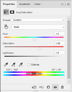
I only change the values of Red for additional warm tones.
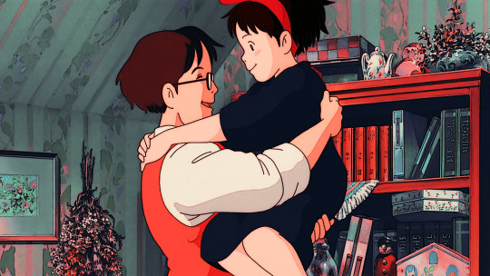
At this point, I also wanted to make the cool colors lose saturation, so I added another Hue/Saturation layer. To have a grayish effect on cool colors and make the reds stand out even more.

Brightness/Contrast Adjustment Layer - you can use the Auto function and then just make the adjustments you want.
In my case, I set the Contrast to -50 most of the time, then the Brightness varies. For this example, I set Brightness to +8.

Then last but not least, I made some slight changes to the Levels Adjustment Layer and then adjusted Brightness to -3.
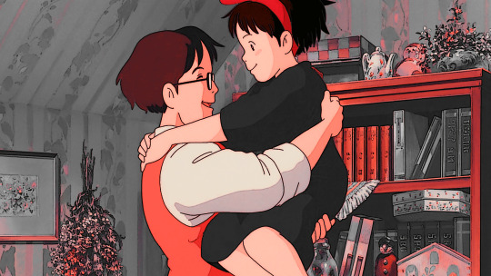
To compare, I will post the original GIF, with LUT file only, and the final GIF coloring respectively:
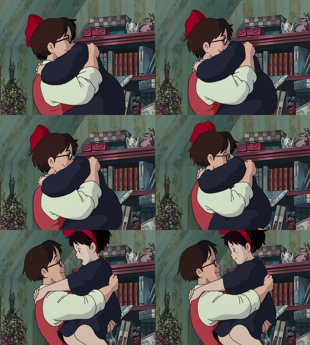
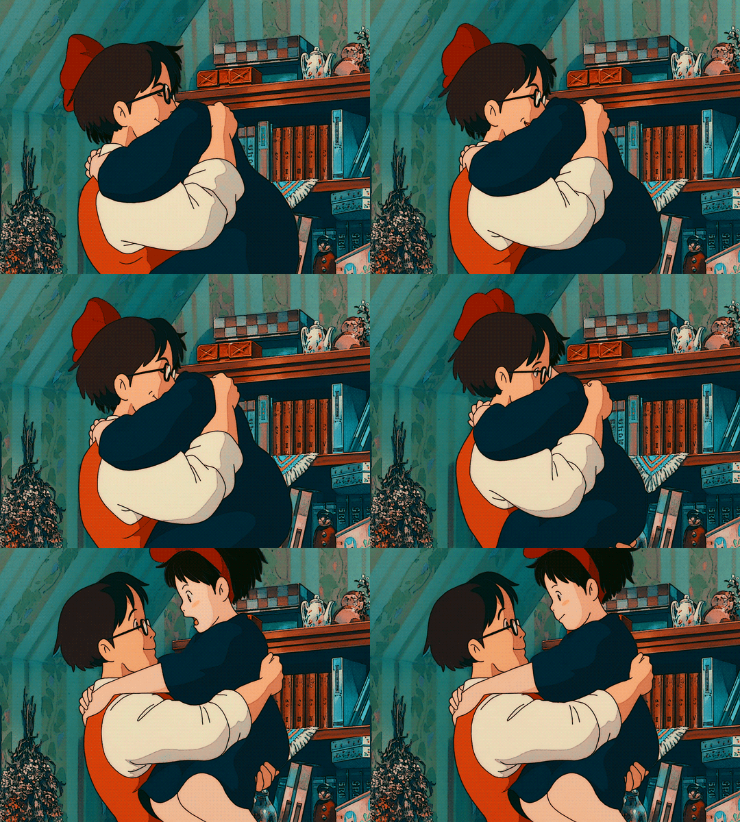
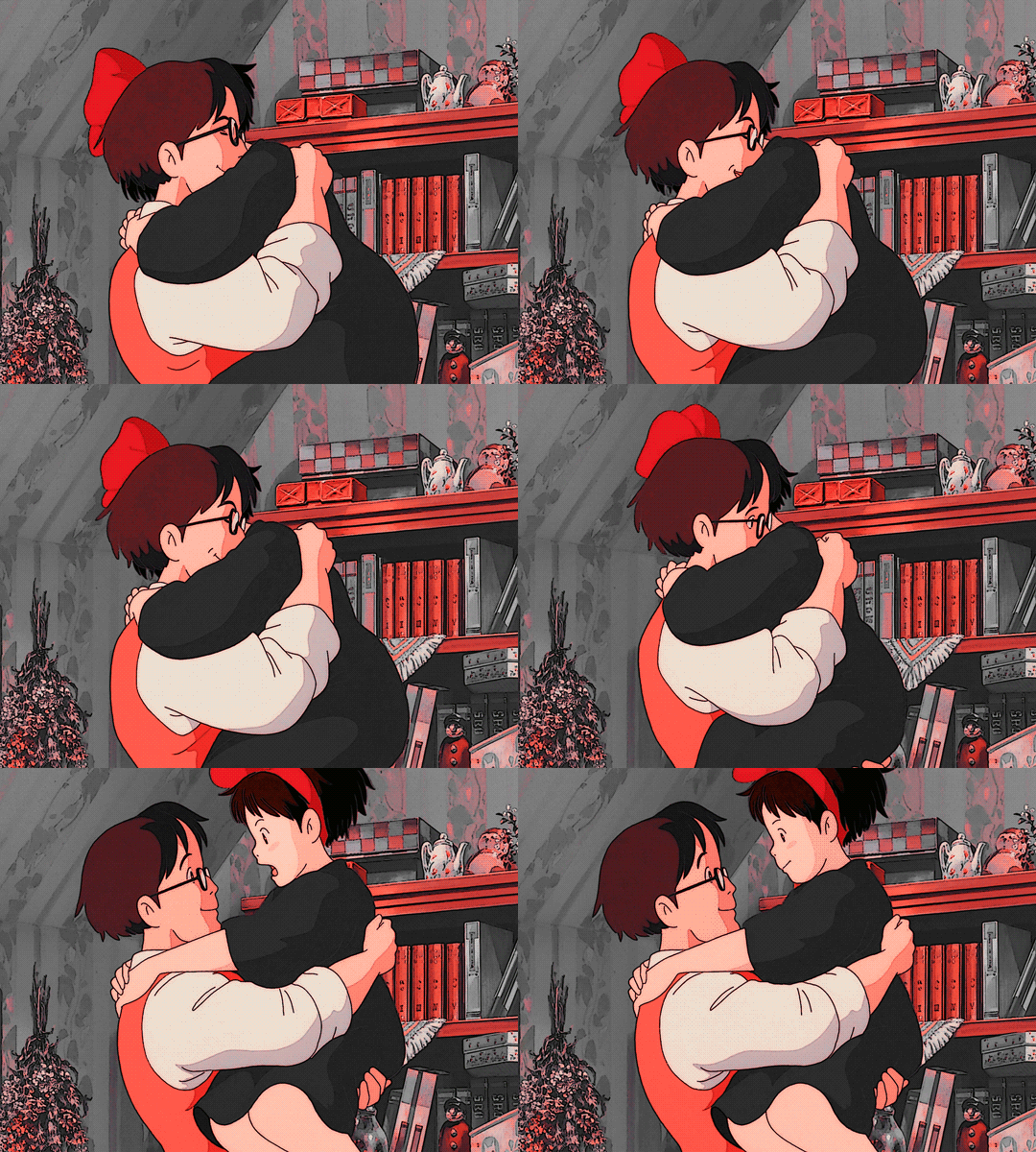
I hope this helps, anon!
I might create a specific tag for this kind of post and just include it on my master list pinned post so it's easy to find. Also, if you ever use this coloring style or the LUT file as part of your coloring, there is no need to credit but if possible, please tag me in your creations (#userartless) so I can see how you personalized the file and made it your own. ^^
13 notes
·
View notes
Note
absolutely love the poses/intimacy of ur art… do you have like. a developing process for that or something similar youd be willing to share 🙇
thank youuuu. i know this is insane but i'm never quite happy with the poses in my art, i usually feel like they look SUPER stiff, but people tell me otherwise so i have to believe them dgfkfdgkdgkdf.
HM. my technique is just: doodling the pose you want (most of the time i already know what i want to do, but if you have trouble even just coming up with poses: google romantic gifs instead of photographs. you get a much better sense of the movement. thank you random vampire diaries straight couple gifs in black and white from like 2014)
anyway. it doesn't matter if it's good (it never is) the important part is for the first concept to be done fast. like. stick figure fast. blob fast. 2 minutes fast.
then lower the opacity, change the color of the sketch to red, draw on top of it, this time a little better, merge it down. rinse and repeat ad infinitum until you're done.
edit: here's a gif example:

i like this method because a. each layer is not the end all be all of the piece, which takes off a lot of pressure to get it right on the first try, and you can then just focus on having fun and experimenting.
and b. once i hit a roadblock, i can look up references (for example: foreshortened arm, or, like, couple holding each other, etc) for something i already have on paper and therefore have to understand & incorporate into what i am doing, instead of begining with a single reference and copying full poses from photographs <- something i did for a really long time.
i think the art i make with the above method is a lot more stylized, which makes me feel a lil self concious because in my mind it feels like i leveled down in talent, BUT it is MUCH better for learning, and most importantly, it is so much more fun
#brothercrush.txt#i wish i could post this on main. anon pls be brave and re-send this question to my main#so i can answer this on main and make it rebloggable :3#technically this is not an art blog hehehe
15 notes
·
View notes
Note
hey raey! ur art is so pretty, reminds me of a strawberry soda float tbh. anyways I wanted to ask what your coloring process is if you don’t mind sharing :)
OH MY GOD HI THANK YOU FOR ASKING LOVE YOU FOREVER ALSO SORRY FOR ANSWERING KIND OF LATE I DONT CHECK MY ART ACC VERY OFTEN ANYMORE
ok so (this is a lighting tutorial not a rendering tutorial btw) here's my Ten Step (not) Program For Achieving Strawberry Soda Floatness
i actually usually start with pretty normal/true to reference colors bc i often don't have incredibly intense, neon lighting. however, im gonna be using the mari piece i just finished to demo, where i wanted to pinkify the drawing from the start.


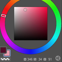
here are some of the base colors (skin, hair, shirt): as you can see even the white shirt leans into saturation/color, and they're all kept around the red/pink area.

ok so here (skipping about 15 steps) i already did the rendering using a color shifting method where instead of using multiply or directly lowering the luminosity (?) i shift the hue closer to the blue/purple category and decrease luminosity + slightly up saturation of the color. so like, on mari's skin you can see that the shadows are pink and purple rather than like. orange or something.
for the background i filled it with a lightish pink color and used the sunset gradient tool on a 30-50% opacity to establish the light source.
alright, here's where the fun begins.
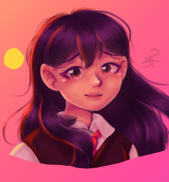
i started off by using an overlay layer (later lowered to 28%, but just use whatever looks good) on the darker colors where the light would shine the brightest. this layer originally included highlights on the face and shirt as well, but i took those off bc the yellow on dark colors looks like an orange and the yellow on lighter colors looks like a fucking highlighter.
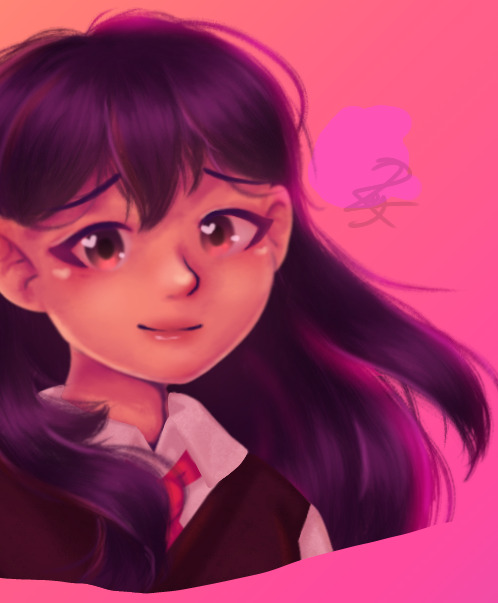
first i added a sort of reflected/second light source of this fun little pink on soft light. i did 2 layers bc 1 wasn't bright enough for me. then on the lighter areas i added white highlights. important little tip: when i pick colors for overlays i usually use yellow as the primary light source, pink as a midtones/secondary light source, and blue or purple as the shadows. however, this is not a rule, just an example:
in this drawing i have blue as the light source & red as the shadow. my tips for picking colors to overlay with: most programs/devices have an option for you to turn off the saturation. whichever color looks lightest is often best for the highlights. you can obviously change the brightness but yeah just make sure your highlights aren't darker than your shadows

apologies for the inconsistent opacities, you get the idea. so i would like to make a disclaimer here that for my hxhbb piece (left) i used only one direct lighting overlay, which was the yellow. the amount of those overlays i use per piece varies. anyways i added a lighter green as a substitute for the white highlights on the darker colors
lil bit of a secret sauce: on an overlay layer i airbrushed yellow onto roughly half of her and pink on the other side. unifies the colors + lighting and just looks cool
okay now here's how to actually strawberry soda float-ify your art (sorry lol that was just background info):
the sunset gradient map is your best friend here. you can really just fuck around with any gradient maps, doesn't really matter. now you can also change the brightness, contrast, saturation, etc. what i usually do is up the saturation & luminosity together: +50 saturation and +25-50 luminosity. experiment with blending modes and opacities and shit
when you're done, uhh, congratulations. the gradient maps are really carrying the entire thing the yellow and white lighting is just to torture myself with
#asks <3#raey draws#raey spam#art tutorial#art tips#i do not know if this is actually helpful in any degree BUT. learning to use gradient maps changed my art forever. so
6 notes
·
View notes
Text
art tipz:
sketch in a different color than you do lineart in and also make sure you use either a brush that is a low opacity or turn the opacity down on the layer so you dont accidentally draw the lineart on the sketch layer (i do pink, red, or blue for my sketch color and i always initially do lineart in black).
make sure your sketch is the same brush size or smaller than your lineart because it will be harder to line precisely if youre tracing over the sketch. this might be way you always think your sketch looks better than your lineart: thick sketches, or sketches where you go over the same line multiple times or chicken scratch will look better to you because its more ambiguous.
people are correct when they say that tracing is Morally Neutral but make sure youre A. using either your own photos or photos that are free to use (you can use unsplash to find reference photos or there is a function on google to filter by usage rights). photography is an art form too and you shouldnt just trace over photographs you dont have permission to use especially if youre tracing the composition and B. make sure the traced bit matches with the rest of your art style and stylization or else its gonna be super obvious that you traced it. also while tracing isnt a mortal sin you should draw from reference too it makes it way easier to draw from memory if you cant find or take a photo to trace.
if youre stuck on a piece download a new brush.
if you primarily draw digitally pick up a pencil. if you primarily draw traditionally try digitizing a piece you already made in photopea (or draw digitally if you have a tablet).
flip your canvas
flip your canvas
flip your canvas (ive seen some people complain about this advice because "if whoever looks at my art flips it in an editing program thats THEIR problem!!!" when thats not why people ask you to flip your canvas. they ask you to flip your canvas so YOU can see the mistakes easier. a lot of people tend to draw their characters at a lean/warp depending on if theyre right or left handed or what pose the character is in, and flipping the canvas helps you see this. the audience, however, has fresh eyes, and will likely be able to see the lean WITHOUT editing the photo. i personally see leans and unevenness all the time in other peoples art (not judging, i think its Fine and im not gonna complain about it, the pieces usually look good anyways, but you dont need to be a nitpick to notice this. also if you come back to your own piece later you might be able to see it). also if you draw traditionally look at it in a mirror or take a photo of it with your front camera)
the top jaw is connected to the head. the lower jaw is the one that moves. the NOSE and LIPS can move around because theyre flexible, but the teeth and the stop will not move unless the entire head moves.
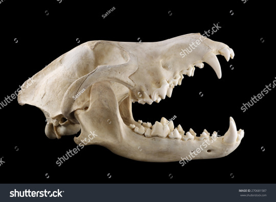
notice how even though the mouth is open, the entire skull is moved along with the upper jaw. the lower jaw is the only part capable of moving independently from the rest of the skull
this is mainly an issue in furry art where people will break their characters skulls in order to open the mouth: only the squishy part of the nose and lips will flex
EXAMPLE OF THIS:
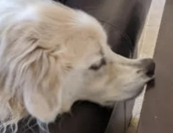
the soft part of his NOSE can be pushed up, but the rest of his face cannot be bent that way.
the front and back legs of most 4 legged animals (not all) bend differently from each other. example:
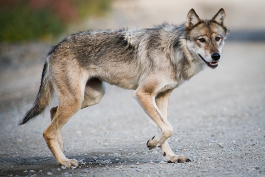
use a reference 4 more information... the internet is such a beautiful place
even if you are drawing just a bust of halfbody shot of a character. if you are drawing them With another character in in an environment MAKE A SIMPLE SKETCH OF THE ENTIRE BODY AND *THEN* CROP IT TO YOUR DESIRED SIZE. please learn from me i never do this and i always mess up the heights or proportions...
perhaps this advice is specific to me and nobody else but stop trying to "learn color theory" none of the tutorials work. color theory is learned by violently throwing yourself at it over and over and over and over and over again until you make something that works. you just Get It or you Dont Get It UNTIL you Get It and ive never met someone able to teach it properly in a way that allows you to apply it to your own art (especially digital art). just keep trying ur not doing something wrong just look at pieces you like and try to emulate how they use colors by eyeballing it. you will pick it up eventually. also try not using pure black or white unless you REALLY know what youre doing bc it usually is kind of distracting.
if ur trying to make a clear pose squint your eyes at it, if you can still see whats going on its probably fine. or just color the entire thing the lineart color to see the silhouette. or start sketching in blocked out silhouettes instead.
you can do whatever you want forever
0 notes
Text


So lately I've been doing a lot of experimenting with my art and my overall style and have felt a little more motivated to make art then I had been feeling for most of this year and a little bit of the last I'm proud of the progress I think I'm making in my art
Also as for the floating heads those girls are my latest project I dubbed them "emo" "freckles" and "snob" great names huh? Haha i know anyways these girls are supposed to be minimalistic
Choosing one color for all of them and trying to stick with that color for their whole look and if I need a different color for something I just lower the opacity of the brush
They are supposed to have differences from one another and not look to similar in any regard to make them distinct
And to try and add additional personality to already minimalistic heads their expressions change to try and convey personality and their accessories are used to not only further distinguish them but also because it could convey more personality afterall you can tell a lot about a person by the way they dress right?
I'll keep doing more minimalistic girl heads for all the colors in the rainbow I've already used orange, purple, and blue, so that leaves yellow, red, and green,
Once I'm done drawing all the minimalistic rainbow girls I'll add them all to a pannel ONE pannel where they are all together furthering their designs and trying to convey more personality in their poses and how they are interacting with eachother and whatever is going on
#what am i supposed to tag this as#drawing#ibispaint drawing#art#artists on tumblr#digital art#digital drawing#unfinished art#hi this is another tag#i like adding random tags#my post#my art <3#learned of some new methods to use the next time i draw#my artwork#artwork#art dump
0 notes
Note
hi !! (a late response to the vent, but) I don’t know a lot about improving your art, artstyles, etc, but i know the typical vague “just practice and use references!” gets tiring. so i’ll try to give specific examples (from my experiences) that worked ??
i improved most of my anatomy and artstyle through animatics
i had a hamilton phase, and animatics basically forced me to learn a lot of anatomy + drawing so many frames made me realise which parts of my artstyle were inconvenient to draw? and which parts of my artstyle i just did not like
it also feels, in a way, rewarding, if you look back on an earlier part of the animatic and go “this looks bad” because you know you’ve improved since then
hmmm for artstyles in general tho. for my art, i took the artstyles i really liked and used them as references? sometimes it helps to trace over the art you like to get an idea of how it’s draw, as long as you don’t use the traced ver in your actual drawing
what i also do is, i’ll put the art i like on top of my art, on another layer at lower opacity, then liquify my own art to match the lines of the art i like. of course, we shouldn’t post that version, but it’s a nice way to learn what you makes you dislike your own style and like that person’s artstyle. it doesn’t always work, but it’s what i do sometimes
like i’ve been drawing in this style for months but ngl, i still use the same picture for eye references every single time i draw an eye LMFAO. i also constantly have bsd manga panels in my ibispaint reference window and i still use them almost everytime i draw. just find drawn references that are in a style you enjoy :D
if there’s an artist you like and can contact, you can ask them about the artists that inspired their art? or maybe the references they use for their artstyle. some people have guides on how to replicate a certain artist’s artstyle too, i followed one to figure out the tbhk artstyle (very good for coloring :3)
actually on the topic of coloring. for colors, i’d just color pick from the reference to see what color it actually is. if it doesn’t match my own art then i’ll recreate the color in a way i’m happy with. like the actual colors in the tbhk art feel too saturated for my own art, so i recreated a softer version of the colors they’d use
i’ll add more if i remember anything. anyways, goodluck!! i believe in you :D
there is no reason you had to be so helpful and sweet how dare you /j thaNK YOU UHUGHGRHGGN
1 note
·
View note