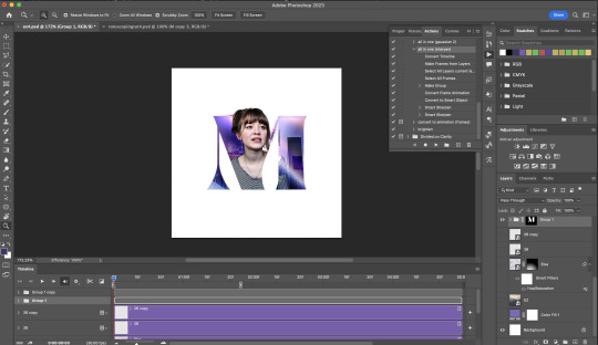
#actions panel in photoshop
Explore tagged Tumblr posts
Visit Tumblr Blog
Explore Tumblr blogs with no restrictions, modern design and the best experience.
Last Seen Tumblr Blogs


Fun Fact
Tumblr is available in 18 languages.
Text

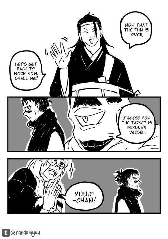
#zhang hao#zb1#zerobaseone#zb1 hao#i said beware. and now. be wared or whatever#can you guys believe theres more than 2 pixels per image on this#i also updated the gunwook one but it had over 10 notes so i just replaced the gifs.#beware. they are getting bumped today or so#i need to be emotionally compensated everytime i make a new gifset something goes wrong.#it was the avspmod yesterday today photoshop deleted one of my actions from the panel before that it was all my files were loading slow#kpop boy posting#gifs :)
46 notes
·
View notes
Photo
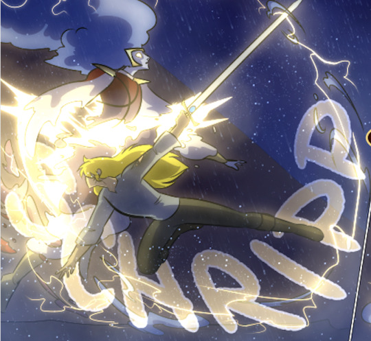
Rita - Retaw ep.4 update#2
I’m going to try to not be lazy and finish this as soon as I can. Episodes 1-3 are free to read on Webtoon and Tapas.
#webcomic#my series#webtoon#tapas#fantasy action#my art#my character art#panel#digital artist#digital art#krita brushes#photoshop
6 notes
·
View notes
Text

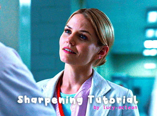
COLORING + SHARPENING TUTORIAL
someone asked for a coloring tutorial and my sharpening settings, so here it is! there are also a few tips to achieve more HQ gifs. :)
tutorial under the cut!
FOR HIGH-QUALITY GIFS
FILE SIZES
it doesn’t matter what your sharpening settings are if the file you’re using to gif is too low quality, so i tend to look for the best that i can get when downloading stuff.
usually, movies (+2h) look better if they’re 5GB or more, while an episode (40 min/1h) can look good with even 1GB. the minimum definition i try to find is 1080p, but i gif with 2160p (4k) when available. unfortunately, not every computer can handle 4k, but don’t worry, you can gif with 1080p files just fine if they are big enough. contrary to popular belief, size does matter! which means sometimes a bigger 1080p file is better than a smaller 2160p one, for example.
SCREENCAPPING METHOD
this can too influence the quality of your gifs. as a gifmaker, i’ve tried it all: video frames to layers, directly opening video clips, loading files into stack, and i’ve finally settled down with opening screencaps as an image sequence. with bigger files, it doesn’t matter much what technique you use, but i’ve noticed with smaller files you can do wonders if you screencap (either by loading files into stack or opening as an image sequence) instead of using video clips. for example, this gif’s original video file was only 4GB (so smaller than i’ve usually go for), if you can believe it!
here’s a tutorial for setting up and screencapping with MPV, the media player i use to screencap. again, you can keep using video clips for bigger files, but you’ll find this useful when dealing with dire causes. i don't file loads into stack, though, like the video does. i open as an image sequence (open > screencap folder > select any image > click the image sequence button). just select OK for the speed. this will open your screencaps as a video clip (blue bar) in timeline mode (i'm a timeline gifmaker, i don't know about you). you will need this action pack to convert the clip into frames if you're a frames gifmaker. i suggest you convert them into frames even if you're a timeline gifmaker, just convert them into a timeline again at the end. that way you can delete the screencaps right away, otherwise you will delete the screencaps and get a static image as a "gif".
ATTENTION if you’re a Mac Sonoma user, MPV won’t be an option for you unless you downgrade your system. that is, if you have an Intel chip. if you have M1 Max chip (or even a better one), here’s a fix for MPV you can try while keeping that MacOS, because nowadays MPV is skipping frames in its latest build. or you can use MPlayer instead for less hassle. here are two tutorials for setting and using MPlayer. Windows users are fine, you can use MPV without trouble.
FOR EVEN MORE QUALITY
ADD NOISE
here’s a tutorial for adding noise as a way to achieve more HQ gifs if your original material is too low quality.
REDUCE NOISE WITH CAMERA RAW
instead of adding noise, you can reduce it, especially if your gif is very noisy as it is.
the path is filter > camera raw > detail > nose reduction. i do this before sharpening, but only my video file isn't great to begin with. because it’s a smart filter, you can reduce or increase its opacity by clicking the bars next to its name in the layers panel.
TOPAZ AI
i use Topaz Photo AI to increase the quality of my screencaps when i need to. it’s paid software, but there are… ways to find it for free, usually on t0rrent websites. if someone’s interested, i can make a tutorial solely about it in the future.
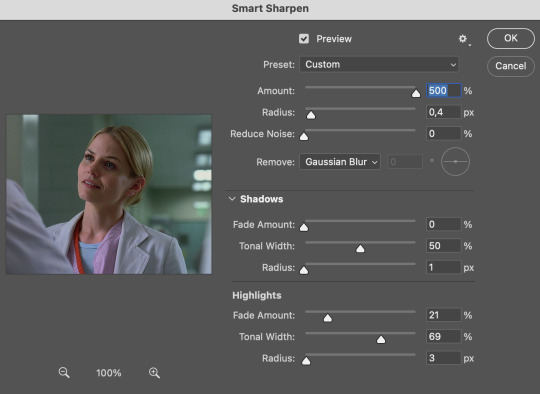
SHARPENING SETTINGS
here are my sharpening settings (filter > sharpen > smart sharpen). i sharpen things twice: 500% 0.4px + 10% 10px. here's an action for it, for more convenience. here's a tutorial on how to use Photoshop actions. for animated stuff, i use this action pack.

COLORING
here’s the gif i'm gonna use as a base. it’s already sharpened like the way i always do it.

LIGHTNING THE SHOTS
half of the secret of a good coloring is good lightning. i always useCurves (layers > new adjustment layer > curves) and Brightness & Contrast (layers > new adjustment layer > brightness & contrast). the settings depend on the scene you’re giffing, but i always try make my gifs bright and with high contrast to make the colors pop.
CURVES
besides lighting your scene, the Curves adjustment layer has four automatic options that will color-correct it for you. it’s not always perfect and it doesn’t mean you won’t need to do further coloring, but it’s a great start. it’s a lifesaver for most ridiculously yellow scenes. look at the difference! this gif uses the 3rd automatic option (the screenshot below isn't mine btw so that's why the fourth option is the chosen one), from top to bottom. what automatic option you need to choose depends on the gif.

sometimes i like to tweak my Curves layer. not everybody does that, it’s not that necessary and if you’re not careful, it can screw your gif up. to modify your layer by hand, you will need to click and drag points of that straight line in the position you desire. this is the concept behind it:

basically, the lower part of the line handles the shadows, while the upper part handles the highlights of the image. if you pull a highlight point up, the image’s highlights will be brighter. if you pull it down, it will make them darker. same thing for the shadow points. you should play with it to get a grasp of it, that’s what i did when i first started giffing.
BRIGHTNESS & CONTRAST
then i added a bit of brightness and contrast.

CHANNEL MIXER
the scene looked a bit too yellow, so i used the Channel Mixer (layer > new adjustment layer > channel mixer) adjustment layer. here’s a tutorial of how it works. not every scene needs the Channel Mixer layer though, i mostly use it to remove heavy overall tints. in this particular case, the Curves layer got rid of most of the yellow, but i wanted the gif to be just a bit more blue so the Channel Mixer tweaks are very minimal.

SELECTIVE COLOR
now, this adjustment layer i always use: Selective Color (layer > new adjustment layer > selective color). this is THE adjustment layer to me, alongside the Curves one. this is how it works:

ie, you can separately edit a color this way, giving it tints. for this gif, i wanted to make the colors more vibrant. to achieve that, i edited the selected colors this way:
for the reds, i added even more red in them by moving the first slider to the right, making the color more vibrant. for his hat to have a more warm tint, i added yellow to the reds (third slider, moving it to the right). finally, to make the reds stronger, i moved the last slider to the right (more black).
for the yellows, i made them brighter by adding white to them, thus making the tile wall and Paddington more bright as well.
for the cyans and the blues, i just added the maximum (+100) of black that i could.
i wanted for Paddington's nose to be brighter, so i added more white to the whites.
lastly, i added depth to the blacks by increasing their own blackness.
you should always play with the Selective Colors sliders for a bit, before deciding what you want or need. with time, you will automatically know what to change to correct the color grading. it all takes practice!
HUE/SATURATION
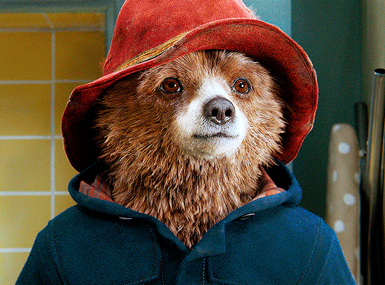
i don’t know if you noticed, but there are some green spots on the blue wall behind Paddington. to correct that, i added a Hue/Saturation adjustment layer (layer > new adjustment layer > hue/saturation) and made the saturation of the greens 0%, making that unwanted green disappear from the background.

while the green spots on the wall are specific for this gif, i use hue/saturation a lot to tweak, well, hue and saturation. sometimes someone’s skin is too yellow, i made it redder by tweaking the reds and the yellows, or vice-versa. the hue bar follows the rainbow bar, so the maximum settings (+100 and -100) give the selected color to change its hue to something more red or pink (the rainbow extremities). changing hue can give pretty whacky results, like turning someone’s skin tone to green, so you will need to play with it to get the hang of it. you can also tweak the opacity of your hue/saturation layer to further improve your gif’s coloring. i didn’t do it in this case, the opacity is still 100%. the reds and the blues had their saturation increased to make them pop just a bit more, without affecting the other colors.
COLOR BALANCE
the highlights of the gif still had a green tint to it due to the automatic correction of the Curves layer, so i used Color Balance. this is how it works: instead of giving specific colors some tints, you can give them to the shadows, highlights, and mid-tones. if your shadows are too blue, you counterbalance them with the opposite color, yellow. same thing with the cyan-red and magenta-green pairings. in my case, i added a bit of magenta.


B&W GRADIENT MAP
now, if this gif was a dish, it’s time for the salt and pepper. i always add a Gradient Map (layer > new adjustment layer > gradient map) (black to white gradient) with the Soft Light blending mode, thus giving my shadows more depth without messing with the mid-tones and highlights. it also doesn’t “deep fry” (you know those memes?) the gif too much by adding even more contrast. usually, the opacity of the layer is between 30% to 70%, it all depends on the gif. it always does wonders, though!
COLOR FILTER
finally, i like to add Color Filters (layer > new adjustment layer > color filter) to my gifs. it’s very handy when giving different scenes for the same minimalistic set because it makes them kind of match despite having completely different colors. in this gif’s case, i added a “deep blue” filter, opacity 50% density 25. you can change the density and the opacity of the layer for further editing, again, it all depends on the gif.

VIBRANCE
if i feel like it, i add a vibrance layer (layer > new adjustment layer > vibrance) to make the colors pop. this can ruin your coloring sometimes, especially when regarding skin color, so be careful. i didn't do it in this gif because i felt i didn't need it.
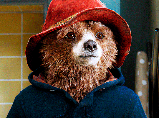
TA-DA! 🥳
AN OTHER EXAMPLE
the color grading of the original scene it’s pretty good as it is, to be honest. let’s see a worse scenario, a VERY yellow one:
no channel mixer this time because the automatic curves option dealt with the yellowness, but you can see it made the gif too green. i needed to correct that with the following adjustment layers:
curves (automatic option) (gif 2) >> same curves layer (tweaks) (gif 3) >> brightness & contrast (gif 4) >> hue/saturation (tweaked cyan+blue+green) >> selective color >> color balance (gif 5) >> b&w gradient map >> (sepia) filter >> vibrance (gif 6)
i added a hue/saturation layer to remove the blues & greens before my selective color layer because i thought that was more urgent than tweaking the tint of all colors. color balance (gif 4) was the real hero here, though, by removing the green tint. the selective color layer was meant to make the red pop more than anything else, because the rest looked pretty good, especially her skin tone (despite the green tint). you can notice that tweaking the curves layer (small gif 3) also helped A LOT with the green problem.
tl;dr 😵💫😵💫😵💫
here's a list of my go-to's while coloring and lightning gifs. it's not a rule, just a guide. there are gifs in which i don't use all these adjustment layers, or use them in a different order. it all depends!
1. curves (automatic option + tweaks) 2. brightness & contrast 3. channel mixer 4. selective color 5. hue/saturation 6. color balance 7. b&w gradient map 8. color filter 9. vibrance
i'll suggest that you study each adjustment layer listed for more info, either with other Tumblr tutorials or YouTube ones. the YouTube ones focus on images, but you can translate what they teach to gif making very easily. you can ask me to further explain any adjustment layer, too! i was brief to keep this short (which i kinda failed lol).
feel free to ask me for clarification or something else about gifmaking wise, i always like to help. ❤️
#*#*tutorials#gifmaker tag#resources#resource: tutorials#ps help#uservivaldi#tuserjen#userrin#userelio#useralien#userzaynab#userchibi#userbuckleys#usertj#userbess#tuserlucie#useraljoscha#userdavid#usershreyu#usernolan#userhallie#userisaiah#tusergio#tusergeo#userjesslynn
677 notes
·
View notes
Note
Coloring anon here, yes, I would definitely like to know more about how you color frame by frame and the other techniques you mentioned! It would be much appreciated, thank you!
Hi anon! I'd be happy to go over my preferred methods for colouring!

First resort (ideal):
Painting over shots with little movement (the first method in this tutorial)
Colour manipulation using selective colours (the second method in this tutorial; alternate tutorial -> i also sometimes add a hue/saturation layer on top to manipulate the cyans/blues as well)
Second resort:
Keyframes for shots with consistent movement where it's easy to hide "imperfections" (tutorial 1, tutorial 2)
Last resort:
Frame by frame colouring -> DISCLAIMER: the way I do this method is the easiest way I've gotten it to work for me but that also means that it's very inflexible when it comes to editing any of the colouring afterwards. Once you start colouring in frame animation mode you're basically locked in so you need your gifs to be exactly the way you want them prior to adding your colour
So in this tutorial I'll go over how I do my frame by frame colouring as well as how I create actions to automate the repetitive parts of this process! (Some resources that explain how to create actions are here: 1 2)
To use the select subject feature you will need Photoshop CC 2018 or later
Step 1: Preparing your gif with base colouring
So first you want to do your base colouring for your gif in timeline mode, which I've explained here. I keep my gifs short (ideally 40 frames or less) since this colouring process is tedious!
I make sure that in my hue/saturation layer, I turn the saturation in the yellow, green, cyan, and blue tabs all down to -100 (and for the yellows I usually add around +20 to +60 in lightness)
Here's my gif with the base colouring that I'll be starting with:

Note: turning down the saturation in almost all the colours gives you that nice silver/grey neutral background to paint on top of. It's a lot less noticeable when your painted layers aren't perfect
Step 2: Converting to Frame Animation Mode
I use the save action from this action pack to convert my gif from timeline mode to frame animation mode.
You cannot edit your base colouring from this point onwards!
Step 3: Using Select Subject
If you're recording an action this is the step you would *start recording*
This is what your window should look like:

Making sure your first frame and first layer are selected, go to Select at the top of your window and click Subject

You should then see the marching ants outline around the person in your gif

You then want to create a new solid colour fill layer (which can be found when you click that little circle icon at the bottom of your layers panel), and set the layer blending mode to colour.
The layer mask will automatically be created since you had the marching ants outline.

Since my person is in colour and not the background, I want to invert the layer mask by clicking on it and using command + i (or ctrl + i), and now this is what it looks like:

Note: Select subject isn't always perfect!!!, depending on how cluttered the scene is and how much contrast there is between your person and the background, select subject could either do a really good job like it did here, or screw up a little like it did here:

That's okay though because it still gives us a good base to start from! We can fix any issues by painting with black and white brushes on the layer mask.
Step 3.5: Create clipping mask
Thanks to @wolfchans for telling me about this because it gives us back a little bit of flexibility when colouring frame by frame! Instead of merging down, we can make a clipping mask instead. Right click the solid colour fill layer and select create clipping mask.


If you're recording an action, it's at this point where I would *stop recording*
Step 4: Fixing the layer mask if needed
So now I want his jacket and t-shirt to also be purple, and to show his fingers behind the glass. I make sure the layer mask is selected, and paint with a brush at 60-70% hardness (painting with black erases the colour, painting with white shows the colour). User smaller brush sizes to paint smaller details!
This is what my canvas and layer mask look like now.

Step 5: Repeat
Now I click on my second frame and second layer, and repeat steps 3-4. As you can see, using the clipping mask allows you to still see and edit the colouring of the previous frame, just make sure you click on the right frame and it's corresponding layer when you're doing further editing.

This is where an action is super helpful in cutting down all the repetitive steps and clicks you need to do. So at this point I'd just play the action I created and paint on the layer mask as needed.
Repeat for all your frames and then you're done! After this I convert it back to timeline mode again so that I can add my text and do any other effects such as blending or transitions. Hope this helped!!
#answered#Anonymous#*tutorial#userbeanie#userwintersoldado#userishh#userfaiths#usercats#usertj#tuserhol#userahri#usereus#usershreyu#userchibi#userbunneis#usermibbles#uservivaldi#carolook#userbuckleys#usertenacious#tuserheidi#userholtz
173 notes
·
View notes
Note
hi sole! your sharpening is always so soft and pretty, i was wondering if you would be open to share it? hope you are having a wonderful november so far <3
Hi, Anon! Thank you so much <3 Yeah, sure, tutorial under the cut:
What you'll need:
Photoshop (I use Photoshop 2023)
Basic knowledge on how to make gifs
Camera Raw filter installed
Okay so, first of all, I use two different methods depending on the size of the gif. Let's start with the one I use for most of my gifsets which are big gifs (examples: x x x x.)
METHOD #1: Smart Sharpen + Camera Raw
I started using the Camera Raw filter last year and let me tell you, I'm obsessed! It completely changes the game of sharpening. I use this method for all gifs with a 540px width.
We're going to work on timeline so get your gif ready and convert it for smart filters. I'm using this scene from my last set as a base:

Here's the gif after I color it (I usually sharpen my gifs before I color them but for the sake of the tutorial I'm showing you this so you guys can see the difference):

(1) Smart Sharpen Layer: Let's start by adding a Smart Sharpen layer (Filter > Sharpen > Smart Sharpen) with these settings:
Disclaimer: I didn't come up with these settings myself I got them from these sharpening actions forever ago so I don't know which one it is :/. I also wasn't able to find that person's new blog (if they even have one since they've been inactive since 2021) so if anyone knows please let me know and I'll give them proper credit!
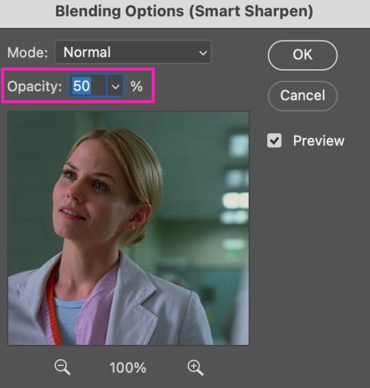
Now we're going to go to the 'Layers' panel and click on this little thingy:

This window will pop up and we are going to change the Opacity to 50%.
(2) Camera Raw Filter: Here's where the fun begins. Go to Filter and click on Camera Raw Filter (you'll need to have the plugin installed for it to show up.) I don't know how the Camera Raw window will look like the first time you open it but good thing you only need to change a couple of things!
If it isn't opened yet click on 'Effects' and we're going to change the Texture and Clarity:
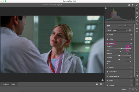
Depending on the scene/show/film I'm giffing, or if I want a stronger or softer sharpening, I'll use two different settings, but 99% of the time they are these:
First setting: Texture (+20) Clarity (+10)
Second setting: Texture (+40) Clarity (+20)


As you can see the difference isn't huge but the first setting gives a "softer" look. As I said I'll use one or the other depending on how I see the scene (it's almost always about the vibes yk.)
Feel free to experiment with these two and see what works best for you (although I wouldn't go higher than 40 on texture because the sharpening will look too fake imo.)
Also this filter is soooo good at making low quality videos look 1080p! Every time I've had to use 720p videos the Camera Raw filter has saved me 🫡
METHOD #2: Smart Sharpen
I use this method for smaller gifs. For example, 8 gifs of 268px x 180px sets (like these) or small-ish gifs in complex sets (like the second gifs in this set.)
This process is much simpler since it's the one I explained before but without adding the Camera Raw filter. That's it that's the method. Just a Smart Sharpen layer with the Opacity turned down to 50%.
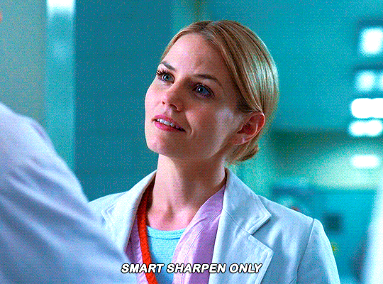
As I said this method looks best on smaller gifs but to be honest it looks good on big gifs too? Depends on what you like most!
Anyway I hope this was easy to follow and if anyone has any questions please feel free to dm me or send an ask! ♡
#ask#Anon#ps tag#useraljoscha#usermelone#userchibi#usermagic#uservivaldi#userlorna#tuserhol#usercats#userlix#usersavana
199 notes
·
View notes
Text
Vanity Fair
Plot: Vanity Fair returns again to shoot for the upcoming Mandalorian film
Word Count: 1.8K
Pairing: Paul Mescal x Reader, Pedro Pascal x Platonic!Reader
Warnings: sweet "father-daughter" moments, laughter&giggles, just general fluff, reader is a badass
—————
It’s always a joy to fly out to California for a photo shoot in which you were dying to be involved. You were excited to receive news from your team of another cover shoot for Vanity Fair for the Mandalorian and Grogu with the amazing Annie Leibovitz who did the cover shoot for the Star Wars series in 2022 when you wrapped season three.
Paul with a clear schedule from productions was working on tagged along with his words, “I get to see my girlfriend and Pedro in action and be on vacation sign me up.”
After a flight and a long sleep at the hotel, you were up and at it earlier at the studio, trapped in hair and makeup. Paul was easily handled by Pedro, who showed up with a later call time and minimal work done in the makeup trailer. Paul looks in wonder at the large virtual soundstage, and it looks like they are on another planet.
“This is insane man,” Paul breathes out spinning in a circle, any kid would freak out thinking they were on a real planet. Pedro laughs as Coco tweaks some stray hairs as the Mandalorian helmet rests on his hip.
“That’s how I felt when I first got on set it’s otherworldy with the build sets then adding this changes the whole environment,” Pedro explains and Paul nods.
“Home sweet home,” You hum strolling onto the set. Paul has to do a double take and Pedro lets out a loud whistle.
“Loving the new hairdo,” Pedro says as you mock gasp pointing at your new short wig. Your hair barely touched your chin in a shag style a big difference from your natural hair and from what he’s seen of the show your character’s.
“This ol’ thing. I originally was gonna cut it short but with Where the Wild Things Are better just to use a wig.” You say and smile up a Paul, “Like the new look?”
You felt so comfortable in your new costume for this film, you loved all of your season’s looks especially season three with your cloak and so glad it continued with this piece. You wore dark pants with padding at the knees, grey boots that stopped right before your knee, a long-sleeved off-white shirt with paneling all down the chest, and sleeves that ombre to a dirty grey, and your favorite part the long tattered brown cloak that comes with a hood. In tune with your character a holster around your belt and hip for your blaster and vibro-knife, plus the buckle where your saber hilt rests.
“Very cool looking and comfortable,” He hums feeling the fabric of your cloak, and you sway allowing the fabric to swoosh around you.
“I got my cloaks and you got your skirts.” You tease at his costuming for his project and he huffs out a laugh.
You and Pedro are called to your places getting a decent view of Paul who stands beside Coco and your hairstylist as you’re guided by Annie to pose.
“It’s a bit weird knowing you’re under there,” You comment to Pedro who stands beside you as the crew tweaks a few lights, “I’m so used to Brendan or Lateef here.”
You hear the muffled chuckle from him underneath the helmet.
“They should’ve photoshopped my face onto them for this. I could’ve been home sleeping.” He says and you scoff shoving his shoulder making him only laugh louder.
They have this huge wind machine that has your cloak blowing in the breeze and Pedro’s smaller one too. It’s a lot of broody looks with the two of you standing further apart, representing the distance between you. They move to solo shots starting with Pedro as your stylist tweaks strands of hair and powders your face as they replace your hilt for the full LED saber.
“Sick huh,” You smirk at Paul who looks over the detailing in the hilt to the exposed channel that holds the kyber crystal.
“Can you still handle that thing?” He teases and you give him a betrayed look and you hear Coco stifle back a laugh.
“How dare you—” Before you can go off on him you’re called on to replace Pedro who is taking off the helmet coming over.
Pedro gives Coco and Paul a confused look at the determined look on your face as you pass, “What’s up with her?”
“Paul questioned if she can still handle the lightsaber,” Coco says and Pedro gives Paul a shocked look as if the question was aimed at him.
“You know she’s got like five years of training with that thing, it’s practically muscle memory now?” Pedro says as the three of them watch you stand on the sand soundstage posing a glint in your eyes. Pedro elbows Paul in the side, “You’re gonna get it now.”
“Alright can we get a little action from you for both video and photo,” Annie says as the other camera person gets another angle.
“Whatever I want?” You ask and Paul should have noticed the hole he dug himself in. You were about to flame his ass from his comment.
“Your comfort level,” Annie says and you give a slight nod twisting your wrist to twirl the saber lightly. Tracing your foot along the sand to get a solid footing before doing a simple sequence you’ve been honing for a while, especially in this costume piece. You twirl the saber around your body seamlessly to others at a jaw-dropping place, you drag your foot through the sand kicking it up slightly as you start your rotation with your back toward the camera as you let go of the saber a skill you’ve been practicing for months.
Practically half of the crew’s jaws drop including Paul as the blade flips and twirls freely in the air behind your back as you complete your rotation catching it in your non-dominant hand before slicing at the camera. It’s quiet for a bit before someone starts clapping and you smile giving a bit of a dramatic bow catching Paul’s gaze a smug look on your face. Your face screams ‘How’s that for handling it?’
“I think we’re good on those shots and a riveting performance,” Annie says and you smile walking off the set with a bounce in your step. The crew changes the set around as you return the stunt saber to the weapons handler.
Pedro claps you on the shoulder, “Very impressive chiquita?”
“How the hell?” Paul breathes out and you shrug acting all innocent.
“That? Just a little something on the fly,” you shrug, coming over, “Maybe not question someone who has been in color guard since the sixth grade, where these skills are a cakewalk.” You press a kiss to his cheek before heading off to change into your next costume. Paul watches you walk away, talking casually to your stylist, and he can feel gazes on him, seeing both Pedro and Coco giving him knowing looks.
“Damn, she’s got you whipped,” Paul’s face flushes red as Pedro let out a full-body laugh and Coco has to hide her laughter behind her hand.
The rest of the shoot was so much fun especially when the Grogu puppet was brought on set to get ‘family’ portraits done. It was always fun being with Pedro, but the two of you were never able to act seriously on set. After a few hours, you wrapped heading back to the makeup trailer to return to normal.
“Ugh, my hair was screaming to be freed,” You say massaging your scalp as you walk up to Paul who is waiting at a crafty table. He smirks seeing your very casual attire, your hair out from under all the pins and wig caps a bit messy in some jeans and one of his graphic tees.
“You always gonna steal my shirts,” He pulls at the hem of his shirt and you grin up at him.
“They are so comfy and better than mine,” You comment and he rolls his eyes while taking your hand as you head to the car.
“Pedro invited us out to dinner tonight,” He brings up and you hum letting your hands swing as you walk. It’s silent between you two until he looks down at you, “Should I be scared of your quietness?”
You just hum and he can see a teasing glint in your eyes, “Oh nothing just thinking that if Tiya and Lucius were in a fight I would whoop your ass.” That has Paul laughing.
“I love you but I highly doubt you would beat Lucius.” He comments.
“I’m a jedi!” You retort and he shakes his head,
“Even without the force, she’s facing a twenty-four gladiator and your character is what eighteen?” Paul laughs the competitiveness in him coming out a bit, “Lucius would destroy you.”
“In this film, she’s twenty-one so it’s only three years difference, and even without the force Tiya has better swordsman skills than Lucius,” You point out before whipping out your phone, “Nah I need a fucking poll cause I know she would whoop his ass, hell everyone in that film. If you had her in Gladiator that film would’ve been over in seconds.” Paul laughs as you speedily type up a poll before posting it on your Instagram.
“They are probably gonna say you 'cause they love you more,” Paul comments opening the car door for you before coming around the other side.
“No, I told them to think fairly, a fight on strength and skill no powers from Tiya.” You comment already seeing the polls shifting between the two some defending Tiya and other Lucius. “I think if either of our characters got into a fight that didn’t end in blood Tiya would probably find Lucius intriguing.” Your comment has Paul smirking as he reverses out of the parking spot.
“A jedi with a gladiator how scandalous,” He grins and you giggle.
“I mean she likes her men that can fight so most likely but Lucius is too devout for his wife to think of other women,” Your comments make him groan slightly cursing his character.
“Well I hope Lucius heals to allow him to pursue other women cause Tiya would be right up his alley,” The car gets at a red light and he turns to face you leaning closer, “Good with a sword, strong, deadly…beautiful.”
You lean in over the center console as his eyes dart quickly at your lips before making eye contact. A tension holds between you just a breath away.
Your hum sweetly makes his gaze darken, “The light’s green.” The car honks behind him has him grumbling under his breath as he focuses on the road. You laugh leaning over and pressing a kiss to his jawline.
“Let’s get home huh, gladiator?”
“Whatever you want, jedi.”
#paul mescal#paul mescal fanfic#paul mescal x reader#paul mescal x y/n#lucius verus#lucius versus x reader#pedro pascal x platonic!reader#pedro pascal fandom#pedro pascal x reader#pedro pascal fanfiction#clan of three series#clan of three#star wars fanfiction#star wars#the mandalorian
102 notes
·
View notes
Photo
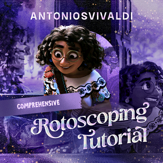

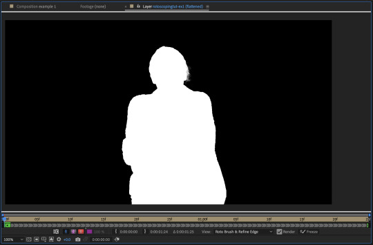
Rotoscoping Tutorial by @antoniosvivaldi
Hi everyone! I’m excited to announce my long-delayed Rotoscoping Tutorial - requested by a number of people over the past calendar year.
In this tutorial, I will show you how to create the cutout gifs like this (and seen in most of my gifsets under this tag) with Rotoscoping on After Effects. I’ll also provide additional examples and a number of things that I do to optimise my giffing / Rotoscoping workflow (e.g. useful shortcuts & other things to be aware of).
This is the structure of the tutorial:
Why Rotoscoping? Photoshop video timeline’s limitations
Photoshop workflow pt 1: Preparing your gif
After Effects workflow: Interface, shortcuts, and Rotoscoping tools
Photoshop workflow pt 2: Assembling your gif; with multiple examples
Bonus content: Rotoscoping tips* & workarounds to common issues
For quick reference, here are example gifsets (and where Rotoscoping is used in the posts) that I will mention in the tutorial:
Example 1: Cutout gif effect | panels 2 + 4
Example 2: Changing a gif’s background colour | all panels
Example 3: Cutout gif effect in a shape | all panels
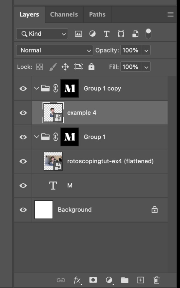
Example 4: Putting it all together | panels 1, 3, & 5
What you need & need to know:
Software: Photoshop & After Effects (After Effects 2021 or later for Rotobrush 2.0)*
Hardware: 16GB RAM required to run later versions of AE*
Difficulty: Advanced; Knowledge in making gifs, applying layer masks, and using video timeline interface assumed
Key concepts: Rotoscoping (AE) / Video Timeline (AE+ PS) / Layer Masks & Groups (PS)
Supplementary files: tutorial resources
*I’m currently running the latest version of PS & AE on an M2 Mac, but I’ve also used older versions (CC 2015 & 2020) on Intel-based Macs. I’ll outline some known compatibility & performance issues, and workarounds later in this tutorial that could help streamline your giffing workflow.
Tutorial under the cut. Like / Reblog this post if you find this tutorial helpful. Linking this post / the example gifsets in your post caption, will be greatly appreciated if you read this to create effects seen in Examples 3 + 4.
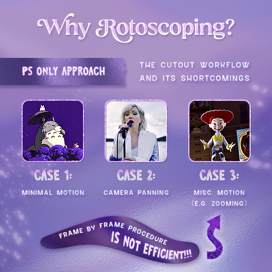
1) Why Rotoscoping?
My Rotoscoping journey is motivated by the shortcomings on Photoshop - namely the limited options to manipulate the Layer Mask keyframes in the video timeline interface, as well my need to gif more efficiently.
Suppose I want to cutout this subject or recolour the background of a gif on Photoshop: I personally classify the gifs that I prepare on PS into 3 types based on the motion of the subject
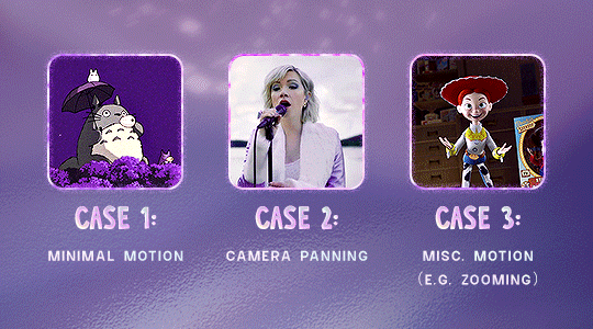
These are the common Photoshop-only approaches when attempting to mask the subject in the gif.
Case 1: minimal motion in the subject → a simple layer mask will do the trick
Case 2: some linear panning of the subject in the gif → using the Layer Mask Position keyframes in the video timeline interface will do the trick
Case 3: subject moves around a lot (e.g. zoom motion) → Unfortunately this is where a Photoshop-only workflow will require frame by frame masking. Layer Mask Position keyframes only apply positional translation (but not transformation / rotation) on the layer mask
Enter Rotoscoping on After Effects: Instead of resigning to frame by frame procedure on Photoshop, I opted to make my life easier by learning to Rotoscope on After Effects. This essentially provides me an opportunity to cutout / recolour a wider range of gifs with relative ease.
2) Photoshop pt. 1: Preparing your gif
Prepare your gif the usual way - whether you screencap or import frames from video.
Then your Photoshop should look like this:
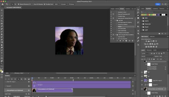
Now, I shall walkthrough & explain my personal giffing workflow (as of 2023) after loading the gif frames. To speed up the process, import my gif prep action file to Photoshop.
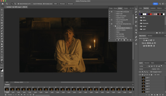
Going to Window > Action, you’ll see a set of actions under the “gif prep” folder.
"set frame delay for timeline” (highlighted in yellow) will set all of your entire gif’s frame delay to 0.03s
“convert to timeline“ (highlighted in red) will take you to the Video Timeline interface
To play an action, press on the Play button (highlighted in green)
i. Set the frame delay of the entire gif to 0.03s. (play “set frame delay for timeline” from my gif prep action pack)
I work with everything in 0.03s frame delay (or equivalently 30fps) at first. It’s always possible to change the frame delay of the final gif to 0.05s before uploading onto Tumblr.
ii) Convert this gif to a Smart Video Layer (play “convert to timeline” from my action pack)
Note: I personally don’t resize the gif just yet. That’s because Rotoscoping in full video resolution will render higher quality details around the edges as well as more flexibilities later on in the editing process.
Performance optimisation: If your computer has 8GB of RAM or less, you might find it helpful to crop / resize your gif to Tumblr dimensions now for a less sluggish performance in After Effects later on.
(I have giffed on a desktop with 8GB of RAM and it’s quite slow at rendering individual frames of a 1080p short clip on AE)
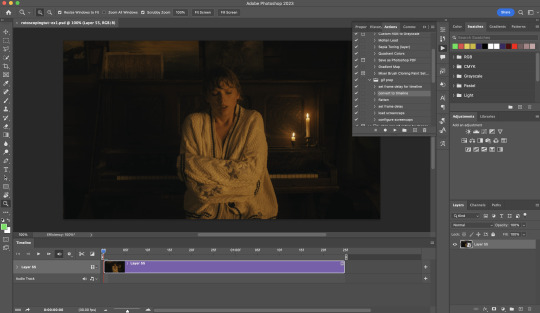
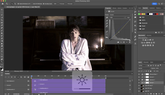
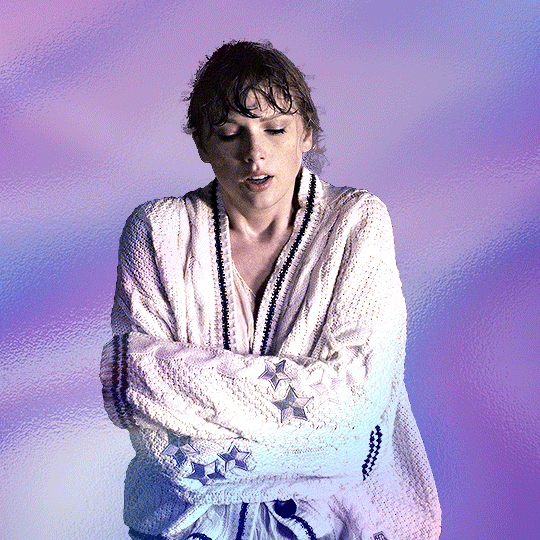
iii) Add colouring adjustments on the gif. This will save you A LOT of time when you Rotoscope gifs that are originally very dark / poorly lit (e.g. the uncoloured Taylor Swift gif shown just above).
If you usually colour your gifs at the very end of your giffing process (i.e. after sharpening), this will be a bit of a change.Nevertheless I still highly recommend adding some base colourings now to at least increase the contrast between the subject and the background.
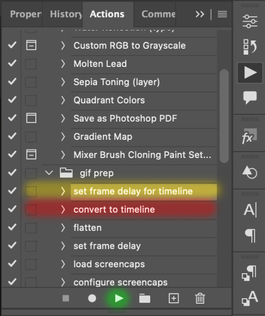
iv) To minimise lagging on After Effects, simplify this gif file as follows:
Flatten / Unsmart this gif file back to frame animation mode: play “flatten” (highlighted in red) from my gif prep action pack
Set the frame delay to 0.03s: play “set frame delay for timeline” (highlighted in green)
Convert the simplified gif file back to the video timeline interface: play “convert to timeline” (highlighted in yellow)
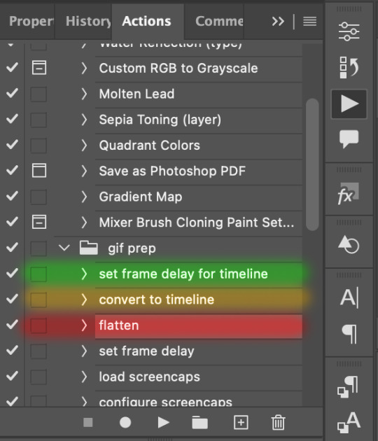
After “unsmarting” and converting back to the video timeline, your interface should look like this

And voila! This gif PSD is now ready to be imported to After Effects for Rotoscoping work!
3) After Effects: Interface and useful shortcuts
Open After Effects and Import (Cmmd / Ctrl + I) your gif PSD that you’ve just prepared.
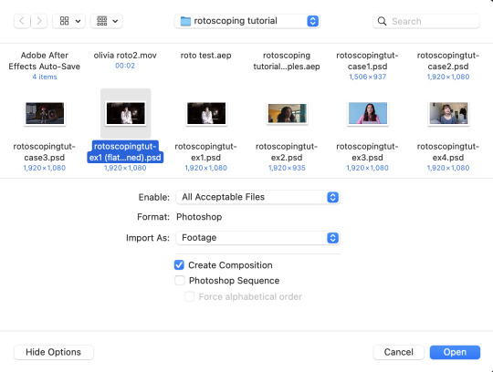
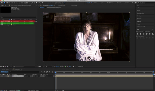
After importing your gif PSD to After Effects, the interface should look like this.
In the screenshot below, there are two compositions: the imported gif (highlighted in green) & another composition file made from selecting the imported gif (highlighted in red)
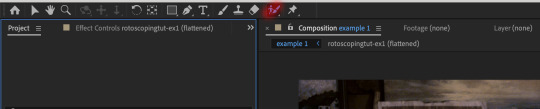
For the rest of the workflow, we will edit from the clone composition (the one highlighted in red), so select this one.
Before we take our plunge into the Rotoscoping, here are a few useful shortcuts to remember. I’ll explain the Roto Brush tool in the next section.
Preview the previous: fn + up arrow
Preview the next frame: fn + down arrow
Add to Roto Brush selection: holding Shift while you’re using the Roto Brush Tool
Subtract from Roto Brush selection: holding Alt while you’re using the Roto Brush Tool
Change Roto Brush size: while holding Cmmd / Ctrl, click + drag your mouse left / right
4) After Effects: The Rotoscoping Process
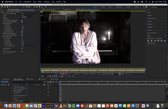
To access the Rotoscoping tools, click on the Roto Brush icon (highlighted in red in the screenshot below)
Then you’ll get the following dropdown options with two Rotoscoping Tools
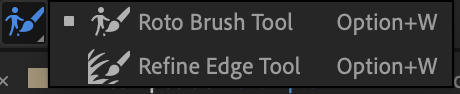
Roto Brush Tool: This is where you add / subtract your Rotoscoping selection in your composition
Refine Edge Tool: Paint around the edge of your selection for more refined edges. Very helpful for Rotoscoping fuzzy edges / hairs
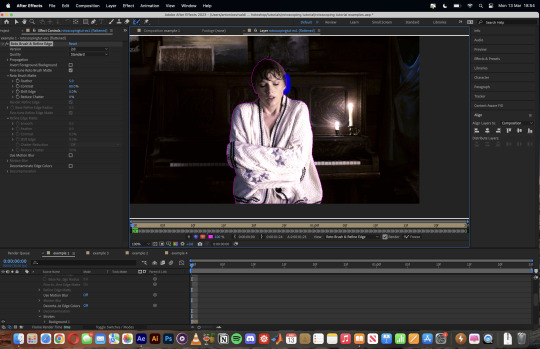
To make some Rotoscoping selection, first grab the Roto Brush Tool and click on the subject you want to cut out from your composition.
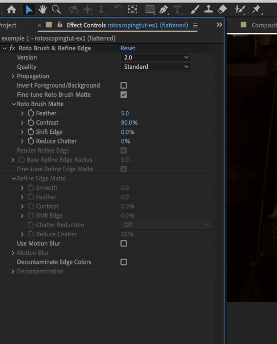
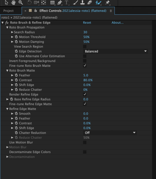
When you’re Rotoscoping you’ll see this in the Effect Controls panel.
There are two versions of Roto Brush:
Version 2.0: The Rotoscoping selection is powered by AI for higher accuracy when you propagate the frames.
Version 1.0 (Classic): This is the legacy Roto Brush Tool that uses a lesser algorithm. Recommended only if Roto Brush 2.0 is unstable on your machine due to RAM issues.
And two quality settings for Roto Brush 2.0:
Standard
Best
Note: I am currently unable to use Roto Brush 2.0 with Best quality model on my machine to compare the differences myself, so I’ll link this page that explains the two quality settings.
Note: if you’re using an older version of After Effects you’ll see this instead. This corresponds to Roto Brush 1.0 / Classic in the newer versions of AE.
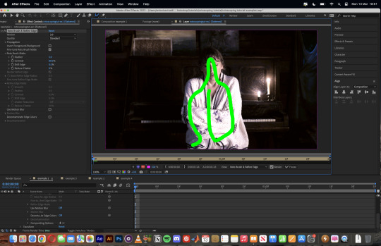
When you’ve made a selection using the Roto Brush Tool, you’ll see the pink lines around the subject. This is the region that you’ve selected to Rotoscope!
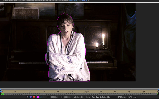
To bring out some details around the edges, grab the Refine Edge Tool and paint around the edges
Then the interface will look like this
To view the Rotoscoping selection that you’ve made more intuitively, you could click on the following buttons.
Personally I like the viewing my selection using Toggle Alpha (the second box from the left) & Toggle Alpha Boundary (the 3rd box from the left)
Toggle Alpha
Toggle Alpha Boundary

Note: If you aren’t happy with the initial Roto Brush selection, you can always add (press Shift while using the Roto Brush Tool) / subtract (press Alt / Option using the Roto Brush Tool) your selection.
After you’re happy with your Rotoscoping selection in the first frame of your composition, press fn + down to view the next frame.
Repeat pressing fn + down and fix the selection along the way (e.g. I subtracted a small area from my Rotoscoping selection with the Roto Brush tool to make the edge look cleaner).

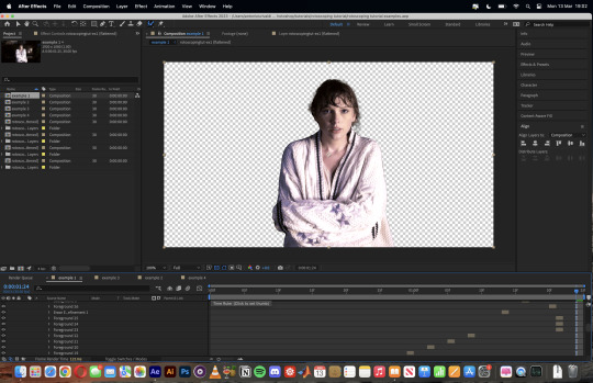
After fixing the selection along the way, go back to the composition file (select the clone composition again) and you will see that a cutout gif is made!
To export this, go to File > Export > Add to Render Queue. You’ll be redirected to the Render Queue panel at the bottom of After Effects.
Highlighted in red: click to change export setings
Highlighted in green: click to change save destination
Highlighted in yellow: click to render video
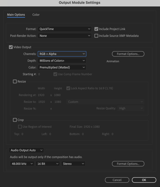
To preserve the transparency of your cutout gif, you need to change your export settings in the Output Module.
Under the Video Output section, change your Channels to RGB + Alpha. Press OK. Then Render the video.
5) Photoshop pt. 2: Assembling your final gif
The essence is to drag the cutout gif (aka the video file that you’ve just rendered on AE) into a new PSD composition file. This will be where you’ll do the rest of your giffing. Your workflow will contain the follow steps:
Make a new blank PSD composition file in Tumblr dimensions
Enable the Video Timeline
Follow the instructions detailed in the individual examples i.e. drag the cutout gif into the PSD & adjust the timeline start / end points
Exporting the final gif. If you’ve worked in 0.03s frame delay all the way up to here, just play the action that I’ve provided in the tutorial in the following order to set the frame delay to 0.05s.
EXAMPLE 1: finalising your cutout gif | sample gifset
After enabling the Video Timeline in your PSD composition file you’ll see something like this
Go to your folder, drag the cutout gif you’ve made on After Effects, resize / reposition, then press Enter.
And also make sure to adjust the Video Timeline’s start / end values.
Add some finishing touches. Because I did the Rotoscoping at full HD resolution, I’ll also need to sharpen my gif in this step.
After you’re happy, you can export this into a gif file and do what you usually do to change the frame delay to 0.05s.
Notes on my “Unsmarting” approach:
To prevent accidentally writing over a PSD composition file that I’ve spent time editing, I personally render this into a short video (File > Export > Render Video) and use the following export settings (to prevent quality loss)
Then I open the rendered clip and play the actions in my gif prep action pack as follows:
flatten: this “Unsmarts” the clip / video
set frame rate: this sets all frames to have 0.05s frame delay
This is the final interface that I get before I pull up the Save For Web window.
EXAMPLE 2: changing your gif’s background colour (for Case 3 gifs) | sample gifset
From your folder, drag BOTH the cutout gif (rendered on AE) and the original gif to your blank composition.
Important: you need to make sure that both layers are properly lined up in the composition file (i.e. selecting both layers when repositioning / resizing)
On Photoshop, press Enter twice and place the cutout gif on top of the original gif from the Layers panel. Then you should get something like this
Select both layers and resize / reposition them in your PSD composition until you’re satisfied with the placements.
The basic idea here is to add some adjustment layers / other things in between the cutout gif and the original gif. To do this, select the original gif layer in the Layers panel.
Then you can start adding.a bunch layers e.g. textures, onto the composition.
And then here’s the exported gif!
6) Fancier Rotoscoping examples
Note: knowledge in using layer masks / groups and making shape / text layers assumed
In the next two examples, I’ll show you how to combine the two previous examples with shape / text layers.
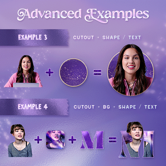
EXAMPLE 3: Placing your cutout gif into a shape / text layer | sample gifset
Add a text / shape layer to your blank PSD composition
We want to prepare a masked group so in the Layers panel:
Make selection from layer: Cmmd / Ctrl + Click (highlighted in red)
Make a new group: click on the folder icon (in yellow)
Create layer mask: click on the icon (in green)
After duplicating the masked group you’ll get something like this in the Layers panel
Drag your cutout gif into the PSD composition
Place the cutout gif into the masked group on top
Select the mask of the top group and paint (in white) over the region you want to reveal for the cutout gif
Add some finishing touches & export the gif!
EXAMPLE 4: Putting it all together | sample gifset
You follow the same approach as in Example 3 to prepare the masked groups, but you need to drag two gif layers in (and resize them using the approach outlined in Example 2)
Place the gif layers as follows
While selecting the mask of the group on top, paint (in white) over the region that you want to reveal in the cutout gif
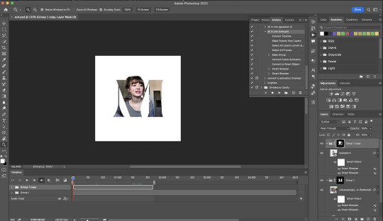
Now select the original gif (placed within the other group) and add some adjustment layers
After adding some finishing touches & exporting the gif, I get this!
Note: you can do even more overlay effects in the background portion of example 4. There will just be more masked groups + adjustment layers
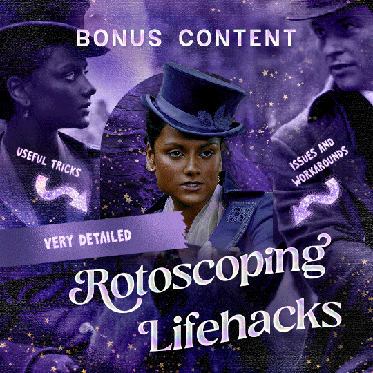
7) Bonus: Some useful Rotoscoping / giffing lifehacks
GIFFING LIFEHACKS:
— Use best quality footage that you could find & Rotoscope in full video resolution, for better details around the edges
— Poorly lit scenes & low contrast edges are harder to Rotoscope (e.g. Toy Story set / TS evermore set).
If you’re new to AE, I would recommend choosing videos with well-lit gifs with simpler backgrounds and high contrast edges (e.g. Maisie Peters Cate’s Brother set)
— Use Rotobrush 2.0 if you’re using After Effects 2021 or later. It’s more difficult to Rotoscope / change background colour for gifs with a lot of movements with the classic Rotobrush tool. If the scene is tricky, you might want to switch to the “Best” quality model.
HARDWARE-RELATED PERFORMANCE OPTIMISATION:
— The recent versions of Photoshop require at least 8GB of RAM. If you have less RAM, it will still work provided you have enough scratch disk space. For better performance, it’s best to close other applications when you’re using Photoshop.
— The recent versions of After Effects require at least 16GB of RAM. If your machine has less RAM than this, there are some workarounds to prevent your machine from hanging:
Essential: close other applications that you’re running on your computer
Resize your gif down to Tumblr dimensions & sharpen it before importing to After Effects.
Install an older version of AE
8) Bonus: Some known software + hardware issues, and workarounds
KNOWN ISSUES ON PHOTOSHOP:
I currently have minimal issues in my giffing workflow, but I’ll nevertheless outline a few common known Photoshop issues for anyone who needs some workarounds.
— Video Timeline interface missing: this affects Apple Silicon Macs (i.e. M1 / M1 Pro / M1 Max / M1 Ultra / M2 / M2 Pro / M2 Max)
Update to newer version of Photoshop (updated 2022 or 2023)
Open Photoshop with Rosetta
— Scratch disk full error: This is a common issue with machines that lack RAM & have nearly used up internal storage. Editing video layers in the timeline interface uses a lot of memory hence will require a lot of scratch disk space.
Make sure that you have enough free storage space while using Photoshop. Alternatively you can use an external hard drive as a scratch disk.
KNOWN ISSUES ON AFTER EFFECTS:
These are a few issues that I have personally ran into over the course of giffing on multiple devices & multiple versions of After Effects.
Note: Inputs from M1 / M2 Mac users with regards to experiences on using the After Effects Rotoscoping tools are welcome!
— Rotobrush 2.0 set to “Best” quality model causes AE to crash: this affects anyone who’s using MacOS Ventura
I’m currently experiencing this issue on my M2 Mac. The workaround right now is to change the Roto Brush 2.0 quality setting to Standard.
This is due to some software compatibility issues on Adobe’s side specifically with MacOS Ventura. Fingers crossed that they will properly fix this bug in the future updates!
— Cannot re-open project files with Rotoscoping: this affects anyone using the initial release of After Effects 2020 (I had installed this on an Intel-based machine and it sucked)
The only option here is to update to a later version of After Effects.
8) More useful Rotoscoping resources
Rotoscoping + Keyframes Tutorial by @jenna--ortega
Rotoscoping + Masking Tutorial by @usergif
Rotoscoping For Beginners in After Effects | Motion Graphics Tutorial
I hope you enjoy reading this! If you have any questions / need any help related to this tutorial, feel free to send me an ask!
#after effects#tutorial#gif tutorial#photoshop tutorial#dearindies#tusermelissa#usernik#useryoshi#usershreyu#usercim#userrobin#useralison#userannalise#userkosmos#userisaiah#usergiu#userives#*#my resources#my tutorials
2K notes
·
View notes
Text

Hi ^^
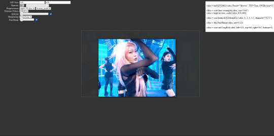
It’s me, the creator of some gifs you like and the creator of many gifs you could’ve probably lived without. A few people have asked me for a giffing tutorial recently so I have made one documenting my normal process! I’m going to gif this Aespa stage in this tutorial because I am still pretty bad at coloring stages. So come struggle along with me 🫶!
Step 1. Getting Sources & Vapoursynth
The worst enemy of the tumblr gifmaker is tumblr itself. You will spend your time making the clearest gif imagineable only for the blue site to reduce it to pixels. But alas, we must gif on. The best way to get good results is have a good source and to precompress your gif with vapoursynth.
As far as downloading from Youtube the best app to use is 4k Video Downloader. 4kVD let's you get download your file as a .mkv which is how youtube stores their 4k quality vids. Only limitation is on the free tier you get only 10 downloads. There are other more technically dubious methods to get 4kvids but I've literally never hit this limit.
10 out of 10 gifmakers agree if you want those good good crystal clear gifs you gotta stick with 4k or 1080p sources. Although if you are a complete sicko like me you can gif 720p and still get pretty good (not great) results.
So now you got your source video but you won't actually be able to open that bad boy up in PS yet. This is where the Vapoursynth step comes in. Vapoursynth will blast that footage into a nice denoised, sharpened and resized little baddie of a video clip for us.

To download VS and get a more in depth explanation of the exact steps on how to use it please reference this post. The basic steps of Vapooursynth are:
Drop your source video on the "vapourscript (drop a video file on me).bat" icon and type in the timestamps
Crop your gif to your liking (I do a lot of 540 x405 or 540x335 for horizontal gifs. 268x480 for vertical.)
Apply the sharpness and denoise (these are the options I use):

copy the code from the white box and paste it into the script like below
I set my denoiser to 1.5 and my sharpening to .5. (I stole this from @hyeongseo lol)
Go to Script > Encode Video. Make sure on this screen to name your file and set the header option to 'Y4M'. (Sometimes this is the step where it crashes and all your dreams are ruined because it can't convert it unfortunately. But 99% of videos are good lol)
You will find your Photoshop ready clip in gifs/output
Step 2. Photoshop
You are now good to open up your clip in Photoshop.

if we export our gif at this moment it will look like this:

Which isn't too bad. They just are pretty washed out and a lot of times at this step you'll see a lot of grain.
Sharpening (again lol) and Noise:
This might sound weird cause we just denoised lmao but stick with me.
We are going to convert our clip to a smart object. If you want to slow down or speed up your clip make sure to do so before converting.
(Often times if i have 60fps clip I put it at half speed, but if the action of the gif is really jerky or flashy at 30fps a lot of times I'll set it to 85% speed)
Convert your video to a smart object by right clicking it in the layers panel and selecting the "Convert to Smart Object" option
Create a copy of layer 1 and arrange it so it is aligned perfectly on top of the first video in the timeline. You have to drag it outside of the video group to do this. It should look like this once you are done:

On the bottom clip (layer 1), select filters -> sharpen -> smart sharpen. Apply the filter with these settings:

Then on the same clip (layer 1) apply the same smart sharpen filter with these settings

Setting up the Sharpness like this makes sure the finer details with stand out with crisp lines in the final product. (Look at how the mesh on her arms is in finer detail now)

Your video might look a little crispy at this point and that is ok cause we are going to soften that.
Now on our top video layer (layer 1 copy) select filters -> Blur -> Gaussian Blur. Use this setting:

Finally apply filters-> Noise -> Add Noise to layer 1 copy with these settings

"Vacancy what the hell? It looks like shit now."
Yeah... But now we'll put layer 1 copy at 25% opacity and it will look less like the shit that it does look like right now I prommy. Here is the current output:

The idea behind all this blurring and adding noise is that it will help create smoother transitions between the colors of the gif and reduce large blotchy bands of pixels that can sometimes show up
PLEASE!!! Save your current step as a PSD file. You can skip having to apply all those filters and just drag the filter groups on to the layers after the smart object conversion step.
Step 3. Coloring
Now to the fun part! There is a lot of trial and error in this step since we only have 256 colors to play with.
Typically my goals for this step are:
Raise the black point (Make Giselle's outfit in this gif black so more color can be used on her hair, skin and the background.)
Reduce the overall contrast of the gif. (Darken the lightest lights if possible)
Saturate the colors enough so they stand out but not so much that everything looks gross.
Depending on how we do these steps we may need to subtract frames from the gif. (Which I hope not cause there is exactly 69 frames in the current version lol)
Here is an example of what my coloring difference can look like:


In this case the colored gif is actually smaller because I elminated a lot of the dark greys in the background.
Vacancy's Dumbass Original Recipe thing
This is probably the only thing different that I do from most creators
My first adjustment layer is usually a gradient map. The green and red one to be more specific.

I then change the blend mode to luminosity and set the opacity somewhere between 12 and 20% (Usually 15%).
This step brings all our shades closer together so we have more freedom with coloring later. Also when idols are very white wash this seems to bring out the shadows and skin tone better in later steps as well. If you overdo it though the person in the gif can wind up looking very orange or yellow so less is sometimes more here.
There's also probably a better way to achieve this but you know... oh well
My Other adjusment layers usually consist of:
Levels: With the gradient map applied you can darken the blackpoint of your gif pretty significantly.
Selective Color: This is the most useful adjustment layer. Make sure to expirement with adding to the black slider on the blacks and neutrals color options. Often times kpop vids are over exposed and darkening this can bring out a lot of unseen color.
Hue/Saturation: I use this layer to darken the blues of the background with the lightness slider as well. You can adjust individual colors with this layer and with selective color and that is a very powerful tool for coloring.
Start:
Finish:
Because I darkened the gif so much I was able to add around 6 frames!
Though I’m not 100% satisfied with this gif, this would be my process from the start. You can put those adjustment layers all in a group and save it to the psd as well to skip all the steps to apply them. I used all the same adjustment layers for the header gif of this post as well which saved me a lot of time ^^!
Since every video is different you usually have to play around with the sliders a lot between clips.
Step 4. It Flops…
Jk jk but it does happen a lot tho on this site so don’t get discouraged ☺️
Parting Notes
If you want a really nicely colored fancam to practice on I would see if MIRAI on YouTube has a fancam of your fave idol. Their videos are really nicely color balanced from the start where stages like this tend to be very bright.
I’ll probably make a follow up post with more coloring tips and my thought processes while making gifs but this is the very basics to making hq gifs hope you learned a lot.
You can always hit my dms or inbox with questions if you have them ^^!
#hope this helps#tagging a few people#tuserflora#userdoyeons#forparker#useranusia#rhitag#usercherry#<- these are all creators I try to learn from#flashing tw#flashing cw#tutorials
89 notes
·
View notes
Note
Heya! I was thinking of making my own comic, and I was curious what app you used to make comics, and if you had any tips.
Anonymous asked: What program do you use to draw? (cant remember if this was already asked or not, sorry if it was)
It has been asked, but not in quite a while, so no worries ^^
I used to use photoshop, but it was an old version that stopped working when i got my newest computer, so I've switched to using clip studio paint. it works pretty much the same, so very little of my workflow had to change, which was nice.
i'm sure most other art programs out there would work just as well though; about the most specialized things i use in clip are some of the brushes--i don't even touch any of the tools that are supposed to help with making comics specifically XD
edit: oops, i forgot to answer the bit about tips for making comics
first off, start small. unexpected guests is not my first comic, and what i learned from past--even failed--attempts has helped me get as far as i have. doing a few short comics will help you get a sense for how to block out panels, how long it takes to draw a page, and how it feels to draw the same characters all the time. Project management is a whole other skillset, but it's important to learn if you want to take on bigger works.
I also recommend studying your favorite comics to understand how they achieved what you like about them. I've mentioned before how the manga Fullmetal Alchemist has been a huge inspiration for much of my work, and sometimes when I'm stuck I'll revisit it to see how its author handled action, how she paced scenes by changing the paneling layout, and so on.
these are far from the only things to know about making comics, but they're the tips that first jumped to my mind, so i hope they help at least a little ^^;
90 notes
·
View notes
Note
Hi! I finally got the chance to read Aurora a bit ago. It's a wonderful story--all I was expecting and better! I was particularly amazed and delighted by the artwork and visual mechanics used to tell the story, so I wrote a post to yell about how cool it is and break some of it down. (No criticism, just praise.) I'm mostly a hobbyist, so I'm hoping I've done it justice.
That said: zero pressure to read it or respond to this ask. Normally I wouldn't send it since I tagged, but I know Tumblr's notifs are a mess and things get lost very easily. I've been in both the "one (1) word of praise will feed me for a year" and the "oh gods don't talk about my writing/art because anything that seems Off will break my brain" modes before, and I absolutely don't want to push or make you uncomfortable!
If you are comfortable, however, I wanted to ask about your use of what I'm assuming are Screen and blending modes in sound effect words. (I'm only guessing that's the technique, though, so I could be totally wrong about how it's done! I'm mostly experienced in image manipulation in Photoshop.) Making them semi-transparent over the actions is genius :) What inspired you to do that, and are there specific techniques you use to make it work?
Same questions go for using specific colors to distinguish different characters' words and actions. I really noticed it in the cave sequence with Falst and Dainix, since their colors are so vivid in the dark (ex. Falst's little swats and Dainix's swooping kick at 1.20.9). It lends excellent clarity to busy scenes.
Thanks! Have a lovely day, enjoy your break, and happy holidays <3
You're correct about the technique! "Screen" is the blend mode I use most often for sound effects. I stumbled on it mostly through trial and error - I love how sound effects add depth to a comic panel, but it's very easy for them to obscure the art in a way I find counterproductive, so "Screen" lets me put the sound effect directly over the origin of the sound while still letting it be visible through the word. Early chapters didn't have it as much-
Most of the sound effects in early chapters are just solid colors with reduced opacity if I'm feeling fancy. But I started figuring it out around chapter 8 and 9, because Falst is kind of a sound-effect-heavy guy, especially in his fight scenes.

In order to make sure they don't impede the visibility of the action, I'll often soft-erase the top or bottom half of the SFX to reduce its opacity while still leaving it readable.
I'll usually double that up with an outline on the SFX so it's still readable. This is an especially important consideration if the SFX goes over an area of the background that's very bright or glowing.

Color-coding the speed lines and SFX to the character or force causing them isn't a hard and fast rule, but I like using it (in part because it's a habit from the OSP illustrations, where every character has a single pop of color in their lineart) mostly because it sort of codes every sound to make it clear where it's emanating from, or the general feeling of the sound. Since I normally do character-colors for SFX, something like this stands out more jarringly-

Which it's supposed to, but a big lightning strike doesn't register as anything too worrying because it's just Tess up to her usual shenanigans.

It's also very useful for magic effects, because each form of magic has its own associated palette.


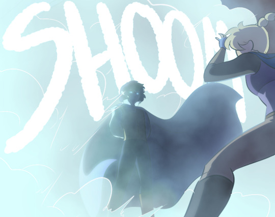
And when I had a very complicated fight scene in a dark environment, I used the texture pattern I'd already made for the monster to color its SFX, so when I Screened them onto the panels they didn't obscure too much while still communicating "this is something else."

Changing the weight, lined-vs-not-lined, and opacity of the SFX words also helps to communicate that not every sound has the same feeling. A strong motion is solid and aggressive, but a crackling, unstable sound is more ephemeral and staticky.

It's definitely been a process of learning as I go - looking back at the earlier chapters I can actually see when I first tried various tricks I now use regularly, like doubling and distorting an SFX to produce the effect of a camera-shaking impact. I haven't really seen any other comics that do it like I do, probably because most other comics follow a more traditional production pipeline where text bubbles and sound effects get locked into the composition early, before the inking stage, because traditional physical comics don't have digital-art layers to play with. Adding sound effects to a page is almost the last thing I do before exporting them, and that only works because digital art and layers allow for a ton of flexibility.
379 notes
·
View notes
Text
so hold my hand (consign me not to darkness) [1/4]
Ah, yes. The fic that made me realise I’m in desperate need of Cursed Spirit Gojou in my ever-growing favourite GoYuu tropes.
Content Warning!
Major Character Death. Other characters are disrespectful to the corpse.
I highly suggest you read the fic first, or just the fic, since I don’t think I was properly able to adapt it into drawings. While I managed to use roughly two weeks of on-and-off planning, researching, and storyboarding, I only had a full week to finish it. You can read more of my thoughts below the comic if you’re curious.
Title: so hold my hand (consign me not to darkness)
Author: qalb_al_louz
It’s ongoing, and as of this drawing, the fic is in its third chapter. While this is (sexually) SFW, always be mindful of the tags! Please keep yourself safe and sound.
Please read from right to left, and enjoy!


You can only upload 30 images in one post, huh Damn, I gotta divide it into parts
Part 1 | Part 2 | Part 3 | Part 4
Alrighty, I'll put my watered down unhinged thoughts below. No extra drawings down there if you're curious haha (unless you want to see the storyboard and the characters' full body character sheet, lemme know). You can skip the stuff underneath the Keep Reading for all parts.
This fic had me grinning from ear to ear every time I read this. The atmosphere, how it goes from POV to POV—of pure fear and panic—and the peak excitement I got when Yuuji properly meets Gojou, like brooooo 😭
Gosh I cannot emphasise how much I love this fic. I’ve always been wanting to make a whole comic out of it, especially since it was 2 chapters and it doesn’t look like the author will update it, but it just… kind of forgotten ∠( ᐛ 」∠)_
But then the author posted a new chapter and I told myself this is a sign I should really start.
also goddamn I was so naive to think I can tackle 2 chapters as comic—no I was in fact cannot
The moment I laid my eyes on the first paragraph, things were portrayed very vividly in my mind. The panel, the angle, Gojou's head rolling down... I was like, hell yeah. Then I continued reading and I finally succumbed to my desire to draw this out.
At first I want to adapt this into a vertical format like those manhwas. However the longer I try to learn and storyboard it... I am simply not yet comfortable with it, especially for such a big project. Even the 1st storyboard starts vaguely vertical before the panels quickly crammed into that B4-B5 format lol. The first sketch estimated 69 (heh) pages for 90% of chapter 1. I said "no" for my own sanity and fully focused on the usual manga format and it was narrowed down to 60. Still a lot though, quantity and time-wise. So with a heavy heart, I can only do the majority of chapter 1 :”) I really really want to draw Sukuna talks back to Gojou—do you have any idea how good that scene was??? Gojou tried so hard to restrain himself, he’s so other I love him 😭
Due to the sheer length of this comic (I'm still in disbelief), I have limit lots of things, and that includes the drawing. If you've seen my other JJK fanarts, they are more rendered than this one. Well, this one is purely sketched with the help of the eraser to tidy up some lines. This is also the first fanart that I did purely on Photoshop, so I can control the typesets and drawings in one place. Usually, I use Photoshop for panels and typesetting and Krita for drawing.
I don't really like Photoshop's brush, but it did really well in curbing my perfectionist tendencies, so that's good.
It's also been quite a while since I draw in general (sobs) so... yeah, you might find differences, or not ¯\_(ツ)_/¯ But I hope you enjoy it nonetheless!
I know setting is important, but maaan I genuinely won't miss rereading chapter 83-93 with a heavy focus on background and character locations. I just want to read the action and dialogue😭 However continuity is really important. But my spatial intelligence is almost non-existent even GPS sometimes can't help me. All I'm saying is that if you find some silly drawing mistakes, do forgive me ∠( ᐛ 」∠)_I only drew all this in a week because otherwise I won't have another chance to complete this.
Well, lots of things I won't miss from this project, but haha let's talk about the characters instead because holy shit what was I thinking, starting this year drawing this many characters in the same project??? I have never drawn anyone here except for Yuuji, Gojou, Nanami and Megumi. I don't think I've ever drawn older Getou before. I already forgot how to draw my boy Yuuji and I gotta draw all these people???
This is what you call making a bad decision, kids. Don't do your "drawing warmup" after months of not drawing and tackling a project of a scale way bigger than you've ever tackled before.
Thank you for reading this far! I hope you find my complaint entertaining! But make no mistake, I genuinely still love the fic. Drawing this, even with all the headaches it gave me, only makes me adore this fic even more.
Thank you very much to each one of you who follows and leaves comments and tags on my silly art—it never failed to make my day :D And I sincerely wish this one also made your day or even made your minute! I'll see you in the next part!
#yuu's art#jjk-fic-fanart#jjk-ship#五悠#goyuu#goyu#5u#gojou x yuuji#shibuya arc#shibuya arc canon divergence#lots of characters on this one#kenjaku#chousou#mahito#jogo jjk#gojo satoru
87 notes
·
View notes
Text
someone sent in this ask and I spent literal hours putting together this tutorial but then it wouldn't let me post it and when I went back into my inbox the ask was gone?? good thing I copy and pasted it, so here it is in its own post
I'm not sure if this will work with programs other than photoshop, but this is how I do it. I know @shinobi-bacon has a tutorial here on how they do it which is pretty different from the way I do it, so if my tutorial is confusing maybe theirs will click with you better lmao. I stole the greenscreen idea from them anyway
SO FIRST, you want your villager on a green screen background. to do this, go to harv's island and use a custom pattern to make the walls and floors bright green. If the villager you're using has green in their design, you'll have to pick a different colour that isn't in their design, but for most villagers green is fine.
if your villager has every colour on them like pietro or stiches then rip you're gonna have to do some manual editing frame by frame. try to choose a colour that doesn't touch the edges of their silhouette too much in that case because it'll make life easier for you
so once you have them in green purgatory, record them doing their emote or whatever. I just use the built-in screen record function that the switch has. press and hold this button to record the last 30 seconds that your switch displayed:

next send that video to your computer and trim off the start of the video so it starts right before a recognizable part of the animation. for this emote I cut it off right before the blink. if you have a slow computer, you'll probably want to trim the end off too so the video is only a little bit longer than one full animation loop
(you can use the video editing software of your preference, I just use quick time player Edit -> Trim)
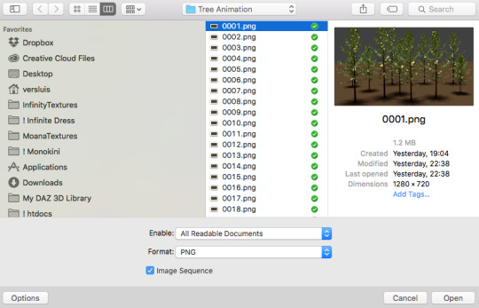
okay time for photoshop. go File -> Import -> Video Frames to Layers
for "range to import" select "from beginning to end" (or you could skip the last step about trimming the video and select a range here, but I find it kind of finicky), and make sure "make frame animation" is checked
once imported, if it doesn't pop up on it's own, go Window -> Timeline to get your animation at the bottom

click through those frames at the bottom until you find an easily recognizable frame (I chose the first frame where her eyes are closed) and delete all the frames before it. in the layers panel, the layer from the frame you've selected should be the only one turned on. delete all the layers below it
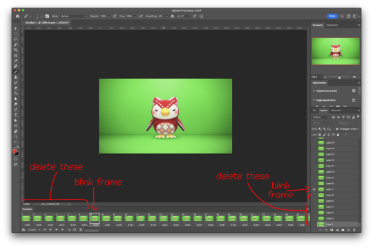
now go through the frames to find the next identical frame. this is where the animation loops. delete that frame and all the frames after it, as well as all of their corresponding layers (note in the picture, frame 121 is selected, and it's exactly the same as the frame from the start of the animation)

hit the play button on the bottom left to double check that it loops properly
next, make sure both THE FIRST FRAME AND BOTTOM LAYER are selected, and crop and reduce the image to your desired size. you can do this step later if you want, it's just that doing it now will reduce the load on your computer and make it run a bit faster. just as long as the first frame and bottom layer are selected, you can do this at any time
SAVE HERE because if you mess up this next part it's a pain to fix, but it's easy to quit and start over if need be
now it's time for my best friend the actions panel !! say hi actions panel !! (Window -> Actions). what the actions panel does is record your steps so you can quickly automate repetitive tasks.
in the actions panel, click the folder and name it whatever you want
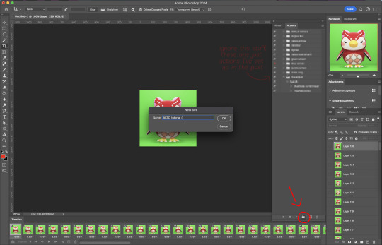
then click the little plus and name that whatever you want and hit record. You'll see the dot turn red to indicate that your actions are now being recorded
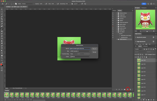
now with the BOTTOM LAYER AND FIRST FRAME selected (ignore that I have the wrong layer selected in the pictures, I fixed it after), go to Select -> Colour Range

click on a part of the canvas that would be green

shift+click on the rest of the green background and adjust the fuzziness until just the character's silhouette remains
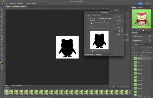
hit OK, now the background should be selected. go Select -> Inverse so that the character is selected, and click on layer mask.
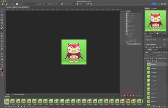
click the next frame button (you MUST click the button, not the actual frame. you need the recording to recognize "go to next frame" and not "select frame 2"),
then keyboard shortcut option + ] to select the next layer up (again, you MUST use the shortcut so it knows to move up one layer and not just "select layer 2"),
and then stop recording.
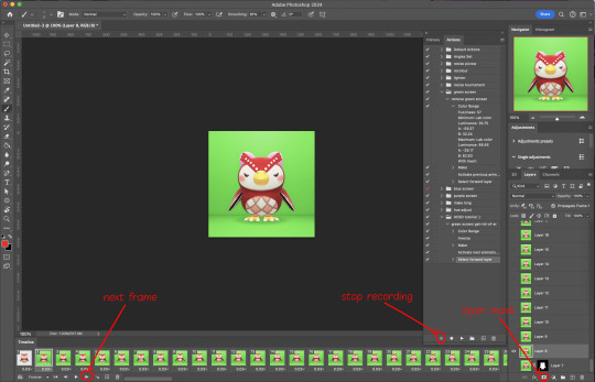
now just repeatedly click the play button and it will do all those steps we just did for each frame :)

this part is usually where it gets messed up for me. if it did something weird like duplicate the same frame or layer your animation over a static frame, just quit and reopen that save I told you to make earlier. the action recording you just made will still be there when you reopen photoshop, so just select the first frame and bottom layer and repeatedly hit play again. if it STILL doesn't work, you probably did something wrong
the recording is now saved in photoshop forever until you delete it, so you can reuse the recording for other gifs! but if they use a different colour background, you'll need to make a new recording (you can see I have separate ones for blue and purple screens). also if you were working with one of those colourful villagers and parts got masked out that shouldn't have been, you'll have to go frame by frame and manually fix them. that's why we masked out the background instead of deleting it.
now it's time to make it into a gif! go File -> Export -> Save for Web. make sure Matte is set to "none" so you don't get those weird white flecks. colours and dither you want as high as they can go, but you can lower them if you need to make the file smaller (though I'd recommend resizing the image smaller first). the bottom left shows your file size. currently as of January 2024, tumblr allows gifs of up to 10MB
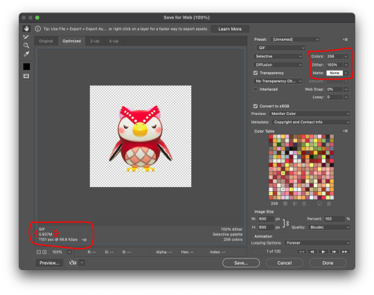
and there ya go! gif! :)
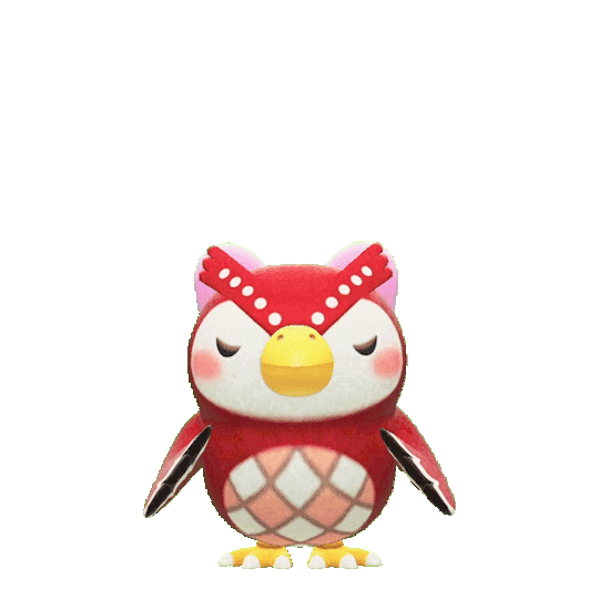
62 notes
·
View notes
Text
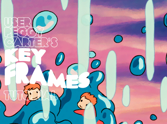
i was requested by anon to make a tutorial for this gifset and here it is!
DIFFICULTY intermediate/difficult. basic giffing knowledge is definitely required.
while my gifset has a fair amount of animation, the only handmade animations can be found in the second and fifth gif. the rest are assets (the checkmarks, the sharpie circles) (either gifs or videos) i found on the internet and pasted over my gif.
THE BASICS OF TIMELINE GIFFING
if you gif with frames, you will need to use a timeline for the animation to work (keyframes). i’m a timeline giffer anyway so this was another Tuesday for me. if you never used that method of giffing, however, it can be confusing, especially if you never used a video editing software before (the timeline works like video editing).
so, here’s a breakdown of what is the timeline:
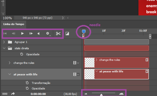
the player icons work like any video/music player in existence. ignore the volume icon.
the gear icon indicates the quality of the reproduction while editing it, not the quality of the end product. think like it’s Youtube reproduction settings on a video in order to save your 4G data, but with RAM power instead. this is very useful if your computer isn’t very powerful to begin with and gifs with VFX are very heavy to handle.
i always click the loop option inside the gear panel because i like to see how the gif will be viewed by the public, i find watching to play only once isn’t very productive. you can stop and restart the reproduction by pressing the space bar on your keyboard.
every layer of your PSD file will have its own bar. the length of the bar means the duration of the gif, so a longer bar means a longer gif and a shorter one, a shorter gif. for everything that isn’t your gif/screencap-based (ie, coloring, typography, lightning, shapes, etc) can be dragged by the extremities as much as you want, making the asset last as long as you want. the only layer that is limited by its maximum duration is naturally your gif, but you can also drag it to make it shorter.
you can also drag a whole layer bar by clicking it and dragging it, making the start and finishing point different from the rest. be careful while doing that otherwise you will end up with blank frames, messing up the looping of your gif completely.
there’s a needle you can drag across the timeline and it works just like on a vinyl disc, the moment the needle drops, it’s the moment/frame Photoshop will show you.
you can also trim your stuff by cutting and deleting snippets of the bar. for that, you will drag your needle to the desired moment, use the scissor tool and then press delete to erase the unwanted bit.
it’s important to point out that the timeline only allows 0.03x or 0.07px speed, no matter what the speed the gif was before converting to that method. if the original speed is closer to 0.03x, then PS will define the new speed as 0.03x. if it’s closer to 0.07x, then it’s 0.07x. i always change the speed to 0.03x before converting to timeline for the sake of not screwing stuff up, which means i see my gif looping while editing in a faster way than Tumblr users will see when the gifset is posted. this takes a while to adjust to if you’re new to timeline giffing, but eventually you don’t think it’s jarring anymore.
that also means you will need to correct the speed after your gif is completely finished. to do that, i use this action.
you can zoom in and zoom out using the little mountain sliding bar. this will be useful later in the tutorial.
if you zoom to the max, you will see all the numbers above your layer bar. these are time marks. the thing is, they seem a bit weird at first. the bigger numbers indicate SECONDS (01:00f, 02:00f, 03:00f, etc), while the smaller and repetitive numbers indicate frames (5f, 10f, 15f, 25f). that means that the smallest drag of your needle possible (from point A to point B) refers to an interval of 1 frame. you will need to take this into consideration while animating stuff.
you can color code your layers, if you think that makes it easier for you to see what you are doing. this is something i do, not only in Photoshop but every Adobe product with a timeline. to change the color of a layer bar (the default is purple), you can right-click on your layer in the layer panel and click the color you want. the colors are the very last thing in the list when you right-click it.
another organization tip is the use of folders. if you create a folder in the layers panel, a folder is created inside the timeline and any layer inside of that folder will disappear from the panel until you click the little arrow next to the name of the folder in the timeline panel. you can color code your folder as well, making every layer inside of it the same color or even different colors.
THE BASICS OF KEYFRAMES
every change related to any property selected (transformation, opacity, style, text warp, position of the layer mask, activation of the layer mask) will be computed in the exact moment in the gif you change it. if that doesn’t happen, you can force Photoshop to do it by clicking the small diamond next to the property name.
let’s say you want an animation to start 0.5 seconds after the gif starts, so you will drag your “needle” to 0.5 seconds and then make the change (making a text bigger, moving a shape, etc).
Photoshop will automatically bridge the gap between the state of the gif at 0 seconds and 0.5 seconds, thus animating your gif.
to start animating, you will need to click the little clock next to the property you want to animate. make sure you click the clock while your needle is at the exact beginning of the gif.
every change (keyframe) will be marked with a small diamond under the layer bar, at the exact moment you changed it. that means if you make jarring changes in a short amount of time/frames, the animation will be quick and abrupt. if the interval is very long, the animation will be slow and smooth.
the selected(s) keyframe(s) will have their diamond painted yellow, while the unselected ones will be grayed out.
you can right-click the diamonds to delete or copy them. if you have many diamonds and want to delete them all, you can click and drag to form a square and select all of them just like when you do to select many files at once on a PC folder. there’s also the option “select all” under the right-click panel.
you can also drag them and change their timing that way. if you have more than one diamond selected, if you drag them, their interval will remain the same, but the starting and finishing point of those two diamonds will change.
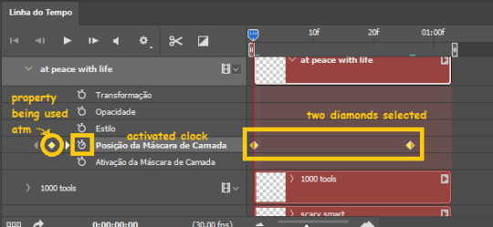
THE SQUARES BAR
the easiest of the two animations. this one doesn’t require keyframe animation, but i put this in the last bit of the tutorial for the sake of its flow.
first, i added the empty squares. they last as long as the gif lasts. after 6 frames, i added the first colored square and made that square last until the end of the gif. i repeated this in a staggered manner (+2 frames delay each colored square) so the colored squares appear at equal intervals.
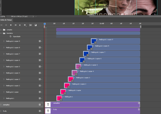
THE STATS BAR
the most difficult of the two, but don’t worry, you got this.
first, you will need to structure your stats, ie, add the text, the dividing line and the pointed lines. that is, if you want to follow the exact design i used in my gif, but you don’t have to if you don’t want to.
next, you will create rectangles that fill the entire stat bars. you will add a layer mask to each one of them and with a layer mask selected, select a rectangle about the size of your original rectangle, then paint it black. you will notice the original rectangle will disappear. if you delete the layer mask, the original rectangle will appear again. that is because you didn’t delete the original rectangle, you just hid it by using a layer mask.
there’s a chain icon between the layer and the layer mask in the layers panel, click it to unlink them.
click the clock next to “layer mask position” with your needle at 0 seconds/frames. drag your needle to the moment you want the stats to end and use the arrow keys to move the layer mask. you will notice the original rectangle will slowly be revealed by you moving the layer mask. you will also notice that a small diamond will appear in the “layer mask position” line in the timeline. you created a keyframe!
if you press play, you will see the animation from the bar going from null to full!
FURTHER READING/VIEWING
this tutorial uses layer mask animation to reveal text too!
a video tutorial for better visualization!
another keyframe tutorial, this time focusing on coloring!
if you still have any questions, feel free to contact me!
and if you (or anyone) else want, i can go in depth in animating each property, i just did a quick overview + explained the stats animation.
#*#*tutorials#completeresources#usergif#useralien#uservivaldi#usereme#userbess#userelio#usershreyu#userisaiah#useraljoscha#usersanshou#usermona#tuserju#userjaelyn#userabs#tusermalina#userbuckleys#tusermimi#tuserlucie#tusermira
254 notes
·
View notes
Text
The Jewel Riders graphic novel
so, how was it?
What I loved:
-The art. Gorgeous! Flowed well, the colors were good. Love it!
-That they made Merlin creepy. In the cartoon Merlin is clearly supposed to be a gentle, all-wise mentor but something about him always came off as a tiny bit creepy in a way the creators of the show did not intend. The creators of the comic picked up this creepiness and ran with it and I am well chuffed that something that was a fanfic idea I had was also going through these creators minds and they went with it and I love it.
-The creators’ love for the world of the Jewel Riders. They brought back the sheep! They remembered Kale’s evil-baby-deer form! They love Tamara and got her spot on! (true Jewel Riders fans love Tamara, we all just do) they had a scene where Fallon is upset and sits with Moondance mirroring one of the more powerful moments in the show. The writers of this comic must have really loved the cartoon, the silliness and the darker tone both together. This is completely a Jewel Riders graphic novel. It’s got the right vibe, the right worldbuilding, it is so perfect at being what it is!
-The plot driver being Queen Anya/Adrianna’s love for her banished sister, with flashbacks to them as teenagers in training to be Jewel Riders. Setting up Merlin as being responsible for Kale getting denied her magic jewel and turning evil and opening up redemption possibilities. Flashback images of young Kale and Adrianna. This is the perfect plot decision, I love it, 10/10 no notes.
What I did not love:
-The story was presented… not badly, but there were a lot of moments that made me go “I think this is what they’re trying to say, but I’m not sure.” For example, Gwen is getting ready to marry Drake and become queen, and she doesn’t want to. I think the intended plot is…
youtube
Land Beyond Dreams, that’s what I think the intended plot is. In the cut-from-the-final-version words of Princess Rosella, “But I’m not prepared to put my freedom on the shelf. How can I share with someone else what I don’t understand myself?” Gwen likes Drake but isn’t sure she wants to marry him and she knows she doesn’t want to marry him right NOW, and she knows she’ll be queen someday but she isn’t ready to stop adventuring YET… is what I think the graphic novel is saying, but it isn’t saying why Gwen can’t just say all that and spend more years as a Jewel Rider.
And it seems like Drake got fired from being a wolf riding boy Jewel Rider to… be Gwen’s full time bodyguard and fiance? But why would that mean giving up his own adventuring? And why does everybody seem to be cutting him out of all the action? There’s no logical reason he isn’t still a Jewel Rider. He even has his Forest Stone in a few panels.
While I utterly love how Queen Adrianna missing her sister summoned said sister back from evil banishment but it happened kind of confusingly. Adrianna summoned her sister, started seeing visions of Kale? Gwen didn’t see them. And then suddenly the land is all thorny and apocalyptic with no “Since Merlin said that Kale had returned, evil thorn plants have been growing out of control!” from anybody.
...is anyone else getting the same vibe that I’m trying to describe here? Like there’s a good plot, but like I’m having to do some long stretches to connect the pieces and the writing could have been changed just slightly to pull everything together in a way that requires less “it seems like” from the reader.
-And here comes the rant.
The thing I really did not love. The thing that made me downright furious with the creators of this graphic novel.
The book had nothing to help new readers who hadn’t seen the cartoon understand what was going on. No little explanatory text, no introductions to the characters and world. There needed to be at least a simple character page like manga have in the beginning… hang on, I can photoshop. The graphic novel needed this:
Ok I made that in like 5 minutes and it’s garbage, but you see my point! This would have added so much for people who just thought the cover was cool and picked up the graphic novel with no prior knowledge of the world. Without it, I’m afraid that the book will only sell to fans of the show, and I can’t imagine that there are enough of us to keep a graphic novel series going. So I think the creators’ decision to write something that’s ONLY for old fans and NOT AT ALL for new fans will result in the series being a flop instead of delivering more Jewel Riders fun for all of us for years to come, and for that I am so angry I could spit nails, so angry I could yell at the people who made a graphic novel that I have so much good to say about!
I hope so much that I’m wrong, and there will be more volumes published because I am just going wild to find out what happens next. What’s up with Kale now that she’s back? What’s up with Merlin now that he’s getting more and more questionable?
And as a longtime fan, what else are the creators going to bring back? Kit the prismfox? That critter made an impression on a lot of us! Ian, the beast of the forest who Gwen kinda had a thing with? The gliders? Will Morgana be back? Will we see any of the other girls’ parents? Will there be anything about Moondance and Cleo being princesses of the unicorns? Might they introduce another zebracorn friend for Shadow, or explore his origins? Could they go mining in the show bible and pull out the biggest unused gemstone: Gwen’s younger sister Tara? They’d have to figure out a way to explain how Tara was never mentioned once in all the show, but maybe she was hidden away for her protection, or kidnapped and the queen was so distraught she swore never to speak of it or something, silly lampshades but why not?
The world of Avalon has so many directions for a writer to explore and I want to see all of them!
19 notes
·
View notes
Text
☠ CHRONICLES OF A BRAINROT ☠
•━━━━━━━━━━━━━•◦˚❦˚◦•━━━━━━━━━━━━━•
After many years simming in my corner, I finally decided to step out of my comfort zone and share my pixel babies with the simblr/tumblr sphere!
I started playing sims with the first opus when I was pretty tiny, and couldn't stop ever since. This game allows my creativity and inner world to express like no other game would, and that's what I love so much about it.
I created many different worlds, kingdoms and stories, but the one I enjoy the most is my One Piece save I started a year ago. It is the first time I am really eager to leave CAS to actually play the game!
Back in 2015 I've been introduced to the manga/anime universe and I never went back! It truly was a revelation, and a revolution in my own stories. But when I discovered One Piece, all of a sudden I was hooked. This universe is so colorful and deep at the same time, it is the safe place I go whenever I feel down, and it never fails me. It may sound silly but I can't explain how warm it makes me feel. Especially Luffy's vibe and laugh, he's so precious.
So last year when I had to stop working because of bad health issues, my last two brain cells met and said to each other "hey, why not One Piece sims?", and that was it, I began this crazy journey of looking for the perfect OP custom content for my babies, then being very disappointed in that matter...and that is when, after weeks and weeks of research, I decided to create my own One Piece custom content, because why not?!
I never touched Blender (and a year later I still feel such a newbie with it) nor Photoshop before, but it didn't stop me to throw myself into it and man, despite all the crying seeing my creations unexpectedly float in game or be filled with terrifying signs in CAS and so on, I can say that I don't regret anything!
I can sing on stage, write songs or dance, but can I properly draw? Hell no! And I've been frustrated for so long since I wanted to do fanarts for my fandoms but I didn't have the skills to do so. Fortunately simming is now one of my places of expression, and I'm genuinely so excited about my lil creations & stories.
My wish is to grow a small community of One Piece fans and/or fellow simmers with whom I could share my passions and enjoy theirs. I know you guys are out there, and I love you already!
•━━━━━━━━━━━━━•◦˚❦˚◦•━━━━━━━━━━━━━•
➨ useful informations for navigation:
• Some of my posts may contain dark topics, blood and mature rp ships (18+)
• I'll do my best to limit spoilers but take note that there might me some here
• I am WCIF friendly but it might take a while for me to answer since I literally use thousands of cc. So please ask for 1 or 2 items at a time. I will happily share their names and creators
• I will not share any download links of my own OP custom content, because I often use other artist's meshes parts, then I mix them with my own etc ; so claiming these items as my own and share them to dl would break those artist's TOUs. Thank you for your comprehension
• That said, if I ever grow a significant sim community, I would eventually contact these artists one by one to ask their permissions to share my content with you! (with credits ofc)
• Aside from my sims I really enjoy editing some gifs and manga/anime panels by doing recolors etc, so you can expect to see a lot of them ♡ (and from time to time i also repost other people's artworks from other platforms with their prior permission)
• Don't be surprised if some of my sims seem really different from one screenshot to another, it is because I have different saves with different timelines (children, pre timeskip, post timeskip, Wano), plus various AUs like high school, dark fantasy world etc, and also a live action save! For example, by now I already have 9 different Sanji sims in several styles and stages of his life (my biggest number for a single character, but I can't help it...I just LOVE him)
• If there are any suggestions, requests, ships (personally into Zosan/Zolu/Lusan/Lawlu/Acesan/Shuggy/Mishanks/Frobin) and more that you would like to see, feel free to ask and I will enjoy making it happen for you!
• You can find me at @poppyxel which is the brand new simblr I created to share my passion for sims and gaming in general. No particular theme there but my chaotic inspiration expressing
•━━━━━━━━━━━━━•◦˚❦˚◦•━━━━━━━━━━━━━•
SO HERE WE ARE ☻
THANKS FOR READING...
HAVE A WONDERFUL DAY ✿❁❀
60 notes
·
View notes
Note
Hi.I would be grateful if you showed how you do these recolors with patterns, because although I understood what it was about, somehow it didn't turn out as it should. I better see how to do it. Thank you <3
Hi again! Sorry it took me a bit to reply, I've been swamped with work asdfghjjhgfds. No problem at all, I'll do my best to explain - I'll just put it under the cut so it doesn't clog people's dashes up. I've also done a quick video showing the process too, in case that's also helpful.
Programmes I'm using:
Sims 4 Studio
Photoshop (I use windows, so all the keyboard shortcuts use the ctrl key. If you are on mac, it will be command instead)
Additional resources:
Photoshop actions by @silverhammersims
Photoshop pattern files. If you don't already have any, you can find some easily by searching 'free photoshop pattern files', or use some of the ones I've shared here
The ~Process~
So, first things first, I find the object I want to recolour in Sims 4 Studio (S4S). For this, I'm going to use 'Modern Colonial Bed'. It has a great plain white swatch which is perfect for recolouring, but if the object doesn't have a white swatch, finding a light/pale colour swatch is also fine.

Then, I open it up in Photoshop.

Obviously, it's one solid image, which isn't necessarily what we want. For example, when I do bedding recolours, I often do a pattern on the duvet (i think it's also called a comforter in some places?), but want a solid colour for the sheets and pillows. So, our next step is to separate each part on to its own layer so we can recolour them individually.
You can use a few different tools to do this, but for bedding, I use the rectangular marquee tool, because there aren't any curves we need to select around. The keyboard shortcut for the marquee tool is 'M'. With that tool selected, I drag a box over the part of the texture I want to separate. I'm starting with the duvet - you can see the 'marching ants' lines around it.

With that selected, I then use the keyboard shortcut 'ctrl + j'. This copies the area you selected onto a separate layer. I rename my layers so that I can easily find each one - i typically call the starting, flat texture the 'base', and rename each new layer accordingly. As you can see, if I click the eye icon next to the base layer to momentarily hide it, we still have the duvet visible.

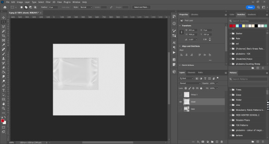
I then repeat this process for the folded sheet, and both sets of pillows. I'll use the base layer to recolour the sheets.

Because the folded sheet and the long pillows are darker than the rest of the texture, at this stage, make them lighter. Whilst clicked on the layer I want, I press ctrl + u, where I can change the saturation and lightness.
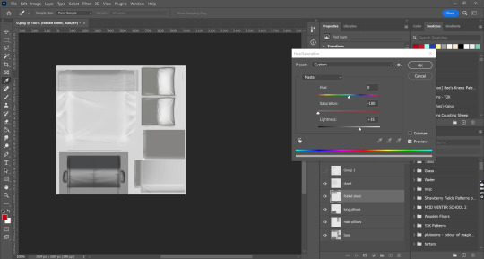
To finish adjusting it, I then add a brightness/contrast layer. To access this, you can go to layer > new adjustment layer > brightness/contrast, or click the little circle icon at the bottom of the layers panel.

When I'm happy with the adjustment, I select both the layer (in this case, the one titled folded sheet) and the adjustment layer, and merge them together. (press ctrl, click on both layers in the layers panel, right click, merge layers). I repeat this process for the long pillows.
OKAY NOW THE FUN PART I PROMISE!
AIGHT now we're gonna add the pattern onto the duvet. Firstly, I make sure I'm selected on the right layer (in this case, the one I've labelled as 'duvet'). I often hide the other layers (by clicking on the eye icon next to each layers' name). Then, I open up the actions panel; if you don't see this at first, you can go up to window > actions.
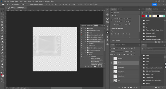
As you can see, I have a lot of actions, but the ones I'm using for this are the silverhammer ones. The names for both action sets is pretty self explanatory - if you want to use a pattern, select pattern base, and for a solid colour, select solid base. Hit the play button, and boom! It will come up with dialogue boxes, just hit the enter key for now as we'll adjust the settings after.
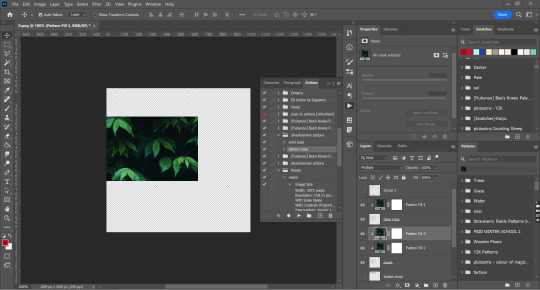
Photoshop will use one of the default patterns first; it's always this leaf one for me, I'm assuming it's the same for everyone, but if not it doesn't matter anyway because we'll be using our own pattern. Using the ctrl key, I select all of the pattern fill layers. Then, I can select the pattern I want to use for my recolour. In my workspace, it's located in the bottom right corner, but it may be somewhere else for you. If you don't see it at all, go to window > patterns. When you've found the pattern you want to use, click on it, and all the pattern fill layers will change accordingly.

Depending on the original scale of the pattern you used, it may look HUGE, or really small. That's fine, because we change the scaling. Double click on one of the pattern fill layers, and it will bring up a dialogue box. I use the middle fill layer (which will be called 'Pattern fill 3') as it has the most opacity and is therefore easier to see. Here you can change the angle, and the scale. I don't want to change the angle this time, so I'll only be focusing on the scale. You can use the slider or type in different numbers until you find something you like. This pattern was really big, so I'm going with a 17% scale. When you're happy, hit the enter key or press the 'OK' button.

You can still see where the other pattern fill layers haven't been changed, but that's fine, because we'll repeat the exact same process with them. Just make sure you use the same scale as you did for the first one you changed (in this case, 17%).
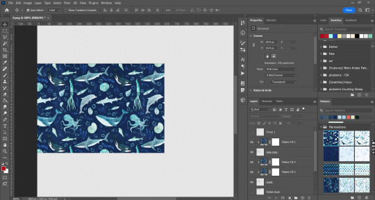
And yay, it all matches! Then I'll select all the layers I just changed and put them into a group (ctrl + g), and rename that to duvet, to keep my layers organised.
Now, I'm going to move on to the solid colours. I'm going to start with the folded sheet layer. I'll click the little box next to the layer to make it visible again. The process is the same as the pattern fill, except this time, I'll select the 'solid base' action.

As you can see, it automatically goes to this eye-hurting neon green, which isn't what I want. Just like with the patterns, I will select all of the colour fill layers using the ctrl key, and then click on the colour swatch I want. If you can't see the swatches panel, go to window > swatches. If you haven't saved a swatch, don't worry! You can do it manually. Just double click on one of the colour fill layers, and it will bring up a dialogue box where you can drag around to find a colour you want, or type in a specific hex code. Then just repeat it for the other colour fill layers.

And tah-dah! It was a bit harder to see on the duvet because of the dark pattern colour, but here you can really see how the texture of the sheet (the shading, wrinkled fabric etc) comes through and doesn't look flat.
I then do the exact same process for all of the other layers.

Aaaaand tada! All that's left to do now is save your finished texture (I use PNGs, but you can also do DDS) and import it back into S4S to make sure it looks right.
I think it looks pretty cute!
I've also recorded a quick video showing the process too, just in case that's useful (sorry there's no voice over, I've honest to god lost my voice from reading so many books over and over again to kids this week).
youtube
I'm so sorry if this was needlessly long or confusing. If I cocked anything up and didn't explain it properly, please do let me know!
#asks#replies#tutorial#sort of?#this is why i dont make tutorials because i SUCK asdghjklkjhgf#tbh its probably good ive lost my voice bc i wont subject you to my accent#THIS IS SO LONG OH MY GOD IM SORRY
23 notes
·
View notes