#Subject Masking Tutorial
Explore tagged Tumblr posts
Visit Tumblr Blog
Explore Tumblr blogs with no restrictions, modern design and the best experience.
Last Seen Tumblr Blogs


Fun Fact
Tumblr Inc. is funded by 13 investors.
Text
youtube
Capturing Winter Magic: Subject Masking in Green Screen by DoInk – Stuck in a Snow Globe Lesson
Step into a winter wonderland of creativity with our latest blog post and video tutorial! In this guide, we'll explore the enchanting world of subject masking using Green Screen by DoInk, focusing on the delightful and always popular "Stuck in a Snow Globe" project. Whether you're an educator bringing seasonal magic to your lessons or a content creator looking to add a touch of whimsy to your videos, this step-by-step tutorial is your key to unlocking the magic of subject masking in all time favorite Winter project of being stuck in a snow globe.
What you will learn:
Introduction to the Subject Masking Tool in Green Screen by DoInk
Crafting the "Stuck in a Snow Globe" project from start to finish
Tips for optimal subject masking in various scenarios
Enhancing your project with overlays, animations, and text
Real-world examples for inspiration and application
Empowering your creative storytelling with subject masking
Subject masking in Green Screen by DoInk opens up a world of creative possibilities, and the "Stuck in a Snow Globe" project is just the beginning. Whether you're telling a winter tale or creating festive content, subject masking adds a touch of magic to your storytelling.
Unlock the magic of subject masking and transport your subjects into a winter wonderland. Share your enchanted projects with us, and let the seasonal storytelling begin!
#Green Screen by DoInk#Subject Masking Tutorial#Stuck in a Snow Globe Project#Winter Wonderland Creativity#Visual Effects in Seasonal Videos#DoInk Tutorial for Content Creators#Creative Storytelling with Green Screen#Elevate Your Winter Content#Empower Your Creative Vision#Whimsical Video Projects#Do Ink#DoInk#Green Screen Magic#How to use DoInk#How to use Do Ink#How to make a snow globe project#Snowglobe projects#Quick Easy Winter Projects#Youtube
0 notes
Text
List of gear ideas because masks and tails are not the only ones that exist
[ PT : List of gear ideas because masks and tails aren't the only ones that exist]
Hi ! Here is a list of all the gears I know and can imagine, I will extend the list as my ideas come!
I mostly know gears for therians, so I apologize to those who don't recognize themselves in the list.
If you are looking for gift ideas for a therian friend, if you want to make yourself a new discreet gear to not attract attention, or on the contrary you are trying to find an original gear to express yourself freely in public, I recommend this list!
Happy reading!
Gears that can be worn :
⚝Mask
A classic: I'm talking about the masks that we see everywhere on YouTube shorts and TikTok. Simple and effective. Plus it's a beautiful art, it doesn't surprise me that many are fans of creating it!
⚝Muzzle-mask, beak-mask
These masks are much less known, but I dream of having one one day! It is a mask that covers the lower part of the face, to make it look like a snout or a beack. Unfortunately there aren't many tutorials (on YouTube anyway)
⚝Fur tails
Another great classic, I would pay good money to have one! It's so... perfect. But be careful! Don't buy tails anywhere! Most of the time they come from very cruel fur farms, so I advise you to watch the videos of Torn (therian territory) or PD on the subject to recognize an ethical or cruel tail.(These channels are on youtube) I swear to you that even dyed or so-called "fake" tails can be real and cruel... Be careful!
You can also make tails out of yarn, there are many tutorials and while it does take a lot of time its so worth it!! The result is often so fluffy! (thanks a lot to @newbornlight who suggested I add these tails to my list!)
⚝Collar
Very effective if you are an alter/nonhuman whose type is domesticated ! And even if you are not, it can symbolize your nonhuman identity stuck/domesticated in a human world. There is a more discreet alternative, if you prefer: chokers! I have one that I made myself with black ribbon and a bracelet clasp. I sometimes add a pendant that looks like a small collar tag !
⚝muzzle
May have the same meaning as collar. It can be a good alternative to muzzle-masks which are quite rare.
⚝Fake ears
So cool and often so realistic...
⚝Gloves/mittens
This can make your human paw look like your type's paw! But be careful when you want to buy some, some are not of such good quality so the glue can come off with use (thanks again to @newbornlight who warned me that this could be the case!)
⚝Paw socks
Very comfortable and very euphoric. I like it. (same warning for glue that can coming off)
⚝Shoes
I've seen some amazing digigrade shoes before (to give you an idea of what it looks like, it's a heeled shoe without a heel) including shoes that look like clogs, but there are some for many different species !
I've also seen beings make lines on the white part of their converse to make it look like paws !!!
Some people buy or make shoes with a certain relief on the bottom so that they make tracks resembling the footprints of their type! (thanks to @sillysatyr for adding it to the list :3)
⚝Different shapes of pants
If your type is imposing, you can opt for cargo pants! For theriotypes with long and thin legs, but big hooves/paws, I recommend flared pants! (I think that's what it's called in English)
I have species dysphoria about not being as big and impressive as my theriotype, but since I started wearing cargo pants and other baggy pants, I feel more confident.
⚝Fake horns, fake antlers
Awwww those are so cute
⚝Wings
Attached to the arms for birds, on the back for dragons/insects!
It's one of the most gorgeous types of gears, and I imagine it's very effective.
⚝Contact lenses
To change the color of your eye, the shape of your pupil, etc.
⚝Makeup
I don't know if you can really consider this a gear but put a little eye shadow under the nose, a line in the little hollow that connects the nose to the mouth, and black lipstick on the upper lip can be very euphoric for some! Of course there are many other different makeup looks for all types... And don't forget, makeup is not for girls, it's for the skin✨
⚝Nails (claws)
I really like growing my nails out, cutting them into almond shapes so they look like claws. No need to grow them out a lot, or make them very prickly, do as you like!
You can also use fake nails!
⚝Paper claws
There are a lot of different tutorials on youtube, usually they are in origami, so I hope you like folding paper ^^'
⚝Legs/arms warmers
To feel like you have fur on your arms/legs, to protect myself from the cold. I made some out of wool, crocheted.
⚝Kigurumi !
A very comfortable and cute little costume, I would really like to have one! For those who don't know, it's a kind of very soft one-piece pajamas with a hood. On this hood there are sometimes animal ears, sometimes horns, at the back there is sometimes a tail, etc. there are some for many different species!
⚝Claw ring
Rings that look like claws. This is so cool! I'm going to buy some soon!
⚝Any accessory with a theta delta on it
Of course !
⚝Any accessory that represents your type
Of course too
⚝Pin's
There are some really cool pins on theriantropy, I recommend it.
⚝Mermaid tail
I've seen costumes like this before, I think the cetacean therians and mermaidkin might like it.
⚝Tattoo
Whether it's a temporary or permanent tattoo, it can be a great way to get closer to your type. Having your identity or the symbol of it on your body can be very pleasant! I even saw someone with his type's fur pattern tattooed on his shoulder.
I just want to clarify that if you want to get a permanent tattoo, I advise you to think carefully about the location, the shape, etc. to be sure.
⚝Sweatshirts/hats with animal ears/horns/antlers on them!
It's very "normal-like", and it can be very reassuring to feel it on your head.
⚝Deer antlers (in the form of a headband)
Very cute! (credits to @zombi-teeth who suggested it to me in the comments ;3)
Other gears:
⚝Objects that remind you of your habitat as your type
To recreate the atmosphere of your habitat in your house/room!
⚝Figurine of your type
It's funny to have a minature yourself
⚝Blanket whose texture reminds you of your type's fur
Very comforting
⚝Feathers!
I have a collection of feathers at home, I'm not a bird therian but it gives me a "predatory pleasure" to have a piece of prey as a trophy at home! (Without harming an animal, of course! I pick up these feathers from the ground)
⚝Stickers
I will probably give a tutorial later on how to create your own stickers, I will also make drawings to cut out to transform into stickers.
⚝Drawings, paintings, etc. of your type
Art is a great way to express yourself!
⚝A mineral/crystal that is associated with your type
In many cultures, stones are associated with animals. Some even use them for meditation.
Did you know that amber is prehistoric tree resin that has hardened over time? I think this fun fact will please paleotherians ;3
⚝A book about your type or its habitat
Read up on your own species to learn more about yourself.
⚝A prey of your type in plush form!
To hunt or nibble in we get bored.
⚝An object that diffuses the scent of your type's habitat
It could be an essential oil diffuser, a potpourri, or just anything that smells like the forest, for example.
⚝ A Tamagotchi
It's a small virtual animal/creature that you have to take care of. There are many different characters, you will surely find one of the species of your type ! This little retro item can really please anyone who feels lonely as an animal in human society.
⚝A chewable stim toy
For those who have shifts/instincts about chewing/biting things!
⚝A whistle that reproduces the sounds of your type!
I have already seen some very pretty ones in wood for example, they can also be suitable as decorative objects! (credits again to @zombi-teeth who gave me the idea)
Here are all the ideas I have right now, don't forget I'll add more later, there are sooo many different types of gears!
Have a nice day!
#therian#nonhuman#alterhuman#therian gear#alterhuman gear#nonhuman gear#alterbeing#alterbeing gear#fictotherian gear#theriomythic#paleotherian#theriomythic Gear#paleotherian gear#therian mask#therian tail#therianthropy#Species dysphoria comfort#therian gear idea#therian list#🏳️🌈🐾 positivity#gear
341 notes
·
View notes
Note
Coloring anon here, yes, I would definitely like to know more about how you color frame by frame and the other techniques you mentioned! It would be much appreciated, thank you!
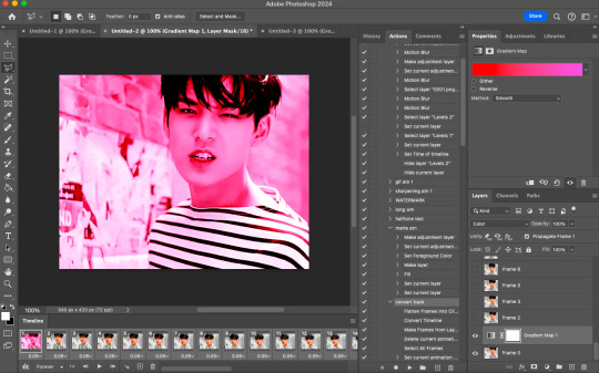
Hi anon! I'd be happy to go over my preferred methods for colouring!

First resort (ideal):
Painting over shots with little movement (the first method in this tutorial)
Colour manipulation using selective colours (the second method in this tutorial; alternate tutorial -> i also sometimes add a hue/saturation layer on top to manipulate the cyans/blues as well)
Second resort:
Keyframes for shots with consistent movement where it's easy to hide "imperfections" (tutorial 1, tutorial 2)
Last resort:
Frame by frame colouring -> DISCLAIMER: the way I do this method is the easiest way I've gotten it to work for me but that also means that it's very inflexible when it comes to editing any of the colouring afterwards. Once you start colouring in frame animation mode you're basically locked in so you need your gifs to be exactly the way you want them prior to adding your colour
So in this tutorial I'll go over how I do my frame by frame colouring as well as how I create actions to automate the repetitive parts of this process! (Some resources that explain how to create actions are here: 1 2)
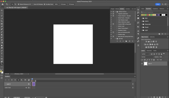
To use the select subject feature you will need Photoshop CC 2018 or later
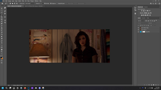
Step 1: Preparing your gif with base colouring
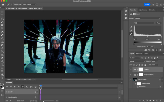
So first you want to do your base colouring for your gif in timeline mode, which I've explained here. I keep my gifs short (ideally 40 frames or less) since this colouring process is tedious!
I make sure that in my hue/saturation layer, I turn the saturation in the yellow, green, cyan, and blue tabs all down to -100 (and for the yellows I usually add around +20 to +60 in lightness)
Here's my gif with the base colouring that I'll be starting with:

Note: turning down the saturation in almost all the colours gives you that nice silver/grey neutral background to paint on top of. It's a lot less noticeable when your painted layers aren't perfect
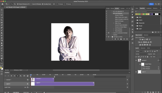
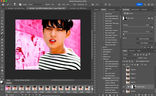
Step 2: Converting to Frame Animation Mode
I use the save action from this action pack to convert my gif from timeline mode to frame animation mode.
You cannot edit your base colouring from this point onwards!
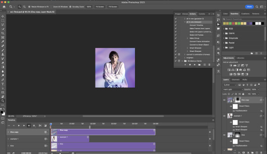
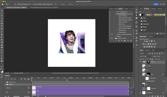
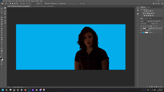
Step 3: Using Select Subject
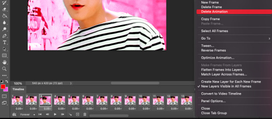
If you're recording an action this is the step you would *start recording*
This is what your window should look like:

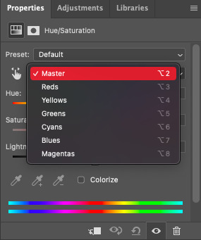
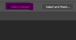
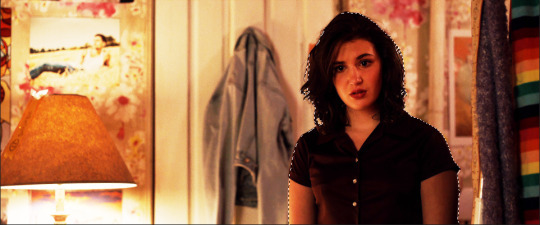
Making sure your first frame and first layer are selected, go to Select at the top of your window and click Subject

You should then see the marching ants outline around the person in your gif

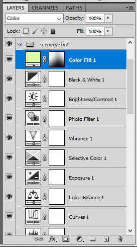
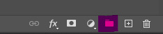
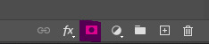
You then want to create a new solid colour fill layer (which can be found when you click that little circle icon at the bottom of your layers panel), and set the layer blending mode to colour.
The layer mask will automatically be created since you had the marching ants outline.

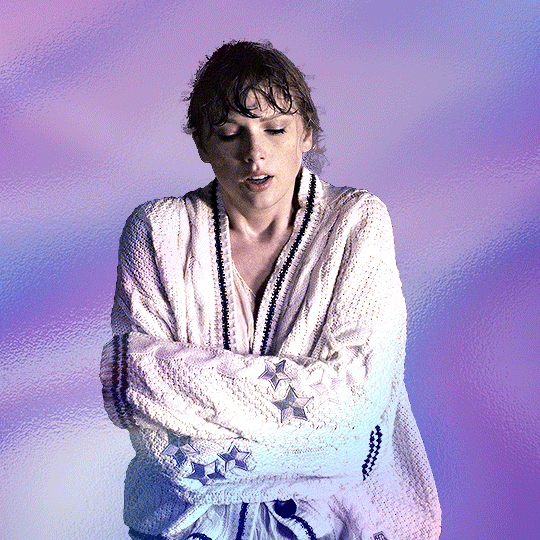
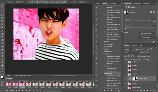
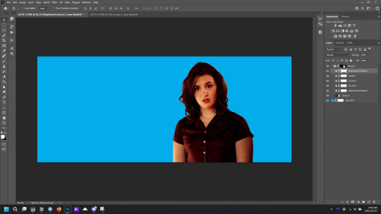
Since my person is in colour and not the background, I want to invert the layer mask by clicking on it and using command + i (or ctrl + i), and now this is what it looks like:

Note: Select subject isn't always perfect!!!, depending on how cluttered the scene is and how much contrast there is between your person and the background, select subject could either do a really good job like it did here, or screw up a little like it did here:

That's okay though because it still gives us a good base to start from! We can fix any issues by painting with black and white brushes on the layer mask.
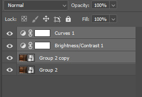
Step 3.5: Create clipping mask
Thanks to @wolfchans for telling me about this because it gives us back a little bit of flexibility when colouring frame by frame! Instead of merging down, we can make a clipping mask instead. Right click the solid colour fill layer and select create clipping mask.


If you're recording an action, it's at this point where I would *stop recording*
Step 4: Fixing the layer mask if needed
So now I want his jacket and t-shirt to also be purple, and to show his fingers behind the glass. I make sure the layer mask is selected, and paint with a brush at 60-70% hardness (painting with black erases the colour, painting with white shows the colour). User smaller brush sizes to paint smaller details!
This is what my canvas and layer mask look like now.

Step 5: Repeat
Now I click on my second frame and second layer, and repeat steps 3-4. As you can see, using the clipping mask allows you to still see and edit the colouring of the previous frame, just make sure you click on the right frame and it's corresponding layer when you're doing further editing.

This is where an action is super helpful in cutting down all the repetitive steps and clicks you need to do. So at this point I'd just play the action I created and paint on the layer mask as needed.
Repeat for all your frames and then you're done! After this I convert it back to timeline mode again so that I can add my text and do any other effects such as blending or transitions. Hope this helped!!
#answered#Anonymous#*tutorial#userbeanie#userwintersoldado#userishh#userfaiths#usercats#usertj#tuserhol#userahri#usereus#usershreyu#userchibi#userbunneis#usermibbles#uservivaldi#carolook#userbuckleys#usertenacious#tuserheidi#userholtz
173 notes
·
View notes
Note
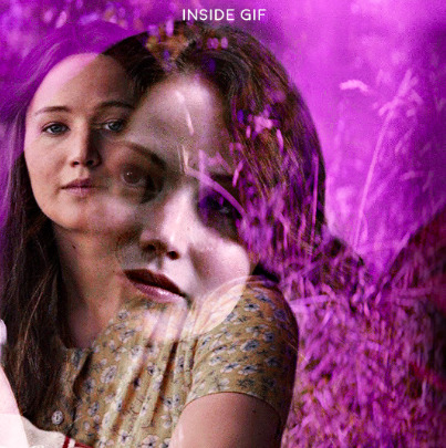
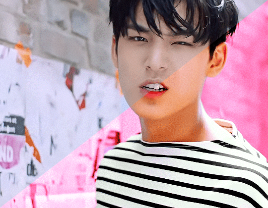
Hi! Can I ask how you did the double exposure gifs for your merlin set? They're beautiful btw!
heyy, thank you!! of course!
it's actually not very hard, the trick is to find the right shots for this. here's how i did it (reference gifset), under the cut.

for this tutorial i will be: — using photoshop cs5 on windows — assuming you know how to make gifs using the timeline — have basic coloring, sharpening, groups, and layer masks knowledge
I. CHOOSING THE RIGHT SHOTS
the ultimate trick to pull this off is to choose the right image. in order to do the double exposure, you need a silhouette shot that has these:
a defined and dark silhouette with a background that is not too busy
enough contrast between the silhouette and the background
the silhouette should take at least 50% of the space
not too much movement
here are a few examples of why they work and why they won't:
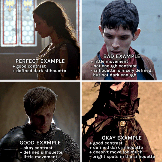
gwen: perfect example since this shot is already quite contrasted with a defined silhouette. there won't be a lot of work needed to make this one work.
merlin: not a great example because even tho there's a somewhat good contrast between him and the background, the silhouette is just too bright, not dark enough.
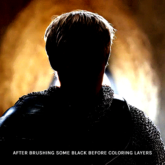
arthur: another good example, even if there are some bright spots on his face and armor. since he's not moving too much, you can definitely brush some black over him to make his silhouette darker (i'll explain/show later)
morgana: this one could work because the contrast is great, but of course her skintone is very bright against the black clothing. that being said, since the movement is not too bad, it could be possible to brush some black over her and move these layers with keyframes (as mentioned for arthur's example). i haven't tried it tho, but i think it would work well enough.
once you have your silhouette shot, you need another gif for the double exposure. what works best, in my opinion, are:
wide, large shots
shots with no to little camera movement (no pan, zoom, etc), but the subjects in the shot can have little movement of course
pretty cinematography/scenery shots
i find these are easier to find and make it work, it's not as "precise" as with silhouette shots. it's mostly just trial and error to see what works best with the silhouettes.
II. PREPPING THE SILHOUETTE
for the effect to work, we want a silhouette that's dark as possible. i'm gonna use the gwen and arthur shots as examples.
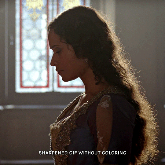
for the gwen gif, i started by sharpening, and then upped the contrast by quite a lot so her silhouette is mostly black, while retaining some nice details. i've used only 3 layers here:

selective color layer: in the blacks tab, playing with the black slider (value: +10)
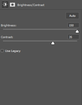
brightness/contrast layer: added a lot of contrast (+61) and a bit of brightness (+10)
black and white layer: on top, its blending mode set to soft light and at 20% opacity. gives a bit more depth and contrast

then for the arthur example, i've also sharpened it first, and added contrast layers in this order (the skintone looks horrible, but it won't matter soon lol):
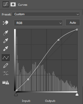
levels layer: black slider at 0, grey slider at 0.76, white slider at 104
selective color layer: in the blacks tab, black slider at +10
brightness/contrast layer: brightness at +1-, contrast at +47
black and white layer: on top, its blending mode set to soft light and at 20% opacity. gives a bit more depth and contrast
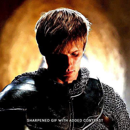
as you can see, half of his face is still quite bright. to correct that, create a new empty layer and put it between the gif and the coloring layers.
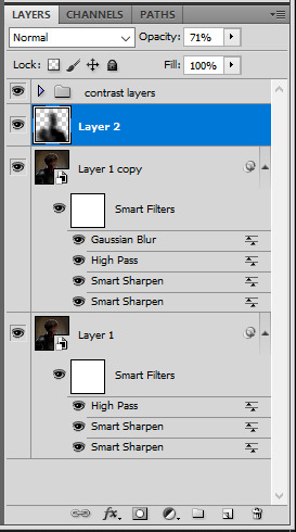
using a really soft brush and the black color, brush some black over his face and body on that new empty layer. you can edit the layer's opacity if you want, i've set mine to 71%. since arthur doesn't move much here, there's no need to keyframe this layer's position. for the morgana example, this is where you'd need to play with keyframes to make it work. here's where i'm at now after this:
you can always edit this layer later if you need, after doing the double exposure blending.
once the silhouette is all ready, you can put all layers in a group and rename it (i've renamed mine silhouette).
III. BLENDING
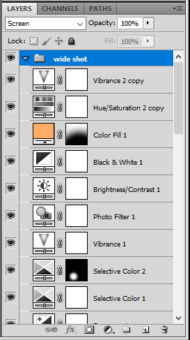
now the fun part! import the wide/scenery shot in photoshop, then resize it to the same height of your silhouette gif. make sure the gif is a smart object layer, and sharpen it. finally, bring this gif onto the silhouette canvas (by right clicking the smart object > duplicate layer). once you have both gifs onto your canvas, put the wide shot gif layer in a group, and set this group's blending option to screen.

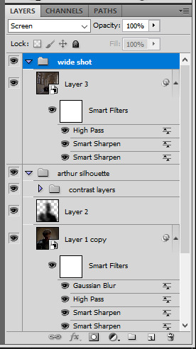
you can then position the wide/scenery gif the way you like it in the canvas. this is how it looks for both examples after i've done that:

if the blending mode screen doesn't give you the best result, so you can play around with other blending modes (such as lighten and linear dodge in these particular cases), but generally speaking, screen is the real mvp here haha.
IV. COLORING
now that the double exposure effect is done, we need to color the gifs to bring them together. i went with simple coloring here, simply enhancing the colors that were already there. just make sure that the coloring layers for each gif are in their respective groups. here's how i've colored both examples:
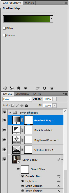
gwen silhouette group: i added a gradient map layer on top of the contrast layers in black to green and set the blending mode to color
scenery shot group: multiple coloring layers, with a green color fill layer (blending mode set to color), with a layer mask so it only affects the top half of the gif
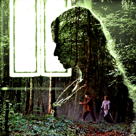
for the arthur gif, i did something very similar but with warmer colors. i didn't use a gradient map for arthur though:
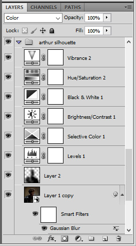
arthur silhouette group: i made the yellow warmer, closer to orange/red, with a hue/saturation layer, and added more vibrance. didn't feel like it needed a gradient map layer here though.
wide shot group: basic coloring layers to enhance colors from the merlin & daegal shot, and an orange color fill layer set to the color blending mode.
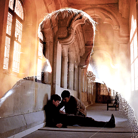
at this point you're pretty much done. just need to add some final touches and typography (if you want).
V. FINAL TOUCHES
a small and completely optional detail, but i wanted to soften the edges of the wide gifs. to do so i've duplicated the smart object gif layer and removed the sharpening filters (right click on smart filter > clear smart filters). put this layer on top of the other smart object layers (but still below the coloring).
then with this same layer still selected, go to filter > blur > gaussian blur... > 10px. this will give you a very blurry gif, but we only want the edges of the canvas to be softer. so add a layer mask to this layer. with a very large and soft brush (mine was at 0% hardness and about 800px size), brush some black onto the layer mask to remove the blur in the middle of the gif.

you can play with this layer's opacity or gaussian blur amount if you want (by double clicking on the gaussian blur smart layer filter). here how both examples look with this gaussian blur layer:
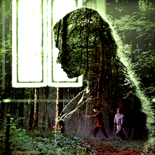

you can also mask some of wide/scenery gifs if you'd prefer, so it shows less outside of the silhouette. just put a layer mask on that whole wide shot group and brush some black or grey on the layer mask. it's what i did for the gwen gif, with a very soft brush and i set the mask density to 72% (i kept the arthur one as is tho):

and that's how i did it! hopefully that was clear enough :)
#alie replies#*ps help#resource#tutorial#allresources#*gfx#usercats#usersmia#userrobin#userfaiths#usertina#usermoonchild#userchibi#uservivaldi#usertreena#userraffa#userriel#userelio#usermadita#usersmblmn
1K notes
·
View notes
Photo
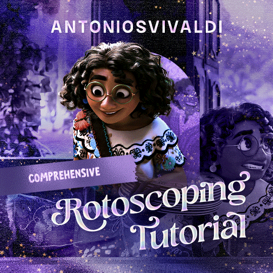

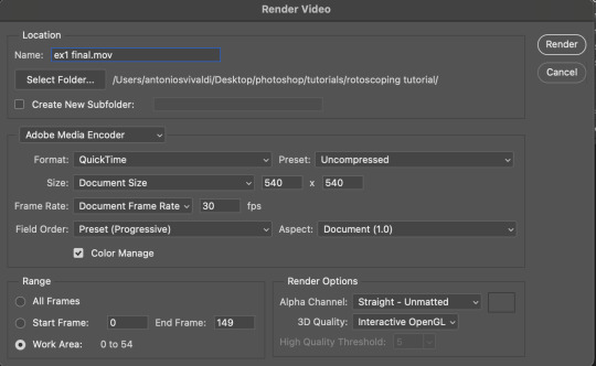
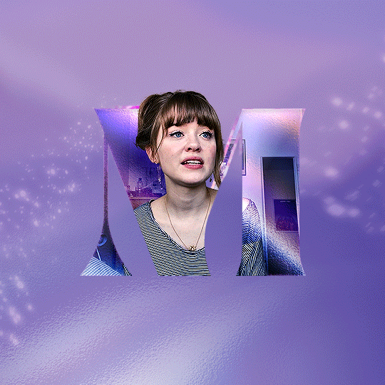
Rotoscoping Tutorial by @antoniosvivaldi
Hi everyone! I’m excited to announce my long-delayed Rotoscoping Tutorial - requested by a number of people over the past calendar year.
In this tutorial, I will show you how to create the cutout gifs like this (and seen in most of my gifsets under this tag) with Rotoscoping on After Effects. I’ll also provide additional examples and a number of things that I do to optimise my giffing / Rotoscoping workflow (e.g. useful shortcuts & other things to be aware of).
This is the structure of the tutorial:
Why Rotoscoping? Photoshop video timeline’s limitations
Photoshop workflow pt 1: Preparing your gif
After Effects workflow: Interface, shortcuts, and Rotoscoping tools
Photoshop workflow pt 2: Assembling your gif; with multiple examples
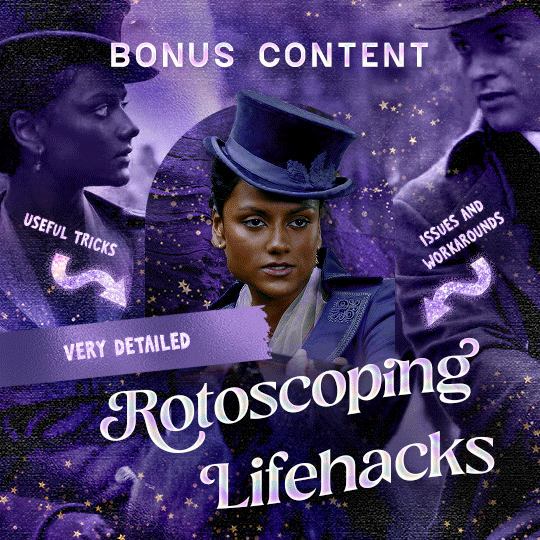
Bonus content: Rotoscoping tips* & workarounds to common issues
For quick reference, here are example gifsets (and where Rotoscoping is used in the posts) that I will mention in the tutorial:
Example 1: Cutout gif effect | panels 2 + 4
Example 2: Changing a gif’s background colour | all panels
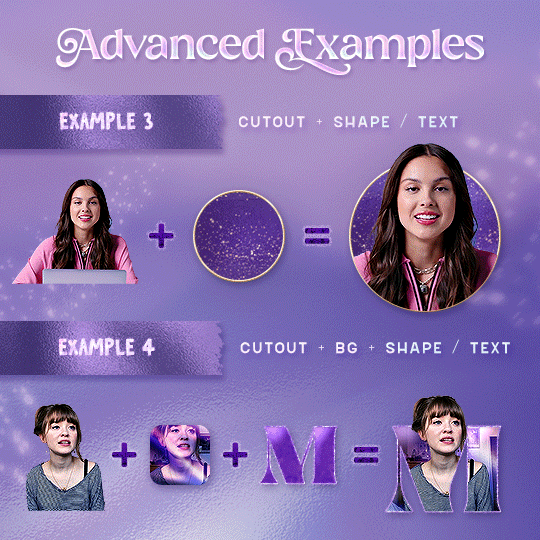
Example 3: Cutout gif effect in a shape | all panels
Example 4: Putting it all together | panels 1, 3, & 5
What you need & need to know:
Software: Photoshop & After Effects (After Effects 2021 or later for Rotobrush 2.0)*
Hardware: 16GB RAM required to run later versions of AE*
Difficulty: Advanced; Knowledge in making gifs, applying layer masks, and using video timeline interface assumed
Key concepts: Rotoscoping (AE) / Video Timeline (AE+ PS) / Layer Masks & Groups (PS)
Supplementary files: tutorial resources
*I’m currently running the latest version of PS & AE on an M2 Mac, but I’ve also used older versions (CC 2015 & 2020) on Intel-based Macs. I’ll outline some known compatibility & performance issues, and workarounds later in this tutorial that could help streamline your giffing workflow.
Tutorial under the cut. Like / Reblog this post if you find this tutorial helpful. Linking this post / the example gifsets in your post caption, will be greatly appreciated if you read this to create effects seen in Examples 3 + 4.
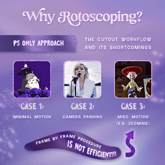
1) Why Rotoscoping?
My Rotoscoping journey is motivated by the shortcomings on Photoshop - namely the limited options to manipulate the Layer Mask keyframes in the video timeline interface, as well my need to gif more efficiently.
Suppose I want to cutout this subject or recolour the background of a gif on Photoshop: I personally classify the gifs that I prepare on PS into 3 types based on the motion of the subject
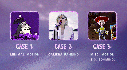
These are the common Photoshop-only approaches when attempting to mask the subject in the gif.
Case 1: minimal motion in the subject → a simple layer mask will do the trick
Case 2: some linear panning of the subject in the gif → using the Layer Mask Position keyframes in the video timeline interface will do the trick
Case 3: subject moves around a lot (e.g. zoom motion) → Unfortunately this is where a Photoshop-only workflow will require frame by frame masking. Layer Mask Position keyframes only apply positional translation (but not transformation / rotation) on the layer mask
Enter Rotoscoping on After Effects: Instead of resigning to frame by frame procedure on Photoshop, I opted to make my life easier by learning to Rotoscope on After Effects. This essentially provides me an opportunity to cutout / recolour a wider range of gifs with relative ease.
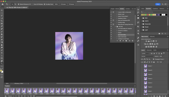
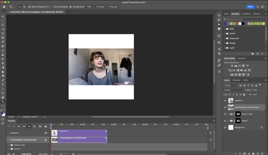
2) Photoshop pt. 1: Preparing your gif
Prepare your gif the usual way - whether you screencap or import frames from video.
Then your Photoshop should look like this:
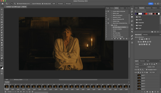
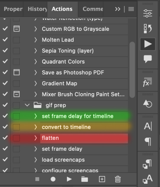
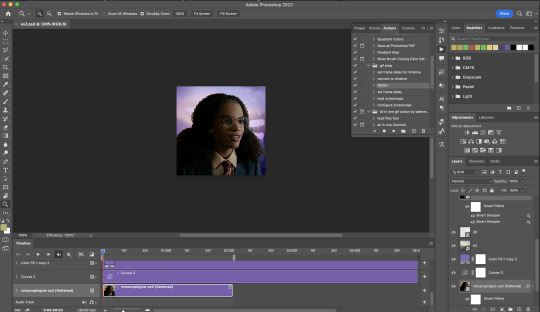
Now, I shall walkthrough & explain my personal giffing workflow (as of 2023) after loading the gif frames. To speed up the process, import my gif prep action file to Photoshop.
Going to Window > Action, you’ll see a set of actions under the “gif prep” folder.
"set frame delay for timeline” (highlighted in yellow) will set all of your entire gif’s frame delay to 0.03s
“convert to timeline“ (highlighted in red) will take you to the Video Timeline interface
To play an action, press on the Play button (highlighted in green)
i. Set the frame delay of the entire gif to 0.03s. (play “set frame delay for timeline” from my gif prep action pack)
I work with everything in 0.03s frame delay (or equivalently 30fps) at first. It’s always possible to change the frame delay of the final gif to 0.05s before uploading onto Tumblr.
ii) Convert this gif to a Smart Video Layer (play “convert to timeline” from my action pack)
Note: I personally don’t resize the gif just yet. That’s because Rotoscoping in full video resolution will render higher quality details around the edges as well as more flexibilities later on in the editing process.
Performance optimisation: If your computer has 8GB of RAM or less, you might find it helpful to crop / resize your gif to Tumblr dimensions now for a less sluggish performance in After Effects later on.
(I have giffed on a desktop with 8GB of RAM and it’s quite slow at rendering individual frames of a 1080p short clip on AE)
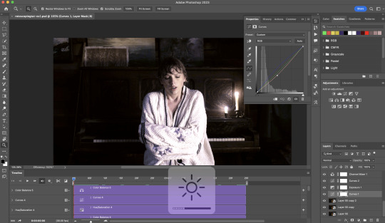
iii) Add colouring adjustments on the gif. This will save you A LOT of time when you Rotoscope gifs that are originally very dark / poorly lit (e.g. the uncoloured Taylor Swift gif shown just above).
If you usually colour your gifs at the very end of your giffing process (i.e. after sharpening), this will be a bit of a change.Nevertheless I still highly recommend adding some base colourings now to at least increase the contrast between the subject and the background.
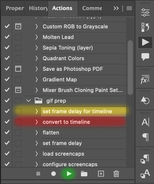
iv) To minimise lagging on After Effects, simplify this gif file as follows:
Flatten / Unsmart this gif file back to frame animation mode: play “flatten” (highlighted in red) from my gif prep action pack
Set the frame delay to 0.03s: play “set frame delay for timeline” (highlighted in green)
Convert the simplified gif file back to the video timeline interface: play “convert to timeline” (highlighted in yellow)
After “unsmarting” and converting back to the video timeline, your interface should look like this

And voila! This gif PSD is now ready to be imported to After Effects for Rotoscoping work!
3) After Effects: Interface and useful shortcuts
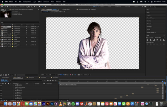
Open After Effects and Import (Cmmd / Ctrl + I) your gif PSD that you’ve just prepared.
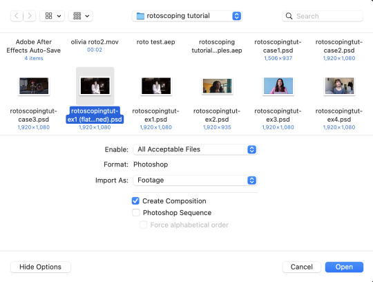
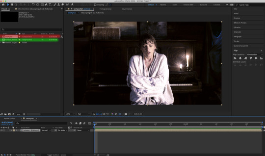
After importing your gif PSD to After Effects, the interface should look like this.
In the screenshot below, there are two compositions: the imported gif (highlighted in green) & another composition file made from selecting the imported gif (highlighted in red)
For the rest of the workflow, we will edit from the clone composition (the one highlighted in red), so select this one.
Before we take our plunge into the Rotoscoping, here are a few useful shortcuts to remember. I’ll explain the Roto Brush tool in the next section.
Preview the previous: fn + up arrow
Preview the next frame: fn + down arrow
Add to Roto Brush selection: holding Shift while you’re using the Roto Brush Tool
Subtract from Roto Brush selection: holding Alt while you’re using the Roto Brush Tool
Change Roto Brush size: while holding Cmmd / Ctrl, click + drag your mouse left / right
4) After Effects: The Rotoscoping Process
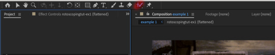
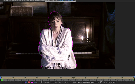
To access the Rotoscoping tools, click on the Roto Brush icon (highlighted in red in the screenshot below)
Then you’ll get the following dropdown options with two Rotoscoping Tools
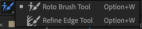
Roto Brush Tool: This is where you add / subtract your Rotoscoping selection in your composition
Refine Edge Tool: Paint around the edge of your selection for more refined edges. Very helpful for Rotoscoping fuzzy edges / hairs
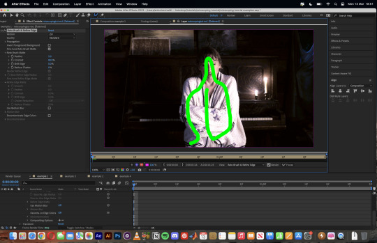
To make some Rotoscoping selection, first grab the Roto Brush Tool and click on the subject you want to cut out from your composition.
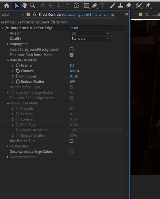
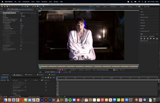
When you’re Rotoscoping you’ll see this in the Effect Controls panel.
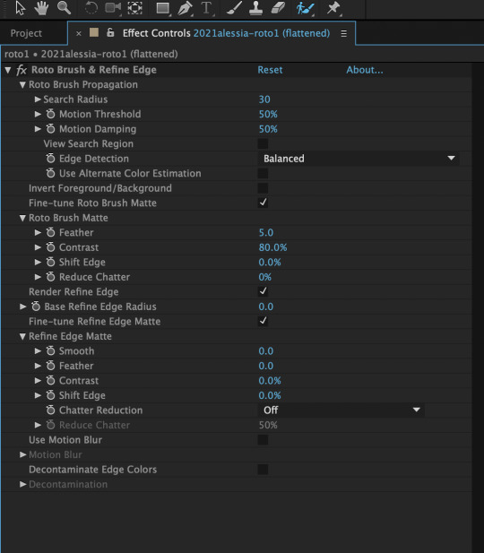
There are two versions of Roto Brush:
Version 2.0: The Rotoscoping selection is powered by AI for higher accuracy when you propagate the frames.
Version 1.0 (Classic): This is the legacy Roto Brush Tool that uses a lesser algorithm. Recommended only if Roto Brush 2.0 is unstable on your machine due to RAM issues.
And two quality settings for Roto Brush 2.0:
Standard
Best
Note: I am currently unable to use Roto Brush 2.0 with Best quality model on my machine to compare the differences myself, so I’ll link this page that explains the two quality settings.
Note: if you’re using an older version of After Effects you’ll see this instead. This corresponds to Roto Brush 1.0 / Classic in the newer versions of AE.
When you’ve made a selection using the Roto Brush Tool, you’ll see the pink lines around the subject. This is the region that you’ve selected to Rotoscope!
To bring out some details around the edges, grab the Refine Edge Tool and paint around the edges
Then the interface will look like this
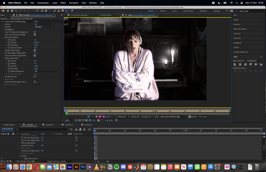
To view the Rotoscoping selection that you’ve made more intuitively, you could click on the following buttons.
Personally I like the viewing my selection using Toggle Alpha (the second box from the left) & Toggle Alpha Boundary (the 3rd box from the left)
Toggle Alpha
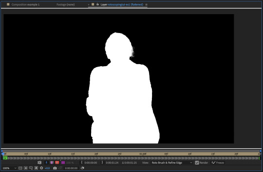
Toggle Alpha Boundary

Note: If you aren’t happy with the initial Roto Brush selection, you can always add (press Shift while using the Roto Brush Tool) / subtract (press Alt / Option using the Roto Brush Tool) your selection.
After you’re happy with your Rotoscoping selection in the first frame of your composition, press fn + down to view the next frame.
Repeat pressing fn + down and fix the selection along the way (e.g. I subtracted a small area from my Rotoscoping selection with the Roto Brush tool to make the edge look cleaner).

After fixing the selection along the way, go back to the composition file (select the clone composition again) and you will see that a cutout gif is made!
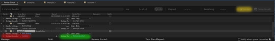
To export this, go to File > Export > Add to Render Queue. You’ll be redirected to the Render Queue panel at the bottom of After Effects.
Highlighted in red: click to change export setings
Highlighted in green: click to change save destination
Highlighted in yellow: click to render video
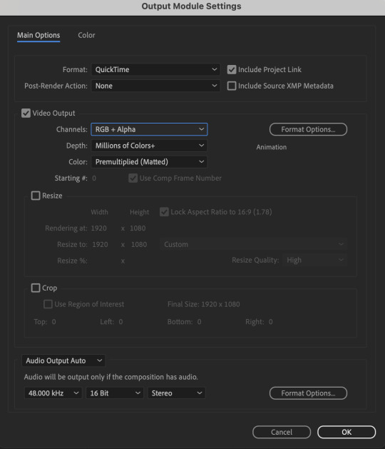
To preserve the transparency of your cutout gif, you need to change your export settings in the Output Module.
Under the Video Output section, change your Channels to RGB + Alpha. Press OK. Then Render the video.
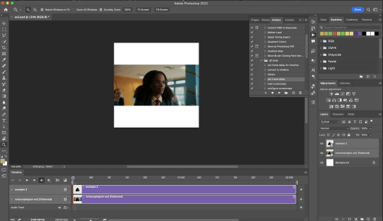
5) Photoshop pt. 2: Assembling your final gif
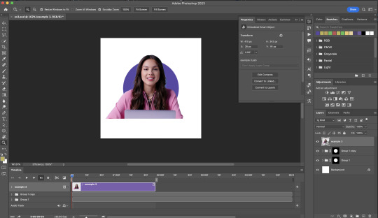
The essence is to drag the cutout gif (aka the video file that you’ve just rendered on AE) into a new PSD composition file. This will be where you’ll do the rest of your giffing. Your workflow will contain the follow steps:
Make a new blank PSD composition file in Tumblr dimensions
Enable the Video Timeline
Follow the instructions detailed in the individual examples i.e. drag the cutout gif into the PSD & adjust the timeline start / end points
Exporting the final gif. If you’ve worked in 0.03s frame delay all the way up to here, just play the action that I’ve provided in the tutorial in the following order to set the frame delay to 0.05s.
EXAMPLE 1: finalising your cutout gif | sample gifset
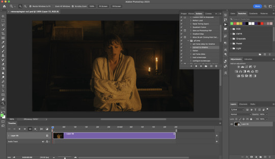
After enabling the Video Timeline in your PSD composition file you’ll see something like this
Go to your folder, drag the cutout gif you’ve made on After Effects, resize / reposition, then press Enter.
And also make sure to adjust the Video Timeline’s start / end values.
Add some finishing touches. Because I did the Rotoscoping at full HD resolution, I’ll also need to sharpen my gif in this step.
After you’re happy, you can export this into a gif file and do what you usually do to change the frame delay to 0.05s.
Notes on my “Unsmarting” approach:
To prevent accidentally writing over a PSD composition file that I’ve spent time editing, I personally render this into a short video (File > Export > Render Video) and use the following export settings (to prevent quality loss)
Then I open the rendered clip and play the actions in my gif prep action pack as follows:
flatten: this “Unsmarts” the clip / video
set frame rate: this sets all frames to have 0.05s frame delay
This is the final interface that I get before I pull up the Save For Web window.
EXAMPLE 2: changing your gif’s background colour (for Case 3 gifs) | sample gifset
From your folder, drag BOTH the cutout gif (rendered on AE) and the original gif to your blank composition.
Important: you need to make sure that both layers are properly lined up in the composition file (i.e. selecting both layers when repositioning / resizing)
On Photoshop, press Enter twice and place the cutout gif on top of the original gif from the Layers panel. Then you should get something like this
Select both layers and resize / reposition them in your PSD composition until you’re satisfied with the placements.
The basic idea here is to add some adjustment layers / other things in between the cutout gif and the original gif. To do this, select the original gif layer in the Layers panel.
Then you can start adding.a bunch layers e.g. textures, onto the composition.
And then here’s the exported gif!
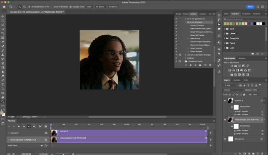
6) Fancier Rotoscoping examples
Note: knowledge in using layer masks / groups and making shape / text layers assumed
In the next two examples, I’ll show you how to combine the two previous examples with shape / text layers.
EXAMPLE 3: Placing your cutout gif into a shape / text layer | sample gifset
Add a text / shape layer to your blank PSD composition
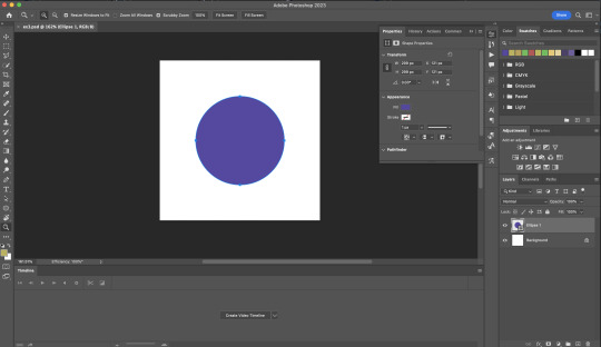
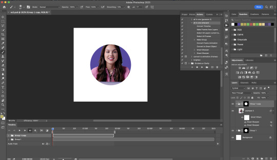
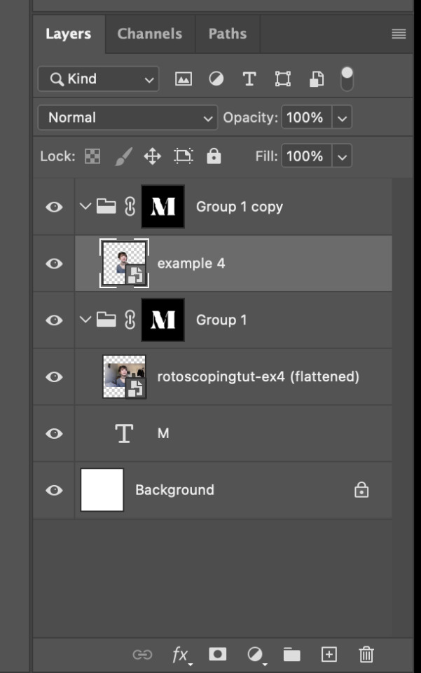
We want to prepare a masked group so in the Layers panel:
Make selection from layer: Cmmd / Ctrl + Click (highlighted in red)
Make a new group: click on the folder icon (in yellow)
Create layer mask: click on the icon (in green)
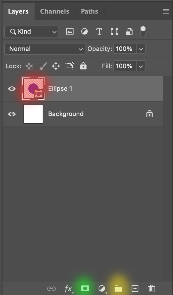
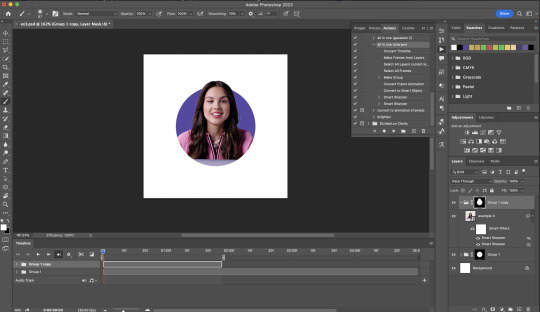
After duplicating the masked group you’ll get something like this in the Layers panel
Drag your cutout gif into the PSD composition
Place the cutout gif into the masked group on top
Select the mask of the top group and paint (in white) over the region you want to reveal for the cutout gif
Add some finishing touches & export the gif!
EXAMPLE 4: Putting it all together | sample gifset
You follow the same approach as in Example 3 to prepare the masked groups, but you need to drag two gif layers in (and resize them using the approach outlined in Example 2)
Place the gif layers as follows
While selecting the mask of the group on top, paint (in white) over the region that you want to reveal in the cutout gif
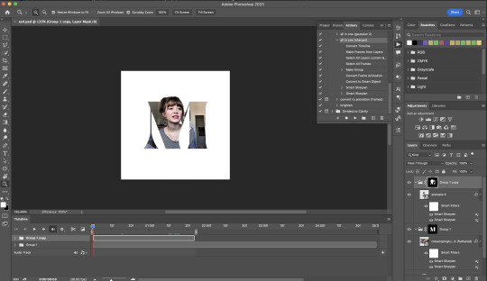
Now select the original gif (placed within the other group) and add some adjustment layers
After adding some finishing touches & exporting the gif, I get this!
Note: you can do even more overlay effects in the background portion of example 4. There will just be more masked groups + adjustment layers
7) Bonus: Some useful Rotoscoping / giffing lifehacks
GIFFING LIFEHACKS:
— Use best quality footage that you could find & Rotoscope in full video resolution, for better details around the edges
— Poorly lit scenes & low contrast edges are harder to Rotoscope (e.g. Toy Story set / TS evermore set).
If you’re new to AE, I would recommend choosing videos with well-lit gifs with simpler backgrounds and high contrast edges (e.g. Maisie Peters Cate’s Brother set)
— Use Rotobrush 2.0 if you’re using After Effects 2021 or later. It’s more difficult to Rotoscope / change background colour for gifs with a lot of movements with the classic Rotobrush tool. If the scene is tricky, you might want to switch to the “Best” quality model.
HARDWARE-RELATED PERFORMANCE OPTIMISATION:
— The recent versions of Photoshop require at least 8GB of RAM. If you have less RAM, it will still work provided you have enough scratch disk space. For better performance, it’s best to close other applications when you’re using Photoshop.
— The recent versions of After Effects require at least 16GB of RAM. If your machine has less RAM than this, there are some workarounds to prevent your machine from hanging:
Essential: close other applications that you’re running on your computer
Resize your gif down to Tumblr dimensions & sharpen it before importing to After Effects.
Install an older version of AE
8) Bonus: Some known software + hardware issues, and workarounds
KNOWN ISSUES ON PHOTOSHOP:
I currently have minimal issues in my giffing workflow, but I’ll nevertheless outline a few common known Photoshop issues for anyone who needs some workarounds.
— Video Timeline interface missing: this affects Apple Silicon Macs (i.e. M1 / M1 Pro / M1 Max / M1 Ultra / M2 / M2 Pro / M2 Max)
Update to newer version of Photoshop (updated 2022 or 2023)
Open Photoshop with Rosetta
— Scratch disk full error: This is a common issue with machines that lack RAM & have nearly used up internal storage. Editing video layers in the timeline interface uses a lot of memory hence will require a lot of scratch disk space.
Make sure that you have enough free storage space while using Photoshop. Alternatively you can use an external hard drive as a scratch disk.
KNOWN ISSUES ON AFTER EFFECTS:
These are a few issues that I have personally ran into over the course of giffing on multiple devices & multiple versions of After Effects.
Note: Inputs from M1 / M2 Mac users with regards to experiences on using the After Effects Rotoscoping tools are welcome!
— Rotobrush 2.0 set to “Best” quality model causes AE to crash: this affects anyone who’s using MacOS Ventura
I’m currently experiencing this issue on my M2 Mac. The workaround right now is to change the Roto Brush 2.0 quality setting to Standard.
This is due to some software compatibility issues on Adobe’s side specifically with MacOS Ventura. Fingers crossed that they will properly fix this bug in the future updates!
— Cannot re-open project files with Rotoscoping: this affects anyone using the initial release of After Effects 2020 (I had installed this on an Intel-based machine and it sucked)
The only option here is to update to a later version of After Effects.
8) More useful Rotoscoping resources
Rotoscoping + Keyframes Tutorial by @jenna--ortega
Rotoscoping + Masking Tutorial by @usergif
Rotoscoping For Beginners in After Effects | Motion Graphics Tutorial
I hope you enjoy reading this! If you have any questions / need any help related to this tutorial, feel free to send me an ask!
#after effects#tutorial#gif tutorial#photoshop tutorial#dearindies#tusermelissa#usernik#useryoshi#usershreyu#usercim#userrobin#useralison#userannalise#userkosmos#userisaiah#usergiu#userives#*#my resources#my tutorials
2K notes
·
View notes
Note
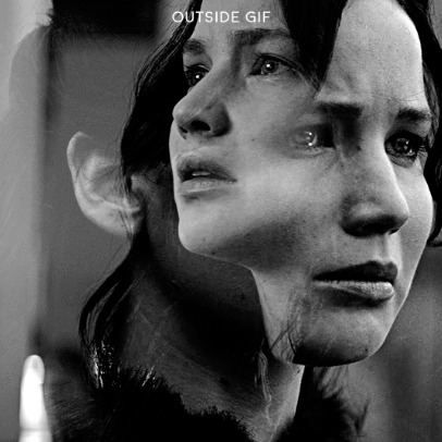
hi, your latest edit for thgweek24 is absulutely stunning and i thought if i can ask if you can make a tutorial about the ripped gifs/paper effect? if not, that's okay! have a nice day <3
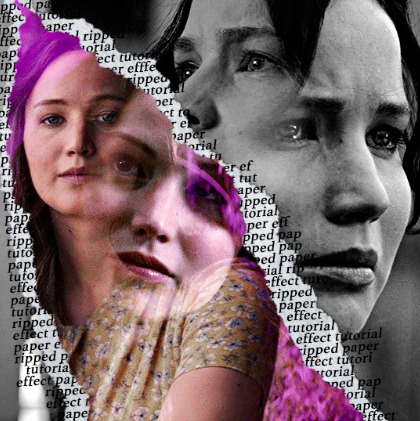
RIPPED PAPER EFFECT TUTORIAL
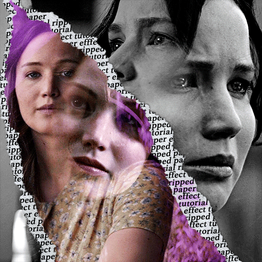
hi! thank u :D (thgweek set referenced)
below the cut are the steps that i took to create this effect. this tutorial is very screenshot heavy and assumes some basic knowledge of photoshop and giffing.
i do my best to try and explain my process so hopefully this is helpful! if you have any questions, please don't hesitate to ask.
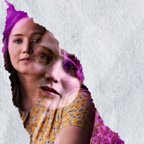
STEP 1: Choose and arrange your two gifs
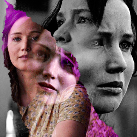
with this specific use of the ripped paper effect, there's one gif on the "outside" of the rip and one on the "inside." in this example, the outside is the b&w and the inside gif is the colored:
for me, the outside gif determined the positioning of the inside gif and the position/direction of the rip. as can be seen, outside gif has a lot of space on the left. therefore, i knew i was going to position the subject of the inside gif more on the right so i could create the rip without hiding too much of the b&w gif.
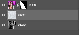
next, you want to arrange the inside gif on TOP of the outside gif. your layers panel should look like this:
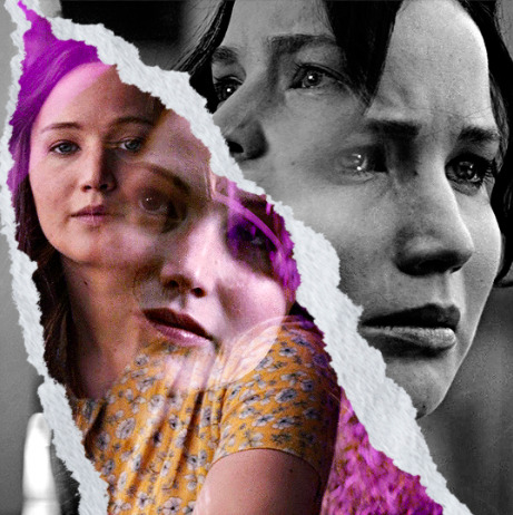
STEP 2: Creating the ripped effect
here comes the fun part! in order to create this effect, you're going to need torn paper brushes. here and here are some packs you can download (w credit to owner).
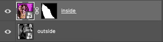
next, create a layer mask on your inside gif. you're going to use the brush of your choosing as an ERASER. then, you can play around with the size and angle of the eraser to create the look you want. this is what the gif and the layers panel now look like:
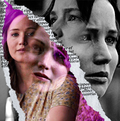
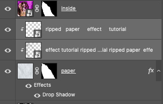
STEP 3: Adding the paper
in order to add the paper around the edges of the inside gif (where the text goes), you now need to download a paper texture. i found mine on google by searching "paper texture png."
place the paper png IN BETWEEN your outside and your inside gif. this is what everything should look like:
now, similarly to what you did in the previous step with the inside gif, you are going to create a layer mask on the paper layer. using an torn paper brush as an eraser, you will erase the paper, creating the shape you want.
be sure to leave enough room for whatever text you want to be on the paper. also, i suggest making the rips of the paper different from the rips of the inside gif so it looks more organic.
here is what my gif looks like after erasing the paper:
optional: add a drop shadow on the paper layer (right click -> blending options... -> drop shadow)
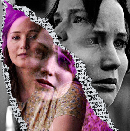
STEP 4: Adding the text
first, you want to identify the space where you will have room to place your full quote within the paper. if there are no spaces, you can always use your brush/eraser to modify the layer masks.

next, add a layer on top of the paper layer (and below the inside gif). select the text tool and start typing your repeated text!
because you can see which text is hidden by the inside gif and what is on top of the paper, a shortcut i use is the "tab" button and only type words that will be seen.
type the repeated words around the quote you want highlighted:
now, in order to contain the text within the paper, convert the text layers into smart objects. then, create a clipping mask on both layers (right click –> create clipping mask). this is what your layer panels should look like:
with that, your gif should now look something like this, with the text contained inside the paper:
STEP 5: Highlighting the quote
as you can see, it just looked like a bunch of words. so, in order to highlight the quote you carved out in the previous step, add a new layer below the layer of the quote you want highlighted:
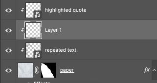
now, use a round brush (softness around 10-15% and opacity at 70-80%) with the color of your choice to highlight the words you want.
and there you have it!
i hope that this made sense and was helpful! if you have any questions or clarifications, please don't hesitate to ask :)
205 notes
·
View notes
Text
HOW TO: change the background color of a gif with a lot of movement ⭐
for if you are lazy as fawkkk like me and don't feel like figuring out how to use keyframes, or if your gif has too much movement to make it work teehee. it is labor intensive, but this gif originally looked like this so it is definitely worth the effort!
METHOD 1: adjustment layers
this works well with movement, however results are best if the background is very distinct! i would not advise against attempting this with a red or yellow background because it is going to mess with the skintones. i'd aim for blues, cyans, pinks, purples and very saturated greens (because some shades of green will be picked up as yellow and not adjust well)
for tutorial purposes, i'm going to go with a gif with a background that's cyan/blue. you can go ahead and get your gif loaded in, sharpened, etc. you can color it first, however i'm not going to be doing so.
the first thing you're going to do is make a hue/sat adjustment layer. you are going to bring the overall saturation up first (so leave it how it is and increase saturation). this is very much a matter of personal taste so just do as much or as little as you'd like. i'm also going to do a levels layer. use the eyedropper to pinpoint the darkest black and whitest white on the image. this leaves us with this, the goal here being to accentuate the background a bit.
now, create another hue/saturation adjustment layer. instead of leaving it as is, change 'master' to the most prominent color in your background. i'm going to go with blue. if you are working with a blueish background, you will likely need to follow this step with blue and cyan for everything to be picked up!
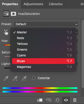
drag the 'hue' slider over in either direction until you achieve the color you're looking for. some shades will be easier than other: going from a blue to a purple or pink will be easier than reaching a yellow shade. however with enough tweaking anything is possible :3 this is what it looks like now.
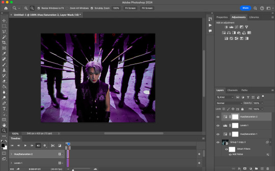
i'm going to do some coloring over this now, and some underneath as well. color to your liking! if the skin tones are off when coloring over this layer, move your coloring layers beneath it. you can also just color it first as i mentioned earlier :) either works fine. export it and this is what we're left with!
METHOD 2: frame by frame
this method is a little more time intensive, but it works well when your background is a neutral color, multiple colors, or too close to a skintone to be manipulated.
a few notes here: this works best in my experience if the person in the gif has dark hair. it can totally work otherwise but dark is more forgiving lol. it also helps it blend better because you can change the highlights without throwing the rest of the hair off!
you are going to want to do all of your sharpening, coloring and any other edits first. otherwise, your background may be messed up when coloring over it. once your coloring is done, convert your gif back to a frame animation. you can find a quick tutorial on how to do this as well as an action here.
with your gif converted back, create a gradient map with the color(s) you want your background to be. start with the very first frame in the gif and put the gradient map one layer above this frame. change the blend mode to whatever you happen to think looks best: i'm using color here.
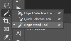
now, you're going to click that first frame and select your magic wand tool. on your top toolbar you'll see an option to 'select subject'. click the drop down menu, select 'cloud select'. then click 'select subject' and it'll select the person in your gif.

then, go back to your gradient map and select your layer mask. make sure your foreground color is white and background color is black. then, go to edit -> cut. this will mask the layer so the gradient map is only applied to the background. make any adjustments using a white brush tool on the layer mask. here, there's still some small orange pieces left over so i'm going to fix that.
afterward, you will merge your frame with your gradient map (i recommend copying the gradient map first so you don't have to create it over and over again lmfao).
the highlights in his hair start to become more visible a few frames in, so when i'm adjusting the layer mask i'm going to account for this by brushing over his hair so the highlights go from their original white to pink. again, this is optional! the white just stands out too much for my linking.
now... you are going to repeat this step until you reach the end of your gif :) gradient map above the frame you're working with, layer mask, merge, repeat. it's time consuming but worth it!
once you're finished and your sanity is depleted, delete the frames from the timeline. the animation is going to be thrown off by all the editing we've done so it's best to just remake it.
to remake it, click the three lines, then 'make frames from layers'

then, select all your frames and set the frame delay to 0.07 (you can do 0.05 too but that's just my preference). you can either export it like this or convert it to a smart object for further editing. this is how it turns out!
37 notes
·
View notes
Note
your icons are soooooo so cute honestly!!! i wanted to ask if there's any way you can make a tutorial on how to make them? of course if you want, if you don't want to, that's okay :)
Hi! I really appreciate that you like my icons, thank you so much! 💖💖💖🥹
It's been a long time since I've done a tutorial so I hope I can explain it well haha
So I will explain how i go from the original picture and the final icon below:
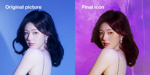
I'm using Adobe Photoshop 2024 but you can use other versions too!
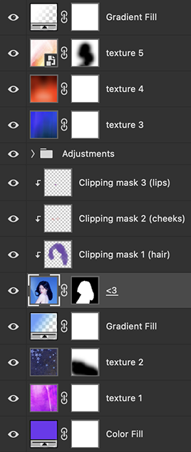
First, I create a 250x250px document and apply a random color fill layer to be the background color of the icon, you can do it by going on Layer > New Layer Fill > Solid color (the color in this moment doesn't matter because I change them later according to the picture I choose to edit).
Then I place the picture I want, adjust the size to make the subject on the center and apply some smart sharpen:
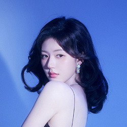
I apply some adjustments to try to color correct if the original picture using Levels, Selective Color and Color Balance to get something like this:
If you want to know the exact adjustments settings I used on this picture you can download the psd here.
To remove the background, I do the hack where I go to the Properties panel (Window > Properties) and click on the "Remove background" option. It's not always that I will get a perfect result but I think it makes easier for me to adjust the little details such as hair and accessories, etc. And I do that using the Lasso tool (shortcut L).
Now, with the background removed I pick a color that I think will match the icon in the Color Fill layer that I created before. To make the background more "fun" I like to add a Gradient Fill layer (Layer > New Layer Fill > Gradient) with a color that might go well with the one I picked earlier to make a smooth and light gradient.
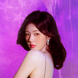
My result until now:
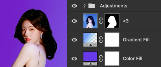
Now it comes the fun: adding textures! I like to add some textures to make the icon more lively and I usually download them on deviantart or on resources websites. You can download some cool textures here, here and here. On this part I really test a lot of textures with different Layer blending. There are a lot of different blending options so you can try as much as you want.
Other thing I like to do is add a clipping mask above the subject layer when I want to color something specific in my picture such as the hair, the clothes or even applying some "fake" blush on the cheeks. I do this adding a new layer, then using the shortcut option (or alt) + command (or ctrl) + g to make it a clipping mask and then using the Brush layer to color what I want. For the blending mode I usually use Soft Light and sometimes Color if I want the color to really stand out.
And in the end I will have something like this:
And my layer tab will be like this:
For using on the dashboard I usually resize it to 100x100 to make it look more sharper and defined but it's really a choice, you can already start making your icon using the size you want, I just prefer doing on 250x250px because i'm used to.
To save it I use the shortcut shift + option (alt) + command (ctrl) + s to save it for web with these settings:
And that's it! Sorry for not going to deep in each step but I guess you can get the feeling when you try making your own icons! Is really about trying different methods and things until you became satisfied with your result.
95 notes
·
View notes
Text
Here are some process shots for this one of Raphael from BG3! That magnificent bastard...

So I started out with a sketch of Raphael. He's got such a charismatic swagger doing the whole "What's better than the Devil you don't know? The devil you do" scene. I just wanted to do a caricature study and have a bit of fun.
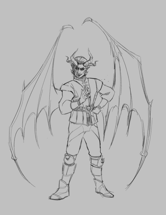
Moving from rough sketch to clean line art is always challenging for me as I often get bored or what was originally loose and fun can become stiff.
I had to redo the linework twice because I didn't like how the first one turned out! Second time is always the charm.
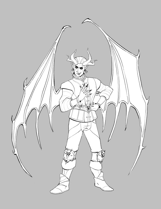
I initially only planned to draw the character but I love the design of House of Hope too much, so I went back into the game and took a bunch of screen shots and sketched out the rough bg.
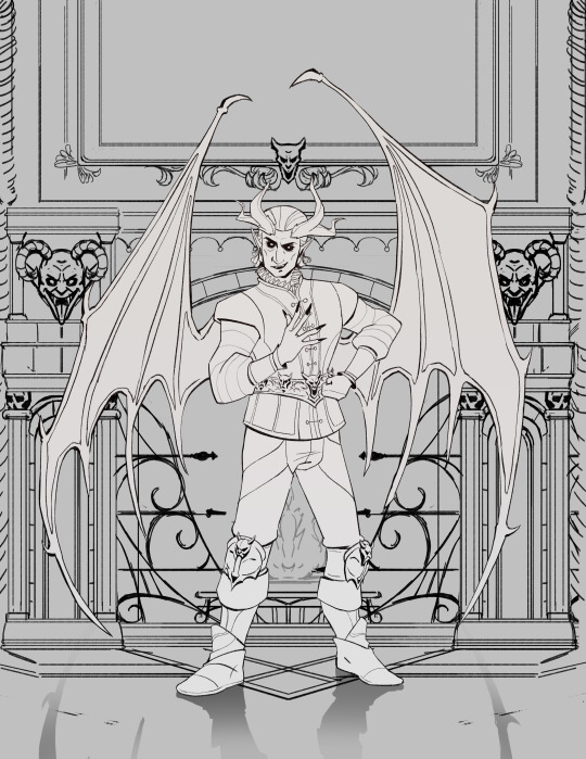
Then I went ahead and cleaned up the bg. At this point is when I group the layers properly, so there is a clear separation between foreground, and background as well setting up the layers for animation. (Making sure the fireplace guards overlaps the walls behind it.)
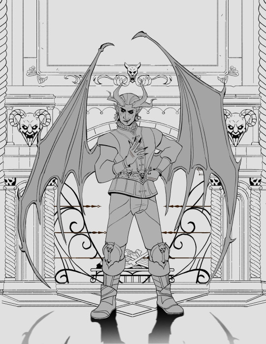
At the next stage I adding in the flat colors. I wanted to keep the style treatment of this piece more on the cell shaded/cartoony instead of super painterly. So I keep the color treatment fairly flat with a small amount of texture with the intention to add lighting as a fx overlapping treatment instead of painted in.
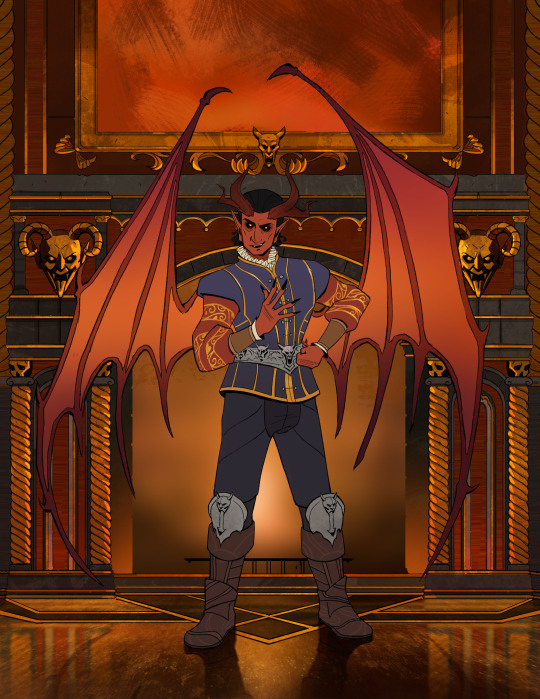
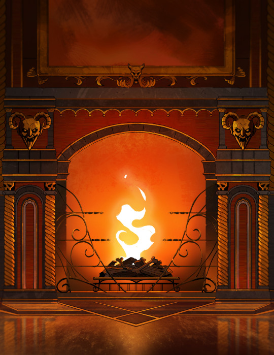
I work on the characters and the bgs at the same time to keep the values and color temp consistant, constantly adjusting as I go. From habit from work, I always paint the entire BG JUST incase I need to make changes or make adjustments to subject in from. Here is the bg all done, with fire painted in as a place holder.
And finally, adding the final lighting layers added on Raphael. I keep it simple here, just a redish/purple multiply player with the areas in the light masked out, and inverse mask on an orange/red overlay layer of the areas in the light.
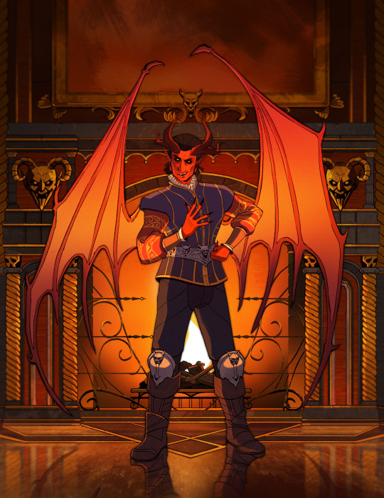
Animating the fire took ironically the longest, the animation tools in photoshop is clunky and I haven't animated since school days. I looked up a lot of references and tutorials! It's not perfect but good enough for me!
#raphael bg3#raphael baldur's gate 3#bg3 animation#bg3#badlurs gate 3#bg3 fanart#artists on tumblr#sketches#drawing#art#artprocesses#art tutorial#bg3 art#art process#art style#animation#bg3 spoilers
154 notes
·
View notes
Text
Self Image as a woman is constant battle between comparison and content.
Idolize the perfect body, the perfect hair, the perfect skin routine, the perfect face shape, the perfect breast size, the perfect gym glutes, the must-be-perfected everything about ourselves.
And after we ‘achieve’ one of the above, we move on to the next project of ourselves.
Women of God, there’s a difference between bettering your body and eating habits, versus objecting your body and eating habits. What I mean by objecting is subjecting ourselves as constant object of attention - attention to the self, and not to God. Attention to the self-image, instead of God’s image.
We should want what is God’s best - for our souls, minds, bodies, and health. We are the temple for the Holy Spirit. But taking that best and turning it into nitpicking obsession, is never going to satisfy your fleshly self-image. You are created in God’s image.
You are the rib, the daughter, the child, the woman of God. When you complicate your beauty in Christ, (beauty as in faith, modesty, prayer, love, kindness, fruits of the spirit, peace), you compromise Christ.
Instead of reflecting Christ, you’re reflecting the world. You’re fixing your outward appearance to match the mask of unpredictable industries.
You can’t say you love God, but then love complaining about your facial features, your body shape, your weight, your stretch marks, your hair, your lips… your whole Godly make up boiled down to what the world defines as a “woman”.
I’ve been here, and I am here, and to be honest, nothing in the world is going to make you a more beautiful daughter, sister, mother, wife, than being in Christ.
We need to value ourselves according to the Word, and not the word of articles, tiktoks, hacks, tutorials, skinny exercise Pilates or whatever.
We mustn’t trade our authentic femininity for short-lived vanity. Don’t idolize what you wear, your makeup, your hair, your skin, your fitness level… etc. Instead of praising God and giving Glory to Him, you give praise and glory to companies and models, and products. I’m not saying don’t get your hair down, don’t go to the gym and get fit, don’t get your nails done, don’t eat healthier, don’t try new methods to help with your acne and stretch marks and dermatological complications, don’t not love your gift of being pretty. I’m saying we mustn’t make our outward appearance the standard over Christ. Our outward must reflect our inward, and that happens when we take our eyes off our insecurities and set them in Christ and the loving Word of God.
Nothing in appearance lasts forever, we aren’t going to look younger and cuter when our bodies are buried one day. Proverbs 31:30, “Charm is deceptive, and beauty is fleeting; but a woman who fears the Lord is to be praised.”
Seek God, seek His image in you, seek His beauty, His purity, His love: because we are made in His image. We are fearfully and wonderfully made! Psalm 139:14, “I praise you because I am fearfully and wonderfully made; your works are wonderful, I know that full well.”
No, maybe you’re not a Victoria Secret Model like Adriana Lima. You’re not the ideal blonde like Taylor Swift, you’re not curvy like Kim Kardashin, you’re not fit like Simone Biles, you’re not attractive like the DCC Cheerleaders, you’re not super intelligent like Amy from the TBBT, you’re not cleared skinned like Jennie from Black Pink. It doesn’t matter what you’re not, it matters what you are: a woman of God. What makes a woman of God attractive and beautiful and intelligent and pleasing, Her love for Christ! PROVERBS 31! Your value and belle is beyond worldy measure. Proverbs 31:15-18, “…She is more precious than rubies; nothing you desire can compare with her. Long life is in her right hand; in her left hand are riches and honor. Her ways are pleasant ways, and all her paths are peace. She is a tree of life to those who take hold of her; those who hold her fast will be blessed.
Don’t spend your life hating your body, it is your vessel for the Adonai Almighty.
^ 1 Corinthians 6:19-20, “Do you not know that your bodies are temples of the Holy Spirit, who is in you, whom you have received from God? You are not your own; you were bought at a price. Therefore honor God with your bodies.”
^ 1 Corinthians 10:31, “So whether you eat or drink or whatever you do, do it all for the glory of God.”
Don’t simplify your significance to God, by treating it as an insecurity. You’re perfect as following Him makes you to be. Matthew 19:21, “If you want to be perfect, go, sell your possessions and give to the poor, and you will have treasure in heaven. Then come, follow me.”
#christian blog#christianity#christian girl#christian#christian faith#christian girly things#christian bible#faith in jesus#christian vent
34 notes
·
View notes
Text
🎵 playlist cover tutorial (& psd)
In this tutorial, I'll be going over how to make a character-centric playlist cover using my template


�� Firstly, thank you so much @withered-rose-with-thorns for your kind words on my edits and interest in learning how to make these! 😊
The core of our process is thankfully a simple one. We'll be using the clipping mask function to affix a character cutout and textures to 3 specific primary layers. Here, I'll walk through remaking a cover similar to that of my Vi playlist. To begin, download the following:
cover template (mega.nz)
My template is 400x400px in overall size and mainly features 3 named layers.

1.) CUTOUT — With the template ready to rock, we'll start by working on the heart of the edit, which is getting the character cutout for the portrait layer. (As a general rule, always try to use the highest quality images/shots for projects whenever possible.) In this example, I've used the Pen tool to free Vi from her scene:

For creating precise cutouts I will only ever recommend using the Pen tool, as anchor points allow the most control in achieving the cleanest results. If you're unfamiliar with the Pen tool and its settings, here's a 60-second guide to the basics. (i.e. connecting anchor points all the way around your character from the start to end > Make Selection > set Feather Radius to 0 and have anti-alias checked for smooth edges) Once you've made your selection, if you need, you can change the cutout size by using the Transform Controls or simply adjusting the overall Image Size.
2.) PORTRAIT LAYER — Back on planet template, we'll focus on the "middle portrait" layer. Above each of the 3 main layers is one titled *top clipping mask*, which we'll keep at the top for all. This is a means of ensuring all new layers created beneath it will stay clipped to the primary layer (as indicated by the little arrow pointing downward to the left of each mini thumbnail image). You can simply drag your cutout to the template, or just copy & paste it in a new layer, and use the Move tool to position the image how you'd like. (If any layer accidentally unclips, right click it and select Create Clipping Mask or just hit that Alt+Ctrl+G)

With your image now in position, you can then change the portrait background color by creating a new fill layer > Solid Color. Double-click the Solid Color layer to change the color at any time. Your cutout layer should sit atop the Solid Color layer and beneath the *top clipping mask* layer, as shown above.
3.) BACKGROUND LAYER — The bottom-most layer is our background color layer, which is gray by default. Feel free to adjust this Solid Color layer any time to your preference. Now with the basics covered (your cutout, middle portrait background color, and background color), let's add a texture or two! Since we're on the background layer now, I've downloaded and resized this unsplash texture and made it a new, clipped layer.

Experimenting with the Blend Modes and Opacity is key (and super fun)! Here, I've set my texture layer to Subtract with a 50% Opacity.
On top of the texture layer, I've added a couple of adjustment layers and color layers using the Brush tool for the sizzle.

4.) PORTRAIT LAYER — Back on the middle portrait layer, we can add a texture layer here a s we've done for the background, though if you prefer you can leave the portrait background as a solid color. For the purpose of the tutorial, I've downloaded this graffiti texture from unsplash and added it as a new layer, changing the Blend Mode and Opacity.

By experimenting with the Blend Mode on your texture layer, adjustment & color layers, you can create all kinds of wild effects to fit your subject and mood of your playlist.
In addition to fiddling with the portrait layer, I've also sharpened my Vi cutout and added adjustment layers above it - such as Vibrance, Color Balance and Curves - to make her shine against the saturation of the colors surrounding her.
When you're all done, save your cover as a .png to retain high-quality compression.
You may have noticed that we didn't make any adjustments to the 3rd "white border" layer after all, which is on purpose! Depending on what look you'd like to create for your cover, and knowing how a clipping mask works from previous steps, the set-up has been prepped to change as you please, if you please.
And if you've read this far, thank you! I appreciate you, and I hope you found some useful information. You're welcome to download the finalized Vi psd cover I made for this tutorial.
Happy Creating! 🧡
14 notes
·
View notes
Note
hi! i love your icons, i was wondering if you could do a tutorial on how you remove the backgrounds? the lil hair details you have is so good idk how to word it 😭🩷
thank you rachel i'm glad you like them 😊
removing the backgrounds is a pretty simple process, but depending on the shot you choose, it can take a bit more work. i'm a visual learner, and tend to over-explain, so there's a lot of images
make sure to sharpen your image first, but don't resize/crop, or at least not too much, i find it easier to work with a large canvas. also, add a solid fill layer underneath your image layers, set it to a bright colour, we'll use that later.
Option A
if you've a got a shot with good contrast between the character/hair/clothes and the background, we have the quick option
copy your image layer, we're gonna work with the top one first
the image already has good contrast, but to make step 4 easier, we're gonna add a brightness layer, crank the brightness way up, and add a little contrast. then i also added a curves layer and just played around with the lines till i felt the contrast was enough
as you can see, she's ugly. but that's okay cause we're gonna get rid of that colouring later
3. select the two adjustment layers, and any other adjustment you added, and also select the top copy of the image, the merge those layers layer/ merge layers (that is not your default merge layer shortcut, don't use it, i don't remember what it originally does)
4. take the magic wand tool, and with the now merged layer selected, choose "select subject" from the top toolbar
your image should now look like this, with the person outlined. if the outline isn't completely perfect don't worry about it right now
5. now select the bottom copy of the image, click create folder, and with the new folder selected click "add layer mask"
now delete the top merged copy, and you should be left with this
very dark
6. right click on the layer mask and select "disable layer mask" and you'll be left with the the original image.
7. you can now do all your base colouring for the icon. make sure the adjustment layers are inside the group you just made, so when you make your background underneath the group, your adjustment layers don't affect it.
colouring tips: toggle the layer mask on and off as you colour, because sometimes colouring that looks good in the scene doesn't look so good without the background. i tend to make the colouring brighter on icons than on gifs, so the character stands out more against the background.
now she looks pretty good, ready to be cropped and have a background added. but maybe the character outline wasn't perfect. the solid fill layer is to help see any errors in the outline. if there is we move on to step 4 of Option 2 and fix them
Option B
if the image you've chosen is darker or has little to no contrast, do steps 1-3 from option A first
4. add a blank layer mask to your merged layers (if you're coming from option A, use the layer mask you've already made) and select the paintbrush. for most of the image you'll want to use a brush between 20px and 50px, with a hardness of 50%. and now the not so fun part, paint over the background. toggle the layer mask off and on as needed to check what's background and what's character. make sure the layer mask is selected before you paint
painting tips:
-paint the outline first, then you can use a much large brush to quickly cover the rest of the background.
-move slowly, but smoothly.
-work in sections; don't try and paint the entire background with one mouse click, because if you mess up and use undo, you lose all the work.
-sometimes you should paint over parts of the character/clothes/hair to make it more cohesive. in the above image, the shirt juts out oddly on her left arm, and can pull focus without the original background, so i would paint over it to make it look more like her right arm
-for hair, use a smaller brush around any loose bits you want to keep. remember that the canvas you're working on is much larger than how the icon will appear when used, so you only need to paint over the parts where the background is very obvious. zoom out if necessary to see how it will look
5. when finished painting, right click on the layer mask and select "add mask to selection", then continue with step 5 of Option A. you can always adjust the layer mask after the final colouring if things don't look quite right.
and that's how you remove backgrounds for icons! probably made it seem more complicated than it is, but i'd rather tell you something you already know than assume you know it when you don't and leave you without crucial information. come back if you have any more questions
13 notes
·
View notes
Note
hi nik, happy new year! i was wondering if you had any tips for scene selection because your blending/choice of scenes is always so pleasing :) thanks for all your help!
hi!! happy new year <3 ah thank you so much! i'm terrible at explaining blending bc i tend to just slap stuff on top of each other and hope for the best sldkfjlksd but i'll try to give a couple of tips using the miles set i posted today!
tip 1: choose scenes that match your lyrics/quote if you can this is my usual first step when choosing a scene bc i want to emphasize the themes of my set. i worry later if it's even photoshoppably possible to blend them lol. for the gif i'm using as an example, i wanted to convey a sense of anxiety and contemplation, as well as show a moment where miles was surrounded by the "everyone" mentioned in the quote
tip 2: map things out before spending too much time on the final if you screencap like me, you know this is the most tedious step in gifmaking 😪 so instead of screencapping a bunch of potential scenes for 20+ min, just grab one frame from each scene you might want to use, and test if they'd be possible to blend. i layer them, resize them a bunch of times, move them around, until i get something i like and seems doable in gif form. then, once you know it's possible, you can screencap the whole scene and make it into a gif. these are the static images i played around with before coloring or fully screencapping:

(i also like to map out my typography beforehand sometimes!)
tip 3: choose scenes with large sections of darkness or solid colors when you blend with "screen" mode (as most gifmakers do), it means the light area of scene A will be visible over the dark area of scene B and vice versa. i like to choose scenes that look like silhouettes, scenes with large portions of solid colors, or scenes where the main source of brightness comes from the subject's face. here's what each of my scenes looked like before and after coloring, so you can get an idea of what i'm trying to manipulate for a smooth blend:

tip 4: use a soft brush to erase bits you don't want i almost always erase some bits from blended gifs! especially if it's intersecting with a focal point of my gif and causing a distraction. sometimes, i even use a levels layer to darken things and then paint over the layer mask to create the darkness i need as explained in tip 3
i think those are my best blending/scene selection tips! again, i'm super bad at explaining this particular effect. but there are tons of amazing blending tutorials on the usergif resource directory you can check out too! i hope this helped a bit! :)
43 notes
·
View notes
Text
Someone asked me how I made the window effect on my recent boots n bombs post! I learned how to do it from a tiktok video by @/crhysille (there’s an artist here with that username but I don’t know if they’re the same person…) but if you don’t have the app or want a slow step-by-step tutorial to follow along easier, check under the cut!!
So!!! For our silly little window effect we first need a subject, a background, a copy of that background, and an optional backup of your subject for if things go Wrong! Because at least for me, procreate likes to glitch out when I make this effect!! Rude!!!!
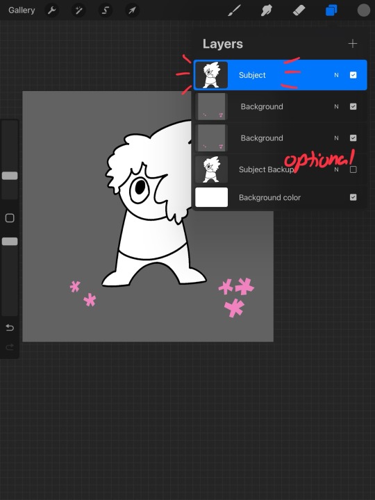
Second! We copy our subject and modify it however we want!! Here I stretched her out a little!
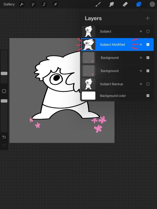
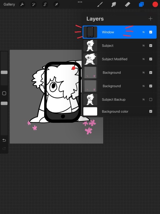
Now! We can make our window! It can be anything you want!! I made a phone :)
Now that we have our window, before we make the cool stuff we should do something first! Merge your subject with one of the backgrounds! I forgot to put an example of why, but the effect will just look wonky if you don’t do this! The subject and the modified subject will both be visible at the same time like above, that’s not what we want!!
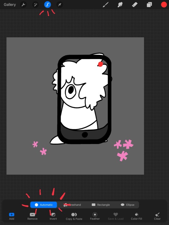
Now that we’ve done that, we can do the fun stuff! Go to your window layer, use select, tap on automatic to make your life easier, and tap on the space you want your window to be! It’s blue now!
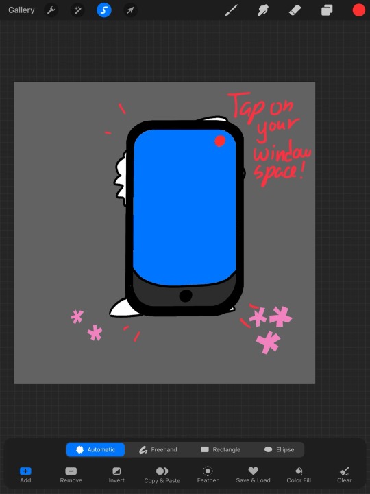
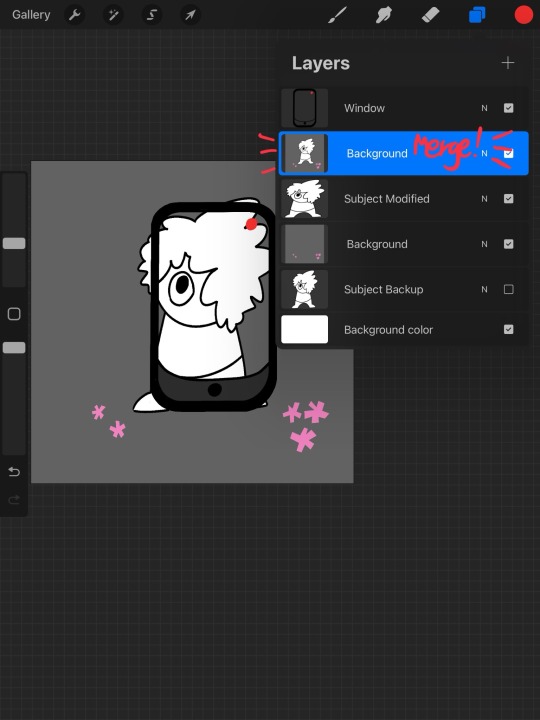
Without deselecting anything, go to your subject layer, create a mask, and invert it!
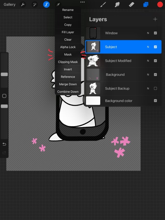
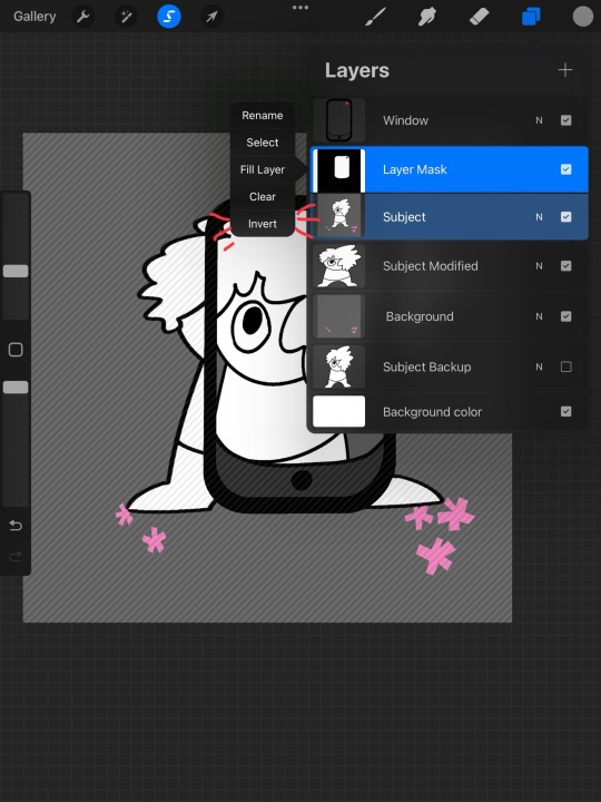
Wow! Almost ready!! Now all you have to do is select your window, and your layer mask together!
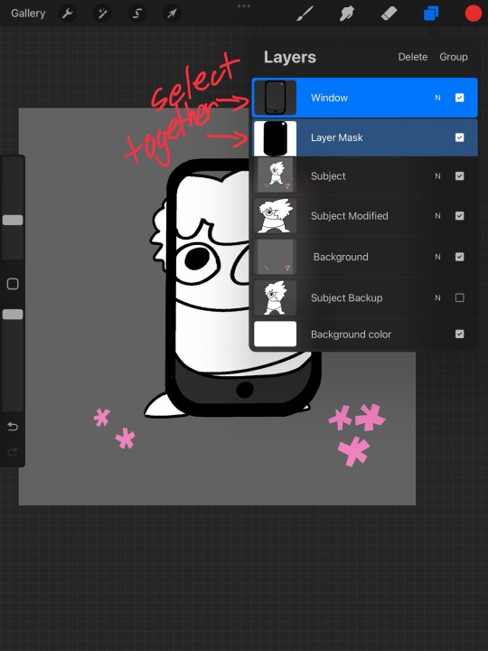
And now move them around!!!!
Wowee!!! You’ve done the Cool Effect!! So proud of you right now!!!! Now you can customize and add layers to your heart’s desire!! Just remember to select them all when you move your window!!! (One second I reached the image limit gotta reblog with just a couple more things…………) (Nevermind!!!! For some reason I can’t add any more videos even on reblogs… whatever!! It wasn’t anything important anyways! I hope this was!!! Coherent!!!!) Thank you @beepiesheepie for asking about how it worked! Good luck if you use it :D
#tutorial#drawing tutorial#bush art#I could have cropped stuff better but! I didn’t feel like it!!#hope this helps you all! it’s very fun and versatile!#now go forth…. you can make stuff like magnifying glass shenanigans…….
13 notes
·
View notes
Text
How I edit my Sims' shadow in Photoshop
as requested by @adelarsims
& based on this tutorial.
━━━━━━ ・❪ ☾ ❫ ・ ━━━━━━
1. Taking a screenshot
First of all take a screenshot of the Sim - I always do CAS but in-game works too ofc.
I take mine in front of a background that loosely matches the color of the background of my edit, in this case white. If you have a fancy CAS background, I recommend this CC by @sonyasimscc to easily get a simple background for screenshots.
I also use this tutorial by @katverse to get really good screenshots, I use 4000x3000px resolution, and this tutorial by @vyxated to not have a CAS UI in your screenshot if you use a reshade like me.
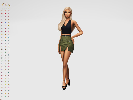
━━━━━━ ・❪ ☾ ❫ ・ ━━━━━━
2. Setting up the Photoshop file
Now in Photoshop create a file, I use 1250x2000 px.
I made a few guidelines, pink being the middle of the image and dark blue guidelines for my shadow editing.

I have a usually white background and a slight Curves adjustment layer with a gradient layer mask so it gets slightly darker at the bottom, completely optional ofc.
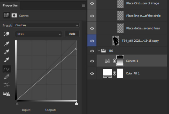
━━━━━━ ・❪ ☾ ❫ ・ ━━━━━━
3. Removing the original background
Import the screenshot and place it however you want. I try to align the Sim in the middle and make it as big as possible.
Then select the layer and go to Select - Subject.

This will usually do a decent job.
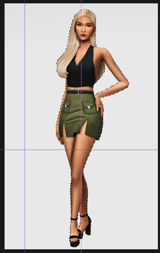
If there are some leftover unselected areas (like on her left hand on the hip) you can either add them to the selection now or edit the layer mask later.
Then create a layer mask.
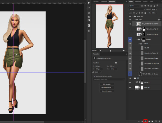
Since the screenshot has a similar background, it shouldn't show too much if it is not perfect.
━━━━━━ ・❪ ☾ ❫ ・ ━━━━━━
4. Creating the shadow
First duplicate the Sims' layer (Shortcut: Ctrl + J).
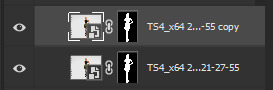
The layer is probably a Smart Object, so you need to rasterize it and right click the layer mask to apply the layer mask.
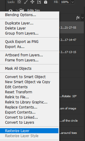
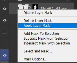
Now lock transparent pixels and paint the layer black.
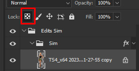
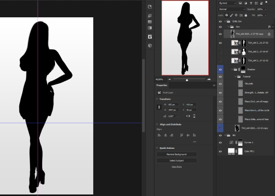
Next unlock the transparent pixels again and move the black layer below the actual Sim. Leave it selected.
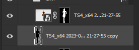
Now you will need the Perspective Warp tool.
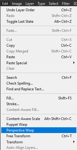
Draw the grid over the Sim, it doesn't have to be perfect, but make sure every part of your Sim is in the grid and nothing pokes out.
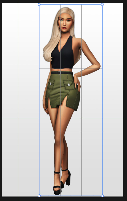
Press enter.
Now you want to drag the upper 2 corners separately wherever you want the shadow to be. I always put mine to the left and around the upper thigh area. I also try to match how slanted the left and right side are.
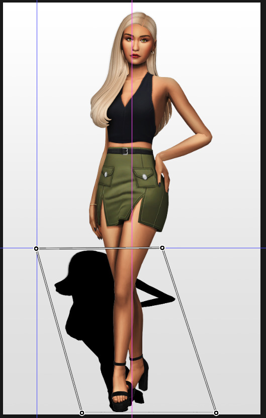
Now move the bottom 2 corners to try and match the shadow with the Sims' feet kinda. It won't work perfectly and you will need to fix it by hand after.
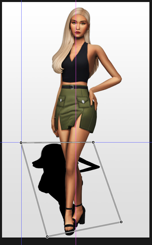
Press enter again.
Now go in by hand and fix the shadow around the feet.
Simply paint with black on the same layer and erase parts if necessary.
━━━━━━ ・❪ ☾ ❫ ・ ━━━━━━
5. Making the shadow look nice
I like to change the layer opacity to 35%, but it depends how strong you want the shadow to be.
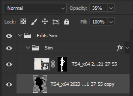
Next I apply a tilt shift blur, unlike in the video.
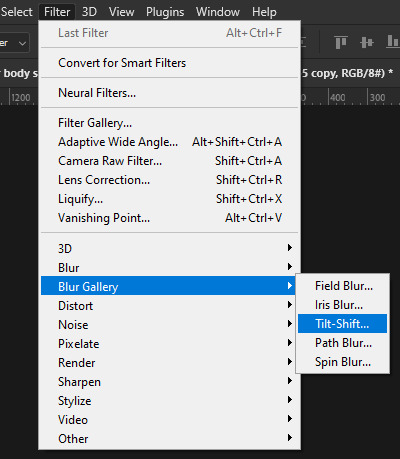
I use a blur of 15px.
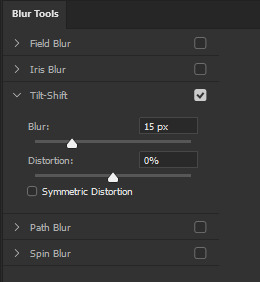
Move the circle at the edge of the image basically or a bit below by dragging the middle of it. Then rotate it on the bottom line by around 10°.
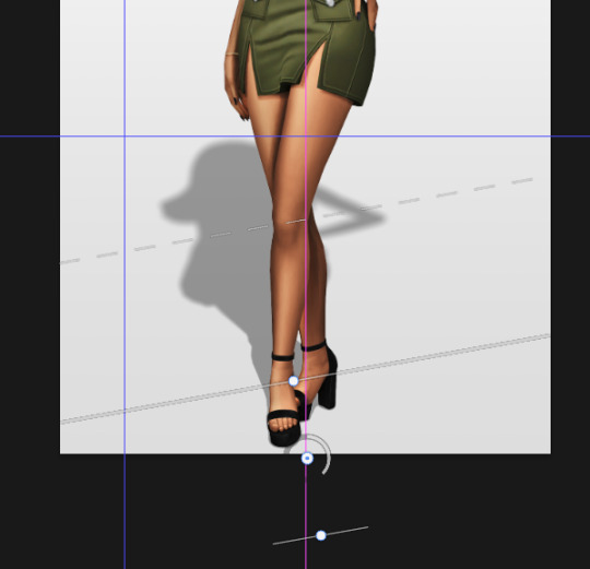
Next move the solid line to the middle of the circle and the dashed line around the ankles.

Then press OK at the top.

━━━━━━ ・❪ ☾ ❫ ・ ━━━━━━
6. Optional: Gradient layer mask
Lastly I like to make the shadow fade out a bit towards the top.
Apply a layer mask to the shadow.
Then get your gradient tool and the default black to white gradient.
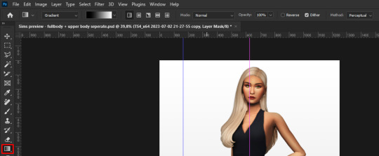
Hold shift to make a straight line and drag the gradient down.
This is how I roughly place mine so it's not too strong.
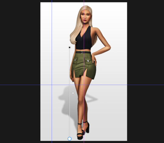
━━━━━━ ・❪ ☾ ❫ ・ ━━━━━━
And that's it!
If you have any questions, let me know~
96 notes
·
View notes
Note
Can I ask how you do the color overlay/backgrounds on your color palette posts? Specifically the rose tyler one.
Sure nonnie, sorry it took me a while to get to I had some other colour palette requests and wanted to make a little tutorial for you using one of them when I got to them. So I'm gonna use this gif from this gifset because I really liked how the colours came out. I'll be honest I have no set colouring pattern for these, the colouring differs from gifset to gifset but it follows the same basic steps. (also a little warning, I tend to ramble when I'm making tutorials so hopefully it makes sense)

For this tutorial you will need:
Basic gifmaking knowledge (I make mine on the timeline option on PS but it works with frames too)
Your gif prepared with your preferred colouring and sharpening
Knowledge of using layer masks when gifmaking (if not don't worry i'll show where to find them)
So here's the gif before all the colouring;
and here's the gif after I've put my normal base psd on and made the adjustments to it;

Now we come to the fun part, like I said before what I do varies from gifset to gifset so just play around with it. A good tip though I've found for changing the background though is choosing a scene that has a lot of blue or cyan because I find them easiest to change the colour of, but it works with any colour to be fair.
For this gifset I started by adding a hue/saturation layer and setting the cyan and blue (or whatever the main colour of you gif is) and setting them to -100, it's not an essential step but it does help if the blue/cyan route is the way you went.
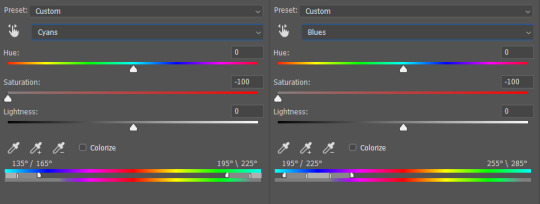
that make the gifset look like this;

All the blue and cyans have turned have turned to gray so now we can start experimenting with our colour overlays. So I created a new layer and filled it with my desired colour, which was this lovely purple colour here;

And i set the layer blending mode to soft light.
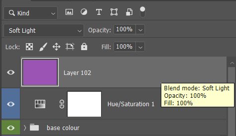

And got this nice result, the parts that were gray now have a purple colour to them, but it's not quite the same shade I'm trying to get, so I duplicated the colour layer, keeping the same blending mode.
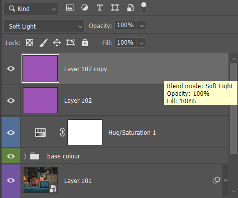

We're getting there now, but I want to try making the purple a bit brighter now, so I duplicated the purple layer again, but this time I set the blending mode to lighten, and turn the opacity down to 12%
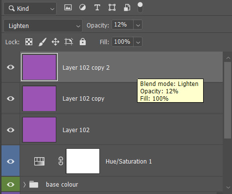

It's a tiny difference, but it's perfect for the shade I'm trying to get, but like I said above it's all down to experimenting with different blending options. Now my only issue is I want to bring back Dustin and Erica's natural skin tones that have been given the purple shade due to the layers. That's where layer masks come in. To get a layer mask pick the layer you want and and click the little icon I've circled underneath where your layers are, which brings up the mask as a white box next to it.
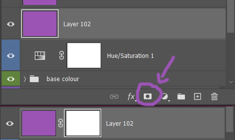
With the white box selected I select the brush tool and make sure the colour of the brush is set to black and paint over the areas of the gif I want to take the purple shade away from (note this step works better on subjects that don't show a lot of movement in the gifs, but there are other tutorials out there that show key frame colouring and stuff that I'll link at the bottom of this)
So now the mask should look like this;
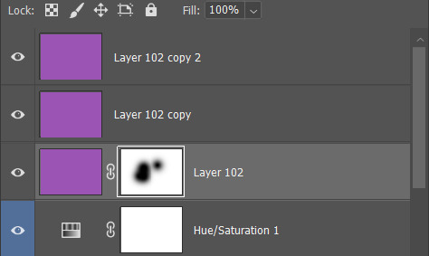
Then I need to apply the ayer mask to the other purple layers, for that I press ctrl and click on the layer mask (not sure what that would be on mac sorry)
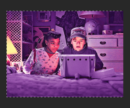
It should look simular to this, the outer area selected is where the purple colouring is the the circles are the are you're trying to change, with that select your next colour layer and apply layer mask, that will then give it the same altered layer mask from the pervious layer. Then repeat these steps on all your colour layers.
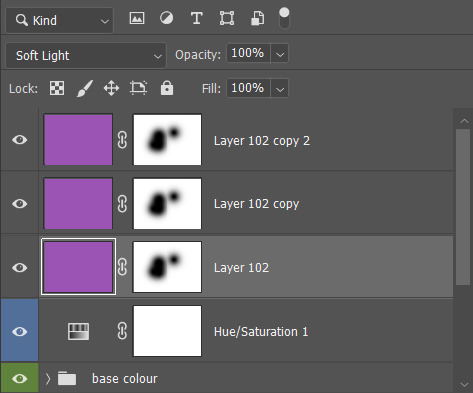
They should all now look like this leaving you're gif looking like this;

And here's the final result, Dustin and Erica have their normal skin tones while the surrounding areas of the gif are now the colour I changed them to. I hope I explained things clearly enough, if not don't hesitate to ask me any follow up questions, here's some other tutorials for changing colours in gifs:
my own colour gradiant tutorial
gradiant colour map blending
key frame colouring
gradiant fill layers
colour manipulation
Just remember to be creative and mess around with it, there's all sorts of results you can get from different blending options that might work better for you ;)
#here you go nonnie#i hope my rambling paid off and this helps :)#asks#tutorials#tutorials*#resources#gifs*
8 notes
·
View notes