#Really captures the original artist's style!
Explore tagged Tumblr posts
Text

Now that we're past the introduction issue, looks like we'll now see Mega Man tackle Robot Master stages and fight em!
As always, Spaziante's covers fricking slap and really gets you pumped xD
#RHSB post#MM2#Having Mega Man separate the bosses from the Mets is a good visual as well as the Robot Masters!#Really captures the original artist's style!#Mega Man#Guts Man#Cut Man#Bomb Man#Patrick Spaziante#Archie comics
17 notes
·
View notes
Text
Not to spam you guys too much but: happy international racoon day!!
What better day to introduce to you my little guy - this is Gremlin (Merchgremlin for short) and I hope to make him into my fursona :3


#I have more art I haven't shared yet but lets keep that until later this week x'D#it was just too good not to share gremlin with you when I learned it was internation racoon day :'D xD#gremlin#oc#original character#fursona#merchgremlin#mine#my own art#fun fact: I hope to get a gremlin tattooed on me x'D#my right arm is reserved for 'little guys' and this one tattoo artist I think is really cool just opened nov-jan bookings#so the plan is to send her these sketches and ask if she'd like to draw a little gremlin in her style#in a pose she thinks captures my energy#it is an idea I have had loosely since july when my roomie at the summercamp called me raccoon coded#so why not#gremiln's a cutie AND a little guy#win win#I will shut up now
20 notes
·
View notes
Text

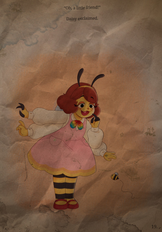
Welcome Home served as a holder of all sorts of merchandise, including illustrated story books. Above is an example of a page taken directly from one of these books that we have received from an anonymous sender. Dated est. 1973. It depicts an illustration of a character never before seen, and according to shredded clippings of documents that came alongside the destroyed page that we have managed to piece together, the character appears to have been named "Daisy Bee". This information is new to us, and we've done significant work to translate the original piece into a digital, fully recovered state with slight alterations.
The exact storybook to which this page belongs to is currently unknown. Additionally, there appears to be zero evidence of this character appearing in the TV show at any point in time, nor has any other merchandise seemingly been sold of this character. We are still working to the best of our abilities to unearth as much as possible about this character and their origins, including the exact date in which they were introduced into the franchise and why no person we've spoken to seems to have any recollection of their appearance.
We have tried to find and reach out to the sender of this letter in hopes of them holding any further information that could possibly aid in our search, but we have ultimately come up with nothing in regards to their identity or location. The envelope we received with the attached illustration and document clippings did not have a return address or name associated with it. Nonetheless, we will continue to work diligently in finding and restoring anything we may discover. Thank you for sticking with us.
Sincerely, the Welcome Home Restoration Team
‼️ This is a fan character. I am in no way affiliated with Clown or their works ‼️
#welcome home#welcome home fandom#welcome home puppet show#personal#welcome h#welcome home art#welcome home oc#welcome home original character#I tried to Really capture that Childhood Storybook style!#I Hope you Like this!#I Worked Very hard on It!#welcomeh#welcome home project#welcome home artist#welcome home artwork#Daisy Bee#I'd love to hear your theories on the story and origins of my character!#Please Shoot your shot! I'd love To See it!
82 notes
·
View notes
Text
Season 3 -Surrealism and its psychoanalysis of Carmy Berzatto
Stick with me here if you like. I'm here to talk about how this season it dove into a psychoanalysis and surrealist style cinema on Carmy and his sexual urges. @currymanganese @caiusmarciuscoriolanus & @vacationship discussed in another thread the surrealism of this season with its close shots and quick cuts as well as leaning into faint storytelling and a focus on moving images. Surrealist Cinema connects with Sigmund Freud's principles in creating this film style.
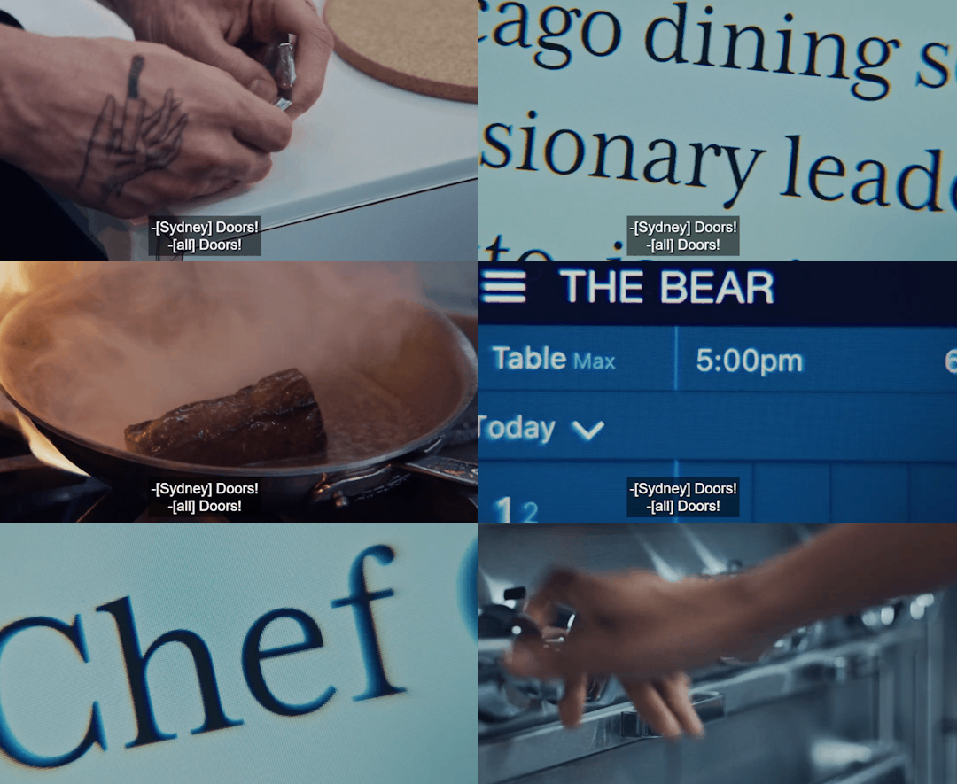
Surrealist films are connected to Sigmund Freud's ideas about dreams and the unconscious mind. These filmmakers used strange, unexpected scenes and bizarre images to depict what’s going on deep in our minds, creating movies that feel like crazy, vivid dreams. The Surrealists ran with this idea in their art to capture pure thoughts from the unconscious mind.
Freud's ideas are super handy for understanding Surrealist art. Early on, Freud figured out that dreams are like visual poems, using metaphors to show our unconscious thoughts and desires. But our minds censor these dreams, turning the original thoughts into metaphors through something called displacement and condensation.
The filming this season prioritized mood over storytelling, which is another interesting aspect. It also featured a surrealistic style of non-linear moving images like in Episode 3x01 Tomorrow- non linear in Carmy's unconscious stream of thought. This symbolism also shown through the displacement of scenes and images.
What is Displacement?
Freud thought Displacement was the important part of dream work, and surrealist felt this way with film. It swaps out objects or concepts with symbols to hide the real meaning. Surrealist filmmakers committed to this act of symbolism. Symbolism is a figure of speech of a character's actions, words, and events that has a deeper meaning.
One example of symbolism from Freud defines that knives often symbolize male genitalia and boxes symbolize female genitalia in dreams.
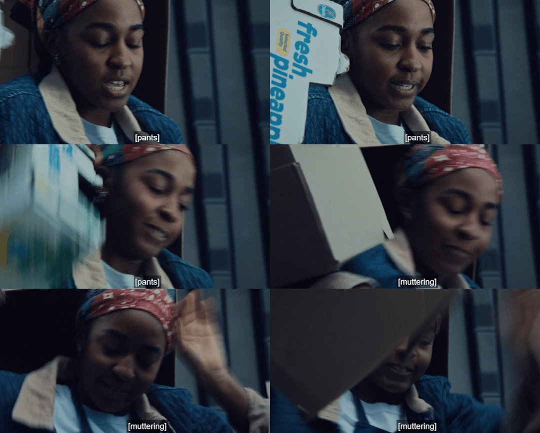
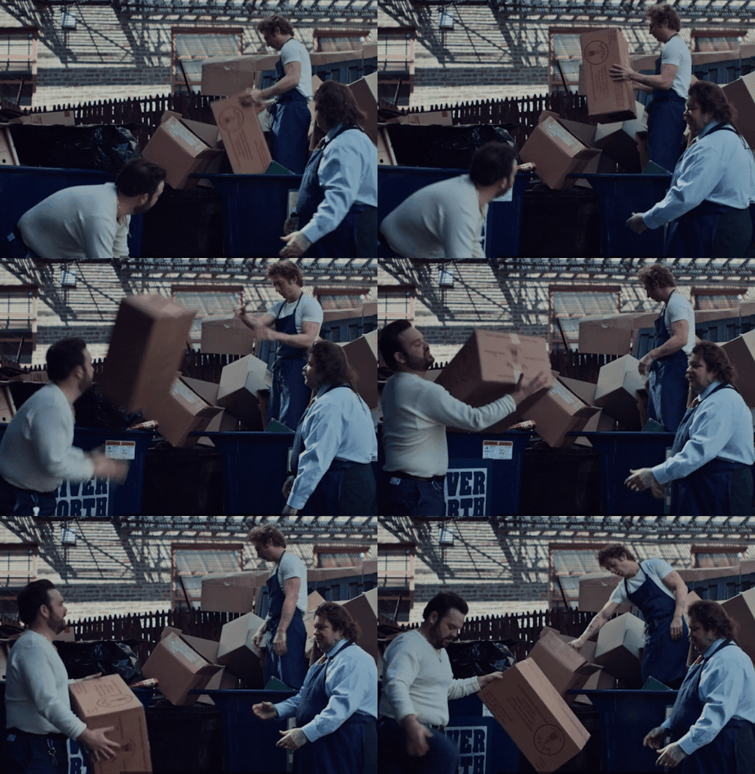
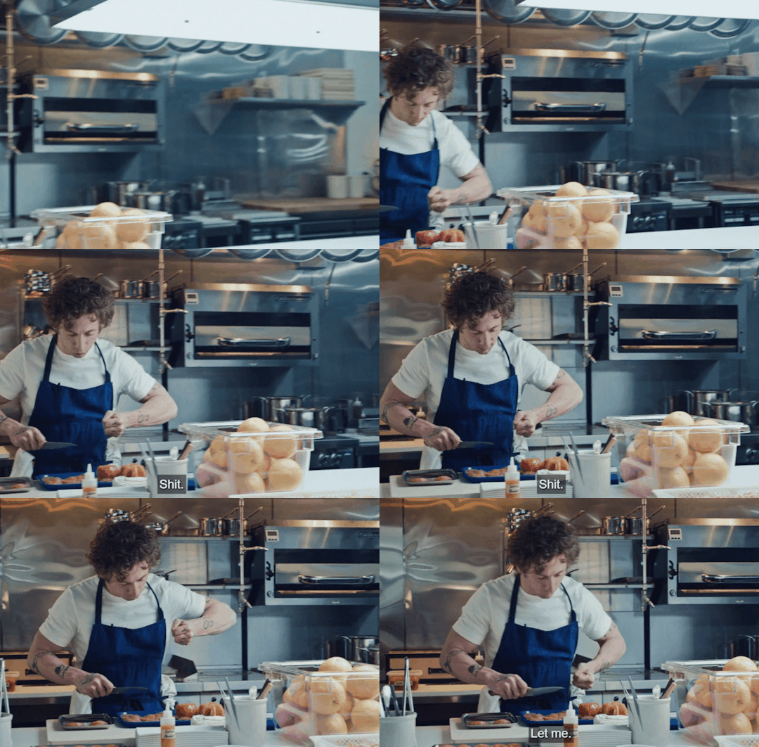
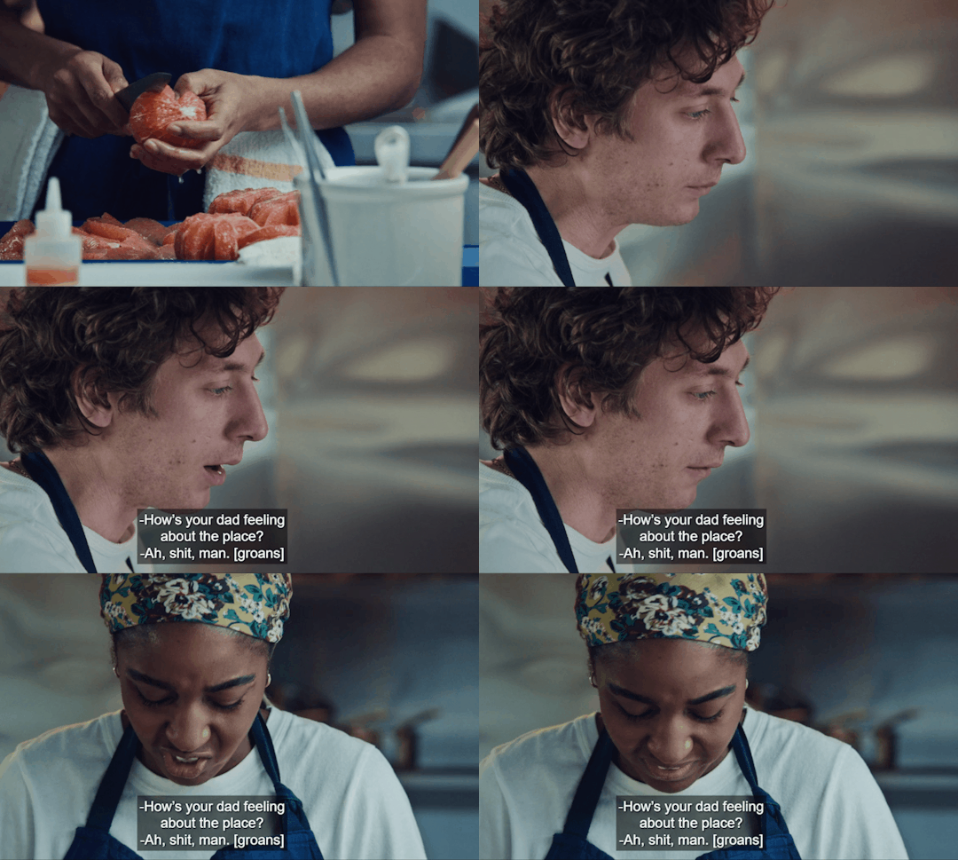
What are the odds of a parallel between knives and boxes, and it's only Carmy and Sydney being frustrated by the tasks of cutting and breaking down boxes?
It's the symbolism of sexual frustration between them.
Textbook Sublimation
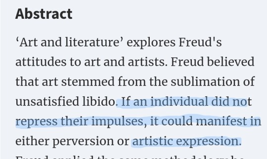
Another Freud concept is sublimation - this is defined as redirecting sexual desire into socially acceptable behaviors or new aims that are still related to the sexual impulse. (AKA Carmy wants a star, not just to beat Chef David- but what carmy truly wants sexually is to please Sydney)
Remember what Richie said about Carmy as he shouts at him and then Carmy looks at Sydney?
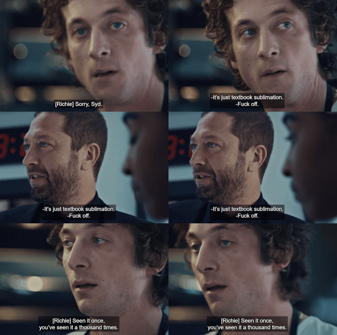
Let's definite what textbook sublimation is:
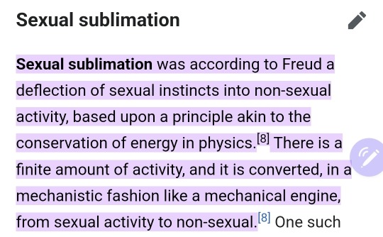
My theory is that Richie told Carmy that he sees him for who he really is. He knows Carmy and knows that he never wanted Claire in the first place. Richie is aware of the tension between Sydney and Carmy, and Carmy's been repressing it all along. Richie is very observant; look at how he observes the tension between Carmy and Sydney.
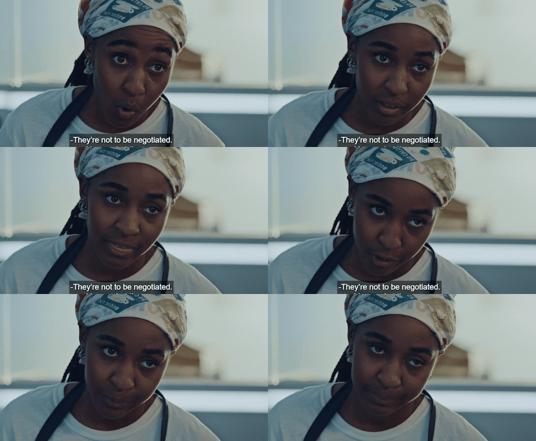
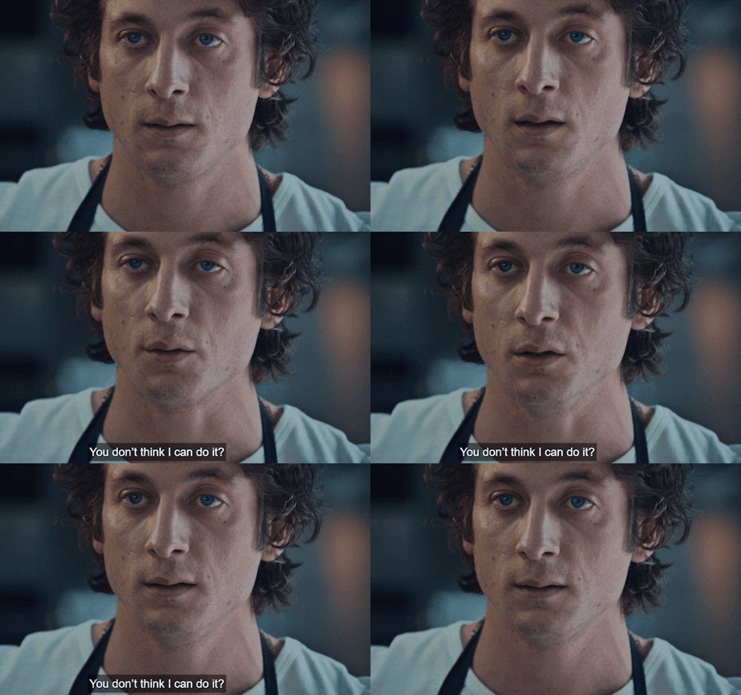
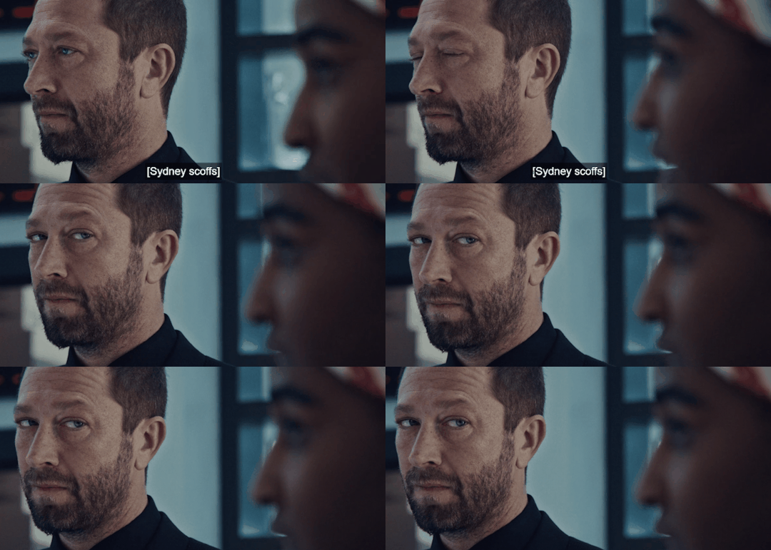
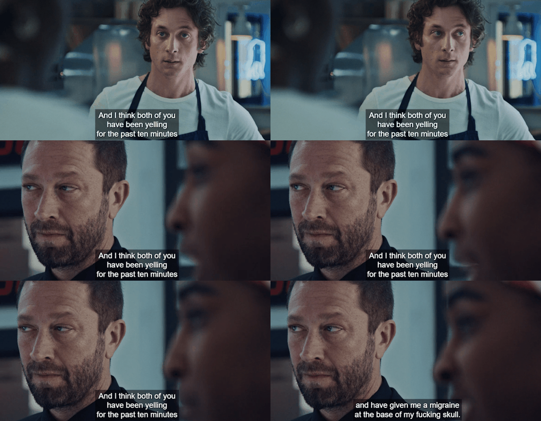
Bonus: Look how Carmy stares at Sydney- he could care less about the Faks in this moment. He's feeling bad for giving her a headache but he wants to fight some more.
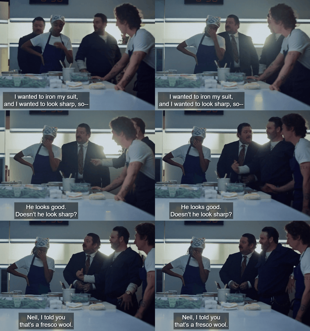
Remember, we theorize here that season 3 breaks into the fourth wall. At that moment, Richie is talking to the audience, giving us a rundown of why Carmy avoids and creates a prison in his mind. We didn't get a clear answer because we were inside Carmy's mind throughout the season. He was experiencing confusion, repression of his urges, and an inability to feel the pain he was going through. Another thing is that he could not accept any joy or love in his life.
I believe the decision to create a surrealist-style season is great because it complements Carmy's avant-garde food style, through which he communicates his artistic thoughts and feelings.
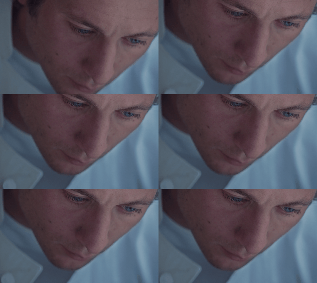
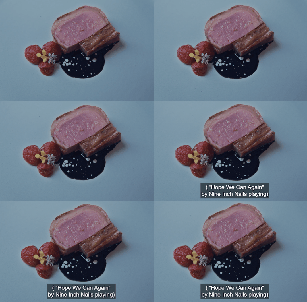
Through the image, we see that Carmy is in a dreamlike state, gazing at the dish he created unconsciously, which matches Sydney's scarf. This hits at the core truth of his desires that he does not want to address. Sydney is the real fun, joy, and amusement that can happen, but he's been sabotaging and repressing since day one, even with the choice of dating Claire. Carmy is more addicted to adrenaline, stress, chaos, and guilt.
I believe the bear in his dream symbolizes the Carmy's unconscious and repressed feelings - desires, guilt, and longing. These emotions overwhelm him as he returns home and processes his grief. The phrase "let it rip" carries multiple meanings, but in this case, I interpret it as a call for him to embrace his emotions and be true to himself.
Thank you for reading.
#sydcarmy#im not a doctor i just love film and psychoanalysis#long post but fun to write hopefully fun to read#i really appreciate sydcarmies! thank you for reading my thoughts#carmy x sydney
161 notes
·
View notes
Text
Hey folks. My name is Kanagen (It's pronounced Ka-na-ngen. Kana is fine.), and I'm a writer. I mostly write sci-fi with a more or less sapphic bent, and I'm not shy about putting lewd content in what I write because fuck petty moralism.
I'm active in the Human Domestication Guide writing community, where apart from being an author (see below), I'm also a Loret, which means I help maintain and update the lore of the setting, help new creators with questions about it or how to fit a story into it, and so on. All of my publicly available fiction at the moment is HDG content, but I plan on working more on my own original settings and concepts in the future.
I have a patreon, where I post my current long-form project's drafts chapter by chapter, once weekly. I also occasionally talk about my writing process. I'm hoping to expand content there in the future as well.
I don't use social media very much because I remember what the internet used to be like before walled gardens and techbros ruined it. (You kids really don't know what you're missing.) Nevertheless, the life of a freelance writer rather demands I put myself out there somehow, so here I am. Ask me questions, behold the weird stuff I reblog, and try not to get too parasocial with me. I'm just a weird lady who puts words in funny shapes.
Bibliography
Long-Form Fiction
No Gods, No Masters - A revolutionary leftist copes with the subtle differences between her own idea of the perfect world and the just-a-little-off version of it the Affini offer. First novel-length work in the Tillandsia Trilogy; highly suggested you read this before The Floret in the Mirror and especially Freedom's Ember.
The Floret in the Mirror - A mystery/thriller about identity, digitization, and impossible simulated lewdness. Content warning for amnesia resulting from traumatic brain injury as part of the setup. Sequel to No Gods, No Masters.
Freedom's Ember (ongoing) - Sixty years after the Affini conquered her world, a woman clings to her independence; sixty years after being frozen for cryogenic flight from the Affini, a woman struggles to discover who she really is when freed from her father's influence. What is freedom, and what does it mean in the context of the Compact? Sequel to No Gods, No Masters and The Floret in the Mirror, conclusion of the Tillandsia Trilogy.
Sui Generis - A martian attorney living on Earth finds adjusting to life with the Affini easier than most; she was already keeping her wife as a pet before they arrived. The real question is, where's that strange jealousy coming from?
Short Fiction
Mainspring - A Terran secret agent is captured by the Affini, trapped by artist for whom his body is a canvas, and she means to make of him her magnum opus. Wind-up doll content, and probably my most commonly cited story for "this rewired my brain"-style reactions.
Reading the Leaves - A tea-obsessed barista, an affini new to humanity, and a sweet (if awkward) romance culminating in a very raunchy ending. Entry for the HDG February Fluff Fic Jam 2024.
The Fifth Fundamental Force - This story is a silly joke. It should not be taken seriously, though many inevitably do.
Aftertaste (stalled) - A former quadrillionaire and epicure who just barely avoided domestication is tracked down by an affini culinary anthropologist who wants to use his brain to reconstruct a lost flavor using his long-buried memory - he was the last human to ever taste bluefin tuna. This fic is only sporadically updated because the stars must precisely align for my brain to be in a state to write boyliker fic. Sorry, I'm just really gay, y'all.
86 notes
·
View notes
Text
Diana and 47 things I commissioned part 3, aka my favorite batch
Let's kick it off with the thing that actually started this entire "isa throws money into the fire for hitman commissions" journey
Airport chibis
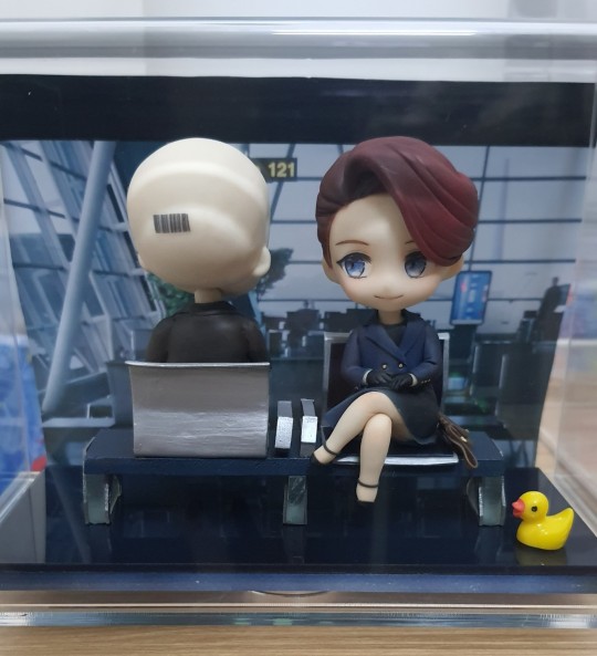

I wanted a custom fourana figure so I made the drawing above for the clay artist to follow (I had more refs but this was the main part)
For the figure, I love the hair shading, it's super cool, the way the artist matched my chair design 1:1 was pretty neat, and the tiny bag next to Diana was so carefully made, it's impressive
One thing to note is that I wasn't given any updates during the figure making progress, so I'm a little bummed about it. The expression didn't 100% match my idea, and the way they sit wasn't really natural lol. I had to do some adjustments after I received the figures (paint smears, cracks, leaning issues), so I wish they had allowed me to give feedback during the process
This was the first thing I commissioned, while it took a while to be finished (sep 2023-july 2024), I do like how they turned out, quirks and all
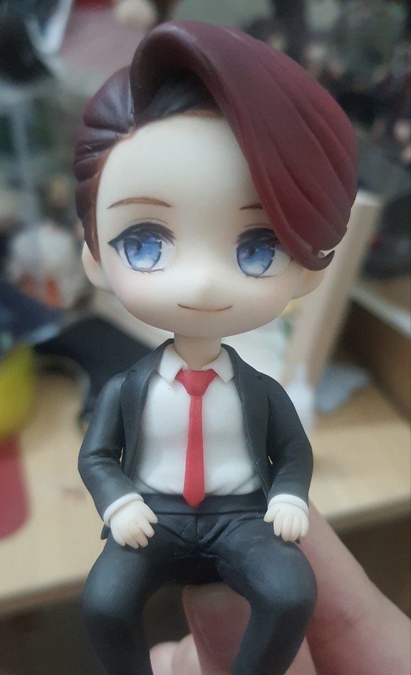
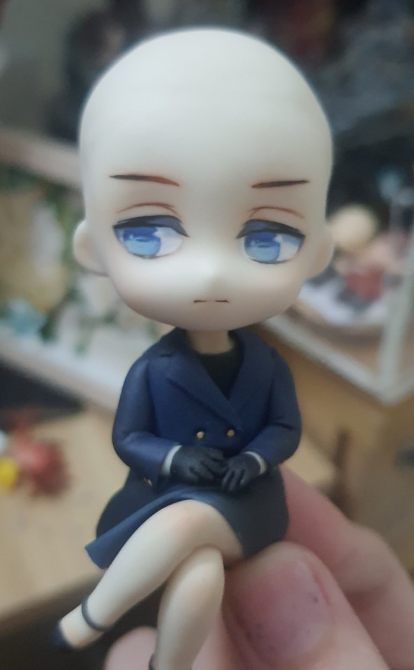
Bonus agent burnwood and miss 47, and also my nails I guess
Tiny posable dolls
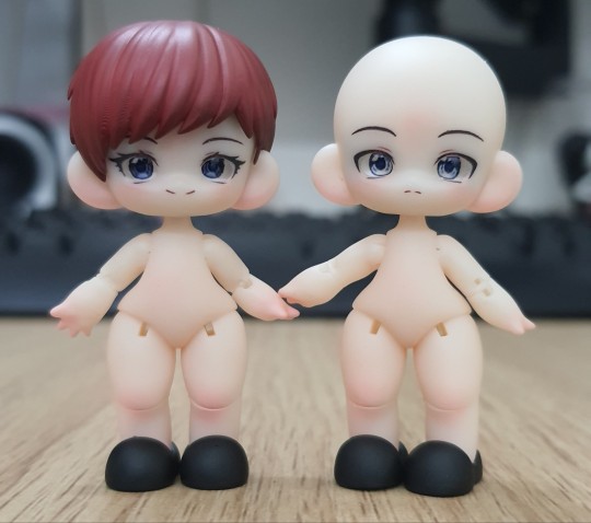
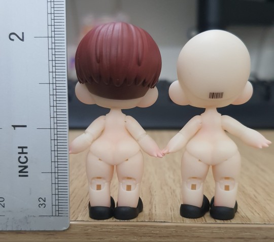

Once again, my drawing was used as a reference. These cost so much for such a tiny size that I would probably never do it again lmao ($150!!!!!!)
I do have nendoroid dolls in mind for the future though, but they will require more time since I have to source many parts like faceplates, hair sculpts, outfits, shoes ect
Despite the insane price, these are indeed very cute, and I'm glad my design was just slapped onto their faces, they look like my drawings have come to life and that's super cool
Last but not least,
Papercut drawing based on @/inuitaiyo's fanart:
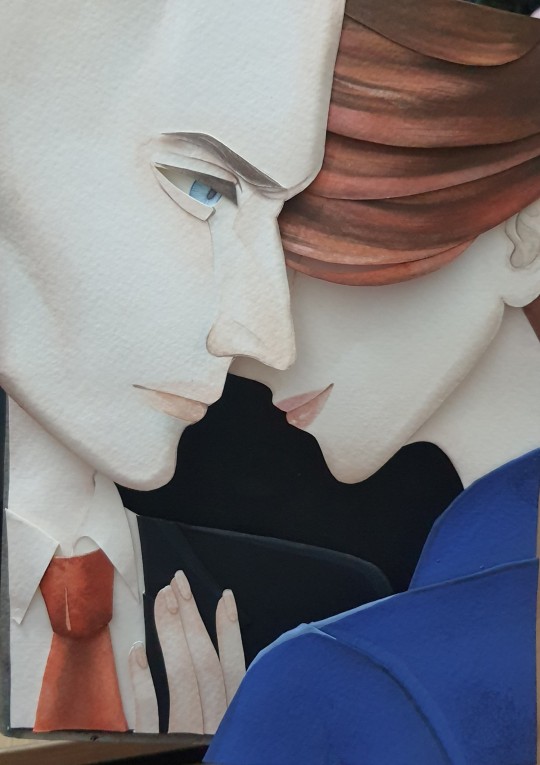
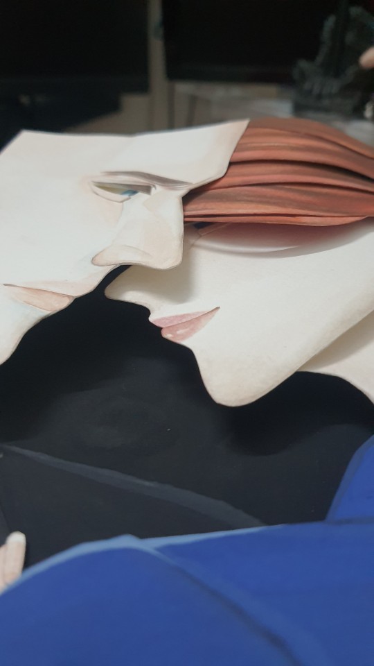
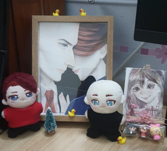
+ desk setup, I finally found clothes for the plushies
I saw SUN's fanart years ago and it's been lingering in my mind ever since, so when I found an artist that can do papercut drawings, my mind immediately went to that artwork. It's my favorite 47 diana fanart, it's so subtle and amazing, and SUN's gorgeous style was the cherry on top. I'm glad that the artist I worked with managed to capture what I love about the original artwork
I had total control over the entire process of this comm, so I added a neat little detail: If you look under Diana's hair, you can kinda see her eyes looking down at 47's lips ehehehe. I made sure that was gonna happen no matter what lol. I'm so happy it worked so well
That's all for now. Next time should hopefully be me finally getting custom fourana nendoroid dolls + a 1/6 scale mendoza diana doll. We'll see, money is a limited resource after all
One more link to SUN's art to end this because I think it deserves so much more love
81 notes
·
View notes
Note
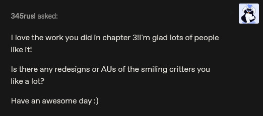
Out of curiosity, seen any favorite Smiling Critters art, artists, or aus you really like? :>

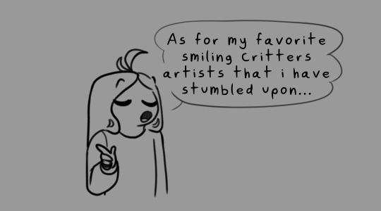

@dreamerawaken and @g0g0izgreen perfectly capture the original style while also adding their own little spin to it with their work which I absolutely adore. Also, just the way they express the critters is so soft I'm so normal over it.
155 notes
·
View notes
Text
My Chemical Romance bassist Mikey Way has a new Teenage Mutant Ninja Turtles Comic with "anime inspired" art and a villain that goes back to the original '90s toys
By George Marston published June 24, 2024
Mikey Way is turning the Teenage Mutant Ninja Turtles' greatest love into their worst enemy
Full article under the cut:
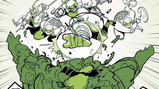
(Image credit: IDW Publishing)
My Chemical Romance is one of the most popular bands of the last 20 years, and in the time since their last official release, several of the group's multi-talented members have branched into comic storytelling - including bassist Mikey Way, whose latest comic is a short in the upcoming anthology comic Teenage Mutant Ninja Turtles: Black, White, and Green #2.
A veritable teen idol of his own thanks to My Chem's beloved presence in the punk and emo scene, Way is tapping into a deep-seated love of both the TMNT and their personal favorite food of pizza for a story that captures the youthful energy of the Turtles in a way that only someone who was there for their meteoric rise and pop culture presence could.
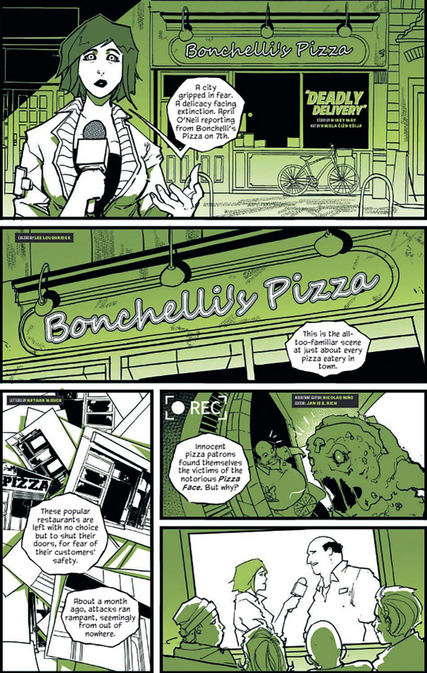
(Image credit: IDW Publishing)
"I was a massive Turtles fan as a kid! Being born in the '80s, wave one of Turtlemania hit when I was about eight years old, so safe to say I was all in," Way tells Newsarama. "My older brother was into the black & white comics early, so I was at least aware of the Turtles prior to that big boom, but my fandom really came alive with the original cartoon series."
"Followed up by the Playmates toy line and then into the live action movie, it really checked every box imaginable for me," Way explains. "The characters and the world building had something for almost everyone. While I was initially into Michelangelo, (because of his name and the nunchucks) I grew into way more of a Raphael fan. He's got more layers as a character in my opinion."
(Image credit: IDW Publishing)
Way's brother is, of course, Gerard Way, singer of My Chemical Romance and founder of the DC imprint Young Animal, which published Mikey Way's first comic, Collapser, which was co-written by Shaun Simon with art by Ilias Kyriazis. For TMNT: Black, White, and Green, Way collaborated with artist Nikola Čižmešija and colorist Lee Loughridge, whose art you can see in the newly revealed pages from the story seen here.
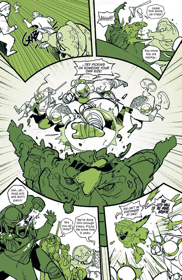
"I love Nikola’s style so much!," Way says. "He has this fantastic anime inspired quality to his work, and it lends itself perfectly to a Ninja Turtles story. I was floored by his pencils and he was a pleasure to work with."
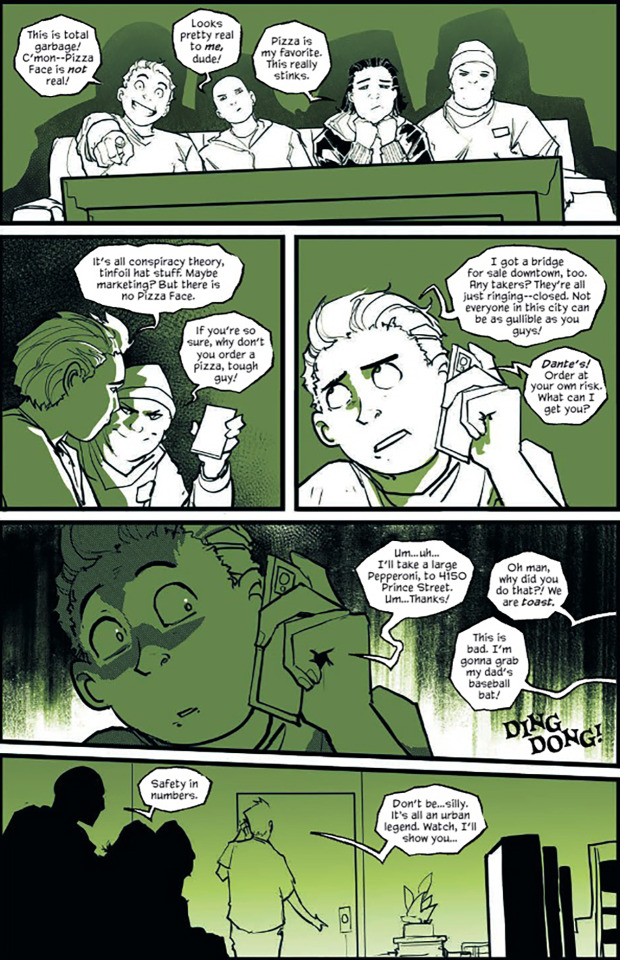
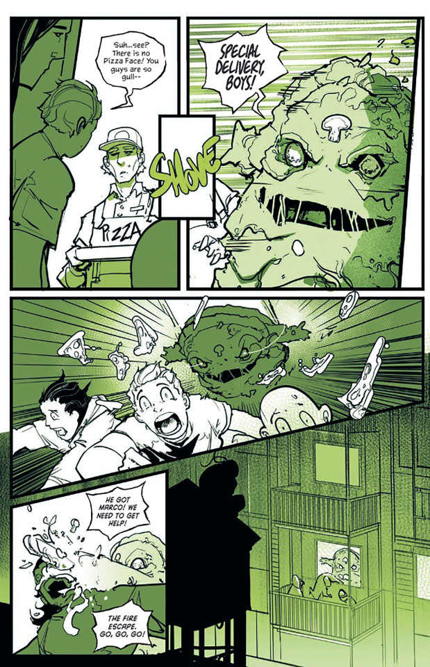
As for the content of the story itself, it all comes down to something that many fans of the TMNT probably love as much as the Turtles do themselves: pizza. Way brings in a classic villain, Pizza Face, who first appeared in the original TMNT toy line in 1990 as a villainous pizza chef, before being revived in the 2012 animated series as a mutated pizza blob.
(Image credit: IDW Publishing)
"I wanted to do a story that was an ode to '80s horror, with a nod to Candy Man or the urban legend of Bloody Mary," Way says of why he chose Pizza Face.
"The character of Pizza Face fascinated me as a kid, because he looked like the mascot on most Pizza boxes mixed with a 'Freddy' or 'Jason'," Way continues. "That mythology I created in my head as a kid really stuck with me. When the opportunity arose to write a Ninja Turtle story, it was literally the first thing that popped out of my head."
And yes, Mikey Way does have a favorite pizza place:
"Star Tavern in Orange New Jersey. Hands down the greatest there is, in my opinion."
(Image credit: IDW Publishing)
Though Way's Teenage Mutant Ninja Turtles: Green story is only eight pages, Way does plan more comics to come very soon - though he's not quite ready to say exactly what just yet.
"I feel like I have more stories that I want to tell," he hints. "At the risk of sounding vague, I would say one can expect an announcement of some sort very soon."
Teenage Mutant Ninja Turtles: Black, White, and Green #2 is on sale now.
#mikey way#gw#nikola čižmešija#lee loughridge#tmnt#idw#gamesradar#newsarama#mcr#interview#return#2024#jun 2024#6/24/24#comics/graphic novels#tmnt: black white & green#deadly delivery#text#photo#originals
71 notes
·
View notes
Text
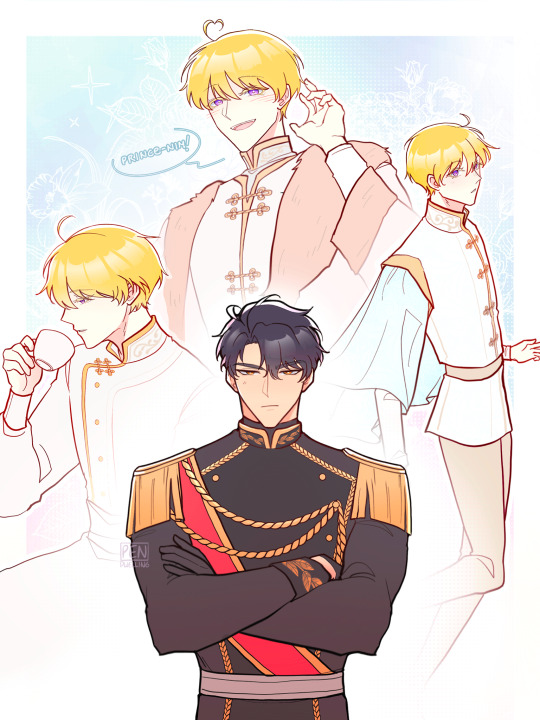
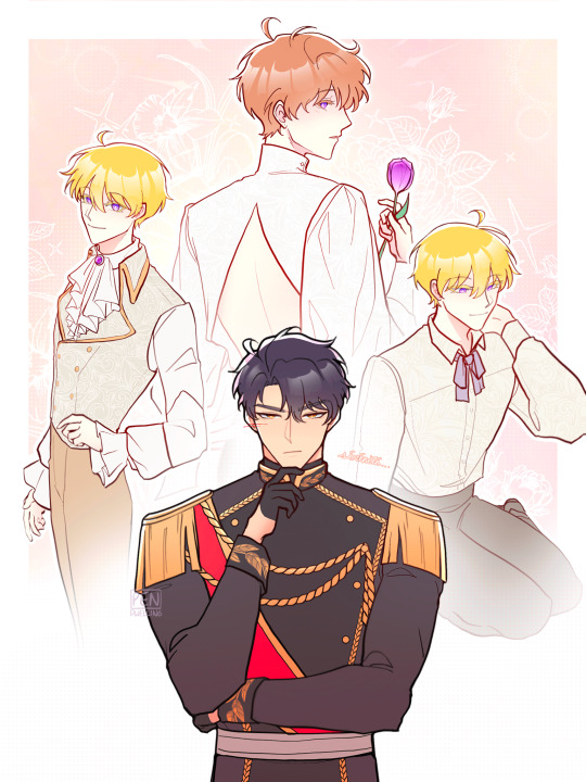
Venetiaan vs. Riester fashion🌷
(ft. model Yeseo and Cédric's imagination~)
Additional notes! :D
Venetiaan fashion:
Inspired by 16th-century Western aristocratic clothing (as confirmed by Sookym). Supporting that, both Losna and Werner have been shown wearing furs and robes!
Round cheongsam-like collars
Wide and flowy sleeves/arms/silhouette
Buttons are distinct from Riester's
Riester fashion:
19th?-century inspired
Suits, vests, button-ups! Neckties are in style since the collars permits it, unlike Venetiaan's high and round collars
Typically slim silhouettes for men (with the exception of cloaks and tailcoats)
(Honestly I just think of it as the typical RoFan webtoon visual fashion LMFAO)
This is just my interpretation haha, it's sorta what I gathered from the info given by Sookym in both in-novel and their notes! Distinct fashion/culture between Venetiaan and Riester has always been interesting to me, especially since Jesse (and Johann) have been noted to switch clothing styles once they become more concretely affiliated with the Riester Empire. (I tried giving Jesse more colourful/darker attires for his Venetiaan wardrobe like in my references pics, but his palette works best with whites/light colours so I couldn't bring myself to do it wkdhdkdksk)
When we first meet Johann, he is distinctly from Venetiaan, wearning its clothing and even greeting Jesse, the prince from said country, as "Your Highness" (which is what people from Riester call Cédric) rather than "prince-nim" (which is what they call Jesse, and what Jesse calls Cédric), displaying his nationality and the royal family whom he serves. He only begins dressing like a citizen of the Empire once he pledges his life and abilities to serve Empress Frédérique and become one of her people!
And as for Yeseo, he only begins to be dressed by his attendants in the attire of the Empire following his 'resurrection', and we can see more of this sort of shift when he goes from being addressed less as "prince-nim", and more as (마마—) "gungju-nim" (palace lord). There's also him eventually being referred to as the Moon of the Empire, instead of the Moon of the Holy Kingdom 🥹
I'm really fond of the webtoon because if there's one thing it does right, it is absolutely how it captures the lighthearted charm, atmosphere, and vibe of the original novel—though one thing im lowkey sad about is that the visual distinction between Venetiaan and Riester culture via clothing seems to have been lost :') It's a small detail on the surface, but it's actually a pretty significant and symbolic shift when Jesse gradually begins to be dressed less like "Prince Jesse Venetiaan", and more as "Marquis de Sérénité of Riester", the Palace Lord of Juliette :')) But of course, making a webtoon is hard work and I still immensely appreciate the artist's work nonetheless (btw I am eternally grateful for them giving Yeseo an ahoge/hair antenna, it is GENIUS chara design and so so so very cute, i love webtoon jesse so much hahajhsjh)
#when the third wheel strikes back#서브 남주가 파업하면 생기는 일#twsb#섭남파업#jesse venetiaan#jung yeseo#cédric riester#cedjess#cedyes#twsb fanart#my art#venetiaan holy kingdom culture#riester empire culture#i love how sookym portrays the cultural differences between the two countries
785 notes
·
View notes
Text
Do you want to hear one thing i want to do to get my mind off stress?
My first every real book series was started when I was around 11 and it got to twelve books, divided into three seasons. It was complex, disturbing and genuinly fantastic (for a child) and i still love it. I adored my main character. I even painted my room to match hers. But the storyline is more fantasy/scifi than what I like now, so i want to try to rewrite it again. I want to bring back my favorite story but in my style I have today. It's thanks to this story that I actually developed such a big love for writing.
It's a story about trying to find a place to fit in when you're not like others, to find a safe place where you can live safely in a world where there are people who wants you captured and experimented on for something you're born with, somethign extraordinary. A story where the characters aren't sure if they're human enough to fit in. It's a tragic story full of betrayal, isolation, loss and fear. And murder (by E).
I talked about Edmund’s evolution a few days ago and I decided to make a new mood board for this character, to see how this character had evolved. I present to you, one done sometime before 2020 (i dont remember when but it wasn't when i started the original story) and one done 2025 because it reminded me that people will not see the evolution to the final product in a published work, only the finished product. Not like you do on tumblr, where you see from start to finish over the years.


And then how the mood for the story was in the very beginning, and what i want it to be in this new 2025 version. It's interesting, I think, to see how it has/will mature and still staying in the same vibe.


This girl is a weapon, figuratively and literally lmao. She, along with her twin, are not like others people. And among them, one is passive and one is aggressive. E's an apathic murderer who has never been taught emotions, someone who will do anything to get her freedom and protect herself and her twinsister.
To finish this nonsense ramble post, here you can have a little drawing of the main characters i made in my og books when I was just a child. Master artist here

Wish me luck in finally doing this story again😅 i really hope I get to show you it someday, published. I don’t know why I made this post but you know me, I like talking about my stories.
26 notes
·
View notes
Text
Bestiaryposting: Wutugald Results
All right, time to see what everyone came up with for the Wutugald! Again, if that statement confuses you, you may find an explanation at https://maniculum.tumblr.com/bestiaryposting . If you want a refresher on the description the artists were working with, here is the original post:
This was a pretty good creature to start with, I think; the random number generator did us a solid with this one. It laid to rest some concerns I had: will people be able to put aside their real-world knowledge of these animals and draw as if they had never heard of them? Yes, apparently -- a number of comments and notes indicated that several participants had guessed what the Wutugald was, refrained from sharing that information, and drew something that fit the description while being nevertheless a fully distinct animal. I was also concerned about some of the upcoming entries that specify a type of animal (bird, serpent, &c.), wondering if that constraint would be a problem -- but a number of people drew some Very Good Birds for this one, so I feel reassured that future entries that are Explicitly A Bird will still be material we can have fun with.
So, let's see what people created. I'm putting these in roughly the order in which they appeared, below the cut:
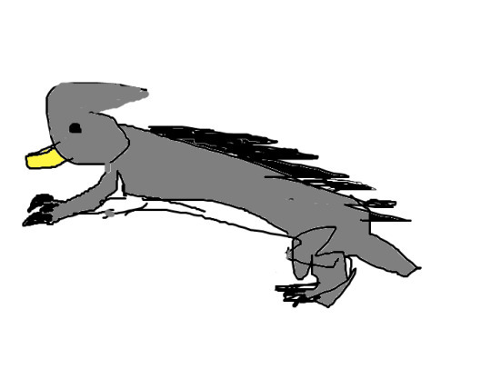
@cosmic-flora (link to post here) produced this in Paint pretty shortly after the original post went up, and posted it with a brief explanation of their design decisions -- they were the first but not the last to interpret the rigid spine as spikes and the single tooth as a beak, and also to provide the creature with claws for digging.

@silverhart-makes-art (link to post here) was also quick off the mark, posting this the same evening along with an explanation of their design process. I'm genuinely impressed by how quickly they were able to draw something so naturalistic -- this went up within like four hours of the original post. This was also the first (but again not the last) to include an apparent reference to the Wutugald's ability to change sex by including both male genitalia and noticeable teats. Also, I wonder if the coat pattern on the baby is a sneaky reference to the animal this is based on, as Silverhart does indicate that they figured it out.
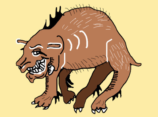
@elodieunderglass (link to post here) created this rendition, which I think does a good job at capturing the vibe in the bestiary entry, of a creature that the medieval author clearly sees as discomfiting and somewhat sinister. That is a grin that makes me worry about the critter's intentions.
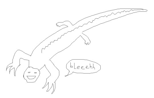
@geeoharee (link to post here) posted this along with a brief explanation of their design decisions. The human face and the speech bubble are great, I think -- it makes me smile. I think this is the first non-mammalian Wutugald, but several more come later.
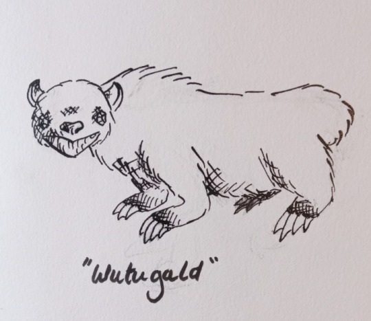
@sweetlyfez (link to post here) drew this with a dip pen, apparently, which is cool. Also this might be the cuddliest-looking version, but my desire to hug it probably says more about my own sense of self-preservation than anything else. That is a cute face, right? It's not just me?
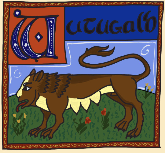
@cinqueform (link to post here) produced this wonderfully medieval-styled image. We can see here the ruler-straight spine and the depiction of the Wutugald's sexual ambiguity, as well as a human-like face for imitating speech. Also a very nice stylized letter W.

@rautavaara (link to post here) has also done a medieval-style rendition, which is excellently sinister in presentation. That is a Worrying Creature. It's also the first (but again not the last) avian interpretation of the Wutugald, which I think really works. Also I'm not sure if this is a sneaky nod to what the animal actually is, or just a case of "great minds think alike", but Rautavaara's interpretation of the rigid spine is very similar to the one in the actual Aberdeen Bestiary illustration I will show y'all at the end of this post.
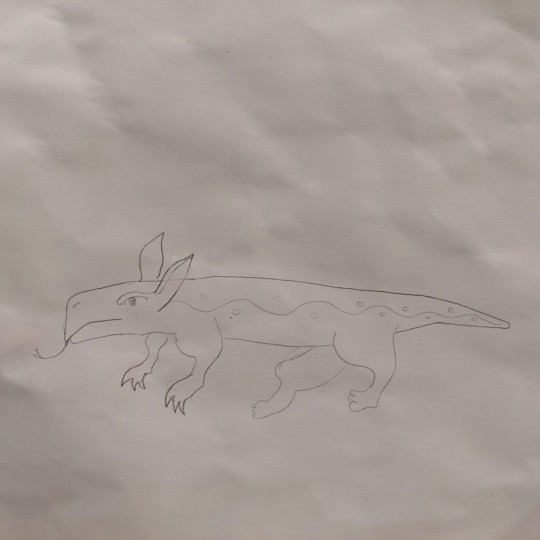
@spontaneousmusicalnumber (link to post here) posted this along with a brief explanation of their design process. I think they're right about the side pattern being appropriate for a bestiary critter.
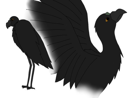
@strixcattus (link to post here) did another avian rendition of the Wutugald complete with a fantastic lengthy reinterpretation of the bestiary entry through the eyes of a modern naturalist. Seriously, go check that out, it's very good.
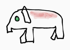
@fidgetyhands (link to post here) provides this image of the Wutugald along with an explanation of their design choices. They also note that limitations in terms of artistic material are probably relevant to a lot of bestiary drawings.
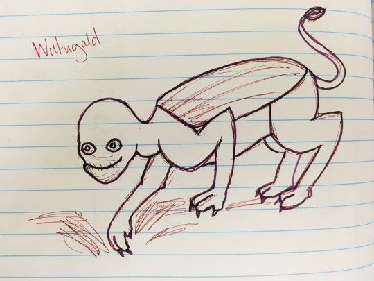
@jamiethekeener (link to post here) gives us this Wutugald in the act of digging. She instructs that we should not ask why her interpretation of Wutugald ended up being so unsettling, which I cannot deny that it is. (That smile... that damn smile.) I also want to highlight the interpretation of the rigid spine as a shield-like plate along the back.
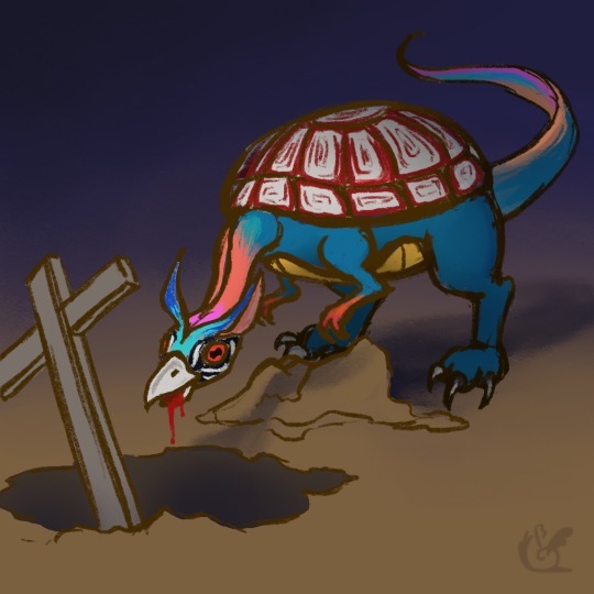
@thewhetherman (link to post here) gives us this rather-frightening-looking creature, along with a brief commentary that definitely ups the spook factor on this whole thing.
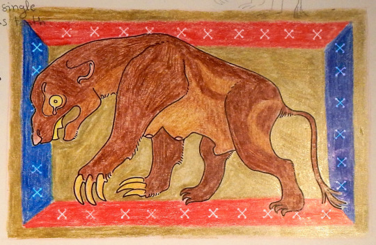
@bruncikara (link to post here) also went with a medieval stylization, with a very period-appropriate pose and frame. We can see again some digging claws and a nod to the animal's sexual ambiguity. Wicked-looking single tooth, also.
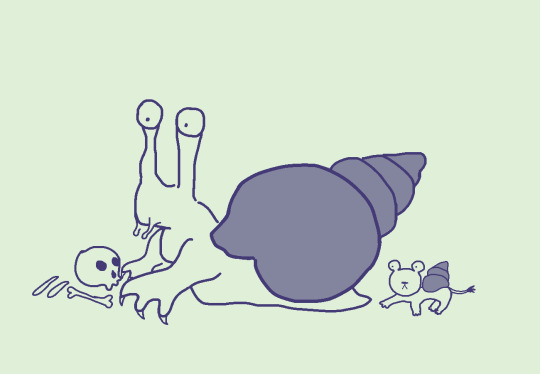
@mobileleprechaun (link to post here) has given us what I think is our only invertebrate Wutugald by interpreting the rigid spine as a shell and the single tooth as a radula. Shown here with its half-lion offspring.
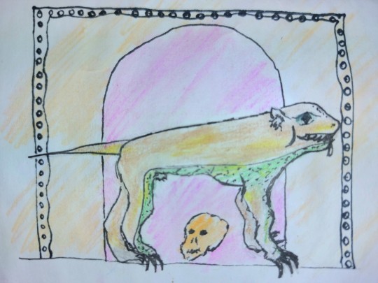
@illogarithmil (link to post here) has also taken inspiration from medieval bestiary art, noting the unusual color and perspective choices typical of the genre. Note the straight tail, the skull, and the doorway in the background -- presumably into a tomb of some sort. The diamond-pupilled eye is striking.
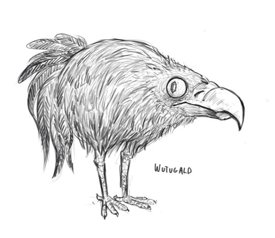
@qwertyprophecy (link to post here) gives us this Wutugald who manages to strike an excellent balance between "cute" and "villainous". Like, I would expect to see these hopping around to signal that the Protagonists have entered the Sinister Fantasy Kingdom, but it's also kind of adorable. I think the gemstone pupil helps with that vibe. Vulture face is for easier eating of corpses, I assume.
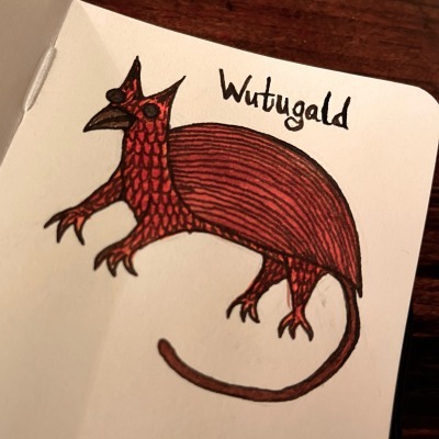
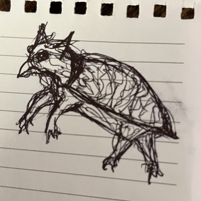
@aaclysm (link to post here) provides both a final version and a "messy bus sketch". We can see the stone-like eyes, the single tooth interpreted as a beak, and the rigid spine interpreted as a carapace. Kind of griffin-like vibes, which I'm enjoying.
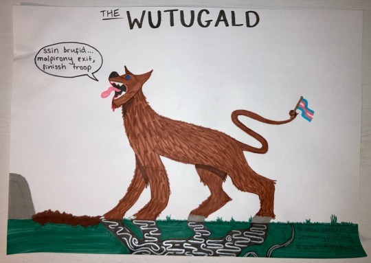
@scarlettbookworm (link to post here) gives us this drawing, which has some delightful details. I like the lines on the shadow, which I assume is meant to indicate the magical effects associated with it. Also love that the Wutugald's ability to change sex is acknowledged by giving it a little trans-pride flag to wave with its tail. I believe the text in its speech bubble is intended to be word-salad, demonstrating that it imitates but does not understand human speech.
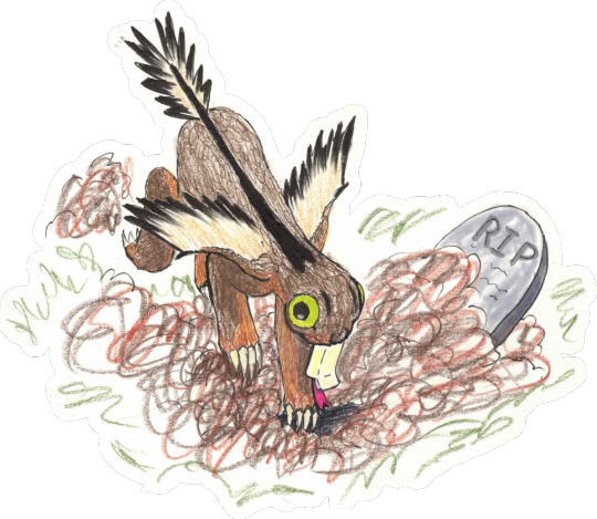
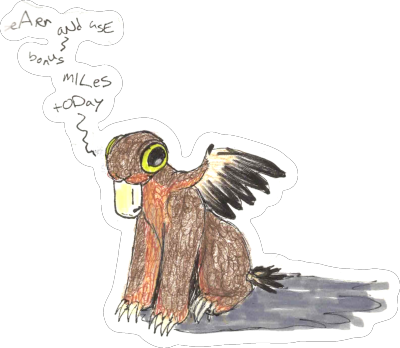
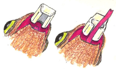
@pachelbelsheadcanon (link to post here) gives us another very cute Wutugald. (More of these than I expected are downright cuddly.) I'm particularly delighted by the attempt to take the whole "single tooth that closes like a casket" thing at its word and make it work. They provide in their post an explanation of what's going on with that and some other interesting zoological details of their creation. I also enjoy the idea that the Wutugald talks like bot-generated spam.
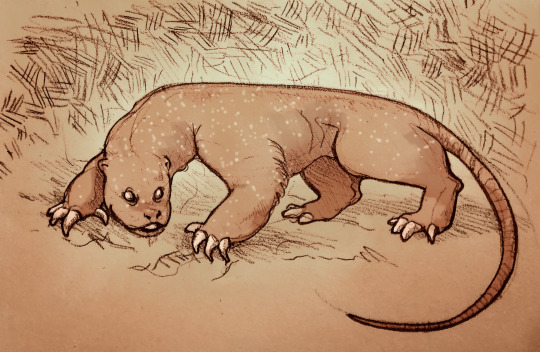
@changeinenthalpy (link to post here) has produced this fairly-intimidating-looking critter. This definitely looks like something that could dig up and eat a corpse if it wanted. Nasty claws on that beast. The shiny gemstone eyes give it an unsettling gaze also.
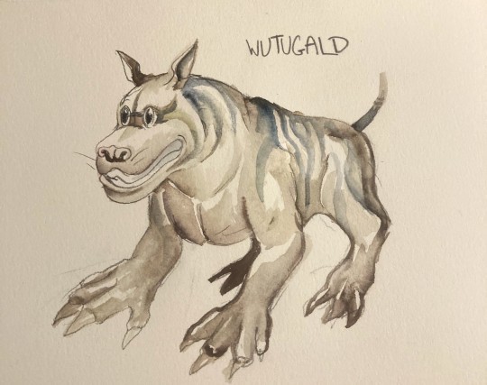
@aethergeologist (link to post here) gives us this creature, which I both want to pet and also want to keep a healthy distance from because those claws look like they could mess you up. They provide an explanation for their design choices in the linked post.
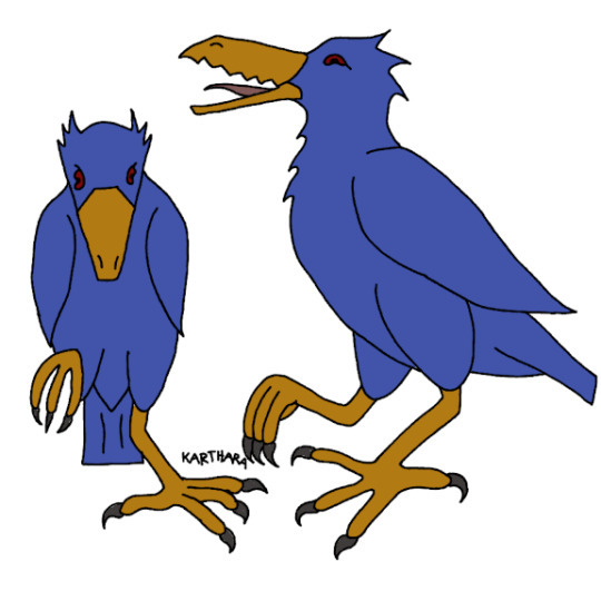
@karthara (link to post here) has added to our store of avian Wutugalds, and includes a brief explanation of their design choices in the linked post. I like how happy it seems in the side view -- all excited about its corpse-digging plans for the evening.
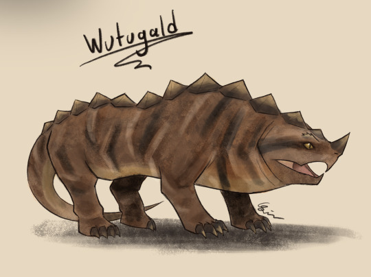
@moustawott (link to post here) created this delightfully prehistoric-looking beast, and provides a detailed account of their design choices in the linked post. I think the snapping-turtle face really works here, and this is probably one of the most dangerous-looking interpretations of the Wutugald.
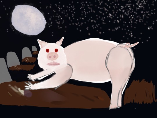
@cattorneyatlaw (link to post here) has drawn an unusually porcine Wutugald. Probably one of the spookier pig drawings I've seen. They provide an explanation of their design choices -- including "why a pig" -- in the linked post.
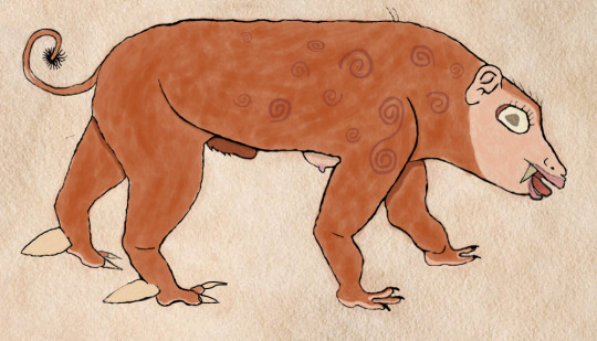
@curiouslyodd (link to post here) has given us a Wutugald with a very unsettling face and an interesting fur pattern. In the linked post, they not only provide an explanation of their design choices, but also a detailed and well-written reinterpretation of the bestiary entry based on the animal as they have drawn it. Go check that out.
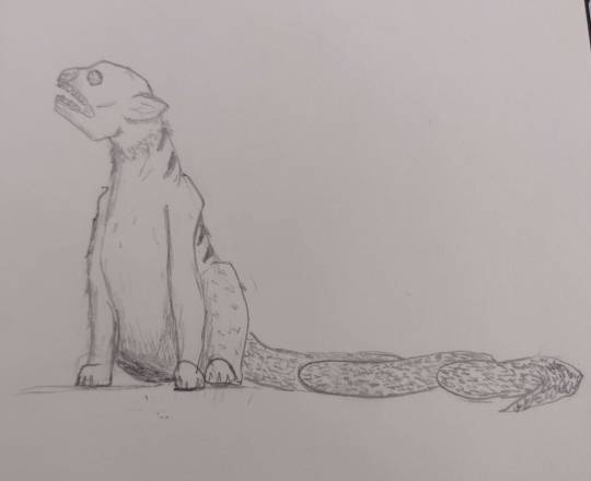
@treesurface (link to post here) has done an interestingly chimeric Wutugald, and includes a brief explanation of their design choices in the linked post. I like the head particularly.
And... hm. We're not going to be able to fit all of the images in one post. The limit is thirty, right? Stay tuned for a bit, I guess. The remaining Wutugalds will be in a reblog of this post, along with the reveal of the animal's identity and the Aberdeen Bestiary's interpretation of the creature.
201 notes
·
View notes
Note
I absolutely ADORE your art style!! I've really wanted to draw my own twst OC, but I can't draw, and I'm trying to learn how. Do you have any tips on how to get started or any anatomy bases that I can try to learn? No pressure! Have a great day!!
hello! Thank you so much for the kind words! 🩷
And as for your question, I'll try my best to explain, as I don't really have the time or resources to give a visual explanation. I hope that's alright! ^^;
as a basis I would suggest you start from the very basics in order to be able to get the hang of anatomy. A good way to do that is by practicing how to draw mainly cubes and cylinders in different angles. You'll also find many tutorials or free websites from esteemed artists that teach you how to add flexibility to these otherwise static shapes, like how to draw a 3d rectangle as if it was twisting— which you will then be able to translate into a person's torso later on!
References are also important, obviously. You can go to websites like Line Of Action or Bodies In Motion for dynamic poses, or even just search on Pinterest for some poses to practice with. Break down the bodies into simple 3d shapes atop each other, practicing on how to angle them or implement them into the line of action needed to draw whatever pose you want (the line of action being a dynamic line that helps you determine the movement of the body and the flow of the captured motion iydk)
You will need to practice with this a lot until you gain the confidence to exaggerate the movement and master how to make the flow of movement look natural and dynamic, the confidence in your lines will improve with time as well. Another suggestion is also seeing archives from animation studios like Disney or gobelins to see what their sketches look like and imitating them to get a good idea on how their lines were drawn— the facial expressions and their exaggerations will also help you gain a primary idea of how expressions can be presented, and in the future you can make it more natural if you'd like, depending on your preference.
Aside from that, the internet also has no shortage of tutorial videos on art basics and anatomy tips— just know what to watch first so that you don't stress yourself out on things you still haven't mastered :) (let it be known that "mastered" doesn't necessarily mean that it has to be art museum levels of perfection— what's important is what you are comfortable with and consider to be your favored result or style) :]
I wish I could have given a more in-depth advice, but I'm self taught and half of the things I picked up or learned were from more than a decade of practice and under my belt,, I pretty much grew up on the internet, so i would always try and copy drawings that I really liked so I can try to the best of my abilities to reach their level, and the more I practiced, the more the basic idea gets fixed in my mind, and I can implement it in a different way in my own original drawings!
I'm still personally re-learning drawing basics as I'm now in my first year of fine arts, so even I have some room for improvement. It's very cliche of me to say, but the more you practice and the more resources you look into, the more opportunities you will have for improvement and learning :)
22 notes
·
View notes
Text
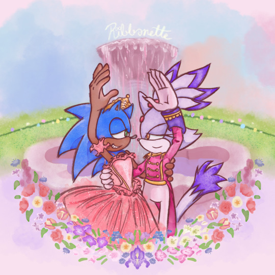
Tribute to one of my favorite movies of all time + the franchise that has me in a death grip 💖
a bit late for Christmas but at least Valentine's day is around the corner ^^;;
Process below if that interests you:
AS I SAID EARLIER, I had been working on this piece as early as December of 2021 😱!!!
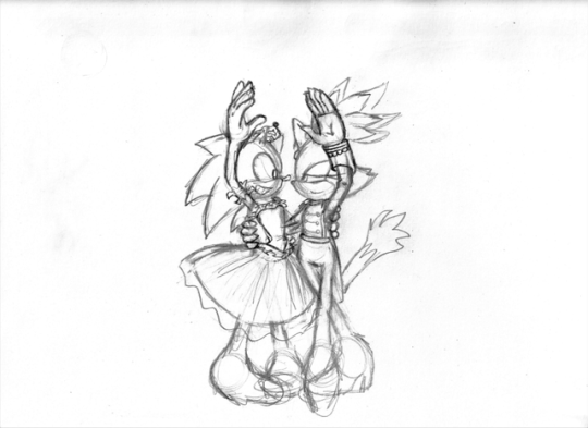
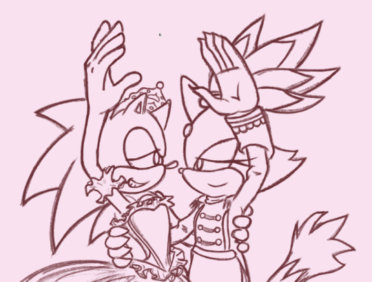
This was the original sketch! I was inspired after learning about Blaze's own design inspiration coming from Takarazuka theater, as well as it being the Nutcracker season so this film was in bouncing around in my head.
and this was allllll the way back in 2021 ^^; I had put the idea to paper to capture the image in my head immediately. But the idea in my head was extravagant and beautiful and would certainly take time to complete, as well as the patience and skill to work with watercolor 😔 I've certainly done my share of watercolor, both physical and digital, but I still feel like my physical watercolor work is a fluke, and I was still a novice digital artist at the time of this sketch.
In short, I wasn't confident my skill could live up to the vision.
So I would put this on the back burner. It wouldn't be ready in time for Christmas, and I could use this as an opportunity to hone that digital art experience so it could be ready next year!
2 Years Later...
It's December 5th. Fuck it. Let's crack this open again, I tell myself.
SO starting with the line art, it's actually 2 different brushes layered over one another.
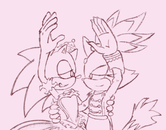
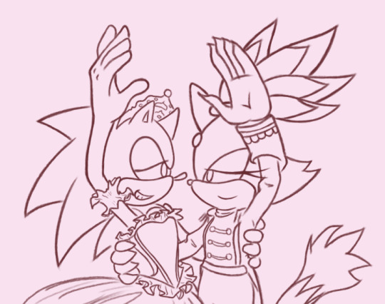
I also changed Sonic's expression to be more love struck-looking, because I'm a sucker for romance.
The image on the left is a watercolor line brush, while the right is a pencil brush. The reason I wanted a water color look was because I thought it would make the illustration look dreamy and fantastical, and I wanted that to extend to the line art as well. However, my usual lines on traditional usually veer more towards thick and cartoony from years of studying the Sonic art style, so I really felt like I was working against myself here. I had also asked friends for their input and they preferred the lines on the right as well. If my followers actually do read these blog posts, I'd love if you could comment which line art style you prefer drawing or looking at.
The happy medium was to just combine the 2. Here's a better look at that:
I like it! I think it combines the solid line with the rustic water color grain. Best of both worlds :]
For the actual painting, The most notable thing I can say is that getting the right pastel-y color was VERY difficult to achieve for someone like me who often loves to use bright and saturated colors in her art. I feel like I really set myself up to do one of those "evil art style" or "opposite art style" challenges I've been seeing around. I had to repaint Sonic at one paint because the blue of his fur was WAY too saturated for the style I was going for:
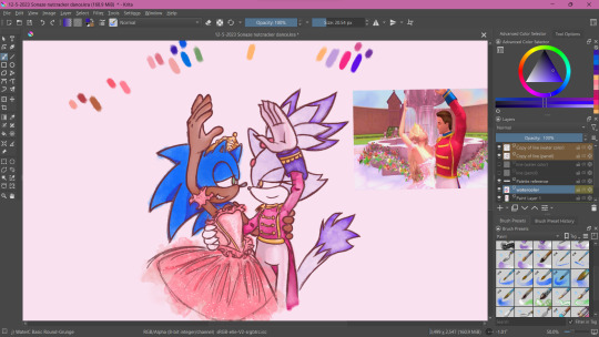
I started with painting Sonic and Blaze in first and then working on the background. I think that's probably the backwards way of doing it but one of the perks of digital art is you can do stuff any order you want when you have layers.
The background wasn't actually as difficult as I thought it would be. I wasn't going for any difficult perspective, and I was using a reference so that could be it. I'm usually averse to backgrounds but I really wanna tackle more of my weak points in art. I actually had way more fun than I was expecting, painting the sky and adding texture to the grass. I think I had the most fun rendering the water coming from the fountain (which you can't even see too well anyway, lol).
Funny enough, I had just about finished painting the characters and background by early January. So why am I posting this in February?
The Flowers...
In case you don't know. I love flowers. I love looking at them, I love learning about flower languages, I love drawing them. so seeing that my reference image showed flowers circling the fountain, I was excited! I was already having more fun than I expected to be having (working against my usual style, rendering a background), so how could this be a pain in the ass?
Well, I am my own worst enemy 😞I couldn't exactly identify each flower offhand from this screenshot alone. The texture of the flowers is kinda grainy, since I don't think the animators were expecting viewers to look too closely at the set piece to use as reference for my lovingly crafted crossover fanart. If anyone has this in high quality though, please tell me.
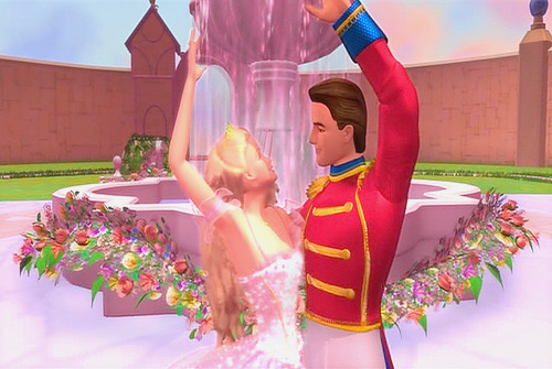
(I think I actually got this reference from a tumblr post but I can't find it on my blog for the life of me nor can I find it in the tags I'm so sorry)
I'm a huge stickler for details so I really wanted to be as "accurate" as possible in my illustration. I can hardly identify some of these flowers with confidence. I think there are roses in there? or tulips? I'm not sure if those yellow flowers are roses or some kinda petunia or if I'm way off.
I'm sure these details won't matter to most viewers but it was EATING AWAY AT ME. Eventually I decided to try drawing in flowers that might look similar to the ones in the reference. Or some based on their flower languages. I was certainly overthinking it ;;;; It led me to going "fuck it" and just throwing in whatever I wanted. There are no irises visible in that screenshot but I made it the centerpiece of the flower ring. Who give a shit.

I made some guides for me to follow: The blue ring was so I could make sure the flowers make a half circular border around Sonic and Blaze. I was envisioning how it could look as like an icon or sticker or something, which is why it's framed this way. then the second guide is the sketch of the flowers I made. I always do line art and I'm not great at just improvising with color to paper, or color to screen in this case.
The rest of this process is then just working on each flower piece by piece (with the help of the mirror tool of course) with varying degrees of detail. Some flowers are more abstract than others, and I had debated if that would look jarring and disrupted any kind of harmony I was trying to maintain with the style parameters I set for myself. And then I decided I was overthinking it once again which is why this was taking me nearly 2 months to complete.
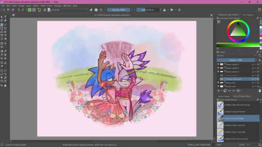
At some point during this process, my wifi went out for a whole week! Of course, I could still work on this illustration offline, but I had a lot of tabs open with a bunch of reference images on there (plus I like to listen to music while I draw otherwise I lose focus and I had neglected to download a varied selection on my phone or laptop 😭 Learn from my mistakes).
The most tedious of this process was making each set of gladioluses a unique color.
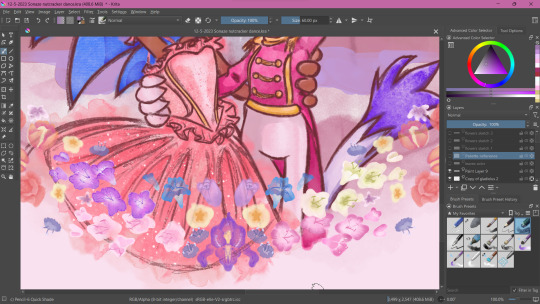
Was it worth it? You tell me! I think they're pretty, at least.
Along the way, I repainted the grass because it wasn't symmetrical (It didn't need to be but I had been using the mirror tool for a lot at this point and it was bugging me). I made other little final adjustments, like color adjusting the leaves on the flowers, lowering the flower ring border, and so on.
Ultimately, I'm extremely satisfied with the final product. I had my heart set on doing something like this for a long time. I had so much fun just experimenting throwing on color or not worrying about technical stuff. Of course, I did do what I usually do and overthink it at some points, but I'm working on it!
I've wanted to do an extremely indulgent AU illustration and other drawings for a Sonic x The Nutcracker story for a long while. I will be totally honest, I'm still a little embarrassed to share stuff like this, even after years of posting fan art online. It feels like the more self indulgent something is, the more people might judge me for it ^^; But I wanna practice what I preach and kill the thing inside me that cringes at my harmless attempts at joy and whimsy.
I would love to do some more drawings for this AU, but maybe post them around December when it would be more seasonally appropriate. I hope you'll stick around for it!
If you read this whole thing to the end, thank you. Whether you follow my blog or not, I hope you have a lovely day :3💝
#Barbie in the Nutcracker#Sonic the Hedgehog#Blaze the Cat#Sonaze#Jess's Digital Odyssey#Sorry for not posting frequently it may happen again
83 notes
·
View notes
Text
An update, sort of?
It's been ages, years? since I've posted to my tumblr. It was a mixture of getting frustrated with fandom drama, and depression over my art and writing. It's easy to say I just haven't posted long enough to build up an audience, etc, but I've had a lot of failed starts on social media with my art over the past near-decade and the lack of traction has made me reach the point of an intense, deep depression. As ironic as it is, I almost resented that people like my fanfiction; why are people reading that, but no one is interested in the art and writing I'm actually passionate about?
I love MDZS, and I enjoyed writing fic for it, but I'm far more interested in writing original stories. If I think that Jin Guangyao's background is interesting (for all that he lets himself become a monster), or have my interest captured by some of the new dramas featuring eunuchs in more diverse roles than the traditional villainous roles, I'd rather sit down and write my own story about those themes, not just hop around between fandoms.
I always tried to reblog stuff from my artist-tumblr to this one, but it never really made any difference. Anything I posted about outside of fandom metas flopped. Some people seem to be able to endure this, but I just couldn't. It hurt deeply in a way that I can't explain; every time I tried to post anything to social media, or even logged on, I was filled with this gaping hole of dread.
I do still want to upload what I have written of my fanfics; anything which I've started posting is either complete or at least halfway. I may still pick those fics up and finish them, too. Who knows.
But overall I'm so much more interested in original writing and art. Writing fanfic for MDZS was a rare event for me, because I love that novel so much that I couldn't let it go after just finishing the novel/radiodrama/donghua.
I'm writing my own novels, and am trying to figure out what the hell to do with them (self-publishing seems most practical, but also dubious for someone who has no social media skills whatsoever). I also am experimenting with a website where I am able to make much more detailed posts about my interests, though it is still in early stages.
So far, this post is the one I'm most proud of, if anyone is interested. I am deeply fascinated by shoujo manga and its history, and wrote this post trying to chronicle how the iconic art style developed. It was a huge amount work to research, write, and lay out the visual examples for this post, and I'm incredibly proud of it.
I don't really know what to say or how to end this, so...there you are.
20 notes
·
View notes
Text
YEESSSSS IT FINALLY CAME IN

i stg i was so scared these wouldn't show up, last week stupid USPS listed my order as 'delivered' when it very obviously WASN'T so that resulted in me having to call the post offices around town and then finally the main offices to put in a support ticket to investigate what was going on BUT like 45 minutes later it showed up so I can assume they found it somewhere it wasn't supposed to be and got it to the correct location this time.
ANYWAYS! This is a really cool self-published tarot deck that I saw advertised around months ago when it was still in production, usually I'm a little sus when it comes to item advertisements online but when I checked out the seller, this seemed to be a pretty reputable Etsy creator who was simply creating a tarot deck themed around Majora's Mask!
Majora's Mask is still, to this day, one of my favorite games of all time, and this deck beautifully merges my love for the game with my love for tarot reading.
Like with the vast majority of tarot cards, the art is the focal point, both in design and thematic messaging. Some card decks fail to express their card meanings, others fail to look appealing or unique.
This deck passed both tests with all the flying colors of its presentation.
It's very simple in execution, with the art contained within black borders that designate its suite/title and number, but that leaves all the room for the art to be appreciated. The artist has done a wonderful job capturing the original style of the game, as well as the themes of the cards themselves. Every single card design is unique, and you can really tell the creator deeply understands both the art of tarot reading and the intrinsic themes of Majora's Mask.

I'd love to do a more thorough video breakdown of the cards in this deck in the future, but for now, take this brief 10/10 rating from me, this was absolutely worth the money and wait! And it turns out I was real lucky too, because it sold out FAST on the seller's Etsy, but I'm hoping that means it was successful enough that it'll be stocked again in the future for anyone who wants to get one for themselves! It's not only a beautiful display of craftsmanship and passion for Majora's Mask, but a very fun deck to read and use ( ´ ∀ `)ノ~ ♡
45 notes
·
View notes
Text
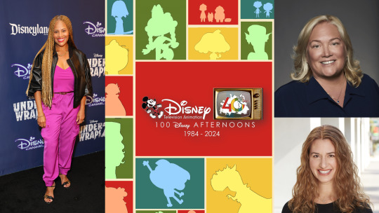
Variety Interviews Ayo Davis, Meredith Roberts And Emily Hart On Disney Television Animation's 40th Anniversary And What To Expect On From The Past, Present And Future
40 years ago, Disney TVA was founded on the heels of challenging outcomes with features “The Fox and the Hound” and “The Black Cauldron.”
Initially, Disney TVA was restricted from using established Disney legacy characters, but nevertheless had huge successes with new shows like “The Wuzzles” and “Adventures of the Gummi Bears,” both of which became popular in syndication. As time went on, DTVA was able to use its limited rights to create shows like “DuckTales” and “TaleSpin,” which featured Disney characters. Today, the slate has evolved to include shows that travel across Disney’s streaming, linear and digital platforms, including Disney+, Disney Channel, Disney Junior and the Disney Parks
Over the 40 years of the studio has collaborated with Walt Disney Imagineering to bring beloved Disney Afternoon characters to the parks as well Mickey And Minnie's Runaway Railway and AquaMouse for the Disney Wish and Disney Treasure cruises from the Disney Cruise & Ships Line as well collaborating with Disney Yellow Two Shoes Team to redesing some heritage characters for the WDW Passholder Magnets.
Disney TVA characters also have gone to the realm of live action. In 2019 Disney Channel brought Kim Possible to the live action world as a Disney Channel Original Movie in 2019. In Spring 2022, Walt Disney Studios brought Chip 'n Dale: Rescue Rangers to a new generation of fans trought a meta-driven live action/animated hybrid film which won an Primetime Emmy Award for Best Feature Film.
In April 2024, it was announced that Kiara from The Lion King II: Simba's Pride created at Disney TVA will make her live action debut on the motion capture/computer animated film "Mufasa The Lion King" with the character being voiced by Blue Ivy Carter. In Fall 2023, it was announced that Blumhouse Television and Atomic Monster where developing a live action reboot of Gargoyles for Disney+.
The future of the studio looks bright as the studio is slated to debut it's 100th show overall "StuGo" in 2025, as well new interations of beloved classics like The Proud Family, Phineas And Ferb, Sofia The First and Darkwing Duck trought revivals,reboots and spin-offs in the coming years with early talks of new interations of TaleSpin, Kim Possible and Recess since Early 2023.
“We have a wildly diverse development slate because we don’t have a house style,” says Meredith Roberts, executive vice president, television animation, Disney Branded Television and CEO of Disney Television Animation “Our styles are creator-driven, so that allows for real support of the artist or creator to fulfill his or her vision. Anything is possible, whether it's CGI. (“Monsters at Work”), hand-drawn 2D (“Big City Greens”,"Primos","Hailey's On It!"), rig-based 2D (“Moon Girl and Devil Dinosaur”,"Kiff") and stop-motion (“Mickey Saves Christmas”,"Rhona Who Lives By The River".). Roberts continues, “We really try and solve all the problems and develop it. We look at the scripts and the story arcs. Every project has to have a strategy behind it that will complement the slate and separate it from other things. Each project has a distinct swim lane to attract an audience. And we’ve learned to meet the kids where they are, in terms of streaming and YouTube.”
Co-viewing, the viewership that happens when adults sit down to watch a DTVA show with the kids in their lives, is part of the studio’s secret sauce and long-term strategy. Many of the shows are written with jokes and plot points for both audiences so both groups will return.
“We double down on the kids and family space,” says Roberts. “We’re not just dipping a toe in the water. We’re diving in. I think we’ve seen a lot of churn with the competition, who just don’t have the patience to develop and are for this audience, which is a very specialized kid audience and co-view audience.” ("The Witchverse", "Rhona Who Lives By The River","InterCats","Fantasy Sports") Roberts reflects: “I think one of the things I’m most proud of is how stable Disney TVA has been for the last 40 years despite a lot of outside churn of the animation industry. Many of our crews feel that Disney is their forever home. I think the excitement they have to illustrate and create with this brand has been terrific because it’s harder to be funny and clean. And nowhere are we tearing down people to get that laugh. I think that’s the beauty of a Disney animated show.”
DTVA also sought to meet kids where they are by making their audience — which is made up of the most diverse generation in history — feel seen, with series such as “Elena of Avalor,” which featured Disney’s first Latina princess, and “The Proud Family,” franchise focused on the life of a teenage Black girl.
“We do have an amazing insights team that are constantly in the field, giving us general information about how kids are watching content, what they’re into,” Emily Hart (VP of Current and Development - Disney Junior) says. “Some of those things are evolving, as we know the ways kids consume content is changing. But there are some universal truths about kids, and it’s great to have that reinforced. Kids still like a lot of the same things that we like. So, there’s a combination that we’re always tracking with every new idea, and we do pilot testing. We get to sit down and talk about the content, and we invite our creators in so they can see the kids talking about it because they’re the audience and they’re the truest test of if the story is going to work.”
Ayo Davis, president of the Disney Branded Television and VP of Current and Development at Disney Television Animation says the division is a “driving force” for memorable kids and family entertainment.
“All of us at Disney Branded Television are so proud of the studio’s 40-year legacy as it continues to entertain future generations with shows like ‘Kiff,’ ‘Big City Greens’ and ‘Mickey Mouse Clubhouse 2.0" --- Davis says.
Those creators who come to DTVA often stay for a long time, partnering with the studio on a variety of different projects or expanding on a hit and reimagining it for the next generation of viewers. “The Proud Family” was a standout in 2001 on Disney Channel. Creator and executive producer Bruce W. Smith is now working on the Emmy-winning “The Proud Family: Louder and Prouder,” which is based on the original series. The show follows Penny Proud as she navigates family life and her own childhood.
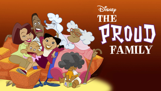
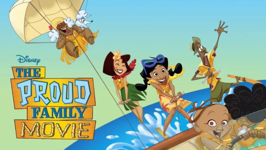
“Being at Disney TVA has allowed me to realize all my artistic dreams,” says Bruce W. Smith. “As a kid, you always have hopes, thoughts, dreams, ideas and characters that can help lay out those ideas in your head. Disney has allowed me to really tap into my creative instinct, at the end of the day, you have to learn how to trust yourself. Meredith Roberts has been a true shepherd for me in all of this, allowing me to stretch my wings. Because of her belief in me and my ideas, she’s really allowed me to blossom as an artist. All that happened at DTVA.”
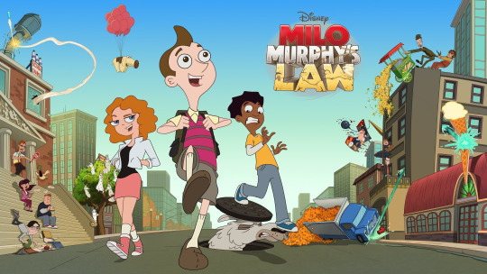
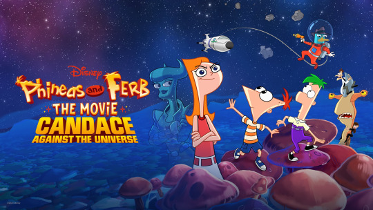
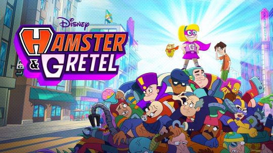
“They really seem to be a place that welcomes your ideas,” Dan Povenmire says of Disney TVA. “They want to find people with real strong ideas of the stories they want to tell, and then they let them tell those stories for the most part. They seem to put storytelling and characters over anything. With [‘Phineas and Ferb’], we would write jokes for the kids and the adults in the room because we knew the adults would be there too. We were just careful not to do any double entendres.”
#Disney Television Animation#Disney TVA#Disney TV Animation#DTVA#Ayo Davis#Meredith Roberts#Emily Hart#Dan Povenmire#Bruce W Smith#Gravity Falls#Big City Greens#Amphibia#Primos#Disney Primos#DuckTales#DuckTales 1987#TaleSpin#Darkwing Duck#Fantasy Sports#The Witchverse#InterCats#StuGo#Gargoyles#The Proud Family#Phineas And Ferb#Milo Murphy's Law#Star Vs The Forces of Evil#The Owl House#Kiff#La Familia Avenúñez
28 notes
·
View notes