#Its concept design time bitches
Explore tagged Tumblr posts
Text
Alright ( cracks knuckles, neck and pops my knees )
Concept designs for Manwë and other characters in the Hero!Ainur-Au begins... Now.
0 notes
Text
burnout from genshin is SO REAL. i keep finding flaws in this game and so so many things that i wish had been designed differently
#star rail appeals to me a lot more in stuff like qol and game design overall but its so grindy and at the same time it makes up for like 20#minutes of play time a day#like not enough#i like grindy rpgs but fuuuck the artifact system is so annoying#and idk genshin has just been feeling too lighthearted?#the character designs are kinda boring and i dont like the writing at all#quests are tedious#star rail does quests 10× better#the summer area event was so boring i think that really drove the boredom home for me#they have so many cool characters concepts and they do nothing with them#theyre all 2d slates#rant over ig#oh wait they also fucked up the underground overlay map its a bitch to navigate#txt
0 notes
Note
Can we see a c! Wilbur design maybe? (If you're chill w/ it) Or Technoblade and Philza?
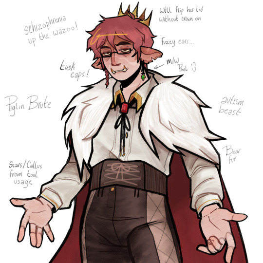
I’m planning on doing a whole separate ref for Wil at some point so I will do both Blade and Philza for you… im really really normal about Techno like really serious I promise you. ( <- lying through his fucking teeth. ) LOTTTTS OF DESIGN PARTICULARS WITH HIM. I deviate a lot from his skin ( for one I get way too engrossed with drawing animals so humanoid it is. ) but I make his outfit more errr. Flashy…? Also southern inspo all over this bitch. as a southern man myself I am forced to give him ( modest ) matador esque pants and a bolo …. I think putting him in that is hilarious cause the closest things piglins have to bulls are fucking hoglins LMFAO. Imagine him in a Nether rodeo … terrifying … Away from design in general I love his character sooo much. I think its important to keep his funny nerd qualities when designing him. Like techno is a beast with technical skills and combat but if you ask him to sit in a room with more than about 3 people he starts sweating. Make him a little loser guys … hes got like one friend total and lives in the middle of nowhere in the snow as a Nether mob. Nothing normal about him. No bitches and no gains …
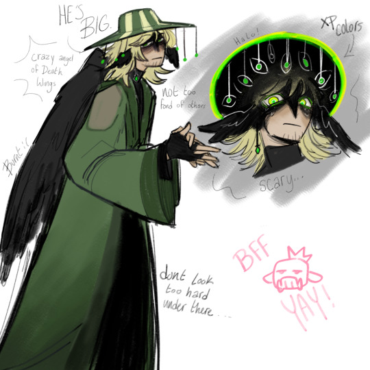
PHIL …. ghh … I have an unpopular take on him because i dont find him very fatherly. Hes more like an estranged uncle who dgaf about his kids. Shanks from one piece if you will. As much as I like his dynamics, for his character I feel like people are constantly glossing over the fact he isolates himself on purpose away from everything and everyone so he doesn’t have to deal with it … Him and Techno are so close because 1) They’re both crazy fucking good at everything and 2) Neither of them WANT to interact with others outside of themselves usually. Techno most often times only talks to people for his own personal gain or when he has no choice … Philza just get dragged into everything cause Wilbur is like a damn blight on the world. IDK! I wish people made him more aloof or terrifying because the concept of him is so genuinely freaky like hes got spies everywhere all the time and could or could not be immortal or some sort of biblical creature like THATS SCARY!!! I tried to mess around with him being green and the Minecraft equivalent of souls ( exp drop when you die ) being the same shade-ish …. Hes just some eldritch horror to me. Not explainable by mere words…
#drawntracks#dsmp#technoblade#philza#emerald duo#theyre also kind of qpr#In a really specific immortal ‘I can meet anyone but still only know you’ type way#Sorry Phil is so lack luster its hard as shit for me to visualize what he is in my brain into reality.#Ill get it better one day#trust#I love drawing Tech he is so special to me eu eu eu#Lwk need to get on my preyduo grind I used to draw them constantly#FOR ANOTHER DAY THOUGH!
909 notes
·
View notes
Text
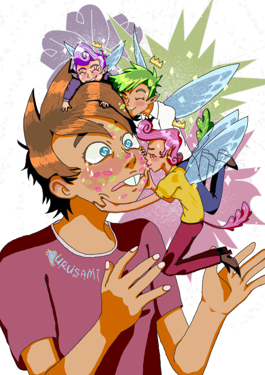
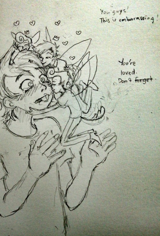
"You're loved. Don't forget."
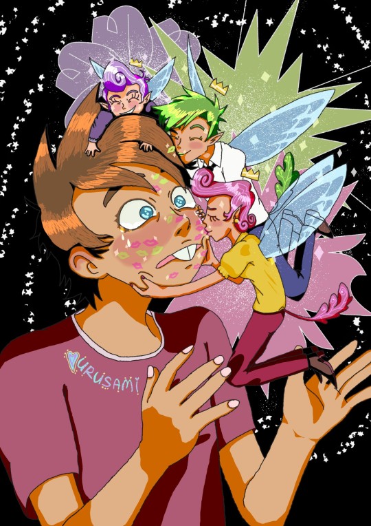
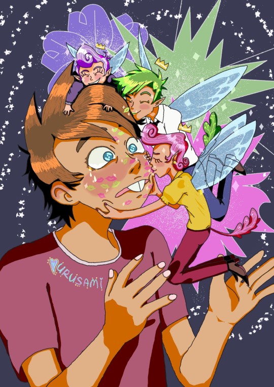
More ramblings and concept art below lmao.
I am devastated on thinking Timmy's fate in the series... I won't put my faith that they will handle it well, so I'll just indulge in fanworks to fill in this void. If they ever do it well one day, then I'll be there for the encore.
For now, I think you'll see a lot of somewhat depressed art on FOP for a while lol. Not continuous mind you! University is a bitch to get through. Whenever I'm free that is. Which is on long stretches of time unfortunately... Still, when I'm not posting trash, I'll be around observing quietly. You can guarantee that at least.
The work this time is inspired by @xblubotx (the adopted parents kissing Timmy one so cute omgosh) and @cubbihue FOP AU (sorry I have not memorised your AU yet). I admire that Blubot can adapt the FOP artstyle so well lmao. It'll be lightyears before I can do that 😭😭😭. Also, their Timmy fanarts break my heart, thank you. For the fairies design, I took inspiration from Cubbihue's AU. I think it's cute that they have tails, but there's not much I can say regarding their AU since its still developing. Take your time on that and have fun by the way.
The context for this one is just that Timmy is embarassed that Cosmo and Wanda are giving him the affection he is missing out from his parents. Poof is laughing from Timmy's embarrassment lol. (Not using Poof's new name because that is not that iteration of his character.) Timmy got a lot of fairy dust to remove from his face on that day...
Hm, are there side-effects to fairies kissing a mortal (on the cheeks hehe)? I kinda wish there was a comprehensive mythology book for stuff like that. There's some sources where I read that fairies kissing humans can actually result in their soul being whisked away to the other world (essentially dying yeah) and some sources say that fairies kissing you means its their way of marking territory or for good luck??? I wonder where those myths came from... but it is fascinating to think about. I guess Timmy will die young then /jk lol.
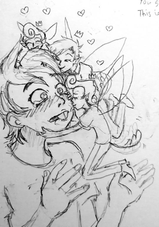
I got input from my younger sister that a darker color background is better than the dark blue one I used initially. I'm quite unsure on this, so I'll just post them all... I also don't think I nailed Cubbihue's AU on the fairy sizes... It's hard to accurately draw characters on a specific scale for me... Oh well, I can practice more. This took me 3 days at least. Also, here's a png version of the piece and two photos of the concept sketches.
I think that's all I want to yap about. Thanks for reading and have a nice day. See you when my homework isn't killing me.
#the fairly oddparents#fairly oddparents#fop#nickelodeon#timmy turner#wanda fairywinkle cosma#cosmo fairywinkle cosma#poof fairywinkle cosma#fop timmy#fop wanda#fop cosmo#fop poof#fanart#nickelodeon fanart#cartoon fanart#infinite painter#usagifuyusummerart2024#digital art#fairy#fairies#fanart 2024#post and tags might change#oh yeah i forgor the reason timmy doesn't have his iconic pink hat is because i couldn't figure out a way to put it#with Cosmo and Poof in his hair lol
425 notes
·
View notes
Text
so sick and tired of people pitting two bad bitches (art nouveau and art deco) against each other. yes, they answer the same question (i.e., how can art respond to the industrial revolution?) in fundamentally different ways (i.e., by returning to nature / by embracing technology), but the difference is, to some extent, only superficial. art nouveau didn''t reject modernity, it very much looked at the present and the future while striving to find a balance between art and craftmanship and industrialization. similarly, art deco didn't reject the past but, rather, held on to many art nouveau concepts while also being inspired by ancient civilizations (e.g., egyptian and aztec) reinterpreting them in its celebration of modern technology. as a result, both art nouveau and art deco engage with the concerns of their time and reflect on the culture of industrialization and come to the same conclusion: in order to oppose the qualitative decline of art and craftmanship in a highly industrialized world, the gap between architecture, design, and art must be bridged
6K notes
·
View notes
Text
I’m going to assume that at this point you’ve all seen Critical Role’s new show Candela Obscura and at least skimmed through the Quickstart Guide (you have done all that riiiight??) So I wanted to compile all the things I’ve done that have been shown so far. Its long so read below the line!
I’m going to try to avoid spoilers. So feel free to read without worry. I’m also going to try and avoid breaking any NDA like a good professional. So I will not be doing some deep dive behind the scenes thing. Only visuals that have already been publicly shared are going to be on here
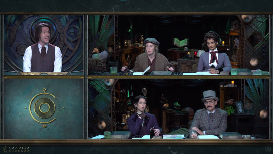
The very first thing I did on this show was the concepts for the main set. Everything is practical. Nothing is green screen or cg or whatever. Some people think it’s just good cg but nope that's all real. You could touch it! (don’t touch it, there are ghosts)

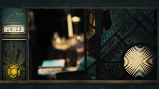
There were multiple iterations on the design, each with their own vibe and statement piece. CR narrowed it down to what you see in the show: a sort of storage hall with an odd clock contraption behind the GM. I think I called this design version the “Abyssal Hall” or something like that (I gave the different versions names to better keep track of which design was being discussed)
The company Flip This Bitch built the physical set. They turned my silly little art into a real thing. So they did all the actual magic of making this set come together in the end! They deserve a lot of the credit for it looking so good in the end.
Also that little piece of art in the bottom left of the preshow is a section from the final concept art of the set.


That contraption behind Matt is based on astrolabes and clocks. This isn’t really meant to be a literal astrolabe or a clock as we would use them in our world. Narratively this isn’t a device that measures either of the things that a traditional astrolabe or clock does. This is a special magickal tool that does a secret third thing.

Also I did concepts for the GM screen. You don't really see it besides in the fancy-shmancy preshow. There were a number of more intricate designs for it but CR went with the simpler option since the only part that would be visible on stream is the top, so that's where I put the most detail.
I should also note that I did not design the logo! It’s pretty prominent on the GM screen but I was supplied an already existing logo for this.
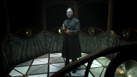
NEXT is the Taliesin enclosure set that you see in the trailer. This is actually meant to be like the lantern room on the top of a lighthouse, minus the big light beacon (You could say Taliesin is the beacon).
Also in the trailer you see a couple brief sketches I did for some world building concepts:
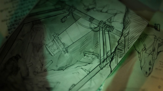
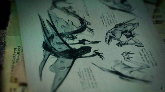
Speaking of sketches there are a number of art pieces of mine in the Quickstart guide
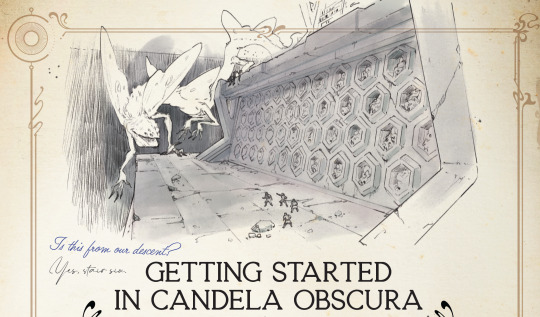


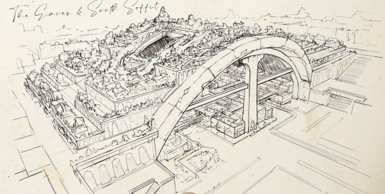

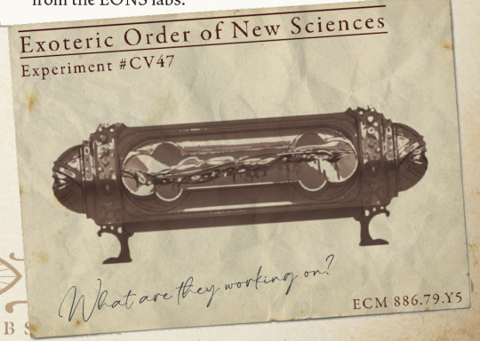


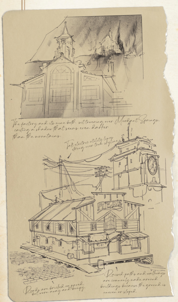
A lot of my art is sketches. They’re all meant to be like notes and drawings from members of Candela as they travel and notate their findings. Most of the notes on these sketches are my actually my notes when I was doing world building concepts, but they replaced my handwriting with a font because my handwriting sucks lmao (also likely for ease of future localization).
Also the cover of the Quickstart guide uses line art of a part of that astrolabe clock set piece. This line art was part of the deliverables that was sent over to Flip This Bitch for construction. They’re just using pieces of those set concepts everywhere!

As you can see I’ve done a lot of art for this project. I was part of this project when it was still early in development. It’s changed quite a bit from where we started.
I wasn’t the only one that made all this art happen though. Other artists, writers, and designers got to add their own vision to this. It was very much a collaborative effort that took a long time to happen. It’s very exciting to see everyone’s hard work come to fruition and there is a lot more to come!
#candela obscura#critical role#my art#ttrpg#illustration#art#cr#candela spoilers#I could say a lot about what went into each thing#but that would be too long#this is already too long#more art is coming#you’ll see it in the final release of the rules/setting book#also it’s very likely a significant amount of art won’t ever be show to the public#such is the life of a concept artist
1K notes
·
View notes
Text
TEAM BUILDING ACTIVITIES 👯
s/o to @powerful-owl for starting this meme and @disarmd for the insanely funny contribution, it’s such a delightful thought exercise! here’s my attempt:
MASCOTS!
american sports have hella mascots, so every team is tasked to create a marketable mascot that could represent them for u.s fans. they also have to build a little model to pitch the concept. there’s the williams whale sharks. the aston martin martinis. lando and oscar devise a walking papaya named penny who looks so much like a vulva oscar backs out almost instantly.
GUESS THE GRID based on clothing choices: drivers assemble an outfit they’d wear and then everyone else tries to guess who picked what. the catch is that the f1a girls did the same challenge and their answers are mixed in as well. everybody thinks doriane’s mercedes-themed picks are george’s and maya gets confused for charles even though there’s no ferrari branding to be seen. chloe’s picked a haas cap with a black skirt and we watch nico hulkenberg go through every emotion known to man trying to figure out why kevin would—???
(meanwhile the academy grid is absolutely ripping everybody’s style choices to shreds, accusing hamda of being the most basic bitch on the planet bc max chose to wear basketball shorts, etc)
PADDOCK SCAVENGER HUNT
5 teams are in on it and the other 5 can’t know what’s going on, otherwise they lose points. charles pretends that he’s too tired to walk when pierre catches him searching the top of a cabinet on carlos’ shoulders. oscar distracts williams while lando tries to get a picture of logan with red, white and blue objects in the background. yuki gets stranded on top of the rbr motorhome because daniel won’t stop using him for reconnaissance and the whole thing gets called off because max sees them squabbling on the roof and thinks the rapture has arrived.
GEORGE AND ALEX MAKE GRAPHICS
ib george’s natural talent for graphic design. the audience gets to see what a communications team actually does in motorsport (educational!) and george and alex get free reign of the entire library of press photos of eachother. george is hunting for a terrible picture of alex to edit onto a podium but ends up having a very verbal crisis about how none of the pap shots are appropriately bad and then spends the next half an hour digging himself into theeee deepest hole talking about how it’s just not as FUNNY if alex looks TOO GOOD on the podium! it would be UNFAIR! alex is squirming and trying to remember where tf he was planning on going with this zoomed-in great-gatsby-esque picture of george’s eyelids on his screen right now. george silently edits alex’s teeth out of his mouth and tries to erase the fact that he just called alex handsome like 47 times.
MARIO KART SIM RACING
im talking full immersion. sherbet land is ice fucking cold. every time they drive over some kind of giant clock or railroad or something the sim porpoises like a jackhammer. someone is standing behind them with a full tank of water for the splash sections. there’s a legitimate epilepsy warning at the start of the video. bowser puts the fear of god into lando norris.
MAX AND DANIEL DO TEMPORARY TATTOOS
i’m hesitant to allow them access to a bowl of water but i have an extremely clear vision of daniel slapping tats all over the blank spaces on his skin to the point where they overlap and he’s just got shiny plasticky tattoo skin everywhere. max would find this unappealing and also stupid until he realizes all the fake tattoos on his side of the table are replicas of daniel’s actual ones. cut to: daniel with a snake tattoo stuck in his eyebrow hairs hiking his shorts up so max can mirror the placement on his own inner thigh. daniel resembling a concussed post malone, watching max’s careful application of the ‘3’ tattoo. max does a horrible aussie accent and daniel looks like a chimpanzee seeing its own reflection for the first time. cinema.
#i am obsessed with this trend#a trace of the true self (complex inner psyche of your blorbo) exists in the false self (giving your blorbo a taser)#maxiel#galex#the grid
70 notes
·
View notes
Note
Do you have any tips on how to design a sparklecat, Like any inspiration or ideas for it.
Oh man, hm. I usually just freestyle it so let me think
The thing is, AphidClan designs are like. My least professional designs that I have lol, so I can’t really give you classic Actual Professional Character Design Technique Advice because if you followed the professional advice, you would probably not be producing anything that looks like Aphidclan designs lmao, you’d be making much better shit. But you guys want Aphidclan specifically, you guys want how I do it! So I’m gonna try to give you guys,,,whatever advice I can scrounge up from the shit that I do specifically! And like break down what my thought process is into tips?? Anyway
My biggest tip has gotta be Pick An Aesthetic. You don’t have to do this, but it’ll help narrow things down significantly. An aesthetic, a theme, etc. All my best designs for the comic that I get the most compliments on have specific theming, and all the character designs of mine I personally grew to…strongly dislike, were characters WITHOUT any theming, like Gravel’s old design for example. It was all just purple and more dark purple but slightly desaturated, and there wasn’t any direction to it at all, because that’s what happens sometimes when you make shit up on the spot and go with your first draft lmao. Blisswhistle’s theme is rainbow, Pearlstar had a sort of cotton candy unicorncore vibe, Gravel’s new look has a punk aesthetic, Shadebreak and Goldshine are famously emo, etc. Pick a theme! It’ll help!
Right now I’m trying to create Toyhouse profiles for everyone in Aphidclan, and it is a bit of a nightmare trying to figure out what to do for the members of the cast that don’t have a theme. I really really need to give Firebeetle a theme and redesign him with it in mind to give him a design that actually looks good because it’s driving me BATSHIT how directionless he is rn it’s really pissing me off. I’m thinking vaporwave neon cyberpunk shit…
DETOUR TIP FOR GENERAL COMIC-MAKING: Don’t always stick with just your first draft before jumping into comic production! A character may look real nice, but you don’t know what it’s gonna be like to have to draw that same design over and over and over and over and over and over and over again forever! A good way to test this is to take a sketch sheet and, as quickly as you can, draw that character as many times as you can! Draw them like 20 times, 30 times, just 5 or 10 can be pretty dang enlightening on its own. You’ll find yourself dropping certain details, agonizing over the more complicated markings, wishing to get rid of certain accessories, adding new features that come more naturally to you, and more! Take note of those natural changes and make edits accordingly 👍 ((psst: have you noticed that Gravel’s concept art shows her depicted with golden earrings? when was the last time I drew those motherfuckers. it happens🤷♂️))
Narrowing down your aesthetic will also help with picking accessories or pivotal details that are related to the theme you chose. If your character has a strawberry theme, you now can give them like a strawberry marking on their chest, or narrow it down to be based on Strawberry Shortcake specifically for nostalgia points, so you can give them the strawberry hat and green-and-white striped leg markings, or leggings. If they’re scenecore, you can give them scenemo hair, or kandi bracelets—have you noticed that Shadebreak has markings that look like fishnet gloves? This is because I wore those bad bitches all the time throughout my emo era in highschool. It’ll make it easier to decide what your markings will be, basically
~~ peruse my collection of my best designs below ((none of these are Aphidclan characters though sadly)) ~~
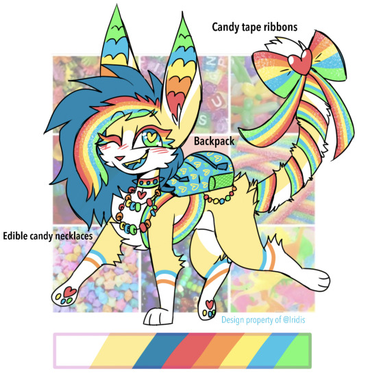
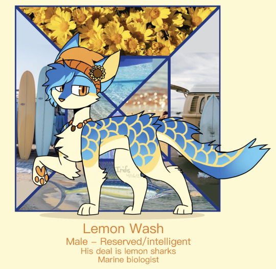
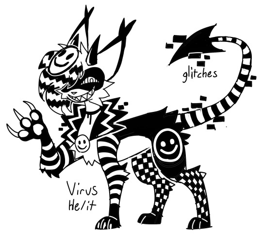
(Virus, the third one, is directly based on the You Are An Idiot computer virus!)
I may not be a professional over here, but I still believe one of the main things that’s always super important about character design is intention. Intention makes the best character designs. Ideally, you want to be completely clear about what exactly you want to convey to the audience about a character. The audience should know exactly what to expect from your character at first glance. Their base personality, whether or not you want them to think they’re a villain, or a good guy, or a background character, or somewhere morally gray and conflicted. Their style, their themes, their age, their goal, their hobbies and passions, what they do for a living, what they’ve been through, why they’re here, their culture, the time period they live in, their status in society, anything and everything that is relevant to their character. Are they tough and rugged and been through some real shit? Are they dainty and flowery and feminine? Are they a princess, or are they a peasant? Are they a thief, a rogue, or an enforcer of the law? Could a stranger tell any of this just by looking at them?
Warrior cats isn’t a series where a lot of intention can be utilized, since we’re only working with cats. I have seen some warriors artists really master visual storytelling in their warriors designs alone, but usually you have to get really fuckin cool with dynamic shape language in order to do that, and I’m nowhere near that level yet with my own shape language lol. Instead, I try to utilize intention in other ways.
Berrykit has very round fur tufts. This is to show that she’s soft, she’s approachable, she’s cute and harmless (presently. …mostly.) But Nimblekit’s fur is jagged and sharp, he’s COVERED in sharp angles all the time, to communicate that he’s edgy!! He’s snippy and snarky and reckless and chaotic!! He’ll getcha!! ((Berrykit’s curly fur is also to make her look more similar to Blisswhistle as her half-sister!)) I also use these fur tufts to make heart shapes in her fur, like her heart-shaped ear tufts, to further drive home her lovecore theming! Stormwhisper has round fur tufts to look more like a cloud, Icesheep has sharp tufts to make him look more like an icicle, etc etc list goes on
Virus has devilish horns and tail to communicate he’s impish and gonna get ya, Lemon Wash has scale markings to communicate the sharky oceanic theming, be intentional!! That’s the fun of sparklecats, there’s more room to play with! You can give your strawberry shortcake cat strawberry markings ! You can give your care bear based sparklecat a funny symbol on their big squishy belly! You can still tell a purpose with their markings and accessories! Intention intention intention, drill it in!!
uhh that’s all I have today. tired now. Good luck! and have fun and all that
44 notes
·
View notes
Text
UPDATE: The Destiel/Supernats aren't taking this well -- explaining my reasoning for the history I gave, and why Destiel is not the big bitch of shipping that it thinks it is
An update to THIS:
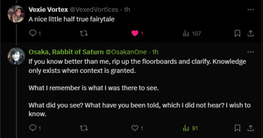
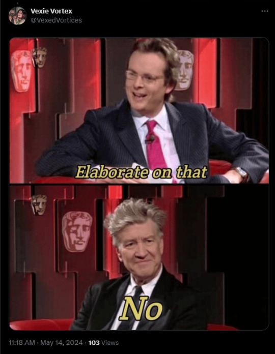
"This is just a marketing thing, Gundam is a giant robot show, only men watch it!"
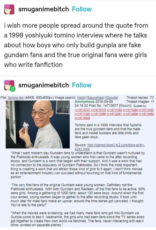
Gundam's fandom is silent majoratively feminine:
"But its not gay, its about giant robots!"
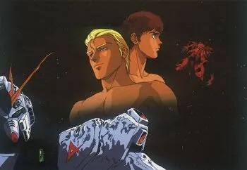
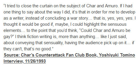
Gundam is very gay. The entire climax of the first story is a riff of Yukio Mishima lmao
The climax of the Amuro/Char arc of Universal Century Gundam (expounding from first Gundam circa 1979), Char's Counterattack is somewhat on the history of Japanese disillusion with liberalism which notably climaxed with the life and history of Yukio Mishima.
You know. THAT Yukio Mishima.
The one who wrote FORBIDDEN COLOURS.
It was so gay that the fanfiction inspired by it became its own damn anime:
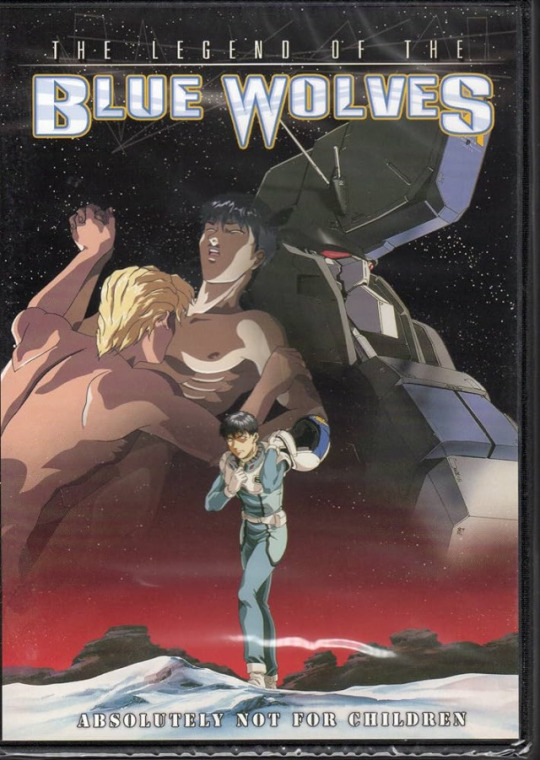
And that's just Charmuro, let alone Charma or a billion other ships just in OG Gundam alone.
We've got This is before we get to Guin Sard Lineford and Yamagi Glimerton (both verrrrry gay), Tieria Erde (a genderqueer trans-coded character who transcends gender entirely in their arc) and a bunch of others.
Gundam was always gay.
"I don't see the numbers"
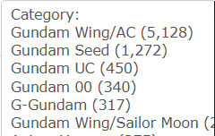
"That doesn't seem like much, Supernat is at least 2x this"
Sooooo the amount of content you do see isn't representative of how much even got written, given FFN had a huge content purge.
First, let's start with the relative proportion of users: If we're analysing the concept of fandom, we first have to look at who had access to the internet in the first place to publish works.
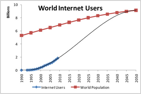
Yeah that's a pretty sizable difference.
Wing's fandom actually exploded in 2000, but got capped VERY early, distributing itself to fansites when FFN fragmented and collapsed.
Why?
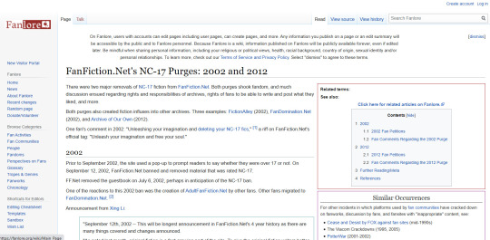
Content purges!
"Isn't there some sort of online archive of this stuff?"
Sure, if you wanna dig through tons and tons of Angelfire and Geocities pages which have mostly disappeared. Otherwise, no! There is no archive of this stuff?
"Why?"
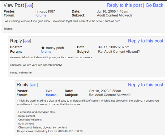
They've since rolled back on this but it means there's a massive amount of lost media out there, including the discussions on it and thus there's an entire history you didn't get to experience.
Its actually very difficult to reach people who've been involved, since it was so long ago that very few people remember, and a sizable proportion of that population have actually died.
"But what about SF fandoms? We have ancient records of stuff like Spirk!"
See unlike physical media like zines, when a server goes offline or there's a data-loss, or something like that there is no surviving copy of the thing in question.
The net result is we have this weird hole where content just vanished, and its now considered lost media. The work of many artists, designers, writers, even videos of events are just lost media because we didn't have the archival mentality adults develop.
You're not gonna hear about all the X-Files stuff or Frasier fanfictions or GW stuff because of these purges and the lack of physical media. FFN users were teens, not adults with resources like US/EU/JP SF fans, who had archival tendencies due to their long history.
So there is this supermassive black-hole in the history of fanfiction running between 1998, and 2008 and some of the only evidence of it are worksafe works and fansites which the owners have long since forgotten about because folks moved on. Moving on is a normal part of fandom.
So to those of you just saying "supernatural is losing to a pair of dumb anime girls" or "urgh this is just a trend tumblr will get over it and go back to supernatural"...
Uhhhhh no they won't, actually?
Supernat's fans mostly seem to be waspy Americans. Gundam is kind of a global phenomenon, one which has traditionally had a silent majority female audience, a vocal minority male audience -- and every time that majority has spoken up, its coincided with a content purge, or a TOS change that mysteriously biases American derived fiction over Japanese derived fiction.
Funny that.
tl;dr:
NATURE IS HEALING
87 notes
·
View notes
Text
Thinking too hard.
I was having a delusional episode while talking to my bestie:
Here's my wild concept for the BTS comeback MV: a Star Wars-like spoof where they are the rebel underdogs fighting the evil empire.
The song would need to have an overall "together we will overcome and save the world" theme. Or it could be a "fuck you evil bitches time to die". Either/or.
They are in those X-wing fighters and those huge land walker thingys.
Jimin can have smeraldo flower decals on his X-wing and JK can have tattoo graffiti looking decals on his. Of course both of their light sabers would be purple. Duh, right? It gets hot in those fighter space craft, they'd be shirtless of course.
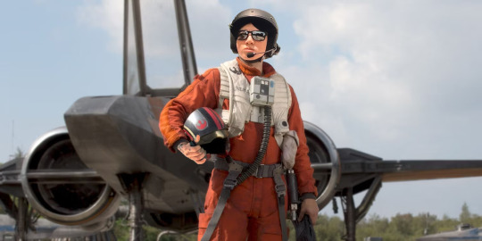
Tae can be riding one of those two-legged horse/kangaroo looking things, wind blowing in his hair. Hey, I just googled what they are called... Tauntauns... tan tans? The universe is universing here. Stick with me, I might be on to something.
Yoongi can be operating one of those land stompers. Googled what those are called (can you tell I'm not a hardcore Star Wars fan? But I did see most of the theatrical movies, except maybe one... anyway) All Terrain Armored Transport or AT-AT Walker because at one point in Yoongi's life, he worked as a motorbike delivery person. Universe, stop it! While delivering more troops and weapons to the front lines, Yoongi can crush people who look like k-media and fake media... or MHJ. For sure kpoppies. Crush 'em all, Yoongi.
I don't want to say it but its a no-brainer: Namjoon is a wise and philosophical ancient being who can slice an enemy in half using only his words. May the force be with you. Slash.
That leaves Hobi. He's the commander of course. Perfectly fitting uniform (designed by LV of course) manning the war room.
Jin, since he's the oldest and the most hardcore gamer, would volunteer to be the one to fly into the heart of the evil empire's ship/vessel/planet/egg/brain/bowels/whatever and blow it to bits before he zooms out safely, escaping obliteration. I guess that would also lend itself to having a slight astronaut touch to it wouldn't it? Kinda also ties in with military stuff.
Cue the close up of Jin winking to the camera and blowing a WWH kiss.
At the end of the MV the evil in the world is destroyed and everyone cheers. The whales in the ocean rejoice.
A bit violent but in a sci-fi fantasy way. Hybe can spend a lot of money on special effects and make it very sparkly and over the top cinematic.
At least you can’t say I don’t have a sense of humor along with this wild imagination.
Time to exit the emo angst school boi era and enter the mature hunk oppa hero era guys. Universe! Get on it!
#maybe too similar to the My Universe MV concept#anyway#ignore me#i spent time editing that pic of jk the x-wing pilot
25 notes
·
View notes
Text
here' a comprehensive list as to every problem I have with the current *unecessary characters known as 'Glitz and Glam'
Do they expand the story/worldbuilding in any meaningful way? Do they explore a new hidden dynamic/past conjunction with a differing character and is that explored meaningfully? What was the point of having them animated when Mammon can portray the same level of humiliation/degrading/on stage lack of positive reinforcements. 😐
I'm so sorry but I view these characters as necessary garbage that caused some animators arthritis via too many patterns, not enough screen time to have meat and potatoes worth of dialogue, or really any pretense within the story whatsoever and yes this extends towards every female character on screen but let's not worry about that !!! Even if they are IMPLIED to be from the ring of envy-a color or ring we haven't seen nor meaningfully conveyed to the audience that it even is possible to go in/exists- it isn't conveyed to the audience well enough besides the visual implication of colors???? Instead of having shitty b-plots that go nowhere via Stolas and Blitz goofing off in seeing stars, Moxxie and Millie getting C-plots for no reason, or loona getting a rabies shot- all of that time could have been exploring hell, going to different rings, focusing on other characters besides the main 5, literally I would prefer a quiet episode like BoJack Horsemans 'Fish out of Water'where we can actually see the personalities of the main characters be appreciated and shown to us but that's never gonna happen :/

What I've been worried about is not even the on screen racism/out of touch 'rap/hip-hop parody' leaves a terrible taste in my mouth, if that isn't enough then the sexualization/implication of an incest type dynamic and nothing else besides fetish bait with these characters constantly grabbing one another and not really acting like siblings moreso someone who has never had siblings attempting to write sibling banter and failing terribly :/
Why do you have a problem with 'Klown Bitch' it's so catchy! Uhm, no??? I feel bad for anyone who attempts to defend helluva/hazbin as good modern musicals let me grit my teeth in silence as to the glorification over white people dominating black culture
HERES A HISTORY OF FEMALE HIPHOP ARTISTS: X
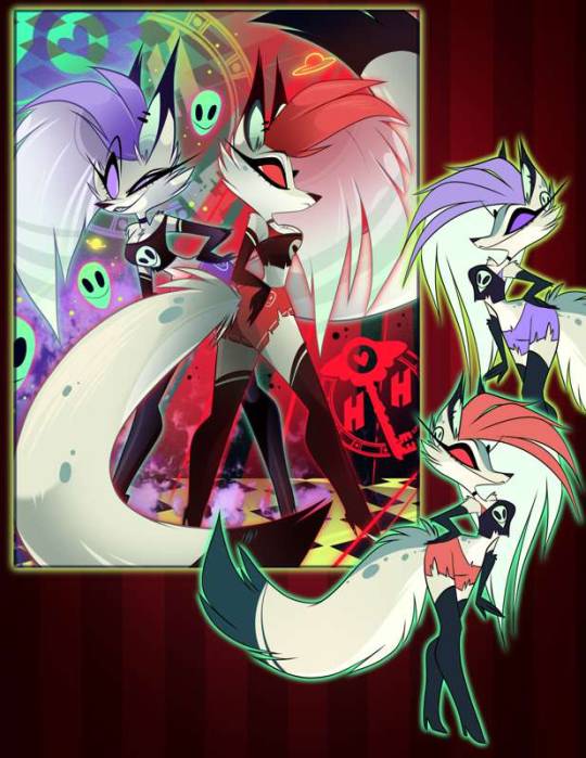
Pictured above is very old concept art about twin characters and its the same hairshape viv kept to transfer over to glitz/glam- despite clearly being over designed and way too much going on Alá vivzie style. It just goes to show she recycles even from herself and not every design is always new hot and fresh :/ AND SPEAKING OF CONCEPT ART-
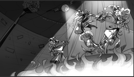
Also also don't forget salems' concept designs thst got passed even though they loon toony, loony, clown enough, and definitely majorly way easier to have animated besides the mess that is the current design meta ???

Love how you can clearly see the silhouettes being so easily identifiable comparably towards the actual amalgamated mess that is their current limbs attempting to hold onto their toothpick body for their head.
All this screams to me is viv using the artists thst try to come onto helluva and they try their best with what their given, viv only picks the best bits SHE thinks is worth her time rather then thinking about the audience or animating anything else besides overglorified white people rap 🤔
Also the episode literally presents its full internalized misogyny/racism within this episode because vivzie herself literally admitted to typing into script with a full chest that
'Women just ain't funny'
. . .
why present misogyny within the series if you as a creator aren't willing to tackle the subject matter? Why write about it or present it as if you're smart over including the joke in your script when it isn't even funny because it just further pushes women out of the entertainment/comedy business which mind you IS ALREADY VERY WELL MALE DOMINATED SO PUTTING OTHER WOMEN DOWN TO PUT YOURSELF UP ISNT HELPING YOUR CASE VIV???
So then what was the point of adding female clowns if all you were going to do with them was make fun of them out of their expense and then profit off of the fact that they are incest coded????????????
?????????Are we watching the same fucking series????????
#vivziepop critical#i'll add more later#helluva critique#helluva critical#helluva boss criticism#helluva boss is homophobic#helluva boss critical#i hate it here#anti hazbin hotel#anti spindlehorse#anti helluva boss#anti vivziepop#cw inc*st#I hate glitz and glam so much
100 notes
·
View notes
Text
The Rorchach Effect - Part 2

Jimmy Darling x fem! reader - NSFW • MDNI word count: 3035 author's note: Smut Time? Friendly reminder: I'm very paranoid and very not english. As a first approach, I preferred to write in present tense(?) to make my work easier. I hope it still turns out to be effective and... engaging, cough cough. warnings: there's mainly masturbation and how do you say that? Tits-fuck? - What a bitch, look at this… ! - Jimmy sneers, bouncing on Elsa's mattress. Taking advantage of the party, we entered her tent and, if that wasn't enough, we are making use of her things. In this regard, Jimmy caresses the fabric of the dressing gown that he stole from her and which he shows off with a light-hearted air. Standing a few steps away from him, I giggle and perform a pirouette. Needless to say, I'm also wearing a designer dressing gown. We are not in a building, no armored door protects us but neither of us seems to care. Anyone could catch us red-handed, Elsa herself, and yet here we are, flirting as if we hadn't eaten each other's faces off just now. - That purple suits you… - I state halfway between a good-natured joke and absolute conviction. The piece of clothing on Jimmy makes me laugh and, at the same time, makes my brain go crazy. He barely fits in it but he still thought it made sense to tie the robe loosely at the waist. On the other hand, I swim in the celestial fabric, making Jimmy hungry and impatient. He wishes he could peek more - better - but I purposely wrap my arms around myself. He can see a small part of my cleavage as well as my legs, from the knees down. I can't stay still, so I move around Mommy Elsa's room because I'm nervous. I try to distract myself but the situation is electric and, deep down, I feel embarrassed for my skin. - Hey, miss? Stop for a while, you're making me seasick! - Jimmy addresses me. The tone of voice is loving and understanding: he knows that I do this when I'm upset and he probably imagines the reasons too. He himself is revved up, sitting with his back straight on the edge of the mattress. - Hey, miss - I mock him, raising an eyebrow - You've never shown off such a correct posture in your life. - I add, approaching him with bare steps. I pose as a high-class woman while I smoke the remains of Elsa's cigarette. I puff a cloud of silver onto Jimmy's perfect features, and he leans in to bite into it and catches me off guard. I fall into a seat on Elsa's boudoir stool and we both laugh until the laughter fades into the silence of a long stare. - Y/N, you're beaut… - - Don't say that. - - What? Why? - - I'm sorry, I'm… I'm not that good at encouraging when it comes to me… - I inhale deeply with a bitter smile. - Are you talking about your skin? - he ask in a murmur, tilting his curly head to the side. He leans his torso in my direction and it's natural for me to close my thighs. It's not the embarrassment I thought it was, but rather a bubble of warmth that suddenly forms in my belly that I try to trap. I see his hand, the one I treated for him, lingering in the act of touching me. He closes and reopens it, searching my face for answers. I just nod. - Do you know what your skin looks like? - he asks, creating a suspense that I am about to ruin. - The coat of a cow? - Jimmy twists into a grimace: he understands the irony but splashes on me the remnants of Elsa's favorite liquor, that he brazenly drank. - Do you know when the summer sun is at its zenith but you are sheltered by the foliage of the trees? Then many pieces of shadow and light are created and… and that's you. - I don't know if he realizes how poetic the concept he has just expressed is, gesturing and looking for the right words. I stare at him with adoring eyes and my mouth slightly ajar, so he coughs and takes a breath. He's going to add something.
Can you touch me? - I'll nip it in the bud. - Can you… touch me, please? Calmly, trace the outlines of the lights and shadows you mention. I want those hands on me. I want to… venerate them. - the moment I pronounce the verb "venerate", Jimmy just flinches. That single sentence has the power to give a shock to his cock, which gradually awakens beneath the silk and, I notice, it twitches slightly. Besides robes, we don't wear anything. - I can. - Jimmy confirms after what seems like an eternal silence. I think he wanted to give me some kind of speech but he prefers to look at me while he slides to his knees. - Do you know how many times I touched you "by mistake"? - he tease. I lose control of my breathing in response: the legs, still locked and contracted, are delicately stripped from the edges of the garment. - Yes. - no, I don't really know but I understand what he means. The same goes for me. As he looks at me, I'm afraid he's thinking: "if I put my hands there, I'll ruin everything". Then I grab the wrist of his good hand and lead him to my left knee. My thighs are shaking but now it's a dispassionate invitation to redesign myself. So he does it. He begins to touch my shins with his fingertips. He leans over to blindly caress the calves and then up. Higher up.
This is the geographical map of Heaven. - he whispers on my mouth, swallowing an excess of saliva. He tries not to look down, positioning himself between my knees for better access to my lips. Suck the lower one slowly; the lip bleached by the disease to which Jimmy gives pigment through his heat. Slowly, he bends through my tremors until I can only see the tangle of his chestnut honey-colored curls. His fingers, now hidden by the fabric hanging from my shoulders, circumnavigate the dark areas of my hips until they imprint themselves on my breasts. The contact electrifies him, so he lets out a moan similar to a shock. He's found in a particular position: he resembles the statue of someone about to prostrate themselves in prayer, with their arms outstretched in the act of pinching my nipples and his lips dangerously close to my mons Veneris. - I'm not a two-flavor ice cream. - I flounder, resorting to a form of reluctance opposed to my pounding desire. He knows these impulsive reactions of mine are often dictated by fear, so he spies on me from below with dilated pupils. It invites me to fall into it - It's not good. My taste. - - Yes it is. - - It's n- … - - Sssssh… - the onomatopoeia rustles against my clit, forcing me to moan in exasperation. As if that wasn't enough, Jimmy doesn't need a voice to urge me to let him do it. He shakes his head: "enough", "no", rubbing left and right his nose and mouth over my heat. I don't think I've ever loved a nod as much as I do right now. I could comfortably enjoy his ministrations, but instead, I stand on tiptoe and peer at him with wide eyes. I imagine my short, quick, sharp breaths hitting his relaxed eyelids. His thick eyelashes. I didn't realize that my hands had become guardians of his and clung to them without the slightest discomfort. - How much… how much would I owe you if I were at one of those Tupperware parties? - I feel him smile against my pussy as he goes back to drawing quirky little things to keep my skin spots company. I see his eyebrows raise eloquently, a sign that he is regaining confidence. - Oh, very much. - he replies after a century. - All. - but I don't have time to provoke him as his rascal tongue marks ring after ring around my clit before kissing it and going down. He spoils my slit as if he were looking for the key to penetrate my cunt and, once he finds it, he does. - Mmh, my God Y/N. Mmmy God, you are so good that I don't want to eat or drink anything else anymore. - I never had the certainty that we would end up like this but now I can admit that I hoped so. Much. I lean blindly against Elsa's boudoir and knock over a bottle of perfume. An eye pencil rolls to the floor. I don't know what to do, I feel like I'm going insane as I reach behind Jimmy's head and push him towards me. I move my hips a couple of times before pressing myself hard on his face. I remain still and his muffled groan precedes his now firm grip on the flesh of my wet thighs. I dodge it in dizziness because this isn't how I want to come and I'm already incredibly close. Confused, glittering with my own juices on his frown, he observes me: he shines like an obscene star, prostrate to my will and not satisfied, however I have another idea.
Give it to me. - it's an order wrapped in velvet. I am peremptory in asking him to give me his hand which, under the passage of my thumbs, I open and extend, staring at it intensely. I spy on him like a voyeur in the "V" space that is created between the two fused segments of his "claws" and I smile mischievously at him before licking the junction point. Slowly, so that he realizes my intention. I go up a wet trail and go over it again as if I were actually writing the twenty-second letter of the alphabet. Then I dedicate myself to the palm, lapping it with my flat tongue as if it were a blueberry popsicle, my favorite. He is astonished, his mouth half-open in an expression that is initially stunned, then reshaped into an erotic drama that I could stare at for hours. Incredulous, he partly follows my movements, partly glances at me: his chin jutting forward and his eyebrows going from desperate to frowning. His body performs in two small jerks that induce him to stand up straight but still kneeling. - Oh, fuck dollface… - he hisses at the exact moment I swallow two of his fingers. There is something that he doesn't understand and that makes him restless. I slide along the joined phalanges and there is not a shadow of disgust on me. On the contrary, I spread my legs wide so that Jimmy notices that I am increasingly wetter. - I feel that… it's as if you were doing it to my cock… - he admits destabilized, unable to hold back the phantom spasms in his lower abdomen. He doesn't notice but, at my pace, he seeks friction in the scented air of Elsa's quarters. In nothing. This only adds to my pleasure, causing me to moan and bite his knuckles. - Ah! But how do you do it?! - I have no idea, I'm just hungry for him and the salivation increases like in the jaws of the wolf. I completely drench his hand, then place it on the stool before sitting back down. Jimmy nods with an expression that doesn't bode well, so he comes closer. - Just do it. Rub into my hand, do it. - he grabs my shoulder and presses me down but he doesn't control the undulations of my pelvis. I spontaneously begin to fuck the aforementioned hand in its entire length, from the wrist to the nails. Back and forth, as if on a swing that has nothing pure or childish about it. I abandon myself to a dotted moan that I address to the ceiling and my body memorizes JD's flesh. The scars, the veins, the rough and atypical paths. - N-now… - I meow crypticly, in a voice too low for him to immediately understand. He looks at me ecstatically, he stopped himself from doing anything and wonders how he managed it but now he's eager to understand what I want. - Now? What "now", honey? - he attacks my neck, repeating itself and making it even more difficult for me to stay clear. - Stick… stick them. Stick your gorgeous fingers inside me. - I'm begging him breathlessly and I wrap him in a hug so heartfelt that it seems my salvation depends on it. A sigh of relief hits my ear as a feeling of fullness creeps up on me. I try to pronounce his name but a lump in my throat prevents me. He compensates, spelling mine. - You're a goddess. - he studies me, curling his fingers against the exact point that makes me squirm. The robe miraculously hung on my now practically naked body, offered to Jimmy. The Lobster Boy is clear about which buttons to touch and insists on looming over my figure, which completely melts onto the carpet. - Jimmy… Jimmy… slowly, don't… I don't want it to end right away! - a voiceless laugh escapes him, too enthusiastic to censor it. We've waited too long, so he moves me on the bed like I'm cotton candy and lies on top of me, piercing me relentlessly.
I can do it again. - stab - And again. - stab - And again. Let yourself go, love… - he invites me not to hold back, adding his thumb to the bittersweet torture that has transformed me into an anthropomorphic wave. Jimmy would drown in it and so he does, kissing me with the transport of when he sings. He basically does this skimpy dance with me that allows him to rub up against me. Against his own hand rummaging perfectly through the folds of my impending orgasm. - I don't know… I don't know what… AH! - something in me is torn. Even before Jimmy can address his concern to me, I am overcome by a tsunami of ecstasy I have never faced before. The discordant note of the cry with which I come copiously, squirting on my lover, is added to the music of the event. Jimmy has the urge to get run over and so, stunned, he relieves himself. He urges me through clenched teeth as my essence drips down his stomach, hiding in his pubic hair and sliding down his muscular thighs. I stare at him, face blushed violently, out of breath or words. JD, dazed, uses my wetness to masturbate himself. - Is that what you want? Look at them. - he breathy refers to his hands; one slides along his lenght and the other caresses my shiny belly in the tumult of the night. He can't believe it, he is driven by the arousal he no longer masters. I am. For this reason, he bends over to briefly follow his gestures but then returns to observe me with pleading eyes. Shocked, I climb up his ivy-like body to kiss him intensely, then squat on the mattress. - Give those hands a rest. - I invite him again, prey to my own breath. I welcome his erection between my breasts, guarding it jealously in a coming and going that in a few seconds makes the boy tremble. - Y/N, fuck, Y/N if you don't… if you don't want me to-… - - Shut up and come, idiot. Give me everything. - - Fuckfuckfuck… ! -
He doesn't need to be told twice. Exhaling a bestial groan in his passionate humanity, he rests his knees against the bed frame. His head falls back and Elsa's robe - that barely acts as a cloak - comes off the sweaty skin of his back. That purple and expensive detail that dresses his non-existent modesty makes the scene one of the most amazing I've ever witnessed. I gaze at him in total adoration as his boyish features twitch and pearly splashes sign my bliss. Face, collarbones, shoulders. Jim, in the grip of his latest convulsions, holds my hair in his fists. He has no voice to make himself heard but he steps back slightly and chuckles while cursing. He peels off Elsa's robe and uses it to clean up first me, then himself, grinning evilly as he wraps the fabric around his cock. - Uh, that's what "normal people" do. - I comment, excited by his bold choice. - Elsa will be happy to find out that the birthday boy had fun. - he pants, throwing the dirty garment on the bed. - Leave yours there too. - he invites me to imitate him and then take me by the hand pulling me up. Tight in a naked embrace, we follow the distant trail of a well-known song, staring at each other with soapy eyes. A few seconds of paradise finally found in four arms, until a creaking alarms us. - Come on, it's time to get to stepping. - Jimmy says, picking up our clothes around the tent. I help him, complaining: - Oh, no. Are we ready to leave forever? - he, for a moment, forgets the possibility of being caught and stares at me intensely. - We are. - immediately afterwards we threw ourselves out of the back exit, immersed in a clandestine darkness. I feel his warmth. His breathing. Our fingers intertwine. - We are - he repeats - but we are not finished here. - I remain silent while I get dressed, I let the buzz of the nocturnal insects speak for me. - Is that so? - I ask, finally. Jimmy re-fastens his trousers, while I scan the summery contours of his beauty. - No. I have to fuck you first in all the places that made us sad. Making love for real, anywhere, until the fucking circus collapses. Then… we'll leave. - I grab his injured hand and threaten the burnt skin without the real intention of hurting him. - Promise me. - - They'll cut off my hands if I lie. - - Happy Birthday, Lobster Boy. - Ladies and Gentlemen: I found Jimmy Darling.
taglist: @taintandviolent @silverzoomies @doll3tt33 @wh0re43van @fear-is-truth @lacucarachapisser + Please, If you want to be added or I forgot someone, let me know!
#evan peters#american horror story#evan peters fanfic#jimmy darling#ahs freakshow#evan peters characters#jimmy darling smut#jimmy darling x reader#evan peters smut#bff to lovers#ficfymo
105 notes
·
View notes
Text
Y’all remember the tiktok trend where grown ups realized that they’d forgotten how to skip. Headcannon that one, a few years after Derry part 2, Richie is being a silly sappy little fellow. Starts skipping while he and Eddie are a park or whatever. He grabs Eddie’s hand to bring him along for the ride. And Eddie??? Understands the hypothetical concept of skipping. And yet his feet? Doing a sort of botched gallop.
And Richie LOSES IT! Starts roasting him. And Eddie is freaking tf out. He’s yelling but also still trying to figure skipping out. You can’t really tell if he’s yelling more at Richie or at himself. And he’s still galloping away. Richie is on the ground, holding his face in his hands to muffle his laughter.
Eventually, Richie gets up and he starts coaching Eddie. Twenty minutes later, they’re hand in hand, skipping down the path.
Richie didn’t have a choice but to tell the losers everything. And the groupchat?? LOSES IT! At first? Just roasts tf out of Eddie at first. Ben comes to his defence pretty quickly. And then asks “when was the last time you guys skipped? Are you sure you remember?”
And the accusations fly right back at Ben. Asking him if he can skip. And Ben??? In his office wearing his fancy designer work clothes???? Takes a video of himself skipping. And he sure can skip! When he’s done showing off he comes close to the camera and says “we just had a daughter. I’ve prepared.”
And again, they’re going wild. Within minutes, videos start pouring in. Bev is first, obviously immediately ready to support her husband. She’s a dazzling skipper. She’d win first prize in a skipping competition. The technique is impeccable.
Stan is next. He gets Patty into it as well, to know one’s surprise. Neither is perfect. Patty’s footwork isn’t perfect but she has pizazz. Stan is pure technique, to the point that it’s awkwardly stiff. But the pair are smiling and skipping so it doesn’t even matter. Their own daughter just toddles around in the background. Kind of embarrassing for her, but she doesn’t know what embarrassment is yet.
Mike is out in a field, phone probably propped up on his water bottle or a log. He’s mostly just frolicking around, but there’s a few solid skips in there. It’s gloriously cinematic.
Audra is on camera next, and bill can be heard saying “show me! I want to see.” She hangs in the air longer than any mortal should be able to. Her flowy dress flounces out. She giggles in response to bill saying “wow!” and “you’re really good!”
But then hepassed the phone to Audra. Of course they don’t think to stop filming in between, so you hear all the shuffling. Audra says “okay, show me!” And Bill?? The bitch can’t get his feet off the ground. There’s no elevation at all. Audra is losing her mind. She’s scream laughing. Bill looks devastated.
A moment after his own roasting begins, bill texts back “so does this mean I’m a bad dad?” And immediately it turns to dad comfort. Ben’s “kids don’t usually start to try skipping until they’re four. You have two years to practice!” And Stan’s “your son is going to see you learn and grow as a man. You’re setting a great example.” Its really quite wholesome.
Obviously someone filmed it in the park. The world sees the graceful pursuit of Eddie learning to skip. Twitter obviously loves it because it so so silly and sweet. Richie tweets something stupid like (and funnier than) “bet your husband can’t skip, either.”
And Bev, because she has notifications on for Richie, immediately replies with Ben’s video and saying “my husband could beat your husband”
More videos start pouring in. Stan keeps their video as a groupchat exclusive, but tweets from his rarely active account “Richie I literally taught you how to skip when you were 6.” Richie responds calling him a bitch.
Bill posts their video saying “watch me realize I can’t skip.”
And later. Hours later. Many. Hours. Later. Audra posts a video to her insta story. She has taught Bill how to skip. Is it graceful? No. Does it have technique? No. Could you call it good? No. But goddamn he skipped.
Eddie holds it over him for weeks that he’s the better beginner skipper
#idk man this was originally supposed to be 3 paragraphs#I giggled so hard I blacked out and did this#it movie#reddie#richie tozier#fanfiction#it 2017#it chapter 2#it chapter two#it chapter two fanfiction#reddie fanfiction#eddie kaspbrak#mike hanlon#beverly marsh#Bev marsh#ben hanscom#stanley uris
70 notes
·
View notes
Text
LONG post featuring my opinions on this design and her concept and also Vivs character design decisions in general
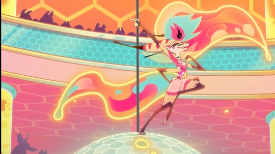
This design singlehandedly made my account rise from the fucking dead because of how much opinions I have on it
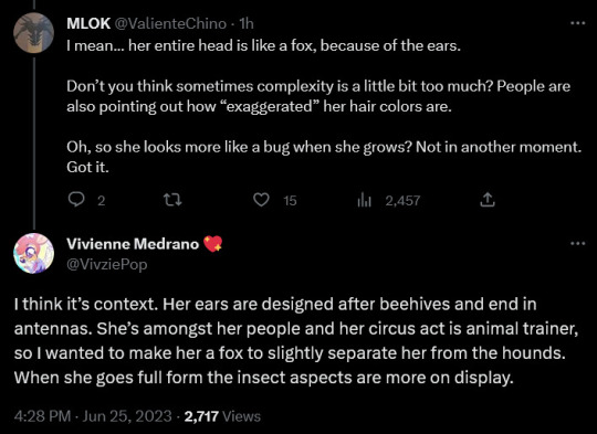
TO NOTE : I LIKE Helluva Boss as a show. Is it perfect? No. Do I think it has issues from both writing and design aspects? Yes. Do I like it regardless? Also yes. You can like a show and still have criticisms of it. Also Viv has answered some criticisms about Beelzebubs design and I will talk about them too
Final warning cuz this is LONG and rambled at points
By this point we are all aware that once a new character gets revealed in Helluva or Hazbin , there's always opinions on it.
But Beelzebub truly takes the cake on how divided people are on her design. People either adore it or hate it with a blinding passion (and some just don't like it cuz they have a Viv hate boner).
I have to say I actually really like it as a stand alone design. Remove her from the story and context it's genuinely an appealing design with fun and bright colors. I personally don't mind the early 2010's sparkle dog look. It has a nostalgic charm to it and if you followed Viv for long enough you know she really likes that aesthetic. She has good colors and color placement and my main real dislike is the weird hair.
And she's animated BEAUTIFULLY !!! Real props to the animators for being able to make this design look nice in motion because god lord is it complicated. This will be a criticism later, but again, its really amazing on how they made this design look good even though we all know this must have been a real bitch to animate.
The real issue that come to me with her design is when you put her in the show and have to think about who she is, what she is, what her lore is ect.
Firstly: Her not being 'lore accurate' kinda falls flat given that none of the designs thus far have been accurate to what they're based on. Like Asmodeus has elements that tie him to his demon name counterpart (with the rooster tail and 3 faces) but they're more allusions then design inspirations. Lucifer is literally just a top hat twink and Mammon (even tho we haven't seen his full design yet) is clown/jester themed. Viv has made it clear that this version of hell isn't supported to be an accurate depiction of biblical hell. So she can really do whatever she wants with her interpretation. Her not being an insect, although disappointing since we don't really have that in the show, is only just a matter of personal taste.
HOWEVER there's still a lot of discrepancies with her design.
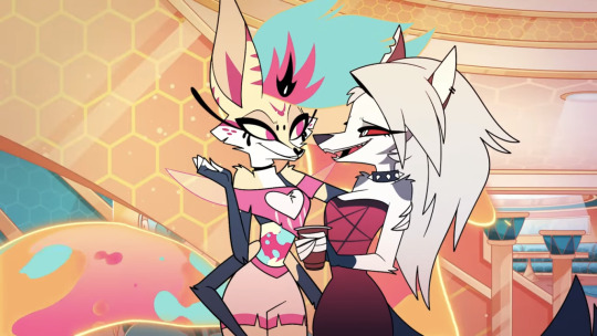
So she's supposed to be a Bee-Fox hybrid... Where's the bee??? Like take away the hexagon background, where is the bee part of her design? She has antenna and wings but... They don't really do much. The antenna are fine and its smart they placed at the tip of her ears, but the wings are straight up not bee wings!!! They look more like pixie wings and they're so small half the time I forgot they were there. Couldn't you have added.. idk some stripes?? she has stripes on her ears but they don't look like bee stripers more so general Viv design details. It's weird given she uses stripes so heavily in other designs yet the BEE character doesnt. Maybe add some fuzz like how bumblebees have?? Maybe trade that stupid lava lamp tail/hair if its too complex. I really don't like how she has normal hair and also a weird liquid part and liquid tail. It adds too much visual noise and just doesn't gel well wit the rest of her design. Her lava lamp stomach too just feels like needless addition of animation work for something that just doesn't add anything. Her colors ( despite being nice) kinda clash against all the other hellhounds who have a muted black/grey/red color pallate. It makes her look like an 13 year olds OC thats been edited in
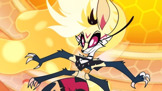
Literally the only things that changed are her colors, size and eyes. In my opinion this should have been her base design because the colors and bug eyes lean into more of the bee aspect. Plus with these colors she fits more with other hellhounds.
Like right now the normal design feels 97% fox with just the most subtle bee elements slapped on. If it wasn't for the background, look me in the eye and tell me this design is a fox bee hybrid.
She also doesn't feel like a prince? She's dressed very casually and doesn't have nearly have enough of an imposing vibe. I didn't know she was a prince until it was said in show. I thought she was just some high rank demon performer. Its kinda disappointing given how grand, larger then life look and energy Asmodeus had. They were introduced in the same way via big song number, but Asmodeus felt like a Prince of Lust, Beelzebub felt more like a performer of Gluttony rather then a ruler.
Also why if she a hellhound in the first place? i saw somewhere on twitter that its cuz her people are hellhounds but that doesnt make sense. Lucifer isn't a human and Asmodeus isn't a succubus, so why does Bee have to be a hellhound? We know that hellhounds are the lowest ranked amongst hell natives, so how do people outside of gluttony feel about her? She is treated like royalty but is also a hellhound, the lowest demon. It causes a needless paradox that makes you question the worldbuilding of the show.
Also why are hellhounds the lowest rank in hell ? and why are they associated with gluttony of all things? I am going to be honest when I say I completely forgot they were native to gluttony because gluttony has a beehive aesthetic and like wtf do dogs have anything to do with it . Like other demons shown have themes that tie them into their respective prince or sin, but we aren't shown why hellhounds in particular are gluttony. Like it feels like a minor thing but when you present information about worldbuilding and show stuff that contradicts it, people will question it.
And why is she dating a hellhound? Or more so why is she so open about it. Like its been shown in the show that Stolas and Admodeus dating imps is a taboo thing so her being so open about her relationship with someone whose even lower then an imp. Again its going back on lore and worldbuilding being contradicted. If you're going to make rules for a show, stick to them.
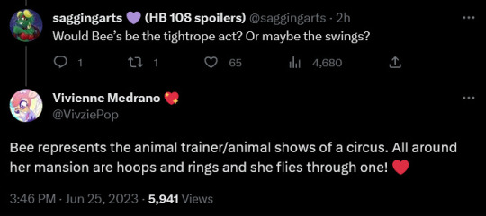
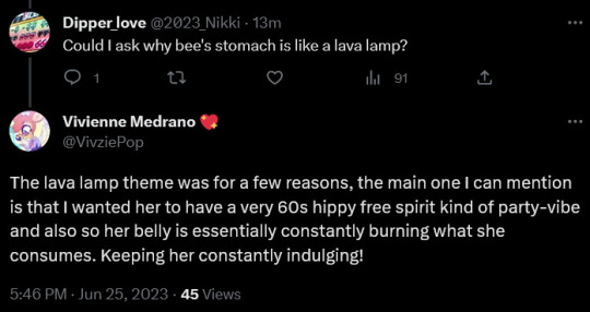
I'm putting these two side by side cuz I have the same complaint about them.
How are we suppose to know this?? First the gluttony ring severally lacks any circus motifs (it has more of a bee theme then a circus one), but Bee ESPECIALLY doesn't have ANY hints at being circus themed, let alone animal trainer.
I knew that all the princes had a circus theme but from I (and from what ive seen in other comments) though she was an acrobat or like dancer of the sort. Literary nothing in her design says she is an animal trainer. And also the hippie 60s spirit is also not anywhere in the design. Just because a design choice is clear to you doesn't mean its clear to everyone else. A good design makes its points across loud and clear so everyone can understand it. This really feels like she's making it all up as people ask. She probably isn't but it really comes across that way. You cant just say something about a design that just isn't in the design or its not shown properly. This is an issue a lot of Helluva and Hazbin Hotels characters have (look up any of their trivia and you'll see how bad some designs are communicated), but with Bee its emphasized tenfold because she's suppose to represent all these different things (fox, bee, prince, party girl, animal trainer, DA sparkle dog, 60s hippie free spirit) at it just isn't conveyed or is put in such a way where you cant clearly tell what it is. It honestly feels like Viv had in mind to have a Kesha pop party girl character and just made her a prince. Shes trying to justify all these things and saying them like they're obvious when they're clearly not!
This design suffers from having too many ideas slapped on it that just don't work and actively work against each other.It makes me less excited for the future prince designs
If youve come this far good for you for sticking around to this way too long of a ramble about a probably one off character in a popular indie cartoon :D
#hazbin hotel#helluva boss#helluva critical#helluva boss critique#design#rant#god this felt freeing to release#seriously it was boiling in my brain for days
216 notes
·
View notes
Text

i’m searching for you in my fading memories .
alternate versions .
whooh . WHOOH !!!!! good GOD !!!!
listen to the song linked while looking I think it really adds . look up a translation too if you want ! listen to the entire lies of p ost in fact . its fucking fantastic .
NOTES .
in april 2022 , i drew a fanmade book cover for the danganronpa x reader fic Sleep Awake . in december of 2023 i redesigned my reader for that story for the third time and thought it appropriate to redraw that old cover with their new design . and yesterday , january 13th 2024 , i finished that bitch . View the fruits of my labour .
in my last Notes section i talked about nerfing the lighting . well um . i nerfed it again . i dont know if it was fate or if i just . idk . didnt want to but i axed both original concepts - the yellow overhead light ( mostly) , and the light blue under light - and just Winged the fuck outta it . that ' mostly ' means that the light source is Still overhead but i just took the colour out to make it more neutral .
another thing i brought up were the shelves and how i wanted to add more items to them . I did it this time , but not to the extent that i really wanted to . i'd hoped for more Clutter and ultimately couldnt think of anymore than a few items . SAID ITEMS BEING !!!!
the pills . self explanatory , since they haunted the majority of cases 2 and 3 .
chess pieces . cute little reference to the chess scene ! even if the scene itself didnt feature real chess pieces , the imagery wouldnt work if i didnt use real pieces .
the letter opener . dont need to explain this one . but i Did originally plan to have it in shin's hand ( explaining why that one is balled like that , because there was originally a Thing in there ) but i couldnt figure out how to draw it and make it look Good . i only added it back when i was colouring the trinkets on the shelves and realised that i Forgot to put it back into the drawing .
the joker card in the bottom corner . also shouldnt have to explain this one .
LITTLE DETAILS I THINK YOU SHOULD LOOK AT .
THE HANDS !!!!!!!!! i decided at the very last second to make them vaguely see through . and theyre all a persons ! amami and shinguji are the obvious ones , but the two holding at the top are supposed to be ouma ( on the scarf ) and akamatsu ( on the rope ) . i would have included tojo's as well but i couldnt fit it in the composition without it looking awkward and out of place and i thought there were already enough references to case 3 as is .
and you literally cant even see it but if you look REALLY closely at oumas hand . his skin is a little grey and you can see the veins through the skin . wonder what happened there . Guess we'll never know !
THE BOOKS !! did the same thing as last time with a Little More . purple books are ouma , green are both amami and tojo , blue is both kiibo and chabashira , pink is akamatsu , and red is phys themselves . i know phys's canonical colour association is olive green but consider : shin is red . look at him . hes Red . that ones for me specifically .
with that . i did all of those books by hand . i drew about 9 variations of books and copy pasted them sure but i Shaded and Coloured them all individually . youll never guess how fucking LONG that took . so yeah . no one book has the exact same shading . goodie !
THE JOKER !!! yes i know i talked about it in the previous section but i WILL talk about the card itself . because i unironically am so in love with how that drawing came out . the little guy featured there is my Lies of P oc scaramouche or scaramuccia ( i use them interchangeably ) . hes a silly jester :3 . the depiction on the card is of him in his prime , before . All Of That Happened . story-wise he's a super famous circus performer known as " The One Man Show " because all of his acts are done alone and are absolutely insane . hes very good at what he does which is Why he doesnt have a crew . and the only reason hes so good is because he't not even human , just pretending to be !
additionally , i originally planned for that joker card to be a Real Life Joker . because a little known fun fact about me is that i collect playing card decks ! but i looked and literally NONE of the ones i currently own would have fit the piece . so . yeah . i just ended up drawing darling scaramuccia . heres the full image im so chuffed
i think thats all i got for the drawing itself . i initially started this back in early december but got stuck and picked it back up a couple days ago , so its been marinating for a bit . hope we all like it ! i think its Better than the original . THE SERIOUS STUFF .
its so fucking insane to think that its been almost 2 years . not only have i truly rediscovered my love of reader insert fanfiction after so many years unable to even think about it without feeling a little sick to my stomach , but ive made so many good friends and core memories through this fic . i even got back into writing . literally never thought id write again after my 11th grade english class and my 10th grade creative writing class . and im having FUN with it . wild .
anyways , this one goes out to vee @chihirolovebot for writing one of The Fics of all time , putting up with my insane ramblings about idol these past months ( READ SWINGING RIGHT NEOWWWW ) , and for letting me help design their dnd characters . godspeed .
it goes out to nex @nexuswrites for beating better genshin character builds into me , giving great fic recommendations , creating thief of detectives quandary fame . READ DQ ( THREAT ) !!!!!!!!!!!!!!!! , and being a fellow p5 and pokemon lover . i miss the coordinator and justice
and of COURSE !!!! rei @berry-creates . the gay the myth the legend . a fellow oc haver and lover , a fantastic writer , and an overall lovely person . this one goes out to u for sharing oc playlists , playing splatoon with me , and for creating maddie . theyre a little freak and i want to study them . i love seeing u go insane over them its like enrichment for me bc i too am also a little mentally ill about them im just really good at hiding it .
theres a whole lot more i could say and more people i could talk about but this is long enough , isnt it ?
thanks for a beautiful 2 years of physouma yaoi . heres to the upcoming sleep awake case 6 , epilogue , all the future additions to the one shot book , the entire rest of dq , tfp , and sams , and more blorbos to put in the smoothie maker . this took a whole two hours to write .
cheers , boys .
song of the post .
60 notes
·
View notes
Text
My personal opinion on the atherines
Catherine time... catherines all over the place.
So. I got into the original game when i was like. 11. Which is crazy i shouldn't have been there. I was always a katherine stan though I felt like it was obvious. Now that I'm older though my opinions on them have changed a lotttt but mostly the same.
So appearance wise, catherine is my favorite I think her design is really creative and cute. I also like natural color palettes better so qatherine is a bit ehhhh for me. He's cute too and very cosplayable but I just like catherines better. Katherine is also a realllllll stunner but I liked her concept art with black hair better... but shes my world too.
Personality wise though catherines at the bottom of the list. Qatherine solo holy shit. Its like sicing a pitbull (qatherine) against a baby (k/catherine). THE PITBULLS GONNA WIN. He is so incredibly sweet and kind and brings out the best in vincent ofc hes the fucking best. Although I think Katherine is sweet as well even though she makes a lot of mistakes that are. Wow. But she learns from them and apologizes and I think thats all that matters.
Qatherine is perfect bc hes like an angel or whatever but Katherine is human and realistic. You will never find a Qatherine irl (or maybe you will idk) because no human is perfect. But you will find quite a few Katherines. I do relate to her a lot because I want to help my friends but end up becoming kind of a control freak and I do feel bad abt it. I think its a realistic struggle to want the best for people but not doing it in a right way.
CATHERINE HOWEVER is an abusive bitch. Shes so hot but shes fucking rude as hell . Why do people like her... its hard i cant have her as a discord icon or else that sets off red flags 😔/lh. I think Catherine has her own appeal but the literal emotional and physical abuse is like . UGHHHHH her and vincents relationship is literally built on that I DONT LIKE IT.
Anyways thats my two cents :3
26 notes
·
View notes