#I don't *hate* this design
Explore tagged Tumblr posts
Text
Potential design for Innocence, Arrogance and Patience
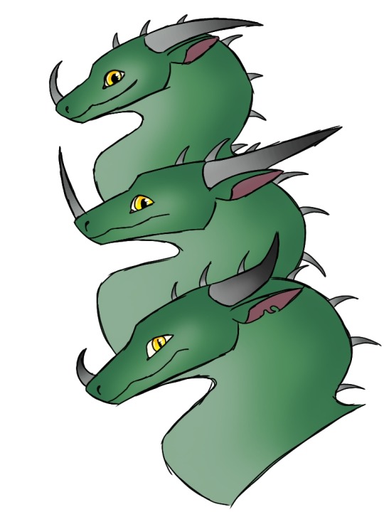
It's very simplistic, which I think can be good for more "main" dragons in the series, but also compared to some of the more varied designs I've made for other species it just makes them look very Generic Dragon, and I'd like to base them more on some real creature, like I've done with a lot of my other designs. I'm not quite sure what though.
#I don't *hate* this design#so if I can't find something a bit more unique that works this is still okay#but idk#I don't feel like this vs the Seadragonus Giagantus Maximus are too distinct#maybe some more detailed patterning might help?#idk#we'll see#httyd books#how to train your dragon books#httyd book fanart#deadly shadow#innocence arrogance and patience#Amity Doodles
13 notes
·
View notes
Text


Slugcat distribution system gave them an explosive rabid raccoon and a overpowered sewer rat ❤️
#rain world#rainworld downpour#five pebbles#artificer#looks to the moon#rivulet#fanart#my art#Hiiii so uh little rant but#i changed the way i draw moon quite a bit because i wasn't too content with the old design#i don't hate the old one or anything like that#i just feel like this one fits her a bit more personally#old one also looked a bit too goober-like in comparison to everyone else and was the only one i had not changed at all from the first time#but also also i wanted to make her look a bit more like pebbles because i like giving siblings similar things in designs#i find it cool#and also she is now taller because pebbles being the smallest in the gang is funny to me goodnight chat.
4K notes
·
View notes
Text
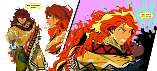
Scary Sunset.
I'm concepting things way outta order in this story, but I'm sure you can piece things together. Context is for a storybeat where, after defeating and capturing Adagio (thus having all three sirens in her possession), Sunset enacts her revenge plot to release the sirens on Canterlot as Thea discovers she's been manipulated. In a confrontation, the two scuffle and fight over the siren orbs while Sunset struggles with her conflicting wants and emotions.
#mlp#sunset shimmer#twilight sparkle#twiset#the orbs are the glass balls sunset carries on her back btw its in her cast line up art#deep down sunset hates thea. she was named “twilight” by celestia. the time of day succeeding sunset. she was always her replacement#but at this point in the story sunset's also fallen for thea. so it's also a conflict of wills in sunset. love or hatred.#hence the “don't make me do this” language. she's rationalizing her hatred and violence as thea forcing her hand and getting in her way#when in reality she doesn't need to do any of this. it's her last stand and outburst to cling to a life of revenge that she's grown too#fond of. because she knows thea has the power to change that and disrupt her identity as a pathetic victim who fell from glory#and that's scary. thea's a very scary thing to sunset because suddenly sunset wants something and to be someone new.#she suddenly wants to change. to be better for someone else. and she never thought or believed that could be an option for her#anyways toxic yuri yayyy#my art#the grand galloping 20s#character design#i hope i got across the pained conflicted emotions in sunset's face tho i belabored over them these past 3 days#i hope a look of anger and dissonance and guilt and “oh god i don't really wanna hurt you please just obey me” while trying to intimidate#is readable. if so it's all in the eyebrows babey
3K notes
·
View notes
Text
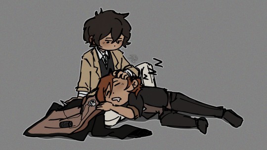
My roman empire is that custom-made badge Dazai has sewn inside Chuuya's jacket after the Lovecraft fight
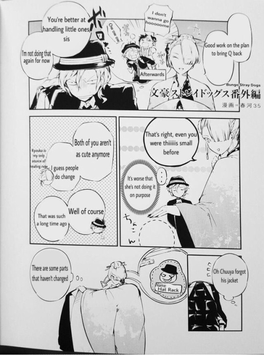
#imagine hating a guy sm you design a badge with his 'image' and then take your sweet time to sew it into his clothes when he's asleep#i like 100% believe Dazai stayed with Chuuya after the Lovecraft fight bc he has always done that before after Chuuya uses Corruption#we don't see it but it's implied#kinda#when we see Chuuya sleeping alone later his face is clean with no blood and his clothes are neatly folded next to him#and that badge yeah#i swear did dazai just keep it next to him at all times waiting for the opportunity#this guy makes me go insane#hope he explodes#sab posting#bsd#bungou stray dogs#bsd chuuya#chuuya nakahara#bsd dazai#dazai osamu#skk#soukoku
2K notes
·
View notes
Text

tall v. small
(well... small in comparison)
#i don't have a name for this character yet#i freakin hate thinking up names#height difference#robot girl#gynoid#android#clip studio paint#artwork#my art#digital art#illustration#digital illustration#robotgirl#robot oc#character design#oc#original character#robot#robogirl#roboposting#tall girl#tall#art#myart#nerro#height comparison
839 notes
·
View notes
Text
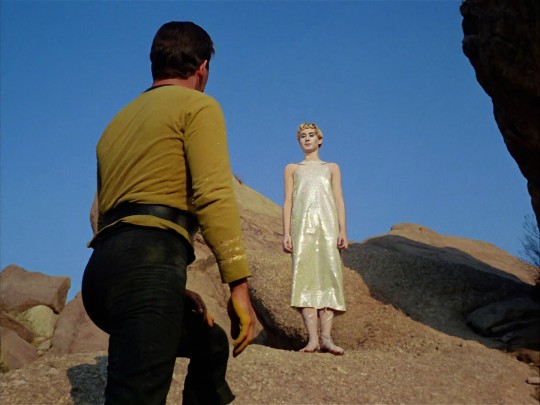

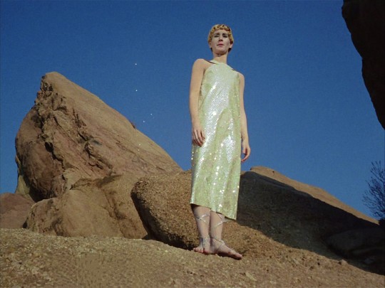
really love that for the metron design they went with "androgynous angel dressed head to toe in glitter"
#played by a cis woman#sites call them a “male metron” though#so interesting#i feel this is never talked about but is actually super forward thinking???#like they were clearly going for genderless#what a perfect blend of “feminine” and “masculine” presentation#for superior beings who have advanced past violence and division and hate#ugh i love this show#even if it wasn't intentional and is just a cheap costume#i still love it#LOOK HOW JIM IS LOOKING AT THEM TOOOOOOOO#star trek#star trek tos#star trek the original series#captain kirk#james t kirk#jim kirk#arena#star trek arena#costume design#trans#gender#enby#representation#please don't think i'm praising this as ACTUAL representation#but for the time and in context#i just think it's neat
1K notes
·
View notes
Text
I love your take on Relativity Falls!! :D ❤️
(Relativity Falls ver @ @citricacidprince !!)
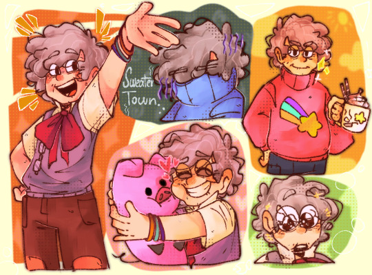
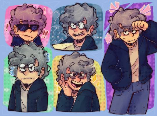
Some lil sketches:
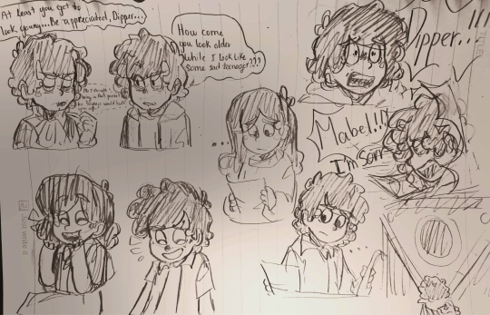
#art#art work#gravity falls#gf#relativity falls#gravity falls au#mabel pines#mason pines#dipper pines#gravity falls dipper#gravity falls mabel#You don't know how much I love Relativity Falls#and Citricacid's version is much cooler than others#No hate to the other vers of Relativity Falls#I just feel like they are more focused on designs rather than the story
835 notes
·
View notes
Text
Once you stop thinking about queer people's labels as strict indications of what's in their pants and who they do/don't bed and instead view queer people's labels as how they interact with the world, you'll find that you'll get along with queer people better and treat them better, I think.
#queer#lgbt#lgbtq#like of course some people use labels in the way i described first and i don't think that's inherently bad...#...but like. as a trans person i hate when people try to like... use my labels (or their labels they force on me) to say what's in my pants#i think there's a fone line between somebody using a label in the first way i described and somebody forcing their understanding of other...#...people onto them. like.#i think it can be a small shift in thought but it's helpful#it reminds me of the shirt that went around of the boston dyke march (<3) shirt design...#...which basically listed who was welcomed at the march and it was a super long list#if anybody is wondering what i'm talking about wrt the last two tags i have the image on hand
6K notes
·
View notes
Text
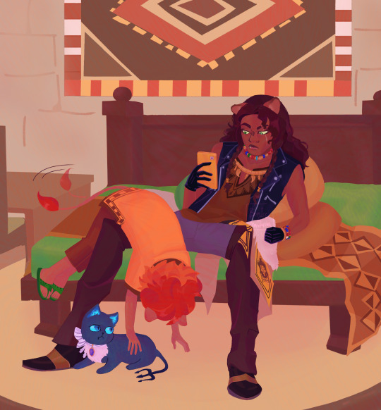
Click for better quality
Shotout to Leona and Cheka for singlehandedly getting me out of the worst artblock I've had in months, love these guys
Tbh I just wanted to draw Cheka doing that one thing kids do when they treat you like a climbing tree, I have other drawing about that but it's a work in progress, it was supposed to be animation practice but Ibis got some crunchy quality on the canvas if you don't pay so. Yeah. Also Grim is here bc why not
#twisted wonderland#twst#leona kingscholar#cheka kingscholar#twst cheka#twst leona#i love em they are so funny#also first time drawing cheka leona and grim i hope you don't mind one or two little design headcanons#i just think that he looks good with curly hair#anyways when I tell you I was struggling with Leona's arm#but ehhhh it worked out.#maybe. I hope so#if this flops I'll cry/j I spent too long on this shit#also god I fucking hate drawing details I hate em if the character has more than two colors in their fit I'm going to complain like a bitch#anyways I missed rambling on the tags can you tell#i drew something#spent too long on details that aren't even noticeable unless you zoom in ughhhh#twst fanart#alt text#i hope the alt text isn't confusing. I always try but i'm not good with words so i'm never sure if it's as clear as I think it is#twst grim#grim twst#ain't that the same tag#grim twisted wonderland#twisted wonderland fanart
835 notes
·
View notes
Text
For my recent comic coloring and lettering class I adapted a (slightly abridged) scene from tmagp 21. It's not perfect and the font certainly needs work but I figured I should stop procrastinating posting it. So.
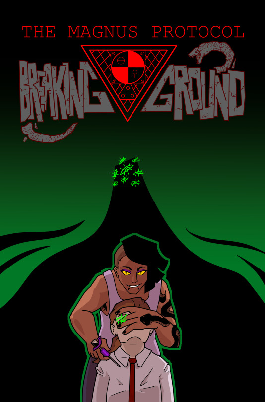
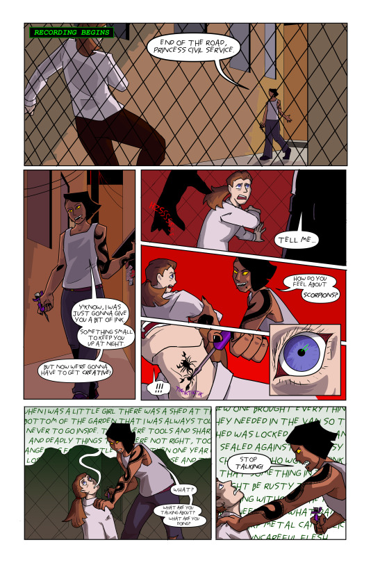
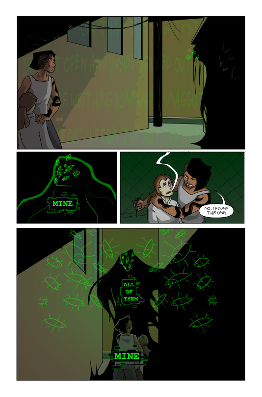
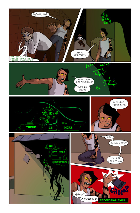
please click for better quality, and hopefully tumblr didn't crunch it to the point of illegibility
This took about 3 weeks total of work over the course of 8 weeks on top of way too many other assignments 🫠 I love art school
#the magnus protocol#tmagp#tmagp 21#ink5oul#gwen bouchard#tmagp archivist#the archivist#tmagp error#artists on tumblr#i hope yall like the 'breaking ground' text i did that by hand#the panels are a little rushed cause i had to cram it into 3 pages#fan comic#please enjoy my ink5oul design#i wanted to make them more detailed but. time constraints#and my sanity#don't worry about the continuity errors#continuity errors build character or something#i hate drawing backgrounds i need to practice
238 notes
·
View notes
Text
F1 spn creature au
* Lance Stroll - # 18
ft. a tiny Esteban appearance!!
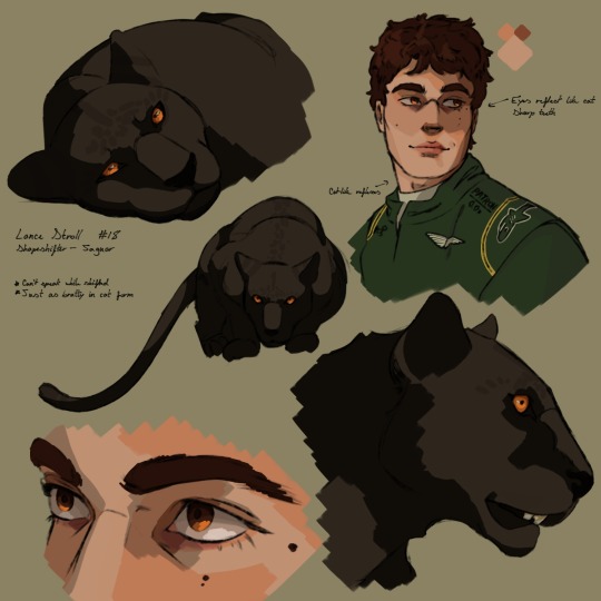
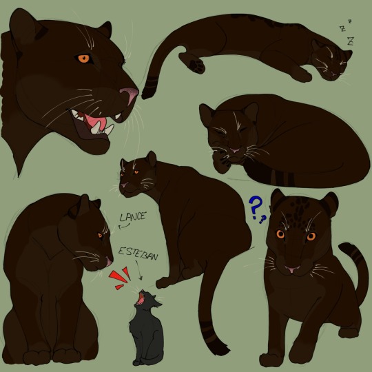
#tumblr pls don't nuke my quality#i beg of you#first time drawing him?? it's literally so fun#lance stroll they could never make me hate you#f1#formula 1#lance stroll#ls18#aston martin f1#formula one#esteban ocon#eo31#i'll most likely tweak his design ever so slightly throughout the workings of this au's foundations#sorry chat#pina rambles#motorsports au
253 notes
·
View notes
Text
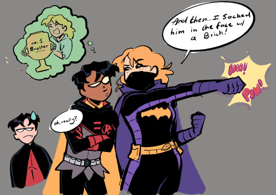
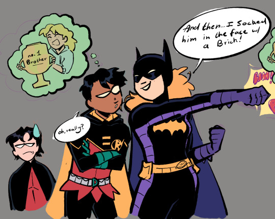
[ID in ALT] Steph and Damian doodle! This taps a bit into their pre-52 dynamic so that's what I was thinking design wise at first but I wanted to draw it w their more recent designs as well to stay hashtag current and topical, so you get both/a fusion, lol
#dc comics#dc#batfamily#damian wayne#stephanie brown#tims there too but he's not the focus so i won't clog his tag#for this to be completely in character Damian would have to be much more disinterested in what she's saying#or i mean ACT disinterested in what she's saying. he's very interested in violence done to tim. esp by his favorite weird big sister#THEY (tim n damian) DO NOT HATE EACH OTHER BTW. this is just the cain instinct at work. also admiration for unhinged steph#idk how much of pre-52 is in play rn visa vie steph (i know cass was still discovering her pre52 past in spirit world so...)#but for the sake of this lets say the brick meeting from detective comics og is still valid. bc i love it#steph violent eye-for-an-eye scrapper tendencies and tims insanity (HE'S STILL INTO HER AFTER THIS) on full display#i don't post a lot of dc fanart bc i find them exceedingly difficult to draw (DRAWING SUPERHEROES IS HARD WHEN UR BAD AT ANATOMY)#(ALSO THERE'S NO CONSISTENT FACIAL/HAIR/ETC DESIGN FOR ANYONE)#but i have done a lot of art and now I'm trying to make an effort to post a wee bit more#mine
1K notes
·
View notes
Text


Throws a bucket of water at their anime hair
#ghost trick#sissel#lynne#inspector cabanela#detective jowd#ghost trick phantom detective#missile#cabanela#jowd#sunnyaliceart#my art#I love these designs so much#don't let missile's smile fool you#he hates baths
2K notes
·
View notes
Text
I think 90% of my gripes with how modern anime looks comes down to flat color design/palettes.
Non-cohesive, washed-out color palettes can destroy lineart quality. I see this all the time when comparing an anime's lineart/layout to its colored/post-processed final product and it's heartbreaking. Compare this pre-color vs. final frame from Dungeon Meshi's OP.
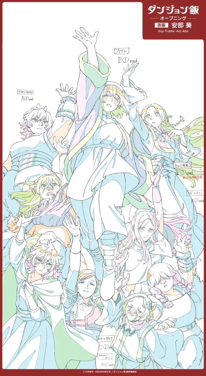
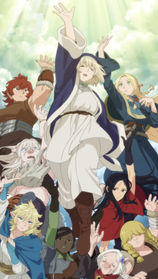
So much sharpness and detail and weight gets washed out and flattened by 'meh' color design. I LOVE the flow and thickness and shadows in the fabrics on the left. The white against pastel really brings it out. Check out all the detail in their hair, the highlights in Rin's, the different hues to denote hair color, the blue tint in the clothes' shadows, and how all of that just gets... lost. It works, but it's not particularly good and does a disservice to the line-artist.
I'm using Dungeon Meshi as an example not because it's bad, I'm just especially disappointed because this is Studio Trigger we're talking about. The character animation is fantastic, but the color design is usually much more exciting. We're not seeing Trigger at their full potential, so I'm focusing on them.
Here's a very quick and messy color correct. Not meant to be taken seriously, just to provide comparison to see why colors can feel "washed out." Top is edit, bottom is original.
You can really see how desaturated and "white fluorescent lighting" the original color palettes are.
[Remember: the easiest way to make your colors more lively is to choose a warm or cool tint. From there, you can play around with bringing out complementary colors for a cohesive palette (I warmed Marcille's skintone and hair but made sure to bring out her deep blue clothes). Avoid using too many blend mode layers; hand-picking colors will really help you build your innate color sense and find a color style. Try using saturated colors in unexpected places! If you're coloring a night scene, try using deep blues or greens or magentas. You see these deep colors used all the time in older anime because they couldn't rely on a lightness scale to make colors darker, they had to use darker paints with specific hues. Don't overthink it, simpler is better!]
#not art#dungeon meshi#rant#i'm someone who can get obsessive over colors in my own art#will stare at the screen adjusting hues/saturation for hours#luckily i've gotten faster at color picking#but yeah modern anime's color design is saddening to me. the general trend leans towards white/grey desaturated palettes#simply because they're easier to pick digitally#this is not the colorists fault mind you. the anime industry's problems are also labor problems. artists are severely underpaid#and overworked. colorists literally aren't paid enough to do their best#there isn't a “creative drought” in the anime industry. this trend is widespread across studios purely BECAUSE it's not up to individuals#until work conditions improve anime will unfortunately continue to miss its fullest potential visually#don't even GET ME STARTED ON THE USE OF POST-PROCESSING FILTERS AND LIGHTING IN ANIME THOUGH#SOMEONE HOLD ME BACK. I HATE LENS FLARES I HATE GRADIENT SHADING I HATE CHROMATIC ABBERATION AND BLUR
2K notes
·
View notes
Text
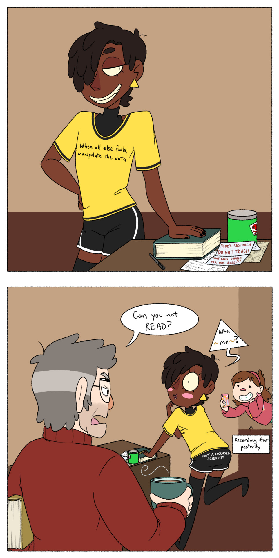
Saw this post and couldn't resist because,
1.) @tesscourtes' human!Bill is a lil cutie-patootie menace that I very badly wanted to draw, and,
2.) I have a - M I G H T Y - N E E D - for any version of human!Bill to find any way he possibly can to annoy Ford a whole lot :D
Also, 3.) I like to headcanon that Bill's knowledge in The Sciences is mostly limited to 'Ways I Can Make A Really Cool Doomsday Portal', and everything else he knows is just a slapdash mix of the stuff he remembers from whatever schooling he went through on Euclydia, a whole awful lot of lucky guesses (which he WILL gaslight you about if you tell him he's wrong), and - naturally - conning all the rest of the answers he needs out of any more educated saps who are unfortunate enough to be around him at the time (answers which he will then proceed to take credit for), so as far as I'm concerned, this "outfit" is perfect for him.
Ignore the shitty backgrounds, I am sick to death of doing backgrounds, I just want to draw goofy shenanigans, okay???
#fanart#billford#bill cipher#stanford pines#gravity falls#mabel pines#human bill cipher#my headcanon is not to say i don't think bill is smart. bill is clearly Very Smart. he just applies all his smarts to con artistry and evil#which - honestly? MOOD#tagging the ship because this particular AU is Decidedly Billford XD#i'd say 'their divorce is going so well' but i think they're too busy with doing ~other stuff~ to actually get divorced#if ya know what i mean - wink wink#i hope i drew him okay ahaha i tried my best but i am still crawling and scraping my way out of massive art burnout :‚)#and i gotta add - it is ROUGH transitioning from drawing furries to drawing regular humans again O-O;#prolly gonna draw this lil menace again with a few other human!bill designs i like all in one image :3c#for rn tho i have an equally mighty need to address a post joking about how bill is not allowed to swear and hates it#got a few perfect quotes from 'the good place' i can utilize with just that one little concept‚ lemme tell ya OuO
359 notes
·
View notes
Text

*passes out*
#💙! mah's art#💙! daisy#not 100% sure if i like all of it but. im satisfied for now#maybe ill make some changes in the future but im so done with this design I don't even care rn lol#anyways#i can start on the daiggie new years drawing i was planning to make😋#mah: “i hate drawing on the computer>:[” *proceeds to draw on the computer*#twisted wonderland#twst#twst yuu#twst oc#yuu twisted wonderland#oc yuu#also i spent way too much time on this to not talk about my thought process#so buckle up#the details on the obi (im so sorry if that's not the name I'm fighting for my life) are meant to represent the night sky#bc midnight#and daisy was brought to twst by wishing upon a star#the other details of her furisode (again. fighting for my life) are ofc daisies and butterflies!#daisies are for obvious reasons#butterflies because they represent Daisy's journey of becoming her own person once she's freed from her step family#the dandelion on the hair is again for obvious reasons (Ruggie)#her shoes are light blue because i wanted to reference the glass slippers but she already has glass slippers on her dorm uniform#so i went with light blue to at least resemble the glass slippers
178 notes
·
View notes