#I decided to draw it completely because I wanted to understand the design better
Explore tagged Tumblr posts
Text
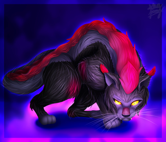
Lykoi cat (werewolf cat). It was the perfect find for this idea for Duman.
#I decided to draw it completely because I wanted to understand the design better#and now this cat is the most dangerous beast in the area)))#I think I'll repeat the same thing with other wizards since I've had an idea about this for a long time#artists on tumblr#digital aritst#artwork#art#my artwork#digital art#digital drawing#wizards of the black circle#winx duman#duman#lykoi cat#lykoi#dark wizard#wizard cat#cat#cat art#duman cat#2024
48 notes
·
View notes
Text
𝐠𝐚𝐦𝐞 𝐨𝐟 𝐥𝐢𝐟𝐞
read this to transform your life
hey guys! today, we’re diving into something that can literally transform the next 20 years of your life. why? because pluto has officially entered aquarius, and let me tell you, this is huge. if you’ve got aquarius anywhere in your birth chart like i do, you’re probably already feeling that intense energy—the urge to level up, get things done, and completely reinvent yourself. i mean, look at me: this is my second vlog today and i’ve been non-stop posting since yesterday. it’s like this cosmic shift has supercharged me, and i know it can do the same for you.
but don’t worry, even if you’re not an aquarius, this energy is hitting everyone in some way. so whether you’re ready for it or not, pluto in aquarius is here, and it’s bringing transformation on a massive scale. now, this blog is part of my series called the “game of life”, but since this pluto shift is so major, i’ve decided to make this a crossover between the two themes. we’re going to talk about how to actually use this energy to change your life, level up, and play the long game to completely transform the next 20 years and beyond. so, if you’re ready to tap into this cosmic power and take control of your future, follow along because this blog might just change your life.
just before we dive in, i want you guys to check out a blog i posted a couple of weeks ago—it’s all about the first steps to getting your shit together. it’s a great starting point for understanding how to lay the groundwork for your transformation journey. if you haven’t seen it yet, head over to blog “first steps” and give it a read. trust me, it’ll help you get a solid foundation before you dive into the next level of this process.
avatar
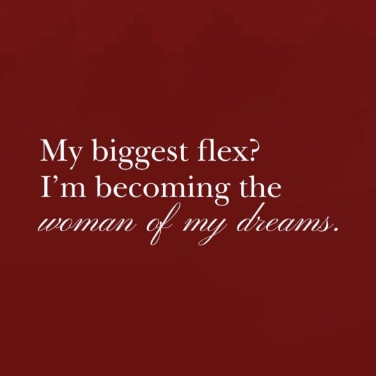
okay, now that you’ve got your basics down from the previous blog, let me introduce you to the game of life. this is where things get fun. first, we’re going to focus on creating your avatar. now, if you’ve read that earlier blog, you’ll remember i talked about building an alter ego. for example, mine is called livia wildrose. she’s my vision of absolute perfection the version of me i aspire to be. this is your chance to go wild. grab a journal and start designing your alter ego and how her life is. i don’t care how crazy, bold, or unrealistic it might seem this is your imagery of perfection. who is she? how does she look? how does she act? what does her life look like? write it all down. get creative draw her, make a mood board, whatever feels right. this is your blueprint. now, here’s the twist: in the game of life, you are the avatar. your current self, with all your flaws and strengths, is the player in this game. your mission? to become your alter ego. think of it like this: your avatar (you) might not have everything your alter ego has right now. maybe she’s more confident, more successful, smarter, richer, or better-looking. but that’s okay because she represents your end goal. every step you take toward embodying her, every choice that aligns you closer to her energy, earns you points in the game of life. the idea is to bridge the gap between who you are now (your avatar) and who you want to be (your alter ego). every time you make progress whether it’s a mindset shift, a small win, or a big milestone you’re leveling up. this is how you win the game.
for example, let’s say your alter ego is this ultra-rich, world-famous singer, idol, and total icon. she’s confident, magnetic, and lives her dream life effortlessly. that’s your end goal that’s your alter ego. now, your job is to build her. create her personality, her habits, her lifestyle, her goals, and most importantly, her mindset. think about it what kind of mindset does she have? does she radiate confidence? does she have unshakable discipline? does she take no for an answer, or does she turn every rejection into motivation? for me, my alter ego, livia wildrose, has a queen-like, goddess-like mindset. that means every single brick life throws at me, i’m gonna build a castle out of it. scratch that i’m gonna build a shrine. nothing breaks me; i only get stronger, wiser, and better. that’s how livia wildrose operates, and that’s what drives me every single day.
imagine you’re playing a game where you have to build a village from scratch. when you start, you don’t just dive in blindly—you go around and observe how other players have built their villages. you notice their strengths, but also their flaws. maybe someone’s village is too cluttered, or their defenses are weak, or their farms are in the wrong spots. you take mental notes: ‘okay, that’s not my vibe. i’m not gonna do that.’ this also brings me to the point that learn from other peoples mistake too. my friend right now is going through a very tough break up. and the guy is being a total asshole. and the more she talk about the relationship to me how it was, and we try to get the cues like “oh we could’ve realised back then when he said this particular thing” that he is not the one. (the fact he was a total sexist asshole) i realised that when i get into a relationship, and if i see my future boyfriend having these traits, i will leave. why? because I learnt from her mistakes of letting things slide, and not noticing the minor red flags that later became worse.
(back to the topic) then, you create an image of your ideal village in your head. you don’t copy anyone, but you take inspiration. you think, ‘this is my aesthetic, this is how i want my village to function.’ you make a mental note of all the details where the farms will go, where the population will live, how everything will flow. and then you start building, step by step, upgrading, improving, and making decisions based on the vision you created. now apply that same concept to your life. create an ideal version of yourself (alter ego) in your head. imagine your ideal life, your ideal personality, your dream self. think about who she is, how she thinks, how she acts, what her daily habits are. don’t just copy someone else’s life take inspiration. maybe you admire someone’s confidence but not their style, or their work ethic but not their priorities. fine. make mental notes and adjust it to fit your vibe. every time you make a decision or work to improve yourself (your current avatar), use that ideal version of yourself as a guide. ask yourself, ‘what would she do? how would she handle this? what choice aligns me closer to her?’ take inspiration from her and let her energy fuel every upgrade you make. step by step, you’ll start building a life that’s completely aligned with the vision you’ve dreamed of. for example in pubg. the end goal is to become a conqueror so what you do every single time when you play that game is make sure that you’re good with your teammates, you get the most kills, you win every single match, because that is what will bring you to your end goal.
the bars of life
1. health bar
health is the foundation, the core, the absolute main bar. without health, nothing else matters. it’s like playing a survival game if your health is low, you’re dead in the water, right? you can’t progress, you can’t fight, you can’t level up. every single step in your journey starts with taking care of your body and mind. health is everything. make sure you’re eating right, sleeping enough, working out, and keeping your mind in a positive, stable place. the healthier you are, the more you’ll be able to conquer in all aspects of life. keep this bar maxed out, or you won’t even have the energy to fight for your dreams.
2. physical bar
now, let’s talk about the physical bar. this is all about how your body looks and feels. how’s your physique? toned? fit? are you putting in the work to make sure your body is in shape, or are you letting it slide? it’s not just about the gym though—it’s about how you present yourself. do your clothes flatter your body type? are you dressing in a way that highlights your best features? are your nails done, your hair styled, your makeup light but on point? when you walk into a room, does your physical presence demand attention and admiration? this is about taking pride in your appearance and making sure your physicality aligns with the highest version of yourself. everything from your posture to the way you dress, this is how people will notice you. own it.
3. mental bar
the mental bar is all about your mindset, emotional health, and mental well-being. how do you show up in the world every day? what is your internal dialogue like? are you a powerhouse of positivity and productivity, or are you letting negative thoughts control you? this bar is about building a mindset that propels you forward, no matter what life throws at you. like i always say, every single brick life throws at me, i will build a castle out of it—or a shrine. i don’t care what happens, it’s all fuel for my fire. this is the mental toughness you need to develop to grow.
if you’re facing challenges—whether it’s dealing with stress, anxiety, or depression—take care of your mental health. if you need a therapist, get one. if journaling helps you unpack emotions and thoughts, make it a habit. every step you take to improve your mental health is a step toward leveling up your life. every time you choose a positive, productive mindset, you’re not just surviving—you’re thriving. strengthen this bar, and everything else in life becomes more manageable.
your mental bar is not just about surviving the chaos—it’s about learning to navigate it with grace, strength, and an unbreakable belief in your ability to create your dream life.
4. spiritual bar
the spiritual bar is your path to alignment with yourself and the universe. this is where you connect with your higher self, your energy, and your beliefs. spirituality isn’t just about religion—though it can be if that’s part of your journey. it’s about meditating, doing yoga (especially Kundalini, like i mentioned), and tuning into the deepest parts of yourself. when you start aligning your chakras and balancing your energies, you’re strengthening this bar. it’s about connecting to something greater than yourself—whether that’s through rituals, prayer, or mindfulness practices. this is the bar that ensures your spirit is nurtured, your energy is clean, and your soul is grounded. if you’re in tune with yourself and aligned with your truth, you can face anything the world throws at you.
5. financial bar
now, let’s talk about the financial bar. this is where you track your wealth, your earning capacity, and how financially empowered you are. how’s your financial situation? are you getting paid what you’re worth? are you bringing in new streams of income? every single time you land a promotion, secure a new deal, or create another source of income, this bar rises. even small wins matter—getting that side hustle going, saving a little extra this month, investing in yourself. all these things count. this bar is about actively working toward your financial freedom and success. if you’re serious about leveling up in life, this bar has to be taken seriously. wealth isn’t just about money—it’s about abundance in every area of your life. when you strengthen this bar, you give yourself the power to live the life you want
6. career bar
the career bar is all about progression, ambition, and success in your professional life. every time you take a step forward—whether it’s landing a promotion, launching a side hustle, or expanding your business—it’s a win for your career bar. it’s not just about the outcome, but about the process too. when you learn a new skill to level up in your field, or when you push yourself to take on more responsibility, this bar grows. every single action you take to further your career—no matter how small—contributes to building the empire you want. it’s about building something that lasts and ensuring that your career serves as the foundation for the life you envision.
7. social bar
the social bar is about how you connect and interact with others. it includes your relationships with family, friends, lovers, and colleagues, as well as your social media presence. every time you make a meaningful connection, whether it’s through a new friendship or strengthening bonds with existing relationships, your social bar grows. it also covers your social media footprint—every time you post something, earn followers, or engage with your audience, you’re building your social presence. the way you show up in the world, the vibe you put out, and how others perceive you are all part of this bar. what’s important is that you’re intentional about your social connections. it’s not just about quantity, but quality. how do you carry yourself? how do people feel around you? remember, you can always adjust the way you’re perceived by adjusting how you act. we’ll dive deeper into how you can shift your social presence to your advantage later on.
8. legacy bar
the legacy bar is about the impact you leave behind and how you’re remembered. while you might not need to focus on this too much at 17 (like me too), it’s still something that will guide your actions as you grow older. your legacy is like the final level of your life game—it’s the impression you leave on others, the tangible and intangible things you pass on to the next generation. think about it like this: your legacy could be how generous you were. maybe you donate to charities, help the less fortunate, or fund scholarships. maybe you leave behind a family with strong values, or set up a business that supports others and creates opportunities. or even, it’s the homes you buy and the wealth you build that your kids will inherit. that’s a form of legacy too—creating something that endures, that your children or loved ones can benefit from long after you’re gone.
you want to make sure you’re giving back—whether it’s in terms of charity, helping your community, or creating something that continues to benefit people beyond your time here. it’s about living with intention, creating something greater than yourself, and making sure that when people look back, they say, “wow, she did something good.” when I think of my legacy, I want to be known for making an impact on my country, helping its economy grow, and providing jobs. so, always think about the ripple effect your actions will have not just on yourself but on the world around you, long after you’re gone.
9. environmental bar
okay, so let’s talk about your environmental bar. this is pretty much everything around you: where you live, who you hang out with, and what you’re consuming—whether it’s people, media, or food. your environment shapes you more than you think. if you live in clutter, your brain gets cluttered. if you’re surrounded by negative energy or toxic people, guess what? that negativity starts rubbing off on you. toxicity? it’s contagious. trust me. this is why i always say: your environment is EVERYTHING. let’s say you’re stuck in a place where people are draining your energy, or your room looks like a hurricane hit it—what’s happening? your life starts feeling chaotic. but if you clean up your space, set boundaries with toxic people, and start surrounding yourself with supportive, positive vibes, you’ll see that your life follows suit. if you’re surrounded by success-driven people, guess what happens? you start moving differently too.
for example, i know my current living situation is toxic. but, once i move out, that’s going to be my environmental grace. i’ll finally have the space to thrive, away from negative energy. maybe for you, it’s as simple as clearing your workspace or unfollowing people on social media who bring you down. the key is that you’re actively creating a good environment for your growth. declutter, move people who don’t vibe with you, and make sure everything you interact with is aligned with your goals.
10. fun and recreation bar
listen, life isn’t just about hustling and grinding, okay? it’s also about having fun. and don’t let anyone tell you otherwise. people always forget that joy and peace are important parts of growth. hobbies, fun experiences, and doing things that bring you relaxation and joy are just as vital as your career or health bar. sure, you might not make money from every hobby, but if it brings you peace or helps you unwind, then it’s worth it.
like me, i might not be making millions off of drawing, but damn, it’s relaxing. it’s something that i look back on and feel proud of. the point is, don’t skip out on fun. go out with friends, explore new things, travel, dance, create. don’t just work to live—live to enjoy it. make time for meaningful parties, exploring new places, or just learning something new for fun. trust me, it will make you feel whole. it’s the only life we’ve got, so might as well enjoy it. while also being productive (im sorry had to add this 😭)
11. intelligence bar
okay, this one should be obvious, but let me make it clear: your intelligence bar should always be leveling up. this is the bar for everything you do to expand your mind, whether it’s learning a new skill, reading a book, acing a test, or just getting smarter from life lessons. it’s not just about school or formal education; it’s about constantly seeking knowledge. every time you learn something new—whether it’s about physics, psychology, or how to make the best goddamn smoothie—your intelligence bar grows.
never stop learning. school isn’t the only place for growth. you’re an adult now—take control of your learning. buy books, watch educational videos, take courses that interest you, and dive into everything that can help you grow intellectually. intelligence doesn’t stop when you leave school, it grows with you, forever. always be leveling up your mind.
watch her video to get more info on this topic (she is MOTHER) literally.
youtube
youtube
youtube
cheat codes in the game of life
read this blog by me first
life is full of cheat codes if you know where to look. one of the easiest ways to hack your life and manifest your desires is by using subliminals, grabovoi codes, eft tapping and even customizing your ChatGPT. these tools are like magic spells, designed to align your subconscious mind with your goals. for example, grabovoi codes are just numbers, but when you write and repeat them, they can bring about extraordinary shifts in your life. subliminals work and eft tapping the same way reprogramming your mind while you go about your day. and with ChatGPT, you have a personal assistant that can help you navigate any life situation, offering advice and insight whenever you need it. these are your personal life hacks use them to transform your reality with ease.
okay, let’s dive even deeper into these cheat codes, because once you start using them, you’ll realize how easy it is to shape the world around you. let’s talk about altering your social image—this is like an advanced life hack that many people, especially celebrities, are already using, but they’re not telling you how. you know how celebrities act on social media, right? that perfectly curated, almost “too good to be true” persona? the thing is, that’s not really them. most of them aren’t as perfect as they look in front of the camera, and they sure as hell don’t act the same behind the scenes. think about the people who might’ve bullied you in the past. they might have treated you like crap, but when they’re in front of others? angels. they put on this sweet, charming persona to get what they want. it’s all about duality—using different faces to your advantage. so why not do the same?
you can reinvent the way people see you. perception is everything. for example, let’s say you want to be perceived like a star, like an icon. one of the biggest secrets to this is creating a unique persona—something that screams you, but is captivating enough to make others want to be around you. think about how a lot of idols have such a distinctive style or energy. that is the cheat code. they don’t just wear the coolest clothes, they embody a vibe, an energy that makes them stand out in a crowd. so, how do you do it? first, know what you want. if you want to be that calm, collected, alluring figure who commands attention without even trying, start by adopting a few things that you know fit that style. if you want that dark, sultry energy, you need to own it—the way you talk, walk, dress, and even the way you hold yourself should exude confidence.
take someone like Dakota Johnson she has this quiet-chaotic energy about her, right? she speaks slowly, her words dripping with this almost sultry vibe. she doesn’t try too hard. it’s not about being overly energetic or trying to impress; it’s about confidence, calmness, and an air of mystery. she can make something as simple as a joke feel funny and seductive because of the way she says it. that’s the magic. it’s not about being loud or brash to get attention, it’s about learning how to carry yourself in a way that leaves people wanting more.
here’s the trick you don’t need to be a different person; you just need to refine your vibe. create a version of yourself that’s like an upgraded avatar. and then, simply start to live like them. how would your alter ego talk? would they speak with more authority? would they be more laid back, or would they be mysterious? do they have a sultry, slow tone when they speak? model yourself after that, and it’ll become second nature. this is where the pluto in aquarius energy comes in if you’re an aquarius (or have aquarius placements), this is your moment. you have the power to reinvent yourself in ways that you never thought possible. take this time to shift your self-perception and how the world perceives you. you can break out of old habits, behaviors, and expectations that others might have of you. this is your chance to become the best version of you, the version that’s unstoppable.
how do you get started?
1. talk like her: figure out how your alter ego would speak. take note of the cadence, the tone, and the vibe they exude. do they talk slower? more deliberately? maybe they joke with a certain confidence that makes everyone laugh, but also feel intrigued. learn to replicate that tone.
2. dress the part: style matters. you can’t be a fashion icon if you’re always dressing like a potato sack. find a style that feels unique to you, but also gives off that vibe you want—whether it’s sleek, bold, or soft. make sure your clothing complements the persona you want to show the world.
3. be unpredictable: people love mystery. don’t always let them in on everything. make them wonder about you. embrace the chaotic quietness—be the person who seems calm, but you always have something up your sleeve. keep them intrigued.
4. embrace the duality: you can be whoever you want to be. show one side to certain people, and another side to others. be strategic about how you present yourself in different scenarios. this is how you gain control of your social image.
5. confidence is key: once you start showing up as this new version of yourself, your confidence will shoot through the roof. people pick up on energy. if you believe in the persona you’re creating, others will too. and that’s how you start changing how people perceive you.
the beauty of this is, you’re not just faking it. you’re becoming it. you’re tapping into a version of yourself that’s always been there, just waiting for the right moment to step into the spotlight. the more you practice this, the more natural it becomes. “fake it till you make”
so, here’s the game plan: figure out your alter ego, start speaking like them, acting like them, dressing like them, and above all, own it. no one can compete with a version of you who’s fully aligned with your highest self. this is the cheat code to creating your dream life and stepping into the role you were always meant to play. use mindmovie, vision board, manifestation books to keep yourself aligned with your desires and goals
yeah, seriously, take this game of life really seriously. it’s not just about coasting through, it’s about making moves that align with your goals and dreams. your environment plays a huge part in that—where you live, who you’re around, and what opportunities are available. if you’re in a place that doesn’t nurture your dreams or support your growth, it might be time to think about moving. i’m in the same boat—i know the dreams i have won’t be fully supported where i’m at, so i’m already planning my next moves. but remember, everything is strategic. you have to play to win, baby girl. don’t settle for anything less than the life you deserve. make the changes, take the risks, and keep leveling up.
life’s like a game, and there are plenty of players trying to win, but how do you outsmart the competition? it’s not just about luck—yeah, that plays a part, but it’s also about skill, strategy, and having the right people around you. you can’t level up on your own, and just like in any game, teamwork makes all the difference. think of it this way: the kings and rulers in history didn’t get where they were alone; they knew how important it was to have the right team by their side. whether it’s friends, mentors, or business partners, you need good people who can support, challenge, and push you forward. surround yourself with those who elevate you, not drain you. build a strong, skilled, and loyal team because with the right crew, you’ll always be ahead of the game. just like the environment you choose—quality food, media, and surroundings—your team matters too.
notations
life is like a mix of different games, okay? think of it like the Sims where you have the ultimate free will. you can literally do whatever you want, and it’s up to you how far you take it. want to be a singer? start posting your singing videos everywhere—Instagram, TikTok, YouTube, and even Twitter. manifest it, use subliminals, grabovoi codes, EFT tapping, and let ChatGPT help you figure out the algorithm and best ways to grow. life gives you all the tools, so use them to build your dream life.
but life isn’t just the Sims, it’s also like Chess. you have to be strategic about when and how you move. be nice but not naive, be a bitch sometimes too period. don’t throw out your best pieces too soon keep things lowkey and make others underestimate you. right now, I’m not the top student in my class, but I’m playing the long game. I’ll show people my pawns first—small, safe moves. later, when it’s the right time, I’ll pull out the knight or queen to checkmate the competition. keep people guessing. be mysterious. don’t tell anyone what you’re planning until it’s already in motion. keep your moves quiet, let them think you’re just playing small, and when the time comes—boom, you’ll show them exactly what you’re capable of.
this is where your team really comes into play. think of it like playing PUBG—if your team sucks, you suck. you can’t lead a squad full of lazy players and expect to win. it’s like trying to win a game while everyone else is just chilling. that’s why you have to be super selective with who you let into your inner circle. the people you’re building your success with need to be on the same level as you, otherwise, you’ll just drag each other down.
i’ve mentioned this before i literally asked a tarot reader to read the people around me, and she pointed out which friends weren’t good for me. guess what? those people turned out to be exactly as she said. so, don’t ignore your gut feelings. these are the people who will be there when you make it big, so make sure they’re the right ones. remember, in life, you don’t often get to choose your teammates, so be super careful who you let in. if you’re young, like 17 or 18, this is the time to build those lifelong friendships. trust me, pick wisely, because they’ll either help you level up or hold you back.
if i were to start a new life from today, this would have been the blog post that would have helped me reach that level. so, thank you so much for reading it through and through, and i hope you like it. also, i’m gonna pin this blog, and from now onwards, every single blog that you’ll see on my channel, on my account, will be somewhat similar to this. i’ll be using this blog as a centerpiece in future posts, building on it and referencing it. so stay tuned, because there’s a lot more to come, and this is just the beginning of the journey. and i’m gonna be doing all these again with you guys too. :)
also, happy 20 years of success as pluto returns to aquarius. love you guys.
#aesthetic#dream life#empowerment#flowers#girlblogging#levelling up#long hair#love#manifestation#manifesting#game of life#level up#self care#self love#self help#self improvement#ideal life#dream lifestyle#pluto moves to aquarius#gaslight gatekeep girlboss#tumblr girls#that girl#girlhood#witchblr#witchcraft#this is a girlblog#femme fatale#empoweryourself#empoweringcommunities#subliminal
492 notes
·
View notes
Text
FMA sketches by Ace Attorney's character designer, Iwamoto Tatsuro
For the past week, Iwamoto-san has been posting sketches of FMA characters on his twitter as a part of his daily sketching challenge and they are absolutely BEAUTIFUL.
I really want to share his art over here and also translate his posts for you all because I think his commentaries are quite insightful for people who are interested in character design!
[Those who know their AA lore would recognize him as who voiced Edgeworth (Mitsurugi) in the games :3]
Anyways, below are his FMA sketches he's shared on twitter so far! (Contains: Ed, Hughes, Kimblee, Mustang, Breda) You can click on the dates to see their original post. I will add to this post if he shares any more sketches, it seems that he has been on an FMA roll xD
###
25/11/2023
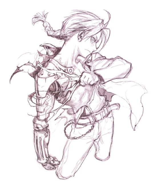
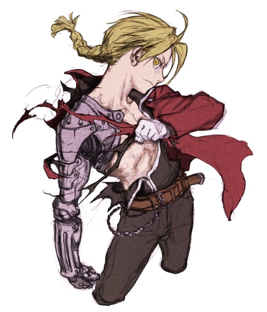
If you draw your favourite things out you will know them better! So, this is Edward Elric from #FullmetalAlchemist.
Even if you have decided on the pose you want to draw, it is better to sketch out these three first:
the moment before the pose is struck
the pose itself
the moment after the pose is struck
then decide which image works better for your art. I learned this from a really great senior of mine, and it is very solid advice.

###
29/11/2023 (Translator's note: I decided to move this one to the top because it is my favourite. No I don't accept criticism.)
I have been drawing Ed's automail again.
I like it when the machine part has a distinctly different silhouette compared to the human body, so I added some original ideas to the design.
What design should I draw next? Perhaps I should draw the military uniform?

# (combined two posts because they’re the progression of the same piece.) #
26/11/2023
Again, it is the time of "drawing your favourite things to know them better!"
It feels so good to draw such great characters...
27/11/2023
My Photoshop has been crashing for mysterious reasons the whole morning, and I tried to troubleshoot in the afternoon and it was a PAIN. Computers are really difficuuuuuuuult--
###
28/11/2023
Iwamoto-style drawing Masterclass: Bonus!
It is the "Give the leather and metal items a bit of flare/shine to immediately make the drawing look more complete"-jutsu!

###
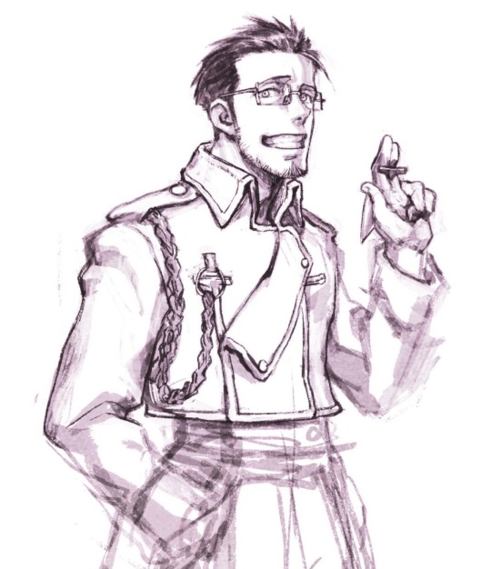
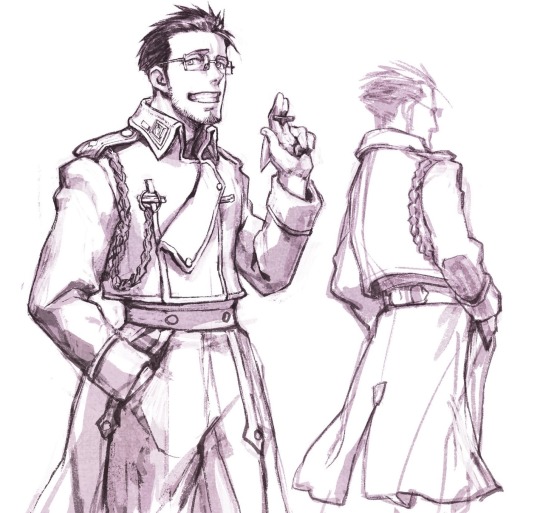
30/11/2023
I wanted the clothes to give off an oversized, loose impression.
Canon Hughes didn't seem to be wearing a shirt underneath... hmm.
03/12/2023
I am beginning to understand the structure of the military uniform better...
Realising the butt flap/cape didn’t actually connect to the upper jacket is a shocker to me.
###
03/12/2023
A continuation of yesterday's sketch
...or so I thought, until I realized how King Bradley and Kimblee during the Ishval war had a different overcoat design, in which they actually wore a single long coat instead of a separated upper and bottom set.
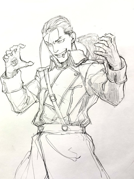
###
04/12/2023
When his clothes were unbuttoned, there was something that looked like an additional button on his right chest... I wonder if it could be fastened from the back?
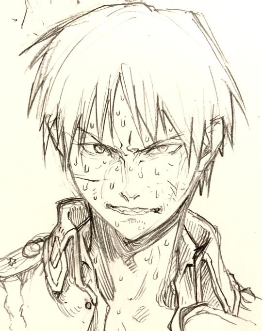
(Translator's note: sorry, I have no idea what button he's referring to here lol)
###
05/12/2023
I like how each character's personality was expressed through the way they dress. Contrary to his appearance, this person was very intelligent, which makes him such a great character.
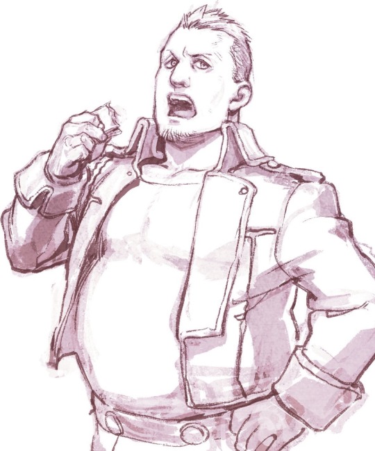
#Lia translates#tweet translation#fma#fullmetal alchemist#fmab#fullmetal alchemist brotherhood#Fma translation#edward elric#roy mustang#solf j. kimblee#heymans breda#maes hughes#iwamoto tatsuro#ace attorney
1K notes
·
View notes
Text
Have some Rewrite Dark Cacao
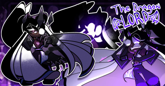
First drawing of 2025-
Wow, finally decided to draw something lol. I decided to draw more of my version of Awakened Dark Cacao, which, for now at least, will be called "Rewrite Dark Cacao" because this redesign is now canon to my rewrite! I wanted to draw my Dragon Lord Dark Cacao showing off his silly abilities, like distorting his face to look like his berserk form and summoning his berserk claws.
I have seen some critiques of my redesign and, while I personally still like it, understand where some of you guys are coming from. The main critique I've seen (that also came from a good friend) stated that the redesign simplified Dark Cacao's hanbok a wee bit too much. Which, I completely understand.
I originally wanted the outfit to look like a mix of hanbok and a samurai outfit (similar to the Vocaloid, Gakupo) but, it didn't turn out too well now that I'm looking at it more lol. So, I tweaked the design a little and added a half-hanbok with a design similar to the Canon design but less cluttered. Which, I think looks a lot better. Everything else looks the same as the original redesign lol.
Rip and tear.... until it is done.
#cookie run#cookie run kingdom#cookie run au#cookie run kingdom au#dark cacao cookie#beast yeast#dark cacao cookie fanart#dark cacao crk#crk dark cacao#cookie run redesign#character redesign#redesign
217 notes
·
View notes
Text
"Pork you literally posted Charlie a few days ago why are you so Hazbin obsessed rn-" ssshhhhshhsshhs.h........ anyway
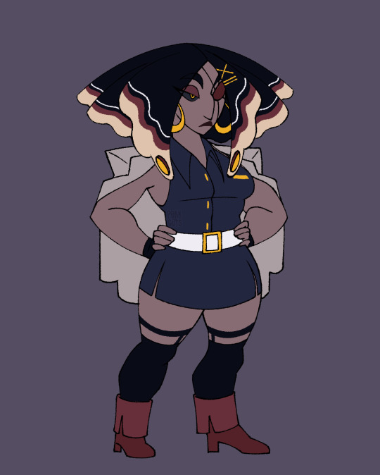
VAGGIE REDESIGN! And I changed her name also bc I'm jus like everyone else fr. Meet Verbena :)
BREAKDOWN BELOW!👇🏾+ Exorcist uniform redesign :3
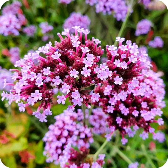
Starting with her name this time. Back when she was still a sinner apparently she was Salvadorian and since she's (apparently?) not a former human at all I decided to take a small creative liberty with her decent and made her Venezualan instead. SOUTH AMERICUH❗❗✊🏾 I'm pretty sure Verbena flowers are native to South America so that's where the name comes from.
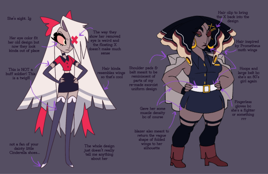
Onto the design! I don't have much to say abt her design honestly. It's not egregious, but it doesn't really speak to me either. It looks like simple formal wear or uniform with some strange meaningless accessories attached. And those weird itty bitty shoes that look like they're part of her thigh highs... I'm starting to think all the characters's shoes were a last minute afterthought. All and all it tells us nothing about her character. The hair wings are cool tho so I did steal those
Also the whole deal with her eye is strange to me. Why Is the floating X there??? It's a real physical part of the world, other people can see it. Do pink X's always float over angel wounds? If her arm got chopped off would an X float over it? Was it like. A fucking curse visual placed by Lute as a constant reminder of her disloyalty? Why did Carmilla point out it was an obvious marker for her being an angel???? My brain can't fathom why it's canonically attached to her wound. If she was a sinner I'd kinda understand but. Yeah idk. Weird
Also her missing eye does not look like an empty socket it looks like a purple circle was sticker pasted on to her face. It's very flat. How did we go from this

to this
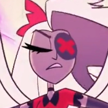
(IT'S EVEN OVERLAPPING ONTO HER NOSE IN THIS SCREENSHOT WHAT IS THAT THING.)
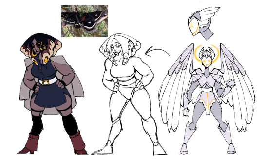
Anyway. I made her hair resemble Polyphemus moth wings because 1. They have eye looking spots and angels are all eyes and 2. Well. Polyphemus has 1 eye. So . 💀

Her overall coloring however is inspired by a Promethea moth. I could say it's because Prometheus defied the gods and Verbena did a similar thing but the real reason is I made a spelling error while initially looking for a Polyphemus moth reference 💀 but hey they both have eye spots! And Iike their coloring for her way better

I also redesigned the exorcist uniform for her redesign bc I wanted her outfit to have reminiscent elements from it.

I gave way less time to the uniform designs, but I still had some main details I wanted to adress. I don't like how they have no armor save for their helmets. Their arm and leg pieces are made of some flexible material that tears easily. It's not giving soldier it's giving soldier costume from party city. The devil like horns are also confusing to see on an angel and the paradoxical design is never addressed. They can be evil and look imposing, but the horns just seem kinda nonsensically on the nose to show how evil they are. At least to me.
In my designs I gave them actual metal armor on their bodies so you can easily tell they're soldiers and it makes sense for them to battle in armor anyway. I also gave them more light "angelic" colors with gold details bc I wanna use gold as a symbol of angelic nature in my rewrite. I wanted their masks to show completely static expressions with wide grins to show how unnerving they are and to allude to the idea that everyone is happy in heaven, and they're all happy to do what they do.
Verbena's belt and shoulder pads draw visual similarities to the pauldrons and mid section pieces in my new exorcist uniforms to draw a connection between her and her past. The Blazer draping behind her back is also supposed to mimic the visual of folded wings. I also tried to do this with all the gold details in her design. The big hoops and belt we're 80's inspired because I decided to follow how in one of her old designs she died in the 60's (even had the big hoops and everything). In my rewrite exorcists are all former humans but I'll get into that later. Also she's got an eye patch now! Just. A normal one.
Charlie is still taller than Verbena just like in the original and idk how tall Vaggie Is exactly but Verbena is like 5'5 while Charlie is 5'11. Verbena's also got more muscle on her bc unless their muscle mass is hidden magically or they don't gain muscle for stupid dumb idiot lore reasons all the exorcists look way too slim to be military grade soldiers but what do I know
I combined a lot of pointy shapes with boxy shapes bc— more similarly to her pilot self— she can be volatile and fierce but also grounded and impassive. I added the slits to her skirt so she can be a sexy formal lady who can still comfortably throw a few kicks, and the heels— well. Idk I feel like she could slay in heels! She definitely doesn't wear em all the time but yeah. Chunky heels. I like them they're cute. Also she's got her little name tag on bc she takes Charlie's job for her SERIOUSLY! she's uh. Idk what is she. A bellhop? General security/protection? Either way she's locked in.
I imagine she had white irises like Adam and Lute along with brighter more saturated and heavenly colors in her hair (color picked from the Polyphemus moth) that turned darker and more harsh after the fall (color picked from the Promethea moth). Really visualizing her emo phase /j
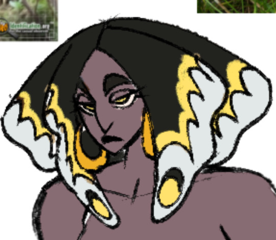
Also I think the little eyes in her hair can emote with her. In the final design the line kinda makes an eyelid and it'd match her eyelid's movements. Sillay
Alright that's a wrap on my Vaggie redesign! No bonus sketches this time bc they're within the texts! Who knows what I'll do next. Who I will deface. I sure don't. I think I might rename Charlie so there's that. Anywhozies hope you like her <3
#my art#digital art#hazbin hotel#hazbin hotel redesign#vaggie redesign#exorcist redesign#couldn't add the flaming banner bc i hit photo limit oops#anyway. FUCK VIVZIEPOP ❗❗❗❗❗❗❗❗❗❗❗❗❗❗❗❗❗❗❗❗❗
182 notes
·
View notes
Text
Not-So-Secret Drawings
REQUEST: Hi there, so I've been daydreaming about this for awhile but I absolutely suck at writing so, could i request hcs were the reader is really good at drawing and has been secretly drawing random people on campus whenever they get the chance, but one day reader forgets there sketch pad somewhere and a character (of your choosing) finds it and decides to snoop and finds drawingsof them and people on campus. Just as they finish looking through reader comes (after realizing they forgot it). I hope this makes sense to you, have a nice day/night.
SUMMARY: Your carefully hidden secret is out now. WORD COUNT: 1k
WARNINGS: Riddle, Azul, Floyd, and Vil snooping looking through your drawings, reader is a really good artist, Riddle threatens you (out of love I swear), Azul is uncomfortable by your drawings (not in a bad way- I think), mentions of getting lectured by Azul, Floyd is a ball of chaos, Vil gets no warnings because he's perfect/j A/N: When I tell you that as soon as I saw this I immediately rushed to write two parts before having to stop because I needed to do my summer homework - and then procrastinated the last part (Vil)- Also I know you implied one character but since I'm indecisive I did multiple haha (I'm sorry (but also kind of not because this was fun)) I'm sure you don't suck at writing!! You just get sick of your own writing because it all seems predictable (speaking from experience, I read my work and I'm like "ew?? I need better words" haha) Vil's part is definitely weird because I was like "Fashion Designer!Reader" (probably because some of my friends take fashion/design classes) and I don't know how accurate this is I suck at drawing so I know nothing please don't come at me- Also on a side note, I have a lot of requests right now and since I have a lot of schoolwork I have to do right now, my writing will probably be scattered. Hope you guys understand! (Hope you have a nice day/afternoon/night/etc too!!)
© kazumiwrites - All rights reserved; please do not steal, edit, copy, repost (etc) my work without my express permission.

You had always been careful with your drawings. You never wanted another person to look at them. After all, you had been drawing other people - and who knew what they would think?
Sure, they were pretty accurate, but still. It wasn't like the people at Night Raven College knew that you were drawing them. And you didn't want your drawings to get destroyed just because someone in a foul mood found them. Just your luck though, as you had left your sketchbook somewhere. Where did you even misplace it…

Riddle Rosehearts
He had always seen you with your sketchbook, but had assumed it was just for studying.
Likewise, when it popped up during class, he assumed that you were diligently taking notes.
It was almost sad seeing how far from the truth he was in hindsight.
Since he found your sketchbook on the floor (perhaps having fallen from your bag - it was always full, after all), he decided to take it to you. On the way over to Ramshackle Dorm, he flipped through the sketchbook before he paused.
These weren't notes. They were drawings.
And very good ones, at that.
They were so detailed, he thought for an instant that you had magicked them on here somehow (before remembering that you didn't have any magic).
So was this what you could do with some time and diligence?
His mother had never let him draw much so his drawings were mediocore at best (at worst, one would think that a small child had drawn them).
He found himself captivated by the artwork, flipping through the pages, seeing the drawings of various people from the school. Even some of himself…? With more details... It was odd, the small flutter in his chest. Happiness?
He jolted as he heard your voice, asking if that sketchbook in his hands was yours, abruptly slamming the sketchbook shut as if he had been looking at something completely inappropriate. Which, in a way, he might have been?
"Sorry for looking at these without your permission." He got out after a moment, handing it back to you. "You're a really good artist." He paused. "But you shouldn't be drawing in class. If I catch you with this sketchbook out during Trein-sensei's lectures, I'll have your head!"

Azul Ashengrotto
Of course Azul had noticed your drawings. He needed to in order to make sure he knew as much as possible about others so he could scam help them whenever they needed it.
Still, he found it intriguing, so he couldn't help but skim through your drawings. And my, were they amazing.
Until he got to the section where you had drawn him.
Sure, there were drawings of him in regular uniform, some of him in his P.E. uniform (he thought that they weren't really flattering on him, but you made it look good).
But then there were the sections where you had drawn him in mer form.
Of course, you had no idea what his mer form actually looked like (without all the overblotting, which you never got the chance to see clearly anyway) so it was mostly guesswork and using your imagination.
There were ones with long, large tentacles swarming around him.
Some with tentacles that were slender.
Some of them popped out of weird angles, which he was puzzled about, but okay.
My tentacles can't move like that - or can they?
They definitely shouldn't be popping out of his ribs. Wherever did you get that particular idea? It made him uncomfortable just by looking at it.
He was so caught up in examining your drawings and he didn't notice you until you literally snatched the sketchbook from his hands, saying something about how they were private.
"Sorry, [Y/N]-san... But these drawings aren't too accurate, you know."
And that was how you got roped into a three-hour long discussion about the anatomy of octopuses as well as the anatomy of merfolk and how your drawings were terribly inaccurate. (You were just guessing, how were you supposed to know any of this?)

Floyd Leech
Floyd wouldn't even wait until the sketchbook was unattended.
He'd pop out of nowhere, eyes bright, asking what you were doing.
Never mind if it was in the middle of class or not.
You've both gotten scolded about this, he should know better.
Still, one day he caught you by surprise, and the book slipped from your hands.
You muttered a small curse before trying to grab it, but whoops, too late. Floyd had already gotten it and was flipping through the pages.
"Aww, Koebi-chan, you drew me?" His gaze met yours, a wide grin on his face (showing his extremely sharp teeth). "You should've just asked, I would've modeled and stuff for you."
You shook your head slightly. You had wanted to keep this a secret if possible... At least Floyd seemed to be in a fairly good mood. You told him that you wanted to draw people in their natural state, without them posing for the "camera," so to speak.
He looked disappointed, but then immediately asked if you could come to a basketball practice or match or something. Perhaps you'd find it more interesting to draw him there. Or maybe in the ocean?

Vil Schoenheit
He was no stranger to people drawing him. He was famous after all.
He did sometimes get… odd pieces of artwork, but that was to be expected.
Still, he didn't expect to find a sketchbook with him in it, abandoned at an empty seat. Only drawings of him.
It had so happened that you were trying to figure out a good design for clothing. You always wanted to have a face to your designs, and he was the perfect subject.
Maybe your drawings didn't do him justice, but it was interesting to see how you could tweak your designs to fit him better.
Still, Vil was plenty impressed.
These designs... He could definitely see himself wearing them.
Maybe he could show them to one of the people he knew... They could help make something like that. With your permission, of course.
He closed the book as he heard you come up.
"These designs really are fascinating. Would you mind showing me more details? I'm certain that we can turn these drawings into reality if you'd like it."

As always, reblogs and comments are always appreciated! ♡ Send your thoughts grr
Feel free to send requests! Check out this post for info ^^
#kazumiwrites#twisted wonderland#twst#twisted wonderland x reader#twisted wonderland x y/n#twisted wonderland x you#twst x reader#azul ashengrotto x reader#riddle rosehearts x reader#vil schoenheit x reader#floyd leech x reader#azul x reader#riddle x reader#vil x reader#floyd x reader#twst azul ashengrotto x reader#twst vil schoenheit x reader#twst floyd leech x reader#twst riddle rosehearts x reader#azul ashengrotto x y/n#riddle rosehearts x y/n#vil schoenheit x y/n#floyd leech x y/n
594 notes
·
View notes
Text


took a stab at tweaking the Darigan Chia- it was a good lesson in humility, if I'm being honest. Its never been my favorite design, so I went overboard at first with changes, and then ended up reigning it back in and feeling more appreciative of the original design then when I started.

(my original 'heavily redesigned' version before I walked it back a little)
The main things I wanted to change going in:
the spots not having shading
the face looking silly instead of intimidating
unclear attachment of the horns + the one closest to the viewer looking like it was attached at a weird angle
the claws on the feet looking like a mustache and not looking attached
the weird little claw at the base of the wings, which is incomprehensible to me
the angles and positioning of the back spikes - two of them seem like maybe they're coming from the back of the arm, but its unclear, and they also create a weird tangent with the already confusing wings
Shading the spots was easy- I ended up adding a few more too, since the value of the spots is so similar to the value of the shadows, the design felt like it needed a few extra that overlap the shaded area. After I decided I wasn't keeping my tailed redesign, I went back and added even more spots to the forehead- if I kept something else from that version, it'd probably be those spots, I think they look nice.
The funny face with the visible lower teeth implies an underbite to me, so I redrew it a little fiercer. I also played around with the idea of a cuter vampiric happy kitty mouth, but it felt too different from the original design.
I understand the original artist's decision to design the eyes the way they did them (the upper line of the eye is the chia's original eye, so if you put contacts on them they look weird but Less weird than they will on completely redrawn eyes), but decided to give my edit the Darigan Wocky redrawn eyes treatment instead, since the base Chia eyes are, imo, kind of awful.
While I made their attachment to the head more clear, I feel that I failed to make the closer horn aligned properly, and I don't think how I drew the rings on the horns makes sense with how they attach to the head either. Symmetrical curved horns are so hard to draw in perspective, and I suspect the original artist had way less time than I spent on my attempt, too. Maybe someday it'll bug me enough to take another stab at it, but I'm setting it down for now, lol
I'm not 100% sure the bigger claws I ended up going with are an improvement either- while they look more attached to the foot and less like mustaches, you lose some of the teal color on the feet, and that color is nice.
I initially redrew the wings completely, but ended up liking the shape of the original wings way better- mine feel cluttered, and my attempt to bring the teal back in a second spot doesn't have the nice contrast that the white webbing has. While I was making slight edits to the original wings, I realized that without the spike tangents and with the far wing re-positioned slightly, I probably wouldn't mind the strange little claws. Its not like this style of cartoon bat wing is realistic anyway.
Oh and I also gave my more elaborate redesign a tail because I felt like it looked like it was gonna fall over, and slit pupils because uhhhhh, and I gave all of them shinier hair because I got carried away and its fun.
anyway! if you read all of that- wow thanks, i hope it was interesting!
35 notes
·
View notes
Text
alright fine you twisted my arm i watched the murderbot show
obligatory acknowledgment that we’re only like 3 episodes in and also im not saying anything that hasn’t already been said. but its my blog so
pros:
-i really liked that opening. do you think they’ll ever make merch? i would absolutely kill for a little muderbot doll like that Q_Q
-yippee yay muderbot yay!! *runs around whipping it around in my mouth like a dog with its favorite chewtoy* yay muderbot yippee!!!!
-the set design is rly cool, and i rly like the outfits! the casting is pretty good, i rly like the actor they got for Mensah, shes good
-Ratthi yelling over the comm was really funny. solid ratthi moment
-gurathins nail polish
-muderbot being smooth down there like a ken doll
-i liked the murderbot gore, especially the part where the “cubicle” (tho its not rly a cubicle anymore, i guess this has better camera angles) patched it up
-i also like mbs internal snark, its funny and in character and keeps the show pretty firmly in mbs head
cons:
-im sad theres no overse or volescu, but more than that im frustrated they decided to remove them AND change pin-lee and arada’s personalities as much as they did. like, i understand objectively that they didn’t want to have a crowded cast and focus on more key players, and they can always be brought in later, its just frustrating
-did not really appreciate the gawky attitude towards the “hippies”, or the poly relationship, or the it/its pronouns, or they way they made arada into the “um actually” animal rights activist lisa simpson of the group. not that i expected apple to handle any of these subjects respectfully but its still. frustrating.
-i get what theyre going for with the restructuring of murderbots timeline, like how they have it to have just recently borked its governor module and therefore a lot more fumbling and panicked, but its also frustrating because it smoothes over some of the really compelling parts of murderbots personality! for instance, the part where its going into the deltfall facility, even though it knows its dangerous, even though mensah tells it not to, it cant really justify why its doing this to the audience. the only explanation is a kind of half-assed “i had to get curious” but it doesnt act curious. in the books, it goes into deltfall because it wants to kill the other secunits. this is the thing i think is really missing from tv!mb, where is the blood thirst?? (granted it does have its little murder fantasy in the first episode, but it drops that pretty quickly and it never gets brought up again) tv!mb is missing one of the most compelling elements of book!mbs personality: the broiling undercurrent of depression/rage. thats the thing that justifies it staying with the company, thats the thing that justifies it going after secunits it doesnt have to go after, thats the thing that justifies it putting up with everything its put up with. its also part of just what makes murderbot a murderbot, like, it calls itself that for a reason!
-i dont particularly care for the drawing out of muderbot and gurathins cat fight. feels pointless, and gurathin is honestly being just a little bit too mean, without the justification. im sure well get tragic backstory about how gurathin saw his parents get murdered by secunits (maybe they’ll even be some of the people mb killed in its flashback??? putting money on that now) but its just awkward more than anything
-all of this on top of the knowledge that were going to soon be getting that annoying corprim girl joining the gang is just like, not filling me with hope! theyre going to bring her back from deltfall, arent they? shes going to be the sole survivor. god if she fucks with mensahs bad ass mining drill moment …………………
-im completely on the fence about how theyre handling mensah. on one hand, i like that theyre touching on some of her later development; her struggling with pressures of leadership and ptsd, her lack of consideration for her own comfort or safety in favor of other peoples, her cutting off her friends and family from the reality of her struggles, thats all good! but it feels a bit early, knowing that she hasn’t been through all of the things she will later on. idk shrug. its not bad or anything. just interesting.
anyhoooo thats all ive got for now. not terribly surprised, not terribly impressed, but it also could be a lot worse. solid 5/10 so far.
#murderbot#murderbot show#charlie chatterbox#very little editing here…. stream of consciousness type meta…..#i dont know if i have strong enough feelings in either direction to justify writing this much about it but here we are#but also ive got the weekend brainfog so maybe the strong emotions will come still#honestly the only thing im strongly holding out hope for is kevin r freer getting to voice art. thats the best idea anyone’s ever had
13 notes
·
View notes
Text
Both my redesigns for my Domino and Chance AU. Updating my designs from last September. Both more proportional and in my (slightly better) art style. Original design here: Echo. Emerie.
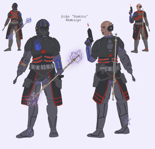
Echo has almost a complete redesign. The only thing that didn’t change was his helmet design. I wanted his handprint back on his chest plate instead of his arm, and as I’m working out the logistics of his energy support, I have reduced their connection cables and complicated centre panel. I wanted him to match Emerie more, so I gave him the same style of chest plate design. His back plate is similar to the back plate is TBB armour without his pack, but I wanted it to follow the diamond shape I established in the first design. Also, actual useful stuff on his belt. Also, their under suits are no longer such a bright purple. It’s more dusky and dull.
An updated kama design to be a more subtle “3” reference, and added ARC straps as well since I wanted to bring back in elements of his ARC armour. I modified his legs since he gets them upgraded and I love the concept of smoother, more futuristic looking prosthetics. His old ones feel clunky. I gave him a more screen accurate arm now I know how to draw that.
Big face update. I have drawn his so much, and I’m refining how I draw clones, so a better concept of how I short hand clones. Same weapons: his embossed D-17 and electro staff which I didn’t update since I put a lot of thought into its original designs to be used duel handed. His armour is mostly unpainted besides his hand print (obviously) and his little designs to match Chance. This is mostly so visually his armour isn’t too complicated for me to draw, but also because I imagine him struggling to decide if he wants to lean more 501st or CF99 now he is with neither. And, of course, Fives vambrace. My signature for my Echo.
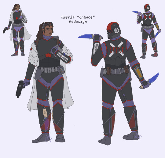
My big change to Emerie is how she looks. The original design was my first ever time drawing her, and now she’s my most drawn character (second to Echo?). I wasn’t planning on doing a new sketch, but I hate her old face so much. Now she looks better: I’ve bulked her out, and she actually looks like how I draw the boys.
Her changes are mostly now I know she’s going to be a much more combative character. Originally she was designed to be mostly intel so didn’t need a lot of armour. Now she has a crotch and skid plate, hand guards, better fitting armour, and a practical belt set up. Her helmet actually fits in this design. Her belt is the right way around, and so are her knives (one in a reverse grip, and one not). Her tattoo is visible, her goggles are more accurate, and her lab coat sits more realistically over her arm guards. I stuck with my original concept for her base armour because I want her to prioritise movement and swiftness which is why she doesn’t have pauldrons/elbow guards/ knee pads covering her joints, it gives her additional mobility and flexibility. And she has the same colour change to her undersuit, and full gloves not fingerless ones.
Still her DC-17 and knives (I love her knives), and I’ve kept her two transmitters even though I don’t necessarily think she’d be taking her long range one with her. Her helmet and right vambrace both show similarities and shape language as Fives and Tech, because I want echoes (ha) of their designs in her concept as she is Echos current duo. I though about redesigning her backplate or giving it a connection port point, but I love her design and I like the concept of using the space for a big statement piece related to her character now she finally gets armour.
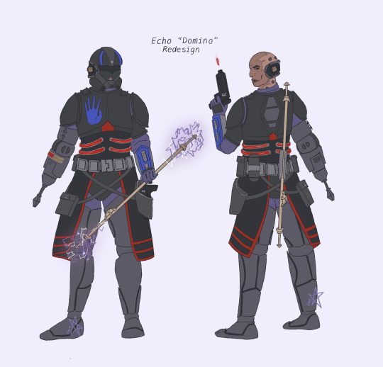
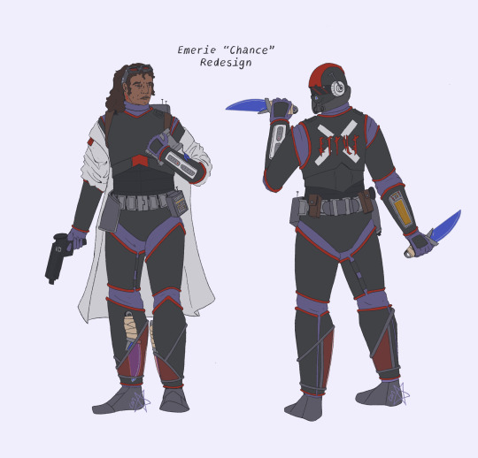
I know I draw “Chance” a lot, and since I haven’t finished the AU, you don’t understand why. But trust me, she deserves it.
Sorry for the rambling. I have a lot of thoughts about these designs. You sort of get that way when it’s your first major Star Wars AU, especially when you’re currently 50k words into it and you’ve only scratched the surface. I started this blog with the full intention of it being somewhere to dump all this AU. Makes more sense why my first Emerie was this design.
#star wars#fanart#tbb fanart#star wars au#domino squad#tbb echo#arc trooper echo#emerie karr#tbb emerie#domino and chance#echo ‘domino’ au#emerie ‘chance’ au#echo and emerie#art practice#clone trooper redesigns
9 notes
·
View notes
Text
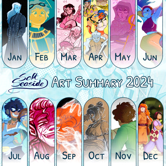
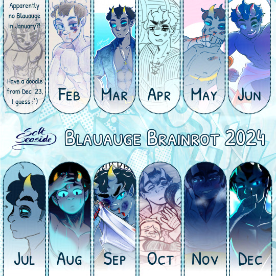
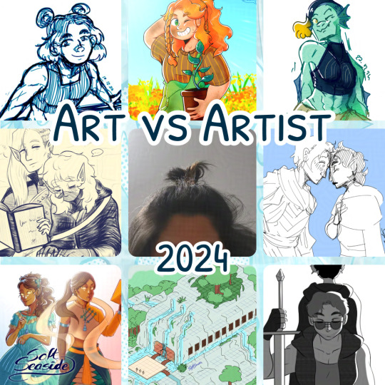

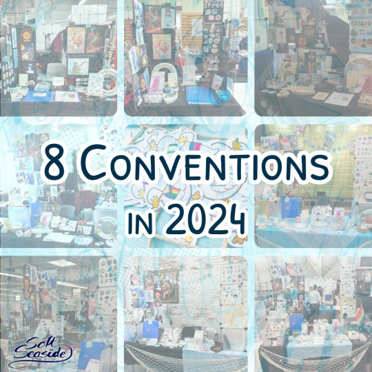
It’s finally time for my art summary and I decided to throw my art vs artist 2024 in here as well! I also made two alternative versions for the art summary and art vs artist thing because…well…I think these summarize my 2024 perfectly sdkjskdj
I’m always really thrilled to make these art summaries at the end of the year and reflect on how the year went down. One of my main goals for 2024 was to finally launch the first chapter of my webcomic. Unfortunately, I got some health problems in the beginning of the year and after that, I started to dm my very first D&D campaign and…well…accidentally got obsessed with Blauauge, one of the OCs of the campaign that I completely lost focus on all my art goals skdjskdjsd
Homeboy ruined my 2024, made me forgot to work on my comic and made me start drawing sm*t ksjdskdjsd Jokes aside, DMing is really fun and made me try a lot of new things and expand my creativity. Artwise, 2024 was really, really fun for me, I forgot how much fun it is to be completely immersed in something and I just had so many ideas and thoughts and feelings and love about this blue tiefling.
While I’ve struggled a lot in the beginning (and still do) because I felt super cringe and ashamed to be so obsessed with a character no one knows/cares about, I slowly started to understand that I’ve always been doing art for myself and only for myself and that’s what I like most about art. It’s okay that not everyone is as hyped as me about my OC and the most important thing is that I have fun. Nontheless, I’m super thankful that people actually started to be interested in him so thanks everyone for sticking up with my unhinged OC brainrot 🫶💙 Let’s see how long it will stay since my mini campaign will end soon and we’ll continue our main D&D campaign again. So maybe 2025 we will finally be free of the blue himbo tiefling lmao.
Blauauge brainrot aside, this year I was able to gather a lot of experiences at tabling at artist alleys (8 in total!!!). I had so much fun, I learned so, so much and I met some really cool people and even made some friends. It was truly an amazing experience and I feel like I grew alot. That being said, I also realized that being a convention artist is EXTREMELY time-consuming and takes a lot of energy. Combined with my full-time job and dming, I barely had time for my other creative projects like my comic or my youtube channel and I feel so exhausted.
Looking at my goals from last year, I achieved one of them (attending more artist alleys) but for the other goals, I completely neglected youtube and I don’t feel ready for an art shop at all RIP + I really wanted be better at the fundamentals and I guess I got a bit better at anatomy because of Blauauge (and Blauauge sm*t) so I guess that kinda fits LMAO?? I also start putting more effort into backgrounds for my comic and I’m thinking more about composition while drawing but it’s still a long way for me and I really have to actively study because I feel like I’m at a step in my art journey again where I feel kinda stuck. However, something that really surprised me is that put a lot of my attention on my coloring and I find it way more enjoyable than last year. Also, just a side note, but I’m halfway done with my internship/apprentinceship and I am kinda proud of how much I’vee improved at graphic design and my branding, hehe.
Next year, I’ll TRY (lmao) to attend less conventions. I’m also on a good track working on my comic again SO THIS YEAR, I PROMISE TO GET THAT FIRST CHAPTER DONE!! and I’ll also try to make another youtube video again and maybe even start livestreaming? (no promises lol)
Thanks for liking my art and wishing you all lots of energy for 2025! 💙✨
#art summary#art summary 2024#art vs artist 2024#art vs artist#art vs artist meme#softseaside art#my art#dnd artist#oc artist
7 notes
·
View notes
Text
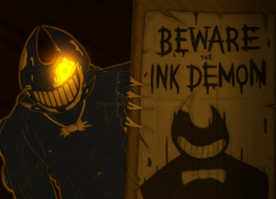
From the depths of the studio - where darkness prevails and the voices of the puddles grow louder - a message is echoed to the rest of the world. A promise filled with hatred and,at the same time,with conviction. Words coming from someone who was more than confident that their blasphemy would come true.
A message that is directed to one creature,and one creature only...
"I will become the very being You never could be"
----- "A Promise Sent from Below" - Return to the Studio AU.
Oh hey, I have an AU, I forgot about that (lie)
I've had a similar idea in my head for a month now. It wasn't possible to do it last month, but no problem. May would make more sense. I did something with this little guy for 414 last year, and I wanted to do something with him again. April 14th of this year would not be possible, but May 14th or 15th? Oh yes. These dates are better because it was between these two (actually it was the 14th I think, but I consider both dates) days that I created this guy above! Consider this drawing a celebration made for…well, me. Of course, he wasn't created with the design above in mind. His original, main design is quite different from this alternative (and less original) iteration. The drawing above shows his current situation in the "current" moments of the RTTS AU.
His creation, which dates back to 2020, was the result of some Bendy-related thoughts of mine intersecting on the day. These being about new things in canon lore that came out at the time (plus speculation about this new information), a theory that at the time I started to understand better (which maybe based on the drawing, you probably know which theory I'm talking about ) and a funny bug found in one of the games (do you remember Ghost Bendy by any chance?) And then,boom. I created Atlas. I remember at the time I was thinking of other names for him because Atlas was just a codename that I had in mind to refer to him while I thought of a definitive name for the guy. But the codename ended up sticking. Plus, Atlas is a cool name and I wanted to give an OC that name.
Even though some details changed over time, I think I eventually managed to solidify his place in the AU. Not that his story is 100% thought out and completed. Hell, my AUs that I have are still not 100% thought out either, so what to expect from their characters. But I think that, currently, I have at least decided on the general idea of his place and purpose in RTTS, and I am happy with what I have come up with.
I don't know when the next time will be that I will show him again. In general, showing things from my AUs is not and probably will never be my strong point lol. But I'd like to draw him again eventually. So uhhhhhhhhhhh, one day. When that "one day" will be, it's up to you to decide
Happy Birthday Atlas. You and your other 2 alternative versions are cool to think about. Here's to another 4 years of chaos for you. 🙌
I can't believe it's been 4 years now, damn.
#bendy and the ink machine#batim#bendy and the dark revival#batdr#return to the studio au#bendy au#bendy oc#crookedsmileart#I found new a way to indicate which specific drawing refers to an AU or not#also writing that...thing at the beginning (drabble????) took a bit out of me#writing things like short story descriptions is so difficult; imagine writing a real fic#How can you all do this; seriously.#fanfiction writers are the real badasses;fr fr#about the “other 2 alternative versions” of Atlas; there are 3 versions of him that I have#the first is the one above; from the Return to the Studio AU. His main incarnation; I would say#Then there's his version in the Toon City Adventures AU; which varies a little from the RTTS version.#There are things in this version of him that I still need to rewrite#and then there's his non-Bendy version;#where I remove all the Bendy connections; and he is practically an original character with no connections to existing material#and play with him in some original stories that I put together in the back of my mind#I admit that this version is what I end up going back to a little more in recent times#But in the end I like all 3 equally#since last year's 414 art; I changed a few little things in his design; but still keeping the general idea in place#I'll eventually have to create a reference sheet for him;i guess#rtts au
20 notes
·
View notes
Text
Fanart For Three Girls and The Mansion of Skeletons Part 2 Electric Boogaloo
Hi I'm back with some more fanarts! For
Three Girls and The Mansion of Skeletons (comic)
and
Three Girls and The Mansion Of Skeletons ( Reader X AU Sans and Papyrus)
Take a look at this post to see the previous art I made.
This time I did something a little different I made designs for all three girls based off three of my oc's that I use as the reader insert, I'll give a basic descriptions on my ocs if anyone wants to know more about them just let me know and I'll put it down in a separate post.
Also I have three separate pieces I originally was thinking of doing more than three for each of the girls and design version but I thought about it again and realized that I would just not complete all of them so I just did three. For each one I'll discuss why I chose the specific design I did and which of my characters are connected to it, and I will show the other designs I have for the girls I made for each version I didn't draw which I used Gacha Life 2 to easily get their designs down.
I also made Tilly which her design will be at the bottom I also wanted to draw something for Tilly but I didn't know how I would draw it so I decided to not do one this time. I was looking at all the art concepts and found Tilly's and she was so cute and I had to make a design for her sadly there is no floral patterns in GL2 but I made it work.
Here are the fanarts first and foremost
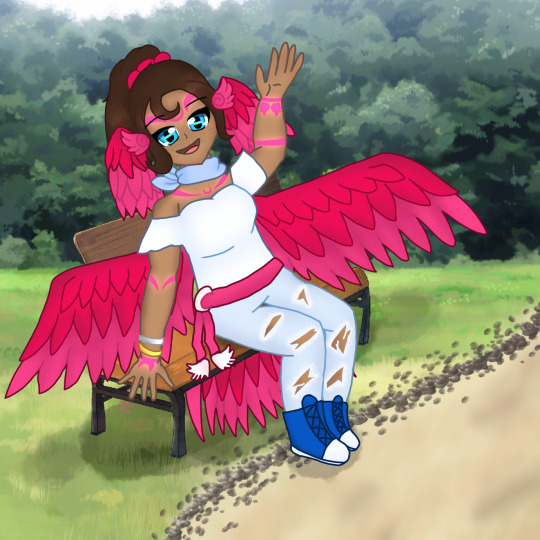
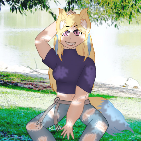
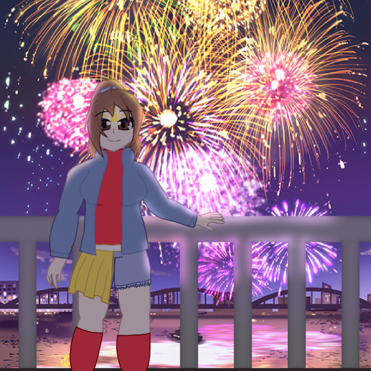
If you want to stop here that's cool, but if want to know about the design choices and lore of everything just keep scrolling to find out
Also I'll show my oc's first the the fanart so you know what the characters look like beforehand to help understand the fanart better
Briar Parrot

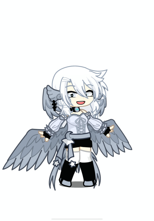
Diana Fenlon
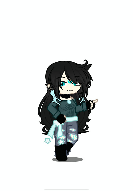
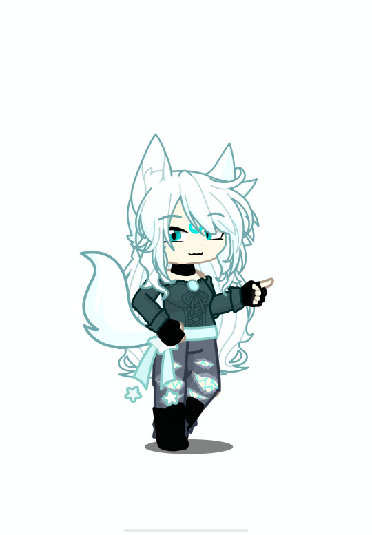
Alvin Cloneo/Echona Cloneo
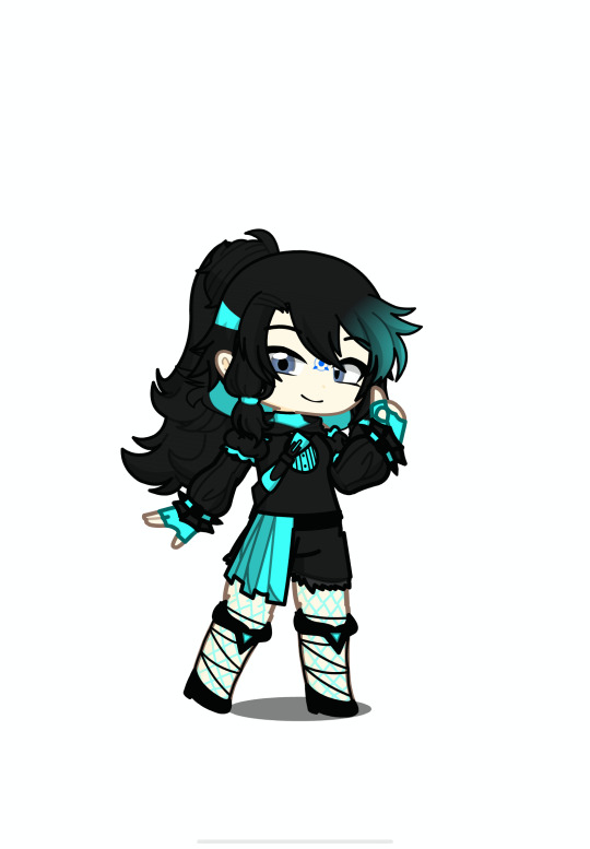
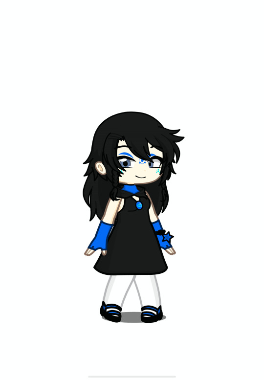
Anyway let's save the super long rambling for the rest of this post and show the fanart!
First is Autumn!

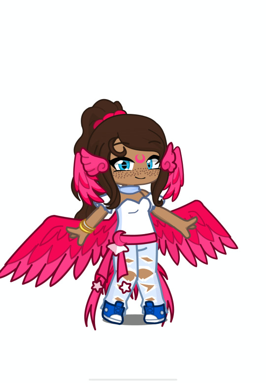
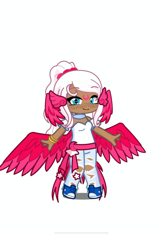
My OC that is connected to this piece is Briar Parrot, as you can tell by the name the character is a parrot specifically a Moon Parrot which are the designs for this group of girls each being of the moons have special makings depending on the person though they all obviously follow the same theme which is of the moon, The reason I chose to do Autumn for the Moon Parrot is because she gets wings in the story and though it would fit best, also for the clothing I did my own outfits that were based on the concept art and comic art, and another detail the backs are open for their wings because I would be hard to have wings and have closed off backs.
Also I used Autumns soul mark two times in the design as you can tell one you can see in the moon markings and one on the dangly bits for the belt, also originally the entire outfit was pink but I decided to do blue instead because she has a few outfits that has some form of blue. Also I didn't really think much on the settings other that a few ideas which for Autumn was her sitting on a bench also her tail goes through the slit of the bench that you can't see because of her wings, I did that because I would imagine it wouldn't be comfortable to sit on your tail.
Now for the small summary for Briar Parrot she is obviously a Moon Parrot but she is also an Ultima if you don't know what an Ultima is for anyone who is just reading this, I'm pretty sure it's an idea that originated from Aphmau because I can't find anyone else having this concept before her please correct me if I'm wrong about that, but an Ultima is a werewolf that can turn humans into werewolves and werewolves into humans by bite or by their eyes when they are red which activates when they experience very high negative emotions.
I have expanded on this concept for my world where other species other than werewolves can have an Ultima variant for example Briar is a Ultima Moon Parrot she originally didn't have problems with her emotions she was lucky enough to be raised by people (which aren't her parents they died when she was really young) who taught her to manage her emotions healthily, but have a very bad event that happened to her she has a lot of problems know but she is trying to work on them but for know she hides as a human when originally she just looked like a normal moon parrot. She used to be very outgoing and generally a person anyone could get along with, she's also the type of person that wants to believe in the good of everyone and will offer a hand and support to those that are in need of help or can change for the better, but she knows when to step back when it's obvious someone is refusing to change but in the present she is very reserved and anxious but sometimes her old personality does still shin through at times.
Also another thing Briar is apart of a group in my world known as relic holders. Which this groups holders the relic made by the gods, basically everyone got them since they were born the relics hides in the person soul/body so it's not visible and sometimes someone can go their entire life without knowing they are a relic holder like Briar, her relic is the Ultima Parrot relic. Relic Holders do get a boost in power from relics but it depends on the relic and their bodies capabilities, for Briar for example only her Ultima abilities get boosted but since Ultima's basically only have 1 ability which is turning humans into werewolves and vise versa the relic boosting doesn't really do much because the Ultima ability is contestant across the board. There is one more relic holder on for these art pieces which she is at the bottom.
I'm not 100% sure on whether Autumn, Doe Mae and Suzy will also be Ultima's for these design I'm leaning more towards yes because if yes than it would be easier for Briar to make friends with them because she'll know about them being the same species as her through both instinct and from the people who raised her which the people who raised her was the Magic Government a Governmental body that does a number of things which the main two being making sure the usage of magic isn't being used for super violent and malicious reasons and two keeping species like Ultima's safe and protected and most of the time knowledge of which people are Ultima's hidden, and though the branch that protects Ultima's collectively raised her the leader of that branch was the main one who did. Though If Autumn, Doe Mae and Suzy aren't Ultima's and are just Moon parrots (or Humans like in the book) I do think they can become for friends because from what I can tell from my perspective the three girls are really good people and Briar really clicks well with good people.
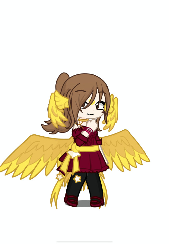
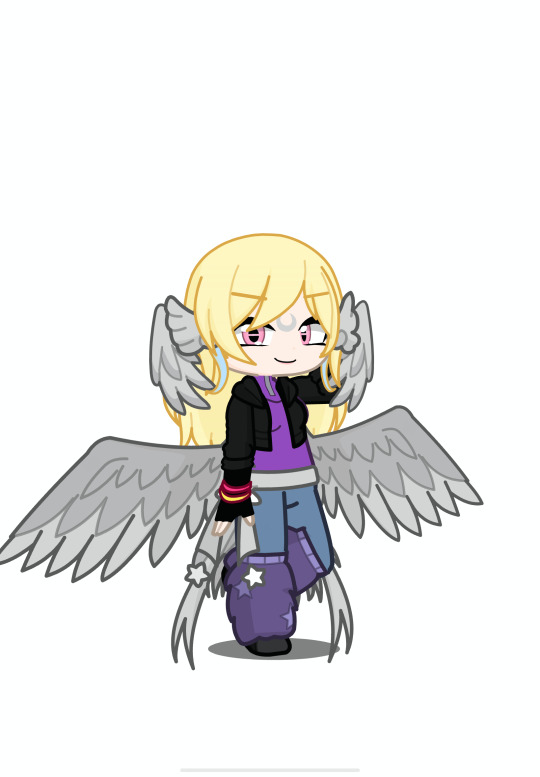
Here are the other designs for Doe Mae and Suzy
Doe Mae
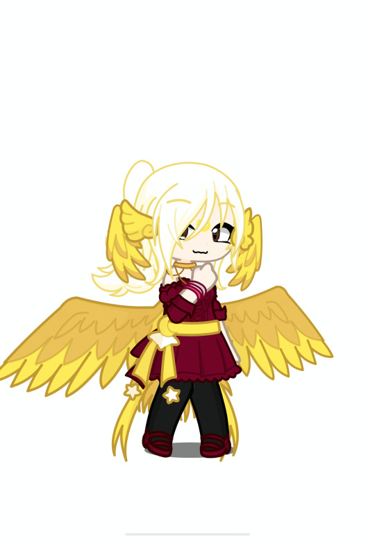
Suzy
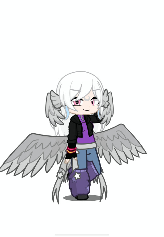
If anyone wants to know more about Briar just comment telling me so.
Next is Suzy!

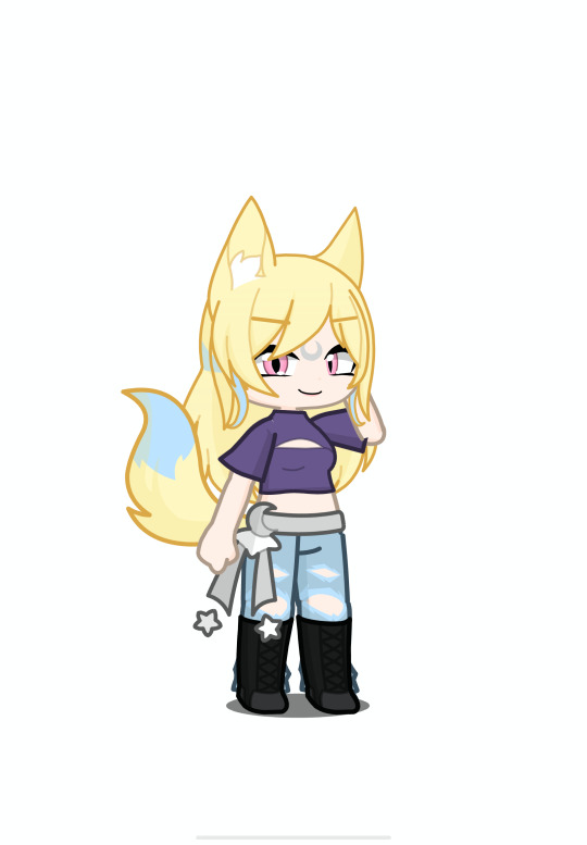
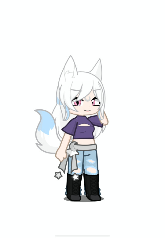
My OC that is connected to this piece is Diana Fenlon, she is a Ultima Moon Werewolf which are what the designs are of for this group of designs, same as the Moon Parrots they have special markings depending on each person, but for werewolves depending on whether or not a moon werewolf is in a large group or pack if they are in one then they get another marking connecting to their regular markings representing their pack they are apart off. I didn't do that for Suzy because I don't know what type of pack she would be apart of or if she would be in one at all. I chose to do Suzy in this drawing for the Moon Werewolves because 1 her soul mark gives her abilities like a wolf, and 2 in her concept art it looks like she turns into a wolf. Also I forgot to mention in Autumn's sections but beings of the moon usually have really light or white hair but depending on the parents they can have other colors as their hair color that's why I chose to do two designs for last group and this group one with the girls regular hair color and the usual moon type hair color. I also drew the girls in their regular hair colors mainly to make sure their recognizable.
Also It might be a little harder to see but I also used Suzy soul marks in her design for the markings it's hard to see it because of the glow of them but you can see it clearly on her belts dangly parts, For the outfit I did a combination of the outfit you se her in the first chapter in the comic and her I guess main outfit the one you see on the cover for the comic and the concept art. Also for Suzy's setting I wanted her to be like sitting on the ground or somewhere but not sitting down like where Autumn is so I chose to do it outside and because of the background I got to some cool lighting and shade stuff but my favorite Lighting and shading is Mae's picture to be honest I had a lot of fun doing that one, I still liked doing the others.
Now the summary for Diana Fenlon she is a half human and Half moon werewolf and as stated before she is also an ultima, she is more comfortable being in her human form because she had a lot of problems in her childhood about her wolf side that came about (not by her mom and step dad their the reason she doesn't completely hate that part of herself) by her extended family though mainly by her uncle and also something bad that happened between her and the same uncle about her being an Ultima. Sadly both of her parents died around when she was 15 except her bio dad which she doesn't know a thing about or that her dad she grew up with wasn't her actual dad, but once she turned 18 she moved out and for like the first few months stayed at friends places till she was able to get a apartment, she was already working before she turned 18. Also when she was around 17 she met a group of werewolves that live in a more secluded area away from the city and their helping her heal from the problems that caused her to not want to be in her werewolf for she's making good progress but she's still only really comfortable in her human form.
For the ultima thing its about the same for the three girls from Autumns section but for Diana's case she probably wouldn't notice the whole ultima stuff because she only found out she was an Ultima by her uncle (he found out because he is a massive hater) and she never really learned anything about ultima's other than the basic history in school so while she could tell by instinct she wouldn't really understand what it is. Though either way of the three girls being ultima's or not Diana most likely can be friends with them, she usually gravitates around nice people because she feels more safe around them. Other than her thoughts about her werewolf self which she gets anxious when anyone ask about it, she is usually the type to be a helpful person mainly like helping carrying things or doing small tasks for help half the time she doesn't even notice she's doing that, but also she is sort of a loner in the sense she doesn't know how to talk to people to make friends all her current friends are people who came up to her first to ask to be friends.
Here are the other designs for Autumn and Doe Mae
Autumn
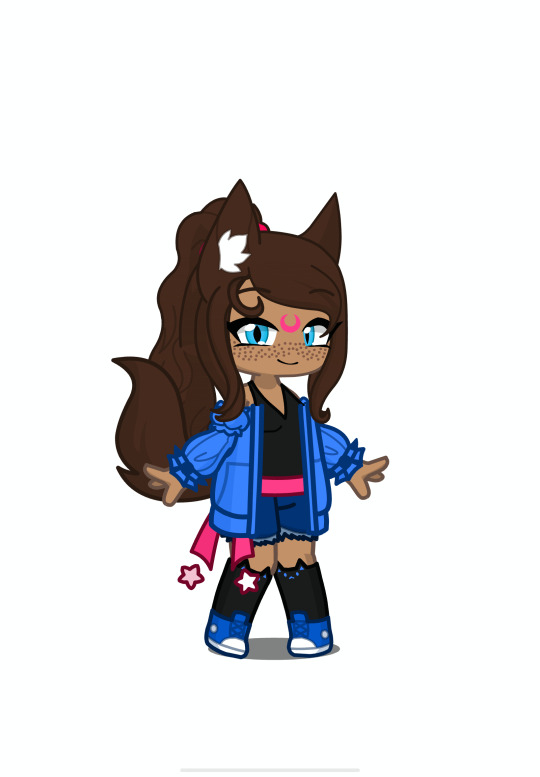
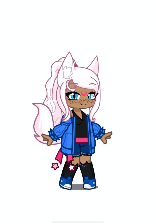
Doe Mae
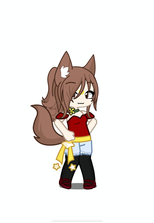
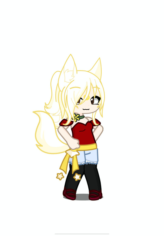
If anyone wants to know more about Diana just comment telling me so.
Lastly is Doe Mae!

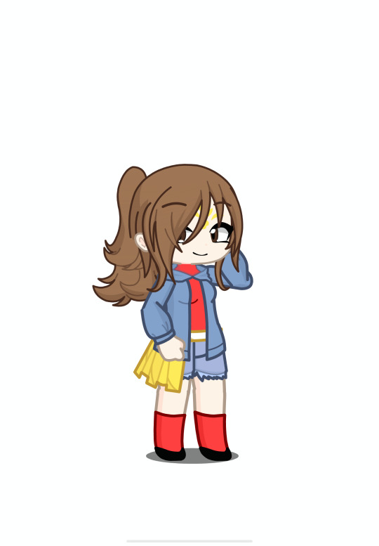
My OC that is connected to this piece is Alvin Cloneo/Echona Cloneo the reason why their two names will be explained in the oc summary but the basic is that Echona is a clone magic user and summoner, which that is the concept for these girls the marking on Mae's for head is the summoner mark which is a marking for those who use summoning magic (cloning magic doesn't give you any markings) the markings usually have a symbol that represents them and the color of their soul. Summoners can make summoner contracts and summon everything except their same species but clones are the exceptions because while yes they are the clone of whoever the clone is from the clones themselves are made of magic so in the system of magic they wouldn't be consider the same as the person they are a clone of unless the person is also a clone. Also for the summoner mark there is a mark the summon can get that is just the summoners symbol it's mostly a protection mark but some summons don't want one. Also to note their is a lot of rules that Summoners have to follow if they want to to summoning freely without getting in trouble, it's mostly to make sure to exploitations or abuse happens but if you just treat your summons like the living beings that they are and stay true to your contact then you don't have any problems
I also used Mae's soul mark in the markings its her summoner symbol, it's not exactly like the picture of her soul mark it's still are rose but their isn't a stem attached to it. For her outfit I did a combination of her first outfit in the outfit concepts and Alvin's accessories also I chose red because her main and quite a few of her other outfits have some variation of red. Now for the setting I wanted to have her on some type of balcony and I was looking through the backgrounds and found a firework one and decided to do that one and when I got to the last part of it I realized I can do some cool lighting and shading (which btw I did Autumn's, Mae's then Suzy's art pieces in that order so when it came to Autumn's I didn't think much of the lighting but I did do some shading for under the bench) for the fireworks I got to do a multicolor back lighting thing for it and that was fun to do.
Now the summary for Alvin Cloneo/Echona Cloneo first off Echona is the original person and Alvin is one of her clones specifically the 41st clone, also the reason Alvin has a name is because Echona names all her clones and lets them chose whatever job or role they want for Alvin she wasn't sure what she want's to do so she mostly just around town and jus doing whatever which Echona is cool with. Also one big thing is that in my world Echona comes from the people who built the town from the ground up and her family has been protecting, managing, taking care of the town since the start and nobody really knows about it, it's not like Echona and her family was trying to hide it or tell people about it but their role has mostly been forgotten by the general townsfolk. Echona uses her magic to the towns benefit she has multiple of her clones protecting and working throughout the town. Also the reason she has so many clones is because she is the holder of the Cloning Relic (yes there is a god of cloning that is a story for a different time and place) the relic gives her a boost in her capacity to have clones available and walking around as well as a mana boost.
Though Echona has one problem that keeps her basically confined to her home and why she mainly uses her clones for everything she has a disorder in my world called Mana Overload Disorder where her body is not built for the amount of mana she body and soul makes and that it makes it harder for her to use magic because of the disorder so her magic basically builds up inside her and since it's difficult for her to release the mana it causes a lot of problems. She gets high fevers and she can even die if she isn't able to release mana in time or enough mana. That is where the clones come in because of her relic she is able to use cloning magic a lot easier than any other magic so she makes clones to use up the over abundance of mana she has so she doesn't have to worry about dieing, she is also able to use summoner magic because it works a little different that most other magic the difference mainly comes from the contract nature of summoning magic, you can make summoning contracts without magic it's just the abilities that comes with summoning that does.
Summoning a summon to your side takes up mana depending one the strength and size will dictate the amount of mana, there is also telepathic communications between summons and summoners it doesn't take up a lot of mana it's more of a passive skill, there is healing magic that summoners has to learn to be able to be summons which that magic depending on the injury can take up a lot of magic (which that one is harder to do for Echona). For the abilities of cloning magic you can obviously clone yourself, clones at first usually are a blank slate of the original but can develop a personality as they go through new experiences and the personality doesn't have to be exactly like the original though does have some traits of the original.
For example Alvin is a very outgoing and friendly person and basically wants to be friends with everyone while Echona is very quite and reserved not in a shy way but in a leave me the hell alone way though she does appreciate silent company which basically just being in a room with someone doing their how things, the only people she lets around her is her clones. She also appreciate the people who makes friends with her clones whether or not they know that the cones are clones it makes her happy to see that people care about them.
Echona treats her clones like family and she doesn't really interact with other people mainly because she doesn't trust people after basically her entire family was killed in an assassination attempt and she survived because she was outside from her family home when it happen sadly she couldn't save her family. So she secluded herself off the grid hidden from the rest of the town while she ran things in the background and having most of her clones do the front work for running, managing, protecting and taking care of the town while she did all the background stuff. Also if a clone dies the original can bring the clone back with it's memories which Echona was grateful for so as long as the original lives the clones can basically can die over and over and still come back like nothing happened.
For how Autumn, Mae and Suzy become clone magic users and summoners I would think it's because of Alvin, the three found out about Alvin being a clone which wasn't difficult because the clones of Echona doesn't really hide the fact they are clones, and after a while of them being friends Alvin may have offered the three to teach them about the magic if they want and if they said yes than Alvin would be more than glad to do so. I'm not sure how the girls would use the clones but for Echona other than having the clones help her run the town she has them for company so she doesn't get super lonely, Echona also has her clones do jobs to make money to help run the town and fund charities, events and places like libraries, schools, shelters, etc.
Here are the other designs for Autumn and Suzy
Autumn
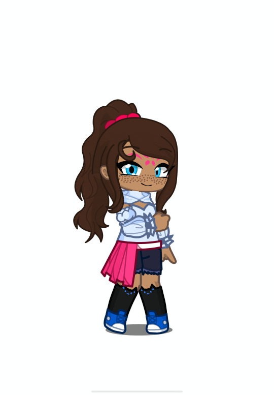
Suzy
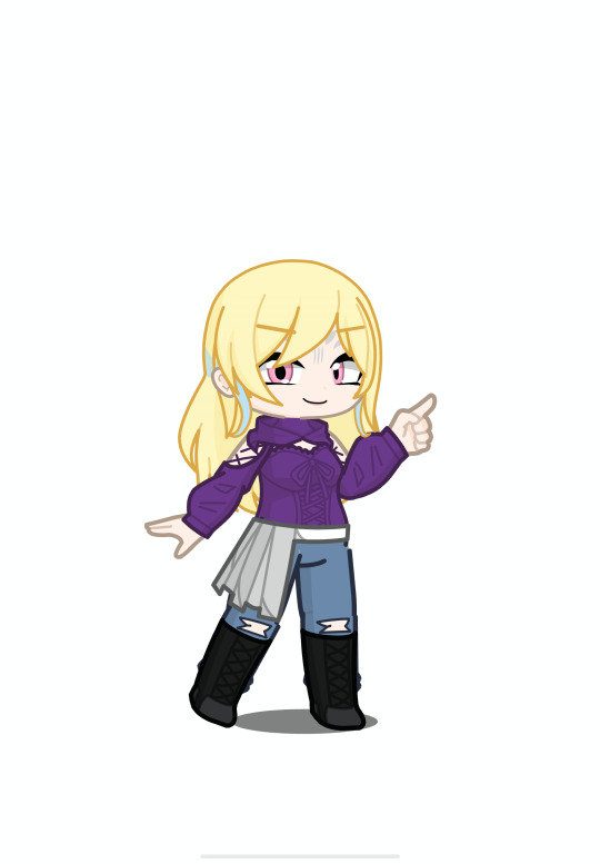
If anyone wants to know more about Echona just comment telling me so.
Finally here is Tilly's Design
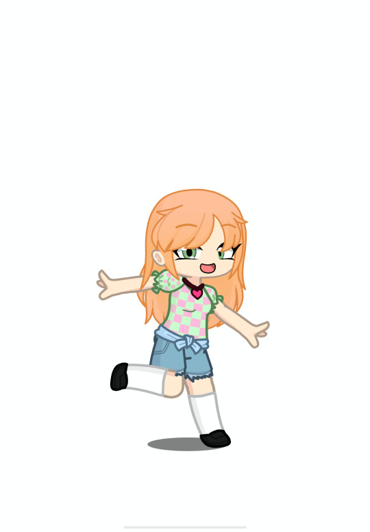
Also here are the speedpaints for all the fanart
I had to link them from my youtube because I wasn't able to have more then 1 video in my post
youtube
youtube
youtube
The total time for all and each is
Autumn: 2 Hours 55 Minutes
Suzy: 1 Hour 25 Minutes
Doe Mae: 1 Hour 46 Minutes
All Three: 6 Hours 6 Minutes
Here are all the links I used for reference for the art and designs, as well as the links for the creators of the book and the creator of the comic
Author of the Book: Goldenwolf16
and I think this is the authors tumbler because this is credited as the owner of the characters in the tumblers comic: galaxyravenwolfx.tumblr.com/
Artists of The Comic: Camie
also here is their tumbler for more clear pictures of the comic: www.tumblr.com/camiecomics
also for the designs in the fanart I used the concept art on the comic's tumbler here it is
Doe Mae: www.tumblr.com/camiecomics/683813599853101057/concept-art-for-the-new-comic-im-working-on-im?source=share
Suzie: www.tumblr.com/camiecomics/684008158733238272/wolf-lady-more-concept-art-for-the-comic-hehe?source=share
Autumn: www.tumblr.com/camiecomics/684455354046791680/autumn-concept-art-the-main-main-character-of-the?source=share
Mae outfits: https://www.tumblr.com/camiecomics/760194471176568832/extras-concept-art-will-be-updated-regularly?source=share
Autumn outfits: https://www.tumblr.com/camiecomics/711822056470298624/some-extras-for-the-comic-ill-make-some-fore?source=share
____________________________________________________________
4 notes
·
View notes
Text
First set of my human au designs!


(Click for better quality)
Info and stuff under the cut
This is a college/ university au, so all of the characters are 18-19.
Joy's studying communications, Sadie and Diana are both studying psychology, Andy's studying industrial engineering and Fred's studying medicine. (These may change in the future, not sure yet)
Heights, because why not:
Joy- 5'9
Sadie- 5'4
Andy- 5'0 (Short King™)
Fred- 6'2
Diana- 5'5
Other random info (Warning- Ships!):
The five of them have known each other and been friends since they were 9-10, so they're all very close.
Riley and her parents are in this au; In fact, Riley's Joy's younger cousin. She's the same age she was in IO2, so she's 13, and she's basically the same character as she was in the movies.
Fred and Diana dated for a year or two, from the ages of 15 to 16, but ultimately decided to just be friends. (Might draw them at that point in their lives for all you Disear shippers out there; While it's not my favourite ship for either of them, I completely understand why you'd like them and I'd be fine with drawing them in more shippy situations. Feel free to ask if you'd like to see that :])
Joy's kind of had a crush on Andy since she was 14, but she hasn't really done anything about it for fear of him not liking her back and their friendship being ruined. (Except wait, he started liking her roughly a year ago, but he won't tell her for the exact same reasons; Plus he doesn't want to admit to himself he's in love with her because of pride). They're essentially the prime example of 'She fell first, he fell harder'
Sadie and Joy have been friends since they were very young, maybe around 2-3. Due to this, the two of them are a lot closer than they are with some of the others.
Fred always has his first aid kit with him, no matter the scenario, just in case the worst should happen. He probably also taught the others how to do CPR in the most effective way, as well as the Heimlich maneuver. At least, that way, he knows everyone will be in good hands, even when he's not there.
Andy played hockey when they were all in high school, but stopped once they graduated. Joy (as she's Riley's cousin in this au, and Riley mentioned in the first movie that basically her whole family skated) did figure skating, and so the two of them bonded over that. I like to imagine that at some point, Joy takes all of her friends to meet Riley and her parents, and she and Andy end up having a talk about hockey.
(Also I'm aware that I said I'd post all of the human designs together, but it was proving to be a lot more time consuming than I'd initially planned, so I thought I'd post the five from the first movie. I didn't want to not post anything for however long it'd take me to get them all done, so I assumed this was better than nothing. I'm currently working on Anxiety's human design, so it hopefully won't be too long :D)
#inside out#inside out 2#inside out joy#inside out sadness#inside out anger#inside out fear#inside out disgust#human au#alternate universe college/university#not tagging the ships#because they're not the focus#relatively happy with these#long winded rants#incoherent ramblings
6 notes
·
View notes
Note
50 for the ask game pls!! As I remember, you have Morgana and Nicholas, they were both very funny and cool in your drawings!
yeeesss morganico !! unleashed............


nico looks so damn lost without his mask it cracks me up everytime
first things first, they were both pre-existing OCs that i decided to play as, rather than come up with a new guy on the spot. this is a disclaimer of sorts -- any similarities in design and naming between nicolas and a certain canon character are coincidental, i swear ! although, as i've come to joke : "the line is thin, between the nicc, and the micc"...
So, Nicolas, my blind first run - he's an alchemist, so I picked "professional" regardless of what stats it would give me, ending up with a skill + strength build in the long run. He uses the saw spear and pistol, and wears the student robes above the hunter set.
Being my first run in my first fromsoft, he's a fairly basic, generalist build, so now that I'm acquainted with the game i would like to experiment with beasthood gameplay - because lore-wise nicolas is supposed to be the "beast" to morgana's "arcane". I'd also like to play around with fire and electricity, being an alchemist and all. That will be for when i pick up his NG+ ...
Nicolas is quiet and mild-mannered, and unfuriatingly unreadable at times. Being a scholar, he's able to push on through The Horrors for the sake of his own curiosity ; I felt so validated when Simon told him that the Byrgenwerth spirit lived on within him...
Now Morgana. She's a witch, so naturally I took the class "cruel fate" for the arcane boost, though this would end up fitting for reasons I'll discuss further down. She uses the threaded cane and the blunderbuss - I know that when it comes to arcane the moonlight greatsword is right here, but in a game that introduced trick weapons, I am not interested in swishing Basic Big Fantasy Sword around X) her gear is completed by the Eye + Augur, with the Call and the Shell if I need extra firepower. Her default outfit is the doll shawl worn over the Yharnam hunter set.
As an OC, Morgana was heavily, unsubtly inspired by Bayonetta : she's skilled and confident, doing as she pleases in extravagant fashion ; so as I've mentionned before it's extremely fitting that, as my second run, she went through the game with far less trouble than Nicolas did ! (with some exceptions...)
Both foreigners, Morgana and Nicolas hunt as an elusive pair. The latter originally came to Yharnam to enroll in Byrgenwerth, but with the college shut down shortly after, together they pursued their own research on beasthood and arcane, independently from the Healing Church, thus branding them with heresy. They don't have sworn enemies, but don't aim to join any organization either. Just a power couple that mostly keeps to each other sdfghj
If I wanted to incorporate their (loose) original storyline in the game, Morgana would get the "Honoring Wishes" ending (not out of respect for the MP, merely didn't have what it takes to resist her) then bestow the "Yharnam Sunrise" ending upon Nicolas. The latter would awaken, keeping his memories at the cost of his humanity, to seek a hunter that would find the missing piece and succeed where they didn't. And if I pushed that crossover to the end, that hunter would be their daughter Amy, aka my main OC, haha !
-
A small addentum regarding Nicolas - as an OC he was less developed than Morgana when I started playing, so I ended up building him directly from his experiences as a hunter, and in turn, based my general headcanons for the Paleblood Hunter from him ! I wanted to mention it because it gets confusing in my early fanarts, but now they are distinct characters, even if I depict them with the same face/hairstyle and a similar personality. Here's a chart for better understanding :')

and phew, hopefully i didn't forget anything ! thank you for asking about them (heart hands)
#ask game#fareehaandspaniards#thank youuu#i booted up the ps4 just to get those pics sdfghjk#WHY ARE THEY STACKING UP I PUT THEM SIDE BY SIDE... FUNCTIONAL WEBSITE SHDFJKYOUPUI8+#sorry for taking space on the dash (salutes)#bloodborne hunter oc#nicolas yoona#morgana waters
9 notes
·
View notes
Text

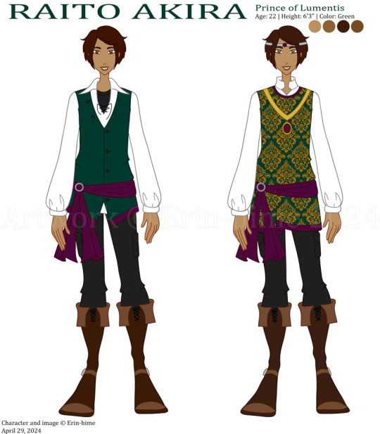
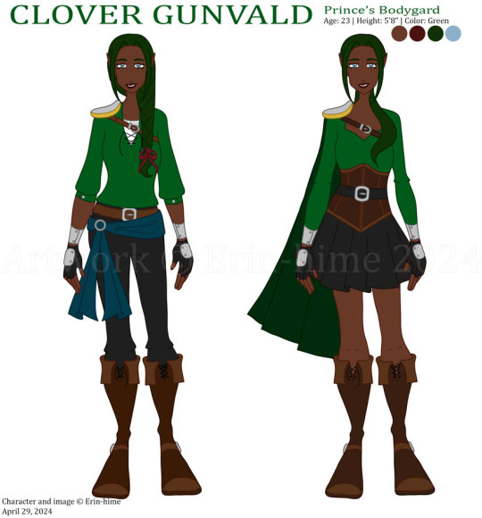
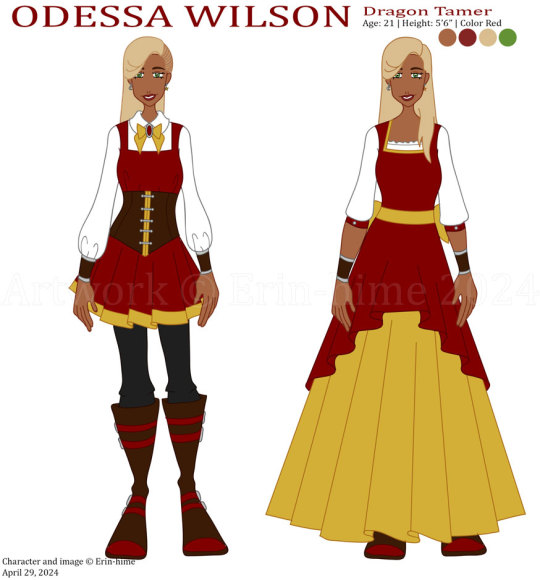
Yes, I knew, I know, I already did designs of these guys a few months ago, but I tweeked a couple of the designs, but me being me, I wanted to post them up for people to see and make it more people’s problem, lol. I didn’t change that much, honestly, but it was enough that I wanted to put up the new designs. Plus, I made design sheets for the major characters, yey.
First is Buttercup, who does get a minor outfit tweek (it’s not noticeable, but I moved her belt down to her hips, and it does look a lot better). But she ended up becoming a victim of Erin taking away everyone’s wavy hair trope that I’ve started, because, well, I ‘see’ her more with the straight hair. She looks cute, she looks innocent, and she strays away from the traditional Altairian hair braiding thing because she doesn’t quite understand the tradition. Same goes with the piercings – she should technically have more, but she opted to skip a few milestone ceremonies because she didn’t want to have too many. I was talked into giving her a 'disguise' dress for when she's traveling in Lumentis for a bit, and I thought it would be funny (since it's a stolen dress), if the colors were completely different from what she would normally wear, and I'm actually pleased with how it turned out! Simple, and yet nice. I also attempted to change her formal dress, but ended up just changing the color of the circular collar for shits and giggles. She doesn’t wear eye liner with the fancy dress because, like with every other tradition, she doesn’t ‘get’ it, plus she’s trying to get the people of Lumentis to accept her, so she’s trying to look more like them, despite failing because of her red hair.
Raito, honestly, doesn’t have any sort of change in either of his outfits, because there’s no point in changing perfection. I love staring at him, because he looks adorable, lol.
Clover I did change a bit, shortening her sleeves, giving her a shoulder guard, and giving her a proper belt and a sash because it didn’t look right with just the belt. Oh, and shortened her braid a little while also giving her a ribbon that happens to be the favorite color of a certain Dragon Tamer. >.> She looks just as badass as she did before, and I love it. As for the other outfit, it’s supposed to be her Palace Guard uniform of sorts. I had a bit of difficulty with it at first, because I wanted her to have the bodice, but giving her a skirt seems to have worked out nicely! Bonus, it’s reminiscent of her original outfit, with the skirt and all. Not really, but that was what I as thinking when I decided to give her the skirt. I also like it because she looks feminine in her uniform, but in reality, she wants to wear pants. But she looks great either way! I love my nature elf warrior girl.
Odessa, well, I changed a lot, obviously. She always suffers due to the fact that I can never pin down her design. I liked her other outfit, but this one just suits her better. I changed a bit of her backstory as well, which explains (sort of) why she went from shaved hair to side braided hair. I also like the longer hair – it makes her look cute. As for her outfit, I really like how it ended up! I don’t have any real definitive ‘look’ for the peasants of the story, save for the Altaitians who have a Viking look, but I like that it suggests that the Ta’Norians have their own style as well. And she gets a nice dress as well, sort of related to her backstory, but mostly because they do give her a nice dress when they make it back to the Lumentian palace. Plus, it haves the added bonus of showing what her hair looks like down and how long it was. (I wanted it to be longer, but I wanted Clover to have the longer hair, since I thought it would be funny if the more masculine one had the longer hair.)
Over all, really pleased with how all of these turned out. I keep staring at the designs and wishing I had pictures of them, despite the fact that I should be the one drawing them, lol.
7 notes
·
View notes
Text
About that Nova and Pluto height difference picture (this is gonna be a long post y'all)
I deleted the picture I drew of Nova and Pluto kissing on every one of my social medias save for Tumblr because people have been expressing their discomfort with how Nova looked like a child compared to Pluto who looked like a fully grown adult.
And I completely understand all the upset reactions since Pluto makes everyone look way more tiny than they truly are. It definitely didn't help that I was being lazy when I sketched and lined everything since I dread full bodies sometimes and tried to cheat by hiding most of Nova's with her big gamer jacket.
So that, mixed with Nova's height in comparison to Pluto, and me not focusing more on her anatomy led to a picture that, if you are already familiar with the characters, looks cute and fluffy. But if you are new to them, looks a lot less cute and more gross.
After talking to a friend as well as a mutual about the picture, I decided that deleting it and fleshing Nova's design out more would be the best.
Unlike Jack, Nana, Sweetheart, and Bitterbat, I've been slacking on drawing Nova and Pluto. And the latter couples have had whole make-overs and an established way I draw them that makes my brain go "YEP THIS WORKS". But Nova and Pluto have been neglected in my head so I haven't been updating their looks alongside my art style like I have been with the others. Which means I still draw them based off the designs I made of them back in like-2020 or 2021???
BASICALLY THEY'VE BEEN LONG OVER DUE FOR SOME TINKERING.
Specifically Nova. Pluto I am very happy with. But Nova's design needs more lovin' in it.
I won't be completely overhauling her since I love her current look-I just want to do a better job at her design.
When I first designed Nova and Pluto, they were meant to be based off retro anime designs for a cute girl and handsome boy (even though Pluto is nonbinary). Sadly, cute anime girls often look very less mature than their male counterparts and so Nova suffers the same problem by default. I also wanted Nova to stand out from my other adult female characters and have her lack the same amount of curves and basically be flat.
This is something I will still be keeping because the idea that "curves=adult" is genuinely a shitty concept. Same as "short=child" since there are PLENTY of shorties out there that are grown adults. I am one of them-it's why I keep making my girls so short. I need some representation down here 😭.
When it comes to Nova's current default outfit-I will technically still be keeping her gamer jacket in her wardrobe closet but I'll be giving her a new jacket that will serve to be her new default one that shows her build more so she won't look so "childish" compared to Pluto. It'll help to avoid a repeat situation (I hope) as well as solve my constant frustration at having to cover up good ass anatomy with clothing (I DO IT ENOUGH TO JACK-I PLAYED MYSELF WITH NOVA'S JACKET)
OVERALL-Nova just needs the same love I gave to Nana and Sweetheart when they went through their original tinkers.
I will continue to draw Nova and Pluto together because I care about them and their story a lot. But with the themes that occur in the story and the relationship Nova and Pluto have together, it's definitely important that I make sure that cat girl looks more like a cat woman in future art I draw of her.
As for why I didn't delete the Tumblr post of the original picture-this entire site is an internet archive which means if someone reblogs something from someone, and then that someone deletes the original post, the reblog doesn't go down with it and remains. So it'd be useless to delete it. I just settled for turning reblogs off.
In the future I definitely want to redraw the picture but I'll hold off until I give Nova the touch ups she very much deserves.
38 notes
·
View notes