#Also wanted to experiment with colors palletes!!
Explore tagged Tumblr posts
Text

"All the world will be your enemy, Prince of a Thousand enemies. And when they catch you, they will kill you.
But first, they must catch you."
Thinking about how dangerous the enemies are in Spearmaster's campaign... I mean they're dangerous in all campaigns of course, but Spearmaster has some real messed up spawns /pos, talk about a perilous quest.
Sorry I haven't uploaded in a hot second, mainly rain world related art block!!
#rain world downpour#my art#phone doodle#rain world#rw spearmaster#rain world art#rain world fanart#rain world fan art#rain world spearmaster#rainworld spearmaster#spearmaster#rw red lizard#rw rot#rw centipede#rw yellow lizard#rw dropwig#rw vulture#rw king vulture#Also wanted to experiment with colors palletes!!
695 notes
·
View notes
Text

i push my penis into my pies or whatever corey taylor said
#zeno's art#ocs#reassassination#octavia krankenstein#dr rigor krankenstein#got some questions for you guys#1. what do you think of this slightly updated color pallete for tavia...#her colors change based on lighting but i wanted to experiment with a darker toned red rather than her usual pinky red#2. what do we think of the speech bubbles + font#is it readable? i think it looks cool but i don't want my comic to be unintelligible lol#and 3. what do we think of that logo....#also octavia will prob wear masks most of the time when doing her assassin work tho#def not the same mask all the time i want some fun variety#like her having to grab some random shit in an emergency and use that
185 notes
·
View notes
Text

@yummycrummy ITS HEREEEE
Yes we’re doin another DTIYS >:))
Rules are simple:
-No tracing
-nothing inappropriate
-you can change their poses
-no deadline! You’ve got all the time in the world :)
-you don’t have to add the extra effects
-you can your own little details if you want ����
And that’s about it! Have fun :)
#artists on tumblr#art#dhmis au#ucr#dhmis#angst#sr#wanted to try a new color pallete thing hehehe#also wanted to practice with expressions and different poses#this whole thing was a literal experiment#the girls are fighting
133 notes
·
View notes
Note
If you don’t mind me asking, what’s the process you go through to shade? How do you make it look so textured?
HELLO ANON!!! I'VE MADE MY LATEST PIECE FOR THIS SPECIFICALLY!!! I'm glad u asked... I love sharing my process because it makes me feel like a smartass 💀 I LIKE SHARING THINGS OKAY!!! IM A YAPPER!!! Now, click on keep reading for the shading process of THIS thing 👇

1st is the base colors, I normally color pick from their references and just adjust the settings of the pallete, but you can also just color them however you like :P for this, I wanted a good balance of yellow and blue, so I put a yellow filter by using darken. My advice for 1st step color adjusting is that you should play with the blending modes alot. The ones I use the most are lighten (if you want it to become more pastel or soft) and darken (if you want a more dull atmosphere or are planning to add alot of bright highlights anyway) so yeah!! flat/base colors!!!


2nd is first layer shading, aka the shadows themselves. Recently, I've guided myself with the direction of shading using the red sun as to figure out where the highlights or light sources would be, and the blue moon for where the shadows should be headed or inbetween. As you can see the sun is both at the top and bottom, which means the shading will be focused in the middle and shouldn't look too strong due to alot of light heading towards it!

3rd is the one I like doing the most, which is having reflective light off of shadows. It's basically light inside of the shadows due to some sort of light bouncing off of a nearby surface. Since the light here is blue, I used blue for the reflective light too. It's the one I use the most, but it can vary for what color the nearby surface is. For this step I use the blending mode hue almost always, but for this I used color since it wasn't visible on Shadow Milks shading before


4th isss highlights or lighting! As I've said, 2 light sources, so I kept in mind the one above and the one below, though the one below is more stronger than the one above. This step is pretty simple, just add thin highlights for where you've already marked the light to move to. Yipee!!!

5th and last is the overall piece adjustment and texture addition :P The thing that makes my art look more textured is this metal image thing from ibispaint's gallery, and sometimes the noise effect if this one doesn't really fit the piece. Again, I play with blending modes for everything to work! The second image displays me adjusting the colors using an effect rather than manually, this makes me have more control with the pallete and its vibrancy, that's why it begins to seem more green and desaturated than what I've shown from this point!!!

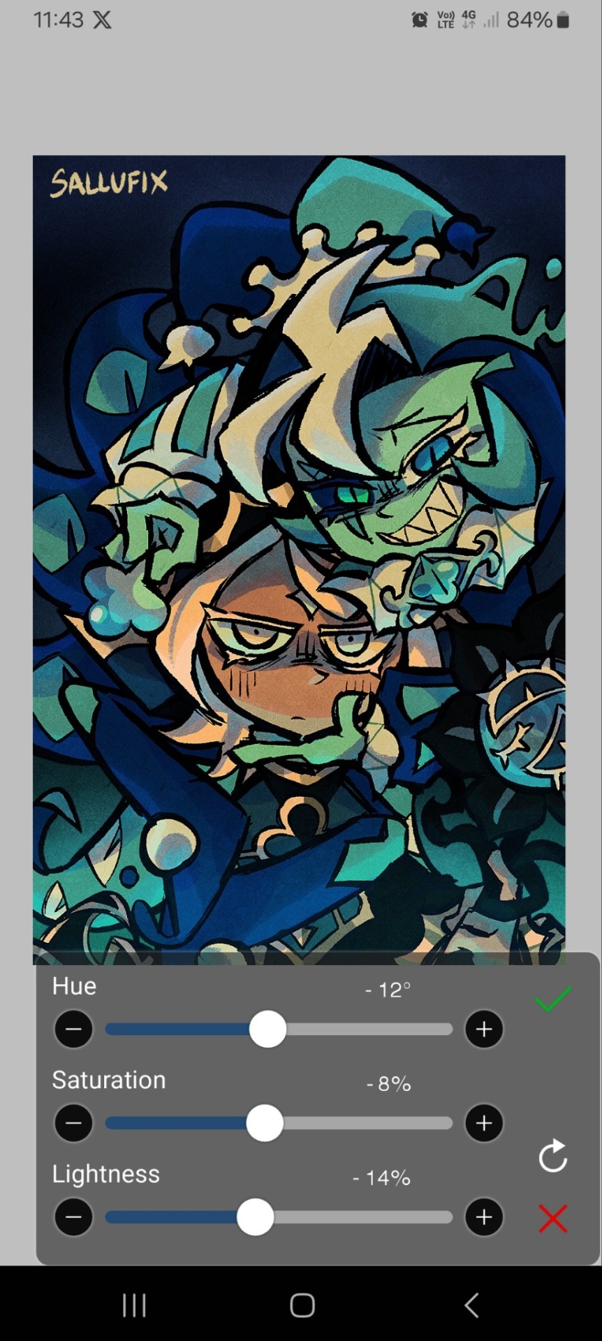
Aanndd voilà! That's how I do it!!! I switch it up ALOT of times, I change and experiment with shading styles a ton, but this one has stuck the most and is the one I've been using recently! I hoped this helped some people or just gave them a fun thing to read and learn about. If you guys want the brushes I use then I'll probably share them if there's an ask for it! bye bye :]
#SalluTips#(I already know I'm gonna forget about this tag)#behind the scenes#ask#This was really fun to do!!! I love yapping!!!#Also. Love u guys <3 Thank u for showing so much interest in my art <3
210 notes
·
View notes
Text
faustina’s style guide. ᥫ᭡
a mini series to help you become your very own fashion icon
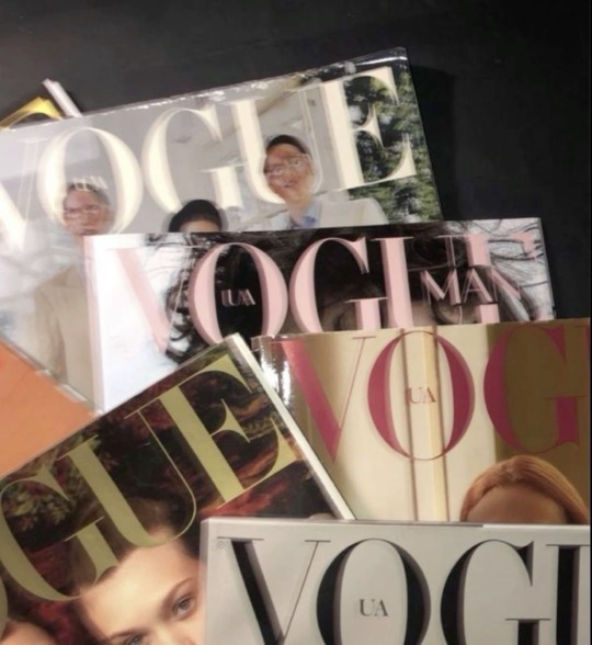
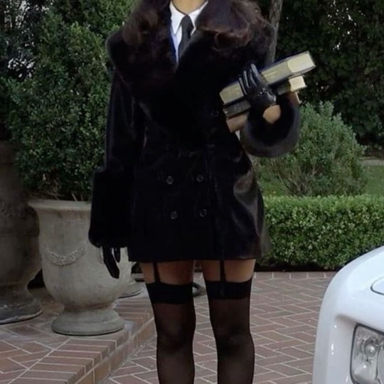
chapter one — RESEARCH & EXPERIMENTS
maybe this is your first time diving into the world of aesthetic styles and fashion! or maybe you’re looking to start fresh with your look, but you aren’t sure where to begin! well, allow me to help guide you in taking your first steps into a whole new you! … fashion-wise, of course. this first chapter will discuss how to get started in your style journey, so let’s get right into it!
୨ৎ — style & aesthetic options
there’s a large variety of aesthetics to choose from, and it’s so wonderful knowing that there are so many different styles to look into! that’s the beauty of having options, you get to see all that’s available to you!
here are some of the different aesthetics…
light/dark academia
old money
coquette
grunge
corporate goth
street style
vintage
cottagecore
of course there’s plenty more out there that you can look at! pinterest will be your best friend when it comes to looking at all the different aesthetics!
୨ৎ — research
once you’ve looked over all the different aesthetics and styles that are available to you, start making a list of the ones that interest you the most! once you’ve compiled that list, start taking a deep dive into them. look at the color schemes, make note of key pieces of clothing that follow the specific style, notice what accessories are typically used!
examples:
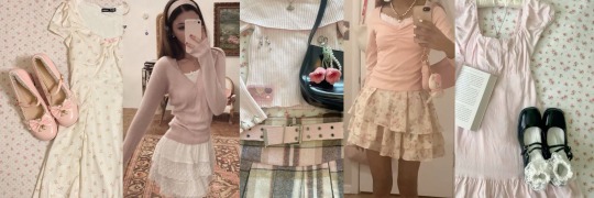
coquette
color schemes: soft pinks/creams/pastels, light colors
key pieces: skirts & dresses, form fitting tops
accessories: bows, dainty/minimal jewelry, lace
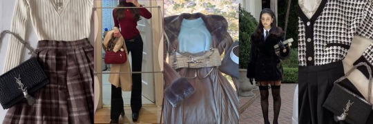
old money
color schemes: any color pallet will do! (neutrals, monochromatic, cherry reds, blues, etc.)
key pieces: skirts/dresses, dress pants, statement cardigans/coats/sweaters, loafers
accessories: pearls, handbags/purses, headbands
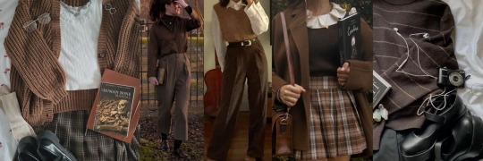
academia
color schemes: neutral colors (light academia focuses on those lighter neutrals while dark academia focuses on the darker tones)
key pieces: sweaters, cardigans, sweater vests, button ups, turtlenecks
accessories: minimal to no jewelry, leather bags (backpacks), fabric tote bags
୨ৎ — vision boards
after doing some research, start creating vision boards for outfit inspiration! this will help just organize what exactly you’re looking for in whatever aesthetic/style you chose! and, it’ll help when you start to play around with different outfits!
again, pinterest will help with this a lot! see what outfits you really love and might want to recreate and save them into a board. there also might be some creators out there on different social media platforms that you might want to take inspiration from, so feel free to include their outfits as well into your vision board!
doing this will also help you see different trends within each style. you’ll see how different outfits have similarities in key pieces, accessories, and even color schemes while also seeing that even though there are tons of similarities, there’s still a wide variety of ways to style the clothes into different kinds of outfits!
୨ৎ — experimenting
this is the fun part: trying out different outfits based on the aesthetics you chose! this might take some time, but sort through your closet and see what you already have.
what to look for:
basics: simple t-shirts, tops, & bottoms
key pieces: statement tops, dresses, coats/cardigans/sweaters, shoes
accessories: jewelry, hats, scarves, bags
play around with different outfits & try out layering! work with what you’ve currently got and make note of what other pieces you might want for your outfits. maybe you’ve got on a super cute pleated skirt with a simple long-sleeve as your top! you might want to add a pair of sheer tights, but you might not have any, so make a note of adding tights to your shopping list! you might also feel like your outfit could go well with a super cute statement cardigan to bring some life into your look, but all your sweaters and cardigans are pretty basic, so add a new cardigan to your list as well!
it’s important to sift through your current wardrobe and figure out what you want to keep and what needs to go. you might have a lot of pieces that just don’t spark any joy anymore, so maybe you’ll create a donate pile. or maybe it turns out you’ve got all the right basics and accessories for a certain aesthetic you want to try, so you’d want to bring those items forward in your closet for easier access to them.
୨ৎ — take pictures
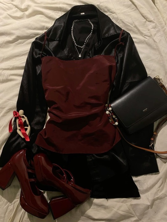
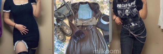
whenever i put on an outfit that i am really proud of, i’ll snap a quick pic of it so that i can save it for later inspiration! sometimes i’ll even lay out the outfit on my bed and take a picture that way too!
it’s good to save those ideas in your phone to look back on them for future reference or to figure out what else that outfit still needs to make it perfect.
here are a few photos i’ve taken of outfits i’ve loved!
final notes —
curating your perfect and ideal wardrobe takes time, but i personally think doing all the research and trying out new looks makes the process go by a lot faster in a fun and exciting way! it’s also important to know that your style is going to change a lot as you grow. as our minds and bodies change, so do our styles! and that’s okay! back in high school, i definitely sported that “abg” aesthetic, but as i got into college i started leaning more towards light academia and then in later years i experimented and felt more comfortable in more alternative fashion! that’s what i love about fashion, the fact that it’s always changing and there’s so many new looks and pieces to try out makes it that much more exciting! so always feel free to explore and try out new things! you might discover some really great things.
with lots of love, faustina 🌷
#milkoomis#it girl#that girl#it girl tips#becoming that girl#becoming her#fashion aesthetic#fashion#style aesthetic#style tips#fashion tips#aesthetic outfits#style guide#fashion guide#fashion girl#aesthetic blog#girlblogger#girlblogging#girl blog aesthetic
178 notes
·
View notes
Text
- GHOST PERI AU -
(AKA Petrified!Peri because that name is cool as FUCK.)
REFERENCES ALSO AVAILABLE HERE!
REGULAR COLORS / HIS BODY [NOT GHOST]

GHOST COLORS / HIM AS A GHOST

SO. You may be asking, "what happened to him?" And I am here to EXPLAIN! :]
This AU is still a fairly [pun unintended] big WIP, so some details are still all over the place/undecided, and some may change over time; constructive criticism, opinions/thoughts, questions, are all appreciated!
The general idea is, well... divergent from the finale. What if, after the chip is grabbed and Hazel, Wanda, [and maybe Cosmo? I don't recall if he goes with them/ends up somewhere else] go to fix the wand, Peri explodes. And it gets undone when Hazel wishes to fix Fairy World. Buuuttt... not quite!
It wasn't her 1 Millionth Wish that she used up on Fairy World— which is why it Doesn't Quite Fix Him Going Kaboomey. But I imagine that having 1Mil Wishes had a mild influence on What Happened and why exploding DID get fixed... sort of. [I need to brainstorm specifics on this.]
ANYWAY.
Peri looks GENERALLY normal most of the time, except for, well, *gestures at reference.* Outside of THAT [cracked wand, cracked crown [crack hidden by the glow], slightly off color pallete], there's some other stuff that's just a Hint of Wrong.
Like coughing up confetti and/or rainbows [without any other sign of magical backup [which he can't experience anymore because he did technically already die via backup.]] And sometimes the funny silly wacky expressions that happened during buildup [big ol' eyes/pupils, star shaped pupils, funny faces [like when he was talking to Dev.]
Throwing this in here. Sometimes he just stares like the TBH Creature. It's kinda silly kinda funny. I need to make a Petrified!Peri TBH emote because that fits well.
I was ALSO thinking about the idea that sometimes limbs can detach [the ghost fairy in that one ep is what gave me this thought], mostly for expressive purposes/fun silly purposes. It can be seen in this image here! Still DEBATING on this, though.
ANYWAY.
ANYWAY.
Cosmo and Wanda Don't Know He Died [because of not being right there] But something Is Off. Peri probably doesn't at first either until they [themself] put it together through context clues, and then they're like, "ooohh no, mom and dad probably don't know I exploded!" And he gets REALLY nervous about them finding out because that'd be A Lot and he doesn't want to Worry Them [because... he fucking died.]
So. There's a lot of him just trying not to Act Suspicious. Which only makes them both concerned! I have so many silly funny interactions between them that I imagine, actually!
Like...
Peri: *Talking. Suddenly... star pupils!*
Wanda: Um. Sweetie?
Peri: Hey do you see that?
Cosmo: Oooh, see what?
Peri: Over there! *Points.*
Cosmo + Wanda: *Looks over.*
Peri: *Disappears.*
WHICH. YEAH. SO. GHOST FORM. They're completely hidden when they're actually a GHOST, and has no wand/wings when they're a ghost, either [they do have wings normally, I just forgot to include them in the reference.] And I imagine whenever they poof into their ghost form that they leave a tiny bit of confetti behind!
ALSO.
He reassigns himself to Dev on his own [who didn't forget after the finale.] And his magic is kind of fucked up. Cause he's DEAD and look at his fucking WAND. So wishes kinda get fucked up when granted a bit sometimes ehehehaha...
ANYWAY.
I am also dumping my Peri headcanons onto him. They're transmasc nonbinary and use he/they pronouns and they're also aroace! :3
PLEASE. PLEASE send me any asks if you have any questions! You don't have to ask to draw them, either— just tag me in any art if you ever make any, please! :]
#fairly oddparents a new wish#fairly oddparents#fop#fop a new wish#fopanw#fop:anw#fop: a new wish#fairly oddparents: a new wish#fop au#periwinkle fairly oddparents#perwinkle fairywinkle cosma#peri fop#peri fairly oddparents#fop poof#alternate universe#fop spoilers#petrified!peri au
305 notes
·
View notes
Note
the way you've used color for years has inspired me beyond what I can explain. I remember trying to pallet like you when I was 14 or something...I'm 22 now and I still look at your art across multiple different years to study how you've used color and try to understand like you do
oh man. well, I'm pretty terrible at responding to big compliments like this other than.... thank you!! I'm very flattered and it means a lot that you think so. make no mistake though I think I still have a LOT to learn about color and I'm always trying to improve myself and be smarter about it all.... a ton of trial and error goes on behind the scenes, I owe my life to the tonal correction and select color gamut functions lol. a huge part of it is being willing to experiment with colors that you dont even think will work together, or that arent even close to the color you were originally going to pick, but you have to try just in case.
personally I've found that I end up happiest with the colors in pieces where I stuck to fairly limited palettes, not necessarily very strict ones but the same general areas of color, yknow? like this


I also basically taught myself to color good as a teenager by drawing small and simple pieces with pre-made palettes, such as...


I would've been?? 16??? when I did these I think. not that I even said I was using pre-made palettes or credited the people who made them lmao. how times change
and I've also learned a lot from studying how color is used in older anime, especially ones from the 90s. evangelion in particular was a HUGE influence on my coloring and what colors I use the most (red and orange, lol).
I know you didnt exactly ask for advice but I wanted to give it anyway! I want everyone to use exciting colors and have fun doing it. just like, watch and look at a lot of stuff. not just my stuff. watch metropolis (2001) that movie has INSANE color blocking. watch the tatami galaxy as well. play mother 3. work until you get better at it than I am, that's what I want. and thank you again!
153 notes
·
View notes
Text
The Caged Bird Still Sings Part 14
Hey guys! Welcome back! So this chapter is getting a little heavy on the angsty side, so just a heads up.
Things have been going great for all the stories especially the Christmas one.
This will be the story that keeps its usual schedule next week. Every other posting day will be finishing up the Olympic Swimmer one. So be on the look out for that.
Also super long chapter!
Steve tries out some hobbies, Joyce pushes, and Steve gets depressed.
Part 1 Part 2 Part 3 Part 4 Part 5 Part 6 Part 7 Part 8 Part 9 Part 10 Part 11 Part 12 Part 13
~
Steve would like to say he got right on the job search the next day, but he really didn’t. He woke up refreshed and feeling good about himself. After a run on the treadmill and big breakfast he had already talked himself out needing to.
But instead he decided that he wanted to learn new hobbies. He had the money and pretty much unlimited time so why not?
The first thing he tried felting. Yeah, he had a lot of money, but he wanted to start with something cheap in case he got bored with it.
Taking the kit out of the box, he already ran into a problem. The leather finger gloves were much too small. Like he didn’t have fat fingers or anything but they were much too tight to fit on even his pinkie fingers he turned them inside out to see if he could make them bigger somehow.
He only succeeded in ruining the finger gloves. He tried rubber thimbles as replacements but still the sharp tool would pierce even the tough rubber.
The kit sat abandoned in a corner of his hotel room until one of the porters saw it and asked if he could have it. His sister did the felting all the time and she was having trouble finding colors she liked.
So Steve let him have it. Three days later the porter came back with a bright yellow canary and a female robin. He proudly displayed them on his nightstand next to the phone and alarm clock.
Robin loved them, but refused to take the robin. She said they shouldn’t be separated at any price.
Steve loved her a little bit more when she said that.
The next thing he tried was painting.
That lasted all of six hours before they got handed off to Will. It was a beautiful oil, acrylic, and water color set, with all the paint brushes and pallet and metal wood-handled pallet knives.
It lasted that long was because that was the time it took for Steve to set everything up, including an old sheet Rosa let him have, start painting and promptly knock everything over. The water, the paints, the easel. Everything. He broke the easel, knocked a hole in the canvas, and smeared paint all over the apron he had bought just for the occasion.
Will was happy to receive the paints, but in turn he gave Steve a simple notepad and pencil and taught him how to draw.
Steve liked that.
It was just for doodling and making silly pictures so it didn’t make him feel like a failure. He went to the bookstore and bought a bunch of books on how to draw certain things. Animals, the human figure. He even found this great reference book on clothes sorted based on the English monarch who was in power at the time the were wore.
Which was all well and good, but it wasn’t exactly what he wanted.
One day while he was over at Will’s talking art and whether or not kneaded erasers were worth the pain they caused if you dropped, Ellie introduced him to a new hobby. Will was against the things, Steve was for.
Jonathan huffed, “That’s probably a class issue as Steve here can afford to replace them and Will can’t.”
Steve and Will stared at each other in complete shock, but had to admit that Jonathan was probably right.
“Yeah, okay,” Steve huffed, “that’s fair. I guess I really didn’t think about it because it’s not my money I’m spending.”
“Have you tried looking for a job?” Joyce asked. She didn’t like that someone was paying to keep Steve safe. As nice as it was, in her experience the well tended to dry up when you least expected it to.
Steve rolled his eyes. “Yes, Mrs. Byers.” Which he had. Yes, he had been focused on trying to learn things that would keep his mind from atrophying, he had also been looking. “If they seen me coming they take down the sign or if they don’t get to it in time, they say it’s an old sign and that they forgot to take it down.”
Joyce’s shoulders slumped in sympathy. The rumor around town is that because Mr. Harrington was the landlord for a lot of the properties that the businesses were on, he had threatened to raise their rent if they gave Steve a job.
Something that all the adults promised not to tell Steve so that he wouldn’t get so discouraged as to not try at all.
But surely Clint Harrington didn’t own every business in Hawkins and she told Steve so.
“No,” Steve huffed. “But he’s friends with ones that he doesn’t. I’m going to try the mall next. Most of the them are franchises and have their main bosses outside of Hawkins.”
She let out a little sigh of relief. It showed that Steve was trying and actively thinking of these types of pitfalls.
Steve shifted uncomfortably. “What have you got there, Ellie?” he asked trying to shift the focus off of him for a moment.
Joyce was watching Ellie while Hopper was at work.
The young girl held up long satin strings of embroidery thread. She had three shades of pink, a white, and a red. She tied the ends to a safety pin that was pinned her leg.
“I’m making friendship bracelets for me and Max,” Ellie said proudly. “The pink is for me, and then I have these colors for her!” She held up blues and purples.
“That’s way cool!” Steve said scooting over to sit next to her.
Jonathan and Will shared a smile. Steve was lost to the shiny allure of friendship bracelets.
“I could teach you if you like,” she said with a smile. “I also have boondoggle!” She held up shiny plastic strips. “I make key chains and other things that need to last a lot longer than the thread.”
Steve really lit up, but then frowned when he saw out intricate it all was. “I’ll never be do anything that fancy.”
Ellie sat closer and pulled out a little paper that she had in her caboodle. “I couldn’t at first either, so I went to the library and took out a book on all the different ways you could plait and how to do boondoggle. Then I copied a couple of the pages I wanted to try.”
She handed it to him and pointed to the easiest. “That’s the one I started with and it will probably take a little bit to get the spacing right.”
Steve tilted his head. “Is this like braiding hair?”
“Yes!” Ellie said excitedly. “That’s right. I forgot you braid Max’s hair all the time. So then it will be easy for you.”
Soon they were off in their own little world.
Joyce watched with her arms crossed and a concerned expression. Jonathan spotted her and shook his head. He stood up and went to stand next to her.
“You’ve got to let it go, Mom,” he said gently. “You aren’t his mom and even if you were, he’s still an adult. As near as anyone of can tell, whoever is footing this bill isn’t in it to exploit Steve, just making sure he’s taken care of.”
Joyce breathed out through her nose as she tried not to snap at her son. She didn’t know that as a fact and Hopper’s reassurances weren’t enough. She hated having to take his word that whoever this was wouldn’t harm Steve. And that galled.
“It’s all the expensive gifts,” she tried to explain. “The car, the unlimited credit card, cash drops weekly, the gold necklace, the hotel. It’s just not right, it’s not decent.”
Jonathan shook his head. “What about all the non-expensive gifts? Things this benefactor thought Steve would like or get a kick out of? Like that little canary with top hat that he keeps on his dashboard? Or all the music tapes they send, thinking Steve might want to try something different. Hell, according to Steve until they left the country, they talked once or twice a day. That doesn’t sound like someone out to hurt him.”
She let out a shuddering sigh. Because Jonathan was right, that didn’t sound like someone trying to use Steve. “I know.”
Jonathan patted on her shoulder and then went into his room, probably to call Nancy. Another person like his mom who worried Steve was being taken advantage of. But even if he was, that was a lesson he was going to have to learn the hard way.
On his own.
Will had long since left to go hang out with Mike while Ellie and Steve made friendship bracelets. He made four. A black, red, and dark grey one for Eddie, a red, a brown, and a light grey one for Robin and two yellow, white, and black ones. So he could one each to Eddie and Robin.
“Those are really pretty, Steve,” Ellie congratulated him. “Those are some interesting color choices.” Spoken as though she was silently judging, but too polite to say so.
He blushed and held up the first one. “This is for my special friend, they are his favorite colors.” Then he held up the second. “And this is for Robin. The colors remind me of a female robin and the last two represent who I am now.”
Ellie blinked for a moment as she took in the information. “I can see that now. Thank you for explaining it to me.”
“I get my thread at Melvand’s,” she said serenely, “if you wanted to continue to make more, that’s where you would go to get your own.”
Steve kissed the top of her head. “Thank you, Ellie.”
He didn’t stay much longer than that, now that both of the other boys were gone, Joyce was keeping too close an eye on him with Ellie. He knew it wasn’t the gay thing as she didn’t mind Will being around her. And it wasn’t being a barely legal adult considering she would gladly leave Jonathan to look over her.
Nope.
It was entirely because she didn’t know who Steve’s mysterious benefactor was. And the thought of this unknown, probably male, person might hear about Ellie later? Yeah, that’s where she drew her invisible line.
Which was bullshit, like with Robin’s mom, Eddie wasn’t going to prey on little girls. He was freaking out about Steve might be underage when they met in the club. But it wasn’t like he could tell Joyce that. She might revoke his time with Will and Ellie if she learned he had been underaged drinking that night. The night Eddie saved him.
Steve went up to his hotel room and flopped face first into his bed. He was tired. Tired of all the questions about finding a job and getting out from under Eddie’s thumb. Like Eddie was financially abusing him or whatever.
He just wanted to bring people to his hotel room and show them all the little things Eddie sent him just because he walked into a gas station and saw something cute he thought he would like. The keychain from Kansas City with his name on it. The bright yellow shirt that said “I don’t take no shit” and had the Iowan state bird of the American goldfinch. That one came with a little note explaining that it was a canary, but the black on the wings reminded Eddie of the deliciously tight black leather pants.
Steve blushed for hours after that one.
He wiggled onto the bed and crawled under the covers without having taken off any of his clothes. Maybe he could hibernate until Eddie got back in America.
~
Steve managed to bury himself under the covers before the porter with the felting sister ripped the blanket off from over his head.
He stared blearily up at the porter. “Martin?” He struggled to sit up, but flopped back down on the pillow in distress. “Just leave me alone.”
“It’s Marty actually,” the porter huffed. “The only people that call me Martin are my boss and my mom. You’re not either.”
“Marty, I just want to go back to sleep.”
Marty pulled the rest of the blankets and yanked Steve off the bed. He went with a startled yelp. He leapt to his feet to fight him, but he saw that Bob and Rosa were standing by his bed with looks of concern on their faces.
“I have the shower running,” Bob said, “you will get in there and at least clean off the sweat you reek of. Then Rosa will change the sheets. Marty will bring up some food while you are showering, then the three of us are staging an intervention, because this isn’t like you!”
Steve opened his mouth to refute that statement, probably something about how no one called the whole time he as sulking.
Bob pulled out a stack of messages. “I have thirteen messages, and that’s only because the answering machine is full.”
Steve looked behind him and sure enough the machine was blinking complete with a full tape.
“Oh.”
He meekly went and did as he was told. He was only going to do a perfunctory wipe down because they were waiting for him, but once he got under the water it felt so good that he began to thoroughly scrub himself down. Normally going without a shower for a couple of days really didn’t do much, but because he had barely moved to pee, he was covered in thin layer of sweat.
He washed his hair and got out of the shower. He dried himself off and put on the long robe Eddie had gotten him. He opened the door and was instantly hit with enticing aroma of chicken noodle soup. He moved out of the bathroom to the main room, lured by the scent of real food.
The sofa was full of the hotel employees so he grabbed his bowl of soup and spoon and sat down on the armchair curled up as small as he could make himself.
“You frightened us, mi corazón,” Rosa huffed. “You weren’t answering your phone, you weren’t ordering food. The only way we could tell you moved at all is that occasionally the cup in the bathroom would be wet or you would be on the other side of the bed.”
Bob nodded. “We were told to look after you, money was no object. That’s what we were told, but you turned out to be kind and generous and frankly better than ninety percent of the patrons here. You treat us like we’re human, so it became our pleasure to serve you. So when you weren’t opening your door to anyone or answering your calls, we knew something was wrong.”
“Sorry,” Steve muttered into his bowl. “I just got so tired of everyone trying to find out who is bankrolling my life style and telling me to get a job that I just didn’t want to deal with it anymore.”
“It’s none of their business,” Rosa huffed. “They’re just jealous that they don’t have this life. I know your papa wants to hurt and all this for you protection, but it seems to me your friends just see the money you...” she snapped her fingers. “What’s the word?”
“I’d use ‘splash around’,” Steve said with a shrug.
“Ehhh,” she knew it wasn’t the word she was looking for but it would have to do. “They see the good. Not the bad. They see new car, but they weren’t there to see you give up your old car. They see the fancy hobbies, but they don’t see your big room and no one to fill it with.”
“She’s right,” Marty said. “I don’t think even the girl that comes with your gifts from Eddie Munson quite understands the crippling loneliness and isolation you have to be feeling right now.”
Steve sniffled into his soup. “Thanks, guys. I don’t know how to impress upon them how dangerous this all is for me. Like the only ones that remotely understand are the Hendersons and that’s because my dad showed up on their doorstep. But even then I don’t think Dustin quite grasps the enormity of it all, but then he’s thirteen so...”
“The only reason your father hasn’t penetrated hotel security,” Bob said with a grimace, “is that the owner, Dr. Sam Owens hates business men like your father. Otherwise, his hold over this town would have extended to here, no doubt about that.”
“So this is what’s going to happen,” Marty said, “if you need to sneak out and just go for a drive to get out of your head, call Bob and he’ll arrange it. If you need someone to talk to ring up Rose or myself. We’re here for you. We understand that Mr. Munson is out of the country right now and it makes it harder, but we’ve got you, okay?”
Steve nodded and said weakly, “Okay!”
~
Part 15 Part 16 Part 17 Part 18 Part 19 Part 20 Part 21 Part 22 Part 23
Tag List: CLOSED
1- @itsall-taken @redfreckledwolf @zerokrox-blog @beelze-the-bubkiss @blondie1006
2- @gregre369 @a-little-unsteddie @chaosgremlinmunson @messrs-weasley @cryptid-system
3- @maya-custodios-dionach @goodolefashionedloverboi @val-from-lawrence @carlyv @wonderland-girl143-blog
4- @irregular-child @bookbinderbitch @bookworm0690 @forgottenkanji
5- @anne-bennett-cosplayer @yikes-a-bee @awkwardgravity1 @littlewildflowerkitten @genderless-spoon
6- @dragonmama76 @ellietheasexylibrarian @thedragonsaunt @useless-nb-bisexual @disrespectedgoatman
7- @counting-dollars-counting-stars @tinyplanet95 @ravenfrog @swimmingbirdrunningrock @lingeringmirth
8- @gutterflower77 @a-lovely-craziness @just-a-tiny-void @w1ll0wtr33 @sticknpokelightningbolt
9- @scoops-aboy86 @kurofuckingshi16 @watermelonmite @eyehartart @dreamercec
10- @little-birch-boy @yearningagain @micheledawn1975 @sadisticaltarts
#my writing#stranger things#steddie#ladykailtiha writes#age difference#ten years between steve and eddie
104 notes
·
View notes
Text
Someone asked me a question earlier, but it wouldn’t let me respond to it so I’ll try my best to sum up some of the things they asked me. they asked me about my comic making process. I should be honest I’m almost a complete amateur. I wanna say I’m self-taught, but that’s not to take away from all of the YouTube videos and tutorials that I’ve watched online. Somehow I just ended up putting them together and into what I have now.
To start off with I almost always try to write my script first. after the script, what’s most important to me is the expressions on the characters faces. I think more than anything that gives me the best direction to my writing. As you can see with my first image, sometimes it can be as simple as just drawing stick figures this just gives me a directional idea of how my paneling’s gonna look. I’d say on average. I do up to three drafts the first draft direction. The second draft is a better idea of that direction and the third draft is all the cleanup so it’s ready for line art 
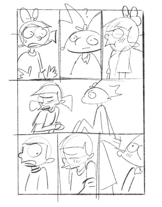
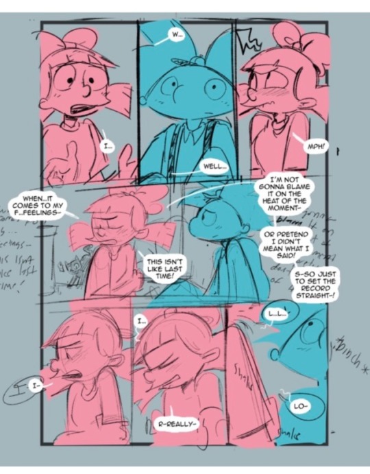
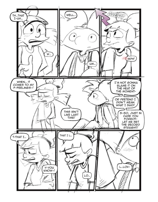
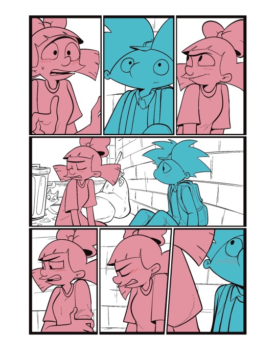
I usually separate my characters by specific color. This is so when I go into color, it’s easier to see which characters need what.
You can call me a bit of a cheater, but I like to use closed lines when I draw my characters. that way I can use a reference layer to just fill in the colors instead of having to do it manually or using my magic wand tool. 

I also utilize the pallets on Procreate to pick their colors
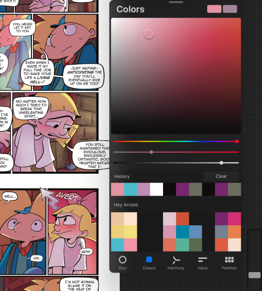
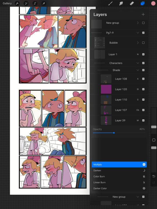
When it comes to shading, I like to use multiplayer layers and erase out the lighting. I might use some ambient lighting here and there with a dark pinkish purple this is going to depend on where your scene is taking place, but since mine is an alleyway, my multiplayer layer is at 40 opacity. For the characters, I usually use my syrup brush to blend in some of the less harsh shades. When it comes to my backgrounds, I like to use my glowing brush to erase out the lighting.
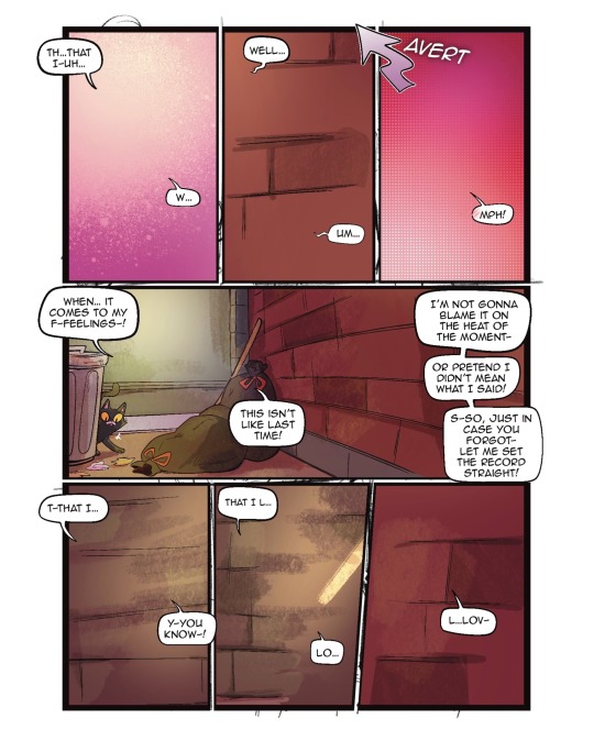
I still myself have a hard time drawing backgrounds I struggle to find where to put my characters in place some people find it easier to draw the background first and then the characters and although I do agree, that’s easier to establish the shot, I need focus on my characters. So what I usually do is draw my characters in a box and then draw that box in a space and that space becomes my background.
 I play around a lot with the Procreate effects that they have I use a pen called, burst for dramatic feelings, like a burst of energy or a burst of emotions I might use a comic dotted layer for something more comedic or action based. 
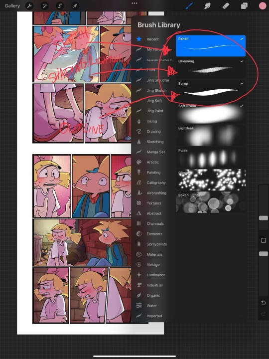
When it comes to brushes, I use a pencil for the sketch, a gloaming for the shading and syrup for the outline. Those are the main pens I use and everything else is effects. 
My organization isn’t always the best either, but this is how I usually do it. Panels and bubbles are at top, including the special effects like for example if I were to write the word ‘shake’ If Helga was shaking or blush, if Arnold was blushing, this would be in the bubble layer.  under that would be panels under that would be characters and in that folder I would have line art, then lighting and shading then color and that follows the same formula for background. 
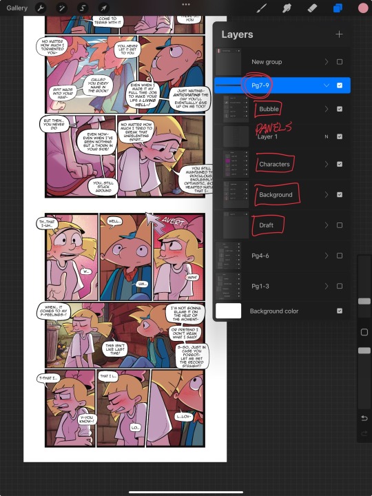
This is a general breakdown of what I do in my comic, and I couldn’t say at all, but I hope it gives you an idea of what I do. again I’m no professional and you should take all my advice with a grain of salt. My best advice is learned by doing I think if you looked at my first chapter and saw my latest chapter, you’ll see my improvement and my paneling in my expressions in my establishing shots and in my color shading. So if you wanna make a comic, just make it and learn as you go, your first one isn’t gonna be a banger more than likely but it’ll be the best learning experience, in my opinion. If you guys have any questions, I am an open book! Feel free to ask me anything.I stream on my TikTok when I make my comics so if you want to watch the process, you’re more than welcome to tune into that but I’m not gonna lie. It’s a bit tedious to watch 😂 I’m @eden_fries on most platforms.  
#arnold x helga#helga pataki#hey arnold#web comic#helga g pataki#fanart#comic#my art#fan comic#my comic#the process
59 notes
·
View notes
Note
HI HI i really love your art, the colors are just. so. wow. i wanted to ask if you had any specific way you chose color palettes and shading to kinda get that "opalescence" look?? do u just put down base colors then paint on top or do you build your palette from the beginning? love your gummies dearly!!
hi !! thank you so much, i love your art too !!!
i consider myself to have a very clear mental image most of the time, so i dont really plan the palettes they just come to me😭 when i get visions i try to doodle them quickly, so i can remember the key colors i want to use (if i dont i WILL forget the whole idea i have a terrible memory)


for the trans gumshoe i knew i wanted a lot of pink and blues but i didnt know how to mix them or compose the background, that took me longer than drawing and rendering him lol


the same for the pink jacket + glasses gumshoe ! i knew what colors i wanted to use, some of the elements too this time, but the composition and overall palette just comes to me just messing around until i like it :3
i dont consider myself really understanding of the color theory or anything, but i reccomend always messing with values and contrast more than pre defined color palletes ! i like mixing pink-blue-yellow most of the time, but always messing with the value and saturation to make them contrast ! also how much each color takes on the drawing. i like my art colorful and saturated but readable and with a lot of elements and/or patterns, so i just try to work with that instead of any written rules or steps. the only advice i can give you is to have fun with your art and experiment with colors !!
#this is a lot of text im sorry i rarely talk about my process#but yeah i bullshit my way tru most of my art so i cant give you a lecture on how color works#“it came to me in a dream” kind of stuff yknow. but it works for me !!! for now
87 notes
·
View notes
Note
im assuming this is the case but were jesse / lukas / petra’s admin designs having similar palettes / overall color schemes to the original three on purpose ??? i remember you doing admin jesse art before so im not 100% sure but i think its a really cool detail unintentional or not :)
actually no not at all. i didn’t even realize that until now 👀
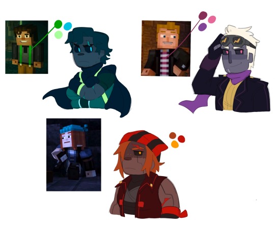
i kinda wanted their color pallets to all stay similar to the colors that really make each character stand out like jesse’s green suspenders, lukas’ magenta shirt, and petra’s red hair.
jesse’s design is based off your classic hero look with the onesie and the cape. the straps around his suit are supposed to represent the suspenders, and they, along with his eyes, are the only parts of him that glow. his colors are supposed to be calm and comfortable, yet dark and intimidating to look at because his admin self is honestly pretty sad. he’s eternally grumpy and wearing a smile is rare for him, so the colors also represent his gloomy mood. (he’s absolutely in no way evil though he’s still the same happy little jesse we know and love, it’s just very hard for him to take on positive feelings while in this form)
lukas’ design is supposed to look like someone of high authority. he’s a leader after all, and i wanted his design to be so anyone who takes a look at him knows he must be a person of high caliber. kind of imagine a pokemon antagonist and how they’re always decked out in attire that kinda makes you think like oh yeah that must be the boss, meanwhile look at all the grunts and they wear something similar, just not as ✨extra✨. yeah like that’s kind of what i had in mind for lukas, but instead of his magenta, i gave him purple because i personally really feel like purple is a powerful color. he’s the most like his original self compared to petra and jesse and he’s far more capable of staying calm and collected. also a good boy. looks intimidating but has the sweetest smile and the softest distorted laugh.
petra is… far more unhinged. her design is not entirely based off of her original appearance, but more around the energy and emotion she gives off. i kinda had a volcano in mind for her because it’s easy to spark a fuse in her and she can erupt and explode at any time really. she’s the most chaotic of the three, and if you read the details of jesse and lukas’ admin experience, petra’s is far less happy. she absolutely had to deal with becoming an admin all alone, and while that does sound sad for her, it’s honestly for the better. she would have been too worried about her appearance being so similar to romeo’s if she were around anyone else, and she gets to cope with that realization by herself and in a way that is honestly much better for her. like she goes down into a massive cave and destroys everything lol. uses her powers to destroy so much and take out all of her anger and aggression on mobs and her surroundings. she’s actively exploding, and once she gets it all out, she feels much better and theeen gets to really sit down and think it all over and cope with this newfound identity crisis
but yeah no the similar themes/pallets to the original admins was a complete accident 💀
164 notes
·
View notes
Note
Hey!! 2 and 6 for the artist asks? By the way, I LOVE your art. The lighting is so striking! Everything you put out is so soothing to look at and definitely inspires me to try fun things with my own art. ☺️💛✨
Hi!! Thank you very much I'm very happy that my art inspires other people!!
ALrighty, I already answered the 6'th question, so it's the second one
Okay in no particular order with the commentary
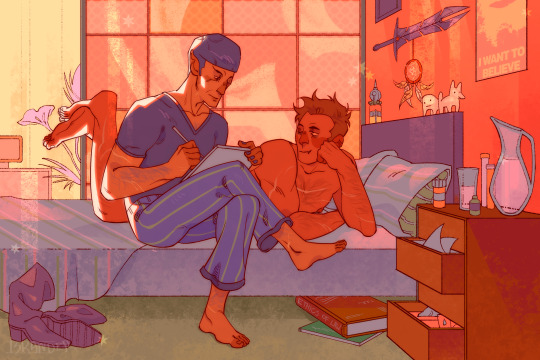
This one I like because I finally got to draw a pretty cool background that I myself think is intresting and does not look like a box bed in the box void. Also it's super warm and silly
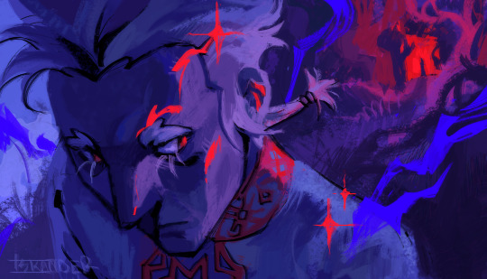
My oc. I really like the angle, color pallet and the render! It all looks so mystique!!
Also like this one for how soft it turned out
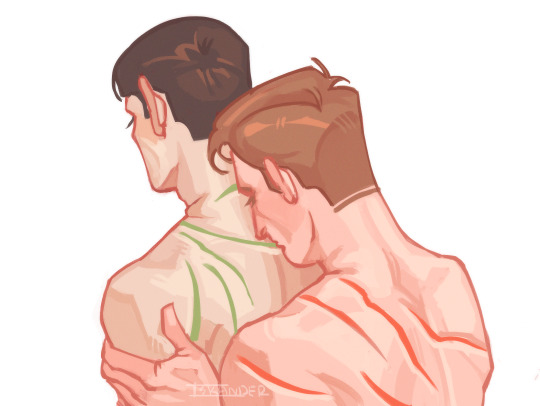
THIS ONE OHHH FUUUUUCKKKKKK It might seem very stupid BUT I HAVE NO IDEA HOW I MADE THIS ONE AND HOW TO REPLICATE IT... EVERYTHING IN THIS PIECE IS AN ABSOLUTE PERFECTION... LINEART? PERFECT. SHAPES? PERFECT. FLAT COLORS? PERFECT. The thing is when I draw usually I will look to how it looks and I always feel like flat colors are not enough - either the shape work is not strong enough or colors aren't poping the way I want them, so I add shading, even though my biggest dream in art is to come to the simple flat colors art style (even though I always experiment and sometimes like to render heavily, I do want to be able to do flat colors)
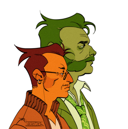
and the last oneee I really like how textures here look with the subtle line work. I also like that I was able to show skin folds on Crowly's face and how this all looks sad and at the same time soft and tender
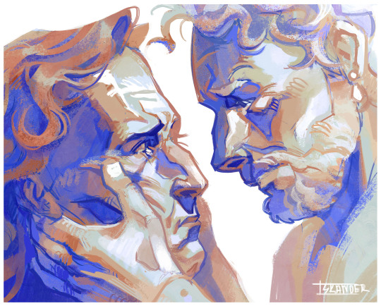
(maybe there's too much "soft and tender" words in this post but I can't help it, I'm living for the tenderness between people)
78 notes
·
View notes
Text
She's my new addiction

Well, I already mentioned that I'm in a LOT of fandoms and that's one of them. Recently my bf made me watch Steven Universe and now I'm OBSESSED with it. And it makes me so sad that fandom is actually kinda dead because last official thing was out in 2018 and there's nothing to keep it alive. I hate to be late on something cool and I don't really know why I didn't watch it earlier.
But. But. Can we talk about Garnet?? SHE'S SO GOOD AND HER ARCH IS AWESOME!! I love everything about her and as I keep watching I notice more detailes that make me giggle in enjoyment. I dunno if I want to be her or I want to be with her and what should I do with that. And I'm not on the first series of cartoon or something, but even rough mommy Jasper couldn't amaze me more than Garnet. I just love her so much.
Well, about art!! I felt like using acrylic markers would suit her the best, so here they are. But my pallet was really limited and I had to mix a lot of colors to get something I would like. I'm still kinda unsatisfied with the color of her skin and this star pattern. I'll figure it out later I think, or just make other fanarts in digital. But there will surely be more. I also had troubles drawing her body in my style which is kinda semi-realistic. I made her hands STRONG and her chest wide, just because it seems logical to me. And it was really hard to draw her hair 'couse I have no experience in drawing this type of them and I obviously need to practice them.
Oh!! Sketch ⬇️

Thanks for your attention if you read all of my silly thoughts!! It really means a lot to me, I don't usually write so much about my artworks •^•
I'm going to post some arts with my SU OC so stay tuned if you like such things!!
#art#artwork#drawing#cartoon#steven universe#garnet#crystal gems#jasper#traditional art#traditional drawing#acrylic#acrylic markers#colorful#colors#purple#cute#artists on tumblr#character art#garnet fanart#garnet steven universe#garnet su#su#fanart#fan art#moonface on tmblr
31 notes
·
View notes
Text
Spelldon Monster High Custom

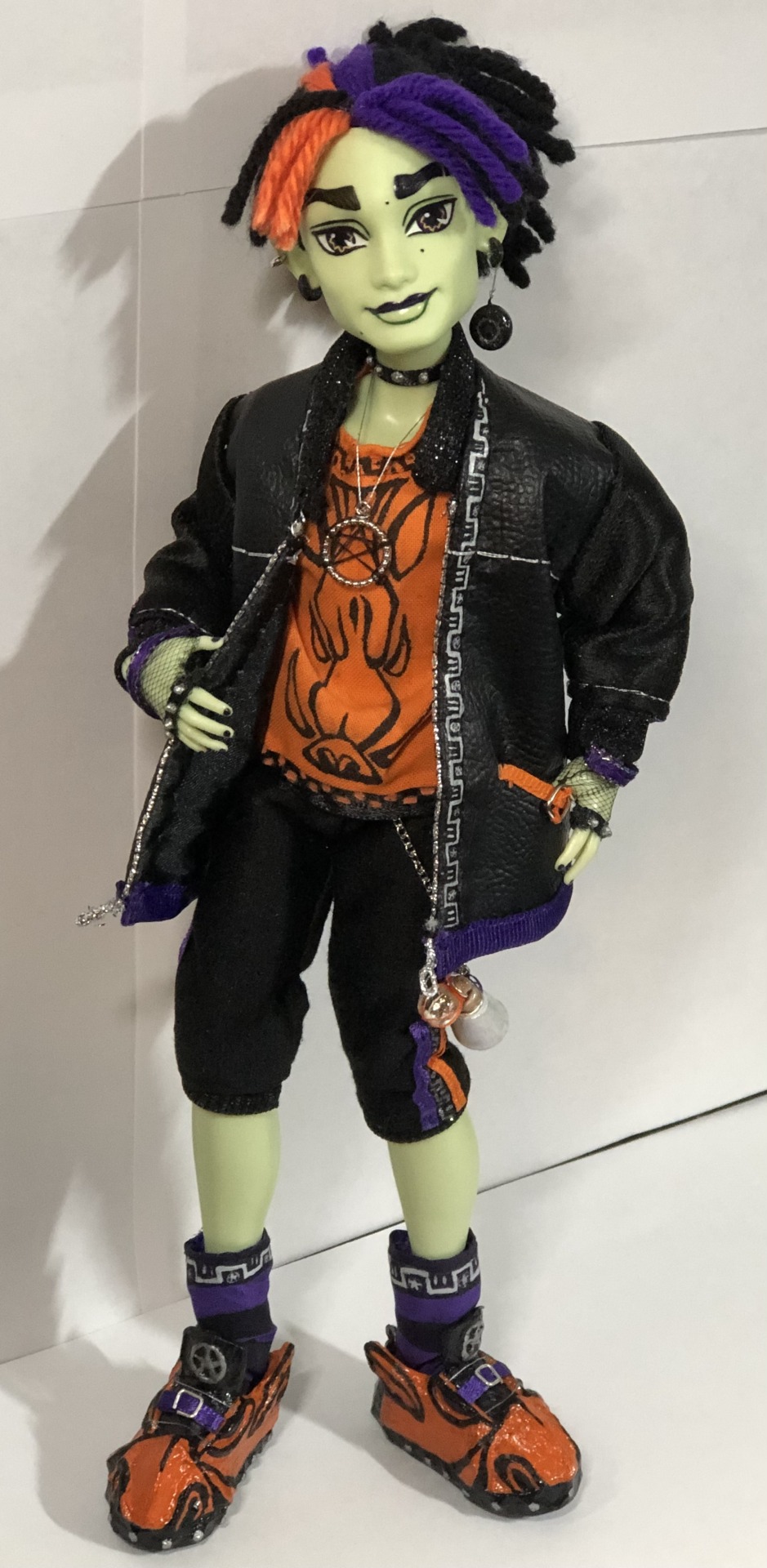
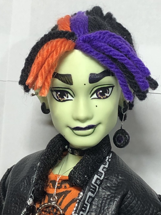
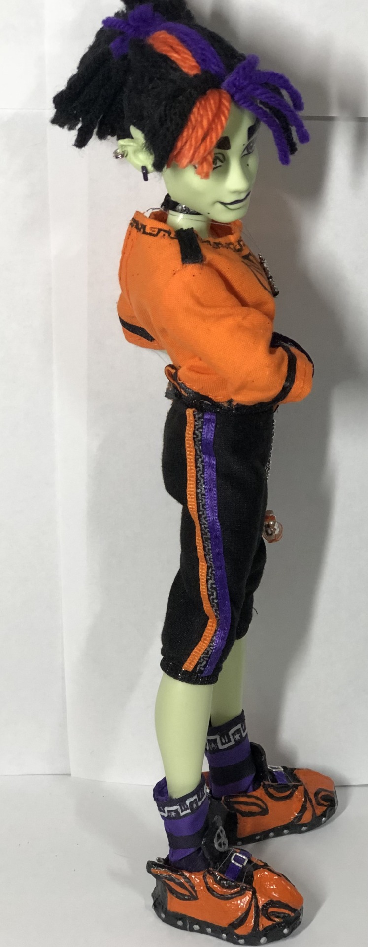
Once I saw that G3 Deuce had green skin, I knew I had to try my hand at making Spelldon Cauldronello. I re-haired him and flocked the sides of his head with yarn to imitate dreads. I sewed him a jacket, shirt, joggers, and socks. I made his little potions (out of beads), earrings (also out of beads), necklaces, gloves, pointed ears (I wish I could have gotten them smoother, but they were so delicate that I could not sand them without them breaking), shoes (out of paperboard and papier-mâché), and repainted his face (my first full face repaint and daaang was that difficult to try and make his eyes and eyebrows look related to one another).
He’s not perfect, but he was super fun to pose and creating him was a HUGE learning experience (like to start sealing all of my thread knots with fabric glue).
You’re more than welcome to draw fanart/make your own based on mine, just tag me- I’d love to see them. Feel free to comment what you like/dislike think I should improve on. :)
Edit: thank you for all the sweet comments in the reblogs guys. You’re all making my day. :)
More under the cut

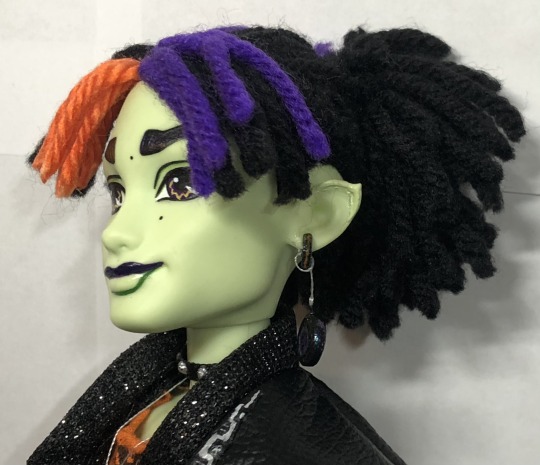
Close ups of his left side (I like how this ear turned out the best).
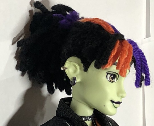
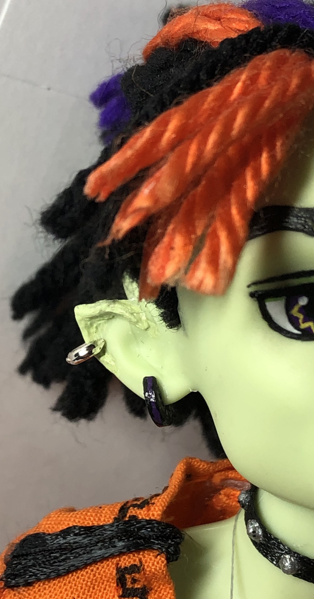
And his right side. I couldn’t get this side smoothed out to save my life, haha. Hopefully his earrings distract enough from it. Keeping beads from old bracelets come in handy! These were just the right size for him. I repainted the lower earring in black, with a stripe of purple, and added silver Ancient Greek designs on either side.
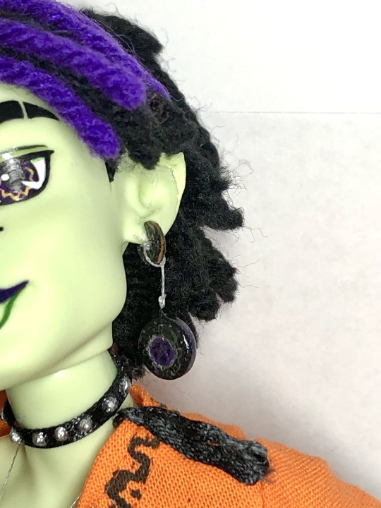
One more close up of his left ear and earring (I added a purple pentagram in the center of the silver Greek designs and the color shift sparkle paint around the rim). His upper earring is the same as his right lower earring, but has an orange stripe.
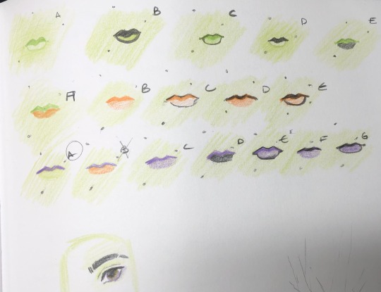
His face-up took awhile, but it is very rewarding to finally give him a face. I tried to make it look like the factory g1 monster high face up and took a lot of inspiration from his older sister Casta’s pupils. I gave him darker purple eyes, with the yellow/gold zig-zags. I gave him three moles, instead of just the one that Casta has, to mix it up a little. I did take a little inspiration from G3 for his eyebrows to add some orange and purple streaks in the front and a cut in his left eyebrow (I don’t know if that is still trendy, but I think it looks cool). The eyebrows are still not super symmetrical, but I already sealed it. I went back and forth on what I wanted his lip colors to be (I know I wanted something two toned) but finally decided on a dark purple upper lip, with a green outlined lower lip.
Also G3 heads are SUPER difficult to try and reattach (and remove) and have to be VERY squishy to put back on their bodies (even after I had trimmed down the neck peg).
Okay, onto his wardrobe! I wanted to imitate Casta’s color pallet: black, orange, purple, silver (and sparkles and studs), while bringing in more “witchy” themes (the buckles, stripe socks, and pentagrams), and his scaritage from his mama Circe (hence the potions, boars on his shirt and shoes, the greek vase designs and the boar designs being black on orange -like the Ancient Greek vases). Even on the Greek designs, I put some teeny tiny pentagrams (namely on his jacket sand socks).

His jacket took the longest (his shoes were the second longest). It is fully lined (the sleeves have a white lining to keep staining to a minimum), and working pockets. I liked the sparkly material I found, but does it shed like crazy (I used it for his collar, cuffs, pockets, and the bottom of his jacket in the back, and wrong side-out for his sleeves -they still have silver sparkles showing though and it doesn’t shed…but it will catch on things). I used thin ribbon for the outside of his pockets (next time I will fabric glue the ends shut on all my ribbons and a thicker ribbon for the bottom of his coat), and bent some wire into buckles. I also used ribbon wire and looped black thread over it to make it look like a zipper. I used fabric paint for the pattern down the front and REALLY hope it stays on there.
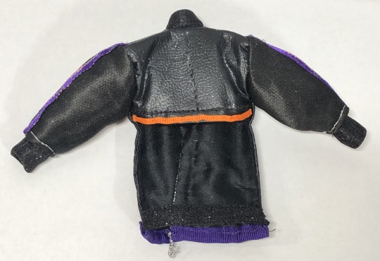
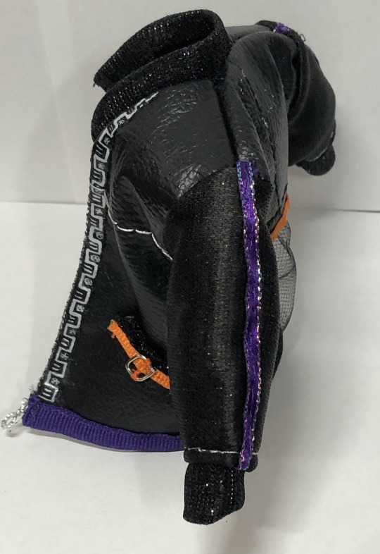
I really wanted a mesh back to his coat (I love how that part turned out), and then added this purple sparkly ribbon to his sleeves. He was going to have another pentagram in the back but it was too much (but it left a cool shadow of the star after I removed it).

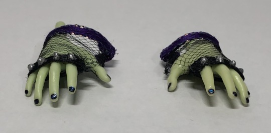
His gloves are made of mesh and ribbon (with glitter fabric glue continuously added on top of each other, and then painted silver, to make the spikes on his knuckles -same thing I did with his choker and shoes). His nails are painted black with the same color flash glaze paint as part of his earrings.
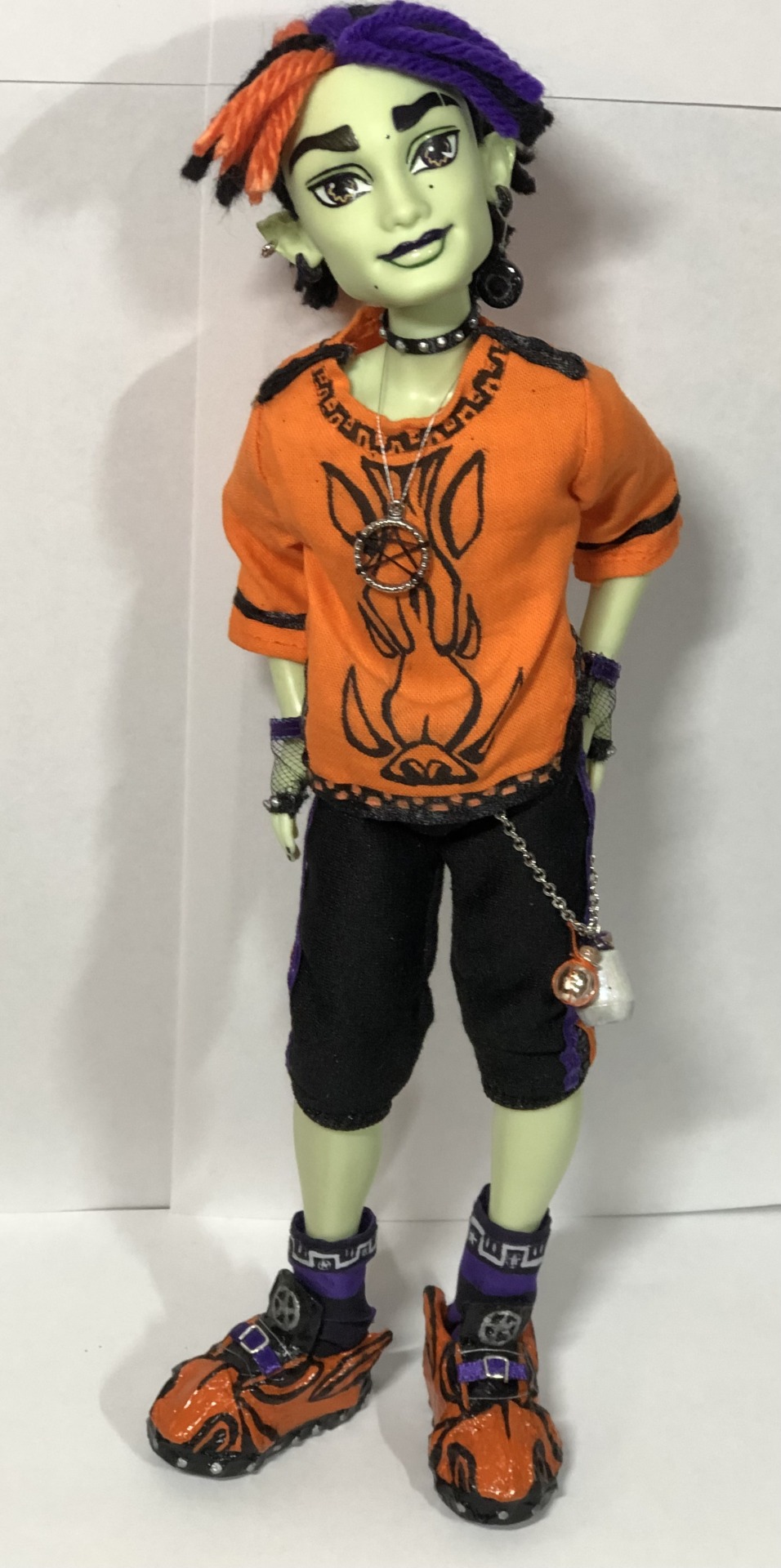
Okay onto his main outfit without the coat (he’s much more fun and easier to pose without his jacket).
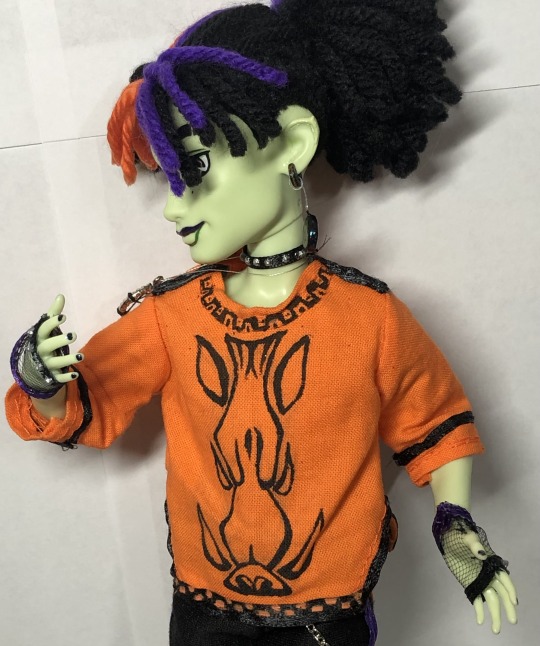
“Spelldon, please move your necklace out of the way, so we can see your shirt better, thank you.”
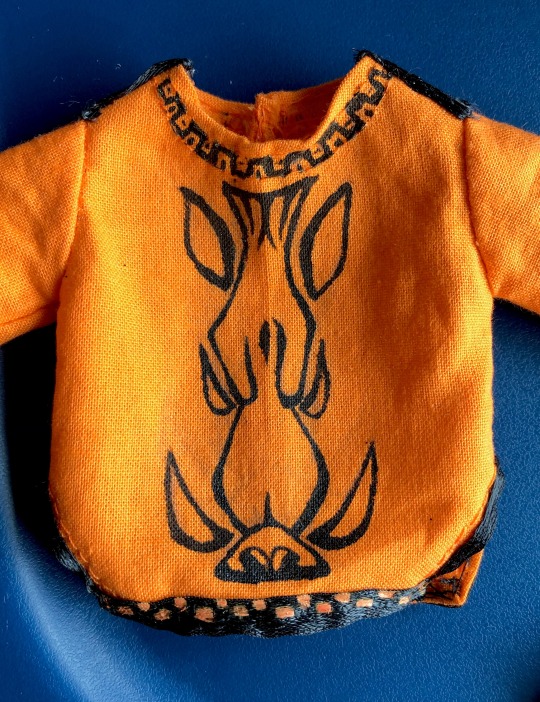
Close up of his wild boar and Greek vase designs on his shirt (done in fabric paint). I REALLY love how the boar turned out as I was SUPER nervous I was going to mess it up. Having a boar/Greek vase design on an orange shirt was also inspired by @spookberry ‘s design of Spelldon. His necklace pendant was another bead I had (and it worked great for attacking thread too).

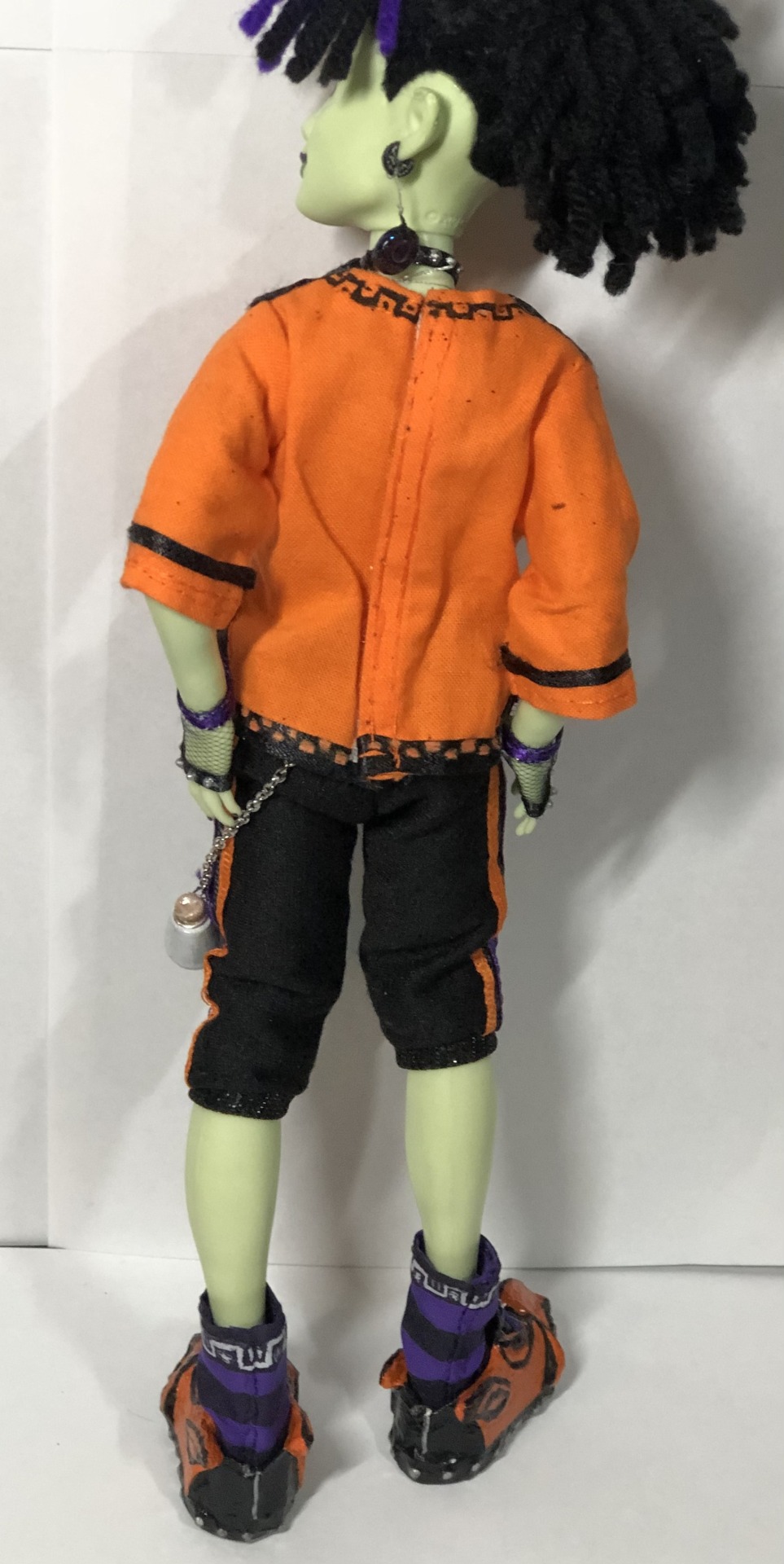
Side and back of his outfit (you can see some of that stray black glitter).

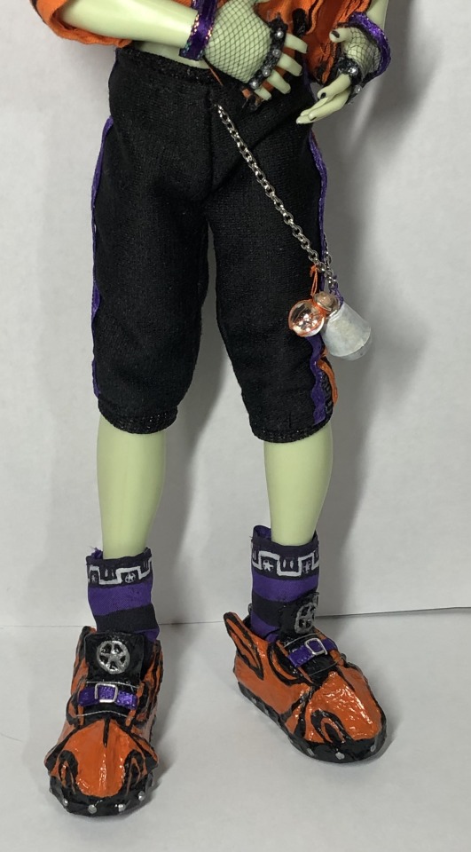
“‘Scuse me Spelldon, can you lift your shirt so we can see you joggers better? Thank you.” His joggers/capri’s and socks were inspired by @peppapigvevo ‘s Spelldon design. Once again I used ribbon, that sparkly material for his waistband and cuffs, and silver fabric paint for Greek vase design.
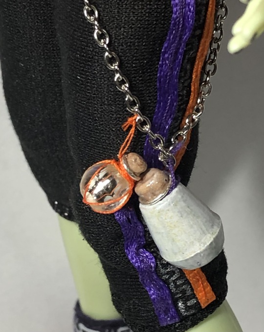
I attached a chain to his joggers and added these potion bottles (while Casta looks like she uses more magic spells and incantations through her singing, I like to think Spelldon uses potions -more like his mom). I made these potions out of wire, beads, thread and air-dry clay.
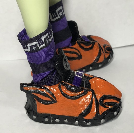


Onto his shoes and socks. I made the shoes out of paperboard and paper-maché. I wanted them to be boar themed while still having pentagrams and studs on them. They turned out a bit wonky (and a tad too long -but it helps him stand up, haha), but I spent too much time on them to redo them, haha. His shoe sole I also painted with that sparkle flash glaze paint too. I also gave him the striped socks, because I love striped socks and tights on witches.
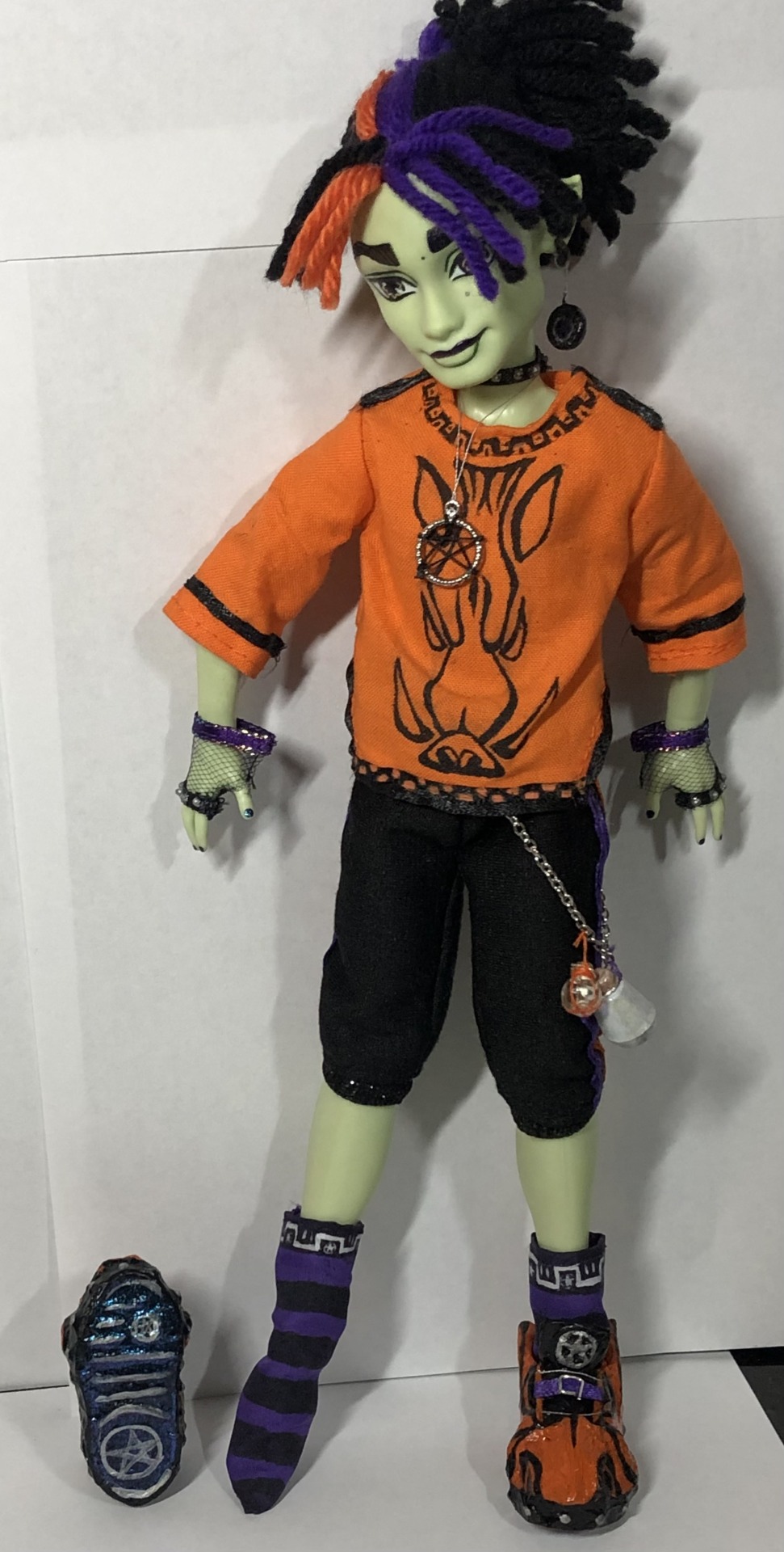
“Thanks for holding still Spelldon, and being patient with me.” I’m going to make another post or two with comparisons with his sister, some of my other customs, and some vampire that claims he knows him or something, heehee.
Oh yeah! My sketches for him:


#spelldon cauldronello#spelldon#monster high doll#monster high dolls#monster high#mh#doll custom#monster high custom doll#monster high custom#spelldon doll#spelldon Custom#customsbyaleta
519 notes
·
View notes
Note
look i’m gonna be serious with yall for a second in the most respectful way i can think of. a good 80% of the stuff you mentioned in your “explanation” has NOTHING to do with the actual accusations ☹️ what does synesthesia have to do with tracing and what does ritual abuse have to do with ANYTHING THEY MENTIONED?? i genuinely dont think it is possible to internalize peoples drawings THAT closely with synesthesia. hell it might not be possible at all! you can internalize and put images of IN PERSON memories in your head yes..but DRAWINGS? makes 0 sense to me.
they didnt even mention the collor pallete blue and white, but seeing your emojis its more of a white and a cool grey instead of a blue. so where tf did blue come from
OH AND I FORGOT TO MENTION THE RITUAL ABUSE MENTION?? you just dont pull that out of your ass to try and prove a point. “I don’t deserve forgiveness” then a paragraph later you’re still defending yourself. this shit has been the most hypocritical and absurd thing ive seen in a WHILE
number names are NOT your biggest enemy dude 😭😭😭 you’ve got plenty of other problems if any of the shit you’ve mentioned is actually true
also..mental illness is NOT an excuse to hurt people. “ohh im disordered and unable to get help!!! ofc i accidentally hurt people!!” if you know you’re hurting people its not a damn accident. from one cluster b to another im actually floored.


“parasocial” DOES NOT MEAN WHAT YOU THINK ??
“leave my name out of your mouth in public spaces” YOURE MOUTHING THEM ON A PUBLIC SPACE TOO??? HYPOCRITICAL???
and now there’s the few things i do understand..
being uncomfortable with irls is ok
saying endos aren’t valid is true (coming from a diagnosed did system)
and thats all i remember. its getting late
I'm answering the points that they brought up. That's how a conversation works and I didn't want to ignore anything to avoid further criticism

synesthesia is a condition where senses connect abnormally. So you smell colours, hear numbers etc. We have a lot of synesthesia connections with touch and art. We are able to recreate a photo perfectly without tracing it because we can physically feel the lines in our hands. This, unfortunately, makes it really easy for us to copy things, even unknowingly. The physical memory will play out in our hands and we will (thinking we're just on a roll) accidentally make something an artist has already made. You don't have to believe me if you don't want to, but I'm not going to lie and admit "I traced!! 100%" when I didn't. Just because you don't understand or experience something doesn't mean you get to say it isn't real. It has been a genuine frustrating struggle. I never said it meant I'm not at fault or that it's okay because it's accidental, that's why I apologized. But it isn't fair to compare a symptom I struggle with to a deliberate act of art theft.
they mentioned number names . on the post.

number names are very often correlated to that type of abuse. it's a form of programming, and that type of abuse is how we experienced it. That form is how a lot experience it. I assumed that was implied
I don't think this is a super important point but it's like a white and dull cyan and cyan is a form of blue so. idk many come at me thinking I target anyone who uses that color pallet and that just isn't true. that's why I brought it up.

I genuinely don't know what you're talking about here but it was most likely in response to a point. I can be aware that people are allowed to dislike me, but there is a difference between people who dislike and people saying things they've heard from people who already hate me because of completely unrelated reasons, spreading it online and further causing harassment for me. None of you actually research what you're claiming, you take the word of people who dislike me and run for it.
Do you understand how scary and hurtful it is to see how many people hate you for reasons that have been completely twisted to the point where you don't understand what they're calling out? It makes you want to defend yourself. I have seen countless shit I have bitten my tongue and ignored but I'm reaching my end and quitting tumblr soon for my own mental health. That is why I'm now responding to things. Even if they have a small blog, if they're talking about me and saying things they have no actual information on, I have the right to defend myself. I would love to privately ask for things to be taken down but in the past I either get blocked or my shit gets taken out of context and spread further. I have never once pushed for my crowd to harass. If you are a k9 follower and you're reaching out and verbally harming people because they dislike me, fuck off. That isn't okay. I don't want that encouraged in this community.

I'm not going to sit here and trauma dump about my childhood, but I will let you know that until about age 10 I had little to no interaction with people. That's all the information I'll be giving. So no, I don't understand it until someone tells me. Communication is important. I have changed and grown a shit ton the past couple of years and I have gotten really good at communicating with people. People have called out my behavior as "apathetic, uncaring and self absorbed" When those are literal key symptoms of NPD & ASPD. The disorders I have zero help for. I have done my absolute best to manage these symptoms. But if you can provide me a screenshot of me ever in the past 6 months I've been most active, genuinely attacking someone for NO reason, then I'd love to see it. The amount you guys play up my monster role is outstanding. I am mature at the beginning of every issue I try to address, but I am a human person, and I have lashed out sometimes. I'm sorry for that, and I'm sorry to the people I've hurt. I can't do anything else but apologize and get better at it; which I have.

There are many people in this community and on this app obsessively posting things about hating me, and I will not respond or address them because I will not feed into what they are doing. I will not publicly react to them because I am not going to engage in that disturbing behavior.

^^^

There's a difference between saying someone is a, b and c horrible thing with no evidence and me responding and debunking shit. Is it badmouthing to?? defend myself??? or stand up for my boundaries???? I honest to god don't get your point here.
But uhh yeah. What you see as a small blog just talking about me is what I see as something that is going to kick up threats and hatred in just about every platform I have. So that's why I'm about to fuck off this app.
Please reach out publicly if there's anything I missed or you're confused on. I will handle it maturely and gently :] Thank you for messaging me !! I don't intend any of this to come off as angry at you, I am angry at the situation.
17 notes
·
View notes
Text
stop what you are doing right now and go watch Jentry Chau vs the Underworld immediately

I instantly fell in love with this show from the moment I saw the trailer, and when it finally got its full release, it did not disappoint
(season 1 spoilers under the cut and also probably the longest post I've ever made by far)
if you have any interest in Asian/Chinese mythology and culture, fantastic animation, soundtracks full of absolute bangers, Texas for some reason, stories that touch on the subject of being Asian American, or high schoolers fighting the supernatural/demonic, or if you just like things that are good, this is the show for you
I watched through the intro in every episode, despite the presence of the skip intro button, and I even often went back to rewatch it after it finished, it is so fucking exhilarating and exciting, I have never felt more hyped in my life
I personally love Chinese mythology, but I truly do not believe that proclivity is even remotely necessary to enjoy this show, it's just all around amazing
the writing is phenomenal
Gugu: "It's a jianshi thing, they can't help but count rice."
Ed: "Hey, I can quit anytime I want!"
this fucking killed me
referencing a jianshi's need to count grains of rice is one thing, that's pretty much expected, but the implication that doing math (counting) is an addiction is so ironically model minority racist Asian stereotype coded that it is genuinely hilarious and I love it so much I'm dying
no idea if that was intentional or if I'm just seeing things, but it made me laugh all the same, and maybe I've got rose tinted glasses on because of my love of Chinese mythology and being able to relate to the Asian American experience, but regardless I cannot praise this show enough
the cast is pretty stacked as well, with solid vocal performances by Ali Wong, Lucy Liu, SungWon Cho, Bowen Yang, Jimmy O Yang, and many more talented actors
the complexity of the relationships goes so much further below surface level than your typical supernatural teen action dramedy, for example Jentry and Kit

it's not just Jentry is initially afraid of Kit because he's actually a hideous monster but learns to love him in the end for who he truly is, Jentry, while admittedly initially shocked by his true appearance, makes it clear why she's really upset with him
it's not just because he was a demon or even just because he lied about being a demon, it's not just because he has killed people in the past, it's not even just because he is several centuries older than her, she's upset because he manipulated her, used seduction to lure her in, planted the pearl that used her (partially) dead parents to draw her into a trap, and sought to kill her, and the reason he did all of this was for his personal desire to get his very own human soul
Jentry didn't believe Kit's feelings for her were genuine, and who could blame her? regardless of the fact that his feeling were, or at least eventually became real, he did seduce her and manipulate her for his own selfish ends
and Jentry even recognizes his eventual genuine desire to be with her as entirely self serving and sought out solely for his own happiness, but in the end Jentry's rejection pushes Kit towards self reflection and growth and he realizes his own selfishness, and then he proves that he is capable of putting others first, by sacrificing his life for hers without anything to gain, a sacrifice made all the more meaningful by his permanent (tentatively) status as dead, especially in a show where ghosts and undead are common place
I have so much more to say about the relationships, and not just romantic ones, I could go on forever, but I'll just stick with the example of Jentry and Kit for now
the animation is beautiful and the color pallet is gorgeous, the music is great and could not be better suited to the show, a lot of passion was clearly put into the making of this show
though my favorite part may be the show's willingness to explore the darker horror-oriented side of Chinese folklore

the painted skin demon story, the actual torture of Diyu, the unheard nü gui, the gruesome deaths, Cheng's daughter's desperate want to return to the afterlife, the content can be a bit harrowing to say the least
while still maintaining a largely PG image, the show manages to put a good bit of horror into the story, but by far the most harrowing parts of the world of Jentry Chau vs the Underworld are the real world themes that it portrays
Jentry is surrounded by people that claim to love her and want to protect her, but many characters, whether on purpose or by accident, end up using Jentry for her powers to their own gain
she was cursed with a destructive power that she cannot control, a power that she does not understand, and she has no idea how or why, but everyone seems to want these powers except for her
in a break from the genre standard, whereas the chosen one teenager might have to hide their abilities and responsibilities to keep others safe, pretty much everyone knows about Jentry's predicament right off the bat, and better yet most of them have already formulated their own misconceptions and prejudices

if you thought it was hard fitting in while trying to hide your darkest secrets, imagine how hard it is to be accepted when everyone not only already knows your secrets, but has been given ample reason to fear you because of them
it suddenly makes more sense than ever why so many chosen one teens hide their peculiarities, it is truly a frightening prospect to exist in a world where everyone around you is both different from you, and keenly aware that you are different from them, there's no fitting in after that
it presents a metaphorical dramatization of a real world experience, something I myself have experienced, growing up in America when nobody else looks like you
I grew up in an almost completely white town, and there was no way of hiding the fact that I wasn't also white, though I was really lucky to live somewhere where racism was much less common place, or at the very least less overt than it is in many parts of the country, a lack of racism didn't mean I wasn't different
Jentry goes to a school that seems fairly diverse, though still mostly white, with many other kids who also aren't white, but race isn't what makes her stand out, it's something else that she was (allegedly) born with, something she (seemingly) has no control over, and something for which she is faced with prejudice much like race, though she later discovers that she can actually change and control these things, that's not how it starts
okay this is getting way too long so I'm gonna rap it up here, but I am hardly finished speaking on the topic, if you claim to have made this far into my rambling I will simply call you a liar, but if there are two things to take away from this mess, it's this:
a - I am desperately hoping for a second season
b - GO WATCH THE FUCKING SHOW
#jentry chau vs the underworld#jentry vs the underworld#jentry chau spoilers#spoilers#tw racsim#cw racism#i fucking love this show#rose rambles#and i'd do it again#and probably will#jcvtu#rose recommends
19 notes
·
View notes