Text
Don't Mind Me! I'll be in Graphics Doing Some Homework.

Evaluate a Library's Comics Collection
Choose a library and a specific subsection of the comics collection to assess.
Spend 20 minutes examining the physical collection and 5-10 minutes examining the catalog entries.
Create a report that includes a brief evaluative description of the collection's scope, currency, diversity, and indicators of use.
Consider the following factors: location, organization, signage, and displays.
The Library:

The Harvard Diggins Library (HDL) houses two graphic novel collections; one for junior readers and another in the teen space. There is not an adult graphic novel section. So, I took a shallow dive into the collection in the YA department, hoping to find some superhero comics!
The Comic Collection @ HDL:
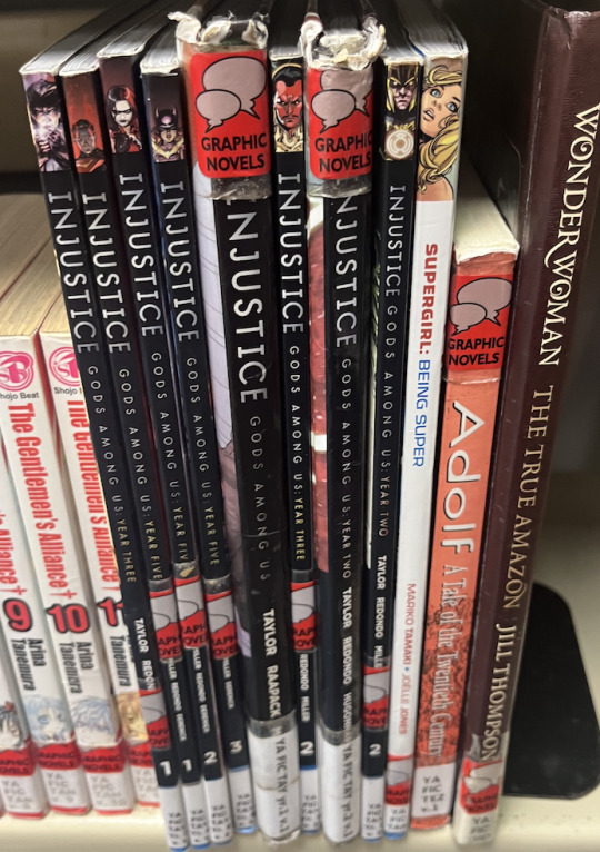
Graphic novels, manga, and comics were all shelved together in the teen space using an A-Z organization style by author name. Apart from the signage at the top of the display and the 4 outfaced books, there was no further marketing for the comics collection or an implication anywhere else in the library pointing to the comics collection. The shelving pictured on the right of the display is not a continuation of the collection but the YA nonfiction display.
Oh, superheroes? Where did y'all go?!
The first item on the shelf was Thor: The Goddess of Thunder by Jason Aaron and Russell Dauterman. The call number for this title was listed as YA FIC AAR. Found one!
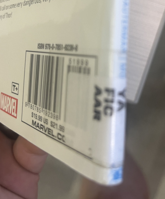
However, this can be problematic, especially for teen readers, for individuals who may not be familiar with the authors of their favorite comics but rather the characters and franchise.
Now off to find more superheroes!
Scope:
The collection is small; however, the scope of a library collection needs to reflect who it is serving. That said, the HDLs comics collection is representative of the smaller teen population in Harvard, IL (Total Population: 9,477). Additionally, HDL subscribes to Libby (OverDrive), which creates a virtual access point to a larger professionally curated digital collection that expands HDLs comics collection exponentially.
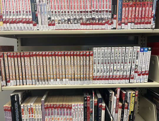
The collection mainly consisted of Manga, with popular graphic novel titles and barely any superhero comics.
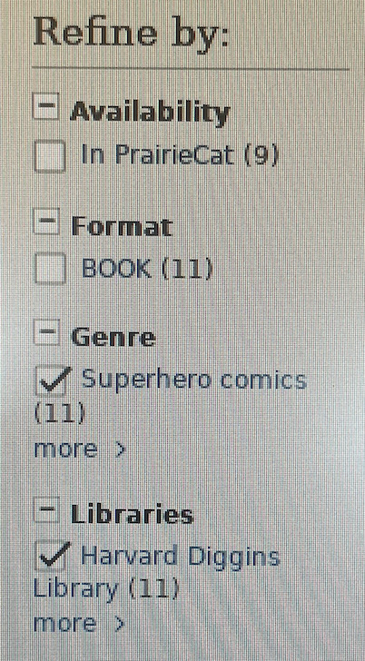
After a brief catalog search, I discovered that HDL only owned 11 superhero comics.
Currency:
The comics collection at HDL noticeably made an effort to include current popular media within their collection efforts. The intended reader would immediately notice and gravitate to several of the manga available from hit anime shows. Some examples include Attack on Titan, Tokyo Gouhl, and Naruto; however, it is essential to note that these titles are older and act as a visible anchor to HDLs collection. Some examples of superhero comics on the shelves were Injustice: Gods Among Us (2013-2016), Hawkeye: My Life as a Weapon (2013), and Marvel's Civil War (2006-7).
Diversity:
This was an area of opportunity for the comic collection. This collection focuses on hit anime shows to attract readers and passersby. While manga includes all genres as an art form and literary medium, the physical presence of these manga series is particularly powerful and takes away from the other titles on the shelf. When I think of diversity in relation to a library collection, Professor Rudine Sims Bishop's words about windows, mirrors, and doors come to mind, and from that context, this collection could be more inclusive of the lives of others. Ms. Marvel was a gem in the collection and on loan at the time of my investigation.

Usage:
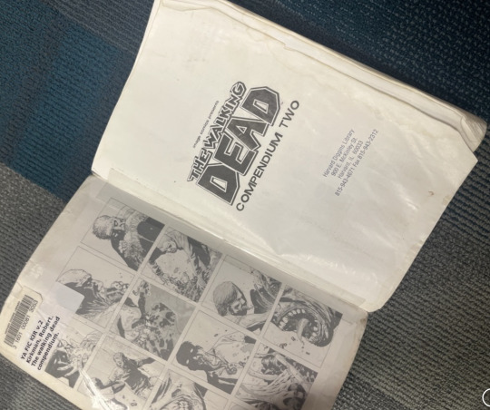
Some of the more popular titles were worn and tattered. For example, this copy of The Walking Dead has seen some wear and tear that is common for paperback circulation in public and school libraries. The paperbacks in the collection did not have any additional life-preserving covering added, such as hard laminate. The majority of the manga collection was intact and had minimal signs of damage. The concern here was whether or not the resources were seeing any movement in circulation.

Overall, HDL represents popular media and teen inclusivity well, but there is room for improvement regarding shelving and location for their comics collection.
One way to improve the comics section would be to move it to a more prominent location in the library. The comics section is located in a small corner of the library in the teen space, which makes it easy to miss. Moving the comics section to a more central location would make it more visible to library patrons and encourage more people to check out comics.
Currently, the comics are organized by author (A-Z), which can make it difficult for patrons to find specific titles. Reorganizing the shelves by genre, theme, or publishing house would make it easier for patrons to find the comics they are looking for.
Despite these minor criticisms, the comics section of this public library is a valuable resource for library patrons of all ages in the community. The library does an ok job of selecting a variety of titles.
Recommendations:
Add more graphic novels to the collection. Graphic novels are a great way to introduce people to comics who may not have read them before.
Offer more programming related to comics. This could include author visits, workshops, or discussion groups.
Partner with local comic book stores. This could help the library to get more new comics into its collection and to reach a wider audience.
I hope these suggestions are helpful to the wayward Tumblr librarian!
L'Chaim, Challa, & Comics!
#MAYL814#graphic novel#mlis#blogging#futurereadylibs#public libraries#collectiondevelopment#librarymedia#tlchat#mwlibchat#connectededucator
5 notes
·
View notes
Text
Find resources. Read, Curate, & Share. Update. Rinse and Repeat.

Curation is a critical tool that can be harnessed to leverage resources as pertinent information to specific target audiences. However, curation is a "living process" and is never fully complete. That said, managing curated information as it ages is necessary to keep it relevant and useful.
The process of weeding through curated websites was simple in nature because the information was organized effectively and took into consideration the user experience. However, the process would not have been approachable if the information had been more unorganized.
Paying attention to the smaller details was important to figure out the resource changes. Some of the changes that had occurred were not immediately apparent. It is one thing to look for dead links and another to sift through the changed information; this was the challenging part of this task.
I enjoyed being able to revisit resources that had left my immediate memory. Revisiting curated resources might be a great way to find inspiration for lesson planning!
In sum, gathering and caring for information is a task that is never fully accomplished. As time progresses, resources ultimately change how they are interpreted and applied.
5 notes
·
View notes
Text
Do you know the way? NO? You need a Pathfinder.

A pathfinder is a tool that explores a topic in extreme depth; moreover, the usefulness of a pathfinder is the culmination of resources about resources for the subject at hand. I created a pathfinder about skincare for a beginner entering the world of skincare for the first time.
My first mistake was that the subject I chose needed to be narrower. Skincare is a large topic that can be broken down into several smaller categories. When I started collecting resources for a skincare pathfinder, I was overwhelmed by the sheer amount of information available. That said, I narrowed my topic to cleansers in skincare, and I had a much easier time filtering through all of the information. Pathfinders need to contain relevant information that extends the reader only a short distance from the discussed subject.
The platform I used to design my Pathfinder was Thinglink, and I was satisfied. Thinglink is a resource that allows a still image or visual file of choice to be embedded with information using their software with visual anchors. The design felt very natural for the purposes of a pathfinder. I was very excited to play around with a 3D file called a glb file. This allowed me to upload a 3D model of a human, which I used to create my pathfinder. From there, I linked and embedded all my resources on the 3D model in such a way as to lead my viewer through my project. This interactive component of the pathfinder provided flexibility in how the resource was used.
The implications of the usefulness in a library setting are apparent. A resource that links information about a particular subject and then offers resources to interpret the information provided. However, designing a pathfinder was a challenging task! I came across too many occasions where I had to re-work how I wanted the information displayed and in what order to maintain the usefulness of the resource. In sum, if done correctly, pathfinders can be a great resource to help you teach when you are not there!
#LIS724#blogging#pathfinder#futureschoollibrarian#schoollibrarymedia#MLIS#Skincare#cleanser#thinglink
0 notes
Text
Genderqueer, Thinglink, and Highschool Freshmen. A lesson for the ages.

The task put before the school librarian group was to design a lesson plan centered around standards that taught technical skills through a collaborative instructional session. The thought process behind choosing this topic was to introduce students to diverse literature that expresses several essential literary elements through the lens of award-winning literature while integrating technology skills. The topic produced after a brainstorming session was not readily agreed upon at first and required more communal finesse an agreement to come to a final agreement. The group was comfortable with a younger age group and had to step out of members' comfort zones to design a lesson plan for freshmen in high school. The final decision driver was the age limitation of thinglink is 13, thus making the high school student the requisite age group for the assignment. This a perfect example of how technology can have limitations within school library settings.
Thinglink effectively conveyed to students different ways to create a multimedia object that can include linked, embedded, or uploaded information. Additionally, the literary topic paralleled alongside these skills acted as a conduit to further expand students' critical thinking and hands-on technical skills at the same time, which is often a more effective form of learning.
Gender Queer by Maia Kobabe was the graphic novel our group selected for our book cover; however, the assignment required the students to come to class prepared with a screenshot of the cover of an award-winning book. From there, the school librarian group walked the students through navigating the technical aspects of thinglink while offering perspectives about the importance of award-winning literature and an analysis of the symbolism associated with the book cover.
Gender Queer proved to be an excellent resource to spark analysis of symbolism and award-winning books with our target audience. However, I did not expect in-the-moment technical difficulties from our students. This oversight was quickly attended to during the virtual session; however, in the future, it would be wise to expect this and have a strategy to alleviate the stress technical difficulties caused. For example, in a collaborative group situation, it would be wise to assign the role of dealing with technical difficulties to a specific individual.
The discussion about symbolism revolved around the concepts of color and contrast. The goal of this dialogue was to guide students to an analysis of their chosen book and to spark an inspiration to interpret what the book cover "says" about the text inside, a critical skill for budding freshmen. A critical lesson component was engaging the students through dialogue, which sometimes felt like pulling teeth. Constantly engaging your students is a great tactic to avoid static moments that can lessen your authority as an expert. The following article, What a Book Cover Can Do, by Peter Mendelsund and David J. Alworth, was a great resource to build the conversation about symbolism in book covers.
This was the final outline for our instructional group project.
#LIS724#thinglink#blogging#futurereadylibs#collaboration#futureschoollibrarian#tlchat#mlis#digitalcitizenship#symbolism#lesson plan
0 notes
Text
Screencasting to make the FINAL CUT!

School librarians have evolved and learned to be in two places simultaneously! Well, they wish... However, screencasting software has enabled it to leverage technology to record and produce video footage that can support distance learning or a flipped classroom learning style. This can be an effective tool for school librarians who need to be in two places at once and to support classroom curriculum with integrated library skills.
Initially, I decided to do some brief, informal research into what makes an excellent screencasting video, and I came across some great resources. The Techsmith Blog offered sound advice when creating a screencasting video:
Choose screen recording software
Prepare yourself and screen for recording
Record your screen
Make adjustments to your recording
Save and share your screencast
Following the advice from the blog, I decided to use awesomescreenshot.com software to record my video. I chose this software because it is user-friendly, familiar, and the free option for the software contains adequate tools to complete my how-to tutorial video.
I decided to record a brief how-to video on using two features of the advanced search option in Destiny Discover for an elementary school library. The ability to use the advanced search options in a library OPAC will empower students to find and access the information they need; moreover, a series of how-to Destiny Discover videos will benefit the unfamiliar library user when the school librarian is unavailable.
The process of creating the video tutorial required initial research, conceptualizing content, recording, and video editing. That said, the work required for a three-minute video tutorial is not represented within the time constraints of the video itself. It's a process. The Techsmith Blog also advises adding transitional elements and background music to elevate your production and provides a link to a great informational video on how to add these elements to your work.
youtube
With this in mind, after my recording had been accomplished, I used iMovie, an apple video editor, to import my recording. From there, I used iMovie to add background music which I obtained from the audio library on Youtube. The audio library on Youtube is convenient for virtual content creators and provides open-licensed music for video creation. Once satisfied, I added elements such as an introductory slide and transitions between slides to avoid jerky, misplaced video segments and promote a more natural watching experience.
This is my final product.
youtube
References
Audio library—YouTube Studio. (n.d.). Retrieved November 29, 2022, from https://studio.youtube.com/channel/UC-Smxhxtin1ERD3w5kchiSg/music
Camtasia (Director). (2020, October 2). How To Make Your Screencasts Look Better (and Easier To Edit). https://www.youtube.com/watch?v=EsIf7r6mAEc
Swanson, K. (2022, January 21). How to Make a Screencast in 5 Easy Steps. The TechSmith Blog. https://www.techsmith.com/blog/how-to-make-a-screencast/
#LIS724#screencasting#awesome screenshot chrome app#MLIS#blogging#videotutorial#video editing#schoollibrarymedia#school library#Youtube
0 notes
Text
Breakout, Breakout, Wherever you are! and meet gamification...
Gamification and game-based learning is the answer to engaging reluctant learners.
Designing a breakout-style activity encompassing several puzzle activities was an excellent way to introduce gamification and game-based learning instructional strategies. The school librarian group decided to use the Questioneers series by Andrea Beaty once again as our literary anchor for this project. Creating several connections to the same literature can create a relationship that can be used as a learning tool.
Google sites was a relatively straightforward application to create our breakout activity. I was glad for the experience because several school libraries use the application for their school library website, and I can see myself using the platform.
Collaboration with the school librarian group members was also not an obstacle. Our collaborative initiative started with a brainstorming process that led us to our familiar theme, and a democratic vote on the types of puzzles being completed finalized our plan. Google workspace creates a collaborative work environment that leaves project contributors free to work at their own pace and on their own time.
This is our end result:
This learning activity has so much promise inside and outside the library; moreover, this activity can be leveraged in a digital environment when in-person physical learning is impossible.
The puzzle-making process was a blast to explore! Creating your own work using digital tools is empowering and gives the librarian more decision-making power over their lesson. I used superteacherworksheets.com to generate the cryptogram I provided to the breakout room. I used the character Aaron Douglas Slater mentioned in the author's notes as the main character's inspiration as the critical component of the puzzle. The tricky part of the process was modifying it to the correct amount of characters for what you were designing. The design process was made easy by using automated technology; however, the technology has limitations; for example, the word renaissance would not fit onto one page correctly. that said, I had to reword my original puzzle.
In sum, gamification and game-based learning are strategies that school librarians can employ to engage reluctant learners. Effective learning can be achieved through gamified instruction and game-based activities and can be used in an interdisciplinary fashion. A school librarian with a collaborative mindset and gamification strategies can be a solid ally to a school's integrated curriculum.
#LIS724#gamification#game based learning#edtech#futurereadylibs#tlchat#schoollibrarymedia#schoollibrary#breakout
0 notes
Text
Fix, Flex, or Flunk? School Library Schedules Promote Student Dumping & 0 Inforamtion Literacy Skills

Libraries are the heart of the school and can function as an extension of the classroom. Library scheduling varies from school building to school building and from school district to school district. There are four core types of library scheduling:
Fixed
Flexible
Responsive
Hybrid
Here is an ignite presentation that will better explain the finer details of the different types of school library schedules.
*All photos used in the Ignite presentation are thanks to unsplash.com
As stated in the ignite presentation, the AASL supports responsive scheduling and offers in their Position Statement on School Library Scheduling that "Scheduling of classes should allow flexible, open, unrestricted, and equitable access on an as-needed basis to facilitate just-in-time research, training, and utilization of technology with instruction from the school librarian and the content-area educator. The practice of scheduling classes in the school library on a set schedule to provide educator release or preparation time inhibits best practice by limiting collaboration and co-teaching opportunities between the school librarian and classroom educator."
Too often, the library becomes a dumping ground for classroom teachers to drop off their students so they can glean a small amount of valuable plan time. The hope with responsive scheduling is that deeper connections to the curriculum can be made while at the same time supporting inquiry-based learning at the point of need (AASL, 2019).
AASL member Chiquita Toure, a public school librarian at Eastmoor Academy in Columbus, Ohio, offers insight into the current landscape of school libraries in her article My Transition from an Elementary to a High School Library. The article depicts the elementary school librarian as merely a purveyor of basic library skills that includes lessons on the Dewey Decimal System, safe exploration of the web, and the use of reference materials that aid in the functionality of learning (Toure, 2018). Toure also whistleblows about her experience that library sessions have evolved into a break/planning period for teachers and argues that this narrow-sighted focus on basic library skills is not the summation of what a certified school librarian is capable of given the correct support and resources (Toure, 2018). This inappropriate use of library sessions offers no benefit to the student or school community. It is in direct contrast to the aspirations and recommendations of the AASL's Stance on School Library Scheduling (Toure,2018). Toure notes that “school librarians can be agents for change if given the space, time, and resources” (Toure,2018).
The Information Literate Student: Embedding Information Literacy across Disciplines with Guided Inquiry by Jamie Gregory is insightful on techniques that can promote inquiry-based problem-solving by exploring multidisciplinary subject matter. However, these methods require schedule flexibility and staff/school buy-in. Gregory states that classroom teachers often assume that information literacy is subject solely to online searching strategies. This damages the student population's information literacy skills and frames the library and librarian as archaic, obsolete resources. Gregory states, “if students are to adopt an inquiry stance, they will need information literacy skills in each discipline throughout each stage of the inquiry process” (Gregory, 2018). These skills are more accessible in libraries that adopt responsive/flexible scheduling.
How do school librarians advocate for this change? The elusive elevator speech is a practical tool to have prepped in one's arsenal for advocacy. Here is a resource with 9+ templates that can be used to establish a tremendous professional elevator speech.
This is a professional and effective means to communicate needs on behalf of the library space; moreover, it will help facilitate smooth dialogue between decision-making stakeholders that can influence library operations.
Additionally, it is critical to understand three essential voices in implementing responsive/flexible scheduling in school libraries, and they are:
Principals-Partner & Supporter; implements concrete change
Teachers- Ally & Collaborator; implements lasting change
Librarians- Change drivers & collaborator; implements responsive/initial change
(McGregor, 2006)
In sum, the school librarian has the skills to positively influence students' information literacy skills and foster deeper curriculum connections through interdisciplinary and co-teaching models. Understanding and applying educational practices, especially those related to literacy and inquiry, are integral to school librarianship. This deep understanding and approach provided by school librarians will produce information-literate citizens who are prepared today and ready for tomorrow. They just have to have the schedule to do so.
*Additional resources
References
9+ Elevator Speech Examples. (n.d.). Retrieved November 10, 2022, from https://www.template.net/business/word-templates/elevator-speech-example/
AASL. (2022). Retrieved 07 November 2022, from https://www.ala.org/aasl/sites/ala.org.aasl/files/content/advocacy/statements/docs/AASL_Scheduling_Position_Statement.pdf
Gregory, J. (2018). The Information Literate Student: Embedding Information Literacy across Disciplines with Guided Inquiry. Teacher Librarian, 45(5), 27–34.
McGregor, J. (2006). Flexible Scheduling: Implementing an Innovation. 9, 34.
Toure, C. R. (2018). My Transition from an Elementary to a High School Library: Building a Better School Library Model. ERIC. Retrieved Nov 1, 2022, from https://eric.ed.gov/?id=EJ1195498
#LIS773#collaboration#schoollibrarymedia#schoollibrary#school librarian#AASL#tlchat#futurereadylibs#ignite#presentation#digitalresource
0 notes
Text
BOOM! BAM! POW! BOOK TRAILERS TO THE RESCUE!

Creating a book trailer was a complex process to begin. The problem was that I didn't know exactly where to start. Initially, I pondered several novels I had read as a young adult to create a book trailer; however, I decided to use a comic book! X-Men was the first choice for me because I am a childhood fan and because of several parallels that have been drawn between the X-Men universe and the civil rights movements in the United States. In the future, I would love to create a unit that uses Marvel's X-Men to navigate and explore what it means to be "other" in society. I created a book trailer highlighting X-Men: First Class Vol. 1.
youtube
First, I am an Apple user outside of work, so I decided to explore iMovie, and I can tell you that I was not disappointed. The layout and design of the iMovie software felt intuitive to use.
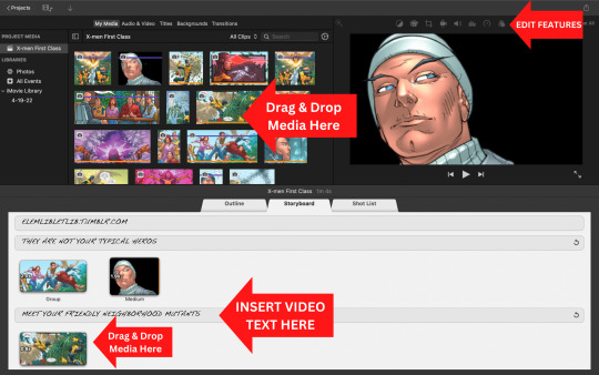
Additionally, I use extensions more often to complete design tasks. For example, remove.bg is a website that can remove image backgrounds, and I used the website to produce the isolated image of Professor X with a black background. Super helpful!
I selected several images from a digital copy of the comic that conveyed character meaning, identification, and action highlights to entice viewers. I took these images and inserted them into my digital storyboard. This process was not as easy as it sounds! It took several prototypes of the trailer before the image sequence matched the selected music's tempo. From there, it was just fine-tuning the video until everything flowed right. This will help promote books and reading materials to students and staff when a physical presence may not be possible.
The challenge was introducing the plot line and characters concisely in a memorable way without giving away the story. Or why read it right? A compelling book trailer uses minimal text, fast-moving images, and a sensible music selection. I hope you enjoyed the book trailer as much as I enjoyed making it.
*Hint Hint- I liked making it A LOT!
#LIS724#futureschoollibrarian#blogging#booktrailer#elementarylibrary#schoollibrarymedia#schoollibrary#digitalliteracy#imovie#x men first class#x-men#edtech#Youtube
0 notes
Text
PROMO 101

Task 1: Create a hypothetical paper promotional flyer (from scratch) for a school library event using design theory and digital tools.
The process:
I started with the print flyer and I decided to use Canva, a free to use graphic design tool, as my medium to complete the design task at hand. The instruction for the printed flyer indicated that a template could not be used. First things first, Robin Williams, in her design book, The Non-Designer's Design Book, suggests to, "Experiment with the graphic image or photograph at least twice the size you originally planned." That said, I used a minimalist approach with a large graphic to create a strong focal point in order to more easily draw attention to my promotional flyer. The text I used was minimal and meant to guide you visually through the design. For example, I used the acronym SLM (School Library Month) as my header and then expanded the acronym on the lower half of the flyer. Additionally, I took inspiration from the original manifesto for SLM from the ALA website dedicated to SLM as a way to brand the event as well as the library space. From a color standpoint, I chose to maintain my minimalistic approach with minimal color and keep the large center graphic as the star of the show. I built the design from the center out.
From there, I used a familiar "table of content" layout to display the series of fictitious events being held by my school library. I chose to do this because I felt it reiterated a visual theme of literacy and reading from familiar visual schemas. The final touches included personalizing the flyer with a bitmoji graphic (teacher branding at its finest), a Twitter handle, and fine print directions for further questions. Can I see this flyer on a bulletin board in my school? Yes. Do I see student's and staff stopping after glancing at the flyer? Yes.
Task 2: Create a hypothetical DIGITAL promotional flyer for the same school library event using design theory and digital tools.
The process:
The digital promotional flyer that I designed was also created using Canva. Canva is a great tool that is user friendly, easy to use, and intuitive. For this segment of the design process I used a free template that was available from a stock selection on Canva and chose to use a template with deeper, richer colors. Being that this flyer is digital, I felt that it was a wise move to use a bold color story that draws attention to the content, but also gave me the opportunity to create negative space with my text. This was effective at creating contrast and helped draw attention to the written content of my flyer. In doing this, a harmony between graphics and text was created. Furthermore, the ALA website dedicated to SLM also provides graphics, a PowerPoint template, and a poster that can be used to design in-house SLM celebrations provided that no alterations are made and that the posting is for education, noncommercial purposes only; moreover, these free resources shaped the official "tone" of my flyer and provided further effective event branding.
Additionally, the use of shapes (squares and circles) provided further contrast and supported the additional graphics used (bitmoji & Twitter handle).
0 notes
Text
To brochure or not to brochure: That is the question

I was tasked to design a subscription database brochure for a hypothetical school library space that would stand as a resource for students and their families. Two-dimensional shapes and harmonizing colors easily identify flat designs. The brochure produced as a result of this project uses flat design concepts and the four basic design principles from The Non-Designer's Design Book by Robin Williams. They are as follows:
Contrast
Repetition
Alignment
Proximity
Here is the finished product.
First, I decided to use a google slides template to start my brochure. Google slides was a convenient application because of the familiarity with google workspace and the design-friendly features such as line guides that kept my brochure balanced and formatted correctly.
I used contrasting colors and line theory to bring contrast into my work. According to Williams, "Contrast is often the most important visual attraction on a page- it's what makes a reader look at the page in the first place." To do this, I used the Google Chrome extension Color Dropper to obtain the Hex Code for the exact color (#dd4451) on the background for the template I used. Then, I traveled to color inverter.imagineonline.co and used the website functionality to obtain the opposite color (#22bbae) throughout my design. Here is a color swatch from the brochure.

Shapes were the following strategy that I used to render contrast throughout my brochure. I modeled the hypothetical library space after my current place of employment, an elementary school in School District U-46, and used several images from my school's website. That said, I used a wolf and moon image specific to the school on the cover and repeated the circle theme alongside rectangular and square shapes throughout the brochure.

The resources I chose were relative to my school district and what they offer to my current students. Again, I designed this brochure in the hopes that I would be able to use it as a prototype for my current place of employment. School District U-46 offers literacy and research database subscriptions and uses Follett Destiny Library Manager. I chose to highlight Encyclopedia Britannica, Tumble Books, Gale Resources, Newsela, Axis360, and Destiny because I felt they represented a large enough spectrum of the school's offerings.
This is where I really drove in on:
Repetiton
colors, shapes, line thickness, fonts, and sizes
Alignment
clean, sophisticated, and connected
Proximity
organized and structured
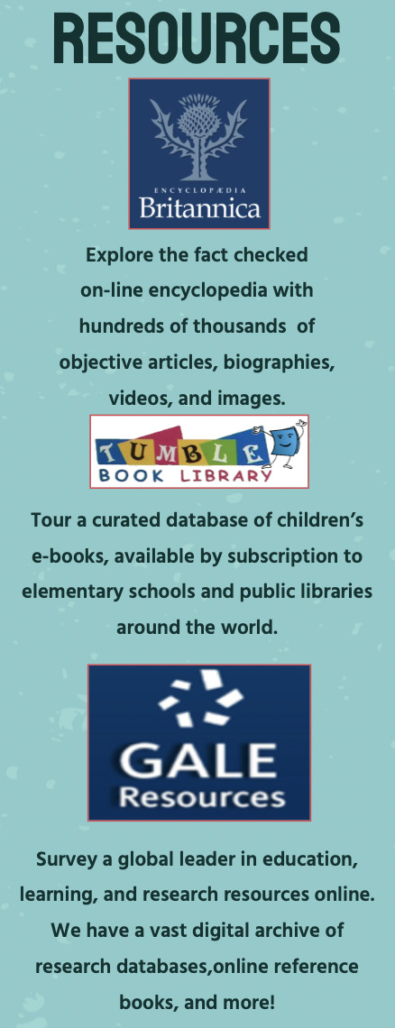
This brochure will help my students and their families to become more familiar with some of the subscription databases that School District U-46 currently uses. Furthermore, flat design and the CRAP design model by Robin Williams can be used to produce visually appealing as well as effective marketing/visual displays. For example, below is a visual pathway from the brochure that I used to help guide students and families to navigate the literacy applications on their student's Chromebooks. Note the consistent use of line thickness, contrasting colors, and alignment.


In sum, design does not have to be intimidating; however, strategy, user focus, and attention to detail will significantly improve the reach and effectiveness of the inforamtion your design is trying to convey.
0 notes
Text
Make space for the MAKERSPACE!
Everyone knows that libraries and makerspaces go together. A professionally managed school library makerspace is a multi-dimensional project requiring several areas of planning.
The typical elementary school library makerspace, when pictured in a mind's eye, typically invokes images of Lego bins, craft supplies, and maybe even a 3D printer. However, if you have spent the day in an elementary school, you know that a space like this just doesn't appear and isn't maintained and operated without effort. Furthermore, what is the point of the space, and how does it add value to the learning happening across all grade levels? These were some of the concepts that my team and I were tasked to contemplate when we accepted the charge to design a hypothetical elementary school makerspace.
First, a concept was needed for the makerspace. The thought of using Andrea Beaty's Questioneers book series was brought to the idea roundtable during initial brainstorming sessions. It was agreed upon eagerly because of the library's mission to promote literacy and connect it with the makespace. Additionally, the book series highlighted community roles and STEM-related careers, which we thought were perfect for influencing relevant inventory choices. It was decided to use a group member's current place of work, Ideal Elementary School in Countryside, IL, as the physical location for our makerspace.
Second, the inventory for the space needed to be created. The budget for our makerspace was $3,000. The document produced was the defining document needed to guide the rest of our project. The inventory-building process was complex because, as budding school librarians, it was required to connect the tools and items we selected for the space and draw parallels to ISAIL standards.
Finally, the group collaborated virtually to design and create our presentation/proposal. The process included effective communication, scheduling, time management, personal/team accountability, and skill leveraging. Moreover, this part of the process proved that more significant design tasks can be tackled using digital platforms and collaboration best practices.
In sum, a school library makerspace is not a corner of a classroom or library with sawn-off paper towel tubes and strewn-about lego pieces. Well, it might have these things, but I can assure you that a professionally managed and designed school library makerpace is a complex operation designed to foster connections with the integrated curriculum while at the same time making relevant opportunities for students to grow and learn in personalized ways.
0 notes
Text
Extra! Extra! Read all about it! Library Media Specialist learns how to curate!
How do you keep information presentable, accessible, and digestible for students and peers? Curation. That said, curation is a game changer for the inforamtion professional and educator alike and acts as the bridge from information need to knowledge acquisition. School library professionals are often seekers and sharers of inforamtion that will supplement and support their spaces and collections. I chose ten websites to use as a beginning toolkit for collection development that could be used as a springboard for ideas. Then I used three different curation websites to organize the selected resources: Wakelet, Pearltrees, and Sqworl. I chose these digital curation sites over other options because of their varied layouts and past familiarity with colleagues using these sites. Here are some of my thoughts on the resources.
Wakelet
The user design feels fresh and modern and is very easy to navigate. The use of white space is clever, and there are pre-populated options on different ways to display information. My personal learning network (PLN) will benefit from this resource by allowing me to share large amounts of information in a user-friendly format that is approachable and shareable. Wakelet is visually compelling and accessible for student accessibility. A must-use for students and children.
Pearltrees
Pearltrees feels very elevated from a visual and beginning user experience point of view. The curation capabilities are very similar to Wakelet, but the design feels like it was engineered for an older audience, not children. There is a certain level of professioanlity felt within this resource that is absent in Wakelet. I would prefer to use this digital curation tool to share informtion with peers and colleagues.
Sqworl
Sqworl was an absolute miss for me regarding the curation tools available. The use of advertising took up large sections of the website interface that broke apart the information so much that the curation aspect of the site was pointless. The overall visual appearance of the website was not appealing and not attractive for a child audience. Perhaps an ad free expereince would change my opinion.
After all this, will I curate or will I dump information?
Curation is the key! Information has never been more readily available to be consumed and, on the same note, overlooked. Curation is another way to serve my patrons in my role as an information professional and educator.
#LIS724#Blogging#Curation#Wakelet#Pearltrees#Sqworl#MLIS#futureschoollibrarian#CollectionDevelopment#edtech#futurereadylibs
0 notes
Text
Living the collaborative life through an interactive lesson <3
I want to start by saying that it was an enormous pleasure to work with Shelby, Madison, and Susie for our first action-packed semester lesson. We were grouped because we all have similar tracks at Dominican Univesity to become school librarians. Thus, we have been dubbed the school librarians group for LIS 724: Integrating Technology into Programming, Services, and Instruction. The content for the week revolved around media literacy, digital citizenship, and copyright. Our mission as a group, should we choose to accept it, was to create an interactive lesson about a topic in digital citizenship. Immediately, I thought of the 9 P's associated with digital citizenship and thought that passwords for kindergarteners were our group's destiny. I gave the group my elevator pitch, and 147 seconds later, we had google slides open, ready for our knowledge.
Peardeck was the easy choice for this mission. It pairs wonderfully with google slides. Like it was made for each other. No really. They were made for each other. With that, working with the others in my group was successful for the design thinking process of the lesson. It was necessary to go through and rework our lesson to be delivered with the proper communication that would be most effective for kindergarten only rather than kindergarten through second grade as initially planned. The levels of thinking are just too different, it was decided.
The virtual space our group collaborated in was treated with respect, patience, and grace. During the whole process, our group spent time exploring the technology with each other and designing a lesson that would be used to analyze passwords. Literacy is at the heart of librarianship, so we decided to connect a read-aloud with the content of the interactive lesson. Password, please? by Vahishta Mistry is an approachable children's story about a girl named Manju and her initial exploration of passwords and what they do.
Peardeck equipped us with sufficient tools to create an interactive lesson for a Kindergarten grade class to successfully interact with the technology presented and approach concepts of digital citizenship through an introduction to passwords. I am in love with this piece of tech genius. Also, shoutout to my team because we are the future school librarians!
Here is a link to a Youtube video that explains how to start using Peardeck!
#LIS724#collaboration#InteractiveLesson#DigitalCitizenship#DigitalLiteracy#Passwords#Kindergarten#Peardeck#edutech#elementaryschool#library#schoollibrarymedia#google slides
0 notes
Text
Now exploring, "How do you even choose a blog?" & Media literacy is important. Duh.

This is a valid question and a practical statement. Let’s start with the question. How do you choose a blogging platform? Better yet, how does one choose a blogging platform that can be used to elevate their professional practice, connect, and as a way to establish an effective personal learning network? I perused the blog resource page supplied with my LIS724 course (Integrating technology into programming, services, and instruction) and decided to explore WordPress, blogger, and Tumblr. My strategy was to find outside sources that compared all three blogging platforms side by side as a way to glean information, so I knew what to look for when I explored their virtual spaces. I have used blogger.com in the past for prior courses and decided to try something new. I consulted a cmswire.com article and another blog (links below) that compared WordPress and Tumblr. Ultimately, I decided on Tumblr because of its costless upkeep, minimalist appearance, short form/visual content style, and unique hybrid blog/social media platform.
Tumblr is an excellent platform to adopt into my PLN because of its dual role as a hybrid blog/social media platform. The minimalist features offer the ability to capture or upload an image, add a small amount of content, link additional information or content, create effortless tags, and peruse other like-minded content. Tumblr will become a personal think tank around information literacy, school librarianship, technology, and building and maintaining a better professional practice.
Now onto the statement. Media literacy is essential because it supports self-expression, critical thinking, and civic responsibility (Lynch, 2017). As an educator and an information professional, I guide students and staff on how to better effectively access, analyze, evaluate, create, and act via all forms of communication (Lynch, 2017). The curriculum that falls into the domain of the library media specialist is complementary to that of the school's integrated curriculum and can be used to support and increase knowledge acquisition amongst students. Media literacy spans all disciplines and remains an effective tool used throughout one's life to interact with and convey meaning via digital and print mediums. This lifelong skill adds value to our democracy and supports modern, literate communities.
Lynch, M. (2017, September 25). What is Media Literacy and Why Does it Matter? The Tech Edvocate. https://www.thetechedvocate.org/media-literacy-matter/
1 note
·
View note
Text

1 note
·
View note
