#would actually improve my linework
Explore tagged Tumblr posts
Text
shocked and affronted that the answer to my art getting better was for me to draw more often >:(
#nat chats#i just got this tattoo apprenticeship#and WHO would have thought that drawing everyday for several hours#would actually improve my linework#like i was doing a commission and im like Damn i'm havin a great art day#and then i'm like wait....#AUGH
36 notes
·
View notes
Text
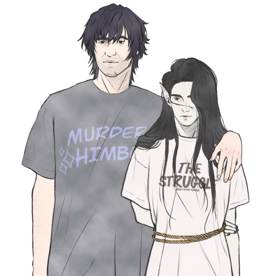
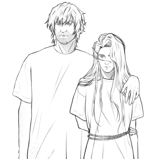
AU where Orin is ✨supportive✨ and gets matching shirts for the old men in her life.
Thank you @luinen-bluewater for saying those quotes belong on shirts, they absolutely do.
#bg3#enver gortash#bg3 gortash#lord gortash#durgetash#bg3 durge#durge#dark urge#gortash x durge#oc: Fine#daemon's art#working on this granted me a truck load of revelations#not sure i like any of them though#but I'd say my linework is improving#and sadly i crave this gortash carnally now#love how fine looks both tired and like hes about to die even though they haven't divorced yet#anyways yes Orin would absolutely mock them quoting that theyre boomers but the fantasy equivalent of that#thats their dynamic#also also; i am realising i have never not once finished a wip of them that isn't a meme or inspired by one#all the portraits that are actually serious are rotting in my wip folder half finished at best
82 notes
·
View notes
Note
Ngl, I'd be in love with daitou's tattoos and would want to see All Of Them. They're so interesting! And I wanna touch em. Can I be 🦇 anon, if you don't have one? -���
Yes! I actually had this tattoo-related piece of lore for the longest time now, but I was never sure how to insert it into the story. 😭 It’s finally my chance to introduce you to tebori, the traditional Japanese art of tattoos.

You hand Daitou another tissue.
“How did you even catch a cold in the midst of summer?” you ask, somewhat incredulous.
The yakuza man lets out another hearty sneeze.
“I guess I stood in the rain for too long, heh.”
A raspy chuckle escapes his mouth. Indeed, last night had been storming and he'd been tasked to discard the bodies from a recent gang fight. Less hassle with the police that way.
Obviously, he can’t tell you that, especially since Kazuya gave him a proper scolding last time he was too generous with the gory details. “What’s the matter with you? Why don’t you just hand her a bone saw and ask her to hold the trash bags, too? Fuck’s sake…”
“Don’t worry too much about me, miss (Y/N). I’ve had worse.” He smiles and turns slightly, pointing behind with his thumb. “After my back piece, I thought I was going to die!”
You raise your eyebrows.
“The tattoo? How would that make you sick?”
“I’ve had all my stuff done the old-fashioned way. Everyone in our Family has been going to the same artist for longer than I've been around."
Daitou raises his hands and gestures the act.
"You use a thin bamboo tool with a needle at one end. Like woodblock carving, y'know? One swift move. Takes a lot of skill, 'specially for linework. It's actually less painful this way, although it's much slower compared to a machine.
Now here's the thing, back in the day pigments were made in a way that caused immune reactions from the body. So for a day or two after your tattoo, you'd have high fever, lethargy, stuff like that. They've improved the formula since, or so I hear. Our old man refuses to switch. 'What? Ya scared of a little heat? Yakuza tattoos aren't for everyone, go back home if you can't handle it, punk!', he likes to say. It's like a manly thing for him, y'know.
My back tattoo, that one took the longest. After the final session, I had the worst fever of my life. Couldn't get out of bed for days!"
He ponders for a moment and grins.
"What's so funny?"
"Would've been nice to know you back then, miss. Just havin' you here makes me feel better already, hehe."

[More yakuza]
#yandere yakuza#yandere x reader#yakuza x reader#daitou#yandere boyfriend#🦇 anon has been added to the list
442 notes
·
View notes
Text
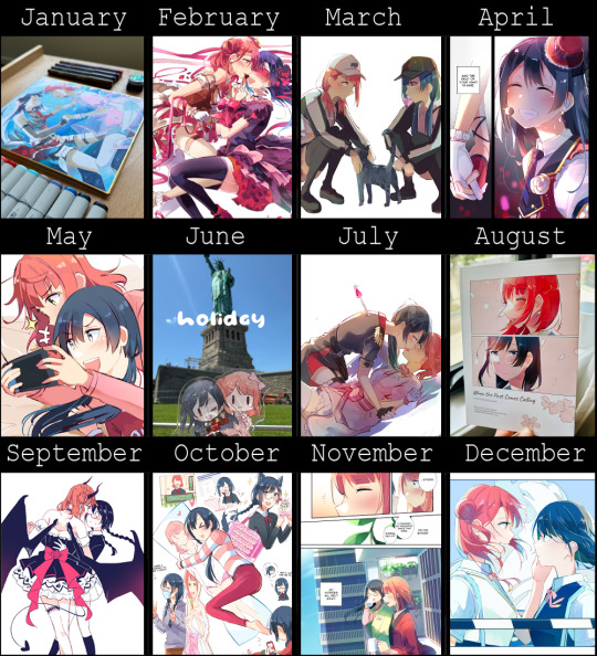
Art Summary: 2024
I've been posting my art online for 11 years! wowie!!
My yearly review is under the cut (1.8k words):
Previous: 2014 | 2015 | 2016 | 2017 | 2018 | 2019 | 2020 | 2021 | 2022 | 2023
Happy new year everyone!!! This is actually the first time in a long time that I've not posted my yearly summary on the 31st. I was a bit caught up with visiting family and being a good host so I didn't get time.
Anyways! Time for my year in review that no one reads except for me the following year. 💪💪💪
How this year went:
I think this year went... alright? Let's see, what did I get up to...
Ah. Okay! Art-wise it went "alright" but life-wise I had a pretty good year! Got a boyfriend! Got a cat! Went on two holidays (Japan, USA)! Visited family! Met a lot of online friends! Went to a bunch of concerts! (YOASOBI, Nijigasaki 6th, Hololive Down Under, Miku) A pretty eventful year ✌✌✌✌
But this is actually an art year in review so I'm going to focus on that! And... yeah, I think I went 'alright'. I don't feel terrible about how I went, but I also don't feel amazing? C+ or B- I think...
How did my art go?
Like I said, I think I went 'alright'. I felt very rocky several times in the year with periods of art block and a good chunk of time where nothing I drew felt 'right'. Was it burnout? Maybe. It took me some time to find my footing again. It also didn't really help that I had a lot of "interruptions" throughout the year. Traveling, getting sick, artist alleys and stuff really messed with my momentum. I did a lot of individual little works rather than comic works. I'm not exactly happy with that but it's something to look at for next year.
In terms of raw, technical skill I'm not really too far from where I was last year. But to be fair, after drawing for a decade that's to be expected. While I want to be always improving, I know that's not always immediately visible. That being said, my shikishis are a lot better than the first ones I made! (But technically it's more like my traditional skills are catching up with digital skills???)
Like I mentioned earlier I spent a lot of the year feeling "lost" when drawing. It was kind of like I forgot my own style? In my eyes that made a lot of the work shakey in quality at best... But excluding that fact, I'd like to highlight that I should probably revisit fundamentals. I think when I'm feeling lost, stronger anatomical fundamentals and linework would probably ground me a bit better. Will that be something I look at in 2025? Who's to say 🧍♀️
In terms of comic works I think I under performed in terms of quantity. And IMO they were affected by me feeling "lost" while drawing some of them. If I were to revisit them I'd probably touch them up.
I liked how the comics turned out though. 😊 (more in the next section)
My 2024 Goals and how I did:
This is the part where I read what I wrote last year and check if I acted on them at all ✌
As always, it doesn't really matter to me if I fulfill these goals or not. What's more important is the "why". It's good to be aware of what is important to you and what isn't.
“Draw more comics.”
Last year I was dissatisfied from a lack of comics. I think I released 1 doujin... and posted 2 mini-comics? So I don't blame myself for being so dissatisfied. Like I said, I’m a story-teller first, illustrator second.
I blamed an art block that had me eventually scrap a 20 page comic that was drafted and lined. I wasn't satisfied with the storyboarding at all. Because I was burned out, the storyboarding was done in a very direct/ dull way so I wasn't happy with it. But, it was a cute idea and I probably should've finished it. (It's like throwing a month of art into the void.)
While I've decided not to salvage that comic, I've taken the experience to heart. This year when I went to the US, I was interrupted while working on a comic I will be uploading somewhat soon. It took about 5 months to finish the comic. Which is a lot for a 14 pager. And that reason is because I was similarly dissatisfied with it. The paneling and the script just felt like it could be better and I wasn't happy working on it. But instead of randomly dropping it, I just re-storyboarded it until I was happier. The comic isn't posted yet, but I like it sooo much more than the initial draft! So my lesson going forward is to put more focus on my personal satisfaction. This isn't my job, it's a hobby I'm passionate about so I should always prioritise my own feelings!
I did end up drawing slightly more comics though. So technically I've "fulfilled this goal". I still don't feel satisfied with my productivity but it's an improvement.
“Push those shikishi to the next level!”
This goal is pretty self explanatory. Like I said, I think I've improved my shikishi craft quite a bit. I've also experimented with various materials like craft flowers and foil! The road of improvement is long and I still have so much more to learn but I'm fairly happy with how I've done.
There is one stipulation though, which is...
“Do artist alley, but don’t burn out!”
...burn out from doing too many artist alleys.
I did explicitly remind myself not to do too many, but I ended up doing 4 this year. I think this had a direct impact on my productivity and my overall satisfaction.
Don't get me wrong, I really enjoy doing artist alley with my friends. It's very rewarding. But it's also clear that I've been shooting myself in the foot. While I enjoy making shikishi they're not very sustainable for populating an artist alley table. When they've sold, they're gone. And it becomes empty space on the table. It isn't like prints or keychains where you can mass-produce some more. It could take me weeks to fill my table again. And I think this is where my productivity feels very strained.
"There's a con coming up... so I should prepare! I guess I should put this comic on hold while I work on shikishi/print stock." <- this ended up happening a lot this year. When it comes to making comics I'm really momentum-based where I have to basically hyper focus. So when my momentum is broken, I have a hard time going again...
And focus issues aside, when I combine it with the holidays I've taken I just haven't had as much time to work on comics in general.
It'd be convenient if I aimed to print every comic I made as they're completed (then you'd have a cycle of new prints on the table every time) but I'd rather aim towards thicker books/ bigger projects.
My problems would probably be solved if I made more prints or keychains and the like. I wouldn't have to be so pressed. But again, I know the issue just stems from me. I don't enjoy those things as much and I really want to specialise in shikishi and hand-drawn art along side my comics.
This year I want to be more selective with my tabling. Either that, or draw faster lmfao .
“Actually start planning that next story”
LMFAO what a big joke. I didn't do much on this.
I actually changed my sights to a few more scale ideas, so I'm not terribly fussed by this. Priorities change sometimes, y'know? What's important to me is that I'm still working towards something.
Goals for 2025:
With all of that in mind, here are the goals I've set for 2025! There's a lot so I don't expect to do them all. I would be happy to select a couple of things 😊. Step by step y'know?
"Draw more comics" (Repeatable Quest)
Continue my setsuayu anthology
I'm working on a bunch of little setsuayu stories I'd like to combine into a collection! I don't know if I'll finish for sure, but I'd like to make more progress.
Make non-setsuayu works
I've been bouncing ideas in my head for R3B1RTH comic ideas. And YuShizu. I've always liked these characters so I'd like to finally dedicate some time to them.
Honestly this goal is so incredibly malleable. I don't see it productive to set a static number of works I'd like to release. Because what really matters is if I make work I end up happy with. I could even end up drawing comics that are completely different in topic but still feel satisfied!
"Improve at art" (Repeatable Quest)
I made this goal super broad too because there's a number of things I want to try doing.
General:
study painting techniques
I think more practise with realism and still-life painting would do wonders for me. It'd give me more familiarity with tone and values that would help me in general. I also would like to make little shikishi with still life!
study composition
Recently I bought a textbook about this topic. My composition skills... could be better! It's truly a mystery how I've made so many comics. When I feel stuck with comics, I get the feeling that not being familiar with composition techniques contribute to that.
Traditional:
Continue producing shikishi
This one is a no-brainer! I still want to do artist alley! I still want to practise shikishi more! Not too much to say here specifically since everything else contributes to this.
Learn how to paint
When making traditional pieces, I'm not limited by media. So why not go more multimedia? Specifically I'd like to try a workshop with watercolour painting, or even gouache! Copic markers, although fun to use do have weaknesses. It'd be good to learn more about different media and how they interact with each other to create more interesting pieces moving forward!
Continue to experiment with craft/media
I did a piece with foil this year and it was pretty neat! (but a bit shoddy since it was my first time haha). I'd like to go further and continue designing pieces that use other materials in different ways.
I've also bought special inks that I'm excited to use as well!
"Improve my actual health"
Okay this one is the hardest goal... For context towards the end of this year I've been really tired. By what? I'm not that sure. I'd take multiple power naps a day and still feel sleepy. And I'd get 8 hours of sleep each night... And it's not like I'm restless when sleeping. I sleep perfectly fine but there's always a blanket of exhaustion....
Anyways I think I should eat healthier and get more exercise in. I think it would help my productivity more. (Less snackies for me 😢)
If anyone read this, damn that's crazy!
Let's have a good year!
#most people use different templates but i think using this really old one forever has its charm too#as always thank you everyone for the support this year#lets work hard next year too!#my art#art summary#nov comic isnt posted yet#but ive been working on it for 5 months so i put it there#its done ill post it soon ish!
24 notes
·
View notes
Text
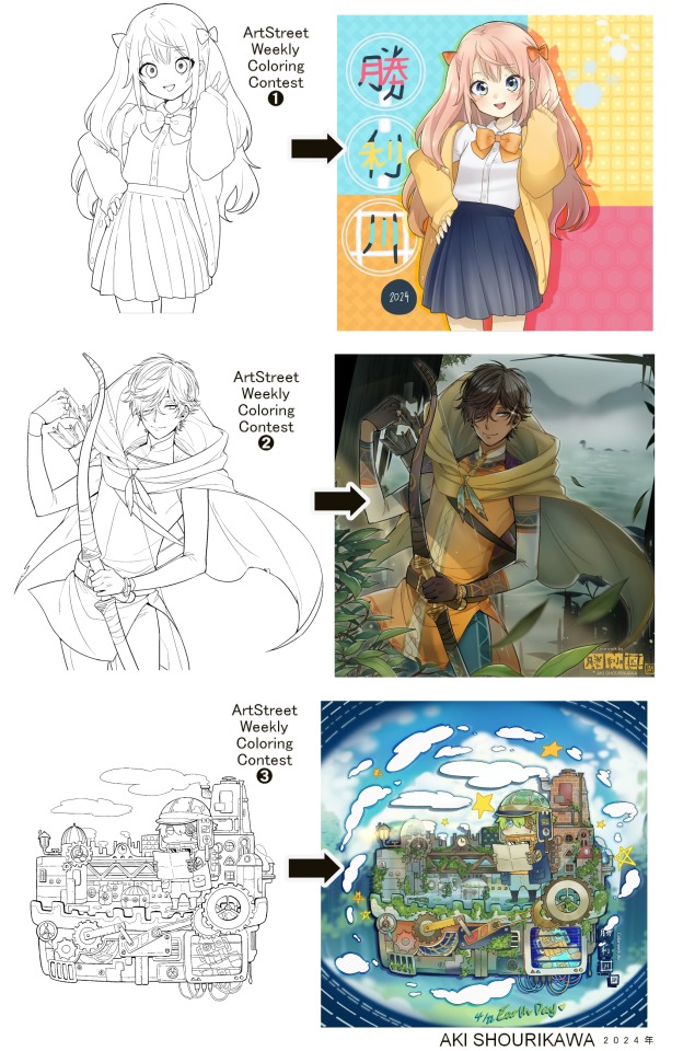
Blog No.003🍊 24年5月10日
「Let's Talk About Coloring+Rendering!!」
~ The Chaos of Akehhh-style Layering w/ Colors & Values ~
ArtStreet recently released some weekly coloring contests and as someone who likes joining 'em + colorwork being the absolute joyous part in drawing for me, I got really into it!! One of them somehow won and I still have the raw .mdp file of it with most of the layers unmerged... so, I thought there might be some value in sharing my chaotic coloring progress with it. There may never be an opportunity like this again...
CONTENTS:
Preface・・・・・・・・・
The Linework・・・・・・
Composition + Planning・
The Render・・・・・・・
Additional FX Tips・・・・
The Layers of Dread・・・
1. Preface
I use the free software MediBang Paint, which is made by the same folks who made the aforementioned art-sharing website, Artstreet. Although its file type extension is .mdp, it can also save as and open .psd files all the same.
If interested, you can download it on their website here! I believe it's available in both PC, Apple, iOs, and Android (also on the PlayStore). ☞And here is my google drive link of my fully rendered entry's raw .mdp file. I also included a .psd version that should be accessible with most other softwares like Photoshop, Clipstudio, etc.
NOTE: Not sure how some layer effects will be displayed apart from MediBang though (either in name or function) . But I think "multiply" and "overlay" is fair game on most drawing/photo-editing softwares with layer systems.
Either way, ↑this is just a bonus thing if you wish to see for yourself how much my MediBang cries everytime I work on something, since visuals of the rough step-by-step will be provided here as well!
At the end of this post, all of the layers' purposes will be explained...y-you'll see...
■And just as a disclaimer: I'm an instinctively self-taught illustrator who is a heavy visual learner, so there are certain methods I do that I cannot readily explain with back-up studies on color theories or formally taught techniques in art schools and the like/certain made-up terminologies that may or may not exist as something else. I mostly operate on instinct, observation, subjective preferences, and vibes, so this would just be me trying to verbalize my process (with visual aid) as a means of share-rambling, rather than actually directly "teaching" anything, I think haha You can take it as a cautionary tale too, honestly-
※I will also be going through this with the assumption that the reader has some background knowledge on digital illustration and general drawing basics + lingo. If you have any questions or needed clarifications, please feel free to let me know!
Although art can be fundamentally "wrong" when it comes to achieving certain specific styles, structures (especially when involving realism as the standard), or general executions of intentions/themes, I am of belief that there is generally no wrong or right 'way' for drawing anything; or for doing ANY type of artistic endeavor for that matter. This might be perceived as a "bad anatomy defender" / "no need to improve, then" stance on my part, but it is absolutely not the case! An artwork is never finished, there's always room for improvementsーa galaxy's size of a room especially for myselfーbut I just think anything at all that brings you an expressive or creative outlet, joy, or peace of mind is worth pursuing, regardless of your own skill or tact and there's no shame in that. I do not wish anyone, especially people starting out with drawing to be discouraged for having their own different approaches in comparison to other people's works by misconception of, "oh, am I doing it wrong?". Sometimes having different or an uncommon worldview is not always a 'bad' thing, I think. Heaven forbid artists actually start getting creative and unique―
What I will be presenting here is simply my one way out of thousands of thousands of different possibilities. So, let's start★
2. The Linework
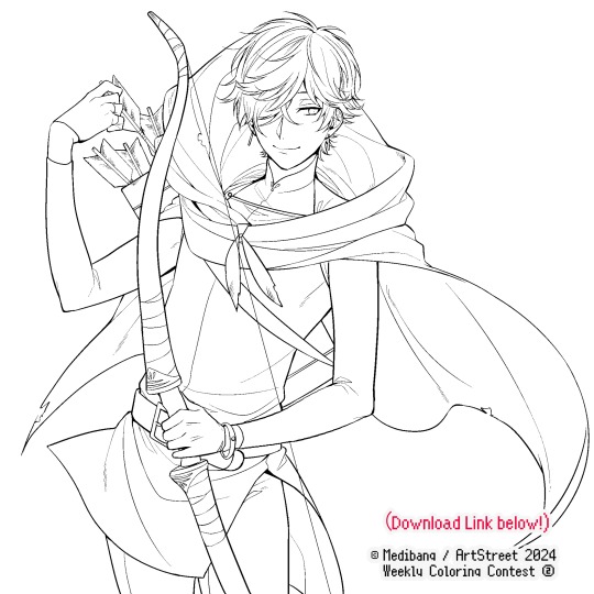
Equally lengthy talk of lineart is probably for a later discussion, but here is the template provided by ArtStreet for the contest + what will be colored in for today.
☞The contest has since ended, but you can still download the lineart template here if you'd like!
3. Composition + Planning
The contest rules said it's "OK to draw backgrounds", so let's go!!
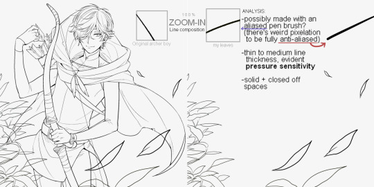
I had already decided on how I want to color it early on: It will be more scenic in nature, rather than stylistic. So, there will be more focus on looking 'real' than 'aesthetically stylish'! Just so it doesn't look disconnected or too out of place, I tried to draw my additions similarly to how Mr. archerman's linework looked as much as possible.
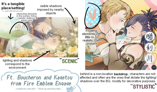
This how I visually define "scenic" VS "stylistic" illustrations (in my head)
I like experimenting and mixing different rendering techniques with varying linework styles and tend to think about my approach with the rendering long before the coloring process, even waaay before I line my final sketch, usually. But for this, I'm simply working with what was given to me.
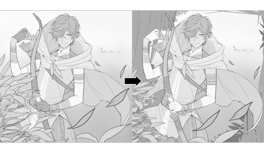
At first, I just wanted a "cool breeze w/ leaves flying away ahhhh refreshing~~" mood, but the space at the side of his head looked rather empty as is, even with Nessie. So I thought about putting him inside a vague...darkly-lit abandoned ruins-setting to eat up some of that space.
And with that, it's time for colors.
4. The Render
My coloring process is the lengthiest and often makes people who see me color in real-time scream in horror, but I think it's actually fairly simple and can be summarized into three nutshelled stages:
①Fill in the colors with a finalized palette of your choice,
②cry Continuously render until your arms fall off you're satisfied.
③ cry even HARDER (optional) Adjust accordingly to fit in better with other elements of the illustration, such as with the focus/subject to background. *will be explained later.
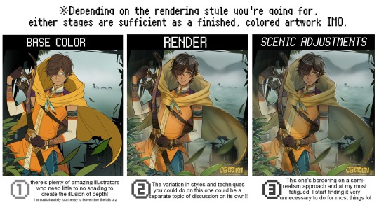
oh and btw, the usage of the words 'render(ing)' tends to be confusing with its association with other mediums like 3D models, but when it comes to drawing I like to think of it this way:
🎨Coloring is the planned/intentional selection of your color range, tints, tones, and palette to use in a drawing, ☀Rendering is the act (or product) of the set of techniques (including effects, filters, etc.) you use with the colors/values to create the illusions of depth, shadows and light, movement, warmth/cold atmospheres, etc in a 2D illustration.
But that's just how I define it with my own step-by-steps. Otherwise, I think either term is pretty much interchangeable.
Anyhoo, what do you think should this man's hair, skin, eye, and clothing's colors be?
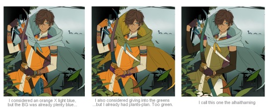
here are some of the variations on the color picks of his outfit that rotted my brain for about 3 hours straight, like it's a 2000s dress-and-match flash game
The many submissions for the contest had many fun color combinations and interesting interpretations I personally think should've won. I saw a lot of blonde archer-princes wearing greens, browns, and blues, as a lot also went for the "forest hunter boi" vibe. But I was saddened by the lack of my favorite colors being used as the primary colorーorange and yellow. So, let's use those!!
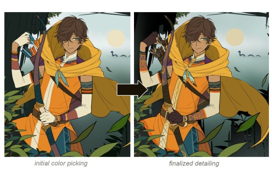
The start of my coloring/rendering journey is never at Layer '1'.........
―Starting with what I've always referred to as "environment prep":
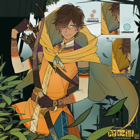
The purpose here is to 'set' the base colors so they match with the environment or general atmosphere. Get ready to see this over and over
This could mean adjusting the saturation, or spraying gradients of the BG's most prominent color on parts that...gives me anxiety the most-
As someone who tends to work with very, very bright color schemes with character designs, trying to blend in when the illustration is meant to be scenic or 'serious' in tone without it being a distracting eyesore can be a challenge. So, this is what I do to counter it.
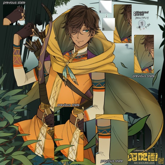
Shading is usually an early step for me as well, even though I think it's a lot of other artists' near-to-final step. I tend to lean towards an abomination mix of soft shade and cel shadeーthe strokes are sharp enough to trace where the shadows start and end, but softened around the edges for effect.
I also tend to apply an additional spray of subtly darker shade on top of the first one? It's usually on spots where I think the light source won't be hitting as much. I wouldn't do this for simple styles (stylized illustrations like with a chibi style), but for scenic illustrations I find it's necessary to achieve that depth against a fully-rendered environment.
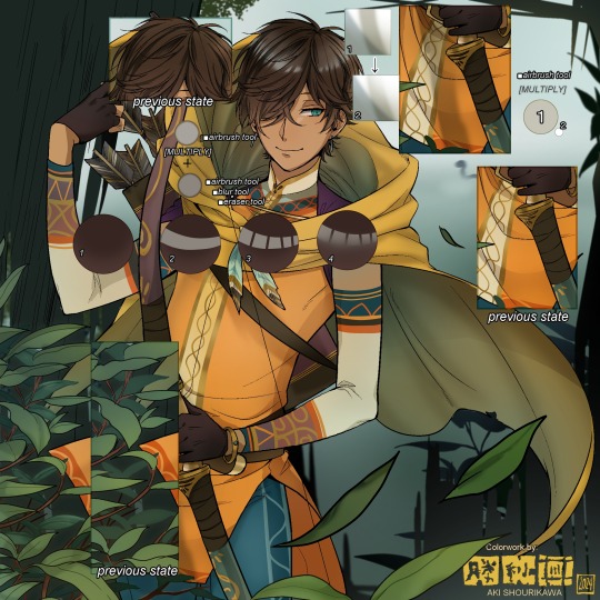
※Just a side note: You may see multiple things changing around, but in real time I'm most definitely working on one part at a time lol. These visual aids were ripped off the raw .mdp by hiding some of the layers, so that's why different areas seem to progress together all at once, even if that's a bit idealistic in actuality.
Apart from the previous adding of shades with a multiply-mode layer for the preliminary shadows, I add one more layer of shadow on there for objects or other characters that can cast distinct shadows on the subject. In here, it's the bow and the hovering strap across his chest.
Lighting is also starting to be added as well.
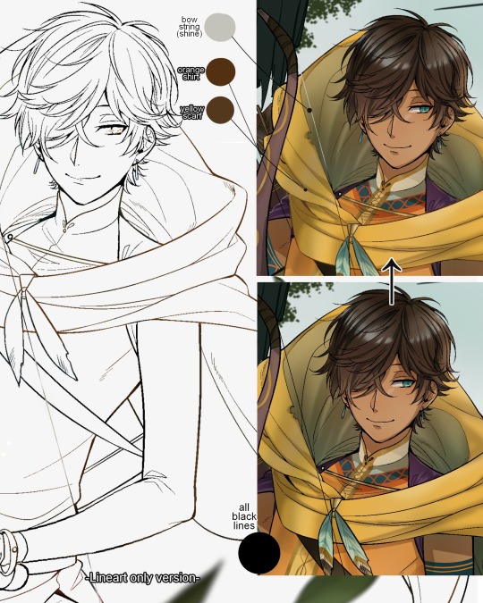
One direct alteration I did with the lineart template was change the line's colors. I find it really softens them to mix better with their filled-in colors + as well as not stand out too harshly against a light-colored scenic background.
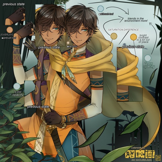
I think you now have a good idea over my hyperfixation on making sure colors are 'vibing' well against the BG lol A lot of these steps are basically just doing the same thing over and over with new layers for the sake of this purpose, really.
And after that, just repeating all the stuff we did with the character onto everything else (background, foreground, objects, etc.) until you're satisfied with it!
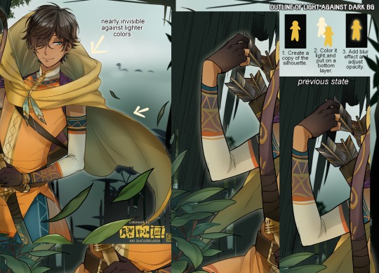
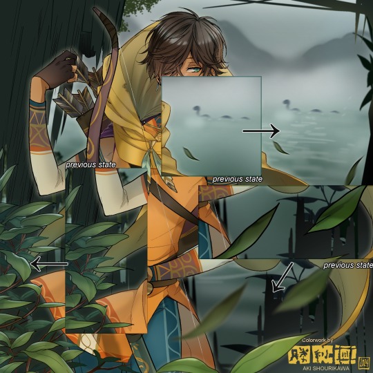
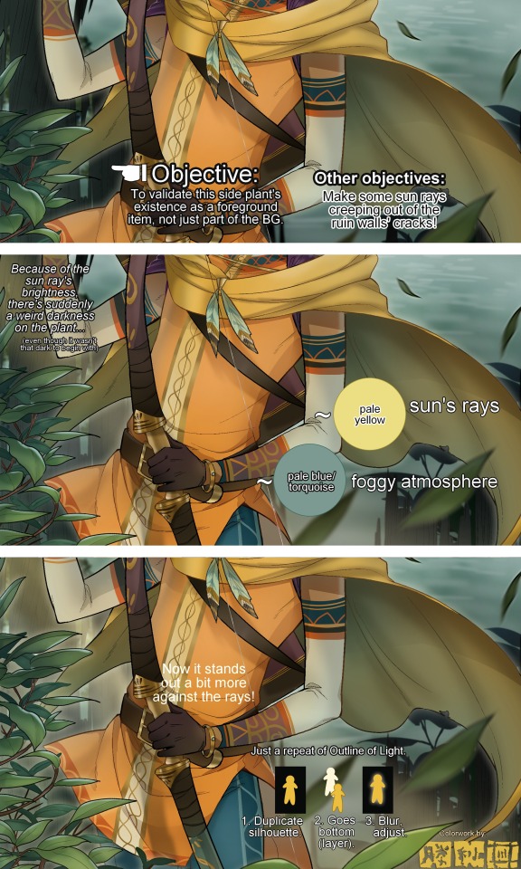
A lot of these changes are very subtle on their own, but makes all the difference in the bigger picture, I think!
Just maybe some additional finishing touches for some boom shakalaka and...that's pretty much it! You will notice that throughout the entire process, there's a lot of random little things that suddenly appear or change with seemingly not much purpose or meaning on its own. I unfortunately have always drawn in this sort of vague, quickly impulsive, directionless way since I was a child and I don't think even I will ever understand it, logically. It's mostly a... continuous string of instinctive feelings of "HEY let's do it this way, if not there's like 10 other things we can try next", is the closest I can get to an explanation of how it feels.
I don't know if it's common for other artists to think or function this way, but I do know for a fact that many people seem to be surprised and confused when they see me drawing in real time this way. Everytime I get asked 'how' I draw certain things, I say things like 'I turn my brain off and vibe with many, many layers with a broken back.' and people think it's just a dismissive joke. I-it's really not, it's literally what happens, I don't have any secret shortcuts for you-
Hopefully this very lengthy post + visual aids can help demystify some misconceptions on what "really" goes on when I'm drawing! It's also a bit of an update of my tutorials made for friendos starting out with digital drawing back in 2015!
Anyway, the rendering stage is where the simplified steps ② and optional step ③ branch out like a fork in the road for me; I don't think one is any "better" than the other, I think doing either is simply a matter of personal preference and artistic choice;
➋being leaving all that 100++ layers rendering that we just did alone and calling it a day,
➌being a little bit more extra w/ additional shadows/lighting that corresponds with the environment the character is in.
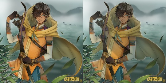
I removed the walls to see the whole figure better in a side-by-side comparison. I like the unadjusted (L) without the wall, but with the walls in the final illustration, I think adjusted (R) felt 'right'. What do you think?
There are some things, although realistic, don't look that good as a visual aesthetic and are just downright excessive/unnecessary to add to certain types of illustrations.
Then there's things that aren't possible in real life, but artistically? Looks really dang cool. Being biased for either ends of the hyperrealism and hyperstylized spectrums of styles is fine; only as long as no discrimination is involved towards people who don't share your opinions, in my opinion-
and to conclude this section, I say,
『 You go render however you wantーhellーno colors even necessary if you wish!
Simple ≠ laziness, just as much as complexity ≠ skill。』
I will never stop yapping about how a lot of minimalist styles require so much more amounts of planning and effort to make sure everything is nice and clean, especially compared to mindless rendering loops like these. Mine's a maximalist hell and I wouldn't have it any other way, but I greatly envy minimalist artists that can render with just something like my step ① with so much grace and tact; not a single stray or wasted stroke!! Anyone who dismisses these types as "lazy" I will violently stuff inside a couchーwithout any potato snacks to snack on!!!
5. Additional FX Tips
Just a shorter section for some optional finishing touches tips'n'tricks used in this I frequently (ab)use☆
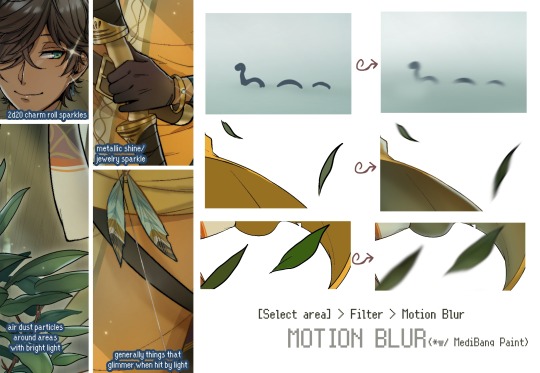
◆ From the very beginning, even before I understood how to draw, it's always been a tradition to doodle around sparkles all around the place. I usually do it with MediBang's sparkle brush if I want it to look polished, or simply draw it manually using either the pen or airbrush tool for a cruder charm.
◆ Motion blur is great, and MediBang in particular also has different types of blur effects like Gaussian and regular blurs. If your software doesn't have these effects / if you're working traditionally but still want to achieve the illusion of motion in a still drawing, you can still achieve the same effect through your linework! Try looking into incorporating action lines (commonly seen in manga and comics) into it. Otherwise, purposefully drawing something blurily to begin with oughta work as well.
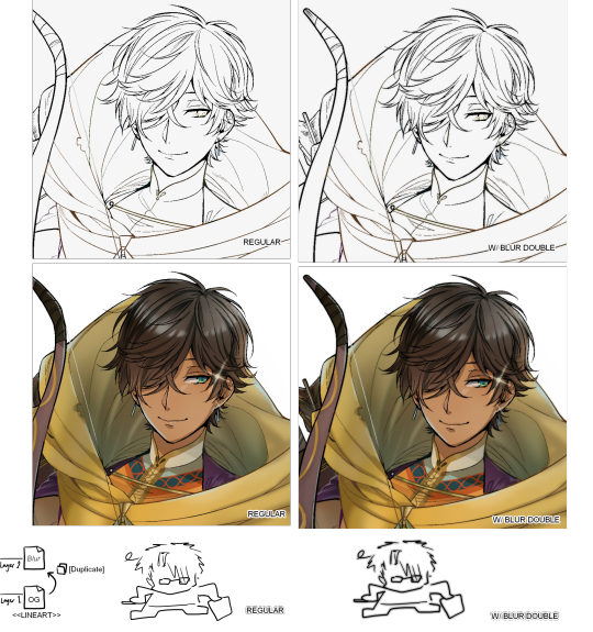
◆ Apart from changing the lineart's colors, there's also this little effect that is achieved by duplicating the lineart and blurring it. It gives something like a...'dreamy' quality to it? The higher the blurred copy's opacity is, the more emphasized it makes everything look.
6. The Layers of Dread
At long last we've arrived... at my MediBang's repeating demise for all of eternity...
Here's a preview of what the .mdp/.psd file of this colored entry's unhingedmerged layers looks like + how I try to validate their existence. When I work on full-sized illustrations, I tend to merge layers as I go, so this is probably one of the rare times I can show something like this without either mine or your PC dying. If you'd like to see, play around with, and toggle them for yourself in all of its............glory, feel free to download it here.
Yes
we're starting at Layer 611. Enjoy.
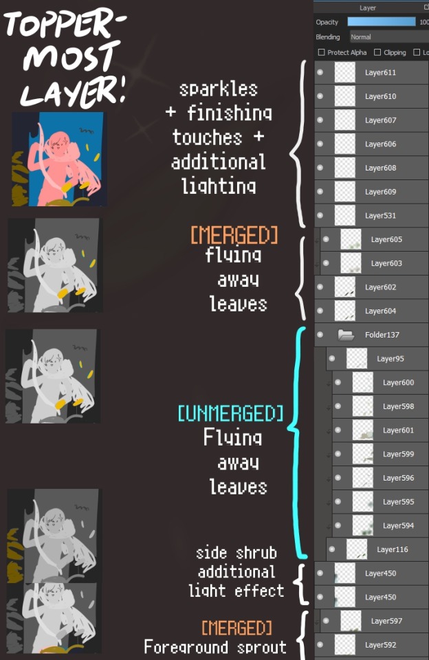
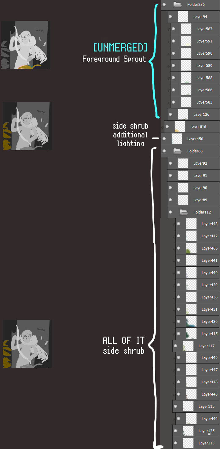
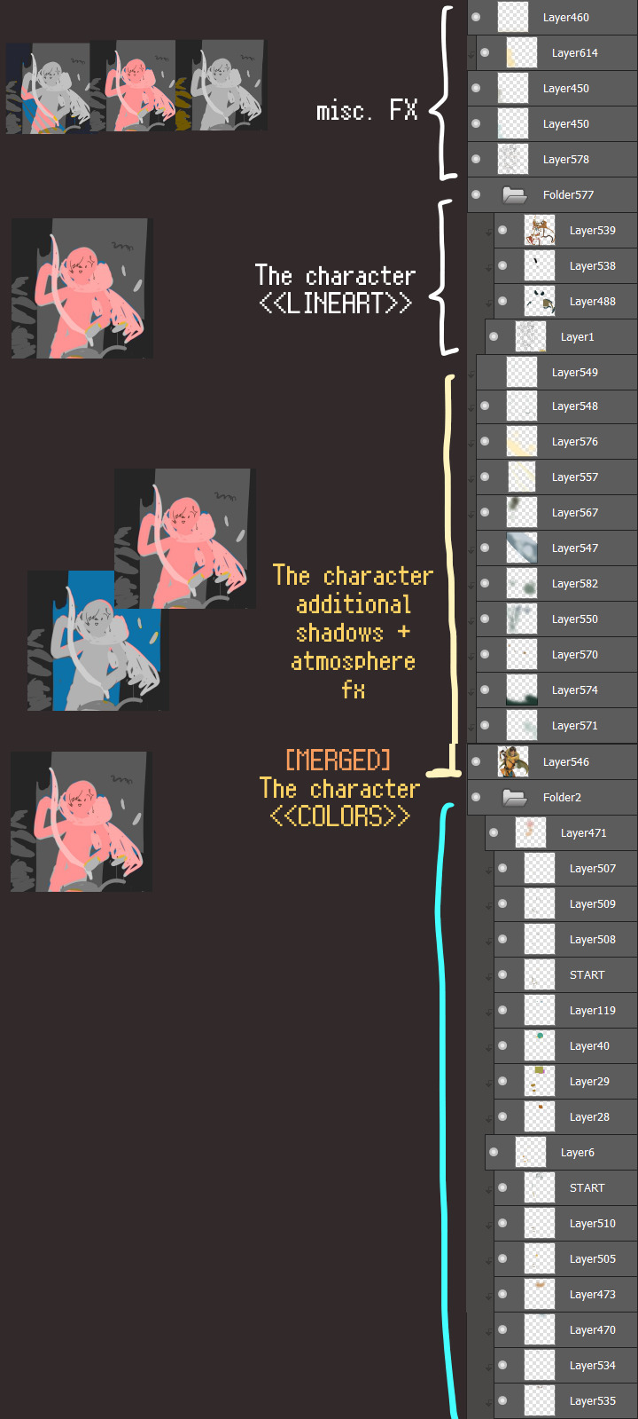
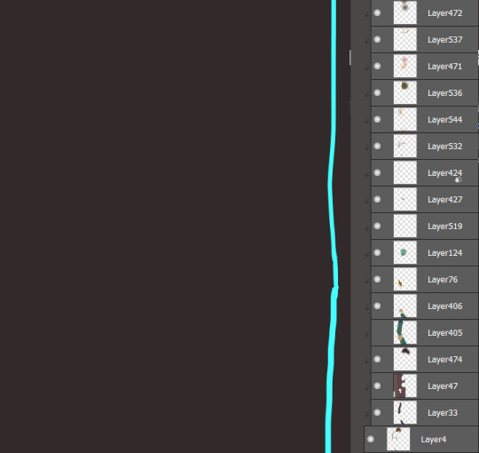
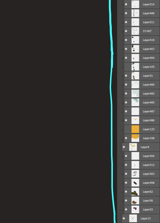
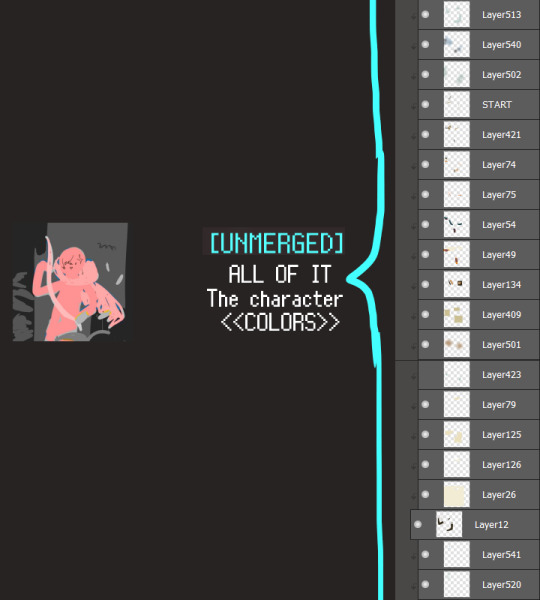
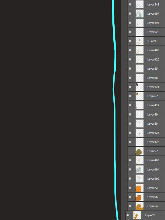
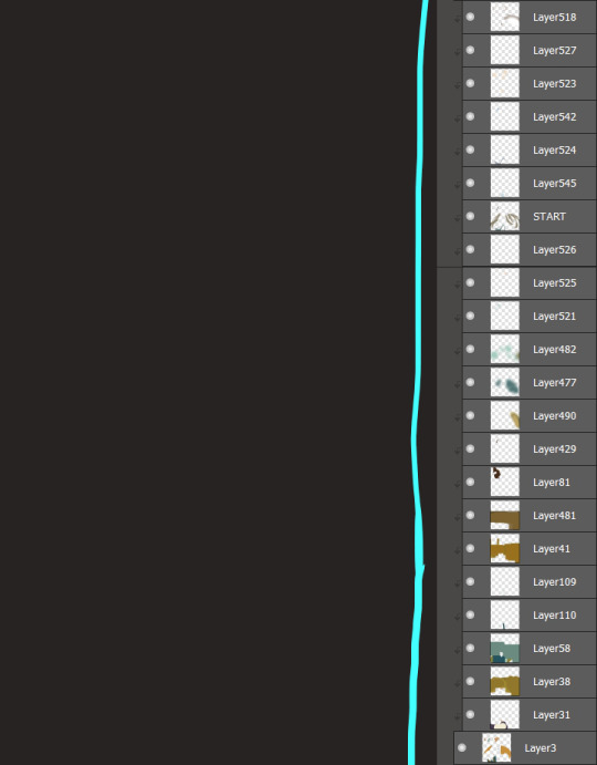
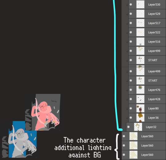
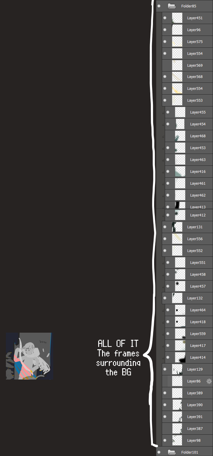
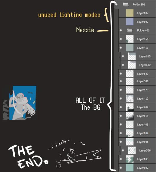
I will now delete my PC's copy because jfc that's one too many MBs ...and it's still eons lighter than what I usually work with on my own full illustrations from sketch to finish......。 (;´༎ຶٹ༎ຶ`) thank you for reading this far and making it out alive, goodbye for now...
・・・ホームページALL LINKS・・・
・Art Gallery・Commission Info・Ko-fi shop・
#art blog#long post#coloring#coloring tutorial#art tips#art tutorial#digital art#digital illustration#digital drawing#digital art tips#digital art tutorials#medibang#drawing journal#drawing process#illustration#coloring practice#nessie#the loch ness monster
34 notes
·
View notes
Note
Sorry if you've answered this somewhere before, but do you have any advice for improving/practicing art?
I am not sure if I am the best person to be giving advice on this matter as there are a lot of aspects of my art that are lacking, but here are some tips that have worked for me personally that I think worth are trying!
This got kinda long so. Under the cut!
First, this is always important, and I know people are sick of hearing this but it's true: practice, practice, practice! Observing things is very important for art but you actually have to try your hand again and again in order to have a result that is to your liking when it comes to art. Please just try to draw as much as you can. You have a pen in your hand? Scribble something. This will also improve your linework.
Do NOT be afraid to use references. It is highly unlikely that you will just happen to be able to draw something you have never drawn before without a reference. If you can't find any refs, take your own pictures. (I do this a lot when it comes to drawing hands)
Most of the time we have these conceptions of how things look especially when it comes to anatomy but humans are all sooo vastly different so I believe it is important to broaden your vision by using diverse references
Don't be afraid to draw bad. Seriously. If a piece you just made sucks, don't beat yourself up about it. It is geniunely not that serious. Take a break and come back to it, if it is still not to your liking and you cannot improve it; it is okay to delete that drawing and try something else. You'll get it, I promise. Just keep practicing.
Most of the time I find that it helps A LOT to draw something I am obsessed with. When I am learning anatomy, I don't just always draw some random people's pics I found on the internet, I will sometimes make that drawing into a character/ship I love
Do redraws from your old art! It is so motivating and fun to see how you have improved and changed as an artist :3
I know it is not healthy to rely solely on validation, but it does help a lot! If you are part of a community, esp one with a lot of artists, don't hesitate to show them your work! You can also draw your friends' ocs and such if you want to, it really is a win win situation because you will be drawing something you want to draw and your friend will be so happy that you took the time to draw their character. I loved gifting people little doodles when I was part of an oc centred fandom :D
Also, since we are talking about validation, validate YOURSELF please. Imagine yourself 2 years, 5 years, 10 years whatever ago. How would you have felt if you saw your drawings today? You would have been so impressed! So take the time to appreciate your own work.
If there are any artists you adore, don't hesitate to try to redraw their drawings, or maybe just some aspects of their style that you love. If you do a redraw, it is advised that you do not post it as your own idea, but if the artist is ok with you posting it with credit, then you can do that too! :D
That being said, keep in mind that you don't have to post EVERYTHING you draw! I used to do that which put a lot of pressure onto me since I would get so upset whenever a drawing turned out bad, but when you realize that you can just not post it, that lifts a lot of tension.
Take care of yourselfff!!! Take care of your arm, your wrist, your back. I think there is this program that makes you take breaks every x minute which is called EyeLeo, you can install that or something similar. But please do take care of your health.
Sometimes breaks are needed. If nothing you draw looks right and you don't feel any joy in drawing, do take up another hobby for some time. Let yourself miss drawing.
Play around with styles and colors and lineweights, see what you like the best. I used to always get so upset that I didnt have a set style, my drawings vary a lot throughout each piece. But now I just keep it cool and don't think about it too much. Don't force yourself!
Also for me a part of drawing I ALWAYS look forward to when drawing canon characters is giving them alternate outfits I save on pinterest. I enjoy so much searching which outfits a character might wear. Maybe you can try this? I know drawing the same outfit over and over again for a character gets old.
Honestly being obsessed with something helps a lot with improving. Like a character or a pairing or whatever. Because you will just REALLY want to draw something for this thing you love, and you will just keep on doing and doing it. Really helpful
But 99.9% of the time, the thing you imagine will not translate completely identical to the canvas/paper. And that's OKAY! That means that you have a great imagination and you will try to get a satisfactory result. It just means more practicing. When you get an idea that you want to draw but don't feel like your skills are enough for, draw them anyway! That way you can see a lot more clearly what you need to work on. And do work on those things.
I think for reference images just find nude reference pictures of real life people. The drawing pose references we see on here or on pinterest with simple shapes ARE very convenient when you just wanna quickly draw something, but if your goal is to learn anatomy, then using a pic of an actual human is ideal.
Remember that art is supposed to be FUN. So do have fun. Experiment!!!
Also I would say like, when I was more of a beginner and tried to do fullbody drawings and such, it never looked good and I was quite discouraged but things started improving when I started to individually focus on things like eyes, noses, lips etc and then trying a more general approach with fullbodies. Might not be the same for everyone though!
I think that's all I can think about for now. Sorry if this is not that useful, but yeah! I would say the most important thing is to just practice honestly :D Go ahead, have fun, draw something! I wish you the best <3
15 notes
·
View notes
Note
What are some things that a beginner artist should know/learn?
Oh boy...I don't know that I'm really qualified to give advice on this, but I started typing and couldn't stop, so
LONG answer below the cut.
I'm going to steal a quote. I first heart it on Drag Race, but I'm not entirely sure of the origin of it besides that.
"You have to learn all of the rules before you can break them."
Essentially, learn the "standard" methods/styles (this does not mean master them! It just means to LEARN them, gain an understanding of them) so that you can take what is useful and beneficial to you and your style/methods, and leave behind the rest.
There's a million ways to do this. You can go to art school, study under another artist, be fully self-taught, whatever is best for you, but the fact remains: You cannot develop a style if you don't even know how, or what a style even is.
Here's where I'm going to sound a little controversial, but it needs to be said:
DON'T BE AFRAID TO TRACE AT THE START, OR EVEN IN LATER YEARS!!!
You have to practice somehow, and if you only ever practice free-hand without reference, then you're going to reinforce the bad habits and hate the result. Bad habits here referring to things about your own art that you find subpar.
For example, when I first started posting my art online, this is the quality I had with freehand, no reference:
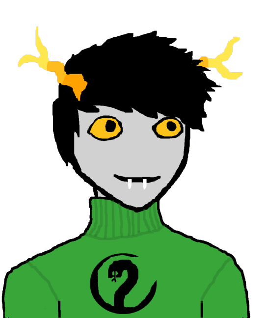
Tracing is a way to build muscle memory, and visual memory. It trains you to notice the proportions, the anatomy of a subject, and it gets your body used to drawing those proportions. Muscle memory and visual memory work together to craft the image you have in mind, and by training them both through tracing, you develop the ability to freehand it far better.
This does not mean to trace and then say you did it all yourself! Tracing images should be done for PRACTICE, not credit/posting unless you outright state it was traced, and cite your reference.
Now! Some things I want to talk about that I can use the image above as examples for...
I mentioned earlier the bit about bad habits meaning things about your art that you personally find subpar. Now, we're artists, we ALL find our own work to be subpar (unless you're Anish Kapoor or Miles-DF, but they're both known to be grade-A douchebags)
When I say that bit about bad habits, I mean things that you look at and go "that isn't me, that's not my style". NOT things you look at and go "It's my style, but it could have been done better".
For example, in the image above, see how I drew the sweater? That is 100% my style. You can see it, even in my newer work, that when I draw a sweater I draw them the same exact way. My linework has improved, my detailing has improved, but the actual style hasn't changed a bit. So that sort of thing is NOT what I mean by bad habits.
Now, notice the way I drew the mouth and fangs? A single, thick black line with two white lines going down from the halfway point?
That's not my style. It isn't how I draw mouths. I don't like the way it's drawn, but it's how I drew it and it's the style I drew it in, despite not being MY style. It needed to be changed. THAT is what I mean by bad habits. With the good habits I have now, I would have had the lips be two distinct things, the fangs would have protruded properly, there would be a noticeable bottom lip.
Part of being an artist is finding your style. That means finding other artists who draw in styles that you find appealing, adapting what you like about theirs into your own hand, as well as leaving behind anything you find hurts your style or your feelings on your style, while finding your own unique methods, your own one-of-a-kind ways of creating art.
Another example, from my own life: I adore an artist called Black-Kitten (Minors, don't look them up, antis/puritans shouldn't either).
I love their art style, immensely. I love the line weight, the way their brush strokes are so clear and deliberate, the level of detail they use that rests somewhere between "realism" and "cartoon".
But I don't want to copy their style. I don't. That goes against ME as an artist, and it disrespects THEM as an artist. So instead, I identify what SPECIFICALLY about their style suits me as a person. What I've found is that it's the line weights. So I emulate their line weights.
Another artist I admire is Fluff-Kevlar (again, minors, do NOT look them up). I love their style for all the same reasons I love BK's style, but something about it is different. From their style, what suits me is the way they blend fur patterns.
So I emulate it, adapt it into my hand, which results in a style that has adapted the line weights of BK and the fur blending of FK, mixed them into something new, and all of the rest is entirely my own.
All of this is to say "Don't find a successful artist and copy them, find an art style you enjoy and adapt the part you love most from it, blend it with yourself, and you'll find your style."
Or you can come up with a style that is 100% your own! There's no reason you can't! But most of us are inspiration-based workers, and we emulate what inspires us, consciously or not, so why not actively seek what we emulate, identify it, and work at it to make it something of our own?
Another thing to be wary of is that little voice in your head that says the result on paper doesn't match the image in mind.
That's the devil talking, and he will tell you that no matter how close your work is to the mental image you had of it at the start.
You could be one single pixel, one tiny little graphite speck, off of the mental image and he would still tell you that.
IGNORE HIM.
"Finished, not perfect" is the name of the game. Doesn't mean rush it, it just means that when it's done, it's done, and whether or not it's perfect, done is good enough. Done is valid.
On top of that...
Draw what you want to draw.
I'm serious. No matter how bland, normal, interesting, weird, fucked up, crazy, insane, stupid, hilarious, jokey, off-putting, insensitive, sensitive, appropriate, inappropriate, or just plain strange it might be, draw what you want to draw.
There are millions of artists out there. There's only one artist that will draw your ideas in your way, and that's you.
If you want to draw a car flying on penguins, do it!
If you want to draw a fat, black, trans character eating churros and dancing the macarena, do it!
If you want to draw steve from minecraft sitting at a campfire, do it!
If you want to draw an airplane with super NSFW anatomy, do it!
If you want to draw smut, or children's book illustrations, or LITERALLY ANYTHING, do it.
Because nobody else in the world will draw it the way you would.
Don't deprive the world of your work, however odd that work may be. Artists are odd by nature, so let your freak flag fly and be proud of it.
The last thing I can really say on this is...well....
Just draw. If you want to get better, if you want to improve, you HAVE to draw. Draw a ton of lines. Draw a ton of circles. Draw a ton of eyes, mouths, lips, noses, ears.
Draw squiggles and zigzags, draw Xs and Os, draw hair and fingers and toes and hands and feet and legs and arms, draw fur and teeth and claws and tails, draw humans and aliens and animals and monsters.
Doesn't matter what you draw. Just draw.
Every line put to paper is practice, every curve is training. You get better and better with each and every one of them.
Do you want proof?
My very, very first art piece to ever go up online:
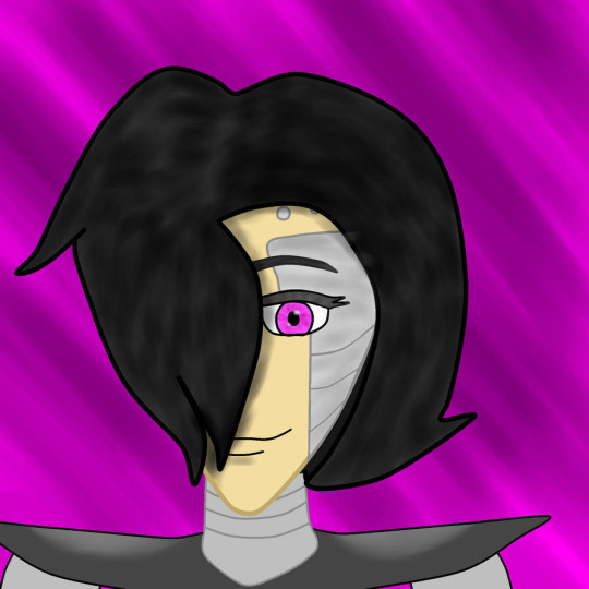
versus my most recent art piece:
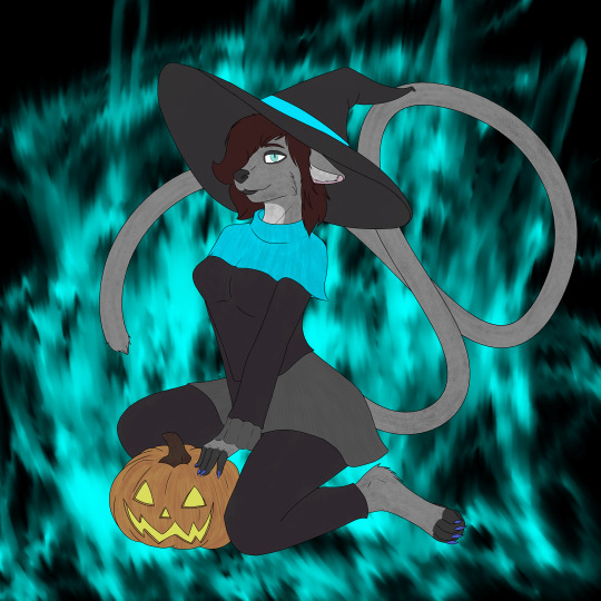
The first image was posted in 2016. I was 18, and thought that using a linework tool in PaintTool SAI was better than using my art tablet because "the linework tool has uniform lines and doesn't leave gaps anywhere"
In 8 years, this is the difference. I went from not even being able to detail hair to being able to do all of this.
And I'm not even that great. I know there are artists who have done 10x better in half the time, and there are artists who can't hold a candle to my work after 10x the time.
Which leads to my closing notes...
You will never be as good as you want to be. Every time you notice improvement, you'll set your own bar higher and raise your expectations. That's how we are. And that's okay.
There will always be artists who are better than you, and artists who are worse than you, and artists who are just as good. DO NOT compare yourself. Acknowledging the existence of better, worse, and equal is fine. Telling yourself "I'm not as good as X..." or "I'm so much better than X!" are paths to the darkness.
“If you compare yourself to others, you may become vain and bitter; for always there will be greater and lesser persons than yourself.” ― Max Ehrmann, Desiderata: A Poem for a Way of Life
Be fair in your judgements of your own work, and the work of others. Practice often, learn from those with more experience/skill, take many teachers, and make their teachings your own. Adapt the good into your hand, and discard the bad from your thoughts.
Sorry if this got rambly, but hopefully you could glean something positive from it.
I'd advise asking other artists this question as well. Like I said, take many teachers. Learn from as many sources as possible, keep what works for you, drop what doesn't, and if anyone tells you otherwise, if anyone says "Actually you should be doing this specific stuff!" as if there's one surefire, perfect way to be an artist, ignore them.
Art is subjective, and there is no wrong way to do it, but there is also no RIGHT way to do it. The best way to be an artist is to be YOUR kind of artist, as unique and one-of-a-kind as the works you create.
#artblr#artist#ask#answer#i really dont know if my advice is any good#but its what has helped me#maybe it will help you too
11 notes
·
View notes
Note
6 & 18 for artist asks!
6. Which artists inspire you right now?
I had the honour of meeting Miranda Meeks at DSNX2024 last year; she was an absolute angel who taught me a ton about the commercial art process and encouraged me to actually pursue it. I can't thank her enough for her kindness 💕
Tamara Osborn was a major inspiration for how to push towards realism in a fun and stylised way, and I still owe a lot of my understanding of humanoid faces to the time spent studying her.
Moving little closer to home... I wish I could tag all my Cosmere art friends here but I would never get through them all! If you're a Cosmere artist on here (Yes! You! 🫵) then you will have left some kind of impression on my art. So I'll keep it short and tag @duckngk for introducing me to the procreate charcoal roll brush, which I have no idea how i ever lived without and has drastically improved my process for the better.
18. Do you have any larger projects you'd like to pursue?
Oooh Brotherwise games you want to hire me so bad~
I'd love to break into the commercial fantasy art space in the next few years. It won't be any time soon, but I'm taking small steps towards that goal.
And in a complete 180, I really want to learn to draw funny B&W comics for my friends. I'm full to bursting with so many mediocre jokes about our OCs that I can't get out into the world. But that will require a skillset i currently do almost nothing to train - simplifying shapes, actually using linework, learning to lead the eye through multiple panels rather than just a single image. And it will probably never happen! But it's nice to dream about sometimes.
4 notes
·
View notes
Note
Hi there! This is random, but I really really love the way you do line art! I love how simple, clean, and direct it feels. It has great energy and feels really appealing! I’m trying to improve my own line art right now… I feel like it takes me a long time to choose the “right” lines and end up with clean finish. What to you think has helped you get up to this point with your line art the most? Do you have any suggestions of ways to study and practice? Any favorite artists you look up to for their lines?
I love your work ❤️ thank you
Hello! Thank you for the kind words. I enjoy doing linework a lot, so this is nice to hear :)
These days my line art is more of a "clean drawing" rather than what one usually imagines under traditional line art, which would be opaque lines with varying weight. Right now I like to use a brush that doesn't vary size with pen pressure but varies opacity only. It gives the lines a very soft feeling that I've grown to love.
I browsed through your art, and I was a bit blown away actually, because I think you have a fantastic energy and expression in your drawings, which is something I aspire to have myself. You are very knowledgable about line weight and shapes, so I won't bore you with explaining any of that, haha.
I think good line art comes down to confidence. Obviously, an artist needs a confident hand to avoid shaky lines, to lead them exactly the way they want to, to give them an energy. This sort of mechanical skill is acquired through experience.
But! I've always felt there is a sort of a mental side to this as well, which is best observed during traditional inking. You have to commit to your lines, you have to trust them. You have to sit back and give control to your hand, because with the experience it has, it also has a mind of its own. This sounds pretty out there, but it's about letting go and not overthinking it. I realized this when I looked up to Jim Lee's work as an older teen. There's a lot of videos on YT where you can see his process, which looks utterly effortless. Take this one for example. It's quick, so it's a bit rough, but it does look like his hand is just doing whatever!
I fostered that approach in my art while doing daily drawing from life - straight to inks without sketching. The drawings look wonky a lot of the time, but it gave me confidence where it mattered later. To this day, when I do clean lines in digital too, I adopt this mindset of letting go, which gives the lines more leeway, which also means that if the line doesn't go exactly where it should according to the sketch, I can still trust it. (Although contrary to this, I still put a lot of controlled effort into faces, and this approach comes more easily while drawing bodies and clothes.)
As for suggestions for practice, as I've already mentioned, drawing from life straight to inks (I recommend this over going straight to inks from imagination as that's extremely difficult, at least for me). Have a fast hand, and do long lines even if they come out wobbly. Try to let your hand roleplay Jim Lee here and there - let it do that flick that crosses a line it shouldn't have, let it make a turn with an accidental squiggle, let it pool a bit of ink at the end of the line. Fake it till you make it. At first, I suggest trying this on subjects that aren't your expertise (eg. in my case, draw a bottle instead of a person), so you don't subconsciously compare this to your best work, but make sure you're still having fun :)
Of course, it helps to like doing line art too. I don't know what your relationship to it is, but if it suffers, I suggest busting out the traditional inks with dipping pens, wodden skewers and brushes. It connects me with the process like nothing else.
As for my favorites, I can recommend one of my favorite manga artists - Satoru Noda. Superbly confident and energetic linework. Check out his series Golden Kamuy or Dogsred :)
I hope this will give you a small idea of how I approach my line art. It might be a mess… If you have any more questions as a result of this, or related to anything else, don't hesitate to ask!
20 notes
·
View notes
Note
In my experience, before I was the holder of the skill I used to just doodle on paper. I love markers. I love whiteboards. Thick blocks of shaders similar to what you see in comics is my go-to style for traditional art. But ever since I became The Artist representing BOW, I learned digital art quite faster than the rest. It was tricky on my first try, like waking up a dormant muscle, but I managed. Once in a while I revisit styles learned throughout the years by my predecessors and improve them, learn a new one so if someone's interested in drawing they can claim it for personal use, or teach a friend to bond with their chosen style like a living book in our magical library if that's relatable. 😂
I'm curious. Do some or each of you have personal art styles? Are there friends who hold the skill, and, probably, consider it as a collective art style? Are you able to share the skill to those who are not used to drawing?
The questions are specific to one skill but it's also applicable to other skills you have like handcrafting, or writing, or a secret third thing perhaps! What have you! I'm happy to listen if you love to dive deep (haha) into the details, or not! Whatever you feel comfortable sharing if it sparks your autism.
Bonus question, free to skip: Cerberus or Hydra are suggested a lot when making a collective sona in and out of the plural community... Did you all vote for the cool bat (the one on your profile) as your collective sona? If so, were there other ideas thrown on the table before choosing the bat? If not for the collective, that's cool. Whoever the bat belongs to, I need you to know that I love it! Still curious about the process. 👀
I've been thinking about what ours could be, but our species differ on a wiiide ever expanding universal scale and nobody agrees to one specific form to represent us all. For sure, we have The Collective Symbol, but it's abstract in nature! We require at least a shape of a creature of some kind! Help! 😅😂 (I'm being silly, not serious! I'm not actually asking for advice but if you're happy to speak your suggestions, I don't mind. Honestly! I'm only invested in your bat - the colors and design are so cool, I love it so much - as someone who is comfortable under the ducksona rather than my human form.) (Sam Lake is a furry, confirmed. —Casey) (I don't know. I like ducks, and cats, and dogs, and deers, and fishes, etc... 😅😂)
Also, maybe it doesn't show but I'm anxious about sending an ask under my name and people finding out who I am but to hell with feeling spooked for simply existing. I consider this exposure therapy. Thanks to my peers support. And thank you to Vis for enjoying the Kesä/Jakala art, and to all the others who enjoy our art in general. My heart swells. OK, where am I going with this - it's getting too long. Excuse me for writing a wall of text. That's all. Please don't feel pressured to answer right away! I have no trouble waiting for months or years, in fairness. Thanks for sticking around reading to the last bit, haha. 🥹
!!!! Ok ok uh for the art related questions yeah a couple of us have different artstyles yeah! For the most part most of us frequent fronters share collective art skill and style as we tend to operate with multiple folks in & around front! But we do have some differences in art style and such, like uhhh Pom and Byte are way too good at art and need to be stopped, Horizon & Zone do linework and stylistic choices that somewhat different to how most of us draw, ❄️ & Sootly & NPC draw very angularly while most of us draw with very round shapes! Sometimes when people haven’t fronted in a while they need a little help drawing because its been a while for them, and other times they’re up to speed on our mostly collective current style already! We don’t quite have one art focused individual but the people i would point at for being the best at our craft would probably be Pom and Byte as most of our favourite pieces have been drawn by them!
Writing is a skill that not as many of us hold as drawing- Gnocchi & Biohazard needed a lot of help writing, while meanwhile our own personal coffee fiend wrote an essay for an exam very well & managed to not panic about it (thank you our coffee fiend,,, i know we all make fun of you for being obsessed with your favourite drink and the rest of us not always wanting it but your really a cool guy so thanks man)! I think Cake, Ark, Amy, and sometimes Timespiral are also some of our general writers, but again thats less of a skill for us in general I think!
Now onto the collective persona development rant >:D !!
Our profile’s little bat guy is actually a variation of our current collective sona, as inspired by one of our irl friends who drew us as a bat! We’ve been wanting a collectove fursona for a little while but were never really set on what to do other than a bit of a general shrug and going “maybe a protogen?” but not ideas other than that. Our irl friend drawing us as a bat made us design this lil guy, as a reflection of our current collective sona with an outfit more like something we might wear irl!

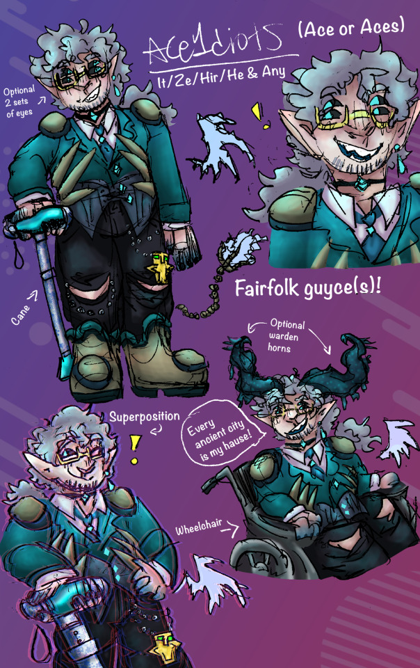
Heres our actual collective sona! Yes its very minecraft themed but in our defence Every Ancient City Is Our Hause !! Most of our past collectivesonas ended up becoming their own people (this actually happened with Byte- it was designed as a concept for a collective fursona and then it formed and now its here as its own person!), making their form no longer represent all of us, meaning that yeah, we fully understand the struggle of trying to make a design that represents most everyone comfortably and that won’t go ahead and form a new guy or just wont be fitting enough to everyone xD
To be fully honest we designed our collective character kind of on accident! It was originally designed for a fashion class we were taking, and then we kept thinking about this guy and at some point someone made him a minecraft skin, and then it got put into an art piece about our experiences with disability for an art assignment, and kinda from that point on, fae have been representative of all of us!
Heres the original sketch of our guy, the artwork in question, and the block version of our beast.
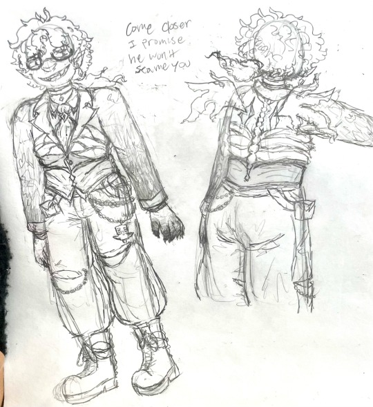

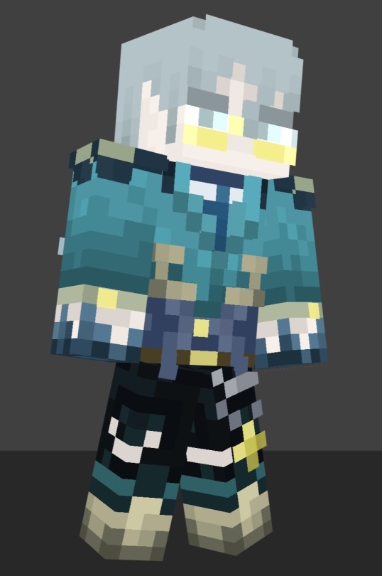
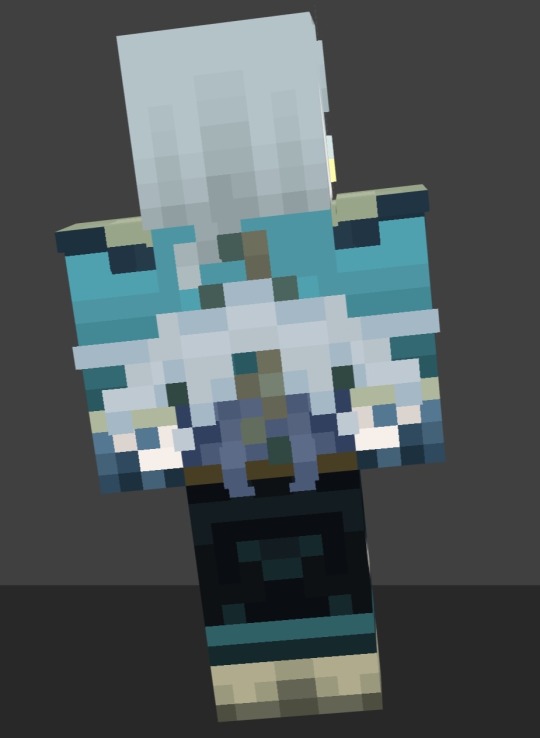
Our collective persona’s a little of a happy accident, but I think it fits us well :D ! Having a collective persona that was a Good Neighbor was incredibly affirming for a lot of us, as a large amount of us in here either are of that ilk or sort of lean slightly in that direction due to our collective perception of self! Of course not all of us are Fae, which is why this guys also a little of a shapeshifter for anyone who wants to draw the collective sona but tweak fae slightly so that its form can feel more fitting to themselves!
At some point, we decided that every Ancient City was our house thanks to a joke we made on our friend CharmLikeTheQuark’s twitch stream while they were playing on Art Of Survival smp, and that jokes kinda stuck around ever since!
The whole deal with our collective sona being a quantum superposition of an offshoot of a Fae court came later when hanging out with our friend Solar, who noticed that for some reason our username was displaying twice when we were playing on a server with them & a couple other friends of ours!
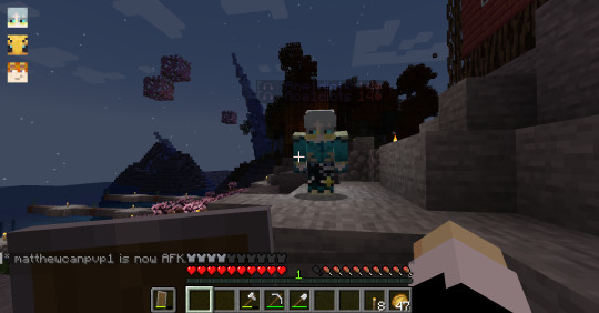

If you zoom into the first screenshot you can kinda see it but its more evident in the second one! But yeah, thats sort of probably why this sona has stuck to us so hard, the idea that it, as a vessel of expression for us, is multiple people too!
Overall, having a guy with themes that fit with things a lot of us enjoy as well as sort of thematically & literally being multiple guys is sort of how we went about realising it was a perfect fit for us, but collective sonas are hard! I send you all luck with designing yours! I guess some of the advice we could give is to go with themes & design choices that primarily stick with frequent fronters but can be slightly altered if need/want be to do so, that way even if it doesnt resonate with everyone, the general idea of “this concept is moldable or perhaps shapeshifter-y in its nature” could stick with more people overall!
so uh yeah thats about it! As stated before the bat variation came about as a variation of our already collective sona as inspired by an irl friends drawing of us collectively as a bat!


Fhew! That was a lotta text, ok! But I hope we answered and got to all of your questions Sam! This took a while to write and is somewhat messy as we’re still sleepy and still in bed, but HOPEFULLY ALL THAT MESS IS HELPFUL XD!
hoo boy did the persona bit take a while but thats ok, it was fun to try to elaborate on all of that!!!
thanks for the ask sam!!!! ahhh !!!! this was super fun to answer :D !!! <33 !!! i hope yall are havin a good day so far !!!!
#asks#longpost#samionkhavi#vis tag#<- fronts still blurryish due to eepy but i think this was mostly me & maybe a bit of timespiral & our coffee enjoyer
6 notes
·
View notes
Text
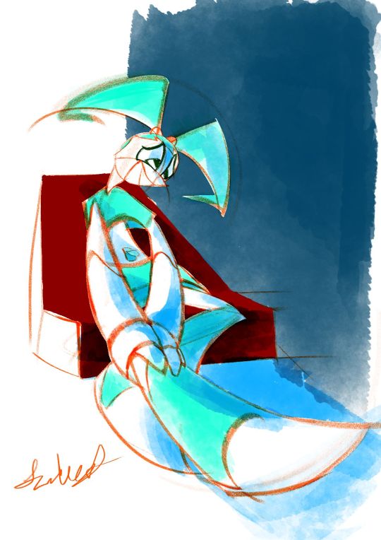
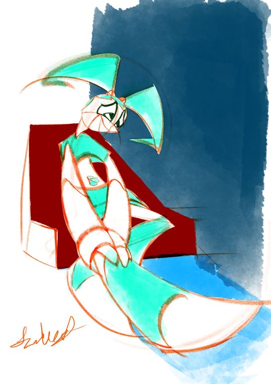
2024-01-07 Jenny holding leg in intense worry 😢
Art Timelapse
Thumbnail Timelapse
Art, plus a shadowed version & two thumbnails.(imo, I like the un-shadowed version better, but the shadowed one's starting to grow on me.🙂)
Based off a spur-of-the-moment thumbnail. In the middle of making it, I interpreted it as she’s not feeling “pain” per se (since she doesn’t have nerves); more like slight pressure that she’s cautious could burst.😔
*So sorry!🙇♀️Between getting ‘rona again & readjusting, I took a longer break than I intended. Guess this drawing of worry is kinda subconscious😳…Now that I've ruminated on it, it's okay🙂. This was a work-life balance lesson in managing forced breaks (like sickness).
MINI JOURNAL
This was another piece I was exhausted with. Another was the “Jenny slightly pulling back” one. While this “Jenny tending to leg” was over a week, it almost didn't feel any less concentrated with exhaustion.😔Anyways, in both cases, I didn't have too clear of an idea of what the final piece would look like (less so with this new one, as I knew I wanted to keep most of the lines red-orange & color Jenny aqua-green).
Social Media Strategy Tweak
Maybe next time, when in doubt, just keep it a sketch, with no colors or tones??? Tbh, I didnt go that route bc I didn’t want a piece that was too harsh on the eyes from being over a bright white background, but at least a softer white. …Now that I've written it out, it sounds like a dumb reason.😥
Or, was afraid that wasn’t finished enough for IG/social media? Maybe, especially since I wanted to have a red-orange pencil-sketch style in there. Maybe be a little more elaborate & have black cleaner ink lines & grey base tones (like your ‘quick traditionally-styled storyboard’ art style)?
Wait, I just remembered: could do sketches, but do that Natalie Nourigat “draw the pose 5 times” exercise.
The exception will be the Jenny Injured diptych (to still be colored but not further pushes gesture-wise (tbh, I again want to try to get done as quickly as possible)...plus, I'll just say, “something different.” 😉
Personal Preferences & Little Backburner
Imo, I like the shadow-less version. Jenny's legs contrast better with the background, and the colors are closer to what I ended up having in mind.
Yes, even the unconventional red-orange linework with cyan base colors😄. I’d actually been meaning to try that out on a piece; tbh, I just like red-orange/vermilion-colored pencil sketches.😊 I was doing another red-orange pencil, Krita sketch in October that I wanted to try that color scheme on, but the perspective needed retooling.😵💫
BTS
I actually had this, along with a thumbnail for a completely different piece, on the backburner. While I wanted to do the other one, I went with this more unclear-looking one. That way, I could finish it before I forgot what I had in mind.
After I was well into the finalized sketch, I found a 2nd, more pushed-gesture version of one of the thumbnails. That’s when I decided to try not to spend too much time on this piece; I wanted to re-do it with this pushed gesture.
Also, after a while of using one of my go-to Krita watercolor brushes from last time (WaterC Flat Decay TIlt), I got really mentally exhausted. Played around with doing the painting stage in Adobe Fresco, but despite Fresco’s watercolor brushes feeling far more comfortable, I wanted to keep this artwork quick. Therefore, I just continued the painting in Krita.
Oh, and instead of erasing the extra pencil lines, I covered most of them up with white.
Plus, that monitor profile changing fixed my colors after all!😊 I’ve gotten my solution written down somewhere. I’ll try to post it sometime.
SELF CRITIQUE
(-) Iffy depth on the navy-blue block of color
(-) Mouth kinda looks like she’s smiling???
(+) Good foreshortening on Jenny & the chair
(+) Great gesture/line-of-action into the hurt leg; decently faithful to thumbnail’s gesture. Improvement from that in “A Place of a Contemplating Robot”
Shadow-less version
(-) L hand [our POV] gets lost in the sticking-out leg
Shadow-ed version
(-) Sticking-out leg disappears into the ground
(-) L arm should have harder edges on the shadow
(+) L hand has hard-edged shadows
(-) Bent leg’s foot also has too soft of shadows
ART SUPPLIES
Hardware: Alienware x14, Huion Inspiroy H610PRO V2 pen tablet, & IMAGE Light Pad Stand A3
Software: Krita (art & timelapse), Autodesk Sketchbook (thumbnail & its timelapse)
Brushes:
(v 1.1) Krita Redux- Pencil (AFresco) - linework & white cover-ups. Less-aliased version of my custom brush
j) WaterC Flat Decay TIlt - hair, ”clothes”, belly button base colors, BG block, ground
(Dig.) Clean-Up Lines (Aliased) - Jenny white matte & chair base color
2 notes
·
View notes
Text
Eternal Diva Fic (Part 13)
This is where all the Softness (tm) is folks; this is the "Clare is indulging" part lmao. Then again, this entire section of the story is me indulging. This entire fic is me indulging. You signed up for this at this point.
No warnings here, pretty sure! Just a nice soft penultimate chapter :]
Word Count: 1.6k / Previous / Next
“What are you up to?”
I jerked in surprise. It was Descole again, leaning on the doorway.
It had been a couple of days. At least that was what I guessed. Time was hard to gauge when there weren’t any windows, and I was lousy at keeping track of time anyway.
Despite Descole’s advice, I had barely gotten any sleep. Believe me, I tried. But my eyes wouldn’t stay closed or I couldn’t settle down. So most of the time, I took out my notebook and just doodled away, hoping that would help.
“Drawing,” I said simply. “Can’t sleep.”
"Again?" was all he said as he came in. It didn't sound accusatory, but I took it that way.
"I've been trying to sleep, alright? It's just been with... everything! All of this!" I let out a short sigh. "I know that's not your fault, but..." I trailed off.
The masked man just stared at me. I might've been seeing things... but he looked a bit sullen.
"I'm not going to force you to sleep. If you can't, you can't. Simple as that."
There was a stretch of silence. Neither of us moved (not that I could move much anyway).
I could tell Descole didn't want to leave just yet. He had been doing that quite a bit, finding random things to talk about to stretch out these visiting times. I didn't really get why; none of it seemed useful to him at all.
“Could I see what you’re drawing?” He finally settled on that as he sat and settled on the other side of the bed.
I blinked. "You actually wanna see my art?"
"It's something you're passionate about, no? You carried a notebook with you to an opera house of all places, and you're fast at it. How long have you been drawing?"
"All my life, basically? It's just something I've always done."
"Fascinating..."
“…I… guess you can look. If you really want to.” I passed the notebook over to him. I didn't have anything to hide; it wasn’t like there was anything embarrassing or weird in there. “Just don’t expect to be amazed or anything.”
He thumbed through my notebook quietly. He just made quirky little expressions at my work and didn't say anything. After a little while of flipping back and forth— enough to almost make me nervous— he handed it back.
“Hm. You were right. I wasn’t amazed.”
“Gee, thanks—”
“Because there was nothing of me in there.”
I gawked at him for a moment. “Really? That's your only takeaway?”
“The only negative takeaway. Your style is charming and extremely expressive, your linework and handwriting is neat, and you somehow do it so quickly. I'm very impressed, dear."
"Wait, you... like it? Like, really you like it? You're not pulling my leg here?"
His smile softened. "Absolutely." But that softness went away fast for slyness. "But! If you want my opinion, your posing could use improvement."
"And drawing you will help with that. Totally not because you want free art of yourself." I couldn’t help but snort. “No thanks. Your hat looks awful to draw.” I pushed it down over his mask so it would cover his eyes. He chuckled as he fixed it.
“I could model for you, if that would help.” His smile may have been smug, but he was serious.
“I’m sure you have better things to do than be my model.”
“No, my schedule’s all free now with Ambrosia discovered. I'm very open and very available.”
“Well, I heard there’s another lost city out there that I’m sure would be a real head-scratcher for you. They’re calling it Atlantis.”
“You--!” He playfully shoved me a bit (though it was more of a nudge), and we both couldn’t stop from cracking up.
~
Another random day, I couldn’t sleep again and Descole visited again.
“Is there anything that will help you sleep better? You’re really starting to worry me.”
Asking the masked man why he was fretting over me so much never got me a straight answer. I just dropped it after a while.
“I dunno. Time’s just… weird down here.” I was about to say it wasn’t that bad, but I swallowed it. Of course it was bad; if I wasn’t sleeping, I wasn’t healing (or at least healing with nothing else happening).
He hummed for a bit, then seemed to get an idea. “When I was a boy, my mother used to read me a bedtime story every night she could. I was out cold right as she finished. Maybe the same will work for you. Besides, it must be dreadfully boring here with only one thing to do.”
“...You have got to have something better to do than read me a bedtime story.”
"Please, dash your concerns. You’re my guest; of course you’re going to take up my time. I'm not going to just leave you alone like some caged animal. And besides… I want to. So, do you want to hear a story or not?"
I was taken aback a bit. He wanted to, genuinely? “Um… sure. Why not?”
A warm smile slid onto his face. “Thank you, dear.”
I liked seeing that smile. Certainly better than... all that on top of the robot.
He went over to a little bookshelf I hadn’t noticed in the room before. He dragged his finger across the spines, looking for just the right one. He gingerly pulled out a smaller book. “Ah, here it is.”
The cover was mainly blue with a blonde boy standing on the moon with yellow stars in the night sky. The title:
“The Little Prince?”
“Have you read it before?”
“I’ve heard of it. I’ve always wanted to read it, but I could never find it anywhere.”
Descole’s smile grew wider. “Well then, I’m honored to be the one introducing it to you.”
And that was how the next few days went: Descole would sit on my bed, reading The Little Prince. He had a voice ready for every character, and it always got a laugh out of me.
Eventually, I’d always fall asleep (most likely leaning on him because I peered over his shoulder to read the words or look at the pictures). He didn’t leave me settled there forever (or maybe even very long), as every time I woke up, he was gone.
~
"Hey, Descole?"
"Hm? Yes?"
We had just finished a reading of The Little Prince, and the masked man looked exhausted. From context clues, it seemed like he was working on another plan for some ancient site or city or what-have-you.
I figured he wasn't going to tell me anything about it, so I didn't say a word. I was probably going to get roped into it somehow anyway, knowing my luck.
But something had been nagging at me this whole time, nibbling at me. I felt like if I didn't get it out soon, I was going to explode. So... might as well while we were both still awake.
"...How do I say this...?"
"Really, is it that bad?"
Ok sir, this attitude was not helping. "N-No, it's not bad! It's-- the opposite of bad actually."
"And you're having this much trouble getting it out?"
I sighed, and then steeled myself, gripping my blanket. "I just... wanted to say: your voice on top of the Detragan was... really nice...?"
Silence. You could've heard a pin drop.
...Why had I said that? Why did I say that?
Augh god, he was going to be just insufferable now! He was never going to let me hear the end of it!
But, to my surprise... it was still quiet. I hazarded a look at him.
Descole looked stunned. He was staring right through me, all sorts of gears and cogs turning in his head. The great mastermind Jean Descole looked... flustered.
Once he noticed me staring, he puffed up like a startled cat and pretended to cough into his sleeve. For a split second, it looked like his cheeks were flushed. But I wasn't sure.
He stammered. "Yours was... as well."
Silence once more. After a few seconds that felt like a few hours, Descole suddenly darted for the door, not saying a word.
"H-Hey!" was all I could get out before the door shut. I let out a short sigh. "Bad idea. Of course it was."
~
I settled into some kind of rhythm eventually: eat breakfast, lunch, and dinner; find some way to pass the time in between meals with or without Descole around; and once night came along, listen to him read.
Every meal was cooked by Raymond, though Descole sometimes told me that I ate some of his cooking offhandedly. I always told Descole that I could tell which parts he cooked: the worst-tasting part. It was just me teasing him, and he recognized that. Honestly, I couldn’t tell which parts he cooked, if any at all.
The masked man and I had pretty easy conversations at the start, but things started to get more… awkward as time went on. Genuine compliments that caught either of us off-guard, and then Descole would hurriedly excuse himself and leave. Words way too sweet for their own good. Eventually, we started talking less and less.
After we finished The Little Prince, he didn’t pick up another book for us to read. He'd just hand me one he'd thought I liked and hurried off again.
It felt… hollowing. I wanted to say something about it, but I couldn’t just force him to talk if he didn’t want to.
Raymond reassured me during all this. “He’s… lost a lot, lass. I suppose he’s just steeling himself for when you leave. He’s enjoyed your company, and he’s preparing himself for when it’s all over.”
It… didn’t make me feel better.
Eventually, I was finally feeling better and could move about the sub. Which of course, meant it was time for me to leave.
#🐉🎮.txt#clare's writing#eternal diva au#seen a lot of things; places you ain't ever been 🐉💫#lead me save me from my solitude 🎭🔧#so fun fact: this is the most edited part of the whole story#i thought it was way too short and it didn't flow well so i added a scene and some more dialogue. i think it's a lot better now#this scene was barely below 1k. and now it's 1.6k. which now mneans this *is* a 20k word fic. gotdamn
4 notes
·
View notes
Note
If you want some actual critique the coloring looks like blurry flats. It doesn't look finished. And the colors clash a little. Your line work is really pretty and it's a shame to see it hidden. You're really good at linework and not as practiced at coloring. You have the right idea though you're just not gonna see the same reaction. I feel very rude for saying this and I'm sorry
Well, it is rude as fuck, to be honest xD I wasn't expecting that amount of brutal honesty from someone I don't know and even if I understand that I'm still learning it hurts cause it feels like I don't have the right to post the things I do unless I reach max level on them. I'll keep posting my shit even if I have 0 notes on them, I'm stubborn like that xD
But you're right, I'm not experienced with colour in digital media and I find it difficult as fuck. So if you're an artist and have tips about how to improve my drawings, feel free to let me know.
Thank you for saying my line is nice, tho.
And it's nice to ask for consent before giving actual criticism, no one wants to read without previous warning that their stuff is shit before going to their awful job xD and yes, yes I wrote that post and if you asked I would have said: sure, let me know, I want to be better. Just, you know, for the next time :)
5 notes
·
View notes
Text
I totally understand why online art communities have landed on "don't discourage artistic expression of any kind" but the insistence on making a one-size-fits-all piece of advice out of it is annoying as hell. Because it usually ends up in the most algorithm-friendly, nonthreatening territory that's geared towards making you feel good and saying nothing. Like, here's someone with a very plain statement that "I dislike when artists develop these skills instead of these other skills" and apparently that's terrible and anti-art, why? Just because it isn't 1000% positive "do whatever you want forever"? For one - you can still do whatever you want forever! Different things work for different artists! Maybe that helped you and is what you needed to hear, maybe composition or linework or other technical aspects being discussed is what other artists wanted or needed to hear, too. This reblog chain is just people upset that one of these was valued at all, and I'm not sure how that's conducive to artistic expression instead of just being 'pro-vibes' On that note, the characterization of any and all artistic "rules" as the realm of elitist snobs, while telling people not to care is characterized as "artists helping other artists" is fucking depressing to see, because guess what a lot of those "rules" are meant to be?? Yes, turns out developing certain skills helps you achieve results that you would not have been able to otherwise. And many, many, many artists have put years of work into documenting and compiling tried-and-true ways to develop said skills because yes, they actually wanted to help other people achieve the same. Whether you personally value those results, whether you think it's necessary for your own art, that's all up to you. Of course there's plenty of genuine criticisms of what is standardized; it's absolutely worth studying how institutional power informs and enforces racist, sexist, classist, Eurocentric standards for what does, or does not count as "good" art. You don't have to unquestioningly accept every pre-existing method just because it's an established thing, you don't have to hold up technical prowess as "objectively" superior. I just think it's also a bit conceited to dismiss common, well-understood practices as if everyone in the past was either an idiot or a bad actor. All of that is besides the point anyway because OP didn't even say "technical skill is the only thing that matters" or "artists who don't improve according to my standards will be put to the sword" or any of the stuff people are projecting onto this post. It's just people seeing a mundane criticism, and deciding it's worthy of condemnation because god forbid anyone voice an opinion on artists that does not conform to the tone and cadence of a children's entertainer
nothing sadder to me than when an online artist posts a side by side of the same picture from 5 years ago / redrawn this year, and the first one is fluid and energetic and full of character, and the second one is flat and static and clean to the point of sterility
16K notes
·
View notes
Text
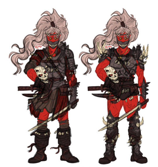
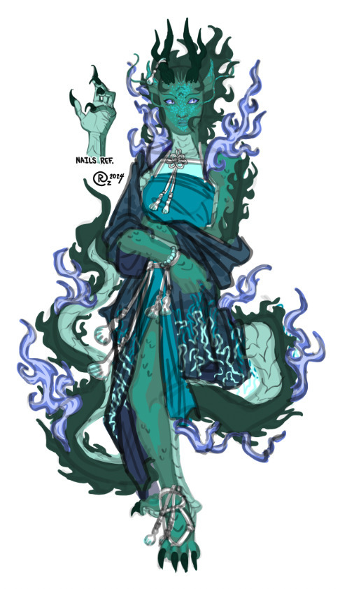
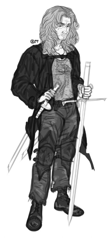
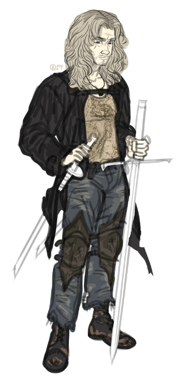
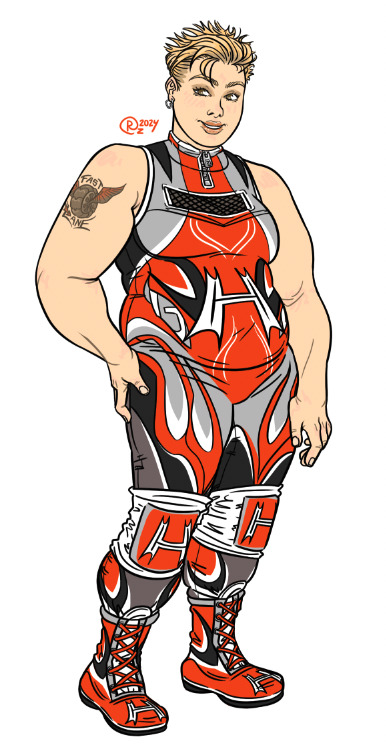
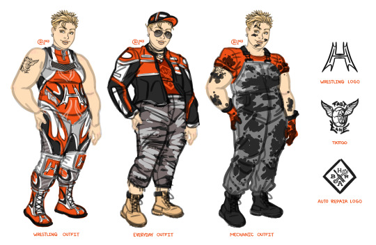
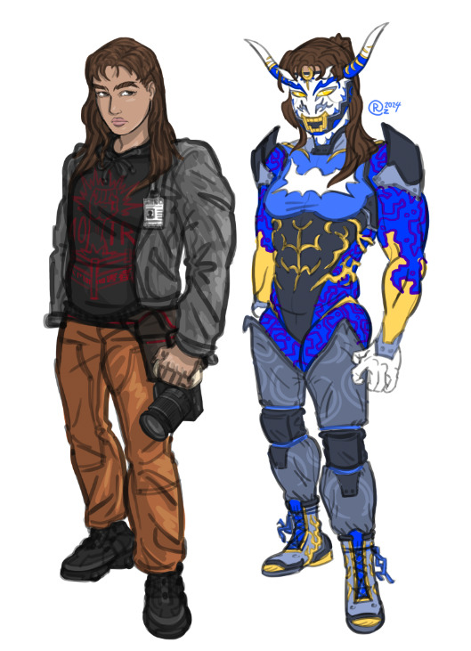
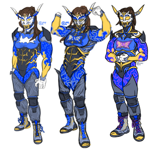
Here are some more unfinished characters (and one that's mostly finished) that I've worked on from January through March. 1). Frauke redesign(s) of the current Frauke armor and of the more traditional Frauke bone armor. I am thinking of rewriting Frauke's backstory and giving the amulet that she wears a personification or something... just a thought for now. I also decided to change her weapons to two short swords instead of the great sword. 2). Ayano's current design. I have planned a few other design options, but haven't sketched any of them yet. Her backstory is also still a WIP, so more on that once it's actually finished... 3). & 4). REIN redesign WIP. Showed his original creator and she said "He seems younger here, before 90+ fatal injuries". In the past, we discussed the ownership of REIN, and I was told he's basically mine in a way, so that's why I gave him a wild new coat of paint at the moment. Now, I gotta finish him up... just like the rest of these... (Just drew him the other day tho, so he's the most recent WIP. Also felt like giving him color, so there is the color version (for now).) 5). & 6). Hattie's final linework for her wrestling outfit. I still need to outline the casual outfit and her mechanic outfit tho... I've been working on/off the same sketch of Hattie since 2022... 7). & 8). Kohaku's redesign. I think I need to improve a lot on her most recent WIP of her wrestling outfit, but for now, I just wanted to show that I have been working on her... I think more "armor" elements would really help, but not sure how to go about that yet... also not sure if I should keep the purple in her design...
--- Sorry if these files are low-res. For some reason, my screenshots are low res when I take them on my other monitor vs my Mactop's monitor... I'm very depressed... so sorry for not sharing things regularly...
#sny_sketches#demonstein#frauke#ayano#rein#hattie briggs#kohaku wasahisa vera#wrestler character design
0 notes
Text
another ramble about art again so i’m hiding it all under a ‘keep reading’ thingy so as to not clog ur feeds :]
aka thoughts about imposter syndrome, fanart, and what it means to draw stuff loosely disguised as a ‘ramble’. maybe a bit of akito almost-kinnie-isms (and probably ena) in there too because why not. also sorry this gets a lot less coherent as it goes on (i lost my train of thought near the end. it’ll come back someday)
i want to keep getting better. i want to keep growing and improving, so that i can convey the ideas in my head to others. i’m afraid to stagnate for too long, because what if it means i’ve hit my limit? what if i’ll never get better than i am right now? an irrational thought, really, but that doesn’t mean it’s impossible. hell, i felt like i hadn’t improved all that much from a year ago, when i tried to redraw a few of my older posts.
part of this stems from the question ‘how do people see my art? what kind of artist am i to them?’ which comes from when i got into fanart and fandom spaces, a long time ago. i would categorize the people i looked up to, my idols, my role models. there was the one that made comics that felt like home with your friends, and there was the one that made pieces that felt like i was sitting in a café in the middle of a busy city, and there was the one that made renders that felt like i was looking at liquid gold. i was fascinated by the effects of all these different artstyles, and decided that i wanted to do the same. i wanted to make art that made people feel at home, like a fic that you keep coming back to, or art that conveyed how i felt well enough that others felt the same way, or could understand it at the very least.
naturally, as i continued to draw and admire these artists from afar, i wondered why exactly their art appealed to me. at first, the answer was simple: i like looking at it. but that wasn’t good enough - what about the things i didn’t really care to look at, then? what made this piece any different?
so i tried to understand, why i liked something, or why others liked something. after studying art for a little (yay classes) i understood more, i understood why those artists made the choices they did. for one, it was their powerful composition, and how they wanted to pull the viewer in with the characters. for another, it was their color palettes, which were always balanced yet strong and guaranteed to catch your eye because of it. other times, it would be the lighting, angled to present the characters in such a way that it made you feel like you were there too, or linework that made you feel just how much the artist cherished the characters. there were other, less technical things too, but i was trying to build a foundation before diving into things that were harder to learn.
in short, there was so, so much more to everything than i had realized as a kid.
so i asked myself the same question. why do people like my art? why is my art appealing and worthy of your time? and where did i fit in, if i were to categorize myself?
these questions got a little worse. incredibly irrational. imposter syndrome was kicking in when i saw that more people were liking my art, especially when i compared it to myself from a year ago. or when my favorite artists were following me back. (it was weird, somewhat. i had always seen them as worlds away from my own space, artists that i had admired from afar and thus never believed that they would turn around and see me.)
‘do people actually like my art? is my art actually worth anyone’s time?’ i wonder. ‘do i deserve these nice comments, or even these likes?’
‘am i even getting better at all?’
these are a bit foolish of me to think. it shouldn’t matter, really. as long as i’m enjoying drawing and having a fun time, then why should it matter whether others like it or not? i don’t have to be doing my best, giving it 110% all the time, i’m allowed to make goofy art or self-indulgent art. this is my motto, for the most part. as long as you’re enjoying the craft, then it’s worth it.
but with the goal of improvement, i don’t always want to stay in my comfort zone. i want to keep pushing my limits, even if its just a little at a time, so i can make something impressive, something that really resonates as much as i want it to, as much as certain pieces resonated with me when i was younger. the same way that i kept coming back to certain pieces (and still do), i want to be able to do that too. i don’t want to feel like a kid playing at an adult’s game, like someone who doesn’t know what they’re doing and it shows.
it’s a tricky balance. i’m not sure if i’ll ever truly feel like i’ve ‘finally done it’. i think that most artists are never truly content with their work as a whole, anyways, and that’s okay. that’s something i should be more okay with. i can make art just for fun, and i can also make art with the intent of solely improving or practicing. i can even combine the two, and most of the time, i try to anyways.
(sorry, i lost my train of thought after writing the last few paragraphs... i dunno where i wanted to go with this exactly HHH.
tldr; i’m always stuck between ‘i’m happy making this art even if its bad’ and ‘i need to get better and leave people in awe to feel like i deserve the love and nice comments i receive’.
if you somehow managed to get to the end of this, ty for reading, even if it was a hot dumpster fire LMAO)
#cat does some thinking#I NEED A BETTER TAG FOR MY RAMBLES#even if theyre only like. once or twice a year max#lol after writing this i came back to the piece i was working on (and what solidified this whole thing)#and it doesn't look as bad anymore :)#argh lost my train of thought at the end of this. i got distracted#i know the akitoisms and enaisms arent explicitly said but i think theyre still there#shinonome struggles
78 notes
·
View notes