24 // Art, studies, & behind-the-scenes commentary account. Aspiring storyboard artist.❌No commissions or trades.All art socials: https://serndestsart.carrd.co/
Don't wanna be here? Send us removal request.
Text
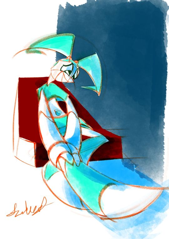
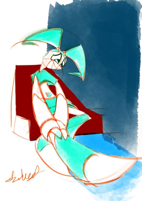
2024-01-07 Jenny holding leg in intense worry 😢
Art Timelapse
Thumbnail Timelapse
Art, plus a shadowed version & two thumbnails.(imo, I like the un-shadowed version better, but the shadowed one's starting to grow on me.🙂)
Based off a spur-of-the-moment thumbnail. In the middle of making it, I interpreted it as she’s not feeling “pain” per se (since she doesn’t have nerves); more like slight pressure that she’s cautious could burst.😔
*So sorry!🙇♀️Between getting ‘rona again & readjusting, I took a longer break than I intended. Guess this drawing of worry is kinda subconscious😳…Now that I've ruminated on it, it's okay🙂. This was a work-life balance lesson in managing forced breaks (like sickness).
MINI JOURNAL
This was another piece I was exhausted with. Another was the “Jenny slightly pulling back” one. While this “Jenny tending to leg” was over a week, it almost didn't feel any less concentrated with exhaustion.😔Anyways, in both cases, I didn't have too clear of an idea of what the final piece would look like (less so with this new one, as I knew I wanted to keep most of the lines red-orange & color Jenny aqua-green).
Social Media Strategy Tweak
Maybe next time, when in doubt, just keep it a sketch, with no colors or tones??? Tbh, I didnt go that route bc I didn’t want a piece that was too harsh on the eyes from being over a bright white background, but at least a softer white. …Now that I've written it out, it sounds like a dumb reason.😥
Or, was afraid that wasn’t finished enough for IG/social media? Maybe, especially since I wanted to have a red-orange pencil-sketch style in there. Maybe be a little more elaborate & have black cleaner ink lines & grey base tones (like your ‘quick traditionally-styled storyboard’ art style)?
Wait, I just remembered: could do sketches, but do that Natalie Nourigat “draw the pose 5 times” exercise.
The exception will be the Jenny Injured diptych (to still be colored but not further pushes gesture-wise (tbh, I again want to try to get done as quickly as possible)...plus, I'll just say, “something different.” 😉
Personal Preferences & Little Backburner
Imo, I like the shadow-less version. Jenny's legs contrast better with the background, and the colors are closer to what I ended up having in mind.
Yes, even the unconventional red-orange linework with cyan base colors😄. I’d actually been meaning to try that out on a piece; tbh, I just like red-orange/vermilion-colored pencil sketches.😊 I was doing another red-orange pencil, Krita sketch in October that I wanted to try that color scheme on, but the perspective needed retooling.😵💫
BTS
I actually had this, along with a thumbnail for a completely different piece, on the backburner. While I wanted to do the other one, I went with this more unclear-looking one. That way, I could finish it before I forgot what I had in mind.
After I was well into the finalized sketch, I found a 2nd, more pushed-gesture version of one of the thumbnails. That’s when I decided to try not to spend too much time on this piece; I wanted to re-do it with this pushed gesture.
Also, after a while of using one of my go-to Krita watercolor brushes from last time (WaterC Flat Decay TIlt), I got really mentally exhausted. Played around with doing the painting stage in Adobe Fresco, but despite Fresco’s watercolor brushes feeling far more comfortable, I wanted to keep this artwork quick. Therefore, I just continued the painting in Krita.
Oh, and instead of erasing the extra pencil lines, I covered most of them up with white.
Plus, that monitor profile changing fixed my colors after all!😊 I’ve gotten my solution written down somewhere. I’ll try to post it sometime.
SELF CRITIQUE
(-) Iffy depth on the navy-blue block of color
(-) Mouth kinda looks like she’s smiling???
(+) Good foreshortening on Jenny & the chair
(+) Great gesture/line-of-action into the hurt leg; decently faithful to thumbnail’s gesture. Improvement from that in “A Place of a Contemplating Robot”
Shadow-less version
(-) L hand [our POV] gets lost in the sticking-out leg
Shadow-ed version
(-) Sticking-out leg disappears into the ground
(-) L arm should have harder edges on the shadow
(+) L hand has hard-edged shadows
(-) Bent leg’s foot also has too soft of shadows
ART SUPPLIES
Hardware: Alienware x14, Huion Inspiroy H610PRO V2 pen tablet, & IMAGE Light Pad Stand A3
Software: Krita (art & timelapse), Autodesk Sketchbook (thumbnail & its timelapse)
Brushes:
(v 1.1) Krita Redux- Pencil (AFresco) - linework & white cover-ups. Less-aliased version of my custom brush
j) WaterC Flat Decay TIlt - hair, ”clothes”, belly button base colors, BG block, ground
(Dig.) Clean-Up Lines (Aliased) - Jenny white matte & chair base color
2 notes
·
View notes
Text
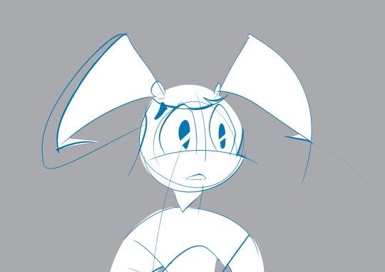
2023-11-26 Jenny mid-shot
(Sorry, coming up with good artwork titles doesn’t come naturally to me.😥)
From Nov. 26, 2023 1:16 - 2:20 pm
Bangs’s outline thicken: Nov 27. 2023 10:59 - 11:02 am
Right side of mouth finish: … 2:28 - 2:32 pm
Art Timelapse
Quick sketch of Jenny. Started off as me seeing if I could use brushes with pressure- & tilt-controlled size in the Freehand Vector Tool. It wasn't possible, but my scratches warmed me up to a new idea for a sketch.
As for the newer sketch, I went with trying to make her look like someone off-screen is about to tell her something that will be difficult for her to emotionally take.
MINI JOURNAL
As stiff as the pose was to me, I didn’t want to fiddle too much. Wanted to keep it quick, so stuck with only thickening the outline of her bangs & lining the other side of the mouth.
BEHIND THE SCENES
Drawing quality/draftsmanship: While still stiff-looking, I wanted the draftsmanship/drawing quality to be close to what would be a quick storyboard panel from me (at least, in Krita).
Matte method: Also, I did a test of doing a matte manually vs. doing it with Krita’s Colorize Mask.
Between the broad blocks of color & the cleaning up of each matte, the manual fill was the quickest.
Time length:
Manual fill: 8 minutes --- 2023-11-26 1:35pm - 1:42pm
Colorize Mask: 27 minutes --- 2023-11-26 1:43pm - 1:53pm & 2:00pm - 2:17pm
However, it wasn’t due to processing power (the most it would load was about 1 second, and that only happened about 3-5 times). One reason was related to the aforementioned drawing-quality/draftsmanship-related advantage for the manual fill: some of my drawing’s lines were not being closed. Another was a composition/posing advantage: a character in a simple pose like this, with not too many small gaps of negative space, was likely simple enough to manually matte in.
I’d still love to use the Colorize Mask as a close alternative to using (on all layers) the Contiguous Selection Tool, so I’ll likely restrict it to closed, large areas.
Iirc, around summer 2022, I was able to control [the gap-related parameters] of the Colorize Mask. However, I forgot how I did it; that was the last time I used it, since that was back when I didn’t make art weekly/bi-weekly.😥...In the end, it was the Colorize Mask Tool in the toolbar (the paintbrush surrounded by arrows).😅🤦♀️ Found it in this Colorize Mask tutorial.
SELF CRITIQUES
(+) Love how you were able to capture the intended subtle expression with the mouth
(-) Torso possibly too upright & stiff
(+) Linework starting to get closer to loose but readable
ART SUPPLIES
Hardware: Alienware x14 & Huion Inspiroy H610PRO V2 pen tablet
Software: Krita (art & timelapse)
Brushes: (Dig.) Clean-Up Lines (Aliased) - linework & manual fills. my custom brush.
Tools: Colorize Mask - white matte (Colorize Mask method)
#mlaatrfanart#robotgirl#scifi#expressionsketch#expressiondrawing#subtleexpression#subtlefacialexpression#shock#pain#disbelief#worry#anxious#dramaticmoment#sketch#loosesketch#storyboardartstyle#krita#kritasketch#colorizemask#kritacolorizemask#digitaltools
1 note
·
View note
Text
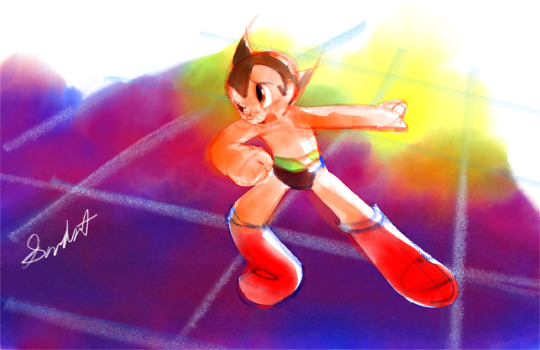
Critical moment Astro Boy
Art Timelapse
I’m late for Astro Boy’s 20th anniversary, but better late than never.🙂
This/last year, I revisited and continued the 2003 Astro Boy (English subbed btw), my initial favorite of the Astro Boy anime. So far, it still holds up! Love its “optimism in the midst of darkness” tone😊 (plus, love me some sci-fi🤓)!
The Franken episode is the kind of episode I’d dream to storyboard: (along with the overall series’ tone) really optimistic in the end, but dark, almost horrific moments to get to before then!
(The other two anime are great too, though. The 1980s anime is a close 2nd for me!🙂👍)
MINI JOURNAL
Started off as a quick doodle. Hoped to continue it as one, but I ended up being really tight with it.
Maybe I could do a quick Astro Boy doodle next time, now that I’ve started getting used to drawing him.
Also, just a general personal reflection: the arc of an Astro Boy 2003 episode is the kind of arc I’d hope to go through in my life: a tense, dark time, but ultimately more fortified optimism out of it.🥹 I’m currently in more of a dark time, but sense some good brightness ahead.🙏
ART SUPPLIES
Hardware: iPad mini 5 & Apple Pencil (1st gen)
Software: Fresco
-Watercolor wash flat
-Watercolor round detail (eyes)
-Pencil [Fresco default brush] (linework)
#astro boy#digital watercolor#20th anniversary#astro boy 2003#fanart#adobe fresco#digital pencil#tetsuwan atom
15 notes
·
View notes
Text
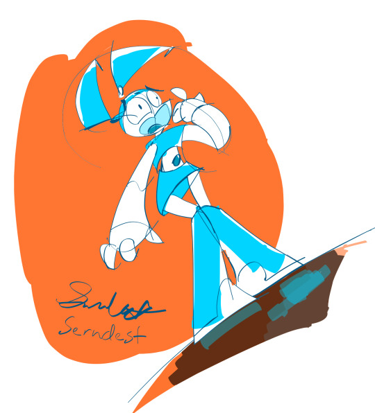
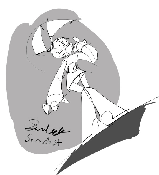
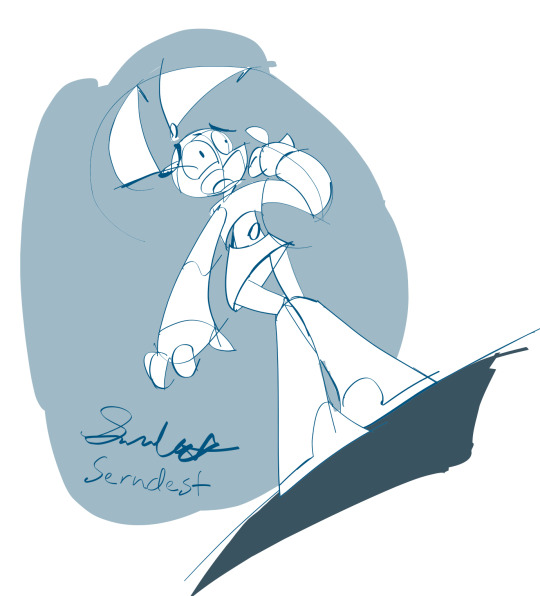
Vector redraws (full-color, greyscale, & blue shades): Jenny Anxious
Art Timelapse
From throughout the past 2 weeks
Vector redraws of my Jenny Anxious fanart
One of the first published times of me doing a sketch-over/draw-over/tracing of my own art.😲
MINI JOURNAL
Wanted it to be quick & low-stakes. Actually didn't intend to publish these artworks. Still wanted to post at least the art timelapse (on my YouTube at the end of the thread).
Tbh, was really afraid of posting the actual art.😰 Afraid could be like that commercialization Andy Warhol satirizes (with his color variations).
BEHIND THE SCENES
Purposes:
Practice of a different-looking medium (One reason why I was ok with "tracing" it—it’s more a test of a medium *look* rather than a test of my ideas/a completely new medium, the latter demoed with my "Jenny expression draws" series. https://twitter.com/Serndests_Art/status/1723521485976039498)
Possible full-color version of my sketchy illustration style. Maybe even what my storyboarding style could be (with the greyscale vector version).
Process: Re-drew the vector sketch-over…3 times😳
-On first 2 times, went with my usual 7-9px Flat vector brush (with Size controlled by Tilt), but didn't like how coloring book-like they both looked.
-Then, before 3rd time, after looking at some professional storyboard artist work, I thought it looked like they started their sketches with a small-sized brush instead of a larger one like I do .🤔
(--My latter-mentioned habit is a carry-over from me personally preferring brushes with darkness variation & size mostly controlled by tilt, like pencils.)
-On the 3rd time, I re-drew it starting off with a small brush (3-4px) & adding some thicker lines to show distance/depth & dimensionality (...which ended up not being as many thicker lines as I expected, with me wanting to avoid coloring-book-like linework😳).
SELF CRITIQUES
(-) On the character matte layer & when the linework is set as a reference, don't use bucket-fill on the linework. Produces a white halo effect
-(*) make the character matte layer transparent, to more easily check
(-) bc the L side of her mouth is elliptical instead of more circular, looks more like an awkward smile
(-) forgot to erase the light blue over L pigtail screw
(-) fine w/ boot reflection as single, no-contact curve instead of one line right below L boot & partial curve below R boot
ART SUPPLIES
Hardware: iPad mini 5 & Apple Pencil (1st gen)
Software: Adobe Fresco (art & timelapse)
-Brushes: My Flat [my tweaked Flat vector brush]
–Parameters: 50% Roundness, 0 degree Angle, Taper Mode: Length (0% on Begin & End Taper), Pressure dynamics (100%), Velocity dynamics (-25%), & Tilt & rotation
1 note
·
View note
Text
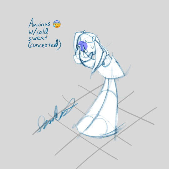
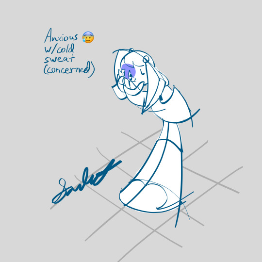
[RASTER & VECTOR] Jenny expression draws: anxious w/ cold sweat (concerned)
Art Timelapse
Head Thumbnail Timelapse
Raster pencil & vector versions (this time, with a more disciplined application of the vector brushes😳).
Finished Friday Nov. 10.
Getting more into character expressions/acting.💪😁Intended to look like she’s thinking/saying "Don't tell me you forgot [this extremely important thing]?!”
Also, change of plans: I'll post each different expression individually, instead of all at once or even 2 different expressions at a time.
MINI JOURNAL
Started around Tues or Wed after the Jenny Anxious art, worked on about weekly up until the week of July 28. Then, started again in August.
Sorry for taking so long on these sketches. I was trying to get the facial expressions & body gestures just right, since I’ve gotten really interested in character acting.
Another reason: CW // body condition mention
Health issue. This time, ingrown hair on left armpit.
END body condition mention
Not dominant hand, but I use it heavily for my digital eraser brush (I hold down my left thumb for the “Erase with brush” tool). 1 possible cause of the health condition: generally not having this rigorous of drawing (as I’ve mentioned in the description of a Spring 2021 2D animation cat gesture drawing)
ART SUPPLIES
Software: Adobe Fresco
Brushes:
Sketch: Pencil [default Adobe Fresco pencil brush]
Re-sketch & tone: My Flat [my tweaked version of Fresco’s Flat vector brush]
#character acting#emoji redraw#expressions#character expressions#sketches#mlaatr fanart#jenny xj9#nickelodeon#adobe fresco#vector art#digital pencil#digital sketching
1 note
·
View note
Text
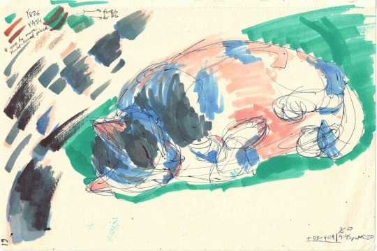
(Old Art 2021-03-27) Colored Gesture Drawing- Sirius Kitty Sleeping
Another gesture drawing of Sirius Kitty for my Spring 2021 intro 2D animation class.
🛑Kitty doesn’t have bald spots/burns; that’s unfinished coloring😳. I tried to quickly finish, but Sirius Kitty moved before then.😅
Also, color and markers weren’t required, but I still wanted to play around with my newly-bought markers. (Also, I bought them for that Spring 2021 class to begin with bc 1) to get free Amazon shipping😅 and 2) to help me with doing original character sketches/concepts (that class was part of what got me into traditional art supplies).
ART SUPPLIES
Linework: Uniball Signo DX (Blue-Black, 0.5mm)
Colors: Caliart Alcohol brush & chisel tip markers (from 51 pack)
-R000 (Skin White): warm shadows (undertone)
-R301 (Blush): belly and inner ear
-B003 (Sky Blue): blue highlights/diffused light (undertone)
-CGII04 (Cool Grey II 4): black fur midtone
-CGII07 (Cool Grey II 7): black fur darker midtone
-S (Black): [attempted] black fur
#old art#gesture drawing#traditional sketch#cat sketch#black cat#sleeping cat#fur bean#inktober#pen sketch#marker sketch
0 notes
Text
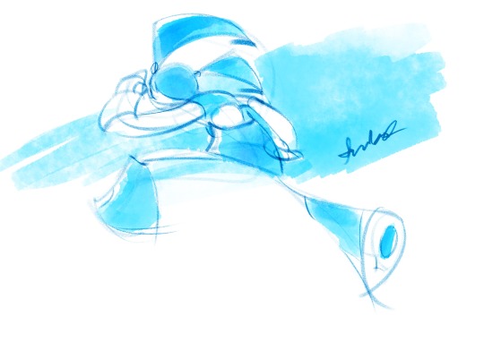
Jenny running sketch (Krita brush test)
Art Timelapse
Sept. 30, 2023 - 5:17-8:29pm (Saturated & signed Oct. 1, 2023 ~2:46pm)
Spur-of-the-moment Jenny sketch from last night, while trying out my Krita recreation of Adobe Fresco's default pencil brush
Ko-fi link: [v 1.0] Krita Redux- Pencil (AFresco) - my free (but Krita-only) brush & importing directions
(Tbh, free bc still have significant kinks to work out imo.🤷♀️Also, I don't feel like recreating the brush myself into other file formats.😂)
MINI REFLECTION
Felt really bad about how disjointed the gestures of my figure/gesture drawings have been near the end of this week. Also, with me wanting to *really* test my Adobe Fresco Pencil recreation for my loose sketches and me getting another Jenny sketch idea, I jumped into it.
Really got loose here, even leaving her pretty off-model imo. Left it, bc I mainly wanted to test my brush with a(nother) sketch. Also, starting to get far looser. Still a little stiff & proportions could be better, but some de-rusting. (Better than earlier. I did 2 other test sketches, as elaborations of some doodles. They’re too stiff-looking. I’ve just left them on my NG sketchbook forum & dA Sta.sh)
My fiddling here was far less than in the “Jenny slightly pulling back” sketch. Still fiddled on her belly button too much. On the other hand, kinda worth it; less intense highlight on it.
BEHIND THE SCENES
Brushes: Lot of trial and error. Far from exact though. Drawing a tilted, perpendicular stroke seeps it over, and I haven’t been able to get the brush to taper just like Fresco’s Pencil brush, but pretty good replication.
Color management: think I fixed my issue! Oh, the issue was that my exported images were more desaturated than in the Krita documents. Looks like exports aren’t desaturated—my laptop’s display oversaturated my document! I changed my display's Krita color profiles to match their build-in profiles to fix that. After that, I tried to compensate by adding a Filter Layer to bump up the saturation by 22-33. Not quite accurate values, but more accurate saturation!
Performance: Oh, and did with Krita’s A5 @ 300dpi document dimension. No lag. (I wonder if it could handle 11x14 @ 300dpi.🤔 I hope so. )
ART SUPPLIES
Hardware: Alienware x14, Huion Inspiroy H610PRO V2 pen tablet, & [stand]
Software: Krita
Brushes:
(Redux) Pencil (AFresco) - linework. My custom brush
j) WaterC Flat Decay TIlt - pigtail shadows; crop top, skirt, boots, & belly button base colors; BG wash.
j) WaterC Spread (Hue Shift) - pigtails and main hair base colors, skirt & boots shadows. My tweaked brush (added hue controlled by pressure).
#fanart#mlaatr#mlaatr fanart#jenny xj9#nickelodeon#robot girl#digital brushes#playing around with brushes#testing out digital brushes#loose sketch#gesture#digital watercolor#digital pencil#digital sketches#krita#krita sketch#krita painting#line and wash#free brushes#krita brushes
8 notes
·
View notes
Text
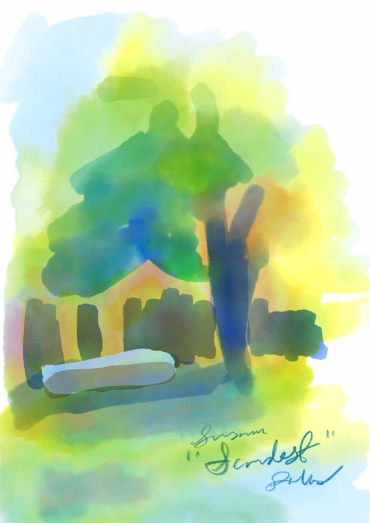
5:38pm Backyard Landscape
From August 24, 2021. A spur-of-the-moment watercolor landscape done while looking out my bedroom window. So may or may not count as plein air painting.😅
Unfortunately, only a timelapse of my recent tweak, but not the main majority.😔
BEHIND THE SCENES
The lighting and overall setting looked so cool that I wanted to paint it. However (and I guess obviously), I don't think it was a weekly background drawing for my Spring 2021 intro 2D animation class. Iirc, I just went in quickly trying to get all the colors before sunset, prob why I just painted instead of my usual sketching (especially since I’m from more of a drawing background).
Fun fact: I ended up showing this In a March 2023 pop-up group exhibition, with the rest of my class. It was part of my instructor’s gallery tech course. I didn't do much physical installation (just used a portrait-oriented TV monitor, installed by a volunteer gallery technician). However, I was…overly detailed about displaying my color just right, so I spent a long time on my color correction.😳 In a way, it still almost felt like I was painting it. Almost actually *not* as straightforward had it been a physical painting. Kinda felt like a blurred line between photo editing and painting.
MINI JOURNAL (ART EXHIBITION)
During the exhibition, I really wanted to socialize more, but I ended up nervously pacing, looking out the window, and walking out to the parking lot the whole time (made me look like a creep, to be honest😨).
Not from being in public though; I'd gotten less shy since then (possible story for another time). But from worry that my parents, uncle, & aunt may have gotten lost or into an accident on the way (since they hadn’t been to this gallery before).😟 Turns out that my parents were having dinner and my uncle didn’t leave work until about half an hour into the exhibition.😮💨
In retrospect, probably should've socialized more instead, and have them call/text me if they were running late or needed help finding a parking place.😔 That way, I don’t miss out on getting to know others.😊
ART SUPPLIES
Hardware: iPad mini 5 & Apple Pencil 1st gen
Software: Adobe Fresco
Brushes:
Watercolor wash
Watercolor flat (Tree trunk, blue tree shadows, fence, gutter piece)
#old art#pop up exhibition#art exhibitions#artist experiences#small town artscenes#digital watercolor#digital art#adobe fresco#adobe fresco watercolor#painting#fine art#spur of the moment
0 notes
Text
WIPS 2023-09-14
WIPs of a few things I'm working on.
Jenny expression drawings


The (mostly) full-body expressions I mentioned about 2 months ago (Top-left date says Sunday bc that's when I last screencapped it, to prep a WIP in case I couldn’t finish any new art before then. I didn't re-screencap it bc I didn't edit the art doc since then...and it would've been too tedious, tbh😥)
Jenny injured 😢


A sketch I built off of a traditional doodle I did, along with a low angle version of that sketch (I’ll be posting both angles, btw😉)
Hank Murray model sheet
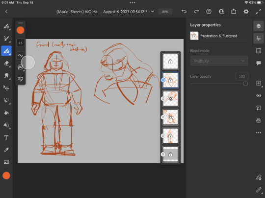


A model sheet of Hank Murray to help with my fan animatic clip of Adventures in Odyssey’s episode "Hold Up!" (Also, yes, I'm an AiO fan.😊)
#wip#work in progress#artistic process#mlaatr#jenny xj9#jenny wakeman#nickelodeon#aio#adventuresinodyssey#audio drama#fan storyboard#fan animatic#character expression#character expressions#character expression studies#full body expression#character design#character model sheet#digital art#adobe fresco
1 note
·
View note
Text
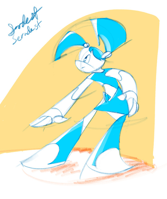
Jenny slightly pulling back
(SEIZURE WARNING) Art timelapse
A tradigital process here, starting with a traditionally-done warm-up sketch from last Sunday. Liked it enough to flesh out.
MINI JOURNAL
Ebbing and flowing of feeling loose & feeling stiffened up when I made a mistake. Also, bit indecisive on her eyes: stick with the original "taken aback" attitude or go with a more innocent attitude? Tbh, this is probably one of my 1st newly made "full-on art account era" artworks I consider "bad."😥Maybe it could grow on me, or I can improve on my flaws here...🤔 Even if it's "bad," I actually still want to post "bad" stuff now and then; you know, earnestness about my progress.😊
TECHNIQUES
Experimenting with a mix of hard-round coloring & pencil shading. Even more mixed are my feelings on the rendering.😥 But, in the end, love how I improved on her left hand (also right hand, from our POV) and the punch of color the pencil has over her blue areas (since I set my pencil layers to "Multiply" instead of just "Normal"), and like the dimensionality of the background shadows and color block!
ART SUPPLIES:
Hardware: iPad mini 5 & Apple Pencil 1st gen
Software: Adobe Fresco (art & timelapse)
Brushes:
Pencil (default Fresco brush) (linework & shadows)
Hard round (Size jitter’s Control set to "True tilt," Blend mode set to “Dissolve”) (highlights Jenny's blue, and BG block)
Hard round opacity (Size jitter’s Control set to "True tilt") (softer highlights/diffused light)
#mlaatr#mlaatrfanart#nickelodeon#sketch#artiststruggles#adobefresco#digitalpencilsketch#tradigitital#sketchingwarmup#drawingwarmup
3 notes
·
View notes
Text
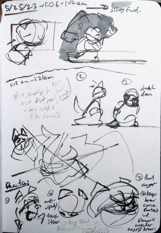
Thumbnails/Brainstorming 1: "3 Cats and a Mouse" storyboard re-do
From May 25, 2023
A picture of some thumbnails/brainstorming for my “3 Cats and a Mouse” storyboard re-do.
Sorry that I posted this so long afterwards. Had some college degree planning stuff to begin to tackle. Also, sorry that some of the text in brackets have question marks. Hard for me to make out my messy handwriting at times.😓
NOTE TRANSCRIPTION
~1:06 - 1:12am
—> slides [forward]
[over grey-toned Damon]
1:12am - 1:21am
(*) Or, simplify to just 1st pose, [and?] anim. mouth
[Tristan] bug eyed & slide down??
(2) [Tristan’s head & tail perk up, startled]
(3) shrink down
[large drawing of Tristan looking fearfully at an angered, impatient Damon— all X-ed out. Rejected shot.]
Reaction:
(1) [shock]
(2) anticipatory transition
(3) final anger
---(*) keepbrow curve. Contrast w/ Damon’s angular angry brow.
---(*) try “Clint Eastwood”-like, [w/] [mad mouth concentrated?]
ART SUPPLIES
Linework: Tombow Fudenosuke (Hard tip)
Grey tones:
Caliart Alcohol brush & chisel tip marker - CGII04 (Cool Grey II 4, from 51 pack) [Damon grey tone]
Pentel 2mm Colored Lead (Black) [Bottom of Tristan’s left shoe]
Sketchbook: Pentalic Traveler Artist Sketchbook (Sketch Paper, 4” x 6”)
#storyboardredo#storyboarding#storyboarding_process#storyboardthumbnails#thumbnailsketches#storyboardingforanimation#storyboardartist#storyboardartists#storyboardartistsoninstagram#storytelling#visualstorytelling#originalcharacters#originalcharacter#cats#cartooncat#pendrawing#fudependrawing#tombowfudenosuke#animatedshort
2 notes
·
View notes
Text
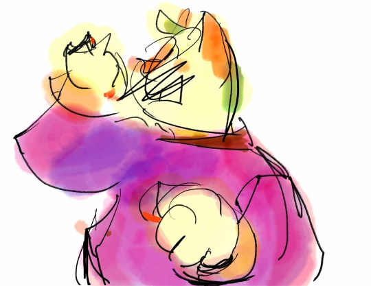
(Old Art) Happy loose drawing
Art Timelapse
From November 21, 2021: "Happy loose draw"
A quick late night sketch of my cat OC Felicity (at the time named "Happy").
MINI JOURNAL (RETROSPECTIVE)
Suddenly got an image in my head of a sketch idea. Pretty late, but wanna get it out before i forget this image. Also, want to vaguely make it look Bruce Day-like (FYI: the 1987-1990 album cover artist for the Adventures in Odyssey audio dramas).
BEHIND THE SCENES: STUDENT SHORT CHARACTER DEV HABIT & ORIGIN OF FELICITY AND DAMON
Since she was a character in my at-the-time upcoming final short for my Intro 2D animation class, this was to help me get used to drawing my characters. Felicity wasn't too difficult, since I'd iterated on her for about 1 year. Damon was similar (he, along with Felicity, were branches off of a cat character in a "textured brush" assignment from my fall 2020 Intro to Digital Art class.
ART SUPPLIES
Hardware: iPad mini 5 & Apple Pencil 1st gen
Software: Adobe Fresco [through an Adobe Enterprise account, with my college account] (art & timelapse)
Brushes used:
Lineart: Natural Inker
Colors:
Watercolor round detail (bangs, shirt collar, neck)
Watercolor wash flat (ears, rest of head hair)
Watercolor basic round (right cuff)
Soft pastel (paw pads)
Watercolor wash soft (all other colors)
#originalcharacter#cat#catcharacter#studentshortfilm#characterdevelopment#characterdesign#adobefrescowatercolour#latenightsketch#timelapsevideo#arttimelapsevideo#timelapseart
0 notes
Text
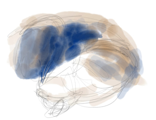
2021-02-22 Animal Gesture Drawing 8: Sirius black curled up
Another old gesture drawing from my Spring 2021 Introductory 2D animation class, this time with color. I’m not sure if we were allowed to add color, but I still added it anyways, to see which color mix would get a black that matched Sirius’s fur.
MINI JOURNAL (RETROACTIVE)
Decided to sketch my cat while he was sleeping on my bed. At one point, he twitched his right ear while purring!😊After a while, he either changed his sleeping position or he got up, so I stopped painting.
Iirc, I had my curtain open, with some morning-early noon sunlight coming in.
SELF-CRITIQUE
- Sloppy sketch (like the left sketch of the ‘Cream Heroes kitty paw shake’ gesture drawing)
+ Color somewhat mitigates the sketch sloppiness
SELF-REFLECTION
+ Decent solutions since then:
–+ Breaking down w/ basic shapes
–+ Having minimal & ‘Japanese cuneiform’-like linework
–+ Cleaning up “wrong decision” lines right after you sketch them
#gesture drawing#cat sketch#cats#black cat#sleeping cat#drawing from life#animal drawing#watercolor gesture drawing#pencil gesture drawing#adobe fresco#adobe fresco watercolor#digital watercolor#digital painting#digital sketch#line and wash
1 note
·
View note
Text
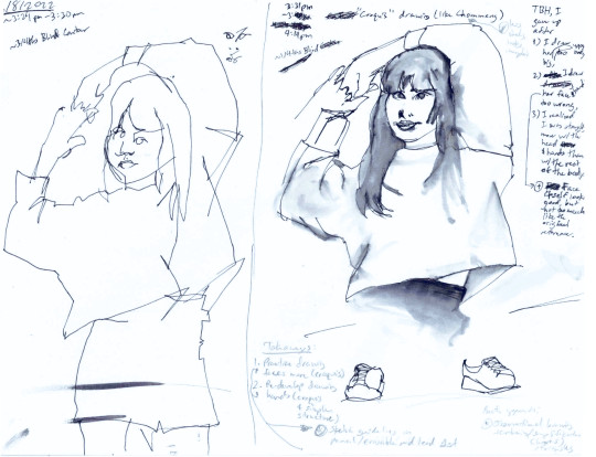
2022-06-08 Girl drawing- ~3/4ths Blind Contour vs Contour
2022-06-08 Girl drawing- Mostly Blind Contour vs Contour
From June 8, 2022. a mostly blind contour drawing & mostly straight-up contour drawing of this photo from chommang_drawings‘s “Sketching Reference” Pinterest board https://www.pinterest.co.kr/pin/569986896599083467/ . (rest of his board, if you’re interested: https://www.pinterest.co.kr/chommang_drawing/sketching-reference_chommang/ )
LEFT: ~3/4ths Blind Contour. ~3:24-3:30pm
RIGHT: ~1/4ths Blind Contour - “Croquis” drawing (like Chommang). 3:31-4:14pm
MINI JOURNAL
[On the contour drawing] TBH, I gave up after
I drew her upper body too big,
I drew her face & hands too wrong,
+ Face itself looks good, but not too much like the original reference.
I realized I was struggle more w/ the head & hands than w/ the rest of the body.
SELF CRITIQUES:
+ 1/4ths blind contour: you capture the facial features pretty accurately; pretty good observational skills there
- the position of each feature needs work
Practice drawing faces more (croquis)
Re-develop drawing hands (croquis & simple structure)
**Subpoint to 1&2: Sketch guidelines in pencil/erasable lead 1st
*Additional approach: observational learning & cartooning/simplification (boxes)/triangles
ART SUPPLIES
Ink: Zebra V-301 Fountain Pen (+ included ink cartridge)
Wash: Pentel Aquash Waterbrush (Flat) [now Pentel Vistage Waterbrush (Flat)] & tap water
Notes: Faber Castell TK 9400 Clutch Pencil (2 mm) & Uni Mitsubishi Lead Holder Refill (2 mm - F)
#chommang#drawing from photo#drawing from photo reference#drawing from observation#observational drawing#blind contour#blind contour drawing#contour drawing#girl drawing#pen drawing#pen and wash#ink wash#fountain pen#zebra pen#zebra v301#pentel#pentel aquash#pentel aquash flat#pentel vistage#faber castell#clutch pencil#lead holder#2mm lead holder#uni mitsubishi#uni mitsubishi pencil
1 note
·
View note
Text
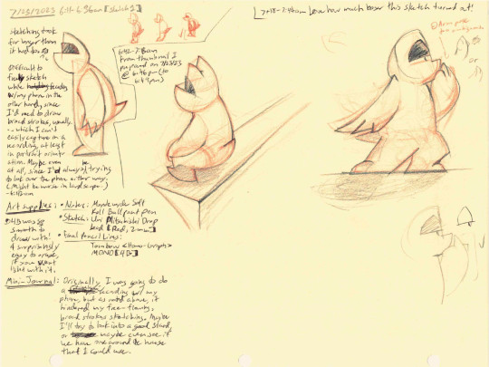


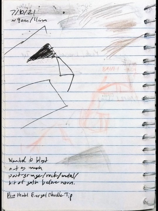
2023-07-25 Graphical cat char red & graphite sketches
Some red lead & pencil sketches of my geometric/graphical cat character, plus older sketches. Last Tuesday, I did this as a way to keep myself awake while trying to readjust my sleeping pattern.🥱
Now, for my notes (both transcriptions of my stream of consciousness, tired writing and edits)
BEHIND-THE-SCENES: TROUBLE W/ TIMELAPSES FOR TRADITIONAL MEDIA
7/25/2023 6:11-6:36am {sketch 1}
Sketching took far longer than it had to.😥
Difficult to freely sketch while recording w/ my phone in the other hand, since I’d need to draw broad strokes, usually…which I can’t easily capture in a recording, at least in portrait orientation. Maybe even at all, since I’d always be trying to look over the phone either way. (Might be worse in landscape.)
- 6:42am
6:42-7:18am From thumbnail I prepared on 7/23/23 @ 6:46pm (to 6:49pm) [also attached]
MINI JOURNAL
Originally, I was going to do a timelapse recording w/ my phone, but as noted above, it hindered my free-flowing, broad strokes sketching. Maybe I’ll try to look into a good stand, or maybe even see if we have one around the house that I could use.
SELF-CRITIQUE
7:18-7:44am [far right sketch]
+ Love how much looser this sketch turned out!
- Arm pose too ambiguous
* [3 alternative arm sketches: 2 below the negative note and 1 upper-body one below the entire sketch]
* Also, 1 alternative, horizontally-squished eyebrow & eye sketch next to the latter sketch
ART SUPPLIES
Notes: Monteverde Soft Roll Ballpoint Pen [refill]
Sketch: Uni Mitsubishi [Lead Holder Refill] (2 mm - Red)
Final Pencil Lines: Tombow <Homo-Graph> MONO [4B]
*4B was so smooth to draw with! & surprisingly easy to erase, if you went light with it.
Paper: Hammermill Colored Paper, 20 lb Ivory Printer Paper, 8.5x11”
#sketches#original art#original artwork#original character#original character art#cat character#cat sketch#big eyebrows#geometric characters#shape language#stay awake#traditional sketch#pencil and paper#uni mitsubishi pencil#2mm lead holder#clutch pencil#red lead#colored lead#colored lead sketch#graphite pencil#graphite pencil sketch#tombow pencil#tombow pencils#tombow homograph mono#4b pencil#hammermill paper#toned paper#self criticism#art critique
2 notes
·
View notes
Text
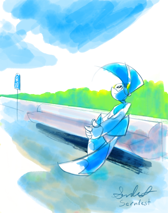
A Place of a Contemplating Robot
I went with something more low-key. Jenny deserves some quiet, calm time now and then.😊(Also, a little reference in the title, and not just to the og show😉)
Really wanted to get another loose illustration out in time for the 20th anniversary. Plus, I’ve been meaning to do a calm piece. Between Jenny’s world-saving duty, life drama, robot-related issues, & people’s pettiness (sometimes including her own😓), I thought that she could use time to herself. That 3rd reason kinda sounds like sending a kid off to timeout for misbehavior, but hey, there might be stress behind that pettiness.🤷♀️ She does have the weight of the world on her shoulders. That, or it might be timeout-like after all😆 where she gets alone time to directly face her mental problems, with no physical problems to distract her.🤔
Or more interesting: needing to handle her mental problem in order to handle her physical one.🤯
Some might think calmer moments are boring, but I consider it a welcomed, necessary breath of fresh air, especially as someone who had a loud, tense upbringing.
Mini Journal
Ended up needing to keep my iPad charging the whole time; larger resolution (11x14” @ 300dpi) *and* Fresco’s live watercolor brushes drained it more quickly (~20% in 20 minutes). Even then, still a lot of crashes once I finished the sidewalk and bench. Now, only rarely do at that resolution. Watercolor-styled pieces will likely be 9x12” @ 300dpi, max.
Far more painful painting process in a full space. In a way, more directly an urban-sketching styled piece because now, it’s in a physical place instead of a void w/ colors! Similar to before, I mitigated some of the difficulty by using an analogous color scheme. This time, I really struggled with working w/ whitespace, like in Teoh Yi Chie’s or Liz Steel’s urban sketching styles.
What helped may have been a style I saw in this colored pencil Liz Steel piece https://www.lizsteel.com/wp-content/uploads/2022/04/LizSteel-159-1104CafeFeohPacHwy.jpg , where sidewalk & road are white, & the only blocks of color are for cast shadows.
Self-Reference
I got into the pose myself, mainly to fix her bent leg & folded hands. In the end, moved the bend leg up, just showed her right hands’ fingers & her left hand’s index finger, & unbent her other leg. Tried to focus on the feeling & gesture of the pose, rather than follow the pose exactly to a T. Mlaatr is just about the perfect style for that, being a gestural cartoon.
Concurrent Illustrating & Post/Note-Taking
I illustrated & prepped my post at same time (...at least until I got to painting the sidewalk😥). In a way, it’s kinda good I didn’t do it this way before, since I didn't have set categories (like Behind-the scenes or Mini Journal) yet. Nonetheless, I still tried to be as organized as possible by having a preliminary & final version of the post on a Google Doc (especially since ELA has been my historical weak area😥).
Behind-the-Scenes: Story, Color Scheme, & Color Application Influences.
Tone & situation/implied story: the 1998 Yokohama Shopping Log OVA, with a robot (in YSL's case, a more human-like android) just hanging out and living life. Maybe even resolving some past problems or relationships.
Color scheme & watercolor style:
grass: how he colored the tree leaves here, by letting the colors mix on the page instead of mixing them himself. https://twitter.com/ParkaBlogs/status/1682275817668362240?s=20
sidewalk: after a lot of struggling, went with Liz Steel’s colored pencil technique: layering lots of colors, especially in shadow areas https://www.lizsteel.com/switching-to-coloured-pencils/ , along with, as noted w/ the first colored pencil sketch I listed, having the rest of the roads/sidewalks be white—controlling whitespace
Art Supplies
Hardware: iPad mini 5th gen & Apple pencil 1st gen
Software: Adobe Fresco
Brushes:
Lineart: Pencil [default Adobe Fresco brush]
Color:
Watercolor wash flat (grass, bench, bench shadow, sidewalk, Jenny clothes & hair)
Watercolor wash soft (sky)
Watercolor basic round (Jenny shadows)
Block stain (bench shadow 2nd pass)
#fanart#20yearsofmlaatr#mlaatr#jenny wakeman#jenny xj9#alone time#alone with my thoughts#adobe fresco#digital watercolor#adobe fresco drawing#digital drawing#digital art#line and wash#ipad mini#ipad art#white space#robot girl#robots#robot art#scifi#cartoon#nickelodeon
5 notes
·
View notes
Text
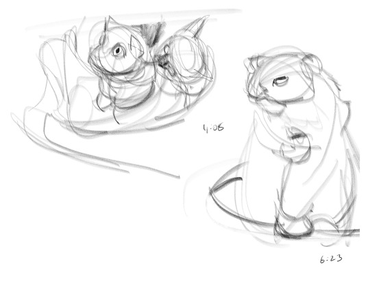
Gesture Drawings 10 "Cream Heroes Paw Shake"
From March 1, 2021
Couple of gesture drawings of Lulu, Momo, and Chuchu in the Claire Luvcat video, "My Cats Learned to Shake and Became EVEN Cuter! (ENG SUB)" https://www.youtube.com/watch?v=r33IPs7tXmg
*Timestamps indicate place in the original video.
Behind-the-Scenes: Original Assignment & A Little of My Drawing and Career History
I originally drew this for a traditionally-focused introductory 2D animation class (in Spring 2021). It was one of two gesture drawings in a weekly drawing assignment where we fill six 8.5”x11” pages with drawings—two in the three categories: 1. gesture drawings, 2. still lifes and abstract drawings, and 3. background/scenery sketches.
I thought it was pretty rigorous, especially since up until 2020~2021, drawing was more of a hobby, while computer programming was my intended career from 2016 to 2019 (story for a more relevant time).
Self-Critiques
+ Pretty good build-up of pencil lines
+ Great shape language for Chuchu, especially her head
- Come up w/ more fitting shape language for Lulu & Momo
- Mostly unreadable Momo head; not too readable as a cat head
#ipad mini#ipad art#cats#claire luvcat#cream heroes#cream heroes chuchu#cream heroes lulu#cream heroes momo#cats of korea#korean cats#gesture drawing#gesture drawings#sketching from video#sketch#digital pencil sketch#adobe fresco#adobe fresco sketch#digital drawing#digital art#Paw Shake#Training#Smart Cats
4 notes
·
View notes