#vertically instead of horizontally
Explore tagged Tumblr posts
Text
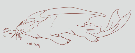
smooth light fury but it's because she's aquatic not because Girl Dragon. she's got broader paws and flatter paws to swim better, and catfish whiskers just for funsies
#OH FORGOT TO POST THIS ALSO#httyd#light fury#how to train your dragon#light fury redesign#you can't see it very well because her back is arched but she's pretty dense. got fat like a seal#also imagine her with seal patterns as well#anyway. back to your regularly scheduled pokemons after this 😊👍#also considered giving her vertical fins on her tail like fish. instead of horizontal. but then i forgot to do that lol
252 notes
·
View notes
Note
Dark protective Hermes will forever be my favorite and I love the way you draw him and Luke!
Like, it’s so interesting because, Hermes is a god, most importantly a trickster. It wouldn’t be hard for him to just take Luke away and keep him from danger.
Even if it does require him to…break, a few bones in the process so Luke doesn’t leave
YES ❗❗❗❗ And thank you hehe dark!Hermes is also one of my favorites 🥰🥰 I adore the idea of Hermes taking advantage of his domains (boundaries, travel, etc.) to manipulate the world around Luke.
And since you mentioned trickery, I couldn't help but imagine Hermes hearing sixteen—almost seventeen, oh, his boy was growing so fast—Luke's fervent prayers pleading with his father to give him a quest, please, dad, let me prove myself—
The sweet plea dances across the empty space inside of him, where a mortal's heart sits and a black hole in a god's lies.
Humor the boy, a voice from long ago within him whispers. The past years have been oh, so droll as time marched on as it did, interspersed only with fleeting romance and occasional sex. Nothing has stirred his interest and attention like his little Luke.
His Luke, adorable Luke, who ran away from May's home, unconsciously manipulating Hermes' domains to his benefit as easy as breathing. The way he took care of Hermes' other sons and those under the protection of his cabin only made Hermes want to spend his days watching him all the more.
Every good boy deserves a treat.
Hermes gives Luke a quest to fetch a Golden Apple at the Garden of Hesperides. Luke's offering of thanks to him was delicious despite the sour aftertaste of mild disappointment.
Hermes hums to himself. Should he give them a bit of a challenge?
The power beneath Hermes' fingertips sang. He isn't sure if it was because he issued this quest himself, but he could feel the chains that bound him to the limitations of godly interference in the mortal realm loosen. As the god known for his wit and cunning, Hermes slips away from the loosened chains with ease.
The freedom makes him wonder just how far he could go before Fate pulls him back. His eyes trace Luke's movements, the way he slid past a monster before stabbing it in the back before a charming smile of triumph stretches across his face. Just how much can he slip from the eyes of Fate?
Hermes follows them in amusement. From the smooth, easy path that they started with, Hermes began nudging them in different directions. He turned short roads into winding paths, open spaces into dead ends. Hermes chuckles to himself when Luke's eyebrows furrowed in confusion and annoyance.
An ancient, buried piece of him claws at him as he watches the way Luke's own questmates begin to question his judgement and sense of direction—a direct insult masked as concern. He watches as Luke bristles and barely holds himself back from snapping at them.
They were all obviously tired and high-strung after the several detours Hermes forced them to take. It made the quest more exciting.
Less exciting, however, was the wound that Ladon etched into his son's face.
Hermes hears Luke's heavy breathing and gasps of pain before he sees him.
He walks casually past the corpses of Luke's questmates; his poor boy uselessly dragged them away from the Garden of Hesperides. If he hadn't he wouldn't gotten as injured as he did.
A glint of gold makes him look down. Hermes ignores it, kicking away the shiny apple that had rolled against his shoe.
"Who's there?" Luke calls out, his hands pressed against his face in an effort to stem the gush of blood pouring from his fresh wound.
Hermes chuckles. "And what do you think you can do in that state? Silly boy, you can't even see."
A stuttered breath. "...Hermes?"
Hermes clicks his tongue.
"...dad."
Hermes smiles. "Good boy," He places his palm against Luke's cheek, ignoring his son's flinch. Poor Luke, he can't even open his eyes. "Now, what do we say we take you away from here?"
He observes the way Luke pauses, the way his head twitches towards the direction of his dead questmates. Hm, could this be a minor ability from Hermes?
"You'll take us back to Camp Half-blood?"
Hermes doesn't have to think about it.
"No. You and I aren't going back to Camp Half-blood."
#au where instead of slashing vertically across luke's face ladon claws his face horizontally#aka a blind luke au#with a bit of an unhinged hermes as a treat :D#hermes#luke castellan#percy jackon and the olympians#pjo#pjo au#tin writes#my ask hole
41 notes
·
View notes
Text
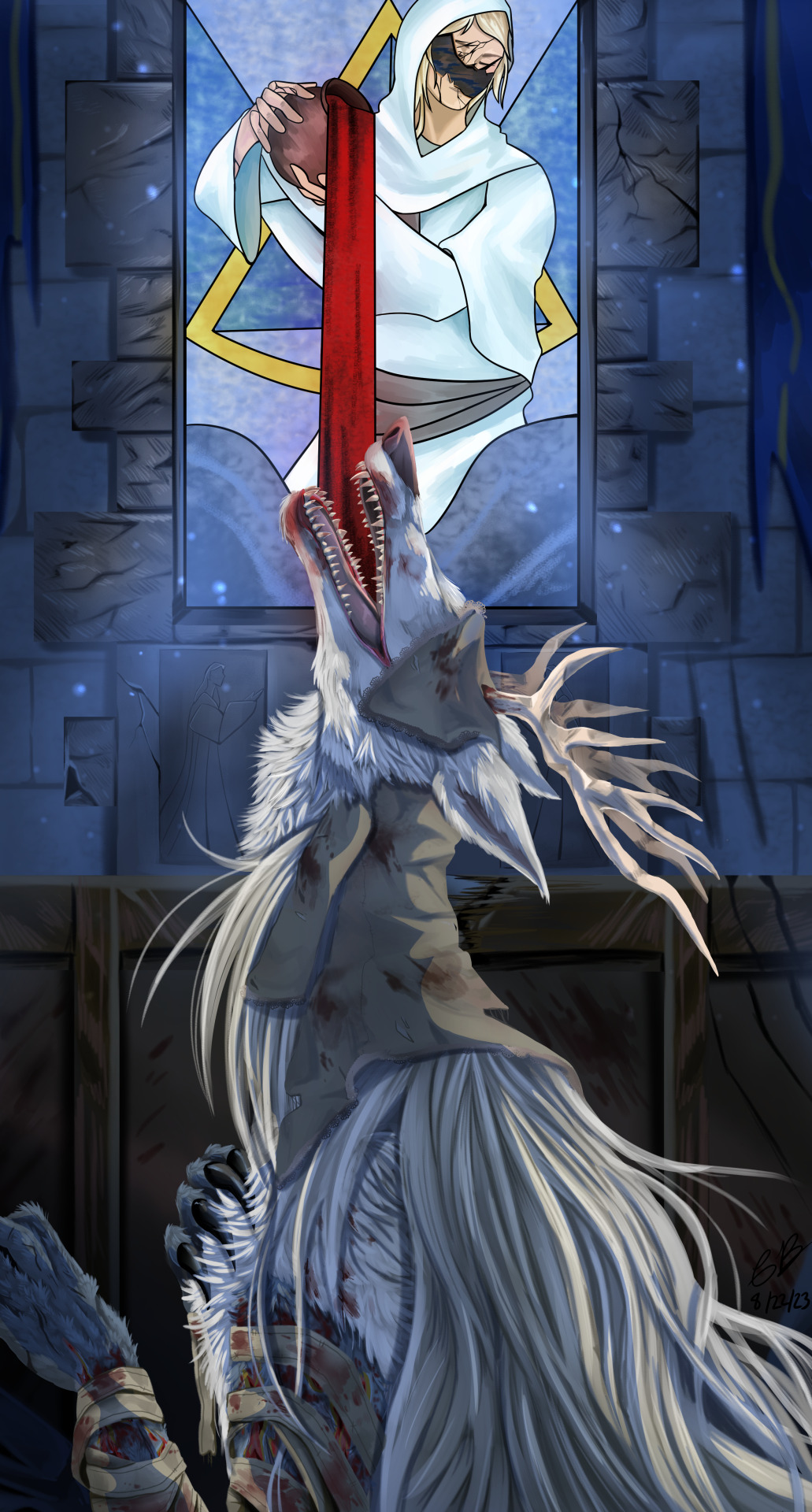
Vicar Amelia my beloved <3
#bloodborne#vicar amelia#soulsborne#cleric beast#bloodborne lore#i originally drew this to make it my compute background but i went vertical instead of horizontal#RIP#Tumblr made her blurry :(
810 notes
·
View notes
Text
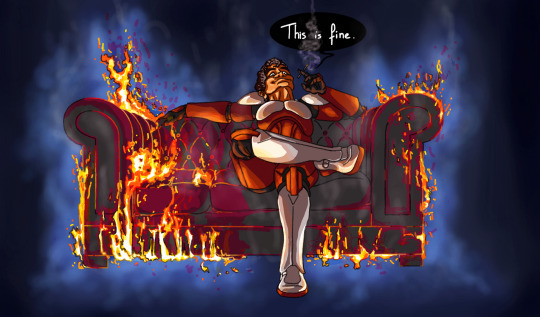
#haunted clone week#its the couch that's haunted#commander fox#corrie guard#star wars#the clone wars#tcw#sw fanart#tcw fanart#sw halloween#happy halloween#i know it's horizontal instead of vertical#and its going against tumblr's flow#but what the hell#its halloween#unnatural#is very much in theme#what happened#who knows#maybe a shiny died in there#maybe it was already like that#when fox picked it off the trashes#maybe he killed a senator in there#and that's all a senator's revenge can amount to#decorative and slightly bothersome#😄#“You said I killed you- haunt me then!” Fox#probably#my fanart#coline7373
348 notes
·
View notes
Text


buttons i've made !! :D
#art#my art#digital art#i like em i think they slap#i'm likely not gonna put the rentry's link on this blog when i'm done but i'm having a lot of fun man hjfhsjfh#//btw if you tap on the images they Are small asf#and i had to go looking for unicode characters but because clip doesn't import text the same way as images when you want to copy + paste#i had to. wait here's the process i went through like 4 times (there was a different character i was gonna use for the last one lol):#import + select bg + shrink selection 1 px + delete + 'that looks alright!' + unselect + scale down about 35 + it's blurry + try to remove#dust + fail + start removing transparent pixels by hand (dot brush) + go monk mode instead of chimp mode because of this + funk up +#whatever whatever whatever + backspace backpedal backtrack + finish cleaning up the most invisible dust + reselect shrunk and cleaned#character + There's Still Dust + with selection engaged continue to clean pixels by hand + deselect and reselect + THERE'S STILL DUST +#repeat process 3-5 times per image + reselect inks and use fill bucket to get anything you missed + you for sure missed + pick a corner or#side that looks best + clean it up make it look real nice + select + copy and paste + flip horizontal + align + merge + select + copy and#paste + flip vertical + align + delete remaining original that was used as guidelines for this + add effects#and BOOM. overcomplicated by 5000 steps but they look good now don't they jfhsjfhvjh#//anyway hungry i'm gonna go Eat 💥#okay CIAO :3
13 notes
·
View notes
Text
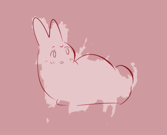
15/11/2023
wadda hell
#daily bunny#319#standalone bunny#when staff makes the dash scroll horizontally instead of vertically#this will be such a good meme to ss your dash
100 notes
·
View notes
Text
Just learned it's national TMNT day!
Have an ongoing project I'm working on.
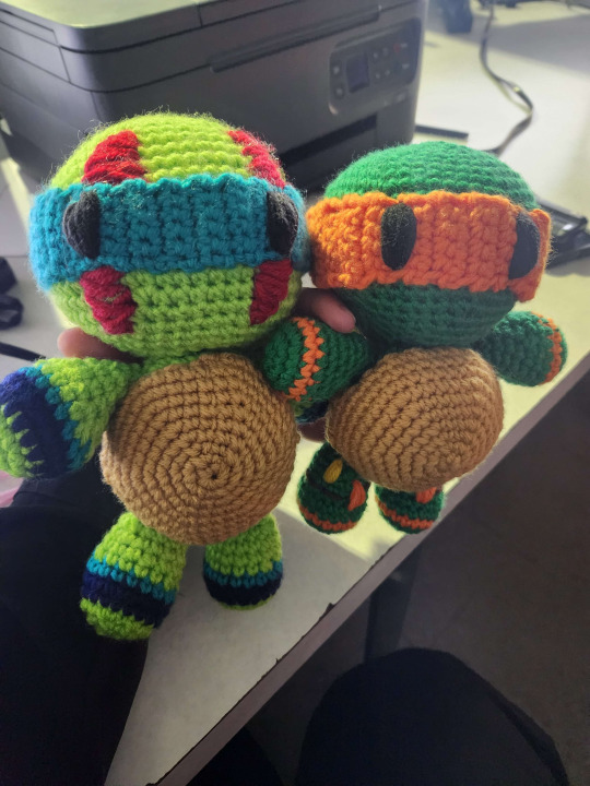
I just have to put on Leo's little yellow stripes and then do Donnie and Raph and all my lil guys are done! I love them so much
#rise of the tmnt#rottmnt#crochet#rise leo#rise mikey#Fun fact: Mikey is done in 4.25 while Leo is done in 4.75#The size difference is wild#I'm going to do Donnie in 4.75 as well#and then Raph will be in 5.0#I'm thinking once I get these done I'll change the pattern a bit to make the arms and legs longer#and I might redo Mikey's torso because I sewed it horizontally instead of vertically like Leo's#and doing it horizontally made the plastron sew weird
29 notes
·
View notes
Text
I had a dream I somehow came to acquire Mother Sonny out the trash and took him home and he did move on his own when I wasn't looking and shattered my phone screen with his mind but it was okay bc I showed him unconditional love
#drawfee#skip speaks#been having bizarre dreams lately#I also got bit by a snake that was just a head with like#vertical fangs instead of horizontal#if that makes sense fjfjff
8 notes
·
View notes
Text
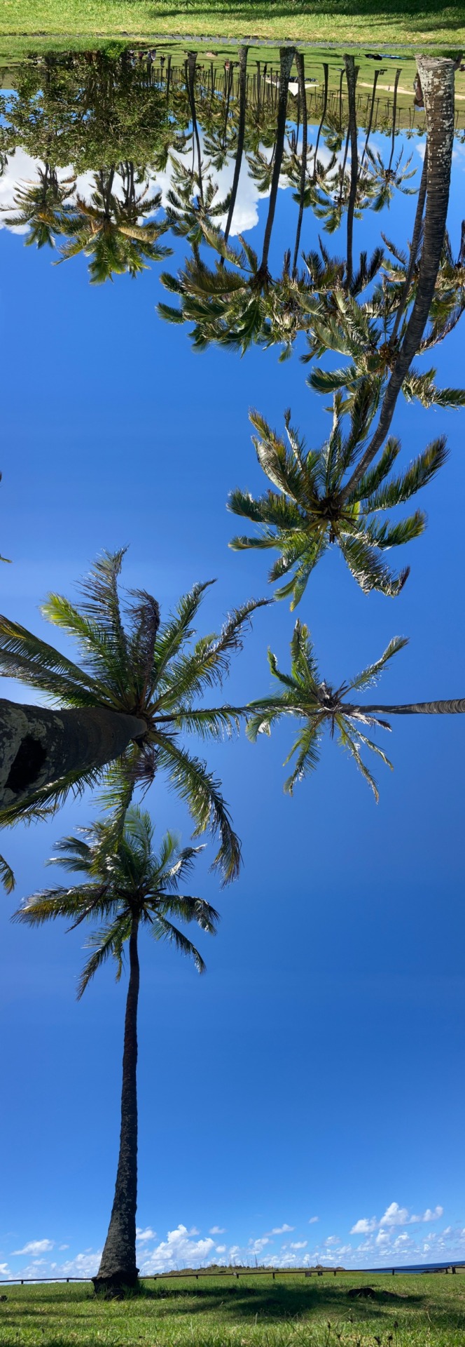
Anakena, Rapa Nui (Easter Island)
#this was a panoramic shot but taken vertically instead of horizontally#I thought it looked cool#I was sitting under that one palm tree#Rapa Nui#Easter Island#Chile#Isla de Pascua#photography#tropical#palm trees#sky#nature#Anakena#beach#travel#clouds#summer
3 notes
·
View notes
Text
Nothing makes me want to light all my belongings on fire and walk into the sea like trying to tidy up
#I feel like I’ve been in a constant state of ‘trying to tidy up’ since I moved in here#I hate that I have so many hobbies that require so much storage#it’s not even that much! just a half dozen big bins worth.#but it makes me feel like a huge lumbering inconvenience#also I feel physically shitty and I can’t tell if that’s stress or im getting sick#and if I get sick now of all times I am going to blast myself into outer space#also a bunch of little things are pissing me off#we talked about getting more storage for upstairs months ago#and talked about getting some ikea kallax shelves#and instead aneki got similar shelves off wayfair#except the thing that’s nice about kallax is they’re BIG and also you can use the vertical or horizontal#so now I have inadequate shelves and also idk where to put them so other things are accessible#and I’m not really able to move furniture around#which I fucking HATE by the way#I’m so tired. I’m so tired.
3 notes
·
View notes
Text
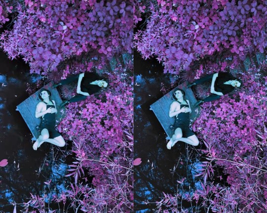
one more 3D stereogram from the musicvideo because Wow i love this shot. enter their beautiful world<3 <3
#it has to be sideways because the camera pans vertically instead of horizontally#why did stu pose like that im obsessed#king gizzard and the lizard wizard#stereogram#stereoscopy#kgatlw#my posts
20 notes
·
View notes
Text
I think i got my new pc build all figured out. Bit over budget. But since this is a thing that would hopefully last me for around a decade. i'm excited! This will be the second pc i will fully build myself, not like, upgrade an existing pre build pc or anything. I will reuse parts where i can and my budget pc's case which will mean my next pc is a very nice small form lightweight unit that i can bring with me to lan parties! Also very cool, 4K screen! One of the reasons i want to up my resolution is to get with the times, i'm using a monitor that barely displays full HD. And while it looks fine to me, and this pc could run the way it does for 5 more years i feel like. It is showing that i gotta get with the times and not be stuck in the past. Windows11 barely has the min spec requirements for me. New games i gotta run with optimization mods or on lower settings. And the most infuriating thing of all! Min window sizes for things like Discord is big enough that it hogs up half my screen! And since i only use a single monitor, not very nice to have that!
#tbf chat programs really need to go back to having like 20% of your screen filled instead of 50#also reading is vertical not horizontal discord! why do you need to be so damn wide!
2 notes
·
View notes
Text
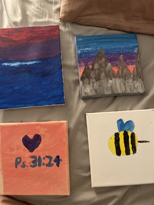
[Image ID in ALT Text]
We’ve had a few art nights at youth group, and here are my four latest pieces. I think it’s a possibility that one could interpret something from the colour scheme. I don’t know, though, I’m not sure. What do you think?
#the first one is from early 2022 when i was questioning my sexuality#kinda like. thinking ‘yeah i’m bi’ but not fully?? idk it was complicated#no one said anything by the way#it’s Abstract#(i painted blue. i painted pink. they came together. i went Oh. Could This Mean Something. it did.)#in fairness: i did orientate it horizontally instead of vertically but like#if i tried that shit as a leader with the current youth they would clock me so hard#but FUCKING-#THE OUT OF PROPORTION BI FLAG TEAM#THE BI COLOURING#the first three are bi in colour scheme the fourth is bi (bee) in principle#bi bi bi bee - bi-thoven’s 5th
7 notes
·
View notes
Text
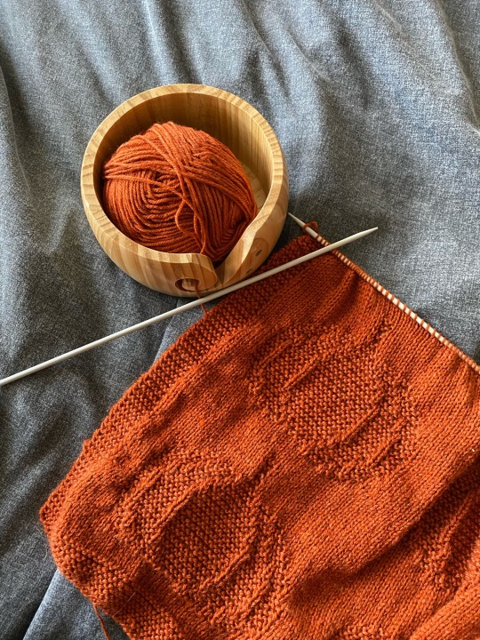
2/3rds of the way through the pattern, and honestly I’m not sure if I’ll be adding an extra row of pumpkins or not. I just feel like it’s going to be quite small? But it is for a baby so I’m not sure if it’s okay being on the smaller side.
I’ve also used WAY less yarn than the pattern calls for despite meeting gauge (called for 200g of yarn, and I’ve probably used about 75g if that?) so I’m wondering if the size is a me issue 😣
#it’s meant to be a square blanket#so I’m not sure if I should keep it small#or add the pattern and make it bigger#but then the design goes horizontal instead of vertical which upsets me a little#any advice?#knitting#aesthetic#knitting blog#knitblr#pumpkin blanket#pumpkin#halloween aesthetic
4 notes
·
View notes
Text
guy who creates endless sandy desert dreamscapes that take eons to cross: "muahaha! i love tormenting dreamers with a sublime treasure forever out of reach beyond an infinitely retreating horizon!"
guy who creates bottomless pit dreamscapes to fall down through where you pass by flashes of forgotten childhood memories: "your dreamscapes are middling and derivative. mine are avant-garde masterpieces that instill a forlorn sadness more potent than you could ever dream of"
#this was inspired by the fact i had a dream that was pretty regular#urban exploring some abandoned warehouses and stuff. encountering bears and such. regular dream shit#but .. i was also for some reason aware of the fact that this was a dream within a dream#wherein the dream i was in was created by this petty hipster dreamscape creator dude#who was all snobby about the fact that he created vertical dreamscapes instead of horizontal ones like everyone else#like ... this metatextual stuff had NO baring on the actual events of the dream#i was just in some dudes shitty torment dimension listening to his podcast
7 notes
·
View notes
Text
As someone who doesn’t use Twitter and hasn’t used it since 2016, at this point I feel like every even slightly Twitter-esque (let alone overt Twitter-esque) design choice Tumblr makes gets yelled about because People Really Just Fucking Hate Twitter whether they realise it or not.
Which, like. Fair ‘nuff. I also hate Twitter, which is why I don’t use it. But nobody ever really gives these design decisions any time to percolate on this site in favour of kneejerk “they changed it and we hate it” reaction. Public likes are not new. Multiple tabs on a dashboard (some of them not things you opted into seeing) are not new. Having to block ads with external tools is not new (and it’s a big deal that photomatt said the words “ad blocker”, like, you couldn’t get that shit on any other profit-driven site, everyone is too scared for their precious monetisation)
The new sidebar, also, I think is pretty ugly right now but it’s probably going to go through a few iterations. I, personally, really wish they’d put the search bar literally anywhere else (maybe group search and discovery together IDK I’m not an UX designer) and I think accessing sideblogs has been too complicated for a while now, but none of those are the same as “this looks like The Other Blue Site”.
Like I’m not a graphic designer. I am certainly not a fucking UX designer, and I think those people are either all nuts or all geniuses. I’m pretty sure the new layout is being extensively heatmapped rn, and what changes it’ll undergo are gonna be done based on that, based on comments that are along the lines of ‘this change would make me more productive’ and less on “WEEEEEH CHANGE IT BACK CHANGE IT BACK CHANGE IT BACK”.
Your animosity towards change is not meaningful user experience information. You misclicking on shit more *is*. If this layout is really *that* bad and terrible, Automattic’s research tools will demonstrate it as such. The developers now are actually much better versed in Web 2.0 design, for better and for worse.
#van stuff#Also like yes I also hate the touchscreenification of desktop sites#as someone who does not have and does not want a touch screen computer#but that's not a design trend I get to dictate as I am in fact a minority user for this site#and the complaints I am tired of seeing are also coming from other legacy minority users of desktop#There are many good UX reasons to opt for a vertical layout instead of a horizontal one#and I think the majority reason is so that people who are on mobile and desktop simultaneously don't have to have two different brainmaps#for their muscle memory on this site#but like... the vertical sidebar is not the same as 'randomly swapping 'Close' and 'Post'' lol#the top of the screen horizontal bar still does things and there's way less empty space there now#and I get wanting negative space and less screen clutter#like... that's the ONE criticism of this update I can agree with#but that's STILL NOT THE SAME as 'arbitrarily fucking over the muscle memory of EVERY site user'#how many people on this site *ever* move out of their dashboard? I know I do!#but I think it's the minority of people considering the user-curated model of propagation this site is still#*actively* promoting#This site looking superficially more like twitter doesn't change that!#like the sky is not falling call me when they eliminate the ability to browse the tags in favour of a flat search#AGAIN#remember when we had that? Remember how *BAD* it was?#remember how much easier finding stuff became when we got 'browse tags' back as the default search?
11 notes
·
View notes