#tutorial ui
Explore tagged Tumblr posts
Text
Tercera entrega, de la serie de 3, donde presentamos el flujo de trabajo para el prototipado de interfaces de usuario con Material Design 3, empleando los recursos que la última versión de este framework nos ofrece para utilizar en Figma. Rápido, aprenderás a generar el UI kit, estilos de colores, estilos de textos, tamaños de frames, retículas y otros recursos en Figma. Indispensable si quieres trabajar profesionalmente en ambos entornos. A continuación, te comparto los enlaces la primera y segunda entrega de esta serie:
Primer contacto con Material Design 2, aspectos relevantes, componentes y más.
Primer contacto con Material Design 3, aspectos fundamentales, componentes, y más.
Tutorial completo, aquí: https://www.formaciongrafica.net/blog/tutoriales-online/uid/el-flujo-en-figma-con-material-design-3/
#material design#md#material design 2#md2#uid#ui#Formación Gráfica#tutoriales ui#tutorial de diseño#tutoriales de diseño#tutorial ui
1 note
·
View note
Text

~hide build/buy lot outlines with reshade~
do I need to explain more? 😁
⚠️ this is not a mod to put inside your mods folder ⚠️
Instead, this utilizes a Reshade/Gshade add-on to remove the lot outlines and being able to do so whenever you want with just a shortcut. Requires Reshade/Gshade and the Shader Toggler add-on. Works on both DX9 and DX11.

Download the latest update on the main tumblr post below:
Patreon post here
#sims 4#ts4 resources#ts4 reshade#t: shader toggler#t: reshade add-ons#hide cas ui#vyx.resources#reshade tutorial#1 hour later... in a true me fashion 😂#just had to double triple check everything works fine
415 notes
·
View notes
Text
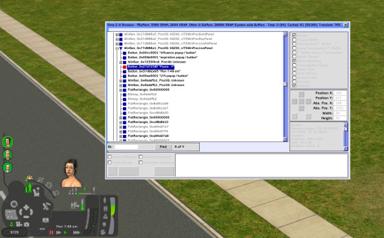
Sims 2 UI Browser
Did you know there's a cheat that lets you play with UI?
Ctrl-U
Well, it mostly lets you find UI elements and move them around
It helped me make wider design dialog window
There's a search bar and info
Track Mouse checkbox is super useful, takes the browser window right to the element you hovering over
What's the use?
Say, you're looking to edit the pause button
The weird number 0x27d7258f is its ID (selected item on the picture)
Now you can find it in UI Data files
Open the ui.package in \TSData\Res\UI (or if you're using a UI mod, you may want to edit its files instead)
Select all UI Data recourses (try Ctrl-A) and extract them somewhere, into a new designated folder maybe
There's gonna be a lot of text files in a UI Data folder
Search that folder for "0x27d7258f" using standard Windows Explorer / File Explorer. It'll find the files with the pause button
What can you do with it?
Edit position by changing coordinates:
area=(170,192,190,212)
I call them start width, start height, end width, end height
IIRC, these coordinates are relative to parent element, not absolute (start where parent's position starts, not where your screen starts)
Find group and instance numbers of its image/icon:
image={499db772,a9200127}
Icons are also found in the ui.package, although they may be in a different one
There's a ui.package in every pack's folder, and you probably used your latest one to extract UI Data files (like SP9), but the pause icon is in the base game's ui package. Some weather related icons may be in Seasons' package and not in anywhere else. You get what I mean
There are all sorts of color options (in RGB, I assume):
fillcolor=(204,204,204) colorfontnormal=(0,0,0) colorfontdisabled=(0,0,0) colorfonthilited=(0,0,0) colorfontnormalbkg=(0,0,0) colorfontdisabledbkg=(0,0,0) colorfonthilitedbkg=(0,0,0) forecolor=(255,255,255) bkgcolor=(0,0,0)
Not all of them might be relevant for all elements, though
If an element has text, font may be edited:
font=0x00001318 font=GenSubHeader font=BuildBuyModeFooter
Looking at bigger elements, there are also a lot of flags and properties. Here's some interesting ones:
moveable=yes sizeable=no titlebar=no outline=no align=lefttop wrapped=yes opaque=yes
You can guess what they mean
Hm. Design tool window is moveable, but isn't sizeable. What if?..
Nah, simply changing "no" to "yes" didn't work
Search shows there are no sizable windows in game, except for UI Browser itself and a few other "browsers" I haven't seen, so we can't easily copy how it's done
Maybe some day
That's it for random UI modding stuff you didn't wanna know :D
226 notes
·
View notes
Text
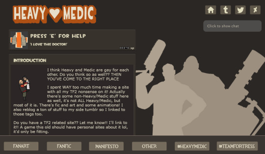
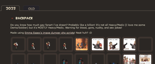
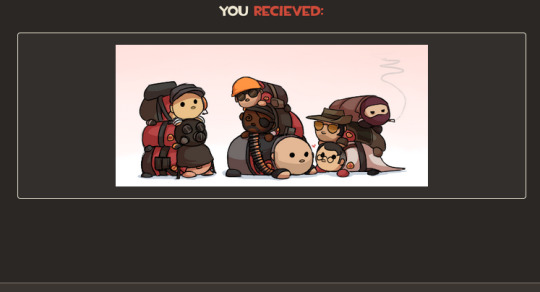
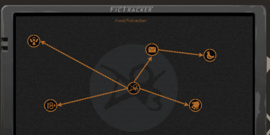
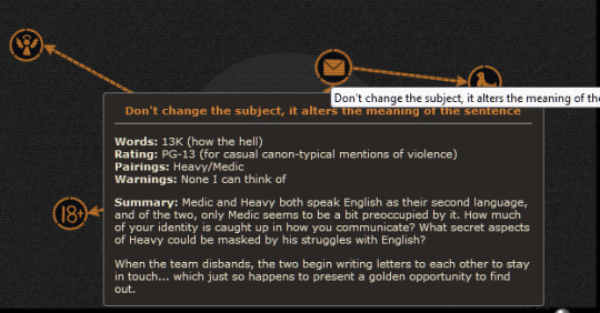
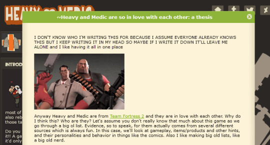
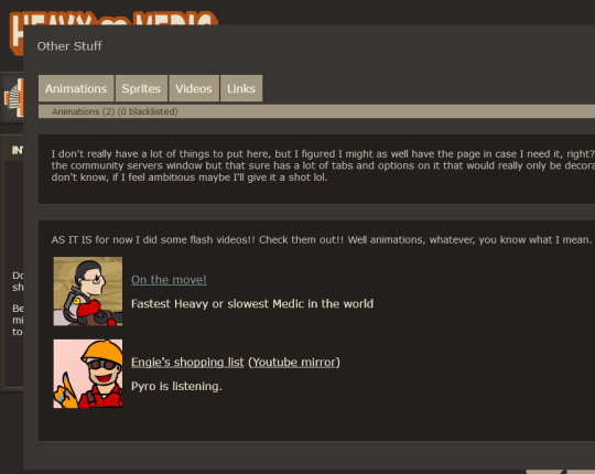
So I spent the last couple days making a HeavyMedic fansite and it is the most ELABORATE SITE I'VE EVER MADE and I'm so unbearably proud of it, it looks SO COOL!! Especially the Fictracker page!! It's even responsive!! You have no idea how long it took to get everything looking right and spacing it and everything. I've never made a site that looks this fancy before! I'M SO PROUD OF IT LOOK AT IT!! LOOK AT IT!!! LOOK AT IIIITTTT plz


Also made some link buttons! Still don't really have an official name for the site as it is but WHATEVER maybe I'll decide on one later. YOU CAN USE THESE TO LINK TO IT FROM YOUR OWN SITE you have your own site right, you should make onneeee (here are some resources if you don't know how) and if it's a TF2 site TELL ME AND I WILL LINK BACK TO IT
[patreon]
#team fortress 2#heavymedic#red oktoberfest#there are some easter eggs on the site too :3#try and find them!!#i just have this open in a tab and keep looking at it and being like man this is so cool#web design can be so tedious and yet so rewarding#have a new appreciation for how slick the tf2 ui is#absolute goldmine for site design#lol comparing this to the huntersmoker site or ghost tutorial that's as barebones as you can get
722 notes
·
View notes
Text
Learning how to 3D model made a little chao as my first thing and I LOVE HIM
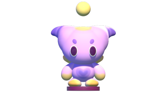

#I need a name for him#i am deeply attached#also shoutout to Dave Reed’s nomad tutorials for making me not hyperventilate looking at the ui#Sonic#chao#chao garden#fly chao#chao sonic#sonic adventure 2#sonic the hedgehog#sonic fan art#annamatopoeiaa art
13 notes
·
View notes
Text
crpgs are dangerous because you will start playing at 7pm and then it will suddenly be 1am
#i am DEEP into rogue trader#true to owlcat i got so overwhelmed with the UI and tutorials/systems in the beginning but now that i'm in I AM ALL IN#gitta.txt
9 notes
·
View notes
Text
i think video editing is a form of dark magic
#not edits#trying to use sony vegas for very rudimentary things and being given the silliest stupidest roadblocks i've ever seen#yes there's tutorials but also explodes at how unintuitive the ui is
20 notes
·
View notes
Text
i think one of my biggest (and only) gripes with procreate is that they dont have like. a masterlist of features their app has to offer. a full thorough ui navigation. because ive been using procreate for a couple years now and im still discovering preexisting features because they just. dont mention it anywhere
#like being able to drag and drop an image into the color pallette area to create a unique pallette from that image?#had to find that out through an instagram reel#procreate has a habit of compressing things almost Too much to make it less visually busy and more “beginner friendly”#which definitely works to an extent. its the easiest art program I've used to date. and that includes ibispaint#but they have an annoying habit of simply not Labeling Things#so they will have a lot of super cool and useful features that you wont even know exist because they dont tell you about it#and their app tutorials are very vague and don't actually seem to show you have to navigate the app.#they feel more like an ad than a tutorial#this is why procreate dreams has gotten flamed so bad i think#its not even that bad is the thing. its got tons of good features. but the ui is simply TOO simplified#everything is hidden in a dropdown of some kind#to the point that its not beginner friendly OR professional quality#because its equally unnavigatable for both#ANYWAYS im just yapping for the sake of yapping#i love procreate. its affordable and user friendly. theres just some very small inconveniences with its ui#i know nothing about developing and do not know what im talking about. for the record.#this is simply the ramblings of a humble artist who loves nothing more than to complain ❤️
9 notes
·
View notes
Text
I truly love looking at my desktop of games and laughing at the sheer disparity on display
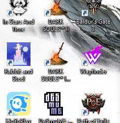
#I'm either here to Fucking Die or Peacefully Farm#ISaT is new and I haven't played it yet but I've heard good things#and I could in theory uninstall Okami I hit 100% in it but I love that game...#reinstalled DA2 to try again someday but augh... UI painful...#bullied into PoE2 by friends it is Okay but visual slurry and I dislike that#Moon Hunters my beloved I wish I had people to play you with so I could 100% you too#maybe one day I'll throw myself back into Code Vein it had a super cool character creator and interesting gameplay#once upon a time I had every Dark Souls installed#but I fucking hate DS1 and 3 LMAO#also Hollow Knight I love you so fucking much but I am So Bad at you I need an easy mode for babies#I can't platform to save my life lmao#Riot and HoYo are my marks of shame tho I wish I was free#and Wayfinder was a “my friends gave me this and I did the tutorial and never picked it back up”#also I have rotating wallpapers and most of it is Arknights lol that one was Saga focused from the Dusk event#I have more games installed but only these one earned icons sort of I got lazy with Wayfinder and PoE2
2 notes
·
View notes
Text
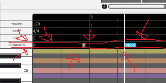
also guess which complainer about cevio/voisona's supposed lack of vocal dynamics controls finally Looked Up. and Discovered.
#IN MY DEFENSE on cevio its hidden by default you have to unhide it#but not in my defence it was just out there in voisona. but in my defense again i got scared by the key controls above it#what if the key signature controls kills me. what if i make eyecontact with it and it kills me#but this shit rules ITS NOT as versatile as my beloved sv tension parameter#you cant go from loud to soft within a note for example#BUT this still adds so so SO much. plus i like the usage of forte and piano for it#i like putting a bunch of pp all over my synth covers. normal thing to say#OH ANOTHER THING IN MY DEFENSE for me not looking at the big black bar and seeing the controls is that there are Not many cevio tutorials#in english or otherwise. most are a little basic or too old so they dont mention these parts. i did watch a few japanese tutorials#most were also too old so they have different UI BUT i did watch one where the dude started fucking with dynamics and i was like WHAT#besides most unofficial tutorials and manuals especially in the english speaking world like Only focus on pitch editing. WHICH makes#a BIT of sense in that older software basically just had that + breathiness and maybe formant as things to edit. but we live in the future#i think there is much more to play with than just pitch bends especially with newer software. lot of fun to be had!!#ia has a really nice special type of phoneme in cevio that makes her go suuuuper soft and relaxed which im having fun playing with!
3 notes
·
View notes
Text

Transform your creative passion into a rewarding career with a comprehensive Graphic Designing course. Learn to create stunning visuals, logos, websites, and marketing materials using industry-standard tools like Adobe Photoshop, Illustrator, and InDesign. This course covers key concepts such as color theory, typography, layout design, and branding, ensuring you develop the skills needed to thrive in the competitive design industry. Whether you’re a beginner or looking to enhance your design expertise, gain the practical experience and confidence to bring your creative ideas to life.
Visit Attitude Academy :-
for your valuable Training Course insights and content.
Call: For Yamuna Vihar +91 9654382235 Or For Uttam Nagar +91 9205122267 or
Visit Website: https://www.attitudetallyacademy.com Email: [email protected]
#graphic design#multi media#ui ux design#graphic designing#graphic designers#graphic design tutorials#skills
2 notes
·
View notes
Text
Segunda entrega, de una serie de 3, donde tomamos primer contacto con Material Design 3 para comprender algunas de sus leyes fundamentales, componentes y a partir de la documentación oficial de este Framework para el diseño de interfaces móviles de usuarios. A continuación, te comparto los enlaces la primera y tercera entrega de esta serie:
Primer contacto con Material Design 2, aspectos relevantes, componentes y más.
El prototipado UI con Material Design 3 en Figma con Material 3 Design Kit y Material Theme Builder.
Tutorial completo, con video de apoyo: https://www.formaciongrafica.net/blog/tutoriales-online/uid/md2-vs-md3-material-design-3/
#md2#md#material design#material design 2#uid#ui#interfaces de usuario#interfaces gráficas#Formación Gráfica#tutoriales de diseño#tutorial ui
1 note
·
View note
Text
[ReShade 5.1+] Hide CAS UI & More
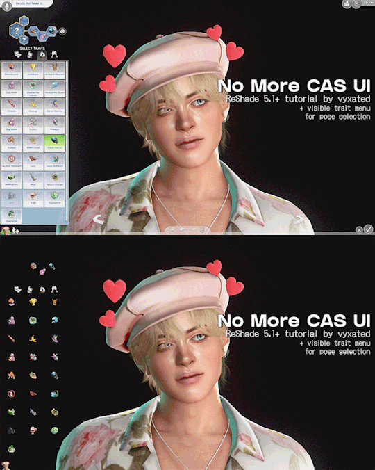
Unlike build mode & live mode, there's no shortcut to hide CAS UI, which is much needed for taking screenshots with Reshade. With this ShaderToggler add-on (made by Frans Bouma/Otis_inf), you can easily hide the UI! This guide will cover how to install the add-on and showcase its features.
If you find this useful, do share the word around! All I ask is that you link back here if you want to share outside of tumblr :-)
📌 UPDATE 19/09/2024: updated both DX9 and DX11 files to fix the hide CAS BG & mirror toggles. Please redownload.

How it works:
One of the features of this add-on is the ability to toggle on/off in-game shaders: UI, geometry, post-processing effects, and more (not reshade shaders). You do that by putting certain shaders together into a group which you can then toggle on/off. This is quite useful for CAS shots as you can't hide the UI when you use ReShade/GShade (unlike build/live mode where you can simply press tab).
This add-on is made by Frans Bouma/Otis_inf so huge credit to him as without this add-on this wouldn’t be possible.
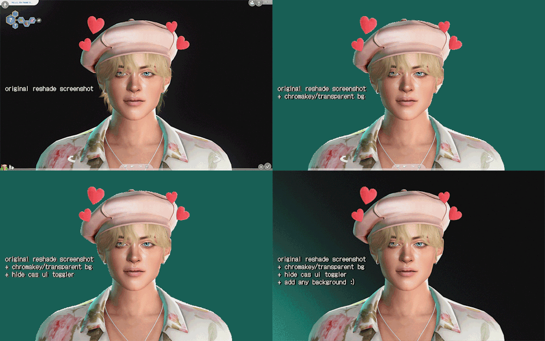
Keep in mind that this add-on doesn’t prevent shaders (bloom/dof/mxao) from affecting the UI, it just hides the UI shader from view. This, along with a shader like ChromaKey/DepthAlpha that allows for transparent backgrounds, makes a great duo! No more cropping to exclude the arrows and editing out the background manually 🙌 (unfortunately alpha hair suffers a bit from it.)
What you’ll get by the end of this post:
A ShaderToggler.ini file that will hide CAS UI elements with the option to either leave the sim/trait icons and trait selections intact for posing your sims, or hide everything except for your sim. Great for taking close-up shots.
There'll also be a toggle to hide infant pillow in CAS, hide CAS BGs & mirrors, and hide camera UI when your sim is taking a selfie/picture in-game.

// ReShade/GShade requirement:
For Reshade users: tested on Reshade 5.8.0 (w/ full add-on support), but it should be compatible with ReShade 5.1+.
For GShade users:
To check if your GShade supports add-ons: check the ReShade version it's based on in the shader notification at startup, similar to the menu here (GShade x.x based on ReShade x.x). You can also check in the reshade panel and see if there's a menu for add-ons.


📂 DOWNLOAD .ini file:
SimFileShare / Google Drive
🆕 DX9 & DX11 support
ShaderToggler.ini : DX9 version
ShaderToggler_DX11.ini : DX11 version

// Installation:
First, make sure that you have the correct ReShade with full add-on support!
Grab the add-on from this github release. For non-legacy players, grab _v121.zip. For legacy players, grab _x86_101.zip
Extract the ShaderToggler.addon file into the game’s \Bin folder where your TS4.exe/TS4_64.exe is (where you had also installed ReShade/GShade).
Still in the \Bin folder, drop the ShaderToggler.ini file you downloaded. You’ll end up with both ShaderToggler.addon and ShaderToggler.ini in the same folder as TS4.exe/Reshade.ini.
The .ini file should be named ShaderToggler.ini for the add-on to recognize it and the toggle groups to show up. If you downloaded the DX11 version, remove the _DX11 suffix.
If you’re a GShade user: there’s a folder called gshade-addons; this is where you should place the ShaderToggler.addon file. Just move the add-on from the \Bin folder to the folder mentioned and you’re good. If this doesn't work, keep it in the \Bin folder.
Open up your game. If you see the add-on & list of toggle groups in the Add-ons tab, then you’ve successfully installed the add-on & settings! Restart if needed.
// Shortcuts (Updated):
Toggle main CAS UI (traits & trait selections excluded): Ctrl+ ]
Toggle sim/trait icons & trait selections: Ctrl + [
Toggle pillow for infants: Ctrl + ; (semicolon)
Toggle camera UI when sim is taking pic/selfie: Ctrl+ ' (apostrophe)
Toggle CAS BG mesh: Alt + ]
Toggle mirrors: Alt + [

Previews:
in CAS:
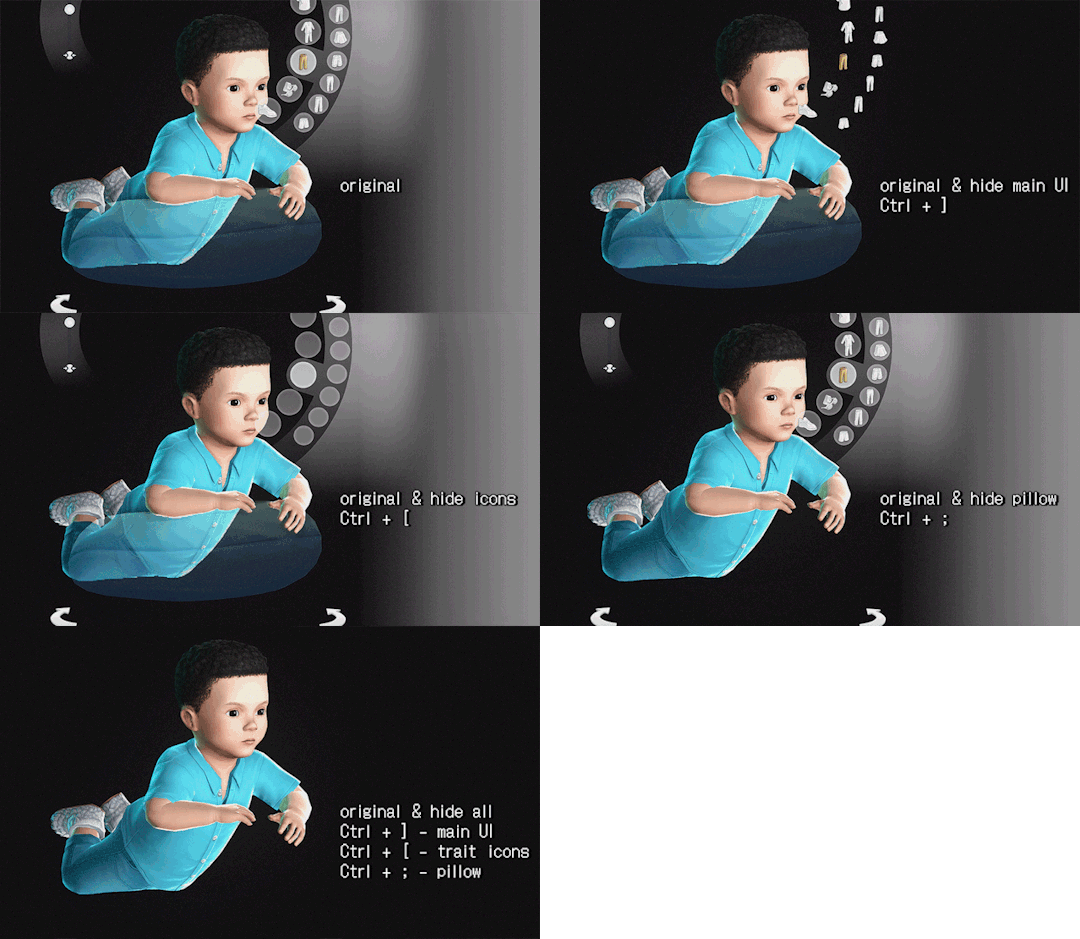
Hide CAS BG & mirror reflections:

in Live mode (for Camera):
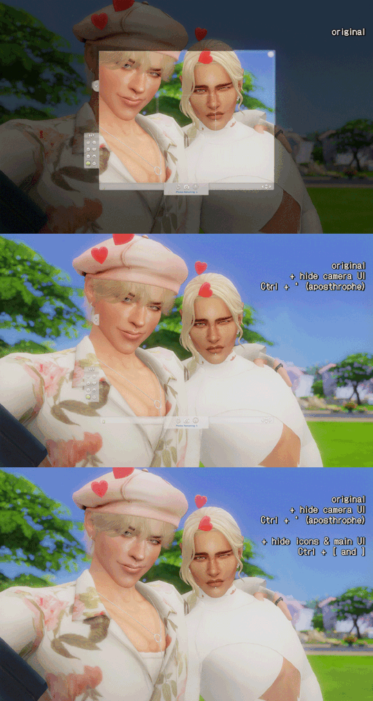
note: you can use the hide pillow toggle to hide the phone object.
🆕 in Build/Buy mode, use caps lock to hide the lot outlines:


// FAQ
Issue: add-on works, but the list of toggle groups doesn't show up.
This is likely caused by my config (.ini) file not being installed correctly. Put the .ini file where the TS4.exe file is, which is under the /Bin folder.
Issue: Add-on failed to load with error code 193.
This is caused by downloading the incorrect addon file. If you're a non-legacy (x64) player and downloaded the x86 addon file, you will encounter the error. Download the right version (_v121.zip) and that should fix the error.
Issue: everything shows up & are installed correctly, but the toggle groups don't have any effect/hide the UI.
This issue only happens if you installed Reshade/Gshade and selected Vulkan/DXVK. You need to select DirectX 9 or DirectX 11 instead for it to work.

tagging @thefoxburyinstitute :-)
#ts4 tutorial#ts4 resources#ts4 reshade#ts4 cas#the sims 4#tutorial#t: shader toggler#reshade tutorial#t: reshade add-ons#hide cas ui#sims 4#vyx.resources
2K notes
·
View notes
Text
me when the video game requires me to use my brain instead of just clicky clicky mashy mashy
#ME WHEN IM LITERALLY JUST TRYING TO GET TO A POINT ON THE MAP BUT ITS THE HARDEST THING IN THE WORLD????? LOWKEY FUCK THE BG UI ALL MY HOMIE#S HATE THE BG UI#especially when i go online to find a tutorial and there's nothing. it make me feel so stupid 😭 like wait you guys figured this out on ur o#✌️
7 notes
·
View notes
Text


Did I spend all night relearning how to 3d model? Maaaaybeeee.... ft. Stella my Pathfinder character
#nomad 3d#my art#pathfinder#stella#not bad with just playing around with ui#ill rewatch a video tutorial at some point for now im having fun just figuring things out as I go
3 notes
·
View notes
Text
I tried to install a ROM on my tablet last night (way too early this morning) and I didn't make any progress 😅 Between the UI not matching more modern ones so I didn't know where I was suppose to start the download and the TWRP download failing, I'm gonna call it a wash for now until I can stumble on a better guide for the tablet model I have.
#enski is a dork#i knew i was cooked when the UIs on the tutorials were blue but mine was black LMAO#''press the volume up to start the download'' what do you mean? i have a directory...oh...
2 notes
·
View notes