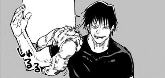
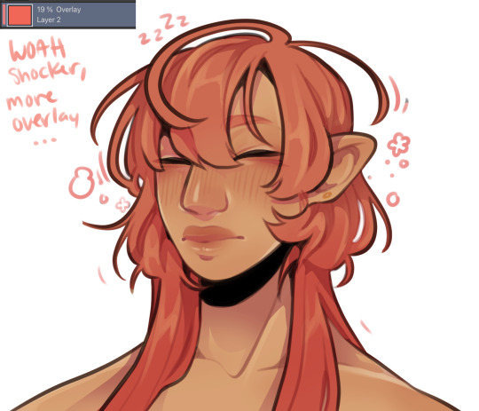
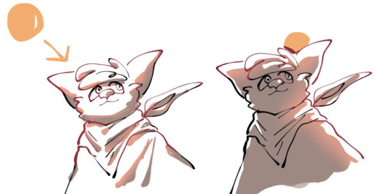
#trying out a little different coloring and shading techniques
Explore tagged Tumblr posts
Visit Tumblr Blog
Explore Tumblr blogs with no restrictions, modern design and the best experience.
Last Seen Tumblr Blogs


Fun Fact
Users from the US are the majority of Tumblr visitors.
Text


It’s them again, your honor.
Please take a look at this post for context and reference!
When I decided to color these sketches with watercolor I was expecting it to not look good and then I would erase it and repaint with other brushes.
But then boom! It was actually starting to look even professional-like the more I kept coloring. I was surprised because my every attempt at watercolor looked like a 7 year old trying with the school’s shitty art supply.
I found out later it ended up looking great on accident, because before I started coloring, I thought the canvas looked to bland, the sketches didn’t pop out, so I used a technique I learned by watching YouTube Shorts on how to use Procreate to give the canvas a paper-like texture.
Basically I used several texture brushes on a different layer, painting with light desaturated warm colors and occasionally a pinch of strong yellows, browns and oranges. Then duplicated it, set one above the sketch on overlay and one below on really low opacity.
Turns out that does wonders when painting with watercolor, really looks like actual ink on paper with the way it melts and creates extra shades of color.
Also little silly thing I noticed after a while, with the way I colored and textured Dream’s body, it makes him look like a underbaked oily bagel 🥯
I really want to take a bite of him, I’m hungry.
If you really liked this and want one, I have my commissions open!
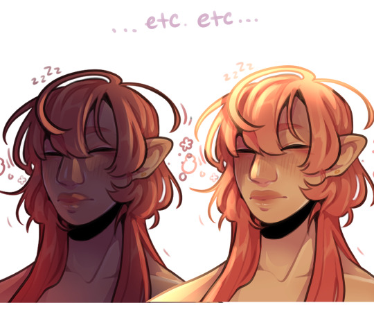
Dream & Nightmare belong to @/Jokublog
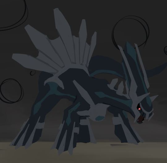
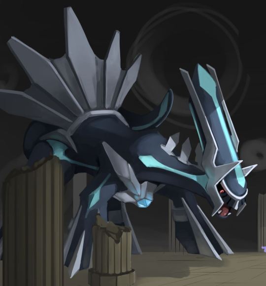
#artists on tumblr#art#artwork#drawing#digital art#digital artwork#design#undertale#undertale au#utmv#undertale multiverse#Dreamtale#utmv sans#utmv fanart#Dream sans#nightmare sans#dream!sans#nightmare!sans#watercolor#procreate#procreate art#I leveled up with this one#sans#yakut arts#yakutarts#yakut art#dragon#Dragon!dream#Dragon!nightmare#furryart
256 notes
·
View notes
Note
Ooh what about Thorins company when reader has dyed hair?? Like makes their hair dye out of plants/flowers or something and every week or so has a new hair colour and like one where you can TELL that its dyed like pink, red, purple, etc
Hi! I'm sorry for not getting back to you sooner! But I had so much fun writing this....It got me out of a writing funk hehe! 🤩💖
Balin: It will always make him chuckle. Balin would regularly compliment you, admiring the bold style. He loves the wild colors and the free spirit you have.
Dwalin: Dwalin finds it helpful when he looks for you in a crowd. It makes him feel safe and secure when he knows where you are.
Óin: Oin is Impressed with your skills. "It takes talent and determination to achieve those gorgeous colors!' He would remake. He would often ask about your technique and what materials you used.
Glóin: Unlike Oin, Gloin is not impressed. He doesn't approve of it. He is more traditional and thinks you're ruining your natural hair and natural beauty. What a party pooper, lol!
Bifur: Bifur adore the colors! He would insist on braiding your hair, wanting to see the colors blend together. He would also add some decorations to add extra pizzazz to it!!
Bofur: Bofur is so sweet! He would want to have matching hair colors! "Come on, let's have pink hair; it would be perfect!" he would say with an infectious smile. He's always full of ideas for new colors, and you find it hard to say no to his charm.
Bombur: Bombur is fascinated at how quickly you can transform. He loves how you can change your style and look so different. He swears it's some kind of magic!
Ori: Ori is your go-to for color advice! He knows exactly how to make the colors pop. He has tips and tricks to make sure the color stays and would also go out of his way to find rare plants that would make some crazy cool colors for you!
Dori: He finds it to be a little improper. He cares deeply about appearance, so the colorful hair almost gives him a heart attack. But after a while, he would slowly come around to liking it and would want to match his outfit to the color of your hair.
Nori: Oh, Nori would tease you relentlessly. A mischievous smirk would creep onto his face each time he saw you. "If I didn't know any better, I would say you're trying to catch my eye with all this blue hair." he would say. He honestly loves the bold colors…even if he doesn't say it outright.
Thorin: Thorin wouldn't openly tell you his thoughts on your hair, but his lingering gazes tell you everything. He tries to make his stares not obvious, but you catch him a few times and can tell he is captivated.
Fíli: Fili loves your colorful hair! He can't stop touching and playing with it! "It's like I'm touching a rainbow," he would murmur. He would be so excited to see which color you would have next.
Kíli: Kili is your biggest supporter! He's always on the lookout for new ingredients so you can get new shades. He is determined to get you to every color in the rainbow. "Here, let me help you with that," he would say, holding the bowl as he mixed the ingredients and gently applied them to your hair. What a good helper, hehe!
Bilbo: Whatever color you have, he will try to find a food that matches. So, if you have blue/purple hair, he'll bake a blueberry pie. If you have red hair, Bilbo will bring home strawberries. If you have yellow hair, he will make honey cake. It's a fun little game you guys play!
#the hobbit#thorins company#balin#dwalin#bifur#bofur#bombur#nori#dori#ori#gloin#oin#thorin oakenshield#fili#kili#bilbo baggins#x reader
104 notes
·
View notes
Text
Makeup Artists
Gojo x reader, Nanami x reader and Toji x reader (individual) Genre: fluff, comedy idk Words: 1.1k Synopsis: The trio attempt to do your makeup Masterlist

Life with the strongest Jujutsu Sorcerer was always an adventure. Today, however, was a different kind of adventure – Gojo had insisted on doing your makeup.
"You know, babe, I'm not sure about this," you chuckled nervously as you sat in front of the vanity mirror, Gojo rummaging through your makeup bag like a kid in a candy store.
"Don't worry, it's just a little fun. I'm practically a pro at everything, including makeup," he grinned confidently, while examining a tube of lipstick.
"You're a pro at everything, huh?" you teased, raising an eyebrow.
"Of course! Now close your eyes and trust me," Gojo said with a wink, and you complied, suppressing a laugh.
He started with foundation, and surprisingly, he wasn't doing a bad job. His fingers moved with surprising precision, blending the makeup perfectly into your skin. You couldn't help but admit that his touch was gentle, even though his usual antics were far from it.
"See, I told you I'm great at this," he gloated, admiring his handiwork.
"Yeah, yeah. But the real challenge is the eyeshadow," you challenged, handing him a palette.
Gojo eyed the colors, looking as if he was about to perform a complex Jujutsu technique. After a moment of contemplation, he dipped the brush into a shimmery gold shade and carefully applied it to your eyelids.
"Looking good so far," you encouraged him, trying not to laugh.
As he continued, Gojo became more engrossed in the process. He even attempted to recreate the infamous blindfold pattern that adorned his eyes on your lids. It was obviously a bold move, but surprisingly, it didn't look half bad.
"Voila! The Gojo touch," he proudly declared, leaning back to admire his masterpiece.
You opened your eyes, examining the finished look in the mirror. Surprisingly, you were impressed. Satoru had managed to create a unique, bold makeup look that somehow suited you.
"You know what? I think I like it," you admitted, giving him a playful smile.
"Of course, you do. I'm Gojo Satoru, after all," he replied, smirking.

It was a lazy Sunday afternoon, and you found yourself at home with Kento Nanami, your boyfriend. As you lounged on the couch, an idea popped into your head.
"Kento, do you want to try something fun?" you asked, a playful glint in your eyes.
He looked at you, raising an eyebrow. "Define 'fun.'"
"I was thinking you could do my makeup," you suggested with a teasing smile.
Nanami's stoic expression remained unchanged, but a flicker of surprise crossed his eyes. "Makeup?"
"Yeah! Just for fun. I think it'll be interesting," you said, getting up to get your makeup bag.
Nanami sighed, but there was a hint of amusement in his gaze. "Fine. But don't blame me if it turns out poorly."
You handed him the makeup bag, and he examined its contents with a mix of curiosity and skepticism. As you sat in front of him, Nanami took a deep breath, preparing himself for this unexpected challenge.
He had battled curses, dealt with demanding people at work but doing someone's makeup? That was a new task.
"Let's start with foundation," you instructed, handing him the bottle.
Nanami carefully applied the foundation, his movements unsurprisingly careful. Despite his initial reluctance, he seemed to be getting into the task. As he continued, you couldn't help but appreciate the focused expression on his face.
"Okay, now for eyeshadow," you said, presenting the palette.
Nanami inspected the colors, selecting a neutral shade. With a gentle touch, he applied it to your eyelids, blending it expertly. You were impressed by his skill and concentration.
"See? I told you I could do it," he smiled, a faint hint of pride in his voice.
As he moved on to the eyeliner and mascara, you couldn't contain your laughter at the sight of Nanami, the serious salaryman, fully engrossed in the art of makeup application. Despite his initial hesitation, he seemed to be enjoying the unexpected bonding experience.
Finally, he finished the look with a subtle lip color. Nanami stepped back to admire his handiwork, and you turned to the mirror, genuinely surprised at the results. The makeup was tasteful, well-blended, and highlighted your features without being overly dramatic.
"You know, Nanami, you might have missed your calling as a makeup artist," you teased, giving him a playful wink.
He rolled his eyes but couldn't hide the small smile tugging at the corner of his lips. "Let's not get carried away."
One random day, you found yourself in the company of Toji Fushiguro. As you sat at your vanity, surrounded by an array of makeup products, a thought crossed your mind. One that you probably should have ignored.
"Toji, do you mind doing my makeup for me?" you asked with a playful grin.
Toji glanced at you, a mix of surprise and skepticism on his face. "Makeup? Really?"
"Yeah, just for fun! It'll be interesting to see what you come up with," you replied, handing him a makeup brush.
Toji sighed, but there was a small smirk playing on his lips. "Fine. But if it looks terrible, I'm not to blame."
As Toji dipped the brush into the foundation, you couldn't help but suppress a giggle at the serious expression on his face. He applied the foundation with a level of intensity that was comically out of place for a makeup session.
"Easy, Toji, easy. You're not exorcising a curse," you teased, trying not to burst into laughter.
He shot you a deadpan look before moving on to the eyeshadow. Toji examined the palette, selecting bold and contrasting colors that made you raise an eyebrow. As he applied the vibrant shades to your eyelids, you couldn't help but wonder if he was aiming for a cursed technique-inspired look.
"Uh, Toji, maybe a bit less on the eyeshadow?" you suggested, trying to salvage the situation.
Ignoring your advice, Toji continued with determination, creating a look that could only be described as avant-garde – a unique blend of vibrant hues that clashed in the most spectacular way.
"Now, the eyeliner," he mumbled, holding up the pencil like a seasoned warrior ready for battle.
You winced as Toji attempted to draw precise lines, resulting in a series of squiggles and zigzags that resembled a cursed seal more than a makeup technique.
"Okay, I think that's enough," you said, struggling to contain your laughter.
Toji stepped back, admiring his masterpiece with a proud grin. The mirror reflected a chaotic blend of colors and lines that left you in stitches.
"Toji, I appreciate the effort, but I might need a little touch-up here," you chuckled, reaching for a makeup wipe.
He shrugged, an amused glint in his eyes. "I tried my best."
He really did attempt to navigate the world of makeup with all the finesse of a bull in a china shop.
#jujutsu kaisen#jjk#gojo satoru#nanami kento#gojo fluff#nanami fluff#gojo x reader#nanami x reader#gojo satoru x reader#nanami kento x reader#toji x reader#jujutsu kaisen x reader#kento nanami#satoru gojo#jjk nanami#jjk gojo#jujutsu kaisen nanami#jujutsu kaisen gojo#toji fluff#toji fushiguro
212 notes
·
View notes
Text
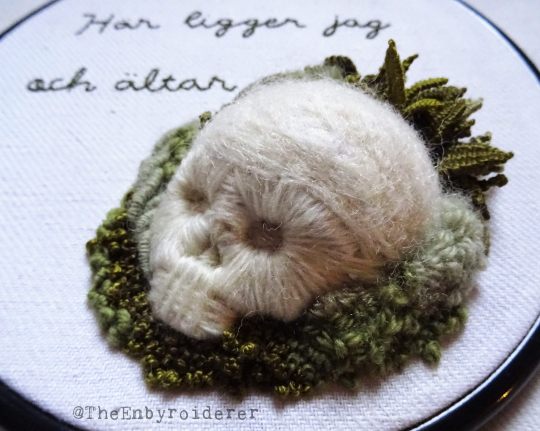
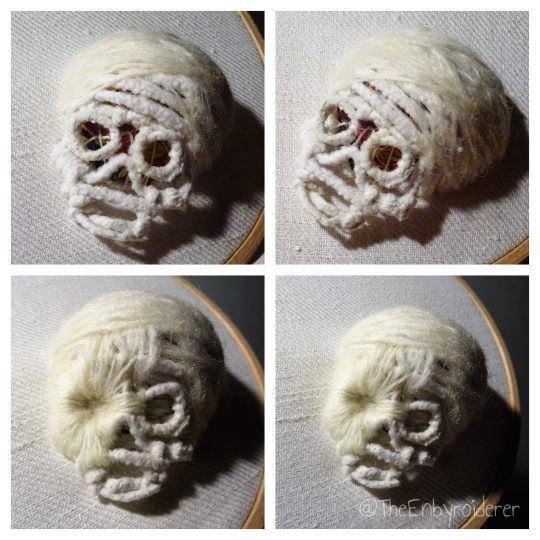
In the lull between fiber projects I'll just post another tutorial. Though this one is less a tutorial and more vague guidelines. There are parts that I can't really tell you how to do and I'm sure there are details that I don't have photos of... but I'll try to describe the process as best I can, and just hope that my words can fill in the gaps. Just ask if you have any questions and I'll try to answer them.
Materials: Cotton fabric, durable, not too thin. Pipe cleaners. Off white cotton thead. Off white wool yarn, a couple different thicknesses is preferable. One shorter and one longer needle, both sharp. (I used sashiko needles, one ~4cm and one ~6 cm.) Felting needles, for the top of the skull. Various green shades of wool yarn, perle, and other threads, for the foliage.
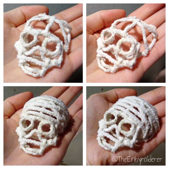
Step by step instructions:
1. Make a skull out of pipe cleaner. Just do it, I can't tell you how.
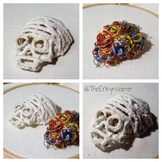
2. Find something to fill your skull with. I filled mine with a bundle of orts (thread scaps), so in my mind this skull will forever be known as Ort-For-Brains. I stitched around and through the bundle of orts a bit so that it was less a random tangle and more of a solid round shape. Then I tucked the orts into the skull and stitched the skull to the fabric with just a few stitches (using a durable cotton thread) around the edge. Make sure you fill the space inside the skull completely. Underneath the face of the skull the brains poked out a bit, so I did some stitches with the cotton thread there to hold the orts down. Another filler may be easier to work with, but I just couldn't resist the though of using colorful orts as brains...
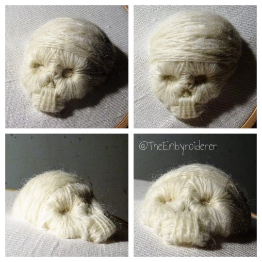
3. Stitch over the pipe cleaner scaffold using wool yarn. I can't tell you exactly how to do this either, and depending on the shape of your scaffold you might encounter different challenges. Just be methodic, and don't overthink it. Use a thicker yarn, or more strands, on the top of the skull, and thinner/fewer strands when you are doing the face. When doing the face I'd say start with the eye sockets because they dominate the face. Stitch outwards from them, as if the sockets are suns and the thread sunbeams, if you get what I mean.
4. When you have stitched to your heart's content you may want to felt parts of the skull to make it smoother. I did anyway. I took bits of wool yarn and carded them a bit to make them less yarn-shaped and more like little sheets of wool, then I used felting needles to poke them into place on the top of the skull. If you have actual rowing wool, use that, it's probably better.
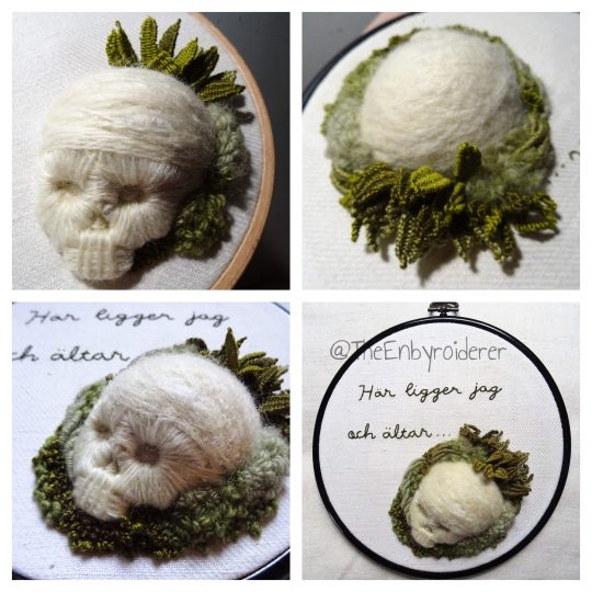
5.When you are satisfied with the skull you can do whatever you want with it of course. I added foliage. Techniques I used for that include: turkey stitch, drizzle stitch, woven picot stitch, bullion stitch and french knots.
#embroidery#3d embroidery#fiber art#3d embroidery tutorial#embroidery tutorial#fiber art tutorial#tutorial#kind of anyway#skull art#memento mori
425 notes
·
View notes
Text
"Get Your Colors" - Warriors Concept Album fanfic
Woe! Fox and Rembrandt angst be upon ye!
Used this as my mind break from "Put Your Gloves Up" and now I'll get back to it. Part six of that will be out soon. Until then, enjoy!
Based on @alexihollis's post
----------
“I don’t get it,” said Fox as she leaned over Rembrandt’s shoulder.
Rembrandt paused, looking between the two oil pastel colors she held in her hands. “Don’t get what?” she asked.
“Why don’t you just get the sets?” Fox picked up a beginner’s box of pastels, a rainbow of simple colors, the ones children got when they were first learning to use them. Rembrandt, however, was not first learning to use them and did not need a kit. “Isn’t that cheaper? And you get all the colors.”
“They don’t have the colors I need.”
Fox grabbed a bigger box. “What about this one?”
“That one has too many colors. And it’s too expensive. Besides, I already have some of the colors I want so I’d rather just pick out the ones I don’t have by myself. I’m not paying for something I have at home.”
“But how do you know what colors you need?”
“I have a plan.”
“But-”
“Fox, do you trust that I know what I’m doing or not?”
“I know you know what you’re doing!” Fox huffed. “I’m just curious. Wait, why do you need four different greens?”
“Because the project I’m working on is a collection of monochromes.”
“What’s a monochrome?”
Rembrandt sighed. She loved Fox, truly, but when the younger girl asked if she could tag along on a trip to the art store, she was not expecting to give a seminar on terms and techniques. “Monochromes are pictures that only use different shades of one color. Usually it’s black and white but I think that’s boring,” she explained.
“Oh. Okay. Can I go look at the sketchbooks?”
“Sure. I’ll come find you.”
It didn’t take Rembrandt much longer to pick out her colors. Trying to balance all of them in her hands, she made her way through the cramped, quiet store to the aisle with the sketchbooks. Fox was not there. Rembrandt cursed under her breath. She hated when she wandered off like this. Walking down each aisle, pausing to look longingly at the nice, expensive spray paints in a locked case, she finally found Fox in the back corner of the store flipping through a book. Fox looked up as Rembrandt came to stand beside her.
“What did you find?” Rembrandt asked.
Fox showed her the cover. “It’s a guidebook to drawing comic book characters.”
Rembrandt looked at the book. She looked up at Fox, her eyes intensely focused on the book, gently thumbing the edge of the page. Rembrandt smirked. “Do you want it?”
Fox looked up, eyes wide as her expression brightened. “Really?”
“How much is it?”
“Six dollars. We don’t have the money, do we?”
“Let me check.” She picked out roughly a quarter of the oil pastels in her hands and discreetly slipped them into the inside pocket of Ajax’s leather jacket that she’d borrowed for the day. It was so loose on her that no one would notice if she hid a whole spray paint can in the pocket, let alone a few small sticks. She put a finger to her lips and smiled. “Yeah, we have the money.”
Fox broke out in a broad grin. Rembrandt made another shut up gesture, and Fox nodded and clutched the book to her chest. They paid for the art supplies and the book - minus the ones snuck into Rembrandt’s pocket - and headed home. Once they were a few blocks away, Fox leaned down and lowered her voice.
“How many did you swipe?”
“Four or five.”
“Nice.” Fox gasped. “Oh, shit! I don’t have any paper to draw on!”
“I have an extra little sketchbook you can take.”
“Are you sure?” Fox asked with another big smile.
“Yeah. It’s one I stole, anyway.” It actually wasn’t. She was planning on keeping it in her jacket so she could draw on the train without carrying her full sized sketchbook everywhere, but she could never say no to Fox when her face lit up like that.
When they arrived back at the apartment, Ajax was lying on the couch watching some thriller TV show. Fox sat at the kitchen table with her book while Rembrandt stood behind the couch. Ajax sat up as Rembrandt leaned down to give her a quick kiss. “How was the art store?”
“It was good,” Rembrandt said. “Got the colors I need and Fox got a book on how to draw comic book characters.”
Ajax glanced at Fox, engrossed in the book, and sat up further to whisper to Rembrandt. “Do we have money for that?”
“I mopped a couple oil pastels and that made up for it.”
“You gotta stop doing that before you get caught.”
“And if I do, I will talk my way out of it.”
“You’re dangerous.”
“You love it.”
“I do.” Ajax pulled Rembrandt close by her waist and peppered her face and neck with kisses. Rembrandt laughed, cupping Ajax’s face and planting a long, gentle kiss on her lips.
From the kitchen, Fox called, “Get a room!”
-----
Cowgirl fidgeted on Cleon’s couch. Rembrandt had had her sitting there for close to an hour, and, shockingly, she was almost out of things to say. Sitting in the armchair across from her, Rembrandt barely noticed. When she really got to working on a drawing, she could work through the night without realizing until Ajax woke up and gave her shit for not sleeping again.
Cowgirl groaned and threw her head back so Rembrandt would finally look up. “Girl, how long do I have to stay like this?” she whined.
“I’m still blocking colors,” said Rembrandt. “Calm down, I’m almost finished. I just need to get a few more shapes in and then I can do the details on my own.”
“Can I at least see it?”
“Not yet. And stop moving your hat. You change the shape of your hair when you do that.”
“None of your other drawings of me have taken this long.”
“This one is special.”
“Um, excuse me, all pictures of me are special.”
“This one’s a collection,” said Fox. Getting up from the table, she came up behind Rembrandt and put her arms around her shoulders. Rembrandt paused her drawing to squeeze Fox’s hand. “They’re monochromes. She’s doing them for all of us. We’re all different colors.”
“What color am I?” Cowgirl asked. Rembrandt lifted the royal purple oil pastel she was working with in response. “Why am I purple?”
“You feel purple,” Rembrandt said simply.
“The fuck does that even mean?”
“It means exactly what I said.” Rembrandt set aside her pastel. “Okay, I’m done.”
“Thank god.” Cowgirl stood up and stretched. “I need a drink.”
While Cowgirl headed into the kitchen, Fox reached out to touch the edge of the drawing, making sure she didn’t smudge anything. She rested her chin atop Rembrandt’s head. “Hey, what color am I?” she inquired.
“I haven’t figured it out yet.”
-----
Shouts and screams echoed behind them. The pounding footsteps of their pursuers like a horde of nightmares. Flashing lights and police sirens in the distance, more shots as the world devolved into chaos. Rembrandt ran faster than she ever had in her life. She barely felt the burn of her lungs and her muscles. She barely heard Swan and Cochise and Ajax shouting instructions behind her. All she could focus on was the path ahead and Fox running just as fast beside her.
Fox tripped. She fucking tripped. Rembrandt almost fell herself with how hard she backpedaled. She grabbed Fox’s arm, hauling her to her feet as panicked words tumbled from the younger girl’s lips.
“We’re dead!” she cried. “We’re fucking dead! When I woke up today, I didn’t think we could die!”
“Neither did I!”
Swan shouted behind them. “The cemetery! Go to the cemetery! Go!”
Rembrandt found herself hiding behind a tombstone, pressing her back against the cold, wet rock as she tried and failed to catch her breath. Fox knelt beside her and clung to her arm. A helicopter flew overhead as lights and blaring sirens passed the cemetery. Swan stood, looking around, and motioned for everyone to stand up. “Make sure we’re okay,” she said.
“This is a graveyard,” Rembrandt said pointedly, because Swan usually wasn’t one for dumb sentences but that was fucking stupid.
“Everybody make it?”
They’d all made it. All except Cleon. All except the best of them.
Rembrandt hadn’t been this terrified since before the Warriors found her. She couldn’t breathe. She could barely see through the rain and the tears she desperately tried to blink away.
“What are we gon’ do?” she whispered. Fox was right there echoing her. “What are we gon’ do?”
“We get back home alive.”
-----
Rembrandt sat on the floor behind the couch in her and Ajax’s apartment. Her, Ajax, and… Fox. It used to be home, it used to be home for the three of them. She still remembered how happy Fox was when they found an apartment and she got her own room for the first time in her life, no longer on Cleon’s couch or briefly sharing Swan’s room when they decided she couldn’t just stay in the living room anymore. She remembered how excited she was to decorate it with comic book posters and all the plushies she collected from carnival games on the boardwalk.
Hanging on the walls were the best of Rembrandt’s drawings of her. Fox loved to sit for portraits. She always said how pretty it made her feel. Even months after losing her, Rembrandt couldn’t bring herself to go into that room. Everything left of Fox was just sitting there collecting dust. Rembrandt couldn’t face that. All she could do was stare at the forever-closed door.
The front door to the apartment opened and shut. She flinched at the sharp thunk of the deadbolt, her mind throwing her back into an east village loft, sitting beside Fox on a couch, clinging to her hand and wondering how the hell she’d gotten into a situation like that.
“Baby, I’m home!” Ajax called. Rembrandt pulled her knees to her chest and wrapped her arms around her legs. Ajax’s footsteps padded through the apartment, around the couch, and Rembrandt heard her sigh as she knelt beside her. Ajax touched her cheek, and she leaned into the contact. It was second nature at this point. “Why are you on the floor?”
Rembrandt jerked her head towards Fox’s bedroom door. Ajax exhaled sharply through her nose. Wordlessly, she sat on the floor beside Rembrandt and pulled her into her lap, holding tight as Rembrandt wrapped her arms around her neck and buried her face in the crook of her shoulder. She was so sick of crying but she couldn’t stop it, burning tears dripping down her face and soaking into Ajax’s shirt.
“I miss her,” she whispered.
“I know,” Ajax said. “I miss her, too.”
-----
“I don’t think Rembrandt likes me,” Mercy mumbled.
“What are you talking about?” Swan asked. “She likes you.”
Rembrandt overheard from the living room in Cleon and Swan’s apartment, which was also Mercy’s apartment now, too, she supposed. Everyone else was out at work or doing gang business and Ajax was still reluctant to leave Rembrandt alone given her mental state over the past months, so she sat with a blank sketchbook in Cleon’s living room until Ajax got back. She tried her best to ignore Swan and Mercy’s conversation but the walls were thin and she couldn’t tune it out.
“She looks at me like she wants me dead,” Mercy continued.
“It’s just resting bitch face. That’s how she looks at everyone she doesn’t know.”
Wow, Rembrandt thought. Thanks, Swan.
“Did she look at you like that?”
“No, but that was Rembrandt then. This is Rembrandt now, and she’s just… she’s getting used to you.”
“Everyone else did. Even Ajax doesn’t side eye me every time I walk into the room.”
“Are you mad?”
“No! No, I’m not mad. I just wanna know what I’m doing wrong.”
Rembrandt sank into the couch. She didn’t dislike Mercy and it hurt to know Mercy thought that but it just hurt so much to face her because-
“You’re�� you remind her of Fox,” Swan said. “And I mean it in the best way! But Rembrandt just can’t-”
Rembrandt turned on the TV and cranked the volume until she couldn’t hear her own thoughts.
-----
Rembrandt stood over her desk in her and Ajax’s bedroom, rifling through her desk and sorting her sketchbooks and drawings. The books had begun to pile up around the room, her desk was running out of storage space, and the corner she designated for larger canvases and other projects had gone from a corner to an entire wall. Ajax hadn’t exactly asked her to clear out some of the pieces, but she always apologized profusely when she knocked over a stack of books or almost damaged a painting, so Rembrandt decided to whittle down her collection to just the best and most sentimental.
With her desk mostly sorted, she turned to the squat filing cabinet she kept beside it. In the bottom drawer, she discovered her collection of oil pastel portraits. She found it within herself to smile as she flipped through the stiff sheets of drawing paper. She’d finished most of them a long time ago, maybe missing a detail or two here and there, and there were some parts she could go back and touch up if she really wanted.
The first one she picked up was Ajax, her strong features highlighted in rich, deep reds, piercing eyes staring directly off the page.
There was Cochise in hunter green, a side profile, smiling softly.
Cowgirl in royal purple, adjusting the brim of her hat with a grin.
Swan’s calm, stoic face in dark night-sky blue.
A self portrait in sunshine yellow.
Cleon in gold. Rembrandt had had to do a lot of experimenting with colors on that one to make sure the palette didn’t look too similar to her own portrait. She’d used mod podge and gold glitter in the shadows of the piece to give it that extra bit of glow Cleon always seemed to carry with her.
Rembrandt’s heart sank when she got to the last drawing.
Fox, in bright Tiffany blue. Fox with a wide grin, Fox with her sparkling eyes staring back at Rembrandt, immortalized in such a fragile fucking medium that some of the details had already begun to disappear from just sitting in a drawer. Any light touch would smudge the pigment and Rembrandt would lose more and more of her because nothing could be permanent, none of it was permanent, she tried so hard to hold on but no matter what she was just going to lose her all over again-
Rembrandt screamed and swiped half of everything off her desk. Sketchbooks and pencils and paint cans crashed to the floor, and Rembrandt fell to her knees amidst the mess, unable to look at the portrait any longer.
When Ajax got home later, she found Rembrandt curled into a ball under her desk, still bawling her eyes out, covering her mouth to silence herself. Ajax spotted Fox’s drawing on the desk and didn’t ask what was wrong. She just sat a comfortable distance from Rembrandt and waited for her to come out. Rembrandt loved her for that.
-----
Rembrandt took a deep breath, shifting her backpack straps on her shoulders before knocking on the door to Cleon’s apartment. Mercy answered. Rembrandt knew she would. She’d planned for this, making sure to come over when she knew Mercy was home from work and Cleon and Swan had business to handle. She wanted this to just be for her and Mercy. She just… she needed it to be.
Mercy raised her eyebrows, visibly confused when she opened the door to find Rembrandt alone. “Hey,” she said.
“Hey,” said Rembrandt. “Can I come in?”
Mercy stepped aside hurriedly, as if she found it rude that she’d been keeping Rembrandt in the hall, even if she really wasn’t. Rembrandt took a few steps into the kitchen as Mercy closed the front door behind her.
“Is everything okay?” Mercy asked. “Cleon and Swan are out if you need to talk to them.”
“I know. I wanted to talk to you.”
“About what?”
Rembrandt fidgeted. She took a deep breath. “Will you sit for a portrait?”
Mercy blinked, taken aback. “Um… when?”
“Now.”
“Now?”
“It’ll take two hours at most. Probably not even that long. Please?”
“Sure. Sure, okay.”
It took closer to three hours, despite Rembrandt’s best efforts. She had Mercy sit on the couch and let her put something on TV instead of having her sit in silence, even if Rembrandt would have preferred that. It took so long because she had to scrap the start of three different versions. It had been so long since she practiced this that she kept fucking up the gradients to the point where she had to take a break and go smoke with Mercy on the stoop to avoid screaming in frustration and forgetting the whole idea.
While trying to get the shape of Mercy’s bangs right, Rembrandt’s vision blurred. She jerked her head up just before the tears had a chance to fall on the drawing. She turned aside, scrubbing at her eyes with the hem of her sleeve, somehow managing to keep her breathing steady.
Mercy noticed and sat up straight. “Rembrandt?” she asked, just a little panicked. “What’s wrong?”
“Nothing. Nothing. I’m okay,” Rembrandt assured her. “It’s… I don’t know. But I’m okay. Please just move back to where you were.”
“Are you sure?”
“Yeah, I’m sure. I’m okay.”
She didn’t need too much more time after that before she was satisfied with the result. Of course, she would look at it the next day and find a million things wrong with it, but she could correct or add or remove details after the fact. As she set her oil pastel aside, her fingertips stained with the pigment, she brushed her thumb along the very edge of the page. It left a miniscule cut behind, a bead of blood staining her skin. She had a momentary flash of panic but nothing got on the paper so it was okay. She wrapped her fingers over her thumb, squeezing until it throbbed, until the bleeding stopped and the stinging disappeared. Mercy, thankfully, did not notice that.
In her peripheral vision, Mercy shifted closer to her on the couch. “Can I see it?”
Rembrandt hesitated. Normally she didn’t share portraits until they were completely finished, but…
She sat beside Mercy and passed her the drawing. “Just don’t touch it. It smudges easily.”
Mercy grinned when she saw her portrait: head resting on her hand and tilted to the side, hair delicately swept behind her ear, eyes calm and gentle, the corner of her lips lifting in just the hint of a smirk. It was all done in the softest coral pink, almost ethereal in the light. She reached over to rest a hand on Rembrandt’s forearm without looking. Rembrandt thought she might cry.
“It’s amazing,” Mercy said with a light laugh. “I don’t think I’ve seen any of your work besides the graffiti before. I didn’t know you could do this.”
“The only medium I don’t work with is oil paint,” Rembrandt said. “Maybe if I win the lottery.”
“This looks like an oil painting. It’s like something out of a museum.”
“Thanks. It’s gonna be part of a project I never finished.”
Mercy turned to her. “What is it?”
“You’ll see it when I finish it.”
“Swan said you do that.”
“She knows me.” Rembrandt took a deep breath, her shoulders curling in as she met Mercy’s eyes. “I don’t hate you, you know.”
Mercy grimaced. “You heard that?”
“The walls are thin and you guys always talk right next to the door.”
“Noted.”
“For real, though. Look, I admit that I… I’m still getting used to you being here. You’re so much like her that it just throws me for a loop sometimes and I know Swan has told you I don’t like strangers and you’re really not one anymore but I…” Rembrandt’s voice broke. She turned away from Mercy, covering her mouth to keep quiet as she screwed her eyes shut. Was her heart really choosing right now to have a breakdown over this?
Mercy angled herself in and put an arm around Rembrandt. This very much broke the first rule of the “how to keep Rembrandt from freaking out” rulebook that Rembrandt knew Swan had set, but Rembrandt was glad she did it. She shifted closer, wrapping her arms loosely around Mercy’s waist as Mercy pulled her fully into a soft embrace.
Rembrandt closed her eyes and let the tears fall. Mercy didn’t say anything. She just held her.
-----
“Is it straight?” Swan asked.
Rembrandt stood back from the wall. Swan and Ajax stood on chairs, positioning a giant canvas while the other Warriors watched them. Behind Rembrandt, Mercy put her arms around her shoulders and watched over the top of the artist’s head.
“I think Swan’s side needs to come down a little bit,” said Cowgirl from where she sat in the arm chair.
“Cowgirl, you’re holding your head at a tilt,” Rembrandt said with a wave of her hand. “Ajax, let your side come down an inch. Wait, never mind, half an inch. Yes! There! You guys can let go of it.”
Swan and Ajax let go and got down off the chairs, stepping back to stand with the rest of the gang.
Now hung perfectly on the living room wall was a collage of all of Rembrandt’s monochrome portraits. They were lovingly cut out and carefully arranged together, with Fox front and center and the others supporting around her. Behind them was a detailed black-and-white background of the city, enough to fill the empty canvas but not distracting from the main subjects, everything pasted down and covered with sealant so nothing could ever damage the fragile pigments again.
All of the Warriors, immortalized.
Cleon crossed her arms and whistled. “Damn, Rem, this is some work. How long you been hiding this?”
“It wasn’t finished,” Rembrandt said simply. “Now it is. With all of us.”
Mercy held Rembrandt tighter.
#warriors musical#warriors concept album#writing#fanfic#rembrandt warriors#ajax warriors#cleon warriors#swan warriors#cowgirl warriors#fox warriors#mercy warriors#background remjax#took a break from angst to write more angst#and now I'm going back to writing the original angst
24 notes
·
View notes
Text
tbh i dont know if i’ve ever made a single piece of art i actually like in an academic setting. they’re always haphazardly done last minute and the subject matter is always so. hm. it’s a little boring. the only times i think i’ve come close to making something i was proud of in school is when i was pushed to my mental breaking point and i just started fucking doing whatever i wanted. so today i’m rating them
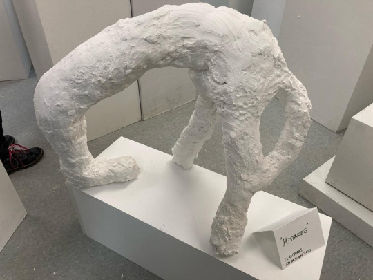
in my sophomore year i was in sculpture class and had to make a smooth plaster sculpture. the amount of manual labor required to sand down a sculpture that had to be at least 3 feet in some direction is not something i wanted to deal with. as you can see my sculpture is not smooth. the design i was happy with— the sculpture itself i was not.
it was titled “Mistakes” or something along those lines. my classmates stood up for me in critique when my professor said it was lazy and unfinished. not one of my peers said a bad thing about it. we smashed the sculptures apart behind the building when critique was over. i still want to cry when i think about it, it was an extremely special experience for me.
10/10 i actually wish i still had it and i have been meaning to make a tiny version out of clay. such a special piece to me, very formative
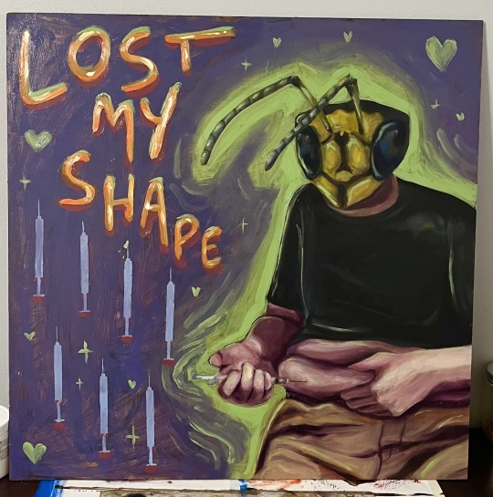
this piece was made at the end of my college career when i first started testosterone. i wanted to make some sort of tribute to it for my final piece— i’m of an extremely divided mind when i think about it. there are parts that look clunky and not developed properly… thrown together, as i believe my professor Jason said. i am, however, happy with certain technical aspects of the piece! the formation and shading of the hand and the syringe is something i really like, and did a lot of layering to achieve. i used a paper cutout to make the repeated syringes on the bottom left, another new technique i tried and was happy with the results of.
the text WAS thrown on last minute in an effort to spice up the piece but it’s a reference to the song Crosseyed and Painless by Talking Heads. it’s a song i’ve always identified with in a gender way, with the first few lines being “Lost my shape, trying to act casual./Can’t stop, I might end up in the hospital.” i felt on the verge of collapse constantly in the early days of my transition. it was like i had lost my shape and was destined to end up hurt in some way. i wish the text was more well thought out, it could have been done in a more uniform way and i think it would have looked a little better.
the wasp head is also a reference to an old oc of mine, who was a man with a wasp head named Gene. i wish i would have used different colors, the black and yellow i used should have been warmer. mars black instead of ivory. whatever again it’s technical stuff.
6.5/10 i could technically go back and fix this one bc i still have it, but i have better things to do rn.
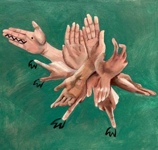
the hand dino came into the world in a fiery manner. for the final project we had to make a piece with the dimensions of minimum like 4ft by 4ft, and by this point i was burnt out and the most exhausted with art i’d ever been (besides maybe sophomore year ig 🤔) and i told my professor i couldn’t do a project that big. he made the mistake of telling me to do what i could manage, which ended up being a roughly 12in by 12in piece of oil painting paper.
in many ways i like the concept of this piece. the idea of it. it’s fun! it’s combining realistic elements with cartoonish ones in a way i enjoy.
however. looking back, i genuinely think it would have been a cooler concept on a bigger scale 😭 which is so frustrating.
7.5/10 i wish i’d had it in me to do it better.
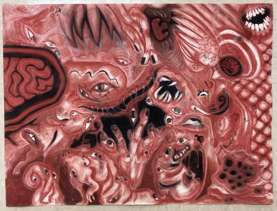
and how could we forget dear body horror babe? made in my first semester of sophomore year and done with ink and charcoal and conte crayons, it was an assignment one of my more eccentric teachers wanted us to do where we randomly splattered ink on a paper using ink-covered coins and tried to come up with a drawing just from the happenstance of where the ink coins landed.
i chose a more abstract route and basically turned every ink splat into an eye and tried to come up with somewhat distorted body imagery to evenly fill all the space on the paper. you can find a lot of stuff going on in this piece.
11/10 but also not done at my lowest point, just during the steady decline.
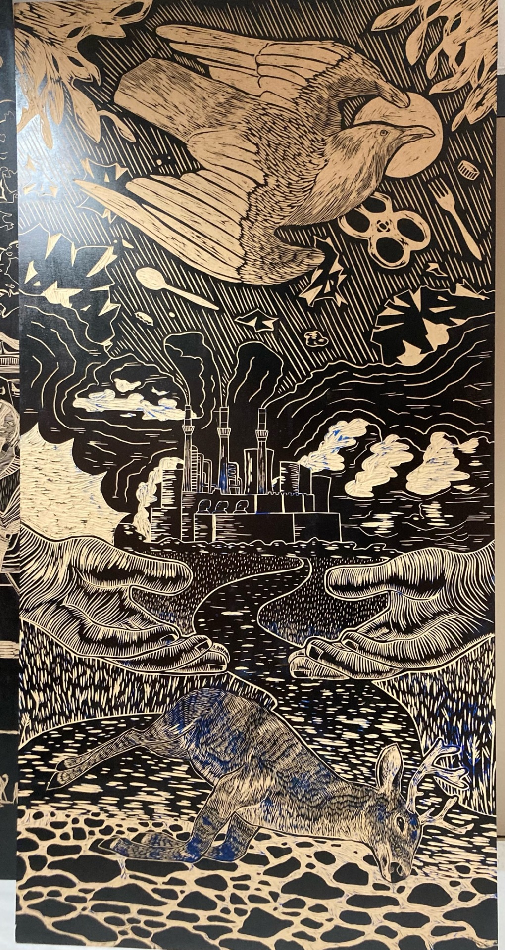
ok can i be frank for a second. i fucking hate this piece. so what you’re seeing is an 8ft by 4ft thin block of particle board, carved by hand in low relief to ink and print on old bedsheets.
my professor for this relief class was strict about the theme of the class, which was political art. she insisted we make art relating to a political topic and our beliefs on it. and this isn’t to say political art is bad in any way, but it’s truly not something i want to FOCUS on creating necessarily. the fact that it was MANDATORY is the issue here. one of my classmates refused to make purposely political art and instead chose to make a beautiful piece of the sun and moon as lovers. i wish i had just done the same and refused to make strictly political art. if i’m honest i just wanted to make an epic wood carving scene of a dark and eerie night outside draculas castle. instead, as you can see, i chose (somewhat arbitrarily in an effort to make the project into something i could enjoy carving) environmentalism.
technically i don’t mind this piece. the composition is fine and the detail in some areas i’m very proud of. other areas not as much. my teacher also forced me to do what i think is over-carve some areas to fill the piece with texture. i do not like it and i wish i had kept some areas fully un-carved, even if it didnt print right. i don’t care.
also what’s worse about the whole experience of this piece is that it was part of an event called Blocktoberfest and my school partnered with a local state college to make and print these huge blocks on their campus. the reason this is bad is bc the state college students did whatever the hell they wanted for their designs and we saw some really cool subject matters, from aliens to occult symbolism. and their school’s art department had a couch in it and ours didn’t. :/
also blocktoberfest was an insane amount of physical work bc rolling those big ass rollers in ink and then a giant block and then ink and then the block and ink and block was a lot of effort. i was sore after it. and it lowkey felt like me and my classmates were doing all the work and like maybe 5 people from the other school were helping. whatever. whatever anyways
1/10 genuinely pisses me off to look at. wish i would have just done draculas castle
^i also think it’s worth mentioning about this professor: no one really liked her. she made it very clear that she thought there was a right and wrong way to create art. and she fully believed she was right about everything bc she was old and wise. and she was also gay so maybe she had some credit. but her art to me always felt a little uppity and she was also really rich. she let us visit her studio and we did our final critique there of a piece i made that i absolutely hated everything about. i dont even have a picture of it bc it pissed me off so bad. she also was lowkey racist towards a few of my classmates so i really don’t like her.
anyways that’s all the pieces i want to review currently. let me know what you guys think about em if you want. i hereby ask for you to critique my art.
the difference between making art for a deadline vs making art purely bc you enjoy the process and outcome is so crazy. it actually makes me sick with sadness. i don’t have the resources to create freely yet. anyways art under the constraint of academia is so frustrating for me specifically. like whatever. whatever
25 notes
·
View notes
Text
Older Sophul in the manga?? (+ the unintentional mini essay I wrote about them)
Friendly reminder to all of you (the 10 Sophul fans out there) that there are actually 2 manga versions of THAT ch22 scene (so spoilers for that ahead).
I do NOT see anyone talk about this so I will talk about it.
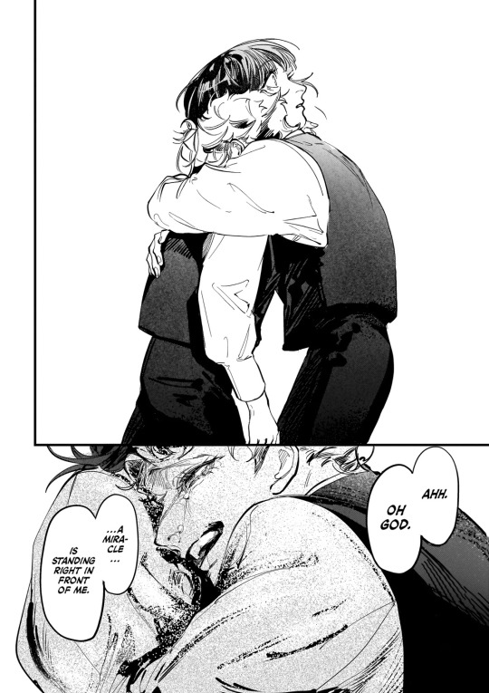
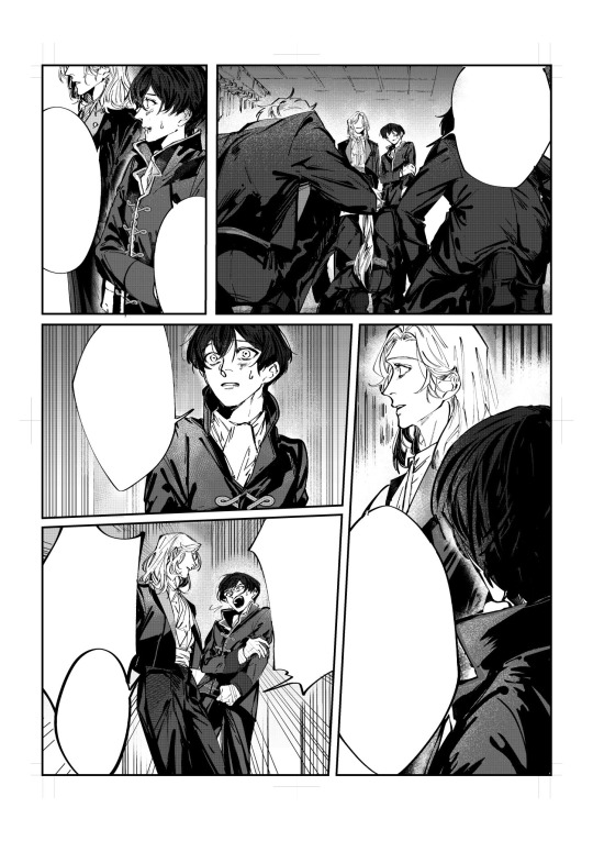
First there’s the one that we actually got in the manga:
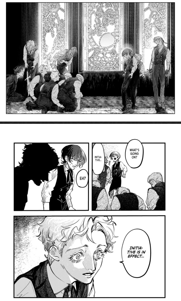

And then there is this from Hamaguri’s twt:
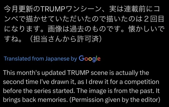
+ notes edit: mini(?) essay on the differences between these 2 variations bc I am totally normal:
this unofficial version of the scene does not show a background or any dramatic lighting. it also does not have as large a range in brushes/shading techniques like the manga does (for the brushes I specifically mean the ‘Oh god there is a miracle in front of me’ panels).
in the 2013 TRUTH version of the play, there was no scene where sophie and ul were hiding in the chapel. I have not seen the other versions as they are not subbed, but if they are also like this maybe it explains the lack of background in the unofficial manga scene.
there are also differences in storyboarding etc that also contribute to the higher level of intensity in the official manga version: for example, the hug is given a full 2/3 of the page with 0 background in official version, while the original scene rendition’s hug has only 1/3ish of the page AND it overlaps other panels. so it feels like a sort of transition from one panel to another in the older one, but in the official it’s a whole new page, you don’t see it coming, more of a panel meant to catch you by surprise, it’s given more space on the page because it’s a bigger deal.
but I’ll get into that in a minute.
both versions have their differences in characterization, paneling, and feel, and I think that’s what’s so good about them both. in this essay I will 🙏
let’s start with the protagonist of all time (literally, as per the series chronology 💔). Firstly I do NOT fw his haircut in the first rendition. he wouldn’t be the same without his fuckass signature jellyfish cut.
Secondly, take for example, the panel when Ul grabs him to hug him. I think older sophie’s expressions seem more horrified, whereas in the official manga he just looks utterly stunned. poor boy :(
I like older sophie’s expressions in this scene more though, I can’t place why. but regardless, it does make more sense for younger sophie to be stunned rather than scared/disturbed in the official version. here’s why: ul seems to be characterized a little bit differently in these versions. not sure if it’s intentional or not but here’s how I see it.
in the second set of panels, where older Ul is saying ‘Could it be.. are you TRUMP?’, his irises are left unshaded and are somewhat bigger than in the manga. in the official, younger ul’s eyes are wider/shaped different while the irises appear smaller + are shaded. these changes from the original to the official contribute better to the feeling that he’s tweaking I think. and there’s more to that.
older ul’s vibes in that specific panel, because of the way it’s drawn, feel like he’s looking at sophie like this because he’s already found in sophie what he wants.
or at least that is how it feels to me, especially when you compare to the manga version, where there is more dramatic lighting, no colored-in background, younger ul is tearing up, the inner ends of his eyebrows are tilted steeper. younger ul’s face (eyebrows and mouth especially) is drawn to actually look more like he’s asking a question. meanwhile, nothing of older ul’s mouth is visible except for his teeth and the corners of his mouth are angled in some kind of smile. it all gives the vibe that he is looking at/talking to sophie differently in the different versions.
almost like in the official, younger ul is less certain of everything than older ul is.
it’s like official manga Ul is searching in sophie for what he wants (as opposed to contest rendition Ul’s look of having found it in Sophie already). he is unsure and trying to convince himself/confirm somehow that it’s there. this difference in how ul might be feeling differently in these two versions can also be seen through the hug.
in the older drawn scene, the movement of ul going in to hug Sophie comes off a lot more natural/slow-occurring (even if still unexpected). ^ see my comments on the storyboard/paneling changes in the third paragraph.
my interpretation is that younger ul’s hug is more sudden because he is more desperate/insecure about his idea, and he has a need to feel like it’s true, so he acts very unpredictably + immediately to try and confirm it.
so this bit of the older version, while less sudden, is better like this than it would have been if their expressions matched their manga counterparts. it’s like older ul already knows what’s in front of him, he’s fully accepted it even while he asks, so he doesn’t need to hug sophie quite as abruptly, he’s not desperate to find some kind of proof for anything.
^^ I’d like to think maybe they knew each other for longer in this version of the scene because they’re older, even though I know that’s 99% likely not the case.
extra note because I forgot to target the body language earlier: younger ul is hugging sophie with his face right in sophie’s shoulder, and older ul is hugging sophie with his head past sophie’s shoulder. they’re both postured the same (I think?) while hugging. older ul would probably be hugging like that because he’s taller than older sophie. but they’re the same height when younger so for the manga it looks like ul is specifically hugging sophie like he’s trying to hold onto him.
but because of all these changes from the first time the scene was drawn, the manga version is much more intense than this trial/unofficial version and now we have the masterpiece that is the manga. it’s likely that the decisions for these changes were not all intentional, and maybe i’m reading a little too much into it but it’s TRUMP & I have the Theme of Sophie and Ul looped on spotify rn so what else can I do .. all these differences are so good to me I fuck with them heavy 💜
honestly wasn’t even planning to yap about everything I found til I was about to press the post button and went ‘wait’ and started noticing. so if all this sounds like bullshit it probably is. oopsies.
but. no one talks about these sophul pictures and I think we should change that 💔
#true of vamp#trump series#trump suemitsu#suemitsu kenichi#sophul#sophie anderson#ul delico#angelico fra#raphael delico#dali delico#delico’s nursery#trump truth#gerhard fra
23 notes
·
View notes
Text
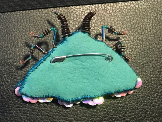
Moth pin/brooch
A couple people asked me how I made this so I figured I’d just make a little post explaining it.
Before I start I WOULD like to disclose that the pin I’ve made is hugely inspired by the one by TheClosetHistorian (on YouTube) and you should definitely consider checking out her video if you want more instruction or like that format better.
I made a little graphic showing some work in progress pictures as well as materials and techniques used in the different areas. I will type it out in more detail below.
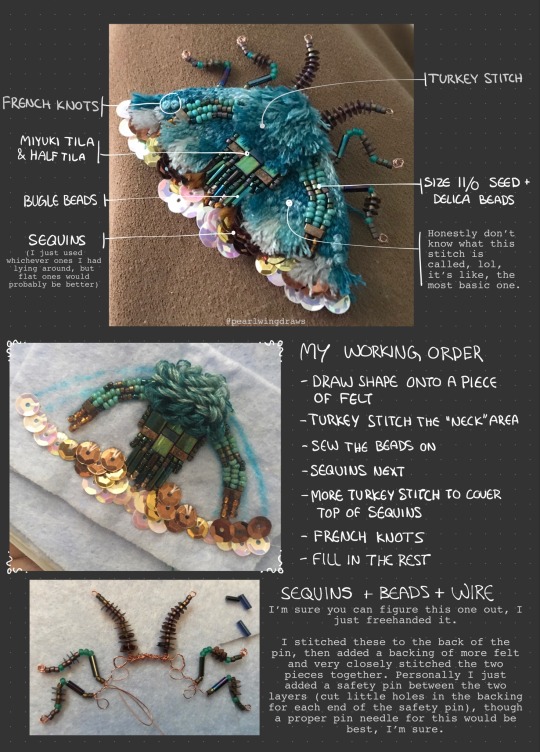
1. First draw out the shape I want on a piece of felt. Add some guide lines for different parts of the design. I layered mine double because it’s quite thin. I used an (unused) dish rag, so don’t worry about the quality of your felt.
2. I start off embroidering the “neck area”, using turkey stitch. Starting from the bottom up, I use a dark turquoise floss, then later mix in a lighter shade.
3. Next I sew on the beads. String on 5-6 at a time and then go back and tack them down with small stitches. I don’t know much about embroidering with beads, so this may not be the “correct” way to do it. The types of beads I used are size 11/0 seed beads and delica beads, as well as bugle beads and Miyuki’s Tila and half Tila.
4. Sequins. I recommend using flat ones instead of the ones I used. I work from the bottom up, trying to get a nice silhouette with the bottom layer, as this will form the outline of the finished piece.
5. After finishing with the sequins, I do some more turkey stitch around the top, so it covers up that edge where you can see the tread. Optionally you can do the whole thing with sequins if you want.
6. Next thing I did was some French knots, just above the turkey stitch in a contrasting color. This is just for some textural variety and decoration, as little “spots”. You can really add them wherever you’d like, or not at all.
7. Then I just finished embroidering the thing. Don’t know what the stitch is called, it’s just making little stitches beside each other until it’s all filled in. I did a little gradient because I felt like it.
For the legs and antennae, i also just winged it. The legs and antennae got layered double in wire and twisted before adding the beads and sequins, then I just used the very tip of my round plier to curl the remaining ends into round little “feet”. Then stitch them securely to the backside of the pin.
I finish it off with another layer of felt, this one painted with a fabric paint I happened to have lying around, both for some extra strength and to match the color scheme better. I cut little slits to fit in a regular safety pin (I recommend get a proper pin/brooch needle) and stitched the backing on with very dense stitches. Pictures below.
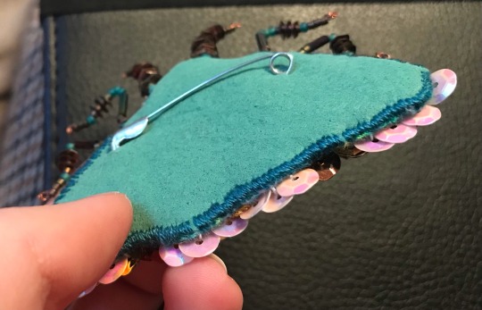
Extra suggestions:
If you don’t have sequins, or want a different look, you can embroider the whole thing. Alternatively you can fill the whole space with sequins if you don’t want to embroider it all. You can of course do any shape, size and color scheme, whether based on real life moths or just fantasy!
Lastly I just want to thank everyone for the love you’ve shown for this silly little bug 💖 it means the world to me, and it has really inspired me. I wish I could sell these, but I don’t think that’s really an option for me right now. I’ll let you know if that changes in the future, but until then, I hope those of you who have the interest to make your own find this helpful.
#my art#art tag#embroidery#jewelry#accessories#embroidered pin#embroidered brooch#fabric art#textile art#tutorial#art tutorial#i guess??#moth#moths#insects#bugs
150 notes
·
View notes
Note
HWAAAAHHH HEY ROOOOO ♡
A not so quick thought I've been dying to shareeeee ahhhhh
Omg- so yk how Mc has that long table in their room??? Imagine setting up a craft station each week for the boys to do a lil craft.
Beel, Asmo, Dia, Simeon and Luke are super excited for crafting. Barbie, Mamms and Levi are excited too even if they won't admit it. But Luci, Satan and Belphie need a little bit of convincing. They're not children! But after your first successful chaotic crafting session they start to like it.
𖥸 Luci is surprisingly artistic. Even if it seems silly, this little crafting session is very relaxing and it gives him time to bond with his brothers. He likes to follow the model closely first before experimenting a little bit with his technique and style
𖥸 Mamms + Levi are trying to 1 up each other the whole time. They will hate on each other's projects and will fight over supplies. Mammon will swipe the scissors from Levi mid-cut even though there are 5 other pairs currently not being used. Then Levi will try to get them back and a fight will break out. Mc has to use "stay" before Levi summons Lotan.
𖥸 Satan bbg I'm so sorry. He will make something beautiful that he's proud of but it will get ruined. He'll just be putting the finishing touches on his craft when Levi and Mammon's fight will cause something to ruin it. A paint cup got knocked over and now there's paint water soaking his hard work. Or the glitter got spilled and now there's sparkly bits clinging to the undried glue. Mc is gonna have to use "stay" again to keep him from wringing his older brothers' necks.
𖥸 Asmo's crafts can be described in one word. Shiny. He's using all the glitter, gold leaf and sequins available to him. He especially likes those gold and silver detailing pens. But don't mistake sparkly for tacky because even if his crafts are sparkly they are still tasteful.
𖥸 Beel + Belphie will make adorable little projects but Beel will try to eat the supplies duh. Please for the love of Dia get the nontoxic supplies. He can't help it though. That shade of pink looks just like a poison strawberry tart and the colors Simeon mixed look exactly like Madam Scream's Macarons! He just wants a little taste. Belphie will be busy trying to stop him from drinking paint. If he keeps a few extra snacks on hand then it will keep Beel at bay.
𖥸 Diavolo is just absolutely enamored by all the cool crafts. Like woah you made that little scarecrow!? And you made a pom pom pumpkin? He's so excited to try out all the crafts and is that one weirdo that is absolutely covered in 8 different colors of paint somehow even though he only used white.
𖥸 Barbatos will also create the most gorgeous crafts. Like excuse me sir, you're telling me you made that out of construction paper, pipe cleaners and popsicle sticks???? There ain't no way. 100% the chillest crafter at the table but he will snap Mammon and Levi's necks if any of the mishaps of their fight ruins his project.
𖥸 Simeon and Luke will probably work together on a craft. Like Asmo's projects, Simeon and Luke will add lots of pastel colors and shiny bits to their project mostly in the form of gold flakes or those metalic paint pens.
𖥸 Solomons crafts are similar to his cooking. They never end up being what was intended. Like today we're making kites and - Uhhh Solomon made an abstract Mona Lisa with construction paper shapes?? Alright then... You do you man
HIIII CHERRY!!! Omgg okay- this is all so cute <3 finally giving that silly table a good use too jsjsjsj besides homework 💀
Lucifer being good at everything doesn’t even surprise me anymore- but he’s genuinely very into it and it’s nice to see him try to relax and do something with his brother that’s just for fun!!!
Mammon + Levi- I wouldn’t expect anything else honestly- those two can’t stop for five minutes and they almost ruin it for everyone. (Until MC calms them down and fixes everything) also the fact Levi’s better at traditional drawing them Mammon is probably another reason they fight hskshsj
Poor Satan. Tho depending on how annoying Levi & Mams have been it might be fine to let Satan smack them up a bit- jkjk bad idea ik- MC needs to help him calm down and maybe start a new project together? (That’ll at least perk Satan up and piss off Levi ‘n Mammon which again will make Satan feel better :))
The first thing Asmo used was a pick glitter gel pen and his artwork is absolutely gorgeous~ (definitely something super shiny!!! but still gorgeous and he’s careful to stay at the other end of the table away from Levi and Mammon helpsjsj)
All the supplies have to be non-toxic and absolutely no one can try drawing or making anything resembling food- Also just imagine Belphie taking the paint water away from Beel and putting it by his drink….so a little later sleepyhead accidentally drink some instead lolol also anything Belphie actually makes looks like it’s out of a horror movie while Beel’s is just…abstract :)
Diavolo’s feels like a callout as the kid who was always covered in paint but he’s so happy with his little somewhat lumpy pompom and little painting!! Just look at his sweet smile!!!
Barbatos doesn’t even need to threaten Mammon or Levi- they take one look his way and see that smile and know they better knock it off and behave- also how??? Sir it’s gorgeous but how??? Hell he probably made a fully functioning little model of MC XD
Simeon and Luke are adorable as always!! It’s definitely something sweet, yet a little more simple, but still very cute! The shiny bits are perfect and they definitely made it with the intention of gifting it to MC when they’re done <3
Solomon……Solomon wtf why?….you could’ve drawn a stick man and it would’ve been better that…uhhh that- But he’s happy!! Also very, very proud of it and when you ask what it’s supposed to be he looks a little offended-
#awhwhwhw I loved this sm <3#not a super crafty bitch myself but with these dummies it would be ✨fun✨#obey me!#obey me#om!#obmswd#obey me fluff#om! fluff#obmswd fluff#obey me shall we date#obey me shenanigans#obey me headcanons#om! hcs#om! headcanons#obmswd hcs#obmswd headcanons#ro rambles#moot mail!
164 notes
·
View notes
Note
Yo! Do you have any notes/tips for your coloring process? I've always had trouble with that part of drawings looking good lmao and I really like yours! If not for your specific style, do you have any tips with that in general?
Iv gotten a few asks about how I color but iv always avoided answering because
A) I am absolutely awful at explaining things, and
B) I am a very Very lazy artist you should probably Not do the things that I do
BUT i feel bad gatekeeping(?) my horrible technique if it helps anybody ig ill try and explain so
✨✨✨Welcome to Reegis’ Probably Not Reputable (But Very Long Winded) Art Advice✨✨✨✨


line art of a random character for the example, just pic whatever colors you have in mind for your base colors, you can try using palette generators or basing it off of existing palettes/characters/whatever I have absolutely no idea how color theory works (& this is why you shouldnt listen to me) so im solely going off of vibes. but it is Rough so onto step 2 & 3
(edit to add i usually start off with the skin hair & clothes on separate clipping layers and merge them together towards the end.. i think i forgot to say that at all here oops)
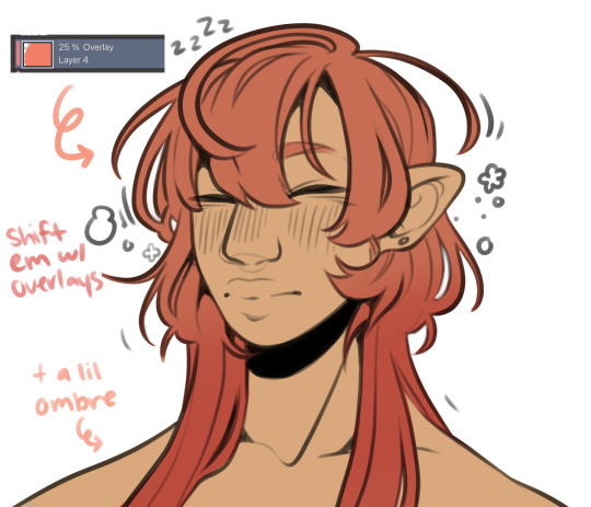

I abuse the hellll out of layer blending modes. overlay, saturation & multiply mainly, but also difference, brightness & screen. (just doodle something & try all of em out to get a feel for them honestly ik theres a Lot and they can be intimidating) for this i just wanted a more cohesive warmer tone to start with so i added a peachy overlay & a slight ombré to the hair to add a bit more interest to the character.
then just the most basic of rendering, some blush & highlights just wherever i think theyd go.


Another thing they tell you Not to do, my next step is to block out all my shading in a vaguely purpleish multiply layer!!! i cant be assed to do it any other way im sorry…. once i have the basic shading down, i lock the layer & go in with air brush eraser & also airbrush in other colors wherever I think the purple is maybe too harsh/clashing
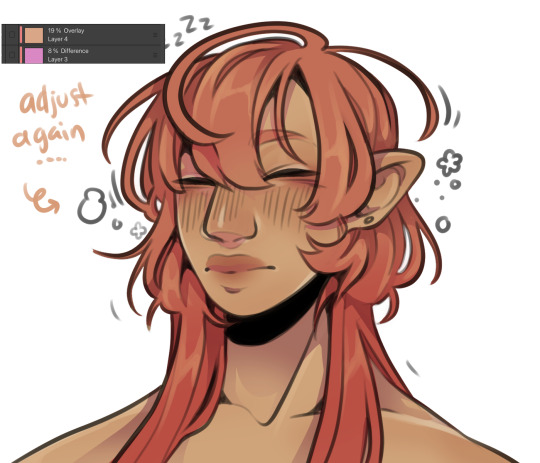
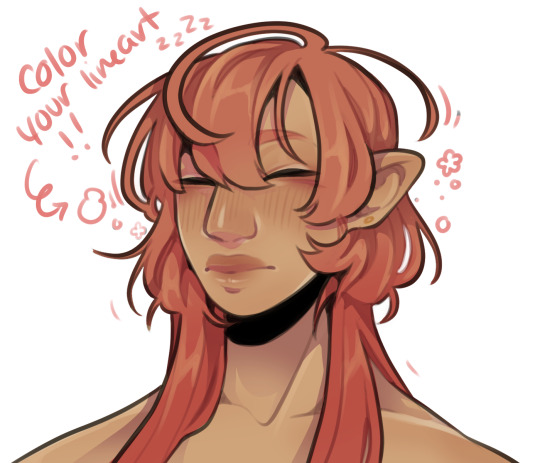
still wasnt 100% happy with the colors so messed around with some more layer filter/modes/whatever you call them then colored in my line art! i think this is honestly the saving grace for all of my art shshsdhhf color your lines people. doesnt have to be all (i dont, i like the contrast) but it usually helps to make some at least a little less harsh
then with a little more color tweaking im done! one random sleepy dude, fully colored (by my standards)
and then if a piece needs more dramatic lighting you justttt
im so serious play around with layer settings! these are just basic multiply & add(glow), there as so many others you can abuse the shit out of & nobody will know or care in your finished piece.
was this?? in any way helpful???? I hope so.
#THIS IS A BELATED ANSWER FOR ALL OF U MY B#scrolled back to find the earliest one i could bc i mean… you asked first#if this was in Any way helpful…. im glad#and also sorry. probably dont do these things#hmu if youd like me to clarify anything ill… do my best#asks#my art
118 notes
·
View notes
Note
dropping in to let you know that I find your painting style verry pleasant uwu Do you have a technique or is it vibes only?
Thank you very much! Apologies for answering late, I'm happy to hear that you find my style pleasant :]
As for techniques... techniques... hmmmmmmm, my art process is very loose, so I suppose its mainly based on vibes, however there are a few techniques that I do use in my art process!
-Going Dark then Lighter
Its easier for me to figure out where the light hits rather than where the shadows fall, for this reason I often start with a character or background a lot darker that they are supposed to be and then adding light to it, it is quite an effective technique for scenes that have dramatic lighting
Sometimes the "outlines" that appear are just me adding light and not quite allowing the light to touch the edges
like this (not all outlines are because of this tho, some outlines I do add deliberately)
-Checking Values
If you make a layer that is entirely white, put it on the very top, then set that layer's blending mode to Color, you will get a black and white version of your artwork! (blending modes Hue and Saturation also seems to work, I can't tell if there is a difference between the three, but I always usually go for Color) Its a quick way to check values and make sure that no colors are blending together
-The less layers the better!
This is more of a personal preference but I absolutely hate managing a lot of layers, so I try to use as little layers as possible, characters are always rendered on a single layer, colors, shading, and all! If I use any blending modes such as Overlay or Multiply, I simply get the result that I want before combing the layers to continue working on it. The 2 brushes that I use has quite a nice blending to it and when worked on a single layer is what most likely what gives it the painterly quality.
Background layers are a bit more complicated because there are many elements to work with, but works somewhat similarly. Near the end of working on a piece I do an "overpaint" layer where go around the entire piece to touch up a few things, though I have to be careful not to add too many overpaint layers, it gets very chaotic that way
anywhos those are some of my techniques, I hope that you find it interesting or that it helps you! 👍
215 notes
·
View notes
Note
I kinda want to get into digital painting, how do you make your paintings look so good? Do you have any tips?
its really all about practice id say, and understanding shadows and light sources.
my mom has studied art for years, she no longer does it, but she told one of the most important advices when it comes to shading. draw a small ball on where you want the light source to come from, and draw from there. imagine how it will effect every small thing in the drawing, how little or lots of light it will have.
this is something i made while explaining this to someone a few months ago, this is what my mom told me what to do, and i learned a lot about shading from this. studying from real life is also very important, seeing how light interacts with objects, how light is reflected off to other objects, how blurry or sharp the shadow can be. its endless amounts of knowledge when looking at real life subjects.
when rendering, light sources are one of the most important things, learning the fundamentals can help you in the long run. thinking of what you want your shadows to look like too, do you want them soft or sharp, or even a mix of both? finding something right for you is important, and that's why experimentation is key for finding what you're happy with. trying so many different techniques is possible when going into digital art, take things from artists you like, redraw your favorite piece to see how they've made it, try new brushes or programs, its all up to you!
color is important when it comes to rendering, that could be said for any piece. color dictates the feeling of the piece, using many different colors in your shading can make it pop out. going back to experimenting, trying new different colors and palettes is very helpful too! play with saturations, values, try using only one hue. i stick to warms usually, but seeing what else you could be using can be fun too! color is limitless, try all that you can :D
in art, i believe experimentation is one of the most important things, it leads to your growth as an artist. i would be nowhere without it, and i very much encourage anyone to try all they can. digital art is one of the most expansive artforms, you can get almost any look with it, you can do so much with it that makes creativity limitless.
#SORRY if this isnt articulated that well :') im better at explaining stuff through voice but im also not putting my voice online LOL#we could probably talk about this when we see each other again. it sucks our schedules dont really work out😭#if youre free 5th or 7th anytime we should hang out more. youre fun to be around#i also have a post about a process of another piece i did.. that could help with how i do it exactly#also sorry if this doesnt go over what you want to know LOL like i said you can ask me about this again irl
53 notes
·
View notes
Text
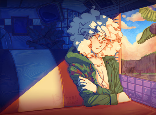
Nagito Color Study | Please do not repost, reblogs are welcome though! Brushes & Techniques & a progress pic below the cut
Uhhhh okay, how to explain this one. I was rereading “Logically Lucky” by PinkSweetSmoke and some of the visuals in the earlier chapters really struck me. The way that they write this relationship is pretty dynamic, and I wanted to see if I could use colors to talk about how Hajime and Nagito feel for each other and what they’re going through emotionally? So this is fanart for that fic, directly inspired by that fic based on the established vista(s) and also the style of writing their relationship, but it doesn’t really make sense unless I say all of that lol? But it wouldn’t exist if not for that fic, so I’d feel weird not mentioning it.
Brushes used (Clip Studio, Free):
Main: “ラフペン” from gyuukotu’s “Fill Set (塗りセット)”, content ID 1695210 Fill: Default India Ink brush pen - the rough pen is a little unpredictable, so I used this to flat the image and make sure that there were no gaps Cloud Flat: "荒筆" from gyuutoku's “Fill Set (塗りセット)”, content ID 1695210 Cloud Blender: I downloaded it from the internet instead of the app 2 years ago and cannot find, with certainty, where it came from, since I get rid of everything on my hard drive that's not art every year :( there are lots of good cloud blending brushes out there for free, though, and I typically use the gouache blender Misc. Techniques: Screen Distortion: I used CSP's free cloth texture clipped above the "blue" layers and then liquified it in places for the screen distortion effect Gradient Mapping: I cannot overstate how helpful gradient maps were for minor color corrections, you guys PLEASE try them on a finished piece of your own if you haven't used them yet. Click Layers > New Correction Layer > Gradient Map and then choose from the premade gradients before adding your own so you can see how they worked. I used a few different ones clipped to specific areas w/ lowered opacity & hard/soft light settings where I felt like the color was falling flat and it was SO helpful at giving it just that little bit more depth. Hearts: I've discovered that you can cheat at hair and clothing rendering by just making hearts. Try and see how many you can find lol Color Theory in General: The whole point of this piece, after it stopped being fanart (lol rip), was to be a color study focusing on the contrast between shadow and light and what I could do within the blues & the yellows to make them appear as if they're actually different colors. In the blue section, everything is p much blue, nothing is any other color. In the sunny section, a lot of the stuff is warmer variations of the standard colors, since I wanted it to be more vibrant and didn't feel like I could achieve that if everything was shades of yellow and orange. That being said, I stuck as closely to that as possible. But ANYWAY, juxtaposing the two starkly different color profiles also helps the blues in the blue side read as colors that they aren't, which was part of why I did this study. Sneaky sneaky: I just modified the diner a bit in order to get the colors I wanted, i.e closing the blinds bc I can. As an artist it's important to remember that YOU have full control over every single part of the piece, you just should ideally have a reason to create inaccuracies/ break rules or else it can end up being a bit messy and disorganized & details/ your vision can get lost.
Aaaand finally, the sketch from TWO AND A HALF MONTHS AGO:
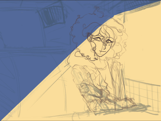
#trusttheprocess 😭😭😭
#nagito komaeda#sdr2#color study#super danganronpa 2#nagito fanart#my art#october 2023#jesus I started in july#but I also like let it sit for a good 2 months after the mockup#so shhhh#fav#komaeda nagito#character study#fanart
73 notes
·
View notes
Note
I love your art so so so so so so so sooooo much, it's sooooo 😋😋😋 I wanna eat it.
And I still can't get over the fact that you follow me and we're mutuals (ehehe, you'll never know who am I..(^_^ )
leaving that aside, what app or software do you use to draw?
And a little tutorial on how you paint?
Oh myyy! that's so kind thank you ^^ whoever you are, it's my pleasure to follow you as well ❤️
I use ibis paint for drawing, and doing pretty much everything :-D
Aaand I have two different ways of doing so! Sometimes i simply do everything digitally, so i don't really know how to explain it (I do lineart -> base colors -> shading on an upper layer, playing a bit with the ibis paint blending modes , so the process differs every time!)
And then there's my favorite technique! Mixing traditional and digital work. Here's how to do it + some tips! I got inspiration from older fanarts i found on this site, they had such an unique charm and i wanted to recreate it somehow.
We'll take this drawing as an example :-D vvv

1. Just draw normally with a pencil on a sheet! You can also:
- Use different stuff from a pencil, such as a pen, or draw with ink (i personally use a mechanical pencil, but feel free to experiment around, that's the key to pretty much everything)
- Use specific sheets, exploiting their own texture, choosing your favorite (they can have lines on, be a little crumpled..you decide!) vvv
2. You'll have to take a picture of it, to import it digitally on your software. Make sure the light hits the paper evenly! Or you can use this at your own advantage, if you want your drawings to have darker places.


3. Import the pic on ibis paint; go to adjust color > extract line drawing (image 1). Then..just play with that setting until you like what you see! This will basically "erase" the white parts of the picture and leave you with the lineart only (image 2). After that, just color and shade everything in the same way you'd do with a digital drawing (image 3).
I recommend using this technique if you think your drawings are better traditionally or if you (like me :'-D) perceive proportions better on paper, rather than on a screen. This is also to give the drawing more texture and make it more alive (compare it to the white blank canva and see how it differs!)
Of course this might not be the best media for everyone. It depends a lot on the artstyle..but feel free to try it out!❤️❤️
#thank you so much anon i really appreciate this kind of questions#tutorials#<- tag in case I'll make more in the future! always feel free to ask anything#my art
8 notes
·
View notes
Text
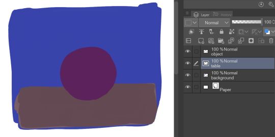
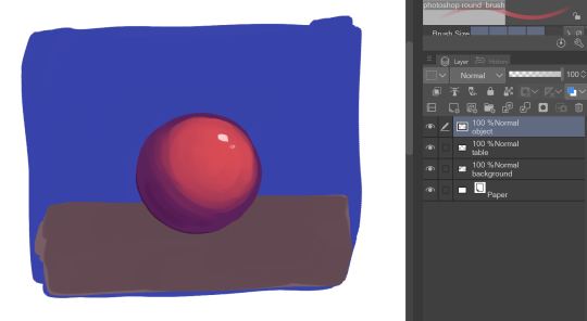
Mewtwo's cloning machine colored became my most popular post so I'm making a tutorial with it.
I know I only colored it but I did use some pretty important techniques when doing original art too so I'm hoping it helps.
Okay so let's say you have a sketch, or in my case an image you want to color. Rule of thumb, you don't want to leave that in grayscale.


If you have a color scheme in mind you'll want your starting point to reflect that. Most art programs have ways for you to do tonal correction.

I like using levels for cleaning up the brightness and making lines sharper, and color balance for adding colors. Gradient map works nicely too. Generally you want to pick contrasting colors for light vs shadow. I did yellow for lighting and blue for shadow because I wanted to catch that oceanic underwater feel. But you CAN do cool lights with warm shadows!
2. If you want to color under your image or sketch, set it to multiply. Lower the opacity to help you see better if you want to do linework over it, or leave it as is if you just want to color your sketch.
3. Block in your colors to get a feel for the lighting. You'll want to make sure you have a CLEAR sense of foreground/middleground/background. Which means you need to pick colors that are bright/medium/dark shades and assign them accordingly.
In this case my foreground is darkest, I chose to make middleground (the machine) my light source, so it is brightest, and background is my medium shade. You don't have to do it in that order, but just keep those rules of three in mind. Foreground, middleground, background. Light, medium, dark. Assign accordingly as your piece needs.


A great way to test your composition is to set your image to greyscale, or even remove your sketch. If you still have a clear impression of depth and where everything is, you're on the right track.
4. What's your focal point? What's the main subject of your piece? What do you want to draw the viewer's eye, to stand out, to be the whole point of what you're drawing? Because that's the part you're going to focus on rendering now.
For me it was the shell.


This was three different layers on different blending modes where I just played with textures, colors and brushes until I got an effect that I liked. In fact I liked it so much that these layers are actually above the base image, so that the texture is untouched by the manga scan texture and the yellow-tinted multiply effect.
5. By this point, if you're applying these steps to any art piece you're working on, you should have a pretty good basis. You should have your colors mapped, your composition, and your focal point for your work. You can continue to render the details, but try to stick to your composition.


None of these steps are particularly complicated. It's just a matter of coloring within the lines, staying true to your chosen color scheme, and remembering where the light source is.
6. If you have a secondary focal point, (in my case, Team Rocket) you can give it a little bit of special treatment to help it not get lost in the image.


I went as far as to copy and paste them, adjust their levels separately from the rest of the work so they looked sharper and cleaner, gave them their own colors separate from the scheme of the main peace, and only tied them into it with their shadows. I painted some rim-lighting around them true to their colors (like Jessie and James's hair) just to help them pop. They're not the main focus of the image, but they're somewhere that they aren't supposed to be, so they need to stand out a little in their own right. 7. Add some finishing touches.


This can be things like adding soft glows to your light sources (I keep mine simple, just a few strokes with a watercolor brush set to the add blending mode) and some shines to shiny objects.
And that was about it.

Coloring this piece was just an excuse for me to play with color composition and textures without having to worry about my own line work for once. But I still used some pretty important principles in illustration to catch what I saw in my head while looking at the original uncolored page. (Especially step 3!! Try that in your next work!)
15 notes
·
View notes
Text
Character Sketching Basics (for total beginners)
I've never really made art tutorials, but I do actually semi-routinely teach digital art classes to local kids in my area. As a result of this, I have also now signed up for a volunteer character sketching workshop for such kids that I am hosting tomorrow.
I figured that since I will have 15 kids there and I can't possibly introduce them to the base concepts one by one, I should make some easy to understand slides that try and teach them the basic thoughts that go behind a good character sketch. Aaaand I figured I would share them here. They are in danish, but I will translate underneath each pic. And before any other of the amazing artists on here start pointing out that this is possibly a bit too simplsitic to be a "proper" tutorial - the workshop is for the 11-14 crowd that may have never heard these things before. That's why it's kept as completely simple as possible. Anyway, here we go:
When we draw characters, we usually talk about three pimary stages - Sketch, Inking and Colors/Shading. That's a lot of stuff to learn, but we'll focus on sketching for today, alright?
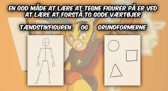
A good way to learn how to draw characters is by learning to understand two great tools - the STICK FIGURE and the BASIC SHAPES.
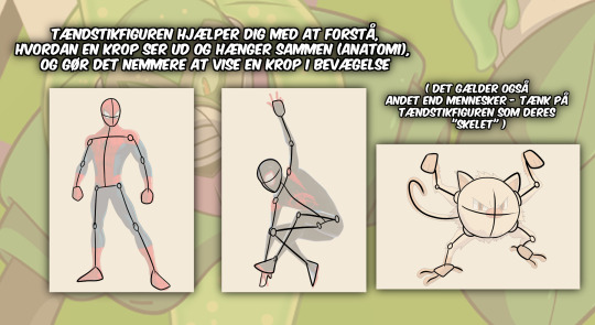
The Stick Figure helps you understand what a body looks like and how it fits together (anatomy), and makes it easier to portray a body in motion. (This also goes for nonhuman creatures - consider the stick figure their "skeleton")
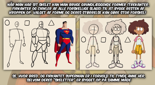
Once you have your skeleton, you can use basic shapes (triangles, squares and circles of all kinds) to build the rest of the body. Your choice of shapes and their sizes can make a massive difference! Notice, how blocky Superman looks compared to the skinny Anne here, even though their skeletons are built basically the same way.

You can also use basic shapes to create some really unique characters, and maybe even tell us something about their personality at the same time. This is called "shape language". Take a look at how some famous characters use very simple shapes. The always friendly and happy Mickey Mouse is round and friendly-looking. With just three circles, he became famous worldwide. The skinny, refined Pearl's body consists primarilly of triangles and long circles - this works really well for a dancer, who is also a bit of a perfectionist. She even carries a spear, which is a pointy weapon that really needs the one wielding it to be precise! Almost every character in "Phineas and Ferb" consists of simple shapes that make them easy to recognize. Phineas and Ferbs' heads consist of just a big triangle and two squares respectively. And with Isabelle and Candace, you can even spot a couple of half-circles!

If you learn how to see these shapes and where they are hiding, you can learn to draw almost any character you can imagine - even the ones that look super difficult and complicated. Shredder here looks almost impossible to draw, but even he has a lot of squares and triangles you can find if you look close enough - and if you drew a solid enough skeleton to start with, so you can tell where certain things are supposed to go on his body. You also use these techniques to draw harder parts of the body, such as hands. It's really difficult, but it'll come to you with practice.
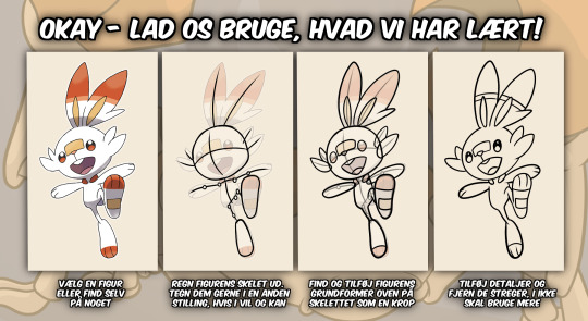
Okay - let's use what we've learned! Pick a character or make something up yourself. Figure out the characters' skeleton. Go ahead and draw them in a different pose, if you want and if you feel you can. Find and add the characters' basic shapes and add them on top of the skeleton to make a body. Add details and start erasing the lines you no longer need.

A FEW LAST PIECES OF ADVICE - Draw softly and loosely. It's hard to erase your lines if you pressed down hard on your paper. - Try not to choose a character that's too complicated to start with. We all gotta start somewhere. - Don't worry about your sketch looking a little messy. After all, it's just a sketch. All it needs to be is a good starting point for when you ink it later. - Your sketch does NOT need to look 100% like the original. The important part is that you can spot how their bodies are constructed, and find all their most important traits. - If there's a part you are having a hard time drawing, take a break and work on something else. Sometimes your brain just needs a little break. - Ask for help! That's why I'm here! - Remember to take breaks now and then. It's good for your hands and for your backs. ----
Soooo yeah. That's my tutorial for ABSOLUTE beginner kids. I hope this will land well tomorrow.
#art tutorial#beginner#begginer artist#beginner artists#kids art tutorial#character sketching#sketching#sketches#fanart#guide#how to draw#danish#my first tutorial#god i hope this goes over well and the kids have fun i am always worried that i am being boring#also there are gonne be like 15 kids there i usually only deal with up to 5 help me#superman#pokemon#amphibia#steven universe#tmnt#teenage mutant ninja turtles#mickey mouse#phineas and ferb#disney#dc#nintendo#spiderman#spider-man#miles morales#peter parker
68 notes
·
View notes