#this one is more cartoony which is fun
Explore tagged Tumblr posts
Text

I did the expressions thing for king of the Gerudo lol. Had a lot of fun
And if anyone asks “where’s x” or “you forgot x” I’m gonna break your online knees I swear on my life
#king of the Gerudo#this one is more cartoony which is fun#totk#just in case#look there’s no spoilers so I’m not tagging spoilers#legend of Zelda#legend of zelda au#zelda au#age of calamity#these characters are so painfully detailed I hate them#Rauru I’m going to fight you#also I can’t figure out sooga’s outfit so I just put him in his yiga outfit
253 notes
·
View notes
Text
I actually love how ugly Merlin's outfit is in Merlin. BEFORE YOU YELL AT ME - I love his outfit, I think it's fun, but when you look at every other character, even other peasants, he literally is wearing ill fitting rags. Everything is too big on him (despite being like six foot but whatever) and his silhouette reeks of boring character design.
But like!! Yeah!! He is just Some Guy. I love how they never give him som epic mage robes or a cool outfit for more than thirty seconds. He is unassuming. He's over here, commanding dragons and controlling the weather in the medieval equivalent of stained sweatpants and a night shirt. It's great.
#mine#merlin#bbc merlin#i came to the realization#that his outfit is quite lame#because whenever i try to find cool edits of Merlin#the coolest looking ones are the ones with the least anount of Merlin in them lol#visually#he is a wreck#like the knights get cool armor and capes#the girls all get like forty gorgeous outfits#the other magic users get fun robes#the other peasants wear a lot less layers#which makes their character design make a bit more sense#and it gives a good silhouette of the baggy clothes and the arms sticking out#and the grime on their face#Merlin is just like hello it is me I have a jacket#the sickest thing about this guys drip is his scarf and his socks#like it's no wonder more cartoony style fan artists tend to change an element or two of his outfit#i love him#but he looks lame#i think he looks wonderful but we are all BIASED#WE ALREADY LOVE THIS GUY
232 notes
·
View notes
Text


wanted to draw a cat. pretty satisfied w how it came out
#wheucto#art#cat#kinda a lot of details but thats okay its just a drawing#ive been drawing cats a lot recently cause i wanna know how to draw them and tried a kinda new method#which did seem to work so i'll keep trying it#anyways someone did ask / think i was a warrior cat fan and. yeah lol#pretty recently though. only started reading the books this year i think#do want to simplify this and make it cartoonier#not a character btw. more like... based on my one fursona i made at some point and donr use#back to wc fan thing. its fun how you can just. tell a persons previous fandoms based on say. how they draw cats or smth#i have watched wc stuff like moonkitti videos before i read the books_ but i dont count that as being a wc fan for me personally#anyways. have this
7 notes
·
View notes
Text
like i wouldnt mind like. Not having new linear games post 5 its judt that sims 4 wasnt even supposed to Be The Sims 4 it was a last minute pivot and the base code is so outdated and was broken On launch so like. i just wish we could have the final actual sims game be like. one that was always intented to be a major sims release AND be intended to be so long term . yk
#i dont even want like. Ooh major graphical updates whatever if sims 5 was announced and they looked photorealizstic id hurl i wouldnt play#it#my ideal would ig be sims 4 with a touch more realism style wise. if this makes sense#like its a bittt too cartoony for me but i like the like. Clay hair or whatever SJFNFJ. and i think having it be simple in basegame means#you can customize it easier + itd run better on more pcs#so im fine eith that. i would nottt want it more cartoony#i also like. I understand the sims is like. an all ages game i do sometimes wish that the animations in 4 were a bit toned down#like i dont mind silly goofy wacky stuff i think its fun and like. The sims has always been a bit sillay yk. but the overexaggerated#animations r sometimes like -_-.... to me. but thats personal preference#IDK. the tags that show up when i type idk r so funny. do i ever know anything. sources say no#BUT ya i just rly wish like. if this is what they wanna do i wish theyd give us One more full game give it lots of time and love and rly rly#focus on having it excel at like. being this partnof the sims#since they wanna have like. Other sims games that have online features and multiplayer and everything. they could use that to make sure that#ts5 was Rly solid as a foundation and as like. ykwim..... they could plan updates for the future And dlc or whatever and i just think itd be#a better move than trying to make sims 4 happen#bc i judt dont think With all the updates in the world. sims 4 wont ever be like. what it couldve been. yk. i just dont think you can make#it work without Fullllyyyy just starting over.#and at this point with like..so many modders and stuff and everything and how much dlc there is thatd be impossible Esp if they keep#releasing new stuff which. They will ^_^#idk. im excited for some other lifesim games im keeping my eye out#but i rly do love the sims and i just wish that it could be as good as it could be. It has such a huge budget and team and like. if ea would#stop just trying to make as much money as possible off it i feel like they could make Such an amazing game. not to put down indie gamedevs#at all the games jve been looking at look Incredible like.. yk. but the fact those games are so good eith FAR smaller teams and budgets is#like. imagine what we could have if the sims had that amt of care and time put into it.#but whatever whatever whatever. sorry im just rambling#again ik what i would want from my platonic ideal of a sims game isnt what everyone would eant#but idk. i feel like another good step might be like. making the other sims games more available and updating them so they run better on#modern pcs. but i dont think thatll ever happen DNDNFJFNFN.
5 notes
·
View notes
Text
my very own tips for young artists that wouldhave helped me immensely
- im begging you practice face shapes that arent a triangle with spiky chin. there is so much variety in face shapes
- if you hate the lineart go over it one more time. especially if it's traditional art and you cant ctrl+z
- ummm. study and do it with your hand & not your eyes. i look at pictures all day and still nothing beats just sitting down and practicing
#1) when i was younger i saw a drawing challenge in which you would draw random shapes and then faces on them#my thought was 'thats nice. i draw more in an anime style though so it doesnt really match' that was silly and untrue#anime is a good example bc sometimes there will be an old man that actually looks like one#either stylized and cartoony or very realistic#but a lot of the time they look extremelyuncanny. one of the reasons is pointy chin in every character#2) this wont be appealing to every artist but if youre struggling with precise lineart it helps!#i just recently realized that i could just..do that. and it looks cool:) youre refining the shapes & all#3) studying real life things will be more beneficial to you but study art as well if you want!#when i was a kid i was taking inspiration from steven universe and it fucked up my sense of proportion. so watch out!#im far from being a good artist but ive been drawing for quite some time and im pretty confident in those tips#its all about fun but if youre frustrated with how your drawings look this could help you cheers#sleep talking
4 notes
·
View notes
Text
I really hope that within the next 10 years they make a remaster + expansion for fire emblem fates it deserves it
#like you can tell that they had SO much they wanted to do with it and you dont even need to look at the artbook#also the hoshido family needed way more depth that entire cast was so boring#conquest gang 4 lyfe#like even if everyone in birthright has deprh theyre also so boring. the onky cool ones are the ninja trio#YES i like tropes but they were FUN#like even if lots of conquest characters were cartoony it really set them all up for like interesting interpretations#on the details of their lives#since you cant really get much outside of supports#but meanwhile birthright characters have nothing.#ahem anyway. fates was a good series. even if it was stupid it was fun.#the kid system was dumb but it could be improved on if it went the alternate universe route instead of#which would be so crazy if every kid was from an alternate universe#awakening only morgan was from an alternate universe#but like with deep realms you can do a lot#especially since inigo owain and severa also show up#post
5 notes
·
View notes
Text
i still follow one of my middle school friends on instagram bc i always hope shes gonna follow me back but she never does
#whatever your art hasnt grown since BURRNNN#no thats mean but its not very good and she w#is it she. wait#yes okay and she went to an art high school which. like. idk what they teach you but your art is still visually unappealing#when they draw in a more cartoony less detailed style it looks good but theyre insistent on these semi realism over shaded peices and they#really dont have a good understanding of form#or like the planes of the face yknow so it just looks pretty odd. its overdone too idk. anyway thats fine theyre clearly having fun im just#confused what they teach you at art high school. my other friend went to art high school and their art is incredible so maybe its just like#personal thing. different school but this one im complaining about went to. allegedly the better one. i dont think you learned i just think#you drew. but. whatever#idk i should probably just talk to her but. she doesnt have enougj followers to be ignoring me#well. yknow. actually maybe she doesnt know who i am. she didnt ever know me as simon#ummmm. maybe im mad over nothing#but well she did know me as anthony and she never did follow me back when i was still anthony so idk#simons spouting
1 note
·
View note
Photo
Not enough people appreciate that The Harley Quinn Show finally came up with the BEST POSSIBLE ANSWER to "How do we end Joker's character arc?"
Almost every other Batman story is just like, "uhhhhh Batman is incompetent and cannot kill the Joker, so there will be no arc actually; this character will remain flat and static forever. You want a message? Uuhhh the message is that mental illness makes you murder people--and yes that is what we are going with for the 2019 movie as well! ........ ugh fine FINE he can have ONE good story, but it has to be the Batman: Beyond movie."
And The Harley Quinn Show is like, "Hold my purse, babes, I'm about to blow these dickheads out of the water and also tell a hilarious yet heartwarming dark comedy about redemption and family, and that's just a SIDE DRESSING to an already-excellent overarching story about self-realization, leftism, and lesbian love, you lucky fucks!!!! 💖💖💖"
Anyway, this art slaps, go watch this show.
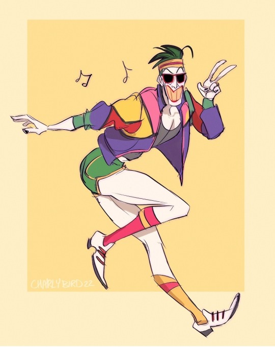

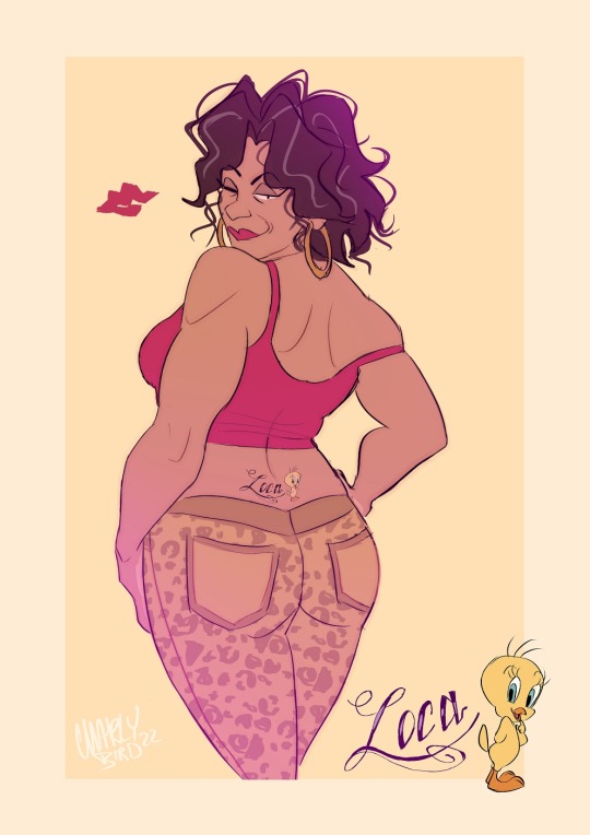
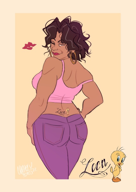
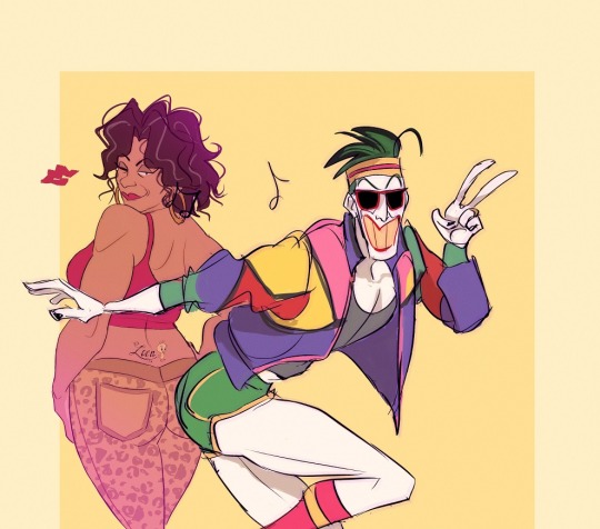

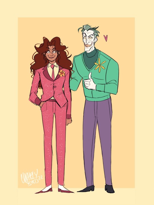
more Joker stuff I have a HC where these two like to go dancing, like at 50s zoot suit style places, but now I also imagine 80s style ones too! they sometimes enter competitions and easily win most of the time XD I finally got round to drawing Beth’s tattoo The last two are: Joker buying Beth a dress just because he liked the colour. I go with the HC that “bastard man treats his family like royalty” The second one is Joker getting a suit made for (an older) Sofia
#the harley quinn show#the joker#joker x beth#this show has against all odds made me like the joker again#batfam#batman beyond#return of the joker#batman beyond return of the joker#it's a good movie#I am 100% sure that there are other quality Joker stories but more often than not he kind of stagnates as a character for me#which is fine in a funny show like the Adam West one with its cartoony comedy antics but in a story that is ever so self serious#it is clear to me how flat this fun character tends to fall#original
497 notes
·
View notes
Text
TF2 x SU au fusions!
oof this took too long but i finally made it !
I kept @gracefireheart Andalusite (HeavyMedic) and @cariocay ‘s Turquoise (EngieSpy) (that i just realized their account got deactivated just a few days ago im sad now) fusion designs because i just found them perfect and whenever i wanted to try making my own designs i always ended up with making something similar to theirs since i was very influenced so i just kept them! They’re so awesome plz check the original artists!


my designs :3 :


About the fusions:
I tried to choose a theme for every fusion that suits the characters like Spessartite (DemoSolly) is a warrior i put Demo’s sword with Soldier’s shield thing well he doesn’t specifically have a shield but yknow the helmet thing i thought that could work.
He’s very powerful, strong and jump into action without a second thought, while he possesses immense strength and a love for loud and chaotic things, his battle prowess is a double-edged sword since his attacks lack precision. however, this unpredictability often leaves his enemies confused and scrambling to defend. he fights more efficiently when drunk lol
Lepidolite (MedicSpy) is a plague doctor, he is very inspired by Hannibal Lecter (nbc Hannibal lol shout out to that one Anon who recommended it for me to watch it lol) at first i wanted to give him a bistouri as a weapon, since it would suit Medic’s saw with Spy’s small knife, but then i felt the fusion was leaning too much towards Medic than Spy, so i put a cane instead to give that old idk gentleman look :P
He is polished and sophisticated, with a hint of underlying sadism and very precise in his movements, he meticulously analyzes his opponents, exploiting weaknesses with surgical precision before jumping into action and strike right where it hurts the most, the cane appears to be a simple walking stick, but inside is a hollowed core that had a retractable, poison-tipped blade, and his poison isn't fast-acting he enjoys toying with his victims, watching as the venom slowly takes hold, fueling his twisted sense of amusement. they are far from being the strongest fusion but they rely a lot on making their opponent weaker by their ability to attack precise hits as well as poisoning them!
Carnelian (SniperScout) his design was inspired by a equestrian outfit (he was the hardest to design tbh bc i wanted his design to be specifically different from the others since Scout is half human so i wanted this "human" aspect to show in the fusion).
He is a walking paradox, he's got Sniper's calm confidence with Scout's hyperactive energy, he loves a good plan but his execution is often fueled by pure adrenaline, he can zip across the battlefield with incredible speed, dodging attacks and flanking enemies. good at mid range and long range attacks but weak at close range, has internalized monologues with himself a lot, he appears calm on the surface however, his foot constantly taps, he fidgets with his slingshot, he cannot stays in place for too long. enjoys taking challenges.
Rubellite (DemoPyro) is a robot with a 50’s cartoon style but with like a creepy vibe to it, their voice sounds like a broken radio perpetually stuck on a laugh track, is both infectious and unsettling.
They just as powerful as Spessartite but just a bit more agile and lean more on the defense style than offense, their body stretches in a cartoony way and battles become a twisted playground for them, a child's game where they hop and blow things up everywhere. they’re very joyful and loves to have fun while making chaos, they usually make jokes but no one understands their muffled voice so they often laugh all by themselves lol the weapon actually expands where the ball and the shaft of the mace connects there’s a chaine (i didnt draw it cuz there was already too much going on in the drawing lol) which helps them reach target from close to mid range easily, they twist and turn their body in very flexible ways before swatting their weapon at their target.
♠︎ If you want to suggest a pair for the next fusion please just comment here DO NOT send it in my ask box plz !!
And if you want to make your own fusion designs/fanart go ahead ! id love to see other people’s interpretations could be ! just don’t forget to tag me and add the tag ( tf2 x su au) :D
hope you enjoy !
+ early designs :


#tf2 x su au#my art#tf2#team fortress 2#fan art#lennylink#tf2 spy#tf2 scout#tf2 engineer#tf2 demoman#tf2 heavy#tf2 sniper#tf2 pyro#tf2 soldier#tf2 medic#tf2 heavy x medic#boots n bombs#tf2 engiespy#tf2 speeding bullet#tf2 napoleon complex#tf2 demoman x pyro#tf2 fusion#steven universe au#su fusion#character design#hannibal#demoman x soldier#tf2 engineer x spy#sniperscout#art
2K notes
·
View notes
Note
How did you learn to draw fat bodies but still keep it cartoony? I love how you draw different types of bodies and make them all seem normal instead of certain body types sticking out like a sore thumb next to others. I struggle to draw fat bodies without it looking weird with the rest of my art. Do you have a specific tutorial you followed or something?
This is a really good question! I'm glad you like my depictions of different body types, i worked really hard to get better at that so im happy folks enjoy em!! I didn't actually learn from a book or tutorial, it was mostly looking at fat bodies IRL and learning to incorporate those features onto what I already drew. As it turns out, we're all human, so if you understand the anatomy enough to draw a skinny person, you have the tools to understand the anatomy of a fat person.
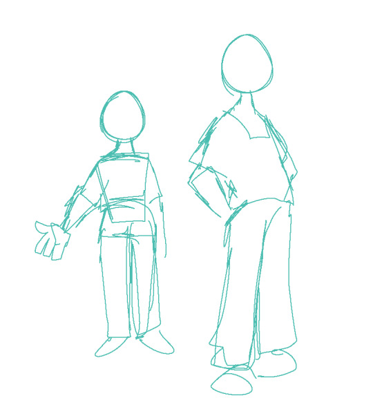
So, like, here, this is my sketch of someone with a very average build. If I were to draw a fat body, I would still use all the basic principles I use here. One mistake I think folks run into is "isolating" parts, which can lead to things like this
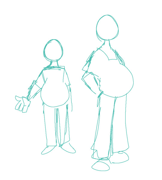
which isn't necessarily bad, but if its not what you're going for, the issue is pretty apparent. Weight affects ALL of the body, not just the stomach or the face or the limbs. If you think about how that weight affects everything in tandem then you can start drawing fat bodies that work more in your style.

for this, this is the same quick sketch using the same pose and principles as the first one. but! I allowed the weight to be distributed across the body. Notice how the legs, belly, arms, etc all got thicker? The key to drawing fat bodies and making them look like they fit is allowing that weight to affect everything. without it, it just looks like you're adding on features to someone rather than considering everything at once.
my other tip is: don't be scared! things like fat arms or chins or bellies or stretch lines are not something that's bad to depict. if you want to draw fat bodies, you gotta not be scared to draw things the way they are. someone having a fat body is not bad, and you drawing that fat body is not bad either. Experiment! To me, art is about representing ideas, and the only way to get better is to experiment with how you represent those ideas. I'm by no means an expert, and I think you can also get a ton done by looking for resources aside from me, but I hope this helps, and have fun!!
5K notes
·
View notes
Text
Tom and Jerry
school clown!Hoshi x top student!reader
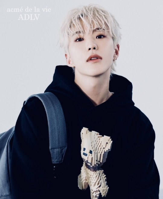
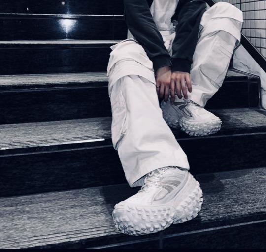
Synopsis: After transferring schools the attention seeker Soonyoung keeps getting on your nerves. Fortunately it is way too easy to make fun of his somewhat lacking intellect. One day you take your snarky comments too far and Hoshi is all fun and games, until he wasn't
Warnings: smut, enemies to lovers, high IQ (f.) x low IQ (m.), slight angst, school setting, classmates, public sex, revenge sex, dirty talk, crack, spanking, fingering, penetration, inferiority complex, questionable fashion choices
WC: 1.4K
Status: part 1 (ongoing), part 2
a/n: join my taglist to get notified about new chapters
Changing schools was easier than you thought it would be. You were halfway through your senior year of high school at the crisp age of 17. The family had to move to different city for work. Making new friends was effortless - you were intelligent, good looking and fun to be around. Of course, big part of your popularity was thanks to the charm of the next new thing which always attracted many admirers. You were getting straight A's, enjoyed busy social life, everything seemed perfect.
Well, almost perfect.
If it wasn't for Hoshi Kwon. The school's appointed clown, now pushing 19 years old, he failed his senior year twice. Pathetic, how could somebody be so stupid? You hated him the moment he showed up on the first day of school - in purple suit, tiger print on the collar with matching hat. Cane in hand. Kicking the door open while singing Sherlock from Shinee he danced can-can. His legs flying up to the rhythm of - I'm so curious yeah! Everybody loved the performance. Everybody except you. The fuck? Where did he even get that ugly ass outfit and apparently his real name was not Hoshi but Soonyoung. Who the hell calls themselves Hoshi? Does he think he is a celebrity? Stupid ass name.

After the teacher assigned him as your desk-mate he made it his mission to annoy you. Teacher's reasoning being - he might calm down sitting next to the top student. Such a nonsense. Isn't it their job to know how to control the kids? You weren't getting paid enough for this. In fact, weren't getting paid at all!!
//
On Friday he arrived to class more excited than usual.
"Look at my fit!" kicking his foot proudly on the wooden desk in front of you. Before you had time to push him off he continued
"Do you like my new shoes?" expecting compliments
"I haven't seen uglier shoes in my entire life." you responded with no emotions what so ever
"What do you mean ugly" his already small eyes squinting into straight lines, eyebrows frowning comically
You couldn't help but laugh. He looked like cartoon character
"Now you laughing at me too?!" Stomping the foot that was still resting on your desk " They are Balenciaga!" still stomping
"They look like boats," lazily resting your chin on the top of you hand "if refugees used these," pointing at the monstrosity "instead of those tiny motor boats, their survival rate would be 100%"
You could hear an audible *gasp* leaving his mouth and muffled laughs from the classmates sitting behind you.
"You are the worst!" he cried out "Do you even know how expensive they were.." tear forming at the corner of his cartoony eyes
"Probably as expensive as the donations your parents must be sending to the school each year to keep you studying here" your voice full of disdain
"wow a kick under the belt now, huh?" you could see the wheels in his little hamster brain spinning at full speed
"You will regret this" was all he could come up with in the moment
"I don't think so" smirk on your face beamed with satisfaction but the sudden dark shadow crossing Soonyoung's usually friendly face put a knot in your stomach
//
Much later that day, after your extra-curricular classes finished, you are standing in the dimly lit locker room reorganising the mess compiled after busy week. School was already empty and you loved the silence. The long halls full of lockers did look a bit spooky now but it wasn't your first time being there alone.
Squeeky steps approaching from behind you. Sounded like one of those Crocs.
"Anybody there?" you were sure it was just your imagination, simply asking the ghosts a rhetorical question
"What if there is.." vibrations of low growl echoed thru your ear sending shivers down the spine
"The hell..?" catching a glimpse of Hoshi in your peripheral vision. Why is he here this late? You knew damn well he ain't taking any extra classes.
"I was waiting for you..." his voice even closer now, hot breath touching the exposed skin of your neck. He was so close to you. You could hear his heart beating. Du dum. Du dum. Du dum. Stable. Confident. In control. Yours on the other hand reaching high frequency of dudududududum.
"What do you think you are doing, Kwon?" forced annoyance in your tone trying to mask something that was hiding a bit deeper. Panic perhaps?
"You tell me," he laughed but it sounded more like a threat "aren't you the one who knows it all?" Pressing the weight of his athletic body on yours, something hard forcing itself against your bottom made you gasp
"h-hey what's your problem.." you tried to sound intimidating, voice betraying you suddenly, only producing shattered whine
"You" not waisting one more second Soonyoung licked the curve of your neck completely sandwiching you between his throbbing heat and your cold locker. Kissing your sensitive skin as if he was waiting for it for so long. Wet kisses quickly becoming possessive bites leaving marks as his signature.
"oh fu-" was all that managed to escape your quivering lips as his hand spanked your ass with such force, it took your breathe away. You didn't want to admit it, but this situation? It was making you so incredibly wet.
Yes, you did hate him. Yes, he was annoying and loud. Always wanting to be the centre of attention. Apart from that you couldn't deny how good looking he actually was. Only person in school who could pull off blond hair and those horrendous outfits.Oh and how the lean muscles played on his body during P.E. class..? Except for his personality, he was 10/10
"You don't have any smart comeback now, do you?" Slapping you once more. Making you loose your breath - again.
"You look much nicer like this" the hand on your bottom started to move lower. Pushing your legs apart with his knee, making a way for his long fingers. Lightly tracing the center of your soaked panties
"stupid uniform-" you cursed. Why the hell did boys wear trousers but they made girls wear skirts? The last line of defence has been crossed.
"Oh?" rubbing the wet fabric "you are dripping all over your pretty panties" the strokes becoming spirals, combining your folds and the textile into unified mess
"I-I'm not..!" knees weakening into his skilful movements
"Mmm, I thought top students are not allowed to lie" forcing two fingers inside of you without warning. Deliciously thrusting into your pool of need.
"shut up-" already moaning. What the fuck am I doing? Now pushing your ass to meet his motion.
"If you are going to fuck me, at least do it right" another push against him "or are you too stupid even for that?" you mocked him, taking at least a bit of your power back
All you could hear was Hoshi's sinful laugh and clinking of metal as his jeans came undone collapsing on the tiled floor. His throbbing member now on your clit soaking in the wetness you produced. Gliding teasingly over it
"What if I don't want to?" rubbing in painfully slow rhythm, making you see stars
Hoshi was very much enjoying this moment. Moment of having upper hand on somebody he couldn't challenge intellectually, on somebody who always knew what to say, somebody who was making him feel and look small. Crushing his ego on everyday basis. Fortunately you were just his type.
"P-please..?" heard yourself saying. Almost as surprised as he was. But fuck it, his dick felt so good on you pussy and it was long time since you had any intimacy. It made you uncharacteristically needy. What's wrong with little steamy sex in the locker room? Nothing. Yeah.
"Please Soonyoung, I want to feel you inside of me. I can't take it anymore. You win."
Grin from ear to ear Hoshi finally entered you with such an enthusiasm like a kid getting the toy he really wanted.
Holding you by the wrists you were hanging off in empty air. Slapping the balls against your needy pussy he was pounding you mercilessly. Waves of pleasure running thru every inch of your body. You didn't notice it before but now you could feel it clearly. His dick had a curve to it and it felt fucking good. On every thrust the tip hitting you exactly where you wanted. You were full of him.
Why is it always these good for nothing guys who fuck the best? Or maybe you were just too harsh on him? You pondered as the following thrust almost took you over the edge, making your head fall forward.
And down there between your trembling legs pair of hideous Balenciaga sneakers
#this hit me like a bolt from gods the moment I saw hoshi's new campaign photos#seventeen smut#seventeen#seventeen x reader#svt x reader#hoshi smut#hoshi x reader#kwon soonyoung#hoshi x you#hoshi x y/n#seventeen imagines#seventeen headcanons#svt fanfic#enemies to lovers#angst#writing angst is so fun??#my fanfictions
255 notes
·
View notes
Text

made a post ages ago thinking about a Postal Soul Eater au and designing the dudes as weapons has been on my mind lmao. ok notes below
p1 is based off an M16 even though thats not the one he uses in game. turns out the one from the game (97) isnt based on any gun in particular! a steam achievement refers to it as an M16 which is why I picked it, though I admit i could have gone with the AK from the box art
p3 is a colt M1911 which i think is the one from the game
i dont actually know anything about guns i am pulling from the postal wiki and some super cool 3D models. gun people dont come for me
figured 1 would be the type of weapon to look very utilitarian, not super cartoony like some soul eater weapons can get. just dark gunmetal and his cross
p3's more fun with it, if more scuffed. BUT theyre both close to on model bc i respect their capacity for mass violence 😌
like i said i think 2 and 4 would be meisters, but if i did have to pick weapons for them, I'd probably go with 2s scythe, and maybe the dumbass supersoaker flamethrower. idk!
#postal#postal dude#postal 1997#postal 3#p1#p3#rws#i realise this has as much reach as postal fans who used to be weebs BUT.#but nothing lol i hope someone likes it anyway#if not. content for meeeeeeeeee baybee#also tumblr chewed this up click for quality lmao
161 notes
·
View notes
Note
when and how did you find your art style? has it changed much over time?
I'm gonna go on a tangent here bc it's pretty interesting for me to look back on aksjd
I don't think it was really linear in a point A to point B kinda way, I still got it more or less where I wanted it to but I can't say it felt streamlined
my first fandom was pokemon anime, so I was 100% set on learning that style first bc that was fun to me, instead of learning basics or anything I went right in and learned how to draw humans in that style, then I got into Death Note so I had to learn an entirely different style bc the previous one didn't help at all, I didn't stick with it very long tho because THEN I got into vocaloid and various anime and more colorful characters so it was pretty much the huge eyes - dot nose style for a while
*then* I got tumblr and this site was very.. overwhelmingly cartoon-oriented so I quickly took an interest in cartoony styles and learned the style which I used between 2011-2016 pretty much, I think that was the first one where I could be like "it's mine" bc I was actively figuring out things I liked and putting my spin on them and it was so fun
but by the time I got into vld I wanted it to be more more complex so I was focusing more on learning lighting, anatomy and making the faces less cartoony annd I really wish I tackled the style of faces differently and I didn't end up hating drawing for several years in the process without even realizing it BUT Anyway
with gnshn last year is when I finally started compiling all the things I liked about drawing again from past styles and also new things so I can all combine it together at last, which is something I haven't done in huh 6(??)+ years.. ughhh lmao I really had to stop and be like "what do I WANT my art to look like?" and I'm still working on it
but yeah basically, it IS a lot more streamlined if you pick tutorials and go like that's a good™️ style to learn and go from there, instead of learning/unlearning things over and over like I did, I don't regret learning the previous styles tho, each of them were what I wanted out of it at the time, but there was a learning curve every single time
anyway your art path is your own whether you choose to get better in the faster way possible or do detours or something else, once you have a set of things that feel personal to you in how you draw them and you can comfortably use that to draw whatever u want to, you'll just know, it doesn't have to happen asap c:
181 notes
·
View notes
Text
More Redacted hc bc why tf not, yknow :))))) (this is also to make up for not doing Brachium and Christian but u don't need to know that-)
One time during their early stages of dating, Angel found out about henna from Baaabe and wanted to surprise David with it some cool squiggles and flowers knowing damn well he would have a strong reaction to it. He did in fact have a strong reaction to it, and so did Angel when they realised they were highly allergic to one of the ingredients used in henna and was immediately brought to the hospital by a very worried David.
Asher has a knack for finding the most unsettling and disturbing facts and sending them to Milo because he doesn't need to know about it at all and gets pissed when Asher texts him in the middle of something important. (Also, fun fact! Camel's piss is as thick as syrup and it was thought to have medicinal properties, so people back then mixed it with camel milk and drink it. It did not have medicinal properties and didn't taste very good)
Gavin has a taser that is bedazzled in pink gems with text written on the front saying "Get tased, b*tch". He bought it for himself some time ago in case some perv got a little too comfortable without his consent.
Damien has a bad habit of chewing on his bottom lip when he's frustrated or zoning out, and he has done it so much that it old cuts bleed on its own even when he isn't biting it. This has led Huxley to buying lip ointments and lip balms for him and placing them in Damien's and his bags whenever they go out, he also has them littered around his home whenever he comes over, in the pockets of his clothes in case they don't bring their bags when going out, and one more he brings everywhere for back up.
Once Freelancer got Caelum a lego set for him to fiddle with while they were doing their coursework. The next day when he finally finished it, they watched in horror as Caelum destroyed the set so he could build it all over again, since he didn't understanding that once you build it, it's done.
Christian has a designer brand crescent cross body bag (it's not designer, he just likes saying it is because it's one of the only expensive things he owns), and because of this, Arden and Kelsey have lovingly named him an eshay (which is a stereotypically hypermasculine Australian man who are inclined to crime and violence, or basically just an annoying Aussie brat who's obsessed with masculinity/a chav) much to his chagrin.
Sweetheart has half empty cups and mugs scattered all over their room with most of the liquid in it drying up or turning into syrup from all the water evaporating. It hasn't gone so far as for mold to start appearing, but it's definitely getting there.
Porter has collected many little things that remind him of Treasure ever since he met them in that club, such as a surprisingly shiny penny from the ground, a cartoony key with a swirly heart on the end of it, a golden ring with hands on it that when worn looks like arms hugging your finger, and many other things that he keeps in his bedside table.
Darlin' and Sam write notes to each other and lay them around the house for each other to see when doing their normal routine. Like, Darlin' would be in the kitchen making their morning coffee and see a sticky note stuck on top of the coffee machine with some sappy shit like "Love you to bits, my Darlin'<3 P.S. Stop putting so many damn shots in your coffee, you're gonna get heart problems one of these days".
Hope y'all enjoy :)))))))
Thank you for coming to my TedTalk :D)))))
#redacted asmr#redacted audio#redactedverse#redacted fandom#redacted angel#redacted babe#redacted david#redacted asher#redacted milo#redacted gavin#redacted damien#redacted huxley#redacted headcanons#redacted freelancer#redacted caelum#redacted christian#redacted arden#redacted kelsey#redacted sweetheart#redacted porter#redacted treasure#redacted darlin'#redacted sam#:)))))))))#this is actually rlly fun#I should make more
136 notes
·
View notes
Text
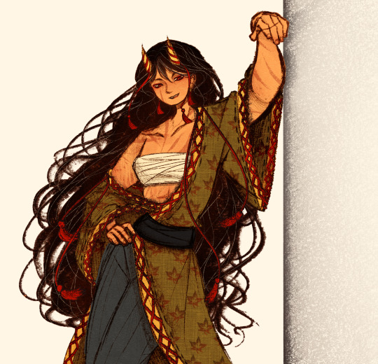
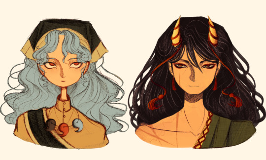
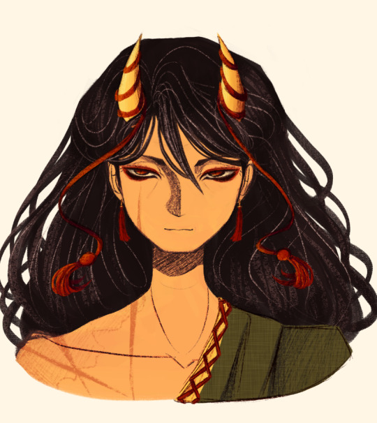
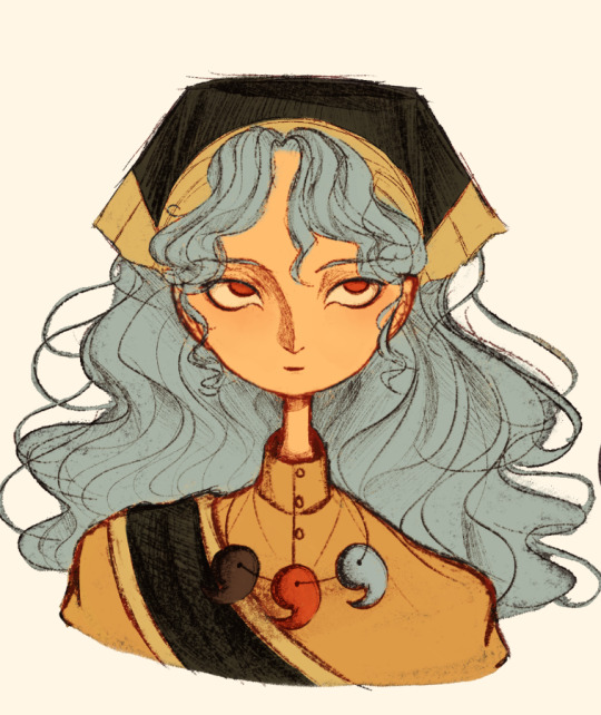
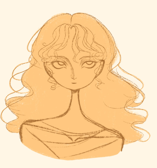
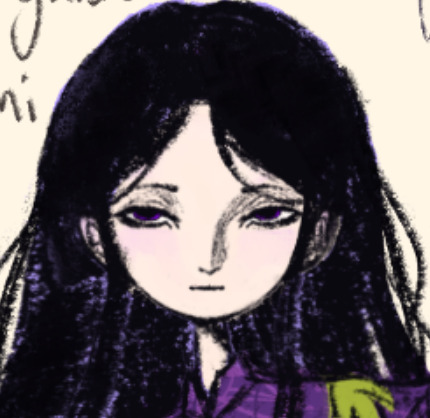
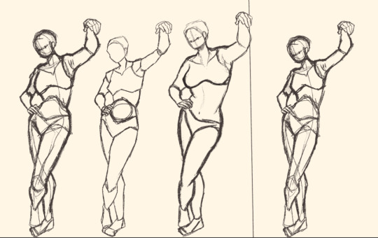
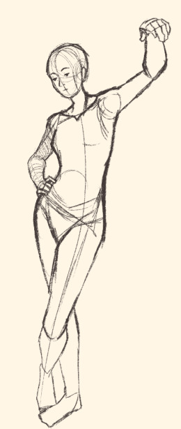
Here's a digital sketch dump of some pose/anatomy practices and some 2hu doodles, I think from now on if I don't have any big final piece to post, I'll just post sketches I liked that I did digitally (might also reblog some drawings of mine that I want more people to see, maybe idk).
Artist's Notes:
Ok so after the recent Hifuu fanart I did, I've been hoping to experiment more with how I draw faces, how I render, as well as how I stylize things. In some of the earlier sketches I did, I had an idea for a pose that I wanted to try drawing, so I took a ref pic of myself doing said pose (the leaning one btw) and then did a sketch over top of it just to get an idea for the shapes, negative space, and silhouette. After that, I wanted to do some simpler breakdowns of the shapes so I can get better at simplifying the body (these ended up being the bottom right sketches in the post). I also did some experimenting with how to push certain parts of said sketches to create a different body type (via liquify and then a more refined version based on that sketch), as well as figuring out what makes a pose feel natural and not stiff. This was also a bit of a foreshortening practice just so I can get more confident with it, and I ended up using the arms from the liquified version for the coloured Zanmu sketch I did since I liked them so much (dw I'll get to that).
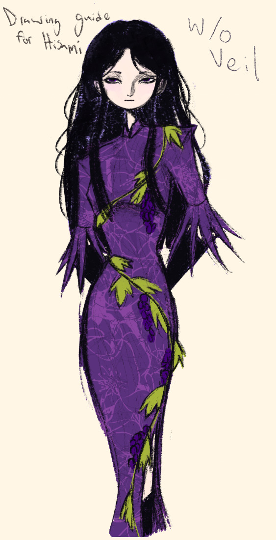
The next thing I wanted to try and draw was Hisami, mainly because.... I am very bad at drawing her in my style. Last time I drew her I made her look really creepy and spindly, and it is my headcanon now that she can switch between a more human, and more creepy look whenever she wants. I'm liking where the face is going a lot, might have to refine a few things about it in the future, but it's cute (I also made the blush purple which I think is what I'm gonna do with her face from now on). I also like how her hair in the sketch turned out a lot, but the outfit..... not as much... Ever since I started changing my style to something less cartoony, I've had a hard time drawing her outfit in my style. Especially the flower veil thing she has on, which, I did try to find a way to draw, but I ended up deleting that sketch because I didn't like it. I'm also not a fan of using the colour purple, like, pure purple, magentas are fine, indigos are fine, but not strict purple. I also have a hard time with drawing all the little pattern details on her dress. I also need to find a way to draw the flower veil in a way that looks good because everytime I try it ends up just looking off (very similar to whenever I try to draw Zanmu's blue spears). I think the only solution to this problem is to do what I normally do and make my own version of the outfit, but with adjustments to suit my style while still trying to keep core elements from the original design intact (like I do with Zanmu and Keiki, and yes I am going to get to that Zanmu drawing just gimme a minute).
Ok next up is Keiki, my favourite Touhou character who I haven't drawn since the beginning of the year. Since my style has changed a lot, I wanted to just do a face sketch of her to get a hang of drawing her again, and I..... really really like how it turned out! When I drew her eyes, I realized that a good way of keeping faces too same facey can be via varying the sizes of their pupils, so that's an idea I'm gonna keep in mind from now on. I had a lot of fun with her hair, I initially was gonna do it like how it is in the official art, but I ended up not liking it, so now I'm gonna draw Keiki with wavy heir like this because it's fun and it looks nice. I also included my base sketch for Keiki's face since I was initially struggling with drawing her bandanna, and in the coloured sketch I added some more detail into her hair.
Now to finally talk about the sketches for Zanmu. Good lord was I having a tough time with her face. I also did this sketch before I figured out how I wanted to draw hair, so that's why the rendering on her hair is different (I did this soon after the Hisami sketch actually). Since I changed my art style a lot, I had to find a way to translate her face from my more cartoony style to my more detailed style, so while the face shape, nose shape and mouth was fine, I was really struggling with the eyes. I did get somewhere eventually though, and I am super happy with how it turned out. I wanted to lean more towards the androgynous side of the gender presentation spectrum, mainly because I think that makes sense for her character. Also made sure to include the silver hairs and some wrinkles just to bring some signs of her aging into her face because those are just staple features of how I draw Zanmu at this point lol. You will also notice that I gave her some scars on the right side of her face, and that's because I am a Zanmu-with-scars truther, I fucking love it whenever I see someone give Zanmu visible scars like that it just adds so much omg (I also tried to put a wolf bite mark on her arm in the full body drawing but idk if it reads well). While you can argue that her not having scars sells the idea of her being this "powerful, untouchable mastermind who is impossible to defeat," I'd say that instead of those scars representing times she got injured, they represent everyone who has failed to defeat her.
As I was drawing Zanmu's face, I referenced my sketch of to help with contrasting their features since I made Keiki's face more traditionally feminine. I also didn't mention this in my commentary on Keiki's face because I wanted to save it for here, but giving Zanmu scars also plays into the fact that she used to be human, wheras Keiki doesn't have any scars because she's a god who doesn't follow the rules of normal human biology. Plus I'm thinking about the two of them interacting again (return of Zan/Keik??? (I'm a multishipper btw) maybe???) so drawing their faces together will definitely help me in the future if I wanna draw them together (again, maybe as a ship? I've kinda been ironing out the kinks in their potential interactions (romantic and non-romantic) for a while now so idk maybe expect that in the future lol).
And now for the full body drawing, when I was doing the face sketch I did this little snippet of an outfit, had a vision, and the made it into a reality. I'll admit, part of me was worried that it would end up looking too much like Yuugi's outfits in the spinoffs and mangas, but I feel like I made enough changes to differentiate them. I tried to keep a few of the major details in Zanmu's design (i.e. the red tassles and yellow lining on her shirt) while putting a new spin on it. I also dialed up the scars to 11 since without them the whole thing kinda looked incomplete. Also, while I could say that the leaves on her kimono are "a nod to the fact that technically she should be a tengu because back then people belived that corrupt monks would turn into tengu but no Zanmu is an oni and they're maple leaves because...tengu...ahahahaha" what really ended up happening was that I looked up clothing patterns from Sengoku era Japan, liked the leaves the most because the red picked up on the red from the rest of her design and just ran with it. I also always had the idea to put Zanmu in men's clothing from Sengoku era Japan and while the accurate thing to do would be to put her in a Buddhist's clothes from that era.... from a character standpoint, I don't think Zanmu is pious enough to strictly wear the proper monk uniform, and also since she's basically the king of Hell, she would probably dress herself like royalty from that era. TBH, I probably could've been a bit more historically accurate, but again, this was mainly for conceptual purposes because I had a vision and I needed to see it through.
If I were to draw her in this sort of outfit again, I should probably try and use more references, although now that I look at it, if she were to wear it properly this would maybe, probably look a bit closer to a Kyūtai sugata (a very huge stretch, but it just kinda reminds me of that) just without the layers under and over the main piece of clothing (In the website that I searched up to try and compare the outfit in my sketch to, they name the outfit pieces but don't label them on the image, so I don't know 100% what everything is called) so I will definitely have to use that style of clothing as a reference going forward.
Also, I was kind of inspired by the ToTK design for Ganondorf since I have finished the game a while ago and I absolutely love what they did with his design (it's just so fucking cool omg) and I thought that sort of look would look good on Zanmu, so yeah got some inspo from that.
And those were all the notes for each of the sketches, I'm motivated to draw rn but kinda art blocked, so doing these little coloured sketches helps a lot.
#touhou project#art#fanart#sketches#sketch dump#zanmu nippaku#keiki haniyasushin#hisami yomotsu#touhou 19#touhou 17#unfinished dream of all living ghost#wily beast and weakest creature
343 notes
·
View notes
Text
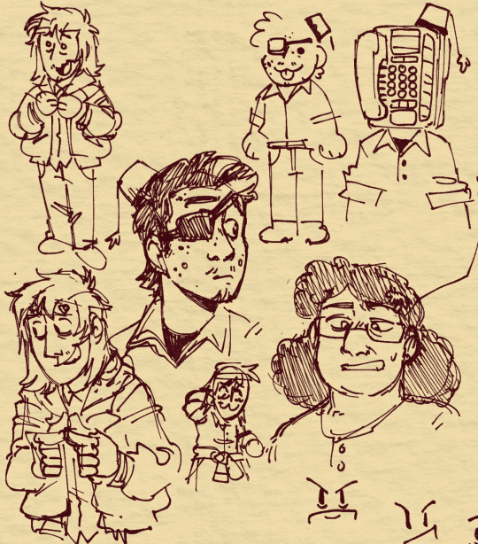
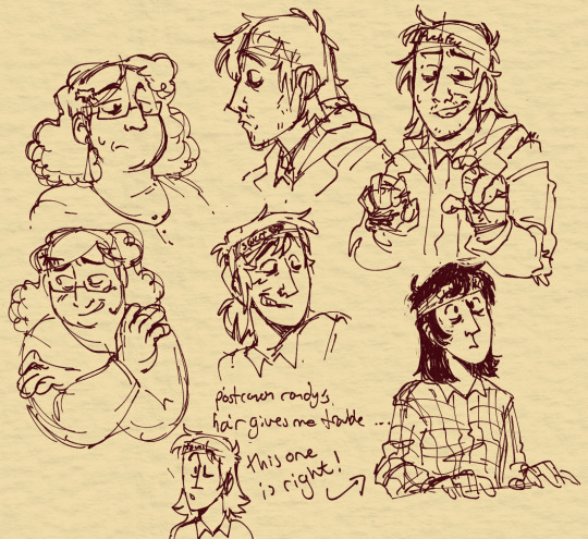
guess what its MOOOOOOOOOORE flesh heads (and one singular regular oliver i guess). ive not been drawing a lot of People lately so getting back in the saddle with these was fun, especially trying to bring a more "realistic" or maybe sort of comic-booky style to them, since a lot of my previous flesh-head stuff has been more cartoony. also figuring out post-transition randy's hairstyle, which gave me a lot of trouble, i thiiink cus of the bandage in the way. lower right in the second image is what i landed on though.
(like this art? please consider helping mounir and his family in gaza survive & evacuate to egypt, take a look at his vetted fundraiser over here!)
141 notes
·
View notes