#they are different translations and also font sizes and everything so that will be a slight adjustment in reading it lol
Explore tagged Tumblr posts
Text
I have !!! my own copy !! of war and peace !!!!
#camera talks#entirely /pos#I was (and still am) borrowing from the library#however my mom found a copy in a to be thrown away bin and grabbed it for me which is sooo awesome I’m having so much fun rn#they are different translations and also font sizes and everything so that will be a slight adjustment in reading it lol#but I’m glad I have my own copy ngl it was going to take me awhile to read#this is very exciting#my day is still not the best and I’m very tired but it made my day a lot better /gen#yippee <3#anyways time for tech booth stuff :)
6 notes
·
View notes
Text
YOU MUST MAKE A WEBSITE
Oh wow, look at that! YET ANOTHER post urging you to make a webbed site! What a completely new thing that people haven't made a thousand masterposts for already!!
• Making a website might look scary. It is Not.
At first, I too thought making a website was too much work. It really isn't! It turns out that all you need is
an HTML file,
a web hosting service and
w3schools tutorials,
and that's about it!
This post will point you towards these resources, and others I found useful while figuring out how to make a website.
• VERY QUICK EXPLANATIONS:
What's HTML and CSS?
HTML is the content of your webpage, the skeleton of it. What shows up in a webpage is what's written in the HTML file!
CSS is the way the HTML is styled; the colour of the background and the letters, the size of elements, the font, all that!
Do I absolutely NEED JavaScript for a website?
Not at all! You don't need to worry about learning it before getting started.
• What do I make a website for? What do I put in there?
ANYTHING AND ALMOST EVERYTHING. Here's some ideas for pages from a post of mine were I was very normal about websites:
You can make a page that's only pictures of your pets.
You can make an interactive adventure.
You can make your own academic blog full of your own essays or articles.
You can just post a ton of art or make a full music page.
You can make a blog and infodump eternally, give book reccs and reviews. You can host a thousand virtual pets and nothing else.
Upload entire books in a single html file. Make a wikipedia for your ocs. Make a fake site for a random fictional place (restaurant, hotel, whatever). You can make a thousand fanpages/shrines about your favorite media. You can upload your own webcomic and make it all like a fancy website and shit.
I could keep going but, for the sake of "brevity", I won't.
• WEBSITE EXAMPLES!
If I started listing the websites I know, this post would be bottomless. Here's only seven:
https://publictransit.neocities.org/ - A webbed site, for sure
https://ribo.zone/ - A personal site
https://leusyth.neocities.org/ - An art archive
https://solaria.neocities.org/ - Personal website with A Lot of stuff (it'll come up in a bit, because it offers web making resources)
https://hog.neocities.org/ - The Hogsite
https://thegardenofmadeline.neocities.org/ - Another personal site! It also has a web resources page and has made another masterpost like this one (but better)
https://spiders.neocities.org/ - My own website, which must be weird to see in mobile . sorry
• You've convinced me. I want a webbed site. Where do I start?
https://neocities.org/
FIRST OF ALL: Neocities. It is a free web hosting service, and it's the one I and the sites I linked use!
When I first started, my website was a black page with red letters and a drawing, and nothing else! It was like that for a month, till i started picking up on how to do things.
Here's what helped me get an idea of how to make things work:
https://sadgrl.online/learn/articles/beginners-guide-neocities
An absolute beginners guide to neocities -- while when you make an account there you get a tutorial page from the site, this one's extra support for that.
https://www.w3schools.com/
Learn HTML, CSS, JavaScript and MANY other coding things for free. All the tutorial/reference pages have live testing windows for you to mess with!! helped me a LOT while figuring this stuff out!
https://htmlcheatsheet.com/
https://htmlcheatsheet.com/css/
Cheatsheets for HTML and CSS, respectively. It includes a JavaScript one too!
https://sadgrl.online/webmastery/
Sadgrl's webmastery resources! Also includes the next resource listed here:
https://sadgrl.online/projects/layout-builder/
Sadgrl's layout builder; not a lot of customization at a first glance, but I've seen wildly different websites all using it as a base, plus it works using CSS Flexbox, so it generates a responsive layout!
(basically, a responsive layout is one that translates well in different sized screens)
https://www.tumblr.com/fysa/728086939730919424/wikitable-code?source=share
Tumblr user fysa made this layout imitating a wiki page!
https://brackets.io/
At some point, you might want to do things outside the Neocities code editor and get one outside the site. I recommend Brackets, because my old as fuck computer can run that and absolutely nothing else apparently, and it works wonderfully! Though I recommend either turning off the code autocomplete or using it after a good while of already using the Neocities code editor, so you get used to coding on your own.
http://www.unit-conversion.info/texttools/text-to-html/
Turn your text into HTML code! i use this kind of pages for my lengthy blog entries that I don't feel like formatting myself.
https://imagecompressor.com/
COMPRESS YOUR IMAGES.
The heavier an image is, the more your site weighs and the more time your page will spend loading. You don't want that, specially if your site is heavy on graphics. This might help!
https://solaria.neocities.org/guides
Some CSS, JavaScript and Accessibility guides! Worth checking out!
https://eloquentjavascript.net/
This is a free, interactive book for learning JavaScript! NOTE: It is very intuitive, but JavaScript is HARD!! I still haven't learned much of it, and my website does fine without so don't worry if you end up not doing much with it. It's still useful + the exercises are fun.
And now, accessories!
• Silly stuff for your page :]
https://gifypet.neocities.org/
Make a virtual pet, copy the code and paste it in your HTML file! You'll get a little guy in your webbed site :]
https://www.wikplayer.com/
Music player for your website!
http://www.mf2fm.com/rv/
JavaScript silly effects for your site :]
https://blinkies.neocities.org/geoblinkies
Blinkie search engine!
https://www.cbox.ws/
Add a chatbox to your site!!
https://momg.neocities.org/
Infinite gallery of gifs. i've spent hours in there looking at moving pictures and out of them all, the ONLY gif i actually ended up using on my site was a rotating tomato slice. it is still there. trapped.
https://wrender.neocities.org/tarotinstructions
A widget that gives you a random tarot card!
https://www.websudoku.com/widget.php
Sudoku widget!
That's about it for now! I don't know how to end this!!! Remember to have fun and google everything you don't know :]
519 notes
·
View notes
Text
Nonverbal Ferb and Human!Perry HCs + Accessibility Devices
Ferb is canonically nonverbal/selectively mute. He only says two lines everyday or when he wants to be funny/sassy. He communicates through nonverbal gestures.
That said, my hc is that younger ferb was given an AAC device before he first talked. It's a tablet or laptop full of buttons and/or symbols that will be said by the device when it's pressed. Highly possible that his parents were worried whether he could talk or needed help with it so giving him one in his early years was them wanting for him to have more options with communicating how he feels to other people if he wants to.
He stopped using it because he realized that rather than symbols/concepts, he communicates better through words (and everyone who matters to him understands him without verbal communication anyway). But he did create bring with him an mp3-sized device that will verbalize every word he types in just in case he gets overwhelmed and he's not with family and needs to communicate (not an AAC device).
To segue this to my human!perry hc;
Unlike ferb, uncle perry prefers communicating with stitched symbols together and gestures than words or even sign language. He can do everything I mentioned but the symbols is his likely preference among all and the easiest for him to use when be gets overwhelmed (altho he prefers NOT TO do any kind of communication and do his own thing when he's overwhelmed tbh and just go back with the communication part later after a while).
On one of his birthdays, the boys made him an AAC device the size of an mp3 player that he can type words in as well. Both his and ferb's have customizable voices. You can in fact even not use the voice option and the device will print out the words that you want said with a customizable font (Perry is using the times new roman font as an added secret identity layer signaling that he's a desk worker guy). Those devices do double as mp3 players too actually.
OWCA examines this device and replicated it (like they did many of pnf's work tbh -> hc) to incorporate in agent P's gadgetry in case he'll be assigned with fellow agents or whenever he ever needs it at work. OWCA also added that device behind agent P's tie and also on the Sign Language Glove that he already wear with his complete agent "suit."
[Sign Language Gloves are gloves that translates what a person signs. The current available one irl already have 40 sign languages inputted]
One feature of this replicated AAC is also printing out whatever perry says on a small paper and sending texts to his fedora that then pops out a comical sign on top on what he wants to say. He doesn't use either much on villains and he didn't need it when communicating with heinz overtime.
As Uncle Perry and Agent P, Perry has different preferences in communicating...
Largely because he’s more relaxed at home and more focused and detached with his emotions at work.
As Uncle Perry, his preferences are:
AAC >>>>> ASL/BSL > typing words to be printed on paper > typing words to be said by the device >>>>> verbal speaking
As agent P (he usually doesn't talk to villains but if he needs to):
Sign Language Gloves >>>>> AAC >> typing words to be said by the device > typing words for it to pop up his fedora
(These are the only ways he'll talk to villains)
Agent P to his colleagues:
Sign Language Gloves (with or without sound depending on the noise allowed currently) > AAC >>>>> typing words to be said by device or printed out on a paper
#phineas and ferb#pnf hcs#ferb fletcher#gayuma evil inc#human perry the platypus#perry the platypus#human!perry#human!perry the platypus#human perry
6 notes
·
View notes
Text
I got the fake Swedish Dracula (Mörkrets makter/The Powers of Darkness) and I thought I'd share some of the differences! For those who don't know, there's a Swedish translation of Dracula that changed a bunch of stuff and went off the rails with the ending. Later, there was an Icelandic one as well. This is my first time reading The Powers of Darkness, but I've read Dracula multiple times.
First up, part 1 chapter 1. This chapter was like 140 pages with barely any margins and a tiny font, so there's a lot of stuff in there.
Every scene is like twice as long.
Jonathan Harker is called Thomas Harker. That's good, because he has a different personality. More sexist, for one. He is also more investigative but somehow less discerning. Eg. He knows what vampires are and make references to them metaphorically all the time ("the fog in London is like a vampire: it sucks the life out of you") but he still thinks for way too long that Dracula's problem is that he just reads too much true crime and has a mood disorder.
Mina is called Vilma now, which is an understandable translation choice as that is a fairly common shortform of Vilhelmina.
Dracula is called Draculitz. He's also way worse at basically everything so far. Every little slip-up from the original is now a catastrophically obvious mistake. However, as the chapter goes on, this actually makes it very scary at some points when he gets away with it.
Dracula has servants. It is slightly more ambiguous if the coach driver is Draculitz in disguise. He also has a maid, Natra, who is described as a deaf and mute idiot, but she doesn't seem very idiotic to me. She moves around soundlessely but seems mostly human. There's also a short man with broad shoulders that Draculitz pretends isn't there?
There's some cat-sized furry creatures roaming the halls that Draculitz also pretends don't exist.
The blonde vampire woman is more proactive. She goes behind Draculitz's back to welcome (hypnotize) Thomas the first day. She wears regency-style clothing, and both Thomas and Draculitz spend a lot of time remarking on her boobs and how they look in those scandalous old styles. Draculitz claims she's a young relative of his that he keeps locked up because she's insane and thinks that she's her own great-grandmother. It's implied that she's a vampire that became a ghost, specifically a White Lady and that she actually was that "grandmother". She might also be able to teleport or go through walls. And she can shoot electricity through her eyes. Then she continuously seeks out and sucks Thomas during his stay whenever Draculitz isn't around.
The brunette vampire roomates aren't there at all.
One of the reasons Draculitz states for wanting to go to London is that only 3 or 4 % of the murders there are solved. He's also a Jack the Ripper fanboy.
Draculitz goes on a rant about how sexy his family is, and Thomas has to censor some of it because he doesn't want to "soil [his] diary with perversions". Ultimately, Thomas thinks that there's no point in calling him out because all "half Asians" (Eastern Europeans) are naturally hypersexual and power hungry.
Draculitz just guilt trips Thomas into promising to stay for another month, then asks if he'd like to write a letter. Thomas writes to Vilma, saying that the Count asked him to stay longer, but never specifies that he agreed to it. Weeks later, the pre-dated letter scene happens somewhat similarly to Dracula.
The lizard fashion scene kind of happens. Thomas hears a cry and sees someone scurrying along a ridge in the wall and disappearing through an opening. The next day, there's a dead farmer woman on the ground.
Thomas goes exploring and finds a room full of gold (sorted in boxes this time), a chapel (no vampires found), a way to raise and lower the drawbridge, and a room full of rotting human remains.
While out exploring, Thomas gets attacked by a humanoid thing with hairy arms. It sucks on his neck and leaves fang marks and a hickey. He's not sure if this was the same thing that he saw crawling along the wall. It might be the same thing as the servant Draculitz pretends doesn’t exist.
After this, he sees a group of farmers come to pick up the dead woman. Before taking her home, they chant something and drive a stick through her heart. Thomas, who knows vampires exist and was just attacked by something that sucked his blood, thinks that Eastern Europeans are heartless and uncivilized.
Draculitz has a basement where hundreds of his ancestors (probably??) and the humanoid creatures gather to dance half naked and chant mysterious songs ("Jokala, Sintala, Dracula").
This is later revealed to be in service of some sort of cult that prays to "Jokala-Adonais". Draculitz writes letters to unnamed world leaders who are also in on it. They call themselves "Mänsklighetens Utvalda" (Humanity's Chosen Ones) and their motto is "Världen tillhör De Starka" (The World belongs to The Strong). The whole thing reeks of the antisemitic conspiracy theory that there's monster jews secretly ruling the world.
Lizard fashion is more boring. There's just a hidden ladder bricked into the outside wall of one of the towers that Draculitz uses.
Before leaving Thomas to die in the castle, Draculitz gives Thomas a heart-shaped ruby ring and begs him to wear it and keep it forever. He also gives him a wallet. Thomas is forced to accept them and it takes all of his efforts to not wear the ring, which is trying to hypnotize him.
After Draculitz leaves, Thomas tries to escape through a secret tunnel he discovered earlier on, but it has now been locked from the outside. Thomas decides to tear up his bedsheets and make a rope to get to the tower ladder and then climb down that way.
1 note
·
View note
Text
Why Web Design is Important

Are you looking to take your business to the next level? Then, without a doubt, website design is the key. From a simple image to complex design elements, every aspect of your website can make a huge difference in attracting and retaining customers. But what makes a website stand out from the rest? Why is web design important?
In this article, we'll dive into this and more in this article. Web design is not just about visuals but also about creating a seamless user experience that guides visitors to find what they're looking for. With the right design, you can improve your brand image and leave a lasting impression on your customers. Join us as we explore the intricate world of web design and discover what it takes to stand out from the crowd.
Why Web Design is Important
Web design has become a vital tool in today's world, and it's no longer just an afterthought for businesses. It's now a must-have if you want to succeed online. Why? Well, because a well-designed website can connect you directly to your target audience. Think about it - a visitor comes to your website and within seconds, they should be able to find what they're looking for. They should be able to learn about your business, see what services you offer, and easily find a way to get in touch with you. That's the power of web design. It can help you build strong connections with your customers and boost your bottom line.
First Impression
Web design is an essential aspect for businesses of all sizes to consider. It’s not just about having a website, but creating an impressive one that will grab the attention of your target audience. The importance of having a great web design cannot be overstated as it has the power to make or break a user’s first impression of your website.
The first impression a user has when they land on your website is critical. If it’s poorly designed, users may find it difficult to navigate and may quickly move on to a competitor's website. On the other hand, a well-designed website will make it easy for users to understand what your business is about, where you are located, and how to get in touch with you.
In addition, a website with a great design creates an instant positive impression on visitors, which helps in getting more leads and conversions. This positive feeling builds trust and credibility in the minds of users, which can translate into more business opportunities. Visitors will feel like they are in good hands and that you are a professional who understands their needs.
Ultimately, a good web design should inspire users to explore your website further and take the desired action. It should be designed with your goals in mind and motivate you to strive for greatness. Your website is the face of your business online, and creating an impressive first impression is crucial in today's competitive digital landscape.
Usability & User Experience
The way your website looks and feels will influence whether or not someone clicks on something or signs up for your newsletter. It also helps determine whether or not they’ll return later to see if there’s more information about what it is that you do.
A good website design creates a positive experience for users as they navigate through your site. The simple act of clicking a link can be enough to start an interaction with your brand. So it’s important that people feel comfortable doing that.
Web designers use different types of templates, colors, fonts and images to create a unique look for each website that they design. This means you need to use the right color scheme, font size, padding and margin sizes in order to make it easy to navigate around the site while making sure that everything looks good at the same time.
These elements work together to create a strong emotional connection between users and the brand they represent. They also ensure that there are no issues with usability or user-experience when it comes to any part of the site or its functionality. You also need to have good content on your site. This will help increase conversions after someone has visited your page.
Build Trust & Brand
A great website design is not only aesthetically pleasing, but it also has the power to create a positive experience for users as they explore your site. It is crucial for businesses to make a strong first impression on their visitors, and a good design can do just that. Your website is often the first interaction a user has with your brand, so it’s important to make sure it’s a good one.
The moment a visitor lands on your website, they are greeted with your brand logo and color scheme. This initial impression can stay with them for a long time, influencing their decision to revisit your site or engage with your brand. If your website design is poor or doesn’t align with your brand’s identity, potential customers may be deterred from interacting with your business.
In addition to aesthetics, website design can impact user experience and customer trust. If visitors notice inconsistencies in your website, such as false advertising or a lack of quality content, it can lead to a loss of trust in your brand. However, a well-designed website can help build trust in your audience by providing a professional and reliable experience.
A visually appealing website can also help you stand out from competitors and increase conversions. By creating an inviting and easy-to-navigate website, visitors are more likely to stay longer and engage with your content, which can ultimately lead to more sales and brand recognition. Overall, website design plays a crucial role in building brand trust, attracting visitors, and increasing conversions.
Search Engine Optimization (SEO)
SEO, or Search Engine Optimization, is a critical aspect of any website. It's not just about getting your website indexed by search engines, but it's also about ranking high in search engine results pages (SERPs). Improving the user experience plays a crucial role in boosting SEO, but web design also plays a critical role.
Good web design enhances the SEO of your website by making it more visually appealing and easier to navigate, which in turn increases traffic to your site. If your website looks great, people are more likely to click on it and explore what you have to offer. Once they find something they like, they will continue to browse and engage with your site.
Search engines such as Google tend to rank websites with proper web design higher because they are more likely to provide users with what they're looking for. A well-designed website gives Google more information about your site, its content, and why users might find it useful. This is crucial when considering all the other factors that go into determining search rankings, such as keywords used in content, backlinks, and pages on the site.
A website with poor web design is less likely to rank high in SERPs, regardless of how great the content may be. That's because search engines use algorithms that prioritize user experience, which includes factors such as website speed, responsiveness, and visual appeal.
Web design is an essential aspect of SEO that should not be overlooked. A good web design can help boost your website's traffic and improve your ranking in search engine results pages, which is crucial for attracting new customers and increasing your online presence.
Conclusion
Web design is an essential aspect of any business or organization that wants to succeed in the digital world. From creating a great first impression to building trust and increasing conversions, a good website design is vital for attracting and retaining visitors.
The importance of web design is evident in the way it affects the user experience. A poorly designed website can drive potential customers away, while a well-designed website can keep them engaged and interested in what you have to offer.
Moreover, web design is closely linked to SEO, as search engines prioritize well-designed websites that provide quality content and a positive user experience. A good web design helps to improve search engine rankings, increase traffic, and ultimately, generate more leads and conversions.
In today's competitive online marketplace, having a good website design is not just a luxury but a necessity. It can make all the difference in the success of your business or organization. Investing in professional web design services is a smart decision that can lead to significant growth and increased revenue.
In summary, web design plays a critical role in the success of any online business or organization. It can help to create a positive user experience, build trust, and improve search engine rankings. By prioritizing good web design, you can ensure that your website stands out and delivers the results you need to grow your business.
0 notes
Text
koito otonoshin speaks in satsuma or kagoshima dialect, which the story itself tells you is notoriously difficult for even other japanese people to understand. and it turns out noda-sensei himself didn't have a perfect grasp of it, because he went back and changed a bunch of dialectical grammar in otonoshin's dialogue in between the magazine version and the release of the volume.
here's an example when he's talking to tsurumi about his brother:
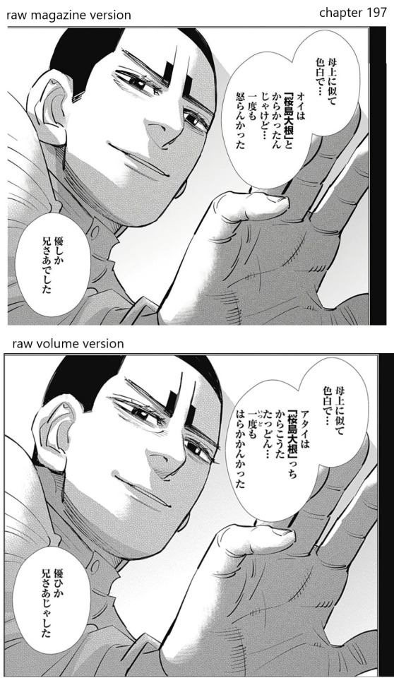
it's hard to get much out of this if you can't read japanese whatsoever, but my point is to show you how much of the text has changed. despite that, none of the meaning of the text changed! only the grammar was changed to make it more accurate to the actual dialect. (to someone who can only [sorta] read "standard" japanese, it became much harder to understand.) for example, noda-sensei changes otonoshin's first-person pronoun from "oi" (informal, i think along the lines of "ore") to "atai" (formal, clearly analogous to "watashi") when he's talking to tsurumi. because otonoshin is trying to be polite. he also adds a little furigana to let you know that otonoshin does not pronounce 一度 as the usual "ichido" but rather as "iddo."
it's probably that noda-sensei wrote the lines in what he thought of as satsuma dialect, and then some astute magazine readers (or maybe his own editors) were like, "hey, you wouldn't say it like that." so he fixed a bunch of it. i bet he got an old person from the kagoshima region to help him out.
(edit: i think it's also possible that noda-sensei was having a hard time deciding if he just wanted to signal to the reader that this was being said in dialect by writing it in sorta dialect [this option would be easier for the reader] OR if he wanted to go all-out and actually write all those lines in dialect [this option would make things harder for the reader but would be more authentic], and he ended up choosing the latter because noda-sensei does not do anything half-assed when it comes to culture.)
i don't know how interesting this is to other people but i think japanese dialects are cool
(some more notes under the cut)

here's how EH scans translated this panel. it's exactly right (sheds a tear of admiration). the 一度 that he pronounces as "iddo" means "once" and it's in the sentence about his brother not getting angry. i only focused on that part because of the added furigana. anyway, even though the dialectical grammar changed a lot, the translation is still perfect, because the meaning didn't change.
however...

the viz translation cut out a bunch of stuff for no goddamn reason, as expected. bite me viz. the font size isn't even different from EH scans, and the speech bubbles look dead empty, so you can't say you had to pare it down to fit in the speech bubble and still be readable in print form. (rubs temples...)
i read the magazine version raws first and then got my hands on the volume version raws, and i noticed some of otonoshin's lines were different. so that's how i ended up making a high-level raw-to-raw comparison (which really isn't something i'd normally care about). and now i'm comparing 4 different versions. what?
for the interested, here's a transliteration of the middle line from the panel above, so you can understand how much it changed
before: "oi wa sakurajima daikon to karakattan jakedo… ichido mo okorankatta"
after: "atai wa sakurajima daikon cchi karakouta taddon… iddo mo harakakankatta"
see?? that's crazy, right? and here's what i think it would be like in "standard" japanese: "watashi wa sakurajima daikon to karakattan dakedo... ichido mo okoranakatta." so comparing that to the former, you can kinda see that noda-sensei first just slightly modified "standard" japanese to be more satsuma-ish (changing "da" to "ja," etc.)., and then he had to go back and change everything because the real dialect is just that different.
i think the implication is that young koito here can't really speak "standard" japanese at this time in his life. he listens to tsurumi speak that way, but he responds in his own dialect. however, adult second lieutenant koito otonoshin speaks in "standard" japanese with only minor bursts of dialect. so he learned to code-switch as a necessity for his career.
in the rest of the chapter and the rest of the koito otonoshin kidnapping incident, every dialect speaker's dialogue is altered in the same way as the example panel. it's quite a substantial change.
make sure to listen out for the dialect if you watch next week's episode of the anime (s4e4), because these lines will be spoken then! unless they decide not to! because if the entire koito family is speaking this heavy dialect, they will have to be captioned the whole time even for japanese viewers! (edit: they didn't caption it! never mind! but they did have all the lines in dialect like in the volume version!)
#golden kamuy#golden kamuy translation notes#guys... you can expect more golden kamuy posts. i'm still deep in.#koito otonoshin#EDIT: i'm regretting how i phrased the 2nd sentence as kind of a diss on noda-sensei. i don't really know what he understood or didn't.#and i don't know how he made his decisions. but there's no sense making significant edits to a post that has been reblogged.
81 notes
·
View notes
Text
A not-so-quick how-to for Ao3 work skins
Ao3 has some pretty powerful customization tools at your disposal - if you know how to use them. Did you know this entire time you could change your text colors, size, background colors, outlines, underlines, overlines, and even fonts of your works? It's fairly easy to do - you only need a little knowledge about markup languages to get started. The way this is done is through classes and the clever application of some simple CSS. Though I've written this guide around using my Obey Me coloring and work skin, the principles are applicable across anything you may want to do with your Ao3 styling.
I've done all the heavy lifting this time around, and have actually created a very, very simple skin that you may want for the purposes of your Obey Me fic including:
Unique colors for each character (sticking to WCAG 1:3 minimum contrast ratio for accessibility)
Heading font and size styling (separate from character colors)
Styled 'pullquotes' for written letters/passages/quotes (at 75% size)
Make sure to keep checking back for updates - I'll put word out here on my tumblr whenever I update, but I've also created a codepen (work skin CSS found in the CSS tab) with the latest version of the skin that you can use to play around in.
Just a heads up before you start: there is a bit of a learning curve, but I have tried to make the explanation as simple as possible, and hopefully provide enough tools and knowledge that you can run with what I've given you and start creating your own styles.
1. Markup: The Basics
I'm sorry - no matter how simple I try to make this work skin, you're going to need at least a little understanding of what markup languages are and how they work. But don't fret: I've had a few years experience now teaching this to absolute beginners so hopefully by the end of this tutorial you'll be feeling like a real Hackerman.
So what is Markup? A tl;dr
Markup is a set of instructions used to tell a program (in this case your internet browser) how something should behave. HTML stands for Hypertext Markup Language and is likely the markup language you'll encounter most often. Ordinary text like you would type in a word document is meaningless to a computer browser - it doesn't know how to read. You need to talk to it in a language it understands so that it can translate your wonderful words into something that appears in your browser. This is done through the use of 'elements'.
Like how you know "words captured in these quotation marks" are quotes (or text written in parentheses is related to but non-essential to the main body), elements are essentially markers that indicate how a thing should be read. In HTML, these elements are denoted through angular brackets <> containing the necessary info that your browser understands. These often consist of an opening tag <[element type]>with content within, followed by a closing tag</[element type> denoted through the use of the "/" slash. Every element that has been opened must always be closed. Common tags include:
<p></p> for paragraphs
<em></em> for emphasis (typically displayed as italic)
<strong></strong> for strong (typically displayed as bold)
<h1></h1> for your highest headline (and subsequent-level headings use 2-6)
<div></div> for generic sections or blocks
<span></span> for specific selections of text.
<a></a> for anchors (links)
<img> containing images <- this one doesn't have closing tags because it's special
and more!
Everything you see on the internet rests within tags like these. You don't see them because they're only for your browser's eyes. Even your fics are formatted with this - though Ao3 does it automatically. You can freely switch between Markup (HTML) and Rich Text Formatting up in the top right corner.
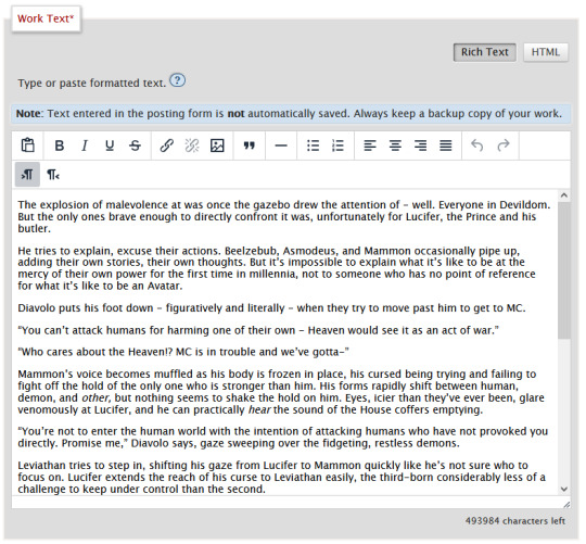
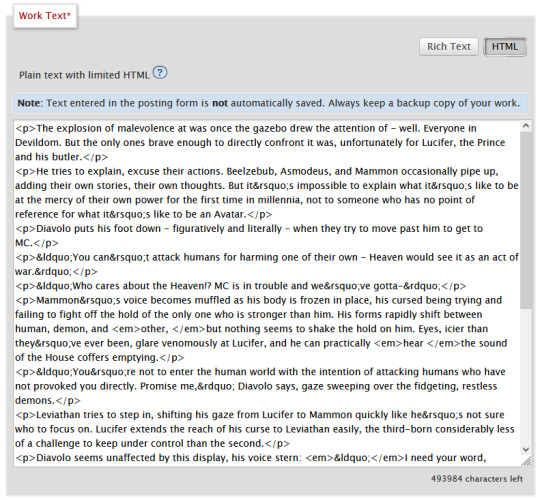
Attributes
Attributes are additional information you can add to an element. Some attributes are essential, like a href (hyperlink reference) for anchor elements. Some are additional information used to differentiate between different identical elements like a class or id. It's this latter, non-essential attribute we're going to be utilizing for our work skins.
Once you have your fic in Ao3, make sure to switch over to the html editor. From there, you are going to find the element that you want to change the look of, and we're going to add a class.
We do this by finding the open tag of an element. That will probably be a <p>. Inside those angular brackets, after the name of the element, we are going to type class=""

What we've done there is create a field for the class, but we haven't actually given the element a class yet.
It's always a good idea to name classes that describe the content, not what you want it to look like. You could change your mind down the line, but then you're stuck with a class called red that's really changing the color to blue. So rather than calling a class "gold", you might instead give it the name "Mammon" as it indicates when Mammon is speaking. This is known as Semantic markup.
Here's a few things you need to know about classes:
Class names cannot contain spaces. We use spaces to delineate new classes in the same element (like commas to separate tags on tumblr).
You can use as many classes as you want, as many times as you want.
They are case-sensitive.
You can add classes to all most html elements. That means that you don't have to just make entire paragraphs a particular style.
I have already specified several classes in my existing work skin. These are [Luci Mammon Levi Satan Asmo Beel Belphie Dia Barb Luke Sol Sim Heading pullQuote] - remember that these are case-sensitive. Feel free to use any one of these, or use your own! Put your chosen class name between those quotation marks I had you make earlier like so!

These don't actually do anything just yet. For that, we need to now head on over into our work skin.
2. Introducing the work skin: CSS
Now that we hopefully have our heads wrapped around the basics of elements and classes, we can start using that to make things look interesting. CSS stands for Cascading Style Sheet. HTML gives the browser structure, CSS gives the browser style.
But first, we have to create a new work skin.
Go to your Ao3 Dashboard and up in the top left underneath "Profile" and "Preferences" you should see an option for Skins. It'll land land you in "site skins" by default, so make sure to click on My Work Skins. From here you can click on Create Work Skin in the top right corner.
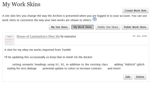
In the "About" section, make sure Work Skin is selected, and give your new skin a title!
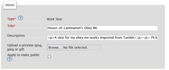
Feel free to also include a description for your own sake. Now. Onto the fun part!
Below the "About" section, you should see a box labelled CSS. In that box, feel free to copy+paste the styles below into that box:
#workskin .Luci { color: #0071ed;}
#workskin .Mammon { color: #e5a71c;}
#workskin .Levi { color: #e26600;}
#workskin .Satan { color: #00c117;}
#workskin .Asmo { color: #ff00bd;}
#workskin .Beel { color: #e80b00;}
#workskin .Belphie { color: #4f08b5;}
#workskin .Luke { color: #00c0ed;}
#workskin .Dia { color: #9b0000;}
#workskin .Barb { color: #007215;}
#workskin .Sim { color: #c1ac44;}
#workskin .Sol { color: #757575;}
#workskin .Heading { font-size: 1.25em;}
#workskin .pullQuote { text-align: center; font-size: 0.75em; display: block;}
This can also be found in the CSS section in this codepen. (disclaimer: tumblr may or may not mess with the line spacing when you copy things over. After you've copied, save your work skin and then reopen it in "edit" - Ao3 will automatically format your work so that it's nice and clean).
So what's actually happening here?
Let's read from left-to-right, top-to-bottom - because that's precisely what CSS does. Feel free to skip this part if you're not interested in creating your own styles and you're happy to just copy and paste existing work skins :)
#workskin .Luci { color: #0071ed; }
This first part here is what is called a "selector". Here, we're specifying what exactly we want to target in order to change its looks. Every character, including the spaces, symbols, and capitals matter.
#workskin .Luci { color: #0071ed; }
#workskin is specifying a unique ID within the HTML - one that encapsulates everything that you want to apply the work skin to - so basically your entire work. This is absolutely necessary in order for the work skin to actually function. We didn't create this ID in our HTML because Ao3 (will) create it for us automatically down the line.
#workskin .Luci { color: #0071ed; }
Following the work skin id, we have a space, a period, and then - hey! That's a class name! The space between the ID selector and the next part indicates we're looking for things inside this particular ID. Periods are used to indicate classes. When targeting a class, you use the period, followed by the class name. So if you're targeting your Levi class, you would write #workskin .Levi . If you were targeting a class that you created in your html, you would write #workskin .[classname] (removing the square brackets, of course).
#workskin .Luci { color: #0071ed; }
Now it's time for the fun stuff - the rules. Once we've targeted what we want to style with our selector, we use curly brackets to contain all the "rules" that we're using to make the browser appear a certain way.
#workskin .Luci { color: #0071ed; }
We start with our property - or what we want to change. In this case it's the text colour, denoted through 'color'. Yes. It's American spelling. I have no control over this. Find a simple list of css properties here! There's loads, but the ones that are probably of most use to you at this point are color, font-size, font-weight, text-align, text-decoration, and display. Make sure to put a colon after the property - that links us into the next step.
#workskin .Luci { color: #0071ed; }
Finally, we have our value - or what we're asking the property to do. In this case, we're changing the color, so the value is a hex color value. Color can also be denoted through rgb [written as rgb(0,0,0)]. Different properties will have different values. For example, text-align can have a value of left, right, or center (note the Americanized spelling again). If you click on the property in this list, it will tell you what values you can use!
You can have as many rules as you want in your selectors, as long as you end each of them with a semicolon. I cannot stress the semicolon enough. If your CSS isn't working - it's probably a missing semicolon. An example of multiple rules being used within one selector is in the pullquote styling:
#workskin .pullQuote { text-align: center; font-size: 0.75em; display: block; }
You can even write rules that override each other, though we try and avoid doing that. When this happens, your CSS will read from top-to-bottom, prioritizing the latest thing it has read (typically your bottom-most). There are exceptions to this, but that's not necessary for this guide.
So by this point you should have copied over the CSS I've written into your work skin, or perhaps tried your hand at making your own. This would be a good point to save.
3. With our Powers Combined
Right! So we have our work skin. We have our work formatted properly, resplendent with classes. Here's how we get these things talking to each other:
Once you've saved and closed your new work skin, open up or post the work you would like to apply the styling to. Down the bottom of the Associations section, there is an option to Select Work Skin. Ao3 already provides some work skins by default - Homestuck and Undertale - but you should be able to select your new work skin from this dropdown.

Now here's the magic. Time to check if this worked. Go through and make sure you've applied your classes to each of the elements you want to change the look of. These can be <p> elements, <em> elements, <strong> elements, or you can even make new, unique sections using <span>. Save your work as a draft and preview it - if you've done everything right, you should see the sections of text you've added classes to have changed in appearance!
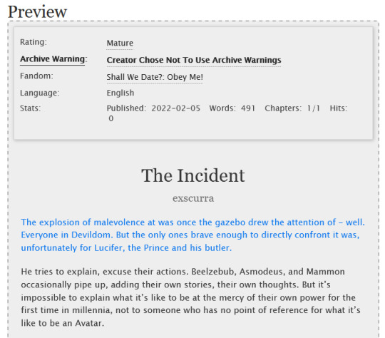
A reminder that you can add multiple classes to one element: say for example you want to create section headings unique to each 'character', you can name both classes in the class field, separated by a space. See the example below:


And that's about it! You can use the same work skin for multiple works - just remember that you should be using the same class names if that's the case. If you create a new class in your html, make sure to go back to your work skin and make some rules for that class!
I've created this codepen that you can play in that is using all the same classes - it also has the work skin in the CSS which you're also very welcome to mess around with.
Ao3 itself has a great guide to using work skins, explaining things just like I did here. The Modzilla Developer Network is a great resource for learning more in-depth about html and css if you want to do weirder and wonderful-er things!
I hope this has been informative and useful! Best of luck using skins in your own fics! 💛
#obey me#ao3#tutorial#omswd#writing reference#long post#cs people dont come @ me about my oversimplifications. this is for beginners! i am not here for definitional semantics!!!!#literally only one person asked for this and YET. i really enjoy writing tutorials
236 notes
·
View notes
Photo

How to Read a Novel in Your Target Language
Watch the video here!
Or click the ‘keep reading’ button to read a transcript!
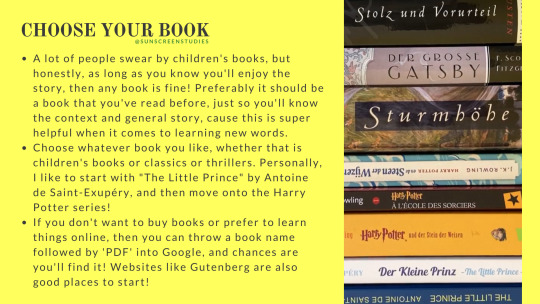
Choose Your Book. A lot of people swear by children's books, but honestly, as long as you know you'll enjoy the story, then any book is fine! Preferably it should be a book that you've read before, just so you'll know the context and general story, cause this is super helpful when it comes to learning new words. Choose whatever book you like, whether that is children's books or classics or thrillers. Personally, I like to start with "The Little Prince" by Antoine de Saint-Exupéry, and then move onto the Harry Potter series! If you don't want to buy books or prefer to learn things online, then you can throw a book name followed by 'PDF' into Google, and chances are you'll find it! Websites like Gutenberg are also good places to start!
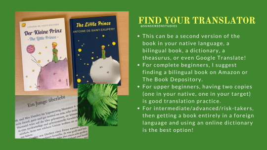
Find Your Translator. This can be a second version of the book in your native language, a bilingual book, a dictionary, a theasurus, or even Google Translate! For complete beginners, I suggest finding a bilingual book on Amazon or The Book Depository. For upper beginners, having two copies (one in your native, one in your target) is good translation practice. For intermediate/advanced/risk-takers, then getting a book entirely in a foreign language and using an online dictionary is the best option!
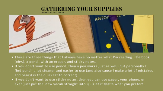
Gathering Your Supplies. There are three things that I always have no matter what I'm reading. The book (obv.), a pencil with an eraser, and sticky notes. If you don't want to use pencil, then a pen works just as well, but personally I find pencil a lot cleaner and easier to use (and also cause i make a lot of mistakes and pencil is the quickest to correct). If you don't want to use sticky notes, then you can use paper, your phone, or even just put the new vocab straight into Quizlet if that's what you prefer!
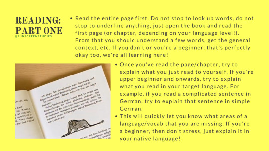
Reading: Part One: Read the entire page first. Do not stop to look up words, do not stop to underline anything, just open the book and read the first page (or chapter, depending on your language level!). From that you should understand a few words, get the general context, etc. If you don't or you're a beginner, that's perfectly okay too, we're all learning here! Once you've read the page/chapter, try to explain what you just read to yourself. If you're upper beginner and onwards, try to explain what you read in your target language. For example, if you read a complicated sentence in German, try to explain that sentence in simple German. This will quickly let you know what areas of a language/vocab that you are missing. If you're a beginner, then don't stress, just explain it in your native language!
Reading: Part Two: After you've read the entire page, it's time to go through it paragraph by paragraph. Read the first paragraph, again try to explain to yourself what's happening, and then (and only then) do you pick up your pencil/pen/phone and underline the words that you do not know. Read the paragraph a second time. Now it's time to translate.
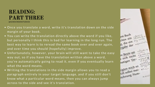
Reading: Part Three: If you have a bilingual book, try and figure out which target-language-words correspond to which native-language-words. If you have a second copy of the novel, then do the same (but remember that font/page size/etc. are going to be different so the paragraph's might be one different pages!). If you don't have the book in your native language, then get the dictionary/theasurus/translating app that you use and look up what the words mean. Once you translate a word, write it's translation down on the side margin of your book. You can write the translation directly above the word if you like, but personally I think this is bad for learning in the long run. The best way to learn is to reread the same book over and over again, and over time you should (hopefully) improve. Unfortunately, however, your brain will still want to take the easy way out, so if you have the translation written above a word, you're automatically going to read it, even if you eventually learn what the word means. Writing the translations in the side margin allows you to read a paragraph entirely in your target language, and if you still don't know what a particular word means, then you can always jump across to the side and see it's translation.
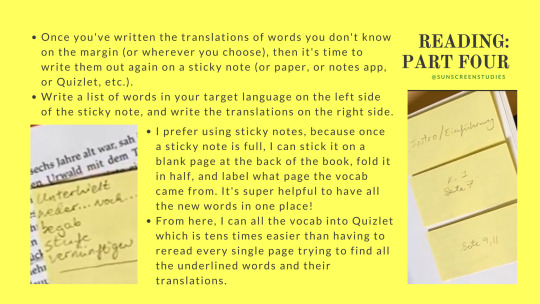
Reading: Part Four: Once you've written the translations of words you don't know on the margin (or wherever you choose), then it's time to write them out again on a sticky note (or paper, or notes app, or Quizlet, etc.). Write a list of words in your target language on the left side of the sticky note, and write the translations on the right side. I prefer using sticky notes, because once a sticky note is full, I can stick it on a blank page at the back of the book, fold it in half, and label what page the vocab came from. It's super helpful to have all the new words in one place! From here, I can all the vocab into Quizlet which is tens times easier than having to reread every single page trying to find all the underlined words and their translations.
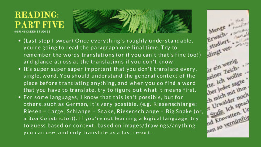
Reading: Part Five: (Last step I swear) Once everything's roughly understandable, you're going to read the paragraph one final time. Try to remember the words translations (or if you can't that's fine too!) and glance across at the translations if you don't know! It's super super super important that you don't translate every. single. word. You should understand the general context of the piece before translating anything, and when you do find a word that you have to translate, try to figure out what it means first. For some languages, I know that this isn't possible, but for others, such as German, it's very possible. (e.g. Riesenschlange: Riesen = Large, Schlange = Snake, Riesenschlange = Big Snake (or, a Boa Constrictor)). If you're not learning a logical language, try to guess based on context, based on images/drawings/anything you can use, and only translate as a last resort.
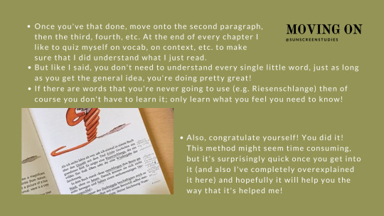
Moving On: Once you've that done, move onto the second paragraph, then the third, fourth, etc. At the end of every chapter I like to quiz myself on vocab, on context, etc. to make sure that I did understand what I just read. But like I said, you don't need to understand every single little word, just as long as you get the general idea, you're doing pretty great! If there are words that you're never going to use (e.g. Riesenschlange) then of course you don't have to learn it; only learn what you feel you need to know! Also, congratulate yourself! You did it! This method might seem time consuming, but it's surprisingly quick once you get into it (and also I've completely overexplained it here) and hopefully it will help you the way that it's helped me!
#studyblr#langblr#how to read a book in your target language#foreign language reading#reading in target language#this took super long to do#and is a lot longer than expected#study tips
227 notes
·
View notes
Text
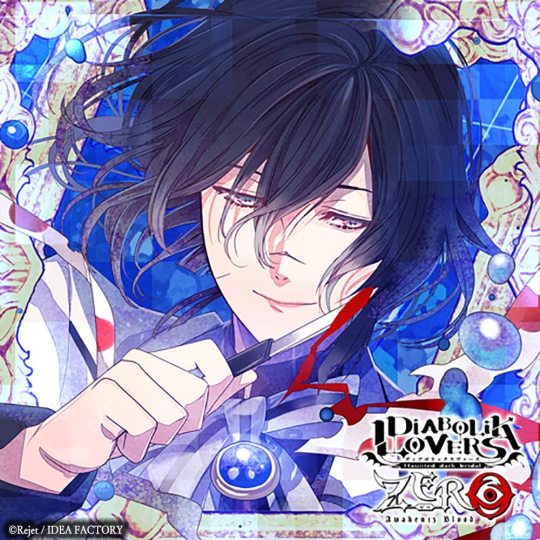
Diabolik Lovers Zero Vol. 12 Azusa Mukami [Track 1]
Original title: 串刺しの蝶たち
Source: Diabolik Lovers Zero Vol. 12 Azusa Mukami [CD not owned by me]
Audio: Here
Seiyuu: Kishio Daisuke
Translator’s note: The second to last Zero CD I have to translate before completing the entire series, wooh~! I know Azusa isn’t a very popular character within the fandom, but I actually have a huge soft spot for him after translating his Eternal Blood CD. ;w; He is just such a cutie at times, it warms my heart. Hearing his ‘clone’ talk regularly completely threw me off though! He sounds so different, but in a good way! I kind of wish Azusa would start talking a little faster himself but I suppose that’s part of the charm of his character?
Track 1 ll Track 2 ll Track 3 ll Track 4 ll Track 5
→ LIKE MY TRANSLATIONS? SUPPORT ME ON KO-FI!
Track 1: Pinned Butterflies
*Creaaaaak*
*THUD*
The two of you step inside the museum.
“It’s really...pouring outside, huh?”
You nod.
“I’m glad we just so happened...to pass by a place where we can take shelter from the rain...If not, we might have ended up...wandering through the forest while sopping wet...However, if we return home late...Ruki and the others will...get worried. I wonder if we should have just...headed straight home after finishing our errand?”
You frown.
“It has been a while since we visited the Demon World...So we just wanted to make a little detour, right...?”
*CRASH*
You flinch at the thunder.
“...Oh. It struck closeby...With the weather like this...It seems smart to stay here...until the rain lifts...”
You agree.
“We’ll end up returning home late but...Let’s stay here just a little longer? Then after we’re back...We can apologize to everyone. I’m sure they’ll understand...If we explain.”
You nod.
“Mmh. I suppose we can kill some time...inside this building?”
Azusa starts looking around.
“Hm...But...I didn’t expect to find a museum around here...Seems like we are the only visitors though...Furthermore...Oh. What an impressive amount of portraits...Several people are portrayed...Seeing them all lined up next to each other like this...makes me a little anxious.”
You tell him it’s a little creepy.
“Mmh. I’m sure they would have made for nice paintings...if only their expressions were a little more bright...But they all seem to be suffering. ...That large canvas over there...The man on it looks sad, don’t you think? I wonder if he...went through a painful experience? ...This museum is kinda...weird.”
*CRASH*
“Ah...! ...Ah, are you okay? ...The thunder is a little scary here, don’t you think? It said on the guide map that there’s a basement floor as well...So should we move there?”
*TIMESKIP*
You have arrived in the basement.
“Just as I thought...We can’t hear the thunder down here...It’s less illuminated than the earlier floor but...It seems comfortable to stay at.”
Azusa comes to a halt.
“Oh. A door. I wonder what room this is...?”
He opens the door.
*Creaaaak*
“Woah...It’s so spacious...There’s a bunch of glass cases...Are they exhibiting something, perhaps...? ...Oh! There’s a lot of...insects. They all look like...specimen.”
You get scared, hiding behind Azusa.
*Rustle*
“Oh? What’s wrong...? No need to hide...They can’t move, so it’s fine...”
You still seem worried.
“Hm...There’s a lot of species from the Demon World but...I can spot some insects which exist in the human world as well...Ah! This! These are the bugs which devastated Yuma’s garden in the past...They ate the vegetables Yuma had been carefully growing...It was quite the fiasco...Me and Kou had to help him get rid of the bugs as well...Fufu~ Brings back memories...”
The two of you continue looking around.
“...Oh. Now that I got a better look, they’re displayed all over the walls as well. I wonder if that...large insect the size of a cushion is...real?”
You get scared again.
“...Oh. Ah...Huh? Your complexion looks...pale?”
You explain.
“Ah...I’m sorry. I guess these are scary to you...even if they can’t move? Yet I failed to notice...Shall we leave this room now?”
You try and act tough.
“You don’t look okay...No need to push yourself...Okay?”
*Rustle*
“Your body is...shaking. Hey, come here.”
Azusa pulls you close.
*Rustle rustle*
“I’m sure you’ll calm down in my embrace...In no time...”
He starts stroking your head.
“There, there...Everything will be okay...I’m with you...after all...”
You smile.
“Mmh. I’m glad you seem a little more...relaxed. Ah...But you’re still a little tense...I wonder if we should touch each other more...?”
He cups your cheek.
“Whenever you do this to me...I always feel really relieved...So I figured you might feel the same...How is it?”
You tell him it feels nice.
“Fufu~ I’m glad...Then, next up...Mmh.”
*Smooch*
You get flustered.
“Hehe~ You twitched just now...Hm. Seems like you’re gradually relaxing...Also the scent of your blood...has grown sweeter. Does it feel...good, perhaps? Oh. Right. If you feel good, you’ll no longer be bothered by the specimen, right...?”
*Rustle*
“Say...I’ll suck your blood. If I do that, you don’t have to worry about a thing...”
You seem a little worried.
“Don’t worry...Leave it to me. Mmh...”
Azusa bites you.
*Gulp*
*Sluuuurp*
“Haah...Mmh...Your blood is...extremely delicious. Say, do you feel good now?”
You don’t respond.
“What’s the matter? Was this...simply not enough? Hm...Hehe. However, you’re enraptured. Your cheeks are flushed and...you’ve got that dreamy look in your eyes. Haah...I wonder why you are this cute?”
You quickly cover your face with both hands.
“Oh...Why would you hide your face? I want to...see it.”
You explain.
“It’s...embarrassing? Hm...There’s really no reason to conceal it though. But...If you don’t want to, I won’t force you...You can keep your hands there, okay? I’ll suck your blood from here...”
He bites you again.
*Sluuuuurp*
“...Haah...Such sweet noises...Even though you said it’s embarrassing...You actually wanted me to do this...right? Hehe. I’ll bite other places too...”
*Sluuuuurp*
*Gulp gulp*
“Mmh...Hah...Haah...Oh. You no longer...need to hide your face? Has your mind...gone blank?”
You nod.
“Fufu~ I’m glad that’s the case. ...Your body has...stopped shivering as well, it seems...I wanted to do this for your sake but...I ended up getting a little too into it as well. Hm...The wounds aren’t deep so I’m sure the bleeding has stopped already...”
Azusa takes a deep breath.
“The whole room’s filled with the scent of blood now, huh...? It might be good that there’s...no other Vampires here. If someone else was around, it might have lead to trouーー”
A sudden gust of wind can be heard.
“O-Oh...? Ah...What was that just now...? The sound of the wind...? It kind of sounded like someone...crying?”
You tell Azusa you don’t like being here.
“...M-Mmh...Guess we should take our leave soon...? It might have...stopped raining by now. Let’s head back up.”
*TIMESKIP*
*Creaaaak*
“Ugh...Oh? Huh? We ended up in a...different room? Did we take...a wrong turn?”
Azusa steps into the room.
“It’s better lit than the other rooms...There’s a canvas and art supplies...Everything’s all over the place. ...Seems like this isn’t an exhibition room. There’s no specimen either, so don’t worry. Say...This might be a working space? Oh...If that’s the case...We might get scolded for entering without permission, right? Let’s quickly leave. It’d be troublesome if...we were to stain something important...”
He bumps into something while turning around.
*Thud*
*Flip*
“...Aah! Oh...I dropped them...S-Sorry...!”
Azusa kneels down to pick up the papers and so do you.
“Ah...Thank you for helping me...”
The two of you pick up the drawings.
“I guess we’ve got them all now...?”
*Flip*
“Oh...These were drawn with...pencil, I suppose? What a beautiful person...It’s the same woman portrayed on all of them. I’m sure she was...someone very important.”
T/N: From this point onwards, I will be putting fake Azusa’s dialogue between ( ) and changing the font to bolded italics. This CD has both the real and the fake Azusa interacting with you and each other, so hopefully that will make it a bit easier to tell them apart.
( Exactly. She was important. )
“...E-Eh?”
( To me, she was irreplaceable.... )
“...!? W-Who are you...? Where are you...!?”
( Right here. Look at the wall. )
“Oh? ...Huh? My...portrait? Are you the one...who talked just now?”
( That’s right. Nice to meet you, dear visitors. Ah. I suppose it would be rude to introduce myself from within the canvas. )
The fake Azusa steps out of the frame.
( ...Uhm, let me greet you one more time. Nice to meet you, dear visitors. Welcome to the museum. )
ーー TO BE CONTINUED ーー
#diabolik lovers#dialovers#azusa mukami#diabolik lovers zero#diabolik lovers translation#diabolik lovers drama cd#drama cd
130 notes
·
View notes
Text
Tutorial: Simple Carousel without using <input>
Hello everyone!
I always wanted to create a Carousel-based theme, upon researching, I found yeoli-thm‘s tutorial (link is at the demo) but I had a difficulty in understanding it as I am not a huge fan of <input>. Luckily, I managed to create a simpler version of the carousel without using <input>.
Here's the result:
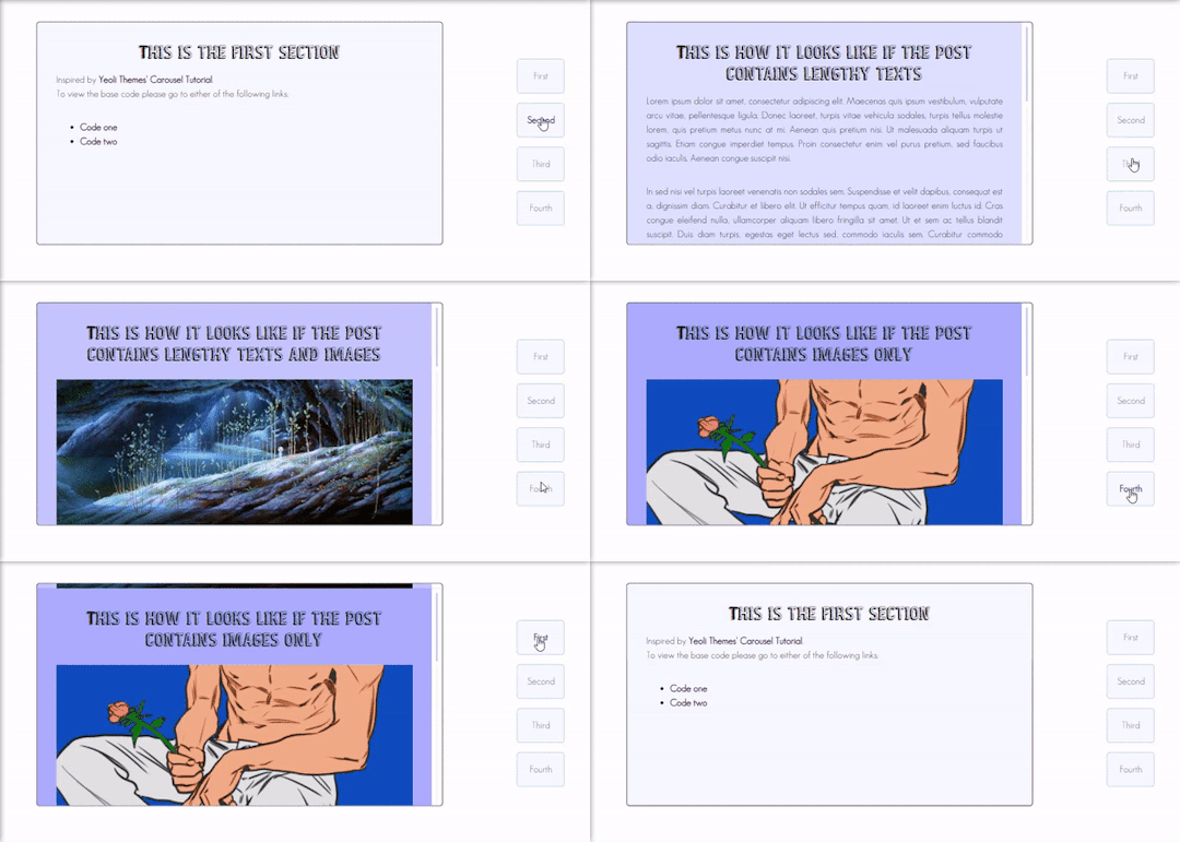
Preview
By having this result, you can create your very own pages and all-in-one themes! The base code will be provided in the demo but if you want to learn how to create this from scratch, please do read this till the end!
IMPORTANT!:
Please like and/or reblog this post if you like this tutorial. If you intend of using this code as a based code, you are required to mention me in your theme post.
This tutorial consists of four aspects:
General styling
Basic Container
Navigation
Carousel
The concept of creating a carousel derives from my smooth scrolling tutorial. If you haven’t check that out, I highly recommend for you check it out.
General Styling
1. Firstly, you need to add the basic code for your carousel. You can retrieve it from this site.
2. Add the universal selector at the style/CSS area:
/*GENERAL STYLING*/ *{ margin:0; box-sizing: border-box; scroll-behavior: smooth; }
It is pertinent to add scroll-behavior:smooth. This is to create a smooth scrolling effect.
3. Once you're done with it, you can create a basic styling for the body, fonts, etc at the style/css area. In my demo, I made a basic styling of the body, paragraph, title, and scrollbar. Example can be seen as follow:
/*BODY AND FONTS*/ body{ background: rgb(248,248,255); background-image: linear-gradient(180deg, rgba(248,248,255,1) 0%, rgba(223,223,255,1) 50%); font-family:geo sans light; text-align:justify; line-height:150%; } @font-face { font-family: geo sans light; src: url(https://static.tumblr.com/v6akjgz/MQbqf9ocl/geosanslight.ttf); } p{ margin-bottom:2rem; } h1{ font-family:vintage fair; text-align:center; color:#1f1b1b; text-shadow:-1px 0 black; font-weight:300; margin-bottom:1rem; line-height:1.15; } @font-face { font-family:vintage fair; src: url(https://static.tumblr.com/v6akjgz/SNhqfaujo/vintage_fair.ttf); } /*SCROLLBAR*/ ::-webkit-scrollbar { width: 18px; height: 18px; } ::-webkit-scrollbar-track { border: 8px solid #fff; background-color: rgba(0,0,0,.05); } ::-webkit-scrollbar-thumb { background-color: #acacff; border: 8px solid #fff; }
NOTE!: There's no need for you to copy and paste the above code. You can always edit it or create other designs that you like to add.
Basic Container
A basic container is a place where you'll be adding the carousel. You can design it however you want in the style/CSS area but at the most basic, you can style it this way:
/*BASIC CONTAINER*/ .content{ /*Basic*/ width: 50%; height: 60%; /*Position*/ position: fixed; top: 50%; left: 50%; transform: translate(-50%, -50%); /*Important*/ overflow: hidden; /*Design*/ background-color:lightblue; border-radius: 5px; border: 1px solid rgb(58, 2, 58); }
Please do take note that this is one of the many ways of creating the basic container. If you know your ways in CSS, you can style it however you want!
IMPORTANT: It is very important for you to add overflow:hidden;. Without this, it will cause the scrollbar to appear and make it less pleasing to see.
For the HTML area, add the following code:
<!--CONTENT--> <div class="content"> <!---THIS IS WHERE THE CODE FOR CAROUSEL WOULD BE SITUATED AT--> </div>
By now, if you click [Update Preview] and [Save], you will now see the container on your page.
Navigation
Navigation is the place where all the links to the section will be wrapped in.
1. Add the code below /body.
<!--NAVIGATION--> <div class="contentlink"> <ul> <li><a href="#partone">First</a> <li><a href="#parttwo">Second</a></li> <li><a href="#partthree">Third</a></li> <li><a href="#partfour">Fourth</a></li> </ul> </div>
2. After that, you are required to style it at the CSS/style are (preferably below the content). The most basic ways to do it is by doing it this way:
/*NAVIGATION*/ .contentlink{ width:5rem; height:10rem; position:fixed; top:30%; right:10%; } .contentlink ul{ list-style-type: none; padding:0; } .contentlink li{ background-color:ghostwhite; border:1px solid lightblue; border-radius: 5px; display: block; margin-bottom: 1rem; padding:1rem; text-align: center; } .contentlink li a{ text-decoration: none; color:rgb(24, 91, 136); transition: 0.25s ease-in; } .contentlink li a:hover{ color: midnightblue; font-weight: 600; transition: 0.25s ease-out; }
So let me explain one-by-one what's the function of each selector:
.contentlink: This is the wrapper for all the navigation links for the carousel.
.contentlink ul: This is the wrapper for the list. Since we don't want any bullets nor padding/indents, it is essential for us to set the list-style-type and padding to none and 0 respectively.
.contentlink li a & .contentlink li a:hover: These are essential to customize the link.
Take Note!
If you are the kind of person who focuses on accessibility, this type of code may not suit your needs. So, you may need to modify both the HTML and CSS code.
Again, this is one of the many ways of styling the navigation section. If you know your ways in CSS and HTML, you can always modify it however you like.
The number of navigation sections does not necessarily be four. It can be two or even six if you like! So, add/remove the link that suits your need.
If you intend to create an effect where whenever you click the section, it will show an indication to it, I would say that it may not be possible to do so as it requires input.
By now, you will see that everything is starting to come up to life. But if you click the button, you'll see that it won't move to another section. This is because we have yet to create the content section.
Carousel
This is where the content of each section lies. Firstly, you need to add the code inside the the div class="content" :
<!--CAROUSEL--> <div class="default" id="partone"> <!-- YOUR CONTENT--> </div> <div class="default" id="parttwo"> <!-- YOUR CONTENT--> </div> <div class="default" id="partthree"> <!-- YOUR CONTENT--> </div> <div class="default" id="partfour"> <!-- YOUR CONTENT--> </div>
Take note!:
class="default" is where you uniformize all the settings to be the same instead of rewriting the same setting in each id
partone,parttwo, etc represents the 'section for the link'. If you refer back tp the navigation above, you'll see that the link/href name is the same as this section. You may change the name to whatever you want to. However, you need to ensure that you also do the same with the link in the navigation area.
Now that you done with this, you can customize default and/or the sections at the css/style area. This is what I did for it:
.default{ width: 100%; height: 100%; overflow: auto; padding:2rem; } .default a{ color:rgb(58, 2, 58); text-decoration:none; font-weight:bold; } .default a:hover{ text-decoration:underline; font-weight:normal; } .default img{ width:100%; margin-bottom:1rem; margin-top:0.5rem; } #partone{ background: rgb(248,248,255); background: linear-gradient(180deg, rgba(248,248,255,1) 0%, rgba(223,223,255,1) 50%); } #parttwo{ background: rgb(223,223,255); background: linear-gradient(180deg, rgba(223,223,255,1) 0%, rgba(197,197,255,1) 50%); } #partthree{ background: rgb(197,197,255); background: linear-gradient(180deg, rgba(197,197,255,1) 0%, rgba(172,172,255,1) 50%); } #partfour{ background: rgb(172,172,255); background: linear-gradient(180deg, rgba(172,172,255,1) 0%, rgba(134,134,254,1) 50%); }
Take note!
If you want to uniformize everything (ie not wanting each section to have a different background-color/image), you can simply remove #partone all down to #partfour.
It is important to set the width and height to 100%. This is to ensure that your section will have its own section.
Set the overflow to auto. This is to allow the carousel to scroll in case if the contents overflow.
With that, you’re done! Please take note that what I’m sharing with you is just an idea of how to create a carousel effect using CSS and HTML. There are myriads of ways of creating this design as long as you follow the said concept:
Set your scroll behavior to smooth.
For the basic container, make sure that overflow is set to hidden.
For the navigation, make sure that the link is set to #THE NAME OF THE SELECTOR.
For the carousel, make sure that height and width are set to 100% + overflow is set to auto.
For each carousel, make sure its id is the same as the navigation.
All the best!
18 notes
·
View notes
Photo
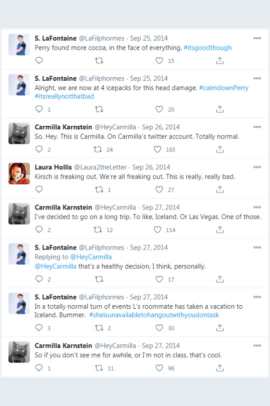
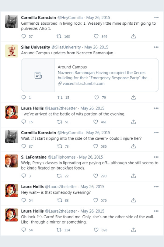
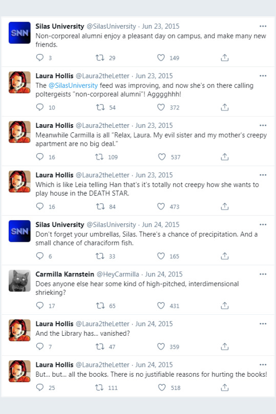
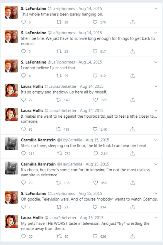
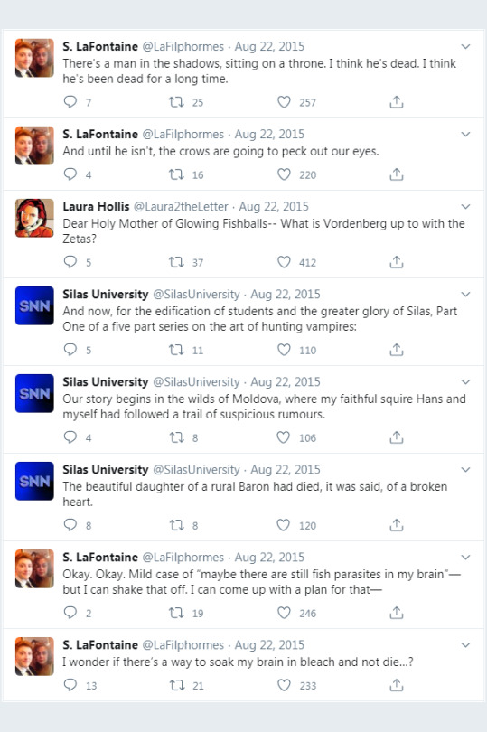
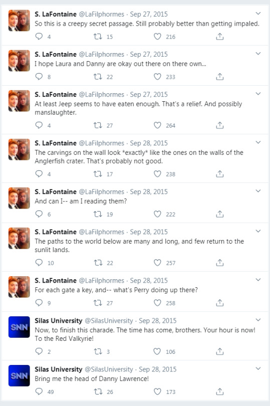

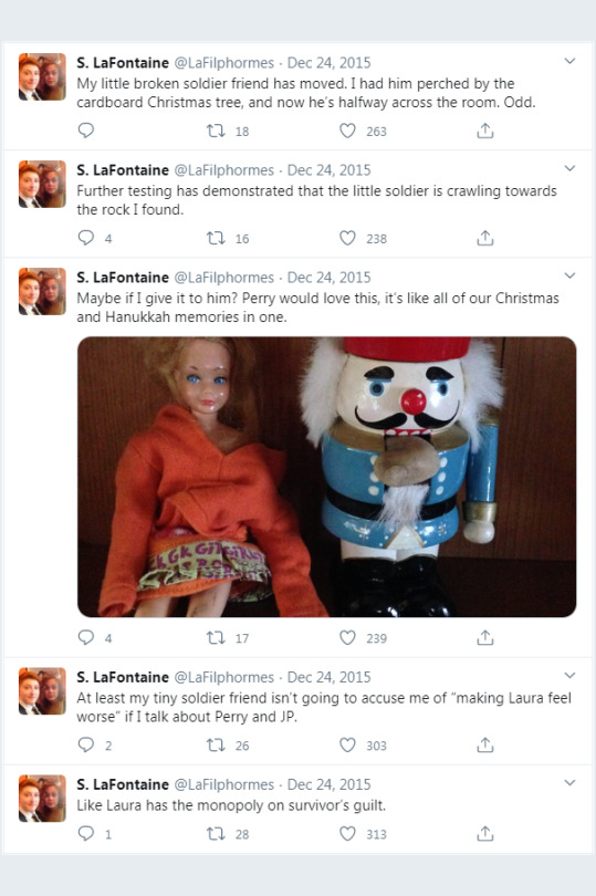
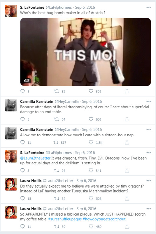
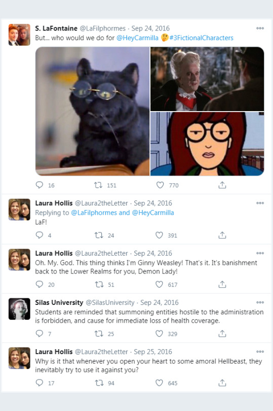
Presenting: The Carmilla Canon Tweets Collection!
I’m only four-and-a-half years late, but I hope people will enjoy this anyway. All four of the canon Twitter accounts, arranged in chronological order, and packaged into a .cbz file for your reading convenience.
Here’s the download link.
If this is the first time you’ve heard of a .cbz file, they can be opened with a program called CDisplay (and other programs too.) Alternatively, you can change the extension to .zip and extract all of the images if you so choose.
For a little more specificity and methodology about this collection: When images were tweeted, the full-size image follows after in a “page” by itself. For links, if they didn’t have an embedded preview within the tweet, I include a single screenshot of the linked site in a “page” by itself. It’s not the full content of the link, just enough to preview the webpage and understand the context of what was being linked.
This collection contains the public tweets, i.e. scripted content. The only replies are the replies to each other. No one else. I did seriously consider including all replies, as well as the tweets to which they were replying, but I ultimately decided against it for a few reasons.
The four canon accounts are still on Twitter and are expected to remain there indefinitely. The accounts are: Laura2theLetter, HeyCarmilla, SilasUniversity, and LaFilphormes. This collection just arranges the tweets from all four accounts together into chronological reading order and uses the icons that the accounts were using at the time the tweets were made.
For the explanation of my reasons for leaving out replies and other highly specific nerdy details:
Reason number one is that the scripted content is essentially the story the writers were telling with these tweets. The rest is sort of in-character ad-libbing, but not necessarily story progression. Reason number two is that a lot of the accounts being replied to have changed names or vanished in the years between then and now. Even a few of the quasi-canon fan-made RP accounts are gone and I wouldn’t have been able to track down all of their tweets or their icons. Reason number three is that if I had included everything I could find then this project would’ve taken me at least ten years to complete instead of four. There are a few gems in the replies, especially from the Silas University account, but I had to make a judgment call. The tweets in this collection are the tweets you would see if you followed all four accounts, but didn’t follow any of the other fans and RP accounts that the canon accounts would occasionally reply to.
Regarding chronological order, there were a few instances in the early days when several tweets seem to have been scheduled for the same time and ended up posting out of order. I rearranged in these instances to present the tweets in what seemed to be the intended order. There was also one instance that I’m reasonably confident was an a.m./p.m. scheduling mixup and I’ve rearranged that one as well. There are other instances where I suspect some tweets might have been inadvertently shuffled somehow, but I didn’t have anything solid enough to justify rearranging.
And this is about to be an extremely nerdy aside within this extremely nerdy aside, but there was one particular tweet that I chose to edit because the formatting or something was causing it to display differently on different devices. It’s one of Laura’s garbled tweets from between S3 Act 2 and S3 Act 3. The characters of the tweet displayed in different orders every time I tried to view the tweet another way. Windows 7, Windows 10, Android Phone, the search results page vs. the status page, and using the mobile.twitter link instead of the regular twitter link.


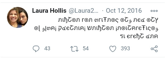


After much confusion about this, I eventually copied the text of the tweet into a document, and it came out in this order:

And according to Ellen Simpson, what the tweet actually says is that, when you read it backwards, bottom line then top. So, what I did was take the screenshot and then manually rearrange the characters into that (backwards) order, and kept the right alignment that the tweet seemed to have, producing this result:

I also included the tweet in a separate “page” right after, as it appeared in the search results on the Windows 7 laptop that I used to screenshot the rest of the tweets, for authenticity’s sake.
The tweets at this time were all scrambled anyways, but the rest were all readable approximations of Ellen’s translations and I don’t think making it that level of scrambled was intentional. The character’s show up in the right (backwards) order on TweetDeck, just not on any version of the Twitter site.

And lastly, the way tweets appear on Twitter has changed several times since I started this project. The circular icons are probably the most obvious change. I’ve pasted the original square icons over those. However, the width of the tweet column, font, and the replies/retweets/likes have changed over time as well.

I restarted this project several times, hoping to be able to screenshot every tweet in the same layout. Eagle-eyed viewers may spot a small and insignificant difference between certain page groups. Doing the whole project in-between any revisions to the Twitter site proved to be more than I was capable of, but the final result has an overall uniformity of presentation that I’m very satisfied with.
I think that should explain just about anything that anyone as nerdy about this as I am would be curious to know.
66 notes
·
View notes
Text
7 Ways to Improve your Core Web Vitals
Enhancing user experience can have a positive impact on your ranking
Recently, Google has updated its core web vitals for the search engine. It was done to improve the user experience on essential factors of the website. The goal was to redefine search quality and website performance on mobile devices, improving loading time, content usage, and clean code.
Core Web Vital was a hot topic in 2021 and will continue to be so going into 2022. As a result, you can drive your agency forward by improving the core web vitals of the client’s websites.
By monitoring these factors, you will make sure your agency meets or exceeds its business objectives. As a result, there will be less chance of any surprises, like a drop in your client’s search engine results.
What are Core Web Vitals?
These are a set of performance-based metrics. Google considers it essential for improving the user experience in terms of page speed, responsiveness, and visual stability. For a website to improve its ranking, it is necessary to measure these metrics.
Factors affecting Google Core Web Vitals metrics?
Largest Contentful Paint (LCP) tells how long it takes for the page’s main content to be visible. It roughly translates into some milliseconds. An average user can start reading the page content without waiting for all images etc., to finish loading.
The First Input Delay (FID) measures the time it takes for your users to start interacting with your website. JavaScript and third-party code affect this score.
Cumulative Layout Shift (CLS) is a metric that measures your site’s visual stability. Different image sizes, animations, and fonts affect this score.
To ensure the site visitors have the best experience. Google suggests aiming for the 75th percentile for LCP, FID, and CLS for both mobile and desktop devices.
Want to know more about Google core web vitals, we’ve covered it here.
Tips to improve your sites for Core Web Vitals
1. Upgrade your hosting service
Web hosting plays a significant role in improving the metrics for websites. The quality of the hosting determines the site’s performance, which directly affects how it performs in search results. Web hosting is also a key factor affecting the Web Vitals score, which includes speed, uptime, technical issues, and security. Choosing a hosting provider for a website is no easy task. With the number of options to choose from, it’s crucial to choose a hosting provider that suits your needs. For example, you can take a look at Cloudways. A top-rated Managed Cloud Hosting Platform that makes it easy to get started with WordPress and other popular platforms. It also makes the process of setting up optimized cloud servers as easy as clicking a button.
2. Optimize the size and dimensions of the images
It’s very important for images to have the correct sizes. An image that’s too large or too small can cause pages to load slowly or not appear correctly. The easiest way to fix this is by compressing the images and using the correct dimensions (width & height). Determining these values can be pretty tricky; however, there are some great tools out there like Smush or Optimus that will help you find what you need. Lazy Load is also an awesome tool that allows images to load as they appear on the page rather than all at once. It only shows pictures or images on a website when it is visible to the visitor. This reduces the number of HTTP requests and speeds up the site significantly!
3. Optimize your database and remove unnecessary plugins
Database optimization is something that every WordPress Developer should do regularly. Even though it’s a pretty primary task, many people seem to forget about it or don’t know how to do it. The efficiency of the database directly impacts the speed and performance of websites and their ability to rank in various search engines.
There are many ways to optimize your database, but one of the best methods is using a plugin called WP-Optimize. It automatically does everything you need to optimize your database, including cleaning out things that aren’t required, like old comments, wingbacks, and unused tags.
The second thing is that Plugins are also often a cause for concern. They can slow down your website and compromise your site’s overall performance.
To avoid plugin-related problems, you should test the client’s site from time to time, disable plugins one by one and see if there is any impact on the site’s speed or indexing. You can use the Plugin Organizer, which allows you to easily disable or organize all installed plugins at once using a simple switch.
Remember, while removing plugins, make sure to test the website thoroughly on all browsers and devices. It is also essential to make sure the core functionality of the website still works.
4. Intrusive Ads and Pop-Ups can ruin websites
Intrusive interstitials are pop-ups or advertisements that are injected in the middle of the content when the user attempts to access a site or its contents. This type of advertisement covers all or most of the screen and blocks access to the website.
This creates a bad CLS (Cumulative Layout Shift) score and most importantly it is super annoying to the visitor.
Here are some simple steps to ensure that your page layout remains static when the visitor scrolls down the page:
Set up the pages in such a way that, when a visitor scrolls down the page the layout should not change.
Make sure you don’t have any floating elements on your web pages. If you do, make sure they are out of the way so they don’t overlap anything on your webpage.
Make sure that the content of the site is easy to read and navigate without distractions from ads, banners, or other elements that are not related to the core purpose of the website.
Remember, Interstitials and promotional banners can have a positive or negative impact on your website’s SEO core web vitals. If they’re used correctly, they can help increase your website’s search engine rankings and traffic. However, if improperly implemented they can have a seriously negative effect on your site’s core web vitals.
5. Videos
An embedded video on a webpage can increase page load time by a couple of seconds. The total time it takes to fully load the webpage is affected by the amount of data being downloaded, so embedding large videos will also affect your bounce rate and time on site. Using third-party video hosting services like YouTube or Vimeo will host your videos so you don’t have to worry about bandwidth or storage space. The quality settings for mobile devices are automatically configured based on the bandwidth speed of the user.
Deferring the rendering of the video until the player is clicked or tapped will help reduce page load time by removing the need for large video files to be downloaded immediately. This prevents an unnecessary delay in the download of other resources on the page.
6. Eliminate the render-blocking element
A render-blocking element is a resource that must be downloaded before any other content on a page can be displayed to a user. Most of these scripts are useful and important to the site, but some are not necessary for the page to work correctly. These scripts will block all other elements on the page until they finish loading.
Due to the delay in presenting content to users, they negatively impact performance, leading to a suboptimal user experience. Google PageSpeed Insights can be used to check whether your WordPress website has render-blocking elements or not.
The best way to reduce render-blocking elements and to improve the site speed and performance in WordPress is to use plugins like WP Rocket. These plugins are configured to block render-blocking resources like JavaScript and CSS files. With the right settings, you can prevent the users from having to download these assets before they can see your content. This will help you to improve the core vitals score and will make a huge difference in the load time of your site.
7. Utilizing Caching and Content Delivery Networks (CDN)
Caching is also one of the most effective ways to increase site speed. WordPress has a built-in caching system, but you can also install a plugin like W3 Total Cache if your host doesn’t offer any caching options.
A caching plugin will cache all the required files of a WordPress site and then serve them from a static file system. This ensures that none of the users needs to download the same set of files again and again. This results in huge speed improvement for repeat visitors (who make up the majority of visitors). A CDN or Content Delivery Network is another way to improve the site speed and Web Vitals. If the hosting provider doesn’t offer one, you can install a plugin like Jetpack for this purpose. A CDN distributes copies of your website all across the globe so that people accessing it don’t have to go through the same server each time. This makes pages load faster for people in different parts of the world because they’re getting content from servers closer to them than yours would be.
Final thoughts:
Whether you want to create a better user experience, boost user conversion rates or increase your client’s search engine rankings, optimizing for Core Web Vitals is the perfect way to do it. It’s well worth the effort to make these adjustments now for the long-term success of your client’s site. Are you still struggling with web vitals? UnlimitedWP offers a white label WordPress development service that covers all of the essential practices you need to improve a client’s site for the Core Web Vitals. Give us a call today to find out how we can help you make websites web vital ready.
2 notes
·
View notes
Note
I gotta ask this question because it has been kicking my ass for awhile now. Do you prefer to read books on a table or do you prefer to have the book in your hand? I struggle with this because I feel like with buying the book I'm supporting the author and I don't feel that when I read via my tablet. But also, I know I can save on space at my place if I don't turn my apartment into a library. I've held off on buying books for awhile and it's convenient having everything on a tablet but at the same time there's a look of sophistication with having your own personal library displayed for guests to see.
Great question and thank you for asking! 💕
I love books and all of their many forms (ebooks, paperbacks, hardcover, audiobooks, etc) and there are pros and cons for all of them.
While hardcover and paperback books offer that specific comfort that comes with the physical sensations of reading - like holding the weight of a book, feeling the pages, smelling that sweet paper scent - and they are aesthetically pleasing (bookshelves, book stacks, photos of books, people seeing you reading a book), they can also be really inconvenient. They’re expensive, heavy, harder to hold, they take up space, sometimes the print is too small, and are inaccessible to some readers.
I am a huge fan of e-readers and ebooks and frankly, I’m annoyed with the superiority from readers who look down on ebooks. I get it if it’s a preference but ebooks are more accessible and more convient to a wider range of readers than physical books for a lot of different reasons.
They are typically cheaper than physical books - while physical books can range in price from $10-$25, e-books can range anywhere between FREE and $9.
They’re a lot easier to hold because they are lighter and an easier shape to hold. Plus you can add a pop-socket or something to make it more comfortable for each reader’s needs.
They travel a lot easier than books. Not only can you have multiple books stored on one e-reader as opposed to lugging around multiple books but you can usually sync between devices (kindle, iPhone, tablet, etc) so that you can pick up where you left off even if you left your e-reader at home.
They are instant! While you can be waiting on a book in the mail or taking the time to go to bookstore, the only time you’re waiting on an ebook is when you did a pre-order or if you’re on a waitlist with your library. Keep in mind, not all readers have easy access to physically go to a bookstore when they’re in need of a new book.
E-books are just easier to read. You can adjust the size, font, spacing, and alignment of the text to fit your needs. You can update the page color to make it easier on your eyes. YOU CAN READ THEM IN THE DARK WITHOUT A LIGHT!!!
E-readers typically have a built in dictionary or allow you to run a web search if you don't know a word so all you have to do is click on it. And same thing with translating foreign language. I’ve read a few books with latin, Spanish, French, or Italian passages that I wanted to know what they meant but the author didn’t translate it for me (and I really need to brush up on my foreign language skills). All I had to do was highlight the text and a translation popped up. This is really helpful to readers who maybe didn’t have the same access to education that other readers have had.
They allow a greater access to variety and diversity in books that readers in, say for instance, a rural or conservative area might not have the same access to at their local bookstore or library.
They’re discreet. Maybe you don’t want everyone around you to know you’re reading blue alien smut (there’s no shame but it’s also okay if you don't want people to know). Or maybe queer teens want to read queer books without their unaccepting family to know about it.
I also did a little bit of research in terms of the author making money on physical books vs e-books and I’m not really finding much data to say they make more money one way or another. Physical books cost more to print and bind and sell which is why they cost more to purchase. That doesn’t mean the author is getting more money in their pocket. And if you sell ebooks at a lower cost, that means more people are more likely to buy, meaning more money in the authors pocket.
Now you could make the argument that physical books are better for the economy because then you’re paying for the labor of printing the books and then selling the books. Which I would agree with but that’s also any technological advancement.
While I can’t display my beautiful collection of ebooks in my home for all my guests to see, I can buy or borrow the cheaper ebook to see if I like it and if I’d want to read it more than once. If so, then I buy the physical copy and add it to my physical collection.
I hope that answers your question and helps you figure out your own preference. And if your own preference is physical books, that’s absolutely fine! Just remember that ebooks are a completely valid and justified form of reading, especially because of the convince and accessibility it offers to all kinds of readers.
Happy reading! 📚💖
3 notes
·
View notes
Text
Ask for writers
Thank you @theisolatedlily and @soldouthaz for tagging me, I really appreciate it! This lovely tag was created by @soldouthaz, which I think is brilliant to get to know other writers!! I love it, so thank you Sarah!
This is quite long, but I still hope it’s entertaining!
1. describe how you first started writing and when you first posted: I’ve always wanted to write. I know that I only began publishing this year (January 2020) but years back, I always would open up a blank document and just... write. Lack of confidence and language barriers (I wanted to write in English, but it isn’t my first language and I only became fluent three years ago) have made it so that I would never finish a story. I think we all had our wattpad moment but even on there I would never really publish because the platform just wasn’t right. But then I discovered ao3, where I’d read fics and also improve my English. Then I found out about fests, and I decided to participate in one last year (2019 BLFF) and my first fic then came out!
And ever since, I’ve been able to write and finish what I start. It’s as if the lock that had been put to block my creativity had been destroyed; posting my first completed fic has acted as a turning point. I was extremely nervous when I first posted, still am, but now I have this need to write and I love sharing what I write and ever since I became a writer, my life’s been a lot better!
2. which of your characters do you typically resonate most closely with? do you base any characters off of yourself?: I switch between Louis’ POV, or Harry’s POV depending on the story; I tend to sprinkle a bit of myself in the characters I write, but then again they’re also completely different from me! I’ve never based a character completely on myself, which I find quite boring (haha); sometime unconsciously, I’d write a character based on someone I knew. I think some examples on how my characters can look a bit like me, is Hamlet in a sea of mist which has gotten his clear-headedness from me; or in my Murder Mystery fic, the way I describe Louis’ fear is heavily based on how I feel whenever I’m faced with something that makes me uncomfortable.
3. where do you often find inspiration?: art (paintings, music), books, quotes, poems and movies!
4. has quarantine helped or hindered your writing process?: having so much free time on my hands has definitely helped; I would seek refuge within my stories, to spice up quarantine!
5. do you listen to music/noise while you write or do you prefer silence? I love love love playing classical music (Chopin, Saint-Saens, Debussy, Yiruma, Einaudi, Faulkner, Schumann, Tchaikovsky, Mozart to name a few) while writing. I can’t write when it’s anything else. But I can also write when there’s nothing; hearing the rhythmic clicking sound of the keyboard as I press over its keys can be relaxing to me.
6. what is your biggest writing pet peeve in your writing or in general?: hm in my writing I guess I tend to write very long sentences, and also I still do grammar mistakes. I hope to work on those points. I also find the way I space my fics very annoying (which is why I’ve begun making outlines!).
7. describe your ideal writing setup: in a couch or a bed with several pillows piled up behind my back, classical music in my ears and a steaming cup of tea next to me.
8. favorite time of day to write?: I love writing when it’s very early, usually after I’ve woken up and freshened up. I don’t like writing when it’s too late because I’m not a night owl; rather an early bird. I especially love when I write and it’s still dark outside, then slowly dawn breaks in and the sky becomes tainted in warm hues of orange, yellow and sometimes even purple and pink.
9. favorite genre to write + one you’d like to try writing in the future?: I love writing fantasy, horror, suspense, action, thrillers. Especially angst and hurt/comfort, as well as slow burn. I’d like in the future to explore sci-fi and magical realism!
10. do you struggle with writer’s block? how do you typically overcome it? I haven’t suffered from writer block so far, which I’m glad!!
11. what is the easiest part of your writing process and the most difficult? writing is the easiest, but outlining (as in, coming up with plot ideas) is quite difficult for me. Also dialogues can be a bit of a problem to me.
12. how do you come up with original characters? (if applicable): I just make them up in my mind, and create them when they’re necessary to the story, giving them personality traits that will help the story develop.
13. what is your favorite and least favorite word? it’s hard to choose cause I have several but favourite: petrichor and least favourite: big
14. what is one thing about your writing that you’re really proud of and one thing you hope to continue working at?: I am proud of the way I describe, which allows me to really settle the story in its verse. I love describing, giving importance to the ordinary. Also feelings; I love describing them and exploring how I can translate them into words, so that the reader can feel them. But I have to work on my dialogues methinks.
15. what work of yours has your favorite ‘verse/world building? how did you come up with it?: those who from the Pit of Hell, roam to seek their prey on earth. I’ve always wanted to begin writing thrillers/Murder mystery fics and with that one I think I managed to? I had read an article on forensic medicine back in the 19th century and it sparked this fic’s plot!
16. what font and size do you write in? single spaced or double?: Arial, 11pt, single spaced
17. what is a typo(s) you find yourself making consistently?: I don’t know if this can be considered as a typo but I tend to repeat, within a paragraph, A LOT my character’s name instead of using pronouns. This is because I’m afraid of confusion when another character arrives in the scene.
18. (if applicable) do you separate fic writing from fandom?: I don’t know if I understood the question properly, but yes? When I use Louis or Harry in my fics, they’re completely different from real-Louis or real-Harry; they’re my characters, they only have the same names, but their personality reflects in nothing real-life Harry and Louis.
I think to answer this better: I do separate fic writing from fandom, but I still think that fanfics are important to a fandom; I haven’t heard of a fandom without fanfics! Fanfics spice up fandoms, I reckon, they’re important to bring people together.
19. what emotion is your favorite to write? which is the most difficult?: Angst is my favourite thing to write, as well as fear. And I struggle with writing humour, I’m not a funny person to be honest
20. what is one thing you hope readers always take away from your works?: I always hope they like my writing and the plot, also the way I portray my characters. I want my readers to feel the writing, and the story in general. I just want my readers to truly enjoy what they read from me <3
21. what is the best and worst writing advice you’ve ever received?: I was told to always write very specifically and to fit my writing into a mould — don’t write ‘he’s’ but ‘he is’, or write shorter sentences, or stop describing so much. But in the end, there isn’t one way of writing — write the way you want.
22. which one of your works would you most want to see turned into a film/television show?: only one? ahhh this is hard! But I’d love to see those who from the Pit of Hell, roam to seek their prey on earth be turned into a movie. There are also a couple of wips that I could see on-screen but I’ll stick to that!
23. do you write scenes chronologically or out of order?: chronologically. Haven’t explored anachronies (analepsis/prolepsis) at all, but I might soon!
24. how do you handle criticism?: really well!! As long as they’re constructive and not mean, I love hearing what people think. Criticism is the best way for me, a person whose first person is not English, to improve!
25. what is the advice you would give to someone who is looking to start writing?: DO IT!! Honestly, don’t tell yourself, ‘I’m not good enough’. Just do it. Open a blank document and write your heart away, even if it’s not a story; just begin it. Explore your writing style, then maybe try to mould it into a plot. Writing is not limited to a certain category of people; it’s not just for those who can write. Writing is for everyone, and like most things, one must begin before improving (practice makes perfect!!) <3
26. what kind of feedback on your work always makes your day?: anything!!! Just the fact someone clicked on my story, read it, and took time to leave a comment — just that is enough to make my heart bursts with joy. I am so so grateful to every single person who’s ever read something from me.
27. which fic ‘verse of your own would you most like to exist in? which fic’s characters would you most like to befriend?: The verse I’m talking about is still a wip, but the siren/mermaid one that I’m currently building! I’d love to live in it.
28. what do you always enjoy getting asks about/wish people would ask about more?: Anything, really, my inbox is open to anyone and for everything! I love discussing books, movies and poetry as well as quotes, and maybe I wish people would come forth to ask me more about my fics or my wips, if they have any inquiries! Or I’d love to write drabbles!
29. what has writing added to your life? how has it changed you?: It has made my life so, so much better. Writing has stitched up a gaping hole in my chest. It’s permitted me to improve in English, has made me more confident and has allowed my creativity to flow. I just... I love writing so much. It has also allowed me to meet some incredible people on tumblr, which I’m very grateful for!!
30. why do you write?: for many reasons; to spice up my life, to help me develop my creativity, and because I love it. I’ve always wanted to be a writer.
boost yourself + tags!
1a. share the last sentence you wrote:
The words echo around his head and collide with his temples like truncheon blows.
2a. describe the wip you’re most excited about:
I’m excited for all of them, but I’ll go with my third BLFF fic. It’s very angsty, post-war, ABO, exes to lovers. It tackles heavy topics, it’s such an emotional fic. I’m so so excited for her (she comes out in January).
3a. share the piece of dialogue from one of your works you’re most proud of:
This is hard. But I’ll go with one from in a sea of mist cause the way Louis answers Harry... I love it:
“I feel like you want to kill me,” he pants out, using his right arm to hold himself up while his other hand comes up to rub at his burning cheek and nose, where Louis had hit him with the sole of his shoe.
“Before our date? No, never,” Louis blinks sweetly, chuckling and climbing up as Harry smiles to himself.
4a. share the best first and last lines from your work(s): I will do only those that are already published:
best first lines are from the hope that warbles in my fluttering breast: There, against the window, was stuck millions of snowflakes, their see-through quality no more as they huddled together, pushed against hard surfaces by the merciless wind.
best last lines are from in a sea of mist: It takes a while for Harry to go to sleep, elation pumping through his veins so fast that the previous tiredness he felt has flown out of the window. But when he finally focuses on Louis’ heavened out breathing, and when he breathes in Louis’ natural perfume that always acts as an ambrosia over him, he manages to close his eyes, and for the first time in a while, he dreams of a future that’s devoid of any darkness.
5a. link the last fic you read: currently reading sweet like honey by @falsegoodnight and Spoonful of Sugar by @zanniscaramouche and they’re absolutely amazing!
6a. link the last work you published: in a sea of mist
7a. link to your ao3 (if applicable): tomlinvelvet
8a. someone that inspires you: Louis <3 his music and just his personality overall leaves so much scope for the imagination. There are also so many writers (both non-fanfic writers and fanfic writers) that inspire me daily.
9a. a comfort fic/work that you’ve been grateful for this year: even the best laid plans and just a flicker in the dark both by @falsegoodnight as well as eyes off you by @soldouthaz ... these fics are just so amazing, everything about them is top tier
10a. other writers that you’d like to tag! @falsegoodnight @scrunchyharry @hadestyles @mercurial-madhouse @youreyesonlarry @raspberryoatss @jacaranda-bloom @soldouthaz @behisoneandonly @vintageumbroshirt @so-why-let-your-voice-be-tamed @lougendarey @quelquesetoiles <3 no pressure ofc!
26 notes
·
View notes
Text
Aphrodite Kallipygos (Zuko x Plus Size Reader) [Modern AU]
Summary: Zuko takes up an art class as part of his therapy and ends up falling in love with a woman who’s a work of art in her own right.
Word Count: 3,500
Disclaimer: There’s a scene in this fic where a couple of thin girls engage in some rude behavior and are criticized in a few none-too-kind words. I want to make it very clear that this scene does not reflect my views of thin people or body positivity - these characters are meant to be a metaphor for greater culture and its strict, unrealistic views of what women should look like.
Author’s Note: I hate rom coms but after writing this fic it dawned on me that I would be excellent at writing them. Also, this one goes out to all my art hoes out there. I geek out pretty hard about art history in this one.
Speaking of which, I reference real-world cultures within the structure of the Avatar universe in this one as well. Something I like to do when I zone out is think about which actual countries would belong to which bending nations; my heritage is primarily from the British Isles, and what with liths like Stonehenge and the hella castles hanging around out there, I think we’d be earth benders - same with cultures like the ancient Egyptians and the Pueblos. I also love the idea of Pacific Islanders who can bend both water and lava, and Incan air benders, and I really wish the idea of global cultures as benders were explored more in the Avatar universe.
Have I mentioned that I’m a massive fucking nerd?
~ Muerta
Zuko never considered himself much of a creative. When he thought about it, he realized that that part of his life had never really been explored; his father always pushed him to focus solely on his bending and combat skills, never allowing even the consideration of other practices or hobbies. As much as Zuko was passionate about the martial arts he'd mastered, he also came to learn that he never had a choice in being passionate about anything else.
“I think you should take an art class,” his therapist suggested. “It would be a good outlet for you, and one that isn't directly influenced by your family.”
“I don't think I've ever drawn anything, though,” Zuko admitted. “I wouldn't be any good.”
“It's not about being good,” his therapist explained, “it's about exploring things that weren't available to you in your youth, freedom of expression. Consider it - there's a shop in this neighborhood that offers classes.”
She handed him a business card adorned with an array of different art styles, from delicate watercolors to bright, bold cartoons; it read, “classes for everything” in a cheerful, clearface font.
Zuko shrugged and pocketed the card. A week later, he was enrolled in a basic studio art course.
He arrived for his first class embarrassingly early, passing under the bell of the shop’s front door twenty minutes before it was scheduled to begin.
The building that housed the shop looked to be older than the rest of the neighborhood around it; the storefront was tiny, with crowded shelves lining each wall and tables and racks wound throughout the center of the space, creating a maze that led to the checkout counter. The room’s ceilings were high, supported by beams in a dark stained wood that matched the floor below. Paper mache sculptures and handmade lanterns hung from the rafters, and the simple, antique plaster walls were decorated with paintings and sketches, likely given by the shop’s clientele. From somewhere in the back, a radio sang folk music, accompanied by the hum of an electric fan.
Zuko wandered through the labyrinthine merchandise displays until he reached the register, where he was met with the single most beautiful sight he may have ever laid eyes on.
You stood behind the counter, leaned over a textbook with a pencil in hand, tapping it back and forth over the pages; you bit your lip in concentration, a few strands of your hair falling loose from the messy knot atop your head and over your cheeks, though you were too focused on your reading to care. An apron bearing the shop’s logo was tied around your waist, emphasizing your body's dramatic curves.
To Zuko, you were gorgeous. He couldn't place what exactly about you allured him; all he knew was that his pulse had quickened to a near dangerous pace.
You looked up at him when you noticed you were no longer alone, flashing him a kind, somewhat distracted smile. He nodded curtly, too nervous to do anything but stare.
“Can I help you?” you greeted him politely.
He cleared his throat, his voice coming out a pitch higher than normal as he spoke.
“I'm here for the art class,” he told you.
You smirked a little, peering down to check the time on your phone.
“It's a little early,” you said. “I was just about to start setting up. You could help me if you want? So you're not so bored while you wait?”
“Yeah,” Zuko mumbled, “yeah, sure.”
You grinned, waving him behind the counter and through a door to the back room. To his surprise, what he expected to be a minuscule stockroom turned out to be a space larger than the actual shop, lined on one wall with massive warehouse windows that poured late afternoon sunlight into the room. Metal shelves and boxes lay haphazardly about, mixed in with a scattering of easels, pottery spinners, canvases, and other art supplies. You directed your guest to a stack of chairs in the corner, instructing him to line them in a half circle in an empty portion of the room while you placed the easels.
“So, do you have a name?” you asked, attempting to make conversation that could drown out the repetitive radio drone.
“Zuko,” he introduced himself.
You stopped what you were doing, fixing him with an awed, slightly amused gape.
“Firelord Zuko?” you wondered.
He blushed, nodding.
“Oh spirits, I'm sorry I didn't bow!” you exclaimed, dropping into a low curtsy. The gesture was mixed with equal parts mirth and genuine respect; Zuko was unsure how to respond, his heart flickering as he watched you.
“I heard you were living somewhere in the city,” you continued after making your own introduction, setting an easel in front of each chair he positioned. “Not into the whole royalty thing?”
Zuko shrugged. He focused on his work, too nervous to look you in the eye.
“Just weird going back there,” he told you. “I don't really want taxpayer money going to making sure I live above my means.”
You leaned against the last chair he set down, smiling warmly at him.
“That's very respectable,” you responded. “Thank you. Y’know, as someone who pays taxes.”
Zuko chuckled softly as you handed him a bin of art supplies, instructing him to set one of each item at every station. He did as he was told, stealing glances at you whenever he was sure you weren’t looking.
“So, uh… do you own this place?” he asked, fumbling over his words.
“Oh, no, this is my professor’s shop,” you replied. “I just work here part time.”
“You’re a student?”
You shook your head.
“Nope. Graduated last year. I work days at the history museum downtown. I also give art history classes here, and help out with the ones Professor Cong teaches.”
“Oh.”
Zuko paused, unsure of what else to say.
“... They teach a different type of history just for art?” he asked after a moment.
You laughed, covering your mouth to muffle the sound and apologizing, giving him a little nod as you collected yourself.
“Yes. Some people even get whole degrees in it,” you giggled. “Not that it’s a useful field to learn anything about.”
Zuko shrugged, trying to shake off the embarrassment of sounding stupid in front of such a cute girl; little did he know, you found the question beyond endearing.
“It sounds important,” he contested. “I’ve been meeting historians from all over the world to correct all the propaganda from the past hundred years. It never occurred to me that I would need different historians for art.”
You smiled at him, meeting him where he stood and handing him one of the sketch pads from your bin. His cheeks pinkened, his eyes darting away from yours as he took it and mumbled a “thank you”.
“I like you, Firelord Zuko,” you decided aloud. “My classes are on Wednesdays. You can come if you want - free of charge.”
Zuko nodded, swallowing heavily as he met your gaze once again.
“Thank you,” he replied. “I appreciate it.”
You laughed a little bit, taking his now empty bin and returning both to their place on a nearby shelf. The shop’s bell rang from beyond the threshold and you went back to the front counter, telling Zuko to take a spot wherever he liked. He sat in the front row; wherever he thought he could be closest to you.

For the next five weeks, Zuko attended not only his studio art class, but your art history class, showing up early to each lesson so he could spend time alone with you. Despite the fact that you invited him to sit in, he paid the fee for the second course, not wanting you to go without the extra pay for your work - he found a doodle of a turtle duck on his seat the next time he showed up, the fuzzy little penciled duckling telling him he was a terrible listener, but thanking him anyway (with a heart scribbled in beside the words).
With your guidance, Zuko learned that there was much more to art than just vibrant colors and pretty decoration. Everything in art, it turned out, had significance, each piece and work holding insight into the people and cultures who created it; you spoke passionately about the art of the Egyptians, who used specific shapes and colors in their imagery to tell stories beyond the written word, about the mysteries of prehistoric structures that revealed how early humanity was much more sophisticated and interconnected than considered at a glance, about the symbols that translated and influenced across centuries to shape how each nation, each culture, portrayed themselves into the modern world. He found himself hanging on every word, falling even more deeply enamored with you with each moment he spent with you.
It didn’t take you long - what with the easy, pleasant conversations you shared before classes - to discover that Zuko lived relatively close to you, only two stops away on the local metro. Knowing this, you often saw each other on the days you weren't at the shop, meeting at the station between each of your respective neighborhoods and having coffee or dinner in one of its many cafes, talking about anything and everything and managing to pass several hours together in what seemed like the blink of an eye. You loved being with Zuko, finding the more you did it, the less you wanted your rendezvous to end; you thought about him all the time, getting all kinds of giddy whenever he crossed your mind.
On one of your extracurricular excursions, you and Zuko wandered around the local high street, marveling at the different streetside vendors and dreamily window shopping behind the glass of the upscale boutiques, doing little more than enjoying each other’s company. It was a hot day, and along your way, Zuko stopped at a coffee stand to get you each something cold to drink.
A pretty young woman in line in front of you eyed you up and down, her gaze flicking from between you and Zuko with disgust. She jabbed her slim, graceful elbow into her equally as flawless friend’s side, whispering something in the other woman’s ear as they both glared at you, sniggering cruelly behind flat stomachs and angular, willowy frames.
You sneered at them, making a point of hooking your arm within Zuko’s and pressing your much wider hip against his, the poison of the encounter sinking into your skin and infecting your thoughts. Zuko noticed your change in demeanor immediately, steering you away from the scene as soon as your drinks were served.
“You okay?” he asked, still holding tight to your arm.
“Fine,” you quipped, biting back tears. “Just a couple of pretty bitches proving how fucking hideous they are on the inside.”
“Wait, seriously?”
Zuko halted, pulling you to the side of the street and out of the way of traffic. He lay a hand on your shoulder, the firm, able grasp of his palm somehow making you feel even worse.
“Someone would really make fun of you?” he wondered, outraged and incredulous. “Why?”
You shook your head, smiling defeatedly as your lower lip quivered.
“People have made fun of me since I was a kid, Zu,” you told him, speaking as if he should’ve just assumed it. “I’m fat. You can’t tell me you haven’t noticed.”
“So?” Zuko replied. You were so shocked, you physically leaned away from him, raising your eyebrows. “Yeah, you’re fat. That doesn’t mean you’re not pretty. I… I think you’re really pretty. Gorgeous, even. You’re beautiful.”
You blinked at him, taken aback. He gave your shoulder a reassuring squeeze, his eyes never once leaving yours.
“... Did I break you?” he tried after a moment, sounding concerned that it was a genuine possibility.
You laughed, shaking your head in feverish disbelief, attempting to clear the confusion that fogged your battered brain.
“No, I just… Nobody’s ever called me pretty and fat before.”
Zuko shrugged.
“Both are true,” he told you. “I like your body. You look like one of those Greek sculptures. Of the goddesses.”
You stared at him, searching his eyes for any sign of dishonesty or patronization; all you found looking back at you was the clumsily genuine man you were quickly falling in love with.
“... Have I ever told you about Aphrodite Kallipygos?” you asked.
Zuko shook his head, as confused as you had been a few seconds ago.
“She’s a statue of Venus,” you explained. “She’s got her dress raised up over her backside, and when they found her originally, she didn’t have her head; the guy who restored her sculpted it so that she was looking back at herself, admiring her body. There’s even a whole folktale about a pair of brothers who fell in love with two women because they had, like, beautifully fat asses and the town built a temple dedicated to Venus and her butt. The name literally translates to ‘Aphrodite of the Beautiful Buttocks’.”
Zuko chuckled, raising the hand at your shoulder to cup your cheek.
“See?” he said. “Men have worshiped thick, juicy butts since the dawn of time!”
You laughed, your cheeks turning bright red as you buried your face in your hands, leaning forward to rest your forehead on his chest and further hide yourself.
“Zuko, oh my god,” you breathed. “Promise me you’ll never say that out loud in a public setting ever again, please. You’re the fucking Firelord for Tui’s sake.”
Zuko chuckled, wrapping an arm around your waist and hugging you tightly.
“Sorry,” he mumbled, still grinning. “Made you feel better, though.”
You pulled away from him, affectionately punching him in the shoulder. He laughed, gasping at you in mock reproach before pressing a finger into your side, shocking you with a burst of static electricity; you cackled as you jumped away, sticking your tongue out at him.
Zuko felt a rush of lightheadedness as he watched you, savoring the sound of your laugh and the radiance of your smile. It was then he realized he was in love with you.

The next studio art class focused on model drawing - more specifically, a nude model. Zuko, having been raised in what was arguably the most reserved family in the world, was nervous about the idea of having to sit in front of a stranger for an hour, not only staring at their naked body, but immortalizing it in graphite on a page.
He was mortified when he arrived at the class and found you sitting in the corner, wrapped in nothing but a silk dressing gown.
As you climbed the platform you were meant to model on, your limbs rattled. You began to question your sanity, wondering what you thought you were doing offering to pose for the class, what kind of statement you thought it would make. You faced enough judgement from others about your weight with your clothes on - what the hell did you think they would do when you stood before them completely naked, every bump and crevice on full display for them to gawk at and criticize?
You glanced to the side at Professor Cong, seeking some sort of assurance or comfort from him; he, being the seasoned professional in his mid-sixties that he was, sat reclined in a chair in his Hawaiian shirt and flip flops, scrolling totally undisturbed through Pinterest on his phone. Honestly, you expected no less - his obtuse reactions in the face of the awkward and uncomfortable were basically a superpower.
Taking a deep breath, you untied the knot holding your dressing gown together and let it fall, slipping gracefully from your shoulders and to the floor. You assumed a comfortable, classic pose, purposely facing yourself away from the man whose eyes you could feel searing into your back.
Zuko’s breath hitched as he watched you undress. Though he only saw the full of your body for a moment, he was captivated. The swell of your breasts and curve of your stomach sent him into a dizzy spell, his mouth going dry and his skin heating with a noticeable flush. The rolls of your back, the ripples and divots along your thighs and rump, the stripes etched into your skin like the veins through a granite block, he drank in every part of you, moulding every detail with a focused hand as he sketched. He made note every scar and beauty mark. Once or twice, his mind drifted towards the salacious, imagining how your body would feel beneath his, soft and supple, releasing exalted breaths and enraptured moans, your nails dragging down his back as he drove you closer and closer to infinity…
He inhaled sharply, snapping himself back to his work. You were Venus, Minerva, Diana - a goddess among men. He would gladly spend the rest of his life worshiping you.

The moment the class ended, you gathered your dressing gown and made a beeline for the employee bathroom, getting back into your clothes as quickly as you could physically manage. The experience of nude modeling wasn’t nearly as harrowing as you expected it to be; you actually found it kind of freeing, being able to show yourself to a room full of other people and come out of it unscathed, in fact feeling quite beautiful - what had you nervous was the fact that you’d have to face Zuko immediately after the fact, seeing as you took the train home together after classes. His was the only opinion you cared about, and you wanted nothing more than to convince yourself that he hadn’t judged you as harshly as the self-hatred brainwashed into you made you believe.
When you emerged from the bathroom, Professor Cong stood in front of one of the empty easels in the back, smirking at the drawing the student had left there.
“Your boyfriend left you his piece,” he teased.
You blushed, glaring at him as you approached and snatched the sketch from his hands.
“He’s not my boyfriend,” you tried in vain to defend yourself.
Professor Cong just chuckled.
“I’ll believe that when I see evidence to the contrary,” he replied.
You looked down at the paper in your hand and felt the breath drain from your lungs, your heart and stomach soaring into your throat.
Zuko had drawn you in the image of Venus, your body draped in gossamer fabric and your head turned over your shoulder, eyes cast downward and lips slightly parted in a blissful, ethereal expression. In the corner of the page, he’d written “Aphrodite Kallipygos” in his sweeping handsome script, beneath which was his signature and the date. You’d never once seen yourself look so beautiful, let alone in the eyes of someone you loved so fiercely.
You swallowed hard, rolling the drawing and securing it with a hair tie from your bag before exiting the shop through the back, knowing Zuko would be in the alley waiting for you.
“Hey,” he greeted you when you appeared through the storeroom door. “Are you okay? You looked really ner-”
You interrupted him by throwing your arms around his neck, slamming your lips into his in a desirous kiss. It took him less than a second to recover himself from the shock of the action and curl his arms around your waist, pressing his body against yours and lifting you every so slightly off the ground, kissing you just as hard as you kissed him. When you parted, you were breathless, your cheeks fiery red and your lips swollen the color of vermilion. Zuko smiled at you, one side of his mouth curling up slightly higher than the other.
“So you liked it?” he asked.
You laughed, nodding.
“Zuko, I loved it,” you gasped. “I love you. I think I loved you as soon as I met you but that sort of thing is really cliche and stupid to admit.”
Zuko chuckled, raising his hand to your cheek and kissing you again, his lips soft and tender this time around. You sighed happily into his mouth, closing your eyes and losing yourself in the feeling of his body sharing the same space as yours.
“I think I loved you the moment I met you, too,” Zuko confessed, his nose grazing against yours as he pulled away. “But you’re right. That sort of thing is really stupid and cliche.”
You giggled, tugging gently on the collar of his jacket.
“Come on,” you prompted him. “Let’s go back to my apartment. You’ve already seen me naked; we need to make it even.”
Zuko laughed, wrapping an arm around your shoulders and leading you out of the alley, his side pressed firmly against yours.
“Fair,” he agreed. “But if you want me to pose for any art, you’ll have to sign some paperwork. I’m still Firelord, you know.”
📚 table of contents 📚
✨ join me on patreon ✨
{ subscribers: @ladylizzieofdarbyshire @celamoon @omgwhattheeven @i-am-not-a-thot @fandomtrash1616 @dream-alittlebiggerdarling @just-another-romantic @berkeliums @eridanuswave @oleander-in-the-wind @kinismanditory @lammello @peppermenty @theawesomefactor123 @loganrwebb @ijustwannabecanadian @a-hopeless-fan @softvv @oddment-niwit-blubber-tweak @pearl-stonecutter @crazy0t @commander-rex @kittyddandnyla @abbyarchie @smol-grandpa @nonbinary-rogers @themanwiththemetalarmsdoll @witchywrter @canibea-whore-yet @fuckwhateverfuck @eridanuswave @duh-dobrik @sum-stuff13 }
#muerta's works#zuko#zuko x reader#zuko x you#prince zuko#prince zuko x reader#prince zuko x you#prince zuko fanfic#zuko fanfic#zuko fanfiction#zuko fluff#prince zuko fluff#prince zuko fanfiction#zuko x plus size reader#firelord zuko x reader#zuko modern au#modern au zuko#prince zuko modern au#atla modern au#modern au prince zuko#atla fanfic#atla fanfiction#self insert fanfiction#self-insert#self insert fic#self insert
73 notes
·
View notes
Text
Ask For Writers
A bunch of thanks to @theisolatedlily and @soldouthaz for tagging me. This was fun!
1. Describe how you first started writing and when you first posted: My high school English teacher always encouraged me to write and that’s how it started. I wrote a lot of poetry before starting fiction/fan-fic and started posting earlier this year.
2. Which of your characters do you typically resonate most closely with? Do you base any characters off of yourself? Every character I write has a part of me, not just in the writing sense but also some traits of mine. I tend to write from Harry’s pov or any other character that is Louis’ romantic interest in the story, entirely because it’s a lot easier to write about Louis rather than as him.
3. Where do you often find inspiration? Real life mostly. Songs, movies and books as well.
4. Has quarantine helped or hindered your writing process? Didn’t notice much of a difference really.
5. Do you listen to music/noise while you write or do you prefer silence? I prefer silence when I write, helps me focus. Rarely do I find a song that fits perfectly with a scene so I have that on repeat until I can’t.
6. What is your biggest writing pet peeve in your writing or in general? People who say only authors with popular works deserve to be called writers.
7. Describe your ideal writing setup ink stains on my hand, fountain pen scribbling smoothly over the paper and a lamp as the only source of light. Somewhere warm and cozy.
8. Favourite time of day to write? Dawn and after midnight.
9. Favourite genre to write + one you’d like to try writing in the future? Horror, fantasy, magical realism, historical and dark elements. Sci-fi is a genre that is way out of my comfort zone so probably that.
10. Do you struggle with writer’s block? How do you typically overcome it? All the bloody time lmaoo. Usually I stick to songs that I enjoy listening, switch genres or plots to overcome the block.
11. What is the easiest part of your writing process and the most difficult? Everything other than outlining is my fav part. Outlining is one pain in the ass.
12. How do you come up with original characters? (If applicable) real life is where the key is.
13. What is your favourite and least favourite word? Least fav: moist fav: tasavvur (it’s an Urdu word that translates into imagination or contemplation)
14. What is one thing about your writing that you’re really proud of and one thing you hope to continue working at? I’m really glad I can paint the imagery of a scene quite well. Paragraph starters is what I’m working on atm.
15. What work of yours has your favourite ‘verse/world building? How did you come up with it? The Blood of Love is one of my best work and I say this very humbly. The atmosphere, the themes, the overshadowing, everything I wrote of it, I absolutely love it and am proud of it.
16. What font and size do you write in? Single spaced or double? Georgia, 11, single spaced.
17. What is a typo(s) you find yourself making consistently? Leaving out apostrophise.
18. (If applicable) do you separate fic writing from fandom? Most of the times. When I’m writing canon, I look into the fandom for inspo.
19. What emotion is you’re favourite to write? Which is the most difficult? Fear is my fav emotion to write, as weird as that sounds. I find writing humour very challenging.
20. What is one thing you hope readers always take away from your works? Writers put a lot of their time into fics and appreciation for the work is always heart-warming. Other than that, I wish more people noticed the overshadowing and metaphors used.
21. What is the best and worst writing advice you’ve ever received? No writing advice is bad. What may work for one may not be suited for other. You may not like what you’ve written today but you can always come back and edit it to your likeness.
22. Which one of your works would you most want to see turned into a film/television show? The Blood of Love for sure! Also a wip: inked memory aka ghost rider au
23. Do you write scenes chronologically or out of order? I write whichever scene I want to and then align them chronologically.
24. How do you handle criticism? Honest and genuine criticism is always welcomed, not spiteful J
25. What is the advice you would give to someone who is looking to start writing? Write because you want and not because you have to. Forcing it won’t do any good. It’s alright to not write when you don’t feel like it but don’t let that get you lazy.
26. What kind of feedback on your work always makes your day? Repeating myself here hehe but when readers notice the foreshadowing and metaphors I use, it brings the biggest smile on my face
27. Which fic ‘verse of your own would you most like to exist in? Which fic’s characters would you most like to befriend? The Blood of Love is a universe I’d love to exist in. Louis’ character from my estranged actor au and Harry from tbol really speak to me.
28. What do you always enjoy getting asks about/wish people would ask about more? Backstories about my characters and fic and my imagination. It runs wild lol
29. What has writing added to your life? How has it changed you? It’s helped me a lot to see from other people’s perspective and read body language in a better way.
30. Why do you write? It helps organize my thoughts and be more coherent in a way that imp not when speaking.
Boost yourself + tags!
1a. share the last sentence you wrote "Before sunset," he says. It's not entirely true. Part of him wishes he could go now but Harry isn't sure if he'd be able to survive without kissing Louis.
2a. describe the wip you’re most excited about: the sequel to The Blood of Love!! We’re gonna get Zayn out, we’re gonna make zourry suffer a little and some zarry beef. And ofc, loads on magic, horror and dark elements.
3a. share the piece of dialogue from one of your works you’re most proud of: “Falling in love with you was never a choice, Louis,” Harry says through his tears.
4a. share the best first and last lines from your work(s): “Of all the things Louis’ done in his life, falling in love with Harry is perhaps the easiest thing he ever did.” — first line
“Louis flushed but dived in for another kiss, sealing this newfound happiness with the kiss of their love.” — last line.
5a. link the last fic you read. Don’t remember which one it was, sorry.
6a. link the last work you published: Cant link the blff yet so The Blood of Love it is.
7a. link to your ao3 (if applicable): Mugglemirror
8a. someone that inspires you: Can I say Louis? I’m saying Louis. And Taylor!
9a. a comfort fic/work that you’ve been grateful for this year: I haven’t done much reading this year, fandom wise but I’m really looking forward to read all the amazing blff fics.
10a. other writers that you’d like to tag! @yvesaintlourent @thepolourryexpress @lads-laddylads @babieloui @falsegoodnight @ashleyjohnsonfanaccount @allwaswell16
15 notes
·
View notes