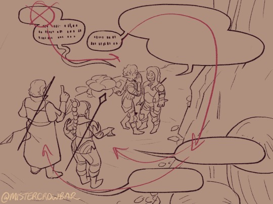
#the layout of how i draw these may change
Explore tagged Tumblr posts
Visit Tumblr Blog
Explore Tumblr blogs with no restrictions, modern design and the best experience.
Last Seen Tumblr Blogs


Fun Fact
The “We are the 99%” Tumblr blog became the slogan for the Occupy Wall Street movement.
Text
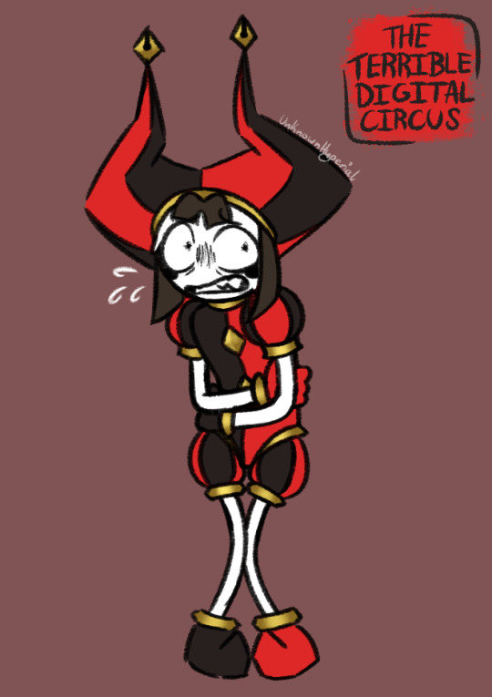
Pomctober Day 1: The Terrible Digital Circus
Fuck I know Im 2 days late at this point but I decided I was gonna join in last minute. I may be behind the rest of Pomtober cuz of it but thats fine. It'll be a good way to learn how to draw Pomni!
I'll post the Day 2 and Day 3 when I finish them. If I finish before Day 4 then I'll just post them when its appropriate to :]
(Pomctober by @tadc-funfair-au Terrible AU by @obamerzslop)
#hypers creations#art#tadc#tadc fanart#tadc au#the amazing digital circus#the amazing digital circus fanart#the amazing digital circus au#digital circus#digital circus fanart#digital circus au#the terrible digital circus au#terrible circus au#pomni#pomni fanart#pomni tadc#tadc pomni#pomni the amazing digital circus#pomni the jester#terrible pomni#pomctober#pomtober#inktober#the layout of how i draw these may change#figured id join since so many others are doing it#besides would be good practice
191 notes
·
View notes
Text
Minecrafters Using Reference
Reference as in real world architecture, not other minecrafters' builds, though that's a fair way to learn too. Studying real world architecture gives insights about designing buildings, while studying other minecrafters would give insight into how to accomplish certain effects in Minecraft.
I didn't have more than passing interest in architecture before watching mcyt, but now whenever I'm outside, I'm evaluating the buildings around me. Do I like their shape? color? Any interesting details? Any wear or texture? And above all: How would you do that detail/shape/etc in minecraft? (please note: I don't even play minecraft)
Rendition and Inspiration
There's a minecraft project called BuildtheEarth that's replicating the earth in minecraft on a 1 to 1 scale. There's some fantastic builds on there.
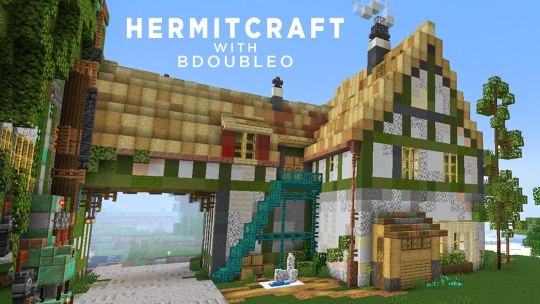
On hermitcraft, Joe Hills is known for creating to scale renditions of real world places/objects. In season 10, he's tackled a project of massive scale with Bell Labs. He used a map from the library of congress to layout all the shapes!

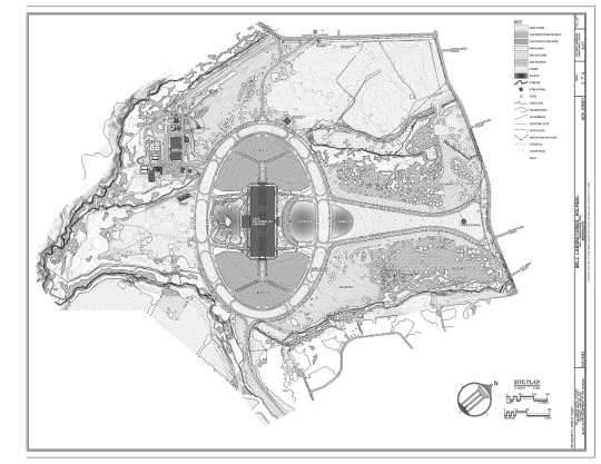
These are examples of renditions/replicas/copies/whatever you want to call it (Although Joe's doubles as a community build area in place of massive parking lots).
Then there's using the buildings for inspiration. This may involve just taking bits and pieces. Or maybe you just take a color palette. Or maybe just the shape. Maybe you don't take anything but vibes. As a general rule, I think having multiple sources of inspiration is important so the new build doesn't end up feeling like a rendition instead of its own thing.
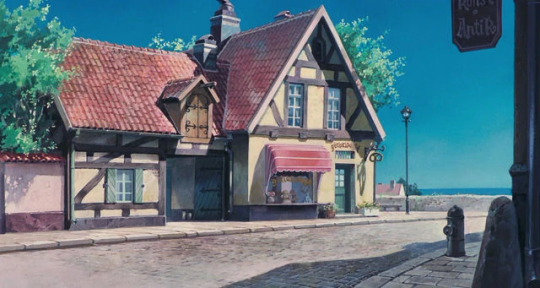
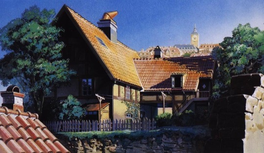
Bdubs in season 9 used the bakery from Kiki's Delivery Service as inspiration for his mud cafe. It can be seen in the wood framing, the stairs, the archway, the shape, the shed, the chimney designs. But the colors, the composition, Bdubs made changes that made it his own and combined the addition to his previous shop Moss o Menos.
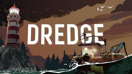
The aesthetics of Geminitay's season 10 base is based on the video game Dredge. I feel like the most obvious influence is in her research castle and fishing boats. She used inspiration from the spooky sea creatures in the game to create a uniquely frightening angler shop.

In Pearl's Build a Day series, she did a week focused on real world places. Here's the one she designed after a countryside home in Australia (her home country):


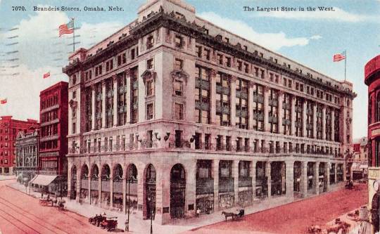
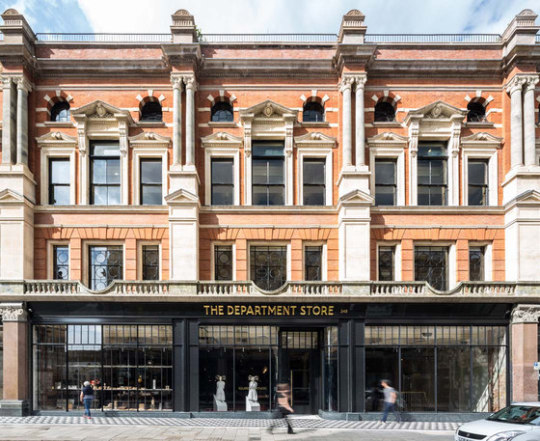
Goodtimeswithscar in season 7, when starting Aqua Town, based his shop on old department stores:

I like looking at his Aqua Town builds in comparison to his Scarland Main Street facades, which draw additional inspiration from Disneyland:


I feel like, comparing the builds you can see how he's grown; he's learned new detailing tricks, found colors and textures that work better with the architecture style. The main street has a similar layout to Disneyland, but his buildings are all unique.
Mogswamp is working on a massive build that's based on architecture drawings from Renzo Picasso:


He's incorporating groin vaults from roman architecture too!
I think builders learning about existing architecture is so good. It can give them so many ideas to add into their toolbox. It reminds them of small details that give builds life, like small sheds, some pipes, porches. And the builds don't need to be realistic; My mind goes to work by Shovel and Joel. Or everything Mumbo has done in season 10.
2K notes
·
View notes
Note
how do you be a mom and still have energy to finish comics? I'm asking sincerely as someone who wants to be a mom but is currently too scared that I'll lose my identity if I go through with it. If you've answered this before feel free to just link me to your response. And of course there's no actual obligation to reply.
Who is the mom who still has the energy to finish comics? Is the mom with the energy to finish comics in the room with us right now?

Ok ok, you’re asking sincerely so I’ll be really fucking for real right now. Here is how I manage to maintain my relatively meager comic output:
1. I have a day job that pays me well enough that I don’t need a second job, and I’m able to work remotely so I’m able to spend a little time with my family and do housework in my downtime.
2. I have a partner who supports the fucking hell out of me, recognizes how important Making Stuff is to my mental wellbeing, and does extra work to help me carve out a few hours a week to draw.
3. I cut way, WAY back on the scope of what I was trying to make. It may not look it at first but worm-in-a-rock god is a significant departure from my typical comic work — there’s no dialogue so no lettering or fussing about text layouts. It’s black and white, and each page is usually about 4 panels. Worm-in-a-rock god is about as simple of a character design as you can get. The first chapter barely had backgrounds. All that, and I’m still only clocking in at about a page a week. The whole thing came from a place of: I keep not being able to finish the things I want to make so I’m going to design a thing I can make with the time and energy I have.
So, uh: luck, love, and compromise. And a lot of hard work??? Same stuff that goes into making a kid. Same stuff that goes into making anything I guess. Sorry, I don’t have a secret.
And idk how to say this in a way that doesn’t seem cynical but you’re going to lose part of yourself. You’re 100% of a person now and the part of you that is going to be a mom has to come from somewhere. But it’s not a loss. It’s just a change, and you were going to change anyway. And I really like the part of me that changed into a mom.
Good luck, with whatever you end up making.
306 notes
·
View notes
Note
What advice would you give to someone who wants to start draw comics?
Read comics. Try to absorb the layouts and lettering - there’s so many ways to tackle it! Also even in published comics you’ll see that the art is messy and scrungly and you can take that as permission to be messy and scrungly too.
Comics are about efficiency and Good Enough. If you try to make each panel a masterpiece you’ll be there forever. Reasons why I mostly do simple pencil comics.
Start small. Do a scene or gag comic at a time. Get a feel for the medium and all the steps you have. If there’s a step you hate, find a way to emphasize the steps you love. EG I hate laying down flat colours but love shading, so I make my page form comics painterly greyscale with a gradient map to spruce them up.
Thumbnail!!!!! Figure out your page or panel layout before you start pencils. It can just be chicken scratch and sticken figures but it will help make sure there’s a clean line of action carrying the viewer from panel to panel and that your lettering fits.
don’t skimp on lettering. you can have beautiful artwork but if your dialogue is time new roman on half transparent ellipses or somehow unreadable it’s gonna drag everything else down. Blambot is a great source for free and affordable comic fonts and even has guides from an industry pro.
There are a huge bajillion elements to making comics but once you’ve made like, literally 100 pages you’ll start just intrinsically knowing things like the 180 rule, how to place a speech bubble when the first speaker is on the right, and that you can draw one nice background and then have gradient colour blocks carry you through most of the page/scene. And then you’ll still keep learning. Always learning!
LOTS of example stuff under the cut, mostly for lettering and layouts:
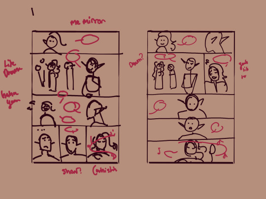
thumbnails vs finished page. The detail is just enough to remind me who goes where. You can see I mostly played with the last part of the scene, going from three panels in one row to making each panel an entire row across three rows. Panels on the same row have less “time” between them as the eyes skips from one to the other faster, whereas there’s a little more gap skipping back to a new row (think resetting a line on a typewriter). Here, the first thumbnail may have fit the artwork more neatly, but I wanted to give Astarion more time to deliberate his decision.
You can also see that I changed the top panel from a close up on Aldiirn to a wider shot showing both. This sets the scene, and the rest of it uses simple/abstract backgrounds until the final panel, which makes a nice bookend while making the overall load easier. One good environment panel will carry you for a while, but don't leave your characters in the void for too long.
Make a script before you start layouts but don’t be shocked if you need to cut things out to have them fit a page. Less is more, generally. This also goes for visual elements - what's most important to the scene? What's just extraneous detail you find fun but is creating clutter?
For the 4-panel comics I don’t put time into thumbnails unless it’s a difficult panel, but I always put the lettering and speech bubbles down first so they have enough room and nothing important gets covered. If you do this much you’re a step ahead imo.
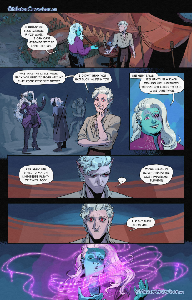
This one I’m working on now and there’s a lot going on with four characters speaking to each other! It’s important to keep a clear line going for the dialogue. Astarion’s first line has the top left corner and clearly starts the conversation. The tail of the bubble carries over to where he whispers to Aldiirn, and we pick up Aldiirn’s lines. The rock wall on the right then draws the eye down to Shadowheart and Gale’s bubble at the bottom. I don’t think the tails on the bottom bubbles are 100% ideal, but it’s Good Enough.
There’s also slightly different points in time going on in this panel, because the art is static but it’s a long convo going on. Gale’s signature finger isn’t in response to Astarion whispering, but to his answer to Aldiirn that comes after. Think of how time works in your panels, especially when you got a big one because size = time.

You can use all sorts of things to direct the eye across a comic page, but I find the strongest things are the bubbles & tails and where characters are looking. Here, Gale’s “stop by” line breaks the panel line to help draw the viewer to him in the last panel, since otherwise the eye was likely to end up at Aldiirn.
I generally like bubbles to be tucked into their panels, either fully inside or up at the edges like “my condolences.” It looks neater than when bubbles are willy nilly over the edges which I see as a sign of poor planning. And! it means when you do break panel lines it can be more meaningful.
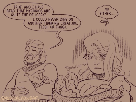
the 180 rule is a film/stage thing for composition to avoid confusing the audience, but the simplest way to put it is: if a character is on the left side of the scene, they should stay there until the action or whatever moves them. You can see here that Aldiirn is always on the right facing left, even when the camera is a bit behind him or a bit behind Gale. the 180 line is the front of Aldiirn’s tent, and the camera never crosses it in a way that would put Gale on the right.
I find it distracting when a conversation is happening in comic and a character breaks the 180 for no particular reason, though are times I’ve done it because a panel worked much better that way. The book Framed Ink has some great guides on composition and how to change the 180 line.
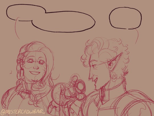
You can also see in the above comic that it’s arranged so that Gale’s always the first speaker in the panels he appears so there’s no criss cross bubble tails. Buuuut what if the first speaker is unavoidably on the right?
Stack the speech bubbles. You want the first speech bubble CLEARLY and undeniably the closest to the top left corner and then other speakers can go below.
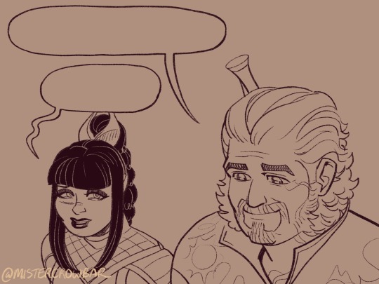
the middle example above also has some examples of playing with the speech bubbles. Wyll’s “square-y round-y” bubble is the standard, the boxy ellipse. The tail has a slight, lanquid curve. He;s comfortable teasing the poor vampire. Aldiirn’s bubble is pointy! the tail straight! with urgency! And Astarion’s bubble and tail are burbling and grumbling through gritted teeth and pain. Varsh Ko’kuu, even though he’s speaking with a standard shaped bubble, has a sharp point in the tail that speaks to his assertiveness in protecting the egg. And Shadowheart has some hesitation with that wiggly tail.
Either hand drawing or using vector shapes for bubbles is fine, but I recommend staying away from true ellipses because they look static. Square-y round-y is where it’s at. Just make sure there’s enough space between text and edge of the bubble, usually enough to fit a capital H or W, but you can play with that spacing too.
The second panel here breaks the “first bubble goes top-left corner” rule, so it’s ambiguous if Gale or Aldiirn speaks first. However! In this case everyone is giving their responses in a jumble to Rath, so order matters less. I’m pretty sure every rule I’ve mentioned has a time and place to break it, but it’s still important to learn the basics first.
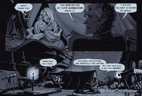
Key thing about comics typefaces: the capital I will have bars and the lower case will not. The barred I is used for I, as in, “I am not inclined to share” where the unbarred is used everywhere else.
When choosing a font, I recommend grabbing one that has Regular, Italic, and Bold/Bold Italic typefaces. I use Milk Moustache for my 4-panel comics because it’s very casual and similar weight to my own handwriting, but it doesn’t have an italic typeface and that drives me nuts sometimes. For the most flexibility, choose a font that has lower case AND uppercase type faces. I stick to upper case 90% of the time but lower case adds more options, like Aldiirn’s “really?” being so small due to his stressed state.
There are some official guides on what should be bold or italic in dialogues but they don’t matter as much unless you’re working for a big publisher with a style standard. Italics for thinking and whispering are common. I go with my gut, like Astarion’s speech is so dramatic I use italics and bold liberally, whereas for most others I may or may not just choose a key word to bold.
I think some programs will let you make text to fit a bubble instead of a square box, but tbh I just spend a lot of time manually making the text fit nicely in that bubble shape.
269 notes
·
View notes
Text

Obscenely late hermitaday day #23 & 25! - Impulse & Tango
Was this meant to be a simple cel shaded drawing on the 30th? Yeah, yeah it was lmao but somehow the power of fire excels at overtaking the rendering capabilities.
But since it's late I'll use this as excuse to ramble below about well, the headcanons and the process down yonder. Also there's variations.
(Also just realized that the compression is high with this one, please click on it to see the details pretty pleasee)


So! Let's talk about that haircut shall we? First off Tango's haircut is basically just me slapping my very neglected oc's haircut onto him lol. There's no function usage or any other lore about it, literally just I wanted to use that haircut more. But Miners and Crafters that's not all! The intensity of the flame actually has meaning believe it or not.
Since Tango in the headcanons is already a nether born blaze hybrid the redstone kinda didn't have an effect on him. This is because blazes produce glowstone which is a power source onto itself. He gets minor effects instead which is a mild (there's literally no other word) high, a intensified hair flame and a brighter eye night shine. Negative effects include mild joint & jaw pain, and a small localized headache behind the left eye.
I like to imagine that other blaze hybrids' hair flame aren't normally that intense, not white-hot heat but rather more red n orange hot similar to the flats. Mainly due to the fact that glowstone is not as powerful as redstone and it's also dependent on how strong a blaze is. Now imagine with me that blazes determine how strong each other are via the color they're emitting. Now remember the blaze boss Minecraft had a vote on to add or not to add? What if Tango is constantly mistaken as a high ranking blaze because of how intense his fire is and he doesn't get attacked a whole lot except for the few that want to challenge him. Meanwhile Tango is just highly infused with redstone like all the other redstoners and he doesn't know what's happening half time as seen by his terrified scream-laughs /hj
He's also semi modified with redstone for the pure purpose of comms just like the other redstoners minus mumbo. I also would've leaned into the steampunk aspect of this season but I figured I'd do a character sheet like etho for all of the redstoners and finalize the aspects on those.
Onto Impulse!
I like to imagine that Impulse was a regular human and over the course of redstone exposure he gained pointed ears and horns. For what reasons? I have no idea but redstone works in mysterious ways and mutates on whatever happens to be in their system. You may see that he has purple lines across his face but then red pupils, why is that? Well since he's cyperpunk themed this season he modified his redstone implants to be rgb. He can change everything else except his pupils because those are deeply affected by redstone and would require surgery to remove the build up of redstone. Will any of the redstoners ever actually get rid of it? No but you can beg all day.
You also might be wondering what's happening in their ears? Well those are the advanced comms that are actually used across all hermits except the ones who've opted out for glowstone variants. They kinda work like bluetooth except more hermit-magic way. I haven't had time to fully think of how it'd work down to the circuitry (that's my usual process for headcanons before I ship them out) but I'll post about it when I think of the full layout. Other design aspects on impulse are derived from his skin and the poster design by applestruda!
Process wise for this piece was kinda a rollercoaster heh. I had started this piece a while ago (can't remember the day on the dot) and then I got insanely busy during the last week of hermitaday. I had done sketch, refined sketch and flats in two days. Then events proceeded forth and we arrive on the 4th which I tried for an entire day to figure out how to render this piece. I then gave up and tried again the day after and pulled up references this round on Pinterest. Tango was surprisingly easy to paint with ref and went rather fast. I will admit the entire time I was rendering him I did say every minute or so "I love you man" because he was turning out so good. Halfway through I then realized I still had to render Impulse. That's when I pretty much ended that night because it was already 5 am working on Tango and demotivation was setting in fast. The next day I was able to continue with hesitancy on Impulse but I managed to keep on keeping on and in the early hours of today I finished up the piece. Where I'm now writing about it close to 2 pm in a restaurant. Man though it was kinda hard to make Impulse and Tango look like cohesive and as if they were painted together.
Enjoy!
(Side note I applied for inprint and if I am to be accepted this will be available along side the three different eefs I've drawn and doc.)
#hermitaday#(by the gods this is late)#hermitcraft#impulsesv#impulse fanart#hermitcraft impulse#tangotek#tango fanart#hermitcraft tango#par art
679 notes
·
View notes
Note
DIRECTORS COMMENTARY PLEASE I LOVE HEARING YOUR THOUGHTS AND PROCESS <3!!!!!!!!
YEAHHH lots to say for this update
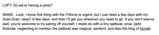
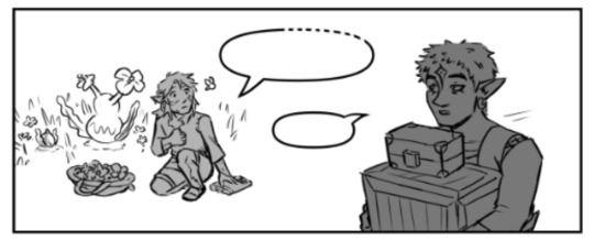
there's a scene I didn't so much as cut from the beginning of this update as significantly shorten: Wolf, Loft, Wake, and Slate are changing into their lighter outfits. Loft says the same line as having the party, Wake begs them for this one day with his Gran Gran, and they all agree they can wait. I've been trying to get better about like, not putting a ton of work into unnecessary connecting scenes, which is why I cut it down. Wake sounding more cavalier also works better for the overall chapter. But i was sad to leave this joke out lol:
may I present to you, Slate's picture gallery! he was mostly on task documenting flora and fauna but he gets a little sidetracked sometimes
I love the idea that he's just, like, kind of terrible at photography. he documents stuff for Zelda and it's always weirdly cropped and kind of out of focus, but she appreciates it anyway.
Slate is also picking flowers for the party! so he is still helping out on that front lol
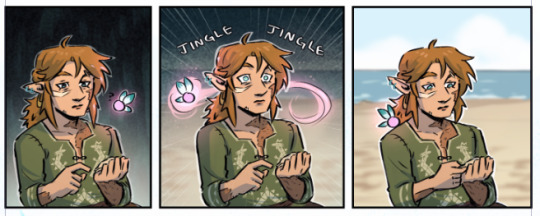
idk if i've mentioned this before, but beetle does still have pincers! they're just. idk what the right word is. retractable maybe? yeah. like the ancient weapon blades
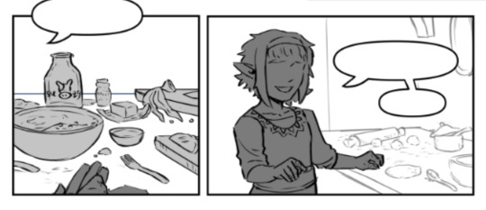
the filling of the half moon pies is pineapple :-) i was. so worried about it looking like an egg HAHA.
I thought way too hard about how they were going to cook these pies. I was originally going to draw a clay oven or some other setup, but ultimately I thought the Zelda tradition of only having pots over fires to cook was a funnier nod lol. So, they're frying the pies
believe it or not, I wrote this scene before reading dungeon meshi HAHA but it certainly served as good reference for how to set up shots for it
Aryll did in fact eavesdrop on Wake telling Tetra The Situation
That's Champion's little sister in the memory! I like the headcanon that her name was also Aryll.
Champion and his sister are making meat pies instead of pineapple ones.
One again, made a bunch of layout mistakes I ended up having to fix, except this time I didn't catch them until I had already gotten to rendering :-( if you're a patron, you probably saw these versions in the WIP:
problems here: Wolf is walking the wrong away. I was sad we'd be losing his expression but alas. And for the panels with Champion's sister, the angle is too low to be an actual POV shot. I could've left it and said he's just sitting or something probably but it was really bothering me lol so I redrew everything. and then recolored all of it. woof.
as a general rule, if he has scars, that's Slate. No scars is The Other Guy
I understand the complaint about this in BOTW, but I actually kind of like that weird moment that occurs after you finish a memory cutscene, and it just abruptly goes back to Link looking blank-faced like nothing happened. It implies this kind of....distance from the memories that I find interesting. Slate has complicated feelings abt the memories of Champion's life he gets, but like. there's pies to make
shout out to peony she's a real one
474 notes
·
View notes
Text
↠The last drop tour
| Part 1 | | Part 2 | | Part 3 |
Alright, alright, I know I’ve already shown you the Last Drop, so here we’re looking at the one from the alternate timeline, as seen in Episode 7. The elements and layout don’t change too much, but there are variations, and since my story is set in this universe, I imagine this version is the most helpful for anyone wanting to explore the universe I write about. The link to the story is HERE, but I hope this can also be useful for anyone writing or reading their own work.
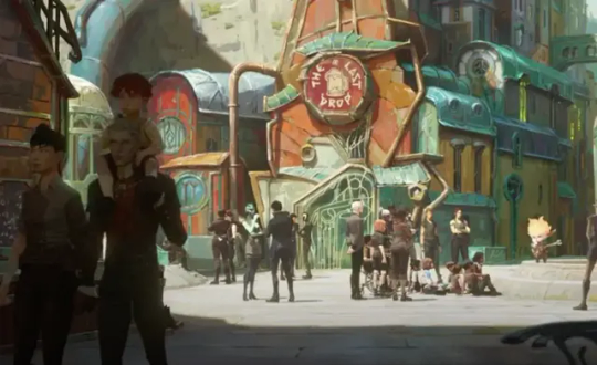
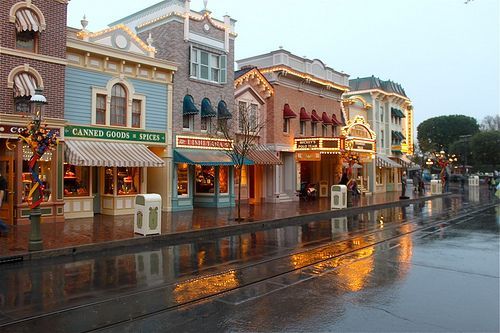
Here we are once again! This tour might be a bit challenging, but don’t worry—your guide has got you covered! This time, we need to start outside.
I know we all recognize the exterior of the bar, which hasn’t changed, but I ask you to take a closer look at the streets. They’re clean and bathed in sunlight. (The Last Drop is in the Entresol, the middle level of Zaun’s three depth levels.) While it may seem almost normal or expected, the smog that used to accumulate made it impossible for light to filter through the thick air, even during the day. As a result, the underground city never got to see this much light. This is the first time.
In Heimerdinger’s sequence where he’s seen playing "Spin the Wheel," we can catch glimpses of glass greenhouses protecting plants, and people in wheelchairs, hinting that the city is now more accessible.
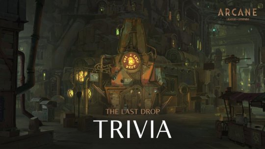
This is the third post where I’ve mentioned this damn ceiling, so I went back just to show it to you, because it was necessary at this point. Let’s start with the fact that the Last Drop has been renovated. The fact that Ekko is wearing a gold earring and is so well-dressed suggests that their profits have increased, and the first thing they did was fix up the place. But enough talk—let’s get to the proof. Now that natural light reaches Zaun, the LED lights on the ceiling aren’t needed anymore. What is needed? Glass, to let the light in.


And so, we move on to another small but significant difference. Scattered throughout the Last Drop, but especially at the bar counter, there are terrariums with plants. Claggor and Mylo are even working on plants capable of converting the dense air of the Sump into clean oxygen. But why do plants have such prominence here? In Season 1, we’re shown that in Zaun, only one place had plants: the Chembarons' meeting room. It was so high up and so clean, thanks to the ventilation on the ceiling, that plants were a privilege of the oligarchy, not something for everyone. But here, even ordinary people in Zaun have plants around, and they thrive.
The bar counter remains the same, the barrels behind Vander are still protected by the same glass partitions as always. The difference now is that everything is adorned with what used to be a symbol of luxury.

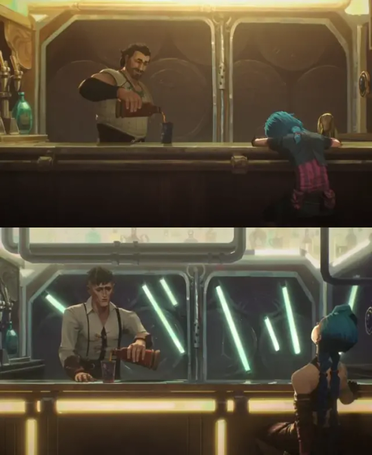
Did you recognize these booths? Now, instead of the Chembarons' photos, there are sheets with dart game scores written on them—both for the kids and the three older men. To be honest, the one I’m showing you in the photo from Zaun’s original timeline is actually the first booth on the left from the entrance. Meanwhile, the one shown where the kids are sitting is the second booth, a bit closer to both the bar counter and the narrow hallway that leads to the arcade area and the pool table.


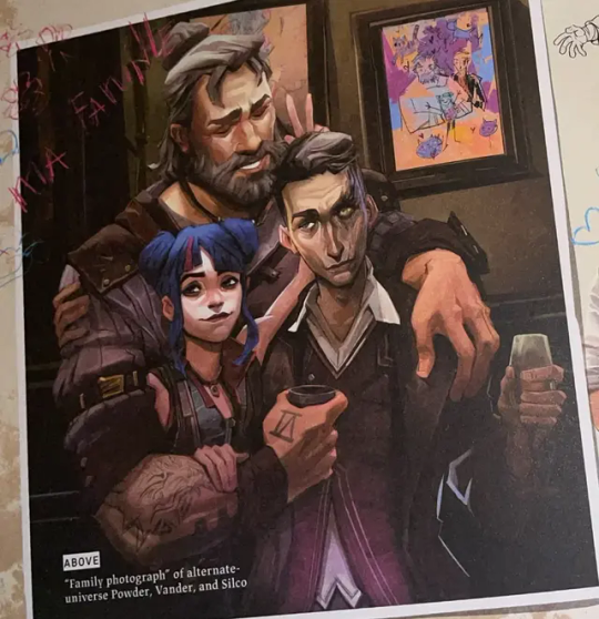
Which ones? These. Actually... this photo was taken in front of the first booth, and we can see Powder's drawings hanging there. Basically, we understand that they’re portraits of all of them together, happy. Maybe some are solo portraits, but they’re definitely very different from how things are now. (the comparison)

I imagine that the basement where Vander and his children used to live is now the place where they store alcohol and reserve drinks, or maybe it has become a boiler room. We don’t have photos of the lower area (which, I remind you, can be accessed by taking the door to the right of the bar counter and going down a long staircase) nor of the upper area, which is reached by climbing the stairs to the left. So, I can’t show you more parts of our beloved bar, but I can tell you that according to what we’re told in episode 7, they now offer both live music and events. So, the Last Drop has continued both Vander’s family-oriented, rustic management and Silco’s vision of a nightlife hub and heart of the city.

As for the rest—how we got to this point, what brought the change, how Silco's eye healed, how they managed to reach such an economic development to renovate the bar in that way—I can only speculate. But, I won’t do that here.
The theme of the universe’s development from episode 7, starting with Vi’s death, is what I talk about in my fanfiction. So, I’ll take a moment to advertise myself during this tour and let you know that if, in addition to the objective facts, you'd like to hear my opinion, I address it HERE (Everytime it rains).
From these three tours, I think you've gathered that I’m someone who pays a lot of attention to details, which is why a superficial analysis of the differences wasn't enough for me. I needed a bigger space to narrate (and analyze) the politics and the domino effect of events. So, I don't know, I hope to see you again at the bar.
Sincerely, your guide, provided by...
-Kiramman's chronocare
#zaundads#arcane writing#arcane#arcane background#the last drop#last drop#arcane silco#silco arcane#zaun dads#vanco#young silco#young vander#vander arcane#arcane vander#vander and vi#silco and jinx#arcane analysis#silco x reader#silco x you#tagged because of the ff#arcane alternate timeline#last drop arcane
181 notes
·
View notes
Text

Hello! I got an ask [x] for a tutorial for one of my recent gifsets for tgcf [x], so here it is, split into three parts:
Drawing a Curve
Template - optional: if you want the curve to flow throughout your entire gifset
Colouring - optional: specific to that particular gifset I did
Progressions
PART 1: DRAWING A CURVE
Trying this out as a screen recording for the first time since it's easier to show 🤡
PART 2: TEMPLATE
This part is optional and only applies if you want your curve to flow throughout all the gifs in your gifset. Of course, you can do your curves individually per gif, but it's generally better to have a template for how the entire curve will flow first so that the joining lines between each gif flow smoothly.
Create a new document for your template. For the height, calculate the height of the entire gifset, including the buffer areas between each gif (4px). E.g. for a gifset of 4 gifs, each of which are 540px in height, the total height would be 540px x4 gifs + 4px x3 buffers = 2172px
In your new document, go to View > Guide > New Guide Layout and change the number of rows to the number of gifs. Make sure Gutter is 4px.
In my case, for this gifset, I skipped step 2 and manually created the template for each gif instead, since every other gif has a different height.
Put in a single frame of each scene in your template (see image below).

5. Club the layers according to which gif they will be in, apply the corresponding layer masks for each gif, and draw your curve that will flow through all 5 gifs (see image below). The reason for doing this (having the previews of the scenes in at this stage) is so that as you're drawing your curve, you have a better idea of where it will flow.

6. Duplicate the curve such that each group (i.e. gif of your gifset) has one such curve layer.

7. When you're ready to edit your actual gif, import your scene into Photoshop and duplicate the layers for that particular gif to your imported document. You may need to shift your duplicated layers or crop your file to the right size.

PART 3: COLOURING
The colouring for this gifset is pretty straightforward since everything is in black and white.
1. Import all your scenes and position them accordingly. Add a mask on your curve layer so that you can mask out the parts of the curve you want to be "hidden under" your scene - so that your curve looks like it's interacting with your scenes.

2. These are the usual adjustment layers I use for black and white colouring, but it's up to you to use what you prefer or are familiar with. Play around with the numbers for each adjustment layer to see what works best for the particular scene.

3. Slap on a crumpled paper texture for an added grunge effect.

4. Colour the remaining scenes and done!


PART 4: OTHER GIFS THAT ALSO WORK THIS WAY
Progression 1: curves flowing to organic shapes
set: [x]
Using the same Curvature Pen Tool, but this time with the fill on, to create shapes first. Then, link up the shapes with lines.

Progression 2: flickering curves and organic shapes
set: [x]
On top of Progression 1, draw 2-3 variations of your curves and shapes and lay them out chronologically on timeline so that you get this flickering effect.

127 notes
·
View notes
Text

Spock keychain 3D render because this is the closest I’ll ever get to making my own keychains. [Spinny version below the cut]
I haven’t done any 3d in a while and they changed the layout of the program I use [gack!] I wish I could make myself acrylic keychains of them. I love the little Kirk
But Jelliedlimes, you may ask, how many times will you draw Spock with a Lirpa? The answer is until they outlaw it, dear tumblr user.
#star trek#spirk#james t kirk#s'chn t'gai spock#spock#st tos#tos spirk#star trek tos#spirk fanart#fem spirk#spock fanart#spirk yuri#amok time#space wives#lirpa#fem kirk#fem spock#K/S#the premise#Jelliedlimes
57 notes
·
View notes
Note
Hi!
I really admire your work and I always follow your comic, it's simply perfect. I would like to start producing my own story one day, but I don't know much about scriptwriting and I don't see any artists who are good at it.
Could you tell me what the process of creating the script for your story is like?
Thank you in advance! ❤️
Hello, Kamily!
Thank you so much for the kind words!
In regards to your question, if you want an example of scripting for comics that I, personally, think is super professional and makes for an easy read go check out @flightyalrighty. They've shared some of the scripts for pages from their 18+, horror, fan-comic Infested.
When I start working on a story I usually outline first. A simple bulleted list of all the events that need to happen in one story or "arc". This list goes through several edits as I figure out pacing. Eventually, I split that event list down into what I think will fit into an issue (about 20 pages), then I start officially scripting and end up with what you see in the below examples from issue 2!
Feels like it's best just to show you what my scripts look like, lol
@mama-qwerty is usually there throughout all these stages. She'll look over my outlines and scripts and make suggestions on what should be changed or edited for better flow. If there is a certain scene or dialogue I'm stuck on, I might skip the page/dialogue until a time where Qwerty and I can sit down and hash it out together. After I'm done, she'll review them one last time before okaying the script and then I move on to layout sketches.
From there, I treat the scripts as guidelines. Panels may be subtracted and/or added as scenes are visualized. Sometimes the script just doesn't translate perfectly into imagery and that's okay! We adjust and move on. The same occurs to dialogue and sound effects, too!
The main thing when it comes to scripting comics is that you don't really need to be good at it. Comic scripts don't have any set formulas like with movies and television. All you need to do to write a comic script is A) be able craft an accurate and direct description of the panels you want on a page (5-8 panels a page is best), and B) be able to tie dialogue and sound effects to those panels. You don't even necessarily need to know how you want these panels to be formatted if you're just the writer. The artist can figure out how to put the drawings together if you need them to. It may even be best to sketch up a crude depiction of what you want if words escape you. Whatever works!
I hope this was helpful! If something was confusing, let me know! I'd be happy to explain further! :)
31 notes
·
View notes
Text
So I made a layout map of what I HC the avengers tower to be since I couldn't find anything on what it is, I needed a map to help visualize it
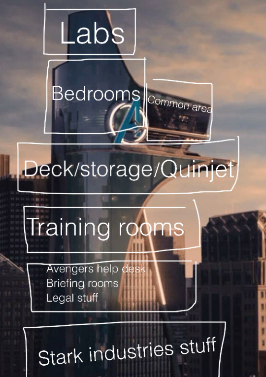
Also, some headcannons about Avengers Tower Domestic Life (some built off of truth, some true, some just headcannons) (mostly Bruce headcannons):
-Hulk and Bruce have separate bedrooms, but both are relatively barren
-Nobody dares go in Hulk's room. One time Natasha peeked inside to find Hulk and found his entire room covered in shelves and on the shelves were little glass animals, and in the center of the room is just a mattress and blanket and a plush animal. Anyone who goes in Hulk's room besides hulk would break anything, and since nobody wants to piss off Hulk they don't go in there
-Natasha and Thor spar a lot, Steve and Thor spar a lot, Thor likes to spar. Thor keeps trying to convince Bruce to turn into Hulk to spar but Bruce doesn't want to
-Clint has one of the highest up rooms because he likes to be up high
-Thor likes to be in Bruce and Tony's lab because he's curious about Midgardian tech. At first the two are like "umm I guess" but they realize Thor isn't as dumb as he seems and he helps them build stuff sometimes
-Tony isn't allowed to cook. Neither is Steve. Bruce and Natasha can cook. Clint can only make simple things. Thor would over-season everything and kill someone so he's not allowed to cook
-Sam likes to stop by whenever he's in the city. He's allowed to cook.
-Bucky ends up living in the tower. He and Steve share a room since they're able to restrain one another if the other wakes up fighting from a nightmare
-Thor and Bruce's rooms are right beside one another's. Bruce has grown to like being near Thor, and Thor is the only one who can go toe-to-toe with Hulk in a pinch
-Thor may not be able to make Hulk calm down back into Bruce, but he can make Hulk calm down enough to stop smashing things.
-Bruce's transformation into Hulk is incredibly painful, since his bones have to snap and then reform, his skin has to stretch insane amounts, his muscles may rip in the process, and his organs have to swell to man times their size to be able to accommodate for Hulk. The reverse is true for Hulk: it's excruciating because everything has to be compressed and shrunk. They both probably scream in agony and have not so pretty marks from changing.
-Thor doesn't ever get sick.
-Tony turns legal documents and printed information about upcoming missions into paper airplanes and sends them about the living room. Sometimes there are 15-20 paper airplanes scattered around the room. He's mastered the technique of folding paper airplanes.
-Steve likes to sit outside on the deck and draw the sunsets, or he likes to draw his fellow Avengers while they're just doing stuff.
-Bucky ends up being able to trust Bruce to tell him anything and finds that Thor is able to give more powerful and anchoring hugs than Steve, so only Steve and Thor get to give Bucky hugs. Soon, Hulk can too.
-The lab(s) gets caught on fire at least once a month.
-Equipment often needs to be replaced in the training room because of Thor and the supersoldiers, while Hulk doesn't go in the training room
-Steve and Bruce are actually good buddies (they bond over talking about statistics, Tony, and just basic life stuff, they have similar views on life and like talking to each other in a philosophical manner) and everyone is a lot closer knit than most people realize
-Bruce doesn't know how to say no very well if he isn't in a bad mood so everyone else will say no for him if they can tell he doesn't want it, like in public or things
-Bruce doesn't like going in public alone, especially not in NYC
(Sorry this was long, I'll probably post more HCs for X-Men and Avengers)
#avengers tower#domestic life in the avengers#Bruce banner#Thor Odinson#Steve rogers#natasha romanoff#Clint Barton#Bucky Barnes#Sam Wilson#the avengers#avengers headcannons
47 notes
·
View notes
Text

Now that I've got all the medals for Stronghold Protocol, I figured I'd share a few tips and tricks I've picked up to help anyone who might be struggling, especially with Core Protocol.
First of all, despite the impression I and others may have given about it, Core Protocol is very manageable. Of course, bullshit rng and the overtuned enemies will claim plenty of attempts, but if you plan properly you can get a few victories quickly enough.
The Pathfinders are easily the most dangerous enemy group, especially in Core Protocol, but they can be consistently countered. Lappland can silence the explosive carts, Manticore and other Ambushers can clear the crowds and destroy carts before they get to the frontline, and Penance can draw and tank the fire from ranged enemies while doing thorns damage back. Penance is also a good counter against the Icefield enemies, so I always have her slotted in as a Tier 5 so I can get her easily if needed.
Getting powerful damage dealers before the bosses arrive is a must. Ulpianus is easily one of the strongest if not the strongest Tier 5, so I highly recommend grabbing him regardless of the enemy. Logos is also always a solid choice. Be sure to be proactive with your placements; killing the bosses is more important than maintaining a defensive line due to how much health they drain.
Ifrit is a very powerful pick due to the layout of most stages, and she performs amazingly with items that trigger on skill use.
This may be obvious to others, but global damage dealers like Decadenza and Goldenglow are excellent even if they have to have an enemy in range to activate their skills; you just need to position them smartly.
Pith's Defense Strategy is easily the best overall, being so versatile it's a go-to pick for tryharding, but the others are still worth using. Don't be afraid to experiment.
The Faction Supplements for Snipers and Karlan Operators aren't worth picking imo unless you've slotted in extra Operators from those factions due to lacking either power or versatility in the base roster. Since you aren't guaranteed to get the Supplement from the Faction you're going for, I'd recommend unlocking their respective Defense Strategies in Foundational Protocol before trying this so you have incentive to use the Operators you've slotted in even if you don't get the right item/Supplement.
You can freely change the skills and modules of all Operators in Stronghold Logistics, even if you don't have the actual Operator upgraded. Be aware though that any Operators you slot in won't have their modules equipped automatically and you'll have to manually do so.
Okay, that's all the advice I can think of. You got this 👍
29 notes
·
View notes
Text
Tarot Time - Agatha All Along, Episode 7 - "Death's Hand in Mine" Part 1
HOLY FUCKING SHIT THIS EPISODE. There's so much to talk about with regards to the Tarot used in this episode. I had to take a couple of days and watch it a couple of times to catch everything. First off, all of the kudos to the writers - their use of tarot is inspired, the way they connected it throughout the show was BRILLIANT, and I honestly didn't see the reveal that Lilia was seeing her final reading coming. I am legitimately in awe of these writers.
So lets talk about it, as this is mostly going to be me trying to wrap my head around everything that happened. As always, I'm an amateur, so I may get things wrong. I'm also splitting this up into two parts because there's A LOT. First part is Lilia's Reading, the Second part is going to be all of the other cards drawn in the episode.
First up; Lilia's True Reading. I'm starting with this one because I've already talked about a number of the cards and what they mean, although even they take on some new aspects now that they are revealed to be part of the final draw. If you haven't read my earlier posts, there's links at the bottom of this one. This is also going to be tough for me, because while I have a decent familiarity with what each card symbolizes, I've never been particularly strong when it comes to layouts, and how to take in the cards as a whole reading instead of individual pieces. But also, someone can correct me if I'm wrong, "Safe Passage" is a layout that - while visually is based on the Celtic Cross - is made up for the show.
The Traveler is The Queen of Cups - Lilia. She described this card in the show - Full of intuition, but also calm, compassionate and nurturing. Warm hearted in tune with those around her - though in this case not consciously, since earlier callouts of the cards were done involuntarily and out of time. She has some aspects of a Reversed reading; her gaps and out-of-time phasings indicate a bit of emotional insecurity, and by her own admission she's bottled things up so she doesn't have to deal with the pain of seeing the future. But the Upright has been stronger with her by far. The fact that she put a sigil on Billy to give him time to come to terms with who he is speaks volumes about her compassion. It's a card that fits her to a T. I also love the modified card - for the most part, they're using a bog-standard Rider-Waite Deck, but most of the cards are in this drawing are modified. The Queen is usually depicted sitting in a throne, but this deck has her in front of a table - ready to divine and interpret and intuit. Less above her people than the normal card, and more of an equal.
What's Missing - Three of Pentacles - The Coven. I talked in depth about this one before. The only thing that changed is who the reading is for - in the first episode it showed up, the reading was for Agatha. But she wasn't the only one who lost her original coven, Lilia lost hers too. She needed them as much as Agatha did; after all, what is a witch without her coven? And as much as they bicker and lack trust in each other, they have become what they've been missing. This card is modified by making the figures standing in a group look like the Coven - Lilia, Agatha, Jen, Billy, Alice, and yes, even Rio. Oddly enough, not Sharon, suggesting either a) the art department didn't have enough room to fit her in, b)she was never a true witch, therefore not part of the Coven, or c) she was close enough to death even before the Road that Rio was essentially following her - metaphorically.
Path Behind - Knight of Wands - Alice. I talked a lot about this card in episode 5, and I don't know that there's a lot to add here. Lilia goes for the simple definition; a knight full of fire and energy. She leaves out the impulsiveness, but probably has to do with sentimentality and choosing to remembering her heroism. Path behind is obvious; her death was significant, and affected the Coven strongly. Since this is Lilia's reading, I think Alice's death is maybe the catalyst for her to start really confronting her own mortality, and her own Path. Again, the card is modified, depicting a knight holding a staff (interchangeable name for Wands) in the same stance Alice was using to save Agatha. Normally it's a knight on a reared-up horse, with the staff held upright. Both versions of the card indicate a very aggressive, action-oriented person, which Alice very much is.
Path Ahead - The High Priestess - Jen. This one is making me FERAL. So the card here is barely modified - the only difference is the High Priestess looks like Jen. And I've talked about what that means in the first post I made about tarot in this show. What it means HERE, however, is super interesting. First of all, Lilia uses the phrase "unwilling or unable to use it" which specifically refers to a Reversed reading, even though the card itself was drawn Upright. And we know that while Jen succeeded in her Trial, all it really did was help her feel confident in her knowledge of the craft; her origins as a root-worker. It didn't remove her bindings. So in some ways, she's not yet the High Priestess Upright, But given that this is the Path Ahead, I think it means she will be. But what does it mean that she is the Path Ahead? I have a guess, but stick with me here. First of all, The High Priestess is the master of the unconscious and spirituality. Secondly, the Path Ahead is for the Traveler, meaning it's specifically LILIA'S Path Ahead. Also, There's a line in the Ballad about "Spirits as our Guide." So my guess, is at some point, Jen is going to be unblocked, and when she is, she's gonna call on the spirits of those who died on the Road - including Lilia. There's a reason Lilia was okay making the sacrifice she did, and why she was so insistent on Jen specifically getting out of there. I could be wrong, but I think the signs are there, and I cannot wait to see if I'm right.
Obstacles - Three of Swords - Agatha. Interesting, this one probably has several implications. Three of Swords represents heartache and grief. For Lilia specifically, one of her biggest obstacles has been her grief over seeing everyone she knows and loves die well before they do, and being unable to stop it. It's stopped her from using her power to it's full potential and kept her from connecting with and caring about people. She's needed to let that go, accept that Death comes for everyone, and that her visions having meaning and purpose, even if she can't change them. The card is mostly the same, they've just put a figure in the foreground that doesn't normally exist, aka Agatha. So it also kind of implies that Agatha, specifically Agatha's own heartache, has also been a giant obstacle to Lilia, and probably the coven as a whole - continuing the theme that actually, Agatha is her own worst enemy, which tracks.
Windfall - Tower Reversed - William/Billy/Teen. I've already talked about how this relates to Billy, but this reading is for Lilia. So the personal transformation is HERS. Violent and disruptive, but she'll become something new. What will she become? A spirit, maybe? Something else, something more? Or is it that in her final moments, she becomes the strongest, most complete version of herself? I'm inclined towards something beyond - she looks almost ecstatic when she draws it, and tied together with her Path Ahead being The High Priestess, I think she realizes while she may die, she's not done, and she's gonna be GLORIOUS. The card here isn't significantly modified, I believe it might be, but it was so quick I couldn't catch exactly how.
Destination - Death - Rio. And we get the (highly telegraphed) reveal that Rio is Death. Normally the card is Black Knight on a White Horse, but here it's just Rio in Grim Reaper guise. Makes sense, given that in this universe she predates Tarot, so in this deck, the card is based on her. Reading superficially, it's just that all roads lead to Death. But the card is more complicated than that and Lilia knows it. Because the Death card isn't just about physical death. It's about embracing the endings and accepting fate so that something new can begin. The personal transformation promised as the Windfall cannot happen unless one is willing to let the old self end. And Rio is the original Green Witch. A flower cannot grow without nutrients, and soil is enriched by what dies in it. So Lilia knows at this point she has to die. But it's okay now, because it's not an end, it's a new beginning. And I'm crying as I'm writing this. And I think the writers were SO CLEVER that the last shot we see of Lilia is of her as young girl, with her mentor saying "Let's Begin".
I think overall the writers have been very good with their use of tarot, and their layout is very cool. I also think it's very smart that they've associated certain cards with certain witches, and that the words Lilia was using in association with the cards were their basic definitions only. It makes sense; we're talking about a visual medium, and the way she did it was punchier, and more dynamic than doing an in depth interpretation of the cards. But what it didn't do was give us the reading as a whole, and almost tricked the audience into forgetting or dismissing the idea that the reading was for Lilia alone instead of the coven, and that the cards are working together to paint a fuller picture. But this episode has also shown that somebody on the writing staff knows their tarot, or at the very least did a lot of research. And I think there's a deeper interpretation to be had; Lilia's died, but she is not done.
I'm so excited for the last two episodes. I don't know if we'll see more cards after this, but I'm not ruling it out as a possibility. I also have the rest of the cards that were drawn this episode, which I'll go into in Part 2 of this (maybe 3, who knows, there were a LOT of cards). It should be up soon, but I need a bit of a break after writing this one. hope you all enjoyed it!
Here's the Links to Past Episodes
Episode 1-3 Episode 4 Episode 5 Episode 6 Episode 7 Part 2
#agatha all along#agatha all along spoilers#death's hand in mine#agatha harkness#lilia calderu#jennifer kale#rio vidal#william kaplan#billy maximoff#tarot cards#alice wu gulliver#sharon davis
60 notes
·
View notes
Text
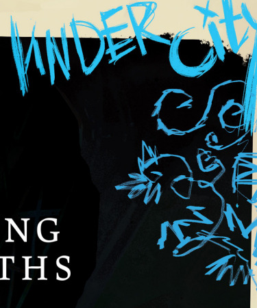
Page 48 - Exploring the Depths
MASTERLIST
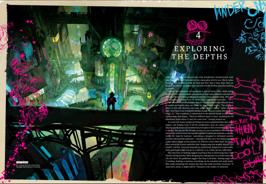
Chapter 4 - EXPLORING THE DEPTHS
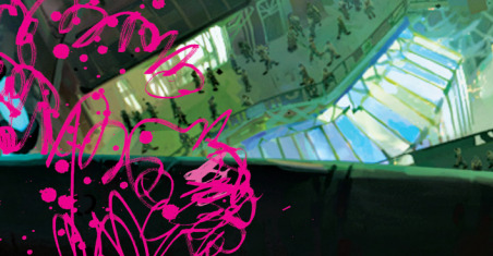
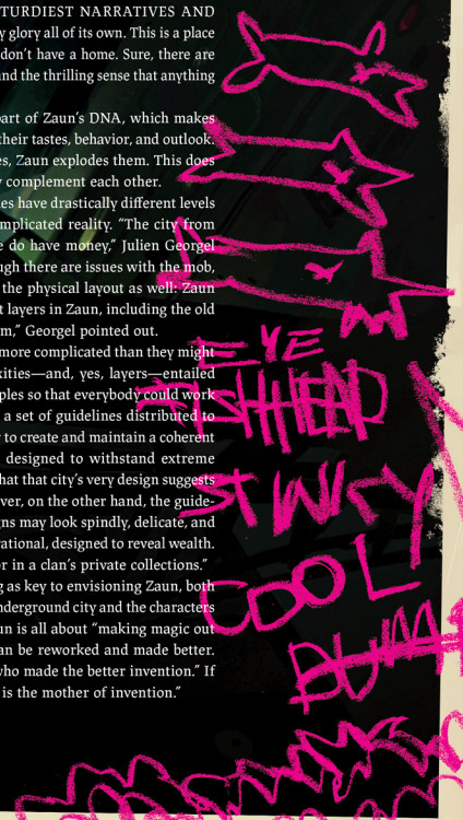
ZAUN HAS A WAY OF HIJACKING THE STURDIEST NARRATIVES AND drawing focus to itself. The undercity has a messy glory all of its own. This is a place that welcomes outcasts, a refuge for those who don't have a home. Sure, there are dangers, but there is also community, creativity, and the thrilling sense that anything is possible.
Pushing the boundaries of conventions is part of Zaun's DNA, which makes the city and its denizens almost avant-garde in their tastes, behavior, and outlook. Whereas Piltover follows codes and hierarchies, Zaun explodes them. This does not make one city better than the other — they complement each other.
The similarly Manichean notion that the cities have drastically different levels of wealth and legality does not reflect the complicated reality. "The city from below is rich with diversity, and some people do have money," Julien Georgel said. "And Zaun is not completely lawless, though there are issues with the mob, drugs, etc." This complexity is represented in the physical layout as well: Zaun reaches deep, then deeper. "There are different layers in Zaun, including the old abandoned mines where Vi and Jinx come from,” Georgel pointed out.
As usual with Arcane, people and things are more complicated than they might appear, and keeping track of all the complexities—and, yes, layers-entailed sharing specifications and fundamental principles so that everybody could work in unison. You can see this thought process in a set of guidelines distributed to the various creative teams that banded together to create and maintain a coherent world. For Zaun for instance, "everything is designed to withstand extreme pressure and potential explosions"—meaning that that city's very design suggests a place where danger is ever-present. For Piltover, on the other hand, the guidelines remind the writers and artists that "designs may look spindly, delicate, and opulent" and that “form and materials are aspirational, designed to reveal wealth. Early prototypes might end up in a museum or in a clan's private collections."
The same lines of thinking suggest recycling as key to envisioning Zaun, both literally and figuratively. When designing the underground city and the characters who live there, the guidelines suggest that Zaun is all about "making magic out of nothing. Nothing is precious, everything can be reworked and made better. Who made something first matters less than who made the better invention." If Zaun had a motto, it might well be "Necessity is the mother of invention."
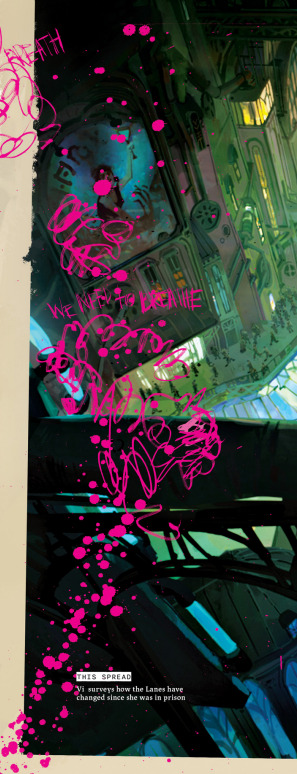
THIS SPREAD Vi surveys how the Lanes have changed since she was in prison

Not much to comment or show in this aside from Vi and Zaun's architecture
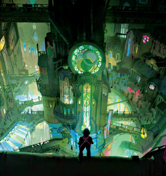
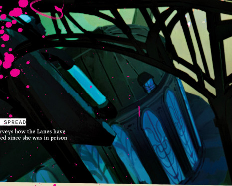
Some windows of the lower levels
How Zaun's architecture combats the darkness is truly amazing to me, all those lights and colorful windows, at least they too have some neon stars to luck up to.
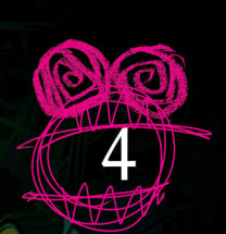
Now...Jinx's Doodles
a little moster eating the 4
She wrote "Undercity" and despite my best efforts I don't understand if whats underneath is simply some swirly doodle or something else.
She drew some little bunnies hangion in one of the pipes,
She added 3 fishes, with
"Eye Fishhead"
"Stinky"
"cool"
"duaa" (i think)
and some little smoke (?) at the bottom
She drew a crossed heart on Vi's back
Some skulls at the bottom of the page
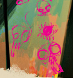
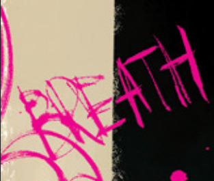
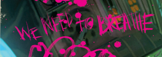
And to end it my favorite due to the implications: she drew what resembles smoke coming from the bottom all the way up, with the words "BREATH" and "WE NEED TO BREATHE" like screams (tho she always uses this handwriting in the artbook).
This is all! Have a good day.
EDIT (request for some close ups) - 24/05/2025
#The Art and Making of Arcane#arcane artbook#arcane#arcane spoilers#arcane season 1#arcane season 2#arcane art#arcane zaun#zaunite#undercity#undercity arcane#arcane jinx#jinx arcane#jinx#vi#vi arcane#arcane vi#violet arcane#arcane violet
23 notes
·
View notes
Text
Notes on Comic Art #2: To Hatch or Not to Hatch, also some coloring stuff
One of the most influential things I've ever read on the subject of comic art is a piece Jesse Hamm wrote on Alex Toth where he talks about flatpacking.
[I discovered while writing this that Jesse Hamm passed away in 2021. He was a brilliant educator, one of the best in the history of the comics medium, and will be sorely missed.]
In the piece Hamm basically discusses how over-rendering objects usually makes them function worse as comic art. Many other people have discussed how using thicker lines for objects closer to the "camera" is good practice, how colors can seperate shapes and create depth, etc.
The question is, where does cross hatching fit into all of this? Or rather, various methods of adding more detailed rendering to artwork? I'm trying to figure this stuff out as I'm doing layouts for my comic, because I want to know the answers before I start inking the final artwork.
I try/want to have an uncluttered, clean, easily readable art style. I occasionally add hatching to my drawings, because hatching is fun, but I often feel like I've slightly ruined my artwork when I'm finished.
I've decided to look at some of the art that I feel like my own work is trying the hardest to emulate, at least philosophically, to see how other artists "weigh in" on this debate. It's important to remember that inkers embellish artwork [hence the alternate title "embellisher"], and so I'm going to try and find inkers most representative of a given penciller's intentions when applicable.
As I was working on this piece, I read Hamm Tips vol 1.1, and I discovered this diagram, which seems to relate with what I'm going to discuss later:

I think it's accurate to say that my desired approach is Uninflected/Deliberate; I think most people going for a clean and cartoonish look fall into that quadrant. Some people might describe Toth's work as being "clean", and so I should clarify that I'm talking about clean in the spirit of "lines meet neatly".
Some of the artists I'll discuss have lines that fall somewhere between being Inflected and Uninflected, and I think a lot of this comes down to inker approach. I feel like, in spirit, all of these pencillers are Uninflected, but some of the inkers use brushes, which creates a sort of middle ground. Brushes add different weights to a line, whereas crow quill nibs and pens have a uniform width. [The technical term for unweighted inked lines is "dumb line"; I believe this was coined by David Mazzucchelli.]
Let's first look at Adam Warren's work in the Dirty Pair volume Fatal But Not Serious. I'm a huge fan of how this comic looks; the flat, cel animation-style colors are very clean and easy to read. It's a very pleasant look, and I'm surprised more comics don't do this.

There is some hatching here, but it's not "serious" hatching. Just a few lines on cheeks, hands, etc. 98% of the artwork is shapes delinated entirely by a clean line and color. The convention floor panel is able to have a ton of detail without really changing the visual "rules" of the comic. An artist who does things in a more highly rendered way may've, for instance, reduced the crowd to a series of heavily shadowed figures, or colored in a single expressionistic wash to paper over things, etc.
Warren's Magical Drama Queen Roxy used a very similar approach to Fatal But Not Serious:

Let's now look at Rick Mays. I'm not a huge fan of Rick Mays, I've only actual read a single issue of a comic by him, but as I was reading Gen 13 he immediately stood out as being the best artist on that series, aside from Adam Warren himself [speaking only about issues Warren wrote]. It feels very telling that Rick Mays later did the final art for a graphic novel Warren laid out called Livewires.
These are from Gen 13 vol 2 #70:
The biggest difference between this piece has nothing to do with Warren or Mays, and everything to do with the coloring approach. I don't think the coloring here is bad, but the gradient-y colors do create a vastly different visual effect than the cel look I highlighted earlier.
The inking approach feels quite similar between the two artists; while Mays's art takes one or two steps towards realism relative to the Fatal But Not Serious stuff, texture is largely used to the same degree [with the grass and tornado being understandable exceptions]. What's interesting is that this issue has three different credited inkers; Karl Story, Rick Mays, and Jason Martin. I'm assuming this happened for deadline reasons.
I feel like I'm maybe starting to sound a little repetitive, and so I feel like I should share an issue of Gen 13 that I disliked, and then we can move to things that aren't Adam Warren-adjacent. These are from #43 and #44, with pencils by Lee Bermejo and inks by John Nyberg:
I'm not a big fan of this. The borderline chiaroscuro inking makes everything look heavily referenced, labored, and weird, and the "acting" in the comic suffers because of the over-rendered faces. It's a real shame the artwork is like this, because this two-part story is actually quite solid and would be a minor classic with better artwork.
I notice that many newer comic artists [which is to say, people who began their careers during the 90s onwards] put a lot of heavy shadows on figures in a way that feels too slavishly devoted to a certain kind of realism. I say a "certain kind" because the high contrast look of black spots being put onto a figure make the shadows way darker than they'd actually look in real life, so it almost makes the figures look dirty.
Look at comic art from the olden days and figures are largely defined by outlines/color. If a figure in an old comic has a lot of shadow on them, it's for reasons that are obvious and motivated; noir-y venetian blinds stuff, a mysterious villain being obscured, someone being underlit, or having half their face obscured, etc. There's a clear reason shadows are being used in these cases, rather than it being done to add usually unnecessary detail.
Anyways, let's look at Amanda Conner's work. Image on the left is from a Vampirella story called Fantasy Feast, and the image on the right is from Power Girl #12. Texture is used, like on the walls of the bathroom, but sparingly.
Looking at Conner's work in this context makes me realize, I don't think I've ever seen Amanda Conner's stuff colored flat [at least after she fully matured as an artist]. I don't think the more three-dimensional rendering used in any of these panels is bad, but I'm not going to be doing that kind of coloring in my book, and so it's not quite as instructive to me.
That being said, I really love Conner's style. I've noticed that Marvel and DC are increasingly using artists with styles that are broadly similar to Conner's; I've included an example below. Maybe it's because the artist below is too lazy to draw a proper background, but their work feels so much more flavorless than Conner's in comparison. I think it's because the "acting" is not as impressive, and Conner brings a fun-factor that feels completely absent in the page below.
I realize "fun" isn't always the order of the day, but this page doesn't really reflect . . . anything. It's completely bland.
Here's Kirby, who couldn't be bland if he tried. The left image is from the Young Romance collection Fantagraphics put out, and the right is from OMAC. The former is from the 40s, latter is from the 70s. [By the way, the Young Romance image is photographed from my own collection; there's no warping visible because Fantagraphics knows how to design a book].

Looking at these pieces side-by-side really challenges a lot of my assumptions about Kirby's artwork, because in some ways his artwork changed less than I previously thought it did without direct comparisons. There are some things that are more abstract about the OMAC page, like the wiggly shadows. Someone unfamiliar with Kirby might assume these were drawn by two different people, but only because 30-odd years of growth seperate these two pages.
Kirby's style, in my mind, is highly geometric and defined more so by abstract shorthand squiggles than hatching or other forms of rendering, but there actually is a fair amount of hatching on the OMAC page.
However, that OMAC page I believe was inked by Mike Royer, or at least someone using a brush. I noticed that, by sheer coincidence, almost all of the Kirby art from my first post in this series was inked by D. Bruce Barry, who didn't use a brush and also followed Kirby's pencils perhaps more literally than any other inker he ever had. In those images, it's clear that most of the hatching in Kirby's work was added by his inkers.
When Kirby did ink himself [using a brush], his style was oddly clean. He did add in hatching, but it was never particularly dense.
Anyways, I want to close this by including some Jesse Hamm quotes from his instructional PDFs:
-Simplicity is great, but often you need extra texture to seel weirdness.
-Another sign of experience is texture. The pro-level artist has learned to give different textures to grass, hair, tree bark, bushes, etc. Meanwhile, the amateur uses the same one or two shading techniques on EVERYTHING, giving it all a samey feel.
-Open spaces of black or white may be "activated" with a bit of texture. A few pebbles/ripples/etc will spur the mind to fill what's missing.
-We talk often about spotting blacks, but spotting greys (i.e., details/texture) is also crucial to clear compositions.
The lesson in the bit of Hamm writing I most often revisited, the flatpacking post, was that too much texture and rendering can make a comic exhausting to read. But reading more of his work, it turns out he had a more nuanced, texture-inclusive view of things.
What's the lesson here? Discretion.
56 notes
·
View notes
Text
Some post!Shabbat thoughts about the antizionist siddurim Tatir Tzrurah and Shoshanat Yadi (and the wider antizionist movement) that are probably the reason I had a migraine all of Shabbat:
These siddurim are designed for three people: those who are in their late teens to early-to-late 20s, completely unaffiliated Jews who stumble in (or are drawn in) to the antizionist cult, and non-Jews. Shoshanat Yadi, in particular, gives the book version of JVP's teacup mikvah with all of its halachic citations. "Look at me," it says, "I'm a traditional siddur. I have halachic citations like other traditional siddurim*, therefore the person using me is most definitely a traditional Jew."
I think the reason that Tatir Tzrurah didn't have any morning services was less about the capabilities of the publisher and more because some part of the antizionist crowd knows that it's extremely hard to defend the antizionist position when you actually go through a traditional Shacharit. That siddur was the bait and its "successor" Shoshanat Yadi was the switch. Even with the changes that they made in Shoshanat Yadi, someone familiar a traditional siddur (wether that's a Koren or an ArtScroll or the Masorti/Conservative Movement's Sim Shalom) would go through it and be like, "hey wait a minute."
Which brings me back to the point about unaffiliated Jews: if their first experience with a siddur is Tatir Tzrurah, they won't have that "hey wait a minute" moment when they start using Shoshanat Yadi to daven Shacharit. An unaffiliated Jew is also more likely to be Jewishly-illiterate and thus more reliant on the English translation. (Shoshanat Yadi kind of gave its hand away there during the intro when it talked about its layout. It mentioned wanting to provide ease for those davening in English alongside those davening in Hebrew.)
To me, it seems like antizionist crowd's primary target are college kids who may not have a set Jewish community or who are wrestling with their own identities, and these unaffiliated, Jewishly-illiterate Jews. They draw them in by promising answers or friends or a non-judgemental community and legitimise themselves in the eyes of these new recruits by providing siddurim that purport to have "traditional liturgy". "You don't need to learn the aleph-bet, we have a transliteration and translation ready to go so that you don't have to think too hard about the words that you're saying," the antizionist crowd says.
There's a part of me that thinks that even Jews who are affiliated with a community and have some Jewish education, but don't have good/decent Hebrew foundation are good targets for the antizionist crowd. As with an unaffiliated, Jewishly-illiterate Jew, an affiliated Jew with a poor grasp of Hebrew is likely going to daven with the transliteration. They'll also be more reliant on the English translation because they don't have the skills to decode and notice the discrepancies that are present between the text and the translation.
I don't know how to fix it. As someone who's training to become a Jewish educator and leader, I don't even really know how to begin addressing it beyond pushing for stronger Hebrew curriculums in religious schools (and even then that's its own challenge, particularly in the more progressive streams because religious schools are often competing with other extra curricular activities on Sundays).
These siddurim make me angry. They also make me sad.
*even though the siddurim that have halachic citations usually just...have them all together in the back like a glossary for nerds like me to read when they're bored
**I do recognise that there are Jewishly-literate Jews out there who are antizionists. The Rosh Yeshivot of Shel Maala Yeshiva are two of them, plus the creators of these siddurim and others.
19 notes
·
View notes