#the comic is drawn like the second pic
Explore tagged Tumblr posts
Text
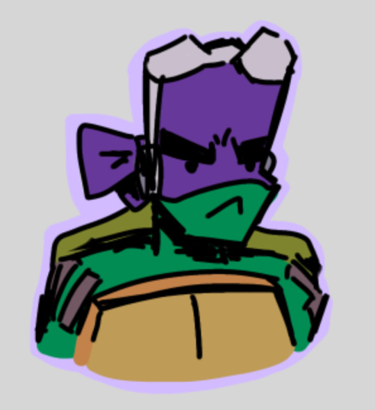
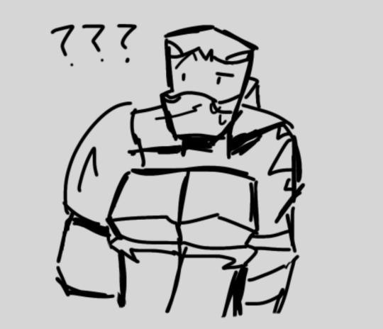
Haven’t posted art in a tad bit so here’s some doodles from that comic I was working on (Sadly, I have yet to continue working on it ;-;)
#Donnie is only colored bc I was rlly happy with that lil doodle#the comic is drawn like the second pic#which is actually just a scrapped panel lol#BAH I WANNA CONTINUE IT BUT IM UNDECIDED WITH WHERE TO GO WITH IT#anyway bye bye I’m trying to write rn#rottmnt#rise of the tmnt#Rottmnt future Leo#rottmnt bad timeline#Rottmnt bad timeline Leo#Rottmnt bad future#Rottmnt Donnie#my art
36 notes
·
View notes
Note
(Not sure if this is a sfw question 😅) but do Perry and Iris ever have any kids or adopt any in the future?
Tysm for adhering to the rules page mwah mwah 😙💕, this IS sfw but this was def the right blog for it lol (questions about the future directed AT the ask blog boyos will probably just confuse them and make Dev’s head hurt wheeze)
ALSO thank u for finally giving me an excuse to finish this wip I’ve had sitting around forever wheeze, the answer to wether or not Perry and Iris ever have kids is a RESOUNDING YES- eight of them, to be exact! (And that’s NOT counting the ones they fostered!!! If you ask IRIS how many kids they have he’ll say ‘DOZENS’, and he has the majority of them in a group chat ;w; 💕)
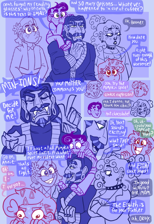

These fam-babies are all human versions of designs belonging to beloved mutuals!! 💕
(please comment to claim your babies djdndndjdjdjdjd I don’t know all y’all tumblrs 😭)
Also More rambling and doodle comics under the cut bc I need to put all the Dad content in one place wheeze
Perriris’ co-parenting journey started after one of Perry’s students had to be rescued from a terrible home situation, but was having so much trouble in the foster care system that Iris (who had been wanting a baby for DECADES anyway) BEGGED his husband to just adopt her themselves, and it went shockingly well!!
However, once thier daughter started asking about a baby sibling, Iris suggested that he and Perry try for a biological child again, despite having never succeeded in the past. Perry’s retirement from his teaching job was fast approaching anyway, but as much as he loved the idea, he knew that is was possible his body just couldn’t do it…
So he does what His older brother Timmy did, back when he was only ten, and wishes on a star.
This wish leads to the birth of WESLEY AND ANNIE, thier biological twin babies! Fun fact about them: because PERRY is a wish-baby (wished for by human Timmy, granted by fairy Timmy) that makes the twins DOUBLE wish babies! (Wished for by Perry, granted by Dev 🥺) so the two of them have a ton of residual magic in thier systems, much like thier daddy! I imagine when they were newborns is when it was the strongest, and Wren would always be the ONLY one to see them do anything unnatural, so she’d constantly be Candace-Flynn-style trying to convince her parents the babies were magic lmfao
Once they start fostering more regularly, Perry and Iris Fairly quickly develop a reputation for being excellent foster parents, especially when it comes to children other fosters have deemed “difficult”- any child that is enough of a little shit to remind Iris of himself as a child gets IMMEDIATELY scooped up be he and his husband, and several of them have never left 💕🥰


MIDDLE PIC DRAWN BY @zennyzach / @perisprinkles - THANK U AGAIN SOBS I STILL SCREAM CRY AND THROW UP ERERY TIME I SEE IT // V POS 😭🥺💕💙💜
They also designed Annie, and Wesley was designed by @phobylee / @theharbingerofdoomtime ! 💙💜
(This second comic is no longer canon bc this was before I decided Wes and Annie were bio children but I included it bc it’s still cute ;w;)
#REJOICE#DILF IRIS BE UPON YE#fairly normal parents au#fop au#fan kids#perirep#fop irep#fop peri#fairly oddparents#human au#my art#fanart#perirep fankids
77 notes
·
View notes
Note
hi!! do you have any tips for anybody who wants to create a webcomic?
hope you’re doing well! :3
Well if you want to make a comic you probably already have an idea in mind so go ahead and make that one ;)
It’s usually good advice to make a shorter comic first but just jump in and make any comic you want. 👍
I recommend making a collection or mood board consisting of other comics you really like so you can examine them and see how each artists handles transitions, speech bubble placement, framing etc. it can give you a lot of ideas and inspiration.
Another fun thing is to try doing some ‘test’ pages. If it’s not ‘the official comic’ in your mind then it might encourage you to experiment a bit and you can figure out how you want to do the colors and lineart and such.
Random tips that come to mind:
-don’t get stuck doing only ‘close up shots’ it’s a good idea to have at least one panel on each page (or at least every 5 panels) that is zoomed out a bit so you can see a full shot of your characters and some background.
-if the scene changes to a new area it’s a good idea to start with an establishing shot with a big background image that shows off the new area.
-don’t avoid the things you’re bad at drawing. Purposely write your weaknesses into the story so you can get better at drawing them.
-pay attention to the kind of angles you’re drawing your characters at. If you notice you’re only drawing a front or side view it can be fun to try more dynamic shots like one from overhead or one from below.
-readability is important so make sure you pick a font that’s easy to read and make sure the text isn’t too small. (Try comparing the size and readability to other well known comics to give yourself a reference.)
-use references a lot and as much as you can. It might seem like the effort of finding a reference picture will make the drawing process longer but I find that it speeds up my drawing process A LOT. I’ll struggle to draw a hand from memory and keep deleting it but as soon as I just take a pic of my own hand to look at I’ll have it drawn in 30 seconds lol.
-don’t stress over anything I’ve said here and just have fun drawing. At the end of the day, all that matters is that you’re making comics because that’s the only way to get better at them 👍
85 notes
·
View notes
Text
oh finally making that post on lore olympus and rachel smythe's supposed 'decline in art style' before I forget about it .
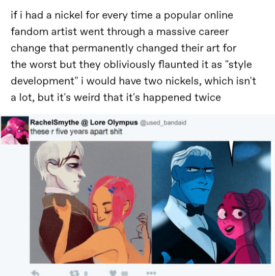
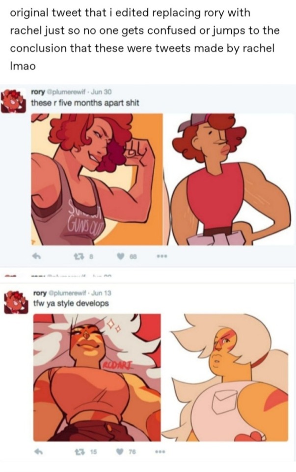
so in the original post, the blogger jokingly edited this tweet in reference to the original tweet on the right made by infamous ex-tumblr fan artist rcdarts. my problems with this post stems from in my opinion an unwarranted comparison and kind of 'grasping at straws' type of complaint to the way lore olympus' art looks. op of the post makes it seem like Smythe's art devolved; but if this is the type of critique you're trying to make it's got pretty weak legs to stand on. the above pictures are not good examples if you're trying to have a valid argument that lore olympus' proto art is better than how the comic ended up looking. you can argue that the character designs of the series are boring and safe considering they're based off of Greek gods as opposed to say the art in the supergiant Hades series. That's all well and good but to say that legitimately that first picture with gray Hades and orange Persephone is 'better' than the second feels disingenuous. From a technical standpoint, the art of the second image is better. The art in the first picture while decently drawn is much flatter and dull than the second. Second pic is definitely more visually interesting and has better usage of its colors/painting style. Though the palette is limited there's still visual depth and volume to it. Design wise I get a much better read of who these characters are and what they're like. Also second pic Hades and Persephone are much better proportioned than the first. Albeit it first pic looks like a wip, Hades' head looks huge in comparison to Persephone's (her torso also looks like it's kind of just floating over his, the limited composition and coloring doesn't make it feel like these two are actually touching/interacting with each other). I think a lot of the smoke lore olympus got (and still gets) is due to the main characters looking like a stereotypical 'booktok' romance couple; Hades being a tall sharp featured fit man in a suit and Persephone being a big bright eyed button nosed Disney princess esque young woman. But the first pic doesn't even divert from those tropes. It's pretty much the same visual dynamic except Hades gives less sugar daddy/mafia boss and more academic(?) shut in. And Persephone's is face is less rounded and her hairs shorter but that's about it in terms of design differences. I've never read lore olympus and don't plan to so I can't give any actual criticism to the series, but in this specific case where we're just judging art and visuals the claim of the older art being 'better' seems unfounded. I think what a lot of people that rag on how the series looks hate it because Smythe's style is very much a product of when she started getting popular. It's very much that early to mid 2010s tumblr fantasy style that a lot of women artists were doing (hence why I feel low-key why this and also Steven universe had/has so many haters is mainly due to misogyny, this is a very feminine art style). y'all need to understand that a person developing a more simplistic style is not equal to their skill devolving. The comparison to rcdarts to me is unjustified cause rcdarts actually did change for the worst. like how I just said simpler style =/= worst art, but rcd's work not only got simple but less visually interesting, less dynamic, utilized more static and dull posing/coloring, and over exaggeration to the point where characters were unrecognizable.
41 notes
·
View notes
Text
REQUEST FOR FNAF CHILDREN OC SUBMISSIONS!!!
Hi cuties! As you know, I have a webtoon called Blarerock, https://www.webtoons.com/en/canvas/fnaf-blarerock-/list?title_no=833851 and I have a request.
I need several human children OC as an audience or by-standers for my comic.
If you have an human oc, please reblog this post with image of child oc attach to it!
Rules-
Please human children characters only! Don't send me a pic of your adult oc and then ask me to draw them younger.
One submission per person! I would like many ppl to have a chance for their oc to be featured!
Must be hand drawn and fully colored art! No Gachas. No black and whites, I don't want to second guess what is color of your oc and then get them wrong.
Just a heads up, the setting is in the pizza-plex; so large room with loud music and flashing lights.
thank you for reading and I hope to see your ocs soon!!

#me babbling#fnaf security breach#my art#fnaf blarerock#five nights at freddy's#webtoon#blarerock au
58 notes
·
View notes
Text


first pic is like.. one year old already. second pic was drawn in december. this is AU where Lisa is the older sis of Brad. Buddy is orphan from orphanage, so is Dusty. there were no flash. i actaully wanted to draw little comics based on this AU to reveal the relationships of the characters... i just really like the concept 🏃♀️
39 notes
·
View notes
Text


First pic: 06/27/24 - 07/10/24
Second pic: 06/26/23 -?
Last pic: 01/13/23
.
.
Last year on my break I did alot of concept art of my Sonic Dimensions AU characters. My brother was telling me for the longest time to give the characters new designs to make them look different but I was too lazy to do it back then, so I finally decided to take a crack at it since my Au has a small timeskip they shouldhave different looks since its a new era for them. Also thinking of the overall theme what im going for the comic. I remember how long it too me to do Sonic's design cause I wanted his look to me be similar to his current one. I wanted to make his shoes look really cool and detailed along with his gloves. I was looking at all these cool runner shoes for him. God knows I'm regretting it cause they are difficult to draw, especially if I gotta keep drawing it in the comic too🥲 but I love how they look so I'm keeping it for now I just gotta practice it alittle more. Maybe i might give him another pair of shoes in the future but we'll see. Lol
.
Anyways the first drawing was me practicing some hatch techniques making it look more like a manga. I want my comic to be colored but i really like the manga black/white look. Haven't drawn a cool looking Sonic in so long so this drawing just gased me up that I actually improved ya'll 😭 I'm so proud of myself.✨️💪🏽 I want to continue doing this on my side account posting my concept work new doodles with it too. Next is probably Shadow.
#sonicthehedgehog#sonicdimensionsau#fanart#artist#digital art#sth#sonic#sonic art#digital illustration#procreate#sketches#doodles#my artwork#concept art#illustrationartists#small artist#sega#sth fanart#drawings#Spotify
20 notes
·
View notes
Note
hi hope !! since nerine is a museum curator, i wanted to ask if u imagine that thered be any pieces meant to depict az or xanthos in the museum ? 🤔 if so, how would they react seeing / realizing it ?
Hii thank you so much for the ask! I actually think about this kind of thing a lot because it's fun 😭 in fact, this art piece I made of them was drawn with the intention of it being something you may see in a museum.


(second pic is for crop 😭)
There's also a canon depiction of AZ in Lumiose Museum that can only be seen in the post-game :~) (I was hoping an HD version of the painting of AZ would be found in the leaks, but unfortunately not... 💔)
Before they reconnect Nerine gets kind of Weird about artistic depictions of AZ. She prefers not to engage with them if possible, though it's of course kind of impossible due to the nature of her work... at the same time, when it comes to keeping these pieces cleaned and organized, she pays extra attention to it...!
Nerine herself also has a portrait in the museum, though she denies that it's her if asked :~) her first husband, the man who established the museum, originally had it made as a gift for her.
As for AZ and Xan themselves, I imagine it's a complicated thing for both of them too 💔 especially before things start getting better. AZ seeing a painting of his younger self and being filled with a strange nostalgia, despite the fact he was miserable as king... Xanthos having conflicting feelings on his Legacy; his name itself has been lost to time.
There'll be a point though where they can start getting silly with it. A comic I want to draw at some point is Xan being mad over a painting of himself where the artist rendered him as a blonde(!), and when AZ laughs about Xan is like "Oh, you think that's funny, do you?? Well, look at this! This artist painted you with a tiny dainty little nose!!!"
#💌 letters#🏹 Xanthos#🗝️ AZ#🌸 Nerine#i haven't talked abojt it much cuz there's a character involved i still need to draw#but i have ir so at aome point AZ and Xan get involved with the Kalos Historical Society ^.^#thank you again for the ask...!
7 notes
·
View notes
Text
Day 19:
(masterpost)
Here's Scott redesign/my take on his design, Unlike El's this one is actually quite different than the card design, I took a lot of inspo from Pinterest necromancers and other artist who drawn his design, I tried to combine elements from everything to make it mine, hope you guy love it as much as I!
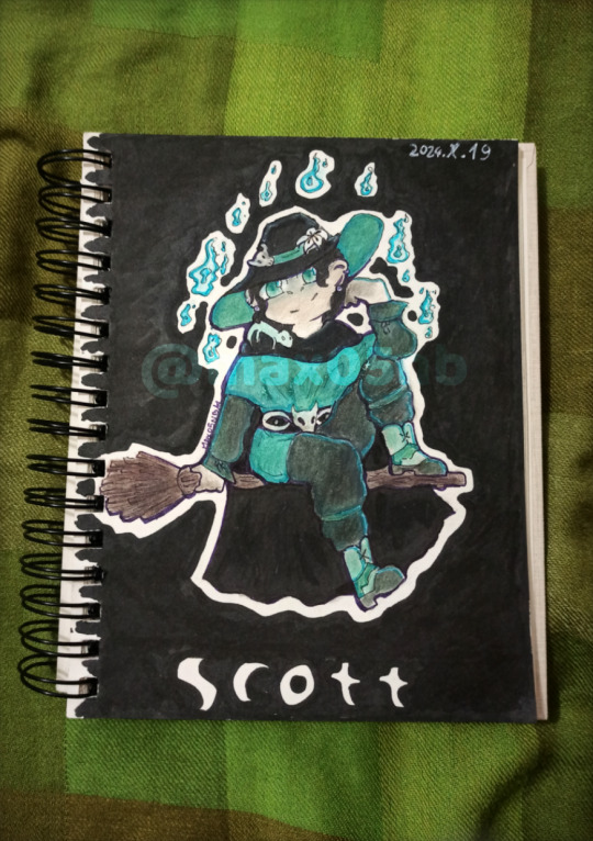
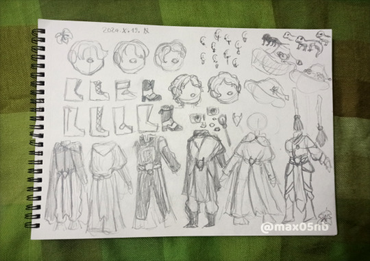
There was a lot of experimenting with him (I figured out the shocking fact that he in fact doesn't have straight hair most likely) and the pose do not make sense (Idk what I was thinking) but I'm happy with the results!
I included more color variety, white lilies on the hat representing Milo and I kinda made the belt have eyes, idk if you can see it or nah
He also has his little gecko friend! That I kid you not spent at least half an hour searching for his name just to come up empty handed... Did he not name them?? Did I just miss it?? Idk
Just to show how smart decision go into these, the reason why he doesn't have the Loincloth (I spent 10 minutes looking for the name of it) is because it's annoying to draw in a siting position. Specifically in the sitting position I usually draw him. Yeah that's it I'm just to lazy to figure out gravity so nahh
Also you see how my designs lack patterns that were my favorite parts from the card designs? Yeah I'm just too lazy to draw them, I know, not very cutesy nor demure of me '^'
Random add ons: I added a another skull, now he has a skull on his hat. Couldn't decide on nose, went with how I'm feeling at the time of drawing. I drawn the wand that turns him into a ghost and drawn two options for a broom, I went with the second opinion btw. I can't get over the fact not even his is straight, the skin has a hair style much closer to wavy almost definitely not straight like how I thought. Should have known, Scott is as close to straight as a circle.
I was debating his earrings a lot, I wanted him to have multiple but couldn't figure out what type. Btw here's lore I made up on a wimp he definitely got his earrings from Milo and never takes them off because of that as it was a gift for his birthday or something. This is now canon to the comic I'm making. Was it important not? But I'm writing this post at 1am because I procrastinate.
He would make it into Edna's nightmares from Incredibles with all the lose fabric he has on most possible designs, he even got a cape in the final one, he's asking to be suck into a plane propellers.
Making this design also made me discover a new artist, so funny story, my phone was broken so I couldn't really use it to listen to music so I used my sister's laptop, I also used that for ref pic btw, and the laptop is logged into her account. I didn't want to mess up her YouTube history and was too lazy to log in the try to log out of my Google account so I opened up incognito, I typed in YouTube and searched "necromancer playlist" and let the ai do it's thing. I'm not kidding when I say this, you can check it for yourself, the second playlist is literally called "playlist for the non binary necromancers" like it was made for me specifically xd Btw really good compilation kudos to whoever made it! Anyway the new artist I found is Bear Ghost, specifically recommend Necromancin dancin and Starkiller.
#art#fanart#artwork#design#redesign#daily witchcraft smp#witchcraft smp#mcyt#scott smajor#wcsmp#mcytblr#necromancer#witches#Spotify#mcytbr#I wrote most of this at 1am#so#exuse my spelling#i tried#and I'm happy with the results#while writing this#I suddenly thought about how he's missing his wedding ring#because he would#definitely have it on at all times after Milo's death#then i remembered#they're not married#I think#but now that I'm thinking about it#they should be finances#damn it he should have a ring and I forgot...
13 notes
·
View notes
Text
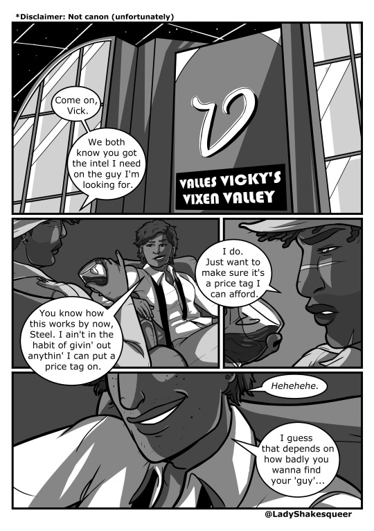
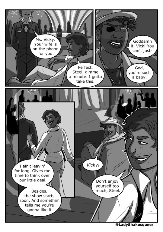


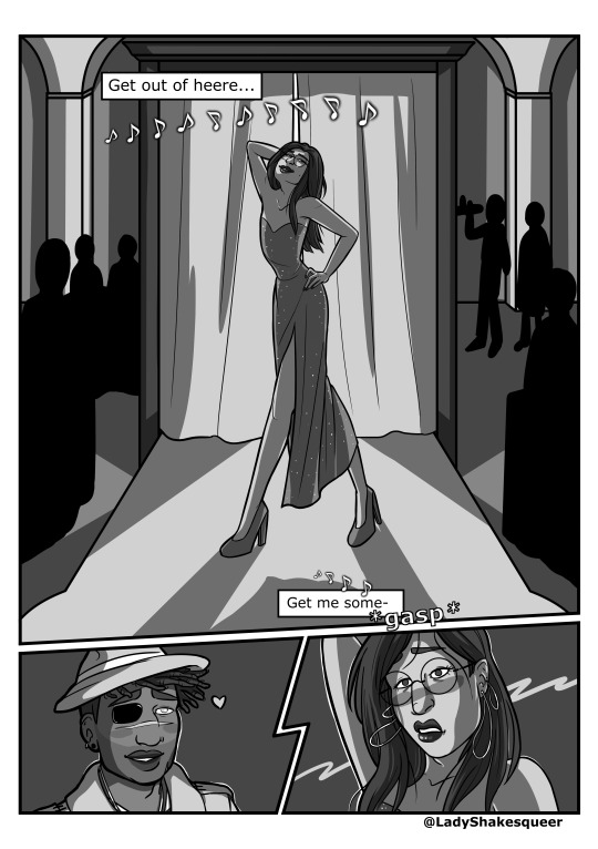
In which Peter Nureyev goes undercover at the Vixen Valley and Juno just happens to find him there. Not canon... (maybe). I’ll find out tomorrow when the finale comes out, I guess lol.
And yes, this comic was all just an excuse to draw Nureyev as Jessica Rabbit.
As always, click the pics for better quality.
[ID: A five page fanfiction comic of characters from The Penumbra Podcast, in grayscale.
Page 1: The text at the top of the page reads: “Disclaimer: Not canon (unfortunately).” The first panel shows the exterior of the Vixen Valley at night. Juno’s word bubble reads, “Come on, Vick. We both know you got the intel I need on the guy I’m looking for.” The second panel shows Vicky and Juno sitting in armchairs together inside the Vixen Valley. Vicky’s word bubble reads, “You know how this works by now, Steel. I ain’t in the habit of givin’ out anythin’ I can put a price tag on.” The third panel is a close up of profile Juno looking serious while holding a drink. His word bubble reads, “I do. Just want to make sure it’s a price tag I can afford.” The final panel shows an extreme close-up of Vicky’s grin. Her word bubbles read, “Hehehehe. I guess that depends on how badly you wanna find your ‘guy...’”
Page 2: The first panel shows an employee of the Vixen Valley dressed in a black suit approaching Vicky, their hands behind their back. Their word bubble says, “Ms. Vicky. Your wife is on the phone for you.” A grinning Vicky responds. Her word bubble reads, “Perfect. Steel, gimme a minute. I gotta take this.” The second panel shows a frustrated Juno. His word bubble reads, “Goddamn it, Vick! You can’t just-!” He gets interrupted by another Vicky word bubble, which reads, “God, you’re such a baby.” The third panel shows Vicky and her employee walking away. Vicky grins and gestures behind her with her thumb. Her word bubbles read, “I ain’t leaving for long. Gives me time to think over our little deal. Besides, the show starts soon. And somethin’ tells me you’re gonna like it.” The final panel, which rests partially behind the third panel, shows a still angry Juno shouting to Vicky behind him. In front of Juno is a stage surrounded by tables of waiting patrons and bustling wait staff. Vicky grins mischievously in the foreground as she continues to walk away. Juno’s word bubble reads, “Vicky!” Vicky’s word bubble reads, “Don’t enjoy yourself too much, Steel.”
Page 3: The first panel shows a close-up cartoonish version of Juno pouting (FX: “pout”). His word bubble reads, “hmph.” The second panel is the same close-up but drawn in a less cartoony style. Juno looks upward curiously as the lighting in the room changes and the show begins. The lyrics to the song Why Don’t You Do Right? by Kansas Joe McCoy and Peggy Lee begin to appear in text boxes surrounded by music notes. The third panel shows the curtains on the stage, now lit from behind by a spotlight to show off the silhouette of the hidden performer posing sensuously. In the fourth panel, Juno gapes up at the stage in interest as other patrons cheer and whistle around him (FX: “whistle” and “woo!”). The final panel shows the silhouetted performer behind the curtain doing another pose. The lyrics on this page are: “You had plenty money 1922/You let other women make a fool of you/Why don’t you do right?”
Page 4: The song lyrics continue across this page. The first panel shows the performer sticking a long leg out from behind the curtain. The second panel shows a close up of Juno’s eyes as they widen and he blushes. The third panel shows the performer stepping out from behind the curtain and grinning, but the second panel partially covers the third, obscuring the performer’s face. We can still tell that they have round glasses, light skin, long dark hair, and long, slender fingers. In the fourth panel, we see the back of the performer’s head as they push the curtains aside. More patrons of the Vixen Valley watch with rapt attention. The fifth panel shows a close up of the performer’s high-heels as they slowly strut across the stage. The sixth panel shows a squinting Juno. His word bubble reads, “No way...” The seventh panel shows an extreme close up of the performer’s heavily lashed eye behind their glasses. The lyrics on this page are: “Like some other men do?/Get out of here/Get me some money too.”
Page 5: The final page of the comic. The first panel takes up about three quarters of the page. It is a full view of the performer on stage, revealing him to be Peter Nureyev dressed in a Jessica-Rabbit-style dress. He poses sensuously, hand on his hip, leg stretched out, and head tilted back. The second panel shows a grinning and slightly flushed Juno with a little heart beside his head. The final panel of the comic is the moment Nureyev notices Juno is there watching him. He gasps, looking embarrassed and blushing furiously. The lyrics on this page are: “Get out of here/Get me some-.” The second line is cut off by Nureyev’s gasp (FX: “gasp”).
End ID]
#i suppose this counts as my first fanfic for the fandom#i was just going to do a basic drawing of Nureyev in the dress but#obviously that didn't work out for me#it wasn't ridiculous enough#this is the dumbest thing i've made for this fandom i swear#no regrets#tpp#the penumbra podcast#penumbra podcast#junoverse#juno steel#peter nureyev#jupeter#valles vicky#tpp fanart#tpp comic#fan art#fan comic#ladyshakesqueer#asexualsoup
155 notes
·
View notes
Text
INCOMING WIP BOMB
Alright, I decided I didn't want to wait any longer and start sharing some of my works in progress from this week. I haven't drawn this much in ages 😳
But anyway, here's a few pics I'm working on currently, some of which will be appearing this weekend when I get a chance 👍


I won't go into lengthy details, but the pics I've done, from top to bottom:
Sailor Moon
Uncanny Resemblance Pt 3, featuring Roxanne
Salvador's official design! (@blazing-shadows , I just KNOW you're going feral right now 😅😂)
Power Paige from Super Why's Comic Book Adventures
Wolf and Lucy showdown? Or perhaps...
There was gonna be a sixth, but I held off. That one's gonna take a bit more work than normal, so there's gonna be a delay on that one. I might include that in the second batch of WIPs/finished projects.
I hope you guys like these, and be on the lookout for them this weekend!
#bishoujo senshi sailor moon#hanna-barbera#super why#star fox#usagi tsukino#wolf o'donnell#lucy hare#fan art#my art#works in progress#this week's art
28 notes
·
View notes
Note
hi!! what's your main source(s) of stickers? your journal looks incredible :00
eeeee ty sm!! i get stickers from literally anywheres. dollar tree, craft stores, walmart, target, pharmacies, amazon, ebay, mercari, etc. i really like buying from artists too. like gloomygonza, mcmadmissele, pepperonccini, so on
here are pics of what i own rn:

really like pen gear products, they have so many diff stuff. both my current journal and the first row of sticker books shown in pic are from pen gear. i also really like fashion angels stickers (second row) and just regular stickers found around. the imaginarium book, i use for more whimsy theme pages, since the style is very vintage/antique like.

have a lotta loose sheets bought from dollar tree, others come with coloring books like crayola ones, lisa frank, trollz, etc. usually just rip them from whatever book theyre attached and keep in a box lol

also started just printing own cutouts from art i like other artists or shows/comics. and even own art drawn myself.
56 notes
·
View notes
Text


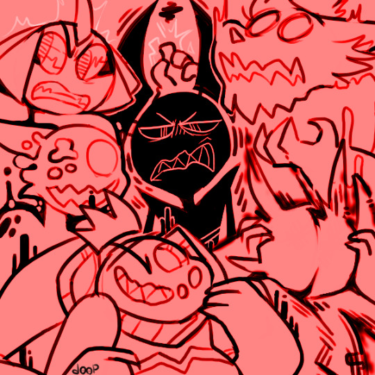
since i'm no longer viscerally opposed to seeing ex-besties OCs or having them on my page, i wanted to share some old art i still like that happened to feature them :) the first pic here has what i consider to be one of the cutest/best looking Lad's i've drawn. overall i just like the little homage to Computers I Like
the posing in the second one is really cute, and i love the composition in the third one! the story with the third one is that in our RPs, multiple characters had become corrupted/infected by Soed, excluding VR specifically, despite him really wanting it. funny (?) in hindsight now that he's Soed spawn himself
more ↓↓↓

i drew TONS of these tiny comics of just OCs saying funny quotes from videos or tumblr posts. i'm sharing this one because i like how everyone is drawn here and because Lad is in it


pokemon AU Lad and (the other one) was one of the last major things we RP'd together and actually "finished" and it was really special to me. asocial middle aged man living off the grid after escaping a criminal organization and the pathetic 35 year old shmuck he meets that just lost everything and doesn't know how a pokeball works. human Lad (as a separate character) got a lot of his development from this


comics from an RP we had where their kaiju OCs showed up from an interdimensional portal or something and started causing havoc. back when Lil was into dudes lmao


i'm sad about archiving this one because it's a cute little moment with Tro and Icha but i feel like the set up with (that guy) is too good to just cut out (sorry these are long, if the text is hard to read, you can click -> right click -> open image in new tab to zoom in)

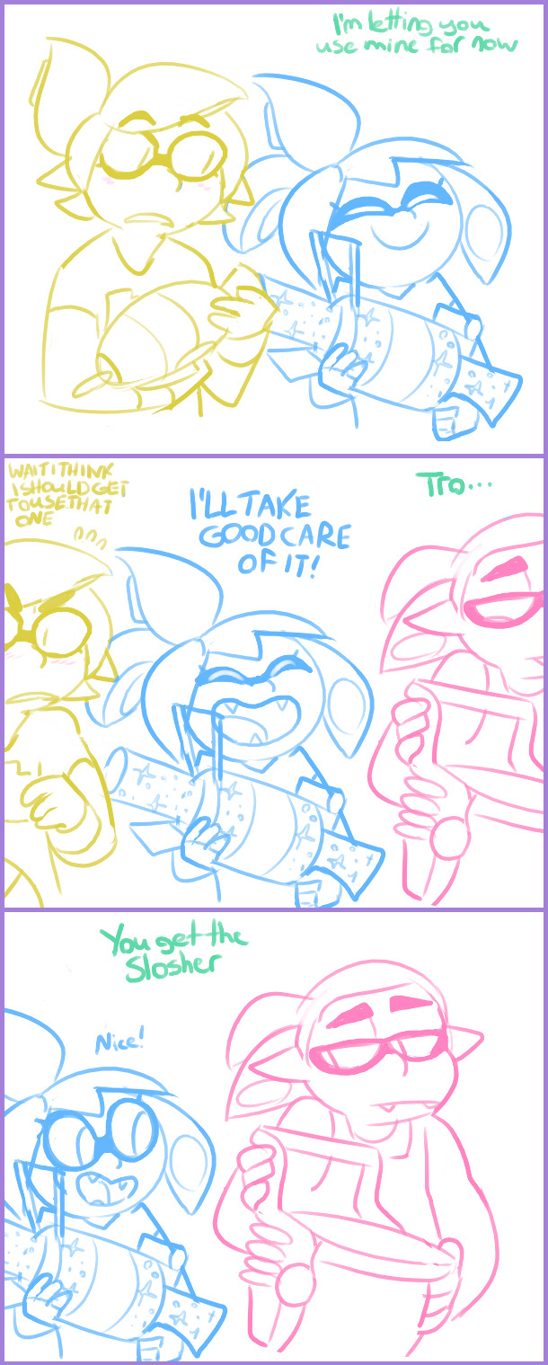

this was drawn back in Splatoon 1 time... before playable octolings and new hairstyles... the pacing in this makes me laugh

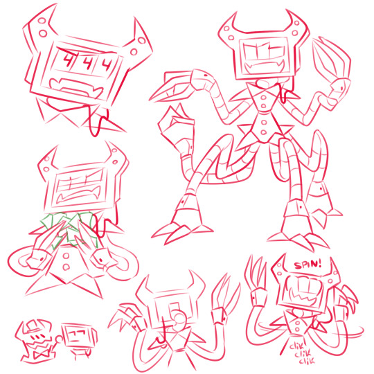
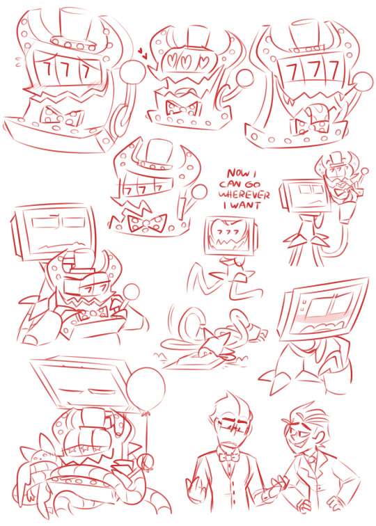
to finish up here's some doodle pages focusing on Lad and (the slot machine), including a fusion. i love the Lads in these so much ubububu he's so cute

Lad reading I Have No Mouth and I Must Scream to (the slot machine). little Lad is so cute LOOK AT HIM!!!
9 notes
·
View notes
Text


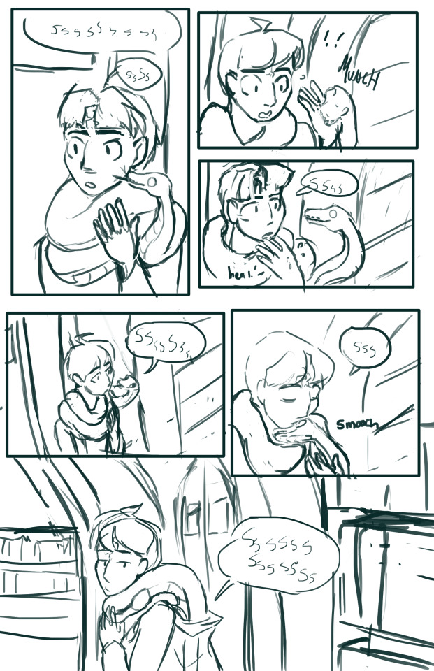

Various sketches I've drawn while enjoying thinking about Gonzoclock's incredible fanfiction Harry Potter and the Philosopher's Snake. Some bonus headcanons and notes ive developed under the cut
First off have this really rough reference art i did for the slytherins

I know what youre asking. You're asking, why is daphne's hair different in this pic from the train pic? the answer is simple. My artistically driven headcanon is that daphne wears a different hairstyle every day. Harry, being a little bit daft sometimes, doesn't even know which is her natural hair. I like fantasizing about silly shit like that.
Also guess i should note that the comic is a scene from chapter 24. 3rd person pov on harrys parseltongue with merlin. Second subnote, didn't update Remus's appearance to gonzo's headcanons in this post, so he just looks like Movie Remus-- he's also wearing a sweater and not a jacket in that scene, oops. I miss details sometimes.
23 notes
·
View notes
Note
I was reading ASBH again and I was wondering what steps you do to draw your backgrounds. They're amazing and I struggle with doing them
First of all I'm in shock and awe that someone out there is still reading my ancient unfinished comic, thank you omfg 😭🙌
Honestly I don't love the backgrounds in ASBH! I had a hard time with them. At the time I just wanted to make a comic, not care if it was messy or well written, and just get it out there!! This backfired because it turns out I do care about those things. A lot of the backgrounds took on a super messy and sketchy quality as a result. I still love that rough art style, but I think I'd do "sketchy and messy" differently now.
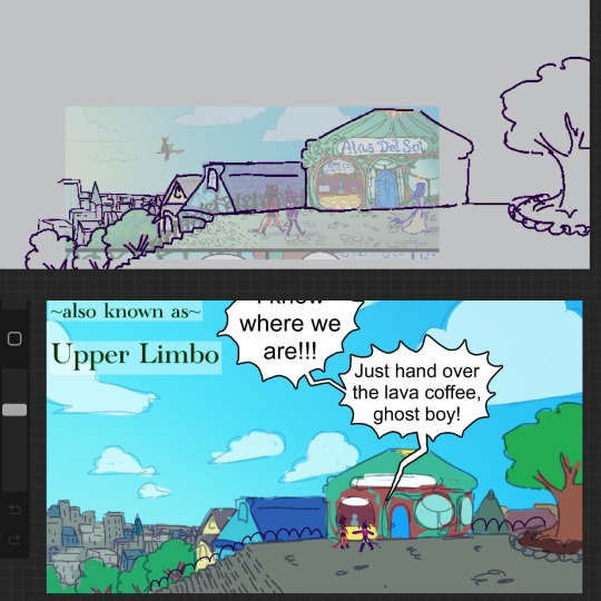
This is the most detailed background I did for the comic. It started by tracing over a pic I took, but editing some stuff to fit the look of Upper Limbo (which was supposed to be somewhat art nouveau). Here's some wip shots:
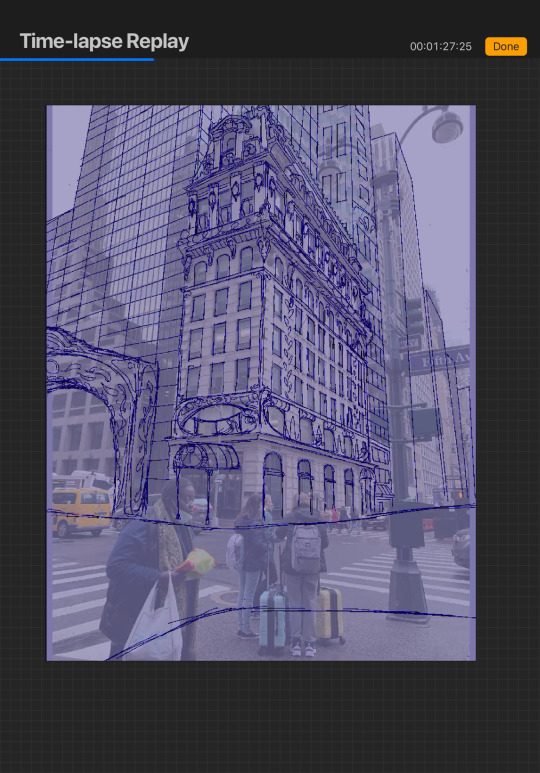
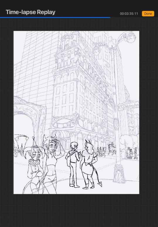
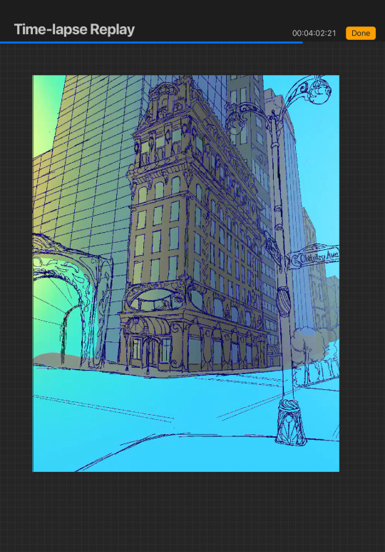
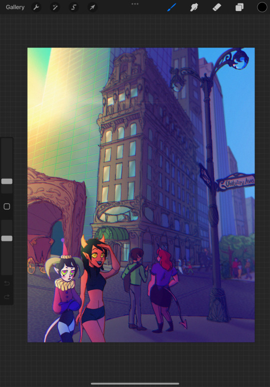
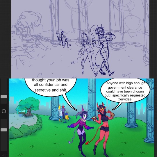
For this next one, I thought the photo would help me get the perspective correct. It sort of worked? You can see in the second sketch how I added on buildings that are in a similar position to the photo. (Also enjoy my beautiful sketches lmfao 😂)
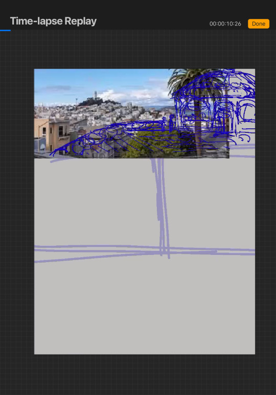

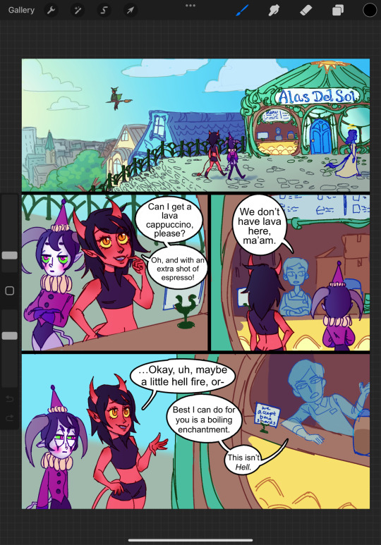
I was having trouble remembering the background so for the next page I just traced over my previous drawing 😂 I simply Couldn't Be Bothered to make my line art look like anything other than spaghetti
This one was all from my sketch, no reference, and yet it somehow looks way better than the other ones imo(this was drawn only a few weeks after the first one, it looks like I improved super fast but really I feel like I was just getting on a roll)
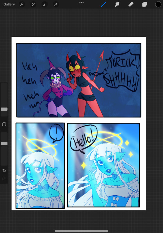
Finally we have this page. I don't even think I posted this. But for the backgrounds here I did my favorite lazy techniques of "big textured background" and "background but I blurred it so I don't have to draw details"
I hope this was somewhat helpful! Let me know if there’s something you’d like me to cover in more detail
10 notes
·
View notes
Note
FIRST CONGRATS ON GRADUATING SECOND care to share that yukuroo comic? Coz I'm interested now :> (u don't have to if u don't want to its okay)
HEHEE THANKS 🥺🫶🫶🫶 I saw your live insta story likes as they were happening lmao 😭😭😭 It was so surreal bc like damn can't believe I'm out of there now 😔 probably a 8/10 graduation, could've used less technical difficulties 💀 but overall great! Esp the fact that we got photo studio pics after 😍😍😍
nOW— Ok so, I made this in like 2 days and 0 actual comic experience 😭 and tbh the clarity hit me when I was done that I don't think I can bring myself to put english dialogue in it 💀💀💀 ANYWAYS, it's like a short comic about her and Kuroo at her show while she was feeling down for lore reasons in my head but like, I couldn't get it all out on paper so instead, I changed the context to it being her first show and her being nervous abt it and stuff 👉👈
I actually planned to make it an actual art post on here but I'm like "Is it too cringe to be shown tumblr wide" bc it's not the best thing I've drawn 😭😭😭 BUT I'd be happy to send it to you via discord to get your thoughts on whether I should post it 🥰👉👉
#「🗨 directors' hangout 🗨」#「✎ yuu's journal ✎」#Movie Kuroo too strong#he got me acting up#😭😭😭#I WISH I had the skill to be like the other Kuroo yumes 😔#There's this rlly good one I look up to#So I rlly hope I can be like her 🥺🥺🥺#ANYWAYS RAY HELLO
3 notes
·
View notes