#the cel shading was so pretty
Explore tagged Tumblr posts
Text
Just a dumb thought about zelda art style
I love the new links to the awakening art style and toy-like aesthetic. But a part of me wonders why have not returned to the windwaker artstyle again. It was used for other games not connected to windwaker like Four Swords and minish cap. I just miss the art style a lot and would like to see it again.
#the cel shading was so pretty#i wonder if theres a reason why that style cant be returned to#it seems more than ever you can mimic the style of concept art#nintendo has always been very good with its stylization in general#ramblings for the void
2 notes
·
View notes
Text
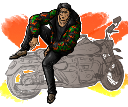
so how's everyone enjoying gaiden
#shishido kosei#like a dragon gaiden#gaiden#ryu ga gotoku#art#i can't say yet whether or not i'm enjoying it#because i'm scheduling this on the 21st of october#but i'm sure i will be... i'm sure i am? how do i say that#for as much as that motorbike demoralised me for the entire rest of the time i spent drawing this i'm pretty happy with it#i'm just out here trying to line his face and then i zoom out to look at it and realise#actually#no i don't want to line a bike#but then it locked me into this rendering style because cel shading looks like ass with that brush#BUT the design pencil feels really nice to sketch with#so here we are.#pose + the presence of the motorbike are inspired by... some movie motomiya was in...#i don't actually know the name of it. just that he was serving
32 notes
·
View notes
Text

Jackie, my good dude~
(Redraw from S4E21: The Champion's Hike)
#craig of the creek#cotc#jackie#cotc jackie#art#I have wanted to redraw this particular pose for /so/ long and finally got around to starting it last week#The shading is a little quick but also I have very little practice in soft shading and it was...so dificult...to focus on this piece#But I wanted to at least give it a try and it's...not terrible? It's definitely rough but there's parts of it that feel kinda nice~#(Also drawing his hair was a process. I couldn't find a great real-life reference that felt right enough so I had to kinda mostly rely on#screenshots to get the feel of his hair right (there were a number of references that were kinda close but never got as visually big as#Jackie's hair so it was a bit of mix 'n' match). That said.. the end version actually feels like it's bending right so time well-spent~)#I might have to do a hard-light/cel-shading version later but it's good to try and branch out sometimes~#Also have I ever mentioned how much I enjoy Jackie? He's a pretty chill dude who's also got that same competitive spirit the king's#champions all have and him being the only one to jump into the water was both so funny and fun to watch~#(And media does /not/ have enough deaf characters of any hearing level so I'll never get over the good feeling when I learnt Jackie was#not only deaf but we got to see more than one episode of him? And more than one after we learn this is the case? It's nice~)
26 notes
·
View notes
Text
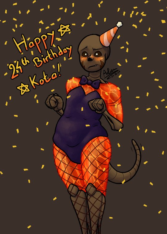
for @kotarandomz's dtiys
first time drawing ecto hell yeah!
timelapse under the cut (slight flash warning)
#my art#dtiys#dtiys entry#undertale oc#idk their name srry#whipped out my old rendering style for this one#feels weird cuz i'm so used to cel-shading rn#i usually don't draw ecto cuz it's mostly invisible in my drawings?#like i take it into account and act as if it's there but i don't actually draw it#i don't think that's a special thing tho#feels like pretty much everyone who draws sanses does that#also i noticed afterwards that i made them thinner#it was completely on accident i didn't notice it until after i finished rendering#i'll pay attention to that now that i know it's something that can happen#hope it doesn't ruin the drawing#anyways this was fun#i really like the colors
2 notes
·
View notes
Note
Eijis eyes are so cute and bubbly in your crane picture!
THANK YOUUUUUUUUU he is sharing a little bit of magic with you all :)
#i was really happy with how the highlights and shading on his eyes turned out actually!!#i was originally going to soft shade the whole piece but i decided to animate the crane#and realized that i couldn't really soft shade it as a gif#so i went with cel shading but tried to keep his eyes pretty soft#anyway THANK YOU#answers#anon#testimonials
7 notes
·
View notes
Text
// Maxis-Match Eyes Masterlist
Was in mood to compile all of my maxis-match style eyes that I've already published, so here they are 👁️
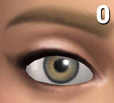
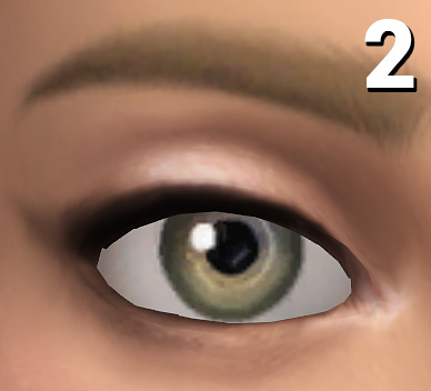
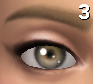
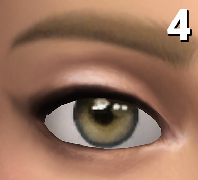
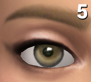
0: only here for comparison reasons, they're the default eyes from EA, the ones your game automatically gets shipped with!
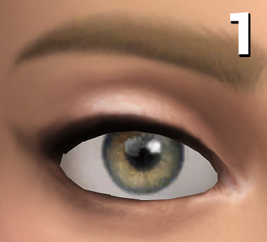
1: Oasis Eyes (very much like the EA eyes, but a bit more textured and not as flat, using these brings a bit of life into sims while not changing the aesthetic. Shown here in the V2 version, the V1 version has a reddish sclera, which is a bit more in line with alpha style eyes)
2: Dazzling Light Eyes (my fav ones! I always have these ingame as my default replacement, as for me personally they're really close to feeling like the vanilla EA eyes but in better, when looking at townies I ALWAYS forget they have CC eyes)
3: Treasure Eyes (with these I've tried to achieve a cel-shading look, so I feel like they make sims look even more cartoony than the regular EA eyes)
4: Waterdrop Eyes + Occults (those have a clean, but different look than the base eyes, while still being really cartoony. May be the most expressive looking ones out of the bunch)
5: Oxygen Eyes (another one which line up pretty well with the general aesthetic of the base EA eyes, but a bit more jelly-like looking if that makes sense?)

And as a bonus, with my DIY eye kit you can turn most eyes into maxis-matchier versions by layering pure white sclera overlay swatches over them!
Example combination: Trauma Eyes + Sclera Color Swatch #20
#masterlist#ts4cc#s4cc#the sims 4#the sims#simblr#ts4#sims 4#sims#sims 4 custom content#ts4 cc#s4 cc#ts4mm#s4mm#ts4 maxis match#s4 mm#ts4 mm
823 notes
·
View notes
Text

Obscenely late hermitaday day #23 & 25! - Impulse & Tango
Was this meant to be a simple cel shaded drawing on the 30th? Yeah, yeah it was lmao but somehow the power of fire excels at overtaking the rendering capabilities.
But since it's late I'll use this as excuse to ramble below about well, the headcanons and the process down yonder. Also there's variations.
(Also just realized that the compression is high with this one, please click on it to see the details pretty pleasee)


So! Let's talk about that haircut shall we? First off Tango's haircut is basically just me slapping my very neglected oc's haircut onto him lol. There's no function usage or any other lore about it, literally just I wanted to use that haircut more. But Miners and Crafters that's not all! The intensity of the flame actually has meaning believe it or not.
Since Tango in the headcanons is already a nether born blaze hybrid the redstone kinda didn't have an effect on him. This is because blazes produce glowstone which is a power source onto itself. He gets minor effects instead which is a mild (there's literally no other word) high, a intensified hair flame and a brighter eye night shine. Negative effects include mild joint & jaw pain, and a small localized headache behind the left eye.
I like to imagine that other blaze hybrids' hair flame aren't normally that intense, not white-hot heat but rather more red n orange hot similar to the flats. Mainly due to the fact that glowstone is not as powerful as redstone and it's also dependent on how strong a blaze is. Now imagine with me that blazes determine how strong each other are via the color they're emitting. Now remember the blaze boss Minecraft had a vote on to add or not to add? What if Tango is constantly mistaken as a high ranking blaze because of how intense his fire is and he doesn't get attacked a whole lot except for the few that want to challenge him. Meanwhile Tango is just highly infused with redstone like all the other redstoners and he doesn't know what's happening half time as seen by his terrified scream-laughs /hj
He's also semi modified with redstone for the pure purpose of comms just like the other redstoners minus mumbo. I also would've leaned into the steampunk aspect of this season but I figured I'd do a character sheet like etho for all of the redstoners and finalize the aspects on those.
Onto Impulse!
I like to imagine that Impulse was a regular human and over the course of redstone exposure he gained pointed ears and horns. For what reasons? I have no idea but redstone works in mysterious ways and mutates on whatever happens to be in their system. You may see that he has purple lines across his face but then red pupils, why is that? Well since he's cyperpunk themed this season he modified his redstone implants to be rgb. He can change everything else except his pupils because those are deeply affected by redstone and would require surgery to remove the build up of redstone. Will any of the redstoners ever actually get rid of it? No but you can beg all day.
You also might be wondering what's happening in their ears? Well those are the advanced comms that are actually used across all hermits except the ones who've opted out for glowstone variants. They kinda work like bluetooth except more hermit-magic way. I haven't had time to fully think of how it'd work down to the circuitry (that's my usual process for headcanons before I ship them out) but I'll post about it when I think of the full layout. Other design aspects on impulse are derived from his skin and the poster design by applestruda!
Process wise for this piece was kinda a rollercoaster heh. I had started this piece a while ago (can't remember the day on the dot) and then I got insanely busy during the last week of hermitaday. I had done sketch, refined sketch and flats in two days. Then events proceeded forth and we arrive on the 4th which I tried for an entire day to figure out how to render this piece. I then gave up and tried again the day after and pulled up references this round on Pinterest. Tango was surprisingly easy to paint with ref and went rather fast. I will admit the entire time I was rendering him I did say every minute or so "I love you man" because he was turning out so good. Halfway through I then realized I still had to render Impulse. That's when I pretty much ended that night because it was already 5 am working on Tango and demotivation was setting in fast. The next day I was able to continue with hesitancy on Impulse but I managed to keep on keeping on and in the early hours of today I finished up the piece. Where I'm now writing about it close to 2 pm in a restaurant. Man though it was kinda hard to make Impulse and Tango look like cohesive and as if they were painted together.
Enjoy!
(Side note I applied for inprint and if I am to be accepted this will be available along side the three different eefs I've drawn and doc.)
#hermitaday#(by the gods this is late)#hermitcraft#impulsesv#impulse fanart#hermitcraft impulse#tangotek#tango fanart#hermitcraft tango#par art
667 notes
·
View notes
Text
CW FLASHING IN THE VIDEO (3rd from the bottom)
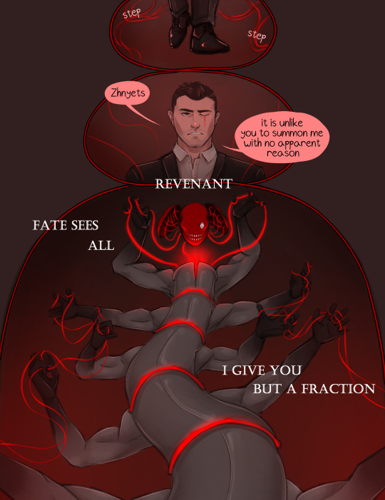



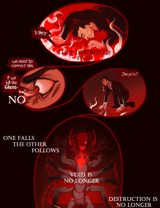

This is it. 3 months in the works, the comic (and video) are finally done.
A little over a year ago, I uploaded the first work in Revenant AU, Ghost's origin comic. I never thought I'd write a whole series for this, but I'm so glad I did. I got a whole new hobby out of it, haha.
I already began working on part 2, but this for me marks the start of it. I'm really excited to get back into this world!
Under the cut there are some comments on the comic I thought some people might be interested in (don't wanna make this post longer than it already is lol). I will upload the frames from the video separately, with comments on it there.
Bottom line is, thank you for letting me just go wild with this :)
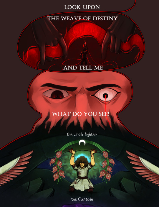
Okay, I'm mostly gonna talk about the part where Fate shows Makarov the 141+Farah. Makarov doesn't see the Fate of people as literal images, he often has to interpret odd symbolism in the flashes he gets from the Weave of Fate.
I decided to go for a style I saw in a collection of calling cards in MW3, mainly from this one:

You can really see it in the faces and pitch-black cel shading.
I'll be going in order of appearance, starting with Farah.
Obviously, each of the "flashes" shows the Reaping of each person, Farah being crushed under rubble. Behind her is a helo of green gas, which symbolizes the Russian experimental gas. The motifs around her are more interesting imo - they're taken from the Urzik flag (and yeah apparently it's "Urzik" and not "Urzikstani"... according to the wiki at least). Wings, plants (feels to me like a pomegranate and some sort of crop, but I couldn't find what it is specifically), and a moon, upside down.
I'm skipping ahead a bit, but I've had the idea to make a drawing of Gaz in the Hanged Man pose since I started the AU basically. I tried sketching it once, and it went bad so I gave up lol. But I decided to come back to that here, and add some sort of tarot connection to all of them. I know practically nothing about tarot, googled the meanings of each, they fit well enough, I called it a day lol.
So Farah is the Moon, upside down.
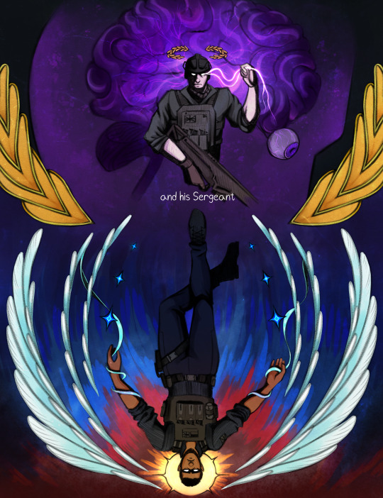
Price is next, showing him taking control of the brain of someone. I didn't use the flag of the UK for the 141 (it'd be kinda boring...), instead I took the Taskforce 141 logo, and broke it down to different elements.
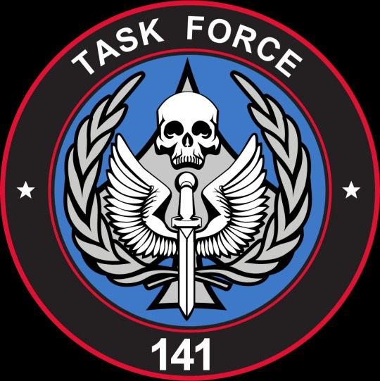
I took the laurels for Price, both framing his illustration and sitting above his head like a crown. I decided he will be the Emperor.
Next up is Gaz, the Hanged Man of course. Gaz gets both the wings and the stars (I changed mine to 4-pointed because... I like them better). Pretty clear why, both symbols relate to the sky. The illustrations kinda follow a rough day cycle, if that makes sense. Farah being night, with the moon. Price with his golden and purple color palette, twilight. Gaz being sunrise, and Ghost and Soap, day. This is why Gaz has a sun behind him.
Ghost was fun because he's the only inhuman one out of the group. I'll let you think what that implies, that even in Fate's Weave, Ghost is an outlier... Ghost gets the skull, and the card "Death". That one was easy, but what I did add is blood flowing down the skulls, like tear tracks...
Soap, the problem child, gave me the most issues as always. For once, it wasn't his fucking face, it was the flames behind him, and overall contrast and readability issues. Soap's illustration is probably packed with the most "hidden" details, though they're obvious if you've read the fic and Konchar's side story. The headless man behind Soap is Konchar himself, holding 4 chains with dog tags on them. The 4 soldiers from Soap's squad, who he killed before Soap was Reaped. Soap's pose is from the moment he came to his senses, after getting shot in the head and destroying a large part of Verdansk. He has 4 swords, pointing at him and downwards, so his card is 4 of Swords, upside down.
Between Soap and Ghost is a circle and a triangle. I'll explain that in the post concerning the video, since that's where I got that from.
If you read all of this, thank you so much! There will be another post for you to read in a moment lol
#cw flashing#call of duty modern warfare 2#cod mw2#cod ghost#cod soap#cod gaz#cod price#cod farah#revenant au#simon ghost riley#john soap mactavish#kyle gaz garrick#john price#farah karim#vladimir makarov#call of duty modern warfare#call of duty fanart#cod fanart#its been so long since i used the rev au tag...<3#as you can imagine... drawing a creature with literally 10 arms flailing around was quite painful#i think you can see me give up on the anatomy in real time there lol#but i do like how this turned out. the video couldve been better edited but#after effects crashed on me 4 times in the few hours i worked on it already so. fuck that lol.#also makarov isnt having a good time huh#deserved tbh
264 notes
·
View notes
Note
hi!! I was wondering if you could share tips (or at least a timelapse) on how you do your lineless art? It’s so simple, yet so pretty, and I’d really love to learn from you :0
Thank you so much! Lineless art IS simple (or rather...as simple as you make it haha)....lined stuff with cel shading is what I find really tough as it's SO tied down and concrete! You can definitely cheat a lot more with raw colour...
I put this tutorial together quickly to hopefully explain a little the basics of my process. I use A LOT of layers but it's mainly to keep all the 'bits' seperate (limbs from torso, head from torso etc) as I'm a fiddler when it comes to rotations but the actual process is very simple. Of course you can add further complexity with gradients, texture etc but I thought I'd use a really straight-forward example.
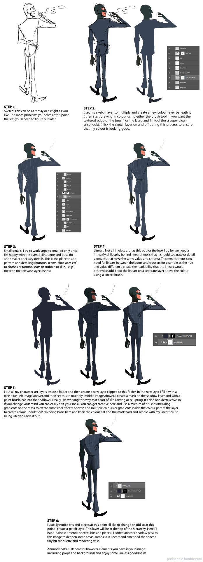
Unfortunately I don't have any timelapses to hand and I'd have to either bust out Procreate or figure out how to record my screen in PS to record one! Might be fun to do in the future :) Next best thing though - my pal works in exactly the same way I do and she's uploaded a bunch of speed paints here (albeit most are landscapes). I also touch on my lineless approach with the few progress pics I posted here and here. Hopefully this helps! Studying other lineless art is the way to go - lots of great vintage illustration to look at as well as shows like Tangled: The Series, Carmen San Diego and Samurai Jack.
305 notes
·
View notes
Text
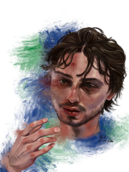
who is #43?
Hello !! First off thank u for visiting. If you clicked read more by accident rip sorry it’s a lot of text. ENJOY!!! <3
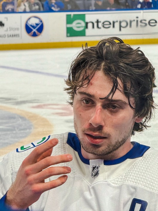
1. This was the photo reference I used. I really did mean it when i said he photographs well!! I really like how scrungly he looks at times lol. v paintable
2. here’s a timelapse for your viewing pleasure in video + gif form <3

3. Process breakdown below. I am not formally trained, so don’t take any of this as professional advice!! The way i paint has been compared to channeling some evil contract with a demon also. So um . Im saying that i dont remotely think that this is efficient or correct, its just whats comfortable for me <3
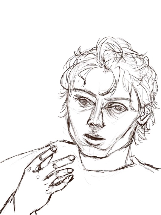
3a) the dreaded lining phase. I have 2 modes of operation when it comes to painting - either i go full-dick with fancy inking/sketching + cel shading (rare, unrefined, haven’t figured out a nice workflow yet) OR i do a very very basic chicken scratch set of lines like so:
It’s less about being realistic here and more about laying down some guide lines for the chaos ahead. If i thought i could get away with it, I would start every rendered painting i do with laying down colours — but unfortchh ive tried that before and it usually ends in really weird proportions. Even with the lines i still need to make adjustments. This is something no people except me would notice but look at the above sketch; the eyes are too big and slightly too far apart, the forehead is too small and thus the hair is also not quite big enough… I have a bad habit of drawing eyes too big on faces, they’re my favourite facial feature to draw.. i barely resisted giving him big cow eyelashes (I love big cow eyelashes… all of my OC’s and most of my more stylised fan art of characters get big cow eyelashes… god…. Big cow eyelashes SAVE ME……….)
Anyway. Structure of the face + hand somewhat established. <3
3b) Underpainting!! Okay stay with me here . Ever since i figured out i dont have to paint in 03925893853 different layers, I’ve joyfully painted on 1 layer as much as possible. I dont have the brain power all the time to be managing layers so I simply dont work with that many layers. For this painting, the skin in its entirety was painted on one layer, the hair on another layer, and the effects on the last layer. There was a placeholder background off-white/grey colour for a while there, and I duplicated the line layer — one for figuring out where to lay colours, and one hidden for later so i could check back to see how accurate to the sketch/proportions were to the actual painting. 6 layers, 2 of which i painted the bulk of the piece on, 1 more at the end.
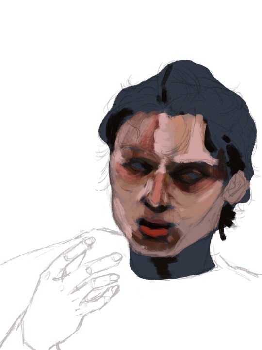
3c) here’s where I started carving out features. I think about objects in terms of volumes and light rather than lines. i love painting and sculpting because of this!! Here you see where I’ve begun to define his features — his eyelids, his bags, his nostrils. Just refining what was there before. The suggestion of facial hair before i gave it up and left it for later (his face is so naked the WHOLE time)
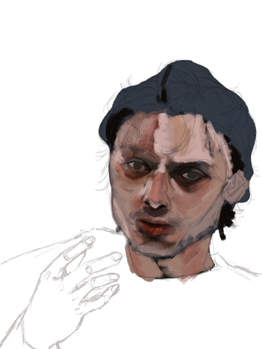
3d) nose bridge highlight, suggesting his eyebrows, a cheek highlight. A touch more coral red and muted yellow pull away from the grey/blue underpainting. Strategically leaving some of it peeking through.
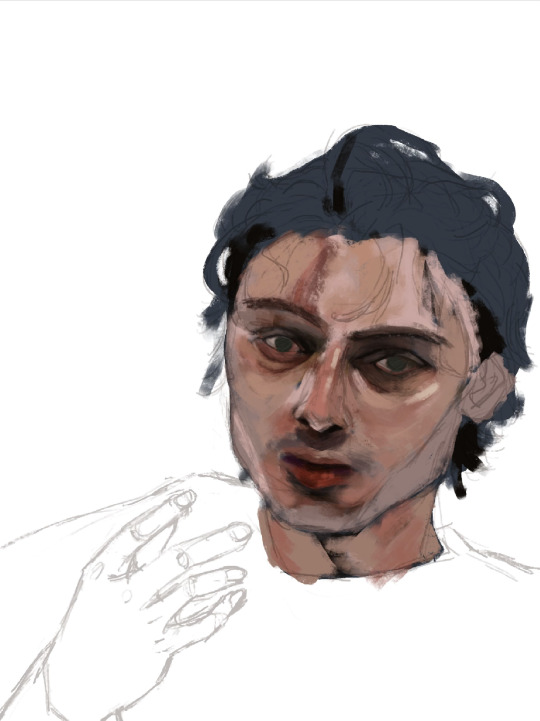
3e) i truly start messing with the fidelity of his features here. Red lipstick <3 and some violet/blue for shadows on the right side of his face.

3f) the part where it starts looking like q.hughes to me (though, my friend said i got his vibe pretty early on which is such a compliment.. waaaaa…..) I love this part of every painting i do. I know it’s definitely not the Correct order since other parts of the entire painting are simply Not Rendered or Done, but whos gonna stop me?? :3
I love love loveeee painting faces. Adding the little shinies to his eyes + lips + upper lip + nose … you don’t know how much of a difference it makes until you do it. Also i snatched his eyebrows
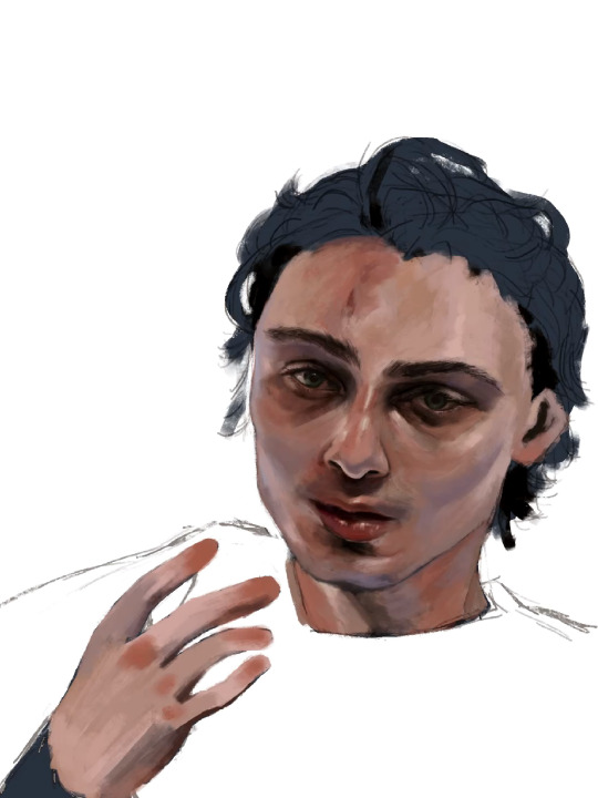
3g) i really pushed the red/coral/ochre/orange here. Note the yellow highlights on his cheekbones, the forehead, and the thin thin line of pink right between where his bottom lip ends and his chin shadow starts <- very important . To ME!!!!!!! Also highlighting his waterline and adding his lashes was so so fun <3
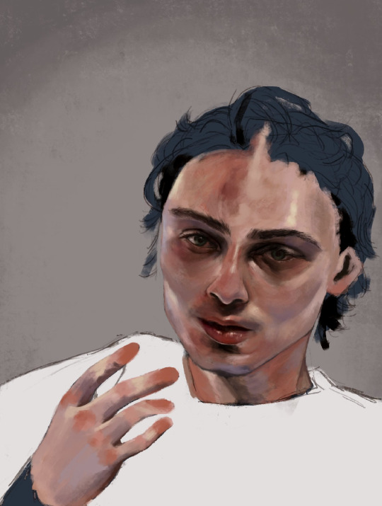
3h) FACIAL HAIR!!! And I started rendering his hand. Some micro adjustments made to his face for proportion check.

3i) i start painting his hair in earnest and realise his forehead is too small so i make the adjustment. I really love how it falls into his eyes in this photo. <3
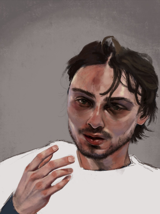
3j) i make some final adjustments to his eyes — a bit smaller, closer together. And i refine the outline of his jaw, push the stylisation of it just a little.
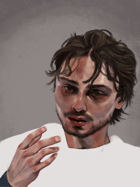
3k) Finishing details; his flyaway hairs, his moles, a bit of texture on his face, shadows cast by his hair, his little forehead cut <3
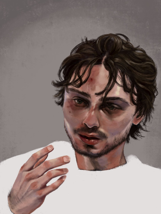
3l) i adjusted his hand here, added more texture to his skin, refined his hair a tiny bit more, and made the decision not to fuck around painting his jersey because i wanted the focus to be his face <3

3m) Canucks blue and green. Captain at 23. His form bleeds into the background. He is the franchise.

theee most fun ive had painting anything. and i finally feel... warmed up? if that makes sense. art for me is like. if i dont do it in a while it feels like nothing goes right when i come back to it. i hate that feeling, and the most difficult hurdle to clear is letting myself feel that until i get back into my Zone. after all this time i feel like im BACK !!!!!!!
i loved painting this fella. hes SO Shaped. <3
Apologies i simply do Not have the energy to write the alt text for all of these so i hope the little blurbs are okay aslkjasdklj. i gotta post and go to bed . if u made it this far, thank you for reading!!
#details and process under the cut ….!#god… it really is like . they let anybody be in their mid 20s these days??? (<- guy in his mid 20s)#quinn hughes#vancouver canucks#hockey art#puckpainting#<- abandoned wet rat of a tag. rarely used
153 notes
·
View notes
Text
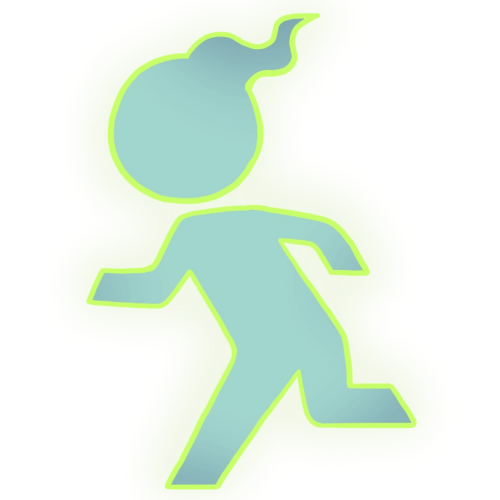
Name: Legsit
Debut: Yo-Kai Watch 3
Look at this! Look at this!!! This is the little guy from emergency exit signs and stop signs and various more of our favorite signs, but this time you can BEFRIEND them! You can run all around town with this absolute icon of an icon! You can take Legsit for a walk across the crosswalk... and you can even teach it to jaywalk! A new thrill it would never dare to experience without your help!
Legsit is an incredible kind of design, the one that's so simple, barely a change from its inspiration, but the inspiration is what's so creative. Legsit is basically JUST the little guy from the sign, with only a little wispy head to differentiate it, but how many times have you seen it used as an actual character, with its origin tied to its gimmick? I have actually long ago had the idea of a Walk Sign Guy as a character (in the context of a boss that swings the sign itself as a weapon, and can call upon the red Stop hand to freeze its opponent) and it is so awesome to see this concept come to fruition in something big, and with its own flair!
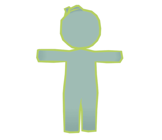
By default, Legsit is in its iconic Static Running Pose, though it is not afraid to actually move around, too. It looks good doing it thanks to being tastefully cel-shaded! What if there was an animal that was cel-shaded in real life? Just one. Not even a translucent invertebrate like you might expect, but like, one particular species of vole. Pretty cool!
In terms of gameplay it's very straightforward. Its specialty is to make itself and allies faster like they gotta get outta here. I'm done talking about gameplay already, it's really about the visual novelty there. Now I will talk about its anime appearance, because yowza!
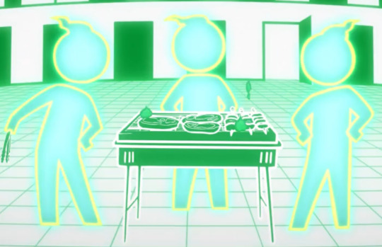
The anime reveals that inside the exit sign is a whole other world, one populated by a whole civilization of Legsit! They each take turns posing in the sign, but when not doing that, they just Hang Out. Some of them play on 3DSes, some lounge about, some play guitar, and some barbecue various meats that are most certainly radioactive! Would you eat Legsit's Famous Toxic Kebab? I sure hope not! Because they were saving it for me.
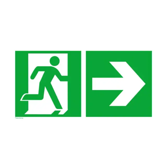
Legsit represents the creativity and wonder that can be found everywhere in the world, and NOT just if you know where to look! I can assure you that anywhere you look, you will see at LEAST a few things that are waiting for someone to appreciate them in just the right way. Maybe you will be the first to discover the potential of something overlooked, and if you're not the first, then that's great too! It means the world is full of beautiful minds!
206 notes
·
View notes
Text

next up for Style Challenge Featuring Varian; wind waker. buy potions from him. or dont. maybe dont
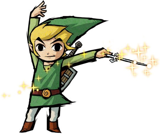
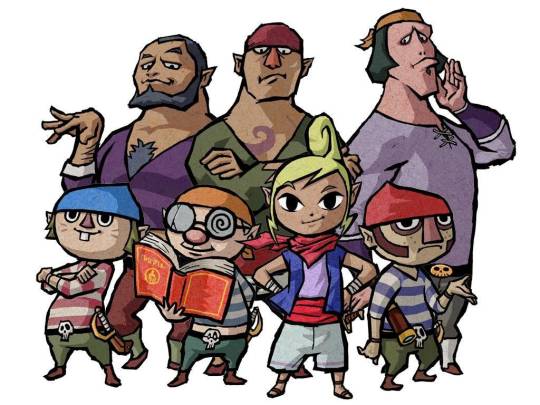
in ye olden times i was pretty big on nintendo stuff, namely zelda. which is probably unsurprising if u think about it
wind waker isnt my favorite of the zelda games but it's certainly high up there and i love the art style a lot so i knew that was Most Certainly gonna be one of the styles to try and mimic
im really fond of bold, thick lines. something i dont even really do with my own style lol but regardless i like it a lot. and then of course the cel shading on the characters is excellent. they have such strong designs too, i love their shapes!
Varian is kind of just based off link and tetra but i used others as points of reference too. i was also looking forward to doing the potion smoke bc i always really liked those smoke effects in wind waker :P
#varian#varian the alchemist#tts#tts varian#tangled#style challenge#my art#vat7k#(once again i know hes in his tts era in this one but the others will have his vat7k design. woagh)#artists on tumblr#wind waker
80 notes
·
View notes
Text

She's a new Queen. The rising sun. The literal new dawn.
I wanna smooch her forehead. ;-;
I wanted to do some TDP fanart and had to stop myself before I just drew Viren or Aaravos again, so I went with homegirl who has what is, imo, one of the best character designs in the show.
Black women w/ gold motifs = me, sold, you should see how I reacted to Mel in Arcane. :')
I initially wanted to paint this, as the sketch was so pretty...but it was a double-edged sword. ;-; Nothing I did with colour brought it up to the standards of the sketch, and so it's been sitting in my WIPs for months, begging for liberation. ;-; Eventually decided to just go my usual cel-shading route and now I have a pretty Janai. ♥
Ft. a screencap background because it's just too hot for me to concentrate atm sobs sobs pls cool down weather i beg u-
#TDP#TDP Art#The Dragon Prince#TDP Janai#Janai#Art#Fantasy#Sunfire Elf#Queen Janai#The Dragon Prince Janai#Queen#Elf#Magic#Digital Art#Artist
524 notes
·
View notes
Text


Subaru and Tsukasa from .hack//sign, painted with watercolors. I was having trouble coming up with ideas when I started this picture, which is why there are multiple parts of it that feel a little off to me. In retrospect, I wish I had found a better pose reference, because this angle makes it look like Tsukasa is a lot shorter than Subaru, but I'm pretty sure Tsukasa is supposed to be a little taller than her. I need to figure out how to draw someone leaning their head on the chest of someone shorter than them. I guess Tsukasa's knees could just be bent. Maybe he/she is sitting. While painting this, I had thought that I regretted doing the black ink on Tsukasa's shirt, since I ended up liking the flat unshaded look of most of the painted areas. But in retrospect, it doesn't look too bad! I was originally going to shade this in my usual "cel-shaded" way, but once I colored their faces, I realized I really like the flat look, so I decided to leave it mostly unshaded. Now that the picture is done, I like it better than I thought I would. That said, I hope to draw more of these two in the future, and I'm hoping I'll be more confident with the next one.
Materials: Canson watercolor paper, Uni Prockey marker, Sakura Micron 01, Sakura GellyRoll, Mei Liang watercolor paints
Watch the lineart video on Youtube!
Patreon / Ko-Fi / Commissions Open!
#dot hack sign#.hack//sign#tsukasa#subaru#lady subaru#art#artist on tumblr#artists on tumblr#tsukasa and subaru#subaru and tsukasa#90's anime#watercolor#traditional art#no ai#painting#illustration
57 notes
·
View notes
Note
May I ask on how you choose your colors when you color your art pieces? It is so pretty to look at the colors of your art, and I want to color like that, but color picking is very hard q-q
here's!! uh, the general areas in the color wheel where i try to pick depending on the vibe
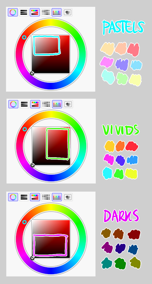
highly inaccurate because tbh i just color pick directly or try to guess the colors from my references and just adjust them to be a little bit more pastel or to the atmosphere and if i have their colors memorized (such as ink or dream), i just pick by memory or by my modified colors LOL

color your scrunkly!

set your line work to multiply and lock opacity
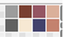
i use warm tones for white ish colors so uhhh idk whatever warm color from here
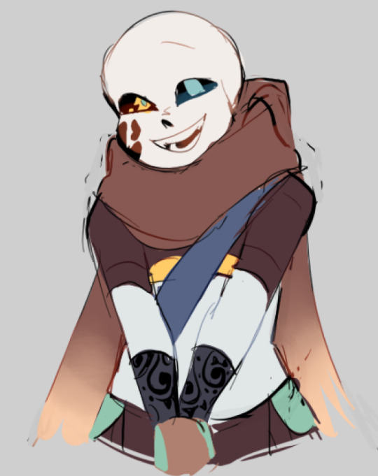

color the line work!!!!! ofc, shift the hue depending on the undertones of the surrounding colors the skull color is a warm off-white, the undershirt is a blue-ish off-white, scarf is warm brown, so on and so on the multiply function rly helps just blend things into the palette a little more, but if ur confident enough, you dont have to set it to multiply at all for extra variation
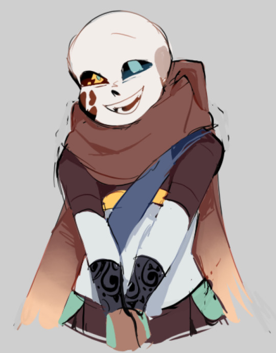
minimal shading by just taking the surrounding colors n adjusting the hue slightly n its value n saturation gives it a very messy cel shaded look! been into it lately and stuff

and then i add a few overlays using the pin light layer mode! i usually use these two colors together, it gives the right amount of pastel colors that really appeals to me
if you have access to gradient maps, i recommend using them lots! it makes the pieces look a little more cohesive the pin light layer mode imitates it n is very versatile if u cant use them though (like me when im just doodling on sai)
that's it!!! that's the basic rundown of how i color i'm not very well versed in color theory so i can only do very basic color picking tips, but maybe next time i can offer ways on how to color more atmospherically!
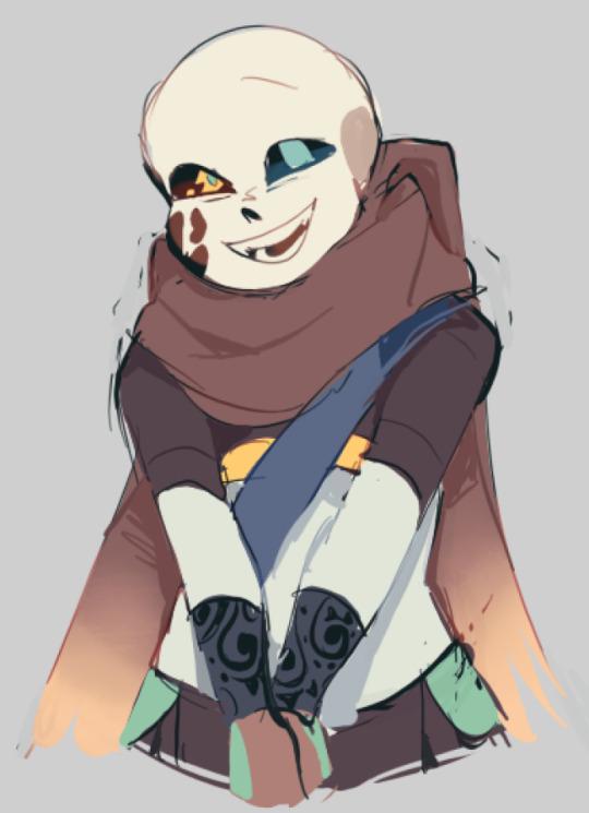
have a nice time coloring your blorbos ✨
#Anonymous#tutorial#ref#ink sans#kia doodles shit#i hope this heeeeeeelps somewhat!!!!!#art tutorial#coloring tutorial#art help#art tips#art advice
403 notes
·
View notes
Text
While a lot of people seem to agree that the older anime style looked way prettier, one thing I don't see often talk about is the color pallettes!!!!
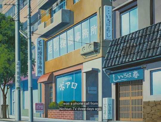
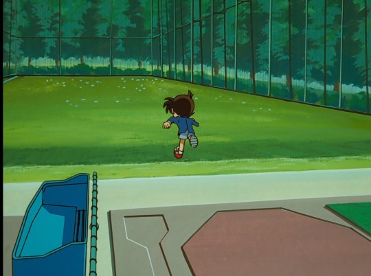
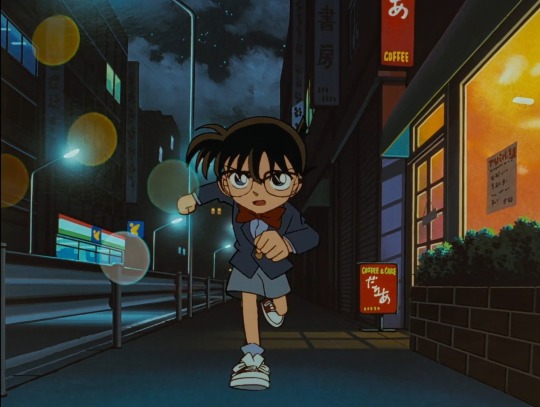
Look! It's so pretty!! The colors may be muted, but it's so colorful still!
I absolutely LOVE the muted colors. 80s/90s anime had the right idea on this- I kinda don't like how modern anime tends to make everything extremely vibrant and shiny (which granted, can work in certain situations and artstyles). I also think cel shading looks overall nicer than the weird blur thing anime does nowadays.
(I'm going to be fair though, modern detco also has nice colors, I just miss the older look a lot...)
90 notes
·
View notes