#that dress was one of a kind and worn by an icon
Explore tagged Tumblr posts
Text

Out and about | New York City, NY | November 9, 2024
Vivienne Westwood 'Sunday Striped Cotton Dress' - $2,390.00 For Future Reference ‘Vintage 1970s Ancient Bronze Coin Necklace’ - $12,750.00 Vivienne Westwood 'Granny Frame Purse' - $210.00 Aquazzura ‘Twist 95 Pleated Sandals’ - $795.00
This outfit has a lot of recognizable, repeat elements going on for it which is something Taylor does a lot with her fashion. Weaving new but familiar pieces in with repeat pieces keeps her wardrobe consistent, but fresh.
Take the dress for starters. For every era there is often a silhouette or item that Taylor has elevated to be its most iconic or associated. For TTPD, it’s definitely been the bustier/corset. And in terms of designers, Vivienne Westwood was an early pioneer in bringing the style to the masses making the house a natural choice to wear.
If the silhouette of the dress looks particularly familiar, it’s because we have actually “seen this film before.” Taylor has worn the checked version of this ‘Sunday’ top to the Chiefs vs Saints game and the blue version of the ‘Sunday’ dress in personal photos shared by Brittany Mahomes from Amsterdam, Netherlands in the summer.
The layering of colours on the bodice feel like a painting of a sunset to me.
If you’ve been following along with Taylor’s fashion, you’ll likely recognize this bag immediately because of the adornment on its front. As a fashion refresher, the symbol is the Vivienne Westwood ‘orb’ logo - an iconic design within VW house codes. It was designed to be a take on the Sovereign orb of the British Royal Family and a cheeky reference to Vivienne’s self-described title of “queen” of fashion.
VW describes the bag as a “a vintage-inspired silhouette and a kiss-lock closure, recalling antique coin purses from the early 20th-century.” Fitting given the vintage coin necklace she’s wearing around her neck, don’t you think?
Despite the “vintage” vibes of the bag, I can’t help but feel that it’s a bit stark and disjointed against the rest of the outfit.
Taylor has also previously worn both the necklace and shoes here. The oversized coin necklace has been seen on two occasions. Its debut was at the Chiefs season opener against the Ravens back in September and its first repeat just a few days following paired with a Gucci monogram dress (For Fashion History lovers, shall share in Stories!).
Of its three outings, this is my least favourite styling of this necklace (the Chiefs game ‘fit was my fave of the three). I would guess based on the cut of the dress Taylor may have been going for a throwback / vintage look my first impression was renaissance fair meets oil painting) but something about the pairing of the scale of the necklace here isn’t working for me.
The necklace itself was a special one-of-a-kind vintage piece from the 70s that For Future Reference founder Randi Molofsky told me was “heavily influenced by the disco movement and Italian resort style.”
To pick up on the colours in the bodice of her dress, Taylor wore a coordinating pair of repeat velvet sandals. You might recall that Taylor previously wore these in September 2023 while out and about in NYC (That particular outfit was a noted copy + paste for me. Will share to stories!).
The velvet here adds a lush, seasonal texture to a going out ‘fit.
Photo by Aeon via Getty Images
#taylor swift#candid#dress#jewelry#shoe#vivienne westwood#for future reference#aquazzura#november 2024
190 notes
·
View notes
Text
While everyone is mass blocking celebrities, whether you participate in it or not, I want you to remember when Kim Kardashian wore Marilyn Monroe's one of a kind dress at the Met Gala and ruined it
This had me fuming for a week when it happened
#the dress was also a piece of history#and it was only made for marilyn monroe#It was also made from a fabric they don't make anymore#that dress was one of a kind and worn by an icon#just to have a spoiled rich person ruin it#It didn't even fit kim because the dress was only made for marilyn#kim broke the zipper and some of the stuff fell off it#just for kim to show how rich she is#they shouldn't have let kim wear it#this had me fuming for a week when it happened#I just want to remind you guys since we are mass blocking celebrities
0 notes
Note
Apologies if you've already done a post on this and I've just missed it, but can I ask for your take on the pyjamas worn by the cast of interview with vampire? I mean technically they're not a 100% necessary item, but just from a quick look there seems to be a lot of variety and they do change over the series
ok, i’m delighted by the specificity of this question, and it turns out that i have a VERY extensive answer.
there’s a lot of sleepwear in IWTV due to the volume of bedroom/coffin scenes, and like any other outfit, these costumes are shaped by characterization and historical period. for instance claudia initially wears a long, modest, frilly nightgown - an old-fashioned style that plays into her girlish doll wardrobe purchased by louis and lestat. however her sleepwear matures over the years, including a trendy lace nightdress with bloomers in the 1920s (note the rectangular silhouette), and a pink padded jacket/pastel robe outfit in 1940s paris. she's following contemporary trends while charting a visible trajectory from child to adult.

when i wrote about the Théâtre des Vampires coven costumes, i noted that while their wardrobes share certain themes (ie. monochrome patterns and stripes), they each have specific personal tastes. that holds true for sleepwear. in the S2 finale we see the coven going to bed in their coffins, with Eglee in a gorgeous (maybe 1940s?) robe, Celeste in a striped pajama suit reflecting her 1920s-30s cabaret style, and Armand in a plain grey set of prison jammies because he's Suffering.
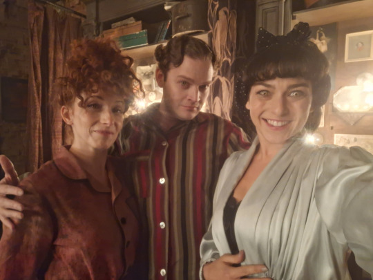
of course, the star pajama outfits all belong to Louis and Lestat, playing into their wealthy domestic aesthetic in S1. they receive multiple bedroom/coffin scenes, and Lestat's gold Leyendecker robe is obviously iconic.
touching on the historical side of things for a moment, pajamas (as in a matching buttondown top and loose pants) were popularized in the western world in the 19th century, as a repurposed south asian import - kind of like how banyans became trendy among the upper classes in 18th century england. this was when loungewear started to catch on as a concept, both in terms of dressing gowns and smoking jackets (which you could wear while socializing at home) and actual pajamas, which became unisex in the 1920s.
back in his human life in the 18th century, Lestat probably slept naked or wore a shapeless white nightgown (and possibly a nightcap, the sexiest of garments). but in New Orleans he adopts Louis' lifestyle, which involves a luxurious wardrobe of fashionable menswear. they're both into shopping and looking good, and i think they enjoy the ritual of getting dressed together each night.

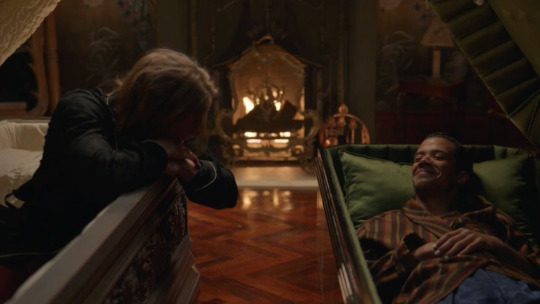
(i also have a personal theory that Lestat may prefer to sleep fully clothed because his formative traumatic memory involves waking up naked in the dark. after all, he doesn't need pajamas to stay warm, and he doesn't have a recent habit of wearing them in his human life like Louis does. then again, maybe he just enjoys having a new outfit for every occasion!)
in Dubai, we only get one scene (iirc) with Louis and Armand in their pajamas, lying in bed wearing outfits that tie into the striped prison bar imagery of their bedroom. Armand is in warmer brown tones (like his Paris wardrobe) while Louis is in black and grey, like the rest of his Dubai outfits. i'd also note that this is the one place where they're genuine in private, meaning that they aren't putting on a show for Daniel. so this is potentially Armand's most relaxed costume in the present day.

the fact that they're wearing this kind of old-school sleepwear feels very appropriate for their whole deal, imo. in the 21st century, a lot of people just sleep in boxers and t-shirts or whatever. there's a slightly 20th century vibe to wearing a full set of buttondown pajamas, and Armand's outfit reads as more stylish (and possibly more wealthy) than your average millennial guy. which makes sense! they're old men.
i think we can assume that every single thing in their Dubai home is ferociously expensive, even when it doesn't need to be. considering the way Louis gives himself a modern makeover in the finale, i do wonder if he'll switch over to sleeping in t-shirts etc next season, or if he'll stick with variations of the same sleepwear he wore during his mortal life.
p.s. all of my iwtv design posts are available on this tag!
#iwtv#interview with the vampire#costume design#louis de pointe du lac#lestat#iwtv costume design#claudia#armand#iwtv meta#fortunatelyhercat#pajamas#asks
485 notes
·
View notes
Text
Maple Heights 1: The beginning
In the quiet suburban enclave of Maple Heights, everything seemed to have its place. The two-story homes, with their neatly trimmed hedges and spotless driveways, lined the streets in perfect symmetry. It was the kind of neighborhood where everyone waved hello, the lawns were always green, and the local church bells rang every Sunday without fail. Families gathered in the evenings for barbecues, the kids played soccer in the park, and the routine felt timeless.

But recently, something strange had started to creep into Maple Heights. It began with subtle changes that no one could quite put their finger on at first—little things, like men in the neighborhood who began dressing differently, speaking in more structured, rigid ways. Then, almost overnight, more and more of the men started showing up in identical black Fred Perry polos, each one with distinctive yellow details—a thin stripe running along the collar and cuffs, and the iconic laurel wreath logo embroidered on the chest. These weren't ordinary polos, though. The fabric had a glossy sheen to it, almost rubbery or latex-like, and they were always worn with the top button fastened tight.
The Evans family had been living in Maple Heights for a decade now. Paul and Greg, a married couple raising their three sons—Luke, 24; Michael, 22; and Tyler, 20—had chosen this neighborhood for its peaceful atmosphere and sense of community. Paul worked from home as a software engineer, while Greg ran the local bakery that everyone in town loved. The boys were a lively bunch, each with their own interests—Luke was the athlete, excelling in soccer; Michael spent his time writing music and drawing in his sketchbook; and Tyler, the tech whiz, could be found in his room building gadgets from parts he scavenged at local sales.
Their lives had always been filled with laughter and activity. Weekends meant cookouts in the backyard, bike rides around the block, and movie nights with popcorn on the couch. Church wasn’t a big part of their routine, but every Sunday, Greg made it a tradition to bake fresh pastries and drop them off at the church before opening the bakery. It was his way of staying connected with the community, even if they weren’t particularly religious.
But lately, both Paul and Greg had started noticing changes in the neighborhood, especially among the men. It started with Mr. Anderson, two doors down. He had always been friendly—waving to Greg every morning as he walked his dog past the bakery. But now, Mr. Anderson was different. His usual flannel shirts and casual jackets had been replaced by a sleek black Fred Perry polo with yellow details. Even stranger, the fabric seemed almost rubbery, the way it caught the light. And the way he buttoned it all the way to the top, stiffly and neatly—it made him look more formal than usual. His conversation was short, stilted, and somehow… off.

One evening, as the family gathered around the dinner table, Paul brought it up. “Has anyone else noticed how people around here are dressing differently?”
“Yeah,” Luke said with a frown. “A bunch of guys at soccer practice started wearing those weird black polos. I mean, they look cool, but... everyone’s wearing them, like, every day now.”

“They’re Fred Perry shirts, right? But they look... shiny,” Michael added, tapping his fingers against the table in thought. “And they all button them up to the top. It’s kinda weird, like they’re in some sort of uniform.”
“It’s not just the shirts,” Greg chimed in, shaking his head. “People are acting strange, too. Customers at the bakery used to chat, laugh, but now they come in, order the same thing, and barely make eye contact. They’re so... focused.”
Tyler, the youngest, leaned forward, eyes wide with curiosity. “I saw a bunch of them after church last week. They were all wearing those black polos. I thought maybe it was some church thing.”
Paul and Greg exchanged a concerned glance. “It’s like some sort of group,” Paul said, lowering his voice. “They’re all starting to look and act the same.”
Over the next few weeks, the changes in the neighborhood became more noticeable. More men—fathers, teachers, even some of the older teens—were now dressing in the same glossy black Fred Perry polos, the yellow details standing out sharply against the dark fabric. Each man wore his polo the same way, with the buttons done all the way up to the top, giving them a sleek, almost uniformed appearance. Even their mannerisms had changed—conversations were short, their expressions calm, almost vacant.
Luke noticed it most on his soccer team. At first, it was just a couple of the players who showed up to practice wearing the polos. But soon, half the team had swapped out their jerseys for the slick, rubbery Fred Perry shirts. And once they did, their personalities shifted. They became more focused, more intense, and eerily synchronized. Luke, who still wore his usual soccer gear, felt out of place. His teammates, now all dressed in the black polos with their yellow accents, would glance at him with strange looks, as if waiting for him to join them.
“I’m not wearing one of those,” Luke said to his dads one night, slumping down on the couch. “They’re all acting weird, like they’re in some kind of club. And the coach is in on it, too. He wore one at the last game.”
“I’ve seen the same thing with my friends,” Michael added. “They’re always wearing those shirts now, and it’s like they don’t talk about anything else. It’s not like them.”
Greg sighed, leaning against the kitchen counter. “Even the customers at the bakery... I’ve noticed more of them wearing the polos. They don’t smile, they just take their coffee and leave. And today, one of them asked if I wanted to come to some gathering after church this Sunday.”
“That’s the second time we’ve heard about that,” Paul said, frowning. “Tyler, you said you saw them after church too, right?”
Tyler nodded, his eyes wide. “Yeah, they were all standing around talking after the service. But they weren’t really talking like normal. It was like they were all... rehearsed.”
Greg shivered. “I don’t like this.”
That Sunday, Paul decided to see for himself what was going on. After the church service, while Greg was delivering his pastries, Paul slipped into the side area of the church where the men were gathering. As he stood at the back of the room, he watched them closely. Every man was dressed in the same black Fred Perry polo, the yellow details gleaming under the fluorescent lights. Their shirts were perfectly buttoned up to the top, their expressions calm and focused as they listened to the man leading the meeting. His polo looked newer, glossier than the others, and his voice was firm but soothing as he talked about the “importance of unity” and “the future of Maple Heights.”

It was more than just a social group. This was something bigger, something that was spreading.
When Paul got home, he told Greg everything. “It’s not just the shirts,” he said, pacing the living room. “It’s like they’re all part of some bigger plan. They’re getting more men to join them. It’s like the whole neighborhood is changing.”
Over the next few weeks, the transformation continued to spread. Luke’s soccer team was almost fully converted, the boys showing up to practice in their glossy Fred Perry polos, barely speaking to anyone who wasn’t wearing one. Michael’s friends had stopped hanging out altogether, and whenever he saw them, they were dressed in the same shirts, their conversations short and emotionless. Even Tyler’s teachers had begun to show up to class wearing the same outfits.
One afternoon, Greg came home from the bakery with a tight look on his face. He held up a Fred Perry polo—glossy black with the yellow logo and details—and tossed it on the kitchen table.

“They gave this to me today,” Greg said quietly. “They said it’s time for me to ‘fit in.’”
Paul stared at the shirt, his stomach twisting. “We need to figure out what’s really going on, before it’s too late.”

But deep down, they knew it was already spreading faster than they could stop it. Maple Heights was changing, and it wouldn’t be long before the entire neighborhood was transformed, one slick black polo at a time.
The next week...
Luke stood on the edge of the soccer field, his cleats digging into the grass as he stared out at his teammates, all of whom were already dressed in their glossy black Fred Perry polos. Their yellow-detailed collars were buttoned up tightly to the top, and the sheen of the shirts gleamed unnaturally in the late afternoon sun. He shifted uncomfortably in his old practice jersey, the only one left who hadn’t made the switch.
Over the past few weeks, more and more of his teammates had started showing up to practice in the strange uniforms. At first, it was just a few of the guys, but now, every single one of them wore the latex-like black polo. Coach had been pushing them harder too, but in a way that was unnerving. The drills were more intense, more synchronized. The team barely spoke to each other anymore, their conversations replaced by curt instructions and short exchanges.
Luke felt the pressure mounting every time he stepped onto the field. He knew the others noticed that he was the last one holding out. His friends, or who they used to be, barely made eye contact with him anymore. They’d glance his way with strange, expectant looks, as if waiting for him to join them, to give in.
As practice started, Luke could feel the weight of their eyes on him. He jogged through the drills, but something felt wrong. The usual energy of the game was gone, replaced by an eerie, robotic efficiency. His teammates moved in perfect unison, their movements mechanical, their expressions blank but focused. And all the while, Luke couldn’t shake the feeling that they were watching him—waiting for him to fall in line.
“Luke!” Coach’s voice boomed across the field, pulling him from his thoughts. “Come here.”

Luke jogged over, his heart pounding. Coach stood on the sidelines, his own black Fred Perry polo perfectly buttoned, the yellow details gleaming in the sun. He had been wearing the shirt for a few weeks now, and ever since then, practice had felt more like a drill session than a sport. The coach’s eyes locked onto Luke’s, calm but intense.
“You’re the last one,” Coach said, not unkindly, but with a firmness that sent a chill down Luke’s spine.
Luke glanced at his teammates, all of them standing in formation, watching silently. “Coach, I’m just not sure about the mask. I don’t really feel like I need to wear it,” Luke said, trying to keep his voice steady.
Coach smiled, but it didn’t reach his eyes. “It’s not about the mask, Luke. It’s about unity. The team needs to be united—on and off the field. You’ve seen how well we’ve been playing lately. We’re stronger, more focused.”
Luke shifted uncomfortably, glancing back at his teammates, all eerily still, waiting. He didn’t want to admit it, but there had been something different about their games recently. They were winning, dominating even. But it didn’t feel like a team anymore—it felt like something else, something controlled.
“I just don’t think it’s for me, Coach,” Luke said, though his voice faltered. The pressure was mounting, and deep down, he knew he couldn’t hold out much longer.
Coach’s smile faded, replaced by a look of quiet authority. “It’s time, Luke. You don’t have a choice anymore.”
Before Luke could respond, one of his teammates stepped forward, holding out a neatly folded black Fred Perry polo, the yellow details catching the light. Luke stared at the shirt, his stomach turning. The fabric looked slick, shiny, almost alive, and the thought of putting it on made his skin crawl.
The teammate, a boy who had once been Luke’s best friend, met his gaze, his expression blank but somehow expectant. “Come on, man,” he said softly, his voice calm but emotionless. “It’s just a shirt.”
But it wasn’t just a shirt, and Luke knew it. It was something more. The moment he put it on, he would no longer be himself. He would become just like them—another piece of the machine.
Luke stood frozen, his mind racing. He thought of his family, of his dads and his brothers, and how hard they were trying to resist the changes sweeping through the neighborhood. He didn’t want to give in, but here, on the field, surrounded by his teammates and Coach, he realized he was alone. There was no escape.

Coach stepped forward, his hand resting heavily on Luke’s shoulder. “You’re part of this team, Luke. You need to be like the rest of us.”
Luke swallowed hard, his throat dry. He reached out, his hand shaking slightly as he took the shirt from his teammate. The fabric felt slick and cold against his fingers, heavier than he expected. His mind screamed at him to stop, to throw the shirt away and run, but his body didn’t listen.
Slowly, he pulled the black Fred Perry polo over his head. The latex-like fabric clung to his skin, tightening around him as if it had a will of its own. He adjusted the yellow-detailed collar, his fingers trembling as he buttoned it all the way to the top. The moment the last button clicked into place, a strange warmth spread through him, and his thoughts began to blur.
His mind felt foggy, distant. The resistance he had clung to for so long started to slip away. His shoulders relaxed, and for the first time, he looked at his teammates not with fear or hesitation, but with calm acceptance. The shirt fit perfectly, and for a moment, Luke wondered why he had ever resisted in the first place.
Coach smiled, patting him on the back. “Good. Now you’re part of the team, put this on.”

Luke nodded slowly, his mind quiet. He took his place among his teammates, their faces no longer strange or unsettling, but familiar—like they had always been. The game started again, and this time, Luke moved with them in perfect unison, every step, every movement synchronized.
As the sun set over the soccer field, the last of Luke’s resistance faded into the background, replaced by the quiet calm of uniformity. He was no longer an outsider. He was one of them now.
After practice, Luke walked home in silence, the cool evening air brushing against his face. His mind felt strangely still, as if the buzzing thoughts he had carried all day had finally quieted. The black Fred Perry polo with its glossy sheen and yellow details clung snugly to his body, and the weight of it no longer felt strange—it felt… right. The top button was fastened tight, and though he had been uncomfortable with it at first, now it felt natural, like it was exactly where it should be.
Luke walked home from practice, the full-face rubber gas mask still tightly fitted over his head. The dark, glossy material gleamed faintly under the streetlights as he passed through the quiet, suburban streets of Maple Heights. The once-familiar neighborhood now felt distant, his breathing slow and controlled through the mask’s filters, muffling the sounds around him.

His black Fred Perry polo, with its yellow details and buttoned-up collar, clung to him as he walked, the rubber of the mask and the shirt making him feel as though he was locked into something permanent. Each step felt heavy, yet he was calm. His mind was quiet now, his thoughts no longer his own.
As he approached his house, he saw the warm glow of the kitchen lights through the window. For a moment, something stirred inside him—an echo of the boy he used to be, the Luke who would come home to his dads, joke with his brothers, and feel like himself. But the mask pressed firmly against his face, silencing those thoughts. He reached for the door, knowing they would see him like this.
When he stepped inside, the familiar warmth of home hit him, but it felt different. His dads, Greg and Paul, turned from the kitchen counter, their faces going pale as they saw him standing there, dressed in the glossy black polo and the full-face rubber mask.
“Luke?” Greg’s voice was filled with shock and concern, but Luke didn’t respond. He simply stood there, the mask concealing any expression, the filters hissing softly with each breath.

Paul stepped forward, his voice shaky. “Take it off, son. You don’t have to wear that.”
But Luke didn’t move. The mask stayed on, its grip on him firm, the strange calm washing over him once again. He was home, but he wasn’t the same anymore. And as his dads stared at him in disbelief, Luke knew that the boy they once knew was slipping away.
249 notes
·
View notes
Text
If Rhian were a villain as his own character, in character, I feel like he'd be the kind of villain to explain his whole Evil plan, giving it away completely instead of keeping it to himself because he's incapable of keeping it to himself. He would be hyped up with excitement for his vision coming to fruition, and most importantly, he would want to do it for the showmanship as he's theatrical like that. Then again, he may be too smart to reveal it all.
If you recall his thematically-appropriate outfit during the Circus of Talents, he seems to love causing a scene, and while Rafal does share this tendency towards the dramatic, I don't believe it's to the same effect or as extreme as Rhian's.
And this brings me to the point that it's just flat-out unusual for Rhian to wear essentially the same outfit for 200 years.
I mean, that seems unlike him and extreme. For evidence, it's implied by TLEA, by the image of his midnight blue robes hanging on a hook in the tower like a relic at the beginning of the book, that he's worn that selfsame outfit all that time. Sure, he must've not had an occasion to dress up for, but when did that ever stop him? Did imitating Rafal mean he had almost given up on his fashion sense? It's not like anyone had seen him. He didn't have anyone to perform in front of after all. Maybe that's the reason: no one would see him, so it wouldn't matter? He'd probably become depressed, and perhaps, the loneliness drove him insane and away from old behaviors.
Yet, how could Rhian, the man who was a fashion icon in his better days, be reduced to wearing the same midnight blue robes for 200 years, as the first trilogy implies? Even villainous Fall Rhian with his pure spun gold cloak did better than this version of him.
Wearing the same clothes like a uniform is Rafal behavior, and while taking that trait completes his disguise, which I'm sure Rhian had down by SGE's present, if no one had the faintest memory of what the real Rafal was like, what was keeping Rhian from caring about his appearance like he once did? He only seemed to fall back into fashion and indulge in it in order to appeal to Sophie and that's it. Did he never regain the right state of mind for fashion to be of any importance by himself? Did Sophie revive that lost part of him?
In conclusion, that is the most implausible thing about the Fall twist: Rhian's lack of fashion sense. /j
#school for good and evil#rise of the school for good and evil#fall of the school for good and evil#rhian#rhian mistral#sge#sfgae#the school for good and evil#tsfgae#rotsge#rotsfgae#fotsge#fotsfgae#sophie of woods beyond#the last ever after#tlea#my post#my analysis#fashion#irony
124 notes
·
View notes
Text
Minoan Heanos
The distinctive open-front dresses worn by Minoan women are probably even more iconic than the multi-layered kilts. Over time, there's dispute whether the garment is one piece or a separate bodice and skirt, but currently the one-piece theory is in ascendance.

The word heanos is derived from the Linear B logogram *146, wehanos. The wes- prefix, which is the squiggle in the middle, indicates a garment. Bernice Jones believes that this logogram represents the garment worn by Minoan men and women.
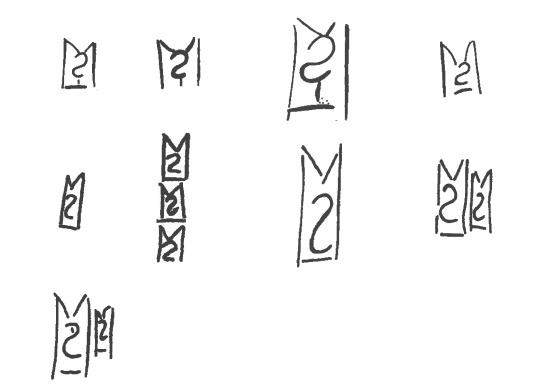
Marie-Louise B. Nosch, The Textile Logograms in the Linear B Tablets, pp 133-138
More research and construction below the cut:
The theory that the garment is a full-length tunic is further supported from imagery from the time, like these figures from the c. 1400 BCE Hagia Triada Sarcophagus. This detail from the sarcophagus shows three figures in some kind of procession, 2 women and 1 man. The woman at left wears a tunic with some kind of pelt as a skirt, and the other 2 figures wear tunics without anything over them, showing that they are one continuous, ankle-length garment.

Some of the most important resources for interpreting how the heanos was constructed comes from the two women depicted in the House of the Ladies in Akrotiri, wherein the side seams of the tunic are clearly visible running along the side of the body and under the arm.
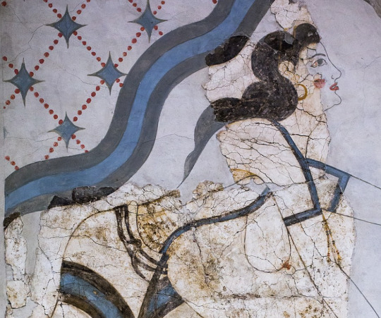
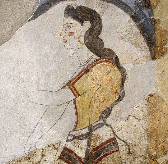
details of figures from the House of the Ladies, Akrotiri, via Wikimedia Commons
advadbsvasb


Diagrams from Bernice Jones' book Ariadne's Threads, p. 82, via Gorgeous Tangents
The heanos itself is made of 3 pieces of fabric: 1 back and 2 fronts. These diagrams show a concave hem like on the labrys-shaped kilt but I went with a straight hem, which is an equally valid option. The end of the sleeves are level with the edge of the hem at the widest point. This would probably be the width selvage-to-selvage on the fabric, being narrower than fabric widths commonly are today. There are 4 seams: the shoulder seam, the two side seams, and a front seam (optional, but recommended if you would prefer not being arrested.) It may be tempting to fold the fabric across the shoulder, so the only sewing is side seams and a neck hole, but this makes a weaker garment overall. I used this as a shortcut in my fitting muslin and it caused tears and weak points at the three points of the front opening.


my fabric was a lightweight, moderately loose-woven cotton with a supplementary weave pattern in squares and diamonds. Linen or wool would have been more accurate but also? much harder to find from online quilting stores selling fabric for affordable prices. The main fabric is dark orange and the pattern is made out of pink/lilac threads. This weaving technique resulted in a LOT of long floats (unsecured expenses of thread) on the back--you can see how the wrong side of the fabric is much pinker than the right side. These floats could snag easily if I wasn't careful, so while it made a very effective visual for this tunic, I do not think that this fabric type would be viable for everyday wear. I'll leave it to people who actually know about weaving to ponder what more accurate weaving techniques would be.
Construction
The overall pattern is basically a T-shaped tunic, and the most important measurements are shoulder circumference, shoulder width, bust circumference, and the shoulder-waist length. In addition, you need measurements for the bicep, waist, shoulder-navel length, and hip circumference. After working out the fit with a muslin, I ended up with this pattern, 1 of 4 identical quarters.

Your first impulse may be to make the tunic very close-fitting, since the depictions in frescoes are skin-tight, but since the pattern has no added gusset this is a recipe for Cannot Move Arm. So I gave a very generous curve under the arm, which also made the dress look better when my arms were down, avoiding armpit wrinkles. I continued that ease into about an extra 2 inches added on to my waist measurement and plenty of extra space around my hips so that I could do exciting things like Sit Down.

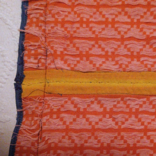
I sewed the shoulder and side seams using the machine, and felled the raw edges on each side of the seam by hand with a whipstitch. I foided back the front edges of the v-neck instead of cutting them, which was a tip I got from the Gorgeous Tangents blog. This strengthens the neckline and keeps it from stretching, and also means that everything can be readjusted if you have size fluctuations or just want to modify the tunic into something more or less modest.
I whipstitched the front edges together by hand--the contrasting selvage didn't matter because it would be covered up by trim. I ended up cutting the tunic a liiiittle shorter than I wanted, so I finished it with some leftover bias binding instead of hemming it to conserve as much length as possible.
Trim

I custom-ordered the woven tape trim from Long Creek Mercantile. Both are made of wool--the "header band" and the hem trim are 1 1/4" wide and the center-front and cuff trim are 3/8" wide. I observed that most images of the Minoan heanos show trim with two colors at most, in a simple geometric or linear pattern, so I consciously restrained myself from ordering anything more elaborate. The clothing on Minoan frescoes is characterized by strongly contrasting colors, so blue trim was the most obvious, and best-looking option. Orange tunics with blue trim appear multiple time in art like the "Dancing Lady" fresco from Knossos:

Dr. Jones suggests that the band across the shoulder would historically have been a header band--a band of threads woven at the beginning of a project in order to properly space the warp bands (see her diagram at the beginning). That may be a reason why the shoulder trim often depicted under the front or sleeve trim, as shown above. Regardless, the trim almost always coordinates.
I sewed on the shoulder trim by hand, the sleeve and hem trim by machine, and the center-front trim with a combination of both.
Tassels
Many frescoes from Akrotiri and Hagia Triada show the ends of the supposed header band turned into tassels. This embellishment is not universal among heanoi, as you can see from the "Dancing Lady" above, but it does add a fun little something!

(yes, my Lounging Pants are very fashionable)
I turned the excess ends of the shoulder "header band" trim into fringes, knotting the yellow ones into a lattice and turning the blue yarns into tassels. The lattice-tassel appears on a fresco from Hagia Triada:

Reproduction of fragmentary fresco from Room 14 at Hagia Triada, Crete
The saffron gatherers from Akrotiri shown below have clearly displayed fringes at the ends of their sleeves. The one on the left has red fringes that appear knotted or ravelled/unravelled in an undulating pattern, and the one on the right has fringes that may be either beaded with papyrus-shaped leaves or cut into short tassels.

Another option is leaving the fringes loose, as seen in the Akrotiri frescoes from Xeste, room 3:
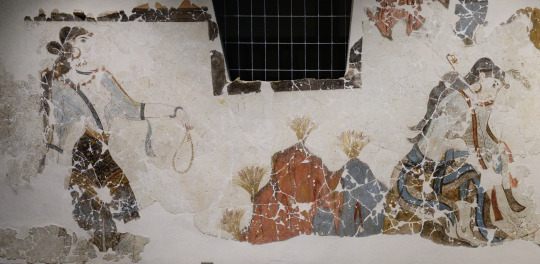
The final garment was super comfy, actually! It's much simpler to create than I thought it would be based on the frescoes, which made it all feel pretty magical when everything came together. I did think it was a little unusual how tailored this garment is, and the potential waste of fabric that comes from a shaped garment, especially compared to how later ancient greek clothing was mainly rectangles. I don't know enough about bronze-age and earlier clothing to have any idea how typical this was, since I'm extremely Not an expert on this subject, but am always open to learning more!
500 notes
·
View notes
Note
do you have any thoughts abt ghostface beomgyu? sounds so hot….. match so well w him…
This hatched the hugest idea ever and I rewrote this like three times till it was perfect. I may rework it again and make it an actual and better work.
Warning: stalking, mentions of blood, killing


Ghostface! Beomgyu, obsessed with the movie Scream and eager to create his own films, found that his attempts lacked the gore and realism he craved. Despite his charm and popularity, his supposed friends tormented him daily for his unusual interests but kept him around because of his wealth and connections. His home life was no better; his single dad would consistently beat him whenever he was stressed. This pushed him to figure out exactly how to make his movie real.
You were the one who saved Beomgyu from your friends' bullying with a simple, "Alright, guys, that's enough, let's get out of here." He mistook your fleeting empathy for a deeper connection. Your intervention was a rare moment of compassion amidst the cruelty, so he became obsessively attached to you.
Your kind eyes, curly hair, and sweet voice captivated him. When he devised his killer plan, he spared you, setting up cameras in your home as well as your shared friends' to gather dirt and intel, waiting for the right moment. He focused mainly on your place, intrigued by your secret love for horror films and the scantily clad way you dressed to sleep.
He wanted you in more ways than one and he was determined to have you.
Ghostface! Beomgyu began his plan, steadily taking out his targets without getting caught. With each victim, he left romantic cryptic messages for you—anonymous notes, unsettling silent phone calls—testing your loyalty and curiosity.
You were driven half-insane by the killer's interest in you, feeling both special and on edge.You always did have a thing for the masked killers in your movies.
After his latest kill, Ghostface! Beomgyu got injured and went home instead of visiting you. Blood ran down his face from a hit to the head, hair sticking to his sweaty face, his jaw clenched in anger for letting his target land a blow. In his rage, he went overboard, stabbing the victim more times than intended. He decided to put together a little gift as an apology for not seeing you immediately after his kill.
A hard knock on your door woke you up that night. The sound echoed through your quiet house like a gunshot. Heart pounding, you slipped out of bed, casting nervous glances at the clock—3:00 AM, the witching hour.
You opened the door to find a small package lying on your doorstep, wrapped in black paper with a blood-red ribbon. Trembling, you picked it up and unwrapped it carefully. Inside was a VHS tape, old and worn, with a handwritten note attached: Watch me.
Your hands shook as you inserted the tape into your parents' old VCR player. The screen flickered to life, displaying grainy footage of familiar places—your friends' homes, the places you frequented, even snippets of your own daily life.
The camera angles were voyeuristic, as if someone had been watching you for a long time.Then, the scene changed—a masked figure appeared on screen, clad in the iconic Ghostface mask, holding a knife. The figure turned to face the camera, and for a chilling moment, you could swear its eyes met yours through the screen. The perceived eye contact sent a shiver not only down your spine but somewhere else also.
A distorted voice echoed from the speakers, "Do you like scary movies, darling? Because this is just the beginning. Check your phone right about... now."
Right on cue, your phone received a message from an anonymous texter: "So, do you like scary movies?" Your heart raced, a mix of fear and excitement flooding through you. You replied cautiously, "Who is this?"
The response was instant: "Your new favorite horror movie villain."
#tyuns-world#[💌] anon!#[💌] - requests#txt x black reader#tomorrow x together hard thoughts#black reader#beomgyu x reader#beomgyu hard thoughts#choi beomgyu#txt beomgyu#txt x reader#beomgyu#tomorrow x together#txt hard hours#drabble
120 notes
·
View notes
Text
Emphasizing Louis's Beauty
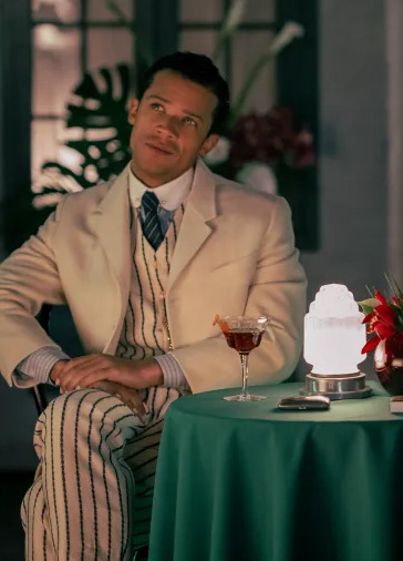
I've talked previously about how Louis in the 2nd half of the season is rarely seen in suits anymore but what about the earlier episodes when he wears a wide array of colorful suits while he is still performing his role in human society? What stands out is how many vibrant colors and patterns we see him in vs. Lestat who is always in some kind of tan, gray or navy. A lot of this is simply historical record as vibrant colors were more typical of black male dress of the era and we see that Louis is trying to maintain appearances, but on the show his bright costuming always stands out from other background male characters black OR white (confirmed by the costume designer that his colors are like a flame drawing Lestat in) and the tailoring and color choices often stands in contrast to Lestat on screen next to him in a more traditional masculine (aka duller) color. I mean compare this to how romantic period dramas typically style the men and women.


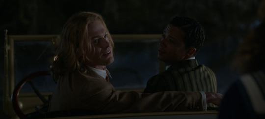
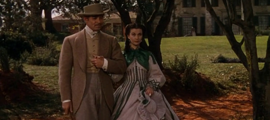
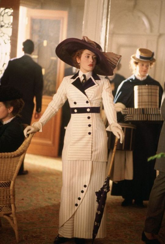
Beyond the historical nods, which most tv viewers don't have detailed references to as there aren't many color images we have from that era, I think the show does a great job of connecting cultural references everyone can immediately pick up on (the Leydecker outfits were obvious examples). For example, if you think of a white stripey suit from the 1910s, the image that came to mind was probably Rose in Titanic. So even as Louis is projecting what was period standard masculinity, what the modern viewer is likely thinking of is a tailored suit worn by the female protagonist in one of the biggest movies of all time. These looks screams high fashion latest designs from Paris, decked out pampered princess of the ship ("prince of your district").
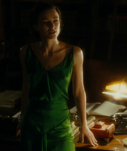
In the same vein, when you imagine an iconic green period costume you're probably thinking of Keira Knightley in Atonement. In fact if you google "green suit in period film" all the results are of women. Rarely are men put in these colors in period romances particularly. I mean I think they put Keira in that green dress simply because she looks incredibly beautiful in that color and that's also how I feel about Louis in his green outfit.

I've talked before about the use of red on Louis but looking at the actual context of when Louis wears red they are specifically scenes of lust (w/ Jonah), shame (the slutshamig w/ the soliders) or anger/revenge (killing the Alderman) and hello look at these!!


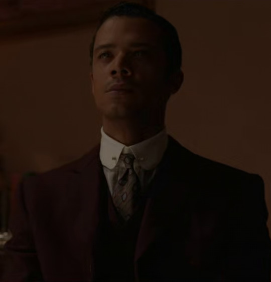
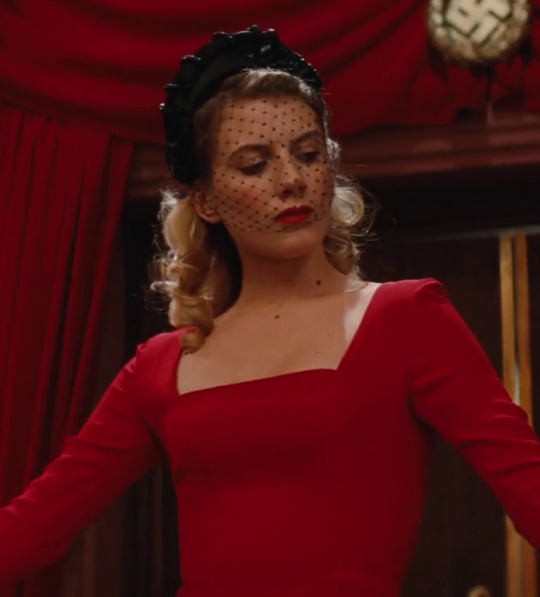
And this is really an exclusively female character trope where vivid color costuming is used to convey mood or emotion! When a man is angry or lustful in a film, he's never wearing red, he's just wearing a boring color like black or grey. Evil and goodness are conveyed by black vs. white costuming with men (i.e Lestat's evil black darth vader get up) but rarely any colors not on that b&w scale.
Also speaking of cultural references in costuming here's this again.
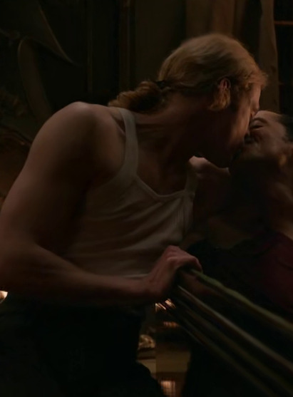
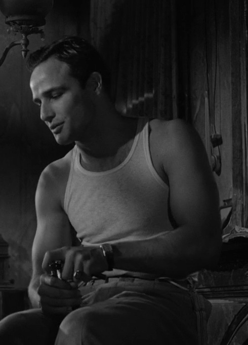
#iwtv#im making everyone look at the wifebeater outfits with their eyes taped open like its clockwork orange#my point is the costumes make louis even prettier while they make lestat appear powerful#(and scary)#so many outfits highlight how broad his chest is and his giant ass biceps#costume analysis
422 notes
·
View notes
Text
Loki’s costume at the end of S2E6 was perfect.
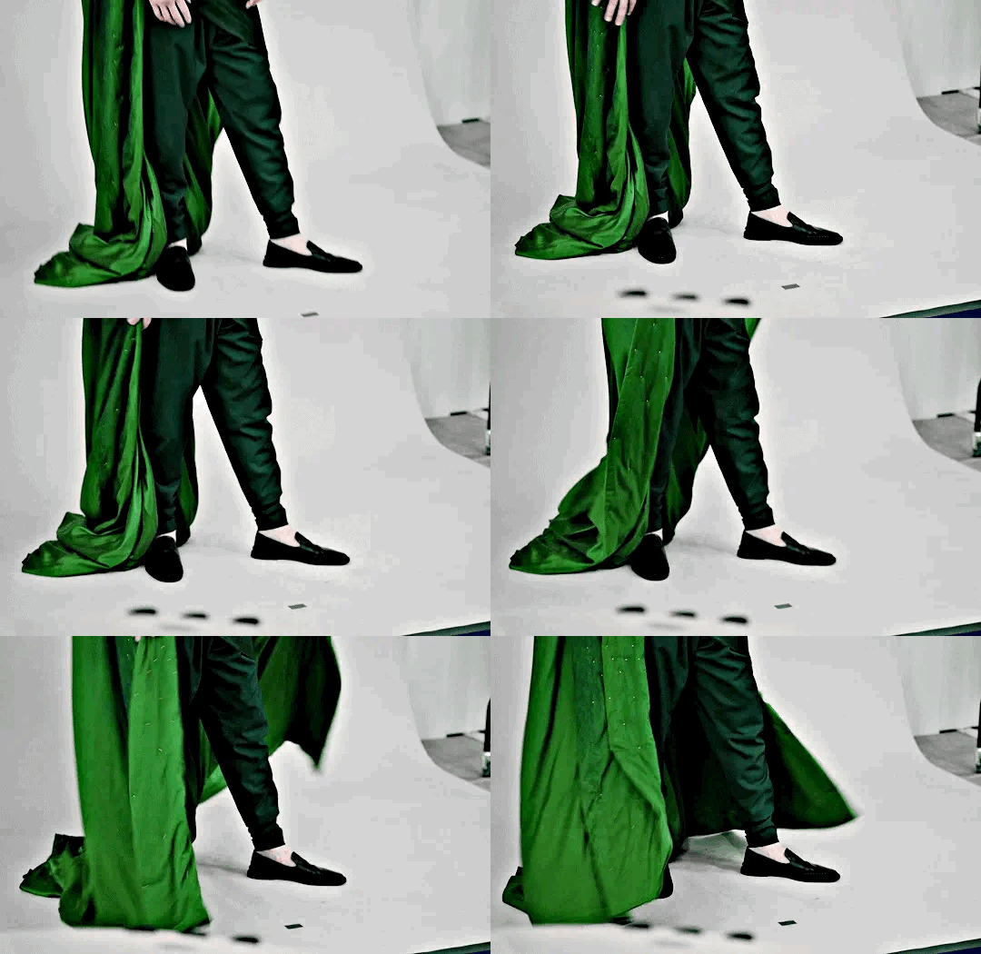
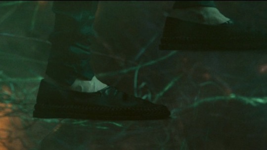
Yes, every part of it, down to those slippers.
And here’s my unsolicited (and delayed) thoughts on the matter.

First, let’s talk about his robe. Not only was it utterly beautiful, down to the draping and the deep, rich shade of green (and I mean come on, would we expect anything less?), its style was incredibly symbolic.
If you look at previous Loki ensembles, especially the ones that include a horned helmet, there is an air of grandeur and finery about them. The exquisitely stitched, buttery leather; the shiny gold trimmings and metal armor accents; the dramatic, billowing capes and overcoats. Even the silhouette of these looks is broad and structured — one might even say severe. Everything about these past looks screams “Look at me; I’m important” and reinforces Tony’s own observation in The Avengers that Loki is a “full-tilt diva” — he longs for the respect and attention that he deserves (and has been denied almost all of his life) and that longing is reflected in his clothing. They are reminiscent of the royal palace in which he was raised. They allow him to be battle-ready, because he’s had to fight and claw for every scrap of love and attention he’s managed to get. They represent a broken prince. A warrior cloaked in royalty. A would-be-king.
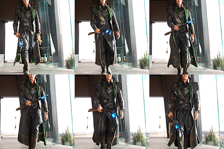


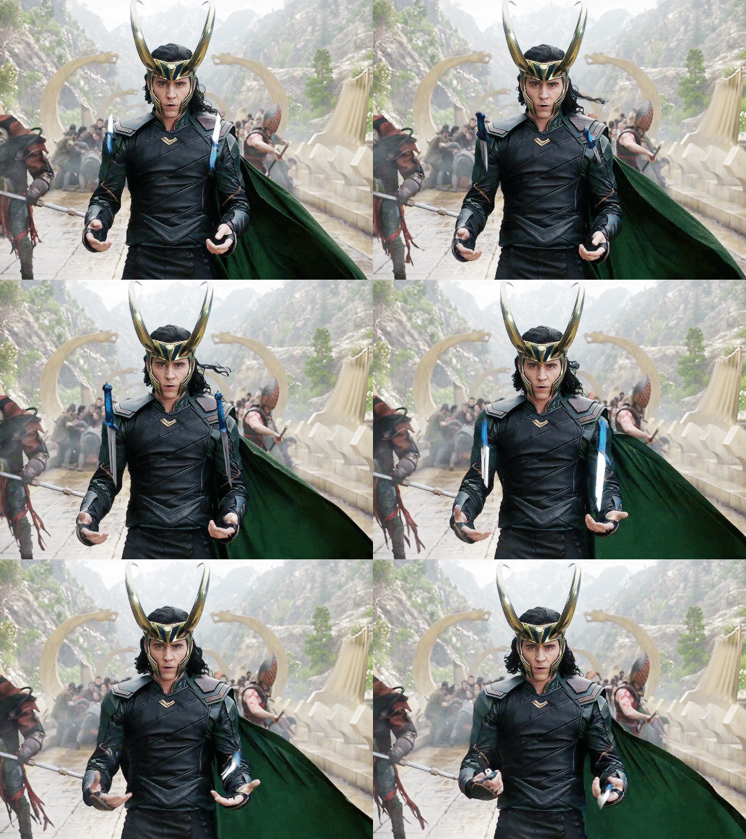
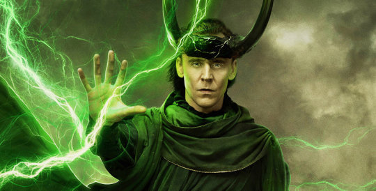
Now, compare that to his robe in Loki S2E6. It isn’t flashy. It has a soft silhouette. The shade of green is deeper and richer than we’ve seen; more earthy. An earthy shade of green which, in my opinion, is a nod to Yggdrasil, the cosmic tree that he will weave the branches of the multiverse into. The gold trimming across the front is subtle and understated - I even missed it at first and didn’t realize there was any gold trimming on the robe at all until I got a closer look later. It is simple. The draping is reminiscent of the robes worn by Buddhist monks. His robe reflects a Loki that has more wisdom and humility, and who has realized that being a good king — a proper god — means he will spend his life in service to others. It is the robe of a man who is confident and self-assured and knows exactly what kind of god he needs to be.
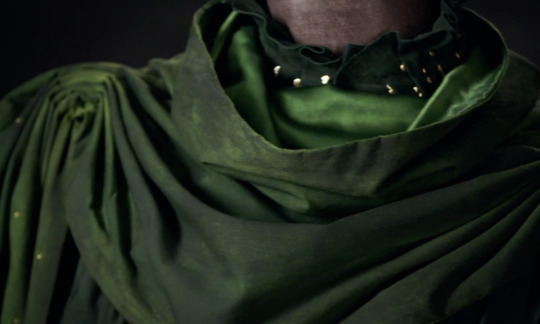

Now let’s talk about the slippers. I noticed that they got quite a bit of flack immediately after the finale aired. And I get it — they’re an odd choice, especially when we are so accustomed to the dramatic boots and finely-crafted and statement-making dress shoes he typically dons. For similar reasons as the robe, they are symbolic and fitting for Loki’s development into a wiser, more humble character. Don’t get me wrong, these loafers are still impeccably stylish, and no doubt they are of the finest craftsmanship, because this is still Loki we are talking about here. But they have a purpose, and that purpose is to get him to his final destination. These simple slippers barely even protect Loki’s feet, showing us a kind of vulnerability that we’re unaccustomed to seeing from Loki. He isn’t guarded in this moment; he’s open, connected to his purpose, and sure of himself. The shoes aren’t for battle; they aren’t meant to impress. They are meant to serve.

Now, about what is, quite possibly, my favorite feature of the costume. The horns. These iconic horns which we’ve associated with Loki from the very beginning take on an entirely reimagined look in the finale. First of all, they are bigger than any set we’ve seen resting upon Loki’s brow. So big, in fact, that they weren’t actually a physical part of the costume Tom Hiddleston wore. So big that they would likely hinder his performance if he actually had to bear their weight on his head.
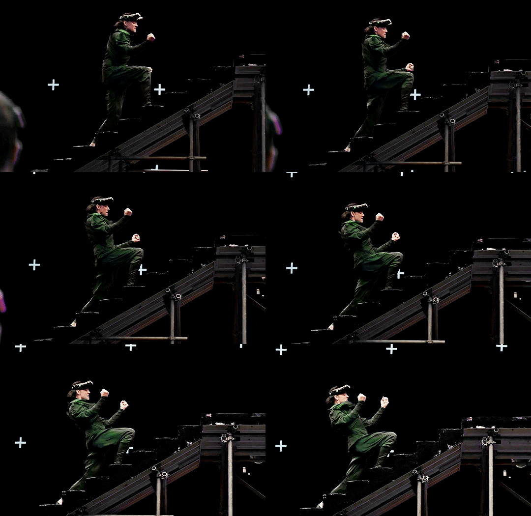
In addition to their size, the horns are made of the same temporal-infused material from which both HWR’s talisman and the citadel at the end of time are constructed. Gone are the opulent golden horns that glisten and shine with the grandeur of royal finery. These horns are dark and heavy. They symbolize the unfathomable weight of the burden that Loki bears in his godly endeavor to save the multiverse. The golden temporal material that runs throughout the horns like veins is reminiscent, to me, of Kintsugi, the Japanese art of mending broken things with gold. And in a way, Loki is a broken thing that has been healed and mended throughout his personal journey of self-acceptance and friendship, and is now more beautiful than he ever has been. More humble. More selfless. More godly.

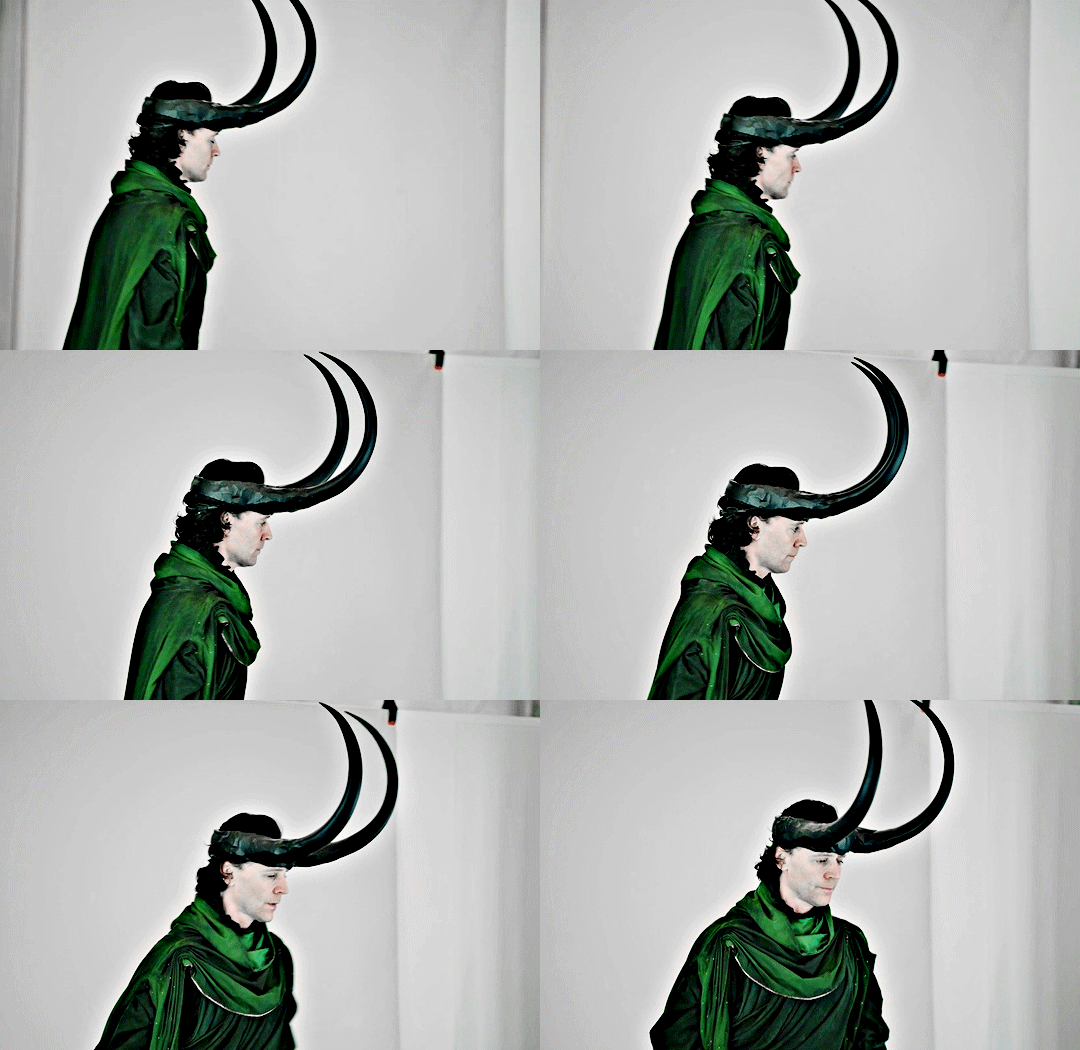


In addition to the horns, the cape, too, is the largest we’ve seen Loki wear. And while at first, this dramatically oversized cape may seem to stand in opposition to the humility that the rest of the outfit encapsulates, it works. It works because, like the horns, it is symbolic of the burden Loki has chosen to bear. This cape would be unbearably heavy; it would make even the most basic movement difficult. And on top of its sheer size, his cape even becomes torn into strips that are woven into the timelines themselves, literally securing his burden — his service to the multiverse — around his neck.

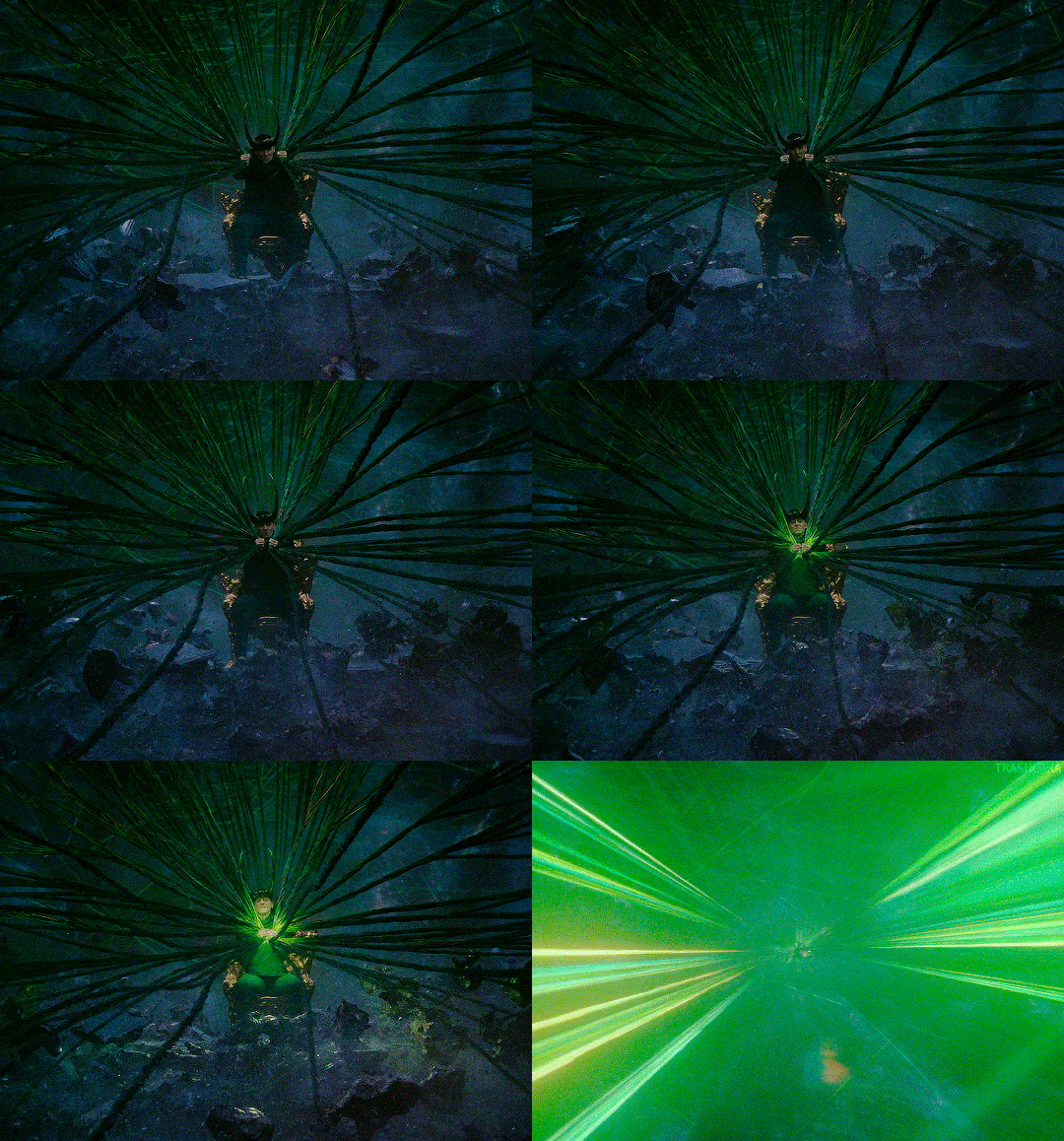

Lastly, I want to talk about the way this outfit manifested. There’s been a common thread throughout this discussion about the humility and selflessness that this ensemble puts on display. And while that’s true, we’re talking about a relative level of humility and selflessness, when compared to Loki’s previous tendencies. This is still Loki we’re talking about here. He’s got a flair for the dramatic. He’s nothing if not intentional about the way he presents himself. And the way he marched down that gangway like it was his own personal runway, while his clothing fell away in shreds and tatters to reveal this completely fresh but familiar look, was completely on-brand for him. It was theatrical. It was glorious.
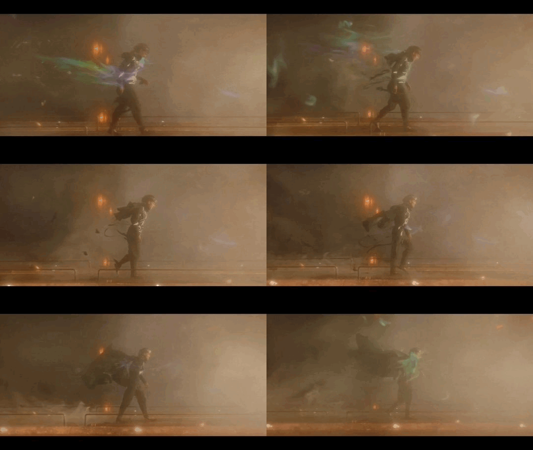
His outfit at the end featured accessories that were heavy and larger than life. Those parts were a burden.
It wasn’t short on the style and drama that we’re so accustomed to seeing from Loki. It was glorious.
And every part of it, down to his humble shoes, was fit for purpose.
One look at this finale costume and you know, without doubt, that Loki is burdened with glorious purpose.

A/N: If you’ve made it this far, thank you for reading my unsolicited thoughts on this beautiful piece of costume design! Also, apologies for the delay in posting. I know some of you have been told this post was coming since the night the finale aired, weeks ago. Thank you for your patience with me as I gathered my thoughts and found the time to organize them and type them out.
🏷️ @peachyjinx @acidcasualties @muddyorbsblr @lokischambermaid @lokisgoodgirl @mochie85 @tallseaweed @give-me-a-moose @fictive-sl0th @coldnique @maple-seed @loopsisloops @gigglingtiggerv2 @simplyholl @superficialdomina @mischief2sarawr @ijuststareatstuffhereok89 @wheredafandomat @liminalpebble @ladyofthestayingpower ++
#loki#loki season 2#loki series#loki show#loki finale#glorious purpose#burdened with glorious purpose#costume design#loki costume#joyful enchantress writes#costume analysis#costume symbolism
352 notes
·
View notes
Text
✨The Sherlock Holmes Museum✨
221B Baker Street, London
hi turtles! here it comes: the photo post to the sherlock holmes museum. i'll include my favorite pictures & the information i could actually keep in my silly brain (probably none). i'll number the pictures, so you can keep track.
please keep in mind that the place was pretty crowded and i couldn't take pictures of everything in perfect quality/from the perfect perspective.
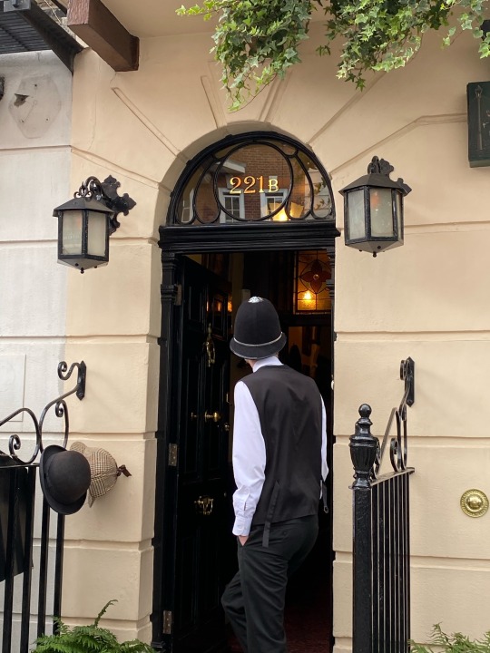
the entrance (1) looks like this:
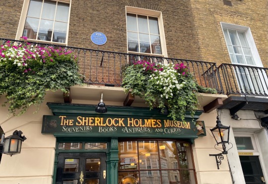
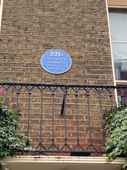
i especially loved the little blue sign (2) above and the "policeman" (3) dressed in a victorian policeman outfit - with a sherlock holmes tie 🥹 (i didn't get a picture of that, i thought it'd be weird to take a picture of him)
the living room (4).
there were two comfy looking armchairs, a fireplace (sadly without billy the skull 😔), and in the right corner you see the chemistry set of Holmes. with the violin right next to it.
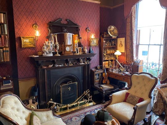
in general, they tried to create the rooms exactly how Sir Arthur Conan Doyle described them in his books. it was described as small but with two big windows to the west side (was it west?? i can't remember...).
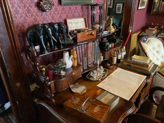
on the left you can see the desk (5), which i think was used by both: Holmes and Watson (not 100% sure about that tho). on the right you see what was hung up on the walls (6) (the guns lol).
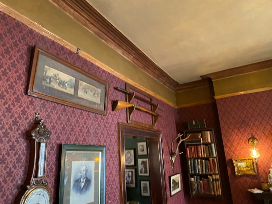
on the opposite wall of the fireplace, you see the shooting marks (7), made by Holmes: the intials "VR" stand for "Victoria Regina" (= Queen Victoria) (Holmes' way to say "long live the queen" i guess? this man was fun when bored...)
and i took a picture of the "The Times" page (8) which laid on the desk because... apparently! i was in the musuem on the day Holmes and Watson moved in together (*johnlock heart explodes a little bit*) and you can see the date somewhere on there... (i found it. but i think she lied to us... imo it says july the 5th and i was there on august the 27th (*dramatic voice* UNbelievable! *excessive eye-roll*) (okay maybe i misunderstood her??? idk))
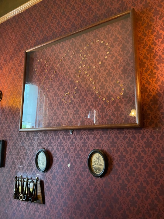

let's move on to Sherlock Holmes' bedroom.
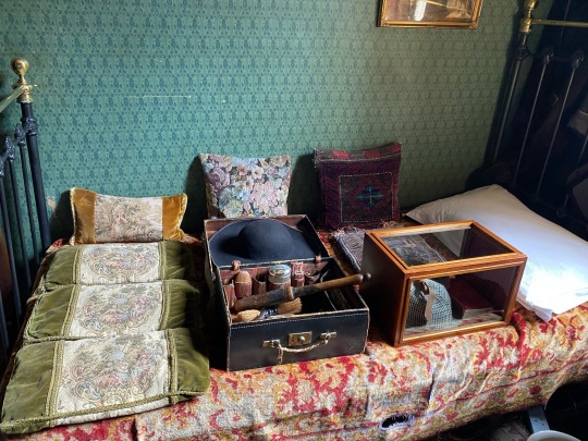
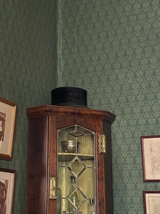
on the bed were laying two boxes (9). one was with... idk random Holmes-stuff (honestly can't remember what she said to that...) and the second was with the iconic deerstalker inside. funfact about the deerstalker: ACD never mentioned this to be a signature feature of our beloved detective. this only became a thing later on. some dude, whose name i can't remember (i warned you about my silly brain), just decided he'll use that in a film production, because it would be much more accessible for the common folk. deerstalkers were mainly used by hunters and the working class. because Sherlock Holmes, who lived in a rather wealthy neighborhood, was a man of the upper class, he would have worn a different kind of hat (10).
this post is part 1 of a series, because apparently you can't upload more than 10 pictures per post (🙄🙄🙄). links for the next parts will be included once all have been uploaded.
-> part 2
-> part 3
keep reading - tag list
tag list! @justanobsessedpan @helloliriels @catlock-holmes @fluffbyday-smutbynight @inevitably-johnlocked @hisfavouritejumper @rhasima @forfucksakejohn @ohlooktheresabee @turbulenttrouble @so-youre-unattached-like-me @totallysilvergirl @peanitbear @train-mossman @loki-lock @smulderscobie @timberva @grace-in-the-wilderness @chinike @jawnn-watson @whatnext2020 @escapingthereality @missdeliadili @kettykika78 @musingsofmyown @7-percent @speedymoviesbyscience @astudyin221b @francj15 @we-r-loonies @mxster-jocale @sherlockcorner @noahspector @our-stars-graveside @jobooksncoffee @baker-street-blog @macgyvershe @myladylyssa @battledress @a-victorian-girl @dreamerofthemeadow @oetkb12 @ohnoesnotagain @mutedsilence @jawnscoffee @raenchaosandcozyadashofmurder @a-victorian-girl @lisbeth-kk @quickslvxrr @safedistancefrombeingsmart
#lollipop lollipop looollipop-oh lolli lollipop!#er idk for some reason this is in my head since i wrote my tagging list lol#ignore this#ANYGAYS:#long post#sherlock holmes museum#221b#221b baker street#sherlock holmes#john watson#acd#acd canon#acd holmes#acd watson#holmes#watson#photo post#turtely's OP
279 notes
·
View notes
Text
well hello there
here is aphmau in my au/rewrite
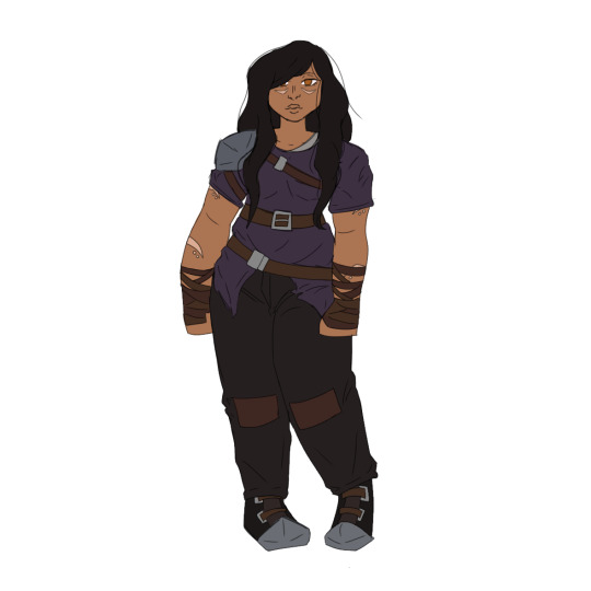
i tried to draw her in as many of her iconic outfits as possible but good irene she has a lot [click for better quality]
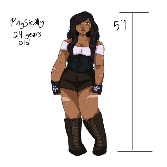
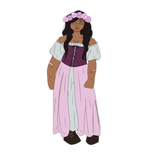
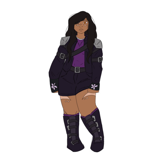
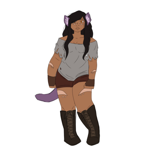
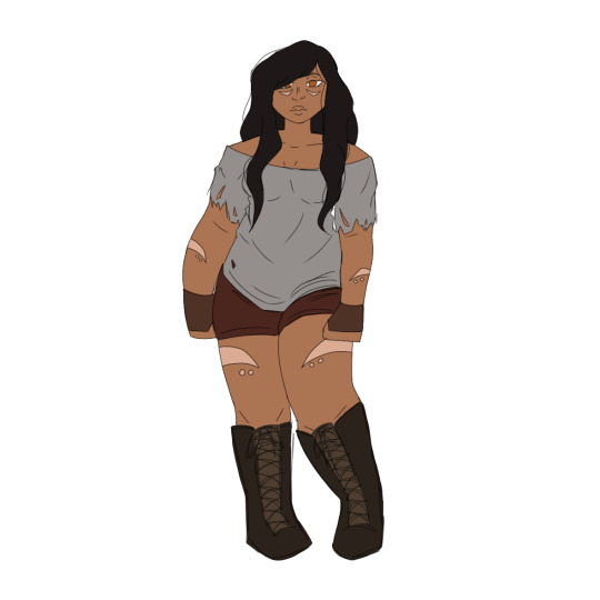
so here are some changes and headcanons i have for aph in my au:
•she’s neurodivergent. not entirely sure what specifically, probably adhd. for sure dyslexic.
•she has sensory issues, which is why she’s usually in shorts. she feels like she can’t move properly in a dress for pants.
•so in my au she is irene just like regular canon. i gave her her markings but you might notice they’re different; here’s why: so in my au, scars and tattoos can both be used as runes to conduct magicks. scar runes amplify one’s existing magicks while tattoo runes bestow a certain magicks ability to a person (even if they already have one to begin with). though this practice is outdated and illegal in most parts of the world. because irene’s abilities existed prior to her become a divine warrior, she scarred herself to not only enhance said abilities but to also show her true dedication. nowadays no one, except maybe zoey, actually knows what they are or what they’re for exactly.
sorry that was a lot… ANYWAY
•when irene locked herself away, she tried to dress in a way she thought might help her blend in in whatever time she popped back out.
•she was wrong.
•phoenix drop gets really hot, especially in the summer, and it doesn’t snow there. aphmau uses it as an excuse to wear shorts all the time.
•when she first showed up she wasn’t as clueless as they made her seem in rebirth. she was just as aware as she was in the og beginning (except no she didn’t think she was playing minecraft) her reason for helping out the village was basically this: “oh look a village, cool i needed a place to stay. oh man these guys are in rough shape, they don’t have a lord?!? ah geez no one’s helping them, guess i gotta help them. oh shit they made me lord!” ok maybe not EXACTLY like that but yk
•she’s not a pick me in this universe :) and she doesn’t lead people on.
•when garroth first noticed how hard she was working on the village without even being asked, he bought her some gloves so she’d stop tearing up her hands. he bought some basic fingerless leather gloves but payed extra to have them dyed black and embroidered with lil purpley pink flowers. he hopes she’d like them and that his gesture wouldn’t come off as clunky or weird. she loved them and keeps them with her even when they’ve gotten too worn to wear.
•laurmau is endgame. aph and aaron never have any kind of romantic relationship. he’s more of a mentor to her. (i’m sorry garmau lovers i love y’all but laurance is my guy)
ok
so that’s all folks, i’m sure i have more headcanons and changes for aphmau but none come to mind right now. feel free to leave suggestions tho :)
garroth is next >:)
#aphmau#minecraft diaries#aphmau fandom#i don’t support aphmau#mcd#minecraft diaries aphmau#aphmau au#mcd aphmau#aphmau mcd#aphmau minecraft diaries#aphmau redesign#aphmau rewrite#aphmau mcyt#mcyt#mcyt au#character design#lady irene#aphmau irene#irene mcd#headcanon#aphmau headcanons#mcd headcanons
151 notes
·
View notes
Note
im sorry your takes are generally pretty great and i appreciate the space you make in fandom but i find the dismissal around lestat's queerness to be diminishing.
louis is a fantastic gay character and u r right about how he represents his queerness which is fabulously. he is mother he is fashion he is wife, a lot, and lestat is a lot more masc in aspects of their dynamic. louis also struggles with it, had internalized homophobia, and his relationship to his sexuality is fraught. now you can have that complexity and still be a "gay icon" sure but what i see here is a gay man existing. not every gay man existing has to be ~iconic~. louis is working on himself.
lestat is a different person and is going out there to make a mark on culture actively, regardless of why. he's not putting on a dress for five seconds (which btw was still pretty impactful in context but ok), he is being meaningfully gnc and making art. this is what queer culture is. it's frustrating to see this element diminished like it's just a meme or a bunch of people being thirsty.
im all for critiquing fandom being weirdos about it but i think the showrunners are doing something spectacular and pretending like fans are making lestat into something he is not just isn't the vibe.
reading this made me realize that I left out a sentence in this ask, so it did come off differently than I intended. I'd meant to say there's already been a lot of exploration of characters / ppl like lestat, but there's never been a character like louis before. I wasn't rly ever talking about lestat's queerness itself, I was talking about how he's prioritized bcuz he's white.
if u personally identity with him in this then that's ur right to, obviously. no group is a monolith and I was never trying to say one way is more "right" than the other. I rly do apologize if it came across like that, cuz I can see why it did.
"he's not putting on a dress for five seconds (which btw was still pretty impactful in context but ok)"
I don't rly know what u mean here bcuz within the show, nobody comments on the dress. ppl react to the baby but everything we know of the dress otherwise was only revealed by carol cutshall bts. I don't know what impact ur meaning here. to the tv audience, sure, but the NOLA audience?? or is it the fact he designed it in the first place.
tbh the thing I most noticed was that once again a white, european immigrant got to be center stage in an event that louis, as a black, louisiana native, isn't (like the card game lestat already had a place at more favored than louis earlier in S1). he also was able to wear that dress in public without public scorn (being european prbly helped here too, he's "other'd" but not the same way as louis is "other'd" for being black), which is something louis could never have done and actually survived at all. it's not that lestat doesn't experience homophobia otherwise, but he's still got a lot more room to confront it than louis, claudia, or armand would have, as ppl who would be confronting homophobia *and* racism with no access to white privilege (claudia literally dies in the same hour we see lestat confront a homophobe otherwise on his and louis' behalf and "win").
idk what they're going to explore for S3 yet, but what we've seen so far is....not that deep tbh. it's not even especially "queer." we're aware he is so we know it is, but straight men have worn makeup and flashy outfits and done homoerotic shit as musicians before too. very often. nothing we've seen from lestat so far has been pushing any boundary as a queer artist or making any kind of statement. I'm not trying to sound like a total bitch here, but a lot of what ur saying is pushing this white fandom agenda of the "importance" of so much that any white, queer character does that....just isn't. lestat's image and sound is taking a lot from other ppl in real music history who *were* doing groundbreaking things at the time, straight or not, but what he's doing is just wearing it as a costume rn. his lyrics even say "I'm an actor / in my makeup." like I said, S3 in full will bring more to the table, obviously, but for what we've seen so far....this hasn't said anything in any objective way that's "deep." u can still like it and identity with it, but idk how u'd argue that it's doing anything tbh. ur welcome to do it tho, I'm not trying to shut down the conversation here. I'm just giving my perspective. I *do* actually think this is stuff we should talk about exactly *bcuz* fandom rides so hard for it all the time. it should be explored why that is, what's the logic behind it. I rly am interested.
edit: wanted to add too that p much everyone we see in this show is queer and creative so literally why is nobody ever saying all this about louis' photography, claudia's acting and interest in fashion (or her general observations on the world thru so many diaries that are referenced in multiple ways as she's not around anymore to speak otherwise), armand's theatre work, madeleine's dressmaking. that's usually why ppl comment on lestat, bcuz he's the most noticed and praised but he's literally not the only one doing it at all.
#asks#interview with the vampire#amc interview with the vampire#interview with the vampire amc#iwtv amc#amc iwtv#iwtv 2022#louis de pointe du lac#iwtv claudia#lestat de lioncourt#rockstar lestat#gay#queer
39 notes
·
View notes
Text
Rating Klinger Outfits on Flamboyance Because I’m Bored: Part 1
This is in no way an exhaustive list, nor is it meant to imply any of Klinger’s outfits are not fabulous. Because they are. It’s more of an excuse to talk about Klinger’s outfits and how much I love them. Also I don’t have any fashion training whatsoever, so this is just for fun.
I’m going to do a part 2 because I don’t want this to be giant and it already is pretty big
Anyway
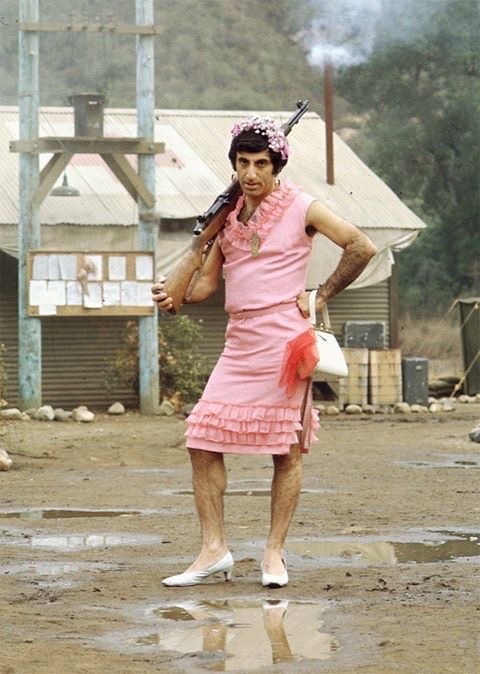
one of the ones I see the most often
Iconic
The pose. The sass. Amazing
Honestly one of his more practical outfits
I love any outfits where Klinger has flowers in his hair argue with the wall
I’d wear that to a spring picnic
6/10 the flowers in the hair give it more points, but overall I think I’d see a woman wearing that at church on Easter Sunday

MORE FLOWER
And the fur coat? The ring? THE FEATHER?
Right this way madam
Stunning
I don’t think I’d wear this though, red may be Klinger’s color but it is sadly not mine
And the pose? He’s such a ham and I love him for it
11/10
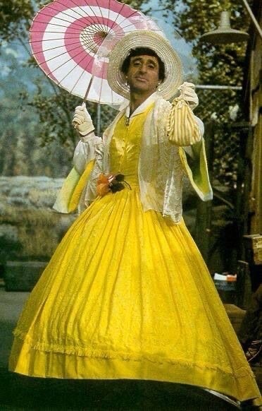
Scarlett O’Hara who???
The yellow is lovely
And the parasol?? Incredible
And the gloves? And the hat?
It’s so much it’s so much
The hoop skirt? WHERE DID HE GET A HOOP SKIRT
It’s giving rich southern belle
1000000/10

The tiara is beautiful and so is the dress
Very similar to the first one though, but feels more like evening wear while the other one is church wear
The mink? (I think it’s mink??) Lovely
He looks like a princess who is undercover and trying not to be recognized as the princess but is failing
8/10 gains points because of the fur and tiara
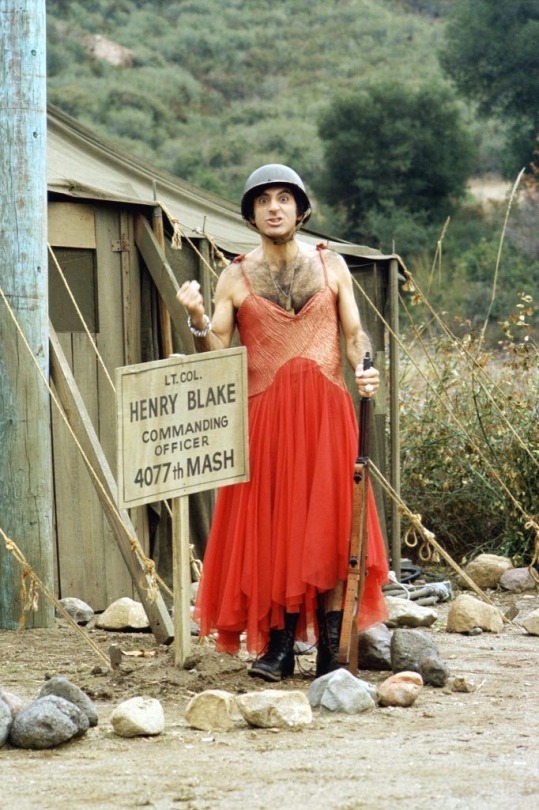
Simple but nice
Looks like the kind of dress I would’ve worn to a middle school dance though I’m sorry
I love it though, and coupled with the army boots and helmet makes it much more unique
Also the low cut?? Ok I see you
7/10 because of the skirt volume
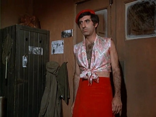
Again, red is such a great color on Klinger
Cute, not crazy but definitely cute
The blouse is my favorite part, it’s so cute
The hat pulls it all together I think
4/10 for flamboyance, the chances of me seeing someone wearing a similar outfit in the wild are decent
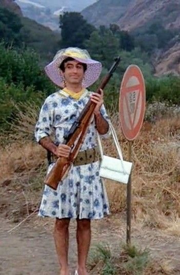
Another good spring outfit
The dress is pretty practical, and nice
It kinda reminds me of a hospital gown though
Which is topical
Klinger definitely slays every outfit he’s in, but I’m not actually super big on this one
It’s nice, but it doesn’t stick out to me
5/10, kinda looks like something a great aunt would wear
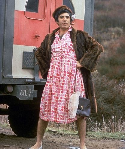
I just realized this dress is going to return in part 2
But it’s two different outfits technically and I have two different opinions
The fur coat definitely makes this one more flamboyant
Also I’m not gonna lie, that coat looks so comfy and warm like I want it
And the matching hat?? Incredible
His stance is also so powerful
Like ok gorgeous
8/10 solely because of the coat and hat

I know this isn’t a dress, but it’s a Klinger outfit
And you know what? I love it
He rocks dresses AND suits, what an icon
I want that hat
However? Not flamboyant at all
Business man core
1/10, the only reason it’s not a 0 is because the hat makes it a little unique for me

Carmen Miranda!! Yes!!
The sparkles? The red fur trim? THE HOOPS??
I wish we’d gotten more of this outfit it’s so amazing
Definitely not very practical though, especially the (incredible) fruit hat
Take it from someone who had to wear a fruit hat for theater, those things are SO top heavy
Very hard to secure, you constantly feel like it’s going to fall off
So props to Klinger
15/10 it’s so much and I love it
All images are from Pinterest
69 notes
·
View notes
Text
Fonts: Body Fonts
I had some free time, and I thought, what could be more fun, than putting together a post of some of my thoughts on my favorite fonts? Certainly not going outside or any activity involving moving from my chair, so font talk, here we come! (Links to where to get the fonts for free included in this post). So of course first up we have the majestic Comic Sans..........I kid! <insert baaing goat gif> While it is surely a most iconic font, I will unfortunately not be covering Sir Comic of the Sans in all his glory. See below the break for the full actual post on my favorite fonts to work with.

Note, my interest in fonts is entirely enthusiastically non-professional. Thus, if there's a technical aspect I called 'the tippy bits' instead of tapers or what have you, uh, my amateur ass doth apologizes.
Body Fonts
Body fonts are the all the main parts of a text. The good ol' torso that carries the headers and stands above the footers. They're the font you see the most of and spend the most time with. They're the part of the text that hugs the eyes, to use an entirely weird metaphor. *** My favorite body fonts are the IM FELL series. Especially IM Fell English.

Look at that pretty serif. It's got a great classic appearance to it that reminds me of old paperbacks. There's a grittiness and unevenness to it that gives a more 'natural' look, and is reminiscent of text from a typewriter. The imperfections of this font (like the uneven tippy bits of that lower case y) are my favorite parts, and they add a lot of character to a text while still being legible. I know some folks may not be as fond of the italicized version of IM FELL, but personally I've never had trouble reading it, and enjoy how fancy it looks. IM FELL English is a font that could work as a letter from a gentleman's daughter to the arrogant, handsome heir visiting town, or as the carefully kept diary of a mad scientist detailing the experiment that would eventually rise up and try to kill him. Fun things like that. *** Next font is Crimson Text (there's a Crimson Pro as well, but I like the Text version better for it's fancier capitals).

Just take a look at that w. Sharp enough to cut through digital paper. And the capital W is even better. The angles, the triple Vs...whew, that letter's a work of art! It looks like it should be walking down the runway at a european fashion show and stared down by an unsmiling stone cold magazine editor.

Crimson Text is a very clean, crisp font. It's got those little sharp tippy bits at the end of letters that look like they could prick you if you tried to pick them up. Crimson Text lends itself well to more modern, artistic text. I tend to personally use Crimson Text sparingly, because while it is a very aesthetically pleasing text, it can be a bit harsh for my tastes, and difficult to work with when pairing with other fonts/design elements. Crimson Text is a font that I feel like is for a special occasion, and that occasion is hard to pinpoint, but when it arrives, it makes the most striking appearance. *** Following that, we have EB Garamond, which is probably the second most used font in my personal typesets.

Garamond is a classic. You see it a lot, in one version or another, in published works. For me, it feels very familiar and comforting to read text in EB Garamond. It's like an old, worn blanket that's still perfectly soft and plush. It's the kind of thing that'd get past down generations in the back of a closet, brought out whenever there was a need. Simple, straightforward, and timeless. The only caveat with EB Garamond is the 'e' in it's italicized form is a bit of an exhibitionist that likes to inappropriately protrude it's bottom bits out into it's neighbor. It's a quick fix to teach that 'e' some modesty if you're on Affinity. Just turn off the final forms for the font by going into Text Style Editior -> Variants -> uncheck Final Forms. And now you're prudently dressed for a night of font formatting. *** The last I'm going to talk about in this post is Baskervville. This is, as per the about page on google fonts, a 'revival of Jacob’s revival of Baskerville’s typeface'. I'm not familiar with the original Baskerville, but hey, an extra letter thrown in has to be extra lucky, right?

The thing that really sticks out for me with Baskervville is the 'o's, and the 'o' shape you can see with the 'e's and 'b's and 'd's and such. It's a very...circular, and pronounced font. Round. Rotund. Orbital. There's a flow and balance to this font that stands out, and makes it unique against other fonts on this list. Conversely, the lines of this font as much thinner and sharper than, say, the lines in the Libre Baskerville version. I like that contrast, though it is a bit of a strange one. Like having long stick thin arms and legs and a really round torso. Like one of those mascots for M&Ms (controversial footwear unspecified). Anyway, Baskervville kind of hovers between classic and modern. It's a font you see a lot of (in one version or another) in published works. It's 'family' has been around a long time, and this latest version is like the youngest son of an old, rich, prestigious family. It's got a lot of potential, and can be applied in new, exciting ways, or it can easily fall into a traditional role and live off of it's trust fund. Recently, I used Baskervville for a Pride and Prejudice modern day high school au, and it really felt like the font blended together the two worlds and two time periods well. It's kind of like a hipster that manages to pull off the fedora (a fine hat, I might say. Hats need a bigger comeback, in my opinion). *** That brings us to the end of this post. You'll have noticed that all these fonts were serif fonts. I just like serif fonts best for body fonts. They're the most commonly used in published books, and so they're the ones I've grown most comfortable with. However, a good sans serif can work well in the right setting. For my own work, though, sans serif are usually kept to titles or headers. If there's interest, I'd like to do similar posts on Drop Caps fonts, Title fonts, etc.
#fonts#body fonts#typesetting#typesetting tips#typography#these are just my thoughts#there's good in all fonts#even comic sans
26 notes
·
View notes
Note
I think I should clarify that I did not at all say that he wouldn't wear a dress because of his pride, I meant he wouldn't wear a dress for his own enjoyement because he doesn't seem like he would do that IN my opinion.
Like in the pilot when he was changing everyones clothes he was feeling excited and guess what, did he make himself wear a dress? No he changed into a different suit. Him wearing a nun outfit was for a bit, he does not seem like he'd make himself alluring in a sexual way while wearing a nun outfit, like?? He was just using that as a symbol.
And Vox already has Valentino who would most definitely wear all kinds of dresses and skimpy clothes as he already is wearing, so why would Alastor wear a dress to tease Vox? Like Vox already has a crossdressing hoe that is Valentino, he's not flabbergasted by a man in a dress.
That's why I included this:

Basing it off his ego was how it was reading to me. I'm aware that sometimes the message gets lost in translations, thus the disclaimer. Most of the time when people say Alastor wouldn't do something their reasoning is based on his ego, which is what I was getting from the ask.
I didn't say that that is what you were saying, those were just the vibes I was getting. But hey, you corrected me, and I love me some good communication. Good job everyone 👍
I also added in my notes:

I know you meant your opinion specifically. And you're opinion is valid, you're allowed to view a character however you want. If you don't think Alastor would wear a dress, then that's that. I don't expect to change your mind, and no matter what I say, I doubt I even could.
I, however, think Alastor would 100% wear a dress.
A lot of people in the show change their outfits and other people's outfits, like Alastor, Vox, and Lucifer, for example. And out of the three, Alastor is the only one who has canonically and willingly worn a dress - the nun outfit, you know the one, yada yada yada I already made that point. (Also, I think I heard something about Viv saying the pilot's not canon anymore - take that with a grain of salt, I'm not 100% sure it's true. But if it is, that's such a shame. I'm going to miss pilot Alastor. What an icon. He was built different 😔)
The joke was for us, the audience, but even then, considering the characters, Alastor was using it as a means to appeal to Charlie. His motives, to me, were more along the lines of playfully reminding her just how faithful and devoted he's been, not so much going "Ha ha! Look! I'm a nun now!" Though, I don't doubt that he would that too. As for always wearing a suit, everybody in the show wears the exact same outfit - with specific exceptions, like mid-song costume changes and the finale battle.
Also, I do want to make a point that not everyone wears dresses to make themselves alluring in a sexual way. Some people wear them because it makes them feel confident and more comfortable. They might just like how they look in them. There's a myriad of reasons why someone would wear a dress outside of looking sexy - and not all dresses are made to look sexual either. (Can a dress even be sexual? Or is merely seen as sexual by the people observing it? Things to think about). Alastor doesn't have to wear a dress to make himself appear sexual, but I do love the juxtaposition of it in comparison to how modest his clothes usually are. He's the epitome of you can look but you can't touch (malicious)
When I said I could see Alastor wearing a dress to trip someone up, like Vox, it doesn't have to be in a teasing and/or flirtatious way. I agree that Vox wouldn't be flabbergasted or flustered by just any man in a dress.
But Alastor? The last person he'd ever expect to wear a dress? Mans would be tripping over his feet trying to get photo evidence. And then he'd go crazy because he can't get any evidence, and everyone he tells thinks he's delusional. (All part of Alastor's nefarious plan to make him suffer).
Also, I do want to add, from your original ask, I agree that Alastor would wear a dress as a joke. Like I said, I think he'd do just about anything for the bit. Can't get in trouble if it's funny, right 👉👉but I still think he would wear a dress just because.
I don't think he cares about what people think of him - well, in some sense. We know he cares about his power and appearing in control at all times, but his physical appearance? Nah, I doubt he actually gives a shit about peoples opinions on his clothes. The entire hem of his coat is in tatters, after all (which is a style he purposefully chooses).
I think he cares about his reputation, but not in the same way others, like, say, the Vee's, care about their reputation. Their model is perfection. Even a step away from that could damage their brand - which is what they essentially are. They're a brand. Alastor cares about maintaining his power and appearing in control of his or any situation he's in, and if wearing a dress gives him more power and control in any given situation, 100% believe he'd do it without hesitation, even if that advantage is as small as catching them by surprise.
#if Alastor does choose to wear a dress unironically#he's not doing it for OTHER people#he's doing it for himself#if he IS wearing a dress for someone else#it's a manipulation tactic or a power move#or just to screw with Vox#i mean WHO would believe that THE radio demon was wearing a dress?#Vox you sound delusional#hazbin hotel#asks#alastor#hazbin alastor#hazbin hotel alastor#the radio demon#anon#anonymous
27 notes
·
View notes
Note
I'm not hating you and other anons or anything, I just want to make this question: Do you really don't like all of Meghan's clothes?
Because I love some things that she wears. Of course some might be inappropriate to some events, but that's where the division should be, like "With that look she proved that she can dress well, pity she chose to use in this event". And some clothes, in my opinion, are good but too big for her.
Sometimes it is easy to get lost in our criticism. And believe me, I don't like her, I just always try to balance my comments with what I would if she was another person, Chaterine for exemple.
I hope I don't sound rude or judgy! Sorry if I offend anyone.
It's a fair question and I really don't mind answering.
The last time I liked an outfit of hers was from the Ireland tour in 2018. There are quite a few looks from when she was early in her royal days that I still love to this day. I am going through all the outfits she has worn since she moved to the US and I can sincerely say that I have not liked a single one of them. 95% of the time my issue is with the fit, she dresses with little to no self awareness of her body and that's why the outfits end up being fashion fails for me. She wears clothes that are not only unflattering, but they end up highlighting her worst features.
Her navy suit from yesterday was the best of the bunch from yesterday, but I consider it a fail because she went with a very bare shoulders look for a meeting with a senior government official and then school children. Another way to say it is that if you wear a great outfit to the wrong event, in my books it's an immediate disqualification. I won't even grade you cause you failed at the starting gate.
TL;DR if someone in her position does not how to dress appropriately for an audience, it is 100% a valid criticism of her fashion choices. Context matters when it comes to fashion. Also if you don't know how to dress for your body, you do not get to proclaim yourself as a fashion icon. It's the hypocrisy for me.
ETA: It kind of reminds of the shorts to a job interview discourse on X. I don't care how nice the shorts are or how great you look in them, you don't wear them to a job interview!
19 notes
·
View notes