#stuff from my comic :3
Explore tagged Tumblr posts
Text
Ride home!
(Mike stole the car)
But atleast their going home ^^

#michaelisforgetful#Michael is forgetful#fnaf#drawing#art#five nights at freddy's#fnaf au#michael afton#evan afton#elizabeth afton#au#comic design#stuff from my comic :3
68 notes
·
View notes
Text

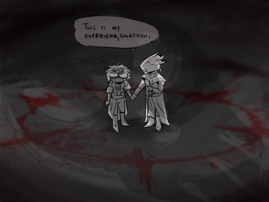
Another repost from my x
#Sorry for the spam#Reposting some stuff from Twitter x or whatnot.#baldur's gate 3#enver gortash#the dark urge#durgetash#dragonborn#Comic#My art
6K notes
·
View notes
Text
got a worm nibbling my brain. can someone help me find a piece of obscure media?
webcomic/indie comic from the 2010s. basically a sci-fi short story about a young girl (with red hair?) who was being raised by scientists as part of an experiment. she receives a haircut/has her head shaved, in preparation for her annual brain scan/testing. it is revealed that while her body is human, her "brain" is artificial, made of computer implants throughout her skull and spine. at some point her biological mother (also a scientist on the same campus?) encounters her and is repulsed, viewing her as a machine who has murdered her daughter.
it was very poignant and it bruised my heart and i can NOT find it anywhere
#i thought it was made by the creator of 'O Human Star' for some reason but apparently not?#goddammit goddammit goddammit#'i don't have to write down the title of this piece of media i encountered in my formative years bc i'll always remember it'#*cut to ten years later frantic googling*#fun fact 'a.i.' is now a completely useless search term#google in general is useless#and stuff i read 3+ years ago regularly vanishes from the internet#bookmarks are not enough! if you like indie media--download that shit! buy digital/physical copies while you can#save it to the cloud back it up and organize that shit!!!#keep a list of the stuff you read (organized by date/media type and possibly with keywords if you want it to be useful longterm)#(or a spreadsheet even if you're like me and rabidly consume short stories/comics like a pack of amnesiac piranhas on a feeding frenzy)#(that stuff PILES UP over the years ok. if you wanna make sure you'll be able to find it again a decade later--curation is key)#because art WILL touch your soul and then vanish into the void leaving naught but a 404 Error in its wake#i am an old man shaking my fist at the kids on my lawn but the kids on my lawn are me and my longterm digital planning skills circa 2012
3K notes
·
View notes
Text
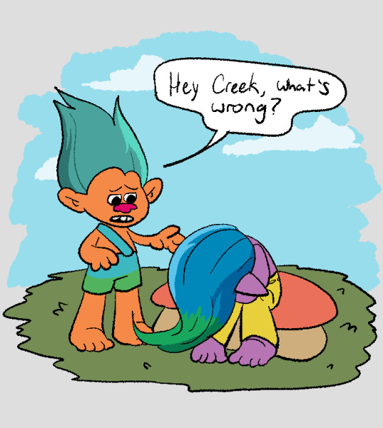

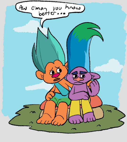

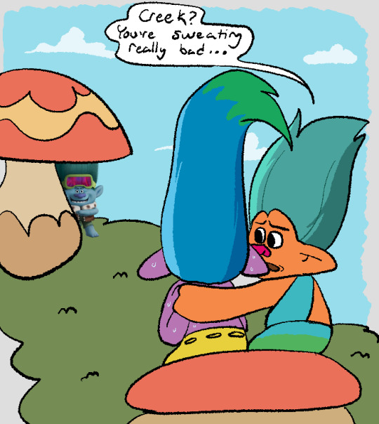
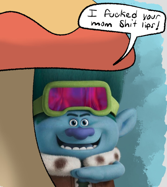
Inspired by these comics by @zivazivc and this comic by @chongotheartist
This has been chilling in my mind since I first saw ZivaZivcs comic and I finally got the energy to make it XD
#my art#dreamworks trolls#trolls 3#trolls band together#john dory#creek trolls#the orange troll is actually a deleted troll from the og movie known as Aspen Heitz#he has green hair in 3d and blue in 2d so i mixed the colors to get the hair i used here#any way#also i used chongos comic as like a reference for the posing and stuff#and like this is what it looks like in the comic but when put into trolls#it lind of looks like Aspen is like comforting his boyfriend creek#and i did not intend for that i just noticed it while coloring and i was like welp#and did not fix it#maybe im just overthinking it#it may just be the closeness due to troll proportions#also the holding hands on the shoulder#but it was in the og so its here too#also i love the scary jd render#whyd they make him so scary ill never know but man does it make for good comedy#i was orginally gonna draw jd too but then when i sketched him he just looked like the render and i was like you know what-#i also thought of using a fake png but that qas too much#so you get real png jd
2K notes
·
View notes
Text
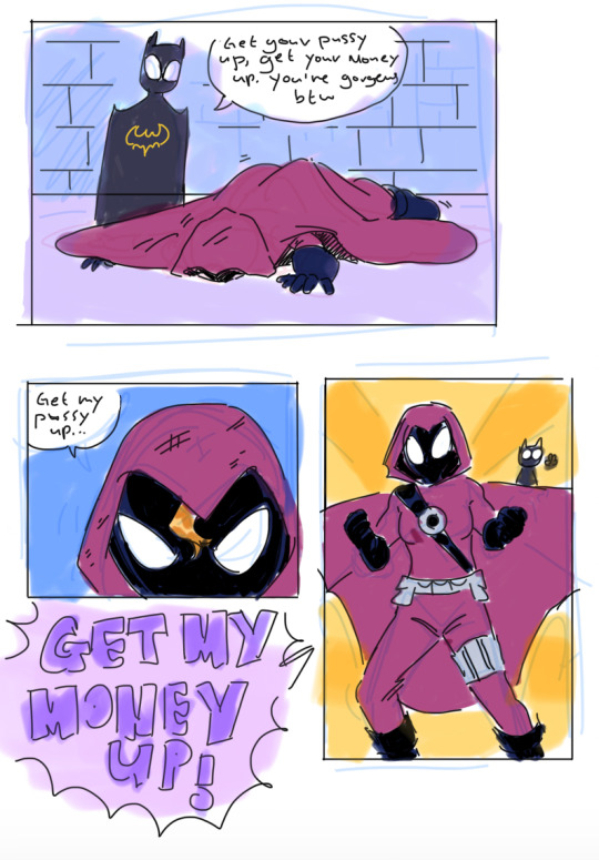
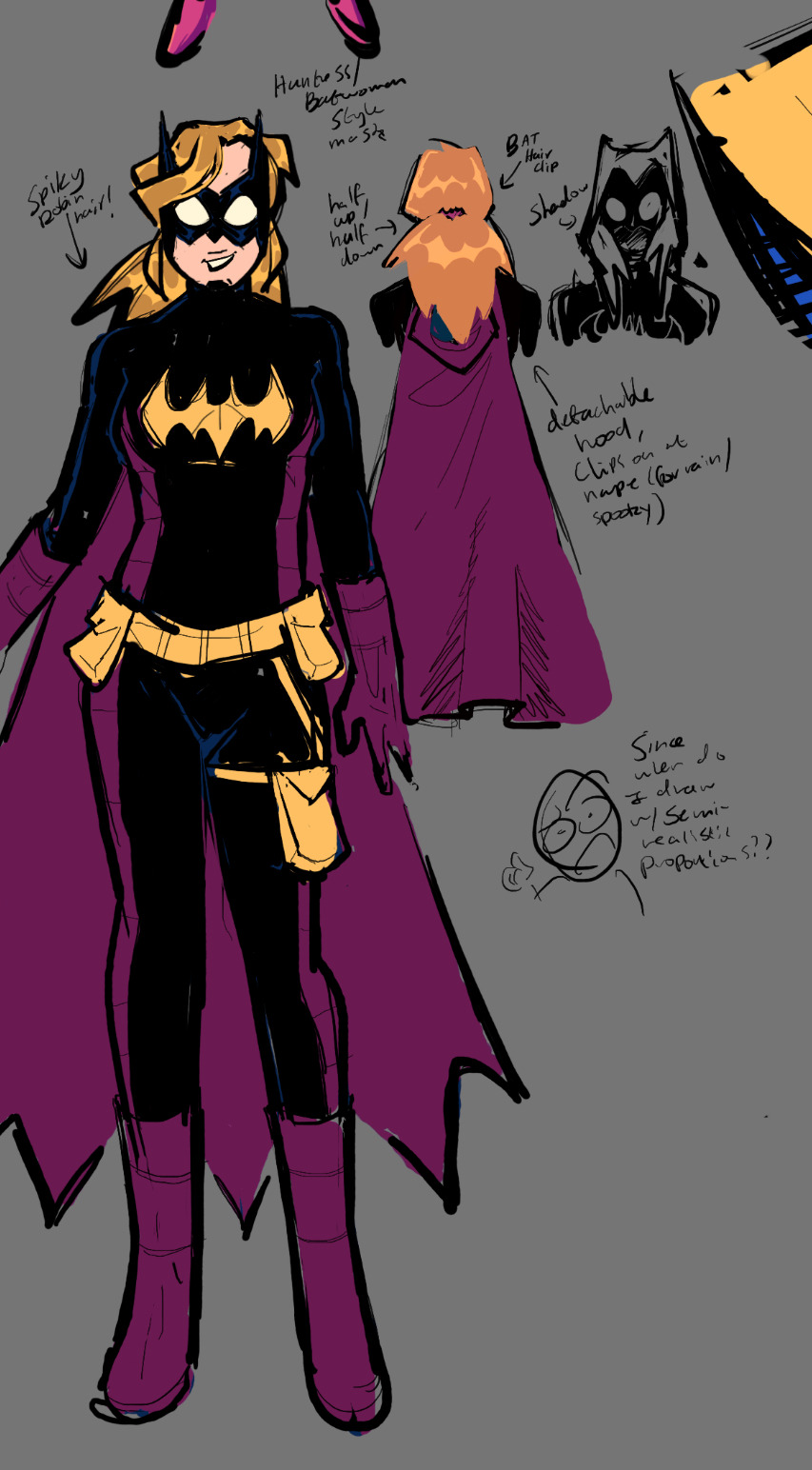

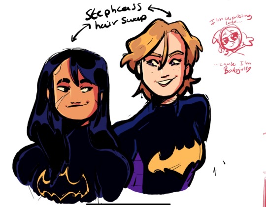
(ID in alt) I literally said I was gonna post this month's ago and then never had the wherewithal to describe it and so I didn't Lmao (said with pain). But since I'm thinking of opening my commissions I figured I should remind ppl that I. Yknow. Can draw.
Lots of Steph here (I had major art block making all of these and my brain worms for her kept me going) + some sprinkles of stephcass for Cass nation to enjoy!
#dc comics#dc#stephanie brown#cassandra cain#jason todd#(yes for the teddy bear. it counts)#batgirl#batgirls#mine#< keep forgetting to tag my art as that I'm terrible 😭#ANYHOW I'm slowly getting back into drawing again after my last ipad got nuked (cant think abt that or ill cry) and i finished uni#oh yeah j finished my first year of uni btw. i went to an Olivia Rodrigo concert like a week or 2 ago. I've been busy lol#but yeah it's looking like I've got a fun summer of bottom feeding ahead of me now that I've officially been told i got passed over for that#-comic job i applied for. lol. lmao even#it's fine honestly it was a pretty daunting prospect i just have to find a way to fill the time by myself now#I've plenty of comics to read so that's nice. got wayyy into mark waids DD run recently (mostly for Chris Samnee's art)#so that's been fun! i have my empowered omnibus (embarrassing and kept under my bed <3) i have TT year 1 i have huntress and WW#uhhh i got flash 1 minute war. lots of good stuff!#so hopefully i don't go. completely feral from lack of stimulation#also hopefully commissions will be a thing i can do#godddd there's many mkre things i want to draw. i got too enamoured w my own bad theory and now I've drawn tim!bats#but unfortunately now i only want to draw tim!bats being laughed at my the batfamily bc seriously tim?? really??#< it's literally probably not going to happen but I've invested myself in this terrible future for some reason#imagine damian trying to robin for tim!bats for 1 (one) night and the next morning he doesn't say anything he just moves to bludhaven#he can't take this shit#oh so many ideas...#ANYWAY. ues. finally art. now if you like it. consider commissioning me (in 2 to 3 business weeks <3)#(no pressure)
425 notes
·
View notes
Text


*drops all of my experimental/unfinished B10 art* ALIEN TIME!!1!
#yo! been a bit#these are from the last 7~ months or so.#sorry for going MIA again- I was sorta rotting#i'll prolly be even more busy this autmn/winter... But I really appreciate you sticking around#still have other fandom stuff in stock as well. i'll post them whenever (*´ -`)#many of these are very silly goofy... i miss experimenting with cooler comic book stuff but i do not have the brain capacity atm lol#bye for now. have a lovely day everyone <3#art#digital art#doodles#doodle dump#fanart#ben 10#ben 10 fanart#ben 10 omniverse#ben 10 alien force#ben 10 aliens#there's the *tiniest* andalite cameo so might as well tag it too lol#animorphs#andalite#alien#alien art#end my suffering
171 notes
·
View notes
Text


In which Ford struggles so badly to relate to other people that he wonders if he’s really human at all. The more isolated he becomes, the harder it is to reconcile with his own humanity.
#my art#gravity falls#Stanford pines#ford pines#bill cipher#comic#eye strain#TIME TO DUMP EVERY ONE OF THE 27483949 THOUGHTS IVE HAD INTO THE TAGS BABY#OK!! SO!!!!#I feel like Ford would wonder why he and Stan (being identical twins) aren’t. yk. identical. shouldn’t Stan have polydactyly too?#as a kid he would dream about secretly being nonhuman and being whisked away to a fantastical world full of people like him#finally free of new jersey‚ finally somewhere he belongs#a lot of this disconnect from humanity came from utterly failing at social interactions while others (including stan) navigated them easily#the feeling waned after Stan was kicked out and he didn't have that direct comparison but it never left#then out in the wilderness of gravity falls‚ his isolation and immersion in Weirdness dragged it back up to the forefront#he deserves to have a breakdown over questioning his own nature. as a treat <3#color symbolism time bc I have a problem and use it at every available moment!!! blue and yellow get more vivid#the further from humanity the subject is#bill is entirely made w pure rgb blue and yellow (+ approximately 2674835 textures/layers/blending modes. I reached 150+ layers. help)#I like the idea that he would appear to ford like pure math considering hes a geometrical motherfucker and how the rest of the mindscape wa#I tried to mostly use trigonometry and related stuff for the Math Greebling. as well as fractals i love you forever fractals#MORE SYMBOLISM:#the grid-ish diamond pattern in all of the mindscape bgs (and elsewhere) is a penrose diagram of spacetime#which shows other universes on the other sides of black holes#SOMEONE ASK ME ABOUT MY EUCLYDIA HEADCANON LATER. IVE DUMPED ENOUGH DUMB HCS IN THESE TAGS ALREADY#BUT I THINK ITS VERY FUN#anyways. fuckt up guys n their egos influencing how they view humanity. bill tells ford hes as human as they come bc he was so easily foole#ford cant reconcile with his humanity bc of a failure to perform in one area#and then the immense guilt and shame over what hes done <3#I have So many ford characterization thoughts. no man nor god can stop me
178 notes
·
View notes
Text
why Aurora's art is genius
It's break for me, and I've been meaning to sit down and read the Aurora webcomic (https://comicaurora.com/, @comicaurora on Tumblr) for quite a bit. So I did that over the last few days.
And… y'know. I can't actually say "I should've read this earlier," because otherwise I would've been up at 2:30-3am when I had responsibilities in the morning and I couldn't have properly enjoyed it, but. Holy shit guys THIS COMIC.
I intended to just do a generalized "hello this is all the things I love about this story," and I wrote a paragraph or two about art style. …and then another. And another. And I realized I needed to actually reference things so I would stop being too vague. I was reading the comic on my tablet or phone, because I wanted to stay curled up in my chair, but I type at a big monitor and so I saw more details… aaaaaand it turned into its own giant-ass post.
SO. Enjoy a few thousand words of me nerding out about this insanely cool art style and how fucking gorgeous this comic is? (There are screenshots, I promise it isn't just a wall of text.) In my defense, I just spent two semesters in graphic design classes focusing on the Adobe Suite, so… I get to be a nerd about pretty things…???
All positive feedback btw! No downers here. <3
---
I cannot emphasize enough how much I love the beautiful, simple stylistic method of drawing characters and figures. It is absolutely stunning and effortless and utterly graceful—it is so hard to capture the sheer beauty and fluidity of the human form in such a fashion. Even a simple outline of a character feels dynamic! It's gorgeous!
Though I do have a love-hate relationship with this, because my artistic side looks at that lovely simplicity, goes "I CAN DO THAT!" and then I sit down and go to the paper and realize that no, in fact, I cannot do that yet, because that simplicity is born of a hell of a lot of practice and understanding of bodies and actually is really hard to do. It's a very developed style that only looks simple because the artist knows what they're doing. The human body is hard to pull off, and this comic does so beautifully and makes it look effortless.
Also: line weight line weight line weight. It's especially important in simplified shapes and figures like this, and hoo boy is it used excellently. It's especially apparent the newer the pages get—I love watching that improvement over time—but with simpler figures and lines, you get nice light lines to emphasize both smaller details, like in the draping of clothing and the curls of hair—which, hello, yes—and thicker lines to emphasize bigger and more important details and silhouettes. It's the sort of thing that's essential to most illustrations, but I wanted to make a note of it because it's so vital to this art style.
THE USE OF LAYER BLENDING MODES OH MY GODS. (...uhhh, apologies to the people who don't know what that means, it's a digital art program thing? This article explains it for beginners.)
Bear with me, I just finished my second Photoshop course, I spent months and months working on projects with this shit so I see the genius use of Screen and/or its siblings (of which there are many—if I say "Screen" here, assume I mean the entire umbrella of Screen blending modes and possibly Overlay) and go nuts, but seriously it's so clever and also fucking gorgeous:
Firstly: the use of screened-on sound effect words over an action? A "CRACK" written over a branch and then put on Screen in glowy green so that it's subtle enough that it doesn't disrupt the visual flow, but still sticks out enough to make itself heard? Little "scritches" that are transparent where they're laid on without outlines to emphasize the sound without disrupting the underlying image? FUCK YES. I haven't seen this done literally anywhere else—granted, I haven't read a massive amount of comics, but I've read enough—and it is so clever and I adore it. Examples:


Secondly: The beautiful lighting effects. The curling leaves, all the magic, the various glowing eyes, the fog, the way it's all so vividly colored but doesn't burn your eyeballs out—a balance that's way harder to achieve than you'd think—and the soft glows around them, eeeee it's so pretty so pretty SO PRETTY. Not sure if some of these are Outer/Inner Glow/Shadow layer effects or if it's entirely hand-drawn, but major kudos either way; I can see the beautiful use of blending modes and I SALUTE YOUR GENIUS.
I keep looking at some of this stuff and go "is that a layer effect or is it done by hand?" Because you can make some similar things with the Satin layer effect in Photoshop (I don't know if other programs have this? I'm gonna have to find out since I won't have access to PS for much longer ;-;) that resembles some of the swirly inner bits on some of the lit effects, but I'm not sure if it is that or not. Or you could mask over textures? There's... many ways to do it.
If done by hand: oh my gods the patience, how. If done with layer effects: really clever work that knows how to stop said effects from looking wonky, because ugh those things get temperamental. If done with a layer of texture that's been masked over: very, very good masking work. No matter the method, pretty shimmers and swirly bits inside the bigger pretty swirls!
Next: The way color contrast is used! I will never be over the glowy green-on-black Primordial Life vibes when Alinua gets dropped into that… unconscious space?? with Life, for example, and the sharp contrast of vines and crack and branches and leaves against pitch black is just visually stunning. The way the roots sink into the ground and the three-dimensional sensation of it is particularly badass here:

Friggin. How does this imply depth like that. HOW. IT'S SO FREAKING COOL.
A huge point here is also color language and use! Everybody has their own particular shade, generally matching their eyes, magic, and personality, and I adore how this is used to make it clear who's talking or who's doing an action. That was especially apparent to me with Dainix and Falst in the caves—their colors are both fairly warm, but quite distinct, and I love how this clarifies who's doing what in panels with a lot of action from both of them. There is a particular bit that stuck out to me, so I dug up the panels (see this page and the following one https://comicaurora.com/aurora/1-20-30/):

(Gods it looks even prettier now that I put it against a plain background. Also, appreciation to Falst for managing a bridal-carry midair, damn.)
The way that their colors MERGE here! And the immense attention to detail in doing so—Dainix is higher up than Falst is in the first panel, so Dainix's orange fades into Falst's orange at the base. The next panel has gold up top and orange on bottom; we can't really tell in that panel where each of them are, but that's carried over to the next panel—
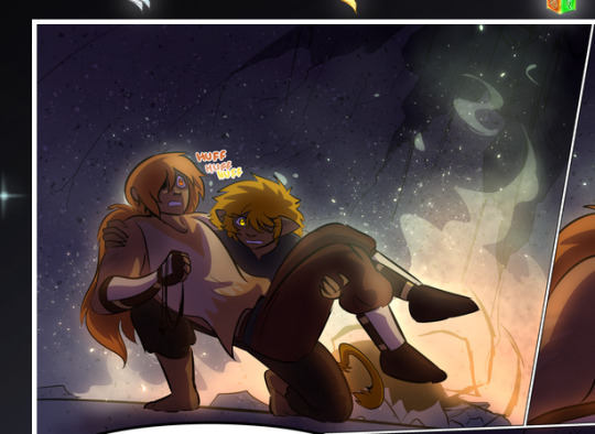
—where we now see that Falst's position is raised above Dainix's due to the way he's carrying him. (Points for continuity!) And, of course, we see the little "huffs" flowing from orange to yellow over their heads (where Dainix's head is higher than Falst's) to merge the sound of their breathing, which is absurdly clever because it emphasizes to the viewer how we hear two sets of huffing overlaying each other, not one. Absolutely brilliant.
(A few other notes of appreciation to that panel: beautiful glows around them, the sparks, the jagged silhouette of the spider legs, the lovely colors that have no right to make the area around a spider corpse that pretty, the excellent texturing on the cave walls plus perspective, the way Falst's movements imply Dainix's hefty weight, the natural posing of the characters, their on-point expressions that convey exactly how fuckin terrifying everything is right now, the slight glows to their eyes, and also they're just handsome boys <3)
Next up: Rain!!!! So well done! It's subtle enough that it never ever disrupts the impact of the focal point, but evident enough you can tell! And more importantly: THE MIST OFF THE CHARACTERS. Rain does this irl, it has that little vapor that comes off you and makes that little misty effect that plays with lighting, it's so cool-looking and here it's used to such pretty effect!
One of the panel captions says something about it blurring out all the injuries on the characters but like THAT AIN'T TOO BIG OF A PROBLEM when it gets across the environmental vibes, and also that'd be how it would look in real life too so like… outside viewer's angle is the same as the characters', mostly? my point is: that's the environment!!! that's the vibes, that's the feel! It gets it across and it does so in the most pretty way possible!
And another thing re: rain, the use of it to establish perspective, particularly in panels like this—

—where we can tell we're looking down at Tynan due to the perspective on the rain and where it's pointing. Excellent. (Also, kudos for looking down and emphasizing how Tynan's losing his advantage—lovely use of visual storytelling.)
Additionally, the misting here:
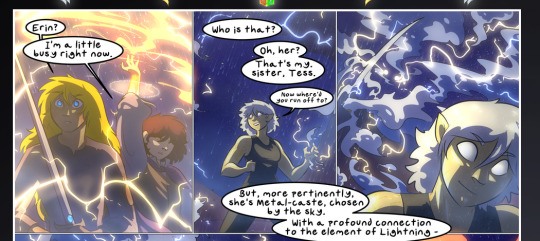
We see it most heavily in the leftmost panel, where it's quite foggy as you would expect in a rainstorm, especially in an environment with a lot of heat, but it's also lightly powdered on in the following two panels and tends to follow light sources, which makes complete sense given how light bounces off particles in the air.
A major point of strength in these too is a thorough understanding of lighting, like rim lighting, the various hues and shades, and an intricate understanding of how light bounces off surfaces even when they're in shadow (we'll see a faint glow in spots where characters are half in shadow, but that's how it would work in real life, because of how light bounces around).
Bringing some of these points together: the fluidity of the lines in magic, and the way simple glowing lines are used to emphasize motion and the magic itself, is deeply clever. I'm basically pulling at random from panels and there's definitely even better examples, but here's one (see this page https://comicaurora.com/aurora/1-16-33/):

First panel, listed in numbers because these build on each other:
The tension of the lines in Tess's magic here. This works on a couple levels: first, the way she's holding her fists, as if she's pulling a rope taut.
The way there's one primary line, emphasizing the rope feeling, accompanied by smaller ones.
The additional lines starbursting around her hands, to indicate the energy crackling in her hands and how she's doing a good bit more than just holding it. (That combined with the fists suggests some tension to the magic, too.) Also the variations in brightness, a feature you'll find in actual lightning. :D Additional kudos for how the lightning sparks and breaks off the metal of the sword.
A handful of miscellaneous notes on the second panel:
The reflection of the flames in Erin's typically dark blue eyes (which bears a remarkable resemblance to Dainix, incidentally—almost a thematic sort of parallel given Erin's using the same magic Dainix specializes in?)
The flowing of fabric in the wind and associated variation in the lineart
The way Erin's tattoos interact with the fire he's pulling to his hand
The way the rain overlays some of the fainter areas of fire (attention! to! detail! hell yeah!)
I could go on. I won't because this is a lot of writing already.
Third panel gets paragraphs, not bullets:
Erin's giant-ass "FWOOM" of fire there, and the way the outline of the word is puffy-edged and gradated to feel almost three-dimensional, plus once again using Screen or a variation on it so that the stars show up in the background. All this against that stunning plume of fire, which ripples and sparks so gorgeously, and the ending "om" of the onomatopoeia is emphasized incredibly brightly against that, adding to the punch of it and making the plume feel even brighter.
Also, once again, rain helping establish perspective, especially in how it's very angular in the left side of the panel and then slowly becomes more like a point to the right to indicate it's falling directly down on the viewer. Add in the bright, beautiful glow effects, fainter but no less important black lines beneath them to emphasize the sky and smoke and the like, and the stunningly beautiful lighting and gradated glows surrounding Erin plus the lightning jagging up at him from below, and you get one hell of an impactful panel right there. (And there is definitely more in there I could break down, this is just a lot already.)
And in general: The colors in this? Incredible. The blues and purples and oranges and golds compliment so well, and it's all so rich.
Like, seriously, just throughout the whole comic, the use of gradients, blending modes, color balance and hues, all the things, all the things, it makes for the most beautiful effects and glows and such a rich environment. There's a very distinct style to this comic in its simplified backgrounds (which I recognize are done partly because it's way easier and also backgrounds are so time-consuming dear gods but lemme say this) and vivid, smoothly drawn characters; the simplicity lets them come to the front and gives room for those beautiful, richly saturated focal points, letting the stylized designs of the magic and characters shine. The use of distinct silhouettes is insanely good. Honestly, complex backgrounds might run the risk of making everything too visually busy in this case. It's just, augh, so GORGEOUS.
Another bit, take a look at this page (https://comicaurora.com/aurora/1-15-28/):
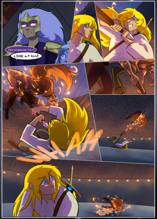
It's not quite as evident here as it is in the next page, but this one does some other fun things so I'm grabbing it. Points:
Once again, using different colors to represent different character actions. The "WHAM" of Kendal hitting the ground is caused by Dainix's force, so it's orange (and kudos for doubling the word over to add a shake effect). But we see blue layered underneath, which could be an environmental choice, but might also be because it's Kendal, whose color is blue.
And speaking off, take a look at the right-most panel on top, where Kendal grabs the spear: his motion is, again, illustrated in bright blue, versus the atmospheric screened-on orange lines that point toward him around the whole panel (I'm sure these have a name, I think they might be more of a manga thing though and the only experience I have in manga is reading a bit of Fullmetal Alchemist). Those lines emphasize the weight of the spear being shoved at him, and their color tells us Dainix is responsible for it.
One of my all-time favorite effects in this comic is the way cracks manifest across Dainix's body to represent when he starts to lose control; it is utterly gorgeous and wonderfully thematic. These are more evident in the page before and after this one, but you get a decent idea here. I love the way they glow softly, the way the fire juuuust flickers through at the start and then becomes more evident over time, and the cracks feel so realistic, like his skin is made of pottery. Additional points for how fire begins to creep into his hair.
A small detail that's generally consistent across the comic, but which I want to make note of here because you can see it pretty well: Kendal's eyes glow about the same as the jewel in his sword, mirroring his connection to said sword and calling back to how the jewel became Vash's eye temporarily and thus was once Kendal's eye. You can always see this connection (though there might be some spots where this also changes in a symbolic manner; I went through it quickly on the first time around, so I'll pay more attention when I inevitably reread this), where Kendal's always got that little shine of blue in his eyes the same as the jewel. It's a beautiful visual parallel that encourages the reader to subconsciously link them together, especially since the lines used to illustrate character movements typically mirror their eye color. It's an extension of Kendal.
Did I mention how ABSOLUTELY BEAUTIFUL the colors in this are?
Also, the mythological/legend-type scenes are illustrated in familiar style often used for that type of story, a simple and heavily symbolic two-dimensional cave-painting-like look. They are absolutely beautiful on many levels, employing simple, lovely gradients, slightly rougher and thicker lineart that is nonetheless smoothly beautiful, and working with clear silhouettes (a major strength of this art style, but also a strength in the comic overall). But in particular, I wanted to call attention to a particular thing (see this page https://comicaurora.com/aurora/1-12-4/):
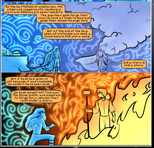
The flowing symbolic lineart surrounding each character. This is actually quite consistent across characters—see also Life's typical lines and how they curl:
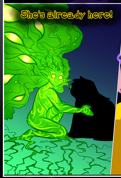
What's particularly interesting here is how these symbols are often similar, but not the same. Vash's lines are always smooth, clean curls, often playing off each other and echoing one another like ripples in a pond. You'd think they'd look too similar to Life's—but they don't. Life's curl like vines, and they remain connected; where one curve might echo another but exist entirely detached from each other in Vash's, Life's lines still remain wound together, because vines are continuous and don't float around. :P
Tahraim's are less continuous, often breaking up with significantly smaller bits and pieces floating around like—of course—sparks, and come to sharper points. These are also constants: we see the vines repeated over and over in Alinua's dreams of Life, and the echoing ripples of Vash are consistent wherever we encounter him. Kendal's dream of the ghost citizens of the city of Vash in the last few chapters is filled with these rippling, echoing patterns, to beautiful effect (https://comicaurora.com/aurora/1-20-14/):
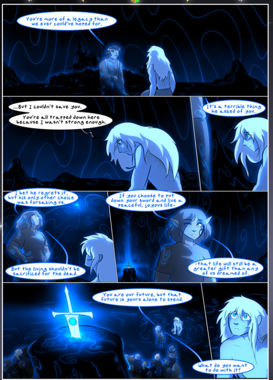
They ripple and spiral, often in long, sinuous curves, with smooth elegance. It reminds me a great deal of images of space and sine waves and the like. This establishes a definite feel to these different characters and their magic. And the thing is, that's not something that had to be done—the colors are good at emphasizing who's who. But it was done, and it adds a whole other dimension to the story. Whenever you're in a deity's domain, you know whose it is no matter the color.
Regarding that shape language, I wanted to make another note, too—Vash is sometimes described as chaotic and doing what he likes, which is interesting to me, because smooth, elegant curves and the color blue aren't generally associated with chaos. So while Vash might behave like that on the surface, I'm guessing he's got a lot more going on underneath; he's probably much more intentional in his actions than you'd think at a glance, and he is certainly quite caring with his city. The other thing is that this suits Kendal perfectly. He's a paragon character; he is kind, virtuous, and self-sacrificing, and often we see him aiming to calm others and keep them safe. Blue is such a good color for him. There is… probably more to this, but I'm not deep enough in yet to say.
And here's the thing: I'm only scratching the surface. There is so much more here I'm not covering (color palettes! outfits! character design! environment! the deities! so much more!) and a lot more I can't cover, because I don't have the experience; this is me as a hobbyist artist who happened to take a couple design classes because I wanted to. The art style to this comic is so clever and creative and beautiful, though, I just had to go off about it. <3
...brownie points for getting all the way down here? Have a cookie.
#aurora comic#aurora webcomic#comicaurora#art analysis#...I hope those are the right tags???#new fandom new tagging practices to learn ig#much thanks for something to read while I try to rest my wrists. carpal tunnel BAD. (ignore that I wrote this I've got braces ok it's fine)#anyway! I HAVE. MANY MORE THOUGHTS. ON THE STORY ITSELF. THIS LOVELY STORY#also a collection of reactions to a chunk of the comic before I hit the point where I was too busy reading to write anything down#idk how to format those tho#...yeet them into one post...???#eh I usually don't go off this much these days but this seems like a smaller tight-knit fandom so... might as well help build it?#and I have a little more time thanks to break so#oh yes also shoutout to my insanely awesome professor for teaching me all the technical stuff from this he is LOVELY#made an incredibly complex program into something comprehensible <3#synapse talks
786 notes
·
View notes
Note
Hey just wanted to say how much I adore the Raven and The Snake! It kept me sane during some hard times last year screaming at Seb distracted me from my real problems LOL! In fact I love it so much I would love to print the fic and turn it into a book for my own personal enjoyment of course, would it be okay with you if I did that and posted the final product on Twitter? I'd tag you of course! Don't know if it's a dumb question but I wanted to check. Anyways love your work you are SUPER talented!
YES YES YES??? OMG PLSSS I WOULD DIE!!!!!!!

IM HONOURED YOU LIKED IT ENOUGH TO WANT TO BIND IT!!! AND PLS, TAG ME EVERYWHERE WHEN/IF YOU DO IT😭😭 ive considered commissioning someone to bind it myself just to have as a memento bc im the author, but omg the fact that someone else would wanna do it too......im glad sebs dumbassery (and lets be real, clora's too. if not MOSTLY cloras) could distract you from your irl problems by yelling at those two idiots🥰🥰 THANK YOU AGAIN IM HONOURED ARGHHH🧎♀️💖💖

LMFAOOO THE WAY I THOUGHT THIS WAS ANON HATE AT FIRST LMAOOO i mean i guess it kinda could still be considered it??? but i love your love for clora BAHAH bc you are so right, let seb drown, this aint about him✋😔...to satiate you heres a wip of her ive had for a while, and maybe ill finally finish it soon JUST FOR YOU🫵🫵💖

#i have so many ongoing wips tho sometimes im tempted to make a poll of what i should work on LMAO#i have a 3 page modern AU comic of how they get together#and a depressing 2 page comic of seb in azkaban hallucinating clora#and also a yandere seb and clora pic#and then just a bunch of other random cute stuff and some moments from my fic#i wanna do a comic of their first makeout session in cloras room bc i love seb in that scene...asking if he can touch her and stuff....#also them the morning after when clora kisses him awake and sebs like 'waking the sleeping princess with a kiss is supposed to be my job'#but for now ..........im gonna go play video games instead👉👉#ask
136 notes
·
View notes
Text
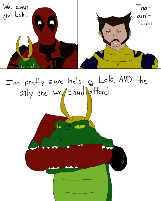
I have very high hopes for Deadpool 3.
((Image text:
Deadpool, holding Alligator Loki: We even got Loki!
Wolverine: That ain't Loki.
Deadpool: I'm pretty sure he's a Loki, AND the only one we could afford.))
#a rare comic from me#not my usual stuff#deadpool 3#deadpool#wolverine#alligator loki#forgive me hugh jackman#i was in a drawing mood
454 notes
·
View notes
Text
hey hi take a look at these out-of-context frames of an old comic from last year i got too overconfident in and abandoned


#yuusha the hell. why do you draw like that#girl started with the eyes then the hair#she said fuck it we ball#no initial sketch#started thinkin bout his eyes and went from there i guess#i realized a lot of their dynamic has changed since then#oh how they've grown#either for better or for worse#[—✦-#-✧ my art#-✧ comic#<- BARELY BUT I GUESS.#twst art#twst fanart#twst#twisted wonderland#twst oc x canon#twst yuusona#twst yuu#(💜) yuusha#(💜) curry noodles#<- if you squint#(💜) ramshackle sushi#<- rare yuusha and grim stuff 🫡#-✦—]#there was no plan#i drew from a single (1) idea#and it just built up#but there was no clear goal or direction#thus it went. nowhere </3
88 notes
·
View notes
Text
Does anyone else hc that Nightmare can like, absorb his tentacles back into his body sometimes? Like the way Stitch does with his extra arms?

#UTDR#UTMV#Nightmare Sans#I just realised earlier I've been just kinda assuming this as fact and I don't know where it came from#cause I don't think it's canon and I can't think of seeing it anywhere else#So maybe it's just me idk#Anyway it's something I wanted to be more prevalent when I was doing the truce au comic (which if I ever work on again I'll probably restar#cause I didn't really know what I was doing and there's stuff I wanna amend)#But the idea was that at the start of their attempted truce the tentacles made Dream uncomfortable#(Not only because Nightmare often used them against him in battle but also it's something different about his brother from his#childhood memories and it was jarring to see his one constant be changed)#He didn't say anything about it but obviously Nightmare could feel it#So whenever Dream was around I would make a point of drawing him with the tentacles sucked in#It was his little unspoken effort to make the truce work. because he wanted it very badly but would rather die than admit it#(or try to figure out why)#But over the course of the truce Dream would notice and start encouraging him to have them out and be himself#Showing Nightmare a little acceptence because despite the differences that's still his brother#You ever write six times more in the tags than the actual post lol#These are the DVD extras of the post you have to go looking for these#Director's commentary of my silly little thoughts :3#Anyway thoughts?
88 notes
·
View notes
Text
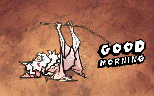
Based on my favorite gif lately
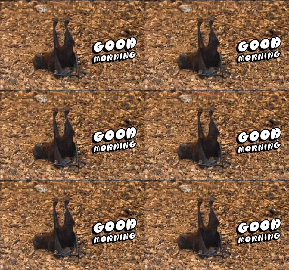
#my art stuff#digital art#baldurs gate 3#bg3#astarion#batstarion#once again specifying this is a spawn astarion with some sort of wild shape thing#bat#good morning#gif#I’ve been in such a weird place mentally about art lately#I just keep stopping myself from drawing things cus I want to draw Astarion -#- but fsr my brain decided I draw him wrong and thus makes it pointless to even start#bat form is fine - I have no problems with it. But in his normal form? no can do buckaroo.#It’s one part why I haven’t shared much art lately - I don’t get happy enough about the “quality”#then just don’t share it as a result - in turn making me feel worse because I’m not posting - making me doubt myself more - etc etc#idk man - I got way too giddy earlier today cus someone could tell this was Astarion - even though this isn’t even the version of him I -#- feel insecure about#I keep seeing these artists making more realistic art and cool comics and interactions - most of which are shaded really beautifully -#- and all I can think about is how I CAN’T do that - even if it wouldn’t fuck me up mentally#I just put too much stress on my ability to create realism and I keep “failing” at doing that (by actively avoiding it for my own health)#idk man - I just wish I felt better about Astarion’s stupid chin OTL
181 notes
·
View notes
Text
Good morning 🙏🏼
I want to thank everyone their support with reblogging my stuff over the years and reblogging some of the context of the situation.
Tumblr and Instagram is filled with the most supportive people I’ve ever had the chance of meeting. The last time something like this happened, I didn’t have much support, not even from people I thought were close to me. It took me a year or two to be okay with being perceived again in fandoms. So I’m very grateful for everything.
I just wanted to post that I appreciate all of the asks and I’ve been reading all of them. I actually get anxious I’m spamming everyone too much so I probably won’t reply to everything. Please don’t feel pressured to support me financially, there’s is a free option on patreon to follow. I’ll post future project plans and occasional updates because I still love comics and I still love DC/Marvel. I do enjoy having people following along for my art/reading journey so I would always be okay with people just following for free. My brain is telling me this post is too long now so I will go 🙏🏼😭
#my brain to me: what in the retired YouTuber ass type post.. (screams) ok#I just received a lot of anons about the situation and I wanted to clarify it’s okay!!#I know the usd conversion rate is crazy… so I’ll try to wrangle my head to post some stuff publicly. I had a friend who supported me from#brazil.. I was like what! ily but if it’s breaking bank please don’t do it!!!#I also didn’t want people sending me asks thinking I didn’t read it.. listen I’ve been a fandom lurker for a while. yes I do get sad when#people don’t reply to my asks… because I’m like I want to know your answer so bad#sorry I’m not doing a very good job replying 😔 I’ve actually never had a fandom blog of this level#I’ve never gotten more than 5 asks over the 3+ years of tumblr usage..#I’m also an ultra perfectionist where I’ll reread what I wrote 2–5 times before posting. yeah it’s a bit crazy! if you send me a list of#recommended comics before I will probably read every single one and then reply 7+ months later…#😭😭😭#let me not ramble more 👍🏼#going to go get breakfast
188 notes
·
View notes
Text


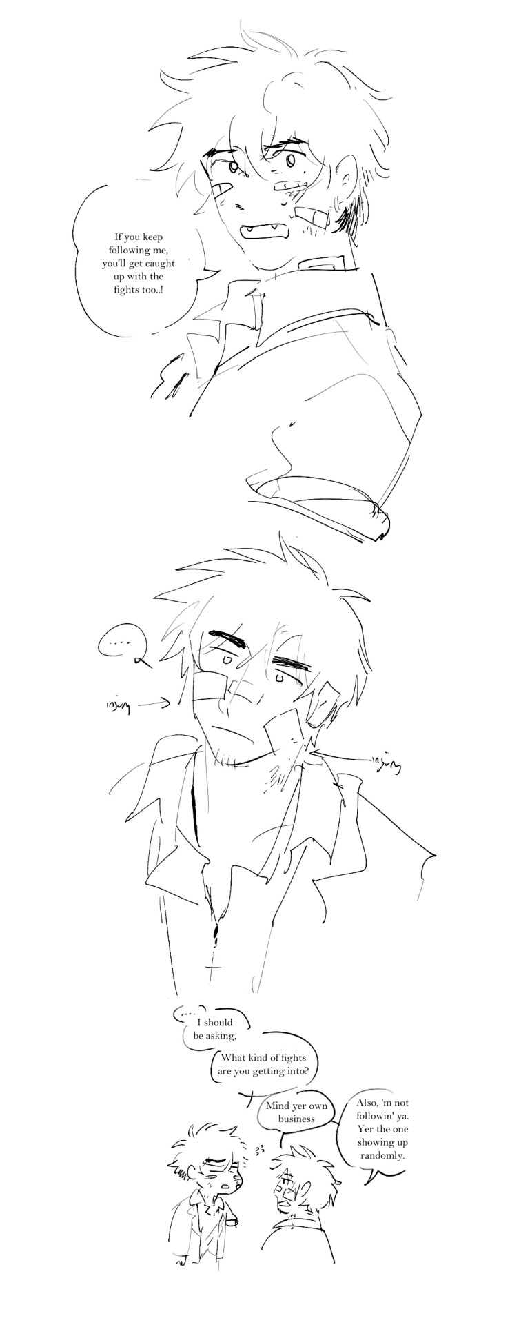


high school au (ID in alt)
#vashwood#vash the stampede#nicholas d wolfwood#trigun#finally uploading some of my au stuff on here sgmkg - most of these are old / when i first started drafting the au so there'll be minor#changes of how i draw them as i upload moar.... milmer are also in this au ofc but i want to draw them better separately when i have the#chance :'3 anyway im AWFUL at talking about my aus - my thoughts r not coherent in these tags. i mainly made this au bc i think about how#they just dont get teen years basically in canon. so im throwing them in the fire of teenage high school love experience (tm)#even though theyre forced into early independence in this au too. heavy inspiration from all the shoujos and romance webtoons i used to rea#in my spare time. my hs experience was also kind of abnormal so i apologize if that slips into this if i make more schtuff. either way this#is just for funsies.... please do not look too into my dumb silly aus...#ill upload the more polished comics i have for this tomorrow#ruporas art
820 notes
·
View notes
Text
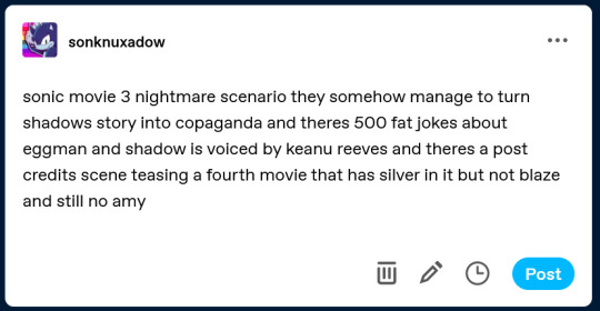
hey guys look what i found in my drafts. from a few days ago .
#sorry i think its my fault that this happened#still unsure if The News is actually real or not tbh since no official sources have said anything about it as far as i know#and i hear the hollywood reporter is usually right about this stuff but idk#the fact that there are no actual sources or evidence for any of this other than ''just trust me bro'' is a bit suspicious to me#+ the fact that theyve been keeping the development of sonic 3 very quiet and secret#yet shadows voice actor. which is one of the biggest topics of discussion surrounding the movie. just. happened to leak somehow ?#but . the timing on this is kinda funny . and very tragic. if it is real#i said it already but i dont get why so many people are celebrating this. from what ive heard he doesnt fit ....#and it feels like another case of casting a random celebrity over an actual voice actor just to have a big name attached to the project#regardless of if theyre really the best choice.#which i thought everyone agreed was a shitty and annoying practice especially if its some iconic video game/comic/whatever character ?#but maybe i just havent heard the right specific voice clips that make people think its a good choice i dont know .
307 notes
·
View notes