#so the complementary colors to green and blue are red/pink and orange
Explore tagged Tumblr posts
Text
can someone give me ideas for renaming kyouka? i dont think that name fits the most and also i chose it maaany years ago now i think it could be cultural appropriation (i tried to compare it with someone naming their oc like Carlinhos and uh... yea feels a lil disrespectful if they dont know much about the name of the culture surrounding it yknow) and i think i can come up with something more meaningful than that. Something relating to the fact she chose her name in a book, and maybe also referencing her whole jester thing going on
#rambles#kyouka oc#i thought of lotte but im not sure#my ocs#oc names#writing help#help#my wips#writeblr#artblr#she has kind of a design#i already figured what her hair looks like#and what lenght it is somewhat#and for her clothes i thought some like vintage XIX century-ish girls clothing OR#pink and orange#now i have a reason for that: she is a sheltered girl#her caregivers wanted to give her an ideal childhood but she was a bit isolated#she also grew up as a project#her given name is also another#“arkisto”#she names herself later in the story#so like the sheltered happy girl thing#makes me think of those sailor-like collars#and also the pink and orange thing i have two reasons for that:#meine's colors are cool#he is blue and green#i want kyouka to contrast his colors#so the complementary colors to green and blue are red/pink and orange#that are very warm colors#i want them for her because it also fits her personality
4 notes
·
View notes
Note
I NEED YOUR COLOR THEORIES ON BUDDIE MATCHING AND TOMMY LOOKING OUT OF PLACE COLOR-WISE AND THE "YOU WANTED THE RED ONE?" COMMENT THAT BUCK MADE LIKE I NEED IT RIGHT NOWWW
Hello my love, welcome to the madness!
First of all, this scene is 100% about Eddie, but for a second they try to make you think that it is about bt. They start with a very odd angle of Eddie's living room, I did not recognize it at first, so it kinda leads you to believe that we are about to get some domestic bt but then the camera quite literally does a 180 and we are suddenly focused on Eddie with Eddie in the middle, they are there to help create this illusion that Eddie is okay and everything is fine, just as much as the decorations that are only placed where Chris would be able to see.


We're also back to the triangle formation they were being put constantly during Buck's coming out arc, which is interesting in many ways, because they put Eddie in the middle, and while I don't love to put a lot of weight into interviews, both Tim and Oliver have talked about the way Tommy is not gonna interfere with buddie, so I'm intrigued about the role Eddie is gonna play within whatever "finding out uncomfortable truths" means.
I don't know how to fully form my thoughts about the scene as whole, but I know yall want me to talk color, and boy, do I have shit to say.
First off, Tommy's hat. I've been going kinda crazy trying to figure out if that damn hat is green or blue, because when I swatch it from different points of the scene, I get different undertones.
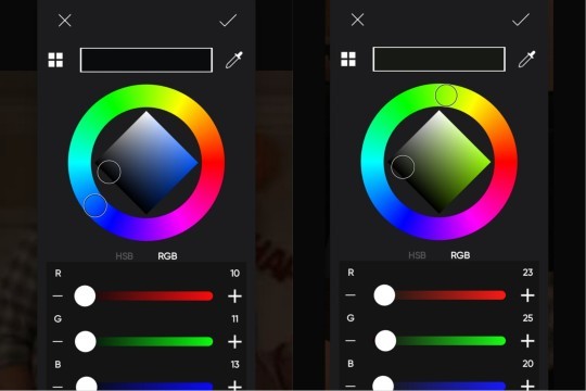
Currently, I'm working under the assumption that it is supposed to be a shade like this, like a dark petrol color, that is meant to be ambiguously blue and green.

Why would it be relevant for his color to be ambiguous in this context? Well, the complementary color to red is green and the complementary color to orange is blue.

I've talked about this a lot when talking about Buck and the way they use green as his something is wrong color, but the goal with complementary colors is to create contrast, so they are making Tommy contrast Buck and Eddie's, red and orange, hats. And there's also the way the letters and the streamer Eddie is holding are red. So while Buck and Tommy are the couple and Eddie is supposed to be the one outside, visually, Buck and Eddie are presented as a unity while Tommy stands out. There's also the way Tommy's lighter shades contrast Buck's darker.

They did something similar at the bachelor party, while the green and pink aren't exactly matchy from a color theory view, their outfits are explicitly stated as a matching costume, in pastel colors, contrasting the choice to put Tommy in a dark blue color, again with Eddie in the middle.

There's something about the way that Buck asks "I'm sorry, did you want to red one?" and Tommy completely ignores it in favor of turning the cones into a flirty comment, is that on a meta-level, since the party is red, and Buck himself wears red a lot, Tommy is yet again rejecting Buck's attempt to bring him in deeper into his life, to find that space where he would fit.

Something else just because this made Alli laugh, the decorations are red, but Tommy is blowing up a green balloon, and well, green is the breakup color and that is funny on its own, but considering the way the party is red, to have him with the opposite color balloon is yet another way to show the lack of effort, to make you aware he does not fit in with the Buckley Diaz family unity, and by consequence doesn't fit in in Buck's life.

But now talking Buck and Eddie specifically. Eddie is in a warmer version of the colors Buck is wearing. They match.

Even the red and orange thing we have going with the hats. Because red and orange are analogous colors, that means they are side by side in the color wheel, and they are meant to create a harmonious look, it's about cohesion, creating visual unity, it's the same principle the show uses to make the blue and green thing work (way too long meta on the blue and green), because since you have the same base color, it's easy to make them make sense together. (Also orange is red with yellow 👀 Eddie working his way to his yellow shade queer arc, I believe in you).
About Buck and the brown. Not a very Buck color. But it is interesting that we have Buck in brown when Eddie needs support and Buck wasn't there, when Eddie needs support and Buck is trying his best to fix it, and when Eddie needs support and finally asks for it.


Buck is here to be something for Eddie to rely on, and the color brown is used for comfort, stability in a positive setting. But also, negatively, brown is used for loneliness, so they are playing with both meanings here with the way they are both in brown.
Also about Eddie and the brown. Eddie wears a lot of earth tones, but that brown is entirely way too reddish for him. And it's something because during the whole Kim fiasco and when Chris leaves, he is in maroon, they used the color as an indication something is wrong.


So while Eddie is still trying to pretend he's fine, he is still partially in that red, from the shade to everything about the decorations.
So this was yet another way to establish Buck as Eddie's support system, and that Tommy doesn't fit in.
I think this is all, if you read all this, I love you 💜
Tagging the people who interacted with this about being tagged in my metas, you can do that too if you wanna be tagged
@sparkedblaze @caw-salem @dreamofsomepiphany @100ceruleaneyes @linus-lucy @chaosqueery @gina-spike @chimchiminie98 @elvensorceress @dangerpronebuddie @ijustdontlikepeople @182daysof @steadfastsaturnsrings @sparklespiff @inell
204 notes
·
View notes
Text
Color Theory in Cinderella Boy
There’s some silly stuff happening with colors, and in this probably brainrot post, I will be using my art brain to over analyze the heck outta this (for those who are interested, though I find it fascinating!)
**This post includes a scene from todays new ep (53), so make sure you read that first!**
So, I first stumbled upon this discovery sorta by accident. I use Clip Studio Paint for my artwork, and I often end up with an average to 30-50 layers per drawing, and thankfully Clip Studio has an option to color-code your layers to make things more manageable.
For my CB drawings, I defaulted to using green for Chase, purple for Buddy, and blue for Deacon. It made sense to me, because of the casts ‘default’ outfits feature these colors:
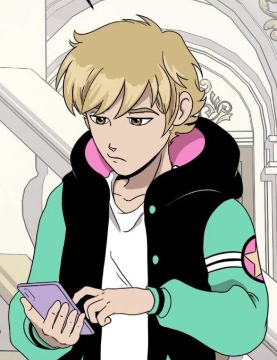
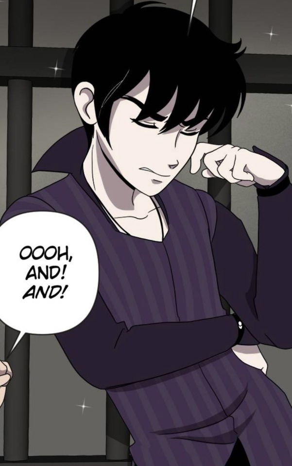
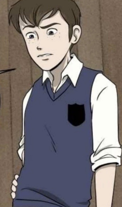
We can also see these colors in some book outfits:
Chase’s green outfit in We Need to Talk About Buddy, Deacons shirt in Beach Boys, and the blue accents in All That Glitters
What I noticed though, was that these aren’t the only colors they are seen in, and in fact, out of all the other colors, two in particular stand out
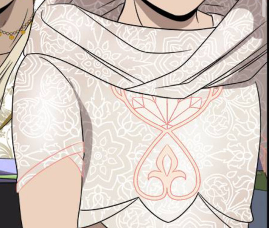
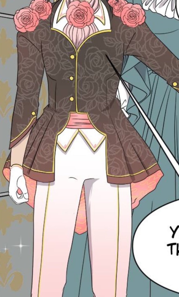
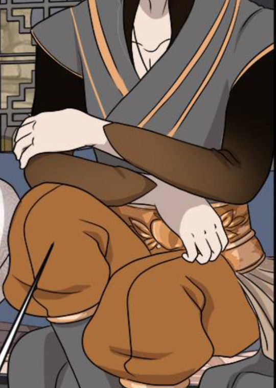
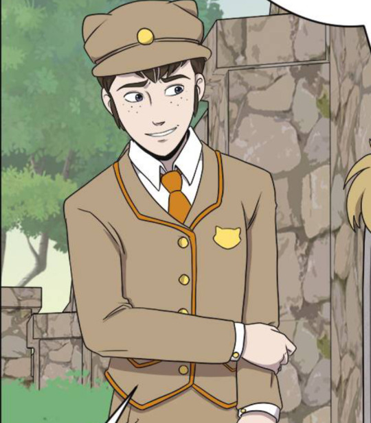
Specifically, pink for Chase, and orange for Deacon
Something to note is that these colors are nearly perfect complementary colors to each other. Even Prunella seems to have this theme, with her red hair and green shirt.
Now, it is generally good for character design for outfits to have good complementary colors to make them stand out, but me thinks that Punko went even further with this.
The thing is, Buddy really only has purple in his color scheme (unless out count every shade of gray and black).
We see him in some other colors, but mainly it’s purple:
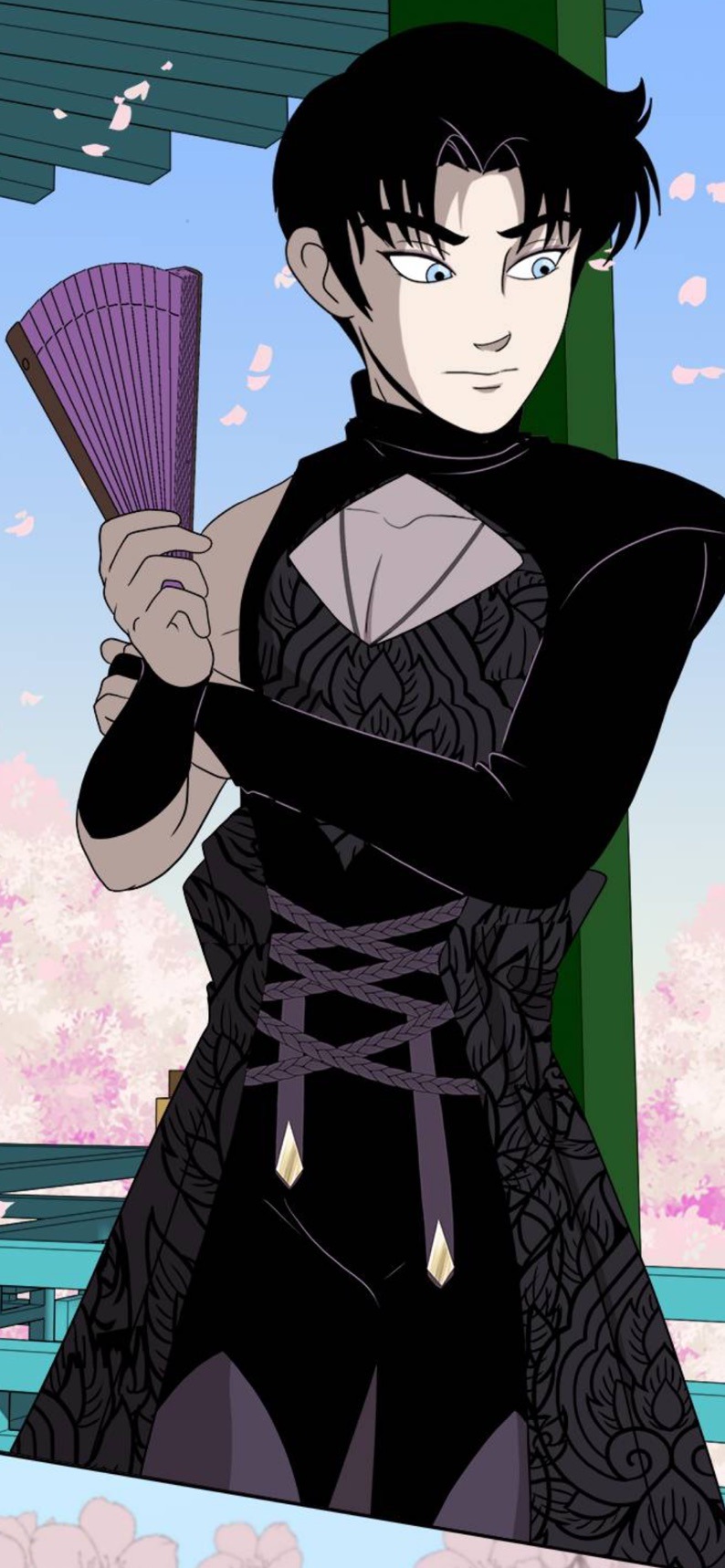
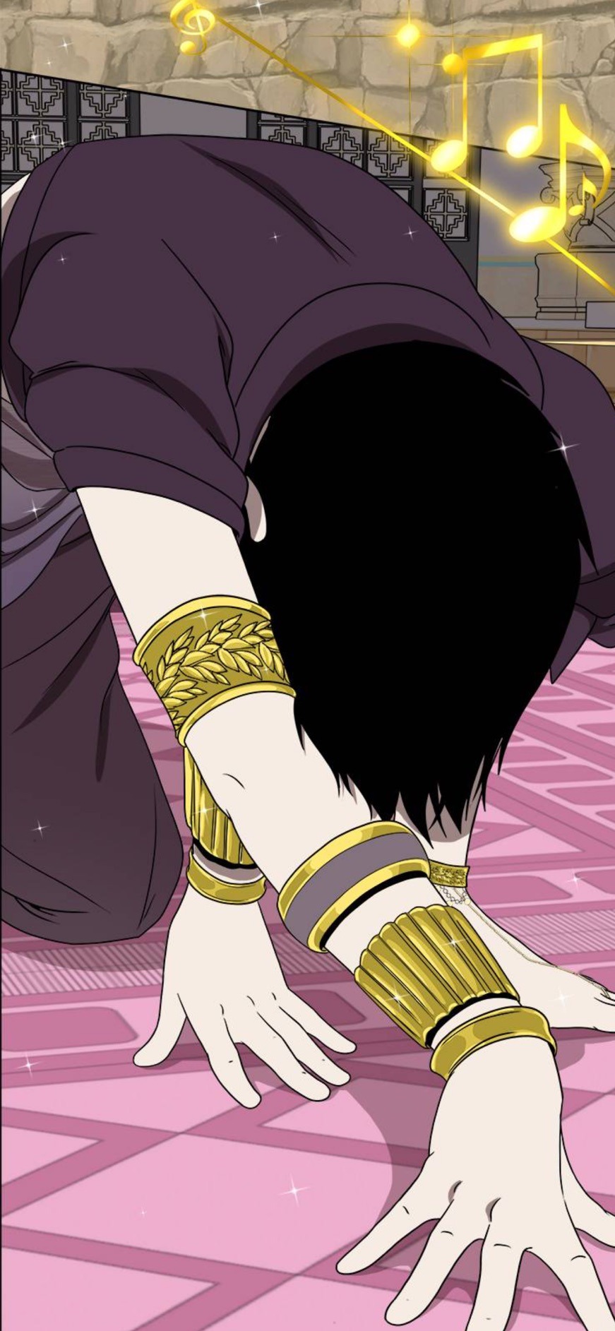
Like, a lot of purple.
(Other examples include Toffee Break, Beach boys, Sick Day, etc)
Pretty much all but two of Buddy’s ten outfits have included some element of purple.
But then again, up until recently, he’s only been a villain. A foil to Chase. The black and purple suited him, for a while, because he was only ‘evil’. (This also leads me to believe that future Ex Libris members will also wear black in their outfits to fit on theme. In Dreams by Day, a presumably Ex Libris worker is wearing a black shirt).
But now? It’s Buddy’s story too. He is becoming a protagonist. And that means getting a new color, possibly one that compliments purple.
And what color flowers bloomed when Chase saved him?
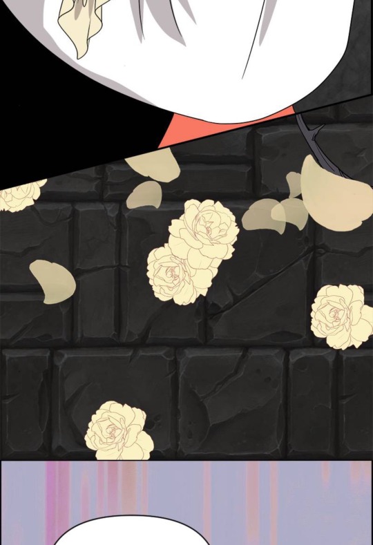
Yellow.
This is leading me to believe that Buddy will have a major character shift at the end of season 1 / beginning of season 2, where yellow is included in his outfit colors. And maybe, S2 will feature Buddy’s story more as he becomes a protagonist ‘,:3
TL;DR: Colors are important to CB characters, and Buddy is gonna be a protagonist soon.
I’ve actually been forming this theory of mine since like, the beginning of October, and the amount of serotonin that filled my brain when I saw those flowers, and seeing that my theories may be true could literally flood a city.
Thank u for reading :D
140 notes
·
View notes
Note
how do you decide the colors of your art? color theory is so hard and your art is always so vibrant and cute! 🥲
Non are you on the right page? 😅 jkjk
uh I've put off answering this ask (this was from March 2nd aksjdhk) because Idk what I'm doing most of the time and go with the vibe BUT I tried my best with this, sorry if it's messy af akjshdkjasd
again like the previous tutorial-ish ask I answered, I am not a professional artist by any means so all of these are just stuff I learned on my own and heavily simplified for me to digest and implement it easily, you'll have to take these with a grain of salt. With that said-
Okay first off, yeah color theory is hard and I don't know everything about it xD I think the most I've used are these ones:

There's a lot of tutorial, advice and like, art out there that explains the entire color theory thing, some are complicated and some are easy. My advice is pick only 1 thing to focus on, try to understand it and then use that one advice, then only moving on to other concepts, because there's so much going on with color theory it's very easy to get overwhelmed and to give up on it!
here are some recommendations if you want to learn color theory:
bluebiscuits
nouconcept has a lot of post of all kind explaining her process and colors in a cutesy, bright and colorful manner, so feel free to scroll through her page! I recommend [basic knowledge with colors, color theory, color palettes (more on this later)]
Btw if you're on Procreate, I like to use the square more than the triangle. Also, if you click on "Harmony", there are modes of color theories (the complementary, tetradic color thingy) that you can pick to create colors easily.


Like when I set it to "Split Complementary" and when I pick this bright pink as my main colors, there are 2 more circle to indicate the complementary colors (green and blue)

Okay in terms of picking my colors like the how and why, the easiest way is to find color palettes to work with, you can find them in abundance in pinterest for starters, but if you want more specific or control you can try colorhunt, sometimes you'll see me reblogging palettes from @/color-palettes too (here's an example on the result of using a set of colors, pretty cool!)
If you're using Procreate, you can also convert images to palette easily. You know how sometimes when you see really aesthetically pleasing screenshots whether it's from games or anything and you go, "huh, I wanna color something like that but I don't know how and I don't feel like color picking every pixel"? yeah just plop it into procreate and you'll get an array of colors to work with. Here's how to do it.


Uhhh next is about shading I guess? xD here's my simplified way to do it. If you want me to go in depth or more about "Layers" you can send me another ask, but I'm not the greatest at it I just like to use a few of it.
On the alpha lock lineart thing, red is usually nice to work with on skins, orange is good for like a glowy/warm/AYO LIGHT IS RIGHT HERE ON HIS HAIR situation, blue is for reflective lights or like in the darker zone (don't take my words for it cuz I rarely use blue correctly)

I think when it comes with shading there's a lot that can go wrong, and very quickly too, so what I would suggest is try out the cel shading technique first, in my opinion it's cleaner and much easier to handle. Marc Brunet does an excellent tutorial on this. If you want to know the differences between cel shading and the usual soft shading you can watch this video by Winged Canvas.
Why I think cel shading is easier? because there's not a lot of blending that needs to be done. From my experience, I feel like blending can sometimes lead to badly smudged, blurry, undefined look on a painting, it comes with experience from understanding different aspects like lighting, face planes, color coherency etc. If you want to learn more about the details, I can suggest:
How to learn digital painting (beginners) by Sinix Design (highly recommend them for the basics and foundations)
Better Shadows by Sinix Design again, this is still something I'm learning and struggling with but this video talks in detail about hard lines and soft lines, planes and etc, essentially the things that make up a good color piece
While we're at it, actually I think before you even tackle color you probably wanna take a look at greyscale first xD but okay then that's a whole new thing to learn so, this post is more like a simplified way of how I color stuff. I will rec Ariabba and Lucas Peinador's videos if you're interested tho.
RIGHT okay so the next few are just more like things I do. When it comes to colored doodle, once I've picked a palette I want to work with, I stick to it. Idk what to call this except color group consistency. You can look at this example below.

You can see how all the colors are primarily from the ones on the side, the only difference I would make are saturation and hue but only very minimal for shadows. (This is also why I recommended finding a color palette in the beginning) I feel like whenever we do colors we're quick to jump into the big fiasco of "oh I want to make everything really bright and really colorful!" and there is nothing wrong with that thinking, it's good! But if you're new to coloring in general, that kind of approach can make a painting feel...uh...disconnected? I think? it's like the colors aren't matching well together if you don't know how to blend and make all the colors work xD If we stick to a set of colors, it's much easier to maintain the tone of the art.
Okay, another tip when it comes to shading is this.

Let me preface this by saying, there is nothing wrong with the "Dull" method, it all depends on the mood/setting of the piece you're working with. Say if you're drawing something that is moody, in the shadow, in the rain, just basically in a darker surrounding, then it works well. But in other cases, if you feel like your colors looked dull then maybe you can try the 2nd method. Basically you shift your hue (the outer circle, the ones with different colors like green blue purple and all) a tiny bit then increase the saturation to the level you want. This would make the shadows/shades much brighter and nicer to look at.
Another tip is understones! they help tremendously in terms of adding just that extra oomph to your art. Take a look at this example.

Adjust your brush opacity (make it lower) to color a base (in this case, orange), then only shade in the color you wanted (red), you can see how it's a little bit more interesting to look at. Again, this is just a preference thing, if you prefer to make it red then go red.
Here's another example, I think this is more so of combining undertones and color stacking. If I just color Laswell's shirt with pure dark purple, it wouldn't be as interesting and eye-catching, ya know? So I actually used a mix of blue and pink as undertone, then I shade dark purple over it, then adjust in some places with a lighter purple as accents.

This is another thing that I do sometimes, not often because idk what I'm doing with this LMFAO but I'm basically trying to add more variation and some pop to a painting by dotting in really bright, almost neon like colors to well, make it interesting looking. I think I always use the blue, purple, orange, yellow category.

Lastly (and I like to say this a lot), when all else fail, just use a gradient. It doesn't matter if you don't know how just know to use a (light color) (base color) (darker base color) combo and instantly your art already looks more interesting. Hell, why not take it a step further and add some texture to the piece? It doesn't have to be complicated, you could put random lines, dots, hearts, whichever works as long as it creates a subtle contrast to the whole piece. Very small detail but it can make a big change! Let's take Alexander the IV as example:

Once we added a green to it, it looks good on itself already, like hey now we know the lil buddy is green. But it's boring, okay then smack on some gradient, make the top lighter and the bottom darker. Hm but it's missing something, okay random bullshit go! Add lines, hearts or use a noise brush over the green and boom, now Alexander the IV looks cuter.
Hope these help!
#gomz scuff advice#man idk if i even make sense aksjhdkjghsk#like i do monochrome doodles like 80% of the time....so...idk shi about colors...DKSJZHLSKGJ#and most of my color doodles usually have shittier engagement/numbers/reach so that says a lot LMAO#i almost didnt want to answer this....but fuck it lmao i didnt feel like removing your ask either so here#maybe it can help a tiny bit#hopefully#waiting for another artist who knows what they're doing - sees this and go wtf is this panda on about kajhsfdkjh#sorry HASKD uhm anyways#ask response#idk how to tag this#color#art#i guess???? yeah sure why not
20 notes
·
View notes
Text
Deltarune Brawl!

Mass attack! Twenty OCs! Let's goooo!
Attacking everyone tagged below:
@somemismatchedsocks
@emthimofnight
@6larosie9
@silvers-starrway
@ekaycheem
@einelitas
@yellowvixen
@polkychu
@zhampip
@totaleclipse573
@sonlc
Skaerial
Lunateaq

So a bit of info on how I got all of this to happen:
This was planned to be a sorta-battlefield between Seafoam and Stardust where both dark worlds collided and both individual parties from both side met and... Didn't get along. Hence fighting.
Their colors were based on the theory/idea between Additive colors and Subtractive ones. The idea goes that the main deltarune cast are composed of additive colors (Susie: Red, Kris: Blue, Ralsei: Green) and their dark forms are basically inverting those colors. It also makes them appear much brighter with heavier darks because the colors are blending together at the center.
For more info, read this.
So then I began to design everyone according to both their hypothetical role type and their Subtractive color type.
By role type, I mean that I divided everyone up into three categories with some basic rules attached:
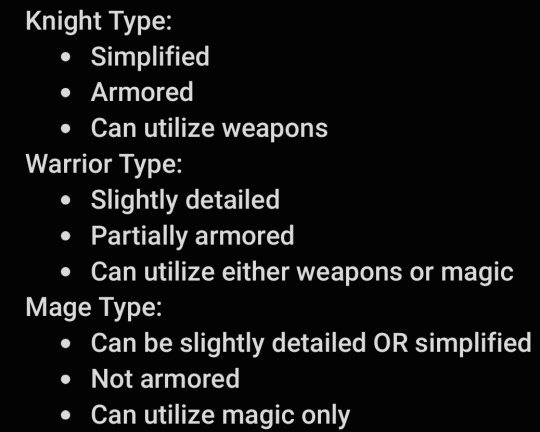
Since the original models were all pixel art, it's hard to tell in any official designs if there's anything else besides basic features, so that's where the "slightly detailed" phrasing comes from.
I mainly based their roles on personality... Also part of a theory that the dark world forms are based on everyone's subconscious. With that in mind I chose outfits I thought everyone would like.
And as for the background... Those are custom saturated colors.

Mainly based on color theming I decided to heavily saturate the icons for seafoam and stardust and then go into a color pallette generator and lay down the core three colors.


And that's basically how I got the background set up.
For Subtractive colors, there were three categories: Magenta, Cyan, and Yellow.
Magenta typically leaned towards pink and red shades with complementary colors. Cyan had blue, purple, and green as complementary colors. And Yellow had green and orange as complementary colors.
For our Sub Cyans we have: Kaiko, Stellar, Sakura, Nymph, Rosemary, Sunshine, Mallow, Meredith, Orion, and Naomi.
For our Sub Magentas we have: Rime, Terios, Juice
And finally, for our Sub Yellows we have: Camellia, Maria, Tulip, Arthur, Keira, Estelle, and Azarael.
And that's it! Experimental color pallettes inside a mass attack of everyone fighting each other! Hope you all like it!
#artfight#artfight 2024#sonic#sonic oc#sonic au#digital art#sonic fanart#🌸mine#This took almost seven hours I hope it was worth it-#Spiritrune au
67 notes
·
View notes
Text
OMORI and colour- an analysis
hey, so this is a post I’ve been wanting to make for a while and never got round to doing, but here I am.
Something I noticed in OMORI and have continued to notice throughout the game is the symbolism between colours and characters, and what they say about their relationships or their mannerisms, because there’s actually a LOT there, more than I expected.
keep in mind this is a pretty basic analysis and I’m sure there’s much more to be discovered, but I haven’t fully learned everything there is to know about colour theory and so this isn’t really my field of knowledge, I just wanted to share my findings.
also, spoilers ahead, so beware!
Filling in the wheel
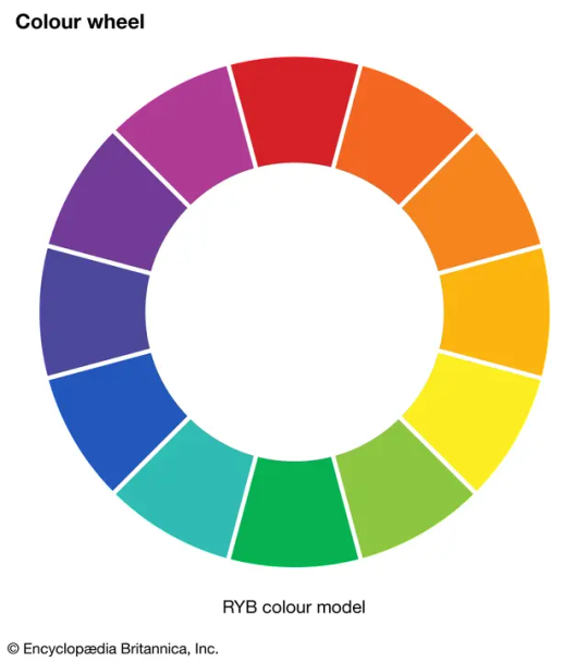
This is a basic colour wheel, and the model I will be referring to throughout this analysis.
in OMORI, and even in external items outside of the game like merchandise each of the main cast are associated with a specific colour.
for example, SUNNY is associated commonly with yellow throughout the game. Here’s a small chart I made to keep track of my references…
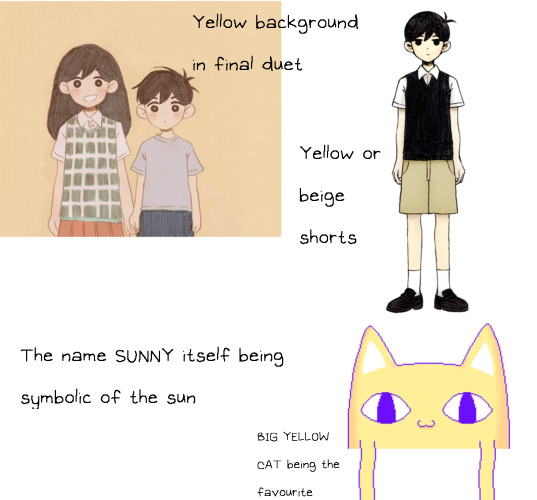
I’m sure there’s more but here’s what I’ve got.
so now we know where sunny stands on the colour wheel, in the yellow region.
the rest of the cast can be easily identified on the wheel- KEL clearly falls into orange, HERO clearly falls into blue, MARI clearly falls into purple, BASIL clearly falls into green and AUBREY clearly falls into pink.
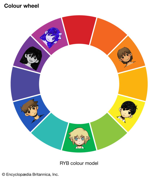
But wait, that’s not the complete wheel.
you’ll notice AUBREY’s positioning differs from the rest of the group, and that’s because I’ve specifically put HEADSPACE AUBREY in that section. Where REAL WORLD AUBREY actually falls is on the red segment of the wheel as that colour is better associated with her emotional state and also slots her better into place on the wheel.

So that means the rest of these midtones represent the rest of the HEADSPACE counterparts, right?
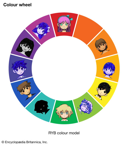
You’ll notice one more blank space, but let’s put that one aside for now. We’ll fill it in later. For now let’s begin to focus on the relationships between these segments on the wheel.
Complementary colours
Complementary colours are defined as “pairs of colours which, when combined or mixed, cancel each other out (lose hue) by producing a grayscale color like white or black. When placed next to each other, they create the strongest contrast for those two colors. Complementary colours may also be called "opposite colours"”.
in other words, these colours complement each other, and are paired together as they are the most striking next to one another. They are opposites, but belong together.
so, who do we have complementing on our OMORI wheel?
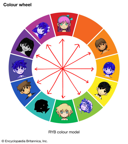
Now, this is quite complicated to look at but I’m going to use what I think is probably the most important relationship in the game and use it as an example.
MARI is commonly associated with purple throughout the game, so much so that it’s constantly in our faces. The main colour for SUNNY’s headspace where he escapes the tragedy of what happened to her is purple, AUBREY laments about a lost promise of dying their hair purple and pink together, MARI gets a grape flavoured (purple) popsicle in one of the photos in BASIL’s album, etc. she’s very clearly shown to be “purple”symbolically throughout the game, no question there.
and as for SUNNY, as we’ve gone over earlier, he is represented by yellow.
so when we reference our colour wheel once having placed these two in their respective spots, what do we see?
MARI and SUNNY complement one another.
And we see this consistently for other key or contrasting relationships through the game. HERO and KEL complement both in the REAL WORLD and HEADSPACE, and so do AUBREY AND BASIL.
They are shown to complement each other, when placed with their associated colours on the wheel.
so, what about STRANGER? Who does he complement with? After all the segment opposing him is empty.
I feel as though there’s only one answer which makes sense for the game.
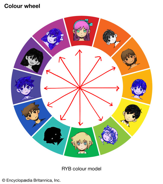
OMORI complements STRANGER and STRANGER complements OMORI.
but, for OMORI, this seems out of character. The character itself is typically associated with black to represent the repression of the truth and also the darkness behind his actions to keep SUNNY guarded from the truth, so this warm colour feels out of place.
but looking deeper into the symbolism, I disagree. Orange itself represents liveliness, optimism, and enthusiasm, which I think represents HEADSPACE. However red, while associated with anger for AUBREY, is more commonly associated with danger and most importantly sacrifice.
As well as this, this specific hue shows to carry more of a red pigment than an orange.
so I believe this can represent this distracting and overwhelming joy of HEADSPACE whilst having great sinister undertones just Millimeters beneath the surface, something very fitting for OMORI as he’s portrayed in the game. (Side note: I don’t think OMORI is evil, by the way. I’m talking about his actions and portrayal in contrast to HEADSPACE, nor his intentions. I view OMORI more as a robotic kind of character than anything but that’s an analysis for another day.)
so, in conclusion, there’s a lot to be told from this wheel. Here’s a finished polished version for anyone who wants to use it, including some extra notes I didn’t discuss here. If there is anything at all you want me to elaborate on or go more in depth into, or just neglected to discuss at all, please let me know! Thank you for reading!

(PS also open for criticism on the wheel- especially if you know more about colour theory than me! I don’t go into much detail about what each colour association represents within the characters themselves here so that may be for another post)
#omori#omori analysis#omori mari#omori sunny#omori basil#omori hero#omori kel#omori aubrey#omori game#colour theory#omori stranger#omori character
122 notes
·
View notes
Note
How do you go about picking your colors…. They’re always so pleasing to look at 🥺
The embarassingly short answer to this would be "i get visions of color palettes and scramble to jot them down before i forget", but I will attempt to give a more technical answer! Most of the time I use complementary colors, since the natural way they clash lends well to funky atmospheres. Something I do for pretty much every one of my pieces is hue shifting when shading, where if I have a base color of, say, yellow - I'd shade it with a red-pink to the left of it on the color wheel. I think hue shifting ends up making the overall palette look like it has more depth and interest! When it comes to thinking of palettes, like I said I usually start with two complementary colors and use only those in thumbnails to get a 'mood' down (magenta and green for something funky, orange and blue for something heavy, etc.) I pretty much never stray from full saturation on colors, and (most of the time) I substitute black for a different, dark color to make a piece look more harmonious or soft! Sometimes I'll do the same for whites, replacing them with grey or blue. Something that's pretty important is that my colors are very very limited! I use only the bare minimum of what I need, and I think it makes every color stand out more as result.

I like to have my colors spaced pretty evenly in my pieces, as well. And while I don't particularly use blending modes much at all, sometimes I'll use an overlay layer to bring in more of a certain color for harmony.
Something not as important but more of a personal thing for me, I tend to use secondary colors in place of primary ones alot (so pink instead of red, orange instead of yellow, teal instead of green, etc.) No particular reason behind that besides just looking nice :) Finally, I'd say to anyone trying to improve on their colors to try thumbnailing a set of sketches purely on color! A vast majority of my pieces start off as me blocking down colors based on a mood I want to achieve and building off from there. I tried my best to make some examples of what that would look like:

I'm very bad at explaining things because alot of this is muscle memory but I hope it helped!! Apologies if my wording isn't clear, and thank you for liking my stuff
#also remember there are no hard n fast rules and everything just depends on the piece!#sorry if this is a lot of information all at once I just didn't want to leave anything that could be useful#also ignore that ghost trick art. might make that into a full piece maybe#i can't be bothered to check for spelling mistakes this took so long
16 notes
·
View notes
Note
do you have any tips for coloring/rendering? your art always looks so effortless and cool!! you always have the best color palettes.

aw thanks!! my reccs for making color palettes work is to learn color theory, not merely for understanding color palettes but to understand color values. if you pick a bright red and a bright yellow at the same value on a color wheel they actually don't read the same because of the ways our eyes work
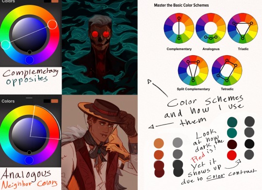
you'll see a lot of my art is either complementary colors or analogous, including the first paintings above are analogous- green, yellow, orange. Yellow, pink, purple, blue.
the top portrait here is mainly dark teals and in gray scale the red glasses are also a dark value, but because red is so different from the blue/greens it stands out by color alone
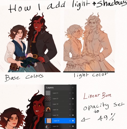
Something I've learned lately is using Color Burn, Linear Burn, or Darken color instead of Multiply for my shadows, set to a very low percentage, esp for pieces where i really want the colors to be dark and rich
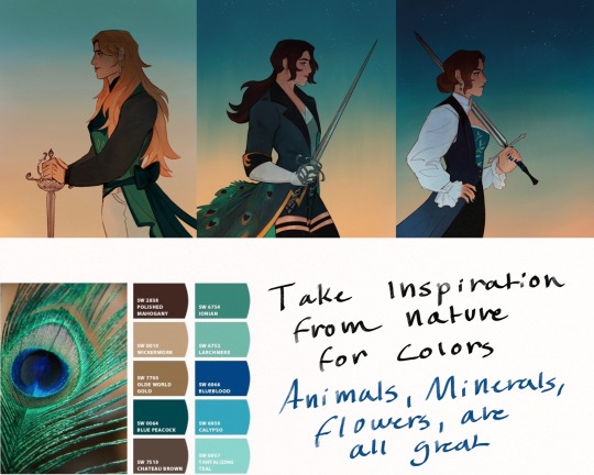
Lastly, when stumped for color palettes take inspiration from nature
#Crows Ask#my art#sorry this is so messy#i hope this helps!#I realize now I didn’t touch on rendering but for that I’d say keep ur workspace tidy and keep separate layers for everything
83 notes
·
View notes
Text
Color Analysis
Color Seasons Analysis is sort of like Kibbe, but for colors in the clothes/makeup/etc you wear as opposed to body geometry typing. There are different systems suited to the appearances of people in different countries.
There is a misconception that your hair and eye coloring, and your skin tone, decides your season. This is not true. Not all black-haired people will be autumns or winters (more on that). It's important to know that your natural hair color may not be the ideal hair color for you to have within this system. That is, someone with ashy brown hair may look better with bright black hair or light blonde in considering their ideal color season, etc. So hair is basically like makeup, it can be changed to suit your colors. Eye color is a little less important because A) your irises are small overall. and B) the most common eye colors will work with almost any type, so it's not worth looking at as much.
In the most used Korean system, you begin with a series of color palettes and the attendant will drape colors over your body to rule out different palettes and see which looks best with your skin/eyes/hair/lips/and such. Obviously we can't do that but we can look at different colors and see how they can be complementary or look off.
In color typing there are four seasons. I'll be looking at the Eastern way of typing (Japanese & Korean) because it's tailored to East Asian people and in my opinion, makes a lot more sense than the more restrictive Western systems. The most important elements are: cool vs warm; brightness vs dullness; and light vs dark.
Cool vs warm: pretty self-explanatory. Does your body project a warm (gold/olive/yellowy/bronze) undertone, or a cool (pink/blue/purple) undertone?
Bright vs muted: Also known as heavy contrast vs light contrast. Do your features benefit from strong contrast? A good benchmark is to compare hair colors: a hair color that's close to your skin tone vs one that's very different. If the different color looks better or adds a pop, you do better with brightness. These people tend to have strong, bright, reflective skin. Obviously brights do better with pops of color while muted people do better with low contrast.
Light vs dark: this one can be hard to gage. Some people just look lifted with light colors while others require deeper, darker tones.
///

In essence, the spring family is 'light and warm', the summer family is 'light and cool' the autumn family is 'dark and warm' and the winter family is 'dark and cool'.
It's important that in this system, palettes are not very strict. Different types can borrow neighbouring palettes. It's more about seeing the colors that obviously don't look good, i.e. the opposite of what you should wear.
Spring light, Summer light: These types have the same palettes. Both require light colors first and foremost. They are overwhelmed by heavy tones. The only difference is that light spring does better with warm tones (pink, red, orange) while light summer prefers cool tones (green, blue, purple)
Summer bright: Needs light and bright colors.
Spring bright: Along with winter bright, these are the punchiest colors. They carry loud color well, including bright lipsticks or eyeshadows.
Summer muted, Autumn muted: These types share the same palette of muted, calm colors. Brightness overwhelms them easily. They benefit from low contrast. Summer muted does better with cool colors while Autumn muted requires warm colors.
Autumn bright: This type foremost has a sense of warmth and depth. They do well with rich tones, such as jewel tones or fall palettes.
Winter bright: Similar to Autumn bright, but they do well with slightly brighter (still rich and deep) colors.
Autumn dark, Winter dark: These types do the best with dark, heavy colors. They share the same palettes, but warm tones are better for Autumn dark while cool ones are better for Winter dark.
As I said, these types can overlap slightly. I've seen the Korean system where you will have a dominant type (i.e. Autumn bright) and a secondary type that is close and you can take colors from (maybe Autumn dark)
If this feels subjective, it is to a degree. You should be able to compare wildly different palettes on a person and see that one works a lot better than another. Like kibbe typing, it can be hard. That's why I only have a few examples to demonstrate how this system would work.
Examples (good vs better)

Tzuyu is a muted autumn. So she benefits from low contrast, warmth and some deeper tones. The outfit on the left is what she wore on the red carpet. It's good, but doesn't emphasize the richness of her coloring compared to my edit, which changes her lipstick and dress to something that is better for autumn muted and autumn dark (again, borrowing similar palettes). I think everyone can see the difference here.

Wendy is a spring bright. She looks great with light brown or blonde hair and soft pink lipstick. The left outfit, which is black/navy, looks good, but the right one (ignore the terrible edit haha!) gives more of a 'wow'. You stop and look at it.

Yujin is an example of a vivid winter. She has a warmer tone, but she looks more herself in rich, bright, cool tones. The left shows her dress edited to be duller and a lighter green; she seems to recede, while in the dress she wore on the right (and with edits to make her lipstick brighter and her jewelry cool-toned) she stands out a lot more. Contrast and depth. The left ensemble might look ideal on a vivid summer.

Hair is also relevant for typing. Haerin is a dark winter. The colors of her outfit are great for her type, but her hair in the left picture is too bright and warm-toned, so it clashes with her outfit and coloring. Vs, on the right, darker, deeper brown hair puts everything into place. Cute on the left, vs snowy princess on the right.
Note that unlike kibbe, color typing applies equally to men and women... while kibbe is tailored to body shapes in female people, everyone has skin, male and female typical outfits have all kinds of colors too.
This is by no means a perfect description but it's meant to show the overall theme of things that really work vs things that look a bit off. I may continue this with a more in depth look at the system.
9 notes
·
View notes
Text
get-to-know you tag game YAY!!! tagged by @coyoteworks thank you tex i LOVE tag games i literally JUMPED out of bed in excitement to do it. YAY TAG GAMES!!!!
here's some mutuals you're not obligated to do the tag game but you can if you want to because its fun :+) @italofobia @luxphobia @real-life-cloud @dykecanthropy @sunshinetomorrow if i didnt tag you you can just lie and say that i did. im too excited to do the tag game OK!!!
last song: alright well legally the last song i listened to was "quest man" by "by release" but i didn't finish it. it was in my discover weekly and i think it's about being a little runescape guy completing quests which is funny. but again i haven't finished it. the last song that i knew was rasputin. ive been on a rasputin kick lately i fucking love rasputin.
last book: oh god am i going to be annoying and have two answers for all of these? manga-wise im reading through yotsuba im on vol 12 it's very cute. "real book"-wise (i.e no pictures) is. um. "A Pickle For The Knowing Ones - Plain Truths in a Homespun Dress" by sir timothy dexter... it's.... well. um. ummm. uhm. So true! Uhhuh! You should definitely read it. And then go read timothy dexter's wikipedia page. Smile.
last movie: lego movie 2: the second part!!! i rewatched both 1 and 2 recently i adore the animation so damn much. and it's been such a long time i forgot most of the jokes so it almost felt like watching it for the first time again. maybe i'll rewatch lego batman next.
last game: mmmmminecraft? minecraft. yeah probably minecraft. not much else to say! it's minecraft.
last tv show: oh god damn it i have to talk about the legend of nezha now huh? to be clear i'm not talking about the actual deity nezha im talking about an awful cartoon retelling of nezha's story from 2003. it was very hard to watch the first episode of it and i only watched it for my anime review project to where i watch one episode of an anime for every season (two anime per season). i had a fucking HEADACHE after i watched it too. I HATE THAT STUPID EVIL ADVISOR CHARACTER HE'S STUPID AND ANNOYING AND I HOPE HE FALLS OFF A CLIFF!!!!!!!!!!

FUCK THIS GUY I HATE THIS GUY!!!!!!
sweet/spicy/savory: i'm honestly more into the salty side of things but between these three i have to go with sweet just because that's probably my number 2 taste. i like savory but it HAS to be in moderation otherwise i feel like i might have a heart attack.
relationship: siiiiigh. Sigh! hmph. looks over my shoulder and then looks back at the camera and sighs again.
fave color: huge pink/yellow color combination fan FOREVER. i also like rainbows. i also like complementary color pairs (red/green blue/orange yellow/purple)
last internet search: "what is a plus 44 number" because i got a weird spam text and i was curious where in the world it was actually coming from. United Kingdom!
5 notes
·
View notes
Note
hi there! i’ve seen your pokemon villain tarot pieces and i think they’re really neat, and the colors especially are very striking - how do you choose the color palettes for them?
Thank you so much! I can go into each one since they all had their own inspirations so if you’re interested in knowing more about that then read on!
For starters, I set the limitation that each card has a base pallete of two hues to help with consistency. Lighting, shading, and effects could be different hues, but the base could only be two. I also decided that I wouldn’t use any pure white, black, or achromatic greys as they felt like loopholes in the two hue rule.
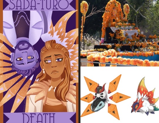
Sada and Turo already had a distinct orange and purple theme, so it made sense to lean into that. While trying to think of things to fill up empty space that matched the palette, I thought of how orange marigolds are used to decorate during Dia de los Muertos and that both Sada and Turo had a variant of volcarona, who has orange wings. With that in mind, I decided to decorate the wings in the shape of a flower as a way to tie it back to the death theme.
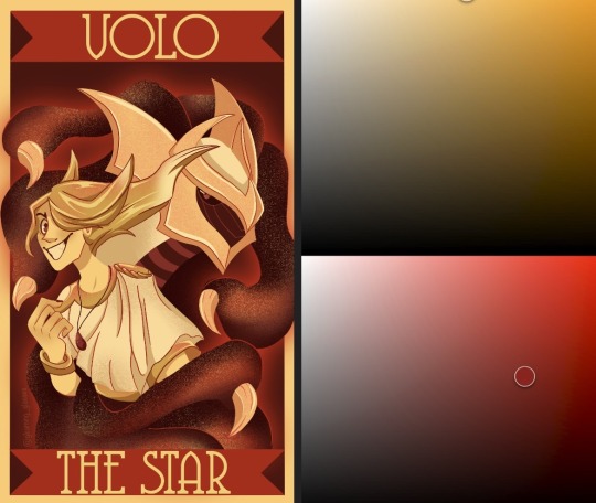
For Volo I decided to use the yellow already present in his design and red as a show of how intense his feelings were at that point, a powerful palette for a powerful trainer. The red also helped tie in giratina who I knew would be an important part of the composition. I wanted this palette to convey a feeling of intensity, way more than any other card.
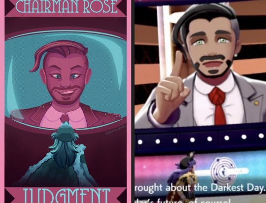
Chairman Rose was tricky, compared to other villains he doesn’t have too strong a signature color. I decided to lean into his name (rose) and do pink with blue to be the screen he’s on in the stadium and Leon’s figure at the bottom. I went with such a non threatening palette to reflect how Rose was not seen as a threat by the player for large part of the game. He leaned into a friendly demeanor and so I felt the palette should reflect that.
For Giovanni at first I thought to use his signature colors of red and black. However, if I did that it wouldn’t be pure black, but rather a very dark shade of some other color, and I didn’t like how that was looking. I started thinking of things Giovanni reminded me of and one thing was wine, which tends to make me think of bright yellows and deep reds or pinks. I also knew I wanted his persian in the card and personally like the head canon that it’s shiny, so using those yellows and pinks worked really well!
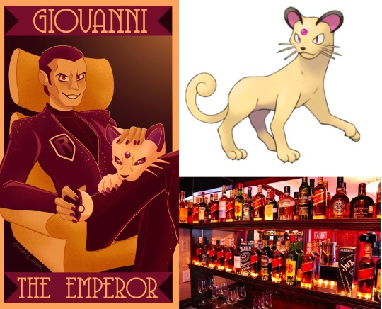
Guzma, Lusamine, N, and Ghetsis each had relations to each other in game and I wanted their cards to reflect that. For N and Ghetsis, that would be by them sharing green and being surrounded by dragons. Ghetsis colors were mostly inspired by his coat and the colors of a shiny hydreigon. For Lusamine and Guzma it was by sharing purple and by having guzma hang by Lusamine’s arm. After that I leaned into the gold in Guzma’s design and a bright blue for an eerie, otherworldly effect of Lusamine.

Lysandre and Cyrus got similar palettes for opposite reasons. Lysandre’s signature color is orange while Cyrus’ is cyan. Blue and orange together make for good contrast with being complementary colors. I gave Lysandre dark blues to help make the oranges pop. Meanwhile Cyrus got bright orange to reference the red chain.
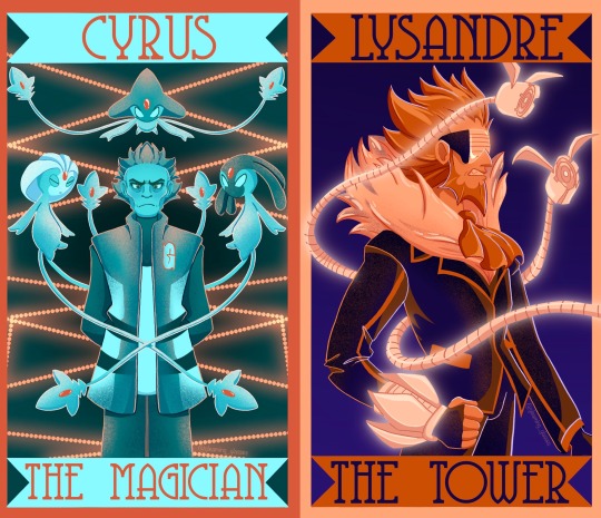
Finally, for Jessie, James, Meowth, Maxie, and Archie, I felt their signature colors were so well known that I had to use them. It wouldn’t make sense to use anything other than red and blue for Maxie and Archie. Maybe there’s some leeway with Jessie and James, but for them I figured if I didn’t use one of their colors, then I shouldn’t use either, and why would I do that when purple and pink work so well for them! And they came together nicely on Meowth.
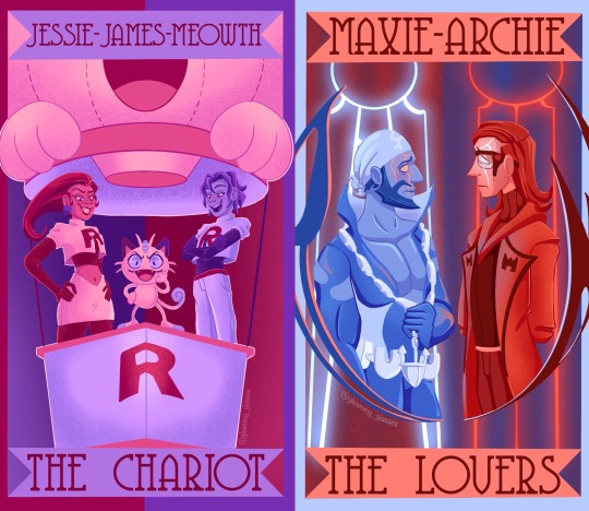
And that’s all of them! I hope that answered your question👍
50 notes
·
View notes
Text
Color Harmony
This is inspired by a post I wrote answering an ask about the triadic color scheme. So, let's dive into color harmonies.
There are a couple of ways to create color harmony, and some of the most common are:
Analogous color scheme (which I usually refer to as "related colors")
Monochromatic color scheme
Complementary/contrasting color scheme
Split complementary color scheme
Triadic color scheme
There are also other color harmonies like the tetradic color scheme (which forms a rectangle across the color wheel and includes 4 colors) and the square color scheme (which forms a square across the color wheel and also includes 4 colors) to name a few. But I'm keeping it (somewhat) basic in this post.
Value (dark/light) and intensity (saturated/muted) also play a role in color harmonies, but I'm keeping it simple in this post by just focusing on color combinations.
As always when explaining these things, I need this visual aid to help me:
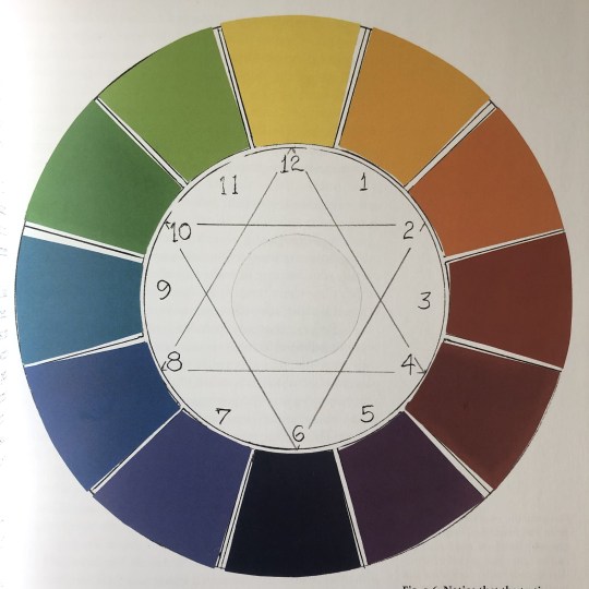
(This is a photo I took of a color-wheel illustration in Betty Edwards' book "Color".)
This is a traditional color wheel with 3 primary colors, 3 secondary colors, and 6 tertiary colors.
(I'm putting their numbers in the list below so you'll know which color I'm referring to on the color wheel.)
The colors are:
12: Yellow (primary)
1: Yellow-Orange (tertiary)
2: Orange (secondary)
3: Red-Orange (tertiary)
4: Red (primary)
5: Red-Purple (tertiary)
6: Purple (secondary)
7: Blue-Purple (tertiary)
8: Blue (primary)
9: Blue-Green (tertiary)
10: Green (secondary)
11: Yellow-Green (tertiary)
(Not that this will matter to the post, but if you're interested: The primary colors can't be created by mixing other colors/pigments. These are the basic colors you need to create the other colors on the color wheel. The secondary colors are those you get by mixing two of the primaries together. The tertiary colors are those you get by mixing the primary color with the secondary color that's on either side of it.)
(Also, the tertiary colors usually have different names in everyday language (like magenta, indigo, or turquoise). But I'm coming from a painter's perspective when naming the tertiary colors because this was how I learned how to identify hues and mix them properly.)
With that sorted, let's dive into the different color harmonies.
Analogous Color Scheme
These colors are inherently harmonious because they share the same space on the color wheel and reflect similar light waves.
Usually, they include 3 colors, but a 4th and 5th could potentially work as well.
If you think of the color wheel as a cake, the analogous colors are all included in a small/mid slice of it. They are all next to each other.
An example could be purple, blue-purple, and blue since these 3 colors are right next to each other on the color wheel.
The analogous color scheme is often used with characters that are color-coded with a secondary (or tertiary) color. Secondary (and tertiary) colors are more difficult to distinguish than primary colors since they're produced by mixing at least two other colors. So, there is always more than one color at play in the secondary (and tertiary) ones.
This is why we often see, for example, orange color-coded characters in QLs use a spectrum of orange where they sometimes verge towards yellow and/or red.
But, this color scheme can be used in the set design as well, as it was in the background in this scene from House of Stars:
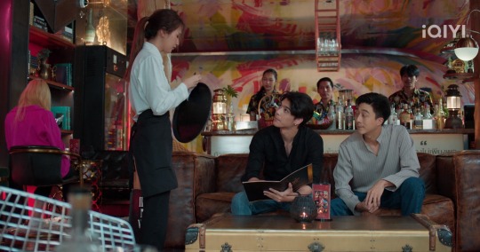
There's yellow, orange, and red (which incorporates a spectrum of 5 colors on the color wheel), and makes an analogous color scheme. There's some pink in there as well, which, if we want to be basic, is pretty much just a light red (red mixed with white). (There's also some green, which is a complementary color to red, but I'll get to that below.)
Monochromatic Color Scheme
This color scheme is basically several values (dark/light) of the same color.
A simple way to think about it is to think about a black-and-white photo. There's everything in there from black to the gray midtones to white.
Or this frame from Bed Friend:
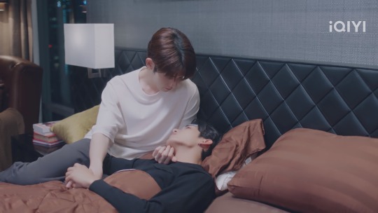
If we just focus on the white-to-black color spectrum, there's the white of the lampshade and Uea's shirt, the gray on the wall, the gray of Uea's pants, the darker gray/black on the headboard and King's shirt, and the black of the nightstand.
If another color was used, the black would still be black and the white would be white, but the midtones in between would be different values of the color of choice (for example purple, blue, or green).
Obviously, it doesn't have to go all the way to the ends of the spectrum (to the black and the white) to create color harmony. Using the midtones also works well, like these harmonious blues in Ji's bedroom in To Be Continued:

(I know this might look gray to a lot of people. But, trust me, there's blue in there.)
Complementary/Contrasting Color Scheme
I've already written about complementary/contrasting colors before, so I won't explain it in detail in this post. However, the core principle is that the complementary colors sit on the opposite sides of the color wheel.
The basic (primary + secondary) examples are:
Yellow + purple
Red + green
Blue + orange
And we also have black/white (or dark/light).
I would say that this is the most commonly used color harmony in the QLs I've watched. It's an easy way to make the colors stand out, it's a great way to show contrasts in characters, but it's also very easily and universally used with the black and white, dark and light contrasts in particular.
There are a lot of options to choose from when it comes to the black and white contrasts, but I'm choosing Lee Hyun and Kim An in Love Class Season 2 because their lives and personalities contrast just as much as their black and white colors.

I also want to add Chen Yi and Ai Di from Kiseki: Dear to Me who are matching each other:

It's a bonus that they're matching on all three colors (black, white, and red).
If I were to choose two of the colors from the color wheel and a QL that used them well, I would choose red and green and I Told Sunset About You:

They used these contrasting/complementary colors everywhere and it was so well done that everything from the set design to the characters was unforgettable. It was divine.
Split Complementary Color Scheme
This is also a way to use color on the opposite side of the color wheel. But, instead of the complete opposite, you select the two colors adjacent to the complement.
Instead of yellow being used with purple, yellow is used with red-purple and blue-purple, or purple is used with yellow-green and yellow-orange.
This is where we get into complicated territory, especially when trying to find examples of this in QLs. I don't think this is used very much (I can't remember having seen a representation of this) because sticking to the primary and secondary colors is easier.
Tertiary colors are used (I would say they're used more as a hue of a secondary or primary color, like I mentioned with orange in the part about the analogous color scheme above, rather than a color on its own) but are difficult to distinguish from the primary and secondary colors that produce them.
Every split complementary combination includes at least one tertiary color, so this might be why this color harmony isn't used as often in QLs.
If you have any examples, feel free to share them.
Triadic Color Scheme
I've already written about the triadic color scheme before, so I won't explain it in detail here. However, the core principle is that this color scheme is depicted with a triangle (there are two examples in the image of the color wheel above). Each point of the triangle points to a color that harmonizes with the other two.
The basic examples are:
The 3 primary colors together (yellow, red, and blue)
The 3 secondary colors together (orange, purple, and green)
An example of this can be Ji's bedroom in To Be Continued (the image I showed above), where there are yellow candles on the nightstands, a red balloon dog to the left (I can't really see if this is a Jeff Koons' figurine, but I doubt it), and the blue surrounding them (as well as their clothes).
There's also the living room in Knock Knock, Boys!, which includes the yellow, red, and blue (I love how all three of those colors pop):

But there are also the secondary colors in combination:

The orange pillow and posters, the purple light in the background to the right, and the green beer bottles. This is just another reason for me to absolutely love this series.
And then there's Secret Crush on You who wants to have all the primary and secondary colors in one frame at the same time (considering this is a colorful show, I'm not surprised):

The yellow, red-ish, and blue straws, the red backpack, the blue on Toh's shirt and the pillow behind Nuea, the orange on Nuea's clothes, the purple on Toh's shirt, and the green on Toh's shirt as well as the plants behind them.
And in this frame:

Where all three primary and all three secondary colors exist on those condom packages. Iconic!
And what a way to finish off this post, lol.
So, there you have it. 5 different ways to create color harmony with some examples from a couple of QLs.
#iq color post#color harmony#analogous colors#monochromatic colors#complementary colors#contrasting colors#split complementary colors#triadic colors#color theory#the colors mean things#house of stars#bed friend#bed friend the series#to be continued#to be continued the series#love class 2#kiseki: dear to me#i told sunset about you#itsay#knock knock boys the series#secret crush on you#my shit
18 notes
·
View notes
Text
I want to know how they made the demented Teletubbies
Like did they repurpose the body of a Lotso Huggin Bear for Nibbly? Does he smell like strawberries? Would make sense for a hungry god.
I love how the yellow one is Tinky but the purple one isn't Winky but Blinky. Yellow and purple are opposites on the color wheel, and complementary. As is orange and blue, and green and red, which probably explains why there's no red within the group since Wiggly is top dog. A certain shade of green opposites pink though, and that's the only reason I can come up with for mentioning these two gods in particular in the line "Nibbly wants his sacrifice and Wiggly wants his wrath."
Some other things:
So chastity is obviously associated with Grace Chasity, but another similar-sounding word is chastise, which mean to reprimand severely, and she also does a lot of that.
Max's name means "greatest," fitting with this God complex.
This takes place in modern day yet I'm surprised not one of the nerds is a true crime fanatic. I'm gonna use that for my NPMD AU fic for my fandom whenever I get around to writing it. I was having trouble with slotting the characters into their basic boxes because while the nerd, the popular character, and the jock are there, none of the other nerds are as desperately horny as Ruth or an otaku geek like Richie.
I think that's all.
#Starkid#NPMD#Nerdy Prudes Must Die#the Lords in Black#Grace Chasity#Max Jagerman#Pokotho#Bliklotep#T'Noy Karaxis#Nibblenephim#Wiggog Y'Wrath
37 notes
·
View notes
Note
hi me again
question abt your vampy bois: what do the tetradic things mean? do they symbolize something or are they part of the pallet for each character? I noticed they are all slightly different, red and vio's especially so

You aren't dumb, it's fine!! XD
Tetradic is the color scheme I use! By that, I mean I mostly use two pairs of complementary colors to choose my flat colors, varying lightness and saturation but not hue. (Until time comes to shade them!) There are other schemes you've probably heard of like split complementary and analogous. I tend to use paletton.com, though there are actually a bunch of different ways to organize hues across a wheel and not all of them will be the same.
I usually pick two pairs of complementary colors—not always in a square, though sometimes they are—and choose one from each pair to be dominant.
In terms of the vampire lords au boys, I used the same orange/blue combo for all of them (mostly for skin and eyes, then later for any white-blues and orange-browns), as well as a pair for their other colors. For Red, I'll use a pure red and cyan, sometimes altering it just a tad to make his red a bit more pink. The system means that Vio gets his purple but also some greenish yellow. Green gets his green but also a bit of magenta. Blue gets blue but also needs some orange or yellow in there.
It isn't anything that complicated really!

10 notes
·
View notes
Note
What If: There had been color swapping with ALL the Cosmic Fury Rangers?

I love this template, @regaliasonata
OKAY SO color swapping ALL the Cosmic Fury rangers, basically assigning them colors ON BASIS OF ROLE AND PERSONALITY? Yes. yes please.
I would keep Amelia as red. SHE FITS. She is a GOOD LEADER. The girl stood up for her team when there was need. Her pink gradually bled into red from the heartache she experienced, not only for herself, but also for her friends. She held the team together when it was needed the most. she deserves that red spot.
Javi acts very much as a No.2, the right hand of the red, do that puts him in the role of the blue ranger (ironic, right?). So, if I was stereotyping color theory, with the amount of ideas and contribution and the fuck-all-jumping-in-headfirst thing Javi has going on in cosmic fury, he'd be the Blue.
Conversely, Ollie becomes black. His blue rots into a dark black, sign of all evil, and Zedd would probably prefer that more too, because "Dark Ranger" obviously puts the black color in mind, than "Dark Blue" (which is very stupid because of course it is) (Also, honestly, swapping Blue and Black has no purpose for me, but since I've been given the assignment, this would be my go-to choice.)
PINK. FERN. FERN SHOULD HAVE BEEN PINK. I WILL DIE ON THIS HILL. The pink space that is left behind by Amelia ascending to red is filled by Fern, in personality, because she becomes the heart of the team! (re: check episode 5 and 7)
Zayto should be Violet. I shall not elaborate.
Additionally, Aiyon should be orange. If Zayto's violet, Aiyon gets to be his complementary. Aiyon has all the features of an orange, in my opinion. Obviously, you can elaborate more on this. If I were to keep Aiyon's gold, though, I would've made Zayto Silver. That would've fit better with 1: the morphin master aesthetic AND 2: with Aiyon's aesthetic. The beige SUCKED.
I... honestly have no color for Izzy. She's a very green-green. But if I had to pick one, perhaps she would be Blue? In which case, Javi becomes green (and I find that very.. un-fitting?) So yeah, Izzy probably stays Green.
And I botched up the entire assignment :D But anyway
ASK ME WHAT-IFS FOR POWER RANGERS
11 notes
·
View notes
Note
Hello Tamelee! 💜 Hope you are having a wonderful day, and that you had a nice christmas if you celebrated it
We all know that Naruto and Sasuke are designed to complement each other. Orange/Blue, Yellow/Purple. But I also noticed something about Sakura’s Genin design. In some manga illustrations, Sakura’s pants, shoes and headband are black, but in others they are green… Her chakra is green in the anime, and I don’t know if it has a color in the manga. And of course she has green eyes.
So I wondered if Kishimoto made Sakura being linked to red/pink and green in order to highlight how separated she is to Naruto and Sasuke? She complements herself in some way. Or maybe it’s to signify she’s pretty self-centered? What do you think? Am I just crazy?
Hi Nonee 🧡! Nothing too special this Christmas but it was nice ^^ Hope yours was as well!!! 🎄 Ah yeah, I checked it again;
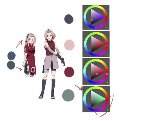
So I'm not too sure about consistency, but her coloring makes a lot of sense. Her childhood version even has the green/pink dress, the other has the green pants and then of course the red headband she got from Ino. Part 1 Sakura has the blue headband and so what they did was make the green a lot more blue and desaturated so it looks better (I tried it with the part 2 green, but that's a no from me), but in Part two, the green is completely complementary to the red and pink while even the "black" from her shoes and gloves are a desaturated purple to match it. It's actually thought out so well. (They are all analogous, contrasting the green, which wouldn't have worked had they used the same green from part 1.) It's true that Naruto and Sasuke match even in design, coloring and everything else and that Sakura.. well, doesn't. But I doubt the design is meant to say much about her real self the way Kishimoto told it. Sakura, her name is derived from the Sakura tree, right? 🌸 And those cherry blossoms are most often pink. In Anime, the color is often used to denote Spring seasons and in storytelling for new beginnings and something happy to look forward to. Considering 'team' 7 it makes sense why they'd pick colors for her that match with pink, but also contrasts Naruto and Sasuke in order to create a more cohesive color combo including Kakashi. (Green, blue, white- and all have hints of red and blue in part 1.) We could take it steps further and even think about other ways she stands out with these colors.. Naruto's colors are very bright and saturated because he wants to be acknowledged and always appears to be 'like the sun'- radiating hope with his fluffy mop of hair alone. He wants to stand out, whereas Sasuke doesn't. But Sakura's 'happy, youthful' coloring also contrasts their childhoods and the way they look at life in general or especially as Shinobi. And with that, their goals in life. Sakura's coloring represents the way she shows off her femininity (as the color pink is often used in shows for that especially in Japan) which really fits the practiced personality in order to appeal to Sasuke. To become someone she thinks Sasuke would like... Had she been completely like her inner/true Self, she may have looked different. It's genius actually the more I think about it 🤔 But look at the other teams as well, they're all complimentary and fitting as a whole and even though the outfits have changed, the main colors stay in place. You're not crazy, definitely onto something, but I can't say whether that is true or not. It could be 🤷🏻♀️
#asktamelee#🌸 talk#I don't think anyone asked for a color theory ramble xD#sorry about that#I got carried away lol
37 notes
·
View notes