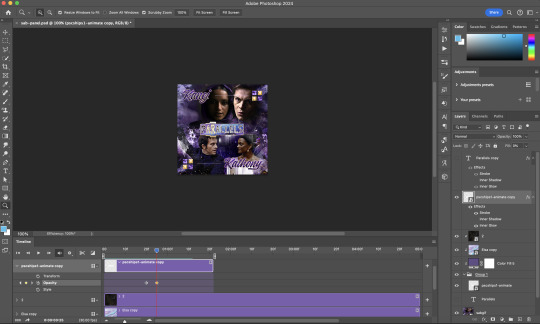
#see I do purple overlays
Explore tagged Tumblr posts
Note
No wonder you don’t color in all your comic pages if you can’t tell the difference between pink and purple

#dang anon …#you’re right tho 🧍♂️#my friends sometimes get confused when they help me color#see I do purple overlays#and saturate everything#and it still doesn’t look colorful enough#pix answers#fnaf#but that’s the screen most of the time I am NAUT color blind
65 notes
·
View notes
Text
The question is: do I bruise easily? Do I bruise often, do to how I behave (being clumsy, being more adventurous, or having a hazardous floor), or is it just that I have a tendency to notice my bruises all at once, particularly when I wear long pants (and frequent flannel)?
#also#is it just me#or do bruises always look way worse when they don’t really hurt#I only just now managed to see my newest one that I could feel so strongly w/ pants on#and it’s this like silvery color that is only slightly less saturated than my own skin#I needed a flashlight to actually see it—and even then I knew exactly where it was and had to shine directly on it#whereas one of the bruises on my upper calf is this mottled purple-yellow#and I don’t even feel it—even when I purposefully poke it#the one next to it is just like a darker greyish overlay on my skin#and that kinda hurts if I deliberately poke it but not that much#this is weird but like#sometimes I do genuinely worry that my having a bunch of bruises might lead someone to falsely assume like abuse or something#because I feel like anything I would say would sound super sus#tbf I tend to get bruises on my legs and occasionally on my arms—especially near the elbow#never really on the face or neck or torso or anything like that#so I imagine this worry is unfounded#also obviously in cases of abuse there are gonna be other signs too
0 notes
Note
Hey I've been observing from afar through your reaction blogging, I haven't been in mcyt as much since the dsmp ended but I still care about a lot of the people in the mcyt circle and I'm interested in what goes on - care to give a rundown of what happened at this twitch rivals thing everyone keeps talking about? (no pressure only if you want to) Aside from the fact I'm sure it was terribly run like most twitch rival events are, but it sounds like there was more to it than that
okay so. i am going to be missing quite a few details because i missed a day myself + my streamer could not care less, so i heavily encourage others to add on stuff i missed
this was a multi-day competition, running for 5 days with prize rewards from 1k to 100k. it started with i think 150 players, with select numbers of people getting eliminated each round. day 1-2 are fairly normal, at least for twitch rivals. of all the games that got played through the whole event, i'd say like 1 was actually good, and maybe 2 were decent, at best. most are bad, poorly-executed, poorly thought out, or just boring in terms of both player enjoy-ability and content creation.
DAY 3 EDIT:

now, sapnap's been sapnap for this entire event already. obnoxious, a bad sport, but most notably, playing DMCA'd songs. the event ran on proximity chat, so while he was unmuted, everyone around him would also be subject to said songs, which could mute vods at worst and terminate accounts at best. most people are fed up with him at this point. while everyone's trying to come up with solutions for the glitch, sapnap spams the discord with useless shit. couriway calls him out in the discord, calling him annoying and obnoxious, then later calling him a cunt in twitch chat. sapnap uses couriway and feinberg's name in his stream title for clickbait and talks shit about them + their friends (hbg/house builder gang). he also makes some weird comment asking if couri is homophobic because sap was talking about having skeppy's dick in his mouth?? or something?? i'm unsure exactly how day 3's issue of the glitch resolved.
day 4 is also your average experience with your usual range of average to horribly painful games. sapnap continues to be a bitch and not take responsibility for his stans attacking anyone in sight, but what else is new
day 5 is. bad. the game set for deciding the final competitors can be cheesed (if you let someone else do all the work, you can punch them in the last second and steal their win) and eliminates like 20 people at once. on top of that, a glitch happens that leaves the server on standby for at least 30 minutes while admins decide what to do. firebreathman sends a picture of a bare naked ass in the discord. someone else sends a photo of their debit card. streamers entertain themselves in various ways, including growing a cactus (fulham), playing osu (purpled), collecting other people's streams for their overlay (fruitberries), playing slime rancher (badboyhalo), and building real-life furniture (couriway). tubbo (who was already eliminated at this point) starts jumping between streams and asking in chat for the tea. the game is eventually replayed, deciding the final 4 players, but it's just as broken and at that point, no one wants to be there anymore. it's revealed through multiple streamers (purpled, i believe also feinberg) that twitch rivals games are not tested before being ran. the only testing done was a stress test to see if the server could handle all original 150-some players. this explains why the games are so bad and poorly organized (some games take over an hour, others barely 30 minutes).
the final four are sapnap, shadoune, sneegsnag, and i think feinberg. it's the most anticlimatic game of connect 4 you can imagine. sneeg eliminates sapnap, and shadoune eliminates fein. notably, fein's game glitches during a throw, which despite being obviously a glitch, the coordinators brush off as being "part of the game". fein and multiple other streamers spend time analyzing every pov frame by frame and all agree that yeah, that was a glitch. shadoune and sneeg are left for the finals. they come to an agreement that this is stupid and a horrible event. tired of this bullshit, they purposefully stall the games and run a podcast for approximately 2 hours, forcing the coordinators to bend to their commands hunger games-style. essentially since the first glitch of the day people were begging twitch to just split the money, something that wouldn't be easy according to tubbo, because everything is pre-signed and delegated before the event. sneeg and shadoune give no fucks, and force the coordinators to split the money anyway, winning the day through the power of friendship. i cannot stress enough how no one wanted to fucking be there by the end of all this.
#muse talk#bumble-punch#ask to tag#aaand scene#i think#this is very long i am sorry. a lot of shit has gone down.
1K notes
·
View notes
Text
Reminiscing


Notes: BLESS THE SECOND SEASDON OF ARCANE OH MY DAYS HES SO GOIREGOSUSSSSSS can u tell viktor is my fav :3
Pairing: Viktor x f!reader
Summary: Years ago you and Viktor had parted ways, and for good reason. It was no longer about science to him but evolution. But evolution is the future? So why was Viktor dwelling so much on the past?
Warnings/Tags: 16+ because its bit suggestive so shooooo - tin/machine viktor, SLIGHT submissive viktor, SLIGHT submissive reader (hopefully its pg enough), swtiching, exes, trying to get back together (oof dont do that), suggestive innuendoes, touchy feely mentions, f!reader implied but no use of feminine pronouns — tell me if I've missed anything!
Part Two >

It had been years since you last saw Viktor, yet the memory of your parting remained etched into your mind like a wound that refused to heal. You remembered the way his gaze had shifted, once warm and full of curiosity, now cold and unyielding. His obsession with the Glorious Evolution consumed him entirely, leaving little room for anything—or anyone—else in his life.
He spoke in absolutes, his words more like calculations than sentiments. You watched helplessly as the person you once knew vanished piece by piece, replaced by a man driven by a vision far beyond your grasp.
The day you walked away was devastating. You hoped, perhaps foolishly, that he might pause, might see the toll his ambition was taking on everything he once held dear. But he didn’t. He couldn’t. Viktor had chosen his path and you had no choice but to choose yours.
In the years that followed, his name became a distant echo, carried to you only by the occasional whisper of rumours. Tales of the Machine Herald, a figure deemed a God, filtered through the shadows of the world. You heard of his relentless march toward perfection, but not once did he cross your path. Not once did you imagine he would.
Until tonight.
The moment you flicked on the light in your living room, your heart stopped, the air leaving your lungs in a rush.
Someone was there.
Seated in your armchair like they owned the place, their silhouette sharp against the glow of the lamp. You froze, instincts screaming at you to run, to fight, to do anything but stand there rooted in place. For a moment, they said nothing and neither did you. The stillness stretched thin.
Then, their voice cut through the tension like a blade, calm and deliberate.
“We need to talk.”
Your chest rises and falls erratically, the sound of your ragged breathing filling the heavy silence around you. He stays where he is, his presence is unnervingly calm. The dim light catches the gleam of his golden eyes. It feels alive, almost predatory, as it fixes on you.
“Are you done gasping for air?” he asks after a long moment, his voice gripped with impatience. The words slice through the room as if your panic were little more than an inconvenience.
“What the hell—who are you? Get out!” you exclaim, your voice raw and trembling with a mixture of fear and adrenaline. Your fists clench at your sides, your body tense and coiled, ready for a fight or flight you haven't yet decided on. Your eyes dart around the room, searching for something—an escape, a weapon, an explanation—anything that could make sense of the stranger sitting so calmly in your home.
The figure doesn’t flinch, doesn’t react to your outburst. Instead, he remained perfectly still.
“You know who I am,” he replies, his voice distorted by the rough mechanical overlay of the mask he wears. The silence stretches taut, heavy with tension, his lack of movement somehow more menacing than any action could be.
Then, with a faint whir and the soft ‘shing’ of metal, he shifts slightly. The purple artificial muscles in his left arm flex beneath the layers of metal, “And there’s no way I’m leaving until we’ve spoken."
He leans forward in the chair. You take a step back, your foot catching slightly on the edge of the rug, but you don’t dare look away from him. Another step, then another, the distance between them never feeling like enough.
You stumble slightly as your heel brushes against the wall, your retreat halted. You were trapped between the hard surface behind you and the immovable figure in front.
Yet he doesn’t rise. He doesn’t chase. He simply watches.
With a deliberate motion, he takes a step forward, and another, closing the space between you with ease. Panic rises in your chest, but before you can react, he’s there, leaning over you. His body is so close, trapping you between himself and the walls of your home.
“You’ve changed,” he remarks after a long pause as he regards you like an old friend. His eyes narrow slightly, taking in every detail of your appearance.
“You look… softer,” he adds, his tone flat and dismissive, as if this change in you is something that doesn’t sit right with him. You don't miss how mechanical his voice sounds.
“Who... are you?!” The words escape in a rush. Your voice shakes, betraying the fear that is starting to creep up your spine. Who is he? Why does he feel so familiar, and yet so... wrong?
There’s no trace of recognition, no warmth in the air, just cold steel and the distant hum of something supernatural beneath his skin.
His fingers graze your skin lightly before gently grasping your chin, the coldness of his touch like ice. His grip is firm but there’s an unsettling gentleness to it. He tilts your face upward, forcing you to look into his eyes.
You can feel the weight of his touch and yet, it feels like it’s not just physical. It’s invasive, as though he’s reaching inside, probing for something. Your neck feels exposed, your breath catching slightly as your body instinctively tenses.
There’s nothing soft, nothing human about his stare. It’s all too alienated, too distant. The faint hum of his prosthetic arm seems to vibrate through the air, a constant reminder that whatever—whoever—this is, it isn’t entirely human anymore.
He leans in slightly, his head tilting to one side, as if pondering the absence of recognition in your expression.
His mask doesn’t convey anything, “You really don’t recognise me?” His tone carries an edge of disbelief, as though it’s almost unthinkable that you wouldn’t. He shifts his weight slightly, but his grip doesn’t loosen, his fingers still lightly holding your chin.
“Take your mask off!” your voice firmer now, though it trembles with the intensity of your frustration. The metallic distortion of his voice only makes it worse, the mechanical overlay making everything feel distant. He’s not any person you could remember, not even close.
He raises an eyebrow at your demand, "Very well," he mutters, his voice still tinged with that mechanical rasp but there's an odd calmness in it now. He pulls it free and it’s as if a veil is lifted from the air.
What lies beneath the mask is a face you know all too well, yet so different from the last time you saw it. His features are gaunt, sharper than you remember, as if the years have carved something out of him.
His skin is pale, almost ghostly under the light. There’s no mistaking it. His eyes, though shinier, still carry a familiarity that hits you like a wave. It’s him. The man you once knew—his face, his expression, the very essence of the person he was, buried beneath the mask and the years.
For a moment, you just stare at him, speechless. He’s right in front of you now.
Real. Yet he feels like a ghost, like a shadow of the man you once knew.
"… What happened to you?"
It’s the first thing that comes to your mind and it seems to carry the weight of everything that’s changed, everything that has shifted between the two of you over the years.
You stare at him, your gaze traveling over the sharp angles of his face, the hardness in his eyes. This isn’t the person you once knew, the person you once trusted and once loved.
The question seems to amuse him, “What happened?” He echoes back to you, his voice ringing with that familiar accent of his. A humorless smile twists at the corner of his lips, but it doesn’t reach his eyes. The smile is dull, "Piltover happened," he adds, as if the mere name of the city is enough to explain everything.
"What happened," he says again as a growl now, “is that Zaun was cast aside—ignored, neglected, abandoned.”
His words hit you. Zaun. That forgotten, broken city that had always been on the edges of Piltover’s gilded perfection. The place that had been swallowed up by the ambitions and the indifference of those who held power.
The place where everything was left to rot, "So I made the city better, myself." His voice is steady, but there’s a dangerous edge to it now.
“And now Piltover is afraid.”
Before you can even react, he reaches up with a swift, practiced motion, placing one hand on the wall beside your head. His fingers splayed wide, as though he owns the very space you’re standing in.
“And you?” he asks, his voice dropping even lower, laced with taunting amusement. The question hangs in the air, thick with challenge, daring you to respond. “Are you afraid of me?”
It’s a question loaded with intent, the kind of question that isn’t meant to be answered, but to make you feel small. However there’s something else in his voice, something... hungry. His words aren’t just a challenge, they’re a test, a way for him to gauge whether or not you see the change in him.
There’s a part of you that wants to deny it, to pretend he’s still the person you once knew, but the truth is right in front of you. This is not the same Viktor.
“You’re not a person,” you’re not sure if he can hear the quiet desperation in your voice as you speak. But as his gaze locks with yours, the chilling look in his eyes seems to confirm what you fear most. Whatever humanity once existed in him is long gone, replaced by something far more dangerous.
He’s not a person. Not anymore.
“That’s the first thing you’ve said that isn’t obvious,” he sneers, his voice dripping with disdain, “I’m as human as you, if not more so,” he rasps, his words cutting through the space between you with confidence.
There’s a hum in his voice, a certain finality in his tone. “I still have a soul—a heart. One that beats just for you.”
His claim is so absurd, so twisted. A heart that beats just for you? He sounds like he believes it, like he truly believes that his obsession, his transformation, was somehow a sacrifice made for you.
His hand on your chin tightens and you can’t help but flinch. Here he is, speaking of love and devotion as if those words still carry any meaning. As if you’re supposed to believe him.
“No, we parted years ago.” The statement feels heavier than you expected. His expression flickers, ever so slightly, the faintest crack in his demeanor. The bitter smirk that had curled his lips falters for just a second before settling back into place.
“We did,” he says, a blend of mockery and intimacy. He pulls back just enough to look you in the eyes. The corner of his lips quirks into a sly, humorless smirk. “I always parted you… in bed, that is.”
Your lips pressed into a thin line as if holding back the sharp retort you wanted to hurl at him.
He laughs again, this time his chuckle is dark and deep, “You remember that, don’t you?” he murmurs, his voice dropping to a low, dangerous hiss. “You remember how I used to make you scream,” he says, the statement suggestive as it sounded.
His smile widened, the curve of his lips taking on an unsettling mix of nostalgia, “I’d drop to my knees for you,” he murmured, his voice low and smooth. “Anytime, anywhere… begging you to touch me, just where I needed you most.” His eyes burned into yours.
His hand finally released your chin, the absence of his grip almost startling. But he didn’t pull away. Instead, his fingers trailed down your neck in a slow motion, the touch lingering just enough to make your skin prickle. When his hand slid around your waist, the shift in contact was seamless.
“You didn’t just take my heart when you left me,” he continued, his voice softening into a purr that sent a shiver down your spine. “You broke it.” Viktor whispered. His lips quirked upward again, but this time, the smile didn’t reach his eyes.
“You know why we split,” you say, your eyes narrowing as you force yourself to meet his gaze, despite the suffocating proximity.
"Always in the lab,” he murmurs, his voice softening slightly, but the growl lingers beneath the surface, ready to rise again. “Late into the night, always trying to find a new way to reach the Glorious Evolution.” His lips curl into a faint, humorless smirk, as though mocking himself as much as the memory of his relentless drive. “Always chasing perfection… and always losing sight of everything else.”
His fingers continue their slow, deliberate path down your body. His hand finally reaches the edge of your shirt, pausing there for the briefest of moments before grabbing it and lifting it slowly.
The fabric drags against your skin, exposing your chest inch by inch. His gaze flickers down, and a faint smirk tugs at the corner of his lips.
“You really are soft now,” he murmurs, "so soft."
You grimaced, "Stop it."
“Why?” He asks, his fingers moving even further down, sliding over the top of your thighs. “You don’t like it when I touch you?”
You instinctively swat his metal hand away but the moment your hand meets the hard, surface of his prosthetic, a sharp jolt of pain runs up your arm. You winced in result.
He grabs your wrist in a sudden, forceful motion, his fingers tightening with a painful grip, “Don’t do that.” He says, a warning tone in his voice. “Don’t swat at me like I’m some filthy little pest, when you used to kiss my hands like I was your god.”
"You're no God." You try to pull your wrist free, but his grip doesn’t budge.
“I’ve never stopped wanting you.” He says, leaning down to bury his face in the side of your neck. Viktor lets go of your wrists and instead pushes himself between your legs, pinning you to the wall with his body.
“I thought of you when I was supposed to sleep.” He purrs, his voice soft and rough in your ear. “I thought of you when I woke up.”
Then, with a deliberate movement, his body shifts closer, and you can feel the undeniable pressure of him grinding against you, pushing you harder into the wall. “I thought of you when I was desperate.”
Viktor's lips are close to your ear, his breath warm and unsteady as he speaks again, this time with a cruel twist. "You don’t even know, do you? How much I’ve ached for you." His words hang in the air.
“I thought of the way you looked back then.” He says, one of his hands trailing back down, grabbing your thigh and wrapping it around his waist. “When I still had you…”
He presses close to you, his hips pushed firmly against yours and his body close enough that you can feel the heat from his body against your skin. “How your skin used to taste…..”
“...You need to leave, Viktor.” You murmur. He leans in just a fraction closer, his lips curling into a smile that doesn’t reach his eyes. There’s no amusement there.
“Oh, I’ll go.” He says, his lips tracing a path over your neck, leaving a trail of soft kisses over your skin.
“But not until we’ve caught up.” He lets go of your hair, one hand grabbing your thigh to keep your leg wrapped around his hip, while the other goes to your shirt, grabbing hold of the material once more.
“Maybe we should start with a little… reminiscing.”

Post Notes: lol i want to make another part but wioth smut oopsise!!!!!!!!!!!! viktor is eating my brain rn
~ ~ ~
my taglist form!
#viktor#viktor arcane#viktor x reader#viktor lol#mooonjin#arcane#arcane viktor#the machine herald#viktor machine herald#viktor m#machine herald#arcane act 3#arcane s2#arcane spoilers????#arcane season 2#viktor season 2#viktor x you#ENJOY PLS :DDDDDD#viktor imagine
586 notes
·
View notes
Text


Paper Hat and Physician Cap
Conversions from the Sims 3 Store and The Sims Medieval.
The paperhat comes with three presets: Solid colour, paper-pattern and the original’s overlay. The default position is the one shown in the previews, but it is of course hatslider-compatible.
These hats do not use shared textures, so all files can be installed and uninstalled individually, independent of each other.
Download Paperhat: SimFileshare | Dropbox
Download Physician-Cap: SimFileshare | Dropbox


Accessory: Toddlerkranz
This is converted from the TSM "Jungfernkranz" hair, and I figured it might work as the sort of falling-hat that toddlers used to wear in the 18th century. Toddler male/female; a teen-to-elder version can be found here.
Download: SimFileshare | Dropbox
Bucket Hat Accessory
Originally this bucket is from EA’s Plants vs. Zombies bonus content. I used the accessory conversion for toddlers by Purple-Plumbobs and converted it for children (Purple-Plumbobs isn’t active under that name any more, but the download is here.) Mine sits over the eyes by default, because that’s what I needed for my story. It can be moved around with hatsliders. There’s a black pane inside, so you can’t see very far “up” in the bucket. Child only, male/female.
Download: SimFileshare | Dropbox
#s3cc#ts3cc#ts3 cc#tumblr download#ts3content#category:accessory#only the third item is new but I'm reducing the number of posts to scroll#and the new editor's image layout is better
113 notes
·
View notes
Text
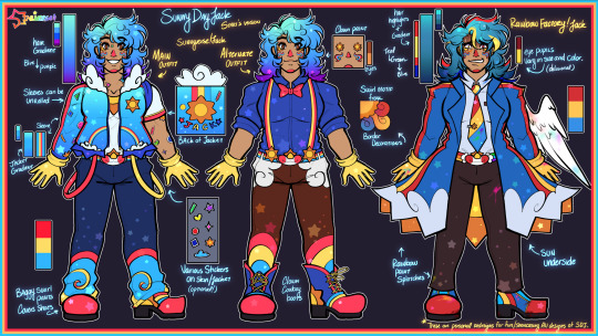
Sunny Day Jack ★ Stari’s Versions
—
★ DO NOT USE/REPOST WITHOUT MY PERMISSION. NO MINORS.
—
Apologies for the tumblr inactivity, space crew! I’m much more active over on Twitter!
Here’s a simple lineup of Jack designs that I’ll be personally using for myself! I love when artists take a character and add their own personal twists on them, so I’ve done the same to my favorite technicolor clown.
I’ve also seen a few people be interested in two other designs that I’ve done, so I’ve added them to the lineup as well for others to use or to see their full outfits!
—
Here’s a explanation of each design element if you all are interested in that:
Sunnyverse Jack(Left):
Sunnyverse!Jack is my personal interpretation, artistic recolor, and story with him. He is basically a spin-off of the Sunny Time Town AU by JambeeBot.
I wanted his jacket to reflect looking up at a vibrant summer sky, with clouds, rainbow pockets, swirls, and stickers to add to the childlike wonder. His different color suspenders replaces the stripes on his shirt, which is now a sun on the collar!
I’ve personally always liked the idea of Jack’s hair cascading into purple tips, it’s been referenced in many other drawings of mine. Considering Papa Rise also has purple-ish hair, I think it fits!
This design went through a couple sketch phases and some reworks with the most recent showcase being the birthday drawing of Artemis, where this design can be seen in now outdated-concept!
Alternate Outfit (Middle):
Over a year ago, I made a drawing about Jack and bowties, spreading my bowtie propaganda…. And I still am HAHA. Listen, Jack with a bowtie is so cute, So I’m bringing that design back as well as a full ref!
I’d like to say that this is his work or side outfit, but this is not the teacher AU. I did not create that AU, so don’t refer to this design as the teacher AU!
Even though I don’t consider Jack as a rodeo clown, I gave him clown cowboy boots to reference [Redacted] and his southern residence somewhere.
Rainbow Factory Jack(Right):
RainbowFactory!Jack or RF!Jack is an AU I made last year as well, and finally got around to giving you all a full standing ref for him!
He got more attention than I thought, I know a couple of you like delusional men. I get it.
For his hair, aside from the primary highlights, I also changed the coloring to be a bit more muddled and darker on the teal spectrum, as I like to do that when I draw Jack in a not so-friendly manner. His hair is also more spiked, compared to the others who have more of a fluffy round curl.
His coat is very simple, red and yellow stripes down to a cloud border, and the inside of the coat shows a giant sun on the underside. He also has different color rainbow splotches in different places on him!
His eyes can vary in size or be consistent, and the colors of them can change or spiral too! Usually though, the right eye is lighter than the other. His colors are more saturated and darker than the other designs.
Cotton Candy Cupid Jack:
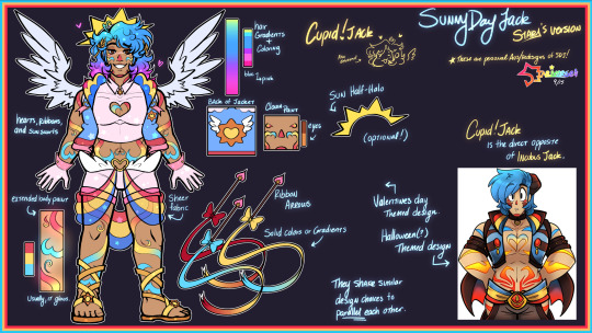
Finally, the last design I have in the lineup is Cupid!Jack!
This is the first custom design I’ve made of Jack. Shared in this post, this was meant to be the Valentine’s Day design I had for him! Though this drawings is extremely old and outdated now for both my MC and art, I decided to carry it on to a proper Cupid AU design for everyone!
He was originally labeled as Cotton Candy Jack in a wip post that keeps getting shared around from time to time, but I’m unsure if I should keep that name for this lover boy now! There was a community cotton candy Jack trend a month or two ago, so maybe I should change the name? What do you all think?
Design wise he parallels the classic Incubus Jack, which I believe was originally a Halloween costume. His design shares similarities on purpose, being the extended body paint gradient and the sheer fabric overlay on the pants.
Almost like an angel/devil duo, Cupid Jack is more pastel, softer/brighter primary hues, has fluffy wings! My goal was to have them be similar enough side by side, but also different enough to tell that they are different themes/holidays.
He has a motif of hearts, ribbons, and sun swirls. His hair gradient is also the most vibrant one, going from cyan to a vibrant pink at the tips.
He has sandals because I thought it fit the whole Cupid vibe, but drawing his dogs out every-time might actually be the end of me.
—
While I will use these personal redesigns, I want to make it clearly stated and obvious that Jack is not my original character, nor are these redesigns an attempt to change his character or completely detach him from his media. There are simply my fun artistic portrayals of him, as I admire his original design, media, and game as well.
The Rainbow Factory and Cupid AUs are technically my AUs. Ship art, written stories, headcanons, etc. of RF or Cupid Jack are completely okay to create! I just ask that you tag me so that I can see what you all do with him!
However, I ask that if Sunnyverse Jack is used, please ask for permission before using his custom design, as it is my own design of him that I use personally.
…and also, I wanna see more MV Jacks! Artists! Show me how you would draw him in your trademark! I love creative expression!
#sunny day jack#swwsdj#sunny day jack au#sdjsunnyverse#sunny time town#sdj#rainbowfactoryjack#cupidjack#cotton candy jack#Sunny Day Jack but in my eyes#colorful clown man gets more colorful
133 notes
·
View notes
Text
ITALIAN FOR DINNER? | R.B X READER
word count \ 2.8k | fluff and stuff | slash / regulus black x reader
in which regulus takes you out on a date to a local italian place
A LITTLE LOAF SERIES MASTERLIST

ITALIAN FOR DINNER? | REGULUS BLACK X READER
Regulus had never felt more nervous in his life than what he did right now.
He had faced a lot of things. He had faced his father’s and mother’s weath. He had faced Sirius leaving. He had faced death over and over, either his friends or ones he might’ve done. He’d even faced the Dark Lord himself, no speck of fear shown in his face.
The Dark Lord himself called Regulus Black a brave man. One of his bravest.
So why was he so nervous now?
He had changed his outfit about ten different times before Kreacher had gotten sick of his pacing and chose one for him. A black sweater with a black denim jacket on top, different patches of paint covering the pockets and back. He had on work pants similar to yesterday, the ends flaring out. Kreacher had also handed him jewelry to wear, gothic necklaces and rings each.
Even though he wasn’t sure, he didn’t have much of a choice in the matter anymore.
“Kreacher doesn’t understand why Master Regulus is freaking out this much.” he grumbled, shaking his head and ticking his tongue. “Kreacher never freaked out this much when he was with his wife.”
“Because I feel obsessed with her,” Regulus stated simply, grabbing an eyeliner pencil before blinking. “Wait, you have a wife?”
“Oh yes, Kreacher has a wife!” he said excitedly, clapping his hands before standing on top of Regulus’ dresser while he did makeup. “Kreacher’s wife was sold to a different owner though. Kreacher hasn’t seen her since.”
“Maybe you should try and find her.” Regulus said. “Could you do that?”
“House elves have magical bonding to each other once they are together, yes.” Kreacher says. “It is how Kreacher knows she is still alive and well. We can communicate through the bond.”
Regulus blinked at that, having not known that was even possible. “Like telepathy?”
“Yes, like telepathy.” he smiled. “Think of it like a matching bracelet with a partner, with a part that buzzes your bracelet each time they press it. Whenever Kreacher thinks of her, Kreacher’s wife will feel it, and visa versa. No thoughts though.”
“You know,” Regulus mumbled, blending his eyeliner out to make a more faded look. “I’ll be gone for this date for a while.”
“Master could not possibly be suggesting what Kreacher thinks he is.” Kreacher muttered, almost in awe.
“You deserve so much more than her, Kreacher.” he said, patting Kreacher on the head. “You deserve the world. And I think finding your wife is a key to that. Go get her.”
Kreacher smiled happily at that, agreeing on the condition that he would help Regulus first.
Regulus decided that he needed to stop worrying. That thought didn’t stop him from worrying, but the thought counted at least. He also decided that he was going to buy you flowers. Magnolias seemed to be a staple in your relationship now that he had talked about them yesterday, so that was what he was going to get.
He walked to the park about an hour before your date was meant to happen, spending about 20 minutes magically ensuring that the flowers were of the best quality. He made sure to cloak his magic though, not wanting neither Muggles to see or the Ministry to track him.
He had flowers. Now was the time to get to your house.
Your house that he didn’t know.

You were currently panicking in your room, dress laid on your body.
You really wanted to impress Regulus. Sure, you didn’t know Regulus all that well, but there was something about him nonetheless. He seemed genuinely nice, like a true good guy.
Which is why you had bought this dress just for him.
It was a purple mermaid dress with spaghetti straps and a black lace overlay. You thought that he might like it, it gave you a vampiric aesthetic kind of vibe. You thought he gave those too.
But would he like it? Would he think you’re doing too much?
You sighed, hands rubbing your forehead as you tried to think. You seemed to know about him, but you also felt like you knew nothing at all. He talked, but not about him. He mainly talked about you, if he was being honest, which made you feel extremely guilty now that you thought about it. Would he only talk about you once you got to the restaurant? Would your dress even hold up in the weather on the way to the restaurant?
You were dragged out of your thoughts when your phone rang. It was Regulus.
REGULUS: I planned on picking you up for our date, but I realized that I don’t know where you live.
REGULUS: Do you want me to come to your house, or do you want to meet at the restaurant?
You felt a flush growing even harder on your face as you read that. He wanted to come to you? Was that a thing that you wanted?
Your heart had immediately said yes.
YOU: i really don’t mind either way, whatever u want to do!!!
YOU: i live just above the bakery, it’s a two story building. the stairs are in the back, tho it’s a bit of a climb
REGULUS: That’s fine, I don’t mind.
REGULUS: Do you have any vases?
Vases? Was he bringing you flowers? Did you even have vases?
Your eyes darted over to your kitchen counter, looking at the island counter. You had a vase when you first moved in, though gave it away after a month or two for a friend.
YOU: no vases :c i’m sorry reggie
REGULUS: That’s fine, don’t worry. I’ll see you in about 10 minutes then, is that okay?
YOU: that sounds lovely! i’ll see you!
You sighed softly, looking down at your phone with a lovesick smile. You were already so done for.

Regulus showed up to the bakery with a smile, going to the back and walking up the stairs. It was a bit of a long climb, though he didn’t mind.
He hummed after he knocked on your house door, the Magnolia flowers in a red vase. His hair was a bit tousled from walking, but he hoped that would add to an appeal of some kind. There was a flush on his face, smiling softly as he waited.
“Coming!” you called out, your voice echoing through the room behind the door.
Regulus smiled at the sound of your voice, hand tightening around his vase as you spoke. He held it even harder when you finally opened the door, almost dropping it out of shock.
How was it possible for someone to look so good?
There you stood in your magnetic glory, the purple dress you wore quickly becoming his favorite sight.
“Are those Magnolia flowers?” you asked him excitedly, gently grabbing the vase. “From the tree that we saw yesterday?”
“Yeah,” he stuttered out, clearing his throat. He wasn’t sure if he was dreaming or not. It all felt like a fever dream. “You, uhm, you look good.” he muttered with a blush. “Really good. Truly.”
You giggled softly, holding the vase of flowers in your hand. “Let me put these up, okay?”
“Okay.” he whispered breathlessly, smiling dopily as you walked off. He felt his heart beating out of his chest, his face flushing bright red.
You came back outside just as quick, the large smile on his face making his heart beat even worse. It suited your face so perfectly, a sight that he wasn’t sure he could ever get out of his mind.
You looked perfect.
“Are you ready?” you asked him.
He nodded, a small smile growing on his face. “Yeah, I’m ready.”

The walk to the restaurant was calm and serene; which helped your beating heart for just a moment. Then it made it worse. A lot worse.
Your hands were swinging together peacefully as you walked in silence, though you found the silence comfortable. You wanted to learn more about him, but you found this silence gave you more about him than things he might say instead.
Regulus was a quiet man. He liked the silence, and didn’t like talking about himself much. Even still, he seemed caring. Like a man who cared too much but was never allowed to express it.
You wanted to show him that it was okay to do that.
Regulus held your hand as you both walked. He practiced the sidewalk rule. He bought you flowers, held doors for you, and did anything one could imagine for a partner to do. He was absolutely perfect, though you weren’t sure if that was a good thing or not.
“Here we are.” Regulus said, smiling at you with an expression that just screamed love.
You wanted to see it every single day.
“It smells delicious.” you sighed softly, smiling as you inhaled the scent. It smelled like a lot of things. Bread, garlic, sauces that mingled so well together. “What do you think you’re going to get, Reggie?”
“Probably something light.” he muttered quietly. “Spaghetti?”
“We could share!” you said excitedly, arms wrapping around his. “We could have that scene from the Lady and the Tramp.”
“The what?” he asked curiously, looking over at you.
You grew a bright flush on your face as you realized what you just said, stammering as you looked down at the ground. He had a small smile on his face, though it also looked rather confused about your reference. “It’s, uh, it’s nothing. I mean, it was stupid.”
“I want to know.” he whispered, tilting your chin up to look up at him. “C’mon pretty girl, tell me.”
You flushed wildly at that, your stammering getting even worse as he spoke. How could one say things like that so casually? He was like a character from a romance book, or someone from your dreams. Someone you never thought you would meet in your life.
“It’s just a movie reference.” you mumbled quietly.
Regulus smiled softly at that, caressing the line of your jaw. “What was the reference?”
“Well, the two love interests,” you muttered, stuttering out your words as you spoke. “They were eating pasta, and they had the same piece. So they, you know, ate the piece. Together?”
“You want to kiss through pasta?” he smiled knowingly, raising his eyebrow.
You pouted at him, crossing your arms. “You hush.”
“My lips are sealed.” he chuckled quietly, hand moving down to your waist as he guided you inside of the restaurant. “C’mon.”
You felt your face flush with every step as you both sat down, your fingers fidgeting with each other as you sat across from him. Your heart was beating out of your chest wildly, so fast that you were sure that it wasn’t forming any contraction.
The waiter came over and you ordered, though your date was mostly a blur because of your emotions. You felt everything all at once, warmth and fuzziness running through your veins.
He was so kind and caring. You got to talk about yourself. He talked a bit about himself, enough to keep you coming back for more. Maybe that was his plan all along, but you found yourself too hooked already to truly care about it.
There was something magical about him, something you couldn’t quite place. It was a feeling that felt so familiar to you, like the feeling of home.
Maybe that’s why you liked him from the beginning. Because he reminded you of home.
“Do you want a to go container for your food?” he asked quietly, pointing at your half eaten pasta. You had eaten quite a few breadsticks beforehand, which made your stomach rather full by the time the pasta came around.
“Maybe, yeah.” you smiled. “Thank you.”
He waved his hand mindlessly, calling the waiter over for a container and the check. You didn’t know how much it cost, since he took the check before you could even look at it.
“Are you sure you don’t want to split it?” you asked.
He shrugged simply. “I have money,” he said, putting cash into the folder. “Plus, I felt you’d want to focus your money on the bakery.”
You flushed brightly, smiling softly. “Thank you, Reggie. Really.”
“You're welcome.” he smiled. He grabbed your container after standing up, holding his hand out for you to hold. “Walk home?”
“Walk home.” you smiled softly.

Your walk home was absolutely perfect. The sun was setting down and created the perfect ambiance, although the air was still cool. The park was full of small children running around for their weekend play, images of your future ones running around with them.
God, you were being delusional.
But how could you not be? Regulus was the perfect man, the best one you had ever met. And so far, he had no issues with you either. He talked about himself when you asked, he let you talk about yourself whenever you wanted.
He was the definition of perfect.
Which is why you felt destroyed by the time you reached your apartment.
“I suppose this is goodbye for the night.” Regulus whispered softly, a small frown growing on his face.
“I think so.” you whispered. “I wish this night could last forever.”
He smiled softly, his hand squeezing yours. “Me
too.” he whispered. “But I read that having some time apart is healthy. I can stop by the bakery tomorrow, if you’re working?”
“That sounds amazing,” you giggled softly. “Thank you, Reggie. I really loved this date.”
He smiled softly, hand squeezing yours again. This time it was a bit harder. There was a blush growing on his face as well, though you decided not to comment on it.
“I did too.” he smiled softly at you.
You smiled softly, the both of you standing there for a couple minutes. There was no sound or movement that you felt could distract you from this moment, eyes locked on each other.
“I have to get back home.” he whispered under his breath, though he didn’t move a single inch.
“You do.” you nodded slowly, still holding onto his hand. “But I’ll see you tomorrow, right?”
“Of course.” he smiled softly, still standing there. He busted out into a small chuckle after a moment, looking down at the ground. “I know I said that it’s important for us. But I really don’t want to leave.”
“I don’t think you should.” you grumbled with a pout, before sighing. “But, you are right. We need our alone time each.”
He smiled softly, nodding. “We do.” he said.
Your hands finally separated as he looked up at you, his eyes looking down at your lips before up at your eyes again. “I’ll see you tomorrow?”
You smiled softly at him, though it didn’t reach as far as it could. Did he not want to kiss you?
“Tomorrow.” you smiled.
He nodded, a large blush covering his face as he nodded you goodbye. His hands fidgeted with the other as he walked back, and you watched him walking away down the street.
You smiled softly. It was probably too soon to kiss him anyways. So, you made your way back inside your apartment.
The flowers were still on your kitchen counter when you walked in, the scent of the flowers permeating inside of the house. It reminded you of him.
You felt your purse buzz, most likely your phone going off. Your hands reached down to grab it, smiling brighter when you saw Regulus’ name.
REGULUS: I wanted you to know that I really loved our date today, Y/N. It was truly amazing.
REGULUS: I’m sorry for not being very expressive, or for not kissing you before I left.
REGULUS: I wish I did.
You felt your cheeks flushing as you read his messages, anticipation building higher and higher the longer you watched those three bubbles type.
YOU: i really enjoyed our date too!!! it was really nice, and refreshing? idk if that makes sense
YOU: and u can always come back for a kiss <3
You smirked proudly, feeling very proud at your successful teasing.
You decided to change out of your dress, changing into a sweater and some shorts you had lying around. You were about to start a movie when your doorbell rang, feet carrying you to open it.
“Reggie?” you asked quietly, a small squeak coming out of your throat as his hands grabbed your face desperately.
The kiss was perfect. Everything felt perfect with him, if you were honest. His hands were grabbing at your cheeks, thumbs caressing them gently as his lips hungrily kissed yours.
“Jesu,” you chuckled breathlessly as he pulled back, taking a moment to catch your breath.
Regulus panted softly, looking down at your lips. “They felt better than I thought they would.”
“Really?” you asked breathlessly. Could he get any hotter?
“Really.” he smiled, kissing your forehead. “Thank you for that. I’ll see you tomorrow, okay?”
You sighed dreamily, giving his lips one more peck. “I’ll see you tomorrow.”

AUTHOR'S NOTE
thanks to everyone who's read this! i loaf all of u guys frfr (i have written so much that i have no regular people words)
AS ALWAYS - please like, comment, and reblog!
#fanfiction#harry potter fanfiction#fluff#fanfic#extra fluff#<3#the marauders#slytherin boys#regulus black#regulus black deserved better#and im giving it to him#regulus black x y/n#regulus black x reader#regulus black x you#date night fanfic#first date#reggie black
73 notes
·
View notes
Text

Hello and welcome to "Icon Making With Killian: An Intro to the 'Lost' Art of LiveJournal Icons"
aka, I'm still making them and I'd like to teach you how to do it, too!
This tutorial was written in Photoshop 2020, but you can probably recreate it in as far back as CS2-ish (since I still use the same sort of techniques I've been using since then, lmao). It also assumes basic understanding of the software, though I've tried to be as clear as possible throughout.
With that out of the way, let's get this tutorial on the road!!!!!!
I started with the bloomed art of Hiiro from the White Lilies scout box (image courtesy of the Ensemble Stars!! English Wiki).

I basically always start with a blank 100x100 canvas and paste the image into it. I try to go into icon making with a vague idea of what I want to do, and I knew from the beginning that my vision for this icon would have the top 1/4-1/3 of the image covered by a solid band of color. To make positioning the image of Hiiro easier, I made a rough version of the band with temporary colors (though they're pretty close to what I ended up using in the end).

With that in place, I could start working with the actual image for the icon. After pasting it in and adjusting the layers so it was under the band, I resized it and moved it around a bunch until I was happy with the position. Once I liked how it looked, I used an Unsharp Mask on the base.

Next up, I used a texture from lookslikerain. However, purple is all wrong for the color scheme I had in mind, so I went to Image > Adjustments > Hue/Saturation... to change it up to better suit my needs. Never be afraid to mess around with textures!

Here's how I adjusted this specific texture, but each one is unique- both the texture and the icon you're creating, so it's best to play with it until you get good results.

I then pasted this into the icon, making sure it was under the layers making up the top bands of color (because I was only trying to affect the base for now), and set this layer to Darken.

Now it's time to mess with the colors of the top band. They sorta matched before I did anything to the base, but now...not quite. I used a layer style for each part of it, but using the paint bucket tool would work just as well. I went to Layer > Layer Styles > Color Overlay... for each, changing the colors as necessary. The thickest band is #85d0bf, the middle band is #086371, and the thinnest, lightest one is #fcfcd8.

Time to start putting stuff on top of everything!! I took this light texture from ianthinae, rotated it, and set it to Lighten. I decided I wanted it to be a little bit brighter, so I duplicated the layer, set it to Screen, and dropped the Opacity to 20%.

I then used a texture from Sarah-Dipity and set it to Lighten as well.

Okay, now that's what I'm talkin' about!!! It's time to throw some text on this~ I went for something simple to go with the theme of the story this card is from: Princely. The font is Georgia, 10pt, in #086371, set to all caps. I decided it didn't stand out enough, so I duplicated it, changed the color to #8b4235, dragged it under the first text layer, and moved it 1 pixel to the right.

I wanted a bit more embellishment around it, so I used this simple tiny text brush from colorfilter in #06444d. I also erased part of it to make it fit the space better.

Finally, I used a texture from shiruji, set to Darken to get a bit more color variation in it, and called it done! :D

If you have any questions, please feel free to ask, and I'll answer as best I can- as long as it's not about making icons in other software D: I only know Photoshop (and Paint Shop Pro, but I don't think anyone uses that anymore). If there are any other icons of mine you're interested in seeing tutorials for - or even just specific techniques! - just lemme know. I love helping :D
Also, I'm happy to share where I get icon resources from. I have a whole post dedicated to that on my DW graphics journal, though tbh that's the best place to talk to me about making graphics in general. But I will absolutely answer asks/replies/etc about icons here on tumblr, don't worry!!!!
#livejournal#icons#icon tutorial#graphics#graphic tutorial#photoshop#LJ icons#100x100 icons#100x100#tutorial#tutorials#reference#what do I even tag this as XD
91 notes
·
View notes
Note
How do you choose the colors in your art? Your color palettes always look so cohesive and so pleasing to look at!
ah, this is gonna be pretty long so i'll talk about it under keep reading :^]
now i am no expert!!! i am just a guy!!!! i'll just be talking about how i do it! ok!
PART 1: COLORS??? HELP.
i really like going with warm stuff on my art so it's kind of a given that most colors i use end up wounding up on this side of the color wheel
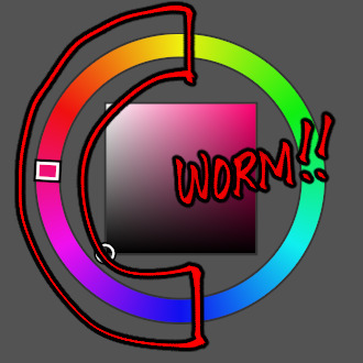
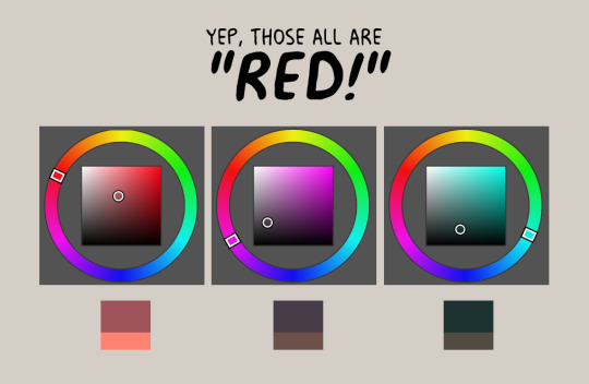
so, let's say i'm coloring trucy, a character who wears blue, i end up choosing warmer looking blues, sometimes i end up choosing purple or gray if the other colors i chose makes it look like blue, yannow, color theory and stuff. like this for example!

now the first one is noticeably blue, but the second one is like a lavender and third one is like, really not blue! it's like a desaturated rose color or something, however, paired with the right colors...
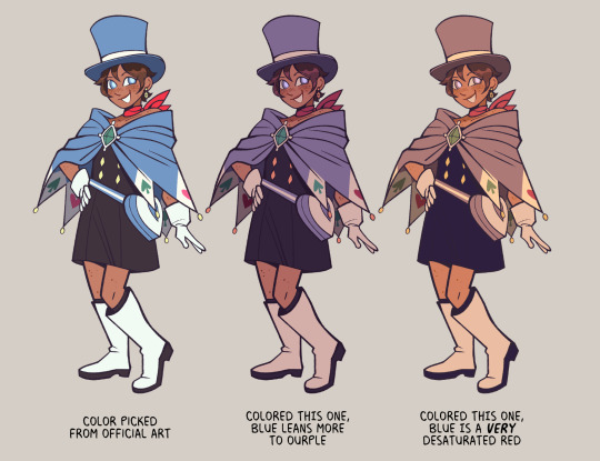
they're all "blue", aren't they?
PART 2: CHOOSE WEIRD COLORS
by weird colors, i mean colors that aren't like what the thing looks like irl. like, a leaf is green right? but, it doesn't have to be when you color it!
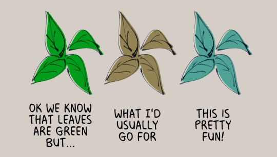
like when i color things gold sometimes, i use a light and desaturated red-orange for it or how like with the color blue, i don't even use blue at all!
now just because i use warmer tones a lot doesn't mean i don't use the colors from the other side of the color wheel, it depends really, if the color scheme i'm going for is monochromatic or if i really wanted to make something pop
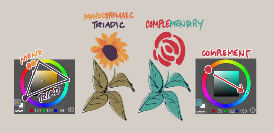
but of course, you can't just color willy-nilly, you gotta take into account
PART 3: CONTEXT AND MOOD
where and when is your drawing set? what's the mood? are we having fun here or are there Horrors?
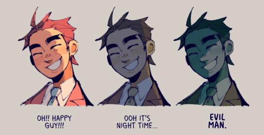
see how it changes the mood? the things we're supposed to be feeling when we look at the drawing? yeahg. ill use warmer colors when i want the drawing to look happy dreamy etc but ill break out the blues and greens when we're in sinister town pftt
also, just wanted to share again how other colors can change what another color looks like:
PART 4: GRADIENT MAPS AND OVERLAY LAYERS
now as for making colors more cohesive... seriously, just slap that thing on top of your piece and it helps the colors get together even more! like of course i choose my own colors but gradient maps + overlay layers are kind of like adding that one final thing.
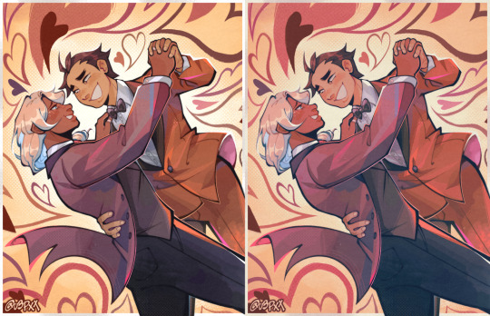
i'll use this one as an example, left one is no gradients maps/overlays and the right one is with them. i just really prefer some good ol' ourple tones in my art so there are a couple of things i add on top to really bring out the warmth in here, like so:

PART 5: ANYTHING ELSE?
uhhh don't be afraid to use tools in your program to correct the colors you don't like ala color balance tone curve contrast brightness etc etc.
hell, you can even color pick from like irl pictures and adjust accordingly to what colors you want.
i also do have like colors that i consistently use when shading things after countless trial and error; like how i'll use purple to shade red, blue to shade with green etc etc
ig that's all, hope this helps!
#sunnysidetutorials#ajdgdjkd there's another in my ask box asking me about how i shade so stay tuned for that ig#im sorry gusy but if yall wanna get into my head with how i color ya gotta tackle color theory first#like . its pretty easy to understand i think#however it did took me a while to like *actually* be able to apply it in my art#so i understand that it can be pretty difficult
1K notes
·
View notes
Text
Magg's Sebastian Sprites update...
I think this mod will be ready to load today, I'm just doing some final testing after a major code cleanup and simplification. This mod is definitely not simple however! There are many options to choose from for Seb's look both for sprites and portraits. I would have had it done today, but I decided I wasn't entirely happy with the long hair portrait overlay so I re-did that. Now I like it much better and just need to test the rest of the festivals and the "slightly cuter" option overlay to finish this one up.
I do love making sprites, so maybe I'll add Sam and Alex to the pack in between writing dialogue...


Seb puts his hood up when it's raining and he's outside... Hard to see here, but the motorcycle sprite also has the purple hoodie.
52 notes
·
View notes
Text
Tutorial: How I Render Accents
PART 2: COLORS
I usually do not recommend 'pixel hunting' aka going over your work with a fine tooth comb and picking out stray pixels to erase. However, for setting up a proper base layer for accents it is imperative to do so.
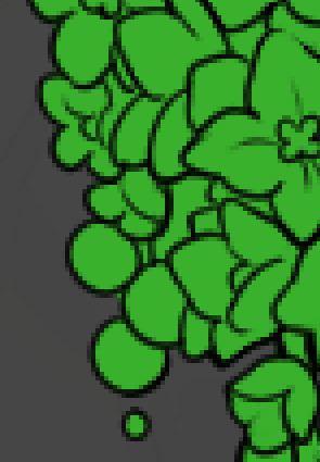
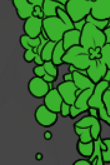
To explain my method of color blocking: I select everything outside of the lines, invert that selection, then fill in. This does a more accurate job than going into each and every section and filling them all in individually, and is also significantly faster. Only downside is small sections like above where you can see bits of the green (which I use bright green against a dark grey background to contrast the base color, lines, and background) poking out, as well as the inner section where it filled in a spot I did not want filled in. Getting all of this right in this stage will make your life easier as you go. (It's also the method I use to color block all my work, even beyond accents)
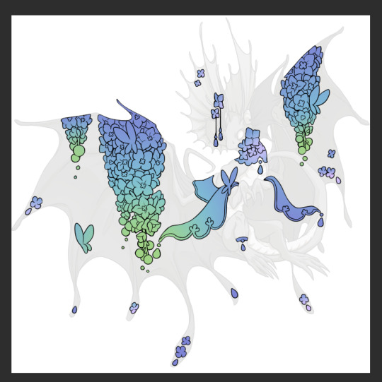
Now this where my style of rendering color may come off intimidating and, tbh it might be. I do gradients first and then I color over them with "normal" blend layers. I typically don't use multiply layers unless I'm shading something that has a lot of textures. If this scares you, it's okay I'll keep walking you through it. Here, my gradient goes from a pastel but deep periwinkle, to a soft more cyan blue, then to a lighter pastel green. Skipping steps and going from the periwinkle to green will give it a different look. There's also hints of a pinkish tone as an accent color.
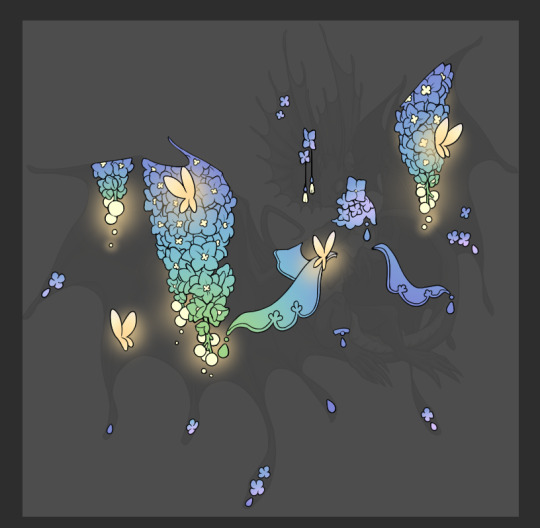
So as I said, these additional layers are done with regular "normal" blend mode layers. I've placed one in between the butterfly line art and the line art for the rest of the flowers, and then an additional layer under everything else. This allows me to create a glow effect specifically around the butterflies, and then specifically under the flowers. Going back and forth with the proper amount of opacity (by using the airbrush transparently) helps to make it glow but not be Too Loud. Also checking it against a dark background can help to check for spots where it spills past the borders, as well as really gauge how Bright it is. I've also color matched the butterflies with the flower pits and the bulbs. This adds extra cohesion and makes them all look uniform but different enough with the gradients.



The stages of how I render gems/dew drops. Take the base color, make it a bit darker and less saturated (as well as changing the hue a bit depending on what the default color is. For yellows I go more orange/red, for blues I go more purple or even pink. It depends), add a small drop light at the bottom thats a fairly saturated version of the base color, and then a stark white/ near white highlight. That's it. Don't over complicate it, it will not matter when it gets shrunk down. Note that I do not use multiply/overlay/screen layers for these types of things as it adds too much bulk to the files and doing it manually helps to strengthen your color theory skills.
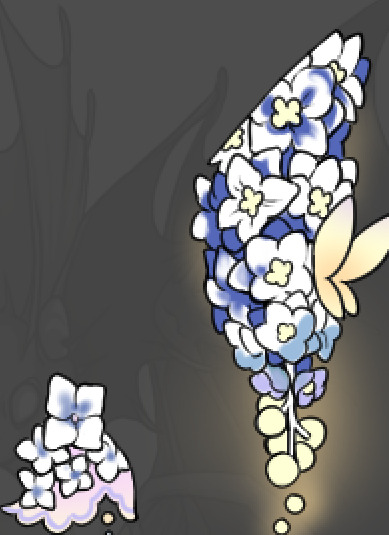
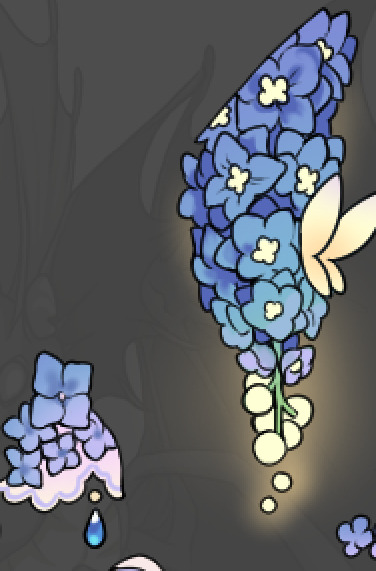
For shading and rendering, again, I create a "normal" layer and simply. Draw over what exists. Color picking and hand blending allow me to create the exact shades and effects that I want that multiply/screen/overlay layers may not be able to achieve. (which isn't to say I dont use them! i just don't use them for the main meat and potato part of my coloring) All of what is shown here is also achieved with the CSP asset SOIPEN (which can be found for free in the asset store)
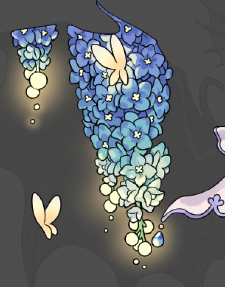

another example. The one on the right is showing how the layer looks without the gradient base layer under it. All of this is rendered by hand. I also specifically put a highlight color around where the butterfly is sitting to give a better illusion that it is properly sitting on the flowers rather than just in front of them.
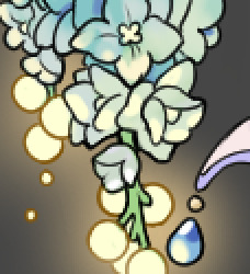
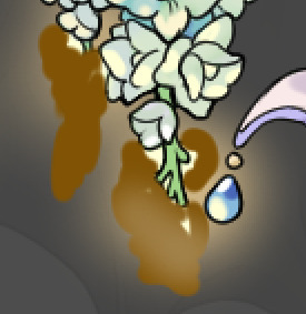
Next is changing the color of the lines, if needed. A method i'll use is I color just the sections I want (on a separate clipping layer) then lock that layer's alpha setting to them add in a gradient. It's a small and subtle effect that adds more depth without doing a lot of effort. (work smarter not harder)
Now we get to the Polish Layers!
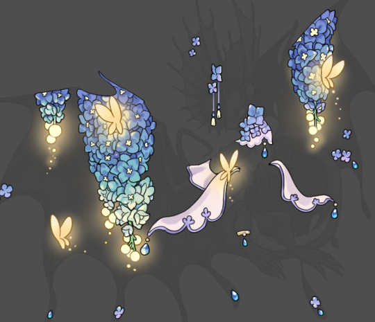
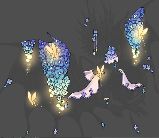
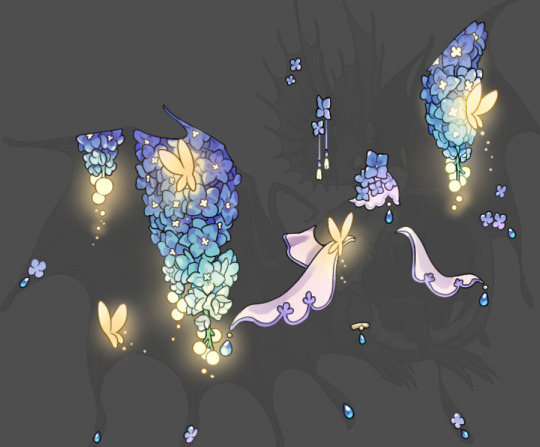
first image is how it looks as a base. second image is with an overlay layer applied. I've used some dark purples and mid tone desaturated greens to push the values a bit further (especially evident on the top left wing) Third image is with a screen layer applied, highlighting the inner most part of the flowers and adding some additional bounce light.
An important thing to note about making accents vs making full coverage skins: OPACITY AND LAYER TYPES MATTER OVER TRANSPARENT SPOTS. What I mean by this is that if you use a soft, light grey to shade with a multiply layer, don't clip it to anything, and have it go outside the lines - that will no longer appear as a 'shadow' when it comes to the final result. Instead you will have a section of soft light grey that is simply laid on top of whatever the image under it is. The same applies for overlay/screen/add layers and so on. If i use a very dark color on a screen layer (to give a soft highlight) and airbrush it over a bunch of stuff and don't clip it, it will end up with this horrible dark splotch over everything that isn't opaque. To this end, mastering normal layers is imperative to having well rendered and convincing accents.
Another thing of note: when it comes to sparkles/small details, note how 'large' the sparkles behind the butterflies are. They seem a bit chunky, yeah?
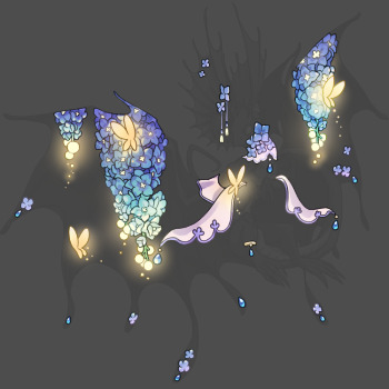
this is what they look like at proper size. If anything, I could have gone larger on the small metal beads connecting the dew drop jewels to the lace.
Another trick I also like to do is this:

a slight hint of transparency! It's just enough to let the dragon's lines underneath show through but not enough to be super noticable. I like to do this a lot when it comes to sparkly and magical effects.
Next is the worst part of all: destroying all that beautiful hard work with the shadow and line art layers! (sobbing)
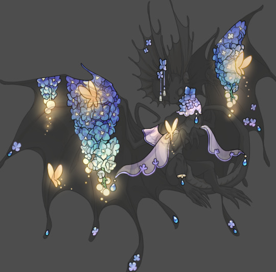
This stage always agonizes me. This is my first pass of the shadow/line layers and let's hope it's dark enough.
But yeah that's a start to finish look at how I create my accents. Unfortunately a lot it devolves into needing to know, yknow, line weight and silhouette importance, color theory and the ways that drawing applications actually apply color to a png vs how its rendered in app. All of these things impact the finesse of the accent, and are things you do have to learn gradually over time, but hopefully this has given yall some additional insight and perhaps some helpful tips.
And this should also explain why I get so mad when people go 'hey can I get this accent in another color' no! no you literally can't!
155 notes
·
View notes
Note
Ehehe, I see that Josuke Araki has made his way into your script :P
Are there any other JoJo's floating around in Soul Society and beyond?
So I like to populate the background characters of my fic with characters from another series as just a fun reference, but I feel like some people are reading into it a little to much. It's like- well, there's a watsonian perspective on it and a doylist one and a sort of meta-watsonian one.
From the watsonian/in-narrative perspective? You know that line from that Stucky fic everyone loves about "we deserve a soft epilogue?" I like to imagine AUs for main characters where they still live in an animeverse, but are free from the burden of being The Main Character. Usuke Urameshi lives in Karakura town, but he was never The Spirit Detective. He's just some former punk with mild psychic abilities who runs the ramen shop Ichigo goes to sometimes. Josuke is just some guy that has enough power to be a shinigami, but he's just like, rank and file. You see him in crowd shots. They're alternate universe versions of their full powered, main character selves and probably happier than those versions.
From a doylist perspective, it's a fun game of reference tag to play with the reader. A sort of where's Waldo of random characters from related series. Sort of like putting Samuel L Jackson in a bit part in your movie and giving him a purple prop to fiddle with. He's not playing Mace Windu, but for sharp-eyed nerds, he is making a star wars reference. Sometimes it's just for fun, sometimes is a way to lay on some really subtle thematic context. Like overlaying a 8% opacity layer of yellow on a digital piece to give the impression of late afternoon. Nothing explicit. Nothing relevant to the plot. Just a bit of seasoning.
From a meta-watsonian perspective, a lot of how I write fic was influenced by the old Kids WB bumps where the voice actors would play their characters *as though they were actors hanging out on the warner studios lot* Batman was still Batman, but he was also a guy playing Batman on TV. Yugi moto still had the cosmic powers of the millennium puzzle but also complained about how much time he had to spend in hair and makeup. So when you see a character from another series in my fic, they're an alternate universe version of themselves that is Not Relevant To The Plot, and on another level they're like an actor famous on another show, coming in to do a bit part on their friend's show for funsies.
...but mostly I do it so I don't have to make up names for OCs I'm only using for four seconds.
To actually answer your question: Yuzu is a HUGE fan of this educational YouTube channel run by Marine Biologist Jotaro Kujo. He's the only guy who gives echinoderms their due. She shows Ukitake and Unohana and they like him a lot too. Unohana writes to him to put him in touch with Hanataro and the two put together a major survey of venomous marine life with potential medical applications. Ukitake just likes fish :).
#AEIWAM#An Elephant Is Warm And Mushy#bleach#bleach fanfic#metanarrative#the thing to remember is that i don't do intergated crossovers#but sometimes friends will do a bit on thier friend's show
156 notes
·
View notes
Text
Elden Ring Map Overlay
Someone made a really helpful overlay of Elden Ring's base game map with its DLC map. https://www.reddit.com/r/Eldenring/comments/1dmm27d/so_i_overlaid_the_dlcs_map_with_the_base_games/
A few things stuck out to me:
The Church District, and especially Ymir's chapel, would have been a wonderful gazing ground for the Erdtree, as the Erdtree sits just north of it.
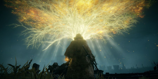
The heart of the Erdtree is right over Shaman Village, which makes me wonder if that's why the Erdtree is located where it is. It also makes me wonder if that's why the Shadow Realm is left with only a minor Erdtree in its place—a pale imitation of what was there before.
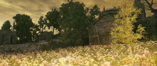
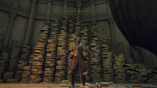
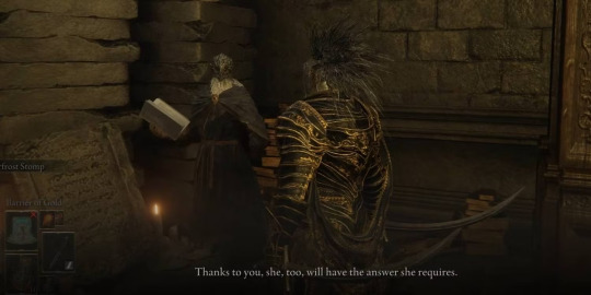
The back of the Shadow Keep abuts the furthest reaches of the capital, including the Erdtree Sanctuary and Marika's bedchamber. Her room is filled with scrolls and tablets that look very similar to those of the Keep, lending credence to the theory circulating about her having taken them from the Keep originally before it was sealed away. At the time, it probably wasn't much of a walk from the Storehouse's library to her chambers.
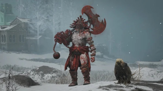
Messmer's chamber was built over what would be the Colosseum in Leyndell. The Duelist Helm tells us, "The snake is viewed as a traitor to the Erdtree, and the audience delighted in seeing these bronze effigies beaten and battered." Because of this helm, people had already been guessing that Messmer is why snakes are so reviled in gladiatorial imagery.
The timing doesn't fit his crusade, though—which likely has to post-date Godfrey's exile and the creation of the Tarnished, since he knows the word "Tarnished". Meanwhile, the Colosseums were around in Godfrey's time as Lord. So if the visual placement of his chamber and the colosseum (and the Duelist Helm) is purposeful, it makes me wonder what happened earlier in regards to him that would cause that connection. Maybe it's just a coincidence of map placement, but it's certainly suspicious. Was Marika playing a long con, slowly turning the culture against snakes, knowing what she would eventually do to seal her serpentine son away?
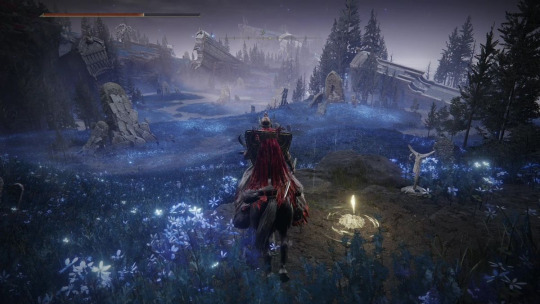
Stone Coffin Fissure's entrance, where St. Trina is imprisoned, extends between Gatefront Ruins and an evergaol in Limgrave. This makes me wonder if that's intentional, given that Stone Coffin Fissure does become Trina's jail. The gaols even glow with a sleep-purple hue, keeping their occupants in stasis and cut off from the reviving powers of the Erdtree.
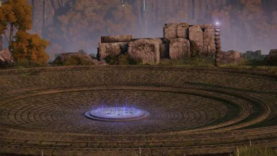
The bull headed stone coffins are even more mysterious. When the Lands of Shadow are divorced from the Lands Between, they look as if they have come from across the Cerulean Sea. But when the lands are merged, that sea becomes a lake.
Does that mean this burial ritual is post-Crusade? That's a bit hard to square with the idea that the Ancestral Follower religion seems quite old, being connected to the Eternal Cities. And that religion's iconography involving bulls does make it the best contender for where these coffins come from.
So does that imply these were originally burials-at-lake instead of burials-at-sea, maybe rising onto the Cerulean Coast during the division of the Lands? Perhaps the lake they were buried in simply became a coastline as the water that would have otherwise covered them rushed out into what became an endless sea, exposing the lake bottom's treasures.
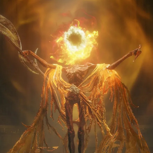
The Abyssal Woods is at a very deep elevation. So is the Forsaken Chapel where the Three Fingers dwells. The latter is still quite a walk from the Abyssal Woods, but it does make me wonder if the two used to be connected by further subterranean tunnels extending beyond what still exists in the capital's sewers. And I wonder if that's how Midra reached the Three Fingers.
#elden ring dlc#elden ring#shadow of the erdtree spoilers#shadow of the erdtree#queen marika#messmer the impaler#st. trina#count ymir#midra lord of frenzied flame#map art
107 notes
·
View notes
Note
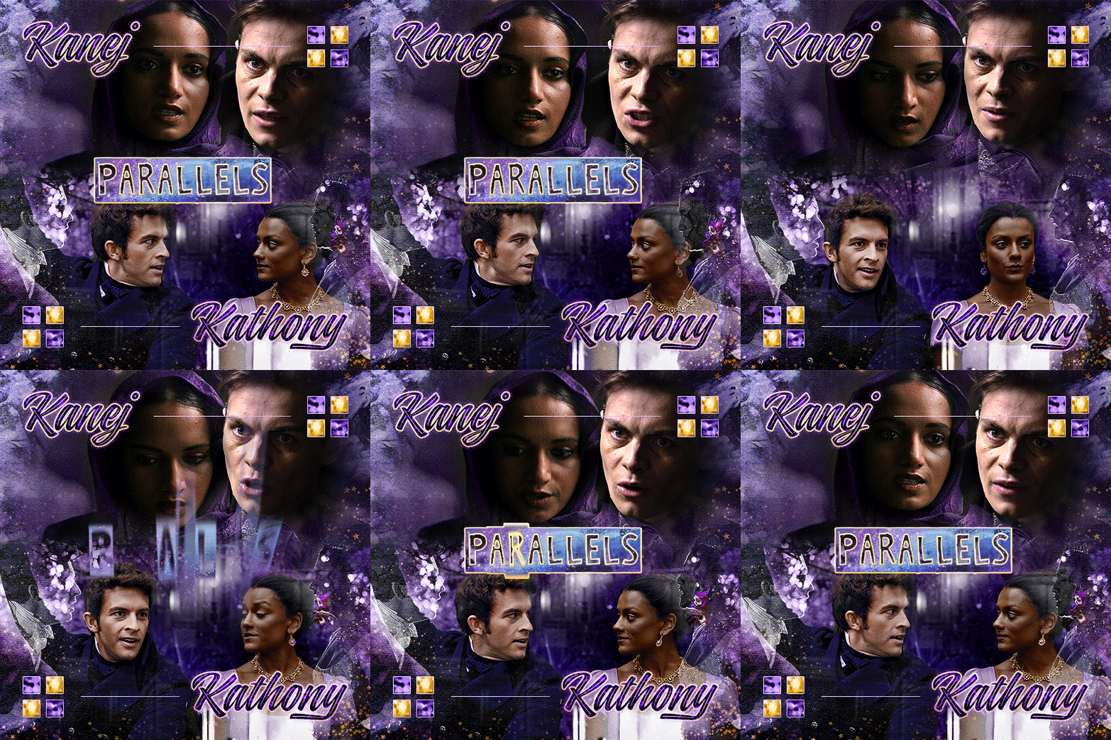
Oh I’m sorry I have GOT to ask! How did you do the text animation in the first gif of 718688291365502976/pscentral-event-15-favourite-ships-kanej?? It’s just. It’s so beautiful
Hi anon! I've used After Effects to create the text animation in the first panel of this post. I'll show you the basic idea of how I've created the animated text effect here :D
What you need:
A cutout font (the font that I've used is Trouble Child Outblack by @justlikethistrain)
Adobe Photoshop with Video Timeline feature
Adobe After Effects
Supplementary files: gif prep action pack / golden outline layer style / assorted textures
Difficulty: advanced; knowledge in gifmaking with the video timeline interface assumed
Note: This tutorial assumes that you're working with all of the composite gifs in a Photoshop composition file and using the video timeline interface
Other useful tutorials to refer to: Text overlay effect / After Effects text animation / clipping mask vs layer mask
Tutorial under the cut. Like / reblog if you find this useful!
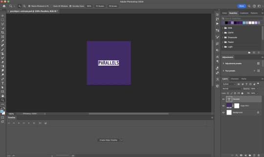
1) Photoshop: Preparing your gif panel
Setting up your PSD composition panel: Create a blank PSD file and set it to Tumblr dimensions (540px x 540px in this particular gifset)
Enable Video Timeline and drag all of the component gifs from your folder to the PSD composition file. Resize / move these gifs around until you're happy with the placements.
Trim the timeline work area so it's the same length as the shortest component gif you've added to the PSD composition file. You can also add some textures & additional adjustment onto this panel.
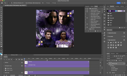
2) Photoshop: Exporting your base gif
I highly recommend exporting the base gif right now, to ensure a smoother experience scrubbing through the video timeline when adding finishing touches later on in the workflow.
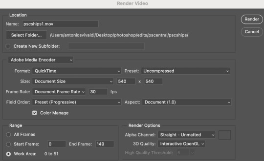
My preferred method is to render the composition as a video clip from File > Export > Render video.
To get the optimal export quality, I use the following settings:
3) Photoshop: Preparing your text layer
Make a new Photoshop composition file of Tumblr dimensions

Drag in the video clip that you've just rendered (the base gif) to this composition file
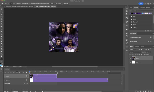
Add a new text layer in your PSD composition file and set the colour to white then tweak this layer until you're happy with the text placement.
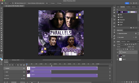
For performance optimisations on After Effects, I duplicate the PSD composition file and delete all other layers. This PSD file contains only the text layer that will be animated.
4) Photoshop: Adding overlays & decorations on the text layer
This step allows you to preview the text effect without the animations (i.e. allows you to tweak the texturings & colourings)
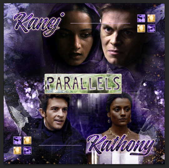
Duplicate the text layer. Set the bottom layer's (highlighted in red) blend mode to Exclusion and apply the gold outline layer style to the top layer (highlighted in green). Make sure the Inner Shadow is disabled!
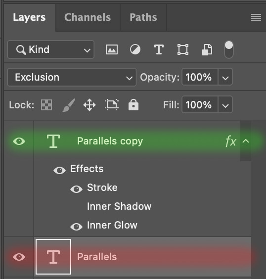
The panel now looks like this
I want to have the liberty to use different colours & textures on the bottom text layer with animation, so the next thing I do is to right click on the bottom text layer and select "Group from Layers"
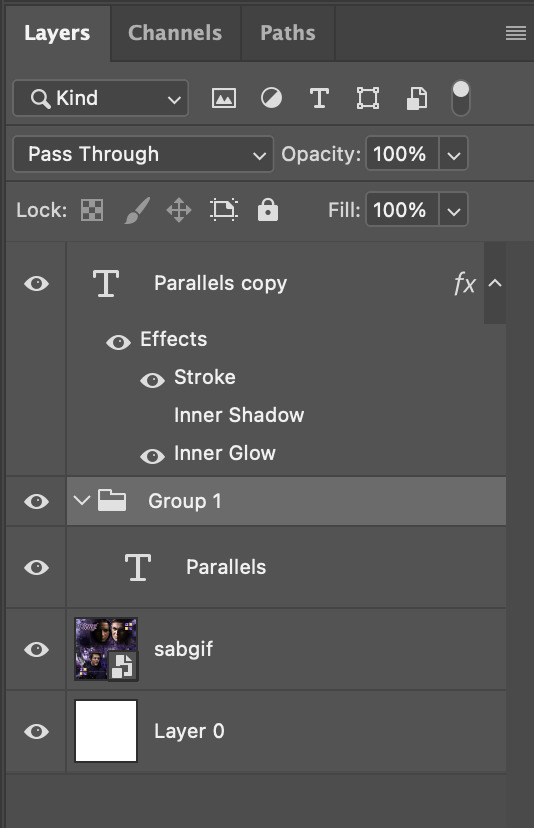
To change the colour of the filled text layer to purple:
Collapse the Group that you've just created
On top of the collapsed Group a purple Colour Fill layer,
Set the Fill layer's blend mode to "Colour"
Right click on the Fill layer and select "Create Clipping Mask"
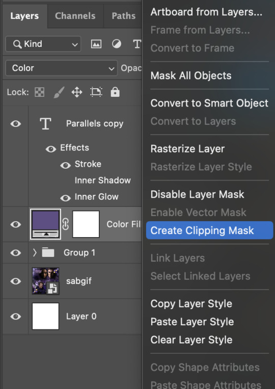
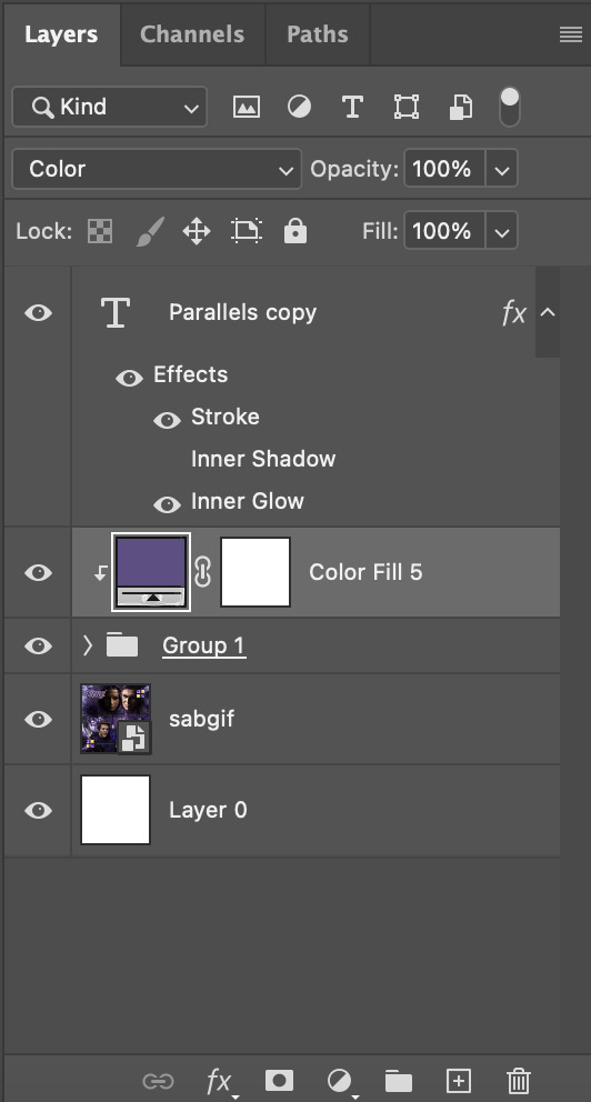
Now the colour of the filled text layer is purple
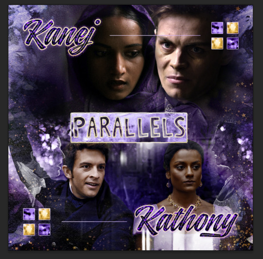
After adding more textures & decorations on the text layer (with photo negative effects) I get the following:
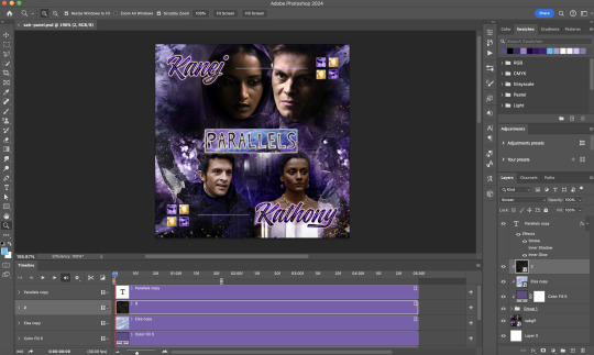
5) Photoshop: Adding overlays & decorations on the text layer
To avoid performance issues on After Effects, I make a new PSD file of the same dimension. With both the PSD files open, I select the text layer (highlighted in red) while holding Shift, I drag this to the blank PSD file (see the green arrow)
Holding Shift ensures that the layer's placement is preserved when it's copied to a separate PSD file.

In the new PSD file, I set the text layer's blend mode to "Normal"
6) After Effects: Animating your text layer
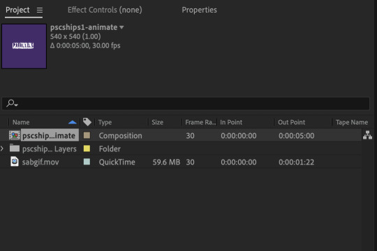
Make a new project on After Effects and drag in the text layer PSD file. Import this file as a Composition

Also drag in the base gif video clip to the AE project.
While we won't be exporting anything with the base gif visible, having this file in the project file is useful if you want to have a better picture of how the animation will look in tandem with the gif.
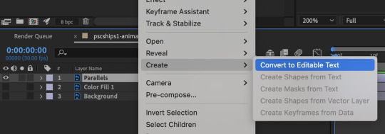
Double click on the composition. Hide the colour fill and background layers. Then right click on the text layer, go to Create > Convert to Editable Text
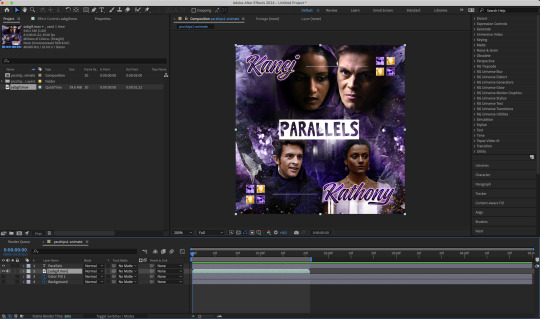
To be able to preview the animation with the base gif, drag the video clip to the composition file and below the text layer. The visibility of the layer can be toggled on / off anytime in the After Effects workflow
Now we prepare the text layer to be animated. Because the final animated effects is 3D & has motion blur, right click on the text layer and select "3D layer" (highlighted in green) and Switches > Motion Blur (highlighted in red)

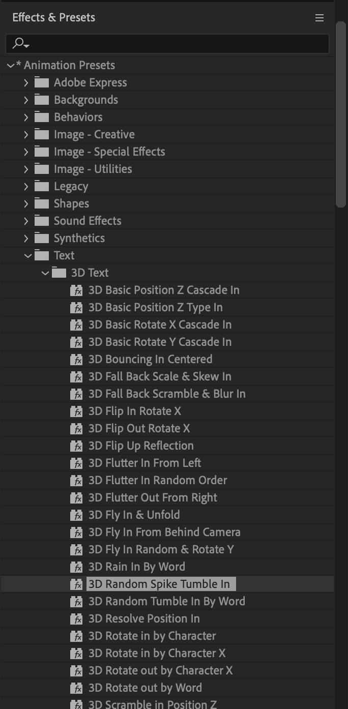
Go to Animation Presets > Text to browse through some presets that you could use to animate the text layer. For this gifset, I've used a preset within the 3D Text folder called "3D Random Spike Tumble in".
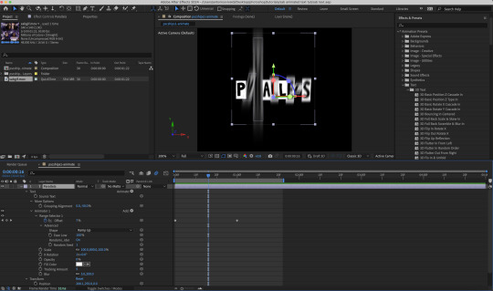
While selecting your text layer, press U to view the keyframes and you can adjust the position of these keyframes until you're happy.

For more finishing touches, press U again to tweak more options in this preset. In this case, I do to Animato 1 > Range Selector and changed the Colour Fill to #fff (the default colour is light yellow)
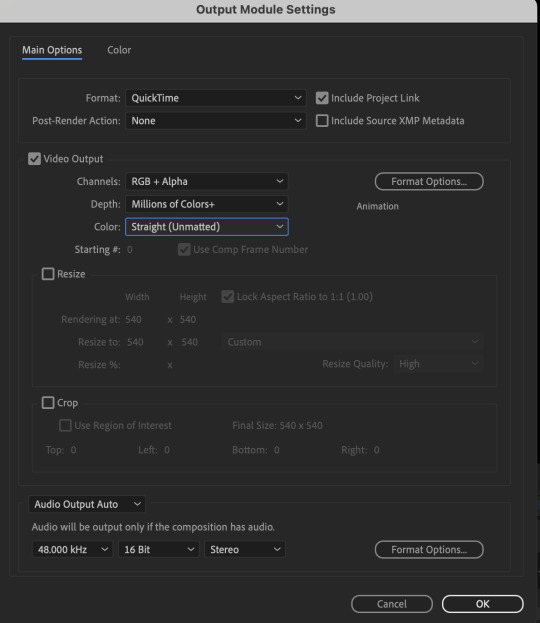
Then do you File > Export > Add to Render Queue

Click on the Output Module and use the following settings to render the text layer as a video file with transparency
Then after specifying the folder in which you'll export the video to, click "Render" to render the video file containing your animated text layer.

7) Photoshop: Adding the animated text & finishing touches
On Photoshop, drag the rendered clip containing animated text, to the PSD composition file with the static text layers.
Duplicate the animated text video layer
Drag one of the layers inside Group 1 and set the blend mode to "Exclusion" (Highlighted in green)
Move the other layer to the top and apply the gold outline layer style with Inner Shadow disabled (highlighted in red)
Hide both text layers (highlighted in yellow)

By scrubbing through the timeline, I've noticed that the animation didn't look clean enough, so I'll add some finishing touches
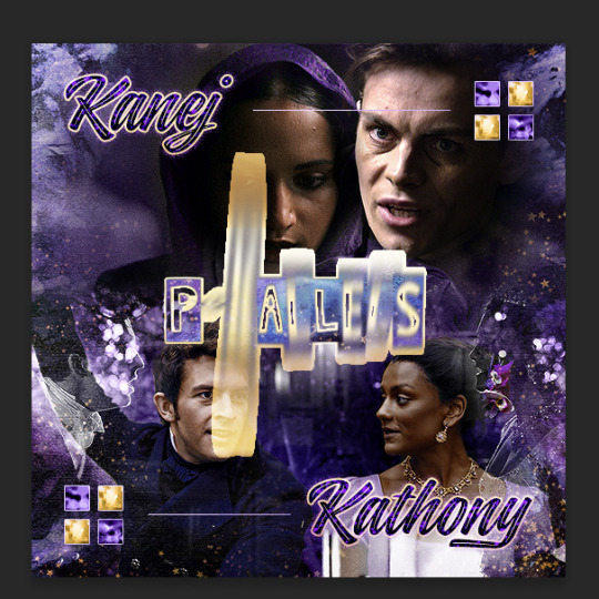
By selecting the upper text layer containing layer styles, go to the timeline and add opacity keyframes going from opacity 0% to 100% a few frames apart
Once you're happy with the finishing touches, flatten / render your PSD composition file, change the frame delay to 0.05s and export your gif and voila!

I hope this helps 💖
#tutorial#gif tutorial#photoshop tutorial#after effects#chaoticresources#dearindies#userriel#useralien#userraffa#usershreyu#user.tee#useryoshi#usernik#userjoeys#usersole#arthurpendragonns#userhallie#*#my tutorials#my resources
143 notes
·
View notes
Text
Sleepy
Media - The Queens Gambit Character - Benny Watts Couple - Benny X Reader Reader - Y/n (Roommate) Rating - 18 + Smut - kissing / snuggling / lap sitting / half asleep / semi non con / neck kissing / love bites / bjs / orgasms / licking / Word Count - 3397

Y/n heard the door and slowly crawled out of bed still in her black pj shorts and purple off-the-shoulder top covered in stars, her curls in two long braids, she trudged out rubbing her eyes and noticing Benny putting groceries away. So she goes overlaying her head against his back, wrapping her arms around him and cooing softly, "Ummm it's a ben-ji-min" she milked the name
Benny chuckled softly as he set down the last of the groceries on the countertop. He could feel her arms wrapping around his waist, as she laid her head against his back. He smiled, a hint of playful, teasing in his voice “Oh god, I really hate that nickname” Benny said jokingly, but he was secretly fond of it. As he enjoyed any attention and affection from her. Especially in the form of physical touch. He gently turned around to face her, wrapping one arm around her waist. ”but it was cute.”
"my Benjamin," she muttered,
Benny chuckled softly again, as he wrapped both of his arms around her waist. Now he was holding her in front of him. As he looked down at her, "You only say that to tease me" he said with a slightly playful tone. He gently pulled her slightly closer, until she was almost flush against him ”But yeah, I am yours, aren't I?”
"my Benjamin," she muttered nuzzling into his chest, "I give him all my kisses,"
Benny chuckled once again, enjoying the feeling of her nuzzling against his chest like that. He then smiled slightly, feeling her breath against his chest as she muttered the nickname again “All of your kisses, huh?” he teased, raising an eyebrow slightly as he gently pulled her even closer. He was enjoying this level of closeness and affection from her. Even if she was only doing it to tease him.
"all the kisses," she muttered pressing kisses to his chest,
Benny’s smile widened as he felt her press kisses to his chest. He gently tightened his arms around her waist, keeping her close to him. “Oh yeah?” Benny questioned, in a slightly playful tone. He gently ran one of his hands soothingly through her hair, while his other hand gently ran up along her waist, under her shirt, to gently rest against her bare skin.
"snuggles" she whines
Benny smiled softly again at her whine, seeing her wanting more affection from him. “You want snuggles?” he questioned, in a gently mocking, but teasing tone. He then chuckled gently. “Alright then, come here,” he said, as he pulled her even closer to him, wrapping his arms fully around her. He then leaned down a bit and rested his chin on the top of her head.
"bed snuggle"
Benny chuckled gently once more, hearing her request for a bed snuggle. He was more than happy to give her what she wanted “Alright, let’s go lay down then” he said, gently tugging her along with him to the bedroom. Once in his bedroom, he moved and sat on the edge of the bed, gently pulling her onto his lap, so she was sat sideways on his lap. He then laid down, pulling her to lie down with him.
she laid herself on her knees on either side of his hips, his stomach and chest pressed together her arms around him as she already began to slightly snore
Benny smiled softly at how quickly she had laid down on top of him, and how quickly she had instantly started to snuggle up against him. He gently wrapped his arms around her back, as he held her close against him. One arm rested around her shoulders, while the other gently rested on the small of her back. He chuckled softly as he heard her slight snoring, the sound actually was quite cute. He then pulled a blanket over both of them. before resting his chin on the top of her head.
"I wuv Benjamin"
Benny chuckled faintly, gently rubbing his hand up her back as she muttered those words. She was very cute and clingy when she was half asleep like this, and he found it very endearing. “Yeah? You love me?” he questioned, in a gentle mock-teasing tone
"mhm"
He smiled softly again, hearing her confirmation of love for him. "And I love you too" Benny said, gently, in a quiet and slightly affectionate tone. As he gently pulled her a bit closer to him, as they were laying together. He then gently ran his hand through her hair, while his other hand gently rubbed up and down the small of her back.
she smiled and gave him more little kisses "can we do the thingy?"
Benny chuckled gently once again, as she started to give him little kisses again. He then raised an eyebrow a bit when she asked about “the thingy” “What thingy?” he asked, curiously, in a slightly teasing tone. Even though he might have had an idea on what she was talking about
"the nice thingy"
Benny chuckled again. He had a feeling he knew what this “nice thingy” was that she was talking about. So he decided to play along. “The nice thingy huh?” he asked once more, in a playful and slightly mocking tone. “And what would this ‘nice thingy’ be exactly?”
"a big party, where we look all pretty and dancing and cakes and wine and I get to wear a big beautiful dress"
Benny chuckled softly, still gently rubbing his hand up and down her back. “Sounds like you’re talking about a wedding, darling” he teased, in a gently mocking tone.
"mhm weddings..."
Benny chuckled, as he smiled slightly. Seeing her so clingy and cute like this. He then paused for a moment, and thought about those words. He then spoke in a slightly teasing, but also serious tone. “You want to get married, huh?”
"mhm my benny. We go make soup and then get weddinged”
Benny chuckled once more, amused by her cute, sleepy babble. “You want to make soup, and get married?” he questioned, in an amused, but also slightly affectionate tone. he then paused, and glanced down at her, thinking about the topic of marriage for a brief moment, before speaking up again. “So…. You do want to get married then?” he asked, in a slightly more serious and somewhat genuine tone.
"mhm" she nodded "I wanna marry the Benjamin"
Benny smiled slightly. Even if she was just making cute, sleepy babble right now, the fact she was saying she wanted to marry him still gave him a warm feeling in his chest. “You want to marry me, huh?” he asked, in a slightly playful, but also somewhat affectionate, tone.
"mhm, marry then you keep me safe and give all the kisses"
Benny chuckled faintly. Even though she was sleepy and slightly incoherent right now, the little things she was saying were still quite cute and endearing. “Keep you safe, and give me all of my kisses, huh?” he repeated back to her, in a teasing, but also somewhat affectionate tone.
she nodded peppering kisses to his neck nibbling and even biting on the tender skin
Benny stifled a soft moan at the feeling of her kisses, and the way she was nibbling and even biting on his neck. The feelings of her lips and teeth against his sensitive skin. “H-hey, careful there” he chuckled faintly, in a teasing, but also somewhat warning tone .
"My Benny" she cooed picking a spot and giving her roommate a love bite
Benny suppressed another moan as she gave him a love bite on his neck. The area where she was now sucking the skin was sensitive and he was feeling the effects it was having on him. Her actions were starting to cause a reaction in him. “L-love bite huh?” he asked, in a somewhat teasing, but also somewhat strained, tone.
she only continued deepening the bite and squirming her hips on top of him starting to rub against the forming bulge in his jeans
Benny bit his lip to hold back another moan. He was very sensitive there, and her sucking, and the way she was squirming her hips and rubbing against him was causing his jeans to grow a bit tighter now. He gritted his teeth, trying to hold back any more embarrassing moans or noises. “M-maybe we should slow down a bit, darling” he warned, slightly breathlessly.
"ummm my Benjamin" she cooed kissing down his throat and chest
Benny tried to suppress the soft moan that escaped his throat when she kissed down his throat and chest. Her soft, and gentle kisses were causing his skin to tingle and shiver at the touch. The feeling of her soft lips against his sensitive skin was making it increasingly hard for him to hold back any more embarrassing noises or reactions
“D-darling - “ he spoke, gently. Trying to keep his voice leveled, and not too shaky.
she whined when her kisses met his belt
Benny could feel himself shiver slightly as her kisses reached his belt. Her whine was slightly adorable to him, but it was not helping his current situation. The sight of her, in his lap, with her face near his belt, was causing his pants to get even tighter. He tried to maintain control and keep himself calm, but it was getting increasingly difficult. He was now struggling to keep his breathing steady and his voice from shaking.
she whines batting his belt buckle with her nose "Come out" she pouted
Benny let out a slight gasp as she started batting at his belt buckle with her nose. Her whiny pouting was still somehow both adorable and frustrating, in equal measure. He was struggling to keep his breathing and voice steady now, and he was having a difficult time trying to keep his body from reacting to her actions. He gritted his teeth, trying to keep control, as he spoke in a slightly strained and breathless tone “D-darling, you’re making it difficult for me to – “
"come out" she begged licking the skin of his stomach above his belt
Benny moaned softly as he felt her licking his skin above belt. Her tongue against his bare skin was sending a shiver down his spine, and he was finding it increasingly more difficult to control his body’s reaction to her touch. He was breathing heavily now, and he was struggling to keep his voice from shaking, “D-Darling… Y/n…”
she pouted and undid the belt herself and tugged his jeans until they hit his ankles and she began kissing and nibbling all over his tight boxers
Benny couldn’t hold back another moan when he felt her tugging at his jeans and taking them off. His boxer briefs were now the only thing separating his skin from her kisses and nibbles, and her actions were driving him crazy. He was now struggling to keep his breathing steady and he could feel himself starting to harden beneath her mouth. “M-my darling – “ he breathed out, in a gasp-filled tone. “-careful now”
"my Benjamin" she cooed licking the obvious stiffness through the cotton boxers
Benny groaned softly as he felt her licking him through his cotton boxers. The feeling of her tongue against him through the thin fabric was making him shiver and strain harder against the boxer briefs. He couldn’t keep his body from reacting to her touch, and he was now letting out small panting gasps. His heart was beating faster now, and his breath was coming out ragged “M-my darling - “ he gasped out, “- y-you’re going to drive me insane”
"ummm my Benjamin, all mine, I wanna eat him all up" she grumbles sleepily as she begins to suck in little spots through his boxers
Benny groaned softly again, feeling her sucking through his boxers, and her sleepy grumbles about wanting to “eat him all up”. Her words were making him squirm, and he was now having to bite his lip to keep from moaning too loudly. “D-darling - “ he panted, “- y-you’re going to make me lose my control if you keep this up - “
"Please come out Benjamin" she begged
Benny grunted softly as he heard her begging for him to “come out”. Her words, and the desperate pleading way she said it, was only making him strain harder against the fabric of his boxers. “D-darling, I - “ he panted, “- I’m going to lose control if you keep begging like that”
"pretty please, come out" she begged between kisses
Benny grunted again, feeling her kisses and hearing her desperate begging. He was nearing his breaking point now, and he wasn’t sure how much longer he could hold himself back from giving in to her. he panted, “- a-and if I come out you know what’s going to happen next”
"please" she whined tugging on the waistband
Benny groaned again, as he felt her tugging on the waistband. Her pleading and begging for him to give in and let her have what she wanted was driving him crazy, and he was at his breaking point. He could barely hold himself back now, and he was losing his last bit of self-control “D-darling - “ he panted, “- a-are you sure you want me to come out - “
"please benny" she whined
Benny could hear the pleading tone in her voice, and it was driving him insane. He was fighting to hold back, but her begging was making it impossible for him to resist any longer. With a last bit of effort, he finally gave in “Y-yes, darling, I’ll come out” he panted, in a barely controlled tone.
she giggled and batted her nose against his hard on as she waited
Benny bit his lip as her nose against his stiffness, feeling the soft contact and her giggling and smiling against him. It was taking all of his self-control to hold back from thrusting his hips forward in response to her touch. “You’re going to be the death of me, darling” he gasped out, in a ragged breathless tone as he tugged down his boxers, “There… happy darling?”
she giggled "ooooohh pretty benny, so big and excited" she giggled starting to pepper kisses on his shaft
Benny groaned softly again as he felt her tugging his boxers off, and
Benny groaned Feeling her soft lips press against his now freed-up erection was driving him crazy and he could feel himself growing even harder. He closed his eyes and gritted his teeth, trying to keep himself from losing control entirely “D-darling - “ he panted, “- if you ke-keep doing that I won’t be able to - “
she ignored him and continued peppering kisses and nibbles
Benny grunted softly as she continued her kisses and nibbles. Her actions were making it increasingly difficult for him to hold back. He was now breathing heavily and he could feel himself growing even harder under her lips. A low moan escaped his throat as his body strained against her touch “D-darling, y-you’re going to make me - “
"my benny" she begged as she began licking
Benny let out a strangled groan as he felt her tongue against him. Her licking was driving him even closer to the edge and he could feel himself nearing complete loss of control. He was gripping the bedsheets tightly, trying to find something to anchor himself to, as he panted breathlessly “D-darling, p-please - “ he gasped, “- I can’t hold back much longer - “
she giggled licking him with an innocent smile "my Benjamin, he tastes like sugar"
Benny grit his teeth as he felt her licking him like a lollipop and heard her commenting on his taste. “D-darling - “ he panted, He could feel the tension building up inside him, he was nearing his limit now. He could barely hold on any longer
she giggled moving closer and finally took it, starting to suck like a pacifier
Benny closed his eyes tight and threw his head back, letting out another. Benny let out another strangled moan and clenched his fists tighter, biting his lip to hold back another moan. Her action of taking him into her mouth and sucking was overwhelming him. He was struggling to hold onto the last thread of control he had. “D-daring - “ he gasped, “- if you d-don’t stop - “
she only continued moving his hand to her hair
Benny complied with her gesture to put his hand in her hair and he grabbed a handful of her hair, running his hand through it. It was taking all of his self-control not to thrust his hips forward into her mouth. “D-darling - “ he gasped, “- you’re going to - “ he grunted softly, struggling to speak through gritted teeth. Benny tried to warn her that he was nearing his limit, but he couldn’t form coherent words. His breathing was ragged and he was struggling to hold back the feeling of release building up inside him. “D-darling - you - “ he panted again, “- I’m close - “
she looked up at him innocently as he spoke and she smiled only getting harder and more intense doing everything she could to make him
Benny could feel himself nearing the point of no return. He locked eyes with her as she looked up at him innocently, and he could swear she had a glint of mischief in her eyes. He was panting heavily, desperately struggling to hold onto whatever control he had left. “D-darling - y-you have to stop - “ he gasped out, “- I can’t hold it anymore - “ He was gripping onto her hair tightly, his knuckles white from the tension. His body was straining and shaking, desperately trying to hold on, but he was losing the battle “D-darling - I - “ he panted again, “- I’m going to - “ He was barely able to form the words before he felt the tension inside him reach its breaking point. With one last gasp, he let go and gave in to his body’s release. He closed his eyes and let out a low groan as he felt his release wash over him. He held onto her hair tighter, his body shaking slightly, as he rode out the waves of his release. He was panting heavily, trying to catch his breath, and reeling from his orgasm. He looked at her with a mixture of gratitude and mild annoyance. “D-darling - “ he gasped out again, “- I warned you - “
she giggled and slowly slowed down letting him ride out the satisfaction as long as possible even taking him a little into overshock and overstimulation before finally pulled back and giggled resting her head on his thigh "Benny tastes like marshmallows"
Benny let out a shuddering gasp at her overstimulation. He was still riding the waves of his release and the feeling of her head resting on his thigh sent another shiver through him. “Y-you’re unbelievable, you know that?” he said, in a slightly breathless tone. He ran his hand through her hair, gently.
she giggled and nodded licking to clean up anything that remained
Benny groaned softly as he felt her licking to clean him up. He was still oversensitive from his release and her action sent a shiver through him. He ran his hand through her hair, gently caressing her head. “You’re going to be the death of me one day, darling” he said, with a mixture of affection and annoyance.
she got to her feet and jumped on him wrapping her arms around his shoulders and her legs around his waist forcing him down on the bed "ummmm my Benjamin,"
Benny was caught off guard by her sudden jump and he fell backwards onto the bed with her on top of him. He grunted softly as he hit the bed and he wrapped his arms around her waist, holding her tight against him. “Yes, darling?” he asked, in a slightly amused tone.
she nuzzled into his chest and almost immediately fell back asleep
Benny couldn’t help but smile as she nuzzled into his chest and fell back asleep. He held her close to him, gently rubbing her back. He chuckled softly, shaking his head in amusement. “Insatiable and sleepy” he whispered with fondness. He continued holding her close to him, watching her sleep in his arms. He was content just holding her and feeling her breathe against his chest. He couldn’t help but feel a warm sense of affection as he looked down at her sleeping form. She was like a fierce little wildcat most of the time, but when she slept, she was soft and clingy. “You sleep darling, maybe in the morning… you might remember we did this this time.”
Commissions here
#tbs#thomas brodie sangster#thomasbrodiesangster#tbs smut#thomas sangster imagine#tbs imagine#tbs imagines#thomas brodie sangster smut#thomas brodie sangster imagine#thomas sangster#benny x reader#benny smut#benny fanfic#benny#benjamin#benny watts#benny imagine#benny watts smut#benny watts imagine#benny watts x reader#Bennywatts#the queen's gambit#the queens gambit#thequeensgambit#TQG#Benny watts x reader
65 notes
·
View notes
Note
Im so so so so sorry for the dm but I gotta do, how did you do the lighting for these two??
https://twitter.com/Licollis_a/status/1657703869068234754 https://twitter.com/Licollis_a/status/1657631596198125569
(dm wouldnt send on twitter so I'll send it here!)
Be not afraid, for I will reveal my secrets in rendering step by step.
1. After I'm finished with lineart, I added the base color. It's faint, but putting in gradient will make it pop.
2. In order for the whole thing to look harmonious with each other, on top of the base color I added a multiply and overlay layer. The color I use for multiply is usually desaturated, kinda pastel-y. The overlay one is more saturated (see alternative colors below).

3. The result should be kind of dark. Which is what I'm after, because what you're seeing is already shadowed. So instead of adding the shadow to the base color, I'm adding the light.
On top of the multiply layer, I added an overlay layer. I keep in mind where the light source is coming from (see the blue arrows). The color of the overlay can be whatever -- it depends on the vibe you're trying to make (e.g if they're in waterfall, I'd use light cyan).
Also, see that normal layer clipped onto my overlay? It's how I added my "fringe" (aka subsurface scattering). I often use pink. Just line it on the edges of the light.

4. Now I added a multiply layer again, just to give the piece more depth and details (like the skin)

5. Now I'm adding what's called reflective light (google to see examples irl). Basically, I covered the darkest parts of the drawing with something lighter. For this one I just added pastel purple in the normal layer, but there are other layer types to lighten it up!
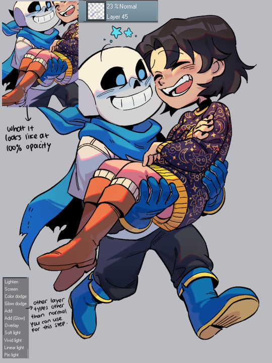
6. Now, I colored the lineart through clipping. I usually just matched the surrounding colors by adding a darker one (e.g dark red for skin).
Optional: I like to make 2 copies of the lineart, make one red and another cyan, and respectively slide it to left and to right. Sometimes it doesn't even look good tho....

7. Highlights time! To do this I disable the background so it's transparent, click right and choose 'merge visible to new layer'. Which flattens the visible image onto a new layer. Now I can add in these white lights by clipping on top of it!
(It's a lil tricky to do this right with a brush, so I used the lasso fill tool.)
To top it off, I add some sparkes. My simp art is done <33
Edit: I forgot!! By the end of it all you can add a texture by setting said texture into overlay with low opacity (on top of the finished art). In CSP you can add a perlin noise, one of these:

You can use other kinds of textures for ur artwork, like watercolor etc.
#by the way the other art you linked also use similar steps. just simpler.#(multiply over base color. overlay for the light and fringe. low opacity for scattered light. done.)#i hope this helps you and other artists too!!!#happy rendering!!!#art tutorial#lico arting
718 notes
·
View notes