#same old art different angle
Explore tagged Tumblr posts
Text
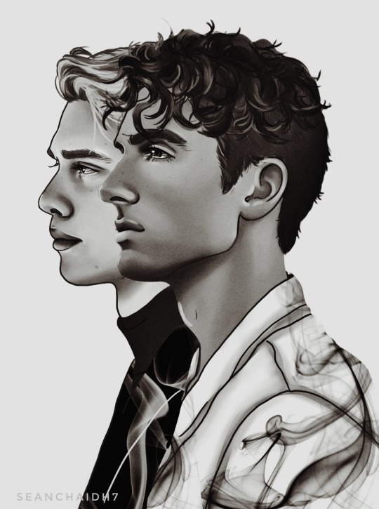
Henry & Alex ❤️
#the white version#for valentine's day#i couldnt decide which i liked more#so i made them both as i usually do#same old art different angle#red white and royal blue#rwrb#nicholas galitzine#taylor zakhar perez#my art#seanchaidh7
406 notes
·
View notes
Text
So a while ago some friends were talking about fans who claim the Same Coin theory is canon. And I made the mistake of saying:
Do you know who also has tons in common with Bill? Mabel. Yet nobody claims Bill reincarnated as Mabel. …wait now I want a "same coin but it's Mabel" AU. Funniest Bill reincarnation option. The all-seeing arsonist is making macaroni glitter art. The omnipotent tyrant is crying because a unicorn called her a bad person.
And then I overthought it for two months.
So—AU where after death, Bill's soul shoots 13 years into the past and reincarnates as Mabel. I'll call it ✨ Sparkly Coin AU ✨

Don't leave yet. Lemme show you why it works. Behold the eerie amount of parallels in their personalities, dialogue, behavior, mannerisms, tastes...


I could have kept going but my attention span ran out. All right, we all on board now? Convinced we could segue from one personality into the other? Great. Now here's why you should be interested: the juicy post-Weirdmageddon angst potential.

As long as a small fringe of the fandom still thinks Weirdmageddon is Mabel's fault, why not amp that up x100 and have some fun with it?
Is everyone sold now? Great. Let's get into the details. I've got 8 more pieces of art under the read more.
So the AU starts the instant Bill dies. Thanks to invoking his deal with the Axolotl—one way to absolve his crime, a different form, a different time—the Axolotl gives him a new shape and shoots him thirteen years into the past. Apparently, the Axolotl thought it would be very funny to stick Bill in the family that defeated him.
Which probably made for a jarring transition.

(It's fine, she's like 10 minutes old, she probably can't even tell who she's looking at. Not being able to tell who she was looking at is what got her into this situation ayyyy)
When Dipper & Mabel come back from Gravity Falls complaining about this triangular jerk Bill, their parents mention that Dipper's name was nearly Bill. See, after they knew they were going to have a boy, one night their mom dreamed about a visitor—some kind of magic pink salamander??—calling her child "BILL." Then at the next sonogram they found out they were having twins, the girl must've been hidden at a weird angle the first time, and they wanted matching names, so they thought, Bill and Bell. But they didn't really like Bell; but eventually they stumbled on Mabel, so to keep the names matching they switched from Bill to Mason. Isn't that the darnedest thing?
(Of course, Mabel and Dipper assume Bill harassed their parents to try to trick them into naming a kid after him. To be a jerk.)
When Bill meets Mabel, he's unaware that she's his future self—Bill's notably bad at doing things like, say, double-checking to see whether he's going to die anytime soon—but like... he can tell something's up.

Naturally, before visiting Gravity Falls, there were echoes of who Mabel used to be—but nothing anyone would be able to identify without context. All her Bill-ish quirks either smoothed out with time (see: how between second grade and fourth grade Mabel went from being the "freak" to the popular girl in class), or else they were accepted by her family as Mabel-ish quirks.


After they meet (and kill) Bill, they have the context to understand some of Mabel's behaviors... and unfortunately, some of Mabel's latent Bill-ness starts surfacing after she's been directly exposed to her prior incarnation.


The part of the Pines family familiar with Bill thinks the worst case scenario is that maybe Bill's survived and is slowly possessing Mabel; but far more likely, they think this is just some weird way of trying to subconsciously process last summer. Mabel doesn't think she's being weird, you guys are being weird, stop giving her weird looks. They get attacked by one triangle and now she can't wear yellow or pick up macrame as a hobby??
(It's not all red flags and uncomfortable triangle imagery, though. When Stan asks her what she'd like as a gift for some important event, she shyly admits that she thinks she's starting to outgrow her plastic gem jewelry and maybe she's old enough to get her first piece of real gold jewelry, if that's not too expensive? And Stan's never been so proud of her. Thirteen years old and already thinking about buying gold!)
But of course, the real fun starts when Mabel finds out.

That's the face of a girl who's just discovered that she tortured her great uncle. Now imagine running into the brother she possessed.
But I've already spent a million words and thirteen images on this post. If enough folks are interested in the AU maybe I'll expand on it later. Let me know what y'all think.
#mabel pines#bill cipher#gravity falls#gravity falls au#gravity falls fanart#sparkly coin au#my art#my writing#(here's that AU I've been taunting y'all with)
3K notes
·
View notes
Text
Lancer Tactics dialogue layout crisis of faith
(from this month's backer update)
Every so often, I'll run into something in development that eats away at me until it pushes me to a crisis of faith and I have a breakdown, burn down a bunch of work, and build something better from the ashes. These are moments of transformation and we're almost always able to come out the other side with something much better than what we started with.
This all sounds very dramatic until you take a step back and see the issue in question is just, like, the layout of a menu. But if medieval priests were able to have schisms over angels on pins I can have strong feelings about graphic design, dammit!
This month's episode revolved around how we're doing character dialogue. For reference the plan was to do a standard 4-slot visual-novel talking heads layout. I call it a 4-slot because there's usually four positions that characters can stand; two on the left, two on the right:
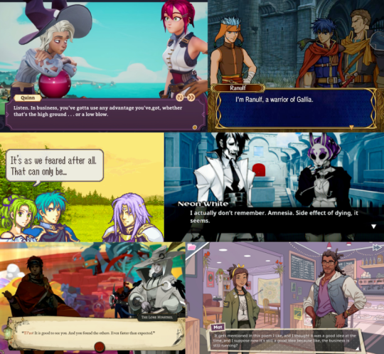
I had it ingame, and it was working. But... something felt off. Do you see the difference between every one of the above examples and this?
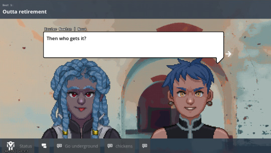
It's all about perspective, baby.
Answer: all the character art in those examples are drawn at a slight angle so they can be flipped back and forth to be made like they're looking at each other.
Trying to do this with the perspective we chose early — straight on — makes for a chorus line of weirdos who are looking directly into your soul as they ostensibly chat with each other. Credulity is strained; the illusion of these puppets interacting in the same space is paper-thin.
(I was skeptical of choosing this perspective for this reason, but we ultimately went with it to make the customizable assets in the portrait maker easier to fit together)
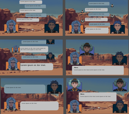
We tried a bunch of different layouts, but they all at least one of these problems:
they'd stare into your soul while ostensibly directing comments elsewhere.
they felt like text messages; this would be fine if that's what we were going for, but we wanted something that could represent face-to-face conversations. (Tactical Breach Wizards was able to pull this style off because they had little 3D dioramas to go along with it)
or, most damning of all, they felt like zoom calls.
So, my heart aflutter and spirit in want, I spent a day doing a research dive into various dialogue layouts (bless the Game UI Database!) to see if any other games had managed to pull this character art perspective off. I ended up with this massive non-chronological taxonomic tree:
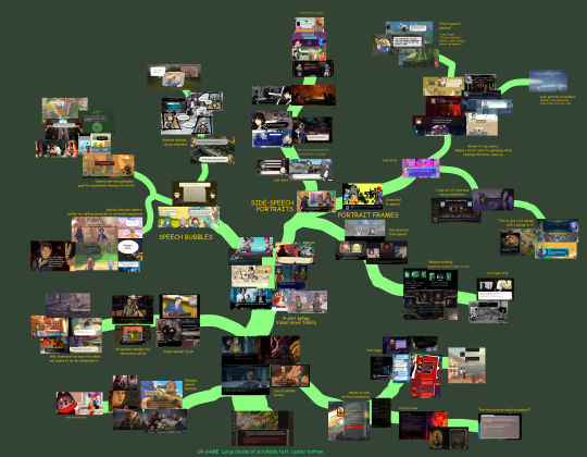
(fullsize here)
The type of layout that particularly caught my eye was this style where each character had their own little box. These layouts borrow a concept from comic books called "closure" where the space and time between characters are left blank. Freed from the constraints of trying to simulate a single space, these layouts allow the reader to fill in the blanks with something that feels more true-to-life than anything we'd be able to render ourselves.
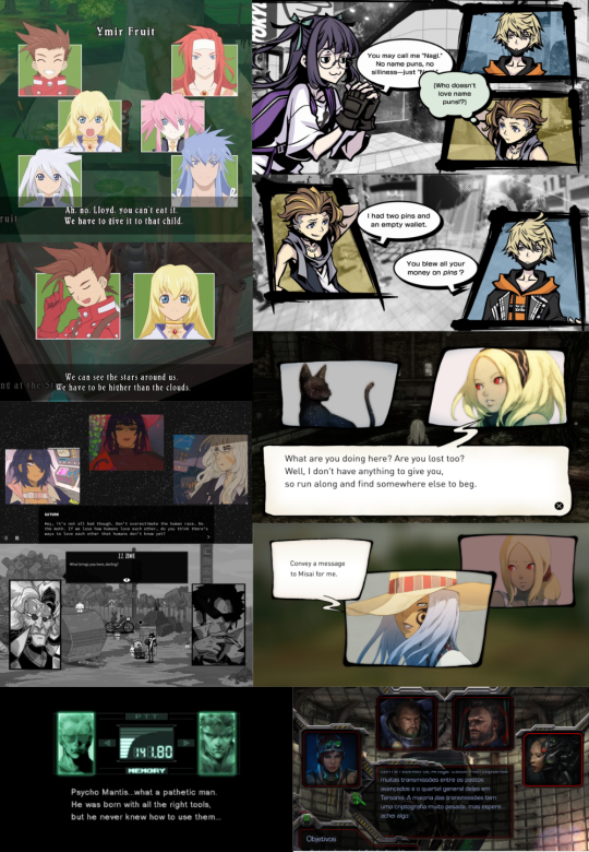
I was especially impressed with the dynamism of Tales of Symphonia and The World Ends With You; rather than sticking to single slots they would animate the entire panels moving around to indicate motion an relative position of characters.
So we threw out the old code and copied them. Here's what we've come up with:
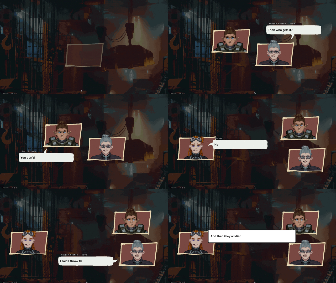
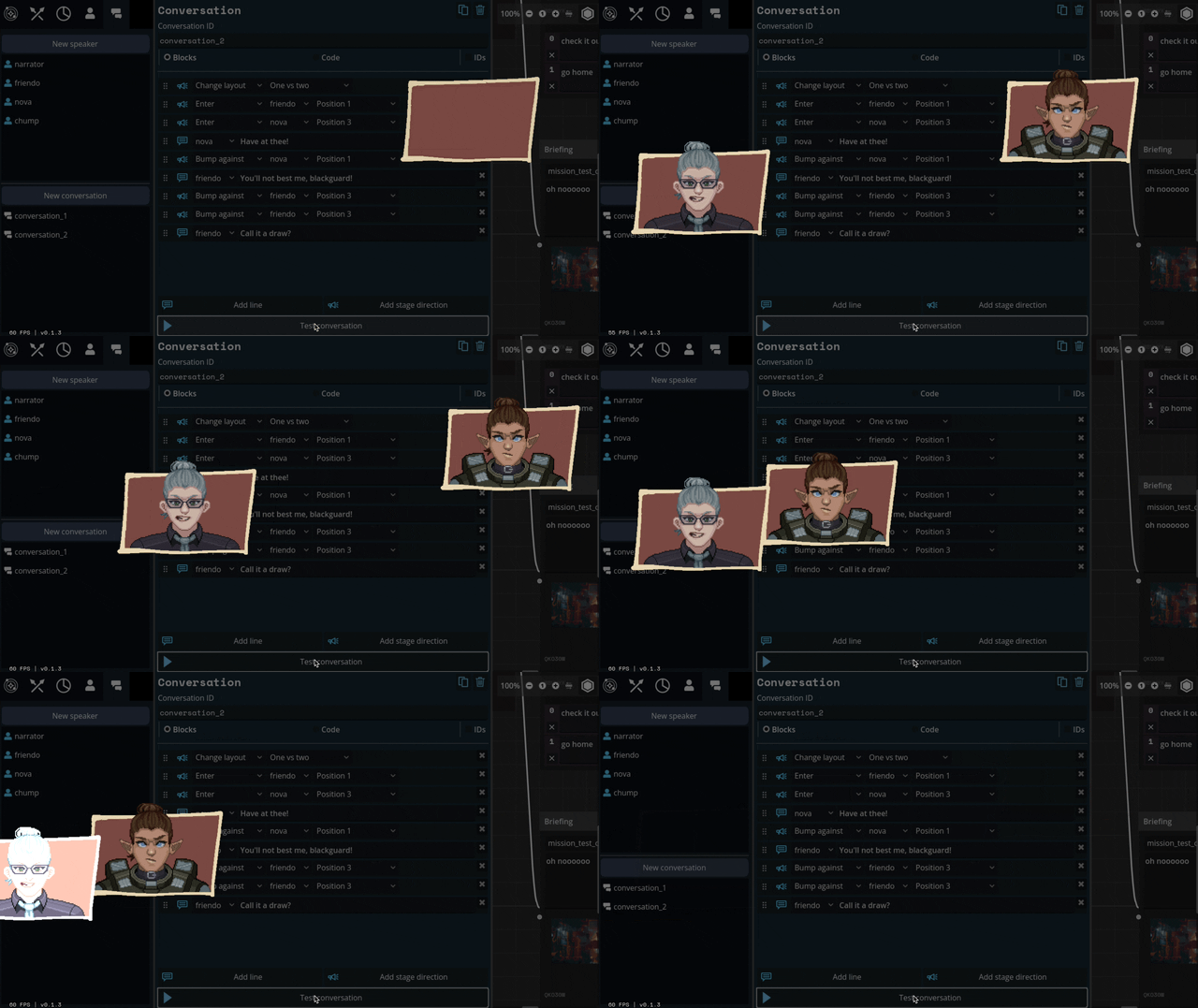
We'll be able to have portraits interact, like smacking each other (I felt like a kid hitting two action figures together, lol)
We can also apply effects like princess-leia-holograms and full-screen "lighting" effects like warning banners:
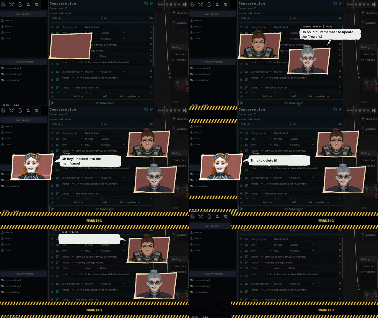
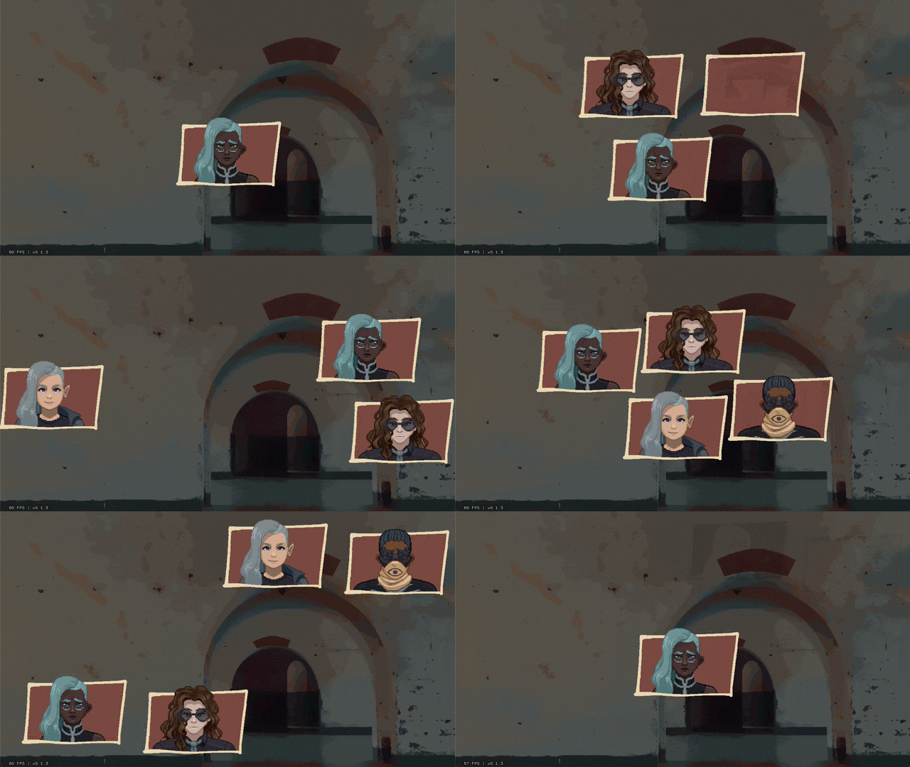
Carpenter and I came up with a number of arrangements that the portraits can smoothly transition between:

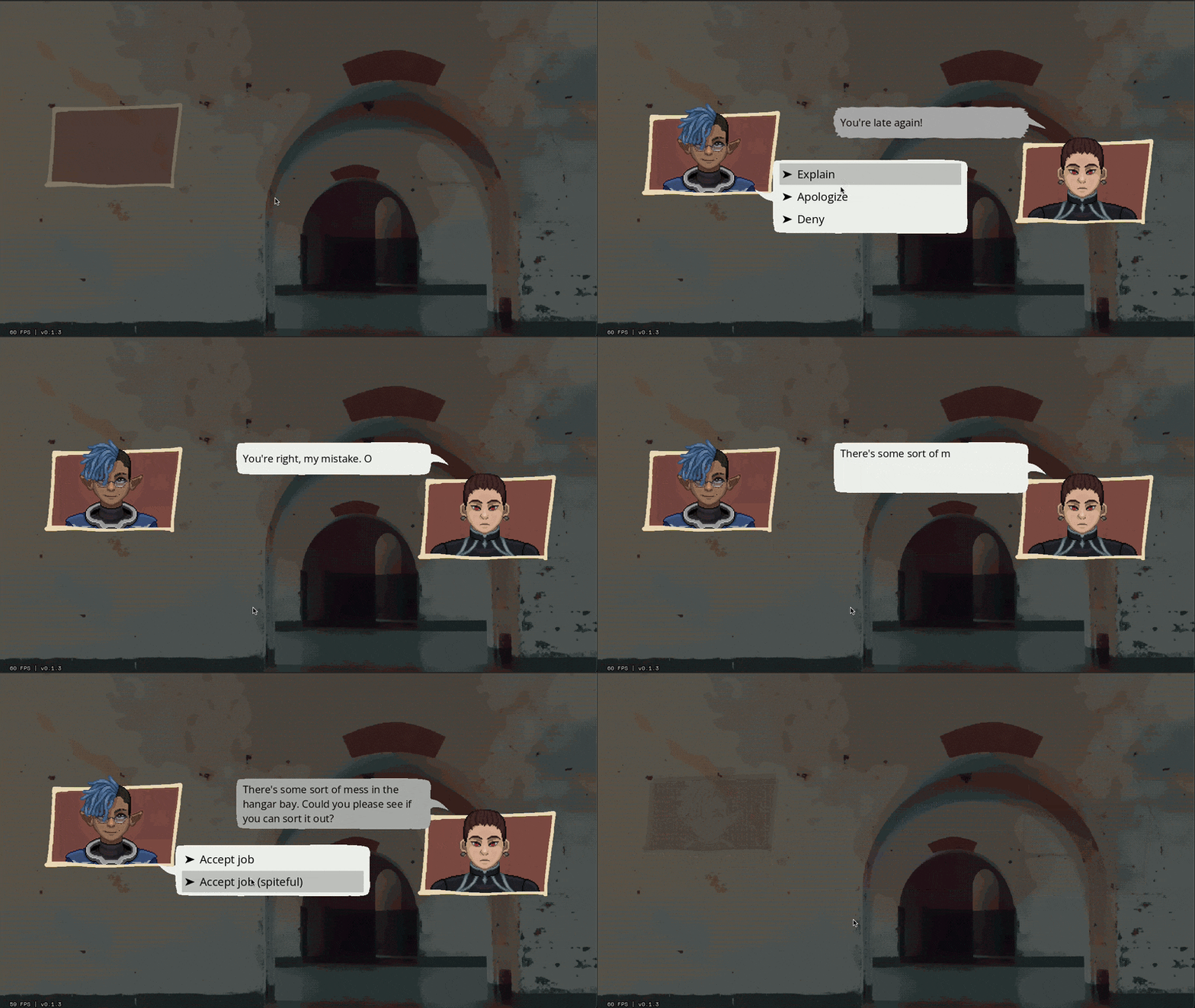
I've also implemented support for choices during a dialogue, potentially leading to branching paths.
Overall, I feel SO much better about this system than our initial designs. It might feel a little more cartoony, but I think we're making a cartoony game so that's not a problem.
Whew. We bit a lot off to chew with this project. I feel like I just made a second visual novel game engine inside of the first. Fingers crossed that it all ends up worth it.
471 notes
·
View notes
Note
Hello! Many people have said this but ill say it too, I LOVE YOUR COMIC SO MUCH ( ´ ▽ ` ).。o♡
I really wanted to ask you about how you do the backgrounds? (Something i struggle with) whats the process? Like from start to finish, also, to do the rise backgrounds do you use reference from the show and generally real photo of ny? Or do you come up with them? And last question- The shadow and light on the background- Like HOW
i know it’s a lot of questions but i’m just so curious qwq and wanna learn to be better, thank you again in case you read this and respond, in case you don’t, i hope you have a nice day and a wonderful life uwu keep up the great work! (≧◡≦) ♡
Backgrounds are a really broad subject and I'm always a little overwhelmed when asked this question. Just like drawing the human body, backgrounds take time, repetition, and practice!
My answer got a bit long, so it's going under a read more :) but if you digest info better in video format I found this on youtube
youtube
It pretty much goes over everything I wanted to say, but in a much better way. I wish I had found it before writing all this out lol
ok, first of all, I'm not a teacher nor was I built to be one of those cool helpful art tutorial people who do a full coloured tutorial filled with illustrations. This is just going to be a messy "how I do backgrounds / environment layouts from start to finish." kinda thing.
... lets start with a sight tangent.
Sketch from Life!!!
If you want to get better at backgrounds I recommend doing some sketching out in the real world!
When I was first getting into doing backgrounds I went to cafes and parks to just sketch the buildings and objects. Sketch rocks, flowers, clumps of grass, garbage cans, bottles, tables, street signs, etc. If you are drawing a tree observe how the trunks twist, how the bark flows, or how the leaves are bunched.
If you can't leave the house the same still applies! Sketch the interiors of your house, the walls, or common objects like chairs and bookshelves. How are objects stacked? items on the floor?
If you aren't comfortable with drawing outside or in public you can take some photos to draw from! They are good for practice and you can use them again as references later. Alternatively you can find pictures online of buildings and objects to sketch as practice.
All spaces have objects in them, it becomes easier to draw those kinds of spaces when you already have spent time observing and sketching them.
ALSO! They don't have to be good sketches! It's just to build out your mental catalogue and strengthen your perception of perspective.
now the actual thing...
BACKGROUNDS
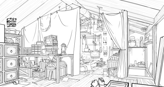
(the pictures used for this are my own. I dug them out of my 2022 folder)
Backgrounds have slightly different rules based on what you are making them for. Videogame Environment Concept Art vs Animation Layouts vs Comic Backgrounds vs Illustration backgrounds.
They all follow the same basics, which I will go over here, but the intention and function of those designs are going to be different. It's all about how you set up the scene and what it's purpose is!
Brainstorming and Thumbnailing
I like to think about a location as though it is a character. An abandoned old house with creaky sagging floorboards is very different from a futuristic space ship with sharp metal floor panels. A gas station has a very different feeling from a library.
I usually start by asking what is this location's story? Why was it built and for what purpose? What kinds of things does this room need to fulfill that purpose? You don’t need solid answers, but its good to be thinking about it while you are working.
Next, sketch some ideas for how this place is going to look. For me, this usually involves drawing the idea from multiple angles and then making lists & small sketches of the objects I think should be filling the space.
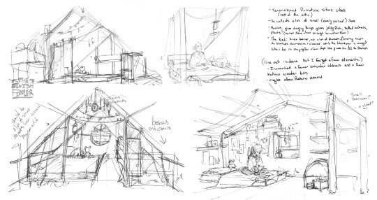
Example: The main character of my original work is a Wanderer. They collect a lot of things on their travels, but those items have to be small enough to be easily carried in a backpack. I wanted his room to be in the corner of an attic, walled off by curtains, and filled with trinkets. You can see some of my brainstorming above.
References
I only look for references after I've done some sketching and planning; this is to solidify my idea first so that I don't accidentally copy anyone else's work. I will make a moodboard with pictures of lighting, colours, items, rooms with specific ceiling beams, old chairs, etc. basically whatever I feel fits the vibe.
Honestly, I don't use references as much as I should. For ROTTMNT fanart I look at backgrounds and screenshots from the series to study the style. I also reference actual photos of NYC to get a feel for how Rise condenses the visual information.
In general, it's good to have references of real life objects/locations, because there are so many details like cracks in pavement, stickers on polls, crowning on buildings, fancy fencing, weird chair legs, etc. that you might not think of. It's the imperfect details that can make a location feel more alive.
Perspective
Once you have your chosen sketch we move to.... the infamous perspective boxes. Doing backgrounds is just learning to be comfortable drawing So Many boxes and carving items out of them.
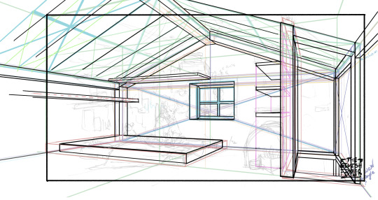
Many better artists than myself have made videos on perspective, vanishing points, and all the technical bits. Videos like THIS ONE and THIS ONE are helpful (this post is great too!!). There are probably a lot of classes to be found on Skillshare or Schoolism. I learned a lot of this in my college art course, so I can't give you a specific video which helped me.
You can get by and be a good artist without learning this stuff. There are quite a few successful artists who have admitted they never bothered to learn perspective (one of these people even made a whole graphic novel series).
I personally avoided properly learning this stuff until I was in my 20s because I thought it would be boring and difficult to do. tbh I really wish I had learned it earlier because it's so much fun to make those silly little boxes imo. It looks scary and complicated but, just like drawing humans, it just takes time, repetition, and practice to develop the knowledge and skills.
Cleanup
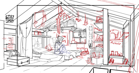
You have your boxes and lines! Cool! Now to make a scene out of it. Fill in the details, get everything placed were you want it! Generally, the lines of each item will point back towards the horizon line, but they can have different perspective points.
Generally you would want to clean it up and get your room completely sketched before doing the lineart. I tend to combine the steps (not recommended)
Lineart
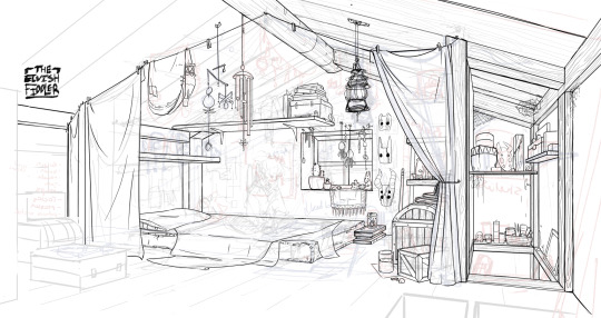
I've mentioned how I do this before. Closer objects have thicker lines and more detailed inside. Further objects have thinner lines and less detail. I didn't quite achieve that balance with the image below, but it's close enough.
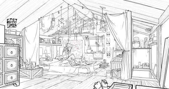
Colours and Shading will have to be a separate post. In the meantime, I highly recommend the book "Color and Light" by James Gurney. I used to borrow it from my local library and a good chunk of my knowledge was learned from it :)
#Artist's Comic Rambles#asks#art related asks#thank you for the ask!! I'm glad to hear you enjoy the comc :D#i hope this was somewhat helpful...#i get overwhelmed by broad questions very easily haha#if you would me to elaborate on something specific I mentioned feel free to ask#i wrote this all out weeks ago and then forgot about it... I just added a link or two but yeah here it is
308 notes
·
View notes
Text
Pearl
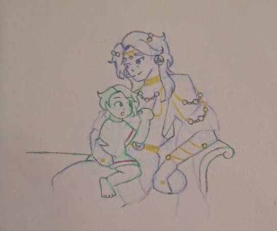
When Telemachus had been born, one of many things that had amazed Odysseus was the sheer amount of unfiltered strength those pudgy little fingers had.
They could barely wrap around his finger. Yet, before long they were fisting Penelope's beautiful dark curls, her dangling earrings and shiny necklaces whenever they were within reach. Once, he even fisted a corner of Odysseus' himation and gnawed on it like the goats of his homeland.
That particular habit stuck long after Odysseus was forced to relinquish the beloved himation woven by his wife for the silks and baubles of a prized possession. He had worried that the hard pearls and cold metals would make his son uncomfortable in his embrace but much to his relief, the child didn't care.
Instead, Telemachus was constantly fiddling with the jewelry, stroking rows of pearls strung upon golden chains and tracing the artful lines of a rose emblem's many petals. How ironic, that the adornments he resented for marking him as a leashed beast also gave him the perfect excuse to keep his son close.
Today was no different, for his son remained transfixed on a pearl nearly as big as a thumbnail. At least it was on a looser necklace that gave Odysseus some leeway.
After failing to divert Telemachus' attention back to the ball he'd been bouncing, Odysseus huffed and reclined on the kline to settle his son more comfortably on his lap.
"Puh." Telemachus babbled.
"Pearl." Odysseus corrected. "Say it with papa, pearl." he repeated, showing his son how to roll his tongue.
"Paaaaaaa." Telemachus said, sticking his tongue out exaggeratedly.
Odysseus laughed, bouncing his wonderful boy on his lap, eliciting excited squeals.
"Funny little wolf." Odysseus cooed, booping his little nose.
"Wuf! Wuuuuuuuuuuuu~" Telemachus giggled.
Odysseus kissed his chubby cheek. How he wished to bottle this moment into an amphora, how he yearned to turn every ounce of his son's happiness and innocence into a wine for Penelope to savour upon their reunion.
Oh Penelope..........
"Papa." Telemachus yanked his necklace. "Puh!"
"Yes, a pearl. You like those, hm?" Odysseus brushed his curls aside, the once fine wisps growing thicker as his body grew heavier. "They come from the ocean. It has many things; fish, coral, boats and islands. That is where we’re from, an island called Ithaca, with the bluest seas and a home on the highest hill.”
This was an old story he has told countless times, and he tells it once more with the same gravitas as the first. He tells his son of the sun-warmed rocks he and his sister raced across to catch birds, silver fishes hauled in nets, goats he helped herd, houses he and his father built, and an olive tree turned bed, its very roots a symbol of his parents’ everlasting love.
And though he has neither loom nor the skill, he weaves a new story for Telemachus. A sunny day, two sets of footprints across white sands, his mother’s weaver hands in his, only just cleaned of resin from fixing a boat.
“We decided to swim. And even if your mother wasn’t half-naiad, even if she had asked for the clouds themselves, I would have said yes without hesitation. And so we swam like fish and splashed one another like children. Then I dove down, down, down until I found a clam.
“I shucked it open then and there and inside, I saw it. A pearl.” he closed his eyes, remembering how he had almost dropped the treasure in his excitement.
“Puh.” Telemachus held up the pearl in his grasp.
Odysseus stared at it, unimpressed. It was a perfect sphere with a smooth lustrous surface that shimmered pink in certain angles. This one little ball alone could feed a small family for at least a month.
It was pretty and perfect, just like him.
It was not beautiful.
It was worthless, in his eyes.
“The pearl I gave your mother was different.” he placed his hand over Telemachus’ to hide the accursed gemstone out of sight. “It was beautiful, it was real and it-”
It was imperfect and oblong, coloured a slight bluish grey that reminded him of her keen eyes, the same ones Telemachus has.
Those very eyes stared at him, wide and trusting, as he waited for his father to finish his story.
“It was our love that made it a treasure. Had I given that pearl to anyone other than Penelope, it’d have as much worth as a pebble.” he finished.
Odysseus caressed Telemachus’ face and the boy gladly leaned into the familiar touch.
“I’ll teach you.” Odysseus promised. “How to swim, how to shuck clams, how to find the beauty in things that remind you of loved ones. I’ll show you a real pearl and help you find one yourself.”
“Papa…..” Telemachus yawned. Ah, yes, no matter the tale, storytime always ended in naptime.
Odysseus kissed the crown of his head. “Sweet dreams, my little wolf.”
Telemachus’ eyes fluttered closed and father and son both released the pearl from their hands.
The little boy dreamed of pearls while his father lied on the kline as if it were a raft desperately trying to keep them both afloat.
BONUS:
Rough full body ref of Odysseus' outfit. I kinda consider it a redesign of my first OoT design since it's more balanced & cohesive.
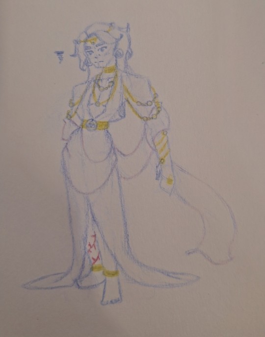
I also want to give thanks to @dkmbookworm, as my convos with her never fail to give me more inspo for this AU. If you're reading this dkm, I hope you liked this snippet I wrote!
#odysseus of troy au#odysseus#telemachus#me 🤝paris🤝aphrodite treating ody as our new favourite barbie doll#i know this isn't ao3 but comments & likes are still very much appreciated <333#i considered adding the veil buuuut i didn't want to make it too cluttered so i scrapped it#anyways enjoy!
101 notes
·
View notes
Text

Corvid Coeducation
Pairing: Sylus x MC (implied) Rating: G Tags: drabble, crack, fluff, humor, mc as a teacher, third person, 3rd person, painting, playful fighting Summary: MC teaches Mephisto how to paint. Loosely inspired by this image (I know it's a raven in the photo not a crow but it gave me inspo all the same♥). Word Count: ~500

“What are you doing?”
The girl doesn’t look up from the crow she’s currently giving careful instructions to. A small easel meant for a toddler or a small child was set up in Sylus’s bedroom, and a large old towel lay underneath it so paint didn’t stain the floor.
“I'm teaching Mephisto how to paint.”
Sylus sounds amused. “Do you know how to paint?”
“I'll have you know I'm good friends with a…“ Maybe she shouldn’t bring up Rafayel here, but was too late and Sylus latches onto her hesitance.
“With a what, kitten?” A different face came to mind and she was quick to offer Thomas up without hesitating. “...art curator.” she said quickly, busying herself with helping Mephisto dip his paint brush again. “So that’s a no.” Sylus sounded skeptical and his words dripped with disbelief and disappointment.
She ignores him.
“Yeah! so I know how to paint–kind of.” She grumbles, before directing the unruly crow back to canvas. Sylus allows the little white lie, a slight smirk playing on his lips. She was getting better at this kind of game, clumsy as she still was at it. He should reward her for that. He crouches next to her, far too close, enjoying the way she fidgeted nervously at his proximity. They both watched as the crow attempted to make a masterful stroke, but all that came of it was a splotchy red blotch instead.
“Remarkable job. Perhaps I should take lessons from Miss, too.” Sylus comments dryly. The girl shoves at him and they get into a tussle, the painting session forgotten while they grapple. She doesn’t play fair and manages to smudge Sylus’s face with a streak of red paint, her expression momentarily triumphant before he grabs her wrist and jerks her close. The tension is palpable in the air, heavy with anticipation. Sylus leans in, his trembling lips hovering above her own, but is startled by the sudden interruption of an angrily squawking Mephisto from behind him.
He pulls back with a wry smile, admiring how disheveled and flushed the girl looked. His voice is a little rough when he speaks and he clears his throat softly. “Mephisto says we are ruining his creative process.” She can only nod and Sylus crosses his legs in front of the tiny easel meant for a child, tucking her into his lap before she can protest. His hand reaches out to take the brush from the crow, who obediently hops over to offer it.
“You’re putting too much paint on the brush,” Sylus murmured gently, removing some paint with a towel until only a thin layer remained on the tip. “Like this, see?” His breath flutters next to her ear and she struggles to focus on his instruction. “It will help him control the brush better if it’s not so weighed down with paint.”
He angles the brush between Mephisto’s beak and watches as the crow hops back to the canvas, his strokes more dramatically effective this time. For a while, the process repeats and the girl is content to sit in Sylus’s lap, their co-education producing a fine painting in the end.
Sylus holds it out, admiring it with the critically trained eye of a collector. “I’ll hang it in the hall where guests can see it.”
The girl can’t bring herself to tease him about it, but she swore Sylus oddly looked like a proud papa.
#sylus x mc#lads sylus#sylus#lnds sylus#l&ds sylus#love and deepspace sylus#sylus love and deepspace#love and deepspace#my writing#sylus fic#sylus fanfiction#no beta don't come for me#sylus x main character
148 notes
·
View notes
Note
Hey same anon as earlier, first off I didn’t mean to offend you with my last question, I was genuinely curious and now realize that unsettling was 100% the wrong word to use and I apologize for that.
Secondly I use anon because I get anxious when commenting online. Lastly I honestly love your art and was just curious, I have trouble wording things and getting tone across properly because I’m autistic. I apologize again for any miscommunication.
It’s alright, I wasn’t offended really. It only rubbed me the wrong way and was just a little confusing.
As another autistic person, I get it! Tone is very confusing, language is confusing, and putting thoughts down “correctly” can be difficult.
To answer your question without anything rude coming through, I draw my eyes because of how it looks in the side view. I over exaggerate the angles a bit and put the pupils way to the side.
I know most cartoon styles don’t follow this, as they commonly match up to the front of the eye/iris, but I just wanted to be a little different and try to make them appear 3d (like in an animated model!)
When I think back on it, I feel like the most mature thing for me to have done was to just answer the question instead of focusing on what upset me. I’m sorry for that, genuinely. I don’t talk online for this reason, as I’m quick to make entertainment from these types of situations. It’s an old habit of mine that’s really hard to let go.
114 notes
·
View notes
Text
Finally Ironed out some ninja designs! I Usually don’t share references but with the behind the scenes stuff I’m doing on my Skybound project I don’t have much else I can share yet.
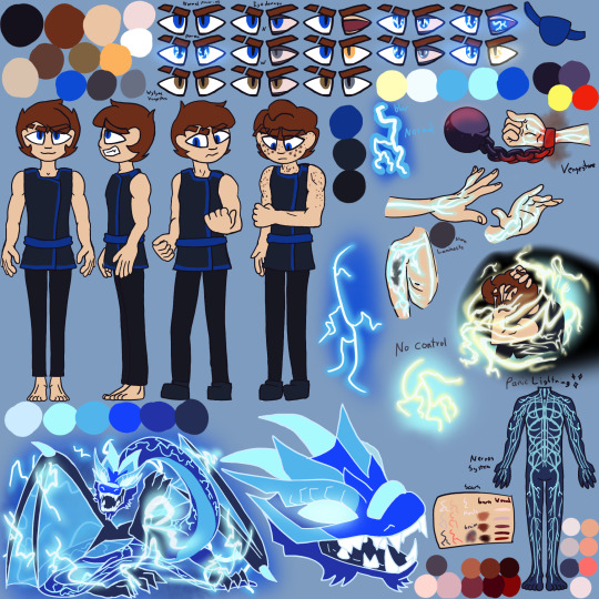

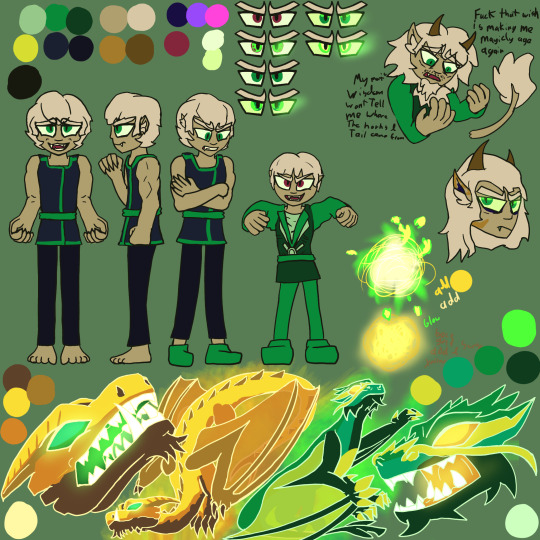
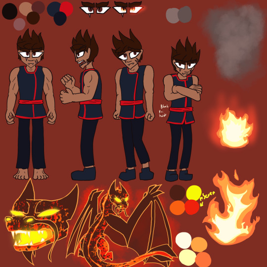

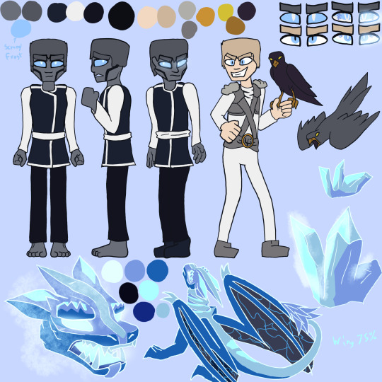
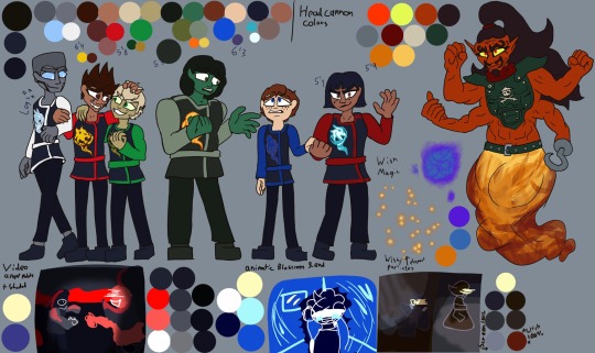
There is a few headcanon/ Fic stuff in references and powers and the all ninja shot is for first part of Skybound project.
I can share Skybound project Updates! I’m making lots of progress! Trying to focus on p1 stuff so I can put full force into the p2 stuff!
|
V
P1 may be ready Summer? 2025
My Skybound talk Video:
* God I have so much to ramble about just when I think I covered something a new angle gets me
* How TF am I supposed to sanely transition from the wholesome reasons I love this season into the horribly problem stuff. Sigh*
* Actually studying videos covering serious topics to navigate how to word things.
* I have to stop drawing so much art for everything or no one will ever see this video.
* The desire to animate my character lipsinking to me is an evolutionary disadvantage I will resist.
Cannon compliant Animatic:
* Song is Ironed out fought a while adding voice lines and I’m way more excited than I thought I’d be for this animatic because I thought it would be overshadowed by how strongly I feel about the other 2. But damn.
* I’m storyboarding after like my life depends on it rn
* Really trying to capture Nya’s character Ark which sent me right back to the video script because I remembered that one reddit post calling her a bitch and rage wrote for 2 hours.
* I am determined to make people see how good her character arc actually is.
* Throwing Jay shade in this one lol he was kinda awful even with being manipulated.
* Trying to convey clear Ideas and story through art is pain but also addicting.
* This is meant as a leading to both part two animatics, but bbnb Kai is shorter than wytyaa Kai. The difference is significant everything else pre dinner with Nadakhan is the same. The other head cannons are almost aligned as far as I know. It’s JUST Kai. What do I do with him?!? Lmao Might just distance him from the other ninja so you can’t tell how tall he is. Thank goodness he is the most gullible and first to wish it all away
P2 out like December if I’M lucky TT
Even though I should focus on first things first, I can’t help myself. these fics have lived rent free in my brain for like 2 years and despite plans shifting the excitement of drawing the story I read and put to music in my head is a force of nature. Thanks Adhd
Wytyaa:
* I storyboarded about half the scenes I want to. Songs are decided but a few parts I’m waiting for the rest of the story for.
* I think I’m going to mess with color palette. I really want to capture the emotion and intensity. I’m learning the full potential of my art and
* I need Final ch released for maping out the second half.
* BUT I AM NOT READY TO READ IT @mondothebombo And from what you told me I don’t think I’ll be able to finish P1 by then. cries*
* I wanna capture the feeling reading wytyaa.
* May make my wytyaa specific refs so I can make animatic art I can post early.
Bbnb
* It’s all storyboarded and half animated
* Thinking about redoing most the earlier stuff, consistency has been a problem
* Also was to mess with colors, dark backgrounds and intense colors.
* I fought with my ref forever to find good enough lightning scar colors cause figuring out the right amount of contrast is pain.
* So now I want to redraw my bbnb scar references a third time.
* May draw other bbnb specific refs so I can make some art for the animatic I can post here early or on on my old A03 book
If you have Any questions feel free to leave an ask! I answer all eventually sometimes I do save em up though so if I didn’t answer something yet, Sorry I will get to you.
#ninjago#ninjago art#ninjago skybound#ninjago jay#lego ninjago#ninjago angst#ninjago nadakhan#Oli Art#my skybound project#jay ninjago#ninjago kai#nya ninjago#ninjago cole#ninjago zane#cole ninjago#ninjago lloyd#ninjago nya#ninjago skybound art#ninjago season 6#wytyaa#bbnb#<- my friends fics are incredible but very dark head the warnings#especially bending but never breaking adults only
75 notes
·
View notes
Text
SATORU, your muse 。˚✐~
— Satoru eases open the door of the house. You’re not home, so he doesn’t feel the need to make his usual grand entrance. Shoes are left at the door, jacket on the rack, and Satoru makes way to the bedroom. Once inside, something on your nightstand immediately catches his eye.
It’s your sketchbook; a now worn, leather notepad that he’d bought you months ago after the old one was filled. You rarely, if ever, let him see your artwork, so Gojo would usually resort to peeking over your shoulder to catch a glimpse of what you were working on. He always teased you for keeping your art a secret, but now that he has a chance to look at your projects uninterrupted, he hesitates. For a second.
Satoru flips open to the first page. It’s just random doodles of flowers and animals, ones he recognizes from the garden in the park you two frequent. The next page warrants the same mundane results: bugs and trees and the tops of skyscrapers and whatever random things that would grab your interest while you two enjoyed the heat of the sun.
The next page catches Gojo by surprise. It’s a bird, but not just any bird, he realizes. It’s a songbird, one he’d half-heartedly pointed out to you one day because he recalled reading about it online. You weren’t even listening to him, or so he’d thought. It’s kind of endearing actually that you’d take the time to draw it. And it’s not just the bird, either. It’s the macaroons he’d mentioned wanting to get one evening, a bouquet consisting of a flower Gojo’d randomly plucked and presented to you, a familiar pair of sunglasses resting in grass, dabbed over top with faded blue watercolor paint. Numerous doodles of such small memories.
Satoru continues flipping to look at your little illustrated photo album. Some of these drawings are of stuff he barely remembers talking about, like a cracked open piggy bank obviously referencing a story he told you in passing. Gojo doesn’t even remember why he brought it up, but you’ve immortalized it here in your sketchpad with pencils and ink.
The drawings only grow more detailed as he gets deeper into the book, and a proud smile stretches across Satoru’s face at your talent. Rapid sketches of buildings and passerby evolve into self portraits of yourself, and he thinks you look so captivating in all of them. Gojo takes note of the silly doodles of even himself in the margins of the paper. Him in his sunglasses, him wearing the flower crown you’d poorly put together, him surrounded by ice cream and candy and the plethora of sweets he so enjoys. His favorites are the inane drawings of you two together, tiny and inhabiting multiple corners of every page. Each one is a delightful surprise to spot.
Satoru turns the next page, and he’s sincerely taken aback. Drawings of eyes, and they all look alike. They’re so detailed, adorned with pretty lashes and shaded so beautifully. He doesn’t have to wonder long on whose eyes these are, the next page bursting with the color blue tells Gojo all he needs to know. He’s glad you’re not here to see his reddening face and the way his breath hitched. This page, the next few actually, are all dedicated to his eyes. They’re inked perfectly, some are at different angles, and you’ve managed to portray emotion into all of them. Satoru wonders if he could draw a picture of you and showcase the absolute adoration in your eyes the way you’ve done with his.
And it doesn’t stop there. Page after page, it’s all Satoru. Him sleeping with a mushed cheek against your chest, him drinking a soda, him looking out the window, him playing the game with Geto, when did you even draw these?
“Satoru?”
He quickly slams the book shut at your call, carefully placing it back on your nightstand and ushering himself from the room. There you are at the door, shaking the rain from your umbrella and leaving it on the mat near the entrance.
“There you are, love.,” you beam at his approaching figure, and Gojo squishes you in a warm embrace. “How was your day?”
Satoru kisses the crown of your head, and grins against your skin. He can’t wait to tell you all about today, maybe give you some more brilliant ideas to memorialize in your sketchbook.
#satoru gojo fluff#satoru gojo x reader#gojo satoru x reader#gojo x reader#gojo x reader fluff#jjk x reader fluff#jjk fluff#satoru gojo x reader fluff#gojo satoru fluff
514 notes
·
View notes
Text
I'm feeling like rambling about AI on main, ignore me if it's not your cup of tea.
So a while ago, I did check out those art prompts AI, because when I pester about something, I like to know what I'm rambling about. I like to do a minimum of research and, if possible, try the thing out before making my opinion. For AI art, my opinion was already pretty solid, but I still wanted to check it out.
I found a free prompt stuff online, asked it a super easy prompt, and asked for a handful of different images. Just to see.
The prompt was [character tripping]. Really. Super easy, right? I wanted the thing to have as much liberty as possible.
It's not just that though. I chose this prompt because it is something I did in art school. Our teacher would give us simple prompts, and we would have to draw doodles in 5 minutes or less. Imagine a class of 15 exhausted art students full of caffeine being told to draw someone tripping.
The 15 art students' results? Little boys tripping over tree roots, teenage girls falling while rollskating, business men tripping on their papers and burning themselves with coffee, old ladies cracking a hip, comical falls backwards with a leg up, realistic falls forward with pained expressions, etc etc.
See, our fast doodles weren't any better than AI anatomically speaking. We were missing hands and our faces were distorted and a foot was bigger than another, things that are also common with AI. But the DIVERSITY. I remember being flabbergasted by it. We all had the same prompt, but none of us drew the same thing. I remember drawing the good old banana peel slip from the old comics I read when I was a kid. My best friend drew a kid falling in mud.
We did several prompts like that as training, and I always loved to see what everybody was doing, because it was always so different.
Now, here was the AI result: 5 anime girls in a running position at an angle, making shocked pikachu faces. Every. Single. One. Of. Them. The angle and the running poses were the only things that changed, and even then just slightly.
The AI only did 5 times the same stuff. Art style changed a bit from one to the other, but always the same vibe, always the same composition, and always that godsdamned shocked pikachu face. It was very underwhelming.
I don't care about perfect anatomy and lighting. But I care about creativity. I love seeing things that I would never have thought to do myself. And the AI didn't provide that at all. Coz AI has no creativity whatsoever. If you don't further your prompt to be very specific, it will just reheat the same bland stuff again and again. It's just boring.
I have a lot of grievances about AI. Art theft, environmental blunder, artists being paid even less than they already were (as if people and companies suggesting to pay us in visibility wasn't bad enough). But even on an emotional level there's nothing. Yes, it's great to see one's character/idea brought to life when one cannot draw. But it'll be the blandest stuff ever. That's just a shame.
#i would like to apologize for the environmental disaster my doing those 5 images triggered#at least it completely vaccinated me against doing it more#but yeah that's also why I pester about AI when I do traditional clothes or architecture research#coz clothes weren't all the same bland hyper sexualized things#but that's what's there because of AI#so uh...#no ai#mindless rambling#sorry for that just felt like sharing that random story of mine
115 notes
·
View notes
Text
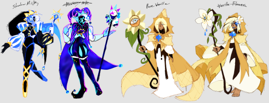
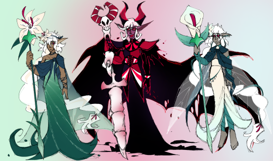
more stuff for our cr retake looooore. something about cycles and reincarnations... supposedly.
[Lore under da cut . also blueberry milk is @viscarrion 's guy i just did concept art ^^]
[ edit: a lot of this is already outdated u-u ]
disclaimer: this was copied straight from a ramble over discord i did while very tired so this is Not final and might sound like a message written at 6am on a hyperfixation high
the thought with the ancients story is . We're making it cyclical with it babyy. age old legacies passed down over ages of cookies made of the same recipes yet Tweaked, born again, over and over, changing and evolving, lights of virtue watching and Waiting for an incarnation worthy of being their avatars. the beasts were a catastrophe that could not repeated- no, the next wielders had to prove themselves.
early attempts resulted in disaster, cookies chasing purpose and power, yet falling into the same corruption as the Beasts and becoming mirror images of their madness. as time passed and recipes changed, eventually, one success would rise- proven by their good natures and a great act of leadership and power. (possibly by striking down another corrupted incarnation deemed the Leviathans- smth we're still workshopping, based offa thing mentioned in the pre-registration artbook)
the soul jams had changed by then, too- but these heroes were, all the same, worthy of them. a successful batch at long last.
for a while the world thrived under their rule- peace prevailed and kingdoms were born, built, and flourished.
yet good things never last.
white lily, on the night of witches, fell into the "ultimate dough" after discovering the true nature of the witches all cookies revered as Gods- how they saw them only as snacks, puny and fragile and delicious. as the woman drowned in dark magic, poisonous ingredients, and was burnt from every angle from a second baking, she emerged changed. angry. pained. hateful. and imbued with that great power, she found herself strong enough to make a stand against the witches.
one by one, they fell. and in pursuit of vengeance and the power to change everything, let's just say that she decided to turn the dynamic of Witch and Cookie on its head. with bloodied teeth and bones as trophies, the now Wilted Lily cookie, who would come to be known as the Dark Enchantress, set out to show the world what she'd discovered. and how she would change it.
of course, the Heroes wouldn't let this stand. the enchantress did not take pleasure in fighting her once-friends. did not revel in how she had become unrecognizable. white lily, however, had always chased goals that she believed was for the good of the world- this was no different, and no one would stand in her way. at any cost, she would prevail.
on a fateful night, the war between her and the Heroes came to a head. Two kings, two queens, and a sorceress entered that battlefield.
what came of it were five shattered soul jams, four orphaned kingdoms, and only one survivor; sealed away by forbidden magic in a final attempt by Pure Vanilla to save the world as he knew it, in his dying breath.
a few hundred years passed. the dust settled- the war, forgotten. but having lost their leaders so suddenly, so cruelly, and while they were so young, the kingdoms left behind were weak. cookies left, rulers took and left the throne far faster than anything reasonable. societies rose of their own merits, but the remnants of kingdoms clung dearly to what was left, their people spurred on by whispers of legends- of undying heroes, who would one day return and bring their small lands to power again.
when spurred by belief, anything you hold closely can be true in the eye of the beholder.
a cookie was baked with pure vanilla extract and decorated in the flowers of the vanilla plant it had been harvested from. a kindly and pacifist healer, a shepherd- the village under the sky kingdom's remains watched closely, and began muttering of his uncanny resemblance to the legend of the kingdom above.
sparks of hope would become a guiding firelight in the villages hearts- slowly, the name Vanilla Flower was drowned out by the prayers for the return at last of Pure Vanilla.
a young girl cookie, red and tart and bursting with life, wandered into the Hollyberry kingdom from Dragon's Valley. she boasted of victory over beasts great and small, bringing great supplies and hopes for prosperity to the beautiful little kingdom. her passion shone bright, her natural sense of leadership even moreso. the queen that their age-old songs would never forget must have returned!
again, the name of Red Holly was lost under the voices singing of the triumphant return of Hollyberry.
The Cacao kingdom stood strong- a council lead them steadily and held them well through the endless winters of their land. But as time passed and mindsets changed, the council would fracture- no single party trusted enough to watch and unify. Nobody, except... Him. A decision was made- it was time to take a kingdom-wide belief seriously. They watched, as each newly baked cookie would come through. Trying to discern if one could finally be the reincarnation of their king. Until finally, a boy of lonesome and bitter origins came to them, begging for a chance to fight for the good of the kingdom. They saw the look in his eyes, and knew he had come home.
Frigid Cacao, under the guide of the council, quietly let his name be lost under their uplifting words of how Dark Cacao had returned.
The golden cheese kingdom had long ago made a promise to their queen- in the event of her death, they were to prepare and ensure her reincarnation happened smoothly. They did not simply sit and wait. Over those hundreds of years, they carefully engineered each step of the recipe- carefully gathered every ingredient, carefully crafted her dough, and carefully, carefully, set her aside- shaped to perfect form- to incubate in her golden egg cradle, slow-baked by the warmth of safety and adoration. It took ages, but she emerged almost perfect. It had taken too long to care about the flaws- for now, this cookie was their queen.
Before Pyrite could even learn her name, she was taught the only one she'd ever be called by her people- Golden Cheese.
the next cycle began with these four, names and identities cast aside to fill the roles of monarchs and heroes the people of the land sought for. They made idols of men, and each kingdom raised them as such.
And even so, how could they doubt who they were when even the lights of virtue told them exactly the same...?
though the soul jams were still shattered, each of the four had been baked with a small piece within them- a piece that now connected them to the past life they once embodied. the lights whispered of destiny, of rebirth- showed them memories of lifetimes long since passed. the four upheld their virtues as best as they could. even as the weight went on to exhaust them, burdened by the responsibilities, legacy, and promises of a life they had no say in- of a person they never were.
... what of the fifth?
dark enchantress, though sealed, was not dead. her soul jam was still hers, right? and white lily had no kingdom, no subjects to morn her, or to wish for her return....
... mostly.
the kingdom of the faeries held her in dear regards. she'd been a friend and savior, bringing unfathomable power only outdone by their own monarch. They led her along on her quest for answers... and felt responsible for the following chaos.
dark enchantress... that was not the cookie they'd known. whatever happened, it was not white lily. Not to them. white lily was still out there, exhiled from herself. what she needed... was help!
so the faeries made a cookie. as best they could, they made White Lily cookie. she would be born anew as one of their own, her flowers not quite the same.. but still hers.
and carefully, they laid that husk where one day, her soul would find its way home again.
Valley Lily cookie did not awake until desperation grew high enough to force a lost soul into her body. And given life... she awoke. Confused, lost, and with no idea of who she was, where she was, and even what she was ... though far more dazed, Valley Lily was no different than the other young "reincarnations."
the only difference was now, that cycle of uncertainty was not at the hands of a kingdom. it was at the hands of cookies who had been forced to remember the lily of a different life. of cookies who looked at a lost stranger, and instead saw an old friend.
#cookie run#cookie run kingdom#cookie run rewrite#shadow milk cookie#pure vanilla cookie#white lily cookie#dark enchantress cookie#how do you live up to a legacy you never knew? a life you never had?#whos the true you when the world tells you that you're somebody else?#when you're molded to fit a shape personality and life of someone far greater that came before?#after long enough; maybe your true self really has been reshaped into that long-lost hero.#the world needs them more than the nobody you were born as anyways. but still...#you feel something is so wrong about it all.#you feel that you will never truly be the one you're told you are.#because that cookie has been dead for a very. very. long time.#crk rewrite
105 notes
·
View notes
Text
guys I'm LOSING MY FUCKING MIND HERE
Found a 40 minute long behind the scene video about Black Myth Wukong from the devs, where they talk about the game, and they also talk about the early 2020 teaser gameplay they dropped, and how the opening differed so much from the final product.
The most interesting part (to me) is the Old Monkey talking at the beginning:

here they are saying how the Old Monkey is holding a bead/pearl bracelet in his hand

"And then suddenly, the bracelet beads break. [...] and then one of the bead fall to the ground and roll forward

"one pearl is one world" (literally translation lmfao this is why I could never work as a translator)
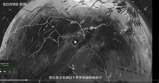
"and then you see the Sun Wukong of this world" and then it zooms into the monkey and this is how the game starts.
Interesting things to me is that
1) they call the monkey character Sun Wukong, so my guess is in the early planning stage, Sun Wukong was supposed to be playable?
2) the each pearl represents a different world??? with maybe different Sun Wukong?? So maybe something like the spider-verse except it's Wukong-verse oh god can you imagine all those monkeys getting together.
We know now that the game is out, they devs have changed some details from the original novel, and added their own twist to it, e.g. how the Tiger Vanguard had two tiger cubs, how Bajie had a spider lover and spared her life, and not to mention how they changes soooo many things about the Bull King, Princess Iron Fan and Red Boy.
It makes sense to play at the multiverse angle then, that way it would explain how each journey turned out differently and had different outcomes for some things. In another universe, the journey happened exactly like in the novel.
I don't think the devs were planning to expand on the multiverse in the game or in the franchise, but rather simply use that as an opening to introduce us into another JTTW inspired game were some things were or had different outcome.
GOD this has me so hyped up because in my Black Myth Wukong AU featuring my OC, I am playing with the different world and universe angle, I feel so validated to go down that route now
Here are some storyboard screencaps:


Here he is fighting the "new" Lingxuzi (not the same guy as from the original JTTW novel) and Monkey is hit with a lot of flashbacks (according to the CN text)


And then we return back to the scene where the Old Monkey is


SHIT WAS THE OLD MONKEY SUPPOSED TO BE SUN WUKONG BECAUSE THE HEADBAND
His final in-game journal entry also says that "Some say he is Sun Wukong himself."

4th spider sister my beloved wife

another spider concept art

my blacksmith husband Yin Tiger

we are all monkey
If anyone wants to watch the video, the link is here. It' 40 minutes long and in Chinese, no EN subtitles
85 notes
·
View notes
Text
Ludovika vs Shuri, a facial comparison breakdown
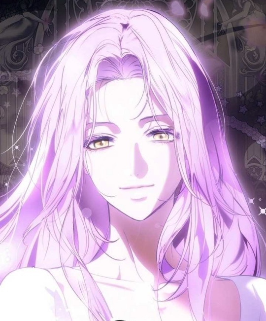
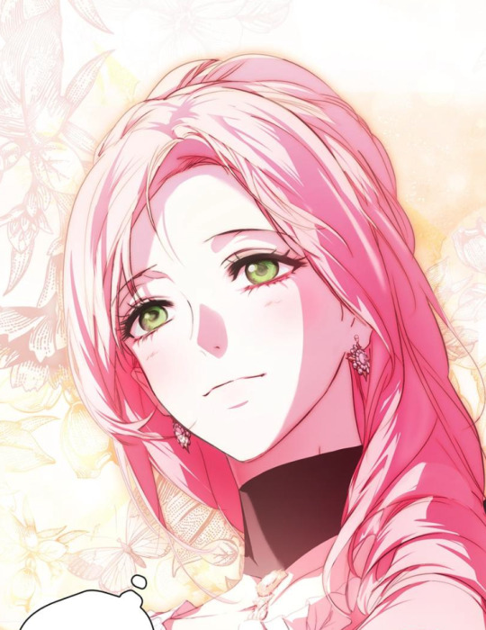
While it's obvious that Ludovika and Shuri have their similarities, as pointed out by various members of the ASM cast, let's break down some of their differences, shall we?
But before we do, let's address a few things!
ORKA takes design seriously! We can't just chalk up slight differences to "one-off mistakes." As you can see below, she did a study on her OWN designs, micro detailing down to the curve of each character's eyebrows. But to be fair, we will only be using art from recent chapters, as ORKA's style has evolved since the early chapters.
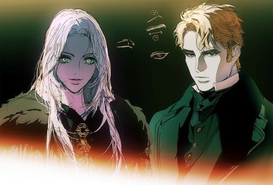
Another reason why we will be only using recent chapters is to avoid differences that may be as a result of Shuri being several years younger than Ludovika. I will also try my best to take this into account as we go.
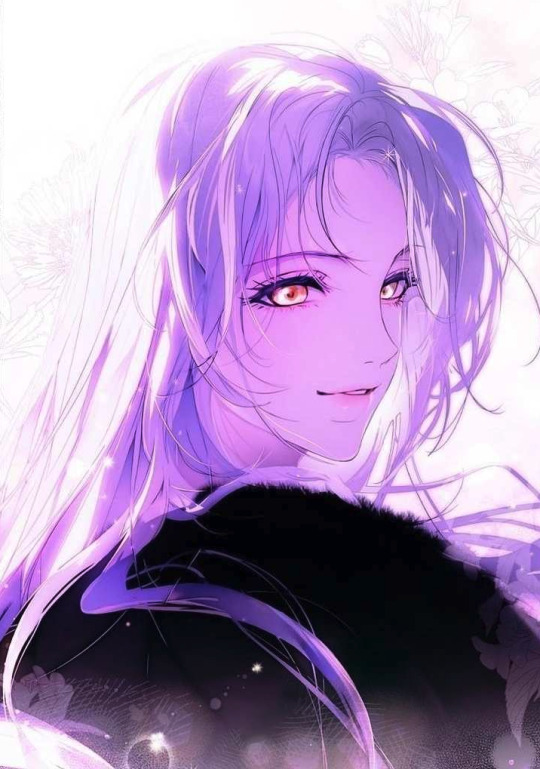
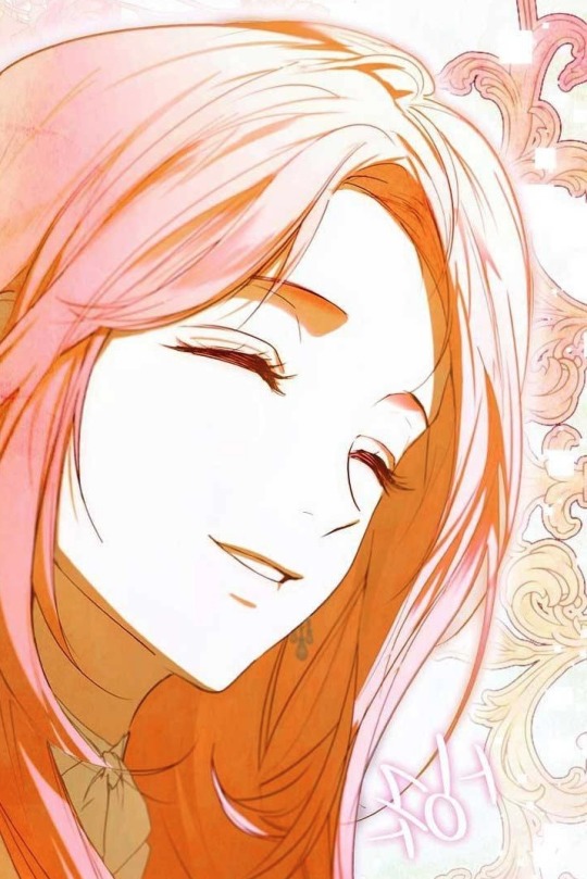
First things first, let's get the obvious differences out of the way. Ludovika has a lavender hair, parted down the middle and golden eyes. Meanwhile. Shuri has light pink hair parted to the side with green eyes. So you might be thinking, if not for the color differences, they would look exactly the same!
But that's not the case! In some instances, seen from Max or Johannes' POV, Ludovika and Shuri almost seem 1:1. However! We must take into account that given their history with her, they are unreliable narrators, and may show a warped perspective on their memories of both girls.
So why don't we remove all the color! Here we have Ludovika on the left and Shuri on the right down below.
Since we don't have a 1:1 shot, here's the two in similar lighting situations with similar expressions and another with a similar angle.

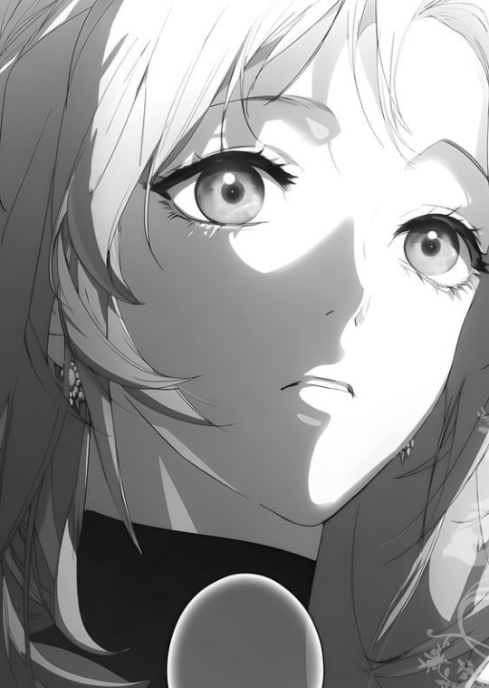
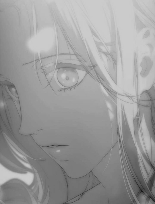
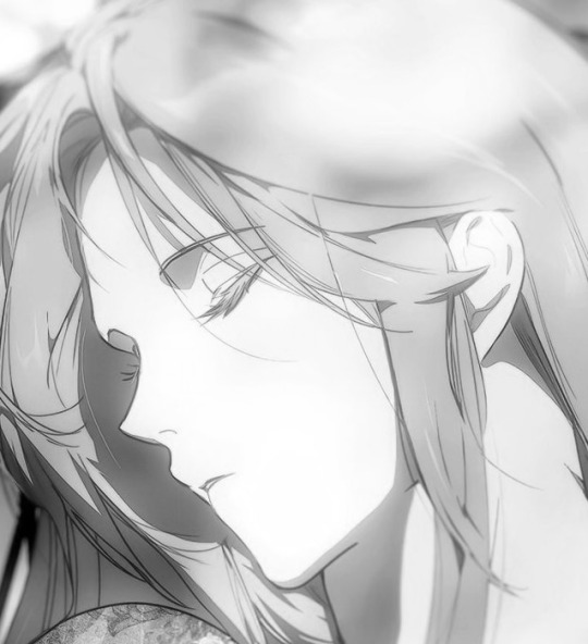
Here are all the points of differences I noticed below!
Ludovika's long arched brows vs Shuri's downward sloping brows with no arch
Ludovika's long, straight, and slightly wider nose vs Shuri's small pointed, upturned nose
Ludovika's narrow and long face with a distinctly V shaped chin vs Shuri's fuller cheeks and shorter face
Ludovika's full lips, distinctly her full bottom lip but also the way the middle of her upper lips under her philtrum has more volume, often highlighted with a tint on pink (that may be makeup) vs Shuri's thinner, almost pointed lips (almost in an elfy way)
Ludovika's narrower eyes that sit higher on her face as a result of her brow to tip of nose ratio being greater than the top and bottom thirds of her face vs Shuri's larger eyes and 1:1:1 proportioned face (though this may change with age)
It's so fascinating how ORKA illustrates the two to look so similar, yet different. Noticing these small details really shines in on the fact that the two are TWO COMPLETELY DIFFERENT PEOPLE.
We've seen so many members of the cast chasing old ghosts that we're forced to compare and contrast Ludovika and Shuri. In reality, it seems like there are more differences than we initially thought, right?
#a stepmother's marchen#the fantasie of a stepmother#ludovika von bismarck#shuli von neuschwanstein#stepyapping
185 notes
·
View notes
Text
Analysis: Alleyway Scene, Rebellion
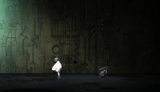
After Sayaka rescues Homura from Mami, their conversation plays out in a souped-up version of the alleyway where Sayaka first met Kyouko in the anime. But first the original version appears briefly in a montage of landscape shots to indicate the passage of time between Homura's first day at school and the first conversation with Madoka in the park.
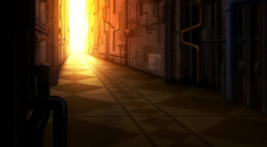
This is also where Homura broke up that fight, so staging the conversation here is an interesting move on Sayaka's part. She's taking advantage of the labyrinth to re-enact the past, now taking the role of the experienced veteran.
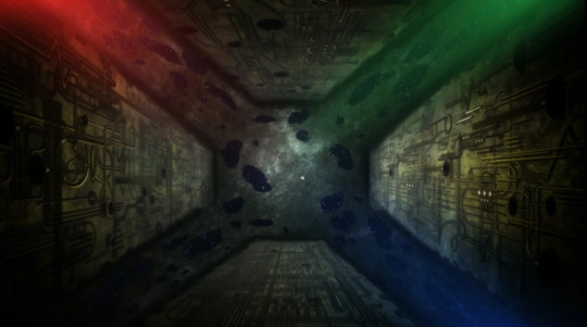
Like all of the spaces in the false Mitakihara, the alleyway responds subconsciously to Homura's thoughts and emotions, so instead of the straightforward line above, we get a series of panels that can shift and rotate in space.
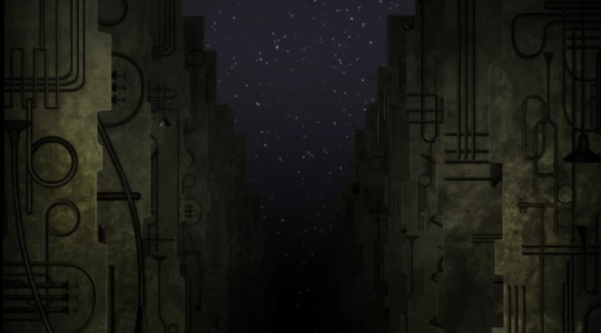
In keeping with Sayaka's musical theme, both versions still have the "instrument motif" on the walls (confirmed as such in the Rebellion Production Note) - the Puella Magi wiki also notes the resemblance to the "Hof der Elemente" in the Art Courtyard Passage in Dresden, Germany. So it's also representing water as well.
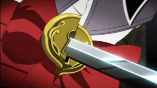
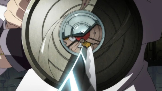
Sayaka using her sword to open the lock and release Homura is laying the groundwork for her using the same trick on Homura's shield.
This scene does a lot of fun things with reflections and upside down imagery, but using the sheen on Sayaka's sword right before she sheathes it is so creative. Note the wavy edge, like the ocean, where the glare is. Also note Homura is upside down and falling (this appears to be a recurring motif in WnK trailers).
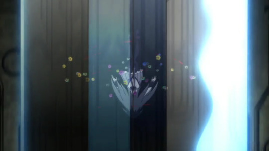
Like cats, magical girls always land on their feet. Homura does a little flip (circular motion!) first.
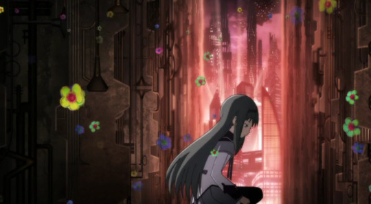
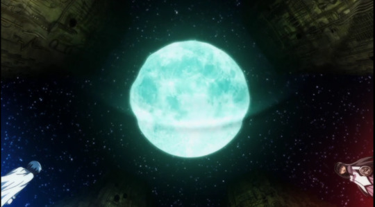
Homura is backdropped by red, Sayaka by blue. The cityscape in the Homura shots is very similar to what we see in Walpurgis no Kaiten trailer with the reddish light--fitting since Homura is dominant there. There is also a giant moon, which is associated with Homura--it round and marks the passage of time (each of her loops is approximately one month).
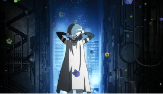
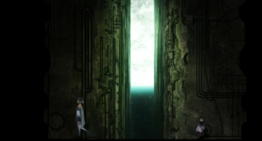
If you're thinking "how can an alleyway have 3 different views?" it's because this is actually a crossroads, both literally and metaphorically. Homura is deciding what she wants to do and where she wants to go and also who she wants to be. All of these questions are interconnected in the world that is also her soul.
I think the panels rotated in-between shots, which aligns with the spacial wonkiness in previous scenes--but it's also supposed to be disorienting, both to Homura and to us. The moon is also moving way too fast as well - compare the shot above to this one with the moon directly above them.
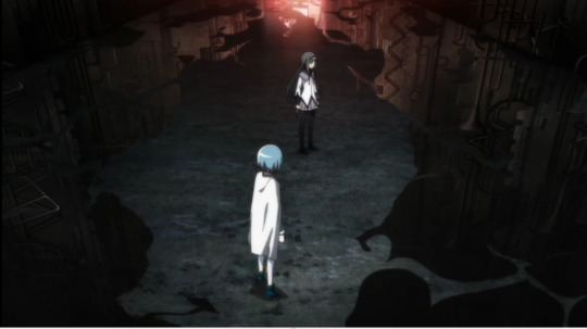
As you can see, the reflections change from moment to moment--sometime reflecting stars and sometimes the alleyway pipes. Some of this is due to changing camera angles and some of it is good old reality wonkiness. As the conversation progresses, the puddles get weirder and weirder... only to distort as Homura realizes Oktavia is directly below her.
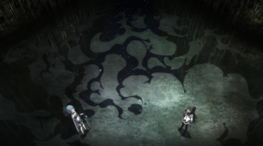
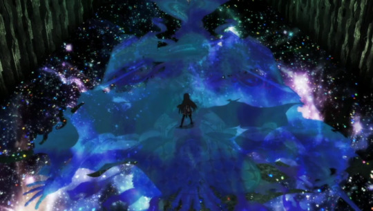
For what it's worth, the Rebellion Production Note says this is not Oktavia but Homura's memory of Oktavia, which is why she has her original series form rather than her new form that we see in the battle against Homulilly later. If I understand correctly, Homura is "filling in the gaps" by hallucinating what ought to be there because she can't perceive Oktavia directly.
It seems like Sayaka is doing her own reality-warping to (at least temporarily) counter Homura's, or at least that's how Homura and the audience interprets it.
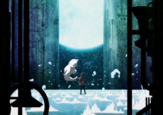
After she stops time, Homura pulls away the sheet, revealing the illusion. Everything is now blue, as Sayaka gets the "last word" visually as well as orally. The discarded cape is also the "bridge" connecting this scene to the next, as Homura reflects.
One of the many profound ironies of this scene is that in the end, Homura does exactly what Sayaka advises her to do--she traps everyone in her remade world, and maintains the status quo--only Sayaka is furious. In some ways, this makes Sayaka a hypocrite, but I would argue no more so than Homura--they each change their minds and adapt the other's original position by the end. The difference, of course, is the scale and the stakes--Sayaka is happy to play around and get a second chance as long as it's a separate bubble and not the entire universe, whereas Homura is the exact opposite.
The circular structure of Rebellion means that every scene has a counterpart elsewhere in the film and this is one of the more obvious pairings.
58 notes
·
View notes
Note
Drawing Sette is surprisingly difficult, largely because she is a child and children have weird proportions. I believe her range of locomotive movement isn’t too dissimilar from a standard human's, correct? When it comes to chairs, it seems like a large part of the issue is that it is uncomfortable for her tail to be angled around the ninety degrees for extended periods of time, given that it's normally shown closer to about 140 degrees? Her teeth are shown to be shark-like; built wholly to rip and tear, is this an art choice or narrative? Are her teeth closer to a lion's?
Also, since you said in your last response that Sette's brain is designed differently, does it effect her sleep? I believe her to sleep very little in the comic, particularly with how she leads Duane through the nights, so is this a choice she's making or a neurological difference? (I'd honestly have assumed that the difference, if any, would make her sleep more so as to better replicate the patterns of lions).
I was going to ask if she had any nonhuman tendencies, specifically instincts, but then I saw the panel of her doing a cat fall. So. Answer found.
Anywho, I'm loving the comic and shall now go disappear into the ether. I bid you adieu, my good fellow. [Disappears.]
Her teeth are unique to her; same number and configuration as a real 12 year old human's, but they're all sharpened to points. Even the molars have pointed tops. Girl's a meat eater. We'll actually discover why she was made this way in a few pages, it's nice and messed up.
Regular chairs are not her fave. She'd rather perch on something - the edge of a chair, a stool, whatever. She has uncommonly good balance. She also moves with more swagger, confidence, and purpose than your normal 12 year old. She moves like an adult, with no gangly awkwardness.
She can get by on little sleep if she has to, but she'd rather sleep just like everyone else. She's also a very light sleeper because in Sharteshane, you have to be. Kasslynian lions weren't the lazy predators of our world though. They were diurnal critters living in sophisticated societies and farming much of their own prey. They evolved hands for tool use and grooming that was important in mate selection. They didn't chase down prey either; they climbed up high, waited, and dropped down on their victims.
One problem Sette's sniff-oriented brain does have is it's made her pretty incapable of reading. She just doesn't get it, and she never will.
Glad you're digging the story! o/
55 notes
·
View notes
Note
This might be a bit of a weird question as I know this isn't a drawing blog, but do you happen to have any pointers for finding good reference photos for drawing cane users? I'm having trouble finding interesting/dynamic poses, and the vast majority of pose generator sites I've found don't even show people with mobility aids. Stock photo sites and google are also limited in their usefulness, mostly giving me very stiff poses. If you have any tips that would be great.
hello dearest asker!
I tried to be an artists once upon a time so let me direct you to some things that might help! Here is an excellent post written up by @deoidesign shows how motion and functionality with a cane works. Here is a post by @sparrowsocks on the cane design itself and the practicality of it. Here is another "How To" guide that is a bit more simple but covers how the hand changes with different handles.
Here is a reference of hands gripping cylindrical objects that I think might be a little helpful. Grabbing a cane or just moving it are all things that go into it too.
If you're going for more a historical setting, Here is a library of sources of historical walking sticks and canes. That source is more novelty canes and not for practicality for a mobility aid, but Here is another source for History and it has more practical canes.
Also things like old photo rolls when film was just becoming what we know today could be something helpful too.
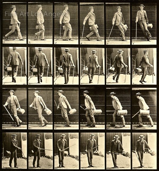
[Image Description: A black and white picture roll of two sets with twelve frames in each. The first roll is a side angle of a man holding a can and walking then taking a right turn and walking back. The second roll is a backside angle of the man walking with the cane and then taking a right turn and walking back.]
We can see for example in the first two frames how the opposite leg moves with the cane.
And of course we have more photos from the Victorian era of men with canes. Granted canes were used largely for fashion but a lot of people did use them for balance and such too. Also they're good references for poses while holding a cane.
Another thing I can recommend is just watching videos of someone using a cane. Look up disabled YouTubers or people who do physical therapy videos and they show largely how movement with a cane should look and more.
If you're looking for dynamic poses I would recommend looking up cosplayers or models who are disabled and use canes. But also looking up disabled actors that use canes or similar mobility aids and go through their filmography is another good way to see references. A lot of disabled people who are artists also post their own photos and videos for art references specifically too.
One last thing is how the character holds their body and what type of cane they need is gonna depend on how they are disabled. Working that out and doing more research is gonna change some things. But also even though there is a proper way to use a cane, some people use canes in different ways to suit their needs and comfort. The biggest example in media is House from House MD and while Hugh Laurie isn't disabled, he does a pretty accurate portrayal of someone using a cane in an alternative way. I personally (when I was getting fitted for one) would use my cane very much as House does, and other people have said much the same.
Hopefully this helps in some way and your fellow artists may be able to throw more help in the notes. Happy drawing!
~Mod Virus 🌸
139 notes
·
View notes