#made with godot
Explore tagged Tumblr posts
Text
mechs go spinny

@gentrigger's mech sprites continue to be the beating heart of the game, so I'm excited to have a new license picker that'll highlight them!
817 notes
·
View notes
Text
Lightning spell
#gunmetal gothic#screenshotsaturday#low poly#indie games#retro aesthetic#made with godot#indiedev#indiegamedev#retro 3d#godot engine
1K notes
·
View notes
Text
Super excited to announce that @gentrigger is gonna be making the mech sprites for Lancer Tactics! I've been a big fan of their work ever since I first saw it here on Tumblr. :)

972 notes
·
View notes
Text
I got the heart to beat faster as you take more damage! It's subtle because I need to prune some frames from the sprite animation but the code's all there to do it.
#game development#indie game dev#indie dev#retro#low poly#ps1#godot engine#made with godot#ursula the undertaker
909 notes
·
View notes
Text
Magic Trickery! 🐇🐇🐇🐇 Mrs. Cool and Fishy!
WISHLIST Magic Trickery on STEAM! Pretty please and thank you!
#screenshotsaturday#screenshot saturday#gamedev#godot engine#made with godot#magic trickery#indie dev#indie game
69 notes
·
View notes
Text

my pixel art shader plugin for the Godot Engine is out now! it's called PickyPixels, and you can check it out here
this plugin is still in its early stages, but the reception to gifs I've posted using it have been amazing, so I was excited to get something out there!
if this is something you've been waiting on, please give it a try! and please let me know if you need any help, or run into any bugs. happy pixeling :D
#auras originals#game dev#gamedev#game development#indie dev#indiedev#indie game dev#indie games#made with godot#godot engine#pixelart#pixel art#shaders#devlog
128 notes
·
View notes
Text
New type of buttons. Can’t wait to add sound effects to this (even though SFX is so far away)
#gamedev#godot#indiedev#low poly#godot engine#indie game#solodev#indie games#my art#made with godot#video games#game development#my screenshots
25 notes
·
View notes
Text
I've been working on this 3D platformer. It's very placeholder-ey right now.
#gamedev#indie games#indie#indie dev#game#gaming#3d platformer#godot#godot engine#made with godot#godot 4#godot 3d and items game
29 notes
·
View notes
Text
Stuff I did during the weekend.
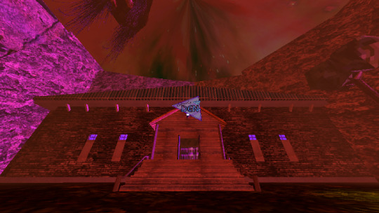


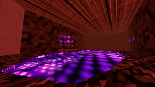


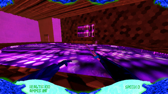
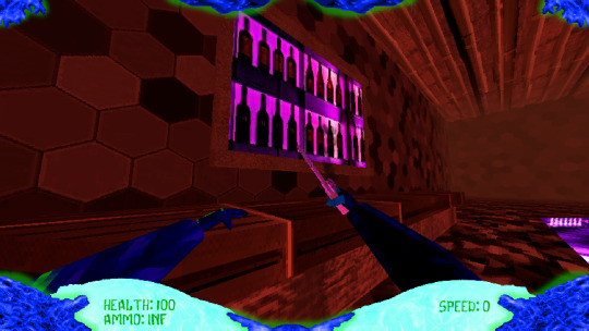
Wanted to do something like this before I work on the proper tutorial zone.
#3d#gamedev#indie game#3d art#indie dev#scifi#lowpoly#science fiction#godot#godot game engine#made with godot#indiegamedev#indiedev#indie developer#game dev#game design#solo game dev#solo dev#metroidvania#boomer shooter#first person shooter#alien oc#aliens and ufos#indie games#retro fps#retro style#retro aesthetic#retrowave
29 notes
·
View notes
Text
The dysphoria game is 100% off
A little something for the gay month.
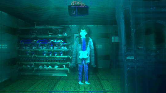
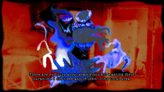
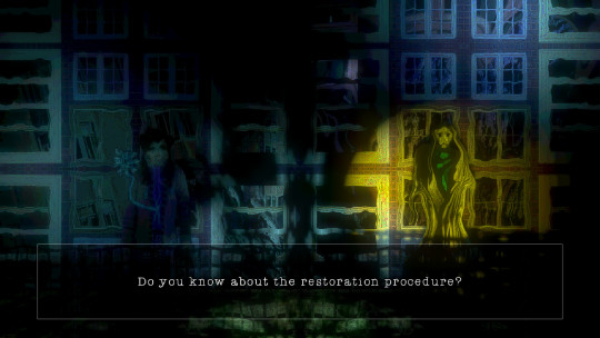
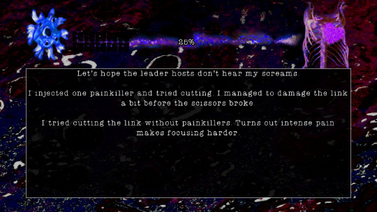
#indie games#indie horror game#horror games#surrealism#made with godot#indie dev#weird game#godot engine#art game#2.5d#pride month#trans pride#lgbt pride#happy pride 🌈#queer
62 notes
·
View notes
Text
Something I made for Godot Wild Jam.
(I just did the player sprites.)
Link: https://itch.io/jam/godot-wild-jam-75/rate/3112948
21 notes
·
View notes
Text
Lancer Tactics dialogue layout crisis of faith
(from this month's backer update)
Every so often, I'll run into something in development that eats away at me until it pushes me to a crisis of faith and I have a breakdown, burn down a bunch of work, and build something better from the ashes. These are moments of transformation and we're almost always able to come out the other side with something much better than what we started with.
This all sounds very dramatic until you take a step back and see the issue in question is just, like, the layout of a menu. But if medieval priests were able to have schisms over angels on pins I can have strong feelings about graphic design, dammit!
This month's episode revolved around how we're doing character dialogue. For reference the plan was to do a standard 4-slot visual-novel talking heads layout. I call it a 4-slot because there's usually four positions that characters can stand; two on the left, two on the right:
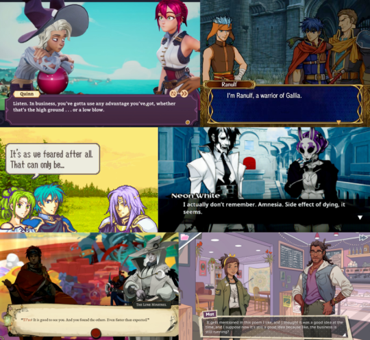
I had it ingame, and it was working. But... something felt off. Do you see the difference between every one of the above examples and this?
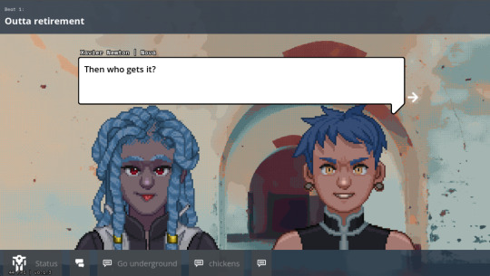
It's all about perspective, baby.
Answer: all the character art in those examples are drawn at a slight angle so they can be flipped back and forth to be made like they're looking at each other.
Trying to do this with the perspective we chose early — straight on — makes for a chorus line of weirdos who are looking directly into your soul as they ostensibly chat with each other. Credulity is strained; the illusion of these puppets interacting in the same space is paper-thin.
(I was skeptical of choosing this perspective for this reason, but we ultimately went with it to make the customizable assets in the portrait maker easier to fit together)
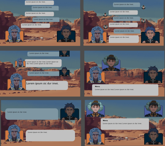
We tried a bunch of different layouts, but they all at least one of these problems:
they'd stare into your soul while ostensibly directing comments elsewhere.
they felt like text messages; this would be fine if that's what we were going for, but we wanted something that could represent face-to-face conversations. (Tactical Breach Wizards was able to pull this style off because they had little 3D dioramas to go along with it)
or, most damning of all, they felt like zoom calls.
So, my heart aflutter and spirit in want, I spent a day doing a research dive into various dialogue layouts (bless the Game UI Database!) to see if any other games had managed to pull this character art perspective off. I ended up with this massive non-chronological taxonomic tree:
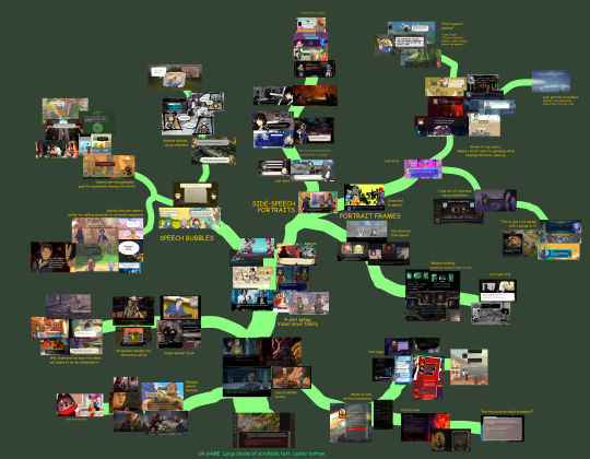
(fullsize here)
The type of layout that particularly caught my eye was this style where each character had their own little box. These layouts borrow a concept from comic books called "closure" where the space and time between characters are left blank. Freed from the constraints of trying to simulate a single space, these layouts allow the reader to fill in the blanks with something that feels more true-to-life than anything we'd be able to render ourselves.
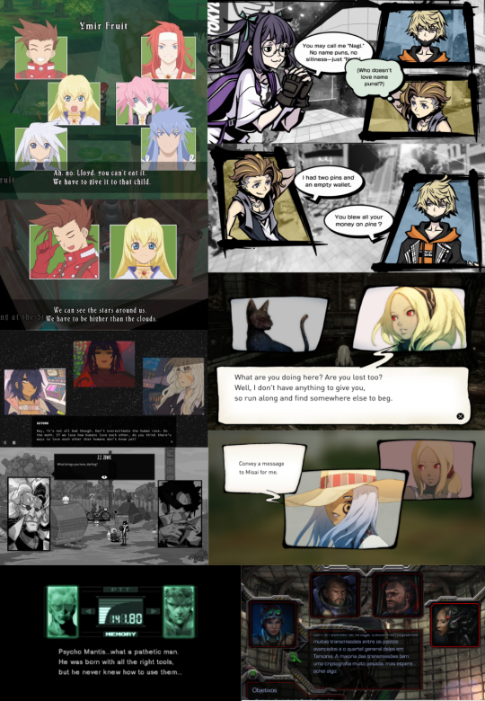
I was especially impressed with the dynamism of Tales of Symphonia and The World Ends With You; rather than sticking to single slots they would animate the entire panels moving around to indicate motion an relative position of characters.
So we threw out the old code and copied them. Here's what we've come up with:
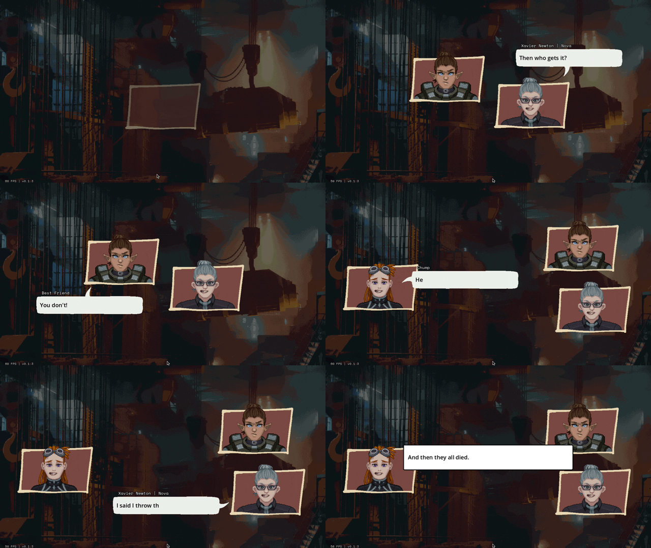
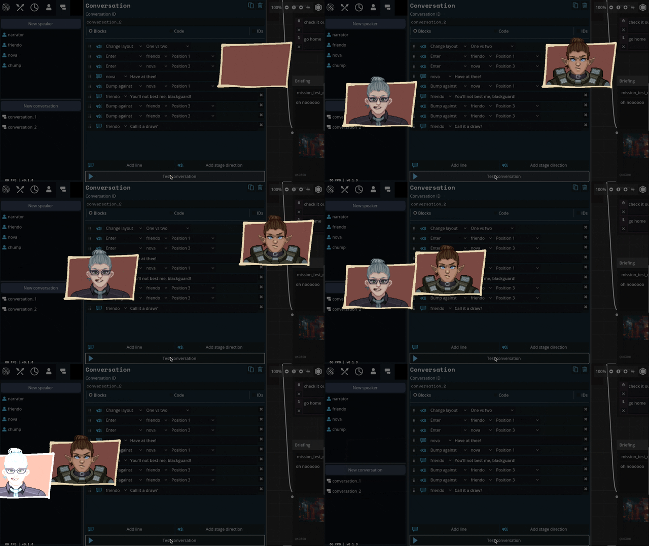
We'll be able to have portraits interact, like smacking each other (I felt like a kid hitting two action figures together, lol)
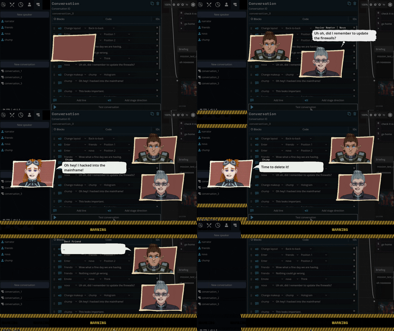
We can also apply effects like princess-leia-holograms and full-screen "lighting" effects like warning banners:
Carpenter and I came up with a number of arrangements that the portraits can smoothly transition between:

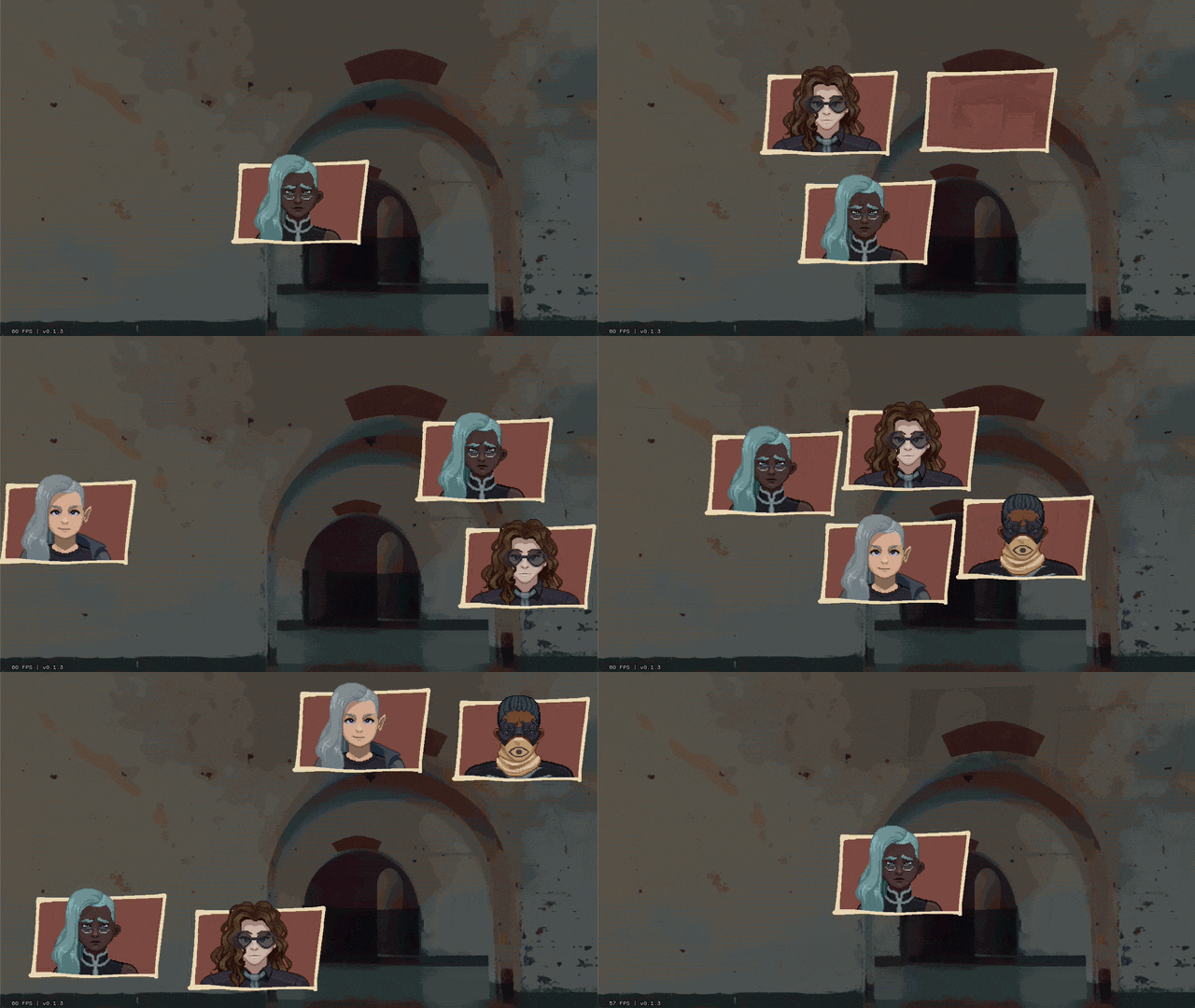
I've also implemented support for choices during a dialogue, potentially leading to branching paths.
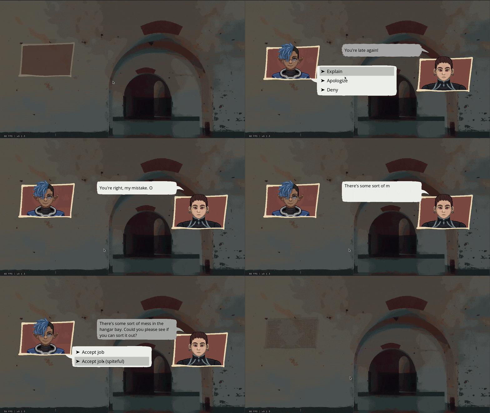
Overall, I feel SO much better about this system than our initial designs. It might feel a little more cartoony, but I think we're making a cartoony game so that's not a problem.
Whew. We bit a lot off to chew with this project. I feel like I just made a second visual novel game engine inside of the first. Fingers crossed that it all ends up worth it.
468 notes
·
View notes
Text
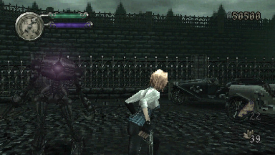
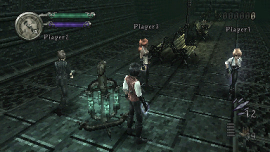
Thanks so much to everyone who has wishlisted and/or helped spread word about Gunmetal Gothic! Steam page has been updated with new screenshots and the latest gameplay video:
More to come in 2024, and I appreciate your continued support!

#gunmetal gothic#low poly#retro 3d#retro aesthetic#indie games#made with godot#indiedev#indiegamedev
940 notes
·
View notes
Text

Multiple grapple groups! Grappling somebody who's already grappling cleanly incorporates the whole mess into the growing polycule. I've set it so you can lift grappled units up only one elevation step higher than yourself; they get scraped off and left behind if you try to move them up anything steeper.
I am very much looking forward to people abusing this and making giant mech katamaris to roll around the map.
258 notes
·
View notes
Text
Wasn't working on Ursula a whole lot because I felt a bit stuck. Decided to go for somewhat of a redesign. Give her more character and expression. Make her really feel like the depressed grad student she is.
Absolute Velma Dinkley energy. A true Double D type of dork.
Gonna overhaul the level too with the camera more in mind so it doesn't seem so claustrophobic. I've got a good trajectory again for the time being.
#game development#indie game dev#indie dev#retro#low poly#godot engine#made with godot#ps1#ursula the undertaker
177 notes
·
View notes
Text
Magic Trickery! 🐇🐇🐇🐇 Bubbunny and Loveshrub!
WISHLIST Magic Trickery on STEAM! Please and thank you!
35 notes
·
View notes