#right sidebar
Explore tagged Tumblr posts
Text

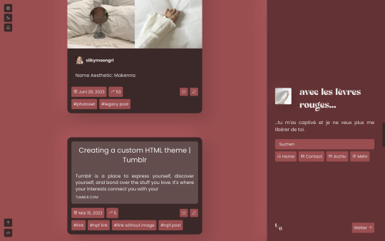
Rouge
Theme 12 by @eossa
Updated version of the revamp from 2022, now fully supports NPF posts, comes with a dark mode, and you can choose between a left or right sidebar layout (learn more about this theme).
Previews: Live (left sidebar, legacy posts) | Static (right sidebar, NPF posts)
Get the Code: Buymeacoffee | Ko-fi | Payhip
#eossa#tumblr theme#supportcontentcreators#aidpaidcontent#userthmrec#responsive#dark mode#1c#sidebar#right sidebar#updates tab#price: prm#blog#my codes#my themes#t12 rouge#theme 12
51 notes
·
View notes
Text
"Mike's gonna teach him [Harvey] to care" - Patrick J Adams about Harvey not caring before he knew Mike.
Fellas is it gay to teach the guy who's infamous for not caring about anyone compassion?
#+ its so crazy to me that mike impacted harvey so much with his 'i do care' schtick that harvey started to care sm that he was willing to#fight with his landlord ...#just to do whats right#i cant believe he said that#this is from the suits sidebar podcast btw!#marvey#suits#harvey specter#suits tv#mike ross#suits usa#tie txt#mike x harvey#mike/harvey
157 notes
·
View notes
Text
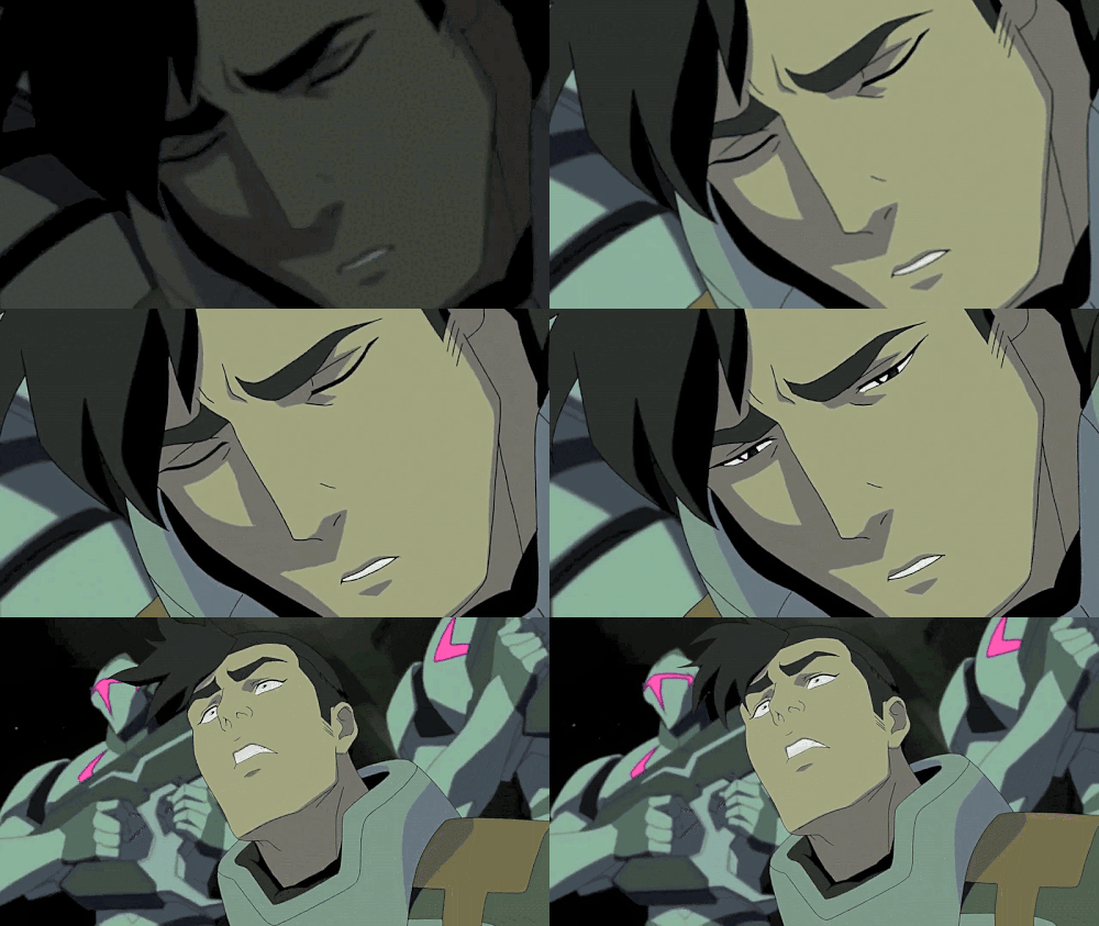
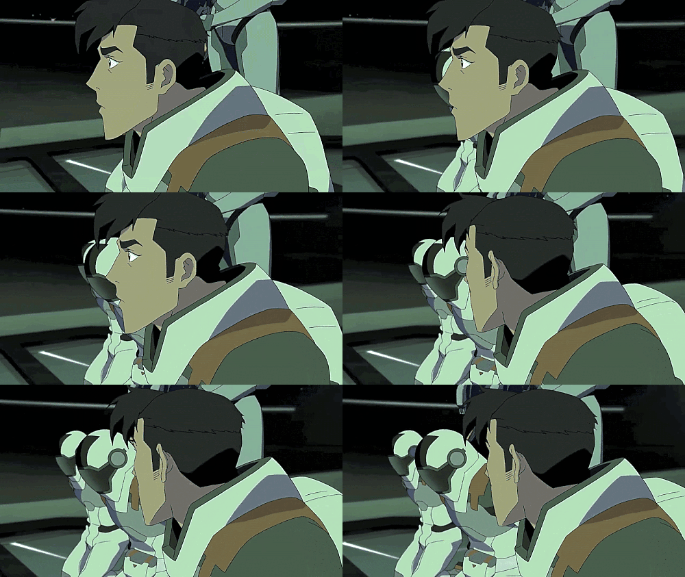
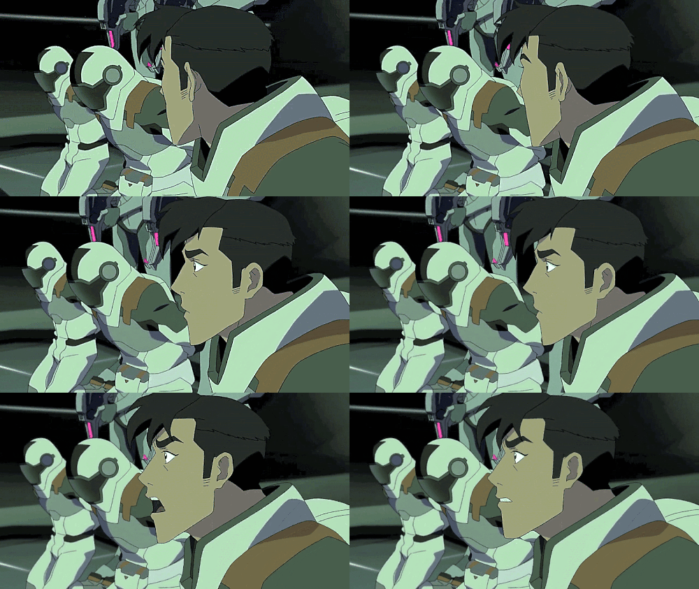

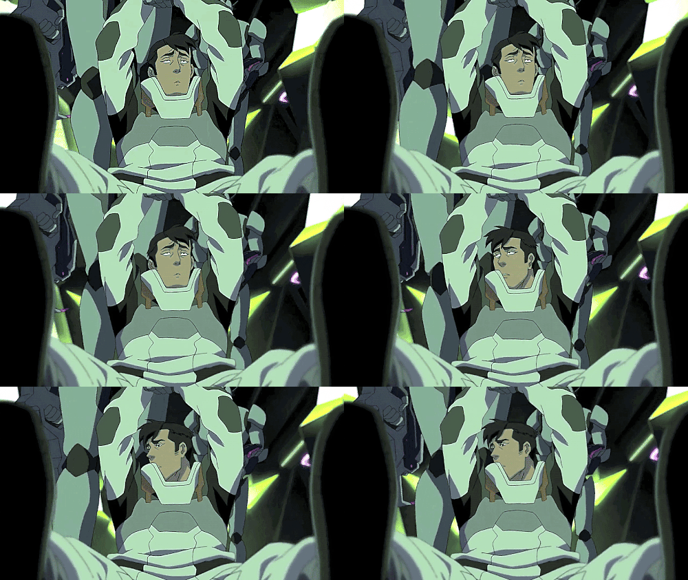

"Please! We come from a peaceful planet! We mean you no harm. We're unarmed!"
#Takashi Shirogane#Shiro#You're nothingness but shining and everywhere at once.#Voltron: Legendary Defender#Mine.#And so begins Shiro's Year in Hell.#(And cue the usual suspects making their tasteless 'you're not unarmed yet' 'jokes'.)#Still not as appalling as the video that likened Shiro's electro-stim bracelets keeping his muscles loose to a fabric tube man that flails#and flutters about outside of car dealerships.#Yet pretty damned awful all the same.#I don't know why Shiro's trauma is a joke while certain other characters are treated like they're#the biggest victims in the entire universe but this IS The Fandom Straight From Hell we're talking about.#All Shiro wanted to do was go on what very well might have been his final mission into deep space#maybe even one of his final flights as a pilot at all#before his body started to fail him.#He lost his long-term partner over this mission.#It was supposed to be routine.#And instead he gets abducted by universe-conquering tyrannical monsters and spends an entire year being tortured#experimented on#and having to fight for his life and kill or be killed for those monsters' entertainment.#Trauma isn't a damn contest but if it was#Shiro is racking up gold medals left and right while everyone else- aside from Allura and Coran- barely snags a bronze.#Sidebar: I love the animation on his hair as he falls.#Why did Studio Mir have to consistently make Shiro look so pretty as he's suffering?#All I want is to fly with queue.
66 notes
·
View notes
Text
Sasha is a dog person because on earth, ever since Anne's family got domino, she's sensed Sasha's evil and twisted ways and attacks her every time Anne leaves the room. She loves Marcy though and it makes Sasha so mad that this cat hates only her
#she is so niceys to her but domino can see right through her#also sidebar i dont know why but i genuinely thought domino was a boy cat up until now#i've watched the show so many times why did i think that#sorry for erasing women :(#i'm sorry women#amphibia#sasha waybright
63 notes
·
View notes
Text
tongrak and his 'i'm about to have glorious jealousy-induced possessive!kink sex' shirt


lets talk about how tongrak puts on the same shirt. sets the scene up so that mahasamut is going to come find him. clearly at least encourages if not instigates the drink with another man. smiles when the other man holds his hand and only pulls away once he knows mahasamut is watching.
(i love the implication that mahasamut was glaring SO HARD the guy noticed him in his periphery and knew it was because of tongrak)
when mahasamut slams his hand against the wall over his head, tongrak visibly shuffles his feet forward whilst leaning back against the wall so he's even smaller/shorter than mahasamut. claims to have been touched at his waist and thigh (...?? when??). grasps at mahasamut's shirt as if to pull him closer even as he's shaking (in fear? excitement? both?). literally does that thing where he moans into the kiss.
then has the audacity to bite his lips and smile possibly the most smug smile ever as he remembers the moment.

#love sea#mutrak#low hanging fruit but you gotta love a man who knows what he wants and goes for it#god they make me feral#i really want to read a fic about the morning after#just tongrak basking in the satisfaction#sore and sated in the best possible way#mahasamut kind of semi-figuring it out after he calms down and thinks a bit#them having a Conversation about it and negotiating how to navigate this kink#sidebar but i like that mahasamut doesn't get angry at the guy#because that's kind of the toxic side of possessiveness#but he has a right to demand an explanation from tongrak because tongrak's the one in the relationship with him#mahasamut continues to be the greenest of green flags <3#love sea the series#love sea the series meta#love sea headcannon things#rambles about shows i'm watching#<my posts>
75 notes
·
View notes
Text





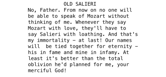
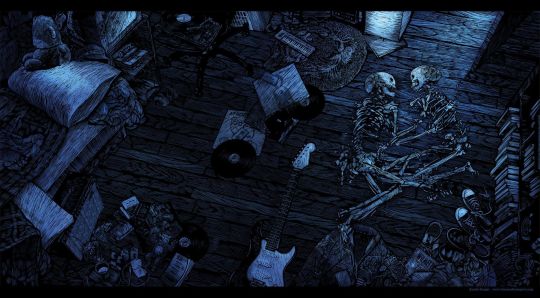


from now on we are enemies / confessions of a pariah - patrick, 2012 / amadeus, 1984 / miss missing you, 2014 / mad at nothing / amadeus, 1984 / pete, 2013 / amadeus, 1984 / believers never die, 2009 / pete, 2011 / love selfish love
198 notes
·
View notes
Text
Stray Warehouse 13 thoughts since I am procrastinating writing my B&W gift exchange fic:
I just love that I can cry over Myka & Pete's relationship and call them soulmates without having to constantly clarify that I don't mean in a romantic way. Everyone already knows I mean it in a platonic way. No one online ships them together. This is a safe space, free from heteronormativity 💕
When I say that Myka is Artie's favorite child, I'm not trying to claim that he loves any of the others less. I am merely saying Myka read the entire manual, cover to cover, the second she got it and that makes Artie want to cry with happiness. No one's done that in decades (since he started at the warehouse). It raises his hopes that Myka might break his own personal record for longest lived warehouse agent. :')
#Guess who just rewatched The New Guy?#And then two seconds of writing later promptly had to watch a S2 finale fanvid to confirm Myka's hairstyle? 😂#So yeah I have ~feelings~ over Myka & Pete and Myka & Artie right now#on top of the ever-present Bering and Wells feelings :P#Which SIDEBAR I'd just like to point out that feelings don't get in my way when I'm writing Lucifer fic#I can crank those suckers out no problem#WH13 fic on the other hand? NOPE! Suddenly I'm wallowing in feels instead of writing 😬 Whoops!#(And that's a big whoops because I am only 1500 words into this way-too-long introspection piece with less than a week left until it's due)#(Am I scared?)#(YES! 😬😬😬 THANK YOU FOR ASKING)#(BUT I *WILL* GET THIS DONE ON TIME I STG!!!)
27 notes
·
View notes
Note
OP, what was the result of the lobster versus craf poll? I'm very curious (my vote is on lobster)
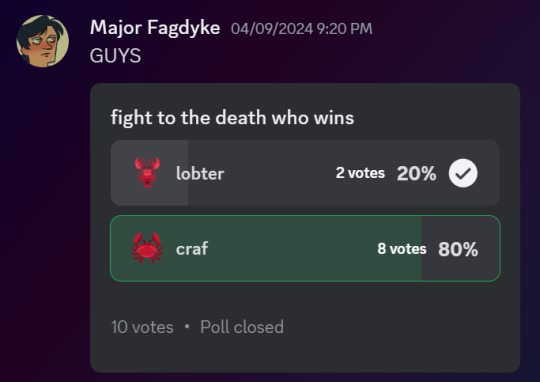
unfortunately lobter was robbed
#i also voted lobter...#shebbz shoutz#ask#also wait why are you addressing me as op you're sending me an ask. my name is right there in the sidebar/header...
82 notes
·
View notes
Note
Fellow ace here! I'm not demi, but I fit under the umbrella as aegosexual (a term I only learned a year ago! Fun times!).
Since anons were being mean, I wanted to say hi!
Aw thank you for sharing also hi we're hanging out under the same umbrella isn't that neat! xx
#asks for bee#thoughts from the peanut gallery#sidebar:#I know it can be really confusing and overwhelming sometimes#where you feel like you have to find a specific word and/or flag to stand under#but all that matters is that you're comfortable with who you are and that can change multiple times throughout your life#sometimes finding the right label helps and sometimes it doesn't#hell I know folks who are pansexual because they like the colors of that flag better than the bi one which isn't a problem outside tumblr#the person who spits on you when you walk down the street doesn't care what your label is they only care that you're not like them#I used to volunteer at the queer crisis centre in the city I used to live in#if finding the 'perfect' label causes you too much stress#then you can toss the entire concept of finding the 'right' box aside#You can do whatever you want forever
20 notes
·
View notes
Text
A quick Stylus script to make Tumblr's new sidebars a little less crowded and more comfortable
So, that new sidebar, yeah? Sure is a thing. The tumblr devs might change things before it's fully implemented across the board, and Xkit Rewritten might add some options after the interface moves from testing to permanent -- but until they do, here's a little fix to spread things out a little, so that your tumblr experience doesn't feel so squished. It results in a dash like this:

which is a little more comfortable than the original, I think.
To install the script, first make sure you install the addon/extension Stylus, if you don't have it already. And then, well, simply click here, and click "install" to add the style. Enjoy your more wide open spaces!
(Code under the cut for advanced users; comments or suggestions are welcome. You're also free to modify your own copies for any sidebar width or spacing you prefer.)
/* ==UserStyle== @name Tumblr - New Sidebar Fixes @namespace https://nobodysuspectsthebutterfly.tumblr.com @author Mindset @description Moves Tumblr's new sidebars outward to make things a little less crowded. @version 1.3 @license GPL-3.0-or-later ==/UserStyle== */ @-moz-document domain("tumblr.com") { /* makes sure this only applies to page sizes where the sidebars appear */ @media (min-width: 1150px) { /* moves the left sidebar further left */ .ZkG01 .h_Erh { margin-right: 100px !important; margin-left: -90px !important; } /* keeps the center section the width it should be and moves the right sidebar to the right */ .ZkG01 .lSyOz { min-width: 625px !important; padding-right: 100px !important; } /* keeps the right sidebar the width it should be */ .ZkG01 .e1knl { min-width: 320px !important; } } }
#tumblr#[tumblr]#sidebars#tumblr ui#tumblr update#stylus#stylish#userstyles#css#coding#i may fiddle with this to reverse the ui to put the menu on the right and the search/check out/radar/xkit tracked tags on the left...#which is easy to do with one line but harder if you want to keep the tumblr t up there on the top left or other things idk#though either way i'm pretty sure i'll do that in a different script rather than updating this one#also fyi this is tagged stylish because my older css tweaks were tagged that but don't use stylish it's spyware sorry. use stylus instead#also posting code on tumblr these days is a pita ugh
212 notes
·
View notes
Text
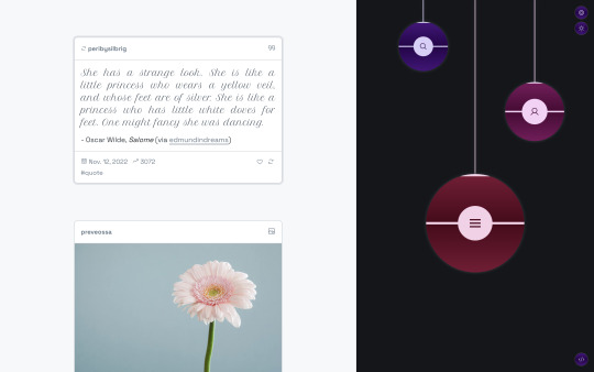
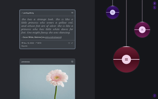
Christkind
Theme 21 by @eossa
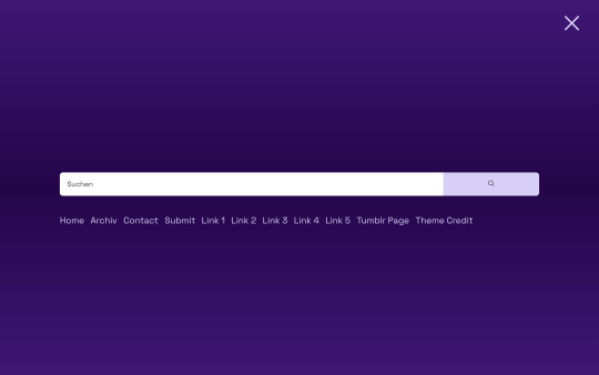
A responsive single-column template for Tumblr blogs. Comes with a dark mode, gooey menu, and two full page overlays. Supports both legacy and NPF type posts fully. Inspired by baubles on Christmas trees. Updated and slightly revamped version of the 2019 original.
Preview the theme: Legacy posts focus | NPF posts focus
Get the code: buymeacoffee | ko-fi | payhip
Need more info? Check out the theme guide.
Some more screenshots of the theme so you can see some of its highlights:



#eossa#support content creators#tumblr theme#aidpaidcontent#christmas#responsive#dark mode#full npf support#1c#sidebar#right sidebar#overlay#price: prm#decorative#blog#my codes#my themes#theme 21#t21 christkind
13 notes
·
View notes
Note
Apologies but you were at the top of my Tumblr feed and I have been instructed to randomly tell someone online a painful truth.
Here goes.
Closing your posts to comments is an inherently hostile act.
Again; sorry. Nothing personal. We all serve the random number gods in our own fashion.
Mndrew, I recognise your profile pic, I've seen you around, I know you're a chill community member and active participant and stuff, so I want to be clear that this isn't like a dig on you or anything, it's just a response to the thesis statement: "Closing your posts to comments is an inherently hostile act". I don't know how many of you know this, but a while back, while I was still at university, I spent around a year? Maybe 2? dealing with an obsessive online stalker.
They made it very difficult to spend time anywhere online, but they especially weaponised Tumblr (I think they realised it was a less public account of mine where I could seek respite). I would wake up in the morning to find they had sent me hundreds, on one occasion close to a thousand, messages. The messages would range from threats of self harm or against me to seemingly nonsense phrases designed to just remind me that they were still there. The tumblr notification sound still spikes my anxiety.
You can't block someone like that. First of all, they would and do simply make more accounts (I just checked - I still have 30+ accounts of his blocked over here). Secondly, this kind of behaviour leaves you in a trap; If you interact with them, they know they have access. If you block them, they know that you saw their message... so they know they have access.
During this period, I had the good fortune of being able to ask Grace Helbig, of all people, whether she had any advice. She got so furious on my behalf I still tear up a little when I think about it, but *she* told me a painful truth that day: As much as you might like to, as much as most people know how to behave appropriately, you cannot leave yourself open to every line of communication your audience might want.
If you look around at my socials you'll probably start to notice a trend. You can't comment on my instagram posts unless you're a follower. You can't DM me unless I follow you on Twitter. Places where I can't control those settings, I simply do not ever open my inbox. In fact, it was really only a short time ago that I turned tumblr messages back on, after a loooong hard think. In many cases this is something that actively hurts my engagement, but it's a choice I've made to draw a line on where and when and how people can access me.
All of that said, you don't need to be an internet personality with digital stalker trauma to draw your lines. Closing your posts to comments is not inherently hostile, it can be an act of self-care, self-preservation. No one is entitled to be able to access you in every way they want to.
#still don't have a personal tag#also sidebar painful truths are so overrated whoever invented this “pass it along" game that I've no doubt started this#you're right up there with chain emails that tell people bad things will happen if they don't pass it on#not you mndrew I don't hold you responsible#also fun fact: i didn't even remember I'd turned off comments on my posts#and after finding out I had guess what? making the decision to keep it that way#Look after yourselves#I learned the hard way that there's no glory in toughing it out
43 notes
·
View notes
Text
I've watched the reintegration scene SEVEN TIMES now and I still get full body chills from it..
The slight change in his voice when he says "you mean what quarter?" is INSANE!!! Ever so slightly more child-like and higher in pitch than all his previous answers ... Fucking 😭 And then the editing.. how was his posing so precise despite the costume changes ?? The precision angles and exact same expressions. The scene and episode ending with the phrase "who are you?" The same phrase that starts the show?? (And again when Mark first meets Reghabi)
SHOCK. AWE. WONDER.
#sidebar I will never NEVER forgive Twitter for spoiling it for me#it was still the DAY the episode aired#opened Twitter and BAM the very first thing I see#no tags no spoiler warning#nothing#I shut the app so fast#but it was too late#I knew he would reintegrate at the end of E3 before getting to watch it for myself#maybe this is extreme idk I'm autistic for reference but I felt sick and cried and stayed up all night#because I was so upset it was spoiled#due to this experience I have a new rule lmao#no social media NOT EVEN A PEEK until I've seen all severance content as it comes out#not giving the internet another chance to do that to me again#I have fully learned my lesson holy shit that sucked#saw a comment earlier saying they're sad they can't watch the ep for the first time again#and got jealous#because they got to EXPERIENCE A FIRST TIME#I KNEW IT WAS COMING THE WHOLE EPISODE UGGHHHHHHHH#anyway just had to whine and cry about that for a bit#I know it's my fault :( I know better now#I've never been hyperfixated on an actively airing tv show before in my defense#it's always been on things that literally can't be spoiled#where everything I could possibly learn about the interest was sought out and welcomed#wow I am the yapper right now I'm done lmao#mine
17 notes
·
View notes
Text
(mgv) frankly a house md omegaverse would require an entire rewrite rather than just "the episode but with mgv elements" bc i have house and wilson helping each other with their cycles (meaning they're fucking) so their dynamic could go even crazier. they bang, unbonded, as friends, which isn't super crazy uncommon but they also regularly display courtship behaviors that they apparently either ignore or write off as pranks or basic decency -- wilson letting house eat off his plate is a huge one for example
#mgv#house md#house mgv#hilson#their will they wont they (that doesn't exist but it Does. to Me) is even worse basically#like they're so close to a breakthrough and yet. they are Stupid#“house would do wilson before cameron does chase” enter house casually dropping that#it is in fact wilson who does him every so often#and only when wilson is not married bc for all his whorishness wilson does try at first#and aside from house's relationship issues keeping him from forming connections#he's also lowkey trying to stay available in case wilson finally decides to get real with him (he's down so bad)#sidebar i feel like i get so sidetracked typing these posts and tags out with The Right Words#that i end up going on entirely separate tangents and completely lose the initial idea i came in with#my brain is a run on sentence generator almost 30 years strong
34 notes
·
View notes
Text
THE LITTLE SCROLLY SIDEBAR LIKE IT'S A VIDEO GAME I'M SCREAMING
#I'm going so so feral for all this downtime shit holy shit#the fun school music#the cutesy sidebar#the sound effects!!!!#I'm. insane#holy shit this is my favorite ever#exactly right now this became my favorite season of d#of d20 ever#35:40 into episode 7 stress tested#my favorite season. confirmed. sealed in stone#this is so good#dimension 20#fantasy high
49 notes
·
View notes
Note
how do u curate your playlists? they're so good (listening to the glen powell one rn lol)
dearest anon, please know you've made my entire summer with this ask <3333 (here's the playlist in question)
now while i recognise you probably weren't looking for a legitimate breakdown of the process here, you've inspired me to take a deep dive, and i'm prone to getting carried away (and yes, i read high fidelity recently and rewatched the film and the series. but i'm sure that has nothing to do with it). so here goes, under the cut:
Lizzy's Guide to the Delicate Art of Making a Playlist
#1 - What's the Point?
There has to be a theme or mood or connecting thread for the playlist. That being said, as long as it makes sense to you, you've pretty much got this covered.
What's the story? Is it based on a mood, an event, a time in your life, a person, a character, a genre, an era, etc. etc. There's plenty to choose from, so there's plenty of playlists to be made. Go crazy, get weird with it.
(In this example, the overarching theme is: Glen Powell Hot (Twisters Edn.) with a sub-theme, if you will: Country Music for Beginners.)
#2 - Song Selection
Once the theme is set, I gather a few tracks that spring to mind immediately. In this instance:
• Why'd You Come In Here Lookin' Like That - Dolly Parton
• Cowboy Take Me Away - The Chicks
• Country's Cool Again - Lainey Wilson
All of these are fairly self-explanatory if you have been caught up in the Twisters press tour at all recently. No further comment.
From here I flesh out the ~general vibelist~ with more tracks, some classics and some deep cuts. I'm cross-referencing my own musical knowledge, previous playlists, spotify mixes (god forgive me, the occasional algorithm picks), and other user's Powell playlists (topgun-heavy, but you certainly can't blame them).
#3 - Order Matters
There's got to be some sort of flow to the playlist front to back, unless your theme is audio whiplash, for example.
Now here I am a devout follower of the High Fidelity rules, which are as follows:
Track 1 - Open with a killer - sets the tone, gets people invested
(Here, Lady Gaga's You And I ~ it's a banger, and it's country enough to get away with. Can't bring out the banjo prematurely, we'll lose people)
Track 2 - Bring it up a notch - let them know we're just getting started
(Alannah Myles, Black Velvet ~ country-ing it up a notch but staying firmly in the mainstream, because again, we don't want to scare anyone)
Track 3 - Cool it down - now we're settling in
(Chris Stapleton ft. Dua Lipa - I Think I'm In Love With You ~ Dua keeps us firmly rooted in the crowd pleasers, and we can sneak in some Stapleton)
N.B. There is a rule here that I don't abide by, the "only one track per artist" - there's three dolly tracks in this lineup alone and i stand by all of them. Provided you're not adding an entire album or two, I think you can get away with it.
Anyway, this three-track run fires us into a classic (Islands In The Stream) which melts into Tyler Childers and suddenly we're knee deep in Kentucky and you didn't even know it.
The trick is to not overthink it, which is always easier said than done. Ordering only has to make sense to you from start to finish. This journey's gotta go somewhere - throw in a few peaks and troughs, and the songs are just connecting the dots along the way.
#4 - As Does Shuffle-ability
Now, having said all that, I feel like this is a safe space to admit I am a chronic shuffler, so a degree of shuffle-ability is required.
All this means is that your underlying theme is evident throughout. Any wildcards are going to make sense wherever they pop up.
With this one, the thread of country through all of these tracks is what ties the theme together (saving a horse). There are some classics (Faith Hill, Willie Nelson), soul-heavy tracks (Secret Sisters, Leon Bridges), and and few more pop-adjacent (Haim, Ashe) but they've all got that twang - so it's shuffle proof.
#5 - Points for Presentation
A good cover, title and description can offset a multitude of sins. Don't underestimate the power of presentation.
Duration comes into play here also, where anything shorter than half an hour feels like it has nowhere to go, but over three hours feels insurmountable. Unless you're going for a compilation, year in your life playlist, or some background low-fi stuff, keep it tight.
And there you have it folks, my (lengthy) guide to playlist curation. Final note, don't love it and leave it. If you come across something new, jostle things around to get it in. Similarly, if something doesn't fit anymore, toss it. The beauty of the modern mixtape is you can edit it as little or as often as you like.
If you made it this far, I'm personally sending you a little kiss on the forehead. And to the anon who inspired this article of a response, I can only apologise. MWAH
#i might have allowed myself to get a little carried away there#forgive me#if you read all of this and you're thinking holy shit this process is absolutely completely cuckoo bananas. well you're certainly not wrong#also sidebar: rob has to be an aquarius from the music snobbery to the fear of commitment to the self sabotage to the general assholery#right?#spotify#playlist#spotify playlist#high fidelity#high fidelity series#rob brooks#rob gordon#glen powell#playlist curation#mixtape#ask#anon#ANON MY DARLING I'M SENDING YOU ALL THE LOVE IN MY HEART#yes i will marry you i'm receiving your coded message i'm reading between the lines#💚💚💚#oh and apologies for the delay but i'm clearly unstable
23 notes
·
View notes