#red black orange and white color scheme
Explore tagged Tumblr posts
Text

Idk anything about Vault Hunters, Ethos episode was my first intro to it, but his armor at the end of episode one really reminded me of something and after scratching my head for a bit I realized what it was:

#i mean. the horns. the oversized shoulder pads#red black orange and white color scheme#cinnamon roll esque goof ball in big old suit of armor#it fits#vault hunters#ethoslab
17 notes
·
View notes
Note
What kind of clothes would Vasco wear after Machete's death? He tends to wear bright and warm colors, and I was wondering if he would start wearing dark and cool colors to reflect his inner state
I also had thought that he might start to veer towards more somber shades. In reality, late 16th century fashion was dominated by dark colors, if you look at portraits from late renaissance/early baroque eras you quickly notice that pitch black was the most fashionable color (compare that to early and high renaissance fashion from 1400 to 1550 which was visibly more vibrant and colorful). I might be bending the timeline a little bit by having him dress in vivid blues with gold accents, but it's his signature style and I think it mirrors his luminous, free-spirited and approachable personality well. After Machete's death he might've experienced a period where jewel tones had lost their luster to him.
#answered#anonymous#Vaschete lore#I just like giving them distinct color schemes#Machete's secretary/assistant Vittorio favors black and dark grey but has an occasional glint of olive green#his personal physician Frosini has sort of a warm but muted palette#the former mentor priest/bishop Giordano is an ascetic guy so he's largely monochrome black and white#but with purple/magenta accents (compare to Machete's red)#Ludovica is green and reddish orange#and I haven't made up my mind about her partner's wardrobe but I have a few ideas#also been thinking of Vasco's twin sisters#this information is entirely meaningless but it's something I like to think about#makes them seem more like individuals#plus I love colors I love colorful things
217 notes
·
View notes
Text
Going Crazy over Vania/Harumi again. Especially Harumi's-redemtpion-arc Vania/Harumi.
Harumi who spent most of her life either acting or being driven by her hatered and anger alone. Who reached a point in her (second) life where she doesn't need to act because there is no one to decieve and where her anger has no clear target. Where she doesn't have anyone to devote herself to, to base her entire being on. A ruler of nothing but herself, with more strength than she can handle.
Vania who spent so much of her life being true to herself and acting with love and care towards everyone who came her way and didn't strike first. Who looked on as her only remaining family tried to kill her heroes, terrorized two whole nations and then tried to take over the world. Who was cast into a life where she has no one to fall back on by her side and a kingdom with twice as many people as it did during her father's rule and twice as many problems, too. A ruler of so many with so few rescources and even less experience.
Harumi who lost her family to an evil beyond the control of the ninja and who chose to pin the blame on humans and not destiny -- on beings that she knew that she could hurt if she only tried hard enough.
Vania who lost what little she had left of her family to an evil beyond the control of the ninja and who chose to pin the blame on evil itself, her father, destiny -- anything and everything, just so that she wouldn't end up hurting anyone who didn't deserve it at all.
Harumi who spent so much of her life actively choosing to hate.
Vania who spent so much of her life actively trying to love.
And then they meet. Both princesses. Both sure that they should despise each other, because they stand (or stood) for opposite things.
But then Vania's reluctant attempts at only partially judging Harumi for what she did, at being polite but not mean, turn into being kind and a bit smitten. Harumi's determination to become a good person (or someone who does some good, at least) drives her into appreaciating Vania, slowly but surely placing her on the same pedestal that she devoted to the Overlord and Garmadon before him.
Vania, raised by a single father, lonely upon an ivory throne of problems, starts to fall for the girl who gives her advice on managing a population. Who reminds her that she needs to rest in order to be as strong as she possibly can. Who teaches her to have a steady hand, somehting that she might need help with sometimes.
Harumi, someone who's never let herself be properly liked by someone so real, a love so true as Vania's, begins to adore the girl that teaches her how to be a teenager even despite their postions -- even despite the fact that one of them is a queen and the other is the ex-right hand of two evil overlords. The girl that doesn't hesitate to communicate how she feels. That offers Harumi a shoulder to lean on.
#RAUGKUJGDJYHGHJjedklhfuikweshfoi!!!!!!!!!!!!#I NEED TO CHEW ON THEM BY LIKE. YESTERDAY!!!!!#they can be both fluffy yuri and toxic yuri. they have opposite and yet complimentary color schemes (white + orange + blue/black + red+pink#Can I plsss be named their no 1 fan and/or CEO like I've written nearly a third of all the fics about them that are on Ao3. The first#non-self-insert fic that I've ever written was about them. I loveee them :((((((#princessshipping#royaltyshipping#jadewingshipping#ough just look at all the different names. we haven't properly agreed upon one of them :( and none of them are very personal except for#jadewing. which isn't even really used.#I'd maybe call it eclipse or new moon. Vania's ships are already usually named after the weather (raincloud for example. or sunset) and#I think that Harumi has a dark enough aesthetic to justify them being named that. If I could also fit something related to spiders into the#name I'd be absolutely satisfied with it but I haven't figured anything like that out yet :(#harumi jade#ninjago harumi#princess harumi#ninjago#ninjago vania#princess vania#vania#lego ninjago
12 notes
·
View notes
Text
cant believe how indecisive i am about my spidersona. cant ever decide on a design, color palette, ANYTHING 😩😩😩
#bro its so hard to just fuckin. pick colors#same w my ponysona (might post so yall can vote on colors n shit)#i like the idea of yellows#like maybe a yellow/black/white scheme#maybe some orange or red or teal as an accent?? but i can never get the ratio right
0 notes
Text
trying to decide what color scheme to make my next plant.. he's gonna be thief i think..
#colors schemes ive got so far are:#pink green gold (cym)#black red blue (niki)#black grey blue (ohaine)#purple black green (unpleasant)#purple orange pink (zuri)#black pink gold (esti)#white red gold (tahmin)#teal purple white (aba)#those r in order of skin color-hair color if its diff/accent color-accent color
1 note
·
View note
Text

BUILD YOUR OWN VAMPIRE (a cas challenge by hauntedtrait)
I looove cas challenges, and I've been particularly enamored with these where you roll or pick attributes based on something about yourself, I also love vampires so I combined the two! The only rule is to have fun! Also, you don't HAVE to pick attributes based on yourself, you're entirely welcome to randomly roll for those too! Use the tag #ht: vampcas to showcase your creations!
The same list that is on the image is under the cut for accessibility.
birth month = color scheme
1-2: bloody red
3-4: demure pastels
5-6: earth tones
7-8: dark and moody
9-10: black & white
11-12: bright and colorful
favorite mythical creature = hair color
dragon: ginger
sphynx: brown
phoenix: blonde
unicorn: white
chimera: multicolored
hydra: fantasy colors
hellhound: black
favorite animal = eye color
snake: blue
spider: black
bear: brown
wolf: purple/pink
tiger: yellow/orange
shark: white/gray
hawk: hazel
fox: red
alligator: green
favorite hobby/ies = extras
cooking: scars
fiber arts: piercings
gaming: prosthetics
painting/drawing: tattoos
sculpting: body horror
programming: glasses
outdoor activities: freckles/beauty marks
playing an instrument: weird eyes
randomly generate a theme
romantic
gothic
emo/scene
victorian
1920s
1950s
1960s
1970s
1980s
1990s
y2k
modern day
historical
rockstar
dark academia
futuristic
urban
punk
hippie
minimalist
maximalist
out of this world
western
animalistic
#sims 4 cas challenge#sims 4 cas game#s4 cas challenge#s4 cas game#sims cas challenge#sims cas game#sims 4 cas#ts4 cas#s4 cas#ts4 cas challenge#ts4 cas game#the sims cas challenge#the sims cas game#buildavampire#ht: vampcas
944 notes
·
View notes
Text


Such a lovely, welcoming estate that they call a textile villa. I don't know what that is, except that the owner worked in textiles. The home was built in 1906 in the Netherlands, as a country home, but the family loved it so much that they decided to stay permanently, so the owner built an office wing and worked from home in 1916. 3bds, 3ba, 6,404.53 sq ft, Price On Request (Must be staggering.)

The house is just as lovely as ever. I don't think I've seen a wallpapered sun porch before. The flooring is orignal.

Isn't this a beautiful sitting room? Look at the unusual fireplace. The mirror is set into the actual hooded mantle and the bricks make a red & black striped pattern.


That light fixture! It doesn't come furnished, but those soft green velvet chairs just make you want to settle in.

Muraled wallpaper in this room is so inviting. And, look at the chandelier.


Spacious kitchen in soothing green tones. Look at that stove and matching hood.


The dining room has built-in storage with a fireplace on one wall. I love the soft pink and how the wallpaper ties in with the furnishings.

They chose to ignore the orange tile on the fireplace, keeping it original rather than replacing it. My mother was a designer and it's not unusual to simply ignore certain elements like carpet color, etc. and proceed with the chosen color scheme. But, note how the flames and a few orange glass bottles pull those colors in.

This rustic lounge is amazing. The plants complement the colors of the velvet fabrics.

The wonderful wallpaper extends out to the hall.


A surprise at the top of the stairs- I didn't expect a library. What a great idea.

Very spacious primary bedroom with an original built-in cabinet. How cozy. Love the fireplace and how they closed it off with decorative tile.


Big, beautiful remodeled bath.

The stylized vintage/modern soaker tub was the perfect choice.


Love this spacious rosy room with a door to a pretty porch.

This home is so beautiful. (And, it's not gray or white.) Look at this wonderful little retreat-for-one to sit, read, and relax beneath a gorgeous chandelier.

They kept the original tile in the back hall off the kitchen and prettied it up with beautiful wallpaper.

And, we're back at the sun room/conservatory with the doors open to the patio.

Beautiful patio and gardens.


The approx. 12.9 acre grounds are partially open to the public to enjoy, with boundaries. A number of places are private, fenced off, and expressly closed to visitors. The fen, for example, they kept to themselves, to swim and relax at the water's edge (well, it is their home, so is there an electrified fence or what?). The current owners are on good terms with the residents of the town: “They have seen how the metamorphosis of the estate and the villa took place and appreciate that they are allowed to walk and cycle here.”
Would you, as the new owner, allow them to continue? (They damned well better throw me a welcoming party first.)
https://www.funda.nl/detail/koop/enschede/huis-welnalaan-5/43617486/
#estates#historic homes#textile villas#houses#homes the netherlands#houses the netherlands#house tours#home tour
320 notes
·
View notes
Text
I love you Eclipses with multiple arms. I love you Eclipses that can retract or add more at will. I love you Eclipses who stole their extra arms from other people. I love you Eclipses who were made with multiple arms to wrangle more kids. I love you Eclipses who have multiple arms because they aren't entirely animatronic.
I love you Eclipses with multiple voices. I love you Eclipses who stitch together clips of other people speaking to communicate. I love you Eclipses who speak with a layer of heavy static. I love you Eclipses who speak only in video game sound effects. I love you Eclipses who don't speak at all.
I love you Eclipses with a red/black/orange color scheme. I love you Eclipses with a yellow and blue color scheme. I love you Eclipses with a purple color scheme. I love you Eclipses with a black and white color scheme. I love you Eclipses with a glitchy handful of colors.
I love you Eclipses who hate Sun and Moon. I love you Eclipses who love Sun and Moon. I love you Eclipses who have a messy relationship with Sun and Moon. I love you Eclipses who are Sun and Moon.
I love you Eclipses who bite and snarl. I love you Eclipses who are cold and calculating. I love you Eclipses who are scared and anxious. I love you Eclipses who are silly and whimsical. I love you Eclipses who are ominous and unsettling.
I love you Eclipses who sink their claws into everything out of a fear it will leave. I love you Eclipses who believe they've never done anything wrong. I love you Eclipses who actually have never done anything wrong. I love you Eclipses who were made to fail. I love you Eclipses who deserved better.
I love you Eclipses <3
#xero says things#sorry i'm in a MOOD tonight#eclipse has always been my favorite tbh#even before tsams when eclipse was still just that sprite in balloon world#the whole vibe has just. absolutely wholly enraptured me#i have seen lots of art and read lots of fics and a lot of these are based of those eclipses ive seen before. the voice one is almost-#-entirely me tho LMAO a lotta ppl make eclipse talk normally so thats all in my heart.....#dca fandom#fnaf dca#fnaf eclipse#eclipse fnaf#dca eclipse#eclipse dca#glitchdrop#sams eclipse#eclipse sams#< tsams is my primary fandom rn so. yk HSJAHS#long post
742 notes
·
View notes
Text

Thank you!! ^.^
I read this way earlier today, like 12+ hours ago, but I wasn't sure how to respond at the time so I thought it over throughout the day and I'm sharing my thoughts in reply now. I've also added some extra tidbits of "lore" in the tags :)
@ the preservation stelle sketch, it's already a solid composition because it's a frame from her ultimate animation, so it's super dynamic w/ its movement. The lighting is also pretty strong and I emphasized it with the line sketch I added atop the color sketch, using an eraser to draw in light lines on the lit-up sides of forms and then using the brush tool to draw in dark lines on the shadowed sides of forms.
and "shapely" is an oddly appropriate way to describe these sketches! lol
I hadn't really thought of them in that way before, but it does make sense tbh. I tend to draw my value & color sketches primarily with a large fixed-size solid rectangular brush, blocking in the major values & hues first. Then I refine the shapes and forms using thin lines and then a pressure-sensitive variable size solid round brush!
Since most of these sketches are in the "line atop the blocked-in colors" phase or just the "blocked-in colors" phase, that means they're chock full of big blocky shapes since I can't get any fine detail w/ that rectangular brush x-x
you mentioning the "pop of orange" also made me realize just how well it works as an accenting color for the Valkyrie HoV design! I didn't quite have that intention per se, I chose orange because it's already associated w/ HoV via her eyes and her void powers, but even w/o that it works quite well. I might have to try and brainstorm some better ways to incorporate that color into the design, though I might save most of the orange accenting for the alt outfit (the bottom-right one in the last page, that's primarily white & black)
Sketch dump time!
Collection of WIP studies (except for the last one, which is less of a study but still heavily referenced lol)


#As a bit of bonus lore for this design...#The first outfit (black and olive w/ teal highlight) is meant to be an Immortal Blades outfit for HoV#and as such I imagine it as a 3rd-gen battlesuit– that places it on-par with White Comet and maybe w/ Valkyrie Gloria too#in contrast the white design in the bottom-right is meant to be a 4th-gen battlesuit– I'm treating it as a redesigned version of KMB#So it'll be based on Knight Moonbeam but with changes to fit my personal taste in character design#and also to work in some Herrscher of the Void battlesuit elements too#both are meant to represent the same Valkyrie HoV– just using different levels of power for different types of combat#the normal combat with Kaslana gun kata in the Immortal Blades uniform#vs. high-intensity combat with the Godsbane-class battlesuit#in the canon lore- Knight Moonbeam is designated HDA-002 and described as a “Long-Range Hunter Killer Battlesuit” in-game#like in part of Chapter 6 or 7 I think- we enter an armory and there's terminals with that info and the Honkai wiki lists them all!#So I'm thinking of reworking that slightly but I'm not 100% sure how yet#I'm thinking primary weapon being a soulium sword w/ 1-handed and 2-handed forms#and the secondary weapon system being the missile barrage we see Kiana use via KMB in the Reburn cinematic#for comparison the other Godsbanes suits include:#HDA-004 Blood knight: Moonlight (Violet Executor battlesuit) [Exoskeleton Honkai-Activated Battlesuit]#HDA-005 Argent Knight: Artemis [Specialised Particle Dispersion Battlesuit]#HDA-006 Shadow Knight: Moonblade [High Mobility Specialised Close-Quarter Battlesuit]#I don't think BKE was listed in that terminal either but it's a godsbane suit and so is Jade Knight#interestingly all the Godsbane suits share a white & blue color scheme (even Knight Moonbeam) except for Hua's#Fu Hua's is black & purple and has orange highlights when it goes into eclipse mode#and VKE was red because it used the Gem of Haste but we saw the Blank Key color varies based on which Gem it uses– via the manga#honkai impact 3rd#honkai 3rd#hi3rd#honkai kiana#kiana kaslana#herrscher of the void
12 notes
·
View notes
Text
full breakdown of the daycare attendant's color scheme & minor design details throughout their apperances
bc im mentally ill abt them lol
warning: this is a very long post and will probably only interest a very specific audience of people
3d model

(source)
their body follows the pattern of having a "primary" color, a "secondary" color, and an "accent" color. this pattern shows up for all of their apperances.
the primary color is the one applied to the crescent moon on their face, the right half of their torso, the upper half of their forearms, the middle "in between" sections of their fingers, and their legs.
the secondary color is the one applied to the other half of their face, and the other half of their torso.
the accent color is applied to their lower forearm, their palm, and their finger tips.
sun's color scheme is a pale tan color(primary), a light orange color(secondary), and a light grey(accent). notably, sun's 3d model's palms are colored with their primary color instead of their secondary.
moon's colors are a pale white, a blueish black, and bright dark blue respectively. also the white of their upper arm fades out into the blue of their lower arm before ending at the elbow, but this doesn't show up on sun's arm. (also also, moon's eyebrow & eyelash are colored in with their secondary color, while sun's isn't colored in at all.)
the buttons on their chest tend to fall more in line with the main colors of their clothes, except for moon's 3d model which is their body's secondary color instead.
nothing major to say about their clothes, so here's a thought about their color schemes: even though moon shares a lot of colors with sun (red, orange, and yellow), sun's design doesn't have any of moon's blue. (though sometimes sun is shown with blue eyes? so who knows.)
their ruffles and ribbons all tend to stay the same color (red), all except for the ruffles on moon's neck which turn blue. this is a consistent detail throughout all of their designs.
their little elf shoes are orange and stay the same color regardless of which form they're in. there's a crescent moon on the inner facing side and a star on the outer side. the crescent moon's two pointy parts(?) are pointed towards their heel.
i will not talk too much about their head/face, but here are some details that are different in other iterations: their eyes do not move, sun's rays cannot rotate and can only move inwards and outwards, and moon's hat goes over their forehead.
also their ribbons have no physics in this game LOL
concept art
(source)
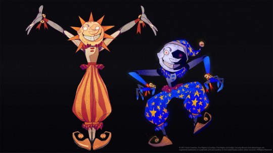
covering this first because the general color scheme and the placement of those colors is nearly identical to their in game model (albeit with brighter, more saturated colors). the overall design is also highly similar, but with a few notable discrepancies:
one major detail that's different in all their drawn iterations is that their torso is one solid piece instead of two separate parts like it is with their 3d models.
moon's arm gradient is still present on their concept art, however sun now has a lighter colored gradient on the end of their arm to match moon's coloration! (this could always be shading but it feels too specific for this to be the case). (also, moon's arms, fingertips, and stars seem to almost glow? which is potentially what their unused emission textures are based off of.)
sun's palms are colored grey! also, the middle sections of moon's fingers are colored dark grey on the concept art (pretty much everything with their primary color is colored like this ((except their face)), but it's probably just due to shading this time since it's not present anywhere else but here.
they seem to have a little circular panel near where their arm bends that isn't present on their 3d model. same with a rectangular panel on their leg.
their clothes, ribbons, and shoes are mostly the same except for a couple small things: moon's pants have faint lines on them to match sun's, their shoes have no symbols on them, and the bit of ribbon on the ends of their pants is colored yellow instead of red. (also moon's shoes are colored darker.)
their face has a lot of notable differences too, but one of the biggest ones is that they have no left cheek! their grin stretches a lot farther up on that side of their face because of this (they have no lips on that side of their face either!). the circular indent on their cheek is colored in on sun's face, their eyes aren't being squished by their cheeks anymore, and they also have a lot more teeth (which don't stretch into the corners of their mouth, and are colored differently than the rest of their face.) lastly, they share the same color for their eyebrow and eyelash!
official art work

something important to note is that all of the dca's (current) official art will have this color scheme and all of the same details due to them either being drawn by the same artist, or because all other current official artwork of them is based off of this design and/or the concept art. (any and all additional artwork i mention can actually be found on their wiki page, but i'll link to it here if i feel it's important.)
one of the most notable details of their official art is that their accent color has been changed to a light grey color for both of them (albeit slightly warmer or colder to match their respective color schemes). though, interestingly enough, moon's palms (similarly to sun's 3d model) are colored with their primary color instead, despite both designs having this detail in the concept art.
additionally, something that was changed from the sketch for this drawing, is that (like their concept art) their shoes lack the little symbols on them, and the ribbon tied on the end of their pants was colored yellow instead of red. something that wasn't changed though is their lack of a left cheek.
moon's button aren't visible here, but other artworks (such as their claw machine artwork) show them as a blue color to match with sun's red.
sun's arm still has the little circular panel near their elbow that can be found on their concept art.
their face has a lot of similar details to their concept art, while still being stretchy and cartoony. they have a lot more craters spread around their face, and sun has consistently been shown to have a chipped tooth... it's cute.
before i move on, i'd like to talk a little bit about their various eye colors! there are several instances of sun with golden colored eyes (e.g. this drawing here, their in game plush, their claw machine art, their piñata from ruin, their actual design from ruin, and an exclusive design from steelwool's store.), while there are only two instances of sun with blue eyes (the sunnydrop candy poster and their icon on the daycare pass).
moon's eye color (when their eyes aren't just... closed) tends to just be red, but there are still a few instances of them with a blue right eye (their plush and piñata, with their claw machine art's eyes being entirely blue).
there's actually even a few specific instances of their eyes being black (their 3d model, the golden moon plush, and the golden sun plush... however that one is more brown than black.)
there's also that one book cover of moon with the pink spiral eyes but that was more of a one off thing.
ruin
this is where my bitching session starts
very noticeably, their eyes move around in this game. did they finally get the glitter glue out of their eyes after the earthquake or something? does no one care about their dead fish eye swag...
speaking of eyes it's actually kind of lame they have yellow eyes instead of blue. the blue eyes actually have some additional meaning to them when you consider moon, but the yellow eyes are just... well, they're already super yellow. what makes them so special. make moon's eyes yellow for a change.
ok actually relevant: they use a mix of both sun and moon's primary colors, while using exclusively moon's secondary colors... both of their accent colors are used too with sun's on their right and moon's on their left.
suddenly their unused emission textures decide to join the party... this was a weird decision for them to make when those textures weren't even visible before. but ok.
all things considered they're actually not even that damaged. the most major damage is to their outer casing and their leg... like, compared to the others this is pretty good? even compared to the original shattered animatronics this is good??
wait is their hat just sitting on the very top of their head? is that because of the rays? are they holding it up? why was this a thing that was changed.
hw2
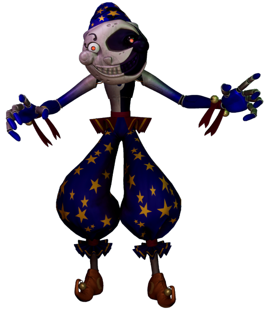
ok well the hat is even farther back now. what the hell. why
iirc their eyes don't noticeably move around as much as they do in ruin, but they do still move around sometimes (iirc they spin around after sun's cartwheel?) which i guess is fine. whatever. im the only bitch who would care about this anyway
they nerfed moon's ultra bright high beam eyes in this one... sad!
this is such a non problem but sometimes (especially in sb) when you shine a light on moon their pants have this little purple shaded section on the inner thigh parts and it looks. weird. in this picture it's not visible due to the shaders but it's very noticable in the daycare section of sb when you get a good look at them with the flashlight.
actually you ever realize how their design literally makes no sense whatsoever. how does their casing change color, and why is their coloring so inconsistent between the two without visibly affecting the other? how do their CLOTHES change color like that?? where the hell does the hat come from??? why do specifically and only the neck ruffles change color???? where do their pupils come from????? i will stop talking about this now
jack o' moon

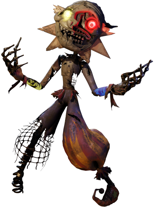
they do have moon's color patterns, they're just shifted around a little. they even sort of have the lack of a texture on the sun rays that moon's model has! but this time it's actually intentional.
their face has the world's shittiest paint job which i think is really funny. i guess it does sort of look like a pumpkin yeah.
idk how the hell their glowing mouth overlay works but it's certainly a thing they have. the glowing eyes are also pretty cool looking admittedly. and the insides of their eyebrow, eyelash, and craters glow a little bit too.. that's cute.
the ruffles on their neck and waist, and the ribbons around the bottom of their pants are green, while the ribbons around their wrists are purple (but a small part of the ribbon on their right wrist is still red)? their shoes are similarly purple.
potato sack pants �� it's a really good part of the whole look actually
basically their design is like if bbw eclipse was stupid. but like in a funny and endearing way WAIT ACTUALLY SPEAKING OF THAT
balloon world eclipse

bitching session is officially OVER
first off: sun's faces! so the first face very obviously takes inspiration from their in game artwork while still having the general face shape for their regular look. the scattered look of the craters on their face and the color of their eyebrow reflect this as well. sun doesn't have their trademark chipped tooth but overall it's a very nice look and it serves it's purpose very well.
since sun's 2nd face and moon's are the same i'll go over them both here... this look is very much based off of their concept art look! but it's more noticable in the shape of their eyes and the way their teeth are drawn this time, because they actually do have a left cheek... but the corner of their mouth still stretches up the same way it does when they don't have one! also, the base color for moon's eye is a little purple here which is always fun.
now ECLIPSE... brightly lit yellow eyes with red flickering pupils... the light being pushed out between the cracks of their teeth... a menacing color scheme too dark for sun but too bright for moon... the faint color of the illuminated crescent moon hidden inside the darkness of their face... their complete and utter lack of a left cheek because it never got added onto this sprite... this is PEAK eclipse design
also, this isn't about their design but i edited these sprites for something a while back and noticed that some of the pixels were just ever so slightly off color? which leads me to believe this was done in a regular art program not made for pixel art, and that whoever made these isn't super experienced with it.. however that honestly just adds to the charm for me. i really love these sprites.
harvest moon
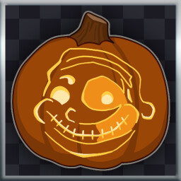
oh mmy god look at it
#my post#daycare attendant#dca fandom#sundrop#sunnydrop#moondrop#this is the cumulative effort of an entire year of hyperfixation on absolutely useless shit#do lmk if i missed something!! i had to rewrite half of this post cause tumblr didn't save my draft -_-
459 notes
·
View notes
Text

Color symbolism in Dead Boy Detectives:
BLUE
In the context of Dead Boy Detectives, blue is emotional detachment.
It's also Edwin's color. Edwin wears blue throughout Dead Boy Detectives; it's part of his most common outfit, though in quite a few scenes his color scheme changes to reflect the narrative beat of the scene and his emotional state during it. (See brown, green, green (alt), and white.) I've talked at length here about the way Edwin distances himself from his emotions, likely learned as a defense mechanism during his time in hell.
Niko wears blue in the episode after Jenny's date goes horribly awry and she declares love to be a farce. She systematically rids her room of anything pink, symbolically purging herself of the emotions that led to the disaster in the previous episode, and attempts to address all of her problems with pure logic.
Monty wears blue in the episode when he puts his emotions for Edwin aside and plays along with Esther's scheme. Notably, the shirt that Monty hides with his blue jacket is a multi-colored striped shirt. It's a nod to all of the emotions he mentioned not having wanted, and he hides them all under the blue he layers on top.
The jocks in the Two Dead Dragons are in blue, not because they've chosen to distance themselves emotionally, but because they don't understand or care about how their actions affect the way other people feel.
Finally, Crystal's mental space is blue, because her neglectful parents have taught her not to trust people with her deeper emotions. Further inside her heart space, there are other colors (see pink and purple) but she's literally forgotten that they're there. This aspect of her personality, and the issues that stem from it, is what David the demon preys on, which is why he always appears in the blue space.
red | blue | pink | green | green (alt) | purple | orange | brown | black |white
#dead boy detectives#dbda#edwin payne#niko sasaki#crystal palace#meta commentary#save dead boy detectives#netflix
150 notes
·
View notes
Text
I recently finished reading all the Lockwood & Co books, and my god they were good, but it got me thinking. If the show continued, like it deserved too, would Holly and Kipps have gotten a signature color the same way the trio did? If so what would they be? Well I was looking at twitter and I saw that most people agree that Holly's color would be yellow, and Kipps' would be white, and I'll be honest I disagree so badly I'm about to write an essay. It's funny because I distinctly remember finishing the books and thinking, "ah watch everyone put their colors as yellow and white cause it's easy". LOUD INCORRECT BUZZER. Y'all just don't get color theory OR the characters the way I do so listen up.
Holly is many things. She's positive, and compassionate, and kind, but she is so much more than that. She's not just a "yellow", yes maybe she is the sunshine of the group, but honestly? Not really, and that's ok. She's fierce and sometimes she has a short temper, she pretends to let everything slide off her shoulder, when really she's just keeping it inside. That's why her and Lucy are constantly budding heads in the beginning of their friendship, they are so similar. I think her color should be red. She's constantly described as wearing it, and I think it really fits her. Red represents passion, energy, confidence, and excitement to name a few. Holly is always described as having a presence, and her energy and enthusiasm comes off her in waves. Red is usually described as the color of love, and I still think that fits. She has such love for the entire crew, and it's so clear she would go to the ends of the earth for them. I also think this would blend in with the others very well. Despite it not actually being blue's real opposite, blue and red are often seen as polar opposites, which really fits for Lucy and Holly's dynamic. It also works because red and orange are both warm colors and George and Holly have always gotten along. They are similar in their methodical and sometimes odd ways of life. I also think it's fun cause Skully's color is green, and green are red are direct color wheel opposites. I'm pretty sure he hates her the most, but Kipps is also competing hard for that title. And lastly black is kinda the color in between, now more on that in a second.
I see what twitter was going for, Lucy and George are blue and orange, direct color wheel opposites, because they are quite literally direct opposites. So it makes sense for Kipps to be white since he's the direct opposite of Lockwood? LOUD INCORRECT BUZZER AGAIN. Tell me y'all didn't understand their dynamic without telling me. Lockwood and Kipps didn't get along cause they were so different, they butted heads so hard because of how similar they are. It's exactly what happened with Lucy and Holly. Plus white represents a lot of things that are definitely not Kipps. My proposed color for him is purple, I know that's a little odd, but walk with me. Although it's never explicitly stated, one can assume that Kipps was an absolute prodigy when he had his talents. I only bring this up, because purple often represents royalty and luxury, and he practically became a fallen king when he lost the only thing he was ever good at it. But purple is much more than that, it also represents bravery, uniqueness. ambition, and justice. I think Kipps' original color is grey, and not just because of the uniform. Grey represents seriousness, sadness, and boredom. That's how Kipps was before, but when he remeets the crew during book 3 and 4, we begin to see the shift. The group helps him gain his ambition back, and with all of their love and support we even begin to see how brave he really is. He has a unique way of going through life, and even when all the odds are stacked against them, he still seeks justice. Purple fits with the general color scheme as well. It's very close to black, which represents how similar him and Lockwood are, and it's also a cooler color like blue. Kipps and Lucy certainly got along the easiest out of the crew.
Overall it just makes sense. George and Holly are the warmer colors, Lucy and Kipps the cooler, and Lockwood as the mediator between them. I feel like red might be a little hard to incorporate without being overpowering, and I know that purple isn't a super masculine color, but hell if those costume designer made full orange outfits look good they can literally do anything. Anyways I know this isn't that important, but ugh I love color theory so much, and I love how much thought the costume designers put in the first time. I feel like having Holly and Kipps color being yellow and white is just a cheap easy shot, and doesn't take into account the characters and their growth enough. I rest my case.
#lockwood and co#lockwood netflix#anthony lockwood#lucy carlyle#george karim#holly munro#quill kipps#SAVE ME COLOR THEORY SAVE ME#God I want another season of this show more than anything#THIS COSTUME DEPARTMENT DESERVED TO BE ABLE TO EAT LIKE THIS AGAIN SMH#it keeps me up that we'll never see holly and kipps' development
242 notes
·
View notes
Note
hiya :D could you maybe make a MCYT + Cellbit preference list with a SO who like to make jewlery like bracelets and stuff? specifically like knadi bracelts and such. like making bracelets with the streamer's name on it or like things that match their brand/theme!!
oooo yeah sure!!! ; also I'm a kandi kid (kinda I can only rlly do singles... embarassing) but I know what I'm talking about for once lmaooo ; thanks for requesting, hope u enjoy!
MCYT ; kandi kid
includes ; tommyinnit, ranboo, badlinu, maxggs, quackity & cellbit
warnings ; language
masterlist

TOMMYINNIT
absolutely adores everything you make for him
there's one with "tommyinnit" and two red and white smiley faces on the side, white beads on the left of his name and red on the right, and another smiley face in the back where you tied it off
there's another that's just 1-1 red and white with a little customized bead on it (a plain letter that he drew a red star on both sides)
and there's like circular rubbery beads that are red and white tie dye
he wears them literally everyday and always brags about you when someone points them out / asks him about them
"oh yeah, my partner made them for me 😊"
he lovesss watching you make like anything other than singles cause he has no idea how you do it
he's got a whole collection of lizards you made for him atp
RANBOO
cherishes everything you make them
there's one that's half blue half purple, separated by a yellow star on both sides where the colors seperate
there's a similar one that just says "ranboo" with some fun star beads and stuff
helps you make cuffs / watches you show them but is still struggling a bit on learning how to do the pattern n stuff
"can you make me this?" and it's a bunch of 3d stars that would take maybe 7 mins to make like yeah ofc bro
he's got so many singles from you that he rotates them around and matches them with his outfits
you made him some little rotating ones too
THEYRE OBSESSED.
FREDDIE BADLINU
mostly only wears 3 on each at most
there's one that's orange, red, purple and pink in a pattern (to match the colors he's dyed his hair)
there's another that says "internet superstar badlinu" on 3 layers, the main is plain black with some decorative beads n stuff
there's also a bi flag one
and some miscellaneous 2d keychains and a couple little 3d desk decorations
he loves showing off the stuff you make when it's just randomly left nearby or you give it to him or whatever
you've given him a lot of singles over time so some get worn more than others, you don't really care
everytime there's a new one he'll be fixated on it for like a week and not wanna take it off
ALEX QUACKITY
you'll walk in when he's doing shit w a handful of bracelets
"omg thank you!!!"
he puts them all on, arms covered in plastic
there's some music themed ones, others matching his brand, others being just color schemes that would match outfits
he actually adores everything you make for him, even the funny ones
"omg this one is weed!!" he shows off a green one w "leaf" beads on it
he wears them outside too, like his wrists are pale glowing white while the rest of him tans 😭
you made him a rotating cuff of a duck in water and he's so obsessed with it but scared to wear it cause he's worried he'd break it
there's also one that says "ur gay" and it's obnoxiously rainbow lol
it's on his key lanyard trust
CELLBIT
literally so grateful and thankful for everything you make for him
and so fascinated cause you make everything look so cool
from singles to 3d pieces, he's literally just 🤩🤩🤩 lol
always showing off the new stuff you'd made him online
always asking "can you make me this?" and sending you pinterest and tiktok inspo
there's a single that says "cellbit" in block letters and its a grey-green color, the beads are both barrels and some square ones you found cause... cellbit? pixels? no? anyone?
also likes helping you organize the beads and set them into small bowls while you work
it's like your bonding time lol
#lowkeyrobin#mcyt x reader#mcyt preferences#mcyt oneshot#gn reader#gender neutral reader#they/them reader#tommyinnit x reader#ranboo x reader#quackity x reader#freddie badlinu x reader#badlinu x reader#maxggs x reader#cellbit x reader#qsmp x reader#kandi kid!reader
90 notes
·
View notes
Note
Crawling back into your mailbox (looks good. have you redecorated?) cause

Are you just gonna leave us like this? Grasping at the girlies?
also if there's nothing you wanna share that's cool just count this as a Hi. I know older drafts are the urgh

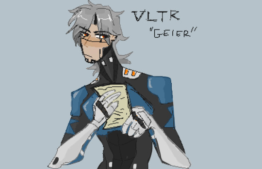

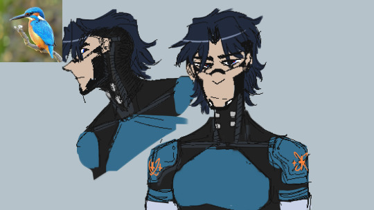
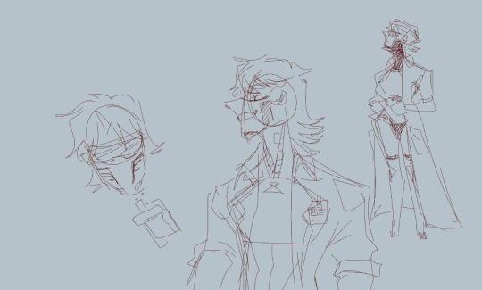
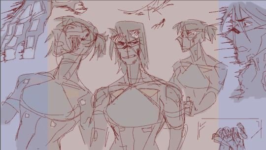


I did redecorate my mailbox thank you for noticing , I specificly dragged in a comfy chair just for you fhfhf Hope you like it!!
The fact u actually notice the weird ramblings i have in tags is making my day Jay ur so cool fhfhf but uh here I suppose this is what you came for? I dont have lot to say about old drafts of Blau and Geier but it is sorta interesting how they evolved. Sorta from one replika to 2 .
The first ever sketch was the orange one , very back then I think i wanted to make a demolitionist expert replika . I immidietly saw someone else have that idea for a replika , that day i drew that so in a panic I dropped the whole concept fhfhhf
i had this problen a lot tbh making both Blau and Geier. The fear of accidently having a same idea as someone else terrifies me and honestly there are firey Geiers out there im pretty sure that other people made. But at this point i like mine and I truly feel like i came up with these 2 by myself now.
All these sketches were made roughly a year ago? Could be bit more actually its hard to say. But yeah Blau was first , originaly even called Geier. Then quickly changed to Eisvogel cause i liked their color scheme and they fit the scientist theme bit more , up until I reallyyy stuck with the Blue Jays for their simplicity and white/blue theme. Blau went through a lot of design changes but the story has mostly stayed consistent.
Geier was bit easier to make , felt riskier for some reason but design wise purely? I really am happy with how Geiers turned out now. Black armor , red/orange themeing for the fire , vented mask in the faceplate and backtanks for gas were all things that kinda just. Made sense to make from start. Visor changed up a bit and the hairstyle , since god trying to make even a bit of an authentic signalis style hairstyle is hard for me.
God looking at these old drawings gives me the ick kinda but also a sense of nostalgia. Year isnt long time yet a lot has happened since then. I like my blorbos so much more then and feel like i can do even more with them. I love signalises and other media too but OCs? Always will have a soft spot for them , specially other peoples ones. Love to see what people create on their own.
#also sorry for the very very shit quality of these i think they were just screenshots so blehhh#but yeah there ya go fjfhfh very first itterations of them#blau has genuienly over 200 drawings now mostly with sybil since thats all i drew for over a year now#but theyre mostly doodles and in a way those 200 files are the actual evolution of Blau and Sybils story that i made with a friend#love goobrs. goobers give life#thank u again for asking it always makes my day to see anyone interact in anyway specialy u jay.#i have been dead lately and i truly apologize for that its just. been weirdly hard to draw. and do stuff. ill get back to it but ye still#thenk u for stincking here#signalis#my art#signalis fanart#oc#signalis oc#blau#blauhaher#geier#geier signalis#old art
29 notes
·
View notes
Text
Was having a hard time finding a good dye to fit a different Tav of mine and now I'm curious what is everybody's color palette.
#bg3#baldur's gate 3#baldurs gate 3#baldur’s gate 3#bg3 headcanons#gale dekarios#gale of waterdeep#bg3 gale#gale bg3#astarion ancunin#bg3 astarion#astarion bg3#wyll baldurs gate#bg3 wyll#wyll ravengard#bg3 karlach#karlach#bg3 shadowheart#shadowheart#laezel#lae'zel#bg3 lae'zel#bg3 halsin#tav time#questions#asks#ask
244 notes
·
View notes
Note
If you wouldn’t mind sharing your secrets, can you drop a quick tutorial for the hades art style? You seem to capture it very well!
Hey anon! Thanks so much, I’m flattered you think so!
To be honest there's really no secret, just a lot of trial and error. I am an amateur, but I’ll point out a few of my observations of the amazing Hades team’s work that I attempted to incorporate into this Astarion drawing, especially SuperGiant Games art director Jen Zee. Everything below is just my layman’s observation of her much, MUCH better work. You should check her out yourself!
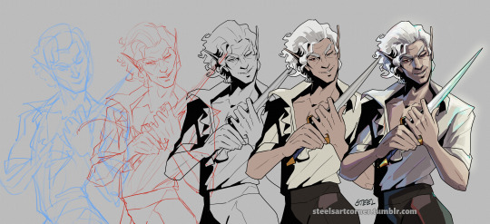
First off, here’s a simple split out of the whole process (this will be long, more below the cut:)
POSE & PERSONALITY
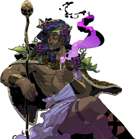
Hades art is full of personality so the first challenge was to pick a pose that illustrates just one or two aspects of the character. For example, Dionysus from Hades 1 below has a languid, draping pose that reflects his chill-guy party vibes. Just looking at him you get an immediate idea of his personality.
And as much as I love the later wet-cat version of Astarion as he matures as a person, for the purposes of illustration in this style I chose a pose and expression that leaned into his early, less complex, more wily self. The dagger, wink, jaunty hips and head tilt are meant to communicate, without additional context, that he’s both trying to be appealing and is not trustworthy.
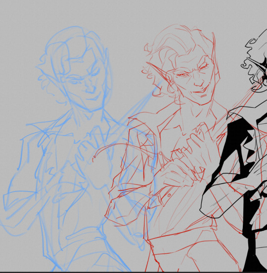
LINEWORK & SHADING
Next is the linework and blocking! The Hades art team tends to use a combination of near-mono-thickness black lines, where exterior lines are thicker and interior lines are thinner or have no lines at all. They will often forgo an interior line to communicate form via color blocking instead. The style also makes heavy use of absolute black for the deepest shades, especially on more sinister characters or spooky aspects of a characters design. (See: Zagreus’ three dog head skulls and his red eye perpetually cast in deep shadow.)
It took some back and forth to find the right balance of black shading for Astarion. Too much and he looked too sinister and not approachable enough. Too little and he looked too innocent.
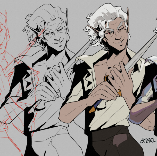
Picking a strong light source helped with determining the direction and placement of the shadows so that just enough was obscured/revealed. It also helps in differentiating forms from each other so that, for example, the arm doesn’t disappear into the chest and become unreadable.
Using heavy black shading was a particularly useful trick in Astarion’s case, because his camp clothes color palette is fairly monochromatic between his light hair, pale skin, and white/cream shirt. That much light color can easily blend in too much and become boring: the flats I used were slight variations of white, from a warm reddish-peach to a yellowy cream to a cool light gray for the dagger.
COLOR & LIGHTING
Last is color! In Hades 1 and even more so in Hades 2, the lighting schemes are deceptively complex. There are often multiple light sources and use of bounce lighting to add a lot of visual interest. For example, check out this lighting on Polyphemus from Hades 2:
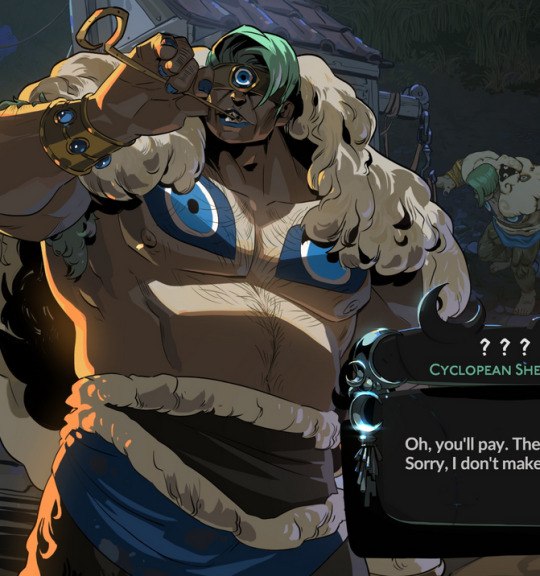
Not only does he have a cool moonlight hitting him from above, he also has a warm orange rimlight lighting him from the left, AND cool lavender bounce light bouncing off the ground and hitting him from below. All these combine and layer on top of one another to help emphasize the forms of the cyclop’s musculature and the textures of his sheep wool coat.
I don’t think I was as successful in my own lighting scheme, because I’m an amateur, but I determined that the scene in which I was placing Astarion has a high sun and was outdoors. This means that the light hitting him from above would be a light, warm yellow and the bounce light hitting him from the left would reflect the nearby water and blue sky of the environment.
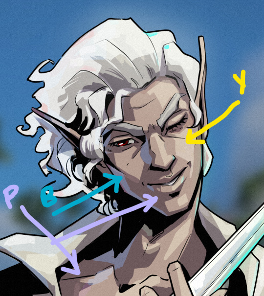

To achieve this, I made use of different layer modes in my art program (Clip Studio Paint) to apply purple shadows (via the Multiply layer mode) and highlights (via the Soft Light layer mode) in a light sky blue and a light yellow for the primary and secondary light sources.
I ran into trouble with the blade, because it was also a light metal in an already light-color-heavy color scheme. At first, it was blending in too much and hard to read. So I decided to give it a bit of a magic teal glow to help it stand out, which meant adding a few specks of magic light reflecting back onto the face and clothes as well.
INTEREST & DETAILS
Speaking of, Hades style art makes extensive use of adding little speckles of high-saturation color to add visual interest and cohesion. See this Zagreus portrait which is primarily made of grays, a tan bone-color, and reds:
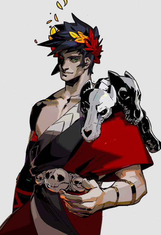
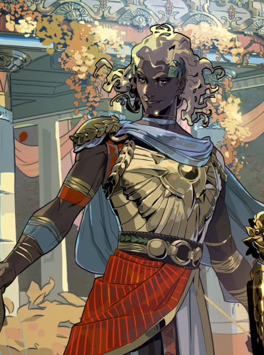
But sprinkled in are neon teal and magenta that don’t relate to the lighting at all. It’s just there to break up the blocks of color, bring unique colors like his green eye into the rest of the portrait, and direct the viewer’s eye. These highlights are slightly less bright in Hades 2, but still there, such as in this depiction of Apollo, who mostly glows with a warm sunlight but also has random pops of sky blue and green flecking his armor and hair.
The pops of color are often placed more centrally on the figure to keep your eye on the important parts of the portrait, like near Apollo’s face and on his armor. The color pops aren’t as frequent at the extremities; too much on the arm and your eye would be drawn away from his face.
I took a similar approach where I grabbed some of the brighter colors (like Astarion’s red eye, and the teal glow of the dagger), to add dabs of color that normally would not “make sense” from a lighting perspective, but add a little visual interest:
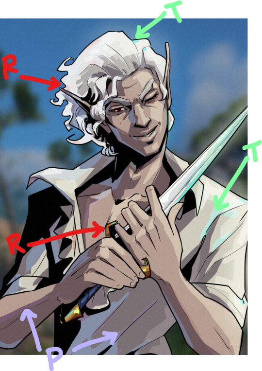
Also I totally studied their approach to Apollo’s curly hair to create the impression of Astarion’s curls!
Anyway, I think that's all I got for now, I hope this helps! There's more but this is already REALLY long so I'll stop here. In the end, it's really just a process of observation and replication of things you love in artwork you admire. Give it a try, it's a lot of fun :)
136 notes
·
View notes