#product template
Explore tagged Tumblr posts
Text
Skin Care Trifold Brochure

In the skincare industry, presentation is key, and a trifold brochure is one of the most effective ways to showcase products and services. A trifold brochure, characterized by its three-panel fold, provides ample space to deliver engaging content in a compact and organized manner. For skincare brands, these brochures serve as a versatile marketing tool to convey brand messaging, highlight products, and build awareness. In this guide, we’ll dive deep into why trifold brochures are perfect for skincare marketing, how to design them effectively, and what content to include for maximum impact.
Why Trifold Brochures are Ideal for Skin Care Branding
Brochures are a staple in marketing because they’re tangible, informative, and cost-effective. But why are trifold brochures particularly beneficial for skincare brands?
Compact Yet Informative: A trifold design offers six panels — front, inside front, inside middle, inside back, outside back, and outside cover. This layout allows ample space to present a brand’s story, product line, and benefits in an organized manner.
Visual Appeal: The skincare industry thrives on visual elements. A trifold brochure allows for creative layouts that can showcase high-quality images, ingredients, and before-and-after transformations, making the content both attractive and engaging.
Versatility: Trifold brochures can be used in various settings, from retail counters and product packaging inserts to trade shows and customer events. They’re easy to distribute, making them a great tool for both direct sales and brand awareness.
Using trifold brochures helps skincare brands reach their audience effectively, providing clear information and vivid imagery that makes the content memorable.
Key Elements of an Effective Skin Care Trifold Brochure
Creating a successful skincare trifold brochure requires attention to several design and content elements:
Eye-Catching Cover Design: The front panel is the first thing customers will see, so it must be attention-grabbing. Use bold, attractive visuals, the brand’s logo, and a catchy headline to entice readers to open the brochure.
Engaging Product Images and Color Schemes: Use high-quality images that reflect the skincare products’ texture, packaging, and application results. Stick to a color scheme that matches the brand’s identity, using soft tones to create a soothing visual effect that aligns with skincare themes.
Concise yet Informative Text: The content should be easy to read and understand. Use short paragraphs, bullet points, and headings to organize information effectively. Highlight the unique benefits, ingredients, and how-to-use instructions of the products without overwhelming readers with too much text.
Effective Call-to-Action (CTA): Every trifold brochure should have a clear CTA that encourages the reader to take the next step — whether it’s trying a product sample, visiting a website, booking a consultation, or redeeming a special offer.
Contact Information and Social Media Links: The back panel should include the brand’s contact information, website, and social media handles. This makes it easy for potential customers to connect with the brand and explore products further.
Step-by-Step Guide to Designing a Skin Care Trifold Brochure
Here’s how you can craft a trifold brochure that effectively represents your skincare brand:
Define Your Target Audience and Messaging: Know your target market — whether it’s teens dealing with acne, adults looking for anti-aging solutions, or anyone focused on natural skincare. Tailor your messaging to address their needs and concerns directly.
Decide on the Brochure’s Layout and Sections: Plan your layout with a flow that makes sense, guiding readers from an introduction to the brand, then detailing product benefits, and finally leading them to a strong CTA.
Choose the Right Images and Visuals: Use professional images of skincare products, ingredients, and application processes. Authentic before-and-after images or customer testimonials can make the brochure more convincing.
Write Compelling Copy: Use engaging headlines and product descriptions that highlight benefits. For instance, emphasize features like “organic ingredients,” “dermatologist-tested formulas,” or “visible results in two weeks” to draw in the reader.
Ensure Design Consistency: Stick to a consistent color palette, typography, and brand tone. Use colors that evoke freshness, calmness, and beauty — like pastel greens, soft blues, or light pinks — to create a brochure that feels aligned with skincare aesthetics.
Content Ideas for a Skin Care Trifold Brochure
The content of a skincare trifold brochure should be strategic, informative, and relevant to the brand’s offerings. Here are some creative content ideas:
Product Spotlight: Feature hero products with detailed information about their ingredients, benefits, and usage instructions.
Skin Care Tips and How-Tos: Include a section on skincare tips that educates readers on routines, application techniques, or ingredient benefits.
Customer Testimonials: Showcase customer feedback or real-life before-and-after images to add credibility and trust.
Special Offers or Promotions: Use one panel to highlight seasonal promotions, discounts, or bundle offers to encourage immediate action.
Best Practices for Printing and Distributing Skin Care Brochures
Once your skincare trifold brochure is designed, focus on printing and distribution:
High-Quality Printing: Choose a reliable printing service that uses high-quality paper and printing technology to ensure your brochure looks professional and appealing.
Ideal Paper Choices: Opt for glossy or matte finishes depending on the brand’s aesthetic. Glossy finishes make colors pop, while matte finishes offer a softer, premium feel that suits a luxurious skincare brand.
Effective Distribution Strategies:
In-store: Display brochures at counters or include them in product bags.
Events and Trade Shows: Distribute brochures at beauty expos, skincare seminars, or pop-up events.
Mailing: Send brochures to your customer base along with product samples or as part of subscription packages.
Conclusion
A well-designed skin care trifold brochure serves as an invaluable marketing tool that combines visual appeal and concise messaging to effectively communicate a brand’s products and values. Whether you’re launching a new product line or boosting brand awareness, a brochure can capture your audience’s attention and motivate them to take action. By following the design tips, content strategies, and distribution ideas provided in this guide, skincare brands can maximize the impact of their trifold brochures and reach a broader audience.
#skincare#skincare tips#skin&bones#product template#beauty products#product design#print template#magazine design#trifold brochure design#layout#trifoldbrochure#trifold brochure#trifoldbrochuretemplate#trifold
1 note
·
View note
Text
It will forever be hilarious to me that Disney wanted so fucking bad to make a Wicked movie — but couldn't get the rights from Universal — that they literally spent billions upon billions of dollars making SEVEN different films (and a whole season of television; not even including their sequels and spinoffs) more than one of which they even got Idina and Kristen to be in based on the stripped-down premise of "what if the Stock Female Antagonist™ was secretly the Misunderstood Angsty Girlboss Heroine™ all along?" (because Disney execs don't actually care about Wicked, they just saw Green, said "hey! if we can't get the real thing, why not use Our Own (and/or Public Domain) characters?" and simply followed the Marketing Department Road all the way to the bank).
Less funny is the fact they were so successful at it — regardless of the merits (or lack thereof) of any of those projects — that it ended up getting the production of the actual Wicked movie delayed by more than a decade (because it would ironically have looked like a copycat and probably faded into the background if it had come out back when Disney was pumping out knockoffs every fucking year).
#seriously though#wicked lived in bob iger's head rent free#like its insane the lengths they went to just to ride its coat tails#they made so much content that nobody thinks of them as brazen attempts to emulate wicked anymore#frozen / into the woods / oz the great and powerful / maleficent / cruella / descendants / once upon a time / etc.#and this isnt even speculation#the production teams have been open about this from the beginning#disney couldn't acquire wicked so they just used its keywords as a template for mass producing “original” projects#some of which went on to become among the most successful films ever made#like they really said “okay what if we just got idina menzel and hired a Broadway composer to give her a Defying Gravity” AND IT WORKED#wicked#wicked movie#disney#gelphie#elphaba x glinda#elphaba thropp#glinda upland#glinda x elphaba#elphaba#glinda#wizard of oz#the wizard of oz
462 notes
·
View notes
Text
Miffy All-in-one Notion template (Ver. 1): Your gateway to peak productivity with an aesthetic Miffy life planner! 🐰🌷

Dive into the delightful universe of Miffy, where organization meets adorable charm in perfect harmony. This template isn't just a tool—it's a playful journey that turns your Notion workspace into a haven of cuteness and productivity.
Miffy-themed elements aren't just for show—they're designed to enhance your productivity with a touch of playfulness. From vision board to workspace, experience the perfect blend of functionality and cuteness, making your work and organization an absolute delight.
✿ What's Inside? ✿
🌷 Vision Board: Yearly Goals, Wishlist, Daily Affirmations, Habits Builder, Gratitude Journal, Countdown
🌷 Academics: Class Timetable, Course Notes, Deadline List, Quick Notes, Important Links, Journals & Essays, Assignments, Upcoming Exam List
🌷 Workspace: Work Progress, Work Files, To-do List, Quick Notes, Important Links, Clients, Meeting, Ideas
🌷 Journal: Monthly Journal, Yearly Journal, Affirmations, Photo Archive
🌷 Financial Planner: Monthly Bills, Monthly Expenses, Monthly Goals, Savings Tracker, Subscriptions, Wishlist, Accounts Balance
🌷 Book Library: Currently Reading, Reading Tracker, Monthly Reading Goals, Book Wishlist, Book Reviews, Notes & Quotes
🌷 Movies Log: Currently Watching, Watch List, Links, Movie Reviews, Movie Recommendations
🌷 Language Learning: Weekly Schedule, Study Notes, Study Goals, Study Materials, Quick Notes, Pomodoro Timer
🌷 Self Care: Morning Routine, Night Routine, Self-care Check, Skincare Routine, Period Tracker, Meditation & Affirmations
Additional Gifts
Free aesthetic Miffy PNG images, banners, and Notion covers that I used on this template (ZIP File)


✿ Get Miffy All-in-one Life Planner Notion Template (Ver. 1) only on Gumroad and Ko-fi! ✿
#notion#notion template#notion inspo#notion aesthetic#notion dashboard#notion setup#notion tutorial#notion.so#productivity#planner#digital planner#miffy#studyblr#studyspo#study blog#study aesthetic#study space#studying#bullet journal#journaling#digital journal#university#it girl#bookblr#girlblogging#pink core#girlblogger#light academia#aesthetic
203 notes
·
View notes
Text
2025 notion dashboard ready 😏😏 link below! i've been very busy but this is all i could pull off for a quick project

Link: https://ko-fi.com/s/a09c2284fa or https://kylemargareth.gumroad.com/l/trendy
and sooo, i revised this notion dashboard that i drafted awhile back. it's now uploaded in my ko-fi, and you can get it there!! just lmk if the price is too high :( im lowkey really broke but i promise ill try to upload free ones soon. i have another one currently under process but its much simpler so i think that'll just be for personal use? hehe happy new year everyone!!! may we all have a very good and kind year :)
#notion#notion template#notion templates#notion setup#project 2025#aesthetic#trendy#productivity#planner#digital planner#college#study motivation#study space#study#study inspiration#study aesthetic#uni#university#studyblr#new studyblr#light academia#academia#study blog#motivation#coquette#that girl
61 notes
·
View notes
Text
NOTION TUTORIAL୭ 🧷 ✧ ˚. ᵎᵎ 🎀
this is to serve as some little notion tips that i use to make my notion the way that it is. cute and efficient. this is very surface level and i'll get more in depth the more the post goes on. im working on dropping a notion template soon <3
first off pick a color scheme, for me, my color scheme is pastel pinks and whites and soft shades of green as an accent.
u can import photos from pinterest by copying the photo (not the link address, the actual photo) and pasting it into ur notion
take advantage of the columns, when u make a new space click "turn into" and use columns, it'll neatly divide the page
experiment with fonts, i use serif. u can also do large or small text, AND full width pages
making toggle lists saves space and keeps ur page looking super neat and organized
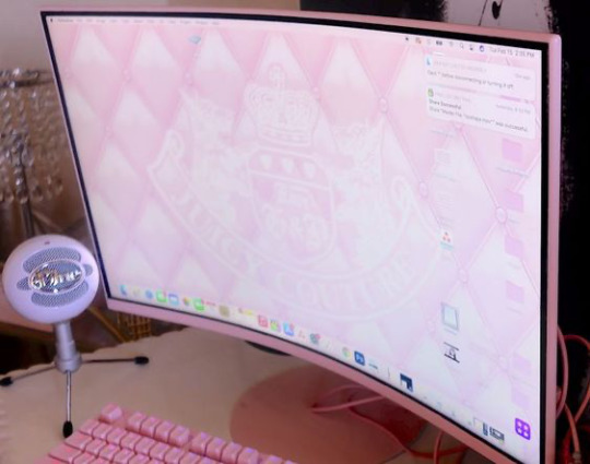
calendars and tables will keep u organized
to add a page ur gonna wanna go to the top left corner and click "new page"
u can import custom icons by going on pinterest and looking up app icons with the color scheme that u want, download that and add it for cute icons, u can also do the same with GIFS
for links and things of the sort embedding the video and adding the link are two different things, embedding the video means that u can access it on ur page (i do this for youtube videos/spotify etc) and when its a link i'll do this for documents and things of the sort
to add titles to ur columns click the "+" button, i use heading 3 bcuz that's the size i prefer but there are other sizes to choose from
a cool feature that notion has is that u can change the background color OR the text color, when u change the background color its more pastel-like if that's what ur going for
to make section dividers click (-) three times to create a divider
#it girl#becoming that girl#self care#notion#dream girl#it girl energy#that girl#notion template#organization#self improvement#self management#productivity#femininity
725 notes
·
View notes
Text

— special delivery: ARCHITECT
a google doc template planner made for those who want a simple, no-fuss experience with digital planning. this two-page template has all the essentials: a calendar with space for events and flexibility to customize with images and text, weekly overview with space for notes and habit tracking as well as daily tasks. save as pdf into your digital notebook, or edit directly in google docs.
what is special delivery?
special delivery is occasional bonus supporter-only content as my way of thanking those who generously support me and help me continue putting out free content! they are not posted on any set or regular schedule.
how does it work?
the most recent special delivery will be accessible via a locked supporter-only ko-fi post to anyone who has supported me on ko-fi recently. for one-time supporters (store purchase or one-time donation), this post will be locked again after 30 days, so please download the content before this happens! for monthly patrons, this post will be accessible for as long as their patronage. when a new special delivery is uploaded, old special delivery content will be put behind a monthly patron-only ko-fi post. only monthly patrons will continue to have access to old special delivery content for as long as their patronage, no matter when they start their patronage. discord server boosters can also gain access to all past special delivery content via a server booster-exclusive channel, for the duration of their support.
how to access?
become a supporter by purchasing something from my store, making a one-time donation or becoming a monthly patron! you will be prompted to create a ko-fi account to access supporter-only content. the source link will lead you to the folder containing all special delivery posts to access and download! alternatively, boost my discord server, and gain access to a server booster-only channel with the links to all past special delivery content. if you have any questions or clarifications, please reach out to me! thank you so much and I hope you enjoy them! ♡
#gdocs#gdoc template#gdocs template#google docs#google docs template#google doc template#m sd#m#other template#planner template#productivity template#bujo#digital bujo
52 notes
·
View notes
Text
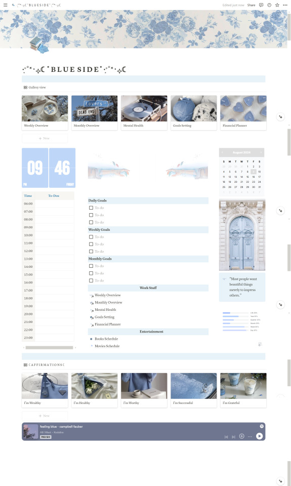
Pastel Blue Inspired Notion Life Planner ( FREE )
This is one of my favorite notion planners i ever made, i put a lot of work in it and i would love to see you guys give it a try ! It's free to use and has all the features mentioned in the description so make sure to check it out :)
#digital planner#notion#notion template#organization#planning#100 days of productivity#study motivation#free notion templates#academics#college#studying#habit tracker#student life#university#green#notion dashboard#organizer#school work#scheduled#school
118 notes
·
View notes
Note
Ok so I might have also made a few more since I initially sent that ask...


Also if you have any requests or anything lmk because it takes me like 2 minutes to type something and render it since I've already made the template lol

OMG I LOVE THESE!!! I say "SLAY QUEEN" or a regular basis, actually :3
#// LOL THE NAVY SEALS COPYPASTA. TY FOR THESE ROSE!!!#// I'll lyk if I can think of any requests with this template :3#rose-lost-her-braincell#Fanart For Cyn#Murder Drones#MD#Cyn#Cyn Murder Drones#Murder Drones Cyn#Uzi Doorman#Serial Designation N#Serial Designation V#Serial Designation J#Murder Drones Doll#Murder Drones Lizzy#Tessa James Elliot#Glitch Productions#Liam Vickers Animation#Liam Vickers#GET SNUCK UP ON!
80 notes
·
View notes
Text
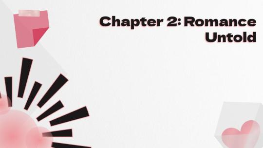
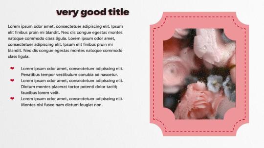
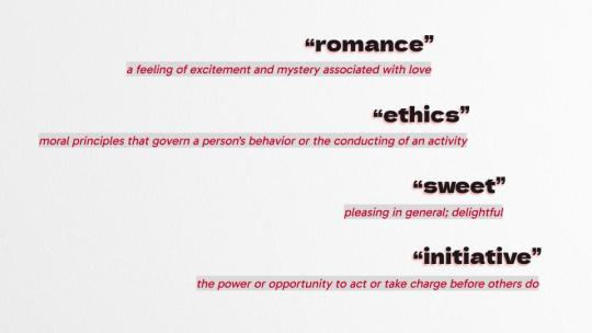
ENHYPEN Romance: Untold theme for google slides!
Add some romance and whimsy to your presentations with a Romance: Untold theme!
12 default layouts, plus one blank layout to customize!
a color pallet picked straight from the album art!
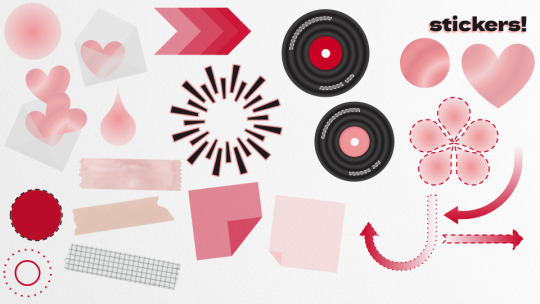
a slide full of stickers that can be pasted anywhere in your presentation to customize and emphasize!
the downloaded slideshow comes with an instruction slide on how to use the stickers, as well as some tips and tricks for google slides themes (including making photos fit into those cool shaped frames)!
DOWNLOAD THE THEME HERE!
#google slides#themes#google slides theme#google slides template#template#academics#academia#studying#studyblr#study motivation#study blog#productivity#university#enhypen#sunghoon#heeseung#heejin#jungwon#enhypen jake#enhypen jay#enhypen niki#enhypen sunoo#romance untold: daydream#romance untold#kpop#kpop moodboard#kpop layouts#kpop themes
35 notes
·
View notes
Text
really sad to see tiktok go especially all of the niche aspects such as resources that were never really taught in school. however i think i’m ok with saying goodbye the consumerism aspect of it all. the whole trend of literally any single meme turning into a way for companies to use as advertisement was brutal because if i saw one more brand using the tik tok voice to showcase their product or use a meme template i’d probably lose it
#our 😀 number 😀 one 😀 viral 😀 product 😀 you 😀 NEED 😀 this 😀 SHUTUPSHUTUPPP#like i haven’t really been on it ever since ads and shit like that was more prevalent#also what it did with the music industry Doechii actually touches on that in her genius Denial is A River breakdown#how there’s templates for artist to make songs that are classified as tiktok#genuinely made me want to rip my hair out#anyways#elderwisp speaks
31 notes
·
View notes
Text
Product Brochure Layout
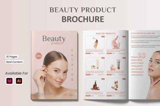
In the current competitive market, it is essential to stand out, and a well-designed product brochure is one of the best methods to do so. A strong marketing tool, a well-designed brochure may showcase your goods or services in a polished and eye-catching way. Because Graphypix recognizes the value of a well-presented product, our product brochure layout is made to assist companies in enhancing their branding and clearly communicating their worth.
Why Choose a Professional Product Brochure?
A product brochure serves as a visual reflection of your brand’s identity in addition to being a catalog of goods. It gives prospective clients important details about your goods or services while demonstrating the professionalism and attention to detail of your company. Here are some reasons why your company can profit from investing in a superior brochure layout:
First Impressions Matter: A professionally designed brochure can make a strong first impression. It showcases your products in a visually appealing manner, making it easier for potential clients to see the value you offer.
Effective Information Delivery: Brochures allow you to present information in a structured and engaging format. You can highlight features, benefits, and technical specifications, ensuring that customers have all the details they need to make an informed decision.
Brand Consistency: Using a consistent layout and design across your marketing materials strengthens your brand identity. A well-designed brochure layout helps maintain a cohesive look that aligns with your other branding elements, such as your website and social media presence.
Features of Our Product Brochure Layout
At Graphypix, we prioritize usability and adaptability when designing our product brochure layout. Here’s a closer look at what makes this layout perfect for your company’s requirements:
Modern and Clean Design: The layout features a clean, minimalist design that puts the focus on your products without overwhelming the reader with excessive graphics. The modern aesthetic ensures that your brochure remains visually appealing and relevant to today’s design trends.
Customizable Layouts: The layout offers flexibility in customization, allowing you to adjust colors, fonts, and images to match your brand’s style. This means that whether you are promoting luxury products or everyday essentials, you can tailor the brochure to suit your unique brand identity.
High-Resolution Graphics: The layout comes with high-resolution images and graphics, ensuring that your final product looks crisp and professional both in print and digital formats. High-quality visuals are crucial for leaving a lasting impression on your audience.
Organized Sections for Easy Navigation: The brochure layout includes well-defined sections for product descriptions, features, pricing, and more. This organized structure makes it easy for readers to navigate through the content and find the information they are looking for.
Ready for Print and Digital Use: Whether you need a physical copy of your brochure or a digital version for email campaigns and website downloads, our layout is optimized for both formats. This dual-purpose design ensures that your marketing efforts can reach a wider audience.
Conclusion:
Investing in a professional product brochure layout is a smart move in a time when visual appeal can make or break a marketing campaign. Our Graphypix layout provides a flexible, easy-to-use solution that lets you showcase your goods in the greatest potential way. You may produce a sleek and useful marketing tool that connects with your audience and increases sales by utilizing this layout.
#beauty#beautyproduct#beautyproductbrochure#brochure template#brochure layout#brochure design#template design#business brochure#graphypix#printtemplate#templatedesign#product catalog template#product template#product catalog#product design#beauty products
1 note
·
View note
Text

Quite surprised that i had something to choose from for a couple of months
#why bother looking for templates when you can make ur own#had to exclude half of MM fanarts to conceal my obvious brainrot#a lot of oc's this year - nice#didn't want to include commissions in here but may was NOT productive personal art -wise......#oc art#blue eyed samurai#midnight mass#father paul hill#bg3#cyberpunk edgerunners#iwtv#armand#2024 art summary
44 notes
·
View notes
Text
FREE! - Weekly Reset Notion Template 🌿

Introducing Weekly Reset — a one page Notion Template designed to help you take control of your weekly routine by combining goal setting, task management, and personal reflection.
Imagine ending each week with a sense of accomplishment and beginning each new one with clear intentions. The Weekly Reset Notion Template is your go-to guide to break down weekly goals, prioritize tasks, and reflect on your journey.
Start each week with a roadmap, prioritize what’s essential, and look back to celebrate wins and learn from every experience. It’s the perfect way to turn each week into a productive, intentional journey.
What's Inside?
Weekly Tasks — Start each week by defining all the tasks you want to tackle
Weekly Priority — Clarify your top priorities to stay focused on what’s most important
Weekly Agenda — Map out your week in advance, giving you a high-level view of your commitments, goals, and special reminders
Reminders — Keep you remind of the little essential things
Daily Schedule — Never lose sight of the big picture of your goals while keep progressing
Reflection Journal — Wrap up each week by diving into what went well, lessons learned, and areas for growth. This journal space lets you reflect on wins, challenges, and insights so that each week builds on the last
Dark and Light Mode available!
Get it now for free! ⬇️
#notion#notion template#notion inspo#notion aesthetic#notion dashboard#notion setup#notion tutorial#notion.so#productivity#planner#digital planner#studyblr#studyspo#study blog#study aesthetic#study space#studying#bullet journal#journaling#digital journal#university#it girl#bookblr#cinnamon girl#coquette#girlblogging#pink core#girlblogger#light academia#aesthetic
49 notes
·
View notes
Text
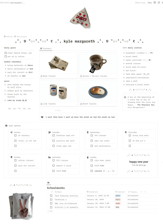
the last time i updated my notion was like, early 2023! and since i started uni, i haven't really been able to use it as everything IS A MESS. ive only got the time now to set it up again for a new year :) hopefully i get into notion again, let me know what u guys think (₌♥ᆽ♥₌)
if anyone wants the link, its up on sale in my kofi! purchasing would be really helpful <3 let me know if it's too pricey :)). template link: https://ko-fi.com/s/d8652c1922 or https://kylemargareth.gumroad.com/l/minimalistic
#aesthetic#bullet journal#motivation#notion#studyblr#notion templates#notion setup#notion template#100 days of productivity#productivity#study space#study inspiration#study#studying#uni#university#academia#light acamedia#coquette#dark academia#classic academia#light academia#academia aesthetic#study motivation#new studyblr#study aesthetic#study blog#studyspo#student life#academics
273 notes
·
View notes
Text
cottagecore fairycore notion planner template


hello everyone <3 i made the ultimate cottagecore notion dashboard / life planner! it's on my etsy:
#cottagecore#goblincore#fairycore#aesthetic#notion template aesthetic#notion#best notion templates#productivity#college life#notion template#notion setup#studyblr#school#academics#university#college#student#student life#career#students#green#green aesthetic
34 notes
·
View notes
Text
You've Got Nothing To Lose
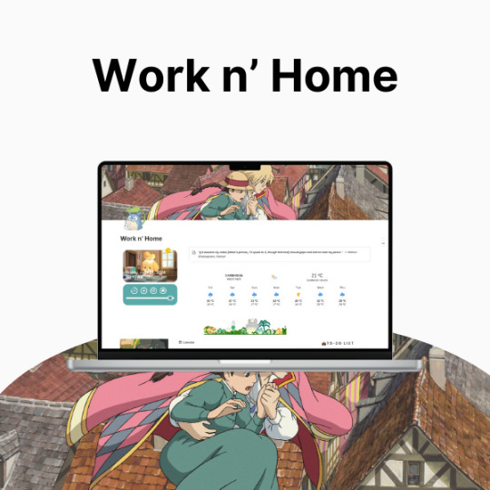
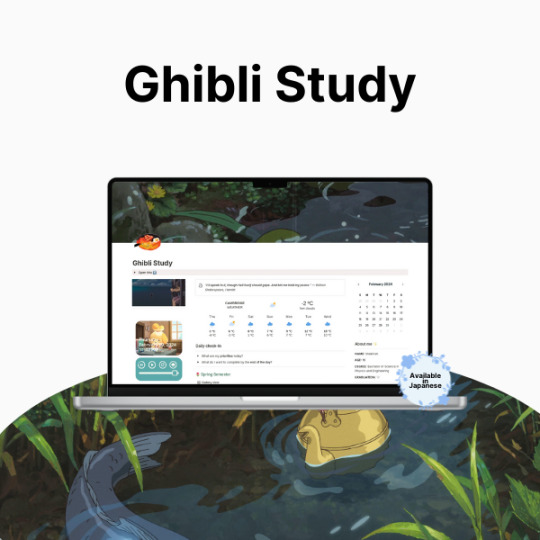
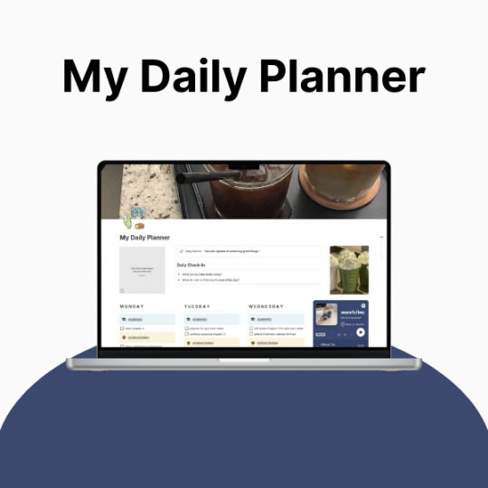
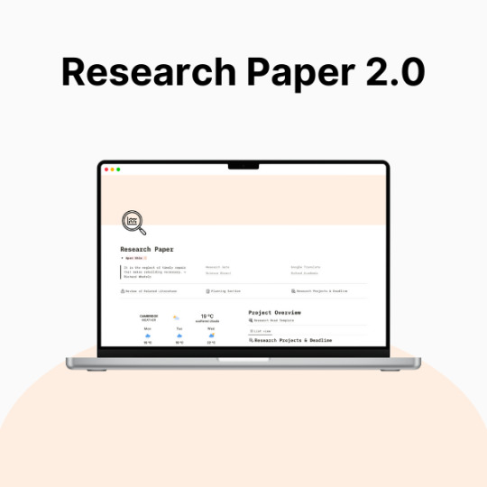
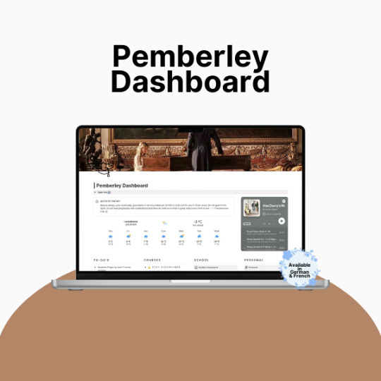
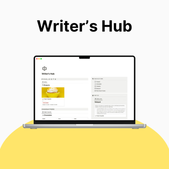
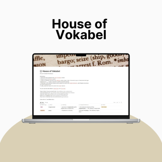
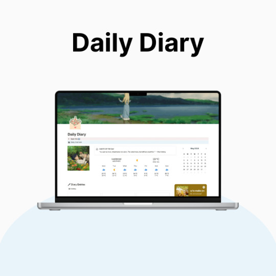
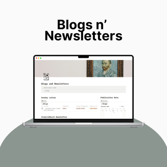
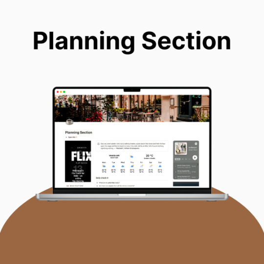
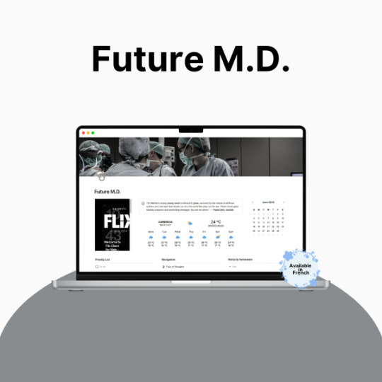
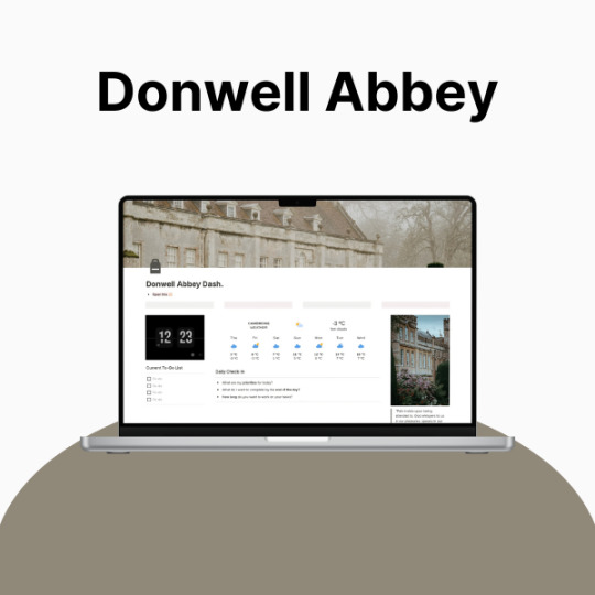
So, productivity. Yeah. Let’s talk about it.
If you’re anything like me, you’ve probably had that moment—you know, when your to-do list is longer than your lifespan, your tabs are multiplying like rabbits, and your brain is just ✨ refusing ✨ to cooperate. Being a full-time student and a creator means my life is basically a constant balancing act, and let me tell you… I was dropping so many balls.
I tried every planner, every system, every method that productivity YouTube threw at me, and nothing really stuck. Bullet journaling? Loved the idea, hated the effort. Google Calendar? Cute, but I forgot to check it. Sticky notes? Everywhere. Chaos. Absolute chaos.
Then I found Notion, and listen—I was skeptical. It looked overwhelming, like an empty void of endless possibilities (and not in the fun way). But once I actually took the time to figure it out? Oh, it was over for me.
Now, my entire life lives in Notion. It’s where I plan my assignments, track my creative projects, and pretend I have my life together. And because I love making things both cute and efficient, I’ve spent way too much time tweaking my setup to be as ✨ functional but aesthetic ✨ as possible.
This post is just a little peek into the things that helped me get my Notion workspace together. Nothing too deep, just some surface-level tips. I’ll get more in-depth later, but for now—here’s what made the biggest difference for me:
🌿 How I Revamped My Notion Setup: 📌 Made It Pretty – Because if I’m going to stare at it every day, it has to be cute. Matching colors, simple layouts, and an aesthetic cover image make it 10x more enjoyable to use.
📌 Created a “Homebase” – Everything I need in one place. No more digging through five different pages for my assignments, projects, and notes. My dashboard is literally my lifesaver.
📌 Kept It Simple – Look, I love a good Notion setup, but if it’s too complicated, I just won’t use it. I stick to a system that works for me: clean, minimal, and easy to navigate.
📌 Automated Whatever I Could – Linked databases? Buttons? Widgets? Yes, please. Anything that saves me even a little time is a win.
✨ Want to try it for yourself? I actually put together a Notion template based on my setup, so if you’re looking for something that’s aesthetic and functional, I got you. It’s perfect for students, creators, or anyone who wants to get their life together in a ✨ cute ✨ way.
🔗 Check it out here! → BRIE BLOSSOMS
I’m still tweaking and improving my setup all the time, so I’ll definitely share more in the future! But for now—what’s your biggest struggle with productivity? Let’s talk in the tags ⬇️ or drop your Notion questions in the replies! 💭💖
#college#anime#school#university#work#art#business#notion#school work#college life#studying#this is actually what i currently use for my daily life so hopefully this helps yall too!#back to tumblr codes i go#notion templates#free notion templates#it girl#becoming that girl#self care#dream girl#it girl energy#that girl#notion template#organization#self improvement#self management#productivity#classic academia#academia
20 notes
·
View notes