#perspective drawing exercise
Explore tagged Tumblr posts
Text
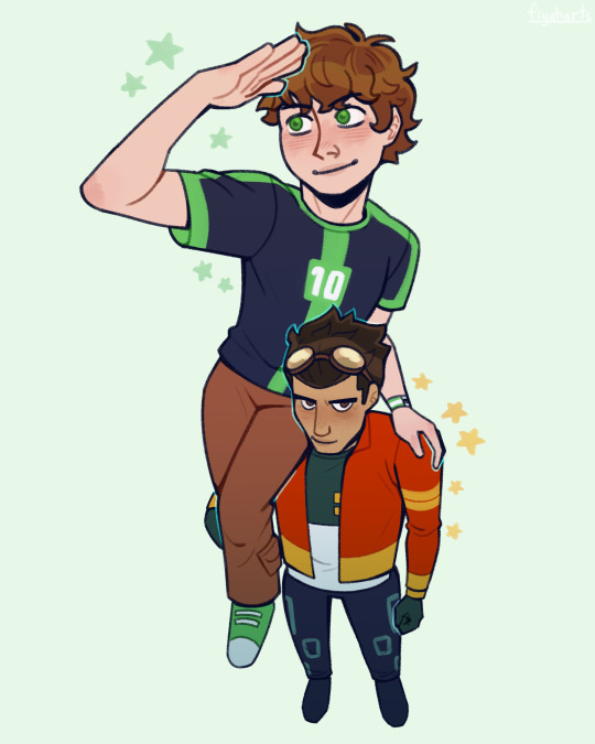
fuck it benrex in the soul eater shoulder pose
#generator rex#ben 10#rex salazar#ben tennyson#benrex#ben 10 omniverse#ben 10 fanart#generator rex fanart#man of action#brex#this just started as a perspective drawing exercise and then i was like you know who would do this bullshit? Them
471 notes
·
View notes
Text
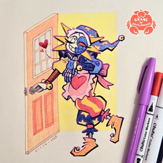
"Do your best today! I'll be waiting here when you get home, starlight~💕"
had two busy days of work outside of my cave and the only thing that kept me going was the sight of my housewife/househusband Eclipse waiting for me at home
that is, the sketch of him waiting for me to finish drawing him 😂
starring @starriegalaxy's Eclipse from her Fear Factor AU/House Husband AU
#fnaf eclipse#fnaf dca#dca fandom#crab art#traditional art#bright colours#fear factor au#fear factor eclipse#all i need is a pretty househusband to come home to#is that so much to ask?#my headcanon for this AU is that Eclipse just collects frilly aprons#every time y/n comes home he's wearing a different one#i'm both happy and frustrated with this one#happy - because i'm glad i finished it and it looks nice#also i feel accomplished since it's the most ambitious illustration i've done during this exercise to get out of artblock#but also frustrated with some small things#most of it is chalked up to me not planning things head of time#namely the door#that's why the perspective is off and the colours aren't great#for some reason my focus was on the handsome apron-clad robot instead of the door no idea why#also this illustration also taught me a lot about this new lineart style i've been using#it needs more careful planning if it's going to be used as part of a larger illustration#the gradients help suggest some lighting and shading#but if it's going to be used in an illustration with a background then it needs to adjust to the lighting of the background#my previous drawings had simple shapes as a background so it didn't matter as much#but here the open doorway suggests light coming from behind Eclipse#so there are dark parts of the lineart that should be lighter#all in all i need to do more planning#but besides that this was really fun#love how chunky his pants and sleeves came out
346 notes
·
View notes
Text
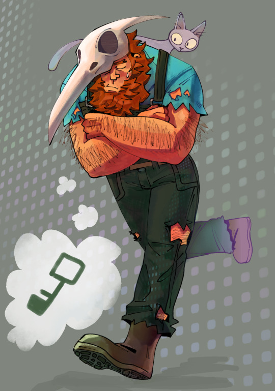
can't stop thinking about this deep-thinker.................
#dungeons and daddies#blake lively dndads#dndads s3#the peachyville horror#marbles dndads#blake could get it- huh who said that#this was a good painting exercise but it's also a protest for the fandom to draw more of this sexy nonchalant man and his stolen cat#tho i never want to draw someone walking again lol wonky perspective the bane of my existence
355 notes
·
View notes
Text

Rough sketches my beloved
#julie and the phantoms#jatp#reggie peters#jatp art#jatp fanart#vampire!reggie#night creature AU#my art#who's better suited for this than the sunshine boy :)#okay this was just an excuse to draw feral vampire art#initially started this a while back to exercise expressions and perspective and now I finally came back to it yay!#first time posting some edgy art here#made a lot of fun!
381 notes
·
View notes
Text


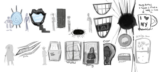
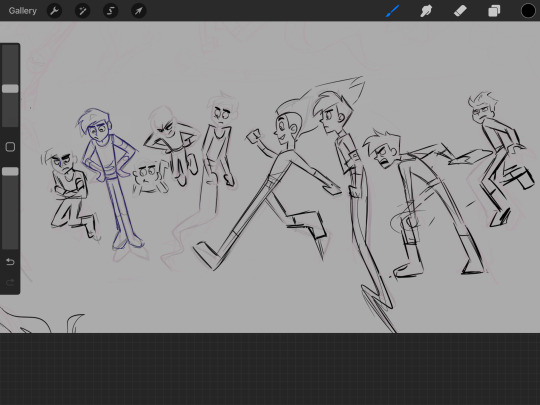


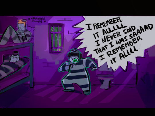
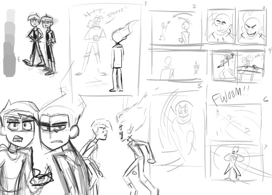
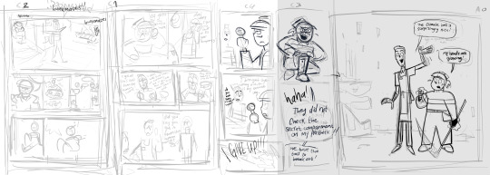
Thank you for tagging me for Wip Wednesday @cookietastic! I am practically made out of wips and sketches.
Mostly I have unfinished drawings of mini comics, they take a lot of time to do lol. Tagging @maya-must-art @keylime-bat-art @necrocoleum @ectospacecadet if you wanna join, but it’s no pressure! 🕺
#wip wednesday#wips#sketches#my art#a lot of these have been around for months#especially the top drawings#I usually go back to#doing drawing exercises when I struggle with a drawing#and abandon it for awhile until I’m comfortable with it again#(especially when it involves perspective)#it’s not Wednesday but let’s pretend airplanes in the night sky are like shooting stars#ocs
213 notes
·
View notes
Text
DRAWING BACKGROUNDS: TIPS AND TRICKS
So many people are afraid of drawing backgrounds and I think it's a shame, so here's some tips and tricks, because I'm not perfect at it myself but I think the hardest part is really just knowing where to start.
First off: Perspective
Yeah, yeah, that's the scary word. But I promise you, once you're familiar with the basics, backgrounds are a LOT less intimidating. Don't get discouraged if WHEN you have trouble with it. Even professional artists struggle with it. I promise you, screwing it up is good and normal. That's how you learn after all!
Now I'm not going to go into detail on how to do it here, because honestly there are a thousand and one free resources online and in libraries that can explain it far better than I ever could in a singular broad-strokes tumblr post. But I AM at least telling you you should familiarize yourself with these basics:
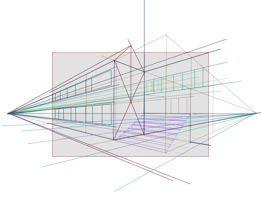
Important Terms: Horizon Line: A horizontal line across your canvas, showing your viewer's eye level and providing a location for most of your vanishing points. Vanishing Point: Integral to drawing in perspective. The sides of a 3D object get smaller as they become farther away from the viewer in space. This point is where the parallel lines of a side eventually meet.
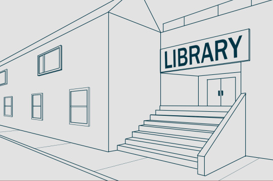
The Basic Types of Perspective: One Point Perspective: Good for drawing things that you're looking at straight on. Two Point Perspective: Good for drawing things at an angle. Three Point Perspective: Good for drawing things the viewer is looking up or down at, especially at an extreme angle.
[Click images for ALT descriptions]
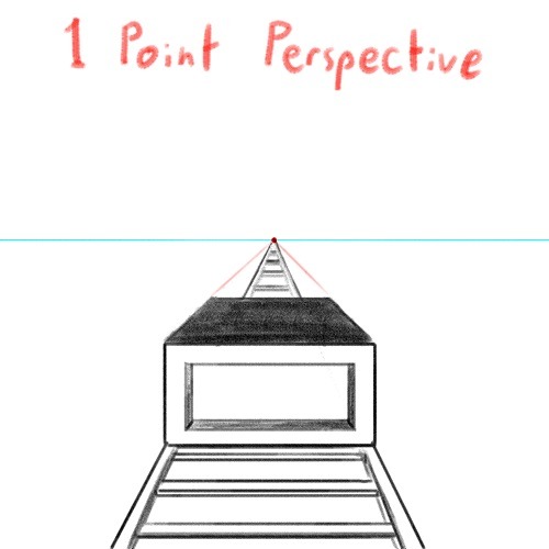
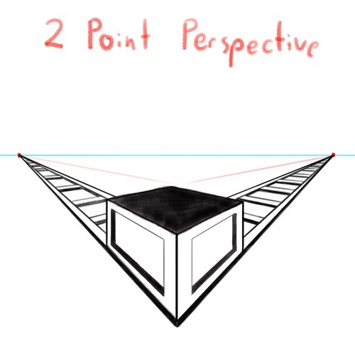
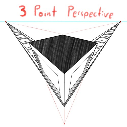
And if you're comfortable with these and serious about improving your skills for use in storytelling, I also might suggest looking up:
4 Point Perspective: Great for extra wide or tall shots and for camera tilts if you're doing an animation or animatic. I think some other names for this in animation include "banana pan" and "warp pan."
5 Point Perspective: Fish-eye lens. Good for all your angsty anime boy slipping into madness needs!
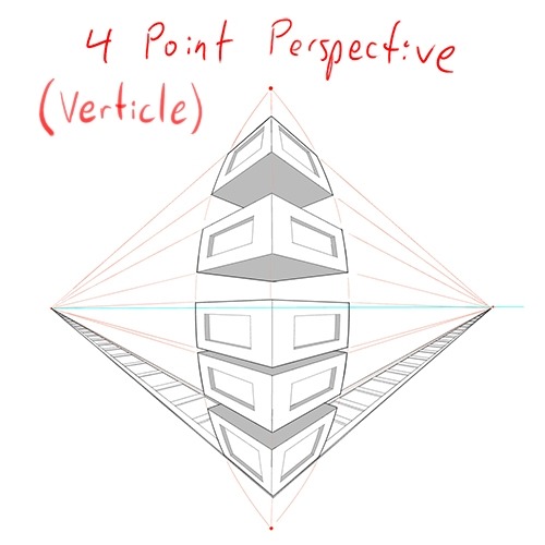
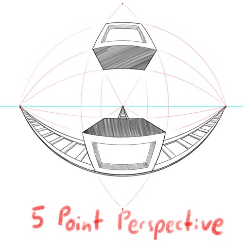
Some perspective tips I wish someone had told me earlier:
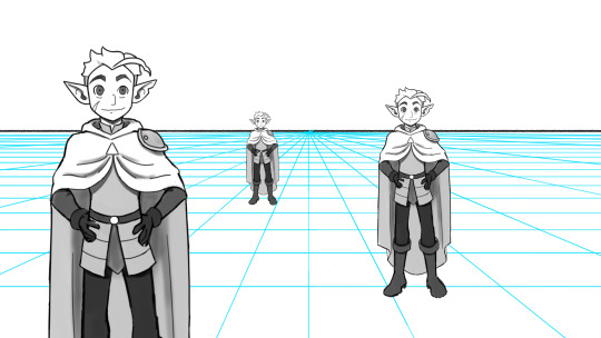
Objects' relation to the horizon line is constant. A super helpful tip to remember when placing a character or object in space is that they will always (assuming they aren't changing in size or moving up or down) have the same relation to the horizon line no matter how far or close they are. If your horizon line is at shoulder height for your focus character in the foreground, any character of the same height in the background will still line up with the horizon line at the shoulders.
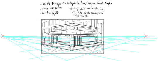
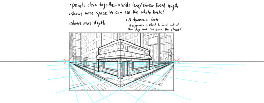
How to pick the distance between your vanishing points: 2 pt perspective uses 2 vanishing points, 3 pt uses 3, etc, etc, but how close should they be? Well, first of all, for anything that isn't one point perspective, one or more points will usually be off the canvas. Super annoying, I know, but the closer your vanishing points are, the more warped your drawing will become. Second, a helpful thing to know is that choosing the distance between your points is basically the illustration equivalent of picking your camera lens! Photography buffs will know that wider (shorter focal length) lenses show more space and make the distance between foreground and background more dramatic, while longer focal length/telephoto lenses are flatter, and more focused and intimate. The same is true of vanishing points that are closer (shorter focal length) or farther apart (longer focal length).
2 point/3 point/etc doesn't actually mean you're limited to that many points total on your page. this one confused me a lot when I was getting started, lol. A lot of examples will show you drawings of nice, neat cities or something, in which all the buildings are facing the same way in order to demonstrate perspective drawing. But in real life, buildings don't all face the same direction. They're at all sorts of different angles. So how do I do that??? Answer: Just because you're drawing in 2 point perspective or whatever doesn't mean you... have to actually keep your 2 points in the same spot. You can move them around, just keep them the same distance apart, so you're not screwing up your camera lens.
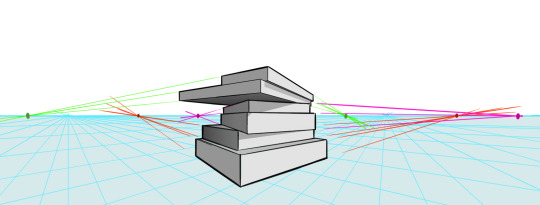
Other Tips:
Use reference! The instant you try to draw a house, you're going to forget every house you've ever seen. That's just how it goes. Buildings are complicated. Do yourself a favor and collect a few reference images first, buddy!
Consider details (like architectural style, amenities, and materials) Your building will look more like a building when you keep in mind that buildings have gutters and door knobs and light switches and paneling and stuff, and aren't just boxes with roofs on them. Again: reference! You will forget electrical sockets and baseboards exist immediately. Art brains are dumb.
Use details and texture to fill in negative space Giant stretches of blank space tend to be boring and distracting. Put a few suggestions of wood grain or something on that wall back there, bud, just don't overdo it.
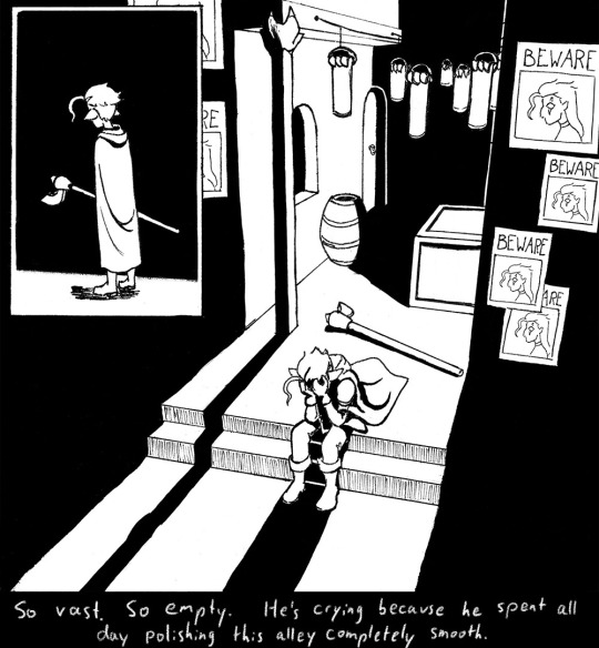

Line weight Darker, thicker lines draw more attention, look heavier, and look closer to the viewer than lighter, thinner lines do. Take advantage of this to draw the viewer's attention to your focal points, de-emphasize less important details, and imply depth. It's up to you to decide how you want to use this and what your style is, especially once you start getting into combining or replacing it with shading, values, and color, but a helpful rule of thumb is to try reserving your thickest lines for focal foreground characters and use thinner lines on backgrounds, especially details in the far distance.
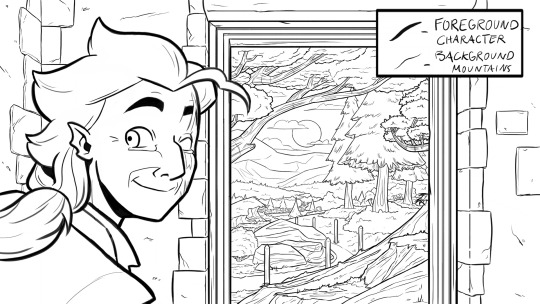
Perspective guides If you're drawing digitally, take full advantage of any perspective tools you have access to! A lot of art programs lately have begun adding perspective guide features that let you set up vanishing points and then literally guide your hand as you draw so you stay in perspective. Some of these include Procreate, Clip Studio Paint, and Adobe Fresco. (still sadly none in Photoshop as far as I'm aware, what the heck, Adobe!). Check through the settings of yours to see if it gives you any perspective guides or other similarly useful tools. They're 100% worth it! And for god's sake, if you've got any skew or perspective warp tools, draw your complicated shapes flat and then warp them instead of spending an hour on it! Don't make my mistakes!
#backgrounds#art tips#tutorial#art reference#drawing tips#perspective drawing#the owl house#hunter toh#doodle art#doodletext#rambling topic#yes i'm using my blorbo to demonstrate art tips what about it#this took longer than i meant it to lol. i got really into the examples#thank you for your patience guys#this turned out to be a GREAT exercise for me as an artist too actually. Trying to explain things is rlly good practice#I didn't even get into values and such. I can only ramble so much I'm afraid
1K notes
·
View notes
Note
hi just wondering if you had any tips on making your art more stylized or shape-y? i feel like when i try it always comes out super flat if that makes sense :) would appreciate any thoughts you have !!
(also i love your art and esp the animations so much)
I'd recommend doing silhouette-based art exercises!
by focusing purely on the silhouette of the character design you're working with, you can focus on making something unique with only using shape language. i did a lot of these and every time i learned something new, and now whenever i make characters or poses i'll throw a black fill bucket overtop to make sure the silhouette is clean and readable.
there's a ton of other resources and ways to tackle this question, but this is personally my favorite solution.
OH AND DRAW IN PERSPECTIVE!! that'll help a LOT when your stuff feels flat. literally just draw with a grid on the floor and the wall, if you follow it i guarantee your stuff will feel less flat instantly. it's fuckin' magic.
#when you do sillhouette exercises you dont need a perspective grid#but it's always good when drawing full illustrations to utilize some sort of perspective#chris talks
68 notes
·
View notes
Text
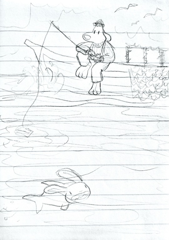
Ay yo guess who’s been enjoying the spooky fish game 👀 if y’all haven’t seen Dredge I would absolutely recommend it it’s so cool!!! It’s like a Lovecraftian horror fishing game and I am obsessed with the aesthetics and gameplay loop and artwork. Just *chef’s kiss* BEAUTIFUL
So obviously I had to do a lil crossover with the blorbos bc \_:)_/ please excuse how messy and bad this is I actually only drew it as a cover for the ones below, which are based on the game’s ending 👀 I didn’t wanna spoil it lmao
Speaking of which, more drawings and spoilers for Dredge under the cut!
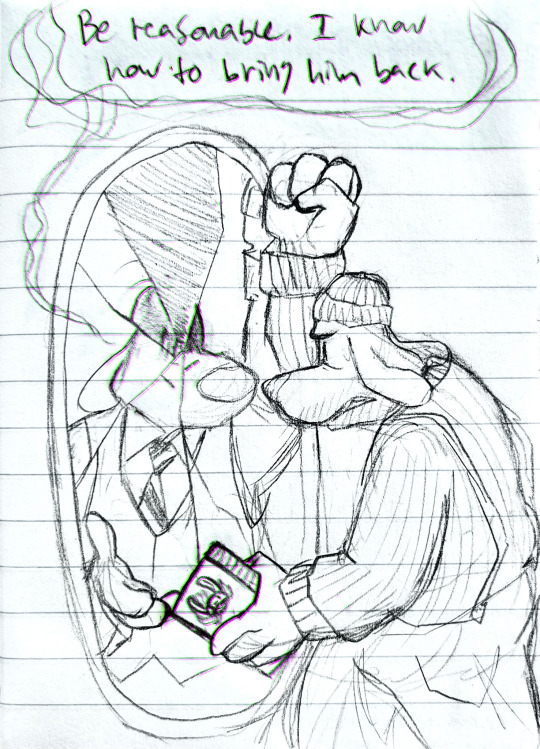
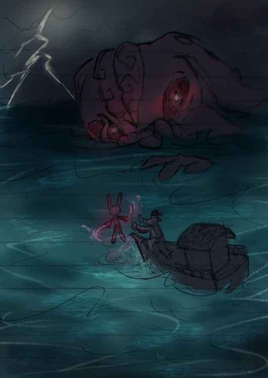
These are also bad bc I decided to try a new program on my phone to make them. Please forgive me hdkfhsjhdjd anyway this game makes me CRAZY it’s so fucking good. Please go play the spooky fish game
#Don’t ask why Max is the lost partner and the leviathan I don’t have an answer 😔#the collector reveal makes me INSANE god it’s so good. it’s all so good#had a lot of fun drawing these hehe. but they were also a good exercise in saying ‘eh. good enough’#like I could’ve gone ham on the boat and the perspective and proportions and water and and and#but I let myself relax instead. thank god#I feel like drawing isn’t worth it if it isn’t fun. don’t be afraid to relax sometimes y’know#sam and max#sam and max freelance police#freelance husbands#my art#dredge game#dredge spoilers#the devil’s playhouse spoilers#I guess? I mean the boy is here so.
150 notes
·
View notes
Text
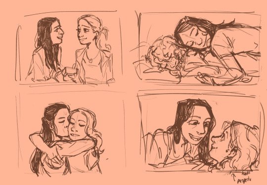
Asta and D’arcy doodles the scenes I drew under cut
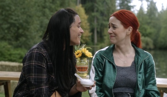

#wanted to figure out how to draw them so yhis was a good exercise#study but like not really. not of colour and all. just of them#somw.good expression ans like uhm perspective practice too it#resident alien#asta twelvetrees#d'arcy bloom#asta x d'arcy#ra fanart#resident alien fanart#pzyii arts
19 notes
·
View notes
Text


late-night snack
#my art#this is much less from a specific reference#and much more an exercise in made-up perspective and suffering#another one i've wanted to draw for a long time...
3 notes
·
View notes
Text
#art tutorials#visual art tips#art fundamentals#art exercises#drawing exercises#drawing perspective#perspective#vanishing points#horizon lines#art warmups#art practice
5 notes
·
View notes
Text
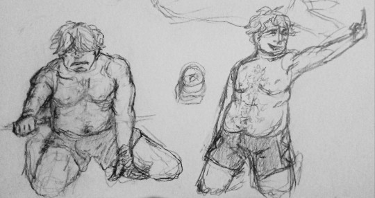
a couple little pose practices for tonight! (⌃ٹ⌃●)
#and a cube+cylinder+triangular prism i stacked as a quick brain check djdkdl#had to make sure i was understanding how to stack things for perspective#he's a wrasslin boy to me now dhdjdkl puttin that man into the ring every night to draw him JDJDKDL#i also attempted to do some pen doodles and my god. those are never seeing the light of day SBDJDML im so out of practice w pen 😭#i used to draw exclusively in ballpoint pen for a yearish in highschool and I've lost all that ability since then apparently LOL#I'll keep working at it djdksl its good exercise for my brain to not be able to erase stuff#dandy.cmd#💜so good at being in trouble#doodlebug.png
6 notes
·
View notes
Text
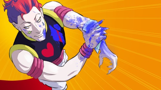
woke up and after three years, hisoka has slithered his way back into an active brainrot slot, sorry astarion girlies, but i need a dose of actual clown every once in a while
#hxh#hxh fanart#hisoka#hisoka morow#clown man#fake blood#now hear me out#Hisoka and Astarion hit so many overlapping boxes for me#like i cant be the only one to think this right#murderous intent#love of blood#a lil scary quirky#carnally attractive in a way that inspires shame#just me?#this was a down facing perspective exercise#then it became practice for drawing blood tehe
15 notes
·
View notes
Text



some more uni stuff! did some photobashing, lighting practice, perspective practice, and 1 minute thumbnails (plus a 6 minute one)
#shrek is god#my art#cam draws#uni project#art student#photobashing#lighting#perspective#thumbnailing#art exercises
5 notes
·
View notes
Text
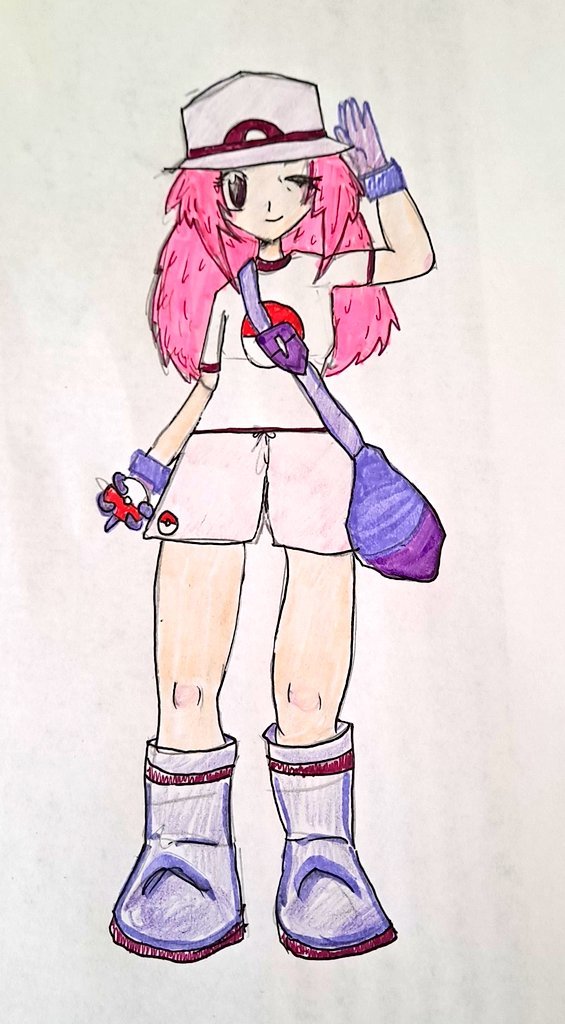
Rosa Murasaki joins the party!!
Heavily inspired by the Leaf design, Rosa is a 20something Pokémon trainer who is starting her journey 10+ years late! She's never had a Pokémon, never bought from a Mart, never even seen a Pokémon Gym before. Please look forward to following her adventures in:
Rosa's PokéJournal, first installment coming soon!!
#Pokémon#Pokémon OC#Rosa's PokéJournal#That's what I'll tag any post relating to this project so I can find it later :)#Basically I'm gonna play Leaf Green thru the lens of Rosa#And as things happen I'll journal about it from her perspective and have drawings of Pokémon and places#And my goal for this project is to get better at drawing Pokémon and better at sketching in general#As well as being a creative exercise :)#So I hope you look forward to it! It's a physical journal!#I'm either going to stream reading sections of it or simply post it on here and Twitter like page by page#And yes I know her legs are too long I drew this at a weird angle and didn't notice until I took a top down picture lmao#I think she looks very cute and tbh I'm really proud of myself for making a decent Pokémon person#Even tho I did use reference especially for the top half like very heavily I still hadn't done it before so I'm happy
5 notes
·
View notes
Text
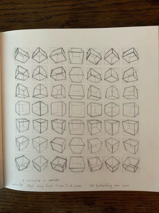
I watch Pikat a lot lately and I saw a live stream where she was just drawing boxes for an excercise that looked really nice, so I tried it. It took a long time to do!
0 notes