#mobile game ui
Explore tagged Tumblr posts
Text
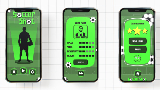
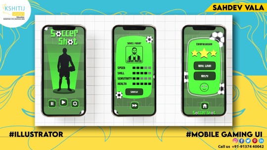
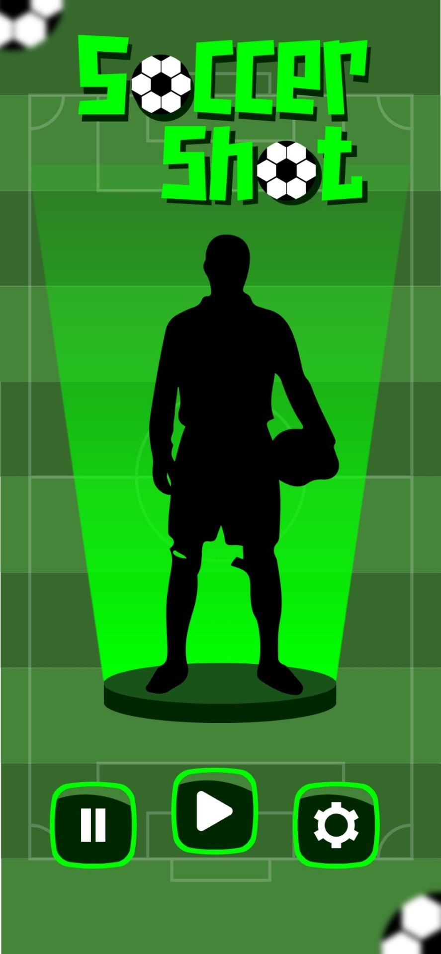
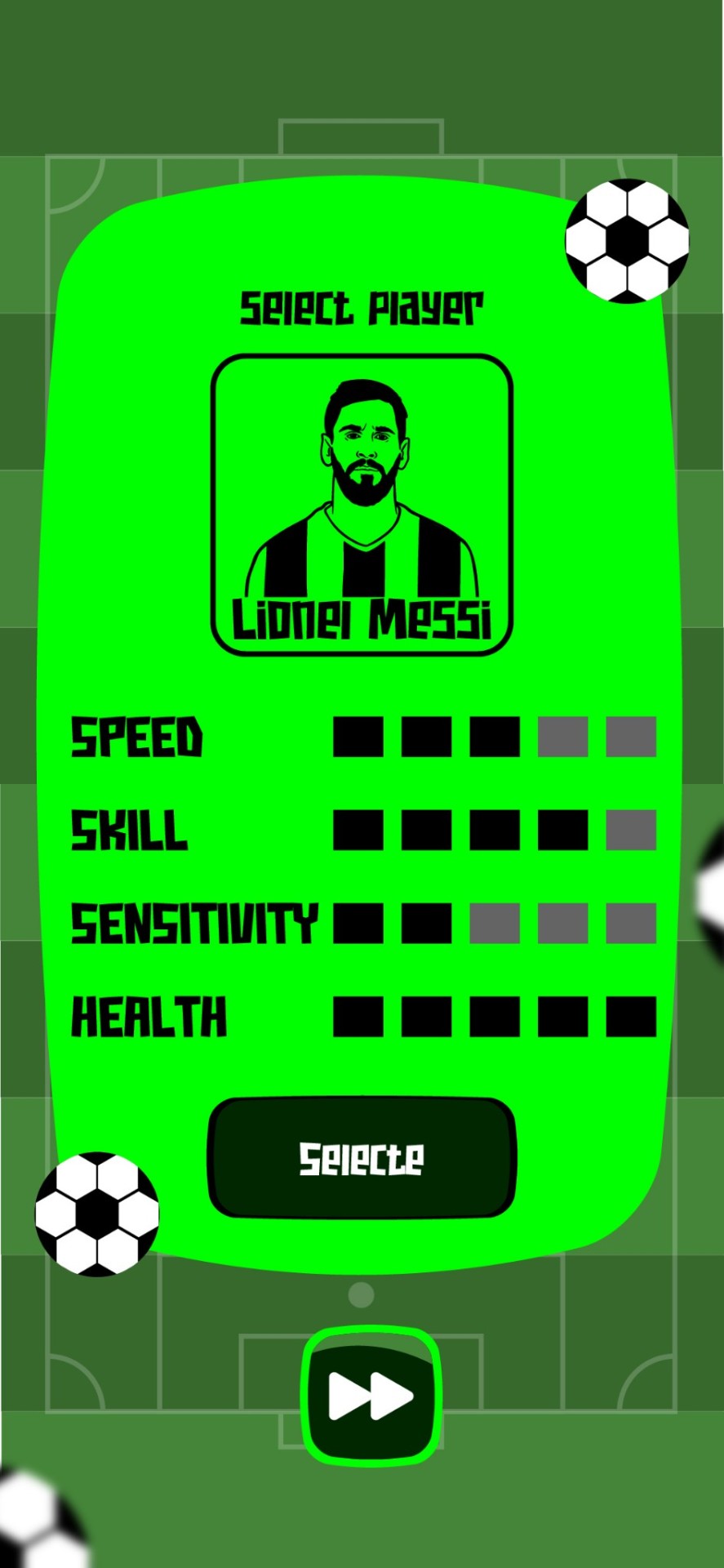
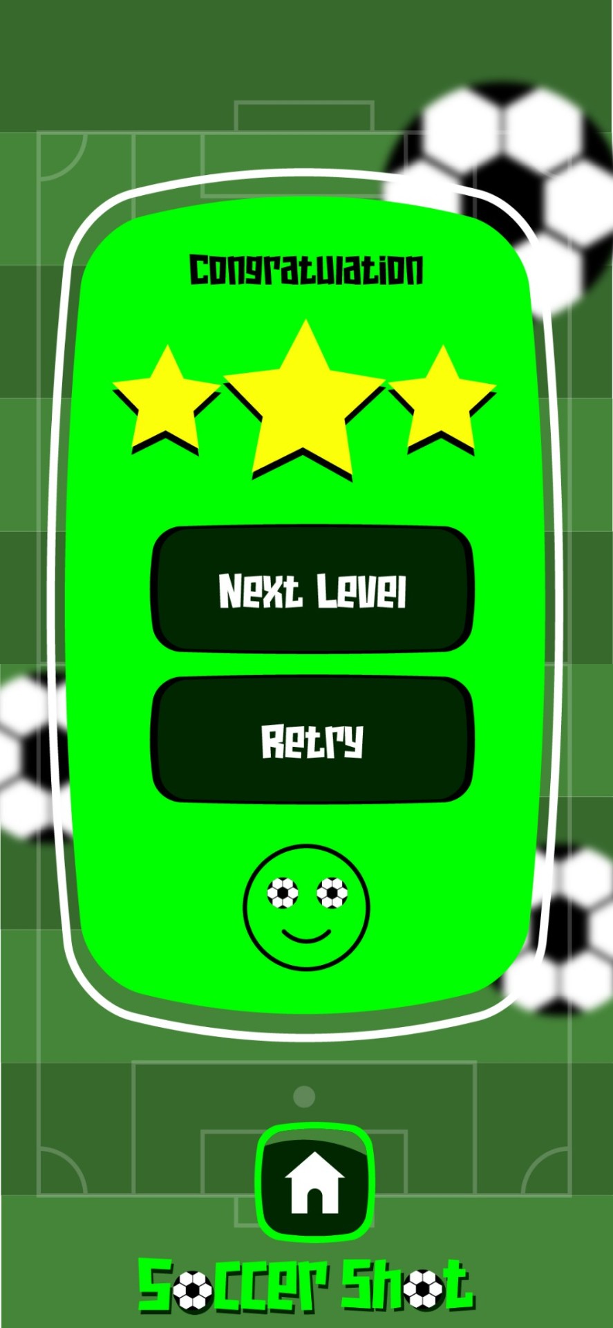
MOBILE GAME USER INTERFACE (UI) DESIGN
#adobe #adobeillustrator #illustrator #illustration #vector #vectorart #Ai #graphicdesign #graphicdesigner #creative #creativegraphicdesigner #creativegraphic #creativedesigner #sahdevvala #valasahdev #kshitijvivan #kshitij_vivan #educationvala #educationcala.com #drawingandillustrations #vectorart #art #illustartiondrawing #gamingui #gaminguserinterface #mobileui #mobilegaminginterface #mobileuimockup
#adobe#kshitijvivan#sahdevvala#adobe illustrator#gaming ui#mobile game ui#mobile gaming ui#mobile game user interface#mobile gaming user interface#game user interface#gameui#game ui#game ui ux#game ux#education vala#educationvala.com#adobe tutorial
3 notes
·
View notes
Text
All I'm saying is that as someone whose first console was a Mattel Intellivision, the sorts of control schemes that mobile developers would have us believe are reasonable ways of playing an action game on your phone are starting to feel eerily familiar.
928 notes
·
View notes
Text
anyone else here addicted to pokemon tcg pocket
#i kinda stopped playing the old pkmn tcg game ever since they nuked half the cards i had with the switch to mobile but#this new app is a nice fresh start and feels less pay to win since you dont need physical card codes to get new packs#the UI is also just so much better then the app that replaced the pc game#its made games go alot faster too with smaller decks and automatic energy draws so its good for casual play#wish they had an option for playing with full decks tho cause i feel like i barely even get set up before the games over
6 notes
·
View notes
Text
Diseño web
¡Hola! Les dejo mi servicio de diseñadora web, si me ayudan a compartirlo les agradecería. <3
#web designer#design#designer ux/ui#ux/ui#figma#figmadesign#uxdesign#ui ux development services#web development#mobile app development#mobile games#desktop#website#graphic design#creative
7 notes
·
View notes
Text

Here is what our sticker game is about:
You’ll run a cozy sticker business from home in your small village ^^
Here are some of the things you can do:
-> Design and create stickers to sell in your online store. 🖼️
-> Visit the printer shop, post office, and supply store for everything you need to grow your business. 📦
-> Receive daily orders from customers and read their reviews. ⭐
-> Occasionally, you’ll get special requests with unique stories from customers, each one is a fun surprise! 🧐
-> Unlock exciting new opportunities, like special contracts with the printer shop and post office, as your sticker shop expands! 💹
This is what the home screen might look like! Things are still a bit up in the air, but you get the idea ^^
2 notes
·
View notes
Text
I wasn't planning on picking up any of the Ikemen games despite my recommended constantly showing me beautiful men however I have discovered they are hiding a beautiful white haired red eyed man in there so. Offers my neck to the chopping block.
#signed#the ui and whatnot is so familiar but i knoww i havent played any of the others No wait i forgot you can see your download history.#< figured it out after weeks of this bugging me. was not an ikemen game but Court of Darkness. Hi Lynt.#I guess these mobile otomes just follow similar layouts. mystery solved! also not the point of this post at all.
3 notes
·
View notes
Text
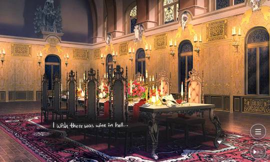
combining my favourite quote from legends of avantris with the aftermath of lesson 6-10
#hambs bad takes#ft my shitty handwriting and my new guilty pleasure mobile game which i try not to post about on main#i havent touched this in a year and there arent a lot of games with uis that make me this angry but im having so much fun#and definitely not also remembering the vice grip my favourite scumbag has on me#obey me
3 notes
·
View notes
Text
I haven't played Starbound a lot recently but decided to play it again for the first time in a while and decided to make little homes in a handful of different planet types, and I'm pretty happy with how they turned out.
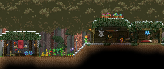
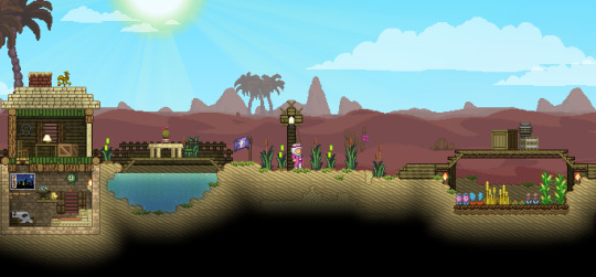
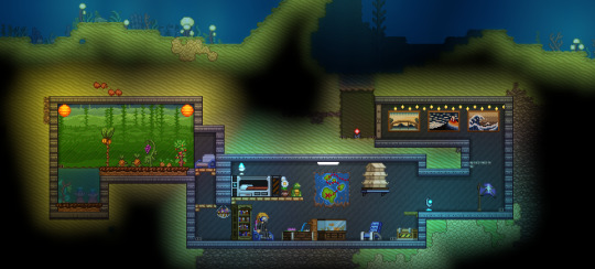
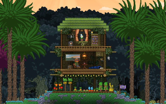
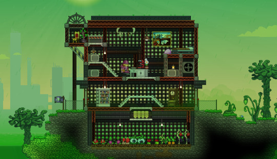
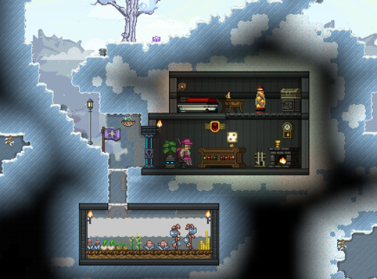
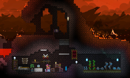
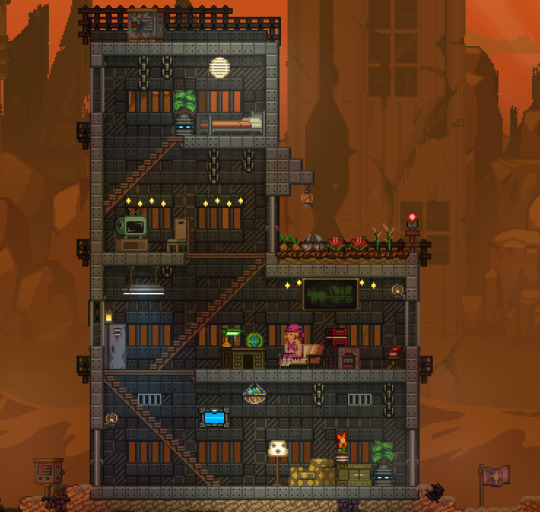
It was a lot of fun to re-use generated structures and pick out little decorations and outfits for each home.
Second post with the other planet types here
#my post#starbound#i learned how to hide the ui while setting up to take these screenshots so thats nice#idk how these look on mobile or anything so uh. pictures#im not usually one to spend time building stuff like this in games like minecraft or... starbound but i did have a lot of fun making these#i had to make the tundra one twice bc i accidentally destroyed the teleport flag and lost the planet and lost my progress on it lol#i also was sitting around for a while ready to take the screenshot cuz i was waiting for the crops to finish growing#i think the jungle one is my favorite. ocean is a really close second#the volcanic one was hard to manage bc there are like meteor strikes on those planets and it destroys blocks they fall onto#im not great at doing this kind of stuff in games but i do like how these turned out i think theyre cute
20 notes
·
View notes
Text
wait can i have a little hater moment again just for a minute. i reeeeeallly do not like texting and text log mechanics in otome games (and honestly any romance-based visual novel but i see it really commonly in otome and otome adjacent stuff) LIKE okay this is a personal skill issue but its nearly impossible to get me to text or message in any timely or reasonable manner in real life (sorry @ my irl friends following me.... im working on it) like i am NOT reading all that shit in a fake phone UI in a game i am playing for FUN. i love reading words but just give me an adv speech bubble for the love of god. nvl is fine too. please. please.
#like its always so long too........ if it was like 3 texts max maybe i can read it#but its always like a full convo mechanic and im always like... why couldnt this have been face to face#realism shcmealism i wanna see your character sprites and CGs not a fake phone screen UI#its probably because of all those otome and joseimuke on mobile using these mechanics. which i also got sick of real fast#but its not just otome games like i said i dont like it in any game visual novel or otherwise#even getting me to read like emails in games is kind of 50/50. depends on if theyre well written enough to get me to care#so many times these text convos you see in romance VNs would be so much better as just like a convo over brunch or some shit#bus stop chats. anything. show me the sprites. show me the sprites#you are a medium with a visual component PLEASE take advantage of it. without fake phone UIs
2 notes
·
View notes
Text
So after fighting for months to include an ad banner in the game I've made I suddenly realised that for a first time project it was...not worth it at all? :'D
Long story short:
I published Bomb di fé on itch.io
Ad free

It's a silly little text based game that I made to fiddle with phone input (like gyroscope and compass). I WAS going to publish it on google play but I made the mistake of submitting the ad version first, and now Google don't believe me when I try to say I removed ads from it TT even worse it won't let me delete the ad version I already submitted. So until I resolved that it's just available on itch.io
It's an android game, from what I tested it looks low-key ugly on tablet but still works :') small victories
#game dev#bomb di fé#at least if you type the name with the accent you can find it by searching google#I'm kinda pissed to waste a good name on a first project#but guess it deserves it by virtue of existing#god knows it got very close to never getting published#mobile games#mobile app development#android#android game#also if you find some ui design choice weird#it's because a ton of idea got scrapped during dev#so don't look too closely lol#libgdx#game release#game dev is fun but everything around it is pure torture#casual gameplay#arcade type game#short game#short gameloop#(depending how clumsy you are)
5 notes
·
View notes
Text
Well I had a whole big thing typed about the paralives video, but I'm gonna just be real with y'all, I'm not impressed. Intrigued, interested, but not that into it. What are y'all thinking?
#nonsims#paralives#it's the art style for me#& the ui hollers mobile game#hope it does well for them though
3 notes
·
View notes
Text


"Kitty Moon" - Mockup match 3 mobile game
2 notes
·
View notes
Text
It's two different ecosystems of computer literacy; they're only fluent in the one they use all the time (app-based UI + mobile website layouts), & aren't in the PC space that anyone who's worked in an office/grew up on a Home/School Computer Room set-up is familiar with.
I work with ppl my grandma's age who are ALSO more comfortable+familiar with the workings of smartphones/pads, and who dread diagnosing issues/even just using PC desktop based UI logic.
It's a **different** kind of digital competence & the problem about the knowledgebase divide should be approached from *that* angle, instead of the doomerism 'ppl are getting stupider nowadays; not like MY days' happening in notes.
Like, consider that most of the symbols aren't even similar to each other, despite supposing to do the same thing. I grew up on PC UI logic and *regularly* hate how mobile UI logic manifests; but also I haven't really kept up with PC UI logic since winXP (am also wrangling win10 into some semblance of xp; registry edits are scawwy) and still primarily use my phone as my 'internet source'. It's two different dialects being conflated bc they both access the same shared spaces, while also having their *own* closed ecosystems of relevant operation information + fulfillment of user needs + social modes.
Telling young zoomers to "just switch to linux" is nuts some of these ipad kids have never even heard of a cmd.exe or BIOS you're throwing them to the wolves
#((aside: it's fun to guess how much time ppl spend in either by how much the feel comfortable typing before adding in a visual break--#vertical screens would be better for a vertical writing system (+UI); horizontal languages don't play nicely with the mobile format#so you get shorter bursts that are easier to read than a block; & the character limits of texts(tweets) reinforces that behaviour!!#whereas desktops even when they add more screens (usually) add them to be wider before making them taller; so more horizontal text can be#comfortably displayed for easier reading than that same amt of text on a vertical set-up.))#linguistics#computer literacy#((you can see this in digital artists too by how they compose their images/comics; korean webcomic sites are STRONGLY vertical#tumblr-first comics/imgs also take advantage of the scrolling aspect; but you can see which ones emulate wide newspaper strips vs longposts#it's a fun game to play at least.))
61K notes
·
View notes
Text
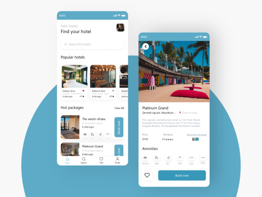
Hello friends,
Take a look at new the design concept for mobile app development. Thanks for your likes and comments!
📩 Contact us if you need any custom UI/UX design and development Services. 🤝 Say Hello: [email protected] | 2digitinnovations.com | Linked in | Instagram | Facebook | +91 7814042409
Best UI/UX company in Delhi NCR
#app developers#app developing company#ui ux company#app development#web developers#web developing company#software#mobile app development#software development#software design#website development#website developer near me#website developer in delhi#website design#website desing bd#readymade app#game developers#game development
0 notes
Text

Who do you think is more likely to leave a bad review? o.O
Discord server for our sticker game
1 note
·
View note
Text
How to make your business online by building an ecommerce website.
Building an eCommerce website is a powerful way to take your business online and reach a global audience. Below is a comprehensive guide on how to make your business online by building an eCommerce website, covering key steps and considerations.
Features Values
Business Planning Start by clearly defining your business goals, target audience, product or service offerings, and unique selling proposition (USP). Understanding your market and customer needs is crucial.
Domain Name and Hosting Choose a memorable domain name that reflects your brand. Register the domain and select a reliable web hosting service that offers good uptime, speed, and security.
Platform Selection Choose an eCommerce platform that suits your needs. Popular options include Shopify, WooCommerce (for WordPress), Magento, and BigCommerce. Consider ease of use, scalability, and available features.
Website Design Invest in a professional, user-friendly website design that aligns with your brand identity. Ensure the design is responsive, meaning it works well on both desktop and mobile devices.
Product Listings Create detailed product listings with high-quality images, clear descriptions, and pricing. Include information like product specifications, sizes, colors, and customer reviews to help customers make informed decisions.
Shopping Cart and Checkout Implement a secure and user-friendly shopping cart and checkout process. Allow for guest checkout, multiple payment options (credit cards, PayPal, etc.), and clear calls to action (CTAs).
Payment Gateway Integration Integrate a reliable payment gateway to process transactions securely. Popular options include Stripe, PayPal, Square, and Authorize.Net. Ensure the gateway supports multiple payment methods and currencies if you plan to sell internationally.
Shipping and Fulfillment Set up shipping options, including standard, express, and international shipping. Use shipping calculators to provide accurate shipping costs. Consider partnering with logistics companies for fulfillment.
Security and Compliance Implement SSL certificates to secure your website and protect customer data. Ensure compliance with data protection regulations like GDPR if you operate in Europe. Display trust badges and privacy policies to build customer confidence.
SEO and Content Marketing Optimize your website for search engines by using relevant keywords in your product descriptions, meta tags, and URLs. Regularly publish content like blog posts, videos, and product guides to attract organic traffic.
Email Marketing Build an email list and use email marketing to promote products, send newsletters, and offer special deals. Tools like Mailchimp, Klaviyo, and Constant Contact can help automate and manage campaigns.
Social Media Integration Integrate social media channels into your eCommerce site. Encourage customers to share products on platforms like Instagram, Facebook, and Pinterest. Use social media advertising to reach a broader audience.
Analytics and Reporting Use tools like Google Analytics and your eCommerce platform’s built-in analytics to monitor traffic, sales, and customer behavior. Regularly review these insights to improve your website and marketing strategies.
Customer Support Provide excellent customer service through multiple channels, such as live chat, email, and phone support. A well-designed FAQ section can also help address common customer inquiries.
Marketing and Promotion Plan and execute marketing campaigns, including discounts, flash sales, and loyalty programs. Use paid advertising, influencer partnerships, and affiliate marketing to drive traffic and sales.
Scaling and Expansion Once your eCommerce business is established, consider scaling by expanding your product line, entering new markets, or offering wholesale options. Explore international shipping and multi-language support to reach a global audience.
Legal Considerations Ensure your eCommerce business complies with legal requirements, including terms of service, return policies, and tax regulations. Consider consulting with a legal professional to cover all bases.
Additional Tips:
Mobile Optimization: Ensure your website is mobile-friendly, as a significant portion of eCommerce traffic comes from mobile devices.
Customer Reviews and Testimonials: Encourage satisfied customers to leave reviews and testimonials to build trust and influence potential buyers.
A/B Testing: Regularly test different website elements (e.g., CTAs, product pages, checkout process) to optimize conversions.
By following these steps, you can build a successful eCommerce website that effectively takes your business online. Focus on creating a seamless user experience, providing excellent customer service, and continuously optimizing your website to meet the needs of your customers.
More Read
#App Development#Game development#web development#Ecommerce website#Mobile app development#Digital marketing#seo services#marketing strategy#search engine marketing#search engine optimization#social media marketing#UI/UX Design
1 note
·
View note