#ux/ui
Explore tagged Tumblr posts
Visit Tumblr Blog
Explore Tumblr blogs with no restrictions, modern design and the best experience.
Last Seen Tumblr Blogs


Fun Fact
Tumblr has been providing a Korean-language service since 2013.
Text
UI/UX 101 para Amateurs (porque, en serio, lo necesitan)
Para este mensaje quiero que me visualicen como los Volturi juzgando desde el palco. Será más divertido.
Hay que entender que estos consejos son agnósticos en el estilo que tengas para hacer tus cosas. Y no tienen por qué seguirlos. Yo a veces ignoro algunos y no exploto (principalmente el de contraste). Pero esta será el primer y único aporte de caridad que haré para esta comunidad que hace codes. Dado que con el reciente drama, lo mismo, algunos se interesan (lo más probable es que no).
Si alguien viene a contradecirme algo, que me enseñe su nómina primero.
Estructura
Dentro del concepto de estructura existen dos modelos, se les llama F y Z. Esto es de parvulario casi, y seguro que intuitivamente habéis llegado a lo mismo sin saberlo:
F es cuando un diseño tiene una columna.
Z es cuando un diseño no tiene una columna.
Ahora, sobre eso, os tenéis que preguntar una cosa: ¿Cómo leemos? Si vuestra respuesta es otra cosa que no sea «De izquierda a derecha y de arriba a abajo», ¡Felicidades por no ser de Occidente! Me sorprende que hayas encontrado esto. Para los demás, leéis de izquierda a derecha y arriba a abajo.
El cómo leemos influencia el cómo se estructuran las webs. Por eso, si por casualidad visitas una web asiática, te quieres pegar un tiro. Simplemente, su estructura no está pensada para como nos hemos educado desde Primaria.
Sobre eso, hay que tener en vital importancia como se presenta el contenido. Nuestra cabeza prioriza siempre el lado derecho porque, como ya hemos dicho, leemos en esa dirección. En el diseño en Z da igual, porque no hay columna. Pero en el F sí.
Así pues... ¿Qué es lo imporgtante en un foro? ¡El foro! Así que si ponen una columna (por favor, nunca dos, no son una red social donde necesitan esa funcionalidad), siempre en el lado derecho.
Contrastes
Esta es una norma que me salto a veces. Quiero decir, en mi foro Brave New World me la salto. Pero hay que tenerla en cuenta.
La norma radica en que NO SE DEBEN USAR COLORES CLAROS SOBRE UN FONDO CLARO, NI COLORES OSCUROS SOBRE UN FONDO OSCURO. Es un poco de calle, pero sorprende la gente que lo ignora.
¿Que por qué lo hago yo? Quería poner la bandera Republicana (de Españita) en los grupos. Y para mí un meme vale más que mil palabras.
Sin embargo, el contraste es algo que varía mucho. Depende no solo de los colores (y lo estridentes que sean), sino de la fuente y su tamaño. Podría proporcionar checkeadores, pero es algo con lo que tendrán que ir a ojo. ¡Good luck!
Fuente
Aquí no hay debate. Mínimo 16px (o lo que es lo mismo, 1rem). Con un interlineado de 1.5 veces el tamaño de la fuente (24px o 1.5rem). Su vista lo agradecerá.
Puede haber elementos secundarios más pequeños. Y el punto anterior de Contraste influye. Así que deben ir un poco a ojo. Por norma general, si necesitan zoom para ver algo (EN ESPECIAL LOS MENSAJES DE UN FORO, QUE SON EL CONTENIDO PRINCIPAL), la fuente es demasiado pequeña.
Resolución
Sé que muchos de ustedes no han pasado de pantallas de 800px de alto. Sé que imponerles que atiendan a resoluciones más altas que 1080p les sonará a clasista. Pero no saben lo rotas que se ven sus skins cuando se las mira por otra pantalla que no sea la suya. Y desde luego, no saben lo horrible que son de visitar, incluso con 170% de zoom, en una pantalla 4K.
¿Cuál es la solución? Es un secreto que diseñadores de todo el mundo saben desde 2003, pero se lo voy a compartir: usen un cuerpo para el foro de 1280px de ancho (incluso se puede menos, yo hice una con 1100px) Y CÉNTRENLO. No es tan difícil.
Navegadores
Sé que hace unos años estaba muy de moda decir «Skin codificada para Chrome uwu» y quedarse tan anchos. A esa gente tengo que decirle: ¿OS HABÉIS FUMADO ALGO?
Entiendo que Chrome (y derivados) son el navegador más usado. Entiendo que targeteando a eso, en específico, se cubre el 90% de la userbase. PERO NO, GENTE, TENGAN UN MÍNIMO DE PROFESIONALIDAD. MIREN DE CUBRIR AL MENOS FIREFOX TAMBIÉN Y, SI PUEDEN, SAFARI.
Móviles
Honestamente, esto es algo de lo que pueden sudar. Yo lo hago con mis skins por flexear, pero no es necesario. He mirado mis Analytics y solo 4 usuarios en 4 foros (retirando duplicados, 30 en total) visitan foros en móvil. No renta el esfuerzo de pensar todo de 0 para eso.
Cabeceras
Voy a empezar esta sección con una skin que no peca tanto del error. Una de un foro de un... ¿semipana? De alguien con quien hablo semiregularmente, que me cae bien y no tiene una skin que me parezca fea.
Lo hago porque a veces me gusta pegar a mis amigos. Y porque no es NI DE LEJOS, un foro con un caso grave de lo que comento.
Ese foro es DC New Frontier. ¿Cuál es el problema? En principio nada. A fin de cuentas, si el foro va a tener tablón, la suma de este y la cabecera no debería ser más de una vista (vista es un scroll completo de la pantalla, 100vh en CSS). Y la skin lo hace. Sin embargo, lo hace en todas las vistas (subforos y temas). Y eso es un problema.
¿Por qué? Se preguntarán. Porque debes hacer scroll cada vez que vayas a lo que te interesa. La información. Ya sea el propio tema o el listado de temas. Y lo mismo, una vez no pasa nada, dos tampoco. Pero cada vez acumula al medidor de coñazo. Y eventualmente o te acostumbras, o navegar implica querer pegarte un tiro. ¡Miren qué cómodo queda si se quita en temas (y lo mismo pasará con subforos)! No es muy difícil implementar un js que elimine un elemento si la ruta no es "/". Pueden preguntar a ChatGPT incluso. Les dejo uno que furula con ese foro.
Y ojo, como he dicho. DC New Frontier lo hace bien. Solo un scroll. Hay foros donde la cabecera es un scroll entero y luego va el tablón. NO HAGAN ESO.
Contenido inaccesible
Llegamos al último punto. ¡Al fin! ¡Mi tortura termina! Por suerte, es lo más de calle. Incluso más que la parte de Navegadores. Y es, como dice el título, el contenido inaccesible.
Para ello, me remito a otro foro que tengo afiliado. Fragments of the Masks (@fom-rol).
¿A qué me refiero con «Contenido inaccesible»? Básicamente, que todo enlace en el foro no debería ser cubierto por un bloque invisible. Salvo que esa sea la intención. Cosa que, en este caso, no creo que lo sea.
¿Por qué no lo creo? Miren el tablón, con su lindo Últimos Temas. Intenten pulsar el primer enlace. No pueden, lo sé.
El motivo de eso es que una imagen lo cubre. La imagen de cabecera. Hipotéticamente, se podría apañar la imagen para arregarlo. Pero es un error causado por la confusión de z-index.
Idealmente, la solución más sencilla es pensando mejor la cosa antes de ponerte a codear, o testeando antes de publicar. Pero todo el mundo tiene errores, ¡incluso yo! Así que dejo un apaño guarro AQUÍ.
29 notes
·
View notes
Text
hi! icy here! ♡
i am currently studying computer engineering as my college major. i have great interest with the intersection between design and engineering.
in my free time, i love to learn (just learning in general). some of my favorite hobbies are ballet, reading books and playing video games. i also love being creative... i also really like anything related to astronomy and self-improvement.
academic interests: engineering, computer engineering, ux/ui design, human computer interaction, design, ai, robotics, astrophysics i have degrees in history (focus is on american immigrant history), visual communication design (graphic design) and liberal arts.
i don't think i'll ever stop learning.
i hope that sharing my journey would help and inspire someone out there. ♡
icy's (big sis advice portion): i know it may get overwhelming sometimes but here is a reminder that you are right in the middle of something you used to pray for... be kind to yourself and trust the process...
333

⋆。°✩⋆。°✩⋆。°✩⋆。°✩⋆。°✩⋆。°✩⋆。°✩⋆。°✩⋆。°✩⋆。°✩⋆。°✩⋆。°✩⋆。
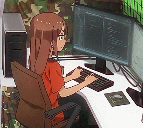
gif source: new game! ahagon umiko programming (my fave character from the series btw)
#new codeblr#codeblr#coding#computer science#computer engineering#engineering#engineering major#engineering stu#cs major#ux/ui#ux/ui design#design#studyblr#new studyblr
173 notes
·
View notes
Text
Diseño web
¡Hola! Les dejo mi servicio de diseñadora web, si me ayudan a compartirlo les agradecería. <3
#web designer#design#designer ux/ui#ux/ui#figma#figmadesign#uxdesign#ui ux development services#web development#mobile app development#mobile games#desktop#website#graphic design#creative
8 notes
·
View notes
Text
WEEK08 HW #7 - Nami Matcha (Extended)
Before:


After:


⭐ View prototype!
Think about the homework you did last week. Either make a new version building on what you learned last time, or pick a new app/website/program. Use Figma in the same way — Give yourself a directive: I am going to make this app/site/*** funny/silly/angry/usable/terrifying/legible/incomprehensible/……….. Then, think about what qualities you can use to create a version that embodies that adjective. Your changes might be subtle or loud – try out a few things before you settle on your final direction. If you don’t know what to do, talk to me.
About Us:
Directive: I am going to make this page less empty and more personal.
My changes:
Introduced more colors to brighten up the page!
Incorporated more photos that are not already in use on the site.
Added the reoccurring arch in home and product display page for a more welcoming feel.
Product display & info (Yame):
Directive: I am going to make this page emphasize the flavor and customer experience of Nami's Yame Matcha.
My changes:
Push matcha description up, making it the first thing a user reads instead of the payment option.
Add more fun and inviting shapes from the home page to display Yame matcha images.
Slight edits to the matcha description to make the text visually less condensed (asterisk, line skip)
Rotating thank you message was too light. Changed it to Nami green and butter yellow!
Customer reviews are visually more condensed because original design require customer eyes to drag across the screen. I hate it lol
2 notes
·
View notes
Text
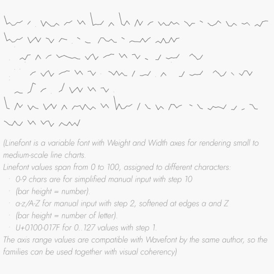

totally awesome sneak peak at my next web typography assignment, everyone go give Dmitry Ivanov a big consensual kiss.
#dmitry ivanov#linefont#typography#web typography#web design#ux/ui#website#coding#digital art#graphic design#lettering#letterforms#figma#html#css
5 notes
·
View notes
Text
It also compresses the space so that it fits on mobile screens. I absolutely loathe this move towards "unifying" the UI. Tons of websites started doing it around 2018 ish. This allegedly makes the experience for users who are on both mobile and desktop more "seamless". If both versions look the same, it "unifies" the experience. But in reality it destroys UX for large swaths of the user base. THey don't care though.
And like Marypsue said, one of the reasons for sqashing the user avatars is making the posts less identifiable, thus making it easier to slip advertising in.
But I guess fuck us desktop users for not being impulsive youth with that disposable income you want having their eyes on your ads.
@Staff why is nobody listening to the userbase? I understand there's often a lot of pushback from established users when things are changed. And some of it is just discomfort at having to adjust to changes, and being used to how things were. But for chrissakes, you guys are literally decimating the user experience. You're fundamentally changing how Tumblr functions, and it's disheartening. OP makes many many very good points about how and why this change is detrimental to the experience that is Tumblr. Not just a complaint from established users that "we liked it better the other way!" but actually demonstrable use case flaws that are making the experience bad. So is the lack of response, (or outright mocking) simply reactionary stubbornness? Is it defensive hurt feels? Is it "they don't know what they're talking about. We're the experts on this stuff." Is it "they just don't know what's good for them." Is it "We're hemorrhaging money and have to do something drastic to attract new users. Fuck the people that have been here since 2008. If they love this place so much they should be happy we're doing something to keep it going!" ? Because honestly it's feeling like y'all are being deliberately obtuse and it's incredibly insulting.
here's your fucking feedback @staff
list of problems the removal of icons causes:
i cant see my friends
ruins the sense of community
can't tell at a glance who's online right now and what they're interested in
literally cannot tell without scrolling back up who put a post on my dash if it has a single addition attached to it. or like. 2 paragraphs in the op.
i cant click my own icon at the top of the dash to quickly view my own blog
can't tell who someone used to be if they change their username
squashes the margins between the menu and posts, making the whole dash feel more cramped
ruins the quick visual cue of how long each post is and where it ends when you're trying to scroll past ones youve seen before
people put a lot of creativity and individuality into icons, and now i never see them
makes people who primarily reblog instead of make their own posts all but completely disappear
list of problems solved by removing icons:
?????
who the fuck was asking for this
ive never in my life seen a website or app that has profile pics forcibly HIDE them, so i guess you did it you made the dash unique again in the worst way
here's some more feedback: maybe when you run an a/b test you should, idk, actually have a feedback form people can fill out about it somewhere
65K notes
·
View notes
Text

The RTD is struggling with a lack of funding and income paired with a lack of modern UX/UI systems both off-site and on-site. What changes can be made to the ticket purchasing systems and transportation maps to streamline the process and bring in more revenue?
A NEW WEBSITE
This project focuses on improving the ticket purchasing interfaces on-site, as well as the important pages of the app and website.
The website home page did not need a lot of work. This version eliminates redundancies and puts more emphasis on important CTAs. The tools menu did not offer anything that the nav menu already did not. It was removed. Trip Planner and Next Ride did not offer separate products; both were merged into Trip Planner. A clear Buy Tickets CTA was added in the hero as well as the nav. This CTA will go to the same link as Trip Planner.

A NEW TRIP PLANNER
The original Trip Planner was too lightweight. It did not offer the necessary information to the tourist demographic. While the current version offers directions for one trip, this version offers a sequence of stops or even an itinerary for a multi-day trip. After the user finishes entering their trip information, the website will offer them a product that fits their needs. The tool may even offer an upgrade if it makes sense. This is focused on increasing revenue.


A NEW MOBILE APP
This new app is modeled off of modern transportation apps like rideshare and navigation apps. This app acts as a complete tool for the user. Once logged in the first screen is a map where the user can look at bus routes, train routes, service interruptions, or any combination of the three. The user can also search for their destination and be given directions as well as a ticket to get there.
The account page is given a personalized set of information for a wallet, upcoming trips, schedules, and service interruptions. The QR code can be scanned as a ticket or multiple tickets. The rest is moved to the nav. Alltogeather this app combines RTD Flex Ride and RTD Mobile Tickets.
How it works:
Search for your destination
Confirm your location
Select a route
Buy your ticket
Get your QR code and directions

A NEW ON-SITE SYSTEM
The ticket purchasing system has been replaced by a system that mimics the mobile app. The difference is simply removing the account log-in and the miscellaneous menu options.
The information booth is replaced by a live updated system. The lefthand side is a digital map that shows interruptions and incoming trains/buses. The right-hand side is replaced by a system that shows a list of routes that are on their way to that location, their arrival time, and if they are running late.
_
🔗 Learn more: shoutgraphics.design/projects/web/rtd/
#RTD#denver#public transportation#ux/ui#ux#ui#app design#web design#wayfinding#rideshare#directions#solution#app development#production design#mockups#wireframing#wireframe#buses#trains#shout#shout! graphics#shout graphics#graphic design#transportation#travel
0 notes
Text
What is UX / UI Design?
Discover the exciting field of UX/UI design and unlock opportunities in one of today’s most in-demand careers. Learn what UX and UI design truly mean, explore various career paths, understand the key skills required, and get insights into salary expectations across roles. Whether you're a creative thinker or a problem solver, this field offers rewarding prospects. Take the first step toward becoming a professional designer by enrolling in an online UI/UX certification course designed to fit your schedule and goals.
0 notes
Text
UI/UX Design Company in Delhi

A Website or Mobile App helps businesses to increase their sales and growth. Therefore, UX/UI Design plays an essential role in achieving this goal. The UX/UI Design of the application improves the overall user experience and customer satisfaction that ultimately helps increase the number of users.
0 notes
Text
Diseño UX y Desarrollo de videojuegos en la Academia 4.0
Mediante la propuesta, los vecinos de Vicente López pueden acceder a cursos gratuitos en un un bootcamp para Desarrolladores de Videojuegos; y sobre el Diseño UX/UI, donde se ofrecerá una formación integral en las fases clave del diseño centrado en el usuario. La inscripción para la Academia 4.0 del Centro Universitario de Vicente López se extendió hasta el jueves 5. El municipio de Vicente…
0 notes
Text
Prestação de serviços on-line
A ascensão da internet e das novas tecnologias revolucionou a forma como os negócios operam e, profissões tradicionais estão sendo reconfiguradas e novas carreiras estão emergindo. Janciéli Dalla Costa – Pitacos e Achados. 2024 abr 24 O segmento de prestação de serviços abrange desde consultoria financeira até apoio psicológico virtual, tem mostrado um crescimento exponencial, impulsionado pelo…

View On WordPress
#aumento da conectividade#consultoria financeira apoio psicológico virtual#crescimento exponencial#empregos trabalhos Jobs workers#Fernanda Belo Nuvemshop#flexibilidade empregadores trabalhadores#freelancers#nIA Bot eLuiz Anversa exame.#plataformas digitais#Profissionais de marketing digital#redes sociais#sistemas publicidade pay-per-click#UX/UI#Workana 99freelas
0 notes
Text
Branding in Lebanon, 2025: Crafting Identities That Resonate and Endure
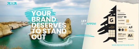
Branding in Lebanon isn’t just evolving — it’s rewriting the rules. From Beirut boutiques to Tripoli tech startups, 2025 is the year we stop following templates and start building identities that move markets.
1. The smartest brands in Lebanon aren’t asking for logos anymore — they’re investing in brand codes.
Color that people can spot with a scroll.
Motion that moves with intention and rhythm.
Language that speaks the audience’s values back to them.
Structure that makes every interaction feel seamless.
Energy that lives across every touchpoint — from billboards to bio links.
A logo? That’s just the tip of the iceberg. The real brand is everything beneath the surface — designed, felt, remembered.
Because in 2025, branding isn’t what people see. It’s how they feel about what they see.
2. Design Like You Mean Business — Because It Is Business
Lebanese audiences in 2025? They’re not just viewers. They’re validators. They scroll fast, judge faster, and don’t give second chances to brands that feel bland.
Design isn’t decoration — it’s persuasion. Every pixel you place should pull emotional weight. It should sell, influence, guide, and move. The smartest Lebanese brands aren’t chasing beauty anymore — they’re engineering impact.
It’s not about looking nice. It’s about moving markets.
Does your design make them stop?
Does it earn the click?
Does it create trust before a word is read?
If not, it’s not branding. It’s background noise.
In 2025, the design that wins is the one that knows its job. It tells your story in a glance. It translates value instantly. It builds credibility before the first DM.
Real branding doesn’t whisper. It converts.
So yes — design like you mean business. Because if you’re in Lebanon’s digital arena, that’s exactly what it is.
3. From Beirut to Koura: Local Relevance is Global Currency
Let’s be real: no one cares about your brand’s “vision” if it doesn’t speak their language — literally and culturally. Lebanese consumers are tired of global copy-paste brands. They’re craving something that feels like home… and sounds like it too.
The brands making waves in 2025? They’ve cracked the code: local identity is your global unfair advantage. They’re weaving in Arabic-English tone shifts, mixing dialects like a DJ, and making people feel seen on both Hamra Street and LinkedIn.
UX/UI Localization in Lebanon
Brands that localize UX/UI with bilingual design, cultural layout logic, and Arabic font optimization see +37% engagement across Lebanese audiences.
Average Engagement Boost
+37%
Whether you’re speaking to the trendsetters of Beirut or the entrepreneurs of Koura, cultural fluency wins hearts — and opens wallets.
Cultural fluency > corporate jargon
Localized design > generic templates
Hybrid storytelling > one-size-fits-all messaging
Relevance isn’t a trend. It’s leverage. Your audience doesn’t just want to be impressed — they want to feel understood.
Speak their language. Reflect their world. That’s how Lebanese brands are building loyalty at home — and scale abroad.
4. Static Brands Die Fast. Dynamic Brands Stay Booked
If your brand isn’t moving, it’s not breathing. In 2025, stillness equals silence — and silence gets ignored. Lebanese audiences scroll fast and decide faster. That logo you spent weeks perfecting? It has half a second to impress.
What separates booked brands from broke ones? Velocity. Fluidity. Energy. We’re talking motion-first branding. UX that doesn’t just look pretty — it responds, adapts, and guides. Real-time campaigns that learn from clicks and optimize on the fly.
Your homepage shouldn’t just load — it should convert. Your design shouldn’t just show — it should sell. In Lebanon’s high-stakes digital economy, brands that can’t evolve are brands that don’t survive.
Branding isn’t a moment. It’s momentum. Either your identity is working while you sleep — or your silence is costing you customers.
5. This Isn’t Design. This Is Competitive Positioning
Your brand is a sales machine. If it’s not bringing in leads, attracting talent, closing deals — it’s decoration, not strategy. In Lebanon, the brands that are winning know the difference. And they build accordingly.
Strategy First: Design isn’t how it looks. Design is how it converts. The strongest Lebanese brands aren’t just eye-catching — they’re deal-closing, talent-attracting, credibility-building machines.
If your brand can’t sell for you, you’re not branding — you’re decorating.
6. Where Brands Become Beliefs — Lebanon’s Next Branding Era
In 2025, a logo won’t carry your business — your belief system will. Lebanese audiences are tired of hollow campaigns and templated visuals. They crave identity. Voice. A brand that stands for something, and stands out doing it.
The next wave of growth isn’t found in aesthetics — it’s in alignment. When your message, visuals, experience, and mission move as one — your brand becomes a magnet. That’s the level where referrals happen without asking, loyalty feels personal, and competition becomes irrelevant.
Ghaith Abdullah
Founder
“We don’t design brands to look good. We design them to be believed. That’s the real ROI — recognition, relevance, and revenue that never need reintroducing.”
Turn Your Brand Into a Growth Engine
Whether you’re launching in Beirut or scaling across MENA, our branding systems are built for traction. Let’s align design, voice, and velocity.
Start Your Branding
Get a Custom Quote
Related Articles
Digital Marketing in Tripoli
Explore how Tripoli’s emerging brands are using smart digital strategies to compete across Lebanon — and win.
Read More
Innovative UX/UI Trends for Elite Brands
In 2025, the line between physical and digital luxury has blurred. A brand’s online presence now serves as a direct reflection of its values, prestige, and attention to detail.
Read More
Innovative Web Development in Tripoli, Lebanon
Explore how cutting-edge web development strategies are transforming digital experiences in Tripoli.
Read More
Insights that build smarter brands.
Explore bold strategies, modern UX/UI ideas, and real-world marketing advice from Lebanon’s digital frontier — designed for founders, creators, and marketers who want to do it right the first time.
Browse the Blog
#DigitalMarketing #UXUI #WebDev #LebanonBusiness #GrowthStrategy
0 notes
Text
The Importance of UX/UI in Website Development – How to Create User – Friendly Websites

Design is Not Just Pretty - It's Powerful
In today’s digital-first world, websites are more than just online brochures – they’re the heart of user interaction, engagement, and conversion. What sets a good website apart from a great one? Exceptional UX/UI design. Whether you’re a startup founder, a marketing guru, or part of a product team, knowing the importance of UX/UI in website development is key to driving growth, retention, and satisfaction.
What is UX/UI Design Really About?
Let’s break it down.
UI (User Interface) is the look and feel – the layout, colour schemes, typography, buttons, and icons.
UX (User Experience) is how users interact – is it smooth, intuitive, frictionless?
Together, they create visually compelling, functional, and delightful digital experiences.
Why UX/UI Design Matters in Website Development
First Impressions Are 94% Design-Related : In less than 0.05 seconds, users form an opinion about your website. A cluttered layout or poor colour contrast can send potential clients running. A UI UX development company ensures your site not only looks good but makes users want to stay and explore.
User Retention & Reduced Bounce Rates : Poor UX? Users bounce. Great UX? Users browse. UX/UI impacts how long users stay on your site and how likely they are to convert. Smooth navigation, responsive design, and smart visual hierarchy keep visitors engaged.
Improved Accessibility & Inclusivity : Great UX/UI design goes beyond aesthetics. A website that’s accessible to everyone – including people with disabilities is not just ethical, it’s good business.
Boosts Conversions & Revenue : From optimized CTA placements to streamlined checkouts, strategic UX/UI decisions can directly impact your bottom line. Studies show that every $1 invested in UX results in $100 in return.
Key Elements of Stellar UX/UI Design
Visual Hierarchy & Layout : Good design directs the eye. Use size, colour, contrast, and spacing to create hierarchy. Guide your users to what matters most.
Responsive & Adaptive Design : Your website must look stunning on desktop, tablet, and mobile. A UI UX development strategy ensures cross-device consistency.
Fast Loading Times : Slow sites kill UX. Optimized images, clean code, and smart caching are essential.
Seamless Navigation : Sticky menus, breadcrumb trails, and logical site architecture help users find what they need, fast.
Consistent Branding : Colour palettes, fonts, voice – everything should reflect your brand identity.
Accessibility Design : Contrast ratios, alt texts, keyboard navigation – design for all users.
The Human Psychology Behind UX/UI
Great UI UX development taps into cognitive principles:
Hick’s Law: The more choices, the longer the decision time. Keep it simple.
Fitts’s Law: Make clickable areas large enough to be usable.
Gestalt Principles: Our brains love patterns. Use alignment, proximity, and similarity to group elements.
White Space: Not everything needs to be filled. Give elements room to breathe.
How a UI UX Development Company Can Help
Designing a functional, beautiful website is part art, part science. Here’s how partnering with an expert team can transform your vision:
User Research & Persona Creation : Understand your audience deeply to create tailored experiences.
Wireframing & Prototyping : Visual mock-ups help you test ideas fast without wasting development hours.
A/B Testing & Iteration : No guessing – only data-driven improvements.
Design Systems & Style Guides : Ensure consistency across pages, apps, and future updates.
Common UX/UI Mistakes to Avoid
Overloading pages with information
Using unclear or jargon-heavy CTA buttons
Inconsistent iconography and visuals
Not testing designs with real users
Ignoring mobile-first design
UX/UI Trends That Are Shaping the Future
AI-Powered Personalization : Smart interfaces that adapt in real-time.
Dark Mode : More than a trend – it’s easier on the eyes and loved by users.
Micro-Interactions & Animations : Subtle movements bring joy and guide user behaviour.
Neumorphism & Minimalism : Clean, soft UI is in. No more clutter.
Voice & Gesture-Based Interfaces : Designs are moving beyond screens.
Final Thoughts: UX/UI Is No Longer Optional
A beautifully coded site is useless if users can’t interact with it intuitively. UX/UI design is the bridge between technology and people. In an age where attention spans are shorter than ever, investing in great design is investing in your user’s experience and your brand’s future.
Whether you’re building from scratch or revamping an old website, partnering with a skilled UI UX development company can be a game-changer.
0 notes
Text
Diseño web y UX/UI
En esta guía te explicaré cómo puedes empezar a hacer la transición de diseño gráfico a UI/UX.
No es un listado genérico que puedas encontrar en cualquier artículo: lo he escrito tomando mi propia experiencia como referencia, porque yo también empecé en diseño gráfico.
Ah, y abajo de todo te doy 3 pasos que puedes tomar a partir de hoy para empezar a tirar del hilo y reencauzar tu camino hacia el sector tecnológico 😏
¡Empecemos!
Antes de nada: mi camino en formato breve
Permíteme que te ponga en un poco en contexto con mi historia: en 2008 empecé a estudiar diseño gráfico (después de hacer un año de la carrera de Turismo).
No te creas que tenía una visión súper clara de qué era el diseño: ni siquiera me había planteado que eso era una profesión como tal. Y de hecho me matriculé en esa escuela porque había una asignatura de marketing, no por las de retoque fotográfico o tipografía 😅
Cuando acabé en 2010 tenía muy claro que quería «hacer páginas web», que lo mío era pensar en pixeles, pantallas y resoluciones y no en milímetros, formatos de papel y tipos de impresión.
Pero claro, una cosa es decidirlo y la otra, encontrar el camino.
Similitudes entre diseño gráfico y UI/UX
Aunque es posible que ahora no lo veas muy claro, la verdad es que ya has recorriendo una buena parte del camino.
Conocimientos de diseño
Si previamente has estudiado diseño gráfico es muy probable que ya tengas muy integrados los conocimientos básicos en cuanto a tipografías, espaciados, teoría del color, uso de retículas, diferencias entre formatos, la importancia de la estética, la capacidad de solucionar problemas… así que por este lado no sufras.
Preparación de entregables
Aunque de otra manera que en el diseño UI/UX, también te habrás encargado en algún momento de preparar el diseño para «salir a producción». Esto es, preparar los artes finales, hacer las comprobaciones con el cliente u otros perfiles senior, enviarlos a la imprenta y ver y validar las pruebas de impresión, entre otras tareas.
Comunicación con otros perfiles
Y por extensión, también estarás acostumbrad@ a trabajar con perfiles distintos al tuyo: clientes, impresores, proveedores de papeles, tintas y acabados, etc.
Así que fíjate en lo que ya tienes: los conocimientos básicos, la costumbre de preparar el diseño para producir y la habilidad de comunicarte con perfiles ajenos al tuyo y al diseño.
No está tan mal, ¿no? 🙂
Diferencias entre diseño gráfico y UI/UX
Sin ningún orden en particular, estas son las diferencias más grandes que he encontrado al hacer el salto de una especialidad —no encuentro otra palabra mejor— a otra.
Herramientas del día a día
El conjunto de herramientas que utilizarás es bastante diferente: mientras que en el diseño gráfico se utiliza mayoritariamente Photoshop, Illustrator e InDesign, en UI/UX se suele utilizar Sketch, Figma, Framer, Invision y Zeplin, entre otras.
Flujo de trabajo
Aquí es donde encontré la diferencia principal. Mientras que en diseño gráfico invertía mi tiempo entre entender el brief y prácticamente diseñar directamente, en UI/UX el proceso de diseño es más extenso.
Según en qué empresa trabajes puede tener estos pasos o quizás solo te ocupas de una parte, pero a rasgos generales podríamos sintetizarlo en:
Entender (de verdad) el problema
Elaborar una hipótesis
Contenido, wireframes y prototipos
Diseñar
Acompañar al equipo de desarrollo
Validar —o no— la hipótesis, haciendo test
Entender al usuario
En general, en UI/UX se intenta comprender al usuario de forma más profunda que en el diseño gráfico. Esto es así porque en digital diseñamos para que algo sea utilizado e interactuable, mientras que en el diseño «tradicional» el diseño tiene una labora más estática, comunicativa y estética.
Ojo que no estoy diciendo que en UI/UX no se comunique o no se tenga en cuenta la estética, solo apunto que la mayor parte de los esfuerzos está en cómo se utiliza y funciona aquella página web o aplicación.
El diseño no es estático
Pienso que, con diferencia, este es el punto más crucial. Si antes te decía que tienes mucho ganado porque ya tienes los conocimientos de diseño, hay un aspecto en concreto que tendrás que olvidar: el diseño estático.
Personalmente me costó bastante dejar de pensar en páginas web como si fueran carteles. Me quedaba encallada en el «pixel perfect» y no me daba cuenta de que lo que importa es la experiencia (más sobre esto en este artículo).
Y por extensión se me olvidaba —a quién quiero mentir, todavía me pasa— pensar en los distintos estados que tendrá un botón, un elemento del formulario, cómo se verá el aviso de confirmación o de error…
Lo que diseñamos en el entorno digital está vivo y existe en muchísimas plataformas, tamaños y resoluciones diferentes. Y además tiene que responder a las interacciones del usuario y a distintos flujos y objetivos.
Terminología de negocio
Desconozco si esto sucede de una forma tan acusada en general, pero lo cierto es que durante los últimos años he tenido que aprender muchos conceptos de negocio, como objetivos de empresa, números y métricas que se observan, disciplinas que se mezclan mucho más entre sí… y además, claro está, saber aplicarlos al diseño —que a su vez tiene el usuario como foco principal—.
Cuando trabajaba en el estudio de packaging prácticamente no pensaba en todo esto: el cliente venía porque tenía una necesidad concreta —por ejemplo, vender un nuevo producto— y planteábamos una propuesta en base a lo que ya habían hecho previamente y lo que había funcionado en anteriores ocasiones.
Tres pasos que puedes seguir para empezar
Familiarízate con los programas. Regístrate en Figma y empieza con el plan gratuito. Verás que no hay mucha diferencia con la suite de Adobe. Lo mismo con Invision, Zeplin… haz pruebas y aprende dónde está cada funcionalidad.
Copia. En este artículo escribí más en detalle sobre este punto, pero en resumen: fíjate en cómo se construyen las aplicaciones que más utilizas en tu día a día. Observa cómo son las pantallas, qué retícula hay detrás, cuando y como salen las alertas, cómo es el flujo que sigue el usuario… Eso sí: copia, pero no lo pongas en tu portfolio. Copia para practicar.
Si te llama más la parte de investigación, empieza a familarizarte con los básicos del UX Research. Prueba con amigos y familiares y experimenta cómo es el proceso.
Pensarás que estos tres pasos son sencillos, pero son los que te ayudarán a empezar a tirar del hilo. Son los que seguí yo en su momento, quizás porque no tenía muchos recursos económicos para apuntarme a mil cursos.
Si te preocupa el proceso de trabajo que se sigue en digital, lo irás descubriendo a medida que vayas realizando los pasos que te comentaba antes. Te darás cuenta de qué paso va primero y qué te funciona mejor a ti. Por si te sirve como referencia, este es mi proceso de diseño habitual 🙂
Apuntes finales
Esto que voy a escribir es posible que sea aquello que llaman unpopular opinion, pero te lo digo igual: de entrada no te recomendaría tirarte de cabeza a estudiar otra carrera, posgrado o máster. Lo más importante ya lo tienes, que son los conocimientos de diseño. Experimenta primero y cuando tengas una idea de hacia qué «lado» quieres enfocarte, busca los estudios que te ayuden.
Con este texto que acabas de leer no pretendo hacer una lista exhaustiva de los pasos a seguir, principalmente porque depende mucho de tus conocimientos previos y de dónde querrás trabajar… pero sí quiero que veas que hacer la transición de diseño gráfico a UI/UX no es tan complejo como pueda parecer: una vez tienes claro qué conocimientos ya tienes y cuáles te faltan, es cuestión de ir haciendo tu camino.
0 notes
Text
Always display images at their intended aspect ratio to avoid distortion.
Color is great way to provide status information, give feedback in responseto user actions, and help people visualize data.
0 notes