#luminosity mode
Explore tagged Tumblr posts
Text

fun fact her hair is iridescent! 🌈
this is an optional detail though, so for people drawing fanart, trades or whatever: do whatever you want! any type of shading is correct!!!!!!
#because lord knows i am NOT doing this again lol#luminosity blend mode my beloved#[ the art of mourning ]#spooky month#spooky month oc#sm oc winifred
82 notes
·
View notes
Note
i've been obsessing the entire day over your beiguang art, specifically the first of the two bonus pictures, specifically the coloring of Ningguang's dress-
i. need. to. know. how.
The process, the brushes. How it looks so simple but *expensive*.
(i am a new digital artist, been drawing on paper my entire life. please please please i have never needed to know anything more in my life this coloring is haunting me i need it i need it I NEED IT)
here's part of the drawing process if that helps
a thing that i remember doing differently was that i duplicated the layer after i was half done, gaussian blurred it, then i lowered the opacity of that blurred layer and erased some parts, painted and sharpened others etc, i mostly did it on the hair and clothes
#other than that well i did do color adjustments after i was done#like fixing the brightness saturation luminosity etc#layer modes help too#ask iztea
38 notes
·
View notes
Text
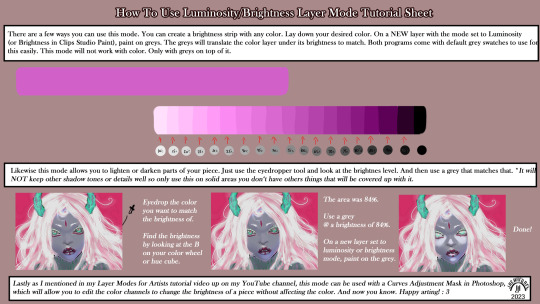
A few other ways to use this mode that I didn't mention in the video so thought I'd throw this up for anyone interested.
LinkTree: https://linktr.ee/jaeharuart
#digital art#layer modes#digital art tutorial#software tutorial#layer mode tutorial#luminosity#brightness#layer mode#jaeharuart#art tutorial#art tutorials#artist#art
20 notes
·
View notes
Text
recently ive been into doing my normal shading then having a multiply layer with the shadows as an orange-browny -> blue gradient (whether the orange or blue is more dominant depends on the drawing) then a second multiply layer with some more blue shading, then a luminosity (that’s add (glow) if you’re not in sai 1) layer in orange. makes it warm and cool at the same time
#sequel to when i was 16 and shaded everything with purple on a multiply layer and orange on a luminosity layer#and then additional layers in whatever modes to make the image look better but you know that
2 notes
·
View notes
Text
It's genuinely kind of upsetting how quickly social media's keep shooting themselves in the foot to just have something to show to higher ups and making their sites more and more user unfriendly. It reminds me of the Oreo CEO skit from College Humor/Dropout TV.
The new Discord update for mobile is genuinely disheartening by how little they seem to care about people hating the new layout. Which honestly, the DMs now being at the bottom and no longer swipping to see server members is annoying. But as someone who very easily gets god awful headaches from heavy contrast and light, the new "default" themes are... very unfriendly to people like me. Let me show you the difference in old Discord's dark mode vs the new:


Like, holy shit, it's Bad. The new one on the right is barely usable for me, it was giving me strain after only an hour or two of use. And it's not even their darkest mode, which is pure black, but it's their only other option aside from pure white in Light Mode.
If you don't want eyestrain, you'll have to pay the 10$ a month nitro not to get migraines. I have the 3$ version, and I can not change the theme with it to their other options. I was able to fix it by fighting all of my settings for an hour to get it back to the original color palette, but jfc. I shouldn't have to reset all my phone setting, open and relaunch discord, and pray that it decides the "automatic setting" is the non-eyeball burning classic dark mode.
The world and social media is just slowly getting more and more unuser friendly, especially towards people with light sensitivity (I can rant for hours about car headlight luminosity regulations). Just kinda disheartening to see Discord so adamantly against changing any of the new UI stuff, especially is they decide to no longer have the class color palette accessible in the future :/
1K notes
·
View notes
Text

hello and welcome to my tutorial on how to create gifs like this one! full explanation under the cut, but if you wanted to take a little peek at the gifset attached to this tutorial, here ya go!
for the purposes of this tutorial i am assuming you know
how to make a gif
what vhs footage looks like
STEP ONE: MAKING YOUR GIF
choose your footage and plug it into your desired software of choice! i use photoshop for this so i can only attest to the efficacy of these methods in that context
as for shot selection, you could feasibly choose anything. however, i prefer shots without too much movement in them - makes it look more like a home video.
because of the heavy amount of colors and filters, i'd recommend a gif somewhere around the 40-50 frames! but of course you can play around.
oh i also set the frame delay to 0.08 seconds. this is slower than most gifmakers tend to set theirs, but it makes it run buttery smooth imo.
STEP TWO: MAKING THE COLORING
here's where we get vhs specific. if you're unfamiliar with vhs footage, i recommend clicking through this youtube playlist! if you're not interested in the coloring, skip to step three (smart object fuckery + filters)
now while making a set i tend to choose some primary colors for my gifs. in the gifset i linked above, i chose to work with blue and orange-y yellow. in some of the other gifs i'll be using as examples (from an unfinished set) i chose green and yellow.


to create the above coloring i generally use these steps:
1) curves
i'm a maniac so i use the same curves layer to initially edit the luminosity AND colors of my gifs. the purpose of this layer is to edit brightness/contrast like i normally would and already start the process of changing the colors a little bit. this is my curves layer for the blue house gif:

to make the gif go from the left image to the right image:


as you can see i used the brightening curves to make the footage a whole lot lighter. i also increased the reds to get rid of the cyan tint a lot of blue footage has, slightly increased the blues, and once again decreased the greens to get rid of any cyan. this does make the blue hue a bit more purple, which is a nice bonus!
as for the gif of the boy, that one's a little harder to show a before and after for, but i'lls how the curves for good measure:

the original shot was already quite bright so i only edited the brightness a litttle bit. because i knew i wanted the gif to be green and yellow, i increased the greens, decreased the reds (except in the shadows), and decreased the blues (to get yellow)
2) channel mixer
now the channel mixer layer takes a little getting used to so i recommend experimenting. ALWAYS USE THIS LAYER ON THE COLOR BLENDING MODE for a more even result.
i use channel mixers to sort of... unify the colors a bit more. for the house gif, for example, i increased the blue channel to +110% blue, but decreased the blue in the red (-12%) to retain the yellow in the window.
if you want me to explain this more in depth, send an ask! it'll be kinda longwinded though


before / after of the boy gif with curves/channel mixer.
3) levels
this is where it starts looking more vhs-y! vhs footage has light shadows and dark highlights.
first, set your levels layer to luminosity blending mode to retain your beautiful colors.
then, crunch the hell out of your gif to make it very... mid.


this may feel a little wrong at first but i prommy it'll look okay at the end. a before/after for the boy:


now that's starting to look familiar right?
4) color fill/gradient map
because i want to unify my colors/make sure my gif is saturated, i usually add either a color fill or gradient map layer. in the case of the house, i chose to go with a dark blue color fill:


because the coloring of the boy gif was a little more complex, i decided to go with a brown to green gradient map.

this will make the shadows yellow, and the highlights green.


BOTH THESE LAYERS ARE SET TO OVERLAY. i usually fiddle with the opacity of them until i like it, but it's anywhere from 7% - 17% depending on what i feel like that day
5) curves (again)
this layer is probably useless but i do it anyway to make myself feel better. this is just a regular curse layer to up the brightness a tiiiiny bit and amke sure everything's clear. also it helps counteract the darkness your overlay color will add in.
6) color balance
this is my most subtle layer so i won't be able to show before and after but i fiddle with the color distribution a little until i'm satisfied. set this layer to color blending 'cause that's what you wanna affect!
i decided i wanted the house gif shadows to be a little more purple, for example, so i added in red (+3), magenta (-1) and blue (+1). etc etc. do what feels good!
STEP THREE: SMART OBJECT FUCKERY AND FILTERS
OKAY that was a lot. sorry or you're welcome. but good news: now's the fun part. convert your animation to a timeline, then select both your coloring and gif layers, right click, and select convert to smart object.
now that your gif's a smart object, i usually crop it. i tend make vhs aes gifs a 4:3 ratio (so 540 x 405 px) because that's what vhs footage was usually recorded as! crop your gif, resize, and then we can continue.
1) color bleeding
vhs footage usually bleeds its colors - this manifests as a short of... weird subtle halo around any object. the way to recreate this in photoshop is to duplicate your smart object.
set your copied smart object to color blending. now move it to the side a couple of pixels (i usually do around 5px, but you do you!)


as you can see, the tree and chimney (and everything else but less prominently) have a yellow shadow to them. this is exactly what we want!
2) filters
now's the time to add your filters and make it look like shit (but on purpose!) first, select both smart objects and convert to smart object again. this will ensure the filters apply to all layers evenly.
i use the following filters:
unsharp mask (amt 35%, radius 4px) - this will subtly add some sharpening but only on the edges of objects
add noise (amt 7.5%, distr. uniform, not monochromatic) - this will add the signature vhs grain.
box blur (2px) - i edit this to be 75% opacity with the little arrows to the right, just to make sure you can still make SOMETHING out when you're looking at the gif. MAKE SURE THIS FILTER IS ON TOP OF YOUR NOISE FILTER. tumblr will kill your gif otherwise
4) ONE LAST THING
usually at this point i'm not happy with either the saturation or levels. (usually the levels). so on top of your smart object, add another saturation or levels layer and fuck around!
in the case of the house gif, i thought it was too bright still so i set my output levels to 13 and 216. for the boy, i thought the shadows were too dark, so i set my shadow output to 11.
BEFORE & AFTER:


aaaand that's it! thanks for reading! if you have any questions, feel free to come to my askbox, i'm always happy to explain my process. happy giffing 🥰
#gif tutorial#ps tutorial#photoshop#completeresources#allresources#giffing tutorial#vhs gif tutorial#idfk. what do you even tag for tutorials lmao
255 notes
·
View notes
Note
haii i usually use ibis paint to edit and if its not too much trouble i was wondering if you had any tips or like a tutorial on how to make better psds on photopea??(/nf) i tried playing around with the adjustment layers for a bit but it didn’t really turn out the way i wanted it to… 💔 thank you for your time and sorry this was so long 😭
PSD coloring tutorial / Recommendations by a self-taught loser
hello! i don't really know how to make a tutorial on PSDs, but i do have a few recommendations!
a useful setting would be Selective Color ( i apologize if the name is wrong, i have my photopea in spanish and have to translate everything myself 😓😓)
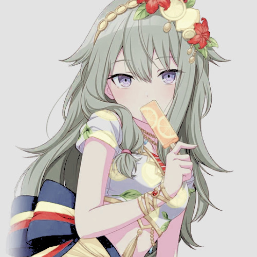
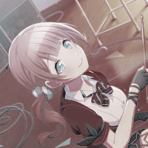

for example, the PSDs i used here barely have any layers, but i used a ton of selective color layers!
basically, from my own experience, i'll say Selective color is to make a specific color kinda .....pop (?. idk how to explain it.
moving on, i also recommend threshold! idk how to explain this one, so i'll just leave an example!
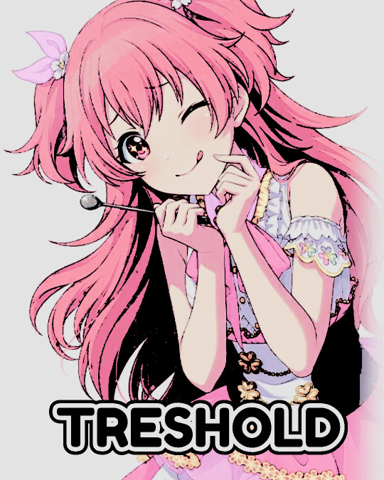
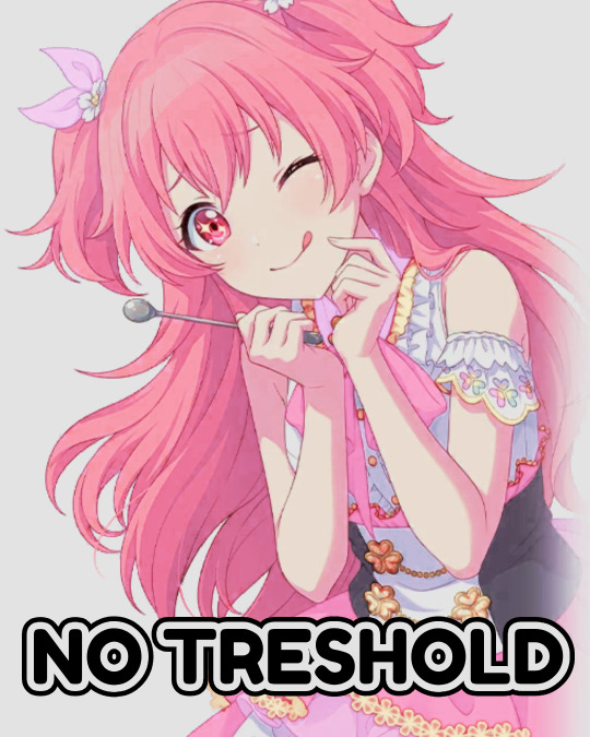
I exagerated it a little to show the effect properly lol, you can adjust it to as little or as much as you want! just remember to set the layer to multiply! (or any blending mode that works for you! many of them work, i just use multiply for... no reason at all actually)
next up, we have Replace Color!
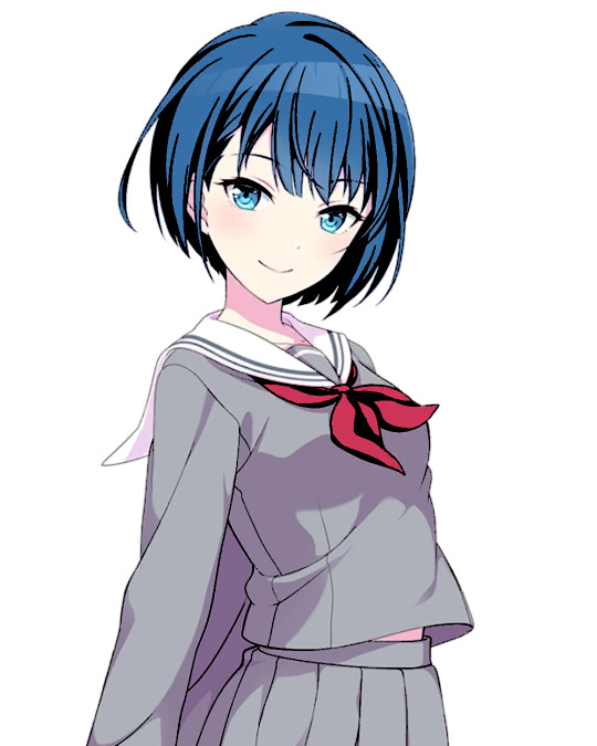
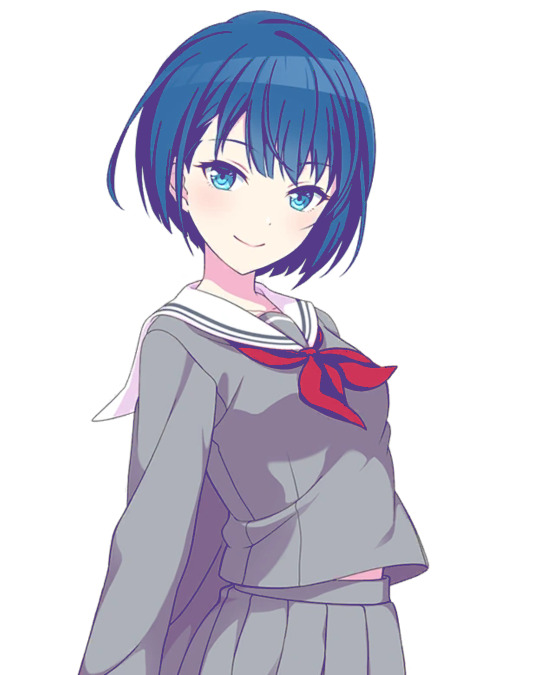
it literally just... replaces colors. most people use it on black! just add the effect, set the color to the one you wish to replace, and start playing with the settings!
-- also, note that when using it on black, you have to turn up the luminosity for it to work!
last but not least, Color Intensity!
its just... color intensity. but yeah! its pretty useful! i'll leave 2 examples here.
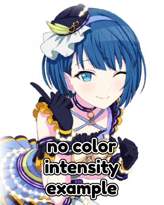
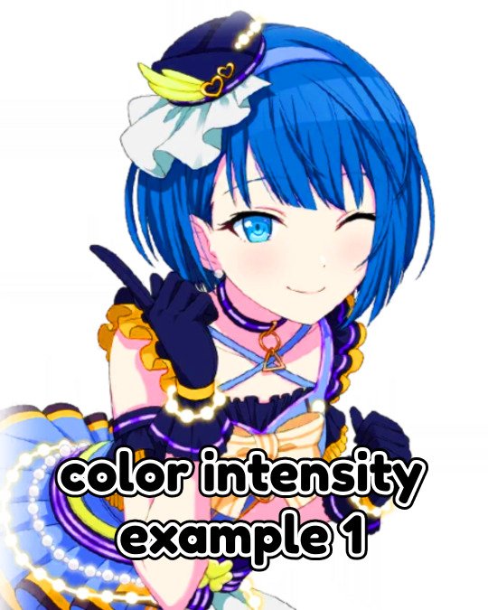
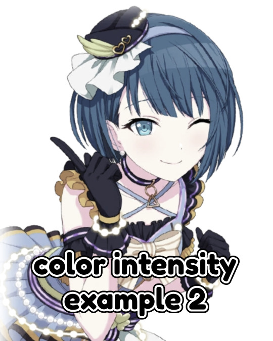
If anyone has any other tips, feel free to reblog! i kind of learned everything by myself, so im not the best, sorry.
i'll confess i haven't seen it myself, but @/canarysage has a psd tutorial here! so... just saying, you should check that out!
(user canarysage feel free to throw tomatoes at me and boo me off the stage (in other words, feel free to send an ask to be removed!))
...and if i left something out, let me know!
#questions / tutorials。#rentry help#rentry tutorial#photopea tutorial#photopea help#psd help#psd tutorial#rentry#psd#rentry graphics#rentry dividers#carrd material#photopea psd tutorial#coloring help#psd coloring help#photopea coloring tutorial#coloring tutorial#coloring psd
214 notes
·
View notes
Note
your rendering is so good how do you do it
Thanks, I love your rendering too!! Gonna try and make a tutorial ^^
To start off, I'm on Clip Studio Paint and these are the brushes I use! First two for rendering characters (round brushes) and the other two for mostly backgrounds (square brushes)


I used to do lineart, but it takes too long >:( now I just make a sketch and sorta clean it up!

Next I fill it in with a gray color. For simpler pieces I just put in the flat colors, but for more paint-y pieces I do grayscale -> color! I'll be doing that here :)
Also, I make 3 clipped layers on top of the gray - two are multiply, and the top one is screen. On the first multiply, I do a soft gradient using an airbrush
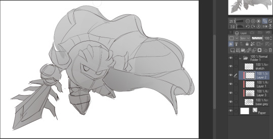
On the next multiply layer, I fill everything in with either a cool-ish or warm-ish gray, depending on the mood ^^
I also determine a light source, and use the lasso tool on the screen layer to block out where (I think) the light hits! Tbh I just do wherever feels right lmao, but I recommend having a reference! I like doing it in triangle patterns
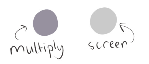
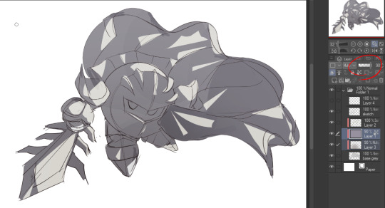
Then adjust the opacity of each layer to whatever feels right, and merge everything (I don't merge the sketch/lineart yet, I do it before adding colors in!)
Now... rendering. Some tips I have are color pick (greys) off of the canvas and use them to paint! Clean up the sketch more, erase edges, but I save details (like Galaxia's red gem, his eyes, etc.) for the end, or during coloring.
After I'm sorta happy with it, I merge the sketch layer, then duplicate it, and add a gradient map! I did this sunset-y one but changed the hue to yellow-ish, then lowered the layer's opacity ^^
Play around with the hue-saturation-luminosity setting!
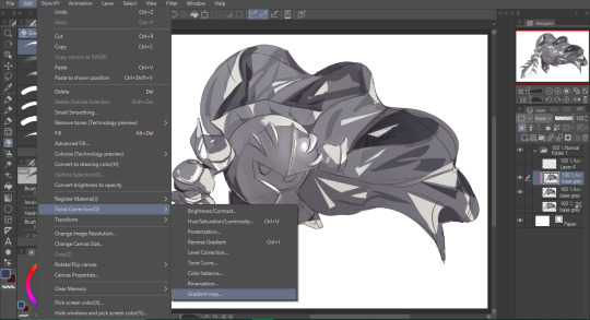
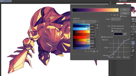

Now go crazy with blending modes! Multiply, overlay, color, glow/color dodge, etc. Feel free to layer them up on top of each other too, and this is to add the character/piece's actual colors in. For example, I used a white-blueish overlay layer for his mask and glove, blue for his cape, blah blah
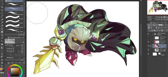
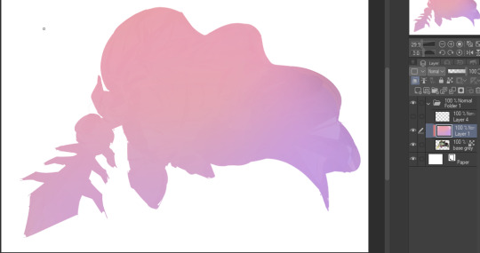
Now I clean the sketch up/refine it more. Also, to "harmonize" the color palette, you can add a colored gradient on top. Then set it to multiply, and add overlay/glow dodge layers with any colors you see fit! I like using teal and light/warm orange! Here is an example of a colored gradient:
Another tip is to add saturated colors on the edges of both lighting and darker shadows, before blending it:

Also I usually add in a light blue/grey in shadowy areas, and lower the opacity for reflective light:

Also! You can lasso + use an airbush with a light blue to block out parts of the background (his cape here, for example). It helps with more depth!
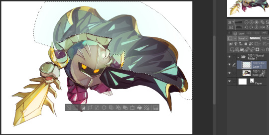
Finally, I like adding sparkles on low opacity :3 And gaussian blur to certain areas! I'm using radial blur on this piece though ^^

For the background, I like doing blocky shapes!! I use my square brush on 90% ish opacity, to color pick different hues from the piece. For lighting I use a glow dodge layer, here's a mini timelapse as well as the finished art!
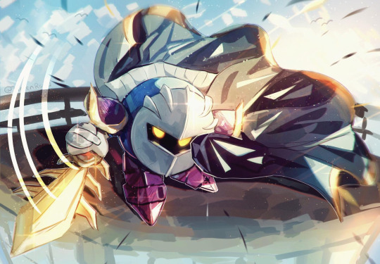
At the very end, play around with the hue/saturation and contrast tools to change the colors :)
#iiii hope this helped??#first time making a tutorial sorry!!#art tutorial#kirby meta knight#meta knight fanart#meta knight#nintendo kirby#kirby nintendo#kirby fanart#kirby series
563 notes
·
View notes
Note
Hii first of all, I FUCKIN LOVE YOUR ART! ITS GORGEOUS AND IM SURE EVERYONE CAN UNDERSTAND YOU REALLY GIVE YOUR SOUL INTO THAT🤧 Your color palette looks so good, What do you pay attention to when painting? (Like when do you think its better to use multiply or something like that and etc.)
first off, I'M HAPPY YOU CAN TELL THAT I PUT MY SOUL INTO MY ART!!! im genuinely in love with drawing and am always finding ways to make creating art enjoyable and impress myself with what i can achieve and learn :D
second, thanks for asking your question!! i dont mind answering it, but my response is quite long. here's my thinking process:
(you specified layer modes like multiply, so im gonna gear my answer towards that a bit) 1. REFERENCE SEARCHING IS KING. color is actually extremely hard for me, so i search around for artworks with palettes i'd like to use and study how an artist uses it. some situations i have a clear idea of what i want, but usually the images in my head are extremely vague, so i borrow palettes from various other artworks that fit the vibe of what i want. an example is this one. my main palette reference were from these artworks. im looking at this artist's use of high saturates and how drawings are overlayed on top of each other. while looking at references, im asking myself how is this artist using warm/cools, where are these warm/cools placed, if their illustration used any form of texturing (like halftones, hatching), how do they use their palette to render form/shape/gradient, when/where do they saturate/desaturate their colors. those questions inform my decisions when using colors too.
2. USING LAYER MODES WHEN NECESSARY. i used to be reliant on multiply for everything, which atp i dont do since i can definitely push colors more first before using layer modes. only when i feel like my current colors are lacking do i start tinkering with tone curves and/or brightness/contrast/hue/saturation/luminosity settings. and if that doesn't work, then i start using layer modes. using layer modes do help with achieving certain effects, color corrections, or when i want to fuck around and find out. i think having a better understanding of what these modes can do makes you more decisive on how you can properly utilize them and to achieve a particular look (like using multiply for a cel shaded style). here's an example:
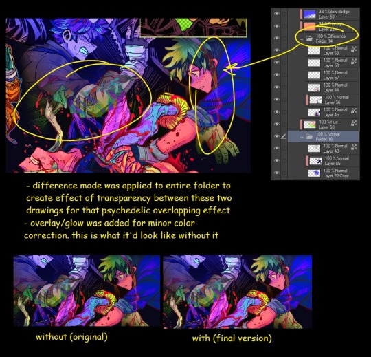
this leads into my next point:
3. BALANCING OUT VALUES. big thing that makes an illustration hard to read is if values blend together which affects the hues and contrast. i check for what elements need to be distinguished from one another and if it can be read clearly. using layer modes can either help with this or not help at all. it's very dependent on the type of layer mode. here's this example where i applied pin light:

back to #2, there are various instances where i'm using layer modes for quick color corrections and/or to help with readability:


other times, i start off having my entire subject in gray and to figure out main shadow/lights (similar to the multiply cel shaded process i linked ealier). im thinking about what this should look like if i only used 2 value tones:


when in doubt though, i check my artwork in grayscale to ensure values aren't overly blended into each other, especially if i didnt start with grayscale like this one:

painting for me takes into consideration a lot of different aspects. im thinking about how colors should interact, where/when to give contrast, checking/balancing out values, etc, but im also making it a time to study off of how other artists use their colors through the references i collected.
hope this answered your question! lmk if there's more :]
#answered art process questions#answered asks#this one took me a couple of hours to form out my thoughts while editing in examples ngl
149 notes
·
View notes
Text
This is not even technically a serious tutorial, but I've been rediscovering my way of coloring lately and I had nowhere to write these notes which I'm afraid to forget. And what better way than publically

Basic colors: Monochrome layer of the 'main' color. Brush is in multiply mode to allow it to lose saturation and luminosity. Focus on having the interest areas (usually the face+whatever is in front of it or occupies a large space} more or less clearly set. In this picture there's not much worry for shadows. If shading is very important to the piece, keep it in mind but don't define them yet. We are mostly looking for general blocking.

Underpaint: A flat layer under the basic colors. Generally neutral gray, but it can be other kind of unsaturated color. Evens the colors and enriches the palette.
The use of neutral colors is due to the special properties of grey to appear the complementary color of any color is is next to while not expanding the color palette.

Base color lights: Enhance the lights with a Screen layer, using colors picked from the picture so far. ALSO: If there's going to be complementary colors, paint those areas white or very light so you can apply them later without muddiness. This might be more or less necessary depending on the colors relation to each other and the next step
In this example, Rei's eyes are not completely white because the unsaturated blues will work well with pink/salmon

Overlay layer: Add secondary colors with Overlay. These are the secondary colors of the image. They are always going to be a different hue.
If the secondary colors are harmonious, it should be easy to blend them. Focus on blocking and contrast the most, and mind saturation, saving it for points of interest or viceversa.
If the hue is complementary or very far in the color wheel, it's important that we left unsaturated or light areas saved for that in the past steps, because otherwise Overlay might not blend well and easily result in muddy or extremely dark saturated colors (which I personally don't like)
Between the grey underpaint, the base colors and secondary colors, chances are you have 90% of the color palette covered. From now on we are going to eye drop from the layer and only move through the color wheel when needed.
I think it'd be no problem to repeat this step if going for a triad palette, but be careful with the ratios and keep the luminsity and saturation steps in mind.

Deepen colors: Using multiply layers, add colors that feel necessary. Color pick them from the image itself, and only vary when necessary.
This is a good step to change the colors of the line art by changing the hue.

Using the same method, use Screen layer mode to add highlights.
Remember there's no need, nor it is recommended, that you colorpick from the same hue to paint over. Highlights will look more rich if they're in a different temperature, and shadows will do the same if they're in a different temperature, although you should use very light colors to avoid ugly blending.
I might update this post later if more epiphanies come to me
81 notes
·
View notes
Text

…make a psd look interesting?
aka, how to fuck up a psd no glue no borax. have you ever looked at your psd and gone, damn, this shit doesn’t fuck? happens to the best of us. here are easy ways to spice up your psds so you don’t end up with the editor equivalent of communion bread
for example purposes, i made a simplistic psd to test these methods on. they should work with most psds, but, as always, fuck around and find out on your own for best results <3
i. threshold + gradient map
this one is an easy way to add specific colors to your psds. step one: add a threshold layer, and adjust it your liking. typically, i set mine to somewhere between 60-40. if you’re making a psd to work on dark skintones, you may want to set it even lower, but if you’re working with, say, pjsk characters, you can go pretty high
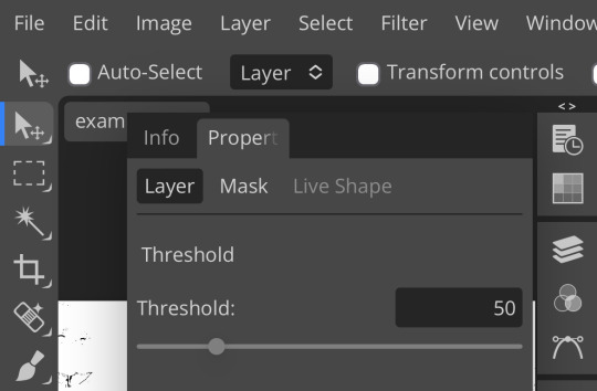
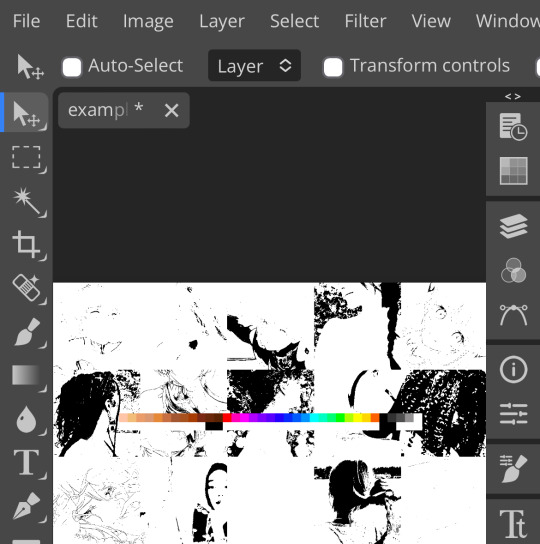
wow flashbang. you can see on my example behind that it doesn’t work super well on irl pictures, and my pjsk images don’t have threshold at all lol. next thing you want to do is set the blending mode of your threshold layer to either multiply or darken—they’re basically the same thing
(psst, if you want to know more about blending modes, check out this post!)
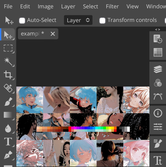
waow crunchy! but still boring right? still boring. not to worry, here’s the fun part: add a gradient map layer, tap it, and go to the slidey icon on the side, which’ll bring up a page like this:
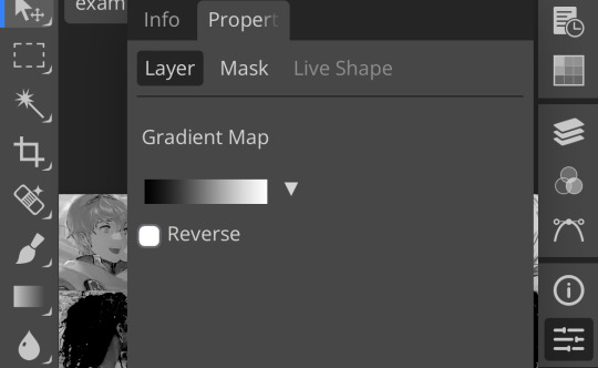
click the gradient in the middle there to edit it. once in, edit the black color to be at about 80-90%, and then change the white color to whatever you like. edit out, and tap the little square next to the text that says “reverse” which should make your gradient look more or less like this:
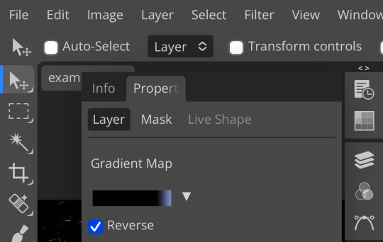
then change the blending mode on your gradient map to ‘screen’ which’ll axe all the black and just leave your color. now your image looks like this:
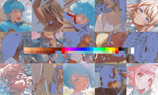
boy howdy, isn’t that fucked up! it is more interesting, but if you don’t want to be looking at that abomination, change your color in your gradient map to be darker, which’ll give you something more along the lines of:

…which is much more reasonable. this is a fun way to add color to your shadows slash lineart, and can be a quick and easy way to make a psd look less flat.
ii. noise gradient map
some of you may be thinking, but, canarysage, what the fuck is a noise gradient map? to which i reply: you’re boring. let me show you.
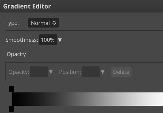
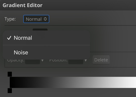
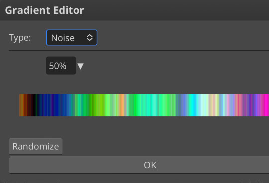
kinda fucked up, right? well, that’s the goal. unfortunately, there isn’t a way to directly edit a gradient map, but you can just click that little button that says ‘randomize’ a couple times until you get something you like! you can also mess with the percentages but i don’t do that because it looks weird

boy howdy, that’s weird looking. not to worry, though. once again, our best friend blending mode is going to come in handy
i typically go to soft light and set the opacity to about 20-30%, but, as with anything, feel free to mess around and do whatever you want. luminosity is also a fun setting for noise gradient maps, just make sure to crank the opacity way down for the sake of my eyes

wow, much better! you can see that the gradient map added a bit of purple coloring and a funky little texture. super cool! thank you, gradient map!
iii. channel mixer
i already have a post on channel mixer and i’m not rewriting all that so if you don’t know how channel mixer works check that shit out but the tl;dr is: ideally, all your channels should add up to 100 (including negative numbers) but that rule can be broken if it looks cool enough. capiche?
iv. color lookup
photopea has a few default color lookups that are pretty easy to use, but i have a couple of presets that i like to add if i’m feeling stuck. to make your own color lookup, open up a psd, and go to file > export color lookup
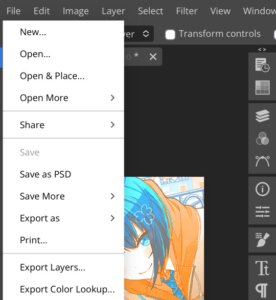
then save it and open it from your files. when you open a color lookup layer, you’ll see an arrow next to the text saying LUTs—click that and your new color lookup should be there
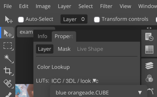
once you tap that, you’ll get a compressed version of your psd added to your folder. it’ll look something like this:
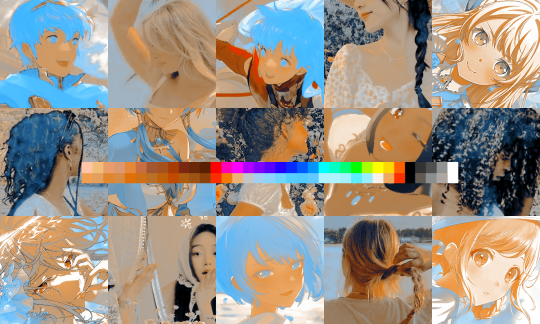
holy orange and blue, batman. luckily, you can apply blending modes to color lookups just like any other layer—mess around with them until it looks how you want!
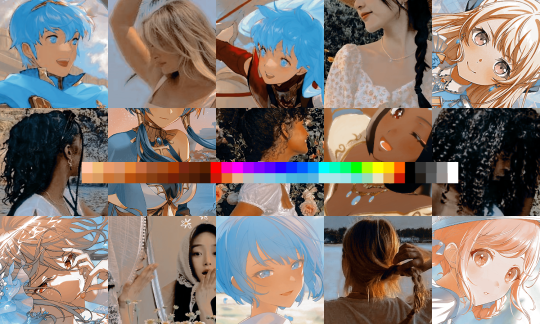
waow much more reasonable! i set this one on color and about 55% opacity, but that is really dependent on what your color lookup looks like and how you want your psd to look. remember, there’s no right way to do things!
an additional note: if you want to, you can save the psd you’re working on as a color lookup instead. if it looks too simple or just isn’t turning out how you want, that’s a good way to incorporate it later :3 just follow the same steps as above!
v. no shame in starting over
if you’ve added and taken away, duplicated and removed, fucked around and found out, and your psd still isn’t how you want: it’s alright to just axe it. the edit police aren’t gonna kill you for it, i promise. if you’re worried about wanting it later, just save it as a psd and come back when your brain is refreshed ¯\_(ツ)_/¯
psd-making isn’t an exact art, so, obviously, there’s no real simple solution to making it look how you want. you just have to mess with it and see what you’ve got. these are just my methods of making my psds less blagh, but, obviously, my editing is moderately more deranged than your average editor.
…so that’s how you do it.
101 notes
·
View notes
Text
TADC ABSTRACTION EYES BRUSH FOR CLIP STUDIO PAINT 👁
this is a Clip Studio Paint brush file (.sut) i made to replicate the designs of the eyes of the abstracted from The Amazing Digital Circus!
here's what it looks like in action!

to add a little extra "oomph," you can create a copy of the layer you drew on with this brush, place it underneath said layer, then play around with Gaussian Blur and layer blending mode to give them a glowing aura!

also i realize the colors may be a bit too saturated. this can be fixed by adding a correction layer for hue/saturation/luminosity or brightness/contrast

i hope this can be helpful to TADC fanartists out there! 💖
68 notes
·
View notes
Note
Not ship chart related but I think your art is so pretty!! Do you have any tips? Especially with coloring if it’s okay <] (/nf)
waah thank you very much! i'll try and explain but here’s my colouring-specific tips, or at least how i choose my colours !! <3
unless for stylistic reasons (e.g. greyscale drawing), i personally avoid pure black, greys and white for colouring. go and choose off-colours instead! for lineart, black is okay but i always go for an actual colour anyways heheh. for the background colour of your canvas, sometimes an actual colour (rather than white or grey) may help you pick your palette to be more harmonised!
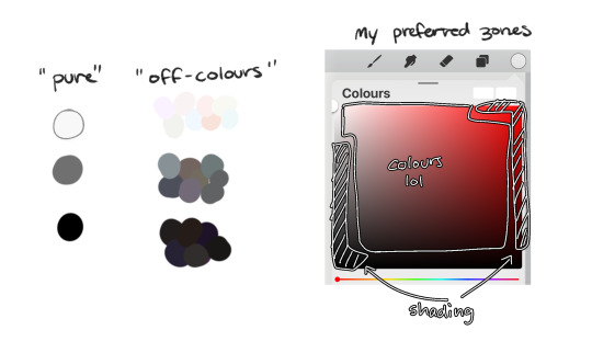
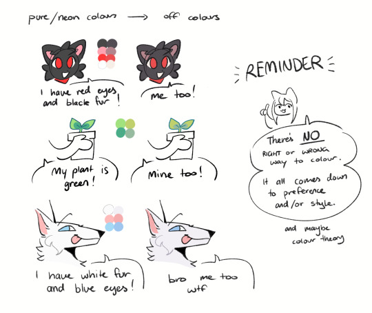
following this, i also don't like using pure/neon for colours (aka the top right corner), unless it's for a certain aesthetic or artstyle (e.g. the character has a "toxic/radioactive" aesthetic; the character is a scenedog (or similiar); or highlights). see below for examples! they may be subtle but sometimes the subtly can make the difference you are looking for, especially if you're looking for a natural look. if you're aiming for the bright/old 2000's artstyle, then pure/neons may be your friend!
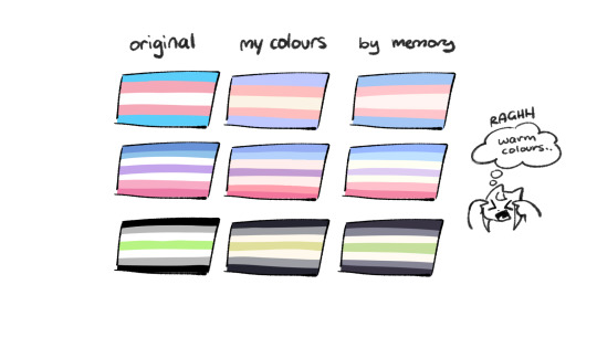
when i'm casually drawing characters (oc or not), i rarely colour-pick from the reference image. i find that when you're "forced to make the palette", it can come out more pleasing to your style/atmosphere of the drawing! it’s more personalised that way... like yea, that’s my favourite versions of those colours! i'm not saying that my colours are better though, only that "hey that's me! in those colours!!" you can have the reference image on the side or go by memory. here’s me doing this with pride flags:
nowadays, when drawing the spooky month characters—who have simple designs god bless—i can just imagine their reference and adjust the colours in my head lol example: if i know that Lila's colour palette is purple, and that her winter sweater is coloured lighter than her hair, then i can just go ahead and pick whatever shade i want following that rule!
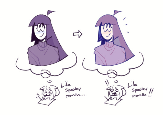
(of course, always double check with the actual reference for physical design inaccuracies and skin tone if it applies. my advice above is just for general hair/clothing colours! …because yknow you don't want to accidentally whitewash a character's skin in the name of aesthetics lol. if you’re unsure and want to be on the careful side, please do colour pick the skin at least !!)
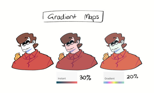
moving on... gradient maps and certain blending modes (like exclusion, luminosity and darken) can be a game changer too. for normal drawings (e.g. drawings with no environment), i use darken the most because it changes a few colours rather than the entire piece... (the percentages are opacity levels!)

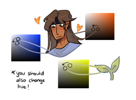
oh and as a really basic shading tip without using blending modes: sometimes, you just gotta go for grey. shading a warmer colour? use grey to make a cool tone. shading a cool colour? use grey to make a warm tone. not all the time (because you don’t wanna make your shading seem muddy), just sometimes…
and that's that! there's always exceptions to rules and often times, your headshot doodle ends up as one big experimental mess (in a fun way, hopefully)!
this is how i choose my colours though most of the time, it is just me going “good enough”
i think we're pretty similar on how we like warm colours! i enjoy going the simple/lazy route and avoid blend modes but then again, shading is a whole different thing…
hope this helps in any way !! <:3 !!! <3
#if anyone wants to ask for specific tips i’m happy to share!#if i have any lol#[ the askbox mourns ]#[ the art of mourning ]#[ mourn's mourns ]#anyways yea i kinda do just imagine the spooky month characters with a light orange multiply layer and then try to replicate it irl#my personal/lazy rule is that if it looks good faraway its good enough AHAHA#spooky month lila#spooky month jaune#spooky month rick#spooky month aaron#spooky month#“actuallyyy the 'black cat' is actually dark grey—” SHHHHHH SHUT SHUT IT. SHUTUT !!!!! i need u to see the lineart /silly#[ mourn's resources ]
96 notes
·
View notes
Note
What layer effects and modes do you use to make your drawing colors look scrumptious
after i finish rendering a piece i use do tone curve -> color balance -> gradient map (color dodge and lowered opacity) -> hue/saturation/luminosity -> posterization (sometimes) lowered opacity. i just fiddle with the settings until it works with my piece. I tend to lean to more of a purple hue (which is why my drawings sometimes look so purple lol)
20 notes
·
View notes
Text
by complete accident I have discovered how to make WORM FONT. (font link)
predictably, this has halted productivity for the day. I'm writing with worms now. take it up with them
instructions: separate dots out onto a layer above the font. activate dot layer style 'outer glow'. set glow blend mode to 'Luminosity'. change Technique from 'Softer' to 'Precise'. adjust Spread and Size for desired worminess - mine is set to 0 Spread and 32 Size.
edit colors as you wish and congrats. you got vurms. 🪱
#art#digital art#photoshop#fonts#typography#WORM#this technique will also work for things that are not text#you just needs to have dots in a row with the above settings#and they'll add this cool segmented effect to whatever's underneath#video
38 notes
·
View notes
Text


Billie Zangewa (born in 1973 in Malawi, lives in Johannesburg, South Africa) is a Malawian artist who hand sews silk fabrics to create collage tapestries.
Billie graduated with a Bachelors of Fine Arts from Rhodes University, South Africa after studying printmaking. Her mother worked in the textiles industry on sewing and embroidery. As a child she witnessed the bond between her mother and other women as they sewed, along with other domestic tasks together, which would influence the themes of motherhood in her work. In her artistic training, she tested several modes of expression, but finally became passionate about the work of silk, both because of her interest in the fabrics, its luminosity and reflective qualities. She indicated that: "Silk has a fabulous quality of reflection but at the same time, I think it is very modern and at the forefront of fashion".
Zangewa's early textile work consisted of the production of patchwork handbags, using scenes taken from the city of Johannesburg. When the artist first started creating the larger-scale collages she is now well known for, she more heavily relied on the usage of text, images with a pop art influence, and, sometimes, effects including embroidery, beads, and mats on the surface of the fabric.
Billie Zangewa works primarily with raw silk offcuts in intricate hand-stitched collages, creating figurative compositions that explore her intersectional identity in the contemporary context and challenge the historical stereotyping, objectification and exploitation of the black female body.
38 notes
·
View notes