#looking at the designs weird me out theyre so wrong
Explore tagged Tumblr posts
Text
WHAT DO YOU FUCKING MEAN ERI'S HAIR IS A FUCKING WIG AND HER EYE COLOR WAS FUCKING CONTACTS
#ooooh god i dont like team star's 'normal' designs#WHAT DID YOU DO TO THEM GAME FREAK YOU TOOK AWAY THEIR SILLYNESS#WHY DOES ERI LOOK LIKE THAT WHAT THE FUCK#WHAT THE FUUUUUUCCKKK#looking at the designs weird me out theyre so wrong#another point to add to 'wow this dlc kinda disappoints me'#indigo disk spoilers#their 'normal' designs piss me off sorry#this is so wrong oooh my god#it's mainly eri and mela why did they do them so dirty#at least they didn't redesign penny......
8 notes
·
View notes
Text
Alright here's my full (possibly hot) take on redesigning Hazbin Hotel characters and making a video showcasing those redesigns while you criticize the official designs.
First and foremost, you are redesigning someone else's OCs. Hazbin Hotel is, in essence, a passion project for Viv. How she talks about it makes that incredibly clear to me. The only difference between Hazbin Hotel and, for example, the story I'm developing surrounding some of my D&D OCs is that Hazbin Hotel got picked up by a streaming service and is significantly more popular than most passsion projects get.
Personally if someone wanted to redesign my D&D OCs, I wouldn't mind it, in fact I'd probably think it was really cool that someone would want to redesign one of my OCs to be closer to their tastes in terms of what they like to draw. I would, however, be made incredibly uncomfortable if someone made a video redesigning them where they also pointed out everything they thought was wrong with the designs. I didn't design these specific D&D characters to be 1-to-1 accurate to their classes in D&D or to look professionally designed. I designed them how I wanted them to look for the story I'm telling because I don't plan to ever play them in a campaign. The main character Avlan is a paladin, and I can acknowledge that his design might not look exactly like a paladin. One of the tabaxi in the story (Ice) is a bard and the other (Spark) is a ranger, and I acknowledge that their classes might not come across well in their designs. The single tiefling I've designed for this story (Tragedy) is a cleric but might not come off as one in their design. But I specifically designed them to be easy for me to draw because I want to be able to tell this story through my art. Having someone say "oh, Avlan's armor isn't paladin enough!" or "Avlan's fur colors and patterns should be closer to a wild rabbit's because harengon shouldn't be based on domestic rabbit colors!" would fucking hurt (especially because I'm so attached to Avlan, but it would hurt just as much if similar comments were made about Ice, Spark, or Tragedy). I am so passionate about these characters and being told their designs are bad or wrong in some way would be like a stab in the heart, and it would still feel like a stab in the heart if this story ever got a massive fandom behind it. Giving Avlan more complex armor because you think it'd look cool or just want to see what it'd look like? Sure, if I could draw more complex armor I'd give him more complex armor too. Giving him more complex armor but also shitting on the armor I decide to draw him with? My motivation to draw him in his armor, potentially draw him period, would be dead for WEEKS.
Why is it suddenly okay just because someone's passion project was picked up by Amazon Prime? Why is it suddenly okay to be "fixing" someone's character designs just because the project has a much bigger budget than most artists get and is on a popular streaming service? It's not. I don't care if you're a professional character designer, or think a specific character would look better with certain traits, or just don't like the character designs.
Hazbin Hotel is still Vivienne Medrano's passion project, and redesigning her characters and making videos talking about everything you think is "wrong" with them is, honestly, disgusting. You can make videos explaining your choices in your redesigns without putting down the designs that already exist, whether you like them or not. Me thinking Lucifer looks better with his tail not restricted to his full demon form doesn't suddenly mean I don't like his official design, because I fucking love it. If you wouldn't do it to an artist whose passion project is just a webcomic here on Tumblr, don't fucking do it to an artist whose passion project got picked up for a cartoon by a big streaming service (or any company for that matter).
#hazbin hotel#vent#kinda#i just think it's a weird double standard#'yeah don't fix people's art! unless theyre working on a project that was picked up by a big company then it's fine to fix their art'#like???#why is that a mentality that exists?? they're still viv's characters#and you can still redesign them without shitting on the official designs#pretty much all of my redesign notes for hazbin hotel are 'how can i make this character easier and more fun for me to draw'#because i specialize in furry art. i don't usually draw humanoids lol#so giving vox some shark traits for example or making adam more birdlike would make them more fun for me to draw#why can't we redesign them based on that without saying 'i think it's weird that this decision was made for this character's design'#they're still viv's characters. they're still her designs. stop pointing out everything you think is wrong with them for fucks sake#we don't need to talk about hazbin's character designs. we don't need to 'fix' them#just say they aren't for you and move on. there's literally nothing inherently wrong with them#i also feel like not enough people actually do research into the historical contexts of some characters#and i think it'd be really fuckin cool to see people redesign characters more based on headcanons based on that than anything#look into how the mafia operated in new york in the early/mid 1900s for angel. look into radio hosts in the 1920s for alastor.#look into las vegas culture during husk's lifetime for husk. look into the culture surrounding tv hosts in the 1950s for vox.#LOOK INTO THE CULTURE OF THE ELIZABETHAN ERA FOR ZESTIAL.#(i just presented zestial ideas to anyone who wants them on a silver platter. you're welcome)#(also new headcanon that zestial was friends with shakespeare in life because why the fuck not)#(when the tags get wildly out of hand)
11 notes
·
View notes
Note
hey so small fun facts about lyric and the process of making her, her right eye, the brown one, is a face detail slot to allow for heterochromia, which is where modder's will usually put it. however, this can cause texture conflicts with certain clothes and accessories, especially custom ones, so u'll see an eyeball texture in random places it shouldn't be. in lyric's case it was the head scarf she wears in her formal and cold weather outfits. u can even spot the white sclera part in the closeup picture of her cold weather outfit.

she also can't wear most jewelry, especially necklaces, for multiple reasons.
1. the necklaces that hang low look distorted due to her custom body preset, mainly in the collarbone area. if u use custom body presets u have to get used to this happening a lot but it's still sad because a lot of the cool witchy-wizard jewelry i had looked fucked up lol. :(


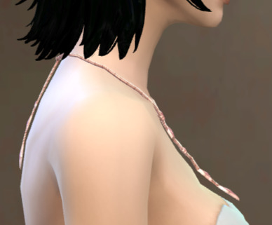
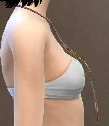

2. the texture of the jewelry would be recolored in some way. if u zoom in closely on the necklace she wears in her hot weather outfit, the crystal has small gray markings that aren't supposed to be there. i'm not sure why it's gray but it might be the shaded part of the sclera.

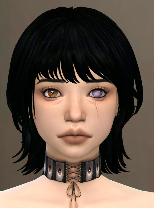
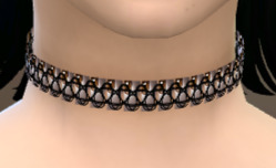


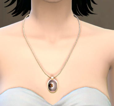
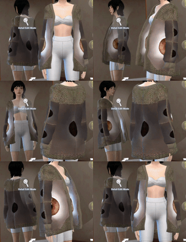
or 3. they replaces her eye texture completely. sometimes this can be fun! most of the time it is not.
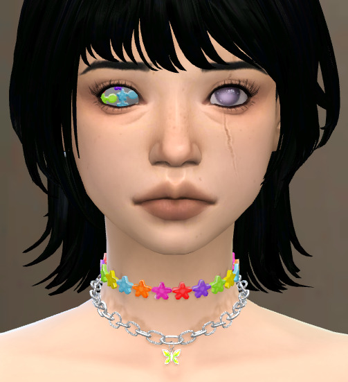
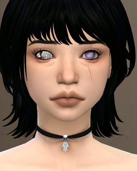
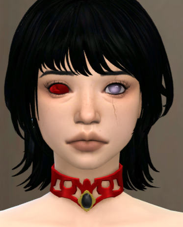


tl;dr: why is there heterochromia options for cats and dogs (not horses for some reason btw) but not for humanoid sims? i'm going to kick ea's ass.
hey idk if u remember this post
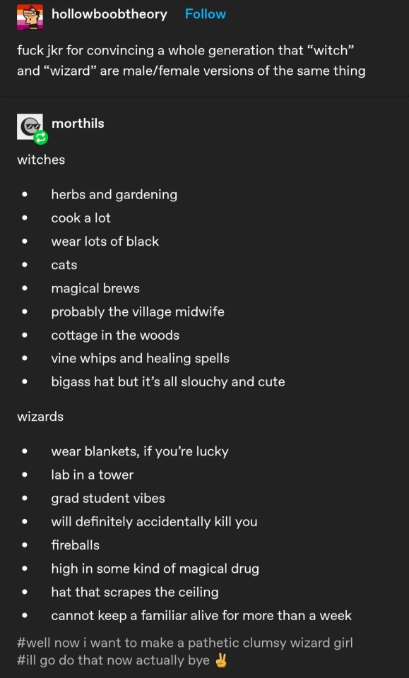
but heres the pathetic clumsy wizard girl. if u even care 👉👈
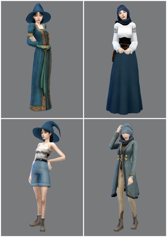
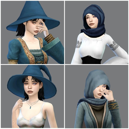
her names lyric! she has a hard time seeing out of her left eye from a spell gone wrong and shes a wet pathetic mess <3
HAIII!! Ye, ye, ye, I like your pathetic little meow meow wizard woman!! Take this!
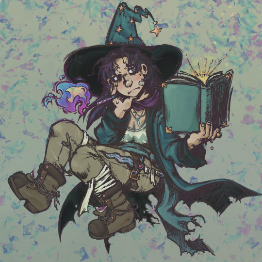
also aaa tumblr made it blurry ;--; looks nicer when u click on it.
#tw scopophobia#tw eye horror#<- maybe? just in case#also uhhh u mightve noticed lyric looks a bit different! i recently got the motivation to redesign my old sims which has been a lot of fun!#the way i make sims now (and build/decorate also) is different than i did 2 years ago and its kinda cool to see that#but i still love lyric's first design and the art ofc!!!!! 💕💕💕💕#i wish i could actually give her that dagger strapped to her thigh bc thats such a cool detail augh#btw im not trying to convince players to not download and use heterochromia cc‚ this is just smth u gotta deal with for ALL cc lol#a shirt texture can override a ring texture‚ a ring can override a hat‚ skirts can override a pair of shoes‚ etc. etc..#usually its a small part of the cosmetic that will be effected like u see in the head scarf and not overridden completely#its just smth u gotta learn to deal with if u wanna play with cas cc ¯\_(ツ)_/¯ its annoying‚ yeah‚ but so is the sims 4#unless u can somehow figure out how to fix it urself. idk how. <3#tbh i could go on for hours on the weird shit that cc can do to ur sims#i have a pair of really nice headphones installed that look totally normal in cas but gives my sim 4 arms in live mode#its pretty cool but was startling as hell when i first saw it. maybe it was conflicting with the body preset? idk#theres some cc that looks normal in cas so theyre nice if u plan on doing cas photoshoots but super annoying or weird in live mode lmao#isnt the way sims 4 custom content work amazing? /lh#btw typing this made me realize ive been spelling and pronouncing sclera incorrectly. what do u mean its not spelled scalera. what.#ive also recently been spelling jewelry wrong. i forgor how its properly spelled and have been spelling it as jewlery instead. smh.#anywayyy ummmmmm sorry for the rambling and the 100 tags em 👉👈
58 notes
·
View notes
Note
hi so i was hoping for like a gut check on this because maybe it's weird and if it is i want to stop.
so im trans and autistic, and because of that im a little behind on understanding masturbation and my body. ive been trying to read up on it and im trying to learn how to masturbate. one of my friends and i were talking about it, and he asked to see some of the webpages i was looking at (shoutout to you and planned parenthood). but we were looking through them and one of the links went to scarleteen.
and he said it was weird and kind of perverted because im an adult (24) and thats for teenagers. i said that i thought it was okay because its not like im interacting with teenagers and theyre pretty good for teaching me i thought because i like the clear writing and the easier words and also its just a webpage. but the more i think about it the more freaked out i get. like scarleteens one of them and also teen vogue and some other ones because those are just what come up a lot of the time for learning more.
so what do you think? is it bad? because my friend and i ended up not sure. but if its bad i'll stop i dont want to hurt anyone.
Hello! Let me see if I can help.
So, there's nothing wrong with using resources designed for children when you're an adult, for the most part.
You're not taking resources from children or even interacting with children [though that's not even necessarily an immediate issue, depending on the situation], you're just using an accessible website with a lot of information on things you might've missed.
It can be very hard to find websites with accessible language, especially when you're new to a subject and there should be no shame in using something designed for people younger than you if it's helpful and its not hurting anyone.
I don't quite understand where your friend is coming from, to be honest. Using "perverted" and "weird", both harsh terms for something harmless, to describe this doesn't really make sense to me.
But I understand that it's upset you, understandably! So let me be clear:
No, there's nothing wrong with what you're doing. Using Scarleteen and websites like Teen Vogue are both perfectly fine, regardless of your age. They're targeted towards children, but children aren't the only ones who can use them.
It absolutely hurts no one for you to read their articles and learn. In fact, it's a good thing you're learning from these websites and showing them to other people you know. That only helps websites like that.
It's not bad in the least, Anon. I'd encourage you to keep using them, especially if they're helping you learn easily. That's literally awesome! [I'm honored to be among those you're learning from! <3]
Hope this helps! Let me know if you have any other questions. <3
64 notes
·
View notes
Text
GIANT FLUFFYBIRD POST
@onlyballs i saw in my phone notifs you sent me an ask but tumblr isnt showing it. HOWEVER. I believe you asked for fluffybird, and of course I will deliver!
i suggest searching the fluffybird tag on my blog if u want more thoughts. because i have said a LOT of stuff. but of course ill always talk about my guys!
BUCKLE UP BROTHER ITS A LONG WAY TO THE BOTTOM!!!!
to kick things off let me explain their characters and relationship. duck sees red as his absolute best friend, the one person in the world he truly gets along with. he loves red very proudly and openly. when it comes to the world and its horrors, duck doesnt much remember but also doesnt quite care. why would he? he has his best friend right there with him! he also loves yellow very blatantly even if he doesnt show it properly. theyre his family, and this is his house, so why would he want to change things or leave? even when hes aware of the pain that he (especially) experiences— he STILL doesnt want to leave— because as his bigger boy self says “this is as good as it gets!”
red sees things completely differently. red obviously does care for duck, but the majority of the time he will deny it. even at ducks FUNERAL red denies caring for him. red is so obsessed with coming off as the calm and collected one he ends up making himself look apathetic to the point of cruelty. duck can also be very cruel, but hes very blatant about the people he loves whereas red will deny ever loving anything. duck isnt afraid of love, but red very much is.
when it comes to the world, red remembers a bit more than duck does. yellow actually seems to remember things too, but his batteries keep his thoughts fogged so he cant properly articulate them. red can remember AND articulate things from past episodes. its not perfect, and he absolutely doesnt understand whats going on— but he DOES remember— and unlike duck, he actually HATES it. theres an argument to be made here that duck doesnt remember because he simply doesnt care to. duck doesnt care so he doesnt remember, while red cares A LOT so he remembers more. but i digress.
red wants to get out of the torture of the house, but truthfully he wants to be a different person altogether. he wants a new life not just because this one sucks— but also because he dislikes himself. he just wants something different. hes restless. even if the house was perfectly safe hed most likely still be running. he’s desperate to find a place that feels like home— but until he accepts his own differences he wont be comfortable anywhere. he refuses love from anyone that isnt his perfect made-up family because duck and yellow are “weird” and if he accepts their love that makes him weird as well, which he fights to not be.
if you really look at red, he doesnt actually want to be loved. he wants to be someone else and have everyone love that guy. but it just doesnt work that way.
duck loves red as he is now. or as he was yesterday, and who he’ll be tomorrow. it comes naturally to duck— he doesnt remember meeting red or developing a relationship with him because he never had to. he was put into the world already prepared to love red. its what he was designed to do. the three of them were designed to be a family, and duck is happy to comply with that script. although he doesnt see it as a script and sees it as his own choice to love them— which isnt technically wrong! i feel the house doesnt give them feelings— only puts them in a situation. so while they have no choice but to live together forever— its their choice to enjoy that life. duck chooses to.
red isnt happy to comply with a script at all, but he was also designed to live with duck and has his entire existence. theres a point at the funeral where red slips up. he refers to the plates on the ground as “our plates” while arguing that he doesnt know duck at all. theres an intimacy in sharing everything down to plates. they also share a room and bathe together (shown MULTIPLE times!) so no matter how much red denies it— he is extremely close to duck. he has no choice but to be. i feel thats one reason why he denies it so much— because he sees it as forced, and he doesnt want that. but i think duck would choose him anyway even if they werent forced to live together and thats why it works.
duck doesnt see it as forced because hed love red no matter the situation. no matter if they were chained to each other or free to go— duck would stay right there. but red wants that freedom. so he presents himself as if he dislikes or doesnt know duck to give himself the illusion of freedom from their shared cage. he doesnt think hed miss duck fully if he was gone. he even gets excited at the idea of living apart in transport.
but its all denial. because he would also choose duck if they werent stuck together! when theyre in the dark and red cant see him— he realizes he WANTS to look at duck. he WANTS to talk to him. he would CHOOSE to do so if he wasnt forced, and he HAS chosen to do so throughout the entire show, whether or not hes realized it. red gets more comfortable at the idea of spending time together because, yes, they are technically forced to share the house. but it doesn’t have to be that way! not in their hearts. not in their minds. thats the way duck sees it, anyway.
they might not always agree on things, but when they do it sometimes devolves into something terrible. There is a point where red guy gives up. he starts to give into the lessons because its easy. because sometimes he DOES enjoy them. sometimes hes just too tired and falls into the pattern he hates because its simple to do so. and maybe after years of being beaten down into submission he starts to agree with duck and see no hope of escape. thats when, at least from how i see it— they evolve into bigger boys.
its not shown how the boys get bigger but its obviously a progression. a slow ascent into madness. i think it starts with them becoming hopeless, and then finding hope in the lessons. theres nothing else to latch on to— so they latch onto them with everything they can. they learn everything they possibly can. they grow and grow and get higher and higher until theyre dangerous. until theyre more self-centered and cruel than theyve ever been. eventually they become too knowledgeable to be taught anything. they become a part of the house rather than occupants of it. soon theyre pulling the strings and torturing smaller creatures for their own enrichment. it gives them a sense of power over themselves knowing once they were in that creatures place. they finally feel in control of their lives but at what cost?
all of this is done with them completely glued to the others hip. despite getting more self-centered they just cant let go of each other. theyre tangled together like weeds. they love each other and they cant let that go— but they cant admit that or indulge in proper companionship because thats vulnerable, and theyre too BIG now to be vulnerable! so they sit across the room. never quite separate but never quite together. its better to be 10 feet apart and never look at each other than to be without each other. loneliness was always their greatest enemy and even while being trapped in close proximity forever they cant seem to escape it.
but there is a smaller version of them, a small moment in time where theyre happy together. where they can sit and have a conversation without fear of judgement. theres no stage-lights on them and the darkness hides their shame. they can actually tell each other how they enjoy the others company. they can be honest and vulnerable.
to duck its normal to tell red he appreciates him (in his own way) but for red to say so is shocking. duck is surprised. but hes happy. and they can spend time together being completely honest and loving each other without it being a big deal at all. without any worry. but those are the moments that always go first. the moments in their memory that deteriorate the quickest. maybe if that moment lasted— maybe if their walls were broken for long enough— they couldve started to get better. they couldve grown to be kinder. they couldve grown to be happy together. but they never have the chance to keep it long enough.
they live everyday as close housemates. they slip into a domestic life that comes naturally to them even when they may not realize. but when they actually start to think. as soon as a song comes on its so much more than that. and neither of them really want it to be— or they do but they dont know in what way or how. they dont know how to explain things to each other. they dont REMEMBER enough to discuss it. so it festers until it ruins them. every single time
tldr fluffybird is like this:
i cant keep reliving the same day every day. I cant bear to forget it all again. even when im too tired to fight ill still have the belief deep inside of me that theres somewhere out there better than this. that theres a version of me out there better than the one i am. i hope to find it some day and i hope to have you with me. i wish i could leave without you but im too much of a coward. This cant be all there is and i will prove it to you someday.
im fine reliving everything as long as its with you, exactly as you are. as long as youre willing to listen when i repeat myself. this IS all there is and im alright with that. an organ or two is a small price to pay to live forever with my family. youre ungrateful for wanting to run, think of all weve done together! but i know you will anyway. so ill be waiting to say “i told you so!” and then we’ll walk home. it might tear us apart but its still our home. this is as good as it gets.
RANDOM FUN FACT AND FAVORITE SCENE TIME!!!!
easy one first— RED is ducks favorite color! which is made even more fruity with the context that duck enjoys specifically LOOKING at red guy!
red and duck have matching pillows! theres two green pillows that you can see in the living room. sometimes theyre together on reds chair and other times theyre split between his and ducks chairs! theyre also in the webseries on their beds— but ONLY on theirs! yellow doesnt have one of these. at least i dont remember so. might be wrong but from what i can tell these pillows are always for duck and red only. at least most of the time if yellow does ever have one!
there are multiple pieces of concept art of 1: them being silly and 2: them being closer than in the final scenes. the original concept for the big boys shows them sitting MUCH closer and their arms intertwined, whereas in the final shot theyre not touching each other at all and duck is moved completely across the room (they are fucking ginormous irl tho to be fair)
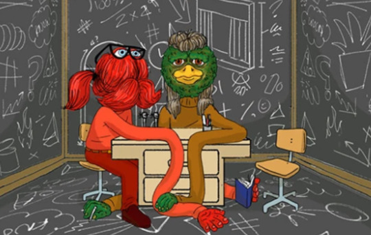
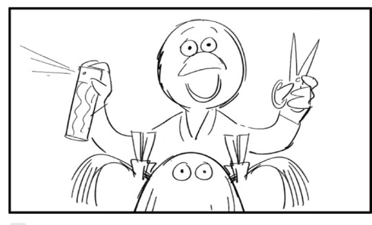
some of my favorite pieces of concept art tho are this little selfie of duck and red with his little peace sign and their arms wrapped around each other in front of a mountain <333 AND THEN DUCK DOING REDS HAIR :DD

one of my favorite scenes of them is in jobs when red is rambling about his lanyard and duck says “what have they done to you?” it sounds so genuine and its a really nice line. it really points out that as judgmental as duck is he worries when red isnt acting himself
speaking of jobs theres a running gag of duck disliking when red is clothed starting with this episode (ironically the first episode) when he walks into reds office he asks “what are you wearing?” and laughs at him. its obviously not about the suit itself because duck also wears a suit— so its easy to assume duck is mocking him because he looks silly in any clothes at all. red isnt supposed to wear clothes— and he also feels uncomfortable in them. its not HIM and duck thinks he looks like an idiot for trying to play someone else. he also gags when red wears denim in friendship which is honestly foul of him 😭. no matter the reason tho he canonically prefers red naked.
on a similar topic— there arent many dirty jokes in the show but when there are they almost ALWAYS come from or are about duck. but occasionally red will get caught in the cossfire. the CONSENT teacher shows up after something duck says in the big room. conveniently a room they share without a yellow normally there. thats then followed up by a rock teacher appearing which is a bit awkward considering duck has “private business” with a rock in transport. then to make matters even worse in the bigger room yellow tells them to “experiment on each other”(?!!?) to which duck turns to red and goes “would you be keen?”(😭⁉️)
(the scene where duck looks red up and down in the car is debatable but ill mention it anyway!!)
its hard to ever truly confirm this one because it was never recorded but the reason fluffybird kicked off so hard back in 2022/23 was because a producer on the show during a qna told everyone to continue shipping red and duck! there were multiple people from around different corners of the internet who went to this qna and all had the same story, so i dont think its a lie but i still cant tell you we have full proof. i know becky and joe repost and encourage fanart of them tho, and thats basically the same thing so. anyway
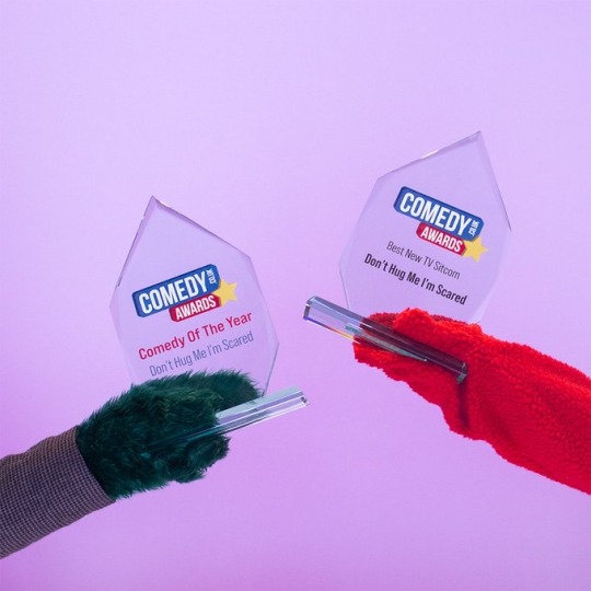
when dhmis won comedy awards they held the trophies together <333
do i even have to mention the fridge scene? well i am!! theres something to be said about how their little confession happens in an episode about and titled “electricity” when electricity and “sparks” between people is a very common trope/phrase in romance. this one is sort of a stretch but i think its neat!
i dont know if becky joe and baker terry had any intentions back in the webseries days for them but the LOVE episode and the way red and duck were left alone at the picnic (mirroring the fridge scene!!!) looks gay as fuck with hindsight bias
when duck comes back from being dead and red is surprised to see him i think the way he says “oh.. hi!” and duck says “helloooo :DD!” is really sweet :(( not to mention the whole argument at the funeral itself. absolute messy ass gay ppl. i dont want YOU i want my BEST FRIEND !!!! and duck was going to leave red his diary… yes it was empty but its still his DIARY!!
the way they email EACHOTHER during computer day is so fucking cute theyre so fucking stupid i love them 💔
the way duck reacts in the food episode isnt talked about enough!! he tears down EVERYTHING to find red. he literally knocks over a camera!! he literally broke reality because he was so desperate to answer the phone. he missed red more than anything and was doing everything he could to find him :(( not to mention how he had to fight his OWN memory in order to remember who red was in the first place! hes always loved him in whatever way :((
the way red laughs when theyre picking on yellow together.. its fucked up and also red is a hypocrite but duck made him laugh and thats something!
the way red tried to comfort duck in the beginning of electricity when he starts to freak out and worry about yellows behavior. he wasnt doing a good job and you could argue he was doing it for selfish reasons and not to actually comfort duck but i really feel it was both. just trying to calm the both of them down.
speaking of electricity again… the way hes washing dishes while duck does a crossword makes me wanna throw up. theyre literally a family. its one of my favorite scenes in the entire series. just in general. i love yellow here too its not abt him rn but i love my son :(((
alright there’s definitely more but im really tired lol so bye fluffybird nation hope this post was fun!!!!!!
EDIT: OH MY GOD I CANT BELIEVE I FORGOT TO MENTION STAIN EDWARDS! In death red molds someone else into being duck, looking like duck, sounding like duck— all because he cant let go of him. yellow goes out to dig him up but red doesnt think its possible so he just makes a new one. and you can hear how desperate he is to make sure hes JUST RIGHT. even stain edwards asks him if he has “issues he needs to work out”… which clearly he does. i cant believe i forgot to mention this cuz this is some insane levels of homosexuality. off the fucking charts
#im sorry if it reads wrong at parts i put in a lot of effort and actually had it a lot longer but tumblr deleted a HUGE chunk of it :((#i exited the app and it didnt save my draft….. sigh but ive rewritten it the best i could#fluffybird#dont hug me im scared#dhmis#dhmis fandom#duck guy#dhmis duck#duck dhmis#red guy#dhmis red guy#dhmis tv show#red guy x duck#dhmis webseries
38 notes
·
View notes
Note
I've never watched a single bit of MLP or Supernatural canon, but I'm in love with the way you designed them as pony/unicorn and I want to know everything about them!!
hi ! im glad you like them. i think even when i watched mlp (when i was. 10?) i didnt ever draw the ponies. as ponies. to think supernatural is what got me to do it ...
i drew my dean pony first bc its design seemed obvious. spots for his freckles and the darkness that clings to his heart. red hooves bc theyre cute and hes the more "kill it if it looks at us weird" of the brothers. sword and shield cutie mark bc its tough and cool and "If I can't save you I might have to kill you". etc. its red where the sword and shield overlap to signify that.
ive thought about it a little more since my inital post and i think his coat would have golden luster like an akhal-teke.

i wanted sams color layout to be the opposite of deans (light on top, dark on bottom -> dark on top, light on bottom). and their oppositesie roles; heavens pet normal guy whos soul was blackened vs THE ANTICHRIST with compassionate swagger.
anyway the green accents are to contrast deans red hooves. he doesnt have awesome spots or an iconic accessory, so i had to buckle down on the colors. the stripe up his nose was gonna be a star (i really like the phrase "born under a dark star".) but i couldnt make it look good around the horn. his mark has the same sword from deans, in an inverted position. its just the sacred heart. like from jesus.
the red spot on his chest is to tie in the color of his mark + looks like a bleeding heart (luzon bleeding heart dove ...) bc of his compassion and also all the demon blood. thumbs up
the hooves are gold bc it is cute. and i think its funny how much they stand out. and to tie in the cutie mark, again. besides yellow is kind of an important color.


answering this ask on the same post bc. the horses. hello, thank you very much ! my samlikerism is having effects . on the horse
yk. i thought i remembered that being a thing about horses. but my genius brain decided not to look at a single picture of a horse, cartoon or real, when drawing those initial ones. i was following my heart into a collapsing coal mine. i was going to draw them getting their backwards legs fixed but that seemed gruesome. and i forgot. here they are sleeping. ignore that the mark is on the wrong side. and the z's are backwards. i had my canvas flipped

32 notes
·
View notes
Text
SPOILERS for HELLUVA SHORTS: Weeaboo-boo
so the last time i made a post regarding an episode (or in this case minisode) of helluva boss, i had some severe criticism that some folks didnt wanna hearso for the sore super stans who may happen across this youll be glad to know i actually loved this episode and have nothing but praise.
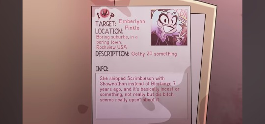
first of all, in the screenshot above we see the latest target is someone who did absolutely nothing wrong. she is being targeted for shipping the "wrong" thing. sound familiar? should be. hazbin/helluva fandom is notorious at this point for the ship wars, and as much as i dont like viv she has half a brain to understand that fighting over fictional characters is stupid and encourages fans to ship and let ship. the humor here is very self aware and a fig at the toxic fans, which to me is a hilarious way to call them out, even if half of them wonr notice theyre being made fun of.
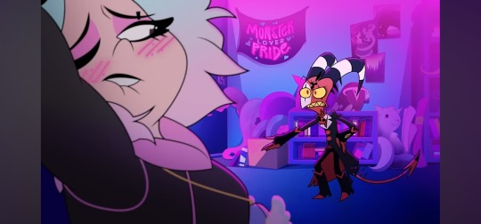
now second of all we get more digs at another sector of fans: the horny fucks. i have no qualms with these fans because they live their dream life. though some could definitely use some fresh air every once in a while. its more so a dig at the ones who dont take the time to exit their fictional reality. THOUGH, lets be honest here, most of us would fall to our knees if a sexy demon appeared to us.
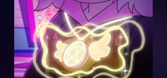
what i dont get is the magical merchandise. maybe im reading too far into this one but there seems to be no reason as to why this girl would have some magic amulet. would be cooler if she just found some real angelic amulet and that was why she was protected by that? adding the random element that anything with a pentagram and wings protects you seems silly. couldve leaned into the fact she clearly worships satan by the doll on her desk, so she cast a spell or something cooler. IDK.
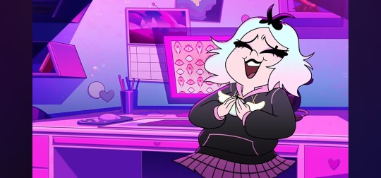
i also like the character design a lot. she looks like a real life con attendee waiting for her favorite actor to sign something. shes cute and appealing to the eye. even her demon design reflects her personality well, someone creative who likes cute but weird stuff, so she has cotton candy colors and typical demon traits.

all in all i liked this minisode. a genuine 9/10 if not 10/10. tune in next time for more unwanted opinions from your favorite dyke.

i also decided to doodle emberlynn, shes very cute.
#vents and txt // words words words#my art // sedles#helluva boss#hellaverse#vivziepop#helluva boss criticism#vivziepop criticism#artwork
46 notes
·
View notes
Note
Theory time for when you have the time and energy!
Everyone is a little (understandably) delulu about Till being alive in the new art, but my artist brain did a very uncanny theory.
What if the reason Till uses the wrong hand and doesn't have the branding is... Because that isn't Till at all? What if it's Io?
There's also a weird upside down blue triangle between Till's hand and his cheek, basically would've been the reflection of the Till in the mirror. I don't know what's up with that and why it's there but it bothers me, like it's a fragment taken out of a puzzle and matches the background more than the colors used on Till himself.
okay hi im here my gears have been working
im using you to start my own ramble anon thank you i love you anon
also the blue triangle is uhhhh the bandage over tills nose on that specific design
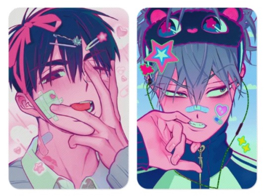
ANYWAYS BRINGING BACK MY PURGATORY THEORY (rolls in whiteboard)
okay so remember the first friday after round 7? this one?
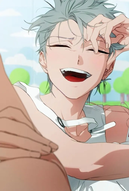
yeah. yeah were bringing this back.
you can clearly see lines in the back showing the false sky, clouds, and trees of ANAKT.
till has an IV hooked up to him and he's still tagged. we would still be able to see his brand from this angle, but there isnt one there.
now we look at todays drop
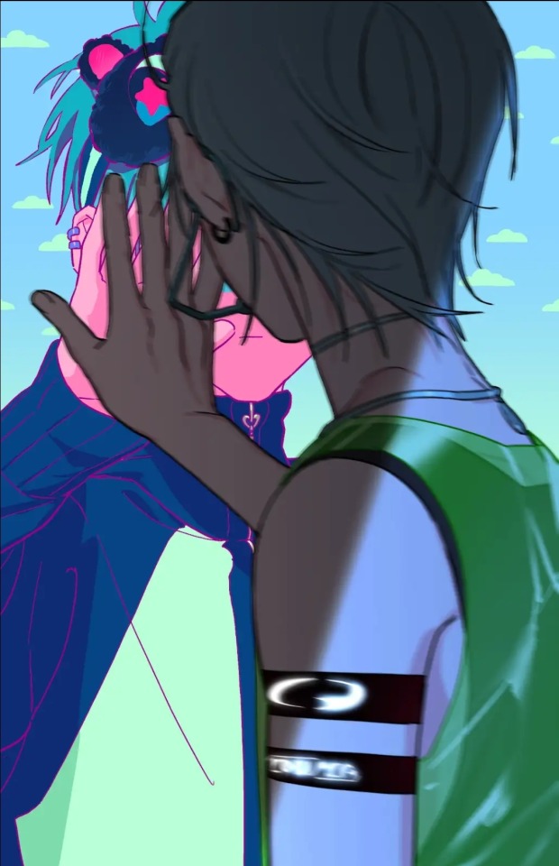
whats in the background? a false sky and clouds. where is tills brand? nowhere to be found. hes still in his round 7 fit, but he only has one hand up on the "mirror" ...and its not even the correct hand as you said anon
both ivan and sua have both of their hands up and are looking at us with blood on them, representing their "deaths" (i put death in quotes cause i refuse to believe any of them are dead ahahahahshahdnahagabwmde theyre not dead guys!!!!!)
till is not facing us, and we cant see au till's face either.
till is most likely in some sort of purgatory, he has one foot out the door/one foot on deaths doorstep. that purgatory is the Great Anakt.
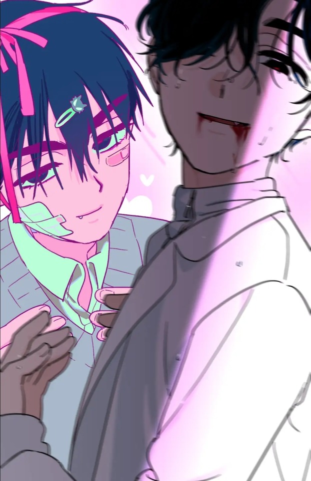
as for ivans, his background has the pink hearts. that probably is just. him dying for the one he loves. im a bit unsure about ivans honestly. i will say that both faces arent covered at all. yes ivans eye is covered by his hair, but his face still isnt obscured by perspective. he bared his whole heart for till
now as for sua... blinks my eyes autistically at you about the android sua theory.
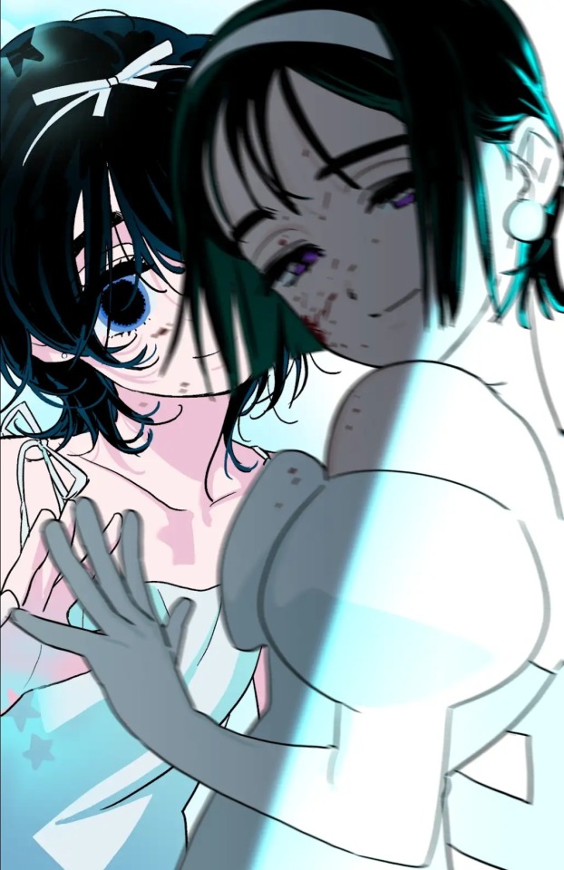
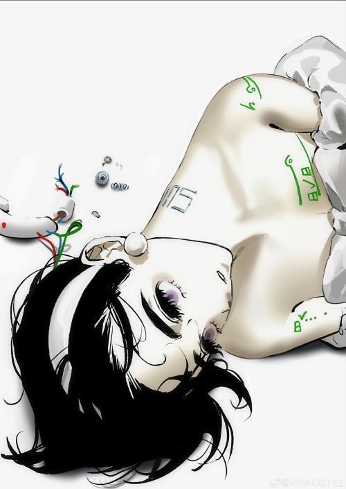
okay so listen. sua is partially covered in the back, and her body is turned in a way so that her other hand is obscured. we know shes still using both hands though because we can see her elbow. so why is she partially obscured? because bababababababaa aaaaa android. or the theory that sua will come back "wrong"
the sua in the back honestly reminds me of my september. like genuinely i get my september vibes from the sua in the back. shes so uncanny. she looks lifeless but still.... somehow alive. and the real sua looks like she knows. she knows something while also being sad or melancholy.
its terrifying tbh.
thats all i have i might come back with more cause im p sure i forgot a few thinfs
im just like. whats getting me is that they uploaded a day early. are we getting a double upload?? cover maybe??? teaser??? idk
#zen's alnst analyses#alien stage#alnst#alnst till#alien stage till#vivinos alien stage#till alnst#ivan#ivan alnst#till#alnst ivan#alien stage ivan#vivinos when i catch you#vivinos#alien stage friday#alnst friday#alnst analysis#alnst theory#sua#sua alnst#sua alien stage#alien stage sua#alnst sua
28 notes
·
View notes
Note
Had my ninety millionth rewatch of Yellowjackets because I wanted to work on drawing the girls. Been thinking about Jackie's butterfly shirt and how Shauna later on wears it. Not to mention to Shauna wears other butterfly shirts. any thoughts on if the butterfly symbolism was intentional? -💀
HI YES. i had like. so many thoughts on this all at once. i reasearched a lot of butterfly shit for a personal project before and it all just clicked in yj context. a warning that this is going to be rambley its going to be messy and some of it might be a stretch. yippee!
SOO first off its def like. butterflies are a very common just design for shirts in the 90s so its def just like part of the period wardrobe. HOWEVER. jackie and shauna, as far as i know, are the only characters seen wearing butterfly shirts (and i could be wrong but even so theyre the only characters with repeated obvious butterfly shirts including in the adult timeline). which is very interesting.
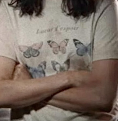
so heres shaunas butterfly shirt (note the words)
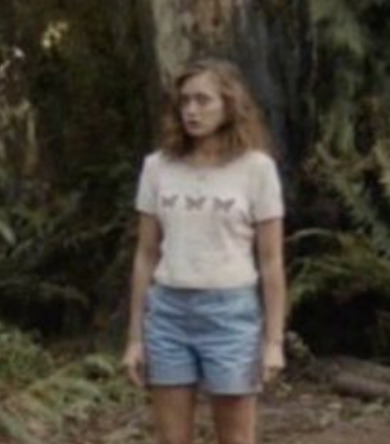
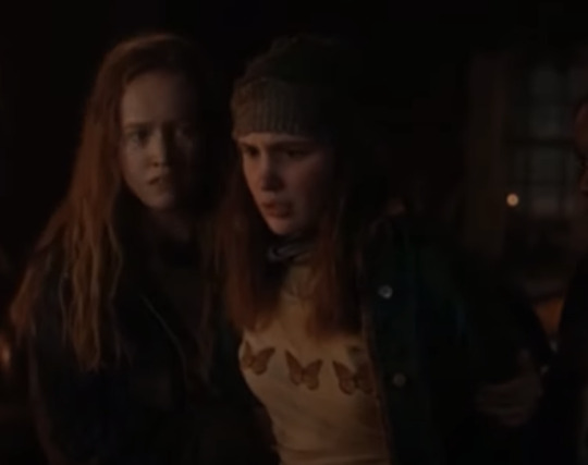
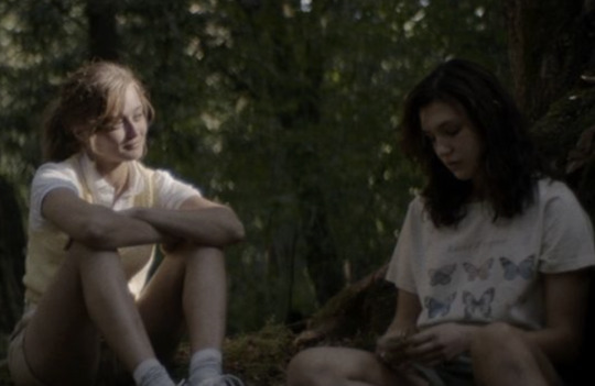
jackie's butterfly shirt and.. shauna wearing it (note the scene)
adult shauna also wears a butterfly shirt im 99% sure it was like black with a white butterfly design. i need to find a pic rgh
SO LETS START
first off - what is butterfly symbolism?
butterfly symbolism is literally anything you want it to be. its such a common symbol if you look it up theres millions of websites on weird slightly not so slightly appropriating spirit bs and a shitton of vague statements. so lets narrow the question.
what is butterfly symbolism in the context of yellowjackets?
much better. my personal view on it is this - butterflies, in a multitude of cultures, are a symbol of hope. theyre pretty theyre flappy theyre whatever. but butterflies are also a symbol of change, of transformation. but what i think is so interesting about butterflies as change is when we look at how butterflies change.
butterfly transformation is inherently something of horror. its a gorey, bloody transformation where the caterpillar literally dissolves in a chamber of its own making and reforms into something completely different. but the thing i find so fascinating is that its not a whole new thing - its literally a restructuring of the caterpillar. its something that was always there.
and this exact thing is imo one of the central themes of yellowjackets - they were always these people. What the wilderness did is amplified it, twisted it, made it louder and more obvious and definitely more bloody. but the violence and the competitiveness and the drama? was always there. look at allie, look at shauna and jeff. what the wilderness did was give them a stage (a chrysalis, if you will) to transform.
What about the specific shirt designs?
Lets start with shauna. Its a basic design with 6 butterflies of various kinds, but the most notable thing for me is the text. "Lueur d'espoir
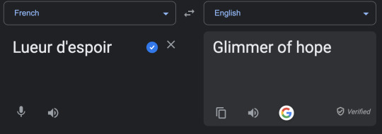
yeah i used google translate whatever its not like ive been taking french classes for years. or something. let me live.
so. as you can see its "glimmer of hope" which goes hand in hand with the common butterfly symbolism. but actions overpower words because with a lot of shauna's actions, (ie 2.07 massive girl on girl violence) shes pretty much the opposite of hope. shes giving into the brutal violence that the wilderness is bringing out in all of them and hell she even relishes it. its an almost comedic grasp at imitating jackie when really shes the opposite side of the butterfly symbolism coin - transformation. but specifically metamorphasis. this side of her was always there.
now its number time!!
shaunas shirt has 6 butterflies and jackies has 3. jackie is literally half of what makes up shauna - without jackie she loses a significant piece of herself. i might throw up.
after jackies death shauna does everything she can to get her back. not only does she talk to jackies corpse for months, she literally EATS her. but theres also more subtle attempts to get that part of herself back - like wearing her "missing half" - the butterfly shirt. its all in vain really because its with that grasping at anything she has left of jackie and order and everything she used to know, with that shirt, that she commits one of the most brutal acts of violence in the entire show. also shauna wears it while beating up lottie after wilderness baby dies and wb was basically the last living (rip) thing she has of jackie. ough.

back to shaunas original shirt, the one with six butterflies. 6 is a number commonly associated with nurturing energy, and sometimes maternal. sound familiar?
similarly, jackie(shauna)'s 3 butterfly shirt - 3 in general is a very powerful number symbolically. the birth-life-death cycle, the mind-body-soul connection, things coming in threes. jackieshauna and whatever they connect to be that wilderness baby, jeff, callie, the wilderness in general maybe lottie. who knows!! the toxic homoerotic bestfriendship spares no one.
ALSO the butterflies on jackies 3 shirt are monarchs which are commonly associated with the dead and more specifically remembrance of the dead. throws up.
so overall!
the butterfly shirts could very much be just be time period wardrobing but i do think there is at least some significance given jackie and shauna are the only characters (as far as i know) who repeatedly wear butterfly shirts.
butterflies in jackie's context are almost a satire of the hope theyre supposed to represent - jackie has lost all hope by clinging to a past she can never get back to. in most cases she would be a hopeful character - take akilahs clinging to wiskayok, doing SAT prep and talking about her family. but the difference with jackie is that she clings to it as if it were already dead. she has this passive suicidality because she knows that shes never going back to what was and she REFUSES to transform. a catterpillar who doesnt pupate and dies never changing.
butterflies in shauna's context i think point to the gorey, transformative yet revealing nature of the wilderness. similar to metamorphosis, through a complete restrucuring of what was already there in the optimal conditions for change, we see this violent, bloody, version of Shauna emerge in the wilderness. Similarly to the twisting of butterfly metaphors, shauna also represents a twisted kind of hope through her pregancy. Inherently a birth is supposed to be a symbol of new life, of hope and joy. And for a while the baby is a symbol of hope! you have the babyshower raising spirits etc. but everyone knows it was doomed from the start. in the wilderness a birth is not a thing of hope but a thing of horror - its seeing your teammates mouths covered with blood and its burying your son when you too are still a child.
soo yeah. butterflies. dont know how much of this is gonna make sense but it definately made me think about things
#i fucking hate you jackieshauna#i hate you butterflies#i hate this STUPID FUCKING SHOW#god#shep speaks#sheps asks#shep talks yj#jackieshauna#yellowjackets#yellowjackets showtime#jackie taylor#shauna shipman#wilderness baby#yellowjackets analysis#yellowjackets meta
82 notes
·
View notes
Note
And im sorry,,, her design made me super uncomfortable and Ik it’s ur artstyle but she seemed too child-like to be a full grown adult?? It was just weird; her personality, height, and the relationship with nyen? It was just weird to me. The new comic where Nyen keeps his original personality and Kokoro is like horrified and looks like she’s gonna cry. I was like super confused and wondering is it an abusive relationship?? It freaked me out and the relationship chart where it said “he’s so hard” was very very very ucky to me,,,
It would make my stomach hurt when theyre together bc she looks very child-like.. it felt like l*libait to me ever since I saw her?? Don’t change her design tho.. it just makes me feel weird:(
Again I do apologize
Hi hi! Actually, I already know who you are and I'm not mad at you, I'm really not. t's just that we should have just initially discussed everything and talked in person, if there's something you're confused about or don't like, we could have discussed it one on one and worked it out in person!
And like I said before and it was mentioned before- Kokoro has been an adult for a long time, just of below average height. I didn't think its design would confuse anyone, but if it does and anyone has questions, I'm happy to answer them! I am the kind of person who condemns everything that is wrong and illegal, that I disapprove of and do not accept.
And the last comic is considered non-canon in my AU where Nyen and Kokoro are together because they are doing well (that's my AU).
So it's okay, let's put all our disagreements and misunderstandings in the past! Let's treat each other with respect and understanding!
⊂(´・◡・⊂ )∘˚˳°
15 notes
·
View notes
Note
thoughts on the wretched wocky? (some of the unconverted ones like the darigan wocky look so good but that blank unappealing not-quite-smile of the regular wockies makes me so, so angry for some reason. theyre looking at me the wrong way and im taking it personally)
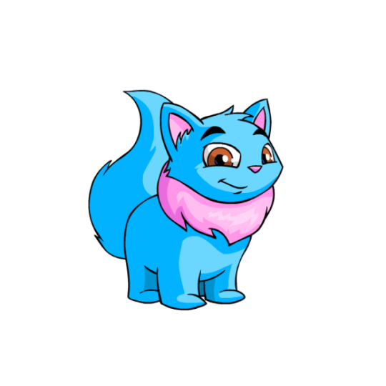
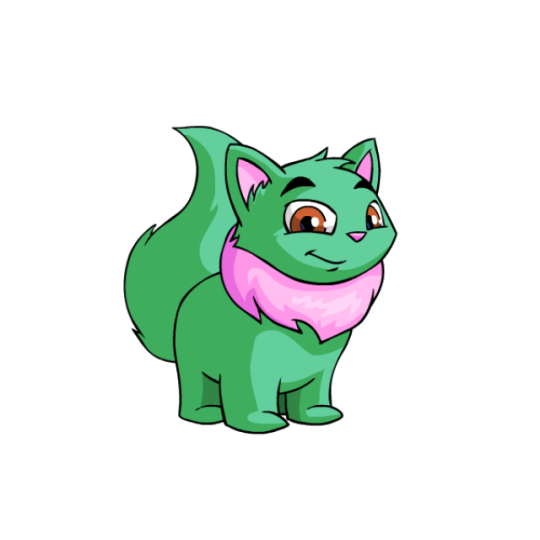
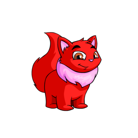
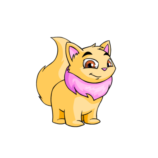
I feel like Wockies have always had a bit of a problem standing out, as they are very plain Neopets—they don't really have a unique "hook". Dozens of Neopets have manes and fluffy tails, and Aishas have you covered if you're looking for something cat-like.
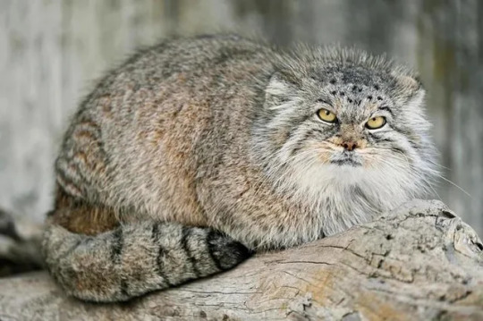
That said, I would argue that Wockies at least stand out in their stocky, incredibly fluffy body shape. If Aishas are house cats, then Wockies are basically Pallas Cats, only they hate the world slightly less. (They're also the most huggable Neopet, and I stand by this.)
Visually, they're super simple; just a chunky body with a mane to break things up a bit. I do have to state that I really don't care for the pink manes on the base colors though—I guess they were trying to match the ears/nose, but it looks a bit clashy (especially on red Wockies) and the brown eyes only worsen this. I think a darker/lighter tint of the base color or a neutral would've worked better there. Thankfully this is solely a problem with the base colors though, as most paint jobs have a more fitting mane color.
Of course, I can't talk about Wockies without talking about customization:
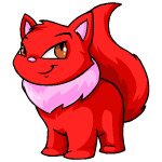
I'd argue that Wockies were one of the worst species conversions out there. At a glance, they look similar—until you notice that, inexplicable, the entire face completely changed. The rectangular eyes and awful thick eyebrows look so much worse than the original design. (Also, the feet are too pronounced on the converted design, but that's beside the point.) And what's weird is that there was literally no reason for this change, and it in no way relates to the actual conversion requirements—the artist seemingly just woke up one day and decided that they really, really hated Wockies. An absolute shame.
Favorite Colors:


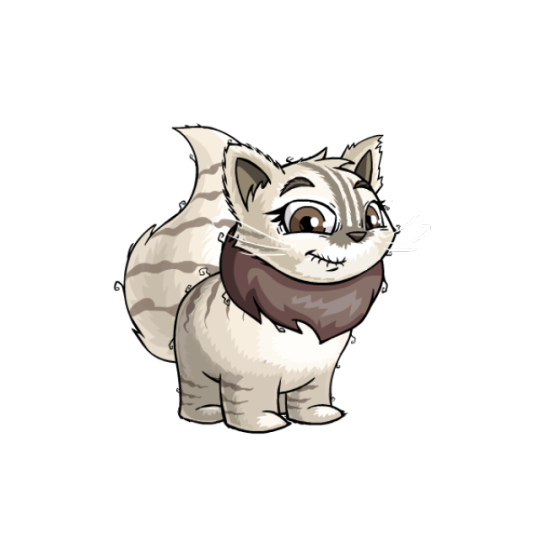
Elderly: This color combo literally just came out last month, but it's already a standout for me. These guys have a really charming elderly cat look, complete with slightly ruffled fur, Siamese and tabby markings respectively, and a folded ear on the males. The clothes are also, for the most part, nice neutral colors (though I find the female's hair curlers jarring, especially due to how the eyebrows clip over them. They can be removed though so no worries there). What's also great is that the base colors are lovely in and of themselves if the clothing doesn't do it for you.

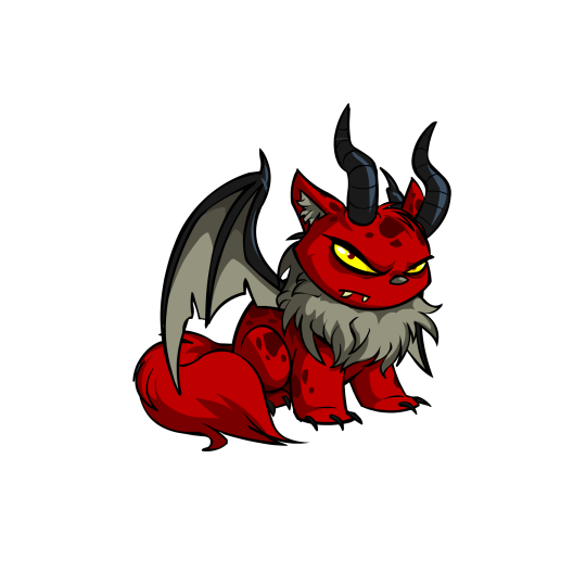
Darigan: I have to give the Darigan Wocky points for one simple reason: it's one of the only converted Wocky colors that fixes the godforsaken rectangle eyes, which already makes it look better than a lot of Wockies. Beyond that though it's also a pretty solid color all around. I'm usually more of a purple Darigan person, but the red does work here, the giant horns are fun, and the mottled markings a nice touch. The UC has a wonderfully grumpy personality, but the converted version sticks to the design pretty perfectly otherwise.
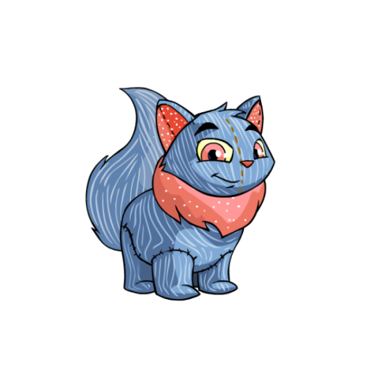
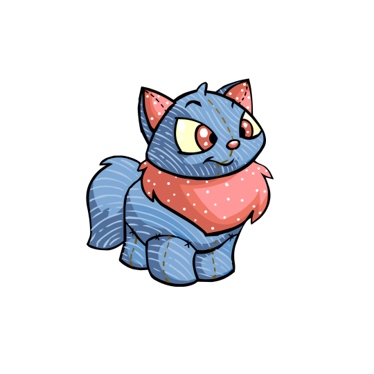
Plushie: I feel like Plushie Wockies manage to make the original pink manes work, mostly because they're using a nice salmon pink combined with a more neutral blue, and they also made the eyes pink instead of having them be brown for no reason. The UC has a super cute body shape, but even the converted version still retains some very nice colors and patterns (though it does low-key bug me that the stitch line isn't properly centered on the face). Good stuff!
49 notes
·
View notes
Note
Art Prompts:
1-TV Headed Men
2-Moth Dolls
3-Planet Themed Mermaids
4-Milkshake Dragons
5-Ice Cream Themed Superheroes
6-More Magical Pony Art (I Love Them!!)
7-Ocean Themed Space Aliens
8- Sea Snakes (They’re awesome! Here’s a link to an article about them: https://blog.padi.com/sea-snake-facts/)
9-Snakes With Prosthetic Arms
10-An Otter With A Cute Little Bow In Her Head

I got way inspired by the sea snake prompt apparently and spent way more time than I meant to on them! I included the whip snake (highly stylized) as an example of a "land snake" (opened up one of my herp books to a random page).
If they were toys like the other snake designs they would include stands to represent the fact theyre "swimming" whereas the land snakes would have slightly more flat bottoms so they can "stand". The sea kraits have round bodies with flatter tails while the seasnakes have vertically oval bodies.
These designs are not 100% accurate to real snakes, obvi, they're artistic reinterpretations of the snakes design. For ex: the whip snake has a stripe, but also has very distinct scales, so I made them diamonds. And the eyelash shapes are just for cuteness.
ok facts about sea snakes I want to add to clarify some things stated in that article (just adding my own knowledge/clarifying things (PLEASE do not take offense to this i am glad to read facts about snakes i just have brain worms when it comes to snakes))
put under cut because it was getting too long

"to keep things simple" isn't... right: theyre split into different categories because they're separate evolutionary lines! And there are a handful of other differences (although the article does go into those later, but ngl thats why i dont like lists organized this way). Anyways, it makes it sound like these categories are not relevant to the evolutionary history imo

I would have clarified that while they all do have paddle like tails, the kraits actually have bodies more similar to land snakes, whereas the true sea snakes have vertically elongated bodies to make swimming easier and are bad at being on land.

Okay so this is true mostly EXCEPT we built a huge canal through panama and there have been sightings of sea snakes on the "wrong" side of the panama canal, specifically yellow-bellied sea snakes which live on the pacific side. There are no breeding populations, but due to human intervention there's potential risk of them being introduced.

See this is why I was like the categories aren't for "simplicity", the sea kraits are separated from the other sea snakes because of their many differences: a major one being that they come on land to lay eggs! A number of snakes all over the world give birth (though yes, not in the ocean) to fully formed (not "nearly") babies!

I would just add that this is part of why they can't cross over to the Atlantic! here's a paper!


...all snakes are carnivores (hence, weird thing to say)? unless you count eating eggs as being "not a carnivore". in which case this would be untrue because the turtle-headed seasnakes (genus Emydocephalus) eat primarily fish eggs!

and this one isn't quite right because of turtle-headed seasnakes again! They have almost no teeth except tiny fangs and as far as I can find are either mildly venomous or nonvenomous. since they dont hunt their venom glands are vestigial.
Sea snakes and kraits are elapids, which include other highly venomous snakes like cobras, coral snakes, and all of the highly venomous Australian species!
While doing research on realistic snake plushies, sea snakes made by WildRepublic were one of the major clear attempts at a retailer trying to be scientifically accurate.
Kraits DO actually look like cartoon animals

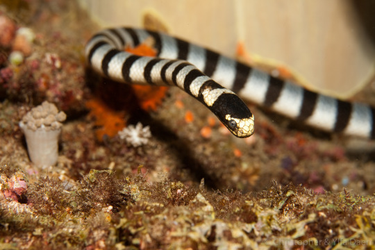
and yeah the olive sea snake does really look like that:

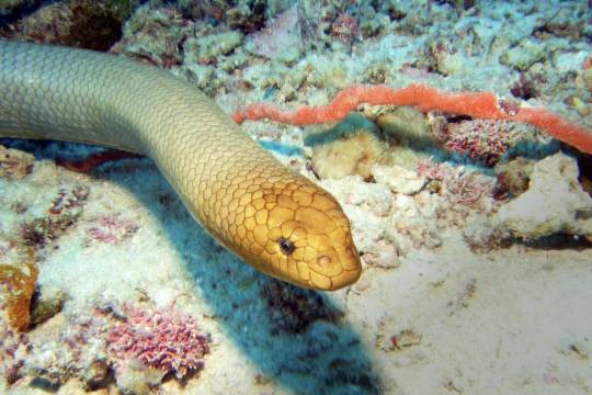
(although the olive one has apparently been taken off their website?)
although the way they title and tag their products continues to piss me off to no end, like this is an EEL not a SNAKE, they're just out here spreading misinformation and confusing things.

they completely rebranded in like 1999 because their wildlife plushies took off so personally I think they have a responsibility now to scientific accuracy since they took on that mantle. but i digress.
18 notes
·
View notes
Note
yoooooooo, I was scrolling through your old blogs and I found you had a mystery files jacket??????? Did you get that at the old shop?? Also what other kind of watcher merch do you have? Cause like, I'm thinking of getting some but I'm afraid they'll add something new and then I've wasted all my money :(
yeah!! i have a mystery files jacket! i got it on the old watcherstore when mystery files premiered last year. i love it, it has inside pockets!!! i wore it to the chicago pride parade last year too!
i have quite a bit of watcher merch because im 🤏 irresponsible with money, and my brother and parents get me watcher merch for birthdays and christmas.
i have the professor plush which i love and cherish so much. he is perfect for squeezing when i get really excited and need to stim
the watcher logo patch and the weird wonderful world patch (that are just by my computer, offering their support)
the weird wonderful world shirt (i actually have 2 because one was misprinted and i was able to get a replacement)
the team shaniac shirt that just cracks me up everytime i look at it. i wore it when i met shane and ryan on tour last october!
the lil ghost from too many spirits pin that lives on my fluffy white coat.
the professor scrunchie and the too many spirits scrunchie (they came as a duo). im obsessed with the professor scrunchie im too scared to wear it cus i dont want to get it dirty. (THEY GAVE HIM A HAT !! THEY PUT A LITTLE HAT ON A SCRUNCHIE AREYOUKIDDINGME??? THATS SO CUTE!)
i got the 2023 signed ghost files tour poster, i still need to get a frame for it.
and i recently pre ordered the team shaniac patch, and im planning on putting it on my mystery files jacket.
also im not saying because of this ask i checked out the watcherstuff merch site and impulse ordered the s1 puppet history pins BUT THATS KINDA WHAT JUST HAPPENED LMAOO (listennnn its been rough, i deserve a little treat in the form of wearing god on my jacket)
their merch is really good, i like it a lot. its cute, some of it is subtle, and good quality. everything i got, besides the shaniac patch, was from the old store. if i remember right, theyre currently switching merch companies ?? and i dont think the old merch is coming back (i could be wrong, i dont work there lol). but if you do want a shot at some of the old merch, they're selling mystery boxes on their watcherstuff store now. plus anything labeled "first edition" is from their old merch store. my guess is when that is sold out, its gone.
it'll probably take them some time to design, produce, and sell new merch. so if you want something now, id get it now because you'll likely have time before the next new drop. but the current merch likely isnt going to go away any time soon.
#special intrest plus being an 'adult' with money means im gonna buy things that make me feel nice when i see and wear them#plus im supporting watcher which feels nice#watcher#thanks for the ask!
26 notes
·
View notes
Text
ive had this cursed thought about transformers one swimming around my brain so im saying something aloud to get it out of my head so MAYBE tf one spoilers based on character design under the cut regarding some stock photos YOUVE BEEN WARNED
(its about girl designs what else do i talk about)
i think they might turn elita into arcee. and if thats true im gonna be so fucking angry
like they were doing all that "before he was optimus he was orion" marketing right? they arent calling her elita one, theyre calling her elita. i get that theyve ignored her for 40 years but she was ariel and then elita one. i guess her IP needed to be more marketable and the "one" in the title makes the seo worse but you know what i mean. maybe she goes from elita to elita one, but why not just say that like they are for the other characters? its not like we dont know?
as soon as we saw elita in the trailer it was a weird design, she has the rounded space buns and clearly becomes a motorcycle like most arcees now do (dont get me started). shes full of rounded shapes and isnt her usual all shades of pink colours, now shes the white silver and pink... like arcee.
if you show non tf fans pics of elita and arcee from previous generations and ask them who they think the bot in this movie is they are just as likely to say arcee. its kind of funny, like i know they dont inherently have the most different designs, but they obviously made it worse than its been before.
you guys know how i feel about how they add evergreen arcee to evergreen g1 lineups
anyway lets examine these two bits of stock art floating around the internet


so many little details are the same as elitas model. look at the pelvis, look at the midsection swivel, look at the shapes all over it. and we could chalk it up to good old fashion "girl bots are made only one way" bullshit. thats entirely possible! BUT... THAT LOOKS REALLY SIMILAR.... i have this horrible feeling theyre gonna say that elita becomes arcee and i MEAN it when i say i will lose my fucking mind if they do that. we JUSTTTT got to the point where arcee and elita can both exist at the same time in the same show and look completely different, where elita doesnt have to be mashed up with another girl to exist. like previously:
energon: ariel (g1 elitas old name) in the original japanese became arcee in the dub.
animated: blackarachnia literally becomes elita one
its really frustrating that theres so few girl characters and that the character whos supposed to be like optimus equal who cOULD HAVE BEEN IMPORTANT FOR THE PAST 40 YEARS IF ANY MEDIA TOOK HER SERIOUSLY gets turned into other characters!
like i swear to god im going to lose my mind i REALLY hope im wrong, i hope im just misreading classic sexist character design as a choice but if im not im posting this to be like "yeah i called it"
#the tf binge thoughts#transformers one#transformers one spoilers#just to be safe#the editor is tryina avoid spoilers so now im telling the rest of you cuz i cant talk to them about it lmfao
16 notes
·
View notes
Note
FORGIVE ME IF HOW IM SHOWING YOU THESE PICS ARE WRONG I STILL HAVE NO IDEA HOW TO USE TUMBLR 😭😭


Okok so this is how I’ve been doodling mc for a while now, when I saw the other amazing art of mc I realised how off I was with the fashion that would fit her 😭 BUT ANYWAYSSS, I was trying to think of a design that would make her stand out? Or Atleast fit in with la squadra. As we all know and love, everyone from jjba has a unique design so I was thinking of bizarre hairstyles for her! So the drawings at the top are when I first started reading your masterpiece 😈😈 and the second to last pic is when she said to ghiaccio “I’m going to get them pregnant.” I forgot place her hand on her hip tho lolol. BUT I ALSO TRIED TO DRAW SHIRTLESS RISOTTO!! It didn’t work out. So I tried to turn it into something funny 🤷♀️ dw because Ive been trying to cook up some art of melone and mc, once I get melones uneven ass hair right 😭
(Do not ask me abt colouring i actually cannot colour to save anyone’s ass 😞 but if I were to imagine her in a colour I’d definitely say hot pink or any sort of pink.)
HELLO!!!!!!!! THE SCREAM I SCRUMPT WHEN I SAW THIS IN MY INBOX HEHEHEHEHE I ABSOLUTELY LOVE HER !!! first of all, I TOTALLY GET THE STRUGGLE OF MAKING OC'S STAND OUT/FIT INTO THE JJBA-VERSE BECAUSE THEYRE ALL SO FREAKISH AND ODD AND having a normal outfit makes YOU the weird one??? BUT EITHER WAY I THINK WHATEVER YOU PICK FOR MC IS NICE :D AND I ABSOLUTELY ADORE WHAT YOUVE DONE FOR HER !!!! her hair is SO pretty !!! AND HER OUTFITS ARE JUST!!! CHEFS KISS!!!
i love ur artstyle SO much omg its so... munch munch crunch crunch mmmm mmm MMMMM 😋😋 YUMMYYYY I LOVE IT AND OMMMG YOU DREW THE SCENES!!?!?!?!?!? IM GOUNG TO IMPLODE!!!! SHE LOOKS SO SMUG ANNOUNCING HOW SHES GOING TO GET THEM PREGNANT AND SHIRTLESS. RISOTTO. RISOTTO. SHIRTLESS... RISOTTO !! HE LOOKS SO SHY I LOVe HIMMMMMM AAAAUUUGGHHHHH AAHGG GRRRRRRHRHRGRRR im gonna start barking
ALSO DO NOT EVEN GET ME STARTED ON MELONE. HIS FUGLY ASS HAIR IS SO HARD TO DRAW??!??!!?!? i can lit only draw him sideways cuz its so uneven and from the front he looks like an emo horse...... BUT IF YOU DO THAT.... I WOULD LOVE 2 SEE IT 🤭
THANK YOU FOR SENDING THIS IM EATING IT UP SLOPPY STYLE LIKE A BOWL OF SOUP - NO SPOON, BOWL 2 MOUTH!
8 notes
·
View notes
Text
brief overview of some movies ive watched and rewatched over the last few months.
first time viewings:
strange darling - i liked it ! i waited months to watch it and deliberately avoided reading reviews and watching trailers for it and im glad i did.
leave my girl alone - honestly one of the funnest movies ive watched in months. i already want to rewatch. the last 30-60 seconds are glorious.
vhs beyond - ok i was a LITTLE harsh in my review. ok i was entirely petty because [SPOILER] they put real life youtubers in the movie and i was so discombobulated like what are YOUTUBERS doing in my HORROR MOVIE! i also have gripes with the 'little green men' subgenre that mostly stem from the fact that my dad believes in aliens and like im gonna be so honest with you i have 1000000 other things on my mind i dont have time or room to think about whether aliens are real and if the US government is using their technology or whatever i do not care. unless theyre giving me free healthcare i do not want to hear about it.
SEGMENTS I LIKED: Stowaway, Fur Babies, and Dream Girl. (tw for body horror, gore, animal death, etc etc etc)
cuckoo - i wanted a little bit more from it but it was good! i liked hunter schaefer as the lead. i think dan stevens should pull a brad dourif and play scuzzy dudes the rest of his career hes good at it and always looks like hes having fun. i will not pretend to understand what was going on i'll prolly have to rewatch
longlegs - full disclaimer i probably set my expectations too high and it's entirely possible that this movie simply wasnt for me. i really wanted to like it and expected to but. i did not. theres more i could say but i think i said enough. i'll try rewatching next year and see how i feel about it.
dracula 3000 - im not bringing this movie up because it's good, it was horrible, i just want to say that it's been 20 years can someone please make a movie about a vampire in space that's GOOD i know someone out there can do it PLEASE
rewatches:
pandorum - i couldnt tell you if this was a good movie or not i really couldnt i cannot objectively assess movies i watched when i was younger very well. all i can tell you is that i really really really liked the sci-fi/horror fusion. also the creature design still holds up i need to know who did it bec it looks better than some of the stuff out today
lake mungo - found footage horror movie OF ALL TIME
sunshine - im in love w this movie i love everything about it. also something i thought about was that it was weird watching chr*s ev*ns in something not marvel is was actually refreshing for once. we need to get cillian murphy into horror/suspenseful sci fi PLEASE.
the slumber party massacre - idk what to say other than 1) idc what i thought when i first watched it i was WRONG i love this movie so much and i do recommend all the reviews i liked if u want to know some of my thoughts/stuff i agree w 2) valerie bates is currently no. 1 girl in horror for me. as u could probably tell from my icon. and header. and sidebar image. and blog page. and
#hvāñume#inspired by my convo w bee ^^#yes i said some of this on letterboxd but thats ok <3#there are other movies but. i didnt want to go on FOREVER.
10 notes
·
View notes