#just turn up your font size !! you can go into html and do that and i will teach you how if you don't know how
Text
YOU MUST MAKE A WEBSITE
Oh wow, look at that! YET ANOTHER post urging you to make a webbed site! What a completely new thing that people haven't made a thousand masterposts for already!!
• Making a website might look scary. It is Not.
At first, I too thought making a website was too much work. It really isn't! It turns out that all you need is
an HTML file,
a web hosting service and
w3schools tutorials,
and that's about it!
This post will point you towards these resources, and others I found useful while figuring out how to make a website.
• VERY QUICK EXPLANATIONS:
What's HTML and CSS?
HTML is the content of your webpage, the skeleton of it. What shows up in a webpage is what's written in the HTML file!
CSS is the way the HTML is styled; the colour of the background and the letters, the size of elements, the font, all that!
Do I absolutely NEED JavaScript for a website?
Not at all! You don't need to worry about learning it before getting started.
• What do I make a website for? What do I put in there?
ANYTHING AND ALMOST EVERYTHING. Here's some ideas for pages from a post of mine were I was very normal about websites:
You can make a page that's only pictures of your pets.
You can make an interactive adventure.
You can make your own academic blog full of your own essays or articles.
You can just post a ton of art or make a full music page.
You can make a blog and infodump eternally, give book reccs and reviews. You can host a thousand virtual pets and nothing else.
Upload entire books in a single html file. Make a wikipedia for your ocs. Make a fake site for a random fictional place (restaurant, hotel, whatever). You can make a thousand fanpages/shrines about your favorite media. You can upload your own webcomic and make it all like a fancy website and shit.
I could keep going but, for the sake of "brevity", I won't.
• WEBSITE EXAMPLES!
If I started listing the websites I know, this post would be bottomless. Here's only seven:
https://publictransit.neocities.org/ - A webbed site, for sure
https://ribo.zone/ - A personal site
https://leusyth.neocities.org/ - An art archive
https://solaria.neocities.org/ - Personal website with A Lot of stuff (it'll come up in a bit, because it offers web making resources)
https://hog.neocities.org/ - The Hogsite
https://thegardenofmadeline.neocities.org/ - Another personal site! It also has a web resources page and has made another masterpost like this one (but better)
https://spiders.neocities.org/ - My own website, which must be weird to see in mobile . sorry
• You've convinced me. I want a webbed site. Where do I start?
https://neocities.org/
FIRST OF ALL: Neocities. It is a free web hosting service, and it's the one I and the sites I linked use!
When I first started, my website was a black page with red letters and a drawing, and nothing else! It was like that for a month, till i started picking up on how to do things.
Here's what helped me get an idea of how to make things work:
https://sadgrl.online/learn/articles/beginners-guide-neocities
An absolute beginners guide to neocities -- while when you make an account there you get a tutorial page from the site, this one's extra support for that.
https://www.w3schools.com/
Learn HTML, CSS, JavaScript and MANY other coding things for free. All the tutorial/reference pages have live testing windows for you to mess with!! helped me a LOT while figuring this stuff out!
https://htmlcheatsheet.com/
https://htmlcheatsheet.com/css/
Cheatsheets for HTML and CSS, respectively. It includes a JavaScript one too!
https://sadgrl.online/webmastery/
Sadgrl's webmastery resources! Also includes the next resource listed here:
https://sadgrl.online/projects/layout-builder/
Sadgrl's layout builder; not a lot of customization at a first glance, but I've seen wildly different websites all using it as a base, plus it works using CSS Flexbox, so it generates a responsive layout!
(basically, a responsive layout is one that translates well in different sized screens)
https://www.tumblr.com/fysa/728086939730919424/wikitable-code?source=share
Tumblr user fysa made this layout imitating a wiki page!
https://brackets.io/
At some point, you might want to do things outside the Neocities code editor and get one outside the site. I recommend Brackets, because my old as fuck computer can run that and absolutely nothing else apparently, and it works wonderfully! Though I recommend either turning off the code autocomplete or using it after a good while of already using the Neocities code editor, so you get used to coding on your own.
http://www.unit-conversion.info/texttools/text-to-html/
Turn your text into HTML code! i use this kind of pages for my lengthy blog entries that I don't feel like formatting myself.
https://imagecompressor.com/
COMPRESS YOUR IMAGES.
The heavier an image is, the more your site weighs and the more time your page will spend loading. You don't want that, specially if your site is heavy on graphics. This might help!
https://solaria.neocities.org/guides
Some CSS, JavaScript and Accessibility guides! Worth checking out!
https://eloquentjavascript.net/
This is a free, interactive book for learning JavaScript! NOTE: It is very intuitive, but JavaScript is HARD!! I still haven't learned much of it, and my website does fine without so don't worry if you end up not doing much with it. It's still useful + the exercises are fun.
And now, accessories!
• Silly stuff for your page :]
https://gifypet.neocities.org/
Make a virtual pet, copy the code and paste it in your HTML file! You'll get a little guy in your webbed site :]
https://www.wikplayer.com/
Music player for your website!
http://www.mf2fm.com/rv/
JavaScript silly effects for your site :]
https://blinkies.neocities.org/geoblinkies
Blinkie search engine!
https://www.cbox.ws/
Add a chatbox to your site!!
https://momg.neocities.org/
Infinite gallery of gifs. i've spent hours in there looking at moving pictures and out of them all, the ONLY gif i actually ended up using on my site was a rotating tomato slice. it is still there. trapped.
https://wrender.neocities.org/tarotinstructions
A widget that gives you a random tarot card!
https://www.websudoku.com/widget.php
Sudoku widget!
That's about it for now! I don't know how to end this!!! Remember to have fun and google everything you don't know :]
403 notes
·
View notes
Note
okay, I have to ask — how do you like your kobo ereader??
I’ve been eyeing one for a while bc I really *don’t* want a kindle, but also *so* many people have a kindle that it feels like it’s the only real option
Holy crap I LOVE IT. It's so much better than the Kindle. (Also: this got long)
I decided to upgrade my old Paperwhite (it was a second gen, so pretty old and small) and I almost got a new Paperwhite automatically (cause I felt much the same as you).
But the Kobos were on the same page and since I'm trying to be less impulsive, I started poking around and they are so good.
I went with a black Libra 2 and it's like the software was actually designed for human beings, unlike the Kindle software, which I think was designed for no one except the devil.
I side-load only and keep all my books organised in collections. The only way to do collections on the Kindle is manually, one book at a time, or jailbreak (and I'm not sure you can jailbreak the new Paperwhites, plus it's such a PITA).
On the Kobo, I can build collections from within Calibre, super fast and multiple books at a time. You can also do them manually on the Kobo, but even that is SO MUCH EASIER than on the Kindle.
The actual screen reading experience is basically identical (you can even side-load the Kindle font if you want it), since e-ink is pretty much e-ink, but it has few extra 'while you're reading' tweaks, like setting the all around margin size of the book (great if you switch between books and comics) and controlling the presence of, and info in, the top and bottom bar (pages left in book, pages left in chapter, percentage left to go etc). It also has a brightness and a warmness setting, so you can tweak those til they're just right for you.
I'm loving the physical page turn buttons so much - way easier than having to swipe the screen. I can hold the Kobo in one hand and just page forward with my thumb. It's also a teeny tiny bit lighter than my old Paperwhite.
I also love that you can 'archive' any books you've bought from Kobo, so they don't show up on the e-reader (you can still get them from Kobo later if you want), unlike Amazon where they're always right there unless you delete them forever. Like I said, I side-load everything, I don't want to see the Amazon-displayed copies. I don't want to see the Amazon displayed ANYTHING.
Kobo also doesn't advertise to you. Even in a non ad-supported Kindle, the home page of the new Kindle software shows trending and suggested books. It's bloody advertising. The home page on the Kobo shows you things about your library, with a discrete text invitation at the bottom to find new books or make a wishlist. There is a 'Discover' tab where you can see suggested books and such, but you have to actively go there, which means you're seeing it because you want to see it.
It's very intuitive to use - there's tabs down the bottom that do what they say on the tin and the settings are clear what they do. If it goes to sleep on 'Books' it wakes up on 'Books'. If you have authors sorted by last name it shows them all sorted by last name (this was endless aggravation on the Kindle which seemed to have an 'I do whatever the fuck I like' approach). It displays a cute little 'sleeping' when it's asleep along with the cover of what you're currently reading (you can turn that last one off).
It natively supports a decent assortment of file types: KEPUB, EPUB, EPUB2, EPUB3, PDF, FlePub, MOBI, PDF, JPEG, GIF, PNG, BMP, TIFF, TXT, HTML, RTF, CBZ and CBR.
I cannot recommend the Kobo Libra 2 highly enough. It's the damn bees knees and I wish I'd gotten one years ago. I can't ever see going back to the Kindle.
Some pics and Calibre details under the cut (which doesn't seem to be working, darn it).


(yes I have been rereading the Kitty series)
The Calibre plugins I grabbed are below, but tbh honest you don't really NEED any of them:

I also converted my library to kepub, which isn't necessary, but gives you some nifty extra reading features.
To create Collections on your Kobo with Calibre
Decide what Calibre column you want to use for setting your Collections (I use tags, because I don't use it for anything else, but you can also make a new column in Preferences or use one of the others).
Make sure your Kobo is ejected then go to Preferences in the toolbar, locate the Import/export section, then click Sending books to devices.
For Metadata Management, choose Automatic management.
Click Apply.
Remain in Preferences, locate the Advanced section, then click Plugins.
Expand Device Interface.
Scroll down and select either Kobo Touch Extended, or if that's not present, KoboTouch.
Click Customize plugin.
Switch to the Collections, covers & uploads tab.
Checkmark Collections.
For Collections columns, enter the name of the Column you're going to use for Collections.
Checkmark Create collections.
Click OK.
Close Preferences and exit and restart Calibre.
Fancy up your library by putting your books in Collections and when you're done, Send to Device and those collections will be there, all nicely and satisfyingly organised on your Kobo.
59 notes
·
View notes
Text
To new tumblr users:
please turn on custom blog theme in your settings. custom blog theme is something that is actually so wonderful about having a tumblr, and we need to show @staff how important of a feature this is to this site.
Propaganda:
Having a custom blog theme gives you a yourURL dot tumblr dot com site. Having your very own website is cool as fuck.
Having your own site makes it much easier to search and view your blog, and use tags to sort posts.
Another fun thing that you can do is create custom side pages for your blog with useful static information, like an about page or a tags page.
show off your personality and interests with a cool site. organise your posts to find them later, and to give your followers the ability to view all the posts on your blog with a specific tag, like a tag for your writing or your art. This can be done by providing a link to a specific tag that looks like this: yourURL dot tumblr dot com/tagged/myCoolTag
You can have a cool site, even if you don't know how to do web code, I promise. Here's how your turn this feature on:
go to the little person icon in your top ribbon (circled in red):

2. in the resulting pop up, scroll down to "blogs" < yourBlog (highlighted in red):
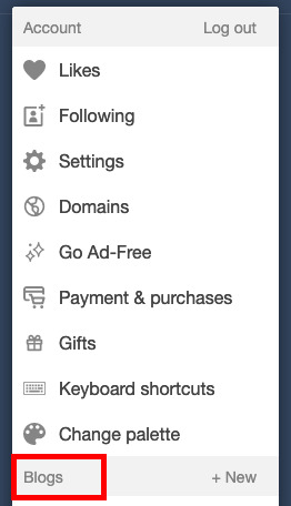
3. click on "blog settings". This will take you to a new page. (highlighted in red)
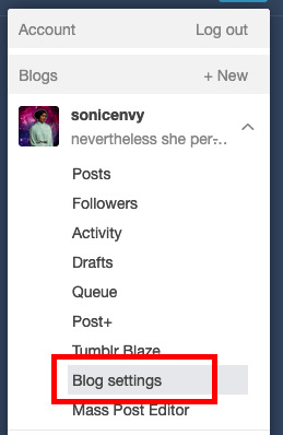
4. on this new page, scroll down to "custom theme" and flip the toggle switch to on. (circled in red)
5. now click that "edit theme" button. This will take you to a new page that will look something like this:
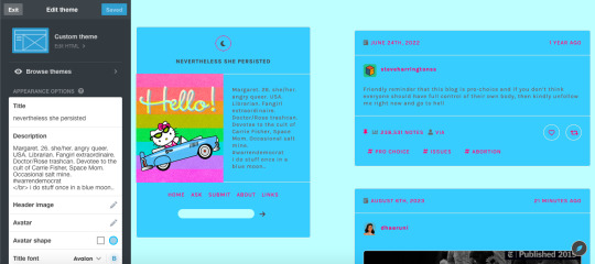
depending on what theme you end up using, the options in the white sidebar will be different. For now, that's not what we're actually interested in though!
6. to get started with your theme, click the edit HTML button.
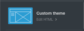
7. This pops open a thing with the code from your blog. This is where you can edit or paste code into to customize your blog. This is where the fun starts!

If you know code, you can write code yourself, but I'm going to just assume that you don't know enough code to write a tumblr theme. Fortunately for you, there are lots of people out here on tumblr dot com that do know how to write code and make tumblr themes and do this AND make these themes publicly available for anyone to use.
8. Where do I find this, you might ask? Great question! A good place to start is Theme Hunter, which is a blog where they share lots of independent theme creators themes. Typically when you use someone's theme, you should reblog their post about it, as this is often a term of use. Theme hunter is nice because they are really organized so you can find some nice categories to start you theme hunt in their "more" drop down:
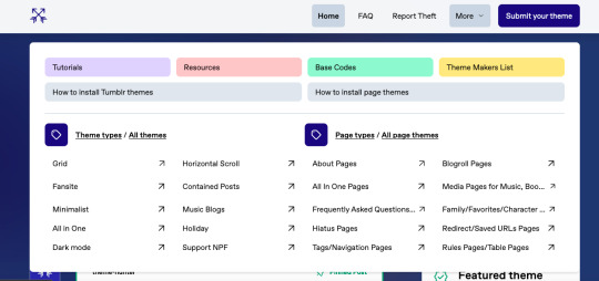
you'll notice that they also have pages about how to install tumblr themes. The "page themes" section is for side page themes. We'll get to that in little bit, but for now what you want is the "Tumblr themes" Most themes will have a set of easy to use customization options for stuff like background colors, font sizes, sidebar images, links, accent colors, etc. Most theme posts will have an example or "live preview" of the theme in question so you can play around with it and see if you like all of the features. Remember that you can change all of the colors and the font sizes if you like.
9. Once you find a theme you like, click on the "code" link in the post which typically takes you to a pastebin page with the code of the theme.
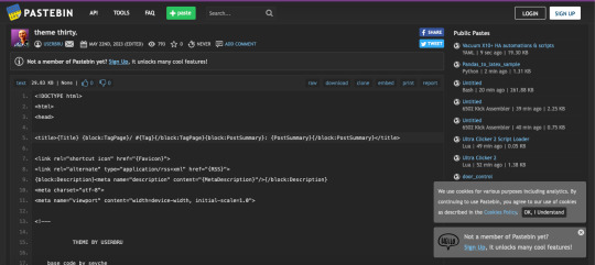
10. click "raw" in the top ribbon, which takes you to a new page that has nothing but the code on it. (highlighted in red)
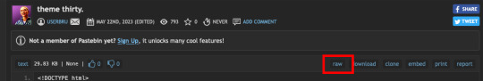
the new page will look something like this:

11. click anywhere in this page, and hit ctrl + a (on windows) or command + a (on mac) this selects all of the code. Now hit ctrl + c (windows) or command + c (mac). This copies all of the code to your clipboard.
12. Now go back to the theme editing page for you blog and click anywhere in the code box. hit ctrl + a (windows) or command + a (mac) to select all of the text in the code window. hit backspace (windows) or delete (mac) to erase the text.
13. now that your code window is empty, click in it again. Hit ctrl + v (windows) or command + v (mac), which should paste all of that code that you copied before into the code window.
14. Now hit "update preview" (highlighted in red)
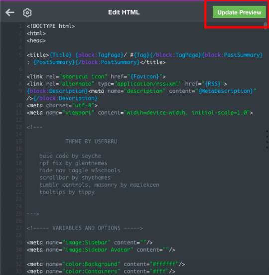
this will update the preview of your blog so that you can now see it with the theme! It may not look quite right yet, but that's because you haven't set up all the customization options yet! Note that until you hit "save" the theme does not become live on your site.
15. hit "save" then hit the back arrow on the code window next to the gear symbol.
16. Now for the fun part! Customizing! Scroll down In the little sidebar to the section called "theme options." This is where you'll get to select stuff like colors, sidebar images and fonts. Sometimes, things still won't look right in the preview, but once you go to your page, you can see what it actually looks like. I recommend having a copy of your blog page open in another tab that you can refresh every time you hit "save" while customizing your theme, to make sure that things look right.
Tadah! you have a new cool website. share the news with your followers.
If you want to get into learning how to make your own themes, check out buildthemes or buildatheme or theme-hunter's tuts page. To learn about web code in general you can sign up for an account through codeacademy or dash general assembly or W3Schools or html dog
#tumblr#tumblr guides#new to tumblr#themes#how to tumblr#resources#ref#long post for ts#learn tumblr#tumblr for newbies series
37 notes
·
View notes
Text
how to customise your blog from within the app
With the whole Twitter exploding into a million tiny pieces situation we’re seeing a lot of people who haven’t been around for a good while or are completely/mostly new to Tumblr, and I’ve been seeing a lot of posts from regular tumblrinas saying “please change from the default icon and settings, you look like a bot”. I’ve been wanting to make some posts about fun ways to customise your tumblr experience and I thought I’d start with a basic bitch tutorial on what you can customise from within the app.
To give the app version of your blog the equivalent of a sick new haircut, go to the lil guy who lives in the bottom right? (?? I think it’s the right. I have dyscalculia but I promise I’m otherwise mostly reliable) side of your dash. Give him a smack on his phat bald head to gain entry to your profile page. Then go to the paint palette icon at the top of your profile.
From here you can change four five things:
Your blog title. This is different from your url and it doesn’t have to match your url or be unique, unless you personally feel the need to be unique. You can change it by tapping it to start editing; when you do you’ll see three menus come up. “Title” is where you change what the title is. “Font” allows you to select a font and some of the fonts have a bolded option. “Colour” will give you a colour sampler to pick a colour from. You don’t have to have a title and you can turn it off under the “font” menu, but having one will make it clearer that you aren’t a bot, especially if you don’t choose “sexyangiebabymilf6969” for your title.

Your bio. I have a Van Gogh quote because I have a separate about page*, so I’m fine letting my bio just be a faintly pretentious smudge of mystique. Other people will often have whatever name they go by online, their pronouns, and sometimes their age and what their main interests are, eg fandom, hobbies, special interests, you know, the neurodiverse slut stuff. People also put links there sometimes using html coding*, like the kids put their caard and some people put ko-fi. You can change your bio by tapping on it to edit. You don’t have to have a bio and can turn it off, but if you have one people will be much less likely to think you’re a bot, and they’ll get some vague idea of who you are and what content you like to paste into your online scrapbook.
Your blog background colour. This can be changed by tapping on the “background” button.
Your accent colour. This can be changed by tapping on the “accent” button.
Your header image. This can be changed by tapping on your header, and you’re able to zoom into a chosen picture to or drag it to reposition. You can also turn off your header or choose whether or not to stretch the image to the necessary size.
Your icon/avatar. This can be changed by tapping on the icon. You can choose to hide your avatar on your profile (it will still be visible on the dash), and select a square or round frame.
Extra note on colour customising. You can pick out a truly custom colour by messing about with the slider and colour sampler, but if you want quick and easy or you’re shite at colour sampling you can click on the circles of colour above the slider to see a range of different preset shades, including greyscale. Each circle has a range of a few pages you can swipe through. If they all turn out to be shite you can go back to the slider by clicking the rainbow circle.

Each time you change an aspect of your profile and are satisfied with it, hit “update” up in the corner before moving to the next thing. Once all the edits are made save them by hitting “save”, also in the upper corner.
Resources for headers and icons can be found by looking through the “headers” and “icons” tags. Please follow the rules of the people who make and share those (they’re usually just “don’t claim it’s your edit, don’t repost, and leave a like or reblog” but each person has their own). I’d also recommend image searching for patterns, as you can tile your header if you use a seamless pattern image, and looking through livejournal for icons (again, please follow creator rules, icons take time to make).
*This post is hopefully a precursor to a post or numerous posts about how you can customise your blog outside the app appearance, including adding pages and using coding to put links wherever you want, and I plan to link to more resources for customisation in said post/s. When/if I get around to writing that I’ll drop a link in a comment or reblog of this post.
Godspeed, have fun finding out how much of the bee movie script you can fit in your bio I remain ever faithfully yours etc
23 notes
·
View notes
Text
...
So, working on a project and one aspect of it is making a really simple scientific poster. I'm the design guy, I do the front nd design since I'm the only person who knows basic html and css, the only person who has taken art and design classes, and I do this stuff for fun so I go ahead and take charge of the poster. Plus they really just don't have the intuition for design at all, even when I or the professors give clear instructions on How To Do Things Right. We have to make tons of drafts and get feedback on them, and its kind of a dripfeed because staff would make comments on some things, neglect to comment on the other things, and make us turn in another draft based on those missed comments.
Every single fucking time my teammates would work on it, I would have to go back and fix allllllll of the margins and padding they neglected, and I would have to remake every image of a diagram into a simplified, vectorized. Every time we had to change text or images based on the feedback, I would have to go back and change those as well. Today, while I was working on this, one of my teammates was literally trying to edit the same thing at the same time (using figma and diagrams.net). I was going to lose my mind because I was just trying to fix all of the issues, like I had to do multiple times, that my teammates would neglect from the feedback, and so this was actively happening while I was trying to fix them.
I had everything in their own groups, so that it would be easy to change things out. My teammates didn't know how to work with that. Earlier teammate literally did not understand that a file cannot have two different file extensions, and sent me a rasterized image of a diagram instead of the actual editable file, because diagrams.net just lets you have an "editable (so like, able to move around the individual elements) png" saved to your google docs, exported it as a plain png and posted it in the project chat. When I couldn't open it they then tried to tell me like, well it worked for me and well it has the other extension too so it should work. It was only the filename that had the 'extension' of the proper file format. (this is the big csc senior class btw)
The fact that we went back and forth so much on that diagram to begin with was frustrating because they could've given me access to the editable file at any time, and would constantly ignore or forget feedback which meant having to fix it many, many more times, and most of those fixes were still missing the core design feedback like 'make the text size bigger' and 'eliminate unnecessary whitespace'. If anything, it would've been much better if I went through with porting it to figma instead of relying on them, but I'm over here not wanting to be a total control freak so I'm like... whatever.
So when I get access to that diagram I fix issues from all of the feedback, but at the end of our final feedback they go and try to edit at the same fucking time as I am editing, and I had been fixing the diagram all day up to that point. Then the same thing happened on the figma document, and of course they deleted my group for the section the diagram was supposed to go in, so I had to make it again, fix the margins, fix the padding, fix the sizing.
They also completely trashed my design for a page I worked on for the project itself like waay earlier in the semester, so I was like. Okay. You guys do your thing, I can put in all my junk later. I would like to avoid wasting my time as much as possible, considering how mentally ill and exhausted I already am.
oh yeah and also the examples the professors put in the powerpoint for posters had the same (margins and spacing or text inconsistencies, bad looking screenshots, that kind of thing) or worse issues (think black impact font on a busy patterned background, for fucks sake) that they kept nitpicking us for, so its kinda like. please actually showcase something that's relevant thanks.
At least it's finally(?) over.
1 note
·
View note
Text
Wonderful Web Wednesday - 3
A Dao of Web Design - John Allsopp
Now this is certainly an old article. Published on April 7th of 2000, this article was written at a time where the adoption of CSS was still a debate. The article focuses on why we as developers and designers should be pushing for an accessible web. I was sent this article by my Web Development professor last semester. This article really made me think about how others experience the web and the applications we use on a daily basis.
John Allsopp's article borders between an appeal to designers and a philosophical discussion of the web and its inherent need to be accessible.
The web as a medium
Unlike mediums that came before them, the web is almost infinitely customizable and controllable. John Allsopp challenges this idea, he believes that designers and developers are not the controllers of webpages, rather the users are the controllers.
But beneath questions like “how do I make my pages look the same on every platform” and “how can I make my fonts appear identical on the Macintosh and Windows” is an underlying question – “how do I control the user’s browser?” Indeed, the word control turns up with surprising frequency.
-- John Allsopp
The first key to creating an accessible webpage is to relinquish complete control.
The nature of the web is that everyone has access to it in whatever format they want. Some people may be using screen readers or they may have mobility issues which require them to interact with their devices without a keyboard or mouse. When designing a website, it is key for a designer or developer to consider how these people would be able to interact with their page. Using native controls inside of HTML and CSS gives people the ability to alter your page to fit their use case. If someone needs to alter the font size because they are visually impaired, they can increase the font size on a page. However, if the designer decided to make the font exactly 14pt, then that accessibility customization becomes much more difficult
The journey begins by letting go of control, and becoming flexible.
-- John Allsopp
The Journey
A great website is a site that anyone can experience. This doesn't mean that it needs to look plain or be low on features. It just means that it needs to be adaptable. By taking time during the design period of a website or application to consider accessibility and adaptability, you can make someones day. That is what is so beautiful about the web. Just by conforming to simple standards such as using adaptable font sizes, differentiated colors, and percentage based layouts you can create a webpage that could give someone the ability to fully experience your work.
John Allsopp's entire philosophy that adaptability is truly accessibility is something that I believe more people need to hear. Making your pages and applications truly adaptable will allow your users to make them theirs. It is impossible to solve every person's accessibility needs; humans are fundamentally different. But if you provide the ability for others to adapt your pages and applications, you create most accessible pieces of software.
It is the nature of the web to be flexible, and it should be our role as designers and developers to embrace this flexibility, and produce pages which, by being flexible, are accessible to all.
-- John Allsopp
#accessibility#adaptability#customization#webdevelopment#softwaredeveloper#software engineering#cool websites#wonderfulwebwednesday#wonderfulweb
0 notes
Text
.
#why am i SQUINTING i have MIGRAINES#yes i'm zooming in i remembered that i can do that but now your theme is fucked#just turn up your font size !! you can go into html and do that and i will teach you how if you don't know how#my sister is legally blind and small font blogs are inaccessible to her even with zoom ins sometimes bc y'all will make poor contrast choice#as well#and don't even get me started on people who have the slight blur on text on their blog. are you fucking with me.#it's inaccessible for both people who are visually impaired (glasses wearers) and people with dyslexia#which describes my sister and my brother respectively but listen i'm also just an angry guy#having a clear font with good contrast is so important#the original text of this post was like 'having small font on your blog is ableist' but i don't want abled people to be acting like clowns#also small fonts are inaccessible to me personally because focusing visually can trigger my migraines#it's not nearly as important of an issue as how small fonts and other font inaccessibilities affect people who are visually impaired and#people who are dyslexic or dyscalculic (which is the word for dyslexia but numbers dyscalculia) like it's massively important for things to#be legible and shit#for people who don't regularly use a reading program and who are used to relying on their eyes it's important to be accessible#anyway thank you for coming to my tedtalk#mer rambles in the tags
1 note
·
View note
Text
Learn to Code for Any Platform
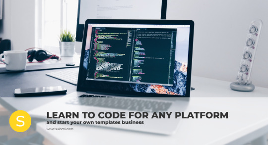
Many people dream of being able to create their own web templates. What they don’t know is that getting there isn’t as hard as it seems.
This article lists some tips on how to learn to code for any platform, and how to start your own Tumblr theme blog. Here’s a quick summary:
Learning to code
Getting started with your own templates
Styling your website
Running your website
Sharing your content
Learning to code
The very first step on your journey is to invest a bit of your time on learning how to code. Make sure to read the basics of coding and start practising - practice makes perfect!
Not sure where to start? Here’s some help:
Codecademy. By far the best place to start. Codecademy has great introductory courses to begin building your foundations on coding and they also offer a wide range of coding languages. For web design, you’ll need HTML and CSS, as well as JavaScript. Other languages may be necessary depending on which platforms you use, but these are absolute basics.
W3Schools. One of the most popular code-learning websites out there. Perfect for beginners, it offers starting tips on pretty much everything you need to start creating your own templates.
CSS Tricks. If there’s any complete CSS masterlist, this is it. You can learn pretty much everything about CSS on this website with accessible explanations and clear examples.
HTML Dog. Despite focusing on HTML, this website also offers CSS tutorials in order to complement both languages.
JavaScript for Cats. A funny and cute way of getting started with JS!
Working on Tumblr? If you’re coding for Tumblr, make sure to read the Tumblr Docs. This explains everything about Tumblr blocks and will help you structure your template correctly.
Starting your own templates
Once you’re comfortable with coding, it’s time to start creating your own templates. Here are a few tips based on my own experience:
Start for yourself. You may be confident in your skills, but it’s a good idea to start creating templates for yourself before sharing them with the public. This way you’ll be able to test your work on your own website and debug things that would have slipped past you.
Find your style. Many designers don’t know what their style is and that’s perfectly fine. Finding your style means that you should find a way of coding and designing that you’re comfortable with. Your templates will have your identity all about them even if you design entirely different things.
Resist temptations. It’s easy to slip into someone else’s source code and see how they’ve done something - stop right there! Even if you have no intention on doing so, you might end up copying someone else’s work and this could bring you some unnecessary headaches.
Ask for help. Don’t be afraid of not knowing everything. Asking for help is advised but make sure to do your research before reaching out - doing so will allow you to learn a lot more than if you were to contact someone immediately.
Styling your website
Your website will be your main connection between you and your work, and the people interested in it. Here are some tips on how to make it appealing:
Keep it clean. Avoid unnecessary elements. Exaggerated zoom effects, distracting elements such as overly thick borders, shouldn’t be used. You want your audience to feel comfortable on your website, so make it as inviting as possible. The ideal design will use a maximum of three font families and colours.
Ditch small fonts. A 10px font isn’t readable in most screen resolutions, which makes your website very hard to use. A minimum size of 14px is ideal.
Watch out for the colours. Keep your website clean is also about being smart with colour usage. Make use of black and white or dark greys for backgrounds, pairing them with an accent colour. If used properly, gradient background look amazing as well.
Running your website
You’ve learned your coding, you’ve found your style, and you’ve got your website. What comes next? Running it.
Stay organised. Running a website isn’t only about having it. You’ve got to have a plan as well. Think about what you’d like to address or share on your website and create a plan (e.g. article schedules and topics, template releases per month or week, etc).
Be polite. You will come across harsh feedback at some point, so don’t expect it to be a smooth ride at all times. People won’t always appreciate your work or agree with your opinions and that’s fine. Regardless of how you’re spoken to on your website, don’t fall into the temptation of responding on the same tone. Stay polite!
Interact with others. You won’t be successful if you’re isolated. It might be intimidating at first, but interacting with other designers and even your readers places you one step ahead on the game.
Don’t just disappear. Life takes unexpected turns but do your best not to vanish without a trace. Leaving a quick note on your website about your absence takes but ten minutes and your readers appreciate it.
Sharing your content
If you’re at this stage, then you’re ready to start sharing your content.
Use social media. Social media makes wonders these days, but you ought to stay active. Regularity is key for a successful use of social media (along with appealing posts and interesting content, of course), so make sure that you use these tools for your own advantage.
Boost your SEO. Your website won’t get far unless your SEO is good enough. It might sound complicated but it’s easier than you think. This great article by Moz guides on how to get started with SEO.
Schedule your content. If you suspect that you can’t stay active on your website or if you’re going through an inspiration surge, you might want to take advantage of scheduling features for a more consistent updating of your website.
Submit your work. You might also be interested in sharing your content with other designers or bloggers of your industry. These people will often share your content and grant you the visibility that you need to start off.
Ready to take the web design community by storm? Good luck!
326 notes
·
View notes
Photo


click for a full view!
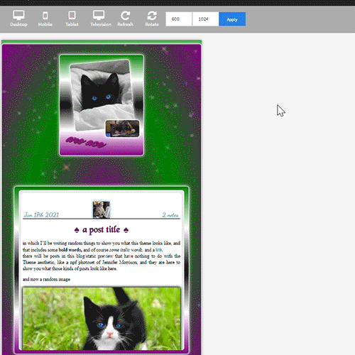
this is the blog I legit grew to love or
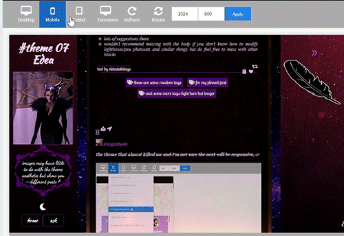
theme 07 - Edea
100% tall container and sidebars on desktop / see gif 2 for responsiveness. As always super customizable!
like or reblog if you use (or just if you like!). Don’t take off the credit, but edit as you please. Links and more instructions/specific sizes in the source! Do let me know if something is wrong, I welcome feedback of any kind.
reminder I have a ko-fi if you’d like to support me <3
in this blog you’ll find:
-the soundcloud player button will automatically be the same color as your tags background (because it's small and it looks nicer to have it match). The player is minimal with visible album cover, by shythemes. Also by @shythemes and with @bychloethemes fix, the pxu photosets and the way I styled the like button, lightboxes, and the script for automatic video resizing.
-npf photoset fix and the (optional) searchbar (hidden under the feather) by @glenthemes
and button to copy the url of the post.
-a second source link will appear if the post has a custom source/a source outside of tumblr.
- @magnusthemes' no ‘href.li anymore’ script.
-by @eggdesign (optional) daynight button you can toggle off.
-dropdown menu that appears when you click on the animated link, a floating feather (or whatever image you choose instead of it) will show 5 more navi-links and a link to each custom page you make if you enable 'show link to this page'. As many as you want, you can scroll down the sidebar when they exceed its height.
-Spotify (audio and npf posts) will have a max height that is half the width of your posts instead of a big album art so they won’t become giant (keeping the 80px height to make the album art disappear will remove the list of songs if you post a playlist so I shortened it * see notes in the post linked in the source.
-responsiveness: even 540px posts + padding and containers will fit in the smallest desktop screen (1024px) because sidebars grow slightly smaller than their regular 250px. In all tablets and mobiles you get the sidebars on top and the container below, you can scroll down to see the content and the screen will also scroll if needed. (due to everything being naturally 100% tall and the post-width changing depending on the user I couldn’t have thin posts fit in big tablet or I’d risk cutting off the larger ones). Topsidebar1 will also show as much content in a row as possible.
-lines around titles of posts from css-tricks, optional unnested captions by @annasthms
-lots of instructions in the html if you decide to change something more.
what you can customize without going to the html page:
rest under read more because as always it got long. Please check it out!
for the toggle on and off section:
-turn on and off the visibility of the second sidebar bg if you just want the floating feather (or an image you may upload instead), daynight mode, the searchbar, the searchbar suggestions that appear when you click on it if you don't want to go to the html editor to add the links, unnested captions for textposts and unnested captions for all other posts ( see faq if curious as to why I divided them); the glow around navi links and description. The normal description if turned off will be replaced by one with a "fancy" background that fits this theme. Rounded borders.
for the pick it/upload section:
-pretty much all colors in your 'regular' theme, including each sidebar, the posts container, the posts second container (entries) and the posts background. All images you see except the nightmode button. Including a secondary bg image for your sidebar when they turn into topbars (given the big change of width), see post linked in the source for more instructions.
-if you have enabled daynight button, you can change the color of posts bg, text, entries, backgrounds, bottom permalinks, links, italic, questions, answers. I couldn't add more or I'd surpass the number of allowed meta tags, but it should be enough to allow people to read your posts (if someone can't read white on black text, like me, they can click on the button and have black on white text, or some other combo) If you want to add more you’ll have to go in the html edtior and search body.night for ‘instructions’, it’s pretty easy now that the rest is already written.
select section:
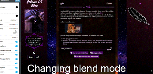
-when it comes to the container behind the posts and each sidebar you can select the blending mode between color and background image, which can be none if you want only one to show fully, or can be hard-light, soft-light, multiply and more, to make the image an overlay and see the result (for example in the preview the sidebar's bg gifs are on multiply or they'd be golden, on top of violet/purple, but in gif 3 you also see the 2nd sidebar on hard-light).
-post width (between 400, 450, 500 and 540 px).
-the font of the posts text among MANY options, including some that wouldn't work well for a post but is there to show you all the potential fonts present in this theme. Why? See below.
text section:
-you can type the following fonts (picking among those shown in the select menu for body font): description, blog title, post title, bottom permalinks, tags
-the size of the gutter/distance between images in photosets, blog title size, post title size, posts font size, description font size
-the symbol in lists items, currently a star or ' \26e6 '. You can replace with other codes or straight up the symbols, there will be a link in the source-link with a page full of other css symbols, remember to add a \ before the code itself.
-the names and urls of navi links (two are under sidebar 1, currently being home and ask, 3 more in the other sidebar)
#themes#codehunters#theme#free themes#free resources#evansyhelp#dailyresources#themehunter#rp themes#rph theme#rph#rpc#fansite theme#main theme#complete resources#resourcemarket#tumblr theme#rp theme#my themes#theme 07#mine
88 notes
·
View notes
Text
Pagination is Hard
If you've been following along lately, you'll have seen that I'm working on a Choose Your Own Adventure style book. Primary writing is happening in Twine, which is a tool specifically for Interactive Fiction/Game Books/etc. But a Twine file is meant for a digital world, and I want a physical book.
More specifically, I want a physical look that looks like a CYOA book, acts like one, smells like one. I want people to pick it up and be teleported back to 1986. And so, there's a few style rules to follow. Some are simple, like the font, but others are more difficult, like pagination.
Twine has absolutely no concept of a page. Pages are irrelevant. It cares about Passages and only Passages. Its primary storage format is HTML, which also doesn't care about pages. Okay, so all you have to do is copy and paste it into Word, and now you have pages, right? Word cares about pages, doesn't it?
Word does not care about pages.
More specifically, Word docx files don't care about pages. Under the covers, they're not much different from an HTML file. (They're actually a zip package of a bunch of XML files, but that particular detail doesn't matter much.) There are tools and SDKs that let you create Word docs, but what you're creating are sections, paragraphs, and runs of text, but not pages.
Now, okay, Word itself does care about pages... Sort of. You can see the pages, you can print the pages, but they're sort of a calculated illusion. Whenever you open a Word doc, the rendering engine figures out how to pretend that the file is organized into pages, even when it's not. But because the pages aren't real, you can do something as simple as shuffle the pages around. That's largely fine, because in most cases, you don't want to shuffle pages around. In a normal document, the page break could come in the middle of a sentence in the middle of a paragraph. Reordering that would result in chaos.
Choose Your Own Adventure books are not normal.
Their whole thing is that all the pages are reordered randomly. Everything is centered around pages. Go on to the next page. Turn to page 73. The pages form an interconnected tree of decisions that make up a story. Pages pages pages.
So, in order to make a CYOA book, you have to be page-based, not passage-based. So, you just take all your passages, turn them into pages, set up links between them, and you're done!
But... Just what the hell is a page, anyway?
A page is a fixed-size panel of text, right? Easy enough concept. But... How much text? One of my passages is 400 words long. Is that more than a page or less than a page?
Trick question! Words don't matter. Pages are measured in lines. With known margins, font, size, spacing, etc., a page can hold a certain number of lines. For the style I'm using, let's say that a page is 25 lines.
So how many words are in a line, then?
Another trick question! Words in a line don't matter.
A cat in a hat ate a pie.
Several loquacious antidisestabilishmentarianistic sasquatches contemplated pseudoscientific philosophies belligerently.
Both of those sentences are eight words long. (So was that one.) But they're vastly different lengths. The first sentence has room to spare on its line, while the second one likely ends up spanning more than one line (depending on how you're reading this post.). So, it's clearly not word count that matters, it's the number of characters that counts. So, how many characters in a line?
Also a trick question! Some lines are short because the last word is a long one and doesn't fit. And letters are different sizes in most fonts.
You pretty much need a full layout engine to figure out how much text fits on a page, and that is not something I have.
But... Why do I care?
I care, because CYOA books are so centered around pages that you have to care about pages. Go grab one and open it up. (You obviously have one just lying around like I do, right?) What's the first thing you notice? Every page ends in one of two ways: The phrase "The End" or with "Turn To X Page" directives. That's the defining feature of the series.
But what else do you notice?
Almost every page ends with a bunch of whitespace. Because every page ends with a complete paragraph. Nothing runs on to the next page.
That's weird in a book.
(Okay, it's not every page. There does seem to be an exception to that rule and the "Turn To Page X" rule, which involves facing pages and a large illustration. It appears that mid-paragraph breaks are permitted in those rare circumstances. But anyway...)
They end with a complete paragraph because they have to. You can't suddenly have a "Turn To Page 37" in the middle of a sentence. No, the book has to pause, give you an instruction, then resume. These books would be irritating if
If you want me to finish the sentence, keep reading the next paragraph.
you were interrupted in the middle of every passage like that. So, in order to avoid that, I need to split the passages up, so that the right number of paragraphs are on each page, and in order to do that, I need to know how many paragraphs I can fit on a page. In order to do that, I need to know how much text can fit on a page and we've already been down that road.
So. What can I do about it?
I can fake it!
Faking things is a foundational principle in computer science. Some problems are too hard to solve the right way, so instead, we solve them the wrong way and make it look good.
You see, I don't really care exactly how much text can fit on a page, I care more about roughly how much text can fit on a page. That, give or take, is 22 lines, and a line is, give or take, 40 characters. And I didn't perform a complex layout calculation involving kerning and justification and whatever'n'th'hell an "em" is. No, I pasted a paragraph into Word with all the settings I wanted, let it do all that work, then I just counted letters. 40-45ish letters and 22-25ish lines, so go low for safety, and presto.
For each paragraph, get ceil(paragraph.length / 40.0) to get the line count for it, and repeat until there would be too many lines. Then put a page break and keep going.
And presto, now you have complete paragraphs and whitespace on every page!
Except for page 153, because fuck page 153:
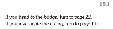
Page 153 is a page number in the heading, followed by two "Turn to page X" choices and nothing else. What this means is that somewhere in my book, there's a directive to tell you to "Turn to page 153.", only for Page 153 to tell you to immediately go somewhere else.
And so you think, "Oh, well maybe that page is full of other paragraphs and there isn't any room left and maybe you can tweak a setting or add a feature that prevents such orphans. So you track down the page in question. Behold page 94:
WHAT THE HELL, PAGE 94‽
It's like 60% full! There's plenty of room for the choices there. Why are you doing this to me?
Anyway, that's all I wanted to say. I felt I had to write this big long thing just to name and shame Page 94, rather than spending that fixing Page 94, because you all need to know what Page 94 did.
#writing#cyoa#choose your own adventure#game book#choose your own adventure rules#pages 151 157 45 98 and 85 are also being problems#but don't get me started on them#or how is you have a paragraph that's like 20 lines long it screws everything up#let alone one that's 30 and can't even fit on a page#also in case you were wondering#it's grammar checking 'dragon' because it thinks it should be 'your badass dragon's name'#but no it's correct#you are a dragon and you need a badass dragon name#although if you had a badass dragon#your badass dragon would need a badass dragon name too
29 notes
·
View notes
Text
#showyourprocess
From planning to posting, share your process for making creative content!
To continue supporting content makers, this tag game is meant to show the entire process of making creative content: this can be for any creation.
RULES — When your work is tagged, show the process of its creation from planning to posting, then tag up to 5 people with a specific link to one of their creative works you’d like to see the process of. Use the tag #showyourprocess so we can find yours!
sabrina @lanwangiji, my love, tagged me to share my process of making this typography edit! check out her explanation of her the untamed edit and her edit tag.
1. PLANNING
i once opened lyrics edit requests so i can learn and practice typography. this edit was a request as well. i asked them which lyrics they wanted to have and the colors they’d like. since i got several requests and it was hard to keep tabs on them, i made a trello board so i could organize everything. i’m still using the trello board for every edit idea i have, the board makes my life easier.
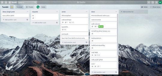

above is what i filled the card in the board with. basically just information of the requests.
1.1 INSPIRATION
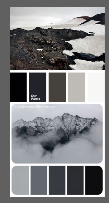
once i got the request, my first thought was to find the vibe the song/lyrics exude. “it’s an old curse” screamed witchy vibes to me, so i went to pinterest to find some inspirations. at first i was looking for witchy poster designs and i came across this. i liked how it has smoke-ish graphic and i thought the smoke suited the “old curse” lyrics. and tbh pinterest is a rabbit hole, they gave me suggestions after suggestions, like this and this which became my inspiration for the color palette (i added the gold from those pics) and the sun moon design gave me the idea to incorporate space stuffs too. i somehow landed on this too, and because i wanted to include space theme, i made a simple phases of the moon. ultimately the hero of this edit was the lyrics, i didnt want the graphics took the center stage. i was inspired to make a crystal ball and do this kind of typography but after several trials i couldnt get the the typography right, so i scratched that idea and went with the space theme instead.
1.2 PICKING COLORS
after i was feeling inspired enough, i went looking for the right colors. i usually just type “color name” and “palette” on pinterest. example “dark grey color palette” and i chose the one i liked best. when the request only asked for 1 color, i always searched for either a complimentary or contrasting color to give it a jushz, to add sprinkles. that’s why i added gold on top of the dark grey.
1.3 FINDING FONTS
this is the hardest part. the fonts play important role to the design. they need to convey the vibes of the lyrics, in this case witchy/magic vibe. i needed to find fonts or font just as magical and a bit whimsical. tho i hoard fonts... i like to use new font for every typography edit lmao sue me.
i highly recommend going to creativemarket free goods site, pixelsurplus font freebies and behance to search for fonts. i always use 100% free fonts, that means i can use it personally as well as commercially. creativemarket gives me desktop license for the fonts, which means i can use it for commercial as well. the reason i do this because i want to open an etsy shop someday, and i want to have the right license when i sell my stuffs. i almost never buy fonts bc they are expensive lmao.
the fonts in used are “Vintage” for the main typograpy (i think i was a freebie from creativemarket) and “Morganite” for the title of the lyrics and the name of artist.
2. CREATING
once i have my materials and ideas, i open my illustrator and hope it doesnt crash every 5 min.
for this kind of typography edits, i use 600x700 px. tbh i dont like using 540px, the suggested tumblr size, as the width bc to me it doesn’t look as good in quality, so i up the px. but more on this sizing later. i utilize the artboards function in illustrator, and i use 2 artboards.
i use illustrator (ai) bc i’m working with vectors. when i work with vectors, the graphics/texts or whatever im making in ai wont become blurry or lose its quality when i enlarge or shrink it. in compare to photoshop, i need to make for example the moon graphic very big, so i wont lose the quality when i reduce and enlarge it again. with vector, i can start small and when i expand it, it’s still as good as when it’s tiny.
2.1 GRADIENTS
i started with the gradients first. i created a rectangle as big as 600x700px and with the “freeform gradient” tool in ai, i played with the colors. below is the color palettes i used
2.2 LYRICS AND GRAPHICS
once the gradients are done, i worked with the lyrics and graphics right away. when i first doing this edits, i made typos a lot lmaooooooo. so i copy and pasted the lyrics on top of my artboard, so i wouldnt have any typos.
i had 3 layers in my ai. one for the inspo pics and the OG lyrics. the rest for the edits themselves. i broke up “It's an old curse/dreamers diving headfirst” into to parts, hence the 2 more layers
i almost always started with the lyrics first then the graphics. but for this edit, i made the smoke first so i can layout where my text would be.
tbh the process of making the lyrics is a trial and error. i tried bunch of different stuffs and i chose whatever the best. but i worked like methodically, i made sure i finished the first part of the lyrics first then i could move on.
i was lucky with this font “vintage”. the font offers me several glyphs like these
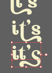
and i chose the one at the bottom. you’re very lucky if you find a font and they have glyphs.
excursion: glyphs vs fonts
glyph is an individual character. It might be a letter, an accented letter, a ligature, a punctuation mark, a dingbat, etc.
A font is a digital file which is used to display a typeface, which contains the entire upper- and lowercase alphabet as well as punctuation, numbers, and other special characters.
after i was finished with all the lyrics i added some graphics to make the edit pretty like small stars or dots. i added the song title and the artist too, sometimes at the bottom sometimes at the top. and i added my watermark put it as small as i could and made it a bit invisible but still can be seen.
2.3 EXPORTING
exporting! this is where i’m going to go deeper with the dimension of my work. in ai, i always choose to save with “export as screens” function. it automatically divides the artboards i have and save them separately. i always save as png, bc the size is smaller than jpg but can maintain the quality.
now the export tab looks like this
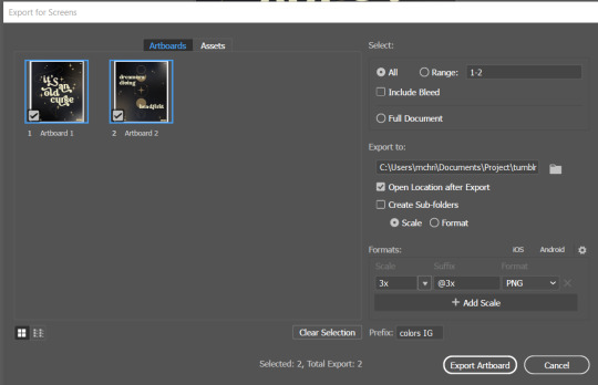
see the formats? i always scale up my edits, 2-3 times the original artboard size. reason is, to maintain the quality. i have tried to save it as original, 600x700 px, but it turned out a bit blurry. bc everything in ai is vector, when i scale up it doesnt lose the quality. BUT once i save it as png, it’s not a vector anymore, and when you zoom in until a certain degree it’ll be pixelated. that’s why i always scale up, to avoid it becoming pixelated when it’s just zoomed 1 or 2 times.
2.4 FINAL TOUCH
i opened my photoshop and also pray it won’t crash. import the png of my edits, add some grains/noise. the reason i use photoshop is, the noise filter is way better than in ai. it’s smoother somehow. and then i export my edits.
(i have a timelapse of how i made one of my edits, it’s not this one, but it’ll give you a better visualization. find it HERE
3. POSTING
now the hardest parts are done, we go to posting!
i uploaded the 2 posters on tumblr as photos then i wrote the captions. for this typography edit, i always chose another lyrics that i like from the same song for the caption. i bolded the lyrics, add link to all of my typography gradient edits.
i always use this link to color my caption. i usually choose 3-4 colors, and i took the colors from my edit. but this was not until recently lmao. before i just took a guess and looked for similar colors that match the edit, but then i thought “why didnt i just use the color in the posters lmao”
ok after i have my html code for the caption, i go to this site to replace the “;” with “ “ so tumblr can read the code.
i’m not one who puts their edits in draft, bc i just cant wait to post it. i have to option here, either i post it immediately when the time is right (i usually post between 4-8) or i schedule it, if im finished before 4.
i put all the necessary tags and click post! i am done finally!
i’m tagging:
@thetriangletattoo for this amazing series
@deludedandlostcause for this impressive gif
@half-lightl for this spectacular edit
@gayndrew for this stunning drawing
@thechampagnelovers for this cool collage
@cloudslou for this incredible edit
@heyangels for this incredible edit
35 notes
·
View notes
Note
How do you create small text and coloured text in rich text box ?? Especially if I use small text, once I publish it it turns into the regular size font. Annoyinggggg

So the thing that you are actually wanting is sadly going to need to be done in HTML. If you edit the post ever you will need to readd the colors in again. There is this AMAZING generator that someone on tumblr made that you can do EVERYTHING that you are wanting but I will quickly make a tutorial on how to work this. Under the cut is a tutorial how to do replies that have small text and colors! I hope that this helps you and if you need help with anything else or this doesn’t make a lot of sense / need more coding replies / formatting help just send me another message! If you find this helpful please like / reblog !

Here is what the page looks like when you land on it.

Write up your reply. I would personally go ahead and put your icon and cut the reply before you do the text so that way all you have to do is add in the html of your reply’s text and be done.

So highlight your reply and go to STYLES and in the dropdown there will be small. This adds in <small></small> around all of your text for you.

Next, you are going to want to highlight what text you want to be colored and click the button that I have highlighted. Pick a color! To explain what is happening in your code <span style="color:#colorhexhere">Your text would be wrapped up in here</span>

Scroll down and you will have your full html there. Don’t touch anything here when it comes to editing it. If you notice a spelling mistake simply scroll back up and fix it and then come down to grab your text.

So I laid down my icon for my reply already ( not a real reply ) and would have cut the thread with xkit by now.

Go to the gear and go from rich editor to HTML.

Post your html at the end of the image html. I went ahead and did that already.

If you want to see the reply and how it will look on the dash don’t go back to the rich text editor but instead click preview in the html section. Go ahead and click post when you are happy with this reply. DON’T GO BACK TO THE RICH TEXT EDITOR OR YOUR COLORING WILL BE GONE.
#rph#rpt#rpo#rpa#・ ˖ ✦ ⋄ . ❝Mine: Answered Ask.❞ 【OFCAMERASFLASHING】#・ ˖ ✦ ⋄ . ❝Mine: Tutorial❞ 【OFCAMERASFLASHING】#・ ˖ ✦ ⋄ . ❝Mine: All❞ 【OFCAMERASFLASHING】
96 notes
·
View notes
Text
show your process
To continue supporting content makers, this tag game is meant to show the entire process of making creative content: this can be for any creation.
RULES - When your work is tagged, show the process of its creation from planning to posting, then tag up to 5 people with a specific link to one of their creative works you’d like to see the process of. Use the tag #showyourprocess so we can find yours.
I rarely keep my psds or keep record of my process but luckily I saved the ones for these edits. Depending on how lazy I am it takes me between 2 hours and a week to finish a full set.
I don’t exactly remember each step but here are layer by layer breakdowns of the final product of the first gif i made for each set.
Explanation down below
@essercipertuttienonperse tagged me for this Miss You edit

and @letsbealone-together tagged me for this Defenceless edit
I chose not to question the difference in quality between these two btw.
Planning
i rarely plan tbh i just go with where the editing takes me with the first gif. bc once i have the first gif down it’s just a matter of making the others match to have a cohesive set.
Choosing the clips to gif + lyrics
Since these two gifsets are song based it was relatively easy to choose the clips because I’ve identified specific shots before that would fit a certain lyric.
For Miss You I used clips from the mv, the royal variety performance and the x factor performance. + maybe i miss you
For Defenceless I used clips from wmi mv, miss you mv and walls mv. + 1st verse.
Making the gifs
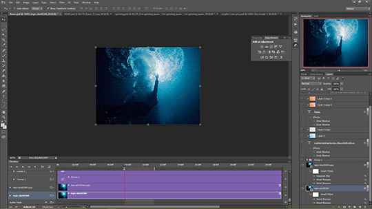
I don’t want to turn this into a giffing tutorial rip, but i basically follow a very basic gifmaking routine and use 2 actions for loading and sharpening. (most of the giffing guides i based mine on can be found here.
But it goes: loading > cropping > sharpening > base colouring.
For refence, I either use PS CS5 or PS CS6.
For Miss You: 540x300 px | For Defenceless: 540x400px
Sharpening settings: smart sharpen twice (500/0.4 + 10/10) + gaussian blur (blending 30% opacity)
The base colouring is mostly there to brighten and colour correct the gif. For that I mainly use curves, levels, colour balance, selective color and vibrance.
For particularly dark shots I use a trick I learned from @stardustony using white color fills and b&w gradient map.
Colouring-Colouring
This is where the fun begins.
Sometimes before even beginning I have a dominant and accent colour in mind, but more often than not the final result is very different from the first round lmao.
I use multiple layers of selective colours to get everything to match and get what I want + different blending modes.
For Miss You i knew I wanted blue and red/orange, so it was a matter of bringing out the cyans and reds of the scenes without making it too grainy.
For Defenceless, the colour choices were based on the colours Nyx associated with the song, in this case pastels, blue, pink and yellow/beige.
+ Additional step for this gif because it was an experiment: i added an empty layer at some point, painted on it with big brushes of blue and peach, then set it to substract to get that rainbow-ish effect on the water.
Adding text
I choose the fonts:
For Miss You --> Gobold Bold (regular) 18pt/36pt
For Defenceless --> Kiona 7pt, Boiling Demo 18pt, Amalia 36pt
Then I add inner + outer shadows to the text.
Then for colours I usually just add two layers with random colour gradients as clipping marks on each text box OR change the font colour and play around with blending modes
Then placement, depends on the vibes lbr
The boxes
Shape > Rectangle Tool (make the box, choose size, stroke, fill)
For Miss You : we have a dashed box thingie going on + the b&w/colour separation
For Defenceless: the box lines are lyrics hehe, i actually forgot how to do it, but it involves making the text follow the path of the lines of the box using the direction selection tool.
Exporting
Save for Web (Alt + Ctrl + Shift + S)
Selective or Adaptative, Pattern, Bicubic
Drafting
To check if the gifs are cohesive, arrange placements and check if the colouring is ok on different devices. I also send the links to friends to see if it’s ok.To add caption (html + edit fiddle)
To add tags: generic tags for louis edits + user tags + tag i use for my edits (usually louis tomlinson, louisupdates, tracksintheam, belletracks, *mine)
It’s also a hack to avoid no showing up in the tags.
Posting
I either let the gifset rot for weeks before I post it, or post it right away because I can. Some people schedule for specific hours for maximum engagement. I only schedule self-reblogs for after posting, 12 hours after, then 9pm my time, then 3am.
Bonus: camping in the notes of my own gifsets for the two first days.
Tagging people some oldish edits I really liked, don’t feel obligated to:
@stanwalls for this pink gifset
@stormyhale for this edit
@tomthenetherlands for this edit
11 notes
·
View notes
Photo
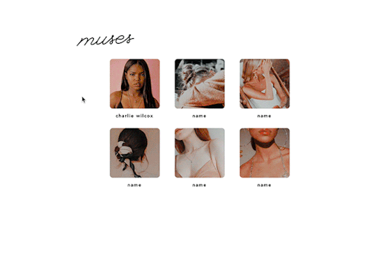
profiled by @erika-writes
↳ a page made for displaying muses, featuring a pop-up window to see a profile on each muse.
preview
code
please give this a like or reblog if you enjoy this theme or plan on using it! if you like my work, consider buying me a coffee. ♥︎
– information to note is under the cut!
things to know:
you’ll need html knowledge when it comes to changing the information, photos and each pop-up box. however, i tried to label everything to the best of my ability so you can follow along!
the most important thing you need to know is that each ‘box #’ needs to match. for reference, click here and here.
you can add as many boxes as you want. it’s not limited to six. again, just make sure all the numbers match up.
however, when adding more boxes, your last box should end with an extra </div> but the boxes before it should end with </a>. for reference, click here.
the “aesthetic” box scrolls so you can put as much information as you’d like.
if the name doesn’t fit because it’s too long, just change the font size! it’s under ‘#name’
to change icons on the info table in the pop-up box, you can find them here but you’ll need some background info on how to go about changing them.
i set this up as a page to display muses but with some creativity, i’m sure it could be turned into anything like location pages or about pages.
if you end up using this, feel free to send me your results or tag me! i’d love to see what you do with it.
image sizes:
square icons on main page -
◦ width: 120px
◦ height: auto but looks best with all the same height
big sidebar image in profile -
◦ width: 250px
◦ height: 500px
small images in profile -
◦ width: 110px
◦ height: 150px
terms of use:
do not remove the credit
do not use this as a base code
you’re welcome to edit the theme as much as you’d like for personal use but do not redistribute it
please try to google any coding questions before asking me
2K notes
·
View notes
Text
OKAY SO I KEEP TELLING YALL TO USE ADOBE READ ALOUD BUT I LEARNED SOME THINGS TODAY VERY IMPORTANT!!!!
Okay. So. I went to chapter 41-50 today to listen to the novel. Start up the read aloud program. Adobe nearly fucking killed my computer. It starts reading, but it’s pausing after every single word like it’s a sentence stop, and REFUSES to pause or stop the program. It takes like five min to get to the bottom of the page, I’m trying everything I can to end the program. It gets to the end of the page (god help you if you accidentally activate the whole doc at once, I’ll send flowers to your grave, you’d have to force shut down your computer to turn it off) and as soon as it stops reading, the program closes (cause I clicked close and every other button I could think of a million times) and finally, blissful silence.
So. I’m all. Shit. Now my programs broke. Google how to speed it up. That’s not a thing with the program I have myself. Google why it hates me. Google ain’t know shit. Finally. A stroke of brilliance. Open up the doc I was using it on the other day and activate it. It’s working fine now. Okay. Time to figure it out.
So I opened up the original doc I copy pasted in to save the PDF from (if you do not have the original; copy paste the whole PDF into a new doc, word or google does not matter as long as you can print from it, save whatever you need there, it works the same) and changed one single thing: I changed the text size to 10.5.
I also just tried it on an AO3 FIC. Read aloud fucks up the same way on AO3 fics. This time tho I downloaded a new one (I did not download the PDF this time, I downloaded the HTML and copy pasted that into a doc) and changed the text to Arial, and the size to 10.5. Then go to file, and print. Don’t worry, this won’t actually print. When you’re in the print window, there will be a drop down menu that gives you the option to save it as a PDF without printing it. Use this.
Those are the winning specs. My Adobe program will now read this fic aloud to me.
If the PDF hates you, change the text to 10.5 and Arial font. That’s it. That’s all you need to do. Also, don’t copy paste a 100k+ word FIC into a google doc. It takes like five minutes to paste and then when you go to save it it takes eight more to do that.
It took me like three hours to figure this out I’m very computer illiterate but I am stubborn and bored and I cannot do yarn stuff without some sort of media consumption so I’m even more stubborn to make it work.
8 notes
·
View notes
Photo
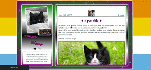

the theme I don’t know how to describe because it has too many things featured in it and it will take a year or
aro-ace theme!
note that you are allowed to use the theme for whatever you want, change all colors, images (you want to make it a marvel thing? go for it! It’s personal and you want to use other flag colors? go pick those rainbow colors!), but my inspiration was, well, not having seen aro-ace themes before and wanting to make one. I didn’t upload background images but you have the option. Feel free to edit as you please, just don’t remove the credit or claim it’s yours!
as always in the source you’ll find the link to the post with static preview, code and instructions/extra credits.
theme is contained, responsive, super customizable. It’s free! But as always consider donating to my ko-fi as this was a lot <3
like or reblog if you use! (or just if you like it, if you want to!)
this post will have: what you can edit from custom page, the widgets/scripts used with credits and some explanations. Asterisks * next to something will indicate that more about it will be said in the linked post. I’d apologize for the length but it’s due to how many things I added to the theme and that you should know about.
now, what can you edit from your customization page:
-nearly every font and its color and size, so that if a font is by default bigger than others you can easily reduce the size. There is a select menu for the body font with all the fonts present in this blog, so you know what they are and can type the one you want for other eleents. I think I only left a couple to be edited from the editor, like your quotes posts if you reblog them a lot. This includes h2 as it’s what you use as ‘big font’ in your posts and h3 in case you want to personalize it and use it for something on purpose, as it has to be added to the html of the post.
-one of the new things:I used a gradient for the backgrounds of the big container, the sidebar and the posts container, but also of tumblr’s default music player (latter done initially following @octomoosey‘s tutorial then messed with by me hence no album art). See static preview posts. You can type the colors straight from the costomization page like this:
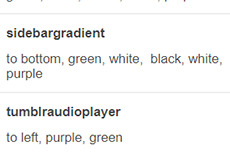
if you want one solid color you can just write, for example: black, black as it needs at least two. To bottom/To left/to top/to right change the direction. The only thing you need to edit from the html is if you want to go from linear-gradient (like you see in the sidebar) to radial-gradient (like in the big container which has green in the center and purple on the outside) and vice versa, if you want.
-you can also upload background images of the sidebar, container and bigcontainer and select the optional blending with the colors, which can be none and you only see the images or something like screen or hard-color and check the results (bigcontainer as an overlay gif on Screen now)
-more typing: you can paste the symbol or the symbol code for the list items and the decorations around the post title, right now both being spades. *
-you can upload up to five background images if you enable the ‘changing background’ function otherwise only the first one counts. They will change when you refresh the page, thanks to @lmthemes
-you can turn on and off the music box (player3 by @glenthemes ), and if it’s enabled you can add two songs from the customization page (or go to the html editor and up it to four before it can get messy as it shows on hover), typing url, author, url of the album art, and song title. You already have We Are Golden by Mika as an example (takes a second to start due to the recording, watch out not to get scared if there is silence and then the first note)*
-optional searchbar in the sidebar with optional suggestions when you click on it (if you want them though you’ll need to go to the editor to type links and names, but you can turn it off and just keep the searchbar, like I said) also by glenthemes’ tutorials.
-the separator between text posts image is also optional and if turned on, you can also turn on and off whether the image is the avatair/portrait of the person who made the post, with a link to the original if it’s a reblog, or if you want the image to be one you upload yourself, 50x50px and it should resize to fit in (also with a link, in this case to the post itself so you can open it from the top of the page). One is the toggle button ifshowtinyimage, and the other is ‘tinyimageisthesource’, if you turn that off you upload the image yourself. If you add a source to your posts, it will appear among the permalinks regardless.
more under read more!
-besides all normal colors and borders you can pick the color of the border/glow/shadow (call it as you want) of three different categories, or turn it off: the mainglow for big elements like containers and sidebar and sidebar images, the audios glow for players like spotify, regular one or soundcloud. Finally the images shadow when inside your posts. The latter is set on inherit because it means that if an image is also a link like your tiny-image it will be of the same color of your links and change on hover. That is something you can only change on the editor by searching for color:inherit and change it to what you want, if you don’t want to turn it off.
-askbox colors have been changed with @eggdesign‘s tricks! look for ask_form in the editor and try changing the number of filter there to see more effects. Also the askbox never shrink, a fix by @whateverhtml
-pinned post has a little banner, styled like permalinks.
-you can pick a color for top-info which are the date and notes. I left it empty because it automatically gets the default links color but you can pick it yourself.
-turn on and off unnested captions looks for textposts and for all other posts (as people who use xkit to edit previous posts will get blockquotes anyway and may not like the final result) thanks to @annasthms code.
-blockquotes are of alternating colors, by @bychloethemes. You can obviously choose the same color if you want them to just have the one. You can also select the type of blockquote, if a solid line or dots or dashes.
-you can choose if your smaller sidebar image, sidebarimg2, is an image you’ll upload or if it’s your avatar/portrait by toggling it on and off. If you don’t want sidebar images and you don’t upload any, there are instructions on top of the html to delete the border so you only see the sidebar bg. (basically just delete their box-shadow)
-speaking of which, your title will wrap around the second image like in the preview. If that doesn’t work for you you can try changing sizes and font or by going to the editor and changing the margin-top so it’s out of the sidebar image’s reach and can be a “straight line” again (in case it doesn’t fit and the long title is cut in the wrong place)
-you can turn on and off a copy link of the post button on the far left of your permalinks bar, so people can copy the permalink from dash - also by glenthemes.
-navigation links have two alternating colors, odd links right now are black, even links are white, and their hovers are the opposite of that. You can make them all of the same color, in which case you’ll need to look for .navilink a:hover and change the hover color for both. If you have custom pages and enable the link to show it will be automatically added. To change the cat icons just search for ‘cat’ and replace as pleased. To change the ask icon because maybe you don’t have them enabled look for ‘envelope’ with your ctrl + f. You can type urls and titles of navi links from the custom page, the first two are automatically home and ask, there are three more under the description. All icons from font-awesome have a black border so the white ones don’t disappear on light backgrounds, you can change that looking for .fas
-you can select post-sizes: 400, 450, 500, 540. Whether the sidebar is next to the container or on top will depend on your post size and the screen width as at some point they may not fit. They always do fit on desktop though, and on screens that are smaller than 800px the sidebar is assumed to be on top and will have a max height of 300px (but you can scroll down). I couldn’t make the bigcontainer get bigger for giant screens as I can’t calculate the right size in which all post-sizes + sidebar will look good.
-lightboxes show images with a glow too. Speaking of which you get lightboxes as always, pxu photoset fix and video resizing fix all by @shythemes and with the bychloethemes fix. npf photosets fix by glenthemes. No href.li addition from tumblr when you add a link to a post by @magnusthemes.
-soundcloud player is minimal and its play button is the same color of your permalinks icons thanks to shythemes tutorial. spotify is also minimal, instructions to change it are there.
-tumblr controls are small and semi-transparent until you hover, also dark regardless, followed painthemes tutorial.
-chats are styled like imessages by ncrthlanes now deactivated, submit posts have at least the submitter’s url recognizable, reblogged asks also get a background for the answer as well as borders, link posts are styled as much as a link-post can be styled.
-there are already links and similar things written to be an example in your customization page but in any case you get instructions in the editor and everything is divided in sections as much as possible. Also I’m here for any questions.
#asexuality#aromance#aroace#lgbt#aro-ace#themes#free themes#free resources#evansyhelp#dailyresources#rp themes#rph theme#rpc#main theme#lgbtqia#dustyresources#onlyresources#completeresources#my themes#tumblr theme#rp theme#theme 08#mine
58 notes
·
View notes
Last Seen Blogs