#italian modernism architecture
Explore tagged Tumblr posts
Text


2 notes
·
View notes
Text
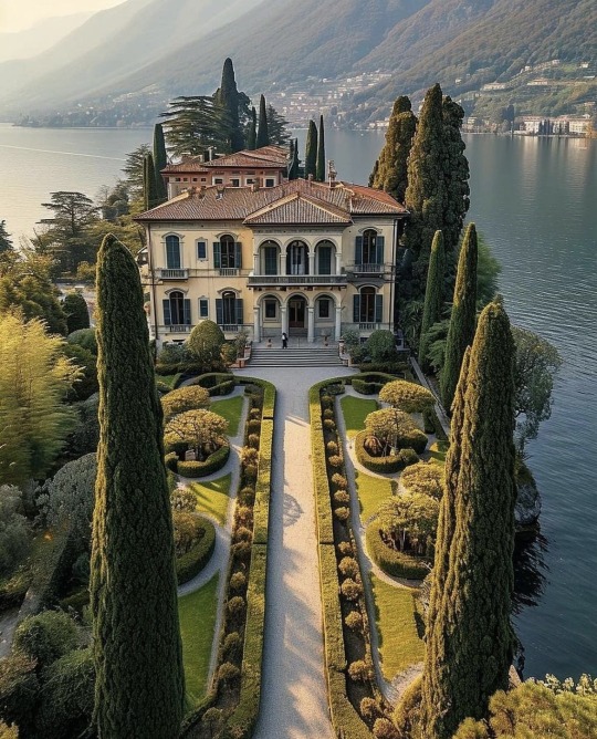
#Italy#italia#Italian villa#Villa#luxury home#modern home#Modern architecture#Lake Como#Luxury#luxury life#luxury living#aesthetic#decor#home decor#lifestyle#lifestyle blog#photography#home & lifestyle#architecture#classy#classy life#home
2K notes
·
View notes
Text


Santnerpass Hut, Rosengarten Dolomites, Italy - Senoner Tammerle Architekten
#Senoner Tammerle Architekten#architecture#design#building#modern architecture#interiors#minimal#modern#contemporary#contemporary architecture#cool design#amazing places#beautiful buildings#cool places#mountains#landscape#chalet#mountain hut#views#mountain view#timber#timber frame#glass#cafe#metal roofing#metal cladding#dolomites#italy#italian architecture#design blog
294 notes
·
View notes
Text

City of the dead, 2024
#aldo rossi#italian architecture#architecture#architectural photography#modern architecture#cemetery#original photographers#photographers on tumblr#photography#aesthetic#original photography blog#lensblr#niinque
81 notes
·
View notes
Text
Every time I try to do a modern AU I want to change up Padme's background
Her face is EE Jewish, her accent is American, her fashion is Mongolian(-inspired), her name is Indian(-inspired), her house is Italian--
And in a modern setting it's unlikely for all to be true at once so. You gotta pick.
I think I usually go with either Mongolian-Italian or Indian-Italian (racially), religiously and maybe ethnically Jewish? Aaaaaand probably Natalie Portman's own "immigrated to the US very young" background because same, which is then the accent.
Me pointing at Padme: I'm gonna project this one specific thing on her and you can't stop me
#Portman's wiki says that her family's background prior to any emigration was Poland + Russia + Austria + Romania. so. EE (Eastern European)#star wars#modern au#phoenix talks#padme amidala#also varykino was filmed in Italy so the landscape and architecture are Italian#natalie portman
79 notes
·
View notes
Photo

Architecture: Angiolo Mazzoni - 1934 Modernist structures rise with cylindrical precision in Santa Maria Novella's industrial landscape.
#italian architecture#white#1930s#industrial design#1934#gray#black#architecture#santa maria novella#italy#modernism#photography
47 notes
·
View notes
Text
Done. Finished these two already!


If you're in Canada, I could use any picture of your choice and give you a commission for allowing me use it.😍💕💕💕💕💕💕😍
#3d printing#artwork#art#architecture#nail art#art detail#art history#archaeology#black art#digital art#fiber art#italian art#japanese art#modern art#my art#original art#huge natural breasts#black and white#artists on tumblr#nature#beauty#beautiful#black beauty#canada#canadian#montreal canadiens#cats#cute cats#butterfly
29 notes
·
View notes
Text


We Rural Country House by Archisbang redefines the essence of rural architecture. Situated within the historic Palazzo Valgorrera in Piedmont, this project transforms a portion of a traditional farmhouse into a modern sanctuary.
Floating wooden structures, wrapped in a translucent polycarbonate skin, merge past and present, creating a space that feels both grounded and ethereal. Exposed brickwork and weathered tiles preserve the charm of the original architecture, while sculptural iron staircases lead to serene guest rooms above.
A design that honors history while embracing innovation—an invitation to live, gather, and connect.
Photography by Aldo Amoretti.
#italian interiors#italian architecture#architecture#italy#italian houses#houses#country houses#archisbang#aldo amoretti#modern design#rural architecture#Farmhouse Aesthetic#Historic Restoration#Interior Design#Architectural Innovation#Piedmont Italy#Contemporary Design#Minimalism#Design Inspiration#Sustainable Architecture#Architectural Photography#Timeless Design
26 notes
·
View notes
Text
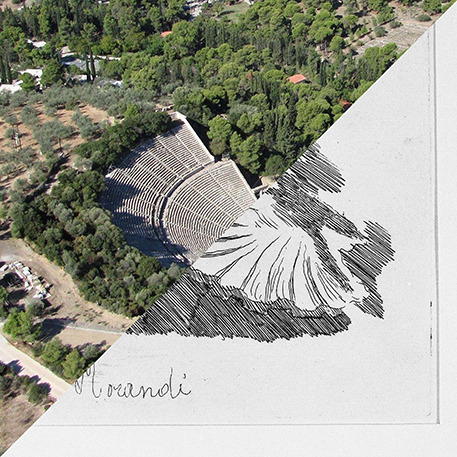
Ancient Theatre, Epidaurus, Greece, 4th century BC VS Giorgio Morandi, Shell and other objects, 1948
#giorgio morandi#italian art#modern art#Etchings#etching#still life#epidaurus#greece#ancient greece#archaeology#greek archaeology#pausanias#Peloponnese#Argolis#asclepius#unesco#world heritage site#landscape architecture#world heritage#architeture#polykleitos the younger
49 notes
·
View notes
Note
Hello
My name is Aya, and I am reaching out from Gaza, where my family and I are living in constant fear and suffering. Every moment poses a grave danger to our lives due to the ongoing war. The bombing never ceases, and we are running out of food and water.
Every passing minute increases our risk, and our hearts are filled with anxiety and pain. I urgently need your help to evacuate my family from this hell. We are desperately seeking a way out, but we need financial support to do so.😔😔
Please, extend a hand to save us and let the world hear our cries.💔💔
✅️ Verified by @gazavetters, my number on the list is (#217) ✅️
Best regards,
Aya.
https://gofund.me/4f615392
help them out if you can‼️🗣🫶
#alternative#artists on tumblr#silly#so silly#kawaii#sillyposting#sillysoper62#art#my art#oc artist#traditional art#digital art#artwork#architecture#nail art#art detail#art history#fiber art#italian art#japanese art#modern art#original art#palestine fundraiser#all eyes on palestine#palestinian genocide#save palestine#free palestine#i stand with palestine#young artist#small artist
8 notes
·
View notes
Text

Carlo Scarpa.
2 notes
·
View notes
Text


#https://www.flickr.com/people/188196077@N03/#lensblr#photographers on tumblr#original photography#original photographers#original photography on tumblr#Italy#italian#architecture#art#venice#museum#modern art
41 notes
·
View notes
Text

TER D-F (2022) cappa mazzoniana, stazione Termini FF/A
10 notes
·
View notes
Text


House Zöggeler, South Tyrol, Italy - Stuflesser Moroder
#Stuflesser Moroder#architecture#design#building#modern architecture#interiors#minimal#house#house design#concrete#modern#italy#italian architecture#minimalist#minimalism#beautiful design#cool houses#beautiful home#brutalist#vinyard#garden#views#scenic#living room#fireplace#balcony#mountains#concrete floor#design blog#light
129 notes
·
View notes
Text
Architectural Finds, 06/25/2023
Today's walk was short, I was just going in to DoBro to get some things from target but of course I had to stop and take some pictures along the way. Here are some architectural highlights from the walk there.


First were these row-houses along Fulton St, and this cool corner window aspect that the end house had.
Built 1882.
Located at 664-674 Fulton St, these seemed like they were all the same architect save for the third house in at 668 which looked like it been rebuilt at some point or maybe covered with a brick facade.
You can see some of the rusting from the old Cast-Iron facade that was cutting edge technology in the day in the second picture.
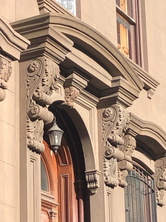

Another row of houses that caught my eye were this row of brownstones with their beautiful ornamentation around the door frames. This is right around the corner at 109-117 S Elliot Pl.
I have no way of knowing if they were all built by the same owners originally as I cant seem to find any records for them online :/, but they were likely built around the turn of the last century 1890-1910 when this style of building was commonly constructed. It was likely that they were built by separate owners/architects, as their ornamental stone decorations aren't all exactly the same.
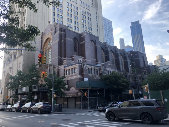
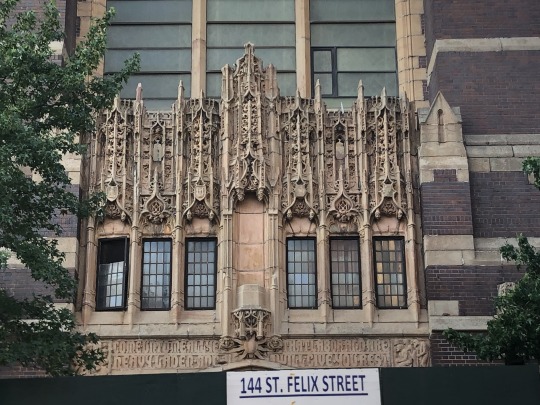
Moving on, A CHURCH! That's right I love a good ornate church and this one surely delivered. Just look at that gothic stone articulation above the entrance! Its so organic looking, it sends shivers down my spine just looking at it and I want to sink my teeth into it all in one.
Built in 1931 to the tune of the Hanson Place Central United Methodist Church, and today it sits abandoned, boarded up, and full of black mold.
The overall shape of the building is so interesting it has so much going on with its MASSIVE brick pillar motifs, likely intended to vertically gesture up toward the creator.
One source describes it as "Gothic restyled in modern dress, an exercise in massing brick and tan terracotta that might be called cubistic Art Moderne."
Someone with more theological architectural background could go further in depth than I can on it I'm sure, but it's always exciting to see the passionate attention to detail that a good cathedral has in it's architecture.
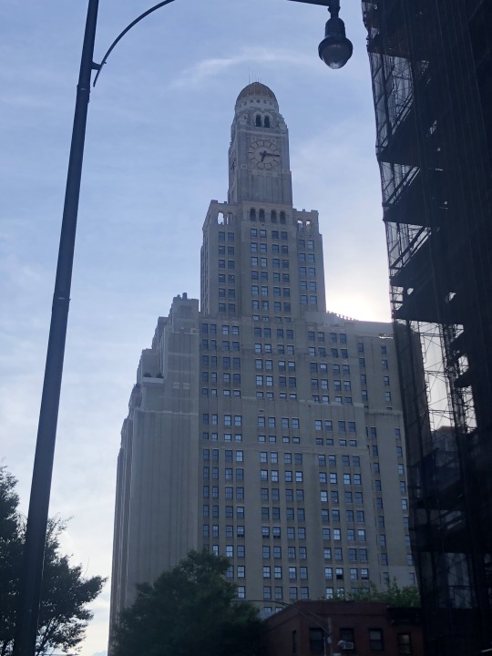

Next I don't know if I love this one but I just wanted to shout it out as having a BIG clock face! Like that thing is so high upppp it must be 100 feet in diameter!
Without even looking it up I'm going to take a shot in the dark and say this is maybe Brooklyn City Hall, or another government building??? It resembles the thing they're doing in all of the governing buildings I've seen up in Albany.
I don't particularly like this architectural style its boring and chunky in my opinion, but I have to say its not the ugliest thing I've seen. I respect the sense of radial symmetry its upper terraces and flanks suggest, and cmon you cant knock that clock.
(update: it's a bank building)

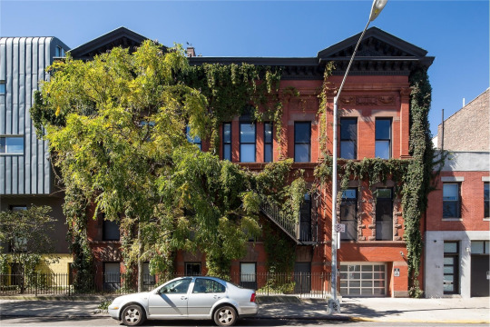
Second to last, we have this red & black beauty. Love the Greek-Revival pediments on each wing of the building as well as the renaissance revival inclusions in the carved cords/ribbons hanging in between the pilasters.
After some research, this seems to be an old Schoolhouse built in 1892 that has unfortunately since been absorbed by the ultra-modern townhouse on the end of the street at 81 Hanson Pl and transformed into a massive painting studio/home by painter David Salle. Wish I could find more info on the original schoolhouse tho :/
(Second photo ripped from google images)
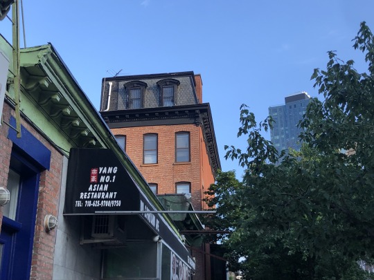
HONORABLE MENTION: Caught this Mansard Roof moment on my way into the subway station and oof, tug at my heartstrings this is cute.
Across the street from the dream studio/abomination this guy sits pretty at 83 Hanson Pl and is the only brownstone on the block with a cute hat (mansard roof).
#Brownstone#DoBro#Boerum#Fort Greene#Brooklyn#architecture#architect#Mansard roof#Schoolhouse#Italianate#greek revival#Renaissance Revival#Romanesque#church architecture#Gothic#art moderne#cast iron#facade#building#Row house#19th Century Architecture
14 notes
·
View notes
Text


BBPR, Torre Velasca, Milan, 1955-57
#her majesty#architecture#architecture student#architecture studyblr#BBPR#milan#italian architecture#modernism#torre velasca
7 notes
·
View notes