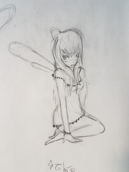
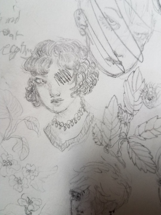
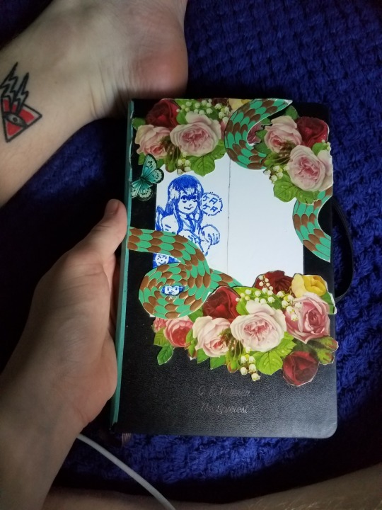
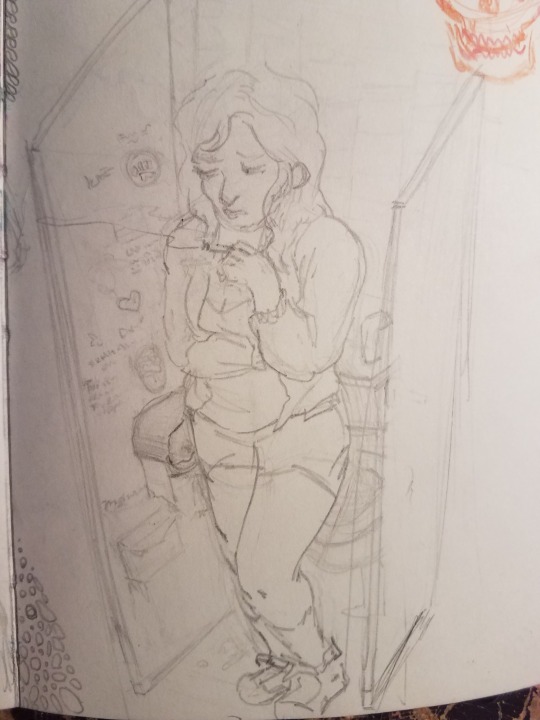
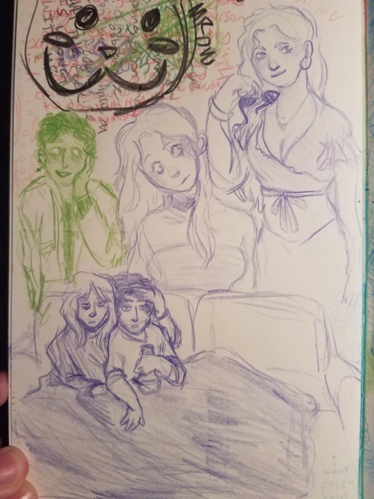
#in my sketch 1 i also copied the characters in the bottom right of the flower banner
Explore tagged Tumblr posts
Note
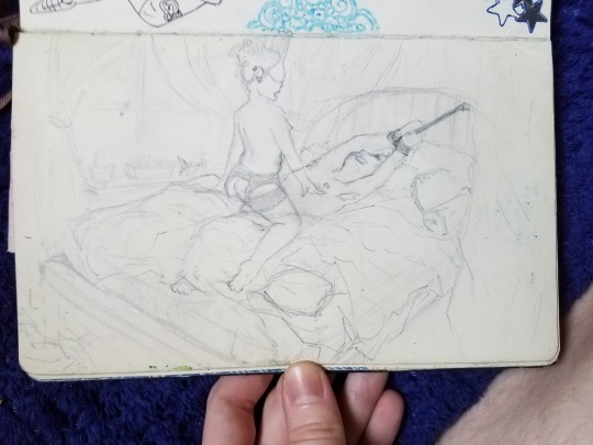
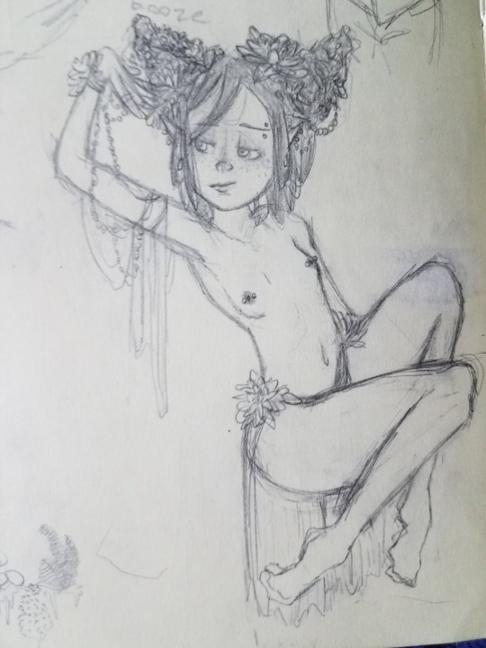
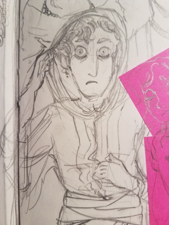
baizhu in the Room Tm

156: room....
#baizhu#genshin impact#baizhu genshin impact#in my sketch 1 i also copied the characters in the bottom right of the flower banner#however. i did chicken out of copying them on sketch 2 (here) because what if i do it wrong and write ten slurs
18 notes
·
View notes
Text
Spy x Family Exhibition Pamphlet
I got my copy of the Spy x Family exhibition pamphlet! I wanted to make HD scans of some of the notable pages and try to translate if I can.
First off is this great "Main Character Correlation Chart" (sorry for my amateur editing, all I have is MS Paint!)
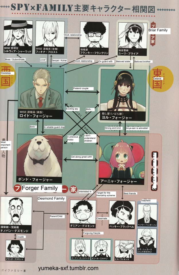
I love how Bond has a different "bofu" (woof) for Loid and Yor!
Several of the pages show the creation process of the manga, starting with rough sketches to final drafts, using chapter 1 as an example. There were a lot of pages for this, so I just scanned the ones that showed the end of the chapter.
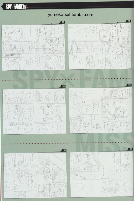
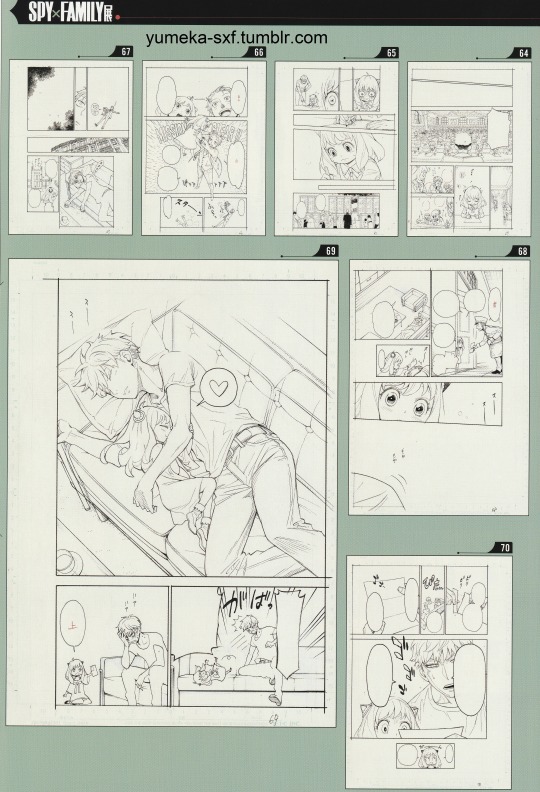
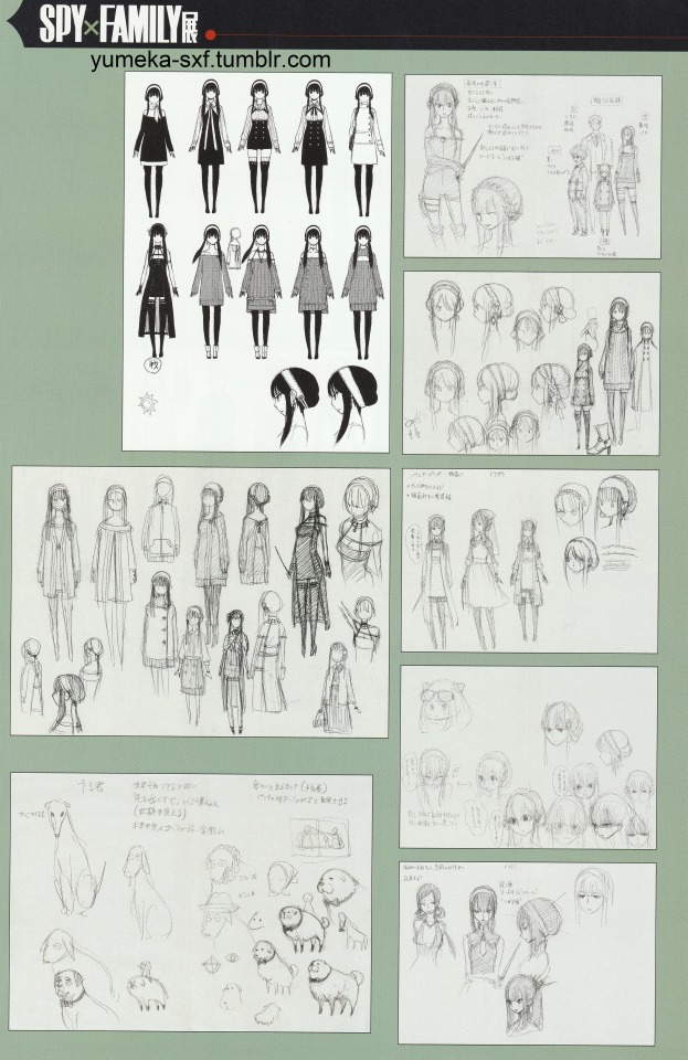
Probably the most interesting pages of the pamphlet are the early character designs/concept sketches. Most of these have already been shared by @sy-on-boy on her post here, but I thought it'd be cool to have them in HD! Unfortunately, even with higher quality images it's very difficult to decipher Endo's handwriting. I could make out just a few words here and there, and Google Lens is very unreliable when the writing isn't clear.
The first page has early concepts for the Forger family, Loid, Anya, the WISE logo, and the Eden uniform.
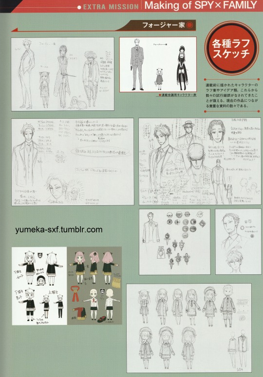
Things to note are that "Oscar" was a working name for Loid, as was "Yolanda" for Yor. What's also interesting is that a beta version of Franky is shown along with the Forgers. Unfortunately I can't make out the notes about him, but I think this has significance because of a sketch on the next page...
Most of the next page shows concept designs for Yor, with a section for Bond and Yor's coworkers on the bottom.
However, what's really intriguing is the sketch in the upper right of the whole family, titled 疑似家族 (pseudo family).
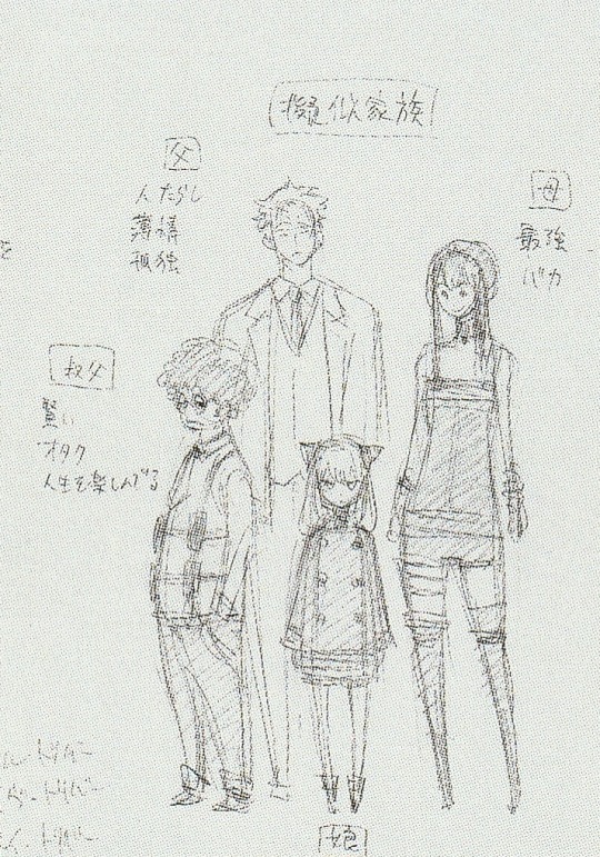
Once again, a Franky-looking character is with them, and he has the title "Uncle" (叔父) Was an uncle originally going to be part of the main Forgers? Was he actually related to Loid or Yor, or if that character did eventually become Franky, maybe he would just pretend to be Loid's brother? I can also make out the word "otaku" (オタク) in the notes for this character as well as "enjoying life" (人生を楽しんでる) Also in the notes for beta Yor it looks like 最強 (the best/strongest) and バカ (idiot/dummy) All I can make out for Loid's notes are 孤独 (loneliness) I think? And what's up with the older and more sinister looking Anya? She really looks like Ashe there. But these are all just early concept designs/notes so I wouldn't take them too seriously.
The next page titled "East and West During the Cold War" has concept designs for Franky, Yuri, Fiona (referred to as a female WISE spy), a male WISE spy, Melinda, and various assassins from the cruise arc.
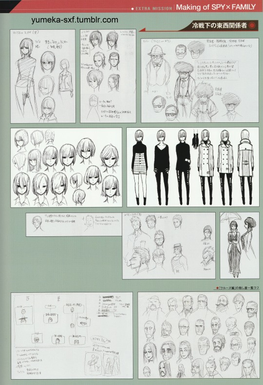
The first interesting thing to point out is the notes next to the very crudely drawn woman at the bottom of Yuri's concept designs. It says "Yuri's girlfriend?"(ユーリの 彼女?) though I can't make out clearly what the rest of it says. For the Franky designs, I could make out "tsukkomi or boke". So it looks like at some point Endo was deciding whether to make him more of a tsukkomi (straight man) or boke (wise guy) personality. There's also mention of giving him a high IQ (IQ高い). Also, the fact that the sketches include Melinda and the cruise arc assassins gives the impression that Endo had ideas for these story elements very early on.
But the character relationship chart in the lower left is really intriguing.
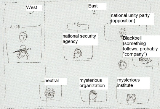
I'm not sure how accurate these translations are so take them with a grain of salt, but they do make sense to me. But I have to wonder why Anya and Becky are connected to Desmond. For Becky, it could be because her family has ties to the Desmonds, but why Anya? Could the "mysterious institute/lab" she comes from have ties to Desmond too? Again, these could just be early concepts from ideas that Endo is no longer using, so best not to take them literally. Also, the lack of Shopkeeper/Garden in the character relationship charts, the concept art, and the exhibition overall, really does portray them as a "mysterious organization" that Endo perhaps didn't plan out until later in the series' development and is still trying to figure out. But as far as this sketch, I have to say that despite how terribly crudely drawn all their little heads are, it's easy to identify every character...proof of Endo's top notch character design skills!
Another sketch that stands out is on the same page...
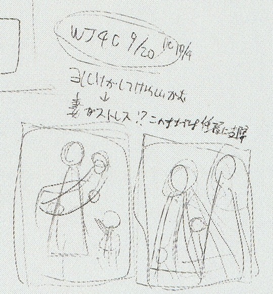
It's a very rough drawing of what appears to be either Loid holding Yor or Yor holding Loid with Anya next to them. But honestly it's such a rough drawing it could be any other parents+child. All I can make out of the text directly above is "My wife is stressed!? At this rate..." And the drawing next to it also appears to be two parents and maybe two children? I also have no clue what the "WJ4C 9/20, etc" at the top means. Very mysterious sketch, lol.
The next page has Eden related concepts, including Becky, Damian, George, and various teachers. The drawings in the bottom section appear to be an alternate/abbreviated version of how the Forgers met.
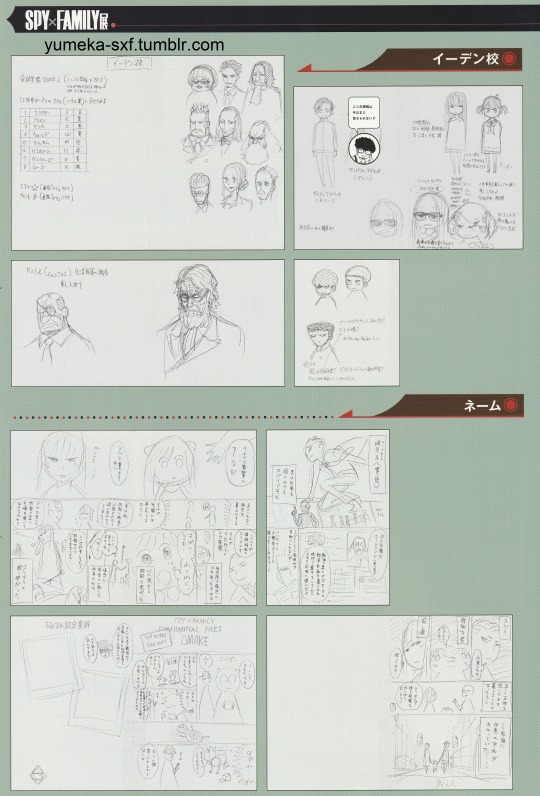
Pretty funny that an image of Franky is covering what's supposed to be a sketch of Demetrius. The text from Franky says "I can't show you this information yet" which is pretty solid proof that Demetrius will make an appearance in the series eventually. There's also nicknames for Damian and Demetrius in the notes - "Dami" and "Demi."
Some notes on the Eden page says there's 2,000 students in the school, with 13 grades divided into 8 classes/houses. The chart on the left is a list of teacher names and their classes, all of which are given names of colors. None of the teacher names have been used so far in the series.
And all that's on the last page of sketches is a continuation of the previous page with the early concept of how the Forgers started (it honestly looks pretty cute, wish it wasn't just rough sketches). And the following section looks like drafts Endo did for promotional material.
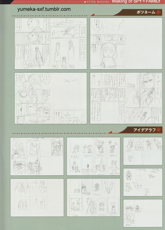
The final pages of the pamphlet are the new extra mission chapter which I already fully translated here.
And that's all I'm going to share for now from the pamphlet! I could spend more time trying to decipher the concept art notes but it was giving me a headache after a while, lol. But if anyone wants to try translating them, go ahead (I have higher quality png files of all the scans if needed...they were too big for Tumblr). And again, these sketches are just trial and error pre-serialization ideas that don't necessarily reflect Endo's final vision for the series, so I wouldn't dwell on them much other than for fun theorizing.
The pamphlet does have other interesting information, including an interview with Endo, a timeline of his work on Spy x Family and other manga, and his notes about random things from the series. So I might return to translating the pamphlet at a later date when I have time/motivation.
#spy x family#spy family#sxf#spyxfamily#loid forger#yor forger#anya forger#bond forger#sxf spoilers#sxf manga#sxf manga spoilers#sxf scans#yuri briar#damian desmond#becky blackbell#fiona frost#franky franklin
454 notes
·
View notes
Text
So... The 10yr old Grandpa PC is now bootlooping. Probably turning senile and yelling at the cloud if it could.
Our guess is the graphics card finally giving up. I still have to take it to the shop tomorrow since it's a holiday today. That being said, I may need to build a new pc. I'll salvage what I can from the old one (ssd, hdd, probably the psu) but I need to get a new graphics card, motherboard and processor since mine is 10yrs old and the new stuff aren't that great paired with older tech and if I'm getting a better gpu, might as well get good processing power. Hopefully, it will last another 10yrs.
But I don't have enough money. So if anyone wants to commission me, now would be the time. As long as you're willing to wait a bit. If anyone wants to buy the SteveTony coloring book, send tips on kofi, I would be very grateful. And if you want to consider supporting me on patreon, I thank you so very much. Lowest tier is $1. You get everything the highest tier has.
I am stuck right now. I'm a freelancer and the pc is my only source of income. I will make pencil sketches for $5 dollars. Send me a kofi and your request. I will be very happy.
I can't copy paste all the stuff on mobile but here's the commission link. And the rest of the links are also at the bottom of that post. Coloring book is pinned on my tumblr.
Thanks so much and wish me luck! 😄
68 notes
·
View notes
Text
made a thingy for the @spnfolklorebang and dumped uh a lot of art on it. I now never wanna see and/or draw snow again (good thing it's July ig fghjfhfg)

so first up is the banner, in which I reuse the putting credits on trees thing because I'm very original with banners (at least it wasn't a desk this time gdfgdf). for some reason that sign with the title gives me Club Penguin vibes and I have no idea why, though I'm thinking idk maybe the colors? also look at me forcing myself to get better at drawing forests using that greyed out outline-less object method

drawing the Impala is Hard no matter the angle so I actually used a reference for once yay. just now realizing Dean might be too small but ehh. for this one, I really wanted to emphasize the fact that Cas isn't there at this point in the fic so I drew a lot of empty space in the Impala as opposed to zooming in on Dean and relieving myself of the burden of drawing more Vehicle. also this is my first time drawing snow like that how's it look. also also what no I totally didn't distort various sections of the banner to make the trees in the background what are you talking about

(bonus sketch but I originally just had the Impala all frosty like this and idk I was still somewhat fond of this version even if the fic had the Impala more snow-covered. looking at this now, the frost looks more like salt from the road than anything though :/)

oh no look away it's my attempt at drawing people squatting down ,_, (never a good thing though neither is me trying to shade stuff). nah but I actually found references of Dean and Cas squatting shockingly easily and tried to copy those. still doesn't look quite right imo but an attempt was made so that they could actually see the tiny prints in the snow which I think came out suspiciously well considering. the weird section of snow on the bottom right is supposed to be a slushy sort of river that's partially melted but not really so I tried to make it look kinda melted. also am I the only one who never realized until now that we never saw any of the main characters wearing any sort of winter clothes? they're up to their ears in flannel but don't have a coat or a warm hat??

bonus art piece thingy featuring Phillippe LeChat (the familiar from That One spn episode, since my boy Phillippe is featured in the fic). houses never come out looking quite right and the roof is a disaster but an attempt was made and yeah I did give him huge anime-ish eyes I don't make the rules
the fic this is made for is called "Full Snow Moon" by @mbqnoyolo
(07/06/24)]
#my art#supernatural#spn#spn fanart#castiel#dean winchester#destiel#my bang legacy#fic art#art made for other people#spn folklore bang#phillippe lechat#from that one familiar episode of supernatural
37 notes
·
View notes
Note
3E from outfit set 2 for taylor?
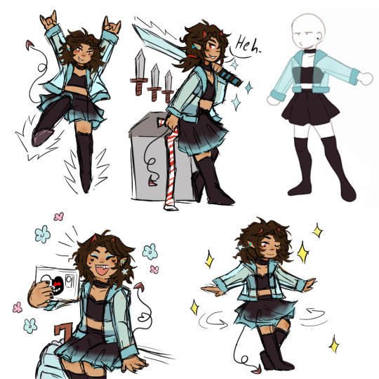
I went a bit overboard haha. Taylor is one of my favorite characters so always happy to draw him and thought the outfit was pretty. Thank you for requesting! (Also Scary helped him with the little bit of makeup in the selfie sketch) Outfit set 1, Outfit set 2 Image description in Alt and copied below:
A colored sketchpage of Taylor in a black strapless crop top and black skirt with a blue translucent coat over top and black thigh high boots. He is shown jumping in the air with both hands in the devil horns pose and kicking his left leg forward while the right leg points down. The top center drawing shows the teen leaning against a cabinet and posing with a sword over his shoulder and three decorative knives on the wall. The top right has a copy of the art meme outfit reference. The bottom left scene is Taylor taking a selfie while sitting with his go bag and fold up cane. He is grinning with braces and one fang visible and his phone case has a monokuma danganronpa sticker on it. Taylor has on blue eye shadow and has used makeup to shape the moles under each eye like hearts. There are also extra hearts below the moles. The last sketch shows Taylor spinning around in his skirt with a happy smile. Sparkles surround him in this scene and the sword one while the selfie one is surrounded in flowers. Most of the sketches include Taylor's blue star shaped earrings or blue hoop or stud earrings.
#taylor swift dndads#dndads taylor swift#dndads#dndads fanart#art#abeinginsand art tag#sketches#art requests
95 notes
·
View notes
Photo

In 2019, I posted a poll asking what my watchers wanted to see me draw more of. In a follow-up poll, a redesign for Kopa won the vote. I started the sketch shortly after, but I never got around to finishing it. After 3 1/2 years, I'm pleased to present the finished reference sheet! Kopa's built and colored a bit more like Nala while still having some traits from Simba (redder for the mane, darker upper-eye area, outer ear rims as a cub, and his underbelly stopping at his chest instead of going up his neck like Nala, Kiara, and Kion's. I like the idea of Kopa having two mane colors, so that returned from my OG design for him (which can be seen here: https://www.deviantart.com/13batsco.....Kopa-530149886). In my current AU, Kopa is younger than his two siblings, and his longing to be important like them turns into envy and frustration when he's unable to get a spot on (Kiara's daughter) Thuraya's Lion Guard. (He's also a brat and a bully, thanks to Simba spoiling him after Nala's death.) What color suits envy? Green! (Not just because of Scar, mind you.) To get his eyes, I mixed Simba and Nala's eyes' RGB values in a bit of a different way: instead of keeping it consistent, I made the R and G values closer to Nala's while having the B be closer to Simba's. Here are the differences: Simba Kopa Nala R 174 77 64 G 23 135 137 B 10 54 143 Color placements: (left to right, top to bottom) 1. Main pelt 2. Secondary pelt 3. Upper eye area 4. Lower eye area 5. Inner ear 6. Darker mane color 7. Lighter mane color 8. Nose 9. Outer ear rims (cub only)/Nose ridge (adult only) 10. Eyebrows 11. Iris 12. Sclera (yellow in eye) You are welcome to use this design for Kopa, but only if it's for Kopa. Please don't use it for your own character! Simba, Nala, Kiara, Kion, and Kopa © Disney Kopa (original that appeared in the Six New Adventures book series) © Alex Simmons This Kopa design and Thuraya made by me, 13BatScorpion95/WaterBat95 STOP: You are not allowed to trace or copy this art or claim the character as your own!
5 notes
·
View notes
Text

Here’s my note before I’ll get started….
(DON’T YOU EVER COPY FROM MINE OR MY FRIEND’S WORK, CHARACTERS, AND STUFF IF ONE OF YOU ARE IMPOSTERS WHO HAD HABITS OF PLAGIARISM! I WILL BLOCK YOU FROM MY BLOG IF I SEE YOUR POST WITH MINE OR MY FRIEND’S ORIGINAL WORK BEING EDITED ALL OVER! I’LL EVEN SHARE IT ONTO MY BLOG SO IF EVERYONE WILL SEE THAT YOU TRYING TO COPY MINE OR MY FRIEND’S THINGS FOR NO GOOD REASON WHATSOEVER! That will be all….I mean it.)
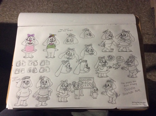
The Puppy Duo from Pibby - Doodle Sketch Art
Hey guys! I’m coming back at least during the last week of 🍀March to share my art post you’ve seen for today. Although not my upcoming Animal OC’s Bio that I’m working on for example, but as another fanart of sorts for Adult Swim’s “would be” upcoming show to keep an eye for official news.
If you wanted to see my previous art posts for Pibby, then please click some links down below for your interests. ⬇️
Pibby Before Apocalypse (Nov. 30th, 2021) - Link Here #1
Tumblr Exclusive (Dec. 28th, 2021) - Link Here #2
Tumblr Exclusive (Jan. 13th, 2022) - Link Here #3
Separate Cartoon Worlds (Mar. 13, 2022) - Link Here #4
⬆️ 1st and 2nd Images
As you can see this is a doodle sketch that I’m gonna explain through details a bit, but just wanted to know how much time and effort for these two pups in working designs. Although last time toincluded them from my previous posts was not bad. Still hoping I would continue working on their designs a bit better from what they actually look like on trailer. It took me to get started back in March. 21st, 2022 til the 27th day that you can see the date I’ve added in the bottom right during my progress.

⬆️ 3rd Image
This is the first one I’m going with for their appearances straight up nicely and in color. 👍
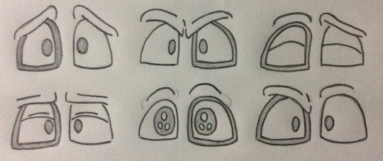
⬆️ 4th Image
Meanwhile doing their eye expressions I’ve gotten; at least when making their reactions whether happy, sad, or angry.
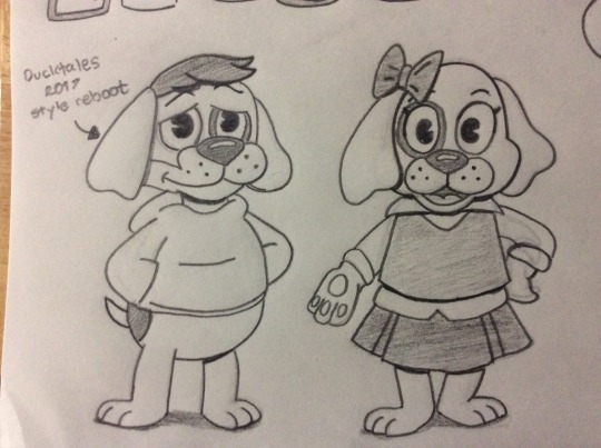
⬆️ 5th Image
Thought I wanted to include this of what if these two getting a “Ducktales” style reboot; especially changing their personality to fit in the modern setting. It looks not bad that I used to watch the 2017 version of Ducktales before thinking it was a good thing. It happens few years that I’m skeptical about watching it like it’ll be good or not, but it was all in my head. 😅

⬆️ 6th Image
Now going back is working their actual final designs; mostly their faces and some ears that I’m hoping this is what they actually look like from watching the trailer. I worked hard a bit to drawn the exact looks to do sideways. After getting through this though, I’m hoping this what I prefer when doing their appearances. Looks good huh?
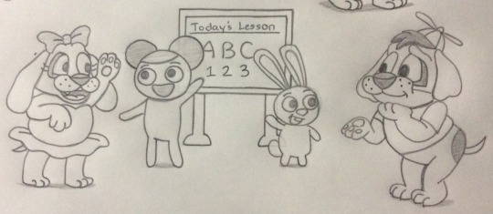
⬆️ 7th Image
Having them to teach learning stuff with Pibby and Bun Bun would be a nice thing if it wasn’t to go around in crazy situation when surviving the apocalypse.
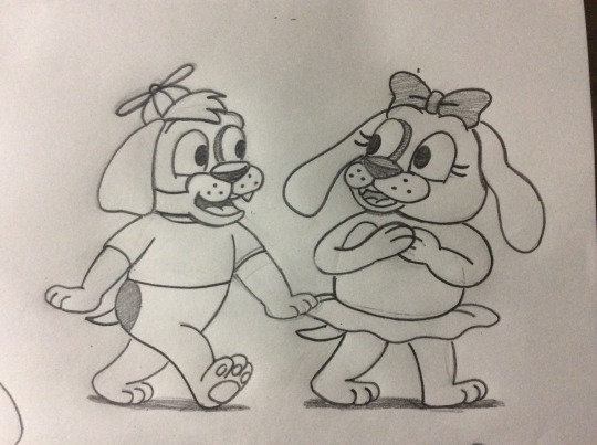
⬆️ 8th Image
Walking and talking to each other, but just wish I could drawn them walking on four legs like normal dogs that we seen other characters in cartoons doing it.
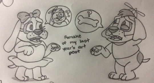
⬆️ 9th Image
Finally here’s the last one as a remake from last year and some changes. Still searching of what supposed to be their third sibling that also appeared from the trailer, but hard to find out if he’s digging some bones or not. It’s been not to figure this one out, but still....😔
Anyways, hope you guys like this doodle sketch I’ve made for this week to share. Can’t help it if I would to continue making better designs until now. 😅
Unnamed Dog Characters (Both Pink and Green), Pibby and Bun Bun - Pibby (also known as Come and Learn with Pibby! and Learning with Pibby: Apocalypse (TBA) created by Dodge Greenlay; produced company by Cartoon Network Studios/Williams Street and distributed by Warner Bros. Television
#art post#exclusive art post#traditional#traditional artwork#doodle sketch#doodle art#pibby#learning with pibby#learning with pibby apocalypse#come and learn with pibby#dogs#children#girl#boy#pink one#green one#designs#design change#eye expressions#etc.#march 2022#march 28th 2022
33 notes
·
View notes
Text
Also here's a dump of other sketches with my thoughts process. Long post, so everything’s under the cut.
The Mythra:
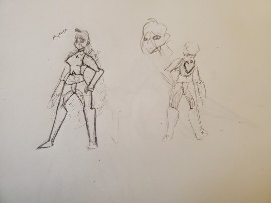
I really liked my first idea so I stuck with it. My thought process was I wanted to emphasize that she's mecha anime and therefore out of place (she already has a mech). Pants are a reference to Alvis's illegal shoes. She’s wearing a crop top because Mythra reads as the type of person who would enjoy wearing a crop top to me. She has giant gauntlet things on her arms because they look cool. I gave her two giant braids because anime (and I’ve noticed a trend of tsundere characters often having two strands of hair going outwards for some reason? And I figured “might as well copy+pasta lol). Her left eye is partially covered by hair, which is supposed to represent her feeling distant or partially isolated from the rest of the world. It’s also a character design trend sometimes used in villain characters, which I thought would fit Mythra since she’s worried about her power being used for evil in 2 and is being constantly compared to Malos in Torna. I kept the choker from the base design because it looks cool and also relates to how she’s constantly constraining herself.
I also wanted to make her buff because she’s a warrior who wields a giant fucking sword, she should be buff (like, the fight scenes involving her in Torna DLC looked a bit awkward because Mythra was swinging a giant sword around one-handed like it was nothing while also having very shrimpy arms).
Overall, I wanted Mythra to feel very alien and distant to the rest of the world. If I were to continue iterating on this, I’d probably look at some of Elma’s armor (mim and alien) for reference because doing that would allow for Mythra to look disconnected from the Xenoblade 2 cast but still feel like a Xenoblade character.
Side note: I assumed that the Aegis shape Core Crystal was a requirement. If I had the option to remove it, I probably would. It doesn’t look bad, but if the goal was to connect the Aegises with the Monado, I don’t like that Alvis’s key had to be retconned for that to function.
The Pyras:


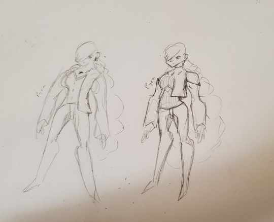
A consistent theme here between the designs was the pants. I wanted Alvis's illegal pants to be a running theme among the Aegises because they are stupid and illegal and I like them. They also look like the most vaguely scifi part of his actual outfit, so I figured giving them a shared article of clothing would be a nice way to visually connect the five character designs (Pyra, Mythra, Pneuma, Alvis, and Malos), and I wanted to keep the vaguely mecha theme going. You can see in Pyra 6 that I was tired and just drew Pyra in Alvis's attire.
I wanted Pyra to look like a mecha design covered up by something that more closely fits the aesthetic used in Xenoblade 1. So not quite mecha, not quite 1. The idea was that Pyra was trying to look more like a common person in order to appear less threatening. If she despises and fears her power, I don’t think she’d want to wear an outfit that embraces it. Putting her in more casual clothing would also contrast with Mythra and better communicate that Mythra is significantly stronger than Pyra. But all that said, putting her in full casual clothing might undercut the emotion Rex and Pyra’s first meeting was meant to invoke (of being like “oh wow, a legendary ancient weapon). And designing her to still look mecha would still be saying that “even though Pyra doesn’t want to be the Aegis, she is still the Aegis and cannot escape her power.” Which is why quite a few designs lean into the mecha aesthetic. The exact balance between mecha and casual clothing was the main thing I struggled with on this design. The final design is the one that more or less struck the balance I was hoping for.
A few of the designs are vaguely sexualized. Specifically Pyras 1, 4, and 7 all have tiny boob windows. If I were to finalize 7, I’d remove the boob window because it looks a bit awkward and I think a belt (similar to Elma’s underboob belt) would look better, but my thought process there was “do I want Pyra to be comfortable?” I don’t want to go over the top with the revealing clothing, but making Pyra wear slightly revealing clothing that she probably wouldn’t want to be wearing could help drive the point that she’s a combination of all the traits Mythra was criticized for lacking. It’s not pleasant or comfortable letting others dictate your entire existence through repeated harassment and Pyra already very heavily acts like the sexist ideas of what a woman should be, so giving her a tiny boob window could help emphasize that point. The main reason I’m saying I’d change it if I iterated on 7 is because I don’t think it compliments the design particularly well.
Another thing that stuck between each version of Pyra’s design was that her left eye is completely covered by hair. I did this for a few reasons: it would follow up on the symbolism of Mythra’s design partially covering her left eye, it would give Pyra a slight air of mystery, and it would faintly reference Alvis’s design (I want the designs to hint at each other but I don’t want it to be super obvious). The earrings were also kept between designs because they were in Mythra’s design and I wanted that to get carried over because it’s a little bit extra cohesion between the two designs.
I wanted was to use Pyra's hair to help represented Mythra binding herself. Mythra has two braids that are loosely flowing, so she's already semi bound. If I were to start drawing Pneuma, I think I'd want her hair to not be tied at all (maybe a similar style to KOS-MOS and Elly as a reference, maybe not?) or I'd just put her in really long dreadlocks or something because hair go brr. One idea I had was to just have one big braided ponytail, but another idea was to try and tie the hair up (which is what I was going for in Pyra 2). I couldn't find a way to do that in a way I particularly liked, so single big ponytail is the way I went.
You can probably see that there were a lot of ideas thrown at a wall here, so I’ll go over some noteworthy facets of each designs.
Pyra 1 had a key on her chest, it was meant to be reference to Alvis. It didn’t stay in other designs because the reference felt too obvious. The first two designs also had a giant X on her chest, it was meant to look like the outfit was binding her, but I don’t particularly care for it. Pyra 2′s pants had weird patterns on them because I was trying to visually make them look a bit distinguished from Mythra’s while still keeping the same idea, but I don’t really care for them. I also don’t like how Pyra 2 is just wearing a T Shirt. I’m not really sure what I was going for with Pyra 3. She kind of looks like Glimmer in the She-Ra reboot, which wasn’t intentional. Pyra 4 leans more into the mecha than any other Pyra. She kind of looks like a ballerina but not really. I was focusing mostly on making her look a lot like Mythra, but I feel that this design has a lot of similar issues to what I have with Pyra’s actual design where it’s sexy and looks cool, but doesn’t really fit the character. Pyra 5 looks like a heroforge character (or maybe like something that fit Mass Effect’s aesthetic if I’m being generous?). I feel that this one also doesn’t fit her character particularly well. Pyra 6 was a bit of an overcorrection and I ended up just drawing Pyra in Alvis’s outfit. And Pyra 7 is the one I actually went with.
Rexes:
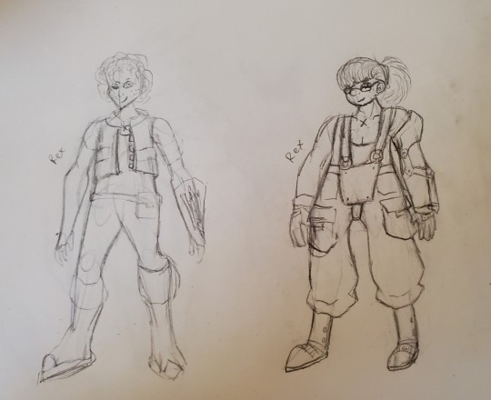
Rex 1 was more of a warm-up than anything. I put him in a vest and some pants. The hookshot and x marking were things I completely forgot about until last minute, which is why they look tacked on. He has a belt with some items in it. I wanted to give him scraffly hair and freckles to better emphasize that he’s just some kid. I don’t really like this design. I feel like if I polished it up, it would still have a lot of the benefits to base Rex while not getting as many people complaining about his pants, but the design is overall a huge “meh.”
With Rex 2, I decided to actually look up what scuba gear looks like. This design ended up emphasizing primarily that Rex has a lot of expertise in salvaging and that he’s a kid with humble origins. His strap on was based on a scuba outfit, same with the shoes. He’s also wearing pull-ups with giant pockets. I felt those imply humble origins because pull-ups get associated with rural settings. The giant pockets imply that he works with machinery. That’s also why his hair’s tied back. If you long hair and you work with machinery, that’s supposed to be tied back so that it doesn’t get caught in anything. I also gave him glasses because we need more characters with glasses.
The character’s meant to be 15 and I feel that this looks closer to 15 than 12. If I were to make future iterations of this design, I’d try to lean more into making him look 15 because he doesn’t look 15 enough to me. I’d do this by giving him acne.
He has gloves because he’ll be using a sword and it’s generally not good to scrape up your palm while using one of those. His hook-shot also now takes up his entire arm because that’s heavy equipment. I haven’t figured out how the wire is supposed to be stored without having it fuck up his arm. But the hook itself is now in a little hook cubby. I think I’d want to make the bottom of the shoes look heavier than they are since they don’t currently look great for walking around the bottom of the ocean.
Still, I’m very happy with this Rex. I mostly draw anime girls, so I’m happy with the number of things I feel I’ve gotten right with Rex 2.
Nims and a Dahlia:


I’m a bit unsure of what I want from the Blade designs. I decided to design around their element, their rough personalities, them needing a core crystal, and their element. I also want them to look like they could also exist in the same universe and maybe not look very human? That was, at least, my thought process when drawing Nim, though that thought process was not consistently held, like, at all. A lot of my Blade redesigns don’t look very good because I didn’t have a very good idea towards what I should even be aiming for. The Blades have very generic personalities and overall feel so disconnected from the world that I’d probably just scrap every existing Blade in their entirety and replace them different characters who are better established. Like, maybe because this Blade was born from the Gormott Titan, they look like Gormotti or part giraff as a result and are more likely to have the earth element? And how many hands they’ve been through and the personalities of their previous drivers stack up to subtly influence their appearance? Like, a Blade from Gormott that ended up in Uraya for 10 lifetimes might be an earth-type cat-person with fins or something? Or maybe the more developed a Blade is, the less it resembles a human? But doing that would require writing a lot more lore per individual Blade than is actually provided. But just having something to better frame the Blades as something other than “random (mostly) anime girls that you pick up along the way” would be necessary to give them good designs.
Anyways, with Nim, I figured giving her a Saytr like appearance would be good. She has a strong association with animals and nature, which, for me, translates to “naked.” Alongside that, I looked up Nymphs and they’re also usually depicted as naked women. I also completely disregarded to the two foxes on her shoulders. They were put into Nim 1 as an afterthought.
Nim 1 is the only Nim that isn’t plus-sized because I figured “why not have some different body types among the blades?” A lot of my redesigns for Pyra and Mythra try to keep their body type more or less in tact less because I think it’s the best body type for them and more to spite the idea that them having big boobs is the reason that they’re oversexualized. Like, they are comically big, but they’re only sexualized because of how much attention the camera and design draws to them. But, that’s a side tangent. I made Nim overweight because I like drawing overweight women. Nim 1 gets the vibes of “naked lady” while Nim 2 has the vibes of “big fluffy friend” while Nim 3 is somewhat of a compromise. If I were to make a final design for her out of these, I’d definitely try and fuse some aspects of Nims 2 and 3.
Nim 3 has vines on her arms because Nymphs get depicted with vines quite a bit. The main reason Nim 2 is wearing a sun dress is because I stepped back and thought “wait, maybe some people would have an issue with a naked anime lady running around.” Nim 2 also has a transition between furry legs and no fur legs.
I didn’t really have any ideas for Dahlia. I saw someone draw a version of Dahlia based off Elsa from Frozen and I thought that might be fun to draw. I don’t really have any further thoughts on this.
Praxises:
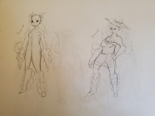
This is sort of where I was at the point where I realized that if I wanted to redesign the blades, I’d need to figure out some unifying theme for them all. I was thinking “maybe blades could try and visually represent different aspects of being human?” This idea was only really used on Praxis and wasn’t very strongly represented. I was kind of tired when I drew Praxis 1 and Praxis 2 was a bit of a warm-up sketch.
Neither of these designs are particularly good. I wanted Praxis to be wearing those 90s bubbly arm and leg warmers because she has a bubbly personality and is a water type. I don’t know why Praxis 2 is a cowgirl.
Zenobias:

Zenobia 1 is based a bit a wrestler because she has wrestler vibes. I see her as the type of person who would do Dark Souls no armor run on the dance pad. My other thought process was “let me google the word ‘zenobia’ and see what crops up” and I saw something about a Syrian empress but I decided to do zero research, so I have no idea if what I drew was offensive towards muslims. She has a scarf tho because wind.
Zenobia 2 is based on a picture of that empress lady. I don’t think it follows her character in-game particularly well though.
Two (Blade) Nias:
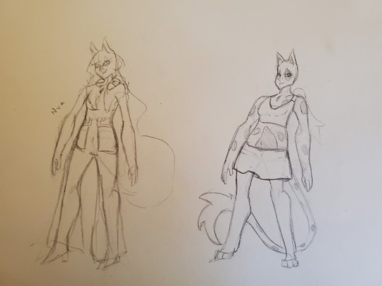
Neither Nia is particularly finished. The main requirements were that this Nia has to look like a Blade, a catgirl, and like something were she’d be able to hide the Blade parts, but not comfortably. I’m at a bit of a loss here. I think the formal wear used in her base-game design is not the way to go. The outfit just doesn’t feel like it matches her brash and snarky personality, like, at all. The first outfit was trying to throw random ideas but nothing was coming up and that’s what happened with the other. Though, Nia 2 gets bonus points for looking like a cats 2019 character. I was sketching out what parts of her body should be covered, but I don’t think I’d want to go with crop-top and skirt because Mythra already has a crop top. The tail is also debatable since I figured if I kept that, how Nia hides the tail could be a fun part of her driver outfit. I also didn’t really like how Driver Nia and Blade Nia have different hair and ear lengths. It bothered me more here than with the original Pyra/Mythra designs because Nia isn’t the Aegis, I don’t think she should be allowed to material and dematerialize her clothing, hair, and ears like that. I do kind of like the idea of giving her paws since those are things that can be easily hidden by shoes. Giving her spotted skin isn’t a bad idea but it’s not as high on the “keep” scale as the paws are (which aren’t super high in the first place).
Overall, it’s probably a bit anticlimactic to end on some lame designs, but that’s how it goes, I guess. If I were to redesign more of the Blades (or finish the Blade redesigns I started), I’d need to figure out what running themes I want from the Blade designs. I think maybe focusing on the human designs first and working from there could be a way to go. Unsure.
#xenoblade chronicles 2#character redesign#pyra#mythra#rex#praxis#zenobia#nia#nim#dahlia#xenoblade spoilers#xenoblade 2 spoilers
15 notes
·
View notes
Photo
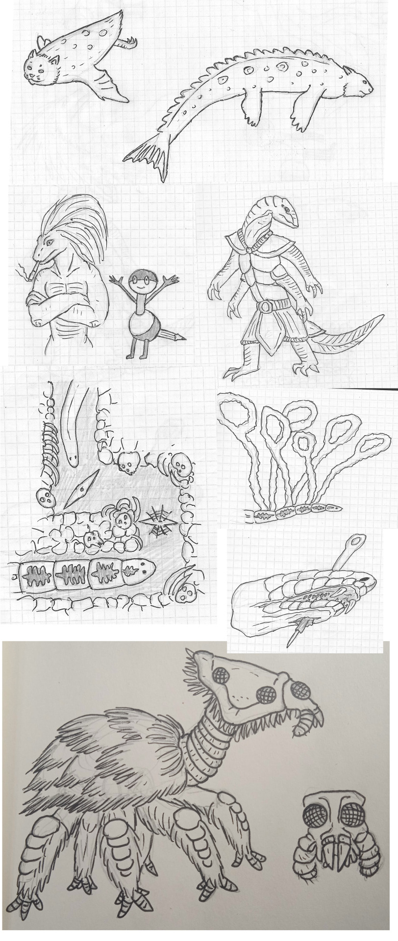
Posting increasingly shittier-looking content once in a blue moon as usual, yay! Anyway, I`ve had enough dreams to assemble another page of these, and now I`ve got an opportunity to scan some haphazard sketches, so, as usual, top to bottom, left to right:
1) There was a some kind of page with six pictures of monsters, of which I only vaguely remembered two. This dream might have also taken place in the world of Monster Hunter - or not, the setting was in constant flux, sort of. Anyway, here on the right we have a "spotted bearshark" - nothing like a bear or a shark, really, and I`m not even sure if it was actually spotted, but it was probably blue. On the left is an "oceanic kitten" - some kind of swampy-green cat-penguin that couldn`t even walk, but was apparently a great flier, and a swarm of these scared away even the most powerful monsters and hunters alike. 2) All I know about these two is that they`re a cartoon protagonist duo. The buff lizard girl may be an amalgamation of several dream beings that I misremembered, IDK. 3) What my subconscious considers an elf, apparently. Not sure how his face is supposed to work, and I know absolutely nothing about his armor/clothing, but I remember him being a nice shade of pink. He was singlehandedly waging a revenge-motivated war against a race of "orcs" (they were called something else, but whatever, I forgot that word) - beings of similar body plan, but redder and pointier. They had a crippling weakness in that killing their sole queen would make them go extinct, so that elf better be stopped! 4) Now this was a rare one - an actual nightmare, kind of. I even submitted it to Bogleech`s Nightmare Menagerie 2021, so I`ll just copy my description from there: It starts as some sort of simple, 2D, probably pixel-art video game – which I guess I am playing, though I can`t see myself at the computer or anything, the game is the whole dream. Nonetheless, I associate myself with the player character – some sort of simple, unsegmented yellow worm with little eyespots – look at some terrestrial nemerteans and you get the picture. The only thing it can do is spit a little webbing or goo. It crawls through a winding, but completely linear corridor of brown dirt and equally brown (though sometimes not) ribs and skull interspersed through it (ostensibly human ones, though sometimes the skulls are just weird bone lumps with circular orifices). The only obstacles here are strange double-ended spikes that rotate in the middle of the corridor, which must be locked in a transverse position for the worm`s head to pass through them (the rest of the worm does not seem to be affected by the spikes). At the end (bottom?) of the corridor is a bigger pile of those weird bones, and puling it apart (with the worm`s webs, I suppose) reveals the monster. It`s another, bigger worm (exciting, I know) – this one is segmented, with either some markings on its back or the organs showing through skin. Something like a semi-transparent tapeworm with a planarian`s head. Now I (the player character worm) must run from it backwards through the corridor, and the only thing that can hurt it (not that there are any consequences to it later) are the rotating spikes locked in the same transverse position that allowed me to pass through them unharmed. Finally I emerge from a hole in the ground, and it`s now the “real life” – I`m somewhere at the highway near the place I grew up in (it`s a decent-sized village, or maybe a town by American standards, near the city of Barnaul, Russia), and also my mother is there. It still retains the aspects of game – apart from the fact I`m still the worm (now actually in first person), there are some characters I can only describe as videogame NPCs and I must navigate a short labyrinth of tiny walls in order to proceed (thankfully, a can crawl over the walls now that I`m 3D). The monster worm emerges soon after, scaring away the NPCs, but it`s much slower than me, so I flee through the village towards my parents` house. It`s placed differently from what I remember, and in place of the garage they`re building a new house – starting with a roof placed directly onto the foundations, so it must be lifted constantly to build the walls. Also all the neighbors are replaced with my relatives. I look for places to hide and eventually find one in the basement of the unfinished house, as the neighbor-relatives alert me that the enemy worm is approaching. From its back, it extends multiple noose-shaped tendrils of wispy cloud-like substance high into the sky, trying to locate me via electroreception. In the end, the weather grows cold and wet for some reason, and the monster worm is anticlimactically defeated by spraying it with water until it freezes and can be shattered into pieces. I get to keep its head, which is surprisingly snakelike, impaled onto a huge needle (I’m still a worm, though I managed to grow hands somewhere along the way apparently). 5) This is the oldest one here, and one I remember surprisingly well. This creature was an alien species hunted by humans for valuable pelts and chelicerae. It was huge and metallic in composition, and the humans were only allowed to use melee weapons, which was not a good time to say the least. Naturally, some people decided to do some poaching with a powerful armed drone... and were immediately arrested by a squad of even stronger police drones coming out of nowhere. It turns out the aliens had their own well-hidden civilization, and the individuals being hunted lost their minds due to a certain disease. This is because they need to consume "metallorganic embryos" sucked from some kind of massive superorganism, but there`s a deficit of those due to overpopulation, and that causes them to irreversibly turn into mindless feral animals. Fortunately, an artificial replacement can be made from human automobiles, so they arranged a deal with the human government. Apparently this species is fine with sick individuals being hunted like beasts, but only if it`s honorable melee.
4 notes
·
View notes
Text
Here is what the kids call my highly disorganized, half-baked list of stuff that could have been done with Jack to make him a better character.
@yeetmetothehell I am sorry if you are disappointed by my ideas.
“Optimus was more like...Jack.” OK…so show us that.
In my opinion...Jack seems like he was intended to be written to be almost a parallel to Orion’s journey to becoming Optimus Prime, at least how he is used in the plot. Jack is described as “smart and responsible”, which can also be read as “hardworking and responsible” and really this can be achieved in narratively using a few points, IMO:
Long hours in his room/the library studying outside of work and school.
Filling out the background of the garage more with sketches/print outs of motorcycle blueprints (to keep the idea that Jack really wants a motorcycle and show hints of extreme dedication, but they’re kept in the garage rather than his room to metaphorically show that distance he’s put between himself and what he wants)
“Man of the House”/”Grew up too fast” (This will be discussed more later but TL;DR “I’ll handle the electric bill this month, Mom”)
Somewhat fragile work/school/life balance that Jack somehow perfectly maintained before meeting the team
Orion was very physically passive. Jack seems to be intended to be written as passive but it comes off as an apathetic reluctance that Orion doesn’t possess (Orion may not believe in violence but he clearly wasn’t unwilling to communicate his thoughts; it’s how he got the title of Prime in the first place.) However, Orion had to learn to become more outspoken over time probably, so we can keep him as being aloof/reluctant at the start of the series.
“Man of the House”/”Grew up too Fast”
It’s no secret Jack came from a nonconventional home; June is very explicitly portrayed as a single mother with a dad nowhere in the picture. However the situation surrounding Mr. Darby is unknown. The way June talks about it makes me personally feel like Jack’s dad either ran out or divorced June and doesn’t bother with his kid. Dysfunction in the family really just goddamn changes you TBH. (can confirm bc hi, I come from a dysfunctional home) Sometimes you just grow up super fast. Jack probably spent his childhood missing his mom as she worked shifts at the hospital and seeing how lonely and hurt she was. He maybe went out and got a job the first day he could and helps with smaller bills (“I’ll handle the electric bill this month.”), or maybe other expenses like groceries and his own phone bill. June probably makes enough to comfortably support her and her son, especially given her job and the cost of living in rural ass desert Nevada. But Jack still does this anyways--it’s how he copes with his issues after what happened with his dad. Doubling down and trying to be what he thinks is the bigger man because his dad couldn’t be fucked.
This would make the disruption him letting the bots into his life creates more staggering; June doesn’t expect her son to pay bills, but the sudden change in behavior (skipping out on work) would be a cause for concern because sudden shifts like that are Usually Signs that Something is Very Wrong. Especially because Jack is usually responsible and open with his mom; he would have told her if he was gonna cut hours at work, theoretically.
Jack feels like he has to constantly put his own wants aside to contribute to his household. Even if June doesn’t force this expectation upon him, it’s a feeling that he will have, especially if he watched his dad just abandon him and June. Maybe he has resentment towards his dad for this and that is causing some anger he’s keeping tightly under wraps? And maybe the bots give him an excuse to do something he actually wants to do for once or some excitement in his life and that’s why he goes along with it? Lots of options, people!
Clothing Choices: The Hoodie™
You are going to have to deal with me being a whore for costuming choices and what they can mean. The show has a problem with the humans wearing the same shit every time they’re on screen and I’d love to rant about all of them (yeah yeah I get it saving money) but I’m focusing on Jack right now. Give Jack a hoodie 2020. A grey one or some other dull and drab color. And make him actually always wear the hood (except like in scenes where he is working bc workplace dress codes obviously) As time progresses, the drab hoodie is changed to a more vibrant color, but he still always has the hood over his head. And then, at a pivotal moment, the boy takes the hood off. (You could even throw in Miko cracking a joke about Jack actually having hair if you really wanted TBH.) Why this? The narrative is that Jack is constantly holding himself under wraps because of his self-imposed responsibilities. As he starts to become more into his own, he decides to express himself more with brighter colors, but still has some reservations. When he takes the hoodie off, that’s when he’s fully realized himself in this process and thus completes the parallel.
Actually make him interact with Optimus in a meaningful manner.
Arcee can still be his guardian in the field and I think working on strengthening their relationship is vital. But also, if you’re gonna make Jack the confidante holding the key to Vector Sigma, there actually has to be...meaningful interaction. Optimus asking Jack what he’s so engrossed in reading and Jack explaining the book he’s got with passion before shutting himself up and saying “it’s kinda dumb though” or something. And Optimus just responds “I don’t think it’s dumb, tell me more.” Coaxing him towards more self-discovery and expression. Optimus maybe sees more of his old self in Jack and starts attempting to be a quasi-paternal figure without really thinking about it because he is, after all, Dadimus. Jack maybe lashes out about how he doesn’t need Optimus to be his dad and that makes the space between them tense for a while. Eventually Jack comes to apologize and maybe there’s an important Talk.. Just a few ideas I will expand on later. I feel like forgiveness and lack thereof is a good theme--I know I was held back for a long time because of how convoluted the concept of forgiveness is with family.
The Character Arc
So, what would Jack’s character development throughout the events of season 1 be? My basic idea for a Jack arc that mirrors Orion’s self-realization and coming into Prime-hood without being a carbon copy is essentially:
Jack is portrayed as a responsible, hardworking, studious teenager who constantly turns down chances for fun and excitement to handle his responsibilities. Has clear dreams for after high school and for his own personal life; but he’s constantly contemplating and changing his mind about whether he will or not because he’s extremely dedicated to helping his mom and all that. However, he still gets super curious about Arcee and gets swept up by her in the Vehicon chase, and he still has whispers of courage and protects Raf during the altercation. He first tries to ditch Team Prime because he’s concerned about his responsibilities, but eventually returns because he’s drawn to the opportunity to finally go buck wild for once in his life (even if he spends his time being hesitant about everything.) His hesitancy and dedication to severe self-imposed responsibility is a result of his inability to move on from what his dad did to him and his mom; he’s under the impression that he 1) Has to forgive someone to move on, and thus 2) He cannot move on because his dad isn’t there to bother to say sorry and take on his position as Dad. In essence, he becomes less the character telling Miko to stop and more the character being pushed by Miko to be more adventurous. In lulls in action, Optimus starts to take interest in him when he notices his constant hesitance to express himself and is just being dragged along rather than going willingly. Has a conversation with him about a book Jack’s reading, which Jack attempts to shut down because it’s “dumb and childish,” but Optimus urges him to continue. The idea that June knows about Arcee as a bike and Jack explaining that he bought a motorcycle as a fixer-upper for dirt cheap can stay. (He probably still is saving up for his motorcycle.)
The longest portion, after Optimus starts interacting with Jack on a level of bonding and gently coaxing him to be himself— Jack becomes more outspoken and he’s shown as curious, analytical, quick witted, and has a deep sense of justice. Being young and craving a childhood lost to his trauma and self-imposed obligations to help his mom with running the household, he suddenly starts spending more time at the base pursuing hobbies and going on missions rather than studying and work, which concerns June. She tries to press Jack, and is met with what can be described as typical teenage headbutting that gets progressively worse. She grounds Jack after the fight, MECH takes her, the rescue happens. (That makes sense to stay in this narrative IMO.) Around this time, Optimus has effectively started becoming Jack’s own Alpha Trion—teaching him things that he’s picked up that he may feel apply to Jack. Jack interprets one of these lessons as Optimus trying to be “dad” and he’s not having it. Makes it VERY clear that he does not need a dad (“didn’t need one before and sure as fuck don’t need one now”) and definitely snaps at Optimus, which then pushes his progress in the arc closer to the end. He eventually comes back to apologize, and Optimus forgives him. He and Optimus have a heart-to-heart about one of the hardest lessons Optimus has had to learn—how to let go of the past without forgiving those who have hurt you and refuse to make amends, so that you may determine your own future. It’s very clear he’s talking about Megatron, even though he never says his name. Jack takes this lesson to heart.
His final bit of development before the hood removal thing probably happens during the events of “Rock Bottom” and reinforces that hard lesson, right when he’s faced with the option to off Megatron. Maybe there’s some taunting about how Optimus preaches softness and forgiveness too much when Jack refuses to kill him. Jack gets angry, and he’s about to fucking do it. But then he stops, takes a breath, and says “Optimus doesn’t preach forgiveness, he preaches moving on from those who refuse to move on themselves. He will never forgive you, but he’s learned to live on despite what you’ve done.” Soon after this, when Megatron comes to the base, Jack takes off his hood, stares Megatron right in the face, and says “This is not forgiveness, Megatron. Don’t you forget that.” Later, when Optimus gives him the key, he tells him something along the lines of “you have grown since we’ve met, Jack, and even though there is still a long way for you to go...” he hands Jack the key. “...Remember that even I am a work in progress.”
Anyways this is again, half-baked. And needs lots of polishing. But it’s something.
49 notes
·
View notes
Photo

The more episodes I revisit, the more I come to love this little guy. Took me a while to warm up to Brain, but, blast it all, he has a bit of a tragic backstory and a good heart underneath all those nails and I’m a sucker for that character type.
To explain some of the poses: Top left corner - Copied from a screenshot. Could’ve pushed the pose (or at least the stretched arm), but I wanted to copy the pose exactly.
Bottom left corner - Based on this fan fiction: https://www.fanfiction.net/s/8372889/1/Brain-Meets-Brawn-An-Alternate-Ending . Wanted to capture the feeling of him waking up paranoid. The green shadow was an experiment that I ended up not liking, but it kind of fits the subject matter....
Middle - In the Halloween episode, we find out that Brain is versed in rhythmic gymnastics, of all things. Was going for a loose gesture drawing and ended up simply coloring on top of the first pose I drew. Came out a bit more feminine than intended, but it’s freakin’ rhythmic gymnastics. Ha.
Far right middle - Also a reference to the Halloween episode. Pinky sells his soul to the devil in exchange for Brain getting the world. Brain ends up feeling guilty about this and goes back to rescue Pinky under the guise that he simply wants him back so as he can show him where the food pellets are. After loosing a challenge to reclaim his friend and thinking he’s lost Pinky forever, Pinky wishes Brain well in the hopes that he’ll find the pellets, to which Brain replies morosely, “Yes... The... food pellets.... That’s all I really wanted....”. Oh, Brain....
-------
The date up there is wrong, of course. I think I finished the basic sketches on the eleventh, hence that date being there...? I have this thing where, once I’ve dated a piece or batch of sketches, I generally don’t touch it thereafter, so it’s weird that I would do this.
Was listening to songs by Seal while completing this. Put me back in a real nostalgic place. Used to lounge in my dad’s huge, comfy chair in his studio while listening to the likes of Michael Jackson, Seal, Miles Davis, and more playing on his cd player as dad animated away. Probably one of the warmest memories of childhood I have. Good times.
74 notes
·
View notes
Text
Loooong overdue Q&A,and Announcements!
Lots of the questions are from many many months ago. Sorry about that! I’m super behind on everything because my life got so crazy for a while there and I’m still catching up! If interested in details about my life, I wrote more in depth about it at the bottom of this post!
Announcements:
❄ Comic updates should start to be weekly again now that things are finally settling down in my life! :D
❄ I found some copies of my comics to sell! If interested in a printed copy of AToTR Volume 1 or Volume 2, Check out my Etsy store here! https://www.etsy.com/shop/GildedPixel

***From the last round of comic selling, a few got sent back to me because something went wrong with the address. Unfortunately i have no idea who didn’t get theirs because of the aforementioned chaos. If you still haven’t gotten your order from like... half a year ago, please just let me know and I’ll send you your order again.
❄ Apparently tumblr is having some uh… “serious technical difficulties”. If it goes belly up, all my comics are free to see on my Patreon. Only the newest comic each week is locked for only patrons to view, but it unlocks when the next one comes out each week. https://www.patreon.com/LorIllustration

❄ A new update to the Youtube dub of my comic is up on Starbot Dubs!
https://www.youtube.com/watch?v=1ZuLjHvERxA

If you haven’t see the previous 5 parts, they’re all here as one video https://www.youtube.com/watch?v=JTAEM9PFPVY
And Now for Q&A!!!

I am so grateful for this letter and for the many other letters of support I was sent over the past couple months. It really helped me get through the low times and I’ll always appreciate it that you and many others took the time to send me words of encouragement, empathy, and advice. Thank you so much!
---

Thank you! AND I WOULD BE SO HONORED PLEASE DO!!!!!!!!! :D :D :D

Thank you! My best advice for anatomy would be to focus on two things: look online for skeletal and muscle anatomy illustrations. Knowing the hardware under the skin helps SO much! Also do lots of life drawings. Draw anyone willing to sit still long enough for you! The more you do it, the easier it will get and the more you will develop your own style!
---

For the most part, I draw around the word bubbles! Then the next priority is to draw what needs to be shown to communicate the point of the panels. Usually in the super early stages it’s just characters that are sketched in, but sometimes elements of the setting are just as important, like a doorway or establishing the setting for a new scene! I hope that helps!

---

LOL she would be SO tempted, but wouldn’t resort to anything like that unless it was over something extremely important that also happened to be an emergency. Ganondorf however would have no problem with it because he has a different, much more Direct, style of governing. XD
---

Rinku is indeed Link!
---

Absolutely the second one. XD
---

TaDaaa!!!! XD

---

Super good question! For the most part all the rooms are just laid out as I need them to communicate a comic clearly. The exception is if I already have drawn a room, I try to keep it the same. The throne room, Specific bedrooms, ect. But I don’t have a castle layout set in stone or anything. lol I will eventually have to do that at some point though.
---

I strongly considered having this be a story arc at one point but it got dropped! Short answer is, Yes. He would eventually try to do that. But would find that Impa had already secretly killed him years ago and never told Zelda.
---

Oh he totally does that all the time!!! Just not important to the story so it’s not shown!
---

YUP!!! XD
---

Someday, totally, but I haven’t even caught up with the ones I started last spring!!! *I suddenly experience a mighty wave of shame*
---

Awww! That’s a really sweet idea!!!! She would totally take his name and he would be so darn proud!
---

Oh HECK YEAH!!!!
---

Possibly! But if so, it will be in the next reincarnation arc!
---

At a later point, I think! if I have time to develop it and not stagnate the story too terribly much!
---

Thank you! And Tingle? At some point, YES. Mask salesman? Not sure yet! maybe!
---

That's beautiful!!! Was it a fic??? That’s an incredibly cool idea!
---

That’s adorable. Eventually they would have to dance together at a royal ball. Ganondorf is a bit more graceful than Zelda, but they would manage. Would be cute as heck too because Zelda would be a little shy and Ganondorf would urge her to be more confident... and maybe rile up her competitive nature by saying he’s better at it than her.
---
Update on my life!
Leaving my old life and my ex last August was the hardest thing I’ve ever done, but it was the right choice and I’m so much happier now. Things are finally getting stable now! I was only planning to stay with my aunt Jan in Ohio for a short while, but she recently got some serious health problems so I’ll be staying with her for several months more to help take care of her. And even though I wasn’t looking for a new relationship so soon after leaving my troubled marriage, I randomly met someone a few weeks ago that just amazed me with how universally kind he is and with how much we have in common! His name is Mark and he works as an army nurse with a forward surgical team attached to a special operations joint task force. He just got deployed to Afghanistan to go and patch people up, and if all goes well he will be back home in late summer. I never thought soul mates were really a thing, but if they are, I think he’s mine! As for my dog Oscar, he’s continued to grow and be a happy giant puppy! He’s going to be a full year old at the end of December! He’s almost 60 pounds now!!!

On the less than great side, I’ve had no luck finding an art-related job, so I’m going to be switching my career goals over to becoming an art teacher. But honestly, I think teaching will be a much more emotionally fulfilling career, so even though that wasn’t my original plan, I’m excited to start to chase that new dream!
Thank you all so much for your continued kindness and support for both for my work and for me as a human. You all are a big part of why I had the confidence and self worth to leave a bad situation and I will always be grateful to you all for that. Thank you for helping me reach this new better life!
1K notes
·
View notes
Photo
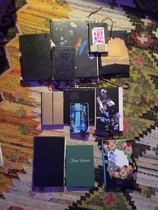
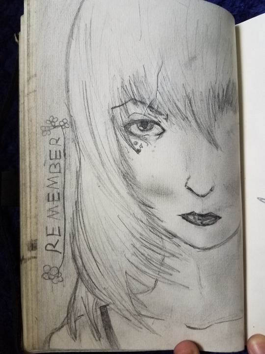


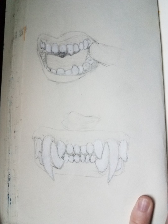
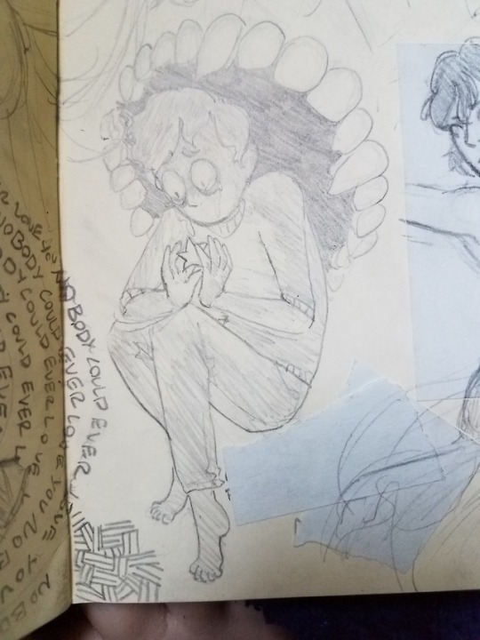

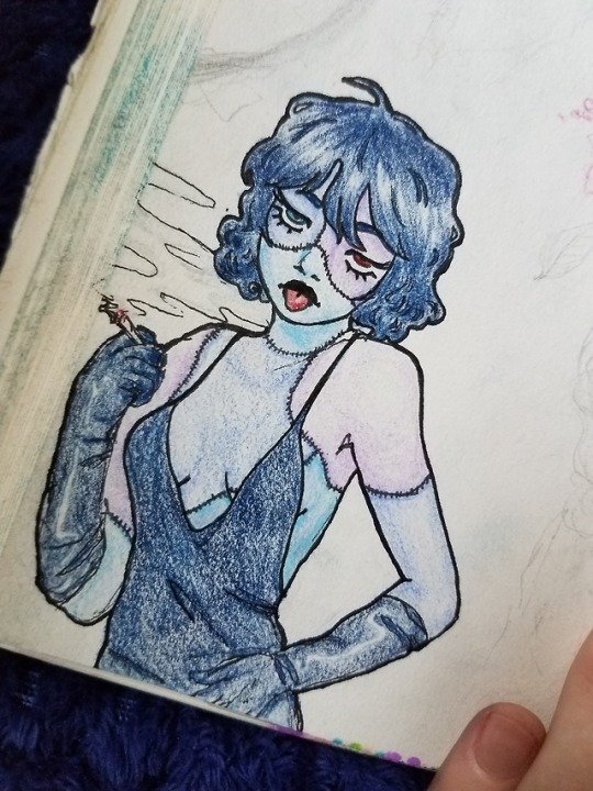
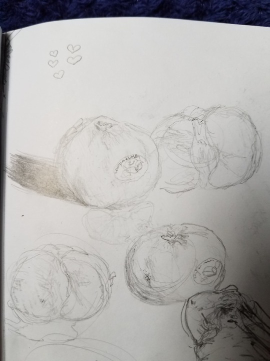
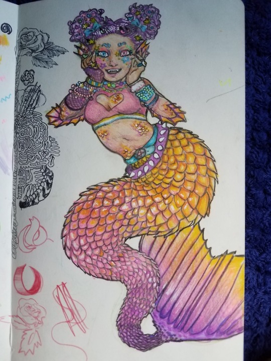
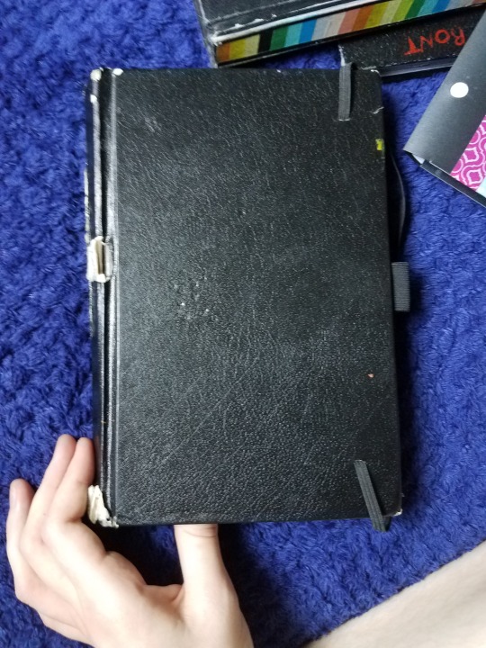
Sketchbooks From Over The Last Seven Years
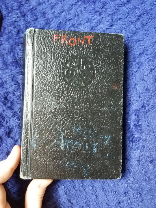
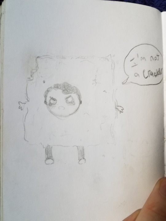
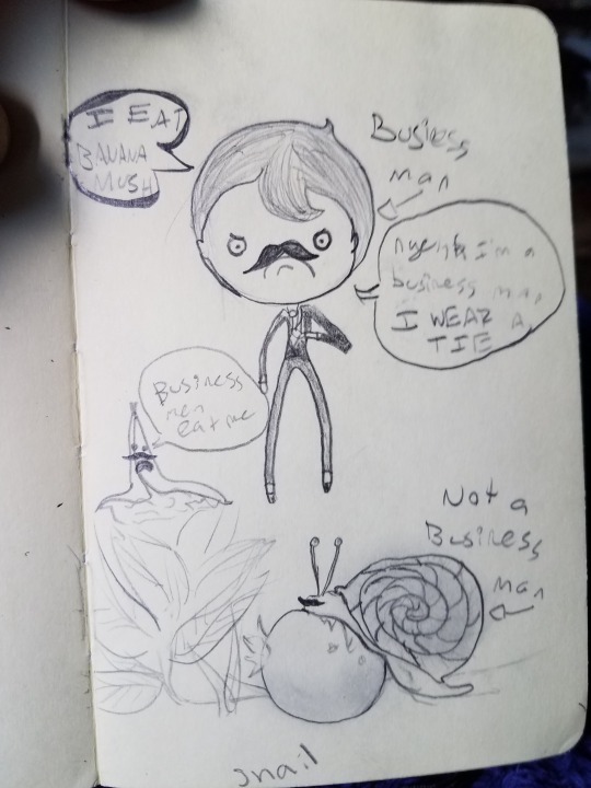
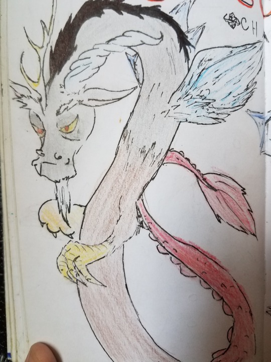
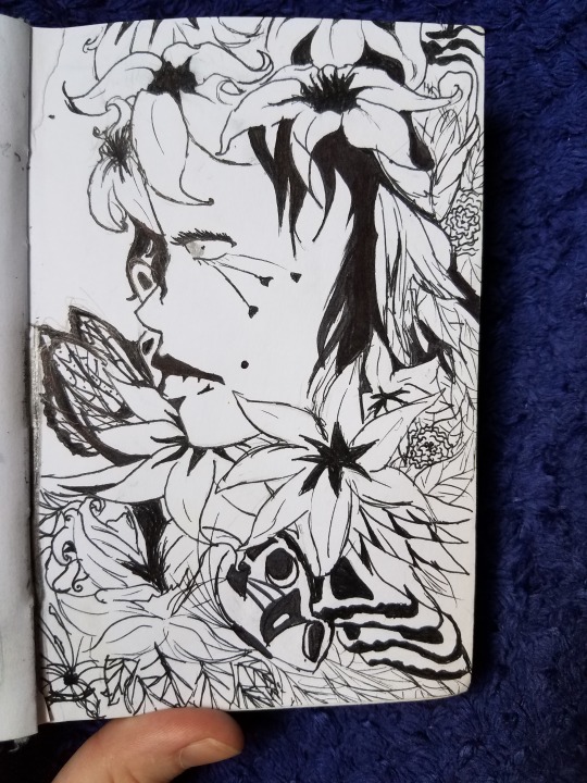
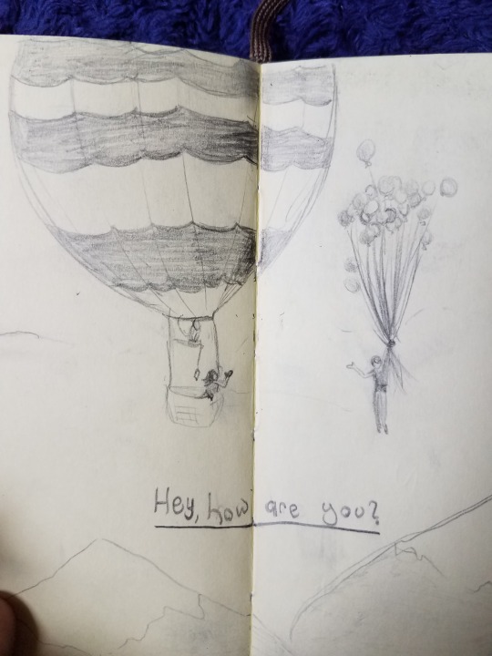
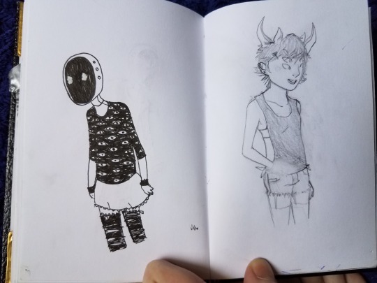
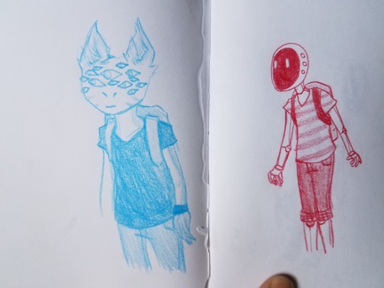
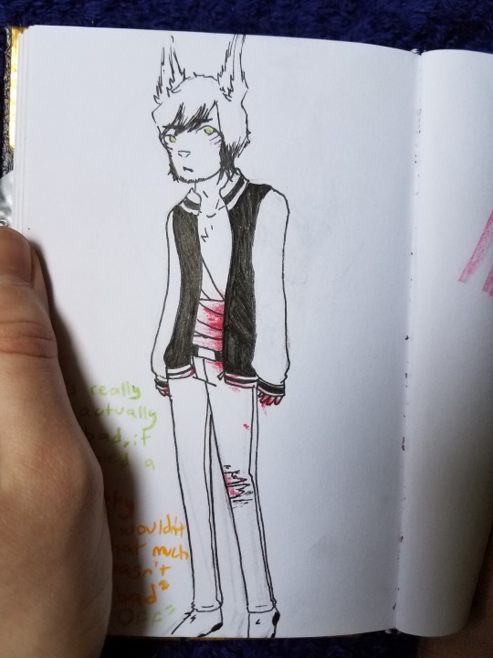
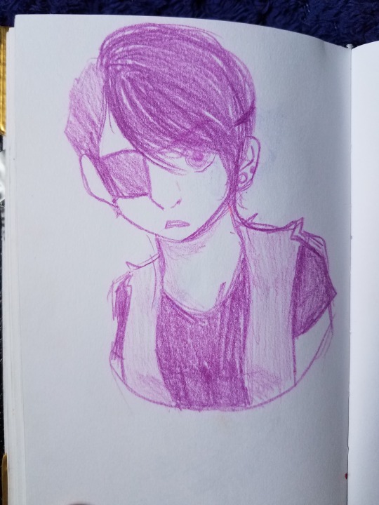
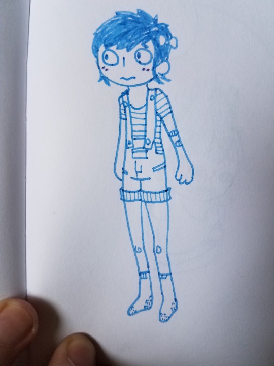
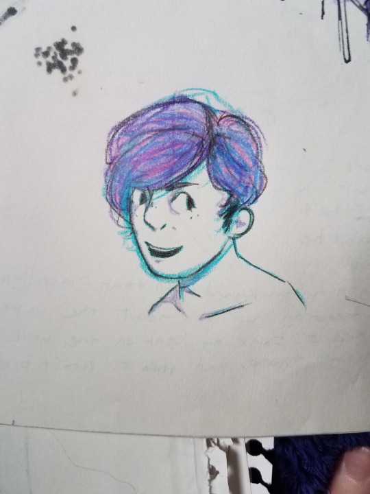
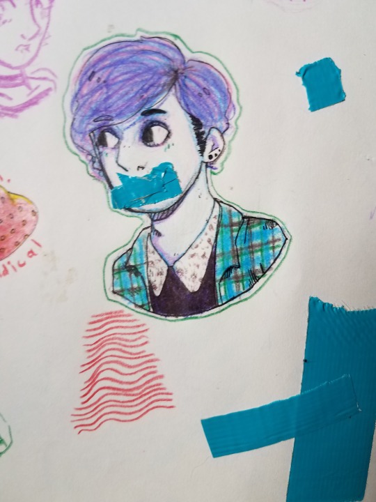
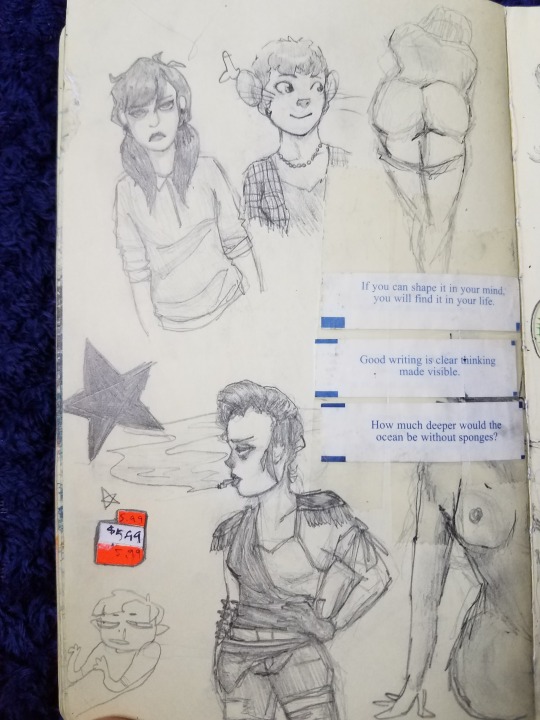
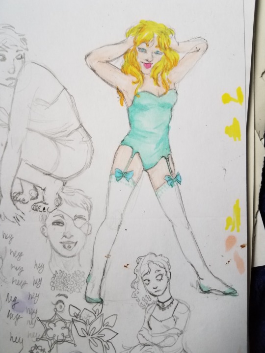
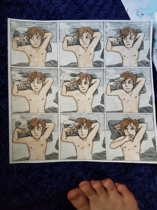
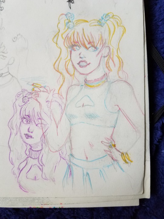
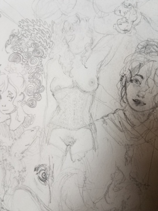
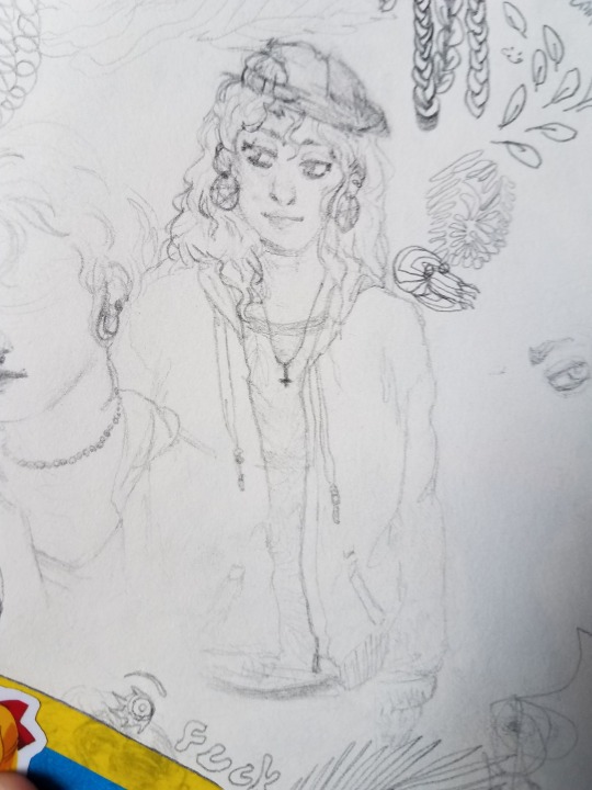
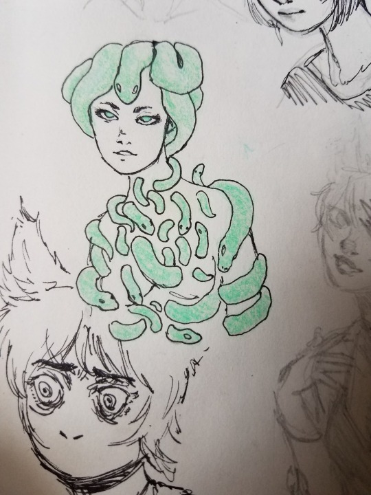
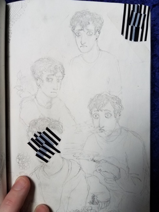
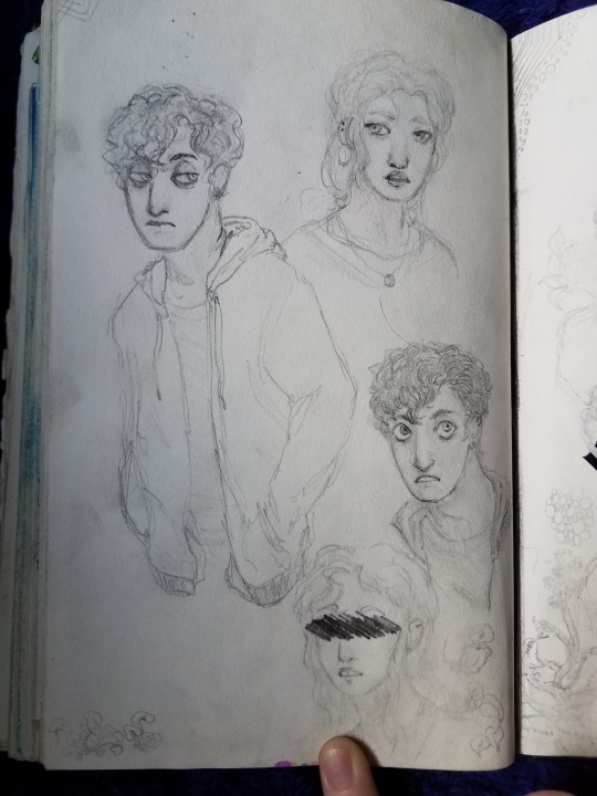
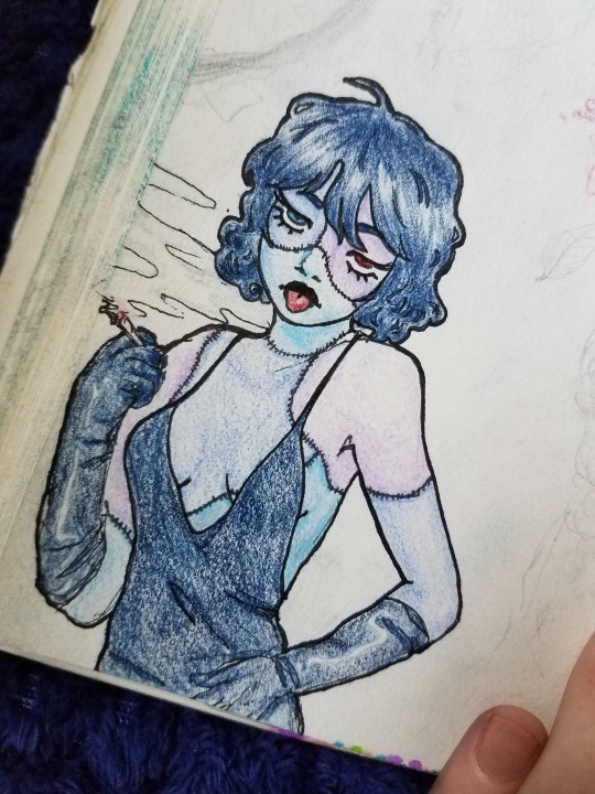
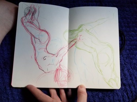
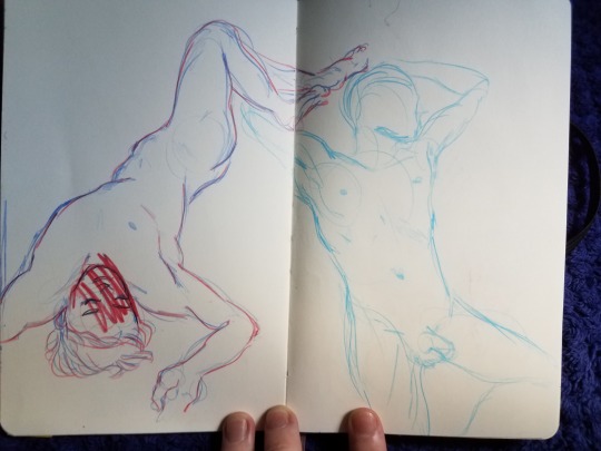
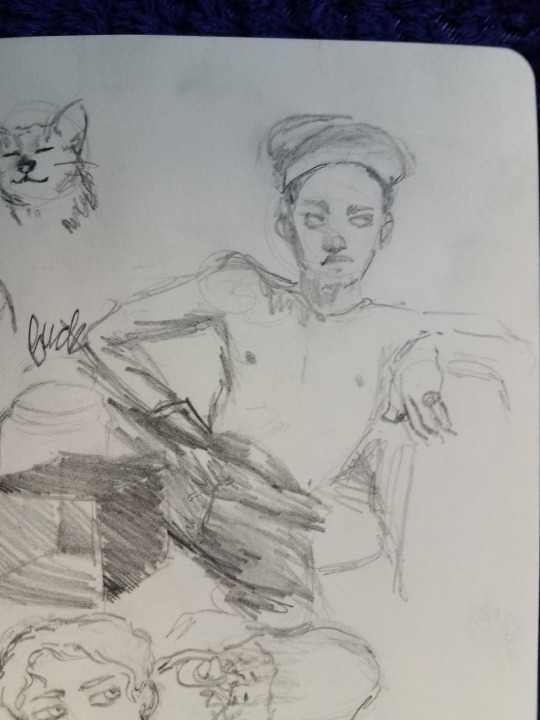
I have a box of sketchbooks and random sketches that I’ve been adding to since I was about 12. Today I went through it all and I decided I’d make a post about it because. idk. why not I guess? So obviously its not every page of every book but like if anyone wants to go through about 7 years of bad sketchbooks and loose sketches and doodles its under the cut. Some nudity
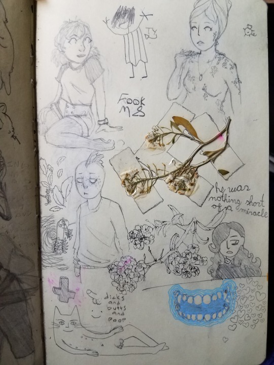
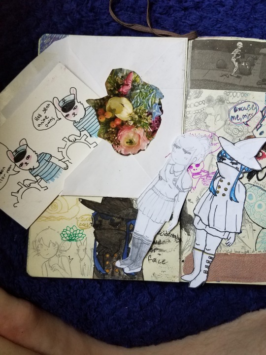
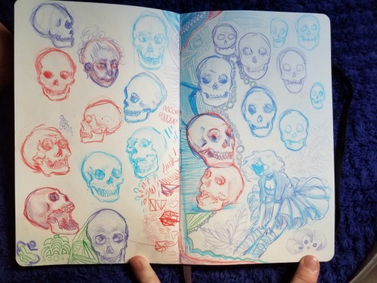
.Going through this sucked a little because like who in the world ever wants to go through their middle school art??? Its hard not to get rid of that stuff because like not only does it suck but it makes me remember middle school and things like anime club and like. ew. But it’s nice to see how much less I suck at this, even if i’m not nearly as talented as I’d like to be. It also makes me sad to think of art i’ve lost, even if it was bad. I don’t have pretty much anything that I did digitally from like age 13-16 because I either deleted it or lost it when a computer broke because i didnt back that up since I didnt think id care but l kinda wish I still had some of that stuff, just like to compare improvement over such a big time period.
I wanted to find some of my actual finished art to post with this, but I couldn’t find it today, so it’s only sketchbook stuff (but I dont finish a lot of things anyway lol). Maybe I’ll make another post comparing old things I actually finished with new stuff once I can find it because I know it’s around here somewhere anyway heres sketchbooks!!
This is from 7th grade, so I guess I was 12. It’s god fucking awful, complete with drawings of memes (which I will spare u from), slenderman fan art, and a weird message about my middle school bike, which I still have in my garage, being stolen, which it never was. And the brakes do work.
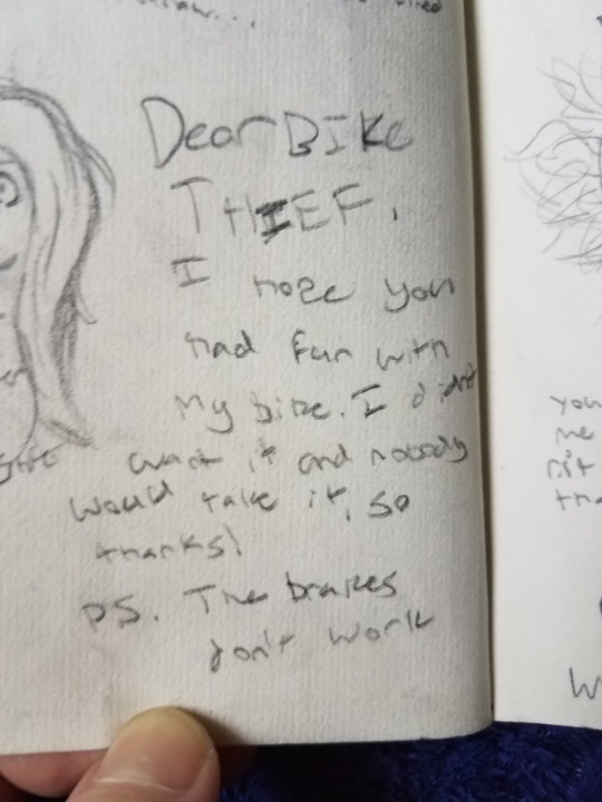


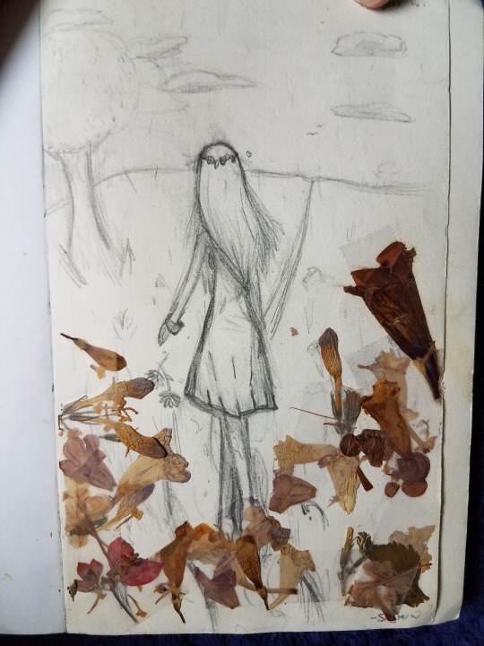
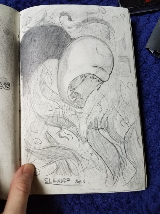
why

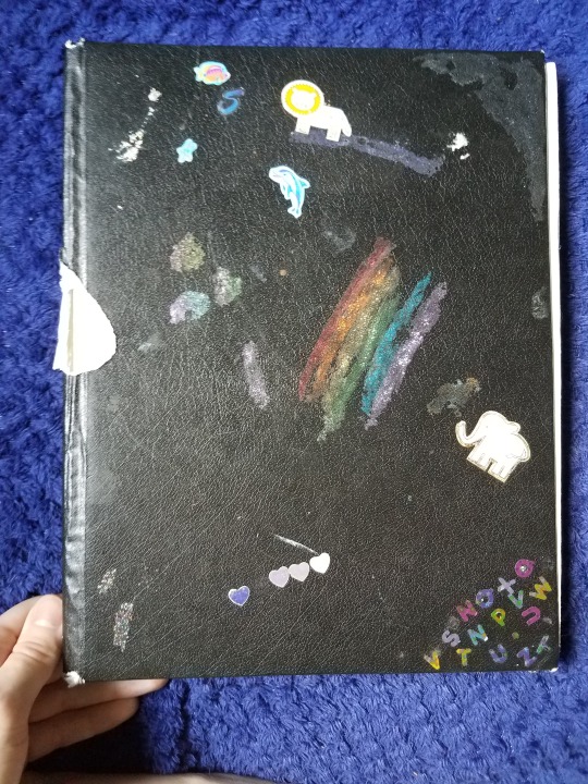
This one is also from when I was 12, but it’s only about 1/4 of the way full.

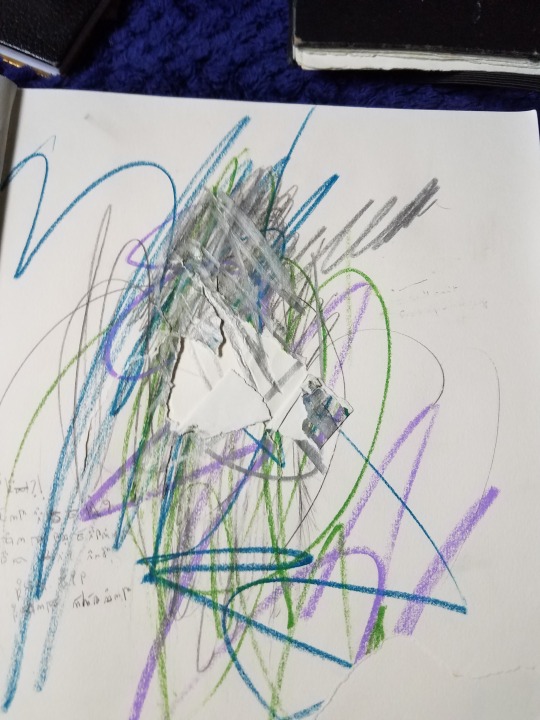
i think i had a mental brakedown here lmao
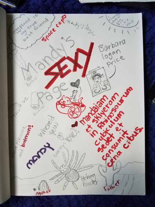
@douche-mccoosh ‘s sexy page

This one was either from 7th-8th grade or just in 8th grade. Idk. Either way I was probably 13 years old. Just a warning: Mlp fan art starts here

1 (ONE) wolf

idk what this is supposed to be honestly


long forgotten OC

This one was also from when I was 13


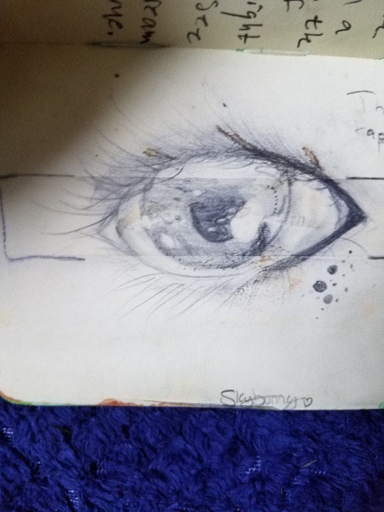
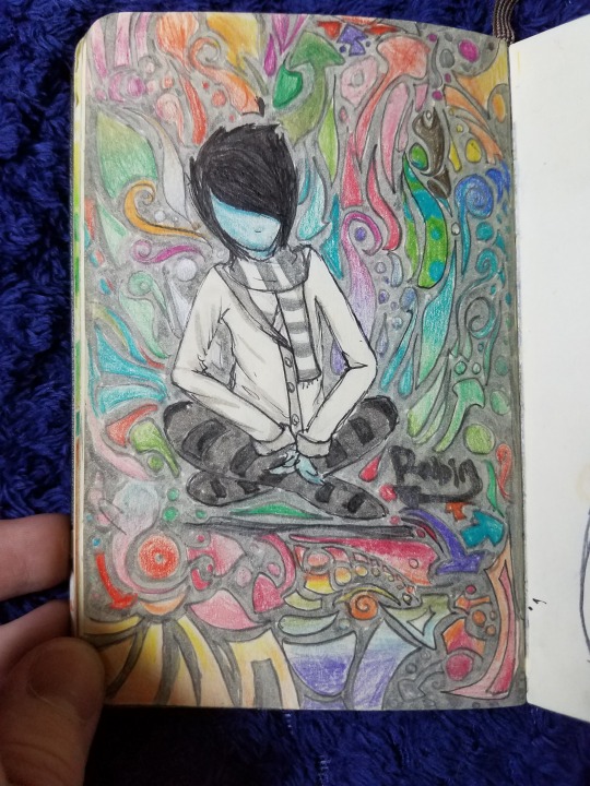


I had this from age 13-14, I started drawing digitally a LOT more around age 14, so I guess I wasnt rly using my sketchbook as much
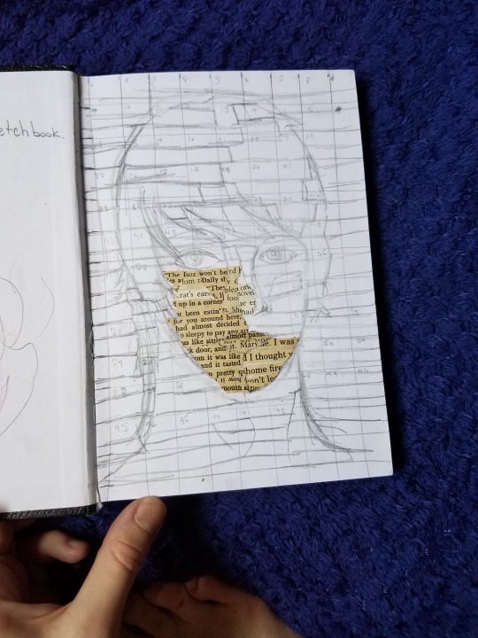
this was like straight copied from a piece I saw at an art magnet school I applied to (obviously I didnt get in lmfao) and I really did not understand how dark I needed to make the paper in some spots. And then I never finished it
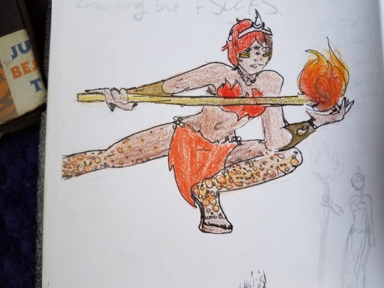

A pony OC... she was a robot ok
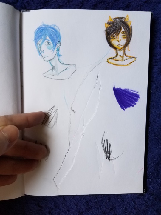
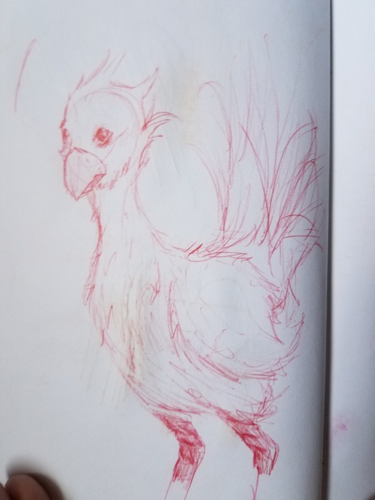
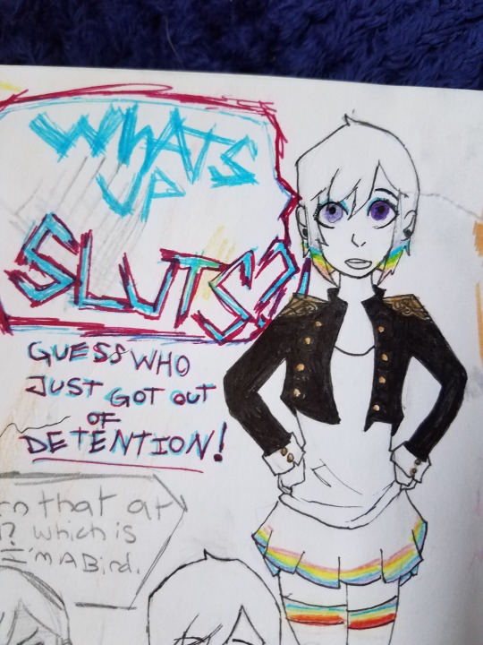

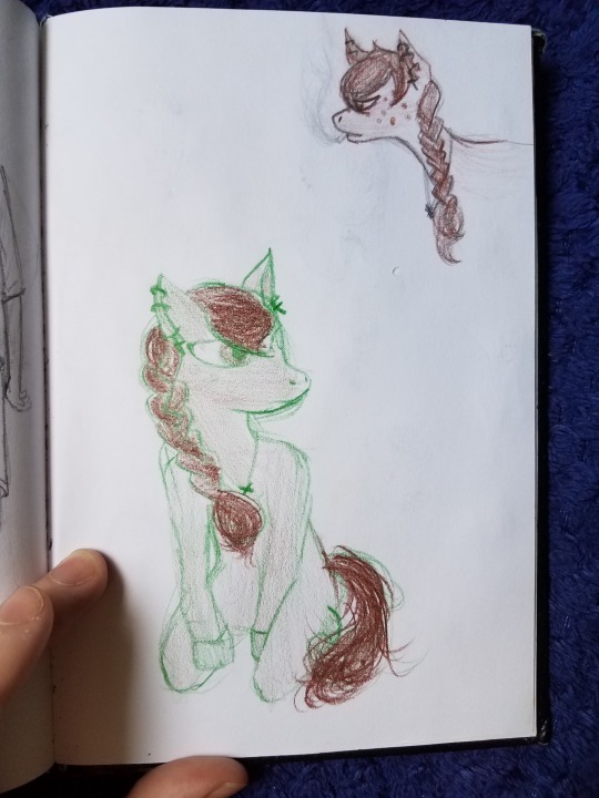

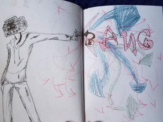

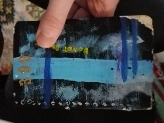
I think I had this one age 14-15. The paper ended up being translucent so I stopped using it early on. Im kinda glad I didn’t fill it up because that actually might be kinda useful to me now
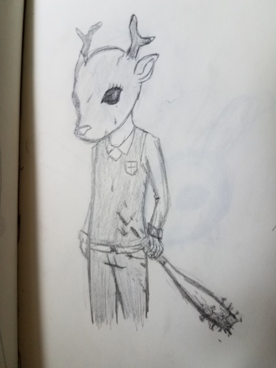
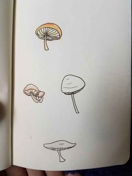
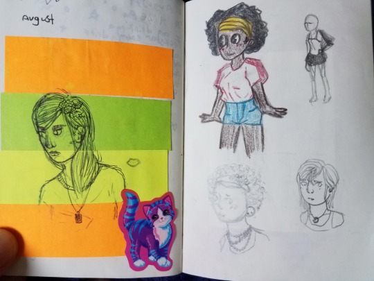


Sweet notes from @lmkno


This one wasn’t in the picture on the top bc I found it later. I think I might also be missing like 1 other one too tbh but oh well lol I think I had it when I was 15? really stopped drawing like a lot around this time, I wasn’t doing digital stuff either cuz my computer was broken at the time
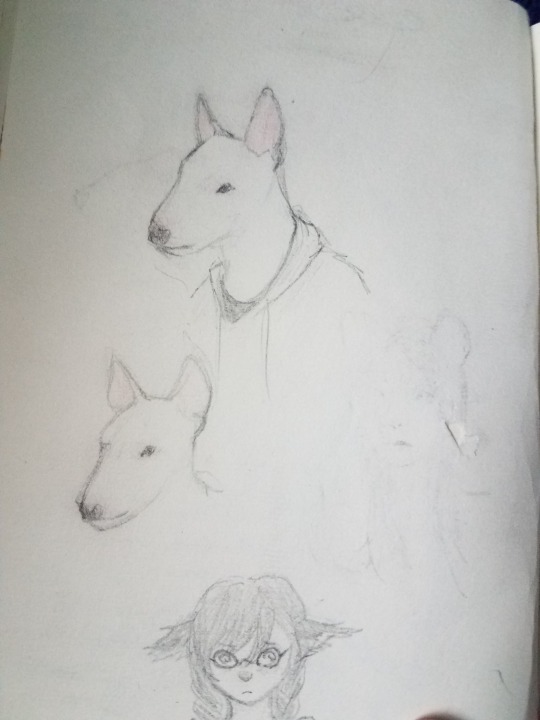
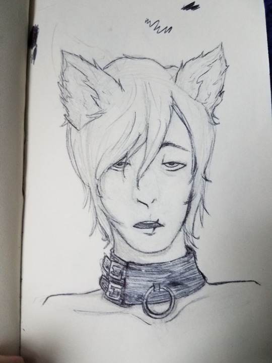
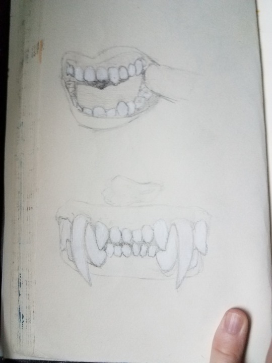

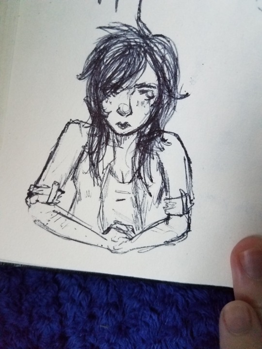
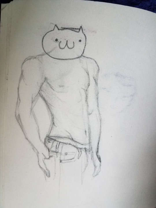

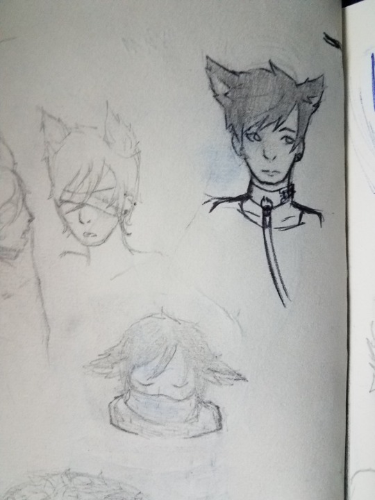
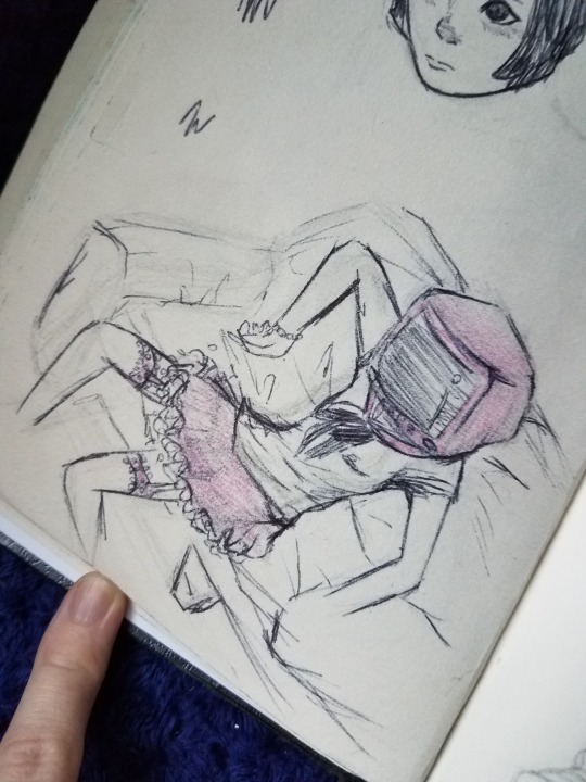

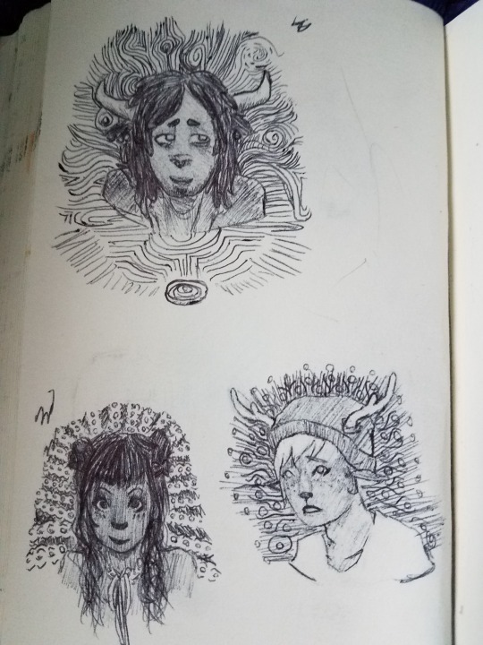
This is also about when I stopped throwing away every single thing i drew on a loose piece of paper, so here’s some random sketches from the general timeframe
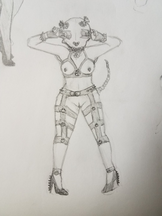
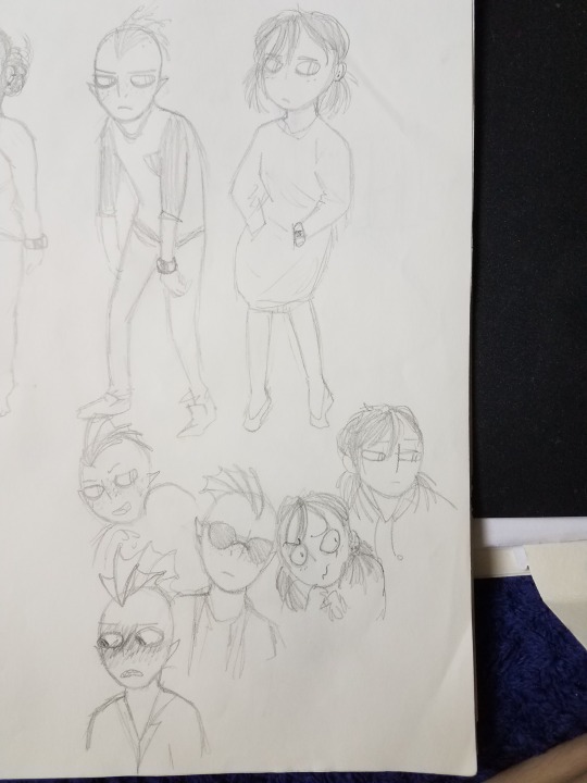
First sketches of my OCs Vonn, the fish man and Elliot, the girl with pigtails
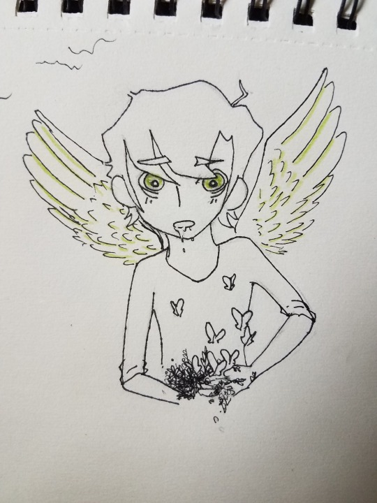
Some of my art I’ve sorted correlating to the OC’s and the universe they belong in or whatever so here’s some OC’s that sort of came about around that time, some of the pictures are from when I was older though

Ginger
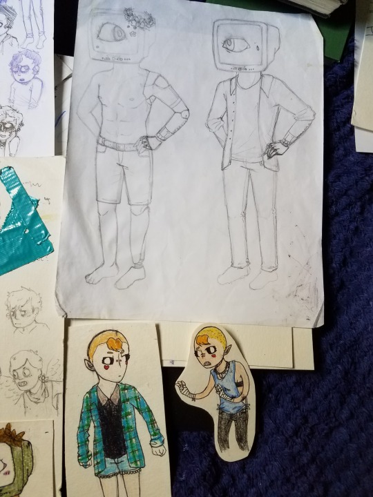
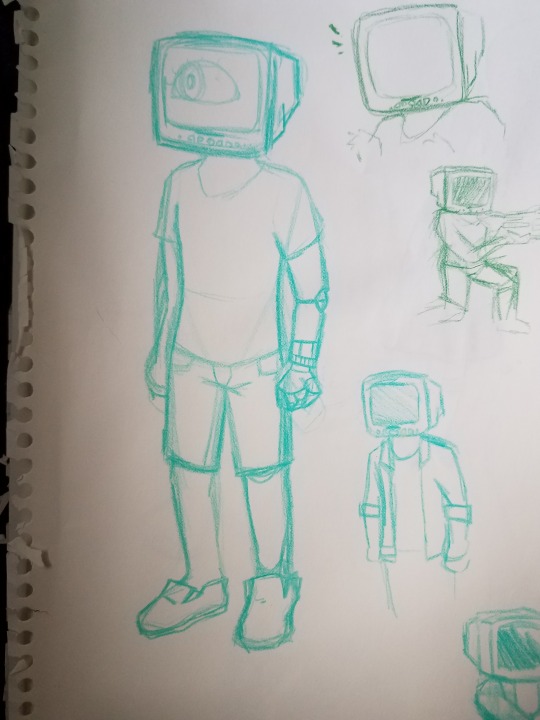
the TV head robot guy was named Seven

the guy with the fuckin,, circle head and weird face is Wolfgang, I still draw him a lot today but ive changed how he looks a l o t
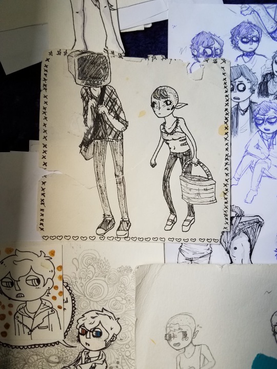


I had this age 15-16, so like 2014-15. Maybe early 2016? There’s a lot of blank pages and scribbled out things. I
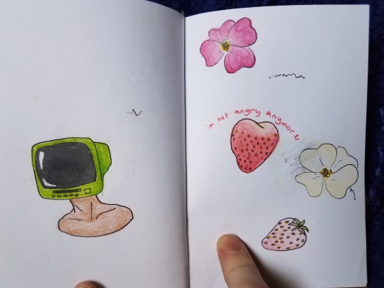


Wolfgang again
fukkin,,,, gaye ass furry roleplay oc
Sketches on loose paper from the time I think??? I honestly cant tell when all of these are from but they’re gonna go here.

first design of an OC named Eryl

A random D20 character
Eryl

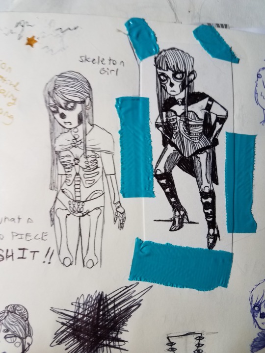

Early drawings of an OC named Lucy Lucy Lucy Lucy Lucy Lucy Lucy Lucy Lucy aka Lucy Ninetimes
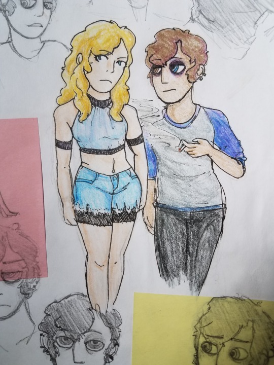
Lucy & Wolfgang
And heres more stuff I had sorted by OCs/universe or whatever
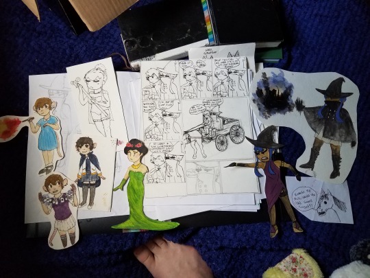
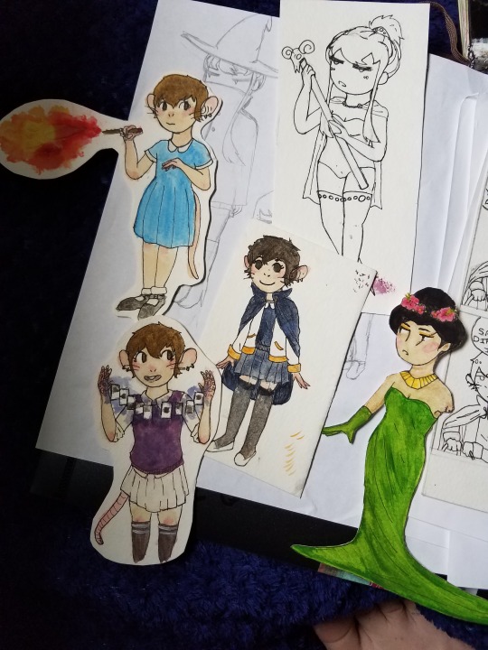


main OCs here are Pidgenfinger, with the blue or possibly stylistic black hair, and Chrissy, shes like. A mouse or something
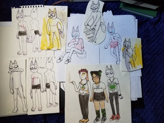
main OCs here are Roland and Ansel, they were like siamese twins and then one of them died at birth and now this guy just has a ghost twin idk it was stupid

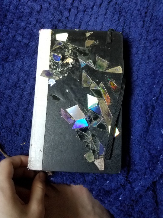
Finally we’re at the point that my phone started recognizing faces in my sketchbook. I had this one age 17, i might have started it like right before I turned 17?
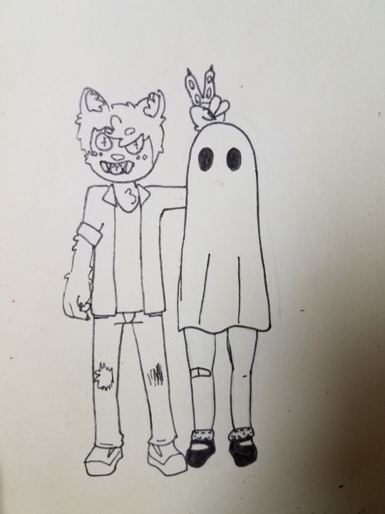

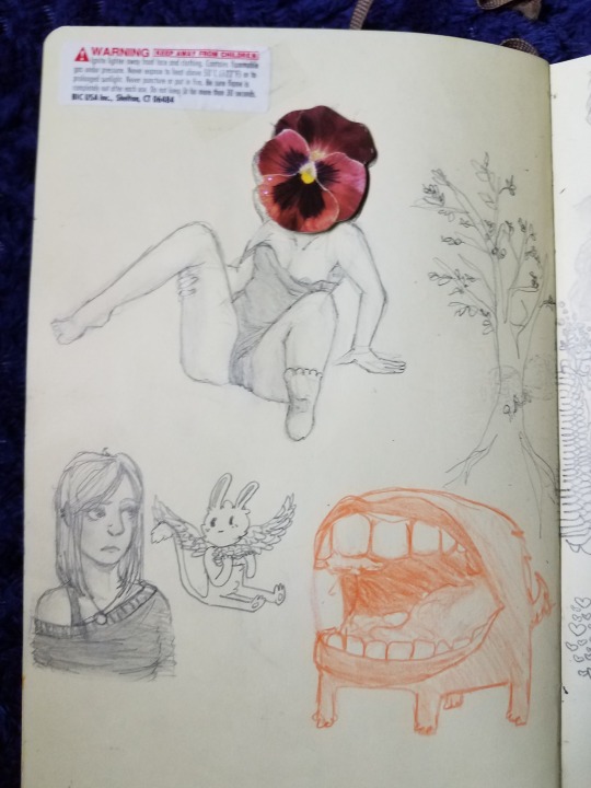
Lucy & Wolfgang

Vonn and Elliot on the right side of the page

Pidgenfingersa

Roland & Ansel

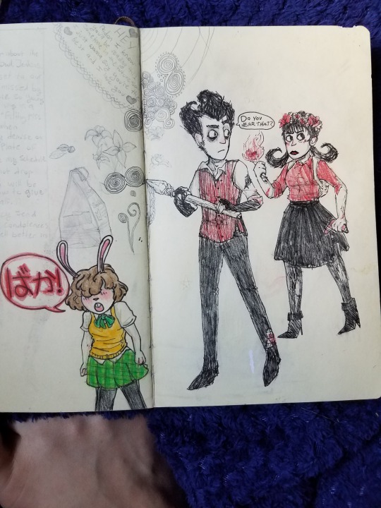
Dont Starve fanart on the right
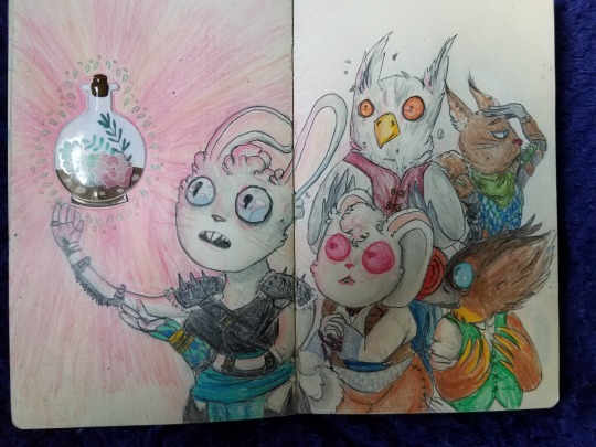
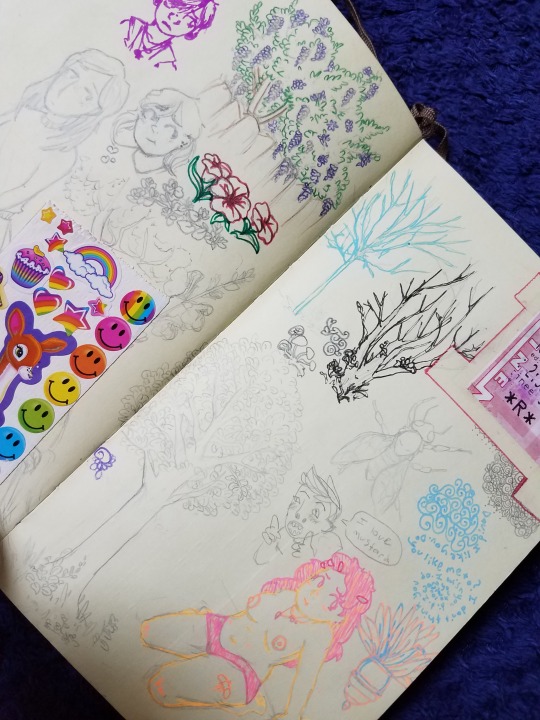
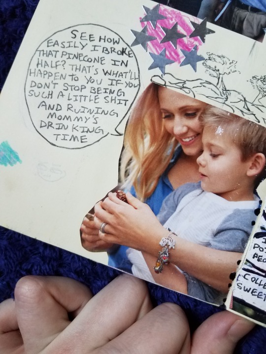

Elliot on the right
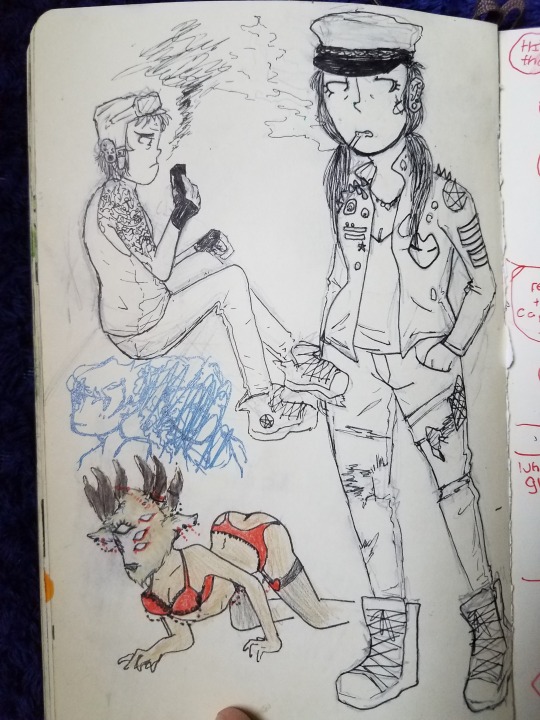
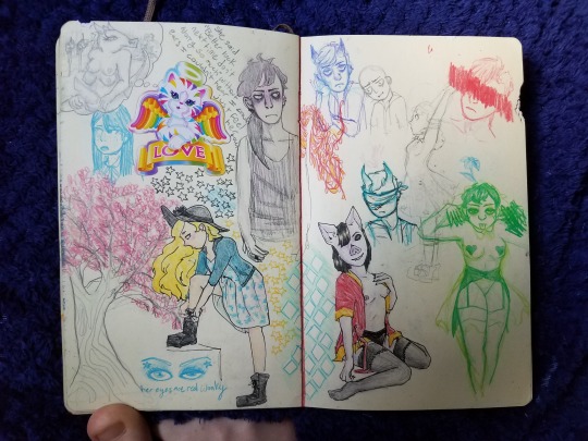
Lucy on the bottom left
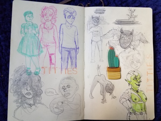
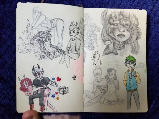
Vonn & Elliot on this page too


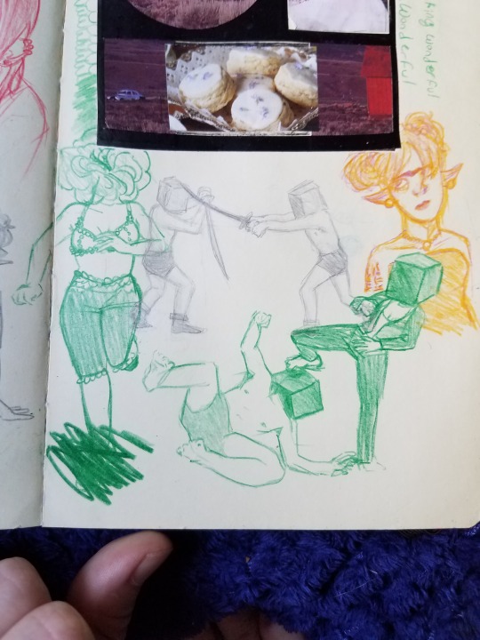

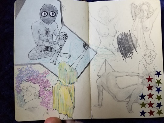

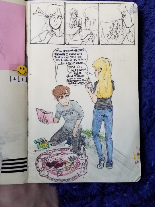
Lucy & Wolfgang, this is dumb but w/e
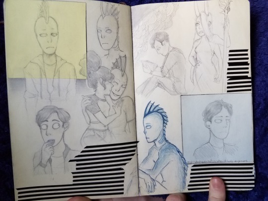
Von, Elliot, and another OC, Eryl. The lady with horns never got a name
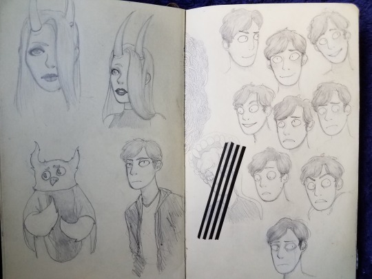

Random Sketches
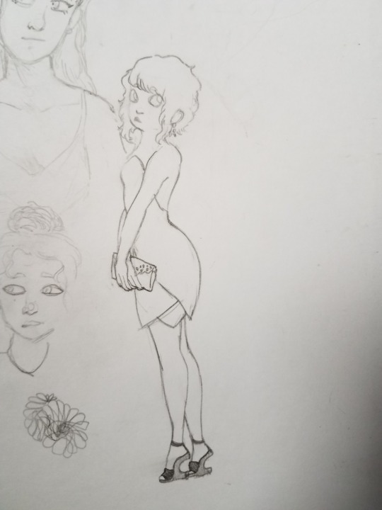
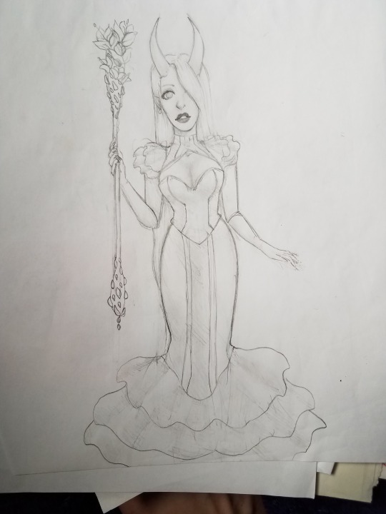

Lucy
Wolfgang

I got this sketchbook a few months after id turned 18 if i remember correctly


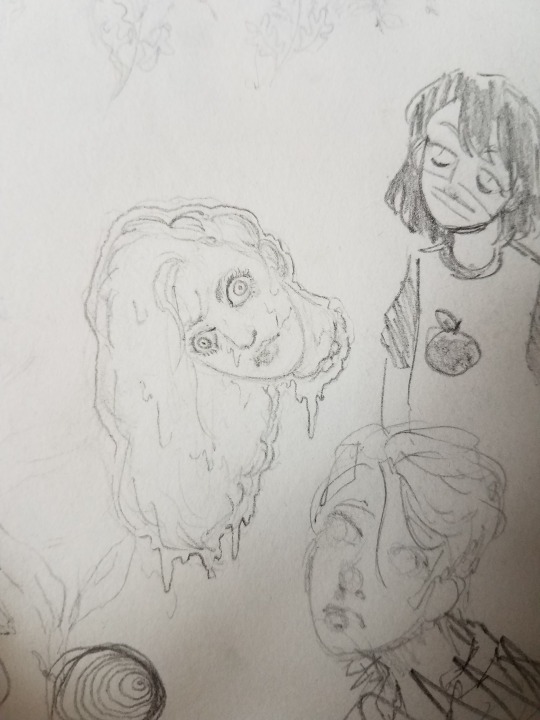
Lucy, but decapitated


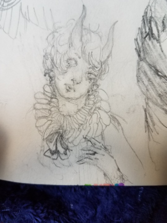


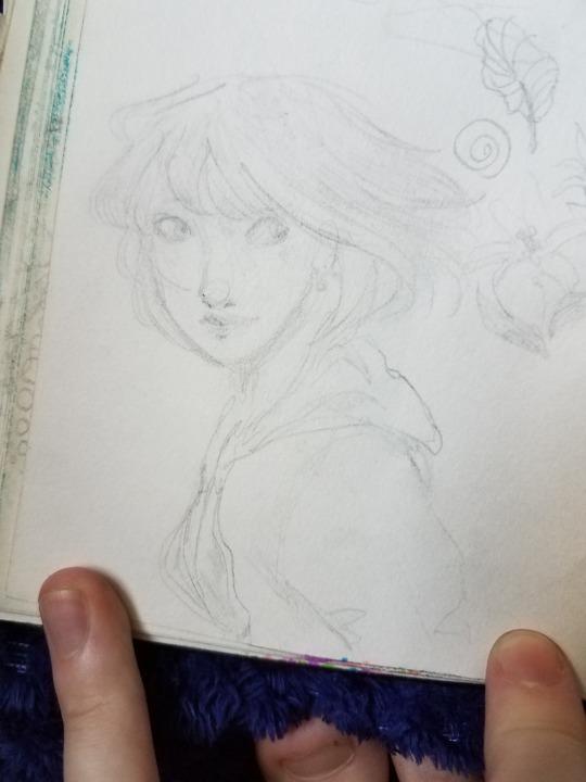
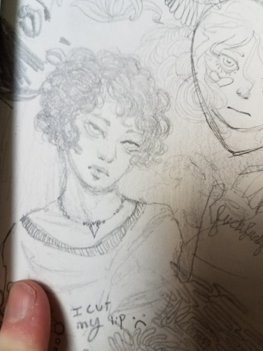




Lucy
Lucy again
Lucy yet again


Lucy!!!!!!!!!!
Wolfgang
(and Lucy)

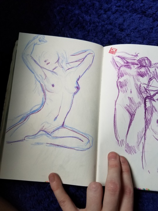


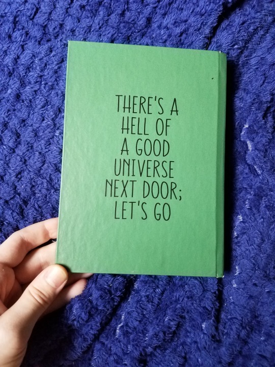
I got this sketchbok as a gift from my wonderful boyfriend @the-lost-professor early january of this year, so technically when I was 18, I’m now 19
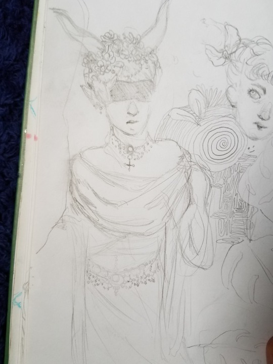
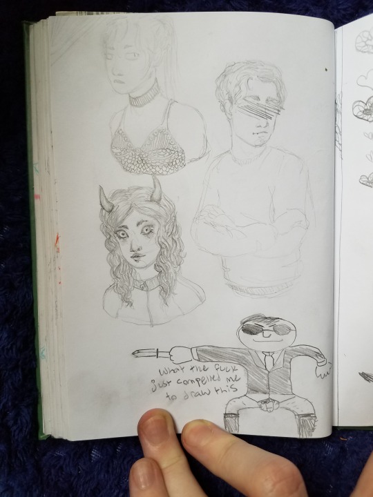
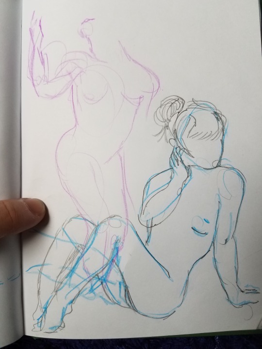

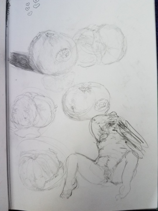
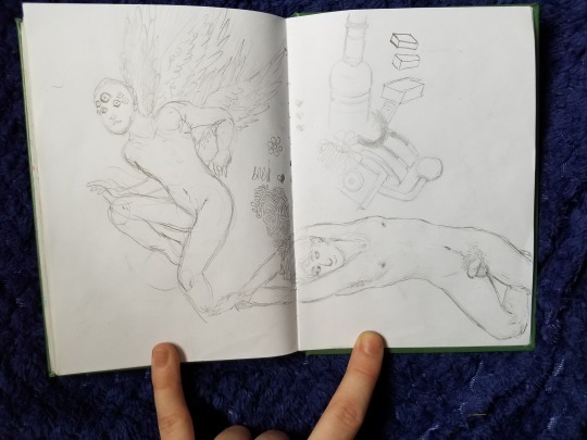
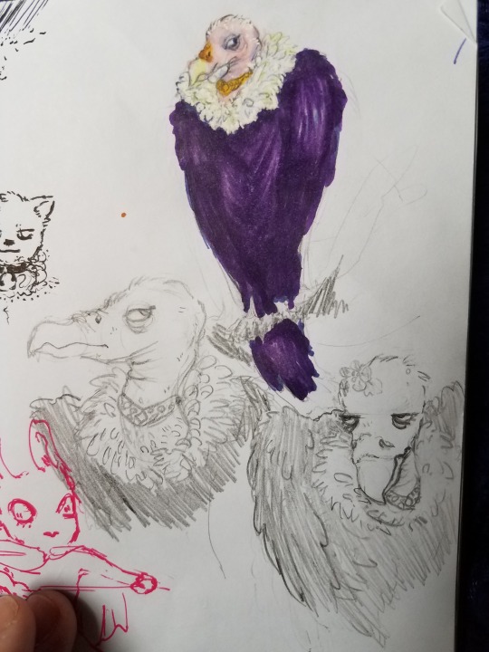
Eryl on bottom right
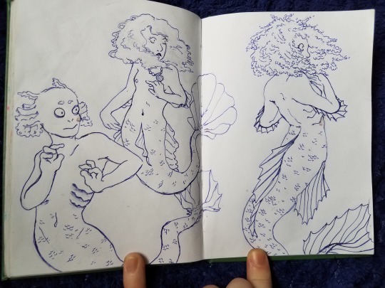
Stuff I did for mermay

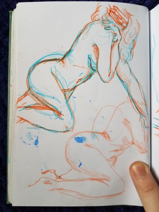
some random sketches


My current sketchbok ft. Tsu This one was also a gift from my boyfriend ♥ I got it late June of this year
Wolfgang

Lucy


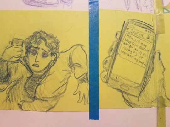
Wolfgang
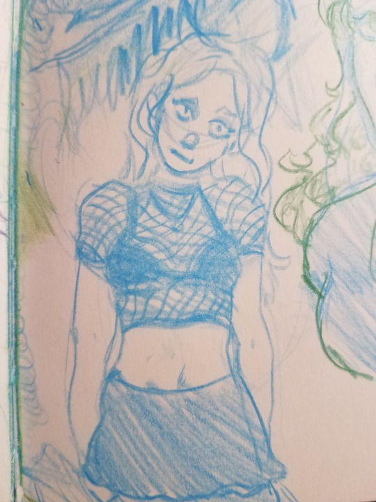
Lucy
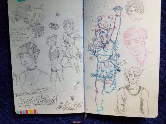

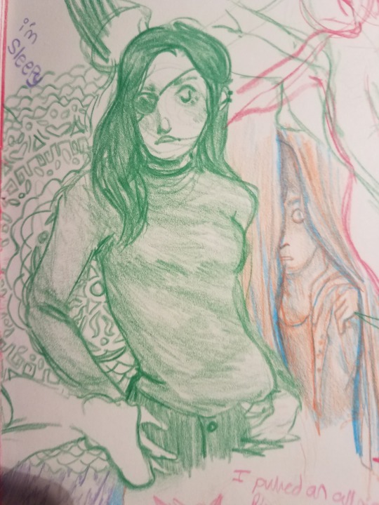
Wolfgang and Leah, and OC that i made a long ass time go and I dont have the original picture but I redrew her
Wolfgangs and Lucys


Eryl on the left

The last thing I did for mermay, which I technically finished after may ended
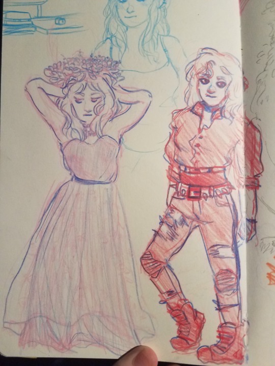
Lucy

and the most recent page! With Lucy and Wolfgang on the right
uhhhhhhhhh
im really fucking hungry now and im gonna go eat bye
#art#artists on tumblr#sketch dumb#sketch compilation#sketchbook compilation#sketchbook#sketchbooks#drawings#pencil#colored pencil#marker#doodles#sketch#sketches#sketching#moleskine#OC#OCs#Original Characters#original character#draw#people#bodies#old art#art comparison#uhhhhhhhhhhhhhhhhhhhhhh#yeah
20 notes
·
View notes
Text
10 Tips for Improving your art
10 tips for improving your art: I've seen a lot of people asking how to improve their art and the main response I see is "Practice, practice, practice." That's great- art is a skill learned over time, but the problem is that the answer is too broad. The fact is, everyone has trouble in different areas, and they need to practice in the areas that are giving them the hardest time. The answer I find myself giving out more often than not is "references, references, references". Telling someone to practice is fine, but giving a better way to practice is more helpful. The other issue is that sometimes we can't see the mistakes we're making in our art, and if someone is reaching out, they need direct feedback to take their art to the next level. When I see someone asking for help like that, I always take a look in their gallery before I even start to reply. Having said that, here is some generalized advice too, that might help. 1. As I mentioned before, references are your friend. There are tons of sites and groups (that I will list at the bottom) where you can find reference pictures. (I am not getting into copyright laws here, so any sites/groups I list will be vetted but be sure to check when searching on your own.) Reference pictures are helpful in virtually any aspect of drawing or painting- everything from figure drawing, to hands, to animals and backgrounds, and using them gives you a visual guide to follow. When looking at references, be critical of everything- study color variations in the shading and highlights, look at the way the light and shadows fall, the way the character or subject is captured- are they still or is there movement in the picture? Take time to just look at the picture for a minute or two before you even begin your piece. 2. If there are certain areas you have trouble with, a lot of people opt to avoid them. I have seen so many people (myself included!) hiding the hands, for instance. Don't. Don't do it! The only way to draw the hands, noses, mouths, eyes, etc better... is by drawing them. It's a simple fact- avoiding them will only hinder your progress. They look bad? They'll get better- it looks worse without them entirely. It may make you uncomfortable at first, but stepping out of your comfort zone and confronting the parts that give you the most trouble will be rewarding in the end. I promise. 3. Take breaks! I know that you're invested but believe me- working on a picture for hours at a time runs the risk of ruining it. Trust me. Breaks are your friend. You're having trouble getting something perfect? Take a little bit and come back to it. A refreshed perspective might help. The human mind can only fully devote attention to something for so long. I don't want to try and count just how many pieces I've ruined because I just couldn't tear myself away from it and throwing 10 hours of work down the drain to start over hurts a lot more than taking ten minutes to rest. 4. Does something look off with your picture? Invert it if you're using a digital program (flip horizontal, flip vertical, rotate it, move it around) or look at it in a mirror if you're using traditional mediums. The perspective flip resets your brain and you can see the mistakes easier. Sounds weird, but it really does work. It'll help you to spot proportions that are off or areas that just... don't look right. 5. Set time limits for practices and sketches! See how much detail you can get in 5 minutes, or faster. I know it sounds difficult- especially if you're working with figures, but it works! Try dropping the timer too. It's hard at first, but trying to get things done in a really quick time (1 or 2 minutes goes really fast) forces you to break things down into smaller shapes. When you're doing this, though, don't worry if the proportions are a little off. The idea is force your mind to look at things more simply. **6. The blur tool is not your friend! I see a lot of blurred shadows and I used to be so bad about doing it myself- shadows on skin have this gradient too them since faces and bodies don't have hard edges, but blurring the shadows is not the way to do it. It's super hard to not do it- I know... either blurring or blending too much but it makes it look too soft and muddies the picture. The key isn't to blur- it's all about the color blending. If you're having trouble getting the blending right- trust me, harder edged shadows looks better than overly blurry ones. (If you don't believe me, take a look at my two Vol'jin paintings... I used to be waaaaaaaaay too guilty of it. I speak from experience.) 7. Having trouble figuring out a technique for something? There are thousands of free tutorials all over the internet of different ways to do it! Speedpaints are also immensely helpful as well. 8. Study others' work. (Study, not copy). Looking at other peoples' work can help you devlop your own way of doing things, and also help you figure out your own style. Look at artists that have styles you enjoy and study how their works look. A lot of personal styles borrow aspects (subconsciously) from others because we're influenced by artists we look up to. 9. Give critiques. This one is helpful but there is a bit of a caviat here in that... some people don't appreciate unsolicited critiques on their work... so a good rule of thumb is to look for people that are asking for them. There are groups where people submit pieces specifically for critiques and helpful comments. Critiquing others' works helps you think more critically of your own. (I'll put a link at the bottom to a helpful journal about how to critique pieces). 10. Ask for critiques and be willing to accept constructive criticism. We have a tendency to get tunnel vision on pieces and it can be hard for us to see the mistakes we make in our works. It's really, really important to get outside perspectives on pieces. Ask friends to look them over- though be aware that a lot of our closest friends and family sometimes have a fear of hurting our feelings, or discouraging us, so they may sugarcoat things, or they may not feel qualified to critique it if they aren't an artist themselves. (My dad feels like he's not qualified to critique or criticize my work because he "can't draw stick figures" so everything looks great to him even if it isn't right.) **For example of what I meant on 6:
Original
New version
Helpful resources: ProjectComment dAPoses (check the descriptions of pictures and credit appropriately) Pose-Emporium (check the descriptions of pictures and credit appropriately) How to give Constructive Feedback reference.sketchdaily.net/en/ line-of-action.com/
#artist tips#improve your artwork#tips#art#digital#resources#hope this helps#I suck at tagging things#be merciful
6 notes
·
View notes
Text
Into the Portal Hole
As the others back home work on Gaster's machine, Sai finds that her friends of the other dimension are more than willing to lend a helping hand.
Sai couldn’t believe it. She honestly couldn’t. She knew from Blue’s previous conversations that Stretch had once worked with the other scientists under his father, W. D Gaster, and her Edge had said something similar about his brother too.
But she was not expecting to have a small, ultra-intelligent taskforce in their kitchen. Gaster was re-drawing his blueprints from memory, his glasses taped to his skull. Stretch, Bee, and Red were hanging over him, all making comments or calculations about what could have possibly gone wrong in their test. “Do you think it was an external factor? One that you hadn’t calculated in?” Red asked, peering at the sketch. When he wasn’t crackling awful jokes, or moping around either of his mates, Sai could see exactly what Edge meant. Red was smart, almost as smart as Gaster.
“it would have to be, otherwise the failsafe would have kicked in and would have spawned back in their own universe…” Stretch muttered, squinting as he followed a gear line in the engine.
“try adding a quadrant of five here…” Bee said, pointing at something on the paper.
It honestly just made Sai’s head spin though she was grateful that progress was being made to get everyone home. If slowly. Bucky giggled. “You have the same facial expression that I do when the twins start talking science.” She said, smiling at her.
Sai sighed. “They are all just too smart for their own good… I hope the twins take after their daddy’s mind at least. If they take after me, they’ll be hooped. Gaster will have them enrolled in all sorts of math and science…” the twins were nestled in her lap, leaning against her as they fed off her magic.
“Hey now. If they take after you, they will be just as lucky.” Lines said, bumping her head against Sai’s hand. “After all, it takes a special person to keep monsters in line, and you have more than the rest of us.”
Nikki snorted and shook her head. “Certain punishment just gets Red all excited. You’ll need to show me how you do it with the rest of your crew.” Beside her, Artemis nodded.
Sai had to smile. Everyone was just so welcoming and friendly. Out of the rest of the AUs, she supposed that they were lucky to make it into one where she had the head start on friends… “Do you happen to have some water?” Sai asked Bucky. Feeding the twins always made her thirsty.
“Sure. I have bottled water in the fridge, bottom shelf, right-hand side.” She gently took Corbel from Sai, cradling him close. “Mind grabbing me one too, please?”
Nikki took Ignatius and carefully held him. “Me three,” she said, her eyes not leaving the babies.
Excusing herself for a moment, Sai walked by the scientist group where a stunned Grillby had been forced to listen to the numbers and scientific formulas. The poor man looked half asleep. Maybe she’ll need to save him and let him escape for a nap for a bit. He hadn’t been sleeping well at the mansion either, Sai remembered, pulling open the door to the fridge and scouring the shelves. Christ, there was a lot of honey here. She supposed that with double Stretches, the honey devouring was also increased. Por Bucky and Blue really had their hands full with these Papyruses.
Chuckling, Sai closed the door, eyeing the pictures that scattered it. There was a world here too, different perhaps, but just as developed as her own. There was a baby Blue sleeping next to his elder twin brothers, then the three of them standing beside what looked to be the Gaster of this world. The twins, now older and more tired looking, sitting at Muffet’s café – the shot had to be taken by Blue. Then there was Bucky sitting between the twins, a dark blush on her cheeks as the twins kissed her. And then a sonogram of four tiny souls curled close together….
Wait… WHAT?
Suddenly that explained Stretch’s and Bee’s reluctance at letting her out of her sight or move much.
“YOU’RE PREGNANT?” Sai cried out, interrupting of the all conversations that were being held in the dining room. Everyone jumped, spinning around to look at her. “WITH QUADRUPLETS?”
The Papyrus twins looked smug and proud of themselves, grinning as they chewed on their lollipops. Bucky smiled warmly at Sai. “Yes…. The twins went into heat about a month ago. We just found out the good news and told everyone about one… two weeks ago?” Bucky asked, looking around at the small group of friends, her arms wrapping around her middle. Now that Sai was looking at her closely, there was the smallest bump to her.
Sai’s mouth was agape, and she trembled slightly. Dropping the water on the table, she wrapped her friend in a huge hug. “Oh, I cannot believe it!” she exclaimed. She pulled back, looking at her other friend. “My goodness, you are small…. You’re gonna look like you have an exercise ball under your shirt by the end of it.”
There was a snort from Bucky. “I always imagined something of my stomach out to here,” she gestured with her hands, giggling. “Something like a half Pacman character.”
Nikki grinned, pulling out her phone. “Now we were practising,” she whispered in a stage-whisper. “We haven’t shown the twin these pictures but…”
There was an odd, high pitched squeak from a quickly reddening Bucky. “Hey! No, you promised that you guys didn’t save them!”
Sai caught a quick glimpse of a picture of Bucky with what looked to be a basketball shoved under her shirt before the phone was snatched by a bony hand. Stretch and Bee were peering at it, hearts in their eye lights. “you should send those to us,” Stretch said to Nikki. “we’ll pick up some of that salami that you like.”
“Deal,” Nikki said, grinning and taking her phone back, ignoring a sputtering Bucky.
“I SWEAR TO THE STARS IF YOU DON’T DELETE THOSE RIGHT NOW, I WILL KICK YOUR ASSES.” Bucky threatened them.
Bee and Stretch chuckled. “aww come on sweetheart. you know that you can’t do that to us 1 HP monsters… our children need us~” they purred together.
“I CAN LOOK AFTER THEM MYSELF IF NEED BE. ESPECIALLY IF YOU KEEP THOSE FREAKING PHOTOS!” Bucky threatened, the others laughing.
Lines shook her head, shaking her fur. “I keep telling you that I know a great place to hide a body. Or two. You just need to ask me.”
Grillby knelt under the table, grabbing a slowly escaping Ignatius. He came close to a laughing Sai, wrapping an arm around her, watching the chaos unfold. ‘Almost like home?’ he signed to her, his eyes twinkling.
Sai nodded. It was close to home… “So how are we getting home?” she asked, nodding to the paper.
“I believe that there is a movie that you close your eyes and clink your heels together three times.” A familiar, English voice said behind her.
Silence fell heavy on the group as the others turned around to face the newcomer. Stretch and Bee came in front of Bucky, Fell stepping in front of Lines in a similar manner. Nikki’s tail wrapped around a growling Red, a large red spike erupting from the grey fur, Pizza taking a defensive stance.
However, Sai leapt at him, hugging him tightly. “Sebastian!” she cried out, hiding her face in his crisp, white button-up. “How on earth did you find us?”
The demon butler chuckled, his eyes glimmering slightly red. “Now, how good of a butler would I be if I couldn’t rescue my mistress?” His eyes looked around at the others, his eyes resting at the familiar and unfamiliar, scanning them in his own way. “Though I am pleased to see that you were not in any danger.”
“Of course not! I had Grillby and Gaster here, and Edge has taught me more than a few things.” she fake pouted, a large smile on her face. Sebastian was here. They could go home.
Sebastian chuckled. “I do not doubt your skill m’lady. Forgive me if that is how it came out.” he smiled at her. “Now, shall I escort you and everyone home?”
“Yes!” Sai said, far too quickly. “I am so ready to get home and see everyone…” she paused, turning around to see her new friends. The others were silent. A little numb over the sudden appearance, but also that they would be losing her so soon… “I… I mean…”
Bucky smiled at her. “It’s alright. We understand. We are friends but,” here she chuckled. “I think that we would all feel the same way if it was us in your situation.”
The others nodded in agreement, still eyeing the demon butler as they slowly relaxed. “I would do anything to get back to Red and Nikki.” Pizza said, his hands reaching out to his mates. Giving them a gentle squeeze, he shot a dazzling grin at Sai. “We know what you meant.”
Sai trembled for a moment before coming up and hugging them all tightly. The little group hugged her tight, being wary of Bucky’s stomach. Sai was surprised to feel the tickle of tears in her own eyes as she stepped back. “I’m going to miss you,” she whispered.
“We’ll miss you too,” Bucky whispered back to her, smiling. “But now that you know we are here, you could always visit us.”
Sai nodded. “Yes… maybe you can come up to our universe and live there?” Sai wondered out loud.
Gaster chuckled. “We’ll update the mansion first before then.” He said to Sai, winking at her.
“Very well…” Bucky pulled her into a tight hug. “Then until we meet again.”
Hugging her back, Sai nodded. “Until next time.” she agreed. Drawing back, she quickly wiped her face, stepping back to be close to Sebastian again. Grillby and Gaster stood next to her, each of them holding one of the twins in their hands. Sai waved at the other universal copies even as the colours blended together, whirling together in a dizzying manner.
* * * * *
Sai stumbled a little bit as the floor solidified under her again. Sebastian’s teleport was a little different than Gaster’s… she gasped as there was a sudden vice around her, knocking some of the wind out of her. “SAI!” Bucky, her Bucky exclaimed, holding tightly to her. “Oh I was so worried and the machine wouldn’t turn on or work or…”
Another hug captured her other side. “I knew you would be back!” Alana exclaimed. “Oh, but I was so worried. I just…”
Sai sniffed and held her friends close to her, watching as Sebastian stepped out of the room, quietly as if he had never been there. Gaster and Grillby chuckled to themselves, holding the twins close to them. “I missed you guys too…. but I have so much to tell you guys!”
#undertail#polyamory#w.d. gaster#ut!grillby#us!papyrus#uf!papyrus#uf!sans#oc#female oc#w.d gaster/grillby/oc#twin papyrus au#underswap#established relationship
6 notes
·
View notes
Photo

So this week was a tough exercise. Based on all our previous experience we now had to draw 14 images of Anne Marie (from All Dogs Go To Heaven) on model. We were given 3 model sheets of the character (which I did not include in my upload). We were told to draw 7 images as exact replicas from the model sheets (5 headshots, 2 full body poses), and after successfully doing that we were told to draw another 7 unique poses of the character from our own imagination (5 headshots. 2 full body). The copied poses that I drew are the top image, the original poses are the bottom image. I’ve included my specific feedback that I was given by Don Bluth on this gif. For the rest of this bio I am going to be re-writing my notes that I took from our lecture. Let me first start out by reciting one quote he gave us from our lecture this evening. More or less he said… “There is no right way to be an artist, it’s all subjective, but we are learning how the classical artists did it and you can take from that what you want.” So keep that in mind when reading these notes. We were told over and over again how important it is to use construction lines when building your character. This is crucial to be able to keep proportions consistent when both drawing and animating a character. we were told, “You’ve got to be able to look at shapes, understand their relationship to each other and duplicate them exactly!” And also, “Putting lines down and getting proportions right is one part of making an appealing drawing. The other part is giving the character enough believable emotion, real emotion, for them to look appealing.” There is a fine balance when making an accurate drawing but not making it look mechanical.. Precision and freedom in your art are both skills that take time to learn. Here’s a good tip to help loosen up your work. You may have heard this one before. when you’re drawing your sketch draw more from the elbow and less from the wrist. This is less so for detailed work, detailed work requires you to draw from your wrist for those controlled strokes (especially when drawing faces) but it is a fantastic habit to get into when you are sketching and finding your form. Really when you draw from your elbow you are using more of your entire arm, the shoulder and the back. You’re using more confident strokes and these strokes carry with them more rhythm. You want that looseness when you sketch. It is desirable it is filled with life. “Notice that really good drawings have busy moments in it [its’ lines] and rest moments” Another thing Don said was “Drawings come from the subconscious. If you can take a lighter look on life, and if you can learn to like yourself (or if you already do) your drawings will get freer and a little more desirable. You can always tell from someone’s drawings if they are a stressed person or an easy going one.” If you’re having trouble with construction lines, here’s a good exercise. A lot of people spend a long time neatening up their sketches, tidying them up. I personally think this is for two separate reasons. 1) because it is hard to let go of an inperfect drawing. 2) because it is harder to start a new drawing than it is to tidy an old one. Either way, letting go and moving on is good. So long as the drawing is accurate that’s all that matters, not the neatness (Glen Keane is a fantastic example of this). Work rough at the beginning before you nail it down. This will also help to make deadlines more manageable to reach because you will reach your goal faster, and if you have extra time left at the end you can always go back and make revisions later. Ultimately, meeting the deadline is more important than having a perfect piece of work. If you’ll learning you will always see things in your work that you could change, tweak or fix. It’s a good skill to know when to stop chasing that rainbow and submit your work. Take the lessons you’ve learned from this experience and apply them to the next drawing you do. Your skills will continue to improve and so will your speed in art. Fun fact. It’s easier to get proportions accurate when you draw small (this is why thumb nailing a drawing before sketching it out is good). For some reason, drawing acurate proportions at a larger scale is (usually) considerably harder to do. On the note of perfection here is another quote that I quickly jotted down from our lecture, phrasing may not be exact but the point is made. “ There is no such thing as perfection, this will happen every time. Here is something that will happen every time. You’ve drawn something, you’ve given it your best effort, now leave it on your desk and come back to look at it the next day. Now you will see your mistakes. This is a good trick to help your brain process. Once you start seeing your drawing different, you can start fixing it and progress as an artist.” So based on that quote here is an exercise I have for you. When you’re working on personal projects be your own director. Finish your work, set it aside, sleep on what you have done. Come back to it the next day and give this work feedback as though it were someone else’s. Pretend you are the director to someone else’s work. Photocopy it, draw over it, set it aside again and the next day come back and make those revisions. In this way you are practicing two desirable skills. 1) how to give feedback, 2) how to apply it.
- I am also on — [Instagram] | [Twitter] | [Deviantart]
202 notes
·
View notes