#improve your artwork
Explore tagged Tumblr posts
Text


Ive already posted a few of these blorbos on other socials, but BANG have some fury ocs
#httyd#how to train your dragon#httyd toothless#toothless httyd#Tagging him because night fury#uh#👍#night fury#night furies#light fury#light furies#the light fury is okay if you get creative with it I guess maybe#but also lesbian dragons#lesbian#dragons.#dragons#dragon#my artwork#art#artist#my art#my ocs#yahoo!!#digital art#artwork#also please ignore the anatomy on some of them I am aware that it looks a tad off😭#these were drawn like 2 months ago so I swear I have improved I SWEAR-
326 notes
·
View notes
Text
🩵💛 5000 Follower Celebration & Draw this in your style Challenge! 💛🩵

This blog vavoomed from 0 to 5000 in less than a month! If that‘s not ineffable, I don‘t know what is. Thank you for all the love and support you showed my silly, smutty, angsty brainrot corner, for every reblog, comment, incomprehensible scream in the tags (yes I read them all). This community means so much to me.
So, to celebrate, we are having a Draw This In Your Style Challenge!
🩵 The Rules:
Recreate this image in your style! Interpret it however you see fit! 💛🩵 (I will love every single one of them)
Post it with the #vavoomdtiys (and @ me if you like, so I don’t miss it!) OR send it to me in a DM or an ask if you're not comfortable posting it in your account. (Let me know if you're okay with me sharing it or not. I will treasure every entry!)
The deadline is the 25th of december! I will pick two winners, the first place will be one I like best and the second place will be a randomly selected one.
The first place gets to request a full comic page!
The second place gets to request a sketch drawing!
Have fun!!!
I will of course reblog every entry and make a compilation post at the end!!
💛 Bonus Gift!
As a little bonus, I am releasing the procreate brushes I use for free! (Now, you should draw this in YOUR style, but feel free to use them for your submission!)
Here‘s the download on Gumroad (just put $0 to download it for free!) :)

You are all amazing! I‘m so excited to see what you come up with!
#vavoomdtiys#dtiys#dtiyschallenge#draw this in your style#good omens#goodomens#crowley#aziraphale#ineffable husbands#art#art challenge#crowley is not sorry#challenge yourself to draw the hands!! you will improve!!#and I will love every single artwork!#vavoomart
821 notes
·
View notes
Note
hi dema! i’m learning how to do digital art, would you mind sharing your coloring process? coloring (and lineart) is the hardest thing for me to do T_T… what brushes do you use for coloring and how do you not make it look muddy? i’ve been trying to follow tutorials from different artists on youtube but i find my work to look so muddy… thank u in advance >__<
Hi, and thank you for thinking about me for advice! I'm honoured to share a bit of my process, nerve-wracking as that is for my shy self, and hopefully help you out as much as I can. Forgive me if I don't express myself very clearly—I have a bit of a hard time explaining these things. Now, let's get started, shall we?
I'll be using the first panel of this artwork as an example.
My process is pretty straight-forward for most artworks. Make a sketch, draw the lineart, and follow a self-made guideline for coloring and rendering.
Sometimes I'll throw the guideline to the trash bin and start experimenting with brushes and chiaroscuro and color palettes, but that doesn't happen most of the time and, when it does, it's more a challenge than anything else, and not really what I think you're looking for.
I'll include my usual steps here, however, and like I said earlier, these steps are more like what you'd call guidelines than actual rules.
(I just realized I didn't save the sketch for this artwork. Oops)
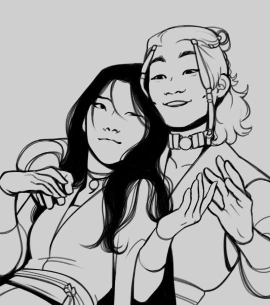
This is the lineart!
I tend to think that details bore me and are actually pretty exhausting to do, but then I go and make things as clear and detailed as I can. Because I'm a hypocrite like that.
I did try to keep things simple here, though, mostly because I had to go through three other panels and didn't want to burn out my fuel mid-process.
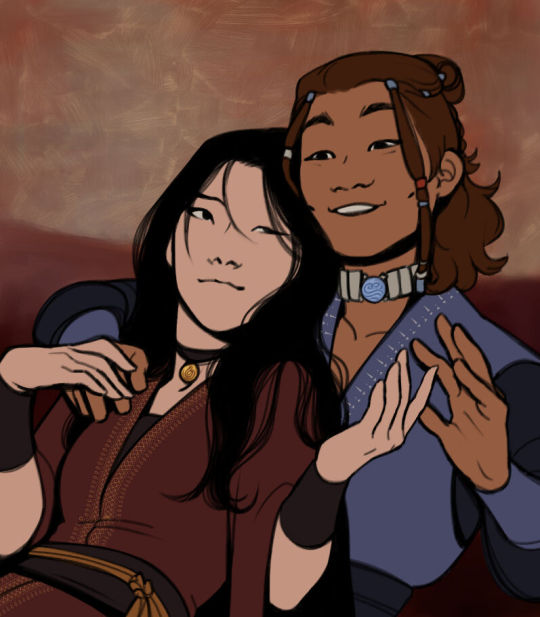
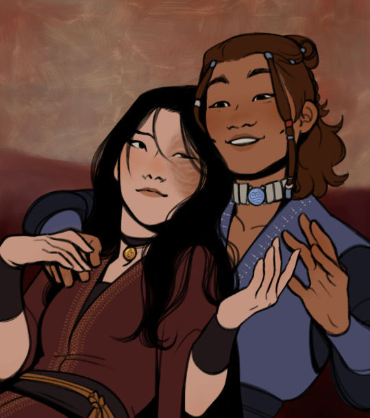
Base colors! The blush (and Zuko's scar!) I draw in a different layer in case I need adjusting the brightness or saturation later.
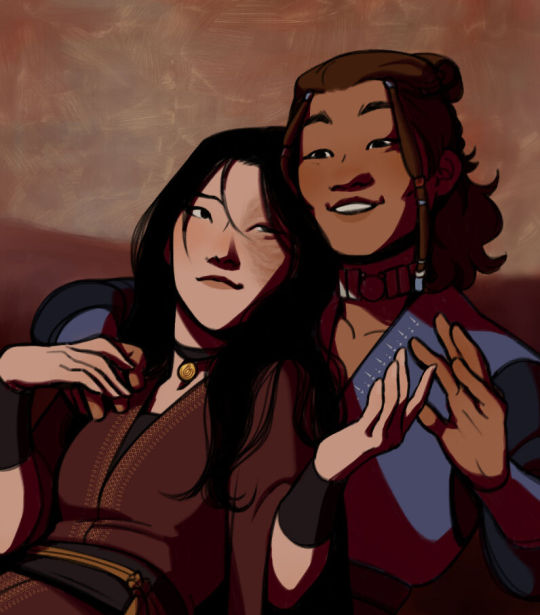
It's time for shadows!
Pick a color depending on the atmosphere you want the artwork to have. Is it a cozy, warm scene in a honey-tinted room, or is it a moment shared under the moonlight? The color choice should come as an answer to those questions—deep red for the first one and dark blue for the second.
Choose a color and make it dark and saturated. Then, play with the layer opacity! A darker shadow means harsher light, while less opacity works best for a softer look. See the difference? It's subtle, but it's there.
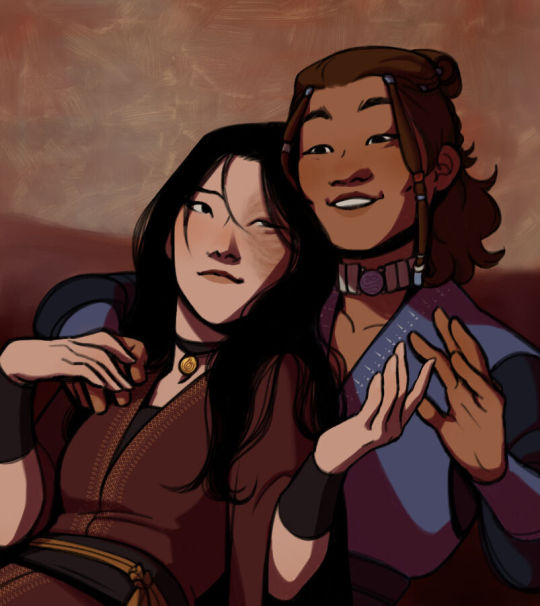
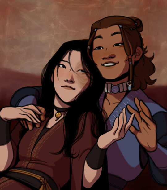
Of course, this is my personal choice. The way shadows are drawn and color is chosen depends on the artist and the artwork. I choose to play with a more simple coloring style, keeping shadows from blending into each other, but you may like a more realistic approach to shadows and colors.
My best advice? Try doing it every way you can, but in the end choose what works best for you. Whatever feels more comfortable, whatever you enjoy drawing the most. And then work to improve it. Love the little proof that you've gotten better, even if it's subtle.
And talking about subtlety...
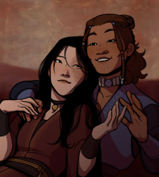
I love to play with gradients. I use them mostly to give the artwork some form of atmosphere, and make it look cohesive and whole. A light gradient in the color and direction of the shadows will help the characters blend with the background, as will another gradient in lighter colors for the light.
Get creative with gradients! Use them so the lights feel brighter and the shadows darker.

Now it's time to work with the lineart again.
The pure black lineart makes the artwork look harsher, sharper, so I tend to give it some color to soften its edges and compliment the rest of the drawing. In darker shades as the rest of the colors, growing more saturated as the light comes closer.
I love to make the characters' eyes pop and glow! It's really fun what you can do by just messing a bit with the tones of the lineart.
Finally, I play with the level correction. A high contrast will help your artwork stand out and look brighter. See the difference?
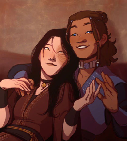
And it's done!
Sometimes I like to add other effects or details, but this is the very, very rough shape of my usual process, and thus what I thought you'd like to see.
Once again, I'd like to point out that this is what works for me, and a large part of improving as an artist is just fooling around and messing up until you find the tools and tricks you're most comfortable with.
So keep drawing those muddy shadows and colors! They're only a step of the process.
#dema answers#zutara#art advice#art process#I hope this helped you anon#Tbh I have zero idea of what I'm doing most of the time#So don't worry if you don't#Worry instead the day you feel like a drawing comes easy and poses no challenge anymore#Always strive to do better to improve to fix that lighting or find a new way to depict a scene or find other filters and effects#No artwork is ever perfect and perfection itself should never be the goal#“Don't trust a song that's flawless”#Don't give up on the strain and the frustration of struggling against your own skills#Never fall out of love with the process#That's where art is
28 notes
·
View notes
Note
Sam!- i didn’t know you had tumblr 2! :O
I DO!!! Hello!! I also have a bluesky! Since people were moving over there from twitter, I made one in case twitter actually started crashing down and everyone was removing themselves from twitter!

I mainly shitpost about Ninjago on twitter, which I use to do on here as well but then I eventually got lazy 😭
#incase if anyone doesnt know>>>#elon made this thing happen on twitter where every artwork and tweet you've made. it gets fed into grok#grok is a AI generator and elon made this because so he can make AI improve itself or some bs like that#OH AND elon is planning to change the block feature on twitter. to make it where the people you block can still view your account#but they cant interact with it. which supports STALKING and a lot of abuse victims and people who have online stalkers are at risk!#but apparently its actually illegal to change and remove the block feature from social media platforms stated by apple and playstore#but the AI thing kinda sucks too..#so everyone is just leaving Twitter. but im staying cause i worked too hard for my audience to just leave everyone there 😭#some people have been going to bluesky and tumblr so :]
20 notes
·
View notes
Text


An echo of past wonders in the midnight sky
(read more for old art I redrawn)
Did I improve?
date 2023 march 18th (~2 years ago) :

#child pris meets future pris#“not your fault” was definitely said multiple times to this small potato#inspired by the scene where Pris talks to her younger self and tell them about being a water witch in the future#I think the og was drawn around the actual time the episode came out#I love that scene btw#I probably draw it more cause I'm always obsessed with past meets future#like the hurt and comfort part of it is so good#redraw#art#fanart#artwork#mcyt#witchcraft smp#mcytblr#wcsmp#old art redraw#art improvement#post editing for lighting and stuff#traditional art#prismarina#water witch#past meets present
11 notes
·
View notes
Text


flan i just finished vs flan i drew in 2018 (age 11)
2024 ver without filters under the cut :)

#2018 flan haunts my nightmares so now i have to inflict this upon all of u#been touhou brained again so i had to draw her#my precious daughter who does no wrong ever she’s innocent your honor#digital art#my artwork#touhou#touhou project#touhou fanart#touhou flandre#flandre scarlet#art improvement#twoadrawstuff
35 notes
·
View notes
Text


#this is what youre getting today#silly goofy mood#art#artwork#drawing#guys im so funny#traditional drawing#traditional illustration#traditional art#traditional sketch#character development#character illustration#original character#character art#character design#meet the artist#artists on tumblr#young artist#art improvement#artist of tumblr#artist on tumblr#oc artist#small artist
14 notes
·
View notes
Text

currently going through a rough patch of art block, so I busted out the ol painting skills and doodled my two favourite doc designs by @potionofinstantdamage and @theoctagon. had lots of fun doing all the loose brushstrokes for the fur and the shiny parts of the metal. feels good to be drawing again :]
#if both @s are reading this hiii#your artworks genuinely inspire me so much. like forreal#whether its lighting or composition or character design#i always feel like i learn something new with each piece you post#man idk what im saying its 3 thirty am#tldr thanks for giving me the motivation to improve my skills as an artist. you're awesome#docm77#thatnerdydino art
269 notes
·
View notes
Text
Old art that I didn't post here for whatever reason or I didn't have Tumblr yet (if I did actually post some of these already, my bad.)
I am doing this on my laptop which as far as I know doesn't let me group images together so every image will be its full size; this is a long post!!
(NOT IN CHRONOLOGICAL ORDER!!!!!!!!)
Trigger warning: old art, blood, body horror, maggots, unfinished art, drug use, old art, gore, sandworms, corpses, nudity, self harm scars, etc.
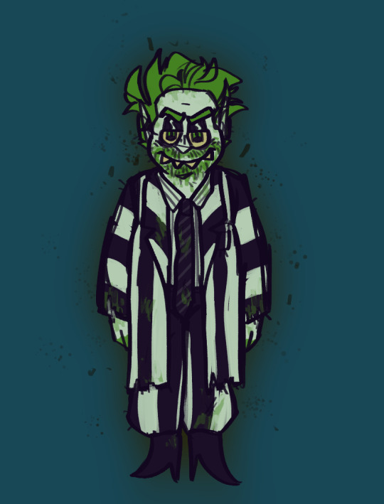
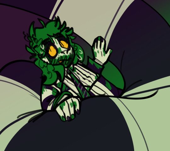
MY FIRST DIGITAL DRAWING OF BEETLEJUICE this is when I knew the short hair wasn't going to work for me
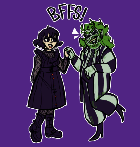
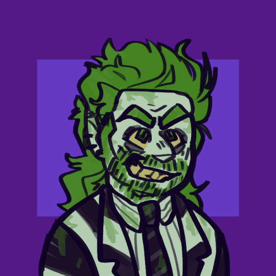


^^I started a drawing of this weird au beej a long time ago and never finished it so I planned to post this sort of sequel after I finished it but as far as I'm aware I never posted it
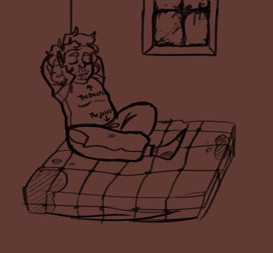
I thought the shirt would be a funny thing for him to wear when he moves into the maitlaind's attic
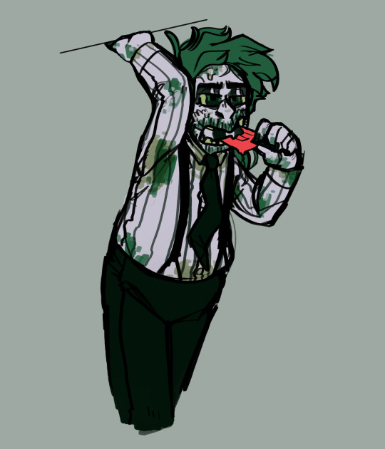
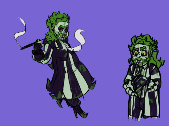
First Bettyjuice drawing!
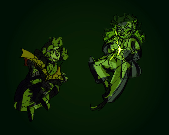

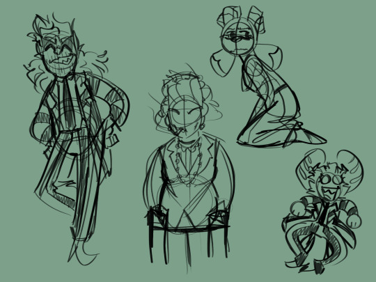
^^Featuring my ocs as Lydia and BJ
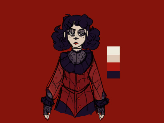
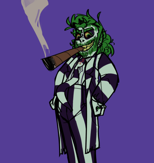
That one Ralsei image
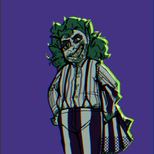
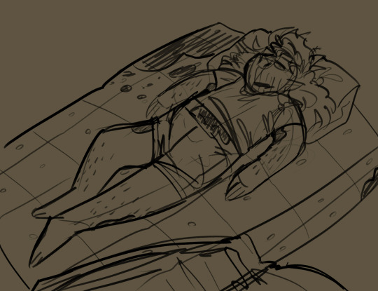
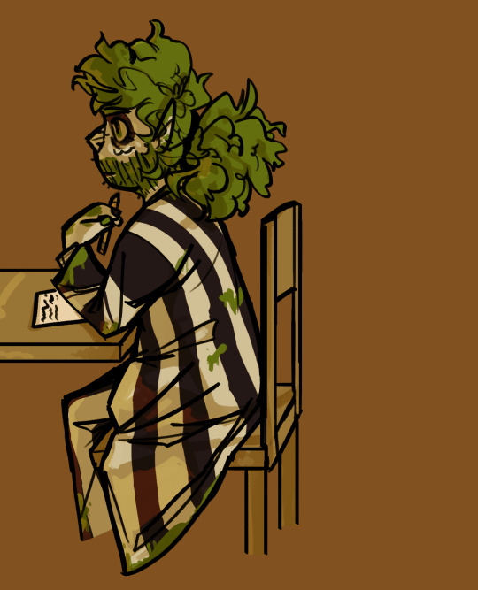
^^ This one is in the tour's fanart binder!
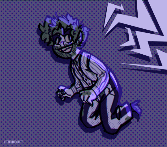
Drew him with short hair for the (technically second) time
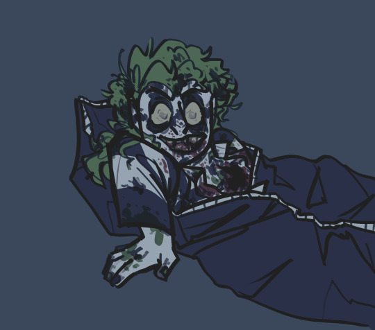
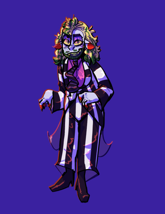
I forgot his beard. Inspired by the Haunting of Hill House (love that show)
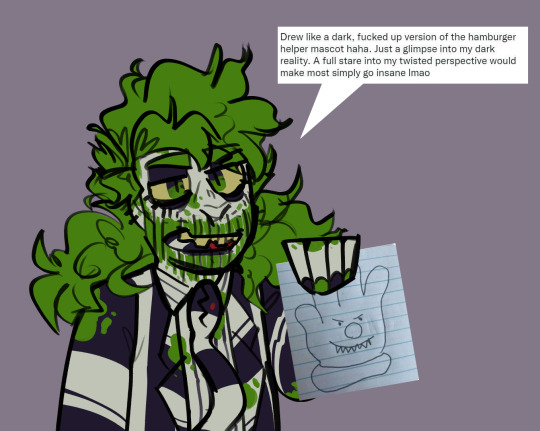
I miss drawing his nail polish
^^art trade (design belongs to ohwowhumans)
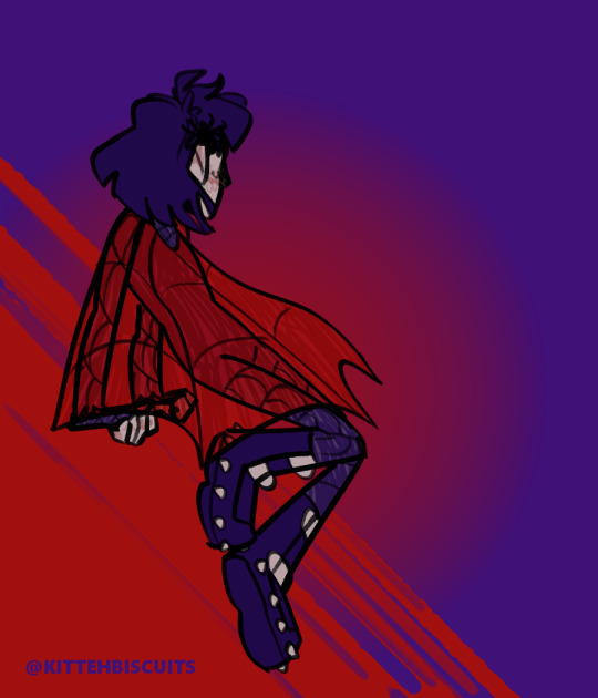
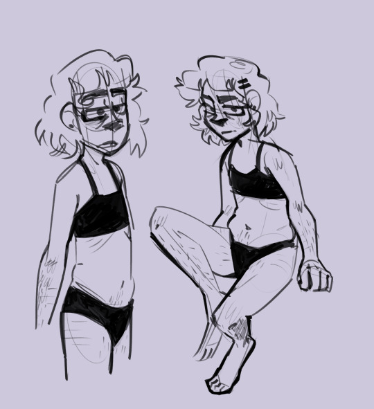

^^Ok I probably have posted this one but it's my Donnie redesign and I think he needs more attention.
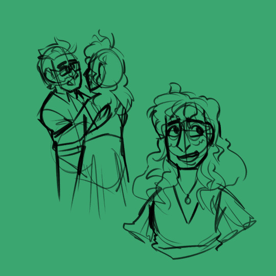
I think I drew this the night after seeing the final show

This one is also a celebration of the final performance
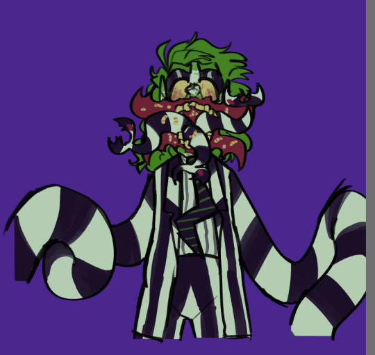
And this one
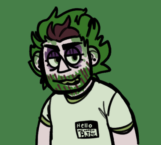
This is Beetlejuice from a really weird fucking dream I had (my mortician character was his coworker at a grocery store in the dream fun fact)
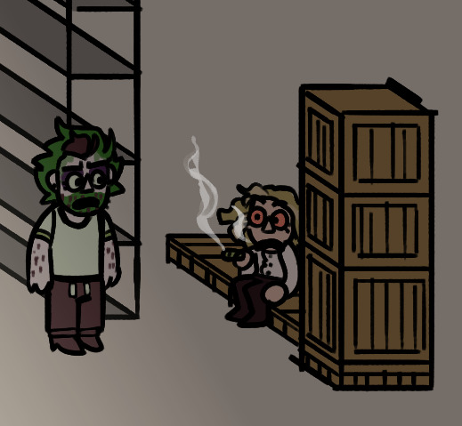
The premise was he caught her smoking weed in the back of the store and there was a big montage of them doing weed every day at work and then she said something that made him think she was gonna tell the boss and get him fired so he got a gun out but didn't end up shooting her and the dream ended (artstyle was vaguely south-park-esque??)
IT'S NOT LETTING ME UPLOAD ANYMORE WAHHHHHHHHH SCREW THIS.
#beetlejuice#my artwork#yeah idk either#sorry if you see this#I may upload the rest of my unposted stuff if anyone is actually interested in that#this post is kind of a gamble#I could do the cringe thing and be like “ohhh ewww I can't believe I drew like that it's so bad!”#but honestly I don't see the point#yeah it's hard to look at but I wouldn't be where I am now without it#in other words keep going guys I promise your art will improve#I keep drawing and my carpal tunnel keeps getting worse so I posted this to satisfy my posting desires instead of drawing something new
18 notes
·
View notes
Text
Just a reminder that it’s ok to not like your art, even if everyone says they love it. Just don’t spend all your time hating art you already did, it’s over move on to the next project.
#Don’t Throw out your “bad art”#If you do then you won’t be able to appreciate how much you improve#Art#artist#artist struggles#artists on tumblr#artwork#watercolor
12 notes
·
View notes
Text
Yay! About two months of improvement


#Ahah your boy is improving at such a fast rate that I can’t keep up!#I’m honestly really happy with how Yuugi turned out!#gotta admit I love his noodle hair#Yugioh#ygo#Yugioh season 0#yugioh Yuugi#Yugioh Kaiba#Seto kaiba#Yugioh fanart#redraw#artists on tumblr#my artwork#my art#rivalshipping
16 notes
·
View notes
Text
I dont know how, but with in a week my art has went from this

To this

With in a fucking week, and I haven't been using bases. This is all free hand.
I'm so fucjing surpised
#greychaos#pro endo#artists on tumblr#plural system#art improvement#digital artist#my art#digital art#artwork#art#digital drawing#your shoulder demon#your trans fallen angel#pluralgang
7 notes
·
View notes
Text

Jaxs design annoyed me so much I realized I also didn't like my sonas design that much anymore and revamped it. I basically just gave them a slightly different hair style and different clothing (big PANT).
They still have their fox tail, but now they have pawed feet instead of hooves or ig triangle ones when I doodle them.
Anyway I like how they look a lot! Its me!! The silly!! I may do colored lineart so their lineart is easier to see compared to the black tho unless Im doodling cuz thats kinda annoying.
#art#hyper art#my sona#sona artwork#sona art#sona#my persona#persona#i redesigned them#thats kinda it#not sure what else to tag this with because its not fanart#I hope this is an improvement in your guys eyes too#not that it matters#im happy with it so#its staying#digital art#drawing#my artwork#artwork
7 notes
·
View notes
Text


Redraw of Beta Luz because I like seeing my art improve and all that fun stuff.
#the owl house#toh#luz noceda#the owl house luz#luz the owl house#luz toh#toh luz#luz noceda the owl house#toh luz noceda#beta luz#the owl house fanart#toh fanart#digital artwork#digital drawing#digtial illustration#digital art#redraw#personal art redraw#don't you just love redrawing your old artwork and seeing big improvements in yourself?#adoralea art
18 notes
·
View notes
Text
Video about my childhood drawings...(PT 1)


#art#artists on tumblr#artwork#digital art#drawings#fyp#fypシ#illustration#my art#hurtful#im hurtin#love your body#love yourself#self love#self help#self improvement#self care#self h@rm#personal#face#mine#life#ptsd#actually ptsd#ptsd recovery#tw ptsd#complex ptsd#mental health#healthcare#health & fitness
9 notes
·
View notes
Text

Angels do dance. Just only in the right company
#good omens#good omens fanart#fanart#doodles#aziraphale#crowley#aziraphale/crowley#aziracrow#ineffible husbands#dancing#bookshop#i love them your honour#and that is saying something since i am aroace#repulsed by many romance#bar one#them <3#really happy how this turned out actually#things i want to improve on but happy#it gives the right vibe at least#i stole the background from the other artwork it was fun to fill in the gaps#cant even tell i had to manually add texture back in#can you
15 notes
·
View notes