#i usually just linked people back to the original psd
Explore tagged Tumblr posts
Text
On Gifmaking:
So season 2's coming soon, and I wanna reflect on making gifs ever since I came back to Tumblr. I can't believe it's been 2 years of making gifs for this show!!!!! Look at how large my folder is lmao

And those are JUST gifs lol
Anyways, over time, my style has changed, especially how I color edit Arcane gifs. I kind of strayed away from a stylized filter color into just something that looks a lot more "natural" and works with the original scene.
Initially, I thought I'd save time, but I ended up not using my old arcane preset PSDs and resulted to coloring almost every scene manually. So in the end, it takes even longer to make them HAHAHA. It takes around an hour and a half for me to make a 10 gif set, basically. It also helps that I have a photography background, so coloring/editing is a lot simpler for me.
Here's a lil before and after of a dark scene (hiiiii viiiiiii <3)


Arcane is a REALLY dark show, but it goes for most of TV shows. Many of them are darker and harder to bring up the lights to make stuff look nice as gifs. Some people don't like to color their gifs, and that's okay. I personally just like color edited gifs more.
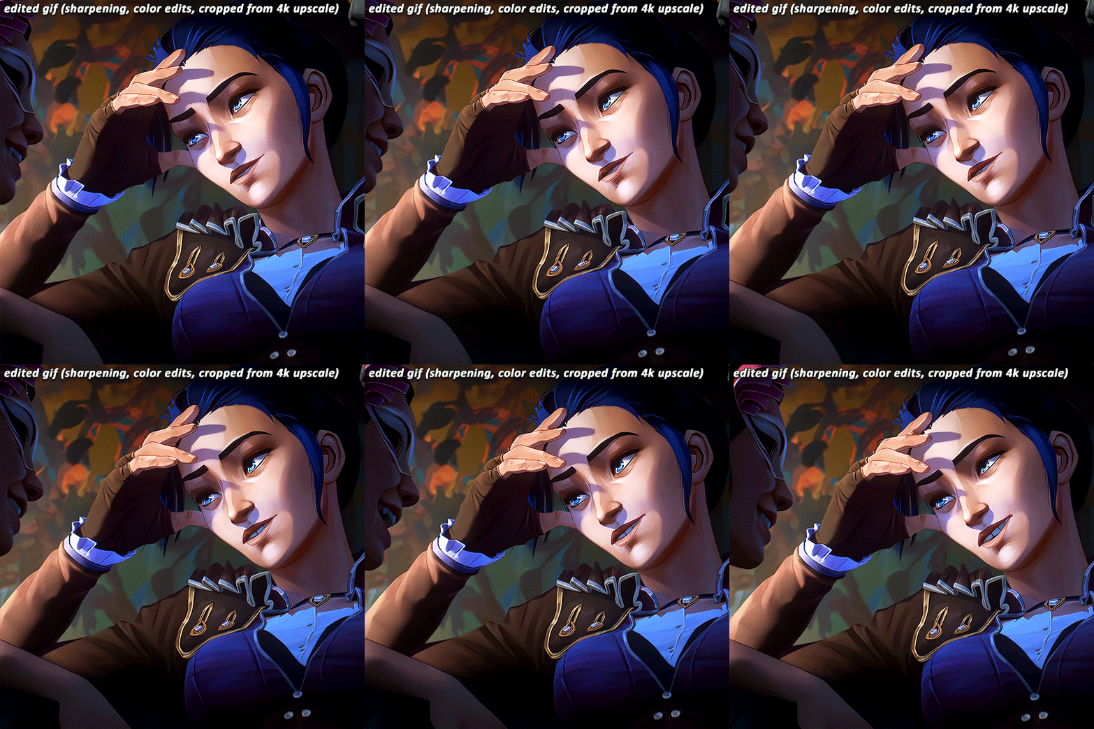
I've started learning how to upscale scenes myself, so that I have a better resolution and leeway to make things look "HD" more.
If you're wondering why my stuff look so "crisp", it's a combination of the scene's lighting, my sharpening settings on Photoshop and knowing how to upscale everything into 4k resolution. Of course, doing this needs an extremely beefy pc, which I am very lucky to own one.
Here's another before and after of a nicely lit scene. These are much, MUCH easier to do than all the darkly lit scenes because of shadows and lighting (caitlyn kiramman truly the rizzler <3)

I've been very lucky to be able to essentially take a nice, long break for like a month doing nothing after being so damn busy for the last year and a half, so it's nice that I was able to make a ton of gifs and be chronically online for a short while LMAO.
It's been so fun! But it's time to go back to reality lmao. I closed reqs for a bit because I was just so swamped with them the last few days, and I wanted to gif scenes that I like this time. I've done like 2 weeks worth of gifs. And you will see Vi a lot bc she's on my mind a lot heehee 🥰what can I say, she's such a babe <3
Here's a lil sneak peek, just look at herrrrrrr 🥰🥰🥰 and yeah, 4k upscaled resolution really helps making these tight crops, it's why i never went back to 1080p lol. It's how I’m able to make zoomed in gifs look decent (like the kirammountains gifset lol)

Thank you so much for all the support, likes, reblogs, and the nice tags you guys give. Yes, I can see and read all of them (both the nice and nasty ones lmao). If you have nothing good to say about the characters or my editing style, or anything related to the edit, please I beg you, just write a separate text post about it <3 If you have nothing nice to say, don't say it in my edits.
Lastly, thank you to the people who share my stuff outside the site and credit the blog and link them back here. I see you and appreciate you <3 You guys don't know how much I appreciate shoutouts and link backs, because people stealing my gifs is something that I've dealt with after making them for like a decade.
Tumblr is sadly not what it used to be in the 2013-2015 era. There’s definitely less activity as time goes by, so I appreciate all the people who credit and link back to this sideblog. Unfortunately, there’s more people who just repost them and it gets wayyy much more traction in other soc med sites. Yeah, ofc I get a lil jealous, but eh what can you do 😞 can’t really stop em.
I also don’t like putting watermarks because it personally looks tacky to me, but I understand why other people do it.
Anyways, if you reached at the end of this lil rambling of mine, thank you! I sadly might be busy during November because that's usually busy season, but I'll try to make time for making gifs of Season 2! Thank you and enjoy your stay on this lil sideblog :)
#personal tag#arcane#long post#nothing i just have free time rn and i wanna spend time on it rambling and yes im tagging the public tag lol#goodbye leave hello real life again
113 notes
·
View notes
Note
Your Skam Italia edits are gorgeous! ❤️❤️The colouring is so beautiful!! What psd do you use, if you don't mind my asking??😊
thank you!!!
i had a link in my faq to the original psd but they deleted, i don’t remember who made it and i don’t have the original anymore so i'll post it myself,,, here’s the link - the psd itself is not mine (credit to whoever made it, i’m sorry i don’t remember you) i just added a few extra layers, and this is the “base” i use for basically everything, aka i start with this and then add a bunch of other layers to make it look nice (mostly color balance, hue/saturation, and selective color)
i’d prefer not to post the actual psd i use for skam italia because i literally use the same psd for every gif (i copy/paste it and then add changes form there to fit different scenes) and i don’t want people copying my coloring, so i hope this is enough
#it's literally more than i've ever done#i usually just linked people back to the original psd#but it's not there anymore#ps asks#mimiofthemalfoys#giuly replies
5 notes
·
View notes
Photo
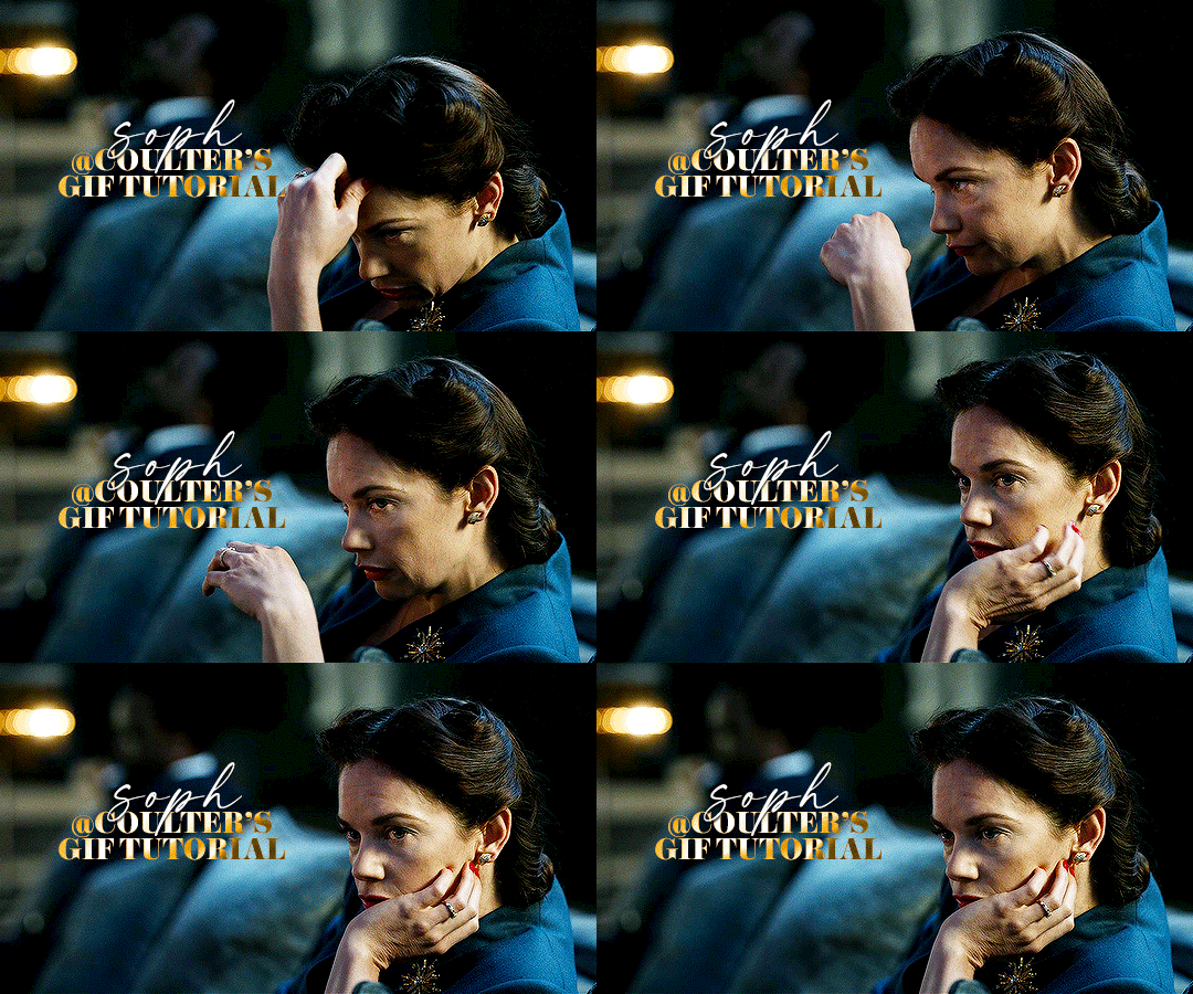
Hello! As requested, here is a tutorial on how I make my gifs. I would like to preface this by saying there are many ways to make gifs, and there’s no right or wrong answer imo. This is just how I personally go about doing so!
I will be using PS CC 2017, but as long as you have the video timeline option, it shouldn’t matter too much; on any version of PS, you should be able to adapt anything I mention here! You will also need some kind of screen recording software. I’ll talk a little more about that under the cut.
To start, you need the source material you will be making the gifs from! I get mine from snahp(.)it (avoiding links so tumblr hopefully doesn’t banish this from the tags lmao) and I always opt for either 1080p or 2160p. Not all laptops will support 2160p as it’s 4K, but either works great! You just want your gifs to be the best quality possible.
Next is where the screen recording comes in. I don’t use the screencapping method to make my gifs (where you use a program to cap a clip and then load those caps into a stack in PS). This isn’t for any particular reason… it’s just how my friends, (who very kindly taught me to gif), had always done it, so it’s now how I do it too. Personally, I find the quality to be just as good as the screencapping method, and have never noticed a difference between the two.
As I have a PC, I use the software built into it for screen-recording. If you go here: theverge(.)com/2020/4/21/21222533/record-screen-pc-windows-laptop-xbox-game-bar-how-to – you can see how to use the XBOX screenrecorder to record from files you have d*wnloaded. This also works on some streaming sites, but I think it depends on what browser you use. Personally, I recommend Firefox, as that seems to bypass a lot of the blocking and ads that occur when trying to do this sort of thing.
For MAC users, I have been told handbrake works well, as it converts MKV files to MP4, which can then be used to make gifs. You only need to convert part of the file to MP4 depending on how much you want to gif, and this also bypasses the screenrecording stage, as you can edit MP4 clips on Quicktime. I am told you can split them into smaller clips by going to edit > trim and it saves the new clip!
I have also used anyvideoconverter for small clips, but I can’t say what it does to the quality of your video, or how big of a file it lets you put in! With the XBOX screenrecorder, it doesn’t matter what type of video files you get, as the recording will save to MP4 anyway.
LOADING YOUR FRAMES
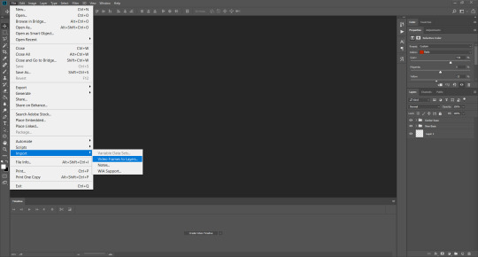
Now, go ahead and record whatever clips you want to gif. Make sure you have the video timeline open, by going to window > timeline. Then, go to file > import > video frames to layers.
Next, select and open your clip from where it has saved (with the XBOX recorder, it saves in video > captures). You should see a little window pop up, where you can move the sliders back and forth to clip your recording to whichever part(s) you specifically want to gif. I recommend trying not to load a lot of frames into photoshop at once, but I would be a hypocrite to say that, since I do it a lot lmao. Just be patient if you do!
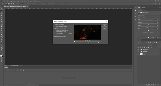
Once you have chosen the length, click okay. Never, EVER, I repeat NEVER click the button that says “limit to every __ frames”. This really ruins the flow and quality of your gif—it’s better to have shorter, but smoother gifs, I promise. And with tumblr’s new 10 MB limit, it shouldn’t be a problem anyway!
Then, your frames should open up. What we want to do is make them into a smart object, so we can edit all the layers at the same time. To do this, click the small button in the left-hand corner. ALWAYS click this first. If you don’t, it will only convert the first frame to a smart object and the gif won’t work.

Give it a second to sort itself out, then, on the right-hand side, select all your frames at once using the shift key.
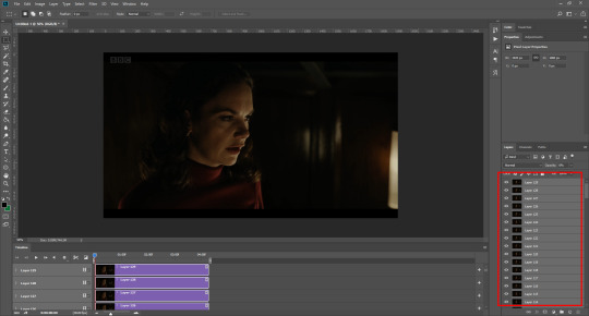
Then, go to filter > convert for smart filters. This might take a minute. Don’t click anything else in case PS gets angry lmao, just leave it for a second and it’ll do its thing. The more frames you have, the longer it takes! Now we have our gif, but it needs to be cropped, sharpened and coloured!
CROPPING
You want to start by selecting the rectangular marquee tool on the left-hand side, then drag it across by clicking and highlighting the area you would like to crop your gif to, like so:
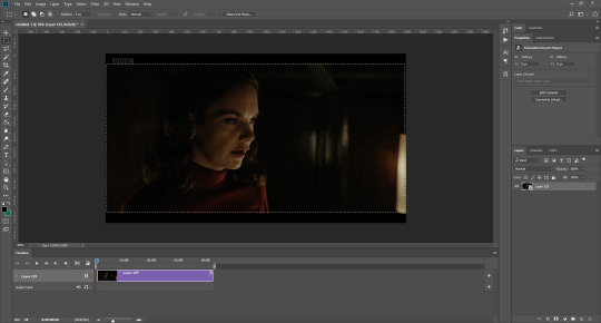
What I tend to do is select everything inside the black lines you sometimes get around your gif (this depends on what file you d*wnload), and also the tiniest bit inside the sides. This is because I��ve found if you crop it right up to the edge, you get a tiny bit of transparency on the sides of your gifs, which I’d rather avoid.
Once you have your desired selection, go to image > crop. Now, the dimensions for tumblr are 540px width, so all your gifs have to be that width. However, the length is up to you. I really like big gifs, so sometimes I even make a full square, or even longer. It’s entirely up to you, and what kind of set you want to make.
For the purposes of this gif, I will stick to what I usually go for, 540px by 350 px. This will mean you’ll have to crop some width off, but that’s okay, since Marisa isn’t central anyway. The cropping is always trial and error for me, as sometimes people move out of the frame within in the gif. The best thing to do is just try it, and then move the slider in the timeline window at the bottom to see if the person stays inside the gif, and if not, adjust accordingly.
Next, go to image > image size:
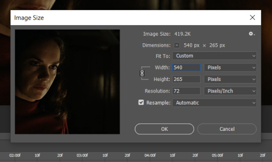
In this box, if I put the width as 540, the gif is a smaller height than I want, as it keeps to the dimensions of the gif when you load it into PS. That’s okay, just put the height you want instead, and we’ll crop off the excess.
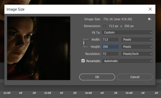
Then click OK. Using the rectangular marquee tool again, we need to remove the excess width. Part of the reason I like this version of PS is that it tells you the width of your selection as you do it, but you can always use the ruler as a guide, and check the size of your image by going to image > image size again.
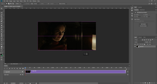

Again, use image > crop, and your gif should now be the correct size!
You can also use the crop tool in the timeline window to crop the length of your gif:
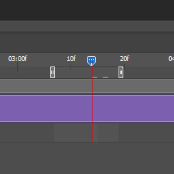
However, I tend to wait until later on to do this (which will be explained further down!)
SHARPENING
Next you want to go to filter > sharpen > smart sharpen.
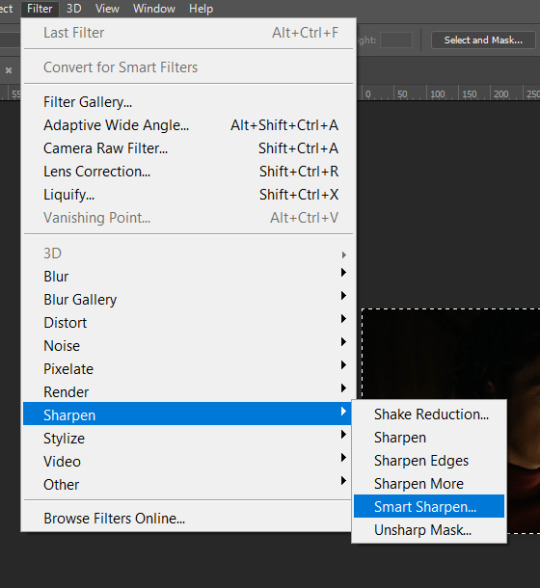
These are my settings. However, 0.4px is very sharp, too much so, but that’s easily fixed.
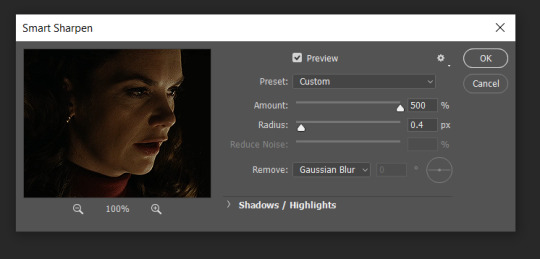
Go to filter > blur > Gaussian blur and then set it to 1.0.
Now on the right-hand side, we need to reduce the blur, so double click the little adjustment button, and change the opacity of the blur. I usually go for 20-30%!

Then click OK, and that’s your sharpening done!
COLOURING
I picked this scene on purpose as it’s dark, so good for showing how to colour a gif. I have a base psd which consists of some very basic adjustments, but it mostly exists so I don’t forget what adjustment layers I like to use. I adjust them every time I make a gif, essentially colouring each gif from scratch.
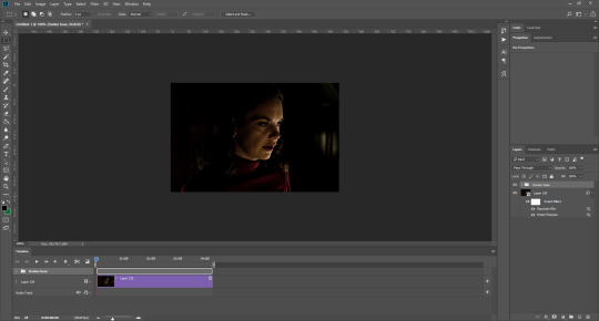
In this case, the psd actually makes it darker. So, what I will do is turn each layer off, and adjust as I go. A lot of people say using lots of adjustment layers ruins the quality of your gif… I have never found this to be true, as long as you are gentle with them. If you whack the brightness right up to the top, it’s going to ruin your gif no matter if you use 1 adjustment layer or 100. I would just say use your common sense, and adjust a little at a time!
I start with a simple black to white gradient map set to soft light, because I think it helps you see depth once you add some brightness to it. I usually do this on about 10%, or more if needed. It’s probably unnecessary, I just like how it looks!
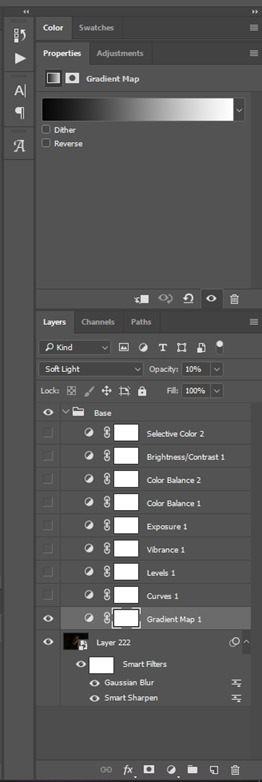
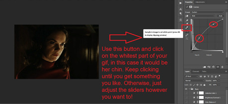
Then, I move onto using curves and levels. This is where things can diverge depending on who you’re colouring. If this person is white, it doesn’t matter too much. If they’re not white, you don’t want to white wash them. My best advice is to play around with it. By adding vibrance and other (usually the red) selective colour settings later, you can ensure you don’t change the person’s skin tone from what it originally was. You can also use layer masks at varying opacities (various shades of grey), on your curves and levels, to remove some brightening so that you’re not changing anyone’s skin colour. Just brighten slowly and check in with yourself honestly about how your gif looks.
Some people don’t like using levels, or curves. It’s completely up to you. I tend to use both because levels are good for bringing depth, even if not brightening (though I like to use them for that as well).
One thing you can do is use the white point of the gif to make PS adjust the curves itself, however I like to drag the sliders myself and see what it looks like. Just make sure it’s not too bright, as we will be using further layers to brighten more, after.
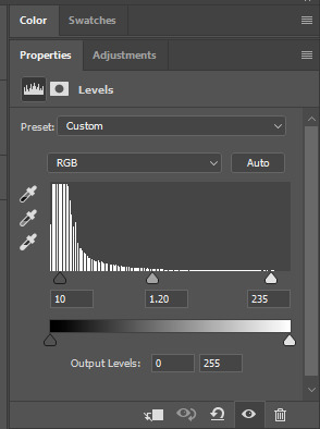
Next is levels. The slider on the left controls the black point, the one in the middle controls the midtones, and the one on the right controls the white points. The black brings depth, the midtones adjust the overall brightness, and the white points produce stronger highlights. Again, you’ll get a feel for how this works as you practice. Just don’t use the white point excessively, especially if your characters are not white.
Then I add vibrance (+20!), because we’ve removed a lot of it when lightening the gif. Next is exposure, which I find brings out the highlight and shadow areas more effectively:

Then colour balance! This helps with scenes that might be a certain colour, i.e. too blue, too green, too red, etc. Moving the sliders in the opposite direction of the colour your gif is will counteract it. The best thing to do when accounting for different colours, is to make a new layer every time you change colour, so that you don’t get confused. I always add a new layer for colour balance and selective colour if I want to change more than one thing. So one for red, one for yellow, one for pink, etc.
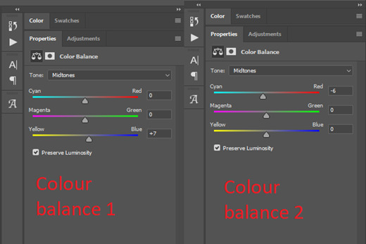
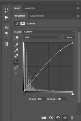
A layer of brightness just to make the gif pop, and because the scene is extra dark, I added a very gentle extra curves layer:
SAVING YOUR GIF
Time to save the gif. You can go ahead and file > export > save for web (legacy) now, but then you’ll have to reopen the gif to reset the frame rate from 0.07, to 0.05. Instead of doing that, I use a modified action. The original was made by the very talented @elenafisher! So I do not take credit for that at all. You can find the original here: elenafisher(.)tumblr(.)com/post/190817437374/gif-sharpening-action-2-preview-download and in my resources tag. Please reblog it if you’re going to use this!
To use an action, first make sure you have actions turned on in window > actions. To load in your action, go to the little lines circled, and then load the action from your downloads:
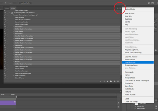
Obviously if you don’t want to sharpen your gifs yourself, you can use the action as it is, and it will give you a beautiful glowing effect. If you’d just like to use it to flatten your gif into frames like I do, make sure to take out all the items I have highlighted:
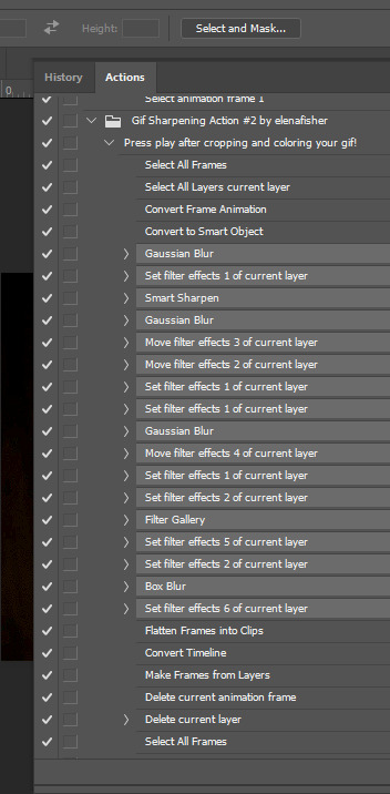
Until it looks like this!
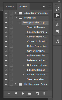
Make sure you have the layer under the file name highlighted, and then click the play button at the bottom! (If you get a screen saying select all frames cannot be found, don’t worry, just click continue!) You can delete the layer that does that if you want, I just keep it in case I realise I’ve forgotten to do something, because you can click cancel and edit your gif before you flatten it. Of course you can undo the steps to get back to the smart object version of your gif, it just takes longer!
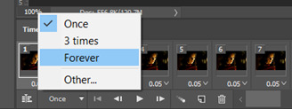
And now your gif is in frames and set to 0.05 already, so you don’t have to change the speed! All you need to do now before saving is change the gif cycle to “forever” in the bottom left-hand corner:
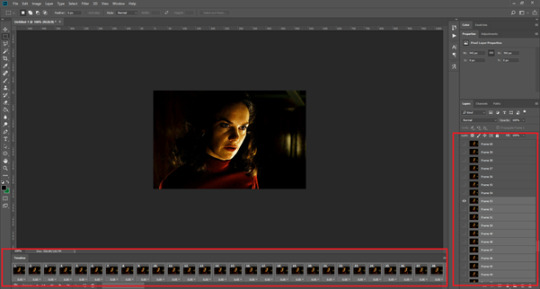
Then to save the gif go to file > export > save for web (legacy). Sometimes, the gif is bigger than the tumblr 10MB limit. You’ll be able to see this in the bottom left-hand corner of the gif save settings. If this is the case, I like to preview the gif, to see whether it would be best to cut frames off of the beginning or the end, or both. When you’ve decided, you can select the frames at the bottom, and in the right-hand side panel, and delete them both using the little bins/trash icons.
I keep checking and deleting frames until I get the gif under 10 MB! Just don’t delete frames from the middle, as then you’ll have the same issue as if you selected “every other frame” when making the gif: it won’t flow!
Lastly, these are my save settings:
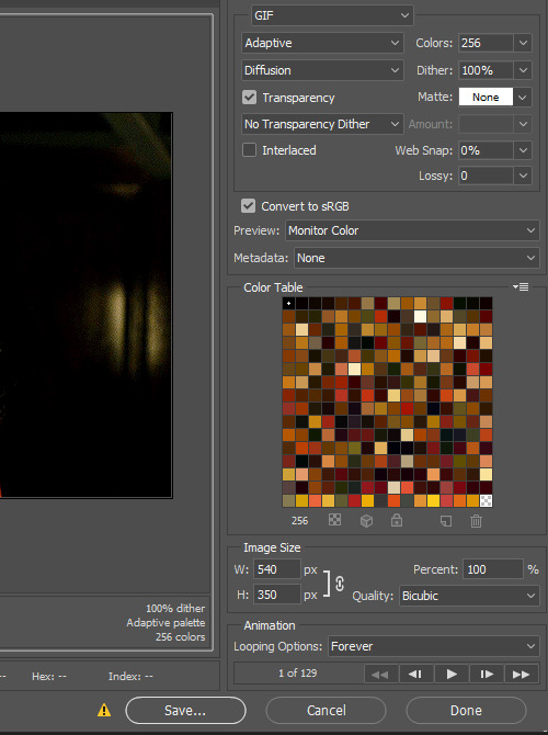
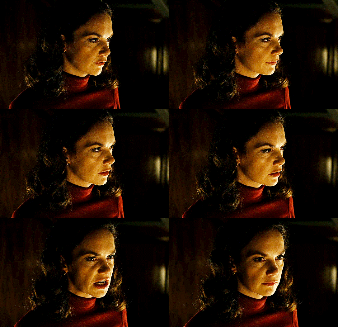
So that’s it! That’s how I make all my gifs. Blending I do when the gifs are in the grouped, smart filter stage, whereas text I add on during the framing section above! Really hope this is helpful, please feel free to ask any questions you may have! 💖
#gif tutorial#tutorial*#completeresources#yeahps#chaoticresources#allresources#mikesmom#usergeo#userava#usertix#usersmile#usertom#if you'd like me to cover anything more advanced just shout#i wanted to show how i add text too but tumblr wouldn't let me add any more pics#but people can let me know if that's something you'd want!
516 notes
·
View notes
Text
HOW TO RECOGNIZE REPOSTED GIFS/EDITS
lately, i’ve been seeing a huge rise in reposts of gifs and edits, and of spreading those reposts. i don’t think it’s a malicious thing at all from people who reblog them, but it’s important to be able to spot them in the future so that we can stop perpetuating this kind of behavior. so without any further ado, here are a few ways to recognize reposted gifs and edits. please keep in mind that it’s usually a combination of a few of these factors, and that one of them being present doesn’t necessarily mean the post is DEFINITELY a repost. be smart, but also be vigilant!
1. non-matching watermarks a watermark is a (usually) small/unobtrusive placing of the gifmaker/editor’s url or username somewhere on the gif. for example, here’s a gif i made; you can see my tumblr url, bringmoreknives, very lightly in the upper left corner.
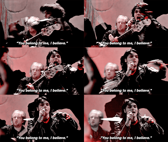
now, just because you see a post from a blog with a different url than the one in the watermark doesn’t necessarily mean it’s a repost. editors and gifmakers change their urls, just like everyone else does. however, the watermark is a good place to start. you can always go to that original url and see if you can trace them to the blog that posted the post in question. and if you’re an editor, make sure you watermark your shit and leave a clear trail to your new blog -- i have redirect pages set up on all my old urls, all the way back to when i first made this blog in 2013.
2. mismatched gifs or edits being posted together, or media being posted in an awkward way in my opinion, this is the best indicator of reposts. oftentimes, because they don’t make the content themselves, reposters don’t understand the logic of making a cohesive gif or edit set, and so will cram a bunch of random gifs/edits of different sizes, video qualities, and psds/effects together into one post. they also might post gifs that were meant to be side by side on top of each other or vice versa, resulting in a reduction of quality and everything looking super pixel-y.
in a post, this will look like:
dramatically different colorings on gifs being posted side by side (not just, like, one or two black and white gifs in a clear color scheme, but one sepia-toned, one original colored, one extremely lightened, etc)
parts of some images being cut off due to different image dimensions
media from a bunch of different events, appearances, episodes, etc. that isn’t tied together by a common theme
3. use of tumblr mobile “fonts” in the caption this is a super obvious one, imo. again, on its own it’s not necessarily a giveaway, but i don’t know any editor who posts original gifs from their phone, simply because you need photoshop to make them, and therefore the files will be on your computer.
4. captions that comment on the content, or a lack of caption at all lack of a caption is less indicative of a repost than an odd caption is. but reposters often caption their reposted comment with something relatively irrelevant, like “omg he’s so cute” or something. additionally, many original posts will have a link to the video source in the caption -- so if everything else checks out AND there’s a source linked, it’s probably fine. (again, lack of a linked video source is not a marker of a repost: tumblr recently changed the rules where any post with an external link won’t show up in tags, so many creators leave off source links now.) also, worth mentioning that people DO often repost with the caption “not my gif/edit/pic,” and this is a great reminder that that is not an acceptable alternative to simply REBLOGGING POST FROM THE ORIGINAL SOURCE.
5. lack of a tag to indicate that the work is the poster’s own creators will often have tags for all of their original content. this can be anything from “mine,” “my stuff,” etc. to a series of asterisks or other punctuation marks that aren’t likely to be used for anything else. additionally, many creators will prominently display a link to this somewhere on their blog, if they have a custom theme. if a post doesn’t have some kind of tag indicating ownership that you can click on and browse to see more original content, that can be a major red flag.
6. crosstagging/adding irrelevant tags reposters want to get their posts seen, reblogged, and liked by as many people as possible. they thrive off clout for stuff they didn’t make. therefore, they have a tendency to add a SHITLOAD of tags that don’t really have anything to do with the actual subject matter. for example, if it’s mcr reposts, they might tag all of the band members, even if they’re not all featured, all of the album names, a ton of bands in the same musical circles, and even instagram-esque hashtags like “cute,” “emo,” “scenecore,” etc.
and there you have it -- here are some of the ways i know to spot reposts from seven years as a creator on this site. you get better at it the more time you spend in a fandom, because you’ll recognize content that popularly gets reposted, and also just learn to have a trained eye for this sort of thing. but until you reach that stage, i hope that this helps. please reblog to spread the word, and don’t be afraid to call out reposters, with links to the original post if you can find it, because creators on this site have a hard enough time as it is. and feel free to add anything else you use to spot reposts!
185 notes
·
View notes
Note
I often don't make things for poc because I'm scared of whitewashing them. Can you link to the tutorials that show how to go about this or could you explain it yourself? I'm always too scared of making things with poc in them and I don't want to whitewash anyone so advice would be amazing!
hi! i guess i could share the things i know about it but i do want to clarify that i’m not an expert at editing! so, if you want really indepth help, it would probably be best to ask someone else!
as for tutorials, these are the ones that have personally helped me! this one by @fadenet (specifically pale/pastel gifs including characters with dark skin), this one by @blueshelp (specifically about east asian and southeast asian celebs), and this one by @kispesan (specifically about edits). this is a post with a ton of resources for gif making, including things about coloring and other anti-whitewashing tutorials (highly recommend!).
when it comes to what i do, it really depends on what i’m making! i’ve made a couple of edits specifically about unwhitewashing characters of color which you can find here for examples, but overall what i do really depends on the kind of edit i’m working with.
i’d also like to quickly say that i use photoshop! while the basic coloring will cross into other programs, some of the tools/names might be different.
lets use an edit of the character aisha from winx club as an example! in season 8 of winx club, the characters aisha and flora (both having dark skin) were whitewashed. the following pictures are a screenshot from the series, showing the whitewashing, and the same sc but edited to reflect her original skin tone and hair color.
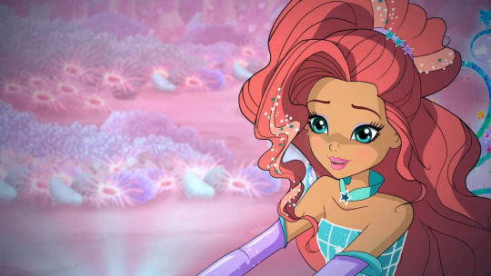
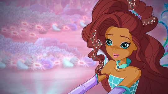
in this edit, i actually went in and recolored her skin using the brush tool (yes, it takes a hot minute to do, but you get faster the more you do it). the reason i do this for picture edits, is purely a personal preference. i like having the control of only editing the parts i want to edit and keeping the rest of the picture the same as before. personally, i don’t love using the selection tools so when i don’t need to,, well, i don’t.
if you have the time, patience, and ability to physically recolor still pictures, i’d definitely recommend it! it allows you to use the eyedropper tool on the original skin tone which makes for a much more accurate edit. taking advantage of the selection tools and paint bucket tool can make the process a lot quicker too!
now, lets use a different method, one that i personally use for things like videos and gifs (basically, anything moving)!

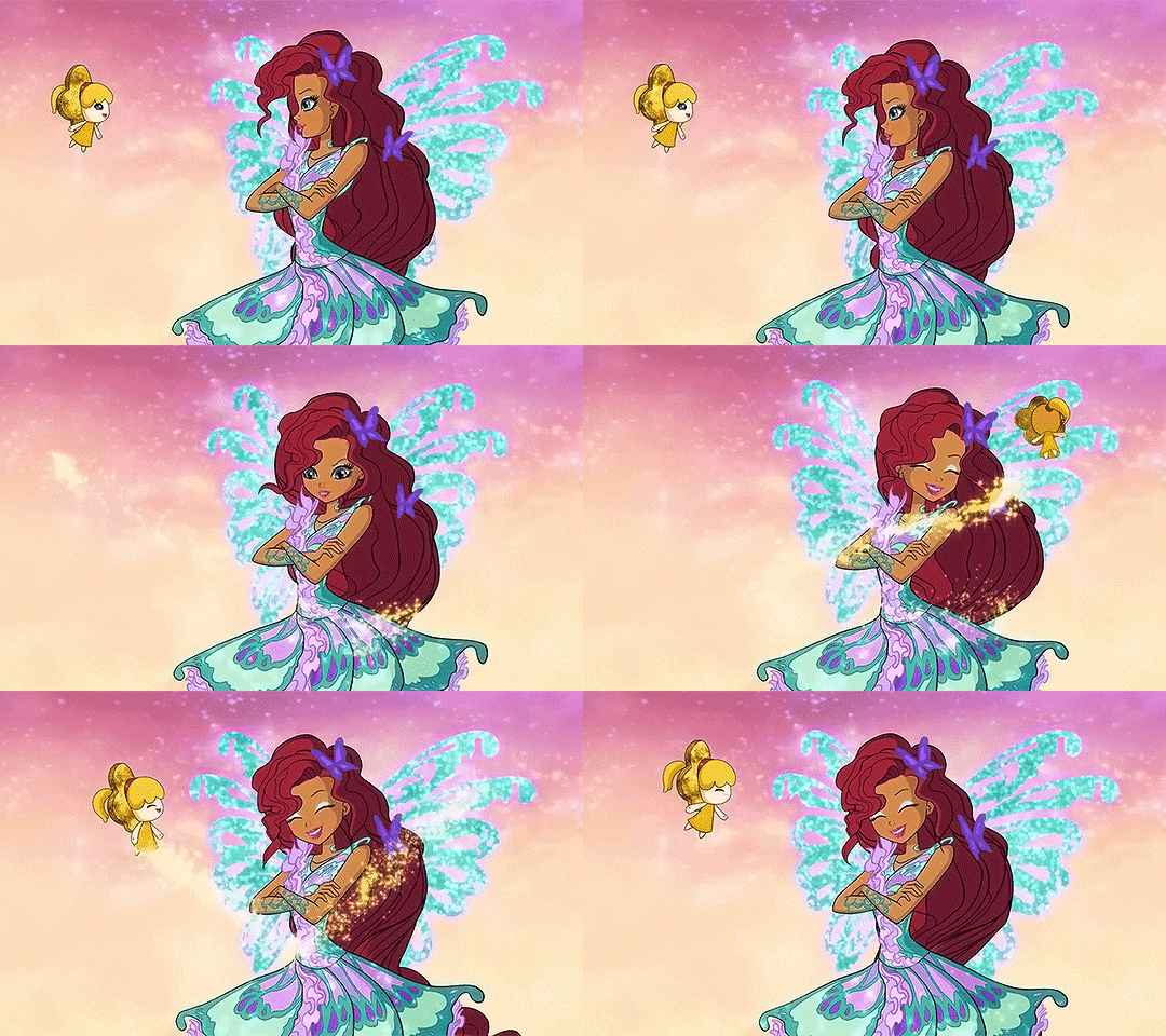
these gifs come from the same season as the above example and as you can see, aisha is heavily whitewashed in the first one. now, this is where coloring becomes your best friend!
so, you have your gif ready for coloring, maybe you used a psd/filter or you did your own thing, regardless, the person in the gif is whitewashed and you want to fix it. so, what do you do? (now, obviously this is just one example. there are many others ways to do this!). what i do, is almost exclusively use the hue/saturation and the color selection layers (i will occasionally use the brightness and curves layers depending on the scene)!

^^this little “guide” or whatever shows what you need to find for this tutorial.
the first thing you should do, is figure out which colors primarily make up the person’s skin tone. a good way to figure this out is by using a hue/saturation layer. click the hue/saturation, which will show a menu similar to the one in the picture, and go through each color and turn the saturation all the way down, so it says -100. don’t mess with the hue or lightness levels yet, just the saturation. this will show which colors make up the person’s skin tone! as an extreme example, if someone’s skin was green and you turned the saturation of greens all the way down, that person’s skin wouldn’t look green anymore, it’d look like someone put on a black and white filter specifically for the color green. just keep a close eye on what changes! now, this saturation change is just temporary! after you know which colors are in that person’s skin tone, you can just delete the hue/saturation layer. (you really only need to do this if you aren't used to coloring darker skin. once you get used to it, you likely won't need to, but it can still be a good reference point if you're lost on what to do)
so, after figuring out what colors you need to focus on, go to the selective colors layers, so you can edit just those colors! for our example here, aisha’s skin tone is mostly made up of reds and yellows while her hair is mostly reds and magentas. when i’m editing her skin tone and hair color, i only focus on those colors. in the selective color layer menu, you have four other colors to control; cyan, magenta, yellow, and black. although it would help, you don’t need to know everything about colors or color theory for this! just mess around with the colors sliders until you get something close to their original skin tone. you may need multiple layers of selective colors to get this right! don’t panic if it doesn’t happen right away, just keep going.
something i think is incredibly important during this step, is having a picture of that person/character open! that way you can actually go back and forth to see if what you’re doing is close. another tip, having another file open with a completely white background with a colored circle of that person’s base skin tone on it really helps. this way you can use the eyedropper and brush tools to see how close what you have in the edit is to the original (basically, use the eyedropper tool to select the skin tone in the edit and then use the brush tool to color it next to the circle of the original skin tone. this helps you see up close how similar they are!). here's an example!

the first example is from the gif and the second is from the still picture edit! you'll notice that the gif example doesn't match up exactly because in that specific scene aisha was directly in sunlight, making her skin slightly brighter than usual, while the photo i used for reference has normal lighting. remember to pay attention to things like lighting and shadows!
now, at this point you might be thinking, “this tutorial only shows what to do for animated characters and i make edits with real people :(”. don’t worry! the second method still works! here’s an example using a real person, kim taehyung from the group bts.

obviously, this isn’t perfect because i spent like. two minutes on it. so the skin is blotchy, the lips are too red, and the background changed. but the way i edited it is mostly the same as the gif example i used! the only difference being that i also used a color balance level to darken up the whole picture. however, besides that i did the exact same things as i did with the gifs of aisha above. if you're making edits with real people, then just do whatever you usually do to make sure it looks more realistic.
i hope all of this made sense? i’ve never done a tutorial before and basically all of what i’ve said has already been said! but here are some more tips for the road:
-when editing black people/characters, don’t make their skin red
-when editing indigenous people/characters, don’t make their skin red
-when editing east asian and southeast asian people/characters, don’t make their skin yellow
-pay attention to lighting! if a scene has darker lighting, skin will look darker than it is!
-on the flip side, if a character is right in front of a very bright light, their skin will look lighter
-don’t avoid the colors red and yellow, especially for people with tan/darker skin. those colors are always essential. they won’t look bad in your pastel edit.
-don’t be afraid to ask for help! if you have mutuals who make edits you can try asking them. or even making a separate post asking for help from any followers that edit! basically, if you truly don’t know what to do, either look it up or ask for help.
-do not just post the whitewashed edit/gif/art with the excuse that it’s, “just the filter” or “just the psd”. take responsibility for what you’ve created.
-if you’re using a filter/psd and you really can’t figure out how to unwhitewash someone.. use a different filter! ik you might really like the one you picked, but that doesn’t excuse racism. there are lots of filters/psds out there that don’t whitewash. use one.
i’m gonna be honest, unwhitewashing is really easy as long as you know how to work whatever program you’re using. and even if you just started, it’s still pretty simple! if you’re scared of making edits with poc because of whitewashing, learn how to not whitewash.
anyway i hope this helps? let me know if something doesn't make sense or needs more explaining! but i'd really recommend looking at the tutorials i linked as they're more in-depth and offer a lot of insight!
#hnng let me know if something doesnt make sense im a little stupid#photoshop#photoshop tutorial#coloring tutorial#anti whitewashing#anonymous#answered#mine.edits#(kind of?)
42 notes
·
View notes
Text
#showyourprocess
From planning to posting, share your process for making creative content!
To continue supporting content makers, this tag game is meant to show the entire process of making creative content: this can be for any creation.
RULES — When your work is tagged, show the process of its creation from planning to posting, then tag 5 people with a specific link to one of their creative works you’d like to see the process of. Use the tag #showyourprocess so we can find yours!
I was tagged by @leonzhng for this NiF set 💕💕💕 thank youuuu 💕💕💕
I’ll be tagging:
@mylastbraincql for this mdzs network anniversary set
@theyilinglaozus for this gorgeous woh set
@wangxianbunnydoodles for this One Basking in Infinite Glory set
@sassassassins for this amazing woh set
@tiesanjiao for this vincenzo set that personally came to my house and tore my heart out
okay so this is the gif

0. software (Mac)
Quick Time Player for screen recording
iMovie for .mov to .mp4 conversion
Photoshop 22.3.1 (that says it will work with .mov clips but that is a bold-faced lie)
1. planning
yeah I don’t do that 😂
my planning is like
these scenes, although a few moments/minutes apart, look to be filmed from the same angle/perspective
I bet they’d look nice by themselves
then I screen record the whole 2 mins or whatever, tuck the clip away in a folder, and 80% of the time forget it’s there
which is why my laptop memory hates me
2. creation
Quick Time Player
Screen recorded the 2 min scene w/no sound
I trimmed 3 clips with Quick Time out of the 2 minute video, all of them about 2-3 seconds long
Made sure I quit Quick Time completely, or it will make iMovie crash lol
iMovie
Imported the three clips
Exported as .mp4
(settings)

then made sure I quit iMovie completely too, or it will make Photoshop crash lmao
Photoshop
Import video frames as layers
Trim + Resize (usually I start with 800 x 1200 or 600 x 900 depending on whether I’m working around hardcoded subtitles, logos, etc. bc that gives me 540 x 360 which is a size I prefer)
Convert to Smart Object
Sometimes I do my own sharpening, but here I think I used this action by rubyred (I think? I don’t remember)
Before I start fiddling with colors, I always check if I have a psd that might work well with the scene (remember I’ve done no planning, so now I’m just flying by the seat of my pants)
By some miracle, I had saved the psd for the coloring I made for this Legend of Fei gifset + threw it on there to see how it looks
And it looked all right :)
If I remember, I throw on my watermark (I did for this one, yayy)
Export - Save for Web
If the gif is over 10MB I go back and trim some of it off (which is a guessing game bc trying to actually play a gif on Photoshop crashes it every time)
Ideally post (usually I just schedule the set for the next open slot in my queue and completely forget I made it until it posts) unless I look at the set in my drafts, decide it’s trash, delete it, and watch like 3 hours of mriad instead
I’m trying to remember what I did to get that coloring and I’m pretty sure it was nothing crazy, there were some blues + greens + cyans in there I selectively enhanced and then just lowered the saturation all the way down. Selectively enhanced the black + maybe increased yellow on selective red? I feel so stupid that I can’t even remember what episode this NiF scene is from so I can go back and see what the original colors were, and make like, reasonable deductions about my own process lol
Thanks to that psd, this NiF set actually only took about 15 mins to make, when this one (where the psd comes from)

had actually taken like 2+ hours and 3 Photoshop crashes AND I forgot the watermark RIP (don’t be like me kids, save your psds + remember your watermarks)
🥰
#showyourprocess#THANK YOU HANYIIIIIIII#if i only had a process that wasn't like#i lost interest in gifing half way through#try 10 things and photoshop crashes and refuses to reopen#*CRIES BC CYAN*#fuck it that looks fine#makes seventeen versions of same gif and trashes all of them#lmaoooo#ily#🥰🥰🥰
16 notes
·
View notes
Text
Kit’s OC Time {Part 2}
🌼So I got this wonderful ask from @chocolatetwix and I got super excited. There is a lot here so I just decided to make a huge post about it. That and I can save it and work on it too so that’s a bonus. You can’t really do that with asks. This will be in a couple different parts so that it’s not too overwhelming!
Let’s continue!
Costume/ CC: Back in my DA days I used to draw a lot of animals and I had a fursona as well. Now I am not sure if I am going to keep her or not but I do actually still like her design. I might just tweak it a tad.
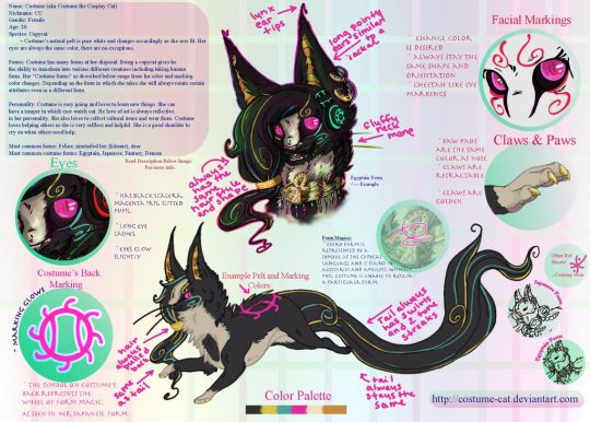
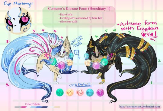
I have an incredible piece of artwork from Nukerooster of her and I just need to share. Go check them out as well (>>>LINK HERE<<<)
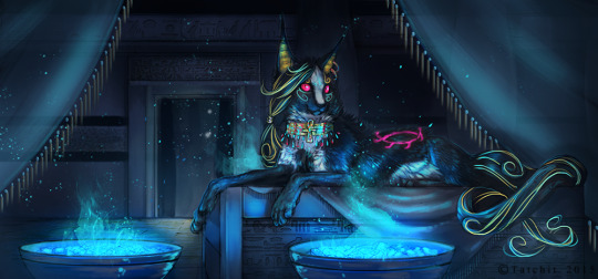
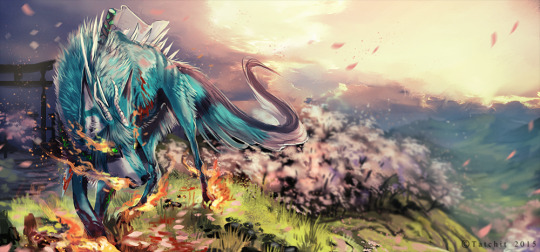
Akuma: Another fluffy boy but I have this OC named Akuma, original... I know. He will most likely make an appearance in my Hell world once I re work him a bit. Basically he was a demon that caused a lot of Chaos and havoc but messed with the wrong village. Mid transformation he got a blessed sword rammed through his chest keeping him that way until the sword is released. It also perpetually bleeds, never heals, and drains his power. Poor demon baby boy. Also I realize that he is old... but like... I still love his design if that is even possible. He used to be red in color which I will post and then I redrew him a few years ago to see how he would look more current. Now he is teal ish.


Nuke also did this incredible one of Akuma.
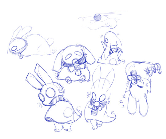
Because of my major I sometimes randomly come up with cute RPG character designs and I really wanted to do one of little monster animals. I created this little guy during one of my classes.
Spip: He is a little vampire ghost bunny. The cross shaped vile around his neck is filled with his HP restore (Blood) If you have a lot the vial will be full but if you don’t have enough it will deplete over time. Poor little Spip just wants to be friends with people but because of what he is they run away. He is kind of my homage to Bunicula if anyone remembers that book. I have ideas for his little buddies too like a Frankenstein cat and so forth. Just a cute little idea.
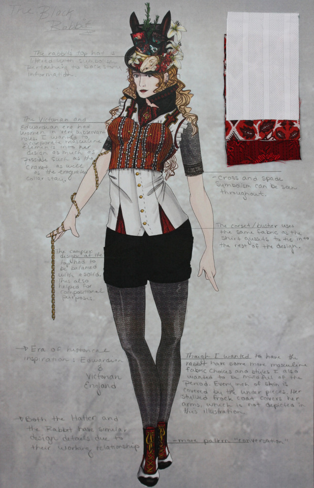
Lastly we have the Infernum (name will probably change I am kind of thinking about calling it Twisted Otherworlds or just Otherworlds) cast which is even larger than the Hell side and I don’t even want to think about that right now X’D It is a little overwhelming. What I do have however are some of the designs I made for them, costume wise. This was back during my fashion degree projects. Think realms with twisted fairytale characters that happen to used to be real people from different periods in time. This is the point I really started to dig into the horror genre and it kind of shows though looking back I think I always kind of have been...
The story is basically a fairytale romp and during the day light hours it’s perfectly fine all zanny and fun but at night is a whole other story. You see the souls that live in these Realms used to be living breathing people. The only thing is that if you end up here though you lose all memory of that life. The Madness which is like a magical curse infects these souls and turns them into their own personal fears or horrors. It’s all back story based and intense so I won’t go into it. There are different monsters and characters and even though it’s an older idea I do think it still has a lot of potential. The realms of the Muses so to speak. Their day and night are switched as well so no matter where you are in the world you dream in the daylight and it’s night there soooo your usually going to get a pretty lucid horrifying nightmare but if you sleep during the night time you will have good dreams. Just don’t fall asleep during the day light hours X’D
Anywhoo! Here are some of my favorites and again these are really old so their designs will be tweaked for the long run. I also apologize for the quality the actual PSD files are not on my laptop so I have to settle with the project photos I took a long time ago. In order you have the Rae the Black Rabbit, Lucian the Hatter, Ace the Cheshire Cat, Crow (probably change the spelling) the Scarecrow, The Woodsman, and one of Pan’s Lost Boys. I also included the top hats I made for them because I still think they are pretty neat!
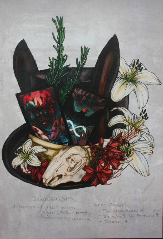
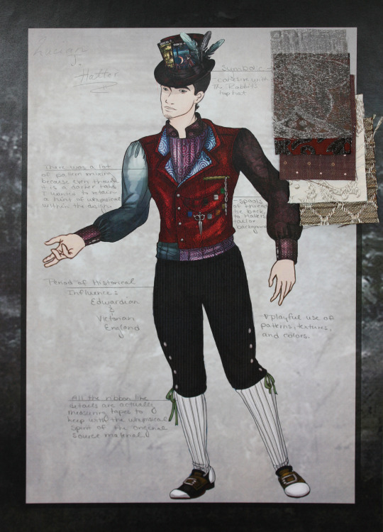
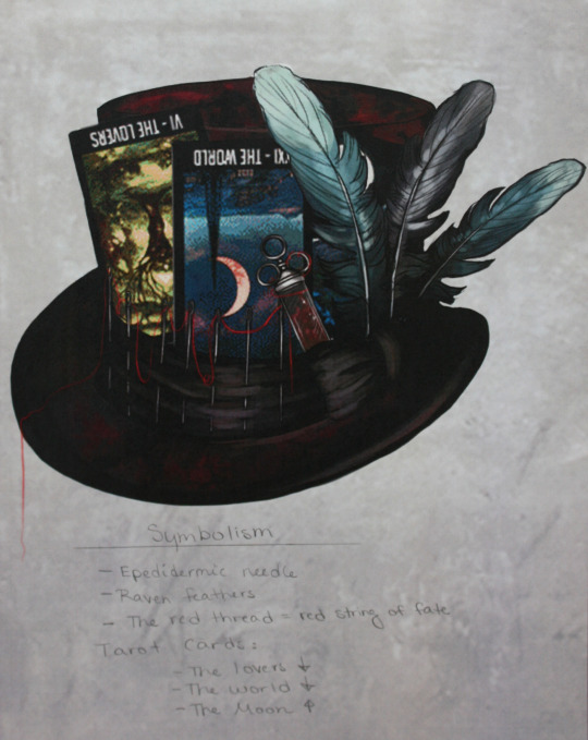
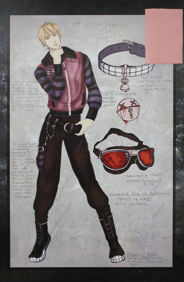
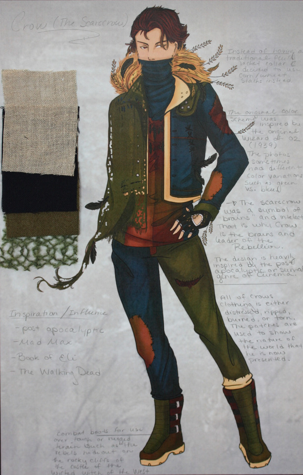
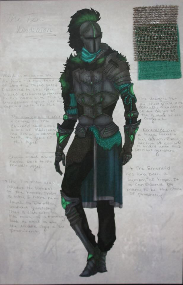
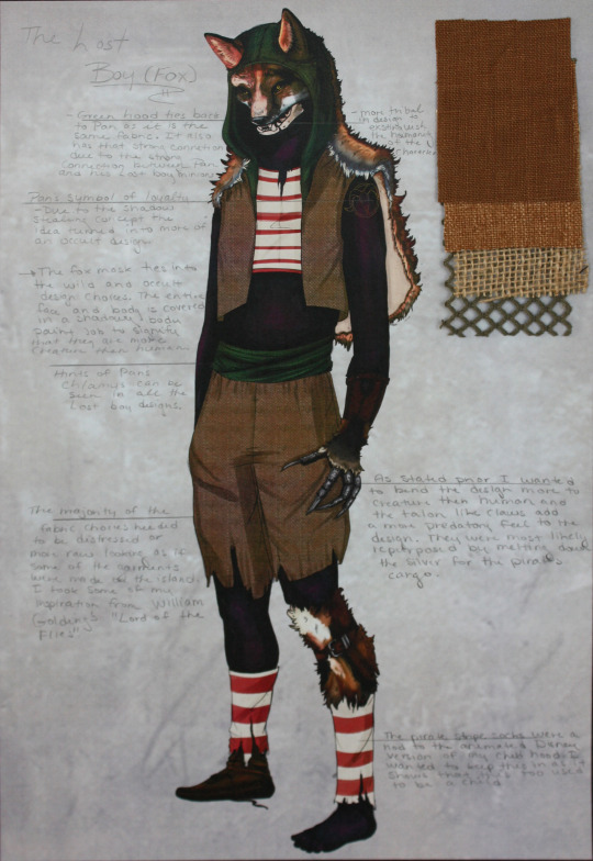
There are also some REALLY old designs for the Twisted Otherworld characters. They had more of an anime flair to them. That said there are a couple characters that I want to share since they are actually important despite the artwork being older than Methuselah.

Maximillian March/ Mad March: Crazy March Hare? I think so. He is a puppet master of sorts in the story and I have to redraw him but he has these deep swirly eyes and sharp teeth. (huh... looks like that design choice happened a long time ago... WELP)

Tweedles: One of my friends was able to pick this out immediately but yea... these are the Tweedles. Their nightmarish 1910′s gas mask Orwellian horror cyborg versions anyway. I have a full image of Dee somewhere that I need to find... (edit) AH there he is... btw I was like 15 when I did this design so I gotta question what the heck was going through my brain.. unless it was that Doctor Who episode with the children that just freaked me out... yeah.. that was probably it. Are those real organs and muscles you ask... yes... yes they are.

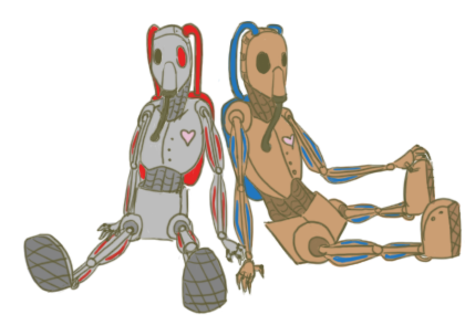
#oc#kits asks#nearly a decade of characters#original characters#persona world builds#Otherworlds#species#god I feel old#thank you for asking!#part 2#Rabbit#Hatter#Hare#Cheshire cat#lost boy#woodsman#Crow#Spip#Akuma#CC#OLD fursona#furry?
23 notes
·
View notes
Photo
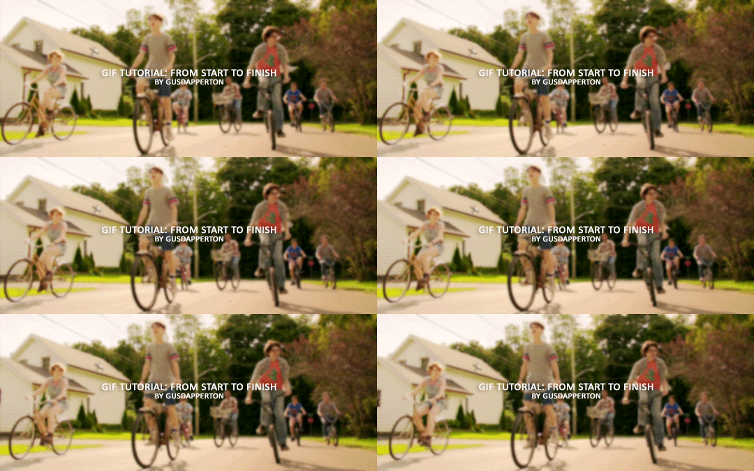
Recently someone asked if I would do a gif making tutorial, so here I am! I’m going to make this as in depth as I can, but if you have remaining questions or problems, feel free to send me them and I will try to help you to the best of my abilities.
Disclaimer: There are many ways to make a gif, but this is the method I’ve been using for years. This tutorial is very long and may make the process seem tedious, but I assure you, once you get the hang of making gifs you could do it in just under a few minutes!
This tutorial includes:
links to all of the sites and programs I use
lots of rambling (w/ pictures)
a short masterlist of my favorite photoshop sources at the end
Links:
Adobe Photoshop CC 2017
PotPlayer (64 bit)
uTorrent
4K Video Download
Photoshop, PotPlayer and uTorrent are the three programs you MUST have for this tutorial. The 4K Downloader is for YouTube/Instagram, which there are other sites you can use for that, but I prefer 4K to make sure I’m getting the best quality I can get. Best part, they’re all free :)
Torrent sites:
PirateBay
yts.lT (favorite)
Nyaa (anime)
These aren’t the only sites that offer torrents (nor are they the only ones I use). When you download torrents, try to be careful; if you think it’s sketchy, go ahead and try to find another. It’s not as scary as it seems, just be aware of what you’re clicking. Some are total duds but I usually have a pretty smooth time finding what I need unless it’s something unpopular or obscure. Whatever site you’re on, try to use the latest links (past hour/day/week) if it’s for a new movie or ongoing show. Also, if there’s the option, download magnet.
PirateBay gives me an ongoing issue with their links, so I try to avoid getting torrents from there if I think I can find it elsewhere. YTS is my favorite site for movies; they’re trustworthy and I’ve never had an issue :)
HD/1080p torrents often start popping up when the BluRay comes out, so don’t depend on any site to have it the day something premieres. Usually you’ll have to wait a few weeks/months. Until then it’ll just be CAMs which no one likes!
For this tutorial I’m going to be making a gif from IT: Chapter Two (link- click 1080p.WEB). Once you’ve gotten your torrent, open up uTorrent. It’ll ask you where you want your download stored, which I always just choose my Downloads folder.

It’s normal for it to take a while. It doesn’t take all day, but 40 min-2 hrs is usually what I have to wait. My laptop is pretty slow, RIP.
After it says it’s downloaded, you’ll have the .mp4 sitting in your Downloads folder (or whatever destination you chose, but Downloads is the default).
Before you close uTorrent, press the torrent file and then delete it (trash can icon above) so you can delete it from your Downloads folder. Otherwise, your computer will tell you the torrent is still open in the program and won’t let you. You won’t need it after you’ve gotten the .mp4.
So now we have the movie! Go ahead and open it up in PotPlayer. Right click > Open file(s) and select the movie. It will start playing automatically.
Note: You need to make folders for the frames to be held in. Its been so long since I’ve set up PotPlayer, I can’t remember if the program made the capture folder that’s in Desktop or if I did... if not, go ahead and make sure you have designated folders. (If you’re making 4 gifs, you need 4 separate folders, and so on.)
Go to the scene you’d like to gif. The scene I chose in this movie is one of the end scenes of the young Losers Club on their bikes (2hr43min).
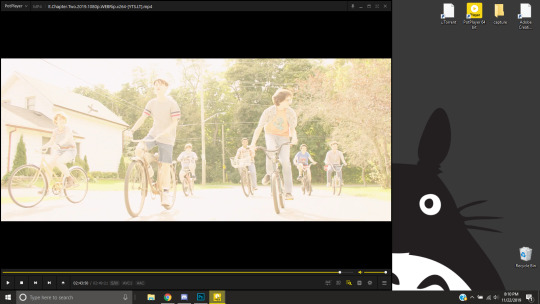
Slide the edge of the program in to minimize the screen a little for the next step.
Now, right click > Video > Video Capture > Capture Consecutive Images
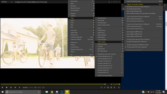
This will pop up:
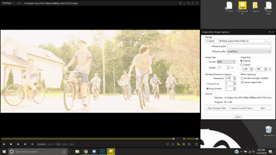
Here is a closer look at the settings:
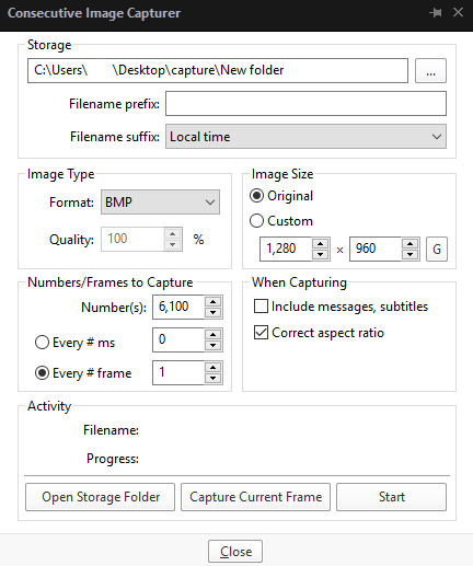
The key things to look at are the Image Type, Image Size, and Numbers/Frame to capture. And of course, make sure you have the right destination chosen in the Storage box because that’s where your frames are going to be. PNG and BMP are the best quality for the type of image. Always choose the original size of the frames. And, make sure you’re saving every frame (Every # frame must be kept at 1).
Make sure to start a few seconds before where you actually want to make a gif. Sometimes (every time lol) the start will lag and you won’t get every single frame you want or thought you were getting. In my case, the screen is fading from white, so I’m going to capture a few frames where the white can still be seen before the full color appears. This way I know I’m getting the most frames I can, and I don’t have to redo it later when I think my gif is too short because I’m missing frames.
While the movie is still paused, press Start in the smaller window, then press Play on your movie. Keep your mouse over the Pause button and end it when you’ve gotten all the frames you wanted. Then, Stop back in the small window.
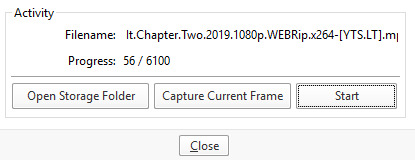
I’ve saved 56 frames to my folder.
The size of the gif you want to make dictates how many frames you’ll be using. Remember the file size needs to be under 3MB. Recently Tumblr increased that size to 8MB, but the quality of the gif will drop drastically, so I ignore it now. (Although, it probably won’t look too different if it’s at like 3.1MB and barely goes over that limit.
540px wide- ~30 frames and under. Because these gifs are so wide, naturally, they’re already going to be a large file.
268px wide- ~50 frames
177px- ~70 & up
These numbers aren’t concrete, though. The taller and/or more contrasting colors in a gif, the bigger the file will be. The shorter and less contrast in colors, the smaller, and more likely you will be able to fit more frames into your gif. These are just what I find to be the case most of the time.
For the gif I’m making now, I’m going to keep it at 30 frames, so I know I’ll be deleting ~26 out of the 56 I saved to that folder.
Tip: I rarely make big changes to the coloring of my gif if I really like the way it looks. If my gif exceeds 3MB, I’d rather delete frames. IMO, nice coloring comes before fitting in as many frames as I can.
Moving on, now that we have the frames we want, go ahead and open up Photoshop. Go to File > Scripts > Load Files into Stack. The drop down that says ‘Files’ I change to ‘Folder’ and simply select wherever your frames are held. For me, they’re here:
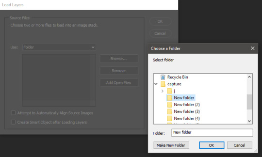
Press OK, let them all load up, then you’ll press OK again in that grey window.
It takes a minute for all of the frames to load up in photoshop. The more you have, the longer it’ll take. Again, my laptop is slow as hell, so maybe it will be really fast for you.
When they’re done loading, go to Window > Animation.
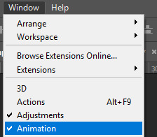
Then, inside the Animation tab, make sure you have Create Frame Animation selected:

Then once you’ve pressed it Create Frame Animation, your first frame will appear. But we need them all, so look over to that four bar icon to the right of the tab and press Make Frames From Layers.
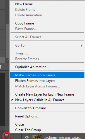
They’ll load all at once, but the gif is backwards. To fix that, simply go back to the same four bar icon and click Reverse Frames.
I’m going to go ahead and delete the frames I don’t want. For me, the beginning frames are unusable because there’s that white fade out in the start of the scene I chose. I’m going to delete those, then go ahead and delete any frame that comes after frame 30.
Here’s where I’m at now:
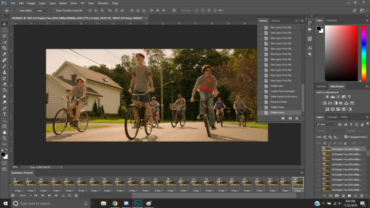
Now to resize it. I like the dimensions it currently has, so I’m not going to use the crop tool at the moment. But once you’ve cropped it to where you like, go to Image > Image Size and a new window will pop up. The widest a gif should be is 540px. How tall it is is up to you. Since I’m keeping the dimensions currently, my gif will resize to 540x225.
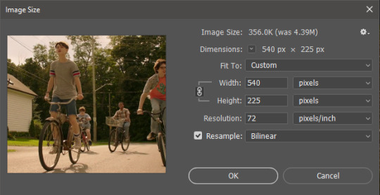
It’s VERY important to note, where it says ‘Resample:’ you need to have Bilinear selected. This effects the borders of your gif. Also, don’t make the mistake of resizing it in centimeters instead of pixels.
Now that it’s resized, you need to set the the frame delay. I choose either .05, .06, or .07. Anything outside of that looks to fast/slow to me (but I know a lot of people who like the way .03 or .04 look. It’s all preference.)
To select all of your frames at once, select the first frame, hold shift, then select your last frame. Then press where it says ‘0 sec.’ > Other > type in however fast you’d like your gif to be. I’m going to use .06. Double check every frame says .06, otherwise it’ll stay at 0 and be way too fast.
Now, again, click that four bar icon and select Convert to Timeline. The Animation tab looks like this now:

For now, look at our Layers Tab, so we can delete every frame that doesn’t show an eye icon next to it (as you can see, my first 5 frames):
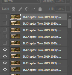
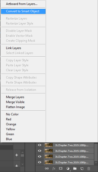
With all of the excess frames gone, select all of the frames you have left (hold shift again) and then right click > Convert to Smart Object
Now, we see this left:
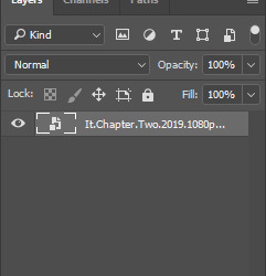

And, technically we’re done with the very basics of making a gif. But you definitely should sharpen and color it for it to look ‘nice’ and aesthetic. I’m going to color my gif now. Personally, I rarely use psds. It takes way too long for me to look through millions of psds, so I make coloring my own for each gif I make. I have two of my own psds, if you’d like to use either of those.
PSD01- this is a super basic psd I use to make any gif look brighter and more vibrant. There are more details in the post on how I use it.
PSD02- I included this psd within another tutorial for how I do color edits.
Both of these are my base psds, but if anyone wants me to do a separate tutorial for how I color gifs on a regular basis, I’ll gladly make one of those too!
Once you’re happy with how the colors look, it’s time to sharpen. Select your gif layer and go up to Filter > Sharpen > Unsharp Mask.
Here are my settings:
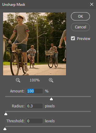
(Amount: 100%, Radius: 0.3px, Threshold: 0 levels)
Now sharpened and colored, here is my final result ready to post:
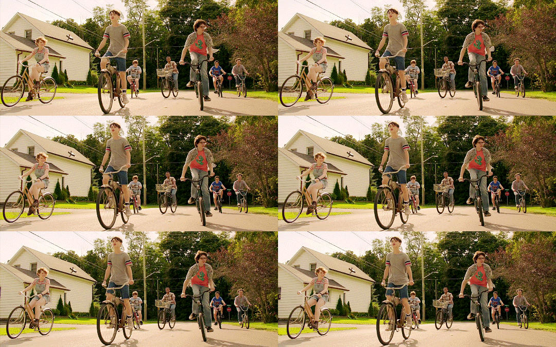
If you’re wondering, this gif is 2.42MB, so I could still make it brighter/more vibrant if I wanted to!
To save, go to File > Export > Save for Web.
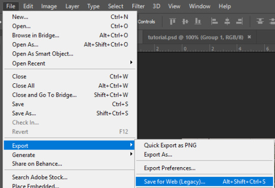
A new window will pop up. There are more settings that you should check to make sure your gif looks as nice as possible, but they’re also up to preference and can range from creator. This is what I prefer:
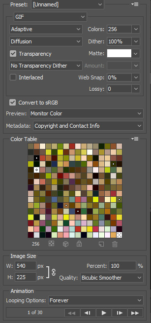
Diffusion is good for bright and/or colorful gifs, but if the gif is dark, I’ll change it to Noise to see if I like that better. Also, always double check you have the loop set to forever, otherwise your gif will only loop once.
And you’re all done!
Here is a short masterlist of resources I recommend checking out and use often:
allscallie (DeviantArt)
Their psds are beautiful, especially if you’re into making moodboards. Everything is very aesthetic!
sttoneds (DeviantArt)
More psds, especially if you’re into gifsets/photosets that are color focused.
BEAPANDA (DeviantArt)
Literally everything they publish is gold. From brushes, textures, psds, renders; they have it all. Their packs are extremely well made, too. I highly recommend bookmarking them. (The renders and brushes look beautiful when you use them in your headers!)
allresources (Tumblr)
There are so many photoshop resource blogs here on tumblr, so to make it easy on you, theirs is the one I recommend the most! The tutorials and resources she makes herself are really great too.
Thank you for reading, and good luck +.゚(*´∀`)b゚+.゚イィ
143 notes
·
View notes
Text
Final 2020 Update: 2021 Goals!!
Cross posting from my devART
Also links to all my alts and shit will be at the end of the post if you need them!
So some of these may be unrealistic due to my struggles with ADHD/Depression Combo but. I wanted to get these down somewhere so you guys can see them and be aware..
Please note, my executive functioning abilities are absolutely Butchered on the regular by my ADHD alone, and the various stressors of 2020 have absolutely taken anything else I might have had in that department and tossed it out the window.
Something something something, financial stressors outside of my control sends me into shut down mode and I can't do anything productive or even fun until it's handled, but because I'm not doing anything productive, I'm not making any money, and the stressors gets worse and worse and it just ends up in a horrible cycle where I constantly want to die because I'm not able to create anything to relieve the stress! Which is why you've all seen... pretty much a standstill on my productivity save one or two pieces a month if I'm lucky
That said, I'm going to start trying (hopefully with some outside help/accountability to keep me on track while I'm unmedicated) to put a system in place that doesn't make me constantly want to die while like. maybe actually getting stuff done! So I'm making some optimistic goals for 2021 regarding both my art and ability to make money, so here goes!
I'm breaking this down into 3 parts:
Changes to expect regarding my social media, commissions in general, posting, etc;
Overall Goals for 2021;
and Goals for January specifically.
Changes to expect going forward from here:
I'm going to be making some changes regarding my social media accounts, including this one, mostly concerning when, where, and how I'm posting.
I am also going to be making some changes to my commission policies, prices, and payments in the coming year, namely:
Lastly, I will be making some changes to my art discord server!
Moving forward, I am going to be MOST active on my twitter and tumblr accounts. They're just easier for me to maintain in general, and although I hate twitter's formatting, it's just easier and faster, and frankly after deviantART and Instagram fucked with their websites/algorithms, it just makes the most sense for me as an artist.
I'm also going to be making an effort to make scheduled cross-posts on all my accounts. In the past, I've been really irregular about when and where I post things (most things got posted to my old tumblr account but never here, i rarely remember to post to instagram, etc).
This is going to include commission slots, finished piece dumps, etc.
I will also be making an effort to semi-regularly post sketch dumps, both digitial and traditional. I am also considering at this time offering a monthly digital download of my sketch collections, though I am undecided as I'm not really sure how many people would be interested.
Increasing commissions prices to reflect time spent working on specific commission types, as well as my personal cost of living.
Planning and announcing commission slots in advance.
Taking and finishing regular commissions to cover living expenses on a monthly basis
Payments will be exclusively through paypal invoice, and will be broken up in halves: first half will be taken up front after I have started and given proof of start (base sketch), the second half will be paid after completion, with WIPS given between first and second payment. Fully completed art will be given after receipt of second half. This is both for my personal protection as an artist, as well as for the comfort of the commissioner as my completion time can sometimes be long due to my ADHD/executive dysfunction.
Moving forward into 2020, my discord will be SFW, but 18+ only. This is a personal comfort thing. I'm 25 years old now, and just really don't want to spend time hanging out with teenagers.
I'm also going to start trying to schedule art streams again! Since this is the only place I can live stream due to my art computer's limitations, it just makes sense to like. Schedule them so more people are able to attend. I haven't decided exactly how that's going to look, but once I have I'm going to make an announcement and formatting guide somewhere for people to see so they can make an informed decision about joining the server.
I will also be regularly posting in the server again. This may or may not be cross posts from twitter and such, we'll see, but I DO plan on being more active there since it's been kind of dead.
I may also reformat the whole server again. We'll see!
Goals for 2021
Regular Adopt Sets -- 2-3 per month. Size, price, and number in set will be decided on case by case basis.
I'll be doing a monthly prompt for myself as well. This is just to get me back in the habit of creating things I like for myself to just feel... less bad about my art in general, and about making art. Also it'll be good for my artistic development i think?
Keeping a monthly sketchbook for warm-ups and in-between pieces. May be offered as a paid download at the end of the month, we'll see.
Might start a patreon? This is EXTREMELY dependent on what my userbase looks like. Tiers and rewards to be decided at a later date
Regular traditional sketches + scan and upload of said sketches. May also be offered in the monthly sketchbook.
Draw more self portraits & self-expression pieces! I don't know if any of yall realize how repressed I've been in the last year without therapy, and I did't either until I forced myself to pursue a vent piece earlier this month, and then felt immensely better afterward so. Going to start doing that! Maybe I'll feel better weee
Regular posting to social media! (see changes above)
Drawing less fantrolls bc I'm just bleh about them lately, drawing more original content!
Drawing fancontent that ISN'T homestuck? We'll see but I'd like to. I don't usually draw fan art bc like. Idk in my mind I don't feel like my interpretation of things is important or cool and I think thats a confidence thing and I'd like to change that so! I'm gonna start making more fan content.
Draw more full illustrations & backgrounds in general because I actually enjoy doing them it turns out?
Practice painting more !! Both traditionally and digitally....
Goals for January 2021
Finish at LEAST 1/4 of my art queue. I'm shooting for half, really, because fully completing it might actually kill me but! We'll see! Maybe I'll surprise myself. But I'm setting the goal low to keep my mental health problems in mind.
Finish and release the base set i've been working on, on and off. It's an homage to the old pixel doll days of 2009-2012, and the full sheet will be free to use (with stipulations, as I have some people blocked that I don't want using it). BUT! There will also be a mix and match .psd that will be pay to use (it'll be pay to use a, bc it'll be huge, and b, bc the edits to make it mix and match results in like 6 seperate bases in general so.... yeah. pay to use)
Finish the pay-to-use base pack i started in june (i may scrap and restart though, we'll see)
Possibly release all old p2u bases of mine in one pack on gumroad? price tbd but it will include old iterations as well as unreleased remakes.
Making some dainty-specific bases! One will be f2u, one will be p2u.
I have a whole dainty YCH set for january! I just have to finish the example... (:
Perhaps I'll be announcing a collaborative project later in the month! It depends on where each of us are at, at the time! We'll see! (: You should be excited though! It'll be a ton of fun!
EXTERNAL LINKS
Instagram
Twitter
Tumblr
deviantART
Discord server
2 notes
·
View notes
Text
graphics guide
a guide filled with basic info, tips, and answers to common questions that i hope helps people who want to start making graphics
*this was made based on my experiences of making graphics and is what i thought was important to cover but everyone has different ways and approaches so dont feel the need to follow everything on here
what is a graphic?
a graphic (also known as ‘gfx’) is a image edit that incorporates various elements (textures, filters, text, etc) in order to visualize a idea or to create a aesthetic composition
unlike making gifs, there is no right or proper way to make a graphic so dont get too caught up in the idea that a graphic should look a certain way - just stick with your style and what you think looks good
anatomy
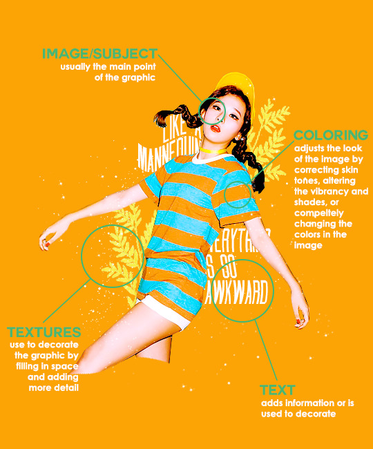
image/subject
usually the main focus of the whole graphic
you should always try to use a sharp hd picture - getting it from the original source is always the best option
make sure the source of the picture allows editing - pictures from public sources like a company or the news can be edited while fansite pics and scans need to have permission asked (and if they give you permission make sure you link them when you post your graphic!)
coloring
often referred as ‘psd’ because that is the format they are in (i.e. pink psd pack)
comprise of multiple layers that can alter the images look
a lot of people make their own colorings since the outcome of the look also depends on the image’s original coloring
textures
smaller cut out images that are often used to decorate the graphic
can also refer to a image that can be use as a background of a graphic
can be found in the form of a png (copy + paste into graphic) or a brush (”painted” on to the graphic)
avoid using any textures that does not state the original poster made them - you could unintentionally be using someone’s work that was not made to be used [read more about it here + resources that you can actually use]
text
text can be used to tell information or just for decoration
try to choose fonts and colors that are legible
faq
what software can i use to make graphics
most people use some version of photoshop (i currently use photoshop cc 2018) and a lot people have it cracked but if you cant afford photoshop, find a cracked version or a patcher (i used adobe zii 3.0.4 for mac), or are uncomfortable with getting a cracked version then there are other softwares that are just as good!
i can only vouch for gimp since i used it when i first started making gfxs. it is very similar to photoshop and shares most of the same tools and has a similar look to photoshop. it is also probably the most popular photoshop alternative and would totally recommend it if you cant get photoshop!
[visit + download gimp here]
where do you get your pictures from
official sources such as teasers companies release, photos released by press, photos from idol’s instagram - basically photos that are made for the public to see are whats best to use for a gfx. you should download the photos straight from the source so you get it at its highest quality
some phrases you can use to search for pictures on google: - [group name] photoshoot - [idol name] press - [group name] showcase - [idol name] teaser
remember the more specific you are in your search the better! also when you search through google make sure you check your source!
avoid getting photos from reposting websites like we heart it and pinterest avoid using fansite pictures and scans unless you are granted permission
i don’t know where to start/i’m overwhelmed and i don’t know what to do/ where should i begin
figure out what you want to make or a theme you want to follow - do you want to make a simple graphic or a infographic? do you want it to center around a certain theme like a comeback or a photoshoot? once you determine what you want to do it becomes easier getting ideas and finding stuff you will need for the gfx
example thought process: “i want to make a loona graphic” → do you want it to be the whole group or a certain member or unit? will it just be a simple gfx or a AU gfx or based on a event that the group is doing? “i’ve decided on doing a kim lip one” → do you want it to have a certain theme like kim lip smiling or kim lip with blonde hair? is there a certain frame of time in which you want the graphic to represent like during eclipse era or hi high era? “i want it to be from max and match era with her teasers” → from here you can start finding pictures to use and thinking of colors and textures that would fit your theme
where do you get ideas/inspiration from
i mean it’s different for everyone but for me i literally just think of stuff and i’m like wow i want to make that happen asdfsdfj but mostly when i see pictures or watch something thats where i suddenly get a idea
but tumblr is full of graphic makers!!! ive seen so many amazing graphics from various fandoms like kpop, anime, marvel, etc.
some amazing graphic editors i know myself include: primirene, ireone, nctjaemin, celo-mar, 1hyungseo, jeongahn, haechxnie, sonxiumin, syua, lulumelody, dinomite, lovelyeo, joohys, whatchatalkabout, yveu, maerinah, mihyon, lorbits, cherryjennie, thatporcelain, monoka, ifbin, 7ww
some other places you can look at are behance (dont go on behance if you have a cracked ver of ps - it might trigger a ingenue software alert that is a huge pain to deal with), pinterest, deviantart, dribble, and probably any social media platform if you just look up #graphicdesign
remember if you take inspiration from someone’s work then you should cite them in your caption - if you are afraid that you might’ve accidentally copied someone when you were trying to take inspiration from them its best to either try to remake the gfx again or just to ask the creator permission if its fine if certain details are similar/same
my stuff sucks how do i get better
literally just keep on making stuff aka practice. you can’t improve if you don’t bother putting effort.
ways i’ve forced myself into practicing making gfxs is by: 1) starting a gfxs series - its self paced and is based on what you want to make (i.e. introducing my biases gfx series, my favorite outfits gfx series, etc) 2) taking in requests - people who would request from you probably like your stuff so its a win win situation (i.e. send me a idol + era, send me your bias + palette, send me a group and i’ll make a gfx of my fav member, etc)
tips
only sharpen your pictures after you are done resizing them, if you sharpen and then resize it might result in a more blurry or grainy picture
always save your graphic every 5-10 mins in case photoshop crashes
have two copies of your image cutout: one will be the original and the other one will be the one you edit with - in case you mess up like over erasing or over sharpening your image you have a back up you can use
stick with a color palette so you don’t get overwhelmed when having to color everything and it makes all the graphic panels you have look more cohesive
on photoshop you can favorite fonts!!! take advantage of it!!! your computer has a lot of fonts saved on it and it takes forever to look through a whole list of fonts so by favoring fonts you can see all of the fonts that you like to use for graphics
combine a png pack to one psd → when you open a png pack you will probably get a lot of png files and it gets annoying having a lot of tabs open in photoshop when most of them are just textures so by putting all of those pngs into one psd you can cut down the files you open and can easily see all of your options
make folders dedicated to colorings and textures that way you can easily access them instead of looking through your computer for a certain file
name your layers... i dont do it because its easy for me to tell what layer is what but when you are working with a lot of layers its best just to name them it’ll make life easier
lock your main image/subject so that when you play with texts’ and textures’ location you don’t accidentally move your main image
use curves to help get a photo back to its original coloring! like if you have a photo that has a weird filter on it just use curves and it’ll help the picture look more natural! [tutorial]
try warping your text to make it stand out more! you can access it by pressing the icon on the top text bar that has a T with a curved line under it. i use flag and wave the most
alter a particular color by using a selective color layer
rather than changing the actual color of an image/texture you can: create new layer → select the image/texture and color it on the new layer instead of on top of the image/texture → change the opacity or the mode of the layer so that the color is put on the image/texture while keeping its detailing and not affecting the actual image/texture
resources
colorings: can be found on deviantart or tumblr just look up ‘psd coloring’ or ‘[color] psd’
textures: can be found on deviantart (check to see if its og content or stolen) simply just search what you are trying to find or ‘png pack’ or ‘texture pack’ common textures you can try to find: vintage flowers, memphis shapes, organic shapes, doodles other wesbites: pngtree, creative market, lost and taken, spoongraphics
fonts: if you are looking for a certain font then you can just do a google search but if you are browsing then dafont and font squirrel are really good websites too some of my favorite fonts: abril fatface, agfatumc, antonellie calligraphy, arcadeclassic, bebas neue, century gothic, couture, daily news 1915, dark larch, hondurhas, kotori rose, krinkles, risingstar, sant joan despi, studly, zing rust
color palettes: i made one myself which you can find here, color hunt, and honestly a quick google search will give you tons of options
if you have any questions, other stuff you want me to cover, or want to add more resources and tips then please dm or send an ask! i hope this helps!
#i really hope this helps someone and that it makes sense#i literally woudlve been so happy if i saw this when i first started it took me so long to figure things out and im still learning#also i basically told where i got everything so like please dont take advantage of this and end up copying my gfxs... its happened to me a#lot#idk what to properly tag this alfkjasd#ps help
129 notes
·
View notes
Text
THE 100 GIF/COLORING TIPS
Okay, so I know nobody asked for this lmao but I’ve seen a lot of people complaining about the lighting on The 100 (which is completely understandable since it’s very bad.) And even though I’m not at all a pro, I’ve been giffing this show for awhile and I’ve found out some stuff that might be useful for other The 100 gifmakers out there.
Please reblog/like this if you save anything from this tutorial or if it helps you at all :)
WHAT YOU NEED
Photoshop (I use CS5).
General knowledge on giffing.
Patience because The 100 is a hard show to color.
COLORING PREVIEW

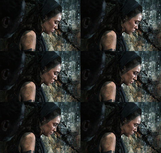
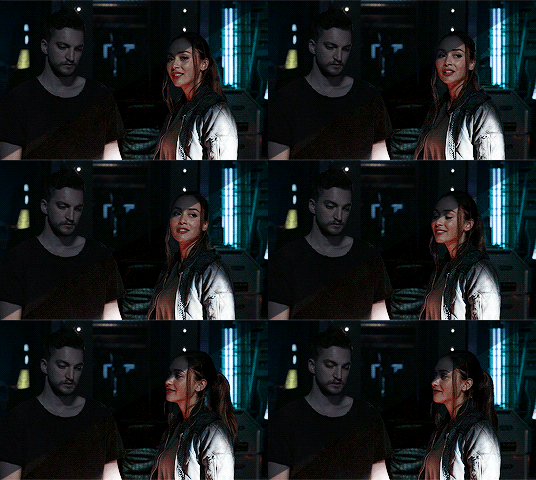
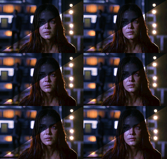
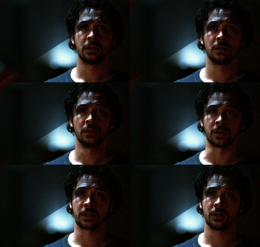
WARNING: This is very long. Everything starts under the cut!
GENERAL GIFFING TIPS
Get 1080p/720p downloads. Since The 100 is already a very dark and grainy show, anything lower will ruin the gifs’ quality.
Make sure you have cropped the gifs to the proper Tumblr size. Click here for reference. And get rid of the network logo when you’re cropping it! It always looks better without it.
Sharpen your gifs! I don’t see any reason why you shouldn’t. Sharpening your gifs will make it look more HD and show off your coloring better. My sharpening is a smart sharpen with these settings. You can go here if you want to experiment with other actions/settings, though.
Do not have any skipping frames. Please. Your gif will look sloppy and won’t be as smooth, therefore ruining the quality of it.
Make sure you have the gif timing right. I usually go for 0.05 seconds because personally I think it looks best, but I’ve seen some who went with 0.04s or 0.07s and that also works well. Go for 0.05s! I realized now other time settings doesnt work as well as 0.05s especially with The 100.
Save settings. My usual go-to settings are these. Though sometimes I went for selective instead of adaptive and it looks okay, too! :)
+ extras: subtitle!
The font you use for subtitles on your gif will also affect the way your gif looks. Fonts that are too big or too small will make it look less HQ, but having the right font with the right size (and the right position!) will make it look good. Here are some text settings you can use that I’ve found: [ one / two / three ]
COLORING TIPS
Now that you’ve kind of gotten the general giffing tips, I’ve listed out some coloring tips that I found out specifically for The 100. All PSDs will be linked at the end of this post.
Adjust your brightness before anything else.
The 100 is generally very dark, but even with scenes that are already not too-dark, you’re still gonna want to adjust the brightness so you can work on the colors better. I’ll go detailed with this one. We’ll be working on 3 scenes, bright, neutral, and dark scenes.
1. BRIGHT/YELLOW
For this one, I used a scene of Clarke from Season 5.
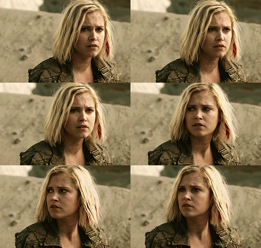
The scene is already very bright, so what we’re gonna do here is to adjust it so it’ll look prettier without being too bright that it hurts our eyes. First let’s do curves. I added two curves layer, the first one is to add just the tiniest bit more brightness to her face, and the second one is to darken the background. and then I’m gonna add brightness and levels for contrast:
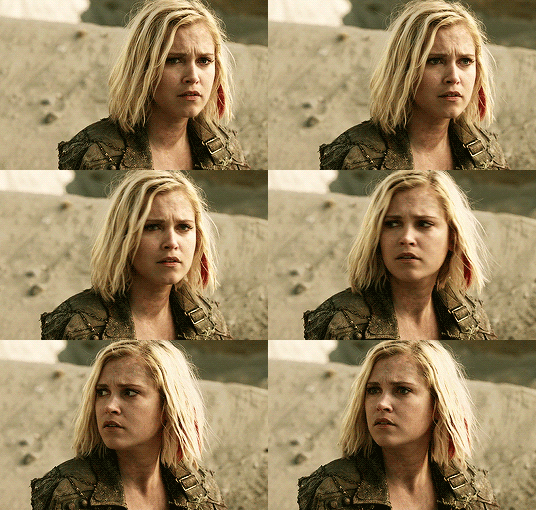
Alright, now that I’m already happy with the brightness, I’m gonna go and adjust the color. This is too yellow for me, so I’m gonna add a color balance layer to and pull up the blues/cyans/magentas

That’s good, but it’s too desaturated. I’m gonna go and add selective layer to make the colors pop up. I adjusted the red, yellow, and neutral and I got this:

Now this looks great already! Unfortunately, I’m annoying so I have to add more adjustments lmao. This is the final result after being added with an extra brightness layer and a gradient map on luminousity.
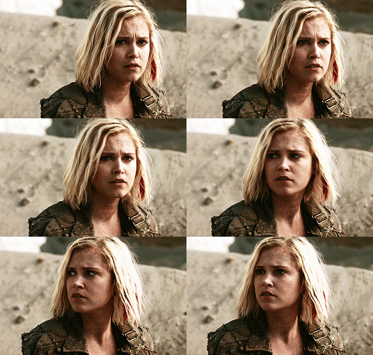
2. NEUTRAL
For this one, I’m gonna use a scene of Lexa (reshop heda you’ll always be missed) from Season 2. It’s not very bright but it’s also not too dark.
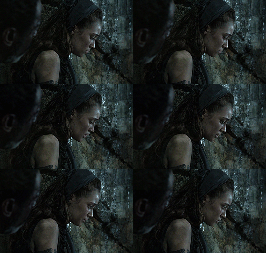
Now the tips with scenes with enough clarity (doesn’t have to be super bright, but if you can still see things clearly) like this one, clicking the ‘auto’ button on curves saves a whole lot of time. I did so and this is what I have in result:

The auto curves will usually brighten the gif and balance the color on it. Often times you still have to adjust it again. But still this will save a lot of time. I added some more brightness and levels before adding color balance and selective colors layer, and here’s the final gif:
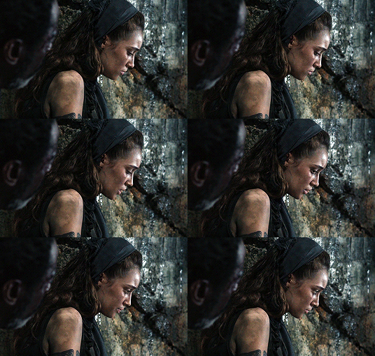
Keep in mind that this will only work with some scenes. This will work alright with the Clarke gif above, but it definitely won’t with this next gif we’ll be coloring.
3. DARK/BLUE
Okay now this one requires some work. I chose Octavia’s scene from the Season 6 trailer.
The original sharpened gif (notice that I got rid of the logo! It’s really annoying for me so I always find a way to get rid of it.)
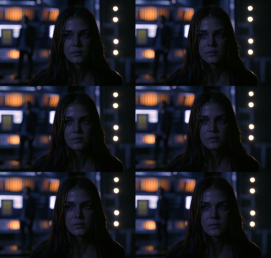
It’s reaally dark. So let’s start with brightening it up a little. I added curves, brightness, levels and more brightness because it was still dark as hell:

Now, you may think it’s already bright enough, but for me personally I can still make it brighter, so I added exposure. With dark scenes exposure works really well. But you have to take it easy with this layer since it affects the gif drastically with very minimal effort. I also added a black and white Gradient Map layer that I always set to luminousity:
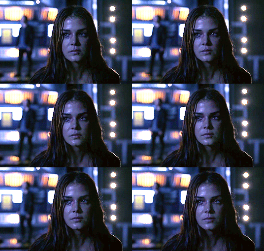
Now it’s time to go and adjust the hell out of the color balance to make it less blue! I also added an extra selective colors layer to make the reds pop out and get rid of the pixelated/grainy blacks on her hair. After that I added another brightness layer. Here’s my final result:

The quality on this gif is not as good as the others since it was from the youtube trailer (1080p youtube video are still low compared to web-dl’s) but that’s basically the gist on how I work on The 100′s darker scenes! :)
Color balance and selective colors.
The 100 lighting often makes your gifs not only too dark or too bright, but also too yellow or too blue. Balancing it out using a color balance almost always helps. Selective colors layer will also help when you want to pop up certain parts of your gifs. Here’s some tips on selective colors that I got from msmarvel’s coloring tutorial.
Selective colors and color balance layer usually go in the middle or on top of brightening adjustments for me. But I found out that color balance could also be done after you’ve done your coloring, but you have to put it under the other adjustment layers to have the most effect.
I’m gonna show you how I edit this gif here of Raven and Murphy with what I’ve said above.
Without any coloring:
Yeah, I know. I can’t see anything either.
I brighten up this gif using my method above for dark blue scenes. Curves, brightness, levels, and add more depending on what you need. Here’s what I have now:
We can see both of them properly now, but it’s waay to blue. Also I’m losing some color from Raven’s skin so I’m gonna add color balance under every adjustment and pull up the reds and yellows.
Now it’s better! You can totally leave it here and post your gif like this. but I added an extra selective colors layer to bring out the red, yellows and blacks, and here’s the final result:

I should mention that when it comes to scenes with POCs, you have to be very careful. With this scene with Raven color balance and selective colors helped bring back her color, but on other scene adjusting too much of the red/neutral/yellow might ruin her skin. You are allowed to adjust the colors on a gif extremely when necessary, but be careful about it :)
Some dark scenes are supposed to stay dark.
I realized that with the 100 (or any other shows tbh) brightening up a gif with a dark scene too much will make it lose so much quality and ruin it. So, what I’ve learned to do is to let it be dark. I’ve seen some people brighten their gifs too much and even though I understand your frustration, it’s gonna be better if you just let it be as it is. But, still, make sure it’s bright enough so you can still see the things happening on the gif.
Here’s a gif of Bellamy from Season 5. You can see how dark it is without any coloring:
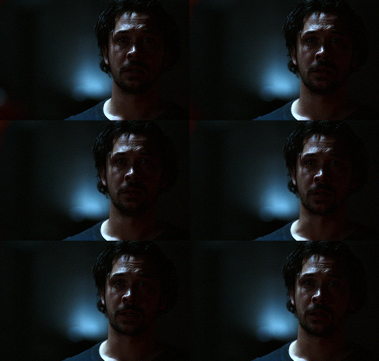
First, let’s brighten this baby up so we can see Bellamy’s face. I added curves and brightness, levels and more brightness:
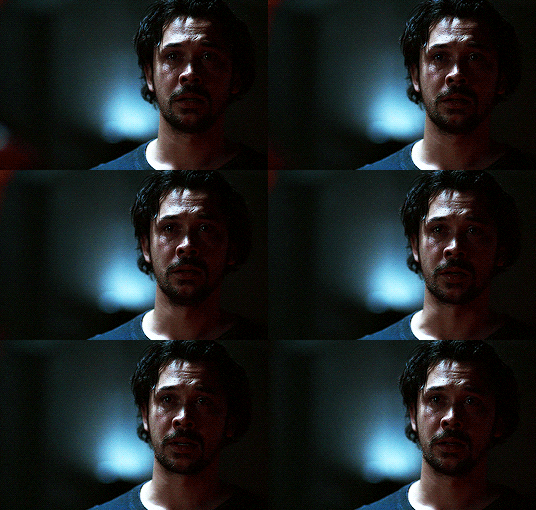
Now I know it’s still very dark, but instead of brightening it up too much I’m gonna go to color balance and add the tiniest bit of red and yellow, and then I’ll add a photo filter. These two adjustments are done so we can have more color on his face instead of the ugly dark red we had. With those adjustments, what we have now is this:
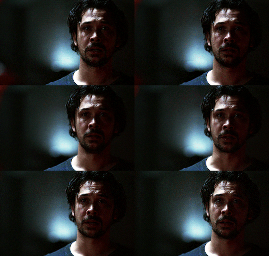
Next, we’ll move on to selective color. This is what I mean when I say you have to be careful with this adjustment. I want to brighten up Bellamy’s face by putting down the blacks on the red selective color. But by doing so I might erase all the reds from his face and whitewash him. To prevent that, while I put down the blacks, I bring up the reds (lowering the cyan) and yellows. I also pull up a bit of neutral and black selective color so I can get rid of the grain (adjusting the black on both selective colors.)
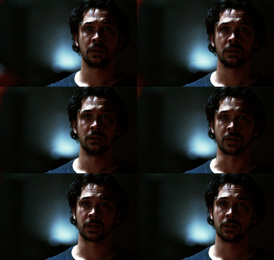
With a little more last-minute brightness, here’s the final result:

That’s pretty much it! You can add more brightness than what I did here (I was in a rush when I made this but I would definitely add a little more curves or brightness) as long as it doesn’t ruin the colors and won’t make the grain too visible.
Now as promised, here are the PSDs I made for this tutorial! Please don’t claim them as your own and feel free to tag me (#useraaya) if you make anything with them so I can check it out :)
[ clarke ] [ lexa ] [ octavia ] [ murphy & raven ] [ bellamy ]
I hope this helps! Don’t hesitate to message me on my main blog if you have any questions. <3
#itsphotoshop#yeahps#chaoticresources#the100edit#the 100#**#gif tutorial#coloring tutorial#*tutorials#*resources#aaya
423 notes
·
View notes
Text
Reply to @prurientpuddlejumper on this ask:
I’m sorry you’re frustrated or if I offended you somehow, but to be frank I don’t appreciate the tone you’re using here. However, to answer you anyway:
> they def meant the links to these alleged "online generators," because I am in the same boat as anon
First of all, unless you ARE that anon, I don’t think you can say they “def” meant anything, since they never came back to clarify, and I did try my best to answer them the first time, and I seemed to have helped since they didn’t come back to report any problems with my answer.
Second of all, “alleged”? That’s very rude. Just because you cannot see them on tumblr mobile, does not mean they do not exist. Plenty of other people have used them just fine, as evidenced by the many posts submitted to this blog. And as the last two people who’ve asked about mobile access before never came back with problems, I can only assume they simply went on the desktop site to use the generators instead of accusing me that it’s not accessible at all.
> post after post about how you updated the UI or whatnot with no link to the thing you updated
It was only two posts (so far anyway), and if you read them closely, you may have noticed I said I was only working on new updates, that they weren’t done, and that they aren’t out yet. And also that “the current generators are still up” so that people have a fully functional version of the generator to use, even if it’s not as pretty as the update is going to be. So no, there is no “link to the thing I updated”, because it’s not done yet. And as the point of the post was about the updates-to-come, I saw no need to promote a link to the generators that are currently available. Seeing as you want that though, I shall go correct those posts and link it, for your and future readers’ convenience.
I apologize for the misunderstanding, if I wasn’t clear enough about the updates being a work-in-progress. I was just trying to update my actual followers (of which I noticed that you are not one) that I was working on stuff, since this blog is usually pretty quiet.
> I REALLY wanna see it, and am growing increasingly frustrated about how much work you're pouring into this *thing* without giving mobile users any way to *access it*.
Again, I’m sorry this is frustrating to you, and you do bring up some legitimate feedback about the mobile accessibility. As I mentioned, I’ve answered at least two asks about this issue before, but since it’s been a few years and phones have definitely gotten more powerful I can look into developing a proper mobile version. But a lot of issues come up with making a mobile version, namely UI and responsive design (because I’d have to account for both vertical and horizontal orientation, and again I reiterate that UI design is hard), dynamic coding/image generation/data input/font importing and styling/etc., and how to save the actual generated image or at the very least the export/import save data for later use on a desktop browser. It takes a lot of work (more than most people realize, I imagine), so if you would like to help with that, let me know, otherwise you have no right to shame me for not making a mobile version, taking my time, or doing any of this.
As it is, you can actually still access the generator on mobile, just not tumblr mobile. You just have to go to a browser on your phone (there’s a reason my URL is so simple). However, as mentioned above, the template was not designed with mobile in mind, so all the fonts and effects and arrangement on the template itself just looks... not like it’s supposed to. Which, again, is part of the issue with the design, but at least you can access it on mobile, against your claims that you cannot.
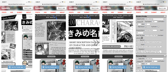
Also, I mainly made this a desktop site because of how large the dimensions of the template are, in order to make sure the text is visible/legible even in the downsized preview image. Even when I view the template on my phone, I have to zoom in a lot, and with the current live version of the online generators, it would have made scrolling around to input data annoying. The PSDs, as well, would be inaccessible on mobile as far as I know (if Photoshop Mobile has improved enough to handle all the layers, masks, and effects, I’m unaware) so it was a conscious decision to make this whole thing desktop-only when I first started this blog several years ago.
> Even the "downloads" link you just shared just redirects back to this same page. Which is probably because you've hidden all the links away in "pages" which are completely invisible and inaccessible on the mobile app
It’s very much tumblr’s fault, and I really should have thought of that at first, but again, it was a conscious decision to make this a desktop site. Even if I made rebloggable/viewable posts with the links in them (which I plan to do soon, if only to satisfy mobile users like you), only the PSD download links would work (but again, not sure how well downloading PSDs work on mobile devices), as the tumblr app will still loop back to the blog, since the online generator is still one of those blog “pages”. And that is not changing for as long as I don’t have the time or money to host it on its own domain.
I can’t change the fact that tumblr mobile doesn’t automatically open blog pages in an external browser, so the only solution I can offer you is to take the extra step to copy the url and go into your mobile device’s actual internet browser, or just go to your browser and type in my URL manually.
If you actually couldn’t access the templates at all (which should not be an issue if you “REALLY wanna see it” given that not only did I offer you explanations and solutions for the tumblr app problem, but also that it IS accessible on desktop and you reasonably could have just gone on a computer) or had any other problem with them, I have made no stranger of myself and have always been open to help people. They have been polite or nice when they do talk to me, and I’ve always tried to be cordial in return. Your feedback is legitimate, and I appreciate it, but you really could have worded your implied suggestion a little better. And to be quite honest, I was offended by the rudeness of your reply, especially when you called my hard work a “*thing*”. Those asterisks imply a very negative tone, in case you weren’t aware.
I get the impression that you think that your demand will be fulfilled right away if you make enough fuss about it, but I’m not going to be manipulated or guilt-tripped because you feel bad. Maybe you don’t mean it that way, but you can “grow increasingly frustrated” all you want, because not only am I working on this for free, on my free time, and by myself, but I am also not doing this for you. You’re right that I am pouring a lot of work into this, as much work as any fan artist or fanfiction writer will put into their own works, and I’m very proud of it (both as it is now and what it will be in the future) and I have fun working on it, but this is not my job. And you’re not paying for a service.
I’m not working for anyone, and I have no reason to have made more than I originally did--originally I only made the student template PSDs for some friends, and the generator (which seems to be my most popular template, even though my original focus was on the PSDs) only came about because one of my friends didn’t have Photoshop. And I wasn’t even going to release either of them to the public, but I did, and the villain ones came over a year later because of this blog and the people who follow it. No one asked for a user interface update (in fact, more people have asked for a pro hero template), but I’m doing it anyway because I can and I want to. That’s all this boils down to. Also my free time (if you hadn’t noticed, everything on my blog runs on a queue, and when I do queue stuff it’s usually like 3am or so--including right now... it’s currently 5am actually) and motivation (I’m well aware of how few people actually use the templates compared to how many people follow and reblog the posts, and honestly it’s a little discouraging). So if I do make a mobile version, be aware that it won’t be coming out for a very long time. (Also, I think you’re the only one in several years who has complained about it, and you are literally 1 in... what, 3000+ people? Judging by the number of notes on the original post I made when I started the blog and my current number of followers. And again, you’re not even one of them. So to be honest, I’m really not motivated to work on this quickly.)
If you want it faster? Being nice when you show your interest helps, it’s how I got encouraged to make the villain templates. Though I never asked for much other than patience. Or at the very least, the respect any fandom content creator deserves--I may not be cranking out fanart daily or new chapters of a fanfiction weekly or anything, but I am still providing the fandom with something they can enjoy at no cost. And like reviews on fics or comments on art, many people have expressed that they’re grateful the templates and generators exist at all, unlike you, which is really the reason this blog continues to exist and the generators/templates to be updated with new and improved features. I could have just left my original template generator up there and abandoned it, but I know how it feels to find out a fanart you loved years ago was deleted or a really good fanfic was discontinued. So I’ll continue to work on it, and yes I’ll put mobile compatibility for the generators on my to-do list, but I’ll do it at my own pace.
Also I’m not making money off of this, but hey, if you wanna give me incentive that way, hop into my DMs or something and we’ll talk, but I’ve never asked for donations or anything and I don’t plan to. The generators and templates are free for use, and most of that is because of tumblr, which gave it a platform and a home. If I hosted it on its own domain, I’d need a means to pay for that, and I’m personally not invested enough to do that when tumblr is free and works well enough.
If you or anyone else wants to help change that, come talk to me, the ask box is always open.
Otherwise, please visit this blog page on a desktop browser or at the very least something that isn’t just the tumblr mobile app, because nothing can be done about mobile compatibility right now, and I’d hate for you to miss out on seeing the templates. Hopefully I can look forward to whatever you will create with it.
-archivist
4 notes
·
View notes
Text
Colette’s Manip Tutorial
Requested by @weryourlegacy and @claurps
This tutorial will take you through how I personally make my manips. I know there are a lot of differing ways out there on how people make their manips but this is just the technique which I personally follow and find easiest. But before I start, I need to credit Geri, my co-owner of this blog, for teaching me how to manip all these years ago. The process which I follow is not exactly the same as hers but extremely similar so a link to her personal manip tutorial is linked here.
Now, underneath the cut I will show you how I created the following manip of Ryan Gosling and Lyndsy Fonseca using Adobe Photoshop CS6:
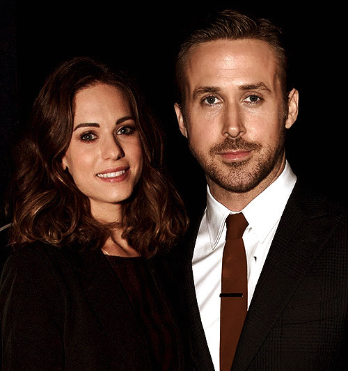
Selecting Your Images:
To select my images I usually just do a quick google image search of whom I am looking for. In this case, I was looking for images of Ryan Gosling and Lyndsy Fonseca.
Typically, I use a select range of different phrases when looking for photos as follows:
“Celebrity name” party
“Celebrity name” after party
“Celebrity name” event
“Celebrity name” candid
“Celebrity name” night candid
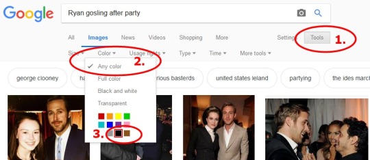
As shown in the above picture, this time around I searched “Ryan gosling after party” to get the image that I will be using for this manip. Once you have entered the keywords which you are looking for into google images, hit the tools button, select any color and choose black. The reason which I recommend doing this is because it is typically easier to manip and play around with images that have a dark background for blending and erasing purposes.
From my Google Searches I have selected the following images which we will be using in this tutorial:
Creating The Manip:
1. Start off with a new blank canvas and use the paint bucket tool to fill it in black. To start off I typically use a 500x600 pixel canvas.
2. Copy and paste your first image into Photoshop. Resize and position it how you please on your canvas. You can resize and play around with your image by keeping the image proportions in tact if you hold down the shift key on your keyboard whilst drag the corners of the images as highlighted by the red circles.
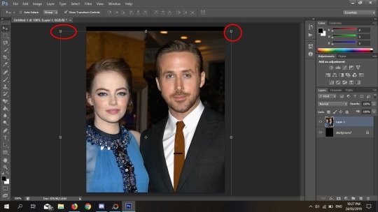
3. Copy and paste your second image onto the same canvas. The following red circle highlights a drop down menu.
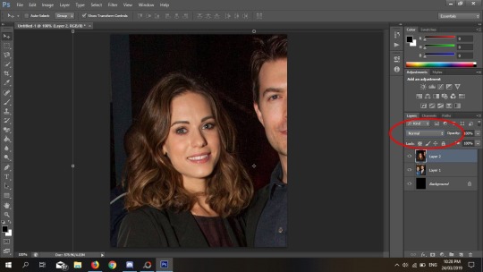
If you click on that drop down menu you should get a list that looks like this:
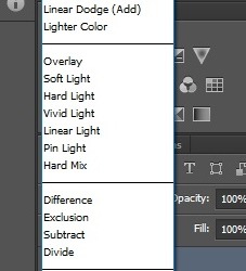
Select lighten and your canvas should now look like this:
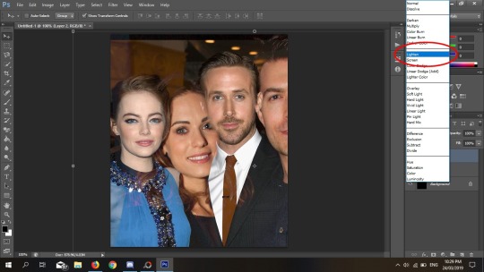
You should now be able to move your layers around and resize images to decide where you want them to be the same way I explained above when playing around with Ryan’s layer. For example, in this situation after I lightened Lyndsy’s layer I then went to make her image smaller and positioned her next to Ryan Gosling like so:
I also used this opportunity to decide which image I wanted “on top.” In this case, I decided to keep it as Lyndsy’s layer in the main foreground.
4. Now the erasing begins. I usually start off with a slightly larger brush to begin with-- usually with a size around 70px and a hardness of 100%. With your top image still lightened, begin erasing the area which you want deleted. E.g, since I wanted Ryan Gosling in this image I erased the area where Noah Bean was in Lyndsy’s photograph like so:
I also decided whilst erasing that I wanted to resize Lyndsy’s layer a little bit and crop the image down to size. Don’t be afraid to do so and make adjustments as you go as you can always ctrl z you’re mistakes.
5. Once you’ve erased enough to get a clearish image of what your end product will look like, use the drop down menu again to make all layers “normal” once again and continue erasing.
I recommend zooming in and slowly making your brush size smaller and smaller as you go to get around all those hard to reach nooks and crannies -- for example, Ryan’s hair.
Also don’t be afraid to erase the background’s of images if they are not working for you. In this case, I erased much of Ryan’s background and a good amount of Lyndsy’s too as they did not blend well together. For some images, they’ll blend in effortlessly-- other’s you will need to erase. This this case, I erased both their backgrounds and used our original black base as the background for this manip.
6. Once you’re finished your erasing you should be left with something that looks like this! Well done, you’ve made yourself a manip! But next we need to edit the picture a little more to make sure both layers match up and look the same. Or at least, close enough to perfect as possible.
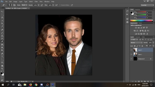
7. For each image layer you’re going to want to play around with the colouring to make the image look as seamless as possible. Select a layer then go to Image >> Adjustments >> Color Balance.
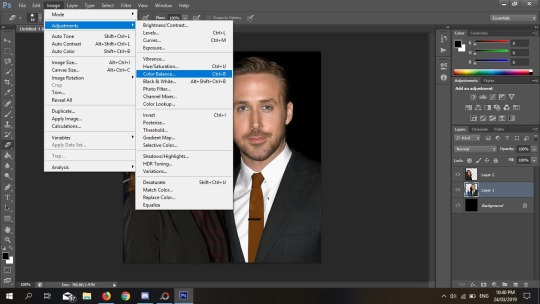
Clicking color balance will bring up a box like this. Just play around with the little slider bars until the colors of your images begin to look relatively similar. And don’t be afraid to go back and forth on both of the images, adjusting each one several times to get it as close as you can. It doesn’t have to be perfect as long as it looks close enough-- a good PSD will help you out with this later.
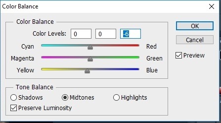
8. I also would recommend sharpening your layers as some images may look softer/harder than others. To do this select a layer, click filter >> sharpen >> sharpen. Then repeat with the other layer if you think it needs sharpening too.
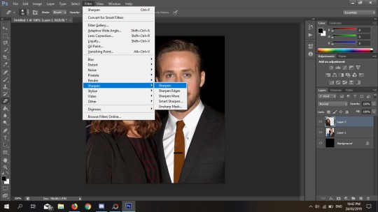
9. Now we will merge the two images together so that instead of having two separate layers it becomes one. Open the layer menu and click flatten image. And boom~ there you have it! A completed manip.
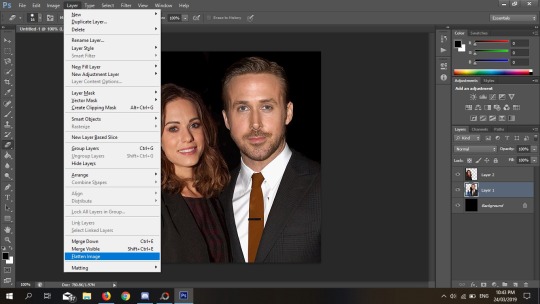
Optional Steps:
10. Auto Tone, Auto Contract and Auto Color occasionally work well depending on your image. In this case I applied all three of them. Sometimes I don’t apply any of those filters at all, while in other cases I may use one of two so it’s really up to you and how you perceive it to be.
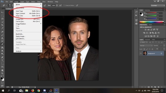
PSD’S:
11. PSD’s are a great way to help with coloring and a good PSD will help you to hide the imperfections in your manip. There are 3 PSD’s that I use-- unfortunately, I only have links to 2 out of the 3 but I will link them here and here.
I usually just play around with the layers and adjustments in order to achieve the outcome I want. Sometimes, I will also use multiple PSD’s on top of each other to achieve the desired effect that I want.
Unfortunately, I do not have the links to the PSD’s which I used in this case but the outcome I ended up with was this as my completed manip:

Hopefully this tutorial has been of use to you. If you have any questions or queries feel free to send them my way. And if you have found this helpful, please feel free to like or reblog this tutorial. xx
70 notes
·
View notes
Text
RULES && REGULATIONS
As these have been updated I thought it best to repost them. The major changes have applied to The ‘Other Things to Note’ but smaller edits have also occurred throughout most sections so all areas that have had changes are copied and pasted below
Disclaimer;
I do not claim to own the character of Harley Quinn, own or be any part of the DC franchise, or own any of the icons or other images posted on this blog. I made all the edits on this page but original images were not my own. I also create and use all my own icons with my own psd. Screencaps where appropriate are my own but mostly I’ve just cropped the comic pages where needed with scans taken from here.
What Private Means to Me;
To me, this means that I will only interact with those who follow me. This isn’t to discourage people from wanting to interact with me as I am willing to give all roleplayers a chance. I’ve started to implement this as I feel that if I follow you and want to interact with you, you should want to follow me and do the same. I just feel that when people don’t follow me back, they don’t want all the plot ideas I have for our muses. Linking into following practices, I typically give inactive blogs two months before unfollowing. If you ever do come back always feel free to drop me a message and we can carry on a thread, if we have one.
A Note For Other Harley Quinn Blogs;
I am a little wary of interactions with other Harley Quinn blogs but I am open to the idea. My wariness stems from my previous experiences as I have lost rp partners, and had entired threads dropped and replicated with other Harleys, which is not okay. I am a criminology and psychology graduate so to the best of my knowledge all psychiatric practices employed by Harleen will be accurate but I have also been accused of “doing it wrong” previously too. I’m hoping these experiences are not replicated. but please understand that I would probably want to talk through a plot and get to know you OOC first before we start anything. I would also appreciate if, at least for now, that we operate from different canon, meaning that I use a different verse for Harley, compared to you..
Other Things To Note;
I am slow. Please do not follow me if you'd like me to turn over replies quickly. To make up for this I have recently swapped to a novella style, meaning that I will only rp in a para style format and will no longer write one liners or semi-paras. This is to encourage longer, more in depth threads with a focus on exploring all my verses have to offer.
As with every blog I will not tolerate God-modding. I write Harley and control her as I see fit and I give you the freedom to do the same with your character. If, for any reason, your character has some form of ability, allowing them to potentially break this then I would prefer to plot out the scene, if not the whole thread so as I writer I can expect this.
Due to the recent changes in how I rp on this blog I will not be writing greeters, and will likely not post that many open starter calls. Instead each starter call will be verse, or even based on a specific plot or idea to allow for a longer starter to be written. If we plot, I wish for you to have at least some form of idea, or at least a verse you wish to write in as Harley's characterisation can change dramatically depending on the verse.
I am now 21 so NSFW content including violent themese and smut will appear on my blog.It will be tagged but may not necessarily be under a read more. However, if placed under a read more by my partner than I shall do the same. I do not emplore an age restriction on my writers but I may limit what we rp to some extent if you are at least under 18 but will do this at your disgression.
When it comes to formatting replies I usually capitalise and bold the first three words of each reply and make the main body smaller as well as emphasisng some words using captials, bolds and italics if I feel life it. Feel free to use your own style of formatting or none at all. If you use a certain style of formatting (including the use of purple prose) during an interaction I may edit my style to make the thread replies ‘match’ more.
Any thread that is responded to without at least a paragraph will now be ignored. I pride myself on not dropping threads, no matter how long they take me to respond to, but a reply like the one I have described is the one exception this. I do not expect a reply that matches mine in length but I would like to see a little effort put into replies as I am now extending my own writing and cannot do that when given shorter replies.
I don’t typically reblog memes but they do occasionally appear on my blog, reblogged from the source if one is linked. They’re great when it comes to icebreakers and just developing a relationship (platonic, romantic or otherwise). I do not practice reblog karma but will send a meme if I think it relates to Harley. As some memes may be ship related I will also add here that I ship Harley with Chemistry although several of her storylines have strong Harley x Joker, Harley x Deadshot or Harley x Ivy interactions. This should not dissuade you from considering a ship in any verse given her flirtatious nature but do not feel like you have to reciprocate her actions. It is just Harley, being Harley.
#BLUEBELL RAMBLES.{appreciate what you got; cause basically I’m fantastic}#( also thinking of a tag change to completely revamp everything but i'm not sure - cause i've accidently turned this into an entire revamp )
2 notes
·
View notes
Note
Hey, may I ask how you make your icons (which are really cute btw)? I would love to give it a try myself but I dont really know where to start vor what size they woud need to be. Do you use a specific program? Thank you in advance ❤
Hi again my love!!! ❤
First of all, thankyou so much!! That’s so kind of you to say and I’m honoured that you’d come tome for advice!!! I’m going to put this under a read more because it might getvery long, I hope that’s okay! Also want to say I am by no means an expert - myicon making stems from a lot of trial and error, hahah!
There’s soooo manydifferent ways to make icons! I have seen and read a thousand tutorials, butthe first thing I have to say is it’s got to be what you’re comfortable with.Whatever works best for you is the best way!
When I first started to make icons, I used paint.net, which is free todownload and such a good program! I still haveit because you can download free ‘plugins’ (like added extra features)that people make and they’re so handy!!!! I used to make coloured backgrounds using the gradient feature, and zoom in very closely and use the rubber tool toerase the background of the characters/people I wanted for the icon, whichworks great if you have a lot of time and patience!
Now however, I use photoshop CS5, which I got from here (no idea if the link stillworks but I hope it does!!!) which I find a lot easier now that I know how touse it! For sizing, as long as the canvas is a perfect square you’re generallygood - I usually go for 150px x 150px, but I know a lot of people use 100px x100px or 200px x 200px!
Here are some tutorials that you might find useful to start you off in explaining how to use PS if you’re not familiar with it!! (x) (x)
Once you’ve got that down, usually you want to cut the people/charactersout from the background. There are soooo many ways to do this but I prefer touse the pen tool to draw around them and then erase the background, a tutorialfor that that I like is this one!
For background, I make my own gradients. Generally, you want to pick acolour you like and then find the lighter version of it, so to do that I pick acolour (for example this is a good list of different colours I referto) and then I use the hex code of that specificcolour to find the lighter version of it - so when you click on it, or searchfor it, it gives you the lighter and darker codes for the colours, which youcan put into Photoshop and then use to make gradients! alternatively you cansearch on places like itsphotoshop and find them,which is coincidentally where I get my textures from that I sometimes put onthe background of icons.
The textures are downloaded, and then once you’ve got them, uploaded into PS and usually set to soft light or overlay (I prefer soft light, but it depends on the colours you’re using I think!) in the drop-down menu on the right side of PS, where there’s different tabs (this one is found directly underneath layers!). It looks like this and put it above my colours to get cool effects in the background :-)

For the shapes part, I actually only learnt this really recently (although I’m going to do a demo of how I did my latest icon further down) and this is the method I used to get the shape!!!! Although I didn’t apply it to the icon in the same way that they did, I found an easier way for me!! Haha.
Something a lot of people also do is change the colours of people’s clothes! This is a great tutorial for that and one that I’ve used for my edits, although still learning with icons!
Okay so I think the easiest way to try and tell you how I make icons is just to show you! So, first things first, you’ve got to get your cap - it’s nice if it’s good quality, but it’s not the end of the world if it’s not!
I decided to use this one from the ITV hub, haha:
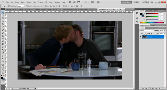
Once you’ve got that, I usually crop it so there’s not as much of the background, but that’s just personal preference. Then, with my pen tool, I go around it and outline the bits of them I want for the icon! (I’ve circled the pen tool on the left just for clarity!)

You’ll also notice the boys look a bit brighter and more defined in the above screenshot - I’ve added a PSD to them, which I’ve made myself. I have an ‘emmerdale psd’ that works quite well forall the characters so I use that as a base and adjust it depending on thescene! But there’s plenty of places to download PSDs too!
Once I’ve got the outline, I join up the dots to the first dot to make a solid line around the boys. Then, right click on the picture and choose ‘make selection’.

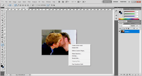
Then you get a pop up box saying if you’d like a little blurring around them - sometimes I do 1px, sometimes I have none, like in this case, depends on the quality of the photo (and sometimes how well you’ve cut out their hair hahah). Once you’re happy, click okay and you’ll get the solid line around them flashing now.

I’m not sure how to do this on a mac, so really sorry if you have one, but you’ve got to invert this line to select the background instead of them, by pressing Ctrl, shift and i at the same time. Once you’ve done that, you can then click the delete button and the background will disappear! Yay! You should get something that looks like this:

After this, you want to go to the menu at the top that says image and click image size, which will present you with a text box like this:

Change the pixel dimensions’ width and height to whatever your icon size is, so in this case 150px - don’t worry if the height isn’t equal to the width, it’s better that the icon is the full width if its not a person’s full body, as you don’t want the picture to take up the full height of the icon anyways! Like this:
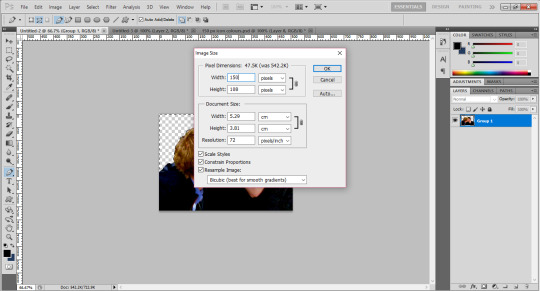
And voila! They are to size. Now, since I’ve made icons before, I have backgrounds already made, so I would drag them onto them. I suggest you make the backgrounds in a separate window and save them for later use (using the gradients for example), meaning you can drag new people onto the backgrounds which will save you time! Once you’ve done that, you’ll get something like this:

Now, you could just leave it there! If you were to do that (I save them with multiple colours for variety!) You might want to go to filter > sharpen > smart sharpen and play around with it until they look more defined, but not overly so!
(Also please don’t judge me - it’s good practice to name your layers informational names but as you can see mine are pretty all over the place, oops.)
For the shape part of the icon, please refer to the link I added above to add a custom shape to your gallery. Once you’ve done that, this is how I added it to my icons!
For now, zoom into your icon and place the shape above the icon and use ctrl and t to make it the size you want, making sure to hold down shift when you’re dragging the sides so it’s in proportion. Once you’re happy with this, press enter to confirm it (its usually best to leave a few pixels between the shape and the edge for the ‘transparent effect’.)
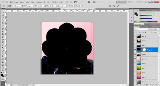
Then, drag the layer down in the bar on the right so it’s underneath whatever colours you want to use for your icon. In this case, I’ve just done a few as an example:
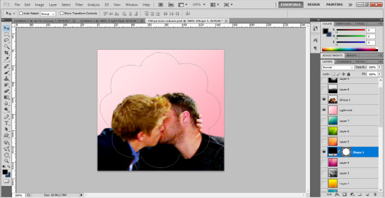
You can see the sort of outline of the shape on them, as well as the background colour. Now, you want to move the boys into the position you want them for the icon, and use something called a ‘clipping mask’.
Right click on the layers at the side and choose ‘create clipping mask’ - the background will then fill into the shape and so will the people once you click it. At this stage, you probably want to use the little eye symbol on each layer to make it visible or invisible, so you can see if this is working or not!
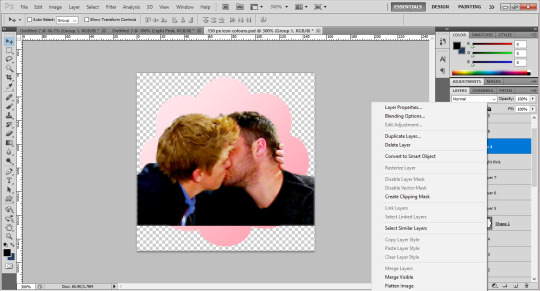
As you can see, there’s a blank bit at the bottom of the icon since I cropped the boys’ bodies there. Luckily as they’re wearing dark colours, I can just paint over this on their layer to fill it in, but you could also resize the original image down to 150px and use a clipping mask on it too! (You can also merge the layers to make sure they’re one layer, by right clicking and using ‘merge down’ which isn’t available in the above screenshot but usually would be!)
Then zoom out, and you should have something that looks like this! (I’ve gone back to the file I made the actual icons on for this screenshot.) Make sure you save the image as .png, not .jpg! Files saved as .jpg can’t read transparency and the edges around the icon will show up as black or white, rather than transparent!

I hope this has been helpful, and that it makes sense, and gives you a good idea of what to do?? If you have anymore questions don’t hesitate to ask❤❤❤
21 notes
·
View notes
Note
Hey Jack! Hidden away in the sequoia forests of California lies a small town. This town is home to supernatural creatures that elsewhere may not be protected. Unbeknownst to its residents, the witches that founded Segoin signed away their privacy rights to the government workers of The Gold Rush Project to be studied. We were wondering if you would please give us an opinion! Thanks so much, and I hope you’re having an amazing day!
hi there @segoinhq! i’m happy to give you an opinion. since you didn’t specify private, i will post this on my blog. feel free to ask me to take it down if that was a mistake.
NOTE: all opinions expressed here are mine, jack’s, belonging to jack. i make no claims to knowing what is best for every group – i only offer advice based on my experiences, what i’ve seen in the community, and my personal knowledge. no one person knows what is best for you or any group other than yourself; because you were the one who put all of this together in the first place. so take everything i say as a suggestion, and remember that you have accomplished so much!!
and if you have any questions, want feedback on something specific, or want elaborations on anything said in this opinion, don’t hesitate to message me!!
start: 17.31 | pause: none | end: 17.48TOTAL: 17 minutes to read all pages. (do not take this as any indicator, I simply time myself)
So my first impression of the main is both a positive and negative one. Personally I’m not a fan of contained themes for RPG mains but I accept that they’re useful, convenient, and popular for many groups that don’t need the whole shebang of a fansite theme. What I’m left to look at is how well you utilized what the theme gave you. Even though you have to scroll to read the whole bio your links are all important and well-placed. The search engine is also nifty. My biggest NOPE is the background. The trees and branches make the entire page very busy-busy and for some people with attention issues (like myself) it really distracts from what’s actually being posted. There’s just a lot of places that catch the eye when it’s not necessary, you know? My suggestion would be–if you’re sold on the picture itself–finding a way to introduce a white-fade or black-fade to reduce the brightness and color vibrancy of the background image. This can do wonders for putting the spotlight back on the posts you’re putting out there.
When it comes to the originality and creativity of your Plot there’s not a lot for me to say. You did a great job putting your own spin on the ‘supernatural town’ genre and not only that but you made sure to give a space for non-supernatural characters to be welcomed in too; which I personally always look for when joining these types of things. Putting your idea aside, however, I’d recommend you look back over your plot and give it some narrative touch-ups. It reads well; both coherent and concise, but I feel like reading a plot should excite me, a potential member, especially in the case of learning the history of the town and how things are the way they are because it will affect my character on a personal level. For example: you end one paragraph with the knowledge that these original witches are dead, but then the next paragraph you continue talking about them again. Maybe that information could have been included in the section above. It’s these little things that just touch things up and make them seem cleaner and more attractive.
Your Rules are objectively good. You cover all your bases needed for an RPG like this. The problem I’m seeing–and this is something I run into on a lot of the opinions I do–is that they’re pretty much… needlessly wordy. “1. Do not Godmod. You control your own characters.” You link to the definition of godmodding, so why add that secondary part? I know it makes your Rules seem a bit more fleshed out but if you go through them one by one I think you might notice that you just end up circling back around in more sentences than you need. “2. This is an 18+ RP. We will not accept any applicants under 18.” Cool, good, but you said that very concisely in “this is an 18+ RP.” Another example: “14. Smut is allowed, just put it under a read more. Once the clothes come off, the read more goes on, yeah?” can easily become “14. All smut must be under a read more.”
Since there’s nothing on the Character, Taken FC, (nothing out of standard) Banned FC, and Wanted Connection pages, I do feel confident in saying that the organization of them is well-done and they’ll no doubt be easy to navigate for players and potential members alike. On your Checklist I see that you have an OOC Discord – I’m a really big fan of those as someone usually on his mobile and on-the-go. It helps me feel more connected to the community; and I know there are many RPers who both agree and disagree with me. All I feel comfortable saying is keep an eye out in your group chat, make sure everyone is being included, etc etc. In the group I ran our OOC Discord was a welcoming place to meet everyone–it IS possible despite what some people say. I have faith in y’all!
So for your Worldbuilding pages I’m trying not to sound too nitpicky. There’s a fine line between what’s totally acceptable and what I, personally, am not a fan of. So please feel free to disregard this, because it’s more tailored to my bias than an objective opinion.
For your Places page: it’s all very squished together. I know you have the different color font for the titles but it’s barely noticeable with my brightness all the way up. Maybe adding an underline, or utilizing the bold/italics can help sort of create some separation? Even just adding a space underneath each point before moving on to the next can create a world of difference when people have a hard time focusing on so much on the screen. Also, and this might just be me being finicky–but I see you have Docks. Fishermen are great… but maybe having a space to clarify the size of the boats and the lake on the edge of town could help? Since there’s definitely no harbor in the middle of the National Park. Small things to think about.
The Supernatural Species list is really well done and comprehensive – giving me everything I need to know as a potential member shopping around for what species I want to apply with. As an image-heavy RPer the difference in quality in the provided images (while in good taste and very helpful!) does sort of take me ‘out of the moment’ if that makes sense. Even something as simple as making them all black and white, or adding a green-tinted psd to them – if you decide to keep them at all that is – can do wonders for making everything seem more uniform and comprehensive. Like with the Places, the information is all very helpful and useful but still squished. I just see a wall of text I have to focus on to not reread on accident. Play around with the settings in the tumblr customizer or even the html code if you fancy. It really helps.
Rounding everything out and looking at the RPG as a whole: there’s a lot of potential here. You offer so much creative freedom to your applicants and that is definitely a great selling point for your group. The small cosmetic changes I’ve suggested above won’t detract from the overall feel of the group, in my opinion; which is good because it means there’s not a lot that really needs ‘fixing,’ pardon the term. And like I said earlier your fresh approach to the genre is definitely there – maybe if you guys found a way to highlight that a bit more in your promotions it could help you get more attention? I don’t know exactly what might help; whether that be simple image changes on the main or promos that really hit home with the idea that the citizens are trapped and not in total harmony like the peaceful locale might make one think–I have no doubt a creative admin team like yourselves will find that one little thing to push you guys into view!
Good luck and be proud of all your hard work so far! It will pay off, of that I’ve no doubt!
Sincerely,Jack
1 note
·
View note