Text
90's Rat Butt at night...
Yeah, it's another one of THOSE. Hey, if I spend about 5 hours working on something, I damn well want to talk about it at least a little!

So here's what we're working with. A drawing by Lakeslug (@riversnailnsfw on Twitter). This had SO many things I love. The 90s aesthetic with the PS1, tube TV etc. Naked Rat Butt. And LOTS of detail. I loves me lots of detail! So I made sure Lakeslug was ok with it and I got to work...
First thing, the lines are too light. I needed to make em darker. I did it in the simplest way I knew - copied the layer 3 times and made them Multiply layers. There are other ways, but I liked the results:

Now we're talking! Also, just fyi at one point I upscaled it to 200% of the original size as it was a little smaller than I like to work with. Okay, if you've gone through my essays before, my next step is almost always to get the Flat colors in...

Now, I don't know what colors Lakeslug had in mind for her, but I don't think you can go far wrong with a sorta greyish main color, pink hairless bits and yellow hair. What you DON'T see here is the LITERALLY 17 Layers of copied images from Google for various things. See, I really like to get colors from real-life objects. I got images of: a bookshelf, an old TV, an old VCR, a PS1, Coke cans, VCR tapes, A file box, PS1 game CD Rom cases. No, really. I did. And then copied the colors to get this Flat layer finished. Now the wood floor and wall you'll notice aren't really flat. They have texture. That was added near the end of the process though. (for the wood, added noise and motion blur - my standard method for creating wood grain. For the wall texture, noise again but then blurred.)

You may not see much change because there's not - but I do like ligher colored fur over the breasts and belly. In the long run you'll hardly even notice them, but they're there. And, of course, the foot pads. Gotta love the beans.
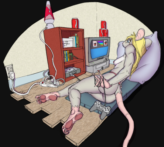
Time for shading. This is 14 separate Multiply layers with purple-grey color. Mostly highlighting her curves, but also the dent in whatever that is she's laying on, her pillow, and hard shadows for the furniture where I thought appropriate. YAY! Done with the tedium. Time to SHINE it up!

Butt highlighting, check. Pawpad highlights? check. Tail highlight? Yup. Boob highlight? You know it. Inside ear? check. More subtle for muscle groups, and on some objects (ps1 controller paddles, TV tube, more.
So it was about here that I made a realization. There are a couple great light sources here! The Lava Lamp and the TV for two. The highlights I put on her ass etc. doesn't work with those though, so I'll need another... Wait... WAIT a sec. This is a friggin' NIGHT scene! Let's go full chiaroscuro on that ass! How?
Well, this isn't rocket science. I literally created a new layer almost on top of all the others, filled it with solid black, and backed off the opacity...
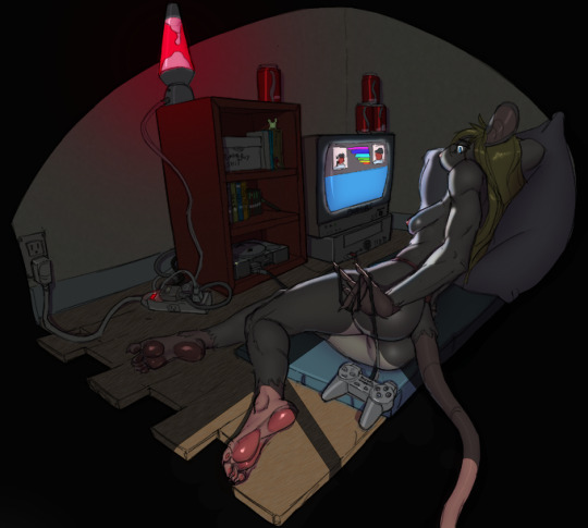
Aha! NOW we've got something special! Erase away those parts facing the TV... Add a bit with a lighter blue color to create the "window frame" effect on the bottom. The implied window now creates the light source for her butt highlights... Yup! That worked! YAY.
Did a couple other things of course. Erased it from the TV screen and the lava lamp itself. Also from the red light on the extension cord and the little green light on the PS1 iteself. Yup, this makes me happy. Lakeslug liked it too so all together a WIN. Let's hear it for rat butts! Hurrah!
3 notes
·
View notes
Text
Danonymous' Ink-Eyes - redux
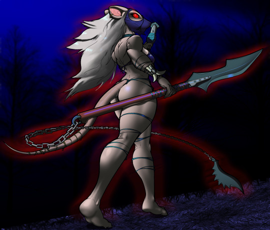
Still lingering around Tumbr - and sometimes I have something I can actually post without the Tumblr-gods striking me down with great fury and vengeance. Latest coloring of another Danonymous Ink-Eyes. Here not just her eyes are giving off evil red evilness too.
Real reason I wanted to post this is I did the shading in a radically different way than I usually do. Is it better? Worse? Shrug. It's different. That's all I can say for sure. You "real" artists already know this method I'm sure, but I've not really used it before.
So I started with Danonymous' original of course. (he actually had it as black lines on a dark grey background - but judicious use of Photoshop's Exposure adjustments fixed that right up!)

Next, standard flat-colors (I just copied from my original Danonymous Ink-eyes that I still have the .psd file for) Also ignore the mask color towards the bottom. I screwed up but it looked good so I ended up keeping the screwup.

Now here's where things start to deviate from my normal method. At this point I copied this flat-color layer, shifted all the colors towards blue and darkened them. As the color-gurus say, shadows tend more towards blue, so I just moved everything towards blue.
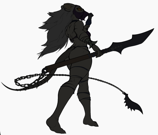
Now, it wasn't originally that radical. I mean, that's practically an almost-black on black lines. Originally it was just a LITTLE bit darker and bluer than the first flat-colors layer. But as I continued working on it, when I came up with the background it kept looking better DARKER, so I ended up much darker for this second layer than originally planned. So what's the deal with these two layers?

Layer mask.
I've long been aware of layer masks. I just haven't USED them much. But now I understand better why they are the preferred method. So this is the layer mask attached to the darker, "shadow" layer. And that layer is over the top of the normal flat layer. This is NOT the "shadow" layer - it's the layer mask FOR the "shadow" layer. Why is that important?
Well, if you just made a flat, normal grey layer and stuck it over the top of the flat layer, you COULD just erase parts of the flat grey layer with a soft eraser and then naturally see the flat colors underneath. It would effectively do the same thing. BUT... what if you later wanted to put back some of what you'd removed? (important when doing those little muscle areas btw!). You can't just "paint" it back in if it's actually colored. Well, you might be able to, but it would be a huge headache.
Instead, a Layer Mask let's you vary the transparency of the top "shadow" layer so you can let part of the underlaying layer show through - but it's non-destructive to the "shadow" and underlaying layer. You can "play" with the transparency. Anything you color black in the Layer Mask will be 100% transparent showing the underlying layer. Anything you color white will be completely opaque, showing none of the underlaying layer. And grey, of course... let's some through.
The important point though is you haven't touched either color layers! You just changed the transparency of the top layer. You can put it back (color the layer mask black). Or make it a little more/less transparent (color darker or lighter grey in the layer mask).
It's not a magic bullet, but I understand now why it's useful. Because of the non-destructiveness to the top and bottom layers! And that's cool!
That's most of all I wanted to say here. But I might as well show the rest of the progress. With flat color layer under the "shadow" layer and the layer-mask on the "shadow" layer applied, I get this:

Not sure I'll keep using this method, but it does work well and I bet most all pro artists use it basically like this.
So I decided I'd do another moonlit Ink-Eyes with dark background...

The rest was pretty standard stuff really. "Shine" layers set to Color Dodge for shiny butt, shiny hair, shiny spear handle etc. A highlight layer over everything for that eye dot (I find color dodge shine layer doesn't work well for highly saturated colors so I literally paint over them directly.) The red was an Outer Glow on the flat color layer, but then I separated the Outer Glow into a Rasterized layer of it's own and then applied Motion Blur over it. Gave a pretty cool effect. A %30 transparent layer for reflections (on spear handle reflecting her legs, on bikini top giving some reflections too, though primary purpose there is just to not let her boob-edge get lost in the dark background.)
So I still am learning new methods. Why did it take me years to "discover" layer masks? Frankly because I didn't need them. But I do like how this came out so I might use them more than "painting" shadows in.
6 notes
·
View notes
Text
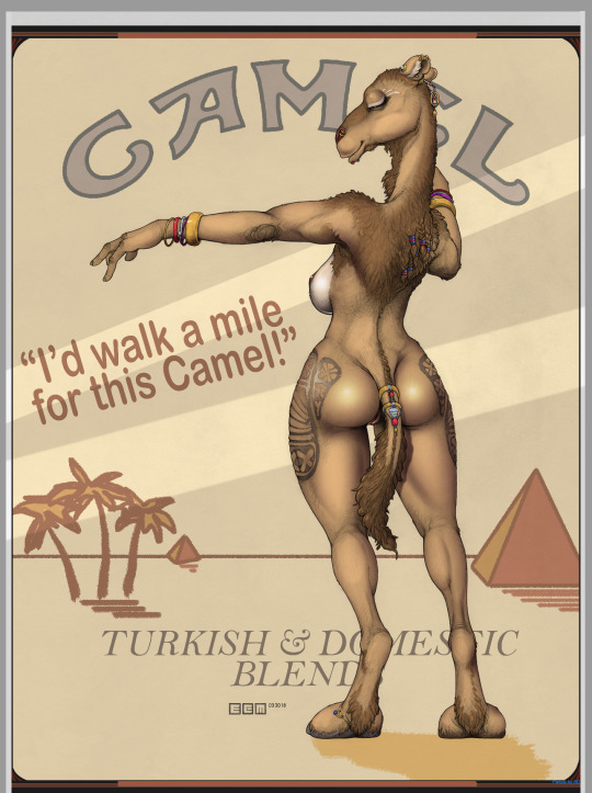
Jo Camel - by ECMajor
BTW, with the new Mature filters, I have no real need for BDNSFW so I'm not really using that anymore. Anyway, let's try another borderline image. I really need Tumblr to keep hitting me over the head with blocking my images. :)
I actually had quite a bit of fun mimicking a pack of Camel cigarettes to finish this image up. My headcanon is Jo Camel was a failed attempt to replace Joe Camel with a mascot that would attract a more mature audience. It worked all too well, but the tendency of the test subjects to lick the pack caused RJR to put a halt to the project.
3 notes
·
View notes
Text
Dammit Tumblr. Deeja Onsen
I start out all angsty and saying I'm not going to come back to Tumblr, then I make something I want to do one of my essay-length things on and it even will fly on Tumblr. Pillowfort is all but empty and Twitter is obviously not great for essay-length posts. So... I lied again.
I've been coloring a lot of Cokesero's Deejas lately. Hey, I like Argonians and I love his commitment to a minor antagonist, plus he's pretty damn good too! So I did another and this time there's no naughty bits so even Tumblr will probably let it slide. It kinda blew up (for me) on Twitter, but I made a TERRIBLE mistake - I attributed it to the WRONG COKESERO! GOD DAMMIT! And of course you can't edit tweets. I feel like such an ass.
Well anyway, here's the original.
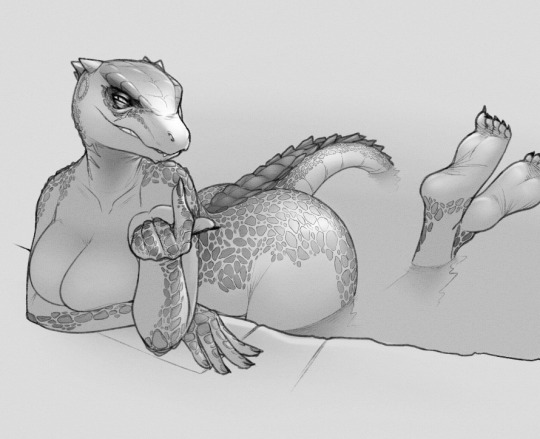
You can probably see why I wanted to color it already. He's already got most the shading done, and frankly - that butt cheek shading looks SO good. I think I know how he did it and I'm going to keep that in mind in the future! But I also thought it might be stupid to try this one since it's so far along already. But then I thought about the water effects and how fun those would be to try... so I did. First, my flat color layers. Technically there's two. The base layer has all of Deeja colored the same green, then an overlayer for other colors on her. At this point line layer is on top set to Multiply and others are just Normal layers at 100%

Thank god - I don't have to color all those scales! He's already done that shading. I thought about doing a highlight on them all, but na... this looks good as-is. So next up, the water. As I often do I grab colors from real photos. In this case...
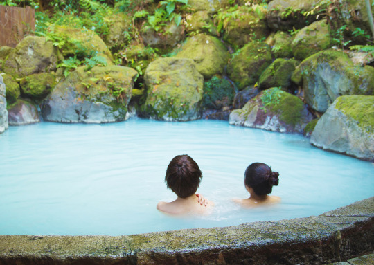
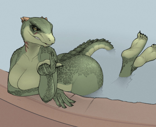
The border she's leaning on I fiddled with other colors, trying the colors in the photo as well - but she blends too much with that. Ended up with a sort of terracotta color with a bit of noise for texture and some light shading. Next some shadows on the wall she's leaning on and some rather subtle ripples in the water behind her. Most of the rest of this stuff is pretty unnoticeable in the long run, but I have learned that little things do make a difference, even if not obvious.

I also noticed the edges of the water in the photo tend more to blue, so I added that. Also I took parts that would be reflecting, (butt, tail and feet), copied them, inverted and skewed them and put each in it's own normal layer but with high transparency - then used the Smudge brush on them to mimic ripples.
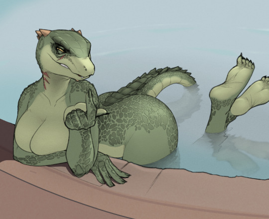
Not sure if it's noticeable, but I also smudged the colors just above the water down into it in a separate layer to hopefully give the impression of the legs, thigh and tail going deeper into the water with a very soft eraser fading them out. The reflections are the more noticeable thing but I hoped that helped too.
OK, time for shading. Cokesero did most of the work for me but... those boobs could use more! :)
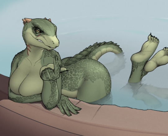
Only 7 soft shading layers this time! I often go well into the teens. Like when I shade her left boob, that's one layer, the right boob gets a different one. That way I don't have to sweat crossover. I erase right up to the cleavage line on one, then reverse for the other. I've found that works best for me anyway. Of course, he did most the shading already. Also I do tend to do a bit of muscle definition with shading too - mostly noticeable on her thigh here. Finally, time for the fun shine layer...

I almost always make this with one or two Color Dodge layers and a brush that's barely lighter than black. There's other ways to do it of course, but that's how I like to do it. Kept the shiny parts relatively subdued here though. Now just a few highlights...

It's important to know when to stop. There's a VERY small highlight in her eyes here, but the main thing is a transparent light "steam" layer over her parts over the water that fades away.
Pretty happy with how it turned out. I do realize I tend to "ride the coattails" of artists better than me, but if I find something that really appeals to me and it hasn't been colored, I do like to see if the artist would mind.
My Twitter has really grown since I started doing Coke's Deejas. I think I'm at about 8200 followers now, and that's pretty big deal. But it's amazing how much WHAT I post really matters. A sexy lizard gets big numbers. ECMajor works not so much, and Prequel things are nearly ignored. That's okay - since I don't draw these things, I just color them, I wouldn't expect different. But I do like to predict a little bit. This one I did NOT predict would be that popular since there's no nipples, ass crack or genitalia. Yet it seems those aren't REQUIRED to get a response if the character is already pretty well established. (They definitely help though. There is a direct correlation.)
Anyway, I hope you've enjoyed today's Ted Talk. I don't mind if nobody reads it. I just like to post these things anyway. When you spend hours doing something like this, it just feels right to document it somehow.
3 notes
·
View notes
Text
On second thought... Naaa
Was thinking of returning here, but I just have to face the fact that a lot of the stuff I do just isn't wanted here. Trying out PF but tbh it's pretty dead. Still, it may be growing.
Good try Tumblr. I still DO like your interface! But... na. You don't want my stuff here - or at least a subset of it. So why would I continue to post having to care about if something is up to your standards?
Will till keep acct so I can watch @glacierclear tho!
6 notes
·
View notes
Text
I now have a good reason to regularly visit Tumblr again.

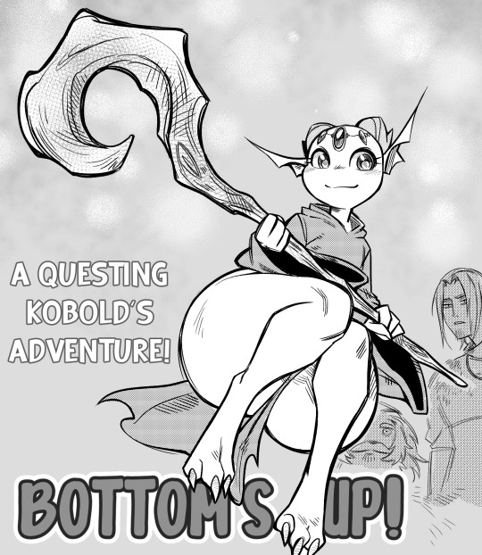
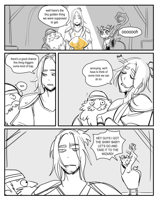

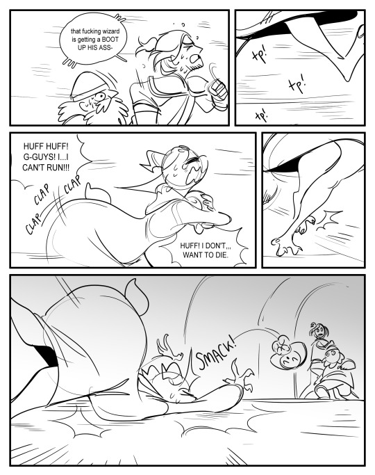
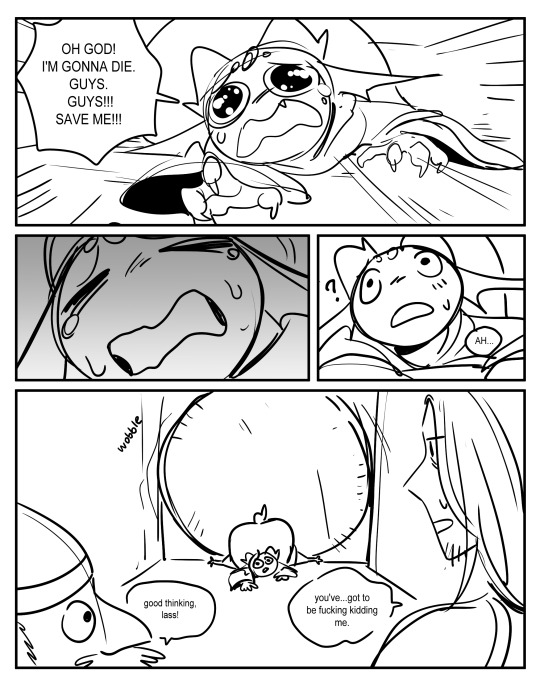
i have yet to introduce my tumblr to Churrp!
a talented (yet, airheaded) mage kobold who longs only for the company of good friends and a life where her ginormous ass won't get in the way.
676 notes
·
View notes
Text
ECMajor Ink-Eyes colored
Let see if this one will be ok posted with Mature filter. Ink-Eyes drawn by ECMajor I colored. I intended background to be a swamp originally, but it kinda morphed into what I picture as an English moorland - which works!

I'm kinda into a Ink-Eyes bing now and have another that will take a long time to finish but looks awesome if I can pull it off:

and...

Both by ECM. That first one will take a while but I really think it'll look great!
OK. Moment of truth. Setting label to Mature. Let's see if this flies.
7 notes
·
View notes
Text
Cokesero's Deeja colored
I never actually left Tumblr. I just can't possibly predict if a nude work is acceptable here or not so I'm very limited in what I can post. But this one's safe enough and I've not done one of these in so long that I'm feeling it. First, I've colored a number of Cokesero's Deeja images. I really like not only his style of drawing Argonians, but frankly his commitment to a frankly minor Skyrim character. So here's today's original drawing by Cokesero...

Very nice action scene. Perspective is spot-on and a prurient panty peek is always... well... I like it. So first, set the drawing to Multiply Layer and do flat colors...
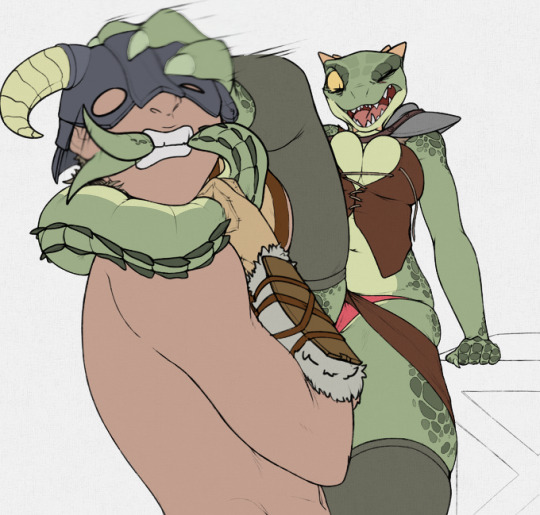
Nothing earthshattering here. But yeah, those panties stand out. Sorry - I like em like that! :) Next is a BUNCH of soft shading layers. 8 in total. It's just easiest to shade in multiple passes for me.

I do squeeze in a bit of musculature suggestions in those layers. Also I've made part of her tail-tip semi-transparent to imply the movement there. Next, a background. About 5 layers here, and I used the photoshop Fibers filter extensively for wood grain.

Time for the Fun Layer - Shinies. (2 layers technically, just easier that way for me.) I tend to overemphasize boobs and mons pubis. Because hetero.
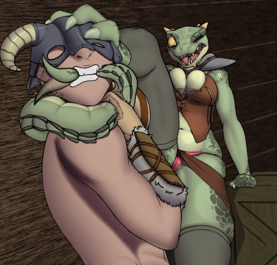
There's a new thing going on above I didn't used to do. I've added texture layers to her darker green skin, her skirt and vest, and his skin. It's probably too subtle to see clearly here, but it's one of the latest new things I've started doing. Another thing I've started doing is...
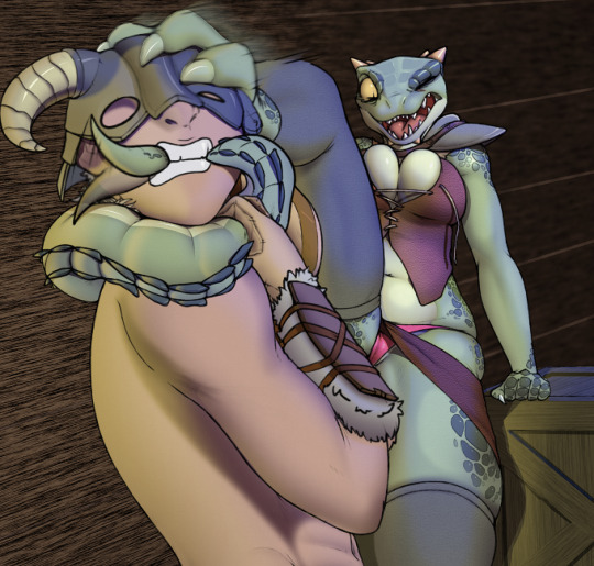
Multiple light sources. Here a yellow light from the lower left offscreen and a blue light source from above-right offscreen. This scene supposedly takes place in the hold of the Icerunner from Skyrim, so an open port in the ceiling at night for the blue and a lantern light source inside seems appropriate. Takes a long time to erase-away those light sources in places they wouldn't hit and I'm not that good at it yet - but I still like the results better than without it.
That's it. My latest and actually relatively SFW.
16 notes
·
View notes
Text
Queblock’s Sensor
I haven’t done one of these in a while, and for a change I have a SFW one, so time to EXPOUND!

This was drawn about 7 years ago. I just came across it relatively recently, but the subject matter interested me quite a bit. The term ‘evolve’ made me think of Pokemon (or Digimon - I don’t know one from the other.) but those prosthetic arms looked decidedly UN-Pokemon. So I saved it, thinking I might want to color it one day. Well that day was mostly yesterday.
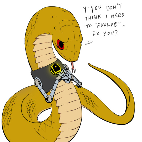
Flat colors. I started with different colors, but decided to do some research and see just who this character was. I knew from Queblock’s original post and the filename itself that it was someone called Sensor. A google search and I had her canon colors available.
Next, I’m thinking background. Where should I plant this snake-girl. Well, there’s obviously a scifi theme here with those robotic arms. So decided to put her in a rather generic scifi ‘corridor’. But also I thought about those scales implied by the sort of hash lining. Naa. I could do better than that. I erased them and applied a few warped scale brushes.
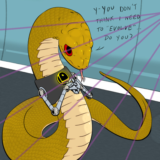
The “light lines” are a thing I’ve started doing when I have to highlight a lot of things (like all those scales) to keep the shadows and highlights consistent. Obviously I take em off in the final product but keeps me focused on where the light is coming from.
The story of Sensor turned out to be kind of interesting though. She is from another world of sentient snakes (and also raccoon sort of things but I digress). On her first appearance in DC Comic’s ‘Legion of Super-Heroes’ she was a bit of a generic princess - but the big reveal later was that this is her actual form. She is able to project illusions though, which she did when around the humanoid Heroes.

Here I’ve added shadows.
So she IS a princess - just a snake princess from her world. She is accepted into the Legion of Heroes. That is a REALLY bold move, even in 1996. A fully ‘feral’ snake girl treated as an equal with humanoid super-heroes! She even has a minor ‘ship’ with another Hero. Good job DC!
But...
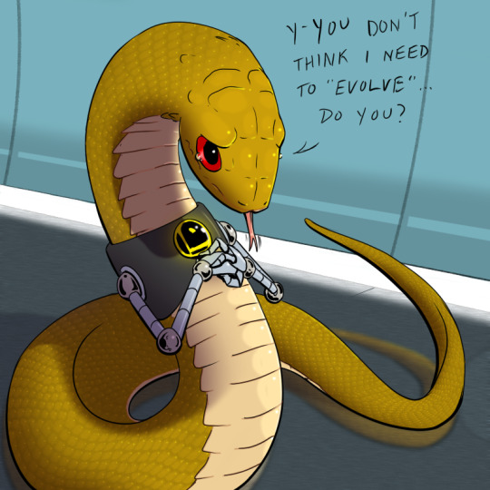
A few more highlights and Voila! Corn Cob Snake! (oof. After adding the scales I realized she really looks like a warped corn cob. But I don’t care. I like corn on the cob. :) )
Alas, DC Comics will always fuck things up. They threw her into an arc where she was transmogrified into this hideous creation.
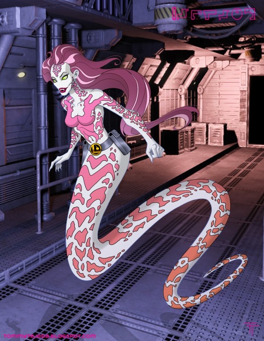
Oof. Yeah, that sounds like something DC would do. Drop everything laudable, drop her color palette even so it’s practically a completely different character. And add tits.
Now hey, anyone following me here knows I love tits. But... I can’t help but mourn for the original Sensor snake girl. Also, if I understood my research right, she eventually gets transformed again from this naga-esque form into a wholly human form. Yeah. Hurrah.
9 notes
·
View notes
Text
ECMajor. And a butt.
An Essay on ECMajor (and a butt)
Yeah. I'm writing a thing on a furry artist. I might start doing this regularly. But I want to start with ECMajor. Is it because he doesn't get enough attention? Nope. Among those who know his work, he's very well known. I've been following him for years now. Don't know the fella at all, but I certainly know his work. I've done some coloring of his stuff since he rarely colors his own, and happily he's fine with others doing that. But when I do I am always inspired to do the best I can because the underlying work deserves nothing less.

So... ECMajor is the best furry artist in the world. (And no. Of course he's not. But he is the best that I follow in my opinion, and I follow quite a few.)
Reason #1: Traditional Art. As in pencils. Lots and lots of pencils. Pretty sure he's been known to do art on a tablet, but his real forte is traditional. Can you imagine the time it would take to shade stuff the way he does? Well, happily you can if you watch him stream sometime. Known as monoceros on picarto.tv. Not a streaming monster but he's on there pretty often.
Reason #2: Variety. You're not going to see ECM do lots of Maid Marion or Krystal. And if he does he throws in a wart or two. (not literally, but he puts his own spin on anything that mainstream.) It is clear he likes the hoofies. And odd eye pupils. But he doesn't only draw cheesecake - at least not in any traditional sense. Plenty of feral things that make you squirm. Undead things that make you squirm more. Cute naked things that seem a little too cute. Hey, I'm not saying I love everything he does and want to put them up as posters in my room! There are things he's drawn that I physically loathe. But they are done so well I can't deny the vision. And that's another reason I think he's the best. No matter what he sees inside his head, it's clear he's dedicated to visualizing it on paper. That's kinda what a real artist is, right there. And if it's something hideous, well dammit it's going to be the best-drawn hideous monstrosity ever.

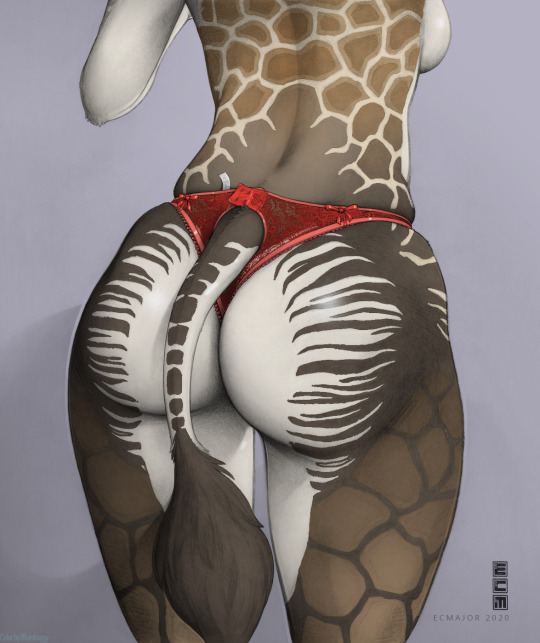
Reason #3: Detail. The detail on some of his work is just outright ridiculous. You-all know I color stuff, right? Well, when I'm coloring stuff, I often get right down to pixel level because of the method I've chosen. And let me tell you, I've never seen the sort of detail he puts into his works by anyone else. It could be a result of doing traditional media, where a pencil actually can draw tufts of hair 2 pixels long. But not just miniature detail - things you wouldn't think of. Little things. Belt buckles that are askew in a way you can tell they would be. Like the one below above is a butt closeup wearing lingerie. He's drawn the friggin filligree work of the lingerie! (Not sure if that's a word, but I think it gets the idea across anyway.) Like, every little pattern is actually drawn in where anyone else would show a couple bits and fade out the rest.
This might be the first one I colored. It drove me to do my absolute best. I’ve improved over the years since this one, and I see some mistakes now. But it was the best I could do at the time, and I’m still pretty proud of it.
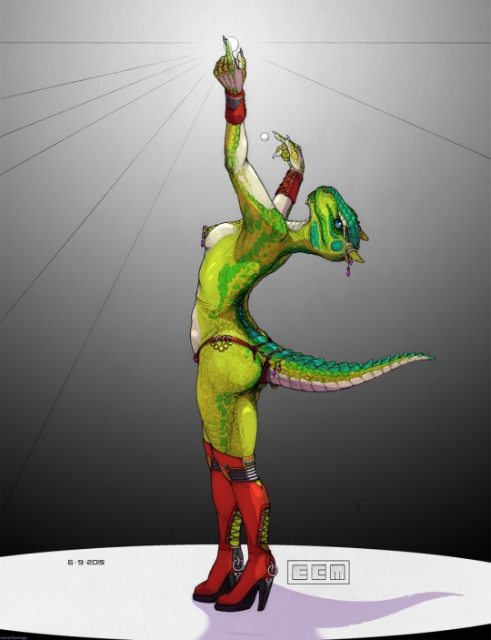
And all that in greyscale. As I said, he rarely colors anything, so he's not able to use colors to define stuff - he does it 100% all with lines and shading. I promise you, if you take away the colors from a lot of the top tier artists, you're not going to be left with much. Which is why coloring his stuff is really pretty easy to do. He's already done all the shading for you. You know where the light source is already. Hell just flat colors on a single multiply layer and you're 90% done.
Okay. I'll stop gushing praise. But if you're not following ECMajor, you're missing out. You won't like everything he does. Maybe 50%, but he doesn't do it for popularity, that's certain. But you also can't argue with his INVESTMENT in his visions. What he sees in his head, he gets on paper and does it with a meticulousness that no one else is doing.
And finally, the butt I just finished coloring. From ECMajor. I did use his reference sheet for Mallory here, so I’m confident the colors are canon.
18 notes
·
View notes
Text
How I Color in Photoshop
I’ve been asked before how I do coloring. I hesitate to call this a tutorial as that implies this is the RIGHT way to do it. Instead, this is just how I do it. My image is a bit risque, but I think Tumblr will be okay with it. This assumes you already have a drawing saved as some sort of file that can be opened in Photoshop. The principal is the same in about every program, but the specifics of how to do things are different. So I’m starting with this:
(BTW, if the images are too small, try right-clicking and Open In New Tab. Seems to show a bigger image.)
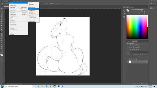
So first off, you may need to change the mode to RGB to work with it. I’ve opened the file here and am changing the mode to RGB. (Edit > Mode > RGB). Once that’s done, we can start working with adding a flat color, a soft shade and a shine layer to it. That’s what I’ll be up to here.

Next, I like to make the line layer editable, so I click the little lock icon there. By default when you do this it will name it Layer 0. That’s fine. If you’re anal you can change it to Line Layer or something.
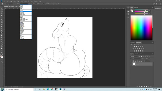
Next I’m changing the Line Layer to Multiply. This is pretty critical. You can do it from the top menu there, or there’s a place just above the layer name (where we Unlocked earlier) too. Either does the same thing. As best I understand, Multiply says to combine other layers with this layer So when we color, the white areas will be colored, the black lines won’t be.
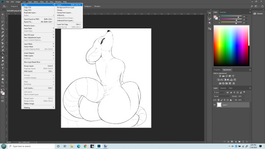
Now I’m adding a new layer that my flat colors will “live” on. It can be a Normal layer since it’s going UNDER the line layer and nothing needs be seen underneath it.

Okay, you can see my new layer on the bottom right I named Flat Color. That’s where our actual colors will be painted. (or more accurately, PENCILED!). You can drag layers above and below each other there, and this layer needs to be under the line layer. I used to make this the Multiply layer and had the line layer underneath it. That works, but will lead to issues later on as you learn to do more layers, so best to just always keep the line layer on top and MOST other layers under it.

Last step before we get to work. I do NOT paint flat colors with a paintbrush. I use a PENCIL. Because the pencil tool is pixel-perfect. That is, there’s no soft edges on a pencil line. Each pixel is either fully colored, or it’s not at all. Even the hardest brushes still have bleed over from pixel to pixel. The size of the pencil really depends on the size of the lines in the line art, but typically I set it at about 5 pixels. That’s pretty small, but lets me get into tight places. I’ve seen others do this differently - but this isn’t about them. It’s how I do it.
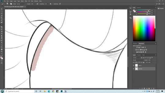
Time to zoom in and get coloring. I’ve chosen my color. Obviously this pencil is bigger than 5 pixels, but I wanted it to be clear what I’m doing. I’m drawing with my pencil right into the line itself. If I stray outside, I use the eraser (ALSO SET TO PENCIL SO IT ERASES PIXEL PERFECT) and keep the edge of the color underneath the black lines. I don’t care about the other side because Flood Fill/Paint Bucket will handle that later.
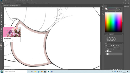
Here I’ve finished drawing the color inside her butt cheek, keeping the edge under the black lines. In practice I’d have gone on to everything that needs to be colored with the same flat color, but keeping this simple. Now I’m switching to Flood Fill/Paint bucket and am going to fill in the rest with one click. It normally will fill the entire section pixel-perfect, though sometimes around very tight angles it may miss a few. Those I fix with a pencil directly.

Bang! Butt cheek filled with a solid flat color. Now draw the rest of the damn owl. No, but seriously I will do this for the entire character with the various colors I want. For her I did this color for her body, a pinkish color for the tail and nose, a white and a green for the eyes. But there’s another advantage of doing this - I can select entire body parts by just selecting the Flat Color layer and use the magic wand to select everything that is that one color. Trust me, that’s a real benefit. You can get stylish later on, but having this flat layer is still awfully handy to keep FLAT. Okay. On to shading. Notice I now have a 3rd layer in between the Line and the Flat layers. It’s where I’m going to do Soft Shading. I also put it in between the line and flat layers, and I set the layer type again to MULTIPLY. Because I do want the flat colors showing through it.
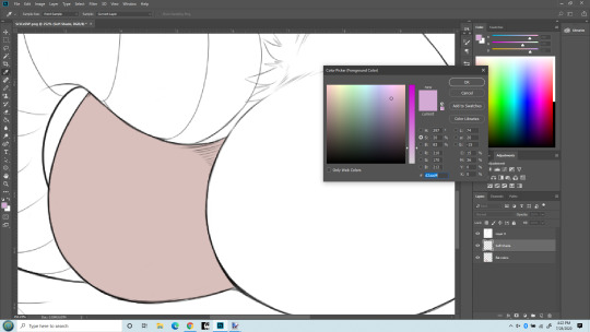
Now I’m getting ready for soft shading. I almost always you a greyish-purple color for shading. For me, it just seems to work the best. I know there are more intricate things, but this is a basics lesson. Another thing, when doing Soft Shading, I use a HUGE paintbrush set to the softest possible setting. Typically the brush spans the entire size of the body part I’m painting. I also SELECT just the part I’m shading. Sometime that takes some patience with the lasso tool, sometimes you get lucky and can just use the Flat layer to select, then move back to the Soft Shade layer. The important thing is to select only the part you are going to shade. You’ll have to do it over again on the other parts. Ideally the separation between the body parts will be a nice line you can hide the transition inside of. Othewise the Smudge tool is your friend to correct small mistakes in shading.

HUGE soft round brush. I think I used about 400px here. But the important part is, you don’t even put the center of the brush inside the section you’re shading! The shading is done with the edge of the brush. Essentially you’re almost doing a gradient.

Zoomed out with a nice soft shading. I did use a similarly soft eraser to work it back a little too.
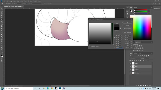
BONUS! Notice the new layer? SHINE layer! I put it above the soft shade. Really I’d probably do a hard shade layer in as well, done similarly to the soft shade in the same color but with a smaller, harder edged brush and just in limited places.
But I want to show the MAGIC of COLOR DODGE! That’s what my Shine layer is set to. Essentially if you color in black, nothing changes. If you color in a grey, it lightens the colors underneath. If you color in white, no matter the underlaying color, you get white. There are other blending types that work similarly but I just like the effect of color dodge best.
Also, note the color I’m chosing. It’s ALMOST black (which would result in no change). It takes only a very small bit of not-black to make a big difference. Going to give that cheek a highlight. First, with a soft brush at maybe 40px.
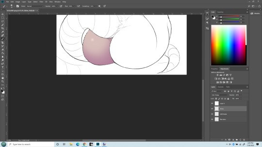
What a difference a little dot makes!!! Now that cheek’s really popping out! The type of brush used when making a highlight makes a big difference too. I do tend to overdo this, I know - but I like it! I can’t help myself! One last thing - what if I use a hard-edge brush instead of soft for the highlight?

Same size brush, but now its hard edged highlight. Really the softness (or other texture used) defines the kind of surface it’s on. The soft looks more natural, esp. on skin. The hard edge looks more like rubber/latex surface. (Neither look like rat fur, but sometimes you don’t care!)
That’s it. This is how I do stuff. Plenty of other things I could have mentioned. Reflection layer is a biggie. I like to do both soft and hard shading too. Eyes of course. Nothing makes a picture shine like good eyes. And then there’s what I truly call Highlights - a layer that goes on top of the line layer, so it can obscure even the lines. Backgrounds, which I’m not very good at but I almost always do them anyway because I like pictures that define a place and time as well as just a character. Shadows (as opposed to shading) which is frankly an art form in itself. But I’ve already put in more pictures of a rat butt than Tumblr is happy with so I’ll end it here.
5 notes
·
View notes
Text
Dreams of Summer
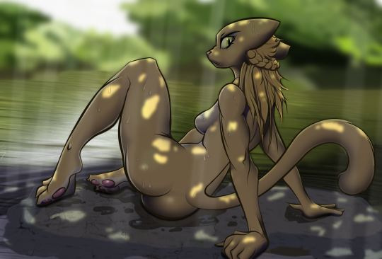
Here, have a naked khajiit caught skinny dipping in the heat of a summer afternoon. Nippless version. She puts on an angry front, but if you’ll join her, her mood will improve. Original drawing by Guoh, but I reinked it and everything you see is hand done by me so yeah - though I still can’t draw, I can sure color!
Rajirra from Prequel Adventure if you didn’t already know. Just a sacrifice to the gods of Summer to hurry up and get here.
4 notes
·
View notes
Text
Signage
I was walking my dog the other day and got an idea for a silly little comic. Kazerad wrote an essay years back that has always stuck with me about a well-meaning little alien lizard that comes to earth but doesn’t know social conventions here. I extrapolated that to Katia who isn’t really all that much different than an alien sometimes.
However I’m pathetically bad at drawing. However I found a perfect drawing of Katia for it by CubedCoconut that I was able to color and mod to my own nefarious purposes. He just gave me the OK to post it, and the others are Kaz’ own works - modified.
No female presenting nipples were harmed in the making of this comic. I’m not sure what the tumblr rules on phallic symbolism on bathroom doors are though. I guess I’ll soon find out.

#katia managan#misunderstanding#s'thengir#prequel adventure#bartender#ASOTIL#oblivion#the elder scrolls
48 notes
·
View notes
Text
One Leg at a Time
Two people sent me this a few days ago - apparently posted anonymously on 4chan somewhere. One asked if I’d be interested in recoloring it. Of course I would!

But I kinda went overboard. Modified the head and legs to be thicker and a few other things, then went more overboard on the background. Censored version here for Tumblr and the Prequel Booru.
4 notes
·
View notes
Text
Mako-Weave - by SentientSocks
Got around to coloring this 6-year-old drawing by SentientSocks today. Just a silly Quill-Weave cosplaying as Mako from Kill La Kill. Wow, that anime is > 6 years old already? I should probably watch it someday.
(I did add the tail. And colors of course. Crappy background by your’s truly.)

17 notes
·
View notes
Text
Lizards in Love - orig by KuroNeko
I’d asked KuroNeko to draw a sick Katia being nursed by QW a few days ago and he came through with a bonus!

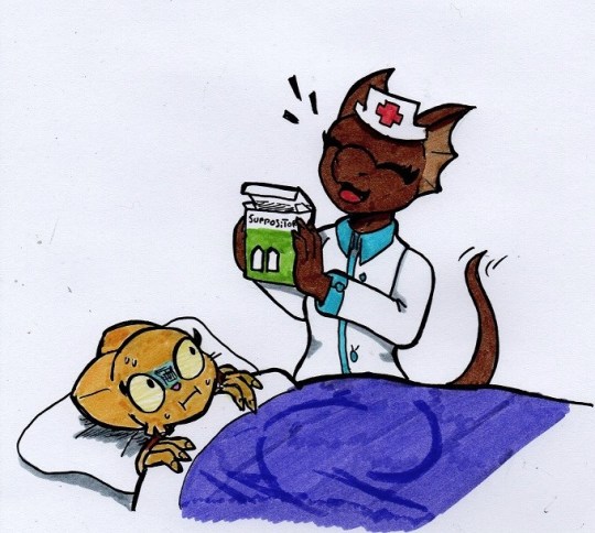
So I felt like doing something for him. He’d posted this sketch that he said he messed up when inking so he wasn’t going to do anything more with it. Sounds like an opportunity!

So I inked the major lines. I did make a few alterations but not many. I do note I left off the stripes now... dammit! Oh well...

The lamp indicated a night scene. He told me both were very pale green bordering on white. I colored them that color, but the dropped the luminosity big time...
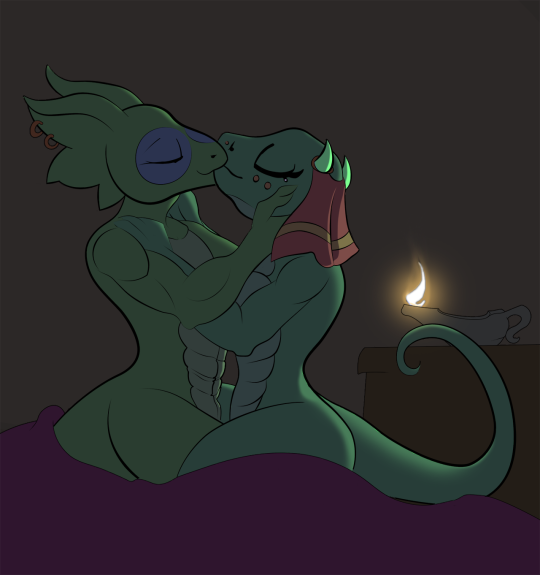
I looked at this and realized I needed another light source to keep it from looking too dull. What light source?
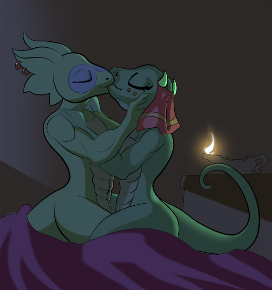
Why, moonlight of course! I do love me some moonlight. Still need some soft shading though...
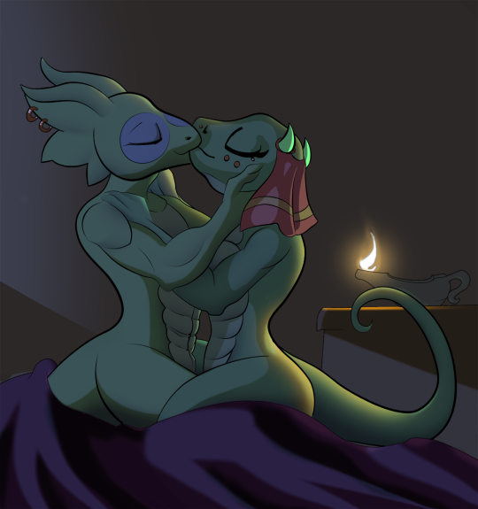
Finally, that back wall is still too plain, and no lizard should be without their proper highlights! So... finale:
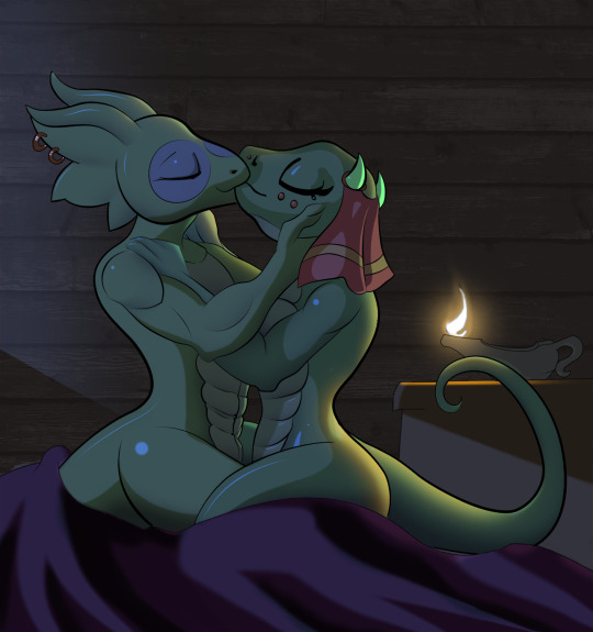
I might have to revisit this and add those stripes though. How did I miss that? KuroNeko didn’t say anything about it, but...
16 notes
·
View notes
Text
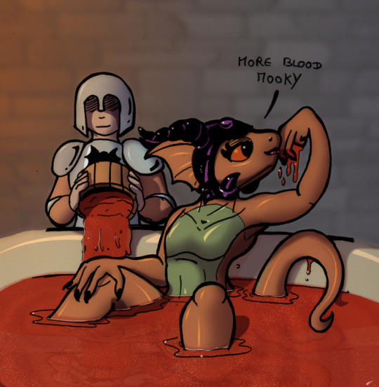
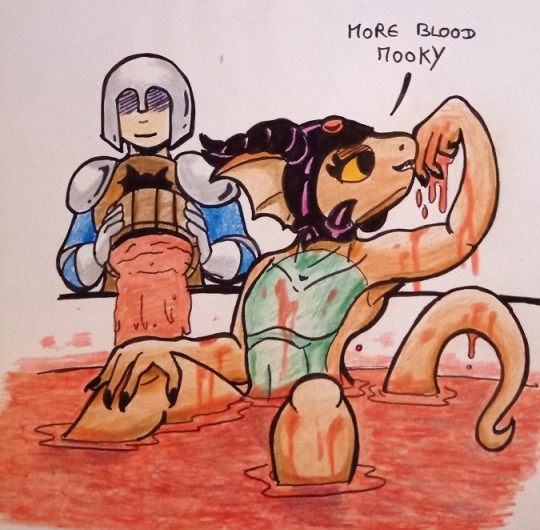
Evil Quill-Weave Bloodbath

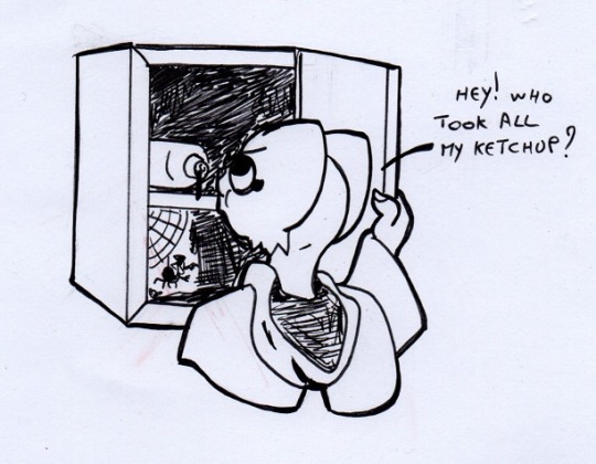
Kuroneko showed me the original line drawing, but didn’t tell me much more about it. A day later I couldn’t resist coloring it. Well, joke’s on me because it isn’t supposed to be real blood. It’s literally supposed to be ketchup.
I did another version as ketchup, and was pretty happy that it turned out to be more obviously ketchup.
Kuro did his own coloring though - traditional media.
and finally, the punchline:
12 notes
·
View notes