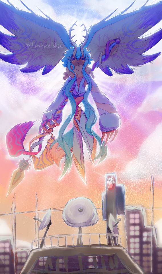
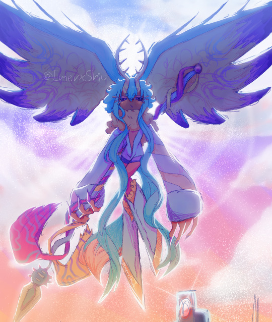
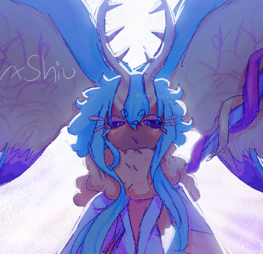
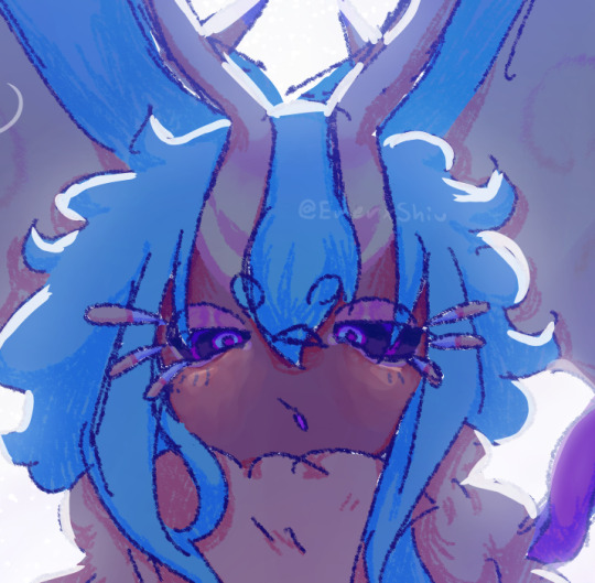
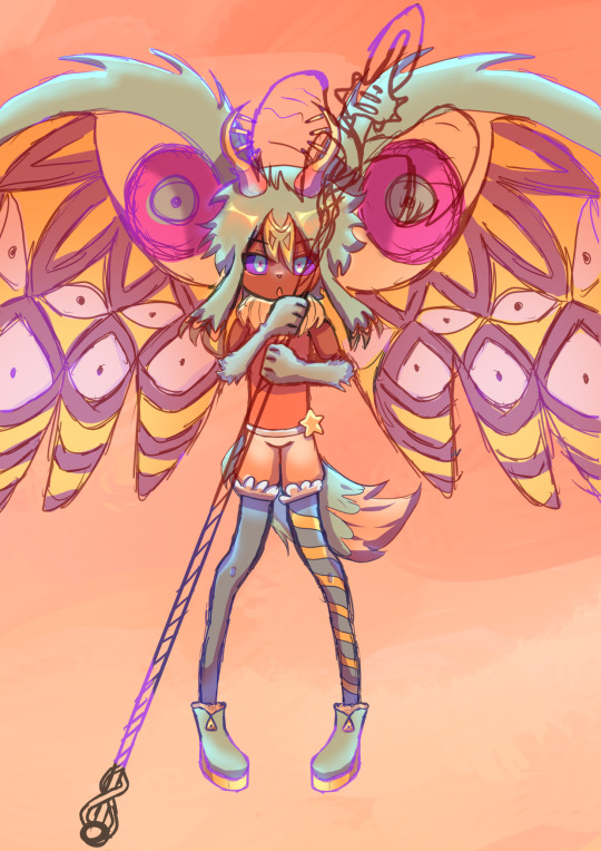
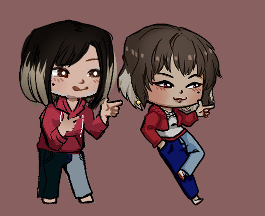
#i tried really hard and had to redraw it a lot
Explore tagged Tumblr posts
Visit Tumblr Blog
Explore Tumblr blogs with no restrictions, modern design and the best experience.
Last Seen Tumblr Blogs


Fun Fact
Tumblr was named as a finalist in Lead411’s New York City Hot 125 in Aug 2010.
Text

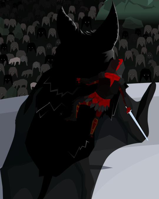
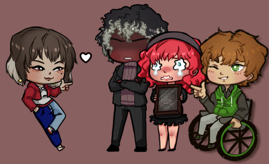
“you’re shoving too hard” “youre not shoving hard enough!”
@razatronz
#mush art#im really happy with thix#i tried really hard and had to redraw it a lot#i really hope people like it#i was gonna draw the scenecap where keith pushes back but i changed my mind#voltron#vld#voltron legendary defender#klance#keith kogane#lance mcclain#fanart#klance fanart#scene redraw#klance elevator scene#i really hope you like it#im very happy with it because its so good compared to my ild art but im so scared of you all#im so happy with if#it looks so good to md#voltron fanart#voltron fandom#voltron keith#voltron lance#voltron klance
299 notes
·
View notes
Note
What was the hardest Beastie for you to design in general! There's so many fantastic designs I'm curious which one had you stumped if any at all. Also how on earth did you come up with so many funny little expressions! I feel like I see a new one everytime I play, they're fantastic! Thank you for your wonderful touch to this game, such lovely little guys!
What was the hardest Beastie for you to design in general?
One in particular comes to mind but it's still sort of a secret. I'll try to return to this when more people know about it so I can talk about it in particular!
There were plenty of other snags, though. In particular Crabaret was so so hard to pose. They don't have finished sprites yet, but Crabaret is unique in that their final sprites will not flip (always crab walking), instead they have two sets of poses for w/e direction they're facing.

Have you ever tried to imagine a crab pivoting on a "waist"? A crab doesn't have a waist! And I gave its torso such a naturalistic shape from every angle other than front why on god's GREEN EARTH DID I DO THIS TO MYSELF!

Around the time I was doing poses for this beastie I started experiencing some (still quite present!) nerve pain/numbness in my hands. For other designs (like Yueffowl) I've done vector art with my mouse to give my hands a break, but try as I did I couldn't do low-res art in a way that communicated the stupid ridiculously nuanced shape I gave this crab, so it was a slow process of sketching out the color-coded body part position in little bursts, using supplemental 3D modeling for stuff I had no means to draw;


Don't get me wrong I'm quite proud of Crabaret but good lord this one was months of on and off work.
How on earth did you come up with so many funny little expressions?
I can't take all the credits on the expressions! Nearly all of them were originally drawn by Greg, but at a resolution that looked really blurry at the size the faces wound up being. I get real fussy about pixel resolution in a way that Greg doesn't, so I asked if I could redraw them at the size they're currently used. Here's a side by side of some of the old/new faces.

As you can see a lot of their soul was already there! I mostly just pushed the shape language of them and sharpened them. Greg wanted them to still feel like his drawings and they definitely do!
121 notes
·
View notes
Text
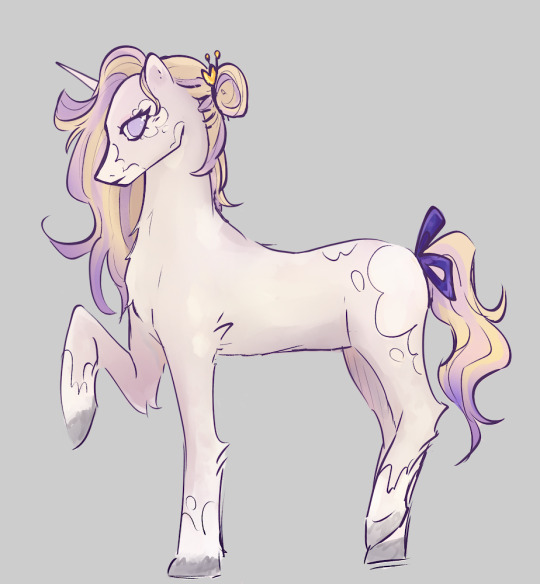
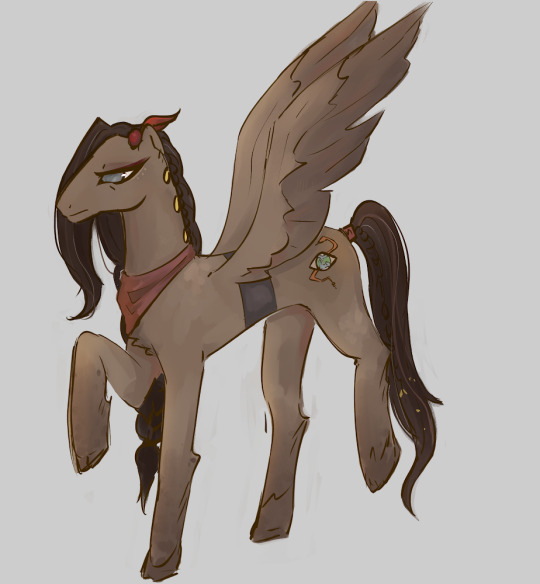
Twst mlp AU | thoughts behind the designs
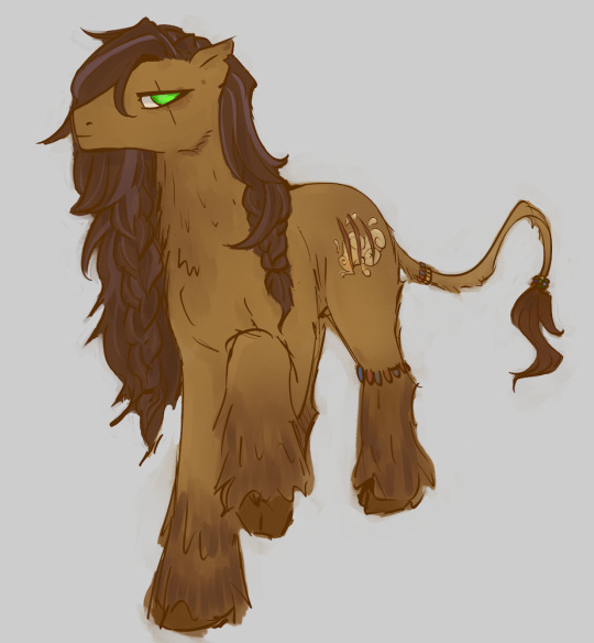

I made Leona an earth pony with a thicker build. Hes a square with sharp angles! Hes one of the first drawings I made for this ‘series’ so its a bit lackluster, but I wanted him to be nice and hairy. I gave him a more lion-like tail, and some jewelry from his culture. His ears are nicked and he has long, slightly tangled hair. He also has a lot of hair around his neck becuase he’s a lion! I gave him a color scheme vaguely resembling a lion as well. Also nice and hairy legs, i love to draw those on horses. His cutie mark is three claw marks over clouds of dust. There are multiple different meanings to this cutie mark.
Vil covers up his cutie mark for personal reasons, but its a spotlight shining behidn some curtains. I tried to give him a more ‘feminine’ look while also keeping sharper angles. I love his color scheme, and i made him a unicorn because I thought it fit perfectly. I considered making him an earth pony to really show how he works hard for everything and doesn’t take shortcuts, but in the end unicorn won. I might change it later though! I had to give him some elegant white spots too, because aesthetically it just clicked in my head. He has a purple bow and has his unique hair accessory in his bun. I gave him longer eyelashes, and instead of making his hair a blonde-purple gradient I made some locks purple.
Jamil!!! He’s one of my favorite designs. I know the obvious choice seems to make him a unicorn, but HEAR ME OUT ON PEGASUS JAMIL! It adds a lot of symbolism and extra layers I think, it’s very tragic. Plus, he looks pretty with wings. I gave him darker and greyer colors to portray his darker and jaded nature, and it’s a nice contrast to Kalim’s design. I tried to vaguely design him off of Arabian horses but it didn’t come through very well. Did you know that MLP has a race of horses called ‘Saddle Arabians’? I didnt and i think its absolutely hilarious. Jamil is also supposed to have bags attached to the thing around his waist, but I’m too lazy to draw them.. His cutie mark is an eye with the world as its pupil, and a snake curling behind it. I put a lot of thought into his cutie mark and I’m really happy with what I came up with! To me it has 4 different meanings! I kinda want to redraw Jamil because he looks so small compared to the others!
Kalim is a unicorn for even more delicious angst. His whole family is unicorns. He’d much rather be a pegasus, but at least he has the magic carpet! Jamil thinks it’s bullshit that Kalim can use magic AND can fly. I made Kalim’s colors more vibrant and yellow and lively. He wears lots of jewlery, has tattoos and is my favorite design of these four! He also took me the longest. His cutiemark is a sun or a coin with gems on it, and it has wings. This too has multiple meanings. I think in the Scalding Sands culture the snake jewelry was something the sorcerer of the sands, an alicorn, wore around his horn. Maybe the original was a magical artifact? Well, Kalim, and other people from the scalding sands, wear fakes to honor the sorcerer. Anyways, I made Kalim slightly hairier then Jamil to show how he’s softer and wilder.
———
I’d love to do more with this AU, because my mind is already full with so many cool ideas! Thanks for reading my rambles and have a nice day :)
#twisted wonderland#twst#fanart#art#jamil viper#leona kingscholar#vil schoenheit#kalim al asim#my little pony#mlp#alternate universe#noahsart#my art#sorry for posting art you’ve already seen#but I forgot to put the explanation in the original posts and posting the explanation without the art would be weird lol#anyways here they are! the first four <3#ディズニー ツイステッドワンダーランド#ツイステッドワンダーランド#ジャミル・バイ��ー#ヴィル・シェーンハイト
144 notes
·
View notes
Note
Pardon me, however, have you ever considered getting help on WAIGLZ or any other fic of yours? Such as a ghost writer or someone to help you with art so it can get done faster?
I am just curious because I thought it would be really coolio to work with you or something, idk.
Please have a truly wonderful day/evening and toodaloo! ^ ^
+ Btw, if I sound rude at all, that is %100 not intentional tone is kind of hard to translate through text lol
I appreciate that the question is meant kindly; but why would I want somebody else to tell my story for me?
It might not make a difference to an audience member; y'all simply just wanna see the rest of the story, it doesn't make a difference who made it because from the consumer's end it still reads the same.
But it makes a hell of a lot of difference to the writer.
If i wanted a ghostwriter I could just chuck my outline into chatgpt. it would be just as good—which is to say it would be very bad—because in both cases it'd be written by someone/something that doesn't intimately understand the vast web of ideas the story's built on and the hundreds of tiny tiny goals I'm looking for places to thread into the story and the exact themes I'm trying to achieve and exactly where and how I want to make it funny and make it heartwarming and make it hurt; and in both cases I'd have to rip the product apart and edit it to sound like the story i'm trying to tell rather than sound like a 40% accurate retelling of my story that was based off of a barebones summarization.
Like, how many times have you seen Gravity Falls? Probably at least once or twice? If you sat down with an episode summary—only the summary, not the transcript or gallery—and tried to rewrite the script word-for-word and redraw the episode shot-for-shot, do you think you could get every word and every angle right? And you've already seen the episode! You remember the finished product! Imagine trying to guess at all that based off of the summary alone if you'd never seen it before!
So now instead of writing my own story i'm merely editing SOMEONE ELSE telling a water-downed version of my story. It takes me just as long if not longer; and on top of that there's no joy in it.
And if that's what i wanted to do with my life... at least shoving it in chatgpt would get me a first draft to edit faster.
as for art: about a decade ago i was writing/drawing a fancomic and tried to split it with friends so i was writing and they were drawing. it slowed down the whole thing immensely. took 4x longer to get art than doing it myself would've taken.
At the time, I updated multiple times a week (my art was worse then lol); and when I asked someone else to do art I had to keep choosing between:
delaying my next post for days while patiently waiting for a friend, with no guarantee they'd actually finish;
impatiently waiting and trying to find a way to politely repeatedly pester them about finishing the art; or
give up on waiting and do the art myself, which would hurt them deeply, especially if they'd already started it and I just went "nah you're too slow, I'll do it myself."
The thing is, I put my passion project ahead of my other hobbies. Why would somebody else put my passion project ahead of their own hobbies? It would be unfair and unkind for me to ask somebody to do that; but I'm not willing to slow down and wait for somebody to do some art for me when it's finally convenient for them; so therefore I'd better do my own art.
#(asking someone else to write my story for me would be like asking someone else to fuck my wife for me.)#(like i bet you would like to help fuck my wife! she's a lovely wife! That's why *I* wanna fuck her! find your own wife!)#(for the purposes of this metaphor please pretend that I'm not ace and that I have a wife and that I enjoy fucking her)#anonymous#ask#bill goldilocks cipher
43 notes
·
View notes
Note
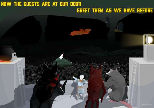
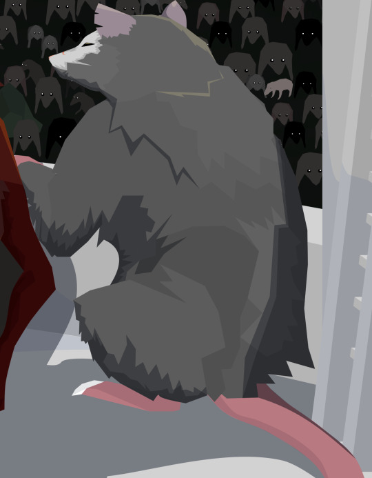
All right I take the bait. Why do you believe Manel should have accompanied Pacifica at the party
AHHH THANK YOU IM SO EXCITED TO EXPLAIN MYSELF (in reference to this post)
ok. northwest mansion mystery is a great episode obviously. but HERES why i think the episode would've been even better if mabel was in dippers spot!!!!!! its kinda a lot so i put it under a read more
so this episode is sort of the middle-ish of season 2 i think, right before the ford reveal!! its not a super long show anyway so theres not a ton of pacifica appearances, anyway. BUT in EVERY SINGLE OTHER PACIFICA EPISODE, her energy has been bouncing off of mabel!!! from their meeting in double dipper, to irrational treasure, to golf war; they have been established as the main dynamic here. golf war is especially important here, because this is the very first step in pacfica's redemption arc! mabel saves her in this episode, the pines give her a ride home, and it seems like pacifica is going to start being a little more understanding of mabel because she had misjudged her, hence why she was treating her so poorly. it looks like theyre gonna establish a friendship between them!
and then. they dont. they basically never interact again. because the next time we see pacifica, she goes straight to dipper in northwest manor mystery. the cold open implies that the northwests wanted dipper specifically because of his knowlege of how to deal with the supernatural but IN MY OPINION that DOESNT EVEN MAKE SENSE because we NEVER see dipper fighting these monsters on his own? hes ALWAYS with mabel. at the very least, i think it shouldve been BOTH of them??? we see a brief shot of a newspaper clipping where dipper is fighting a vampire bat or something and i just. when did this happen. where is mabel
that would be a fine argument for it being both of them instead of just mabel so heres one of my bigger points thats gonna come back a lot in this breakdown: dipper. does not like pacifica. he STRAIGHT UP HATES HER. every single interaction theyve had has been negative!!! its even massively negative at the beginning of this ep!!!! though mabel often dislikes pacifica, she TRIES REALLY HARD TO LIKE HER. mabel has a lot of love in her heart, and if she could, shed want to be her friend!!! its always been pacifica whos been rejecting those advances!!! golf war was the start of pacifica understanding that about mabel, and it nmm wouldve been the PERFECT time to wrap up that arc, rather than leaving it!!!
and i would argue that could STILL LEAD INTO A DIPCIFICA ARC, if thats what the showrunners/fans wanted? most of why dipper hates pacifica to begin with is because shes so terrible to mabel. he only agrees to go to the party in canon because MABEL wants to!!! imo, i think the lead in to them being a couple would be a million times better if that massive problem in their relationship was solved first
i dont PERSONALLY like dipcifica but im trying to stay unbiased about this if you cant tell
i would also argue that like. dipper just seems really out of character. the reason i picked some of the scenes i did for my redraws, was because they were scenes that i think his behavior would fit mabel a lot better. examples:
why do the northwests have a suit in dippers size anyway. he literally doesnt even like wearing it sjkfhkj in a potential re-write of this ep, i considered that mabel would come in wearing her super extravagent home made dress, and it would 'violate dress code', so she would be forced to wear one of pacificas we could still have that cute dress-up expo scene that we do AND have some fun commentary/symbolism about pacifica being nervous about having her in the dress because its NICE and TOO GOOD FOR HER and she looked FINE BEFORE ANYWAY
mabels empathy is a recurring theme in the show. shed WANT to give pacifica the benefit of the doubt, and would be VERY betrayed when finding out her and her family already knew about the ghosts and knew what he wanted. i understand that dipper was so upset because it seemed like pacifica was changing for the better just to find out that she wasnt, but i think this fits so much better with mabel, because shes always WANTED to believe that shes secretly a good person. she would be glad to see her turn a corner, and would be upset when finding out she was 'wrong', and that she really was mean deep down. whcih would obviously lead to her comforting her later/finding out the truth about her etc etc. on the other hand, dipper literally never believed she had good in her. from the first interaction we see of them, he thinks shes as terrible as her family. he ISNT as interested in giving her the benefit of the doubt and if it wasnt a life or death situation i dont think he wouldve forgiven her. IDK i just think its more in character for her
the dancing scene!!! honestly this works fine as is (i can see both dipper and mabel being excited to make a mess on a fancy carptet) but idk i just think it carries so much more weight if its these two girls. silly moments for mabel!!!! pacifica getting to really be a kid and not just a sparkly prop!!!!!!! pacifica finally indulging in her sillyness that she mocked in irrational treasure!!!!!!!!!!!!!!!
ok moving on. one of the bigger things that bother me about it being dipper here instead of mabel is one teeny tiny (honestly really irrational) scene at the party. in it, dipper is confronted by fiddleford, who tells him he has big news about the author/the laptop and the towns in danger and its vitally important and dipper just. shrugs him off???!!?!?!?! i cannot even IMAGINE. in alex hirschs words "the first season is about dipper being in love with wendy, and the second is about him being in love with the author" meaning that. those are the TWO things that dipper is completely and totally obsessed with. hes clearly not over wendy (as we see in later episodes) and this is not long after sock opera/society of the blind eye so youd THINK hed be more depserate for answers than ever!??!?! this child was willing to sell out his great uncle and raise the dead and stay up for several nights in a row for answers, and the second he is offered some (from a man who WORKED WITH THE AUTHOR btw) hes like like 'whatevr'?!?!?! it is so out of character and it drives me fucking nuts every time. i know hes starting to like pacifica now but as we see in the comics (if you chose to think those are canon) HE DOESNT EVEN SEEM TO LIKE HER THAT MUCH!??!?! hes STILL convinced shes vain, and mean, and selfish!!!! he DOES start to have a little arc with her but jksdfjksf IDK i just cant in a million years see him passing up the chance for answers to the biggest mystery in gravity falls to hang out with a girl he tolerates
but yknow who i CAN see doing that? MABEL!!!!!!!! mabel would be concerned when mcgucket comes up to her, and starts talking like this!!!! i can totally see her suggesting that he relax for a little while and enjoy the party like dipper did, and then forgetting to come back to talk/not running into him later!!!! ESPECIALLY since i can see mabel WANTING to spend time with pacifica where dipper just. really doesnt seem to want to MOST of the time
ok ill admit that this last one is sort of a personal opinion. but i just. i really dont like the B plot of this episode with mabel and the girls. IDK its just so annoying and pointless to me to have a plot where its just a bunch of girls turning against each other over a guy. im not gonna say its mysoginistic bc i know little girls can be boy crazy but i just. dont see why there was a need to make them fight/turn against grenda briefly??? even when they rekindled and it was all ok in the end its just. in comparison to the A plot its so. Nothing.
in my head i have a rewrite of this episode and how it goes is that pacifica approaches dipper and asks for help and he turns it down (like he does in canon). mabel suggests that they do it anyway, but he refuses, as he wants nothing to do with her. when dippers gone, mabel agrees to help (and pacifica begrudgingly accepts bc it seems like the only option) and so she steals the journal when dippers not looking. she goes to the party, and events go pretty much the same?? only major difference i can think of is that the B plot is replaced by one where dipper realizes mabel and the journal are missing, so he sneaks into the manor/sneaks around the house trying to find he rand get it back (and its so massive he has no luck). the reason i think THAT works is because we can even still have the scene where dipper turns to wood like shifty prophesied!!!! and i would even argue it makes more sense this way because wasnt shiftys warning that "if you keep digging so deep into the secrets of gravity falls, this will be the last form youll ever take" ?
OK IM SORRY THIS WAS SO LONG im probably forgetting points too so i might edit it later but THANKS FOR ASKING
tldr: pacifica and mabels friendship plotline was left on a total cliffhanger after golf war and if mabel replaced dipper in nmm it would've been a good resolution to it
edit: check the reblogs if youre still interested! i added another list of reasons i think this (mostly in response to people disagreeing)
#Gravity Falls#gravity falls analysis#gravity falls essay#mabel pines#pacifica northwest#northwest mansion mystery#northwest manor mystery#gravity falls nmm#nmm#mabcifica#mabifica#i wanna add that. it is fine if you like dipifica SJHKDFJHKDLS I KNOW ITS CANON i personally Do Not Get It but to each their own#but also while saying that i want to add that . im not trying to argue that mabcifica should be canon#in fact i do not think it should be#when i say i think mabel should be in this episode i am specefically saying that it doesnt NEED romantic undertones to be good#they can jut be buddies#cloudysrants#northwest mansion mabel au
410 notes
·
View notes
Text

I FINALLY FULFILLED MY GOAL!!
Second half of Genderbend Tristan platoon (Tristan and Jade) as promised!!!
The second I realized I would post Tristan and Jade’s designs together I realized I had to redraw this scene from the anime. I did really change their height difference, Tristan’s really just taller though (thank you Elizabeth) for all those curious Chion’s height is like somewhat between them and Isolde is just… jack up the really insane height difference.
For the rest of Genderbend 4kota designs here’s what I’ve done so far: Isolde + Chion and post-timeskip Chion (not a lot but hopefully there will be more)
If I continue with this next update is probably gonna be either more Jade or Chion art, Aged up versions of platoon, or Donny and Edlin
I haven’t put this anywhere but if anyone wants to ask about the Genderbend characters and stuff my ask box is open. If you want to request a specific sds/4kota character’s Genderbend design I might do it, just expect it to probably take a while and it will probably be done in traditional art.
Design rambles about the art as well as some Genderbend Tristan Platoon (emphasis on Tristan) lore below the cut
Jade’s hair was a pain to design yall don’t even kno T-T I like the design better in traditional art but I wanted to post the digital version of the design for consistency.
What made Jade’s design so hard was that how to give her wing like hair to kinda come through, og she was going to have a middle part, then I thought maybe something like Arlecchino’s design from Genshin but I thought Jade would have short hair so I ditched that. So she ended up with this and I tried to keep the wing design there with the shape of her hair.
Tristan’s design was not what I initially had in mind but here’s kinda my thought process behind it: her hair looks more like what I imagine fem Meliodas would look like, and she’s wearing a full suit of armor cuz… do u really think Mel and Elizabeth are letting their daughter go out WITHOUT A SUIT OF ARMOR?! I don’t think so.
Neither of their clothes were what I initially imagined, Tristan was either gonna wear gold or silver and red, but then I put her in dark blue and I got a thought:
Since Jade, Chion, and Tristan tend to match I put them all in various shades of cyan/blue. Chion has light cyan, Tristan has dark blue, and Jade has both for Monochrome reasons.
Also when Jade dies her jewelry is then worn by each member of the Tristan Platoon. Tristan gets the choker and Isolde and Chion get the hair clips.
Also Jade’s hair clips and choker are made of actual jade (gifts from Chion and Tristan respectively)
Quick Fun Facts about them:
They are both tomboys
At some point Tristan had a crush on Jade (she was going through her romance phase yall and Lance was off on missions and stuff what’s a girl gonna do?)
Tristan really likes holding sleepovers (she has tried to do a full Tristan Platoon one but Mel and Elizabeth won’t allow it for Isolde)
My personal hc is that Tristan always wanted a younger sibling when she was younger and kinda projects that fantasy onto Chion. So from her perspective they kinda have an idealized older/younger sister dynamic.
To elaborate further: Tristan kinda sees Chion as this girl that she takes under her wing and dotes on and what not. This leaves her with a pretty wrong overall interpretation of Chion. She very much just sees the “Tristan (platoon)-exclusive part” which is very kind, very helpful, and someone that she needs to protect/look out for.
I love Chion but u see the problem with that interpretation of her
It’s also the reason why I’m on the fence if Chion’s hair is still getting burned off by Gawain if only cuz Tristan and Isolde 100% would throw hands (and I don’t wanna give Chion a hair cut pre timeskip too much work)
Additionally Tristan really likes Chion’s long hair and likes to braid it and play dress up with her at the sleepovers
Tristan gets a lot of flack for how she presents herself, lots of people think that a princess shouldn’t act that way and stuff
Tristan and Jade have a very similar dynamic to canon. Tristan sees Jade as her best friend. And Jade sees Tristan as… a girl she secretly hates… you’ve read her death scene
Tristan was the one who gave the hair bow to Isolde still, but after seeing how much he liked it Jade gave him some of her old girly things she wasn’t really into, and Chion “just happened” to pick up some new accessories and gave them to him.
Idk why I wanted to do this but here’s all there types(romantic)
Tristan - she’s into more masc women or more feminine men (there you go Trislance and Trisolde shippers)
Chion - says she’s into masc women but it’s not really a factor for her. Wants someone bold, and kinda like a knight in shining armor, prob reads Isolde’s romance novels
Isolde - wants cheesy romance, does not care if he is romancer or romancee he wants cheesy rom com romance
Jade - wants someone who needs her/relies on her since she struggles with feeling unwanted
Another random romantic thingy there are so many romcom hijinks with this platoon there are so many misunderstandings with who is and isn’t a couple:
People of Liones think that Chion and Isolde are a couple. Isolde was heavily convinced that Tristan had a crush on Jade (right conclusion but at the wrong time). Tristan was convinced that Jade and Chion were dating at one point. Tristan was convinced Chion had a crush on Lancelot at one point (I may actually write a fanfic on that for comedy reasons).
As for actual crushes: Chion likes Jade. Jade likes Isolde. Isolde likes Tristan. Tristan likes Lancelot
#4kota#4koa#7ds#four knights of the apocalypse#nanatsu no taizai#nnt#sds#seven deadly sins#4kota chion#chion#tristan liones#tristan platoon#female Tristan liones#4kota jade#jade 4kota#genderbend#4kota isolde#isolde 4kota#trislance#lancetris#chion x jade#trisolde
48 notes
·
View notes
Text


Hey @crown-of-roses-thsc, did a thing :3
Fun fact about me and my journey in the THSC fandom- before I started this blog, I mostly stuck to just watching a lot of things on youtube and just- being amazed at all the amazing stuff people did for THSC- and one of those things I watched was the Line Without a Hook Animatic for CoR- and I would watch that on repeat for HOURS- it was both just an amazing animatic, and I loved the song after watching it, too!
So after getting permission to do redraws, I just HAD to do these- so thank you Snickerz for your amazing au!
And side note I tried really hard to find your Henry's eye color but couldn't- so if blue isn't it I will absolutely go back and change that-
#the henry stickmin collection#the henry stickmin collection au#rhm#right hand man#reginald copperbottom#ellie rose#henry stickmin#thsc#extra stuff#funny story i was listening to the song as i drew these#unrelated au art
34 notes
·
View notes
Text
FORGOTTEN LAND'S SECOND ANNIVERSARY :3
I AM SOOOO BACK
I started this drawing yesterday around afternoon and finished it just a few minutes earlier.
I went with a messier type of drawing instead of more clean like the elfilin one from yesterday, i find it fun doing it like this, mostly cause i dont have to worry about making it perfectly so i dont get as frustrated as normal. Id place this one as my second best digital drawing. im pretty sure i havent posted what i consider my best digital drawing here, tho i do have it in instagram, i might post it here one day, tho these two are way too tied up, i love how this came out, its not exactly like how i imagined it but its really close to it, and also itd say that since i dont tend to play around lighting that much, this was such a joy to draw and i cant help but stare at it a lot, at least until i start hating it because i made quite a lot of errors. i also changed my elfilis gijinka just a tad bit from last time, but its not that big of a difference, mostly.
ofc i had to draw elfilis for forgotten land's anniversary, i tend to deny it in my head but yeah they're my fave of the kirby characters even tho i hate them a bit. I wanted to draw some more doodles, like, elfilis eating cake, kirby car, a bunch of other stuff (not elfilin cuz i already drew him yesterday) but when i tried i couldnt draw anything more, guess this drawing burned me out a lot, huh?
you can definitly tell i spent all the efforts on him cuz if you look a bit closer to the bottom part you'll see its almost barely detailed, but i mean, they're the focus so make sense i guess for me not add that much detail there. um also, maybe because i dunno i had OVER 130 LAYERS jeez no wonder firealpaca was slowing down so much, i need to manage my layers better next time, tho i did do something i keep forgetting, wich is naming them (most of them at least) that was a real life saver
Also, antares (fecto elfilis' spear/cadaceus), as always, was a pain to draw, but this time its probably been draw the most accurate out of every other drawing ive made with it in it, i didnt notice it was like, a little curved when it reached the blade
some close ups since his face is a bit hard to see
silly :3
fun fact! actually, this is technically a redraw, somewhere around between february and march i started a fecto elfilis drawing for the first anniversary, but i couldnt finish it in time, and i never finished it
thats...quite the improvement! (i remember being so proud of it)
also his wings are like that cuz i did not want to draw the pattern, its way too hard, i literally copy pasted it, wait, i was talking about the 2024 version but i looked at the 2023 one and i just noticed it also has the pattern copy pasted, i guess some stuff never changes since i still abuse the ctrl+c ctrl+v to this day
Also i ended up making a huge error there, i was planing to add the phantom spears from orbital pulsar (the attack he does first when you battle them at lab discovera) but theres an innacuracy, when they do the attack, they always close their eyes, i had actually sketched him (well i mean both these drawings are basically the first sketch (2023) or second sketch(2024) with some color, shadows and lighting. i didnt do lineart in the 2024 one cuz i wanted to be a bit like the og i made (too bad i sketched that one with black since the og was sketched with white due to me drawing the bg first)) with his eyes closed but them decided to make them open for a reason i cant remember, maybe i thought itd look nicer? idk
ive had the idea of redrawing this for quite some month now so it was kinda already planned
background cuz i think it came out really pretty
doesnt have the little stars since without elfilis and the structures it looks fucked up. the actual sky in game is more blue, but the clouds have some orange, in the 2023 ver. i made the sky orange, and in the 2024 ver i wanted it more accurate, but i didnt wanna loose the orange sky, so i did a gradient. pretty...
also here's a screenshot i took when i was like halfway trough it, its barely noticeable but i changed his mouth in the final drawing
I really love katfl, like a buncha whole lot, its basically almost my first mainline kirby game. 100% the demo, finished the game in almost one day, i literally play it monthly, like, every month i put the card in my switch, start it up, get morpho sword, and go shred elfilis in lab discovera. i would probably not even be here on tumblr and the kirby fandom if it werent for it. and i love it so much i genuinly cannot express how much i like it and treasure it with words or anything
Thank you for reading my unnecesarily long rambles lol
I hope i'll post tomorrow and dont forget like usual
Jambuhbye!
#art#fanart#kirby#kirby fanart#kirby gijinka#silly#digital art#firealpaca#fecto elfilis#fecto elfilis gijinka#my wife fecto elfilis and his new drip#yep changed them again#fecto elfilis lives in my head rent free 24/7#fecto elfilis fanart#kirby and the forgotten land#katfl#katfl spoilers#katfl second anniversary#kirby and the forgotten land second anniversary#katfl fanart#kirby and the forgotten land fanart#please reach a lot of people i spent way too much effort on this drawing#kirby series#kirby elfilis#kirby of the stars#:3333#:3#digital artist#artists on tumblr#small artist
48 notes
·
View notes
Text


a couple wips and pieces done over the course of this year that will never be completed but felt cute enough to post … yes i draw a lot of leaf she just never makes it outta procreate to tumblr 😭 here are my reasons for leaving them in wip hell:
1. this was half of the piece, other half had hilbert and cheren looking at the girls. hilbert looked really good but i couldn’t get the perspective of cheren to work. was meant to show the reunion of hilda and cheren after the bw -> bw2 timeskip!
2 & 6. kantrio alola trip!! orginally drew blues body for anatomy practice and because of that the pose came out looking too stiff? the 2nd half of the piece had red in it but literally couldn’t get his face to work no matter how hard i tried lol. 6 was just for fun the concept of instagram in the pokemon world makes me giggle. LOVE how i rendered leaf so RIP
3. just a fun leaf drawing!!! just hated the piece next to it! still love how leaf looks there tho! outfit was based off avril lavignes ‘he wasn’t’ mv and dialogue from blues route 22 battle in frlg!
4. my adult design of clem, my fan daughter of red! originally was going to make into a nicer piece but i accidentally merged all the sketch layers together and that demotivated me LOL this happens way too often but still want to redraw clems design bc i really love the pose & outfit!!!
5. based off a part of my very long kanto au! looks fine? just didn’t love the blue piece next to it and always get kinda shy to share my blue x leaf work.
#long post sorry in a yapping mood lol#uploading art that’s anything older than a month old (which ALL of these are) makes me stressed cause I can see the improvement i could do#to ALL of them😭😭😭 i geuss that means ive improved … or i’m just too harsh on myself!!! probs both#wip#ramblings
17 notes
·
View notes
Text
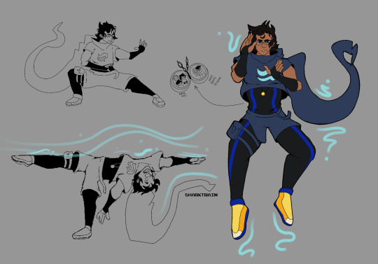
Adult John redesign because he deserves it
Also a follow-up on my threat of airbender John aka John is basically an airbender if you think hard enough about it.
See below if you want to hear my yap session on elements of this design vvv
Okay so, why have I done this?
I wanted to make my own take on his design because I hate seeing my boy get roasted so hard by his friends for his outfit. I tried to keep some elements akin to his child-self’s design for sake of identification. I specifically kept the appearance of a crop-top (as seen in hs2 when he wears his younger self’s outfit) but with the addition of a skin-suit underneath for some actual practical protection (as I assume he will be doing some fighting at some point in the comic). I also kept his hood (it would be a crime not too) but with the addition of a collar to make it more similar to Commander Karkat’s outfit.
I also had an idea to make his outfit inspired by a Blue Tang, as his original colors are blue and yellow. I liked the addition of darker, more muted colors to keep up with the idea that they’re adults and this world they ended up in did not end up to be all sunshine and rainbows. BUT I kept his brighter colors as accents to call back to his fact. But yeah, idk why but I really liked the idea of theming aspects of his design on this little fishy vvv.
As far as the airbending aspect, outfits from ATLA for airbender are dynamic and move with the wind, which I felt suited John’s original outfit well. I’d imagine his hood will blow with the direction of wind which he is bending. Additionally, the reason he has a thigh back (other than its a little bit slutty) is that by having it attached directly to his thigh, he’s less likely to have it get in his way while fighting/wind/airbending.
Finally, the locket. I’m just a sap but I have a headcanon where he insists on fighting alongside his friends, BUT, that means he has to go off on his own a lot of the time, and isn’t able to see them or his son because of safety reasons. Thus, I think it is just a nice symbolic thing (especially because he is depressed) to have a reminder of people he cares about with him constantly.
I might in the future do a LOK screencap redraw from that scene where Zaheer uses airbending to take the air out of a person’s lungs, but I genuinely don’t know who John might do this to, other than random grunts.
#homestuck#homestuck2#homestuck beyond canon#hs#hs2#john egbert#john Egbert design#homestuck headcanon
24 notes
·
View notes
Text

oh to have another Blood Bunny summer …. 🐰🩸🔪 [ redraw of blood bunny’s cover art originally drawn by vewn ]
blood bunny is probably one of my favorite albums ever, not only because i love the songs, but because i rlly miss the vibes of the time i listened to this album on loop; so i decided to redraw the cover art in my art style ! <3… 2021 was a really hard year to me, but listening to this album always made everything a bit easier :’) idk, blood bunny makes me feel like i’m in a cute coming of age movie or something (¿?¿) and it never fails to make me happy!! ,,, thank u chloe, never stop making music lol ❤️🫶🌟
i also tried to recolor this with gradient map and i think this ones looked nice too :P


and for those unfamiliar with this album, this is the original cover !

i really like this cover (and all the blood bunny single covers, what a pretty art style), so i had a lot of fun experimenting to translate this illustration to my style !
#im not sure if i like this drawing that much#the proportions of the face are definitely not okay and its driving me insane but. whatever#jayskai_art#chloe moriondo#blood bunny#chloe moriondo blood bunny#blood bunny chloe moriondo#chloe moriondo fanart#blood bunny fanart#chloe moriondo fans#chloe moriondo fandom#kidzwithbugz#fanart#my fanart#music fanart#album cover redraw#album cover#queer artist#my art#my artwork#procreate#2024
13 notes
·
View notes
Text


this took probably a year to complete, because I had no motivation and I was sad a lot, and going through all the MJ eras was really hard lowkey. I adored this man and when he died my whole world crashed. And for the longest time I tried to forget about him, but he's apart of me and always will be, so I did a redraw of one of my oldest drawings and I love how it turned out.
#Michael Jackson#MJ#King Of Pop#Drawing#artists on tumblr#art#artist#digital art#traditional art#Redraw#fan art#Michael Jackson Art#MJ fan art
16 notes
·
View notes
Text
I present to you, my Magnum Opus. The Underland Chronicles rendered in the style of an early 2000s flash based point and click adventure game (the MNOG)
I have spent so long on this. Inkscape doesn't log total project time the way Krita does, but it's the most time I've spent on any single piece of vector art. Even then there's still a million things I want to go in and change but... aaaaaa you have to cut it off somewhere. I have been copy pasting rats for hours, and don't even get me started on the shadows. The shadows look good, they are not physically accurate. I tried.
Here are some bonus features!
No text overlay. Clean if you want to print it or make it a desktop background.

Close up on Solovet and Ajax I've never actually drawn Solovet, or any underlanders really. I definitely am phoning it in by framing her from behind. When it came to designing what kind of armor they'd wear I took inspiration from both Greek and Roman designs. Ajax was originally much more saturated red until @paksenarrion-dorthansdotter corrected me. The books describe him as dried blood colored. (please don't look too close at the rats they don't hold up to scrutiny)
Close up on Ripred. He looks just a little bit small and fat in this one, but that's just because he's slouching. When he stands up it all stays in his hips and ass. I always draw Ripred like he appeared on my cover of Code of Claw. The scar on his face isn't really visible from this angle because it cuts left to right and he's looking left.
Lastly, here's Gregor and Ares. There is an official design for his armor as seen on the cover of my copy of Code of Claw. I redesigned it because I thought that version looked kinda pants, tbh. Little goofy and hard to take seriously.
The great thing about vector art is you can zoom in and obsess over tiny little details that end up only being like 4 pixels wide in the final export. Case in point, these rando flyers. Such minute detail that gets flattened out to a single pixel in some cases.
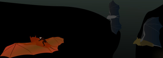
Sidenote: I always imagined the flyers as more microbat inspired, which is why I draw them with tails... but these ones end up looking very flying fox-like and have also some megabat proportions. This isn't really an intentional artistic choice, it's just a compromise I had to strike to make them look decent. I need to practice drawing microbats more.
Oh well. The author isn't that descriptive about their proportions so I guess it's up to interpretation.
Lastly, here's the original sketch that I traced over. A lot of features ultimately got cut, as well as the dimensions to the side being changed. Solovet originally was going to have a braid but then I remembered that line from the first book where Luxa explains that you have to cut your hair to go to war. Ripred also looked a lot more teddy bear like in the sketch, so I ended up not even tracing him. Bane was a redraw, and I actually did trace part of Ajax and then just frehanded the rest.
If anyone is reading this far and hasn't read the underland Chronicles, now is a great time to go to your local library and pick it up. These books slap and this tiny community would love to suffer our brainrot welcome you into our fold.
Fly You High
#my art#tuc#the underland chronicles#the underland chronicles spoilers#tuc spoilers#the code of claw spoilers#vector art#mnog#bats#rats#fantasy#tuc20#inkscape
72 notes
·
View notes
Text
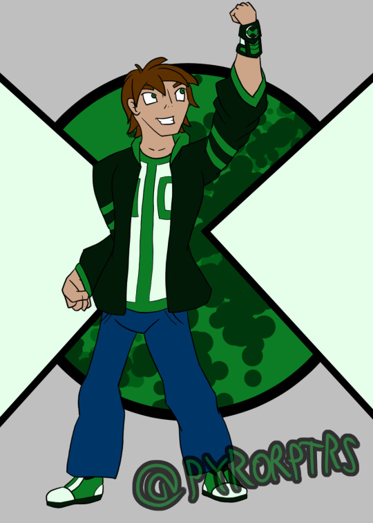
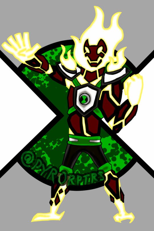
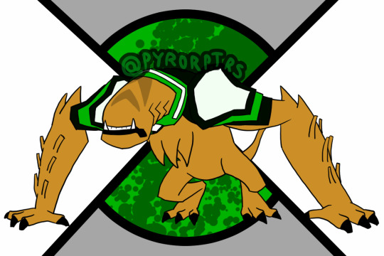
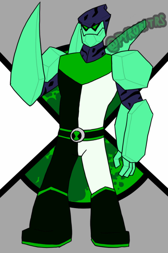
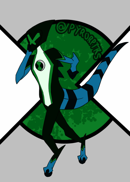
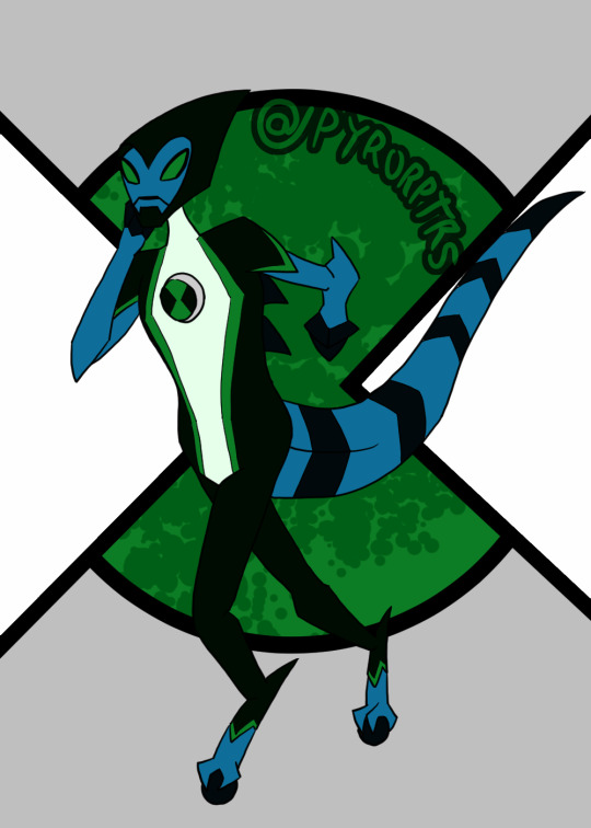
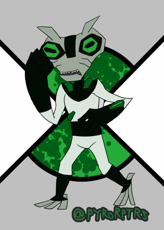
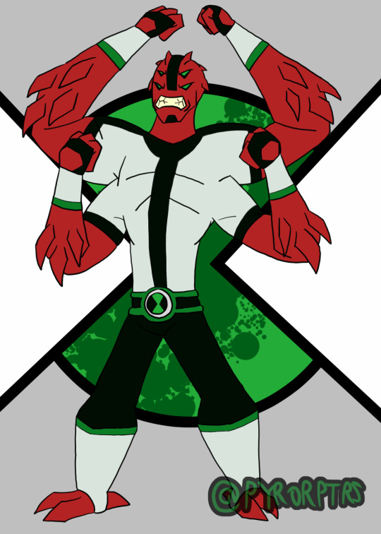
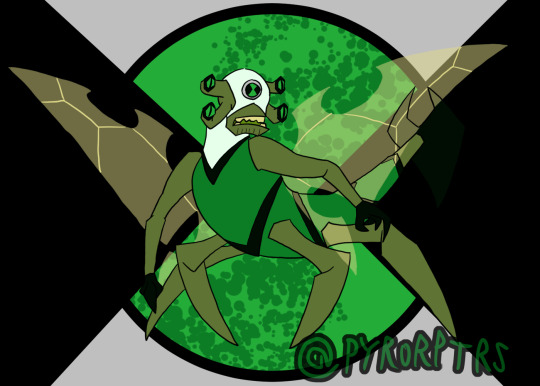
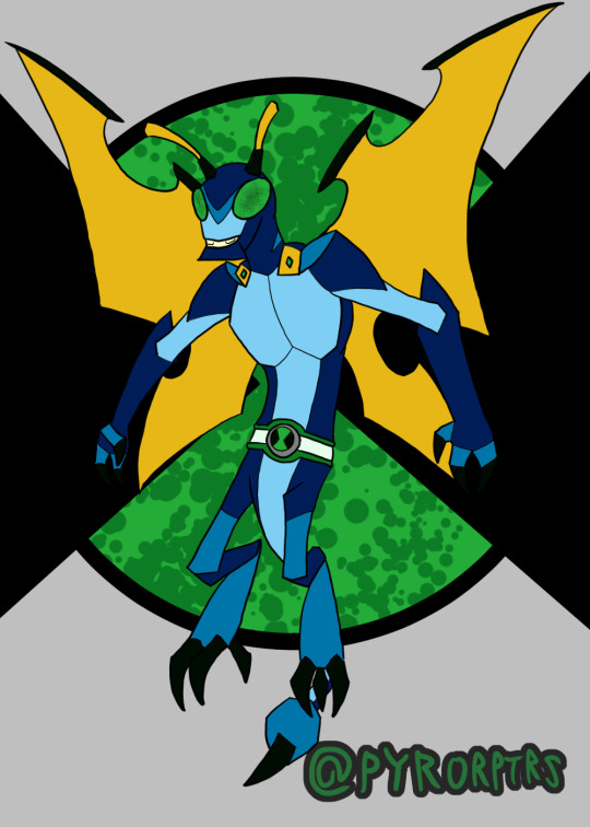
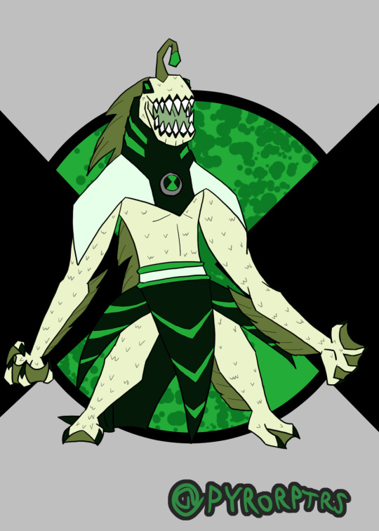
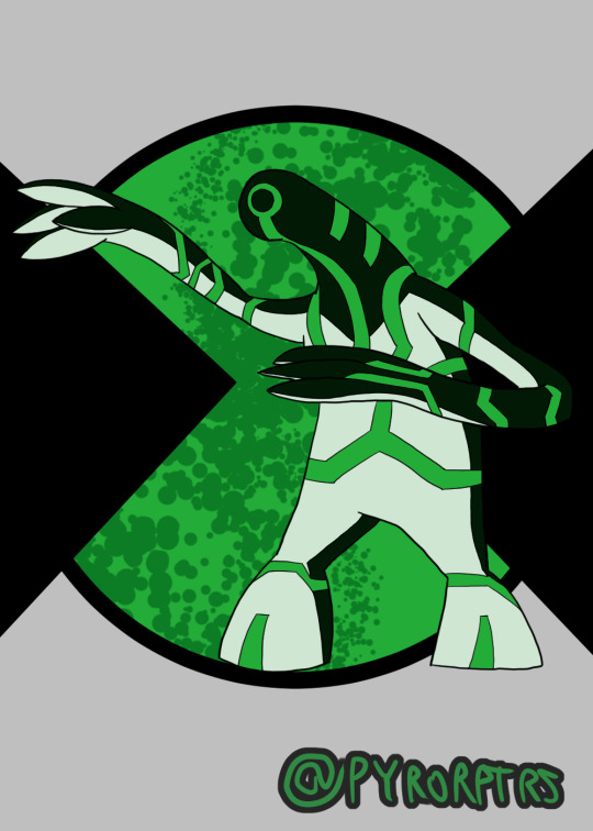
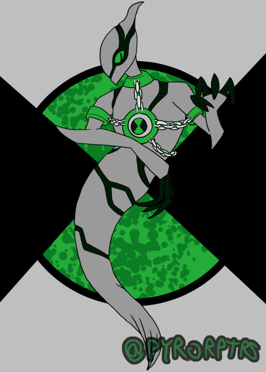
Ben 10 Redesigns Playlist 1
Did redesigns of Ben's first 10 aliens awhile back.
I think Ben 10 designs as a whole work best when you have a specific color scheme to work with, so I tried to incorporate green as the primary with a greenish shade of black and white as the secondary's and highlights. I also made it a rule that unless the alien has some way to properly incorporate the omnitrix into the body, they need some sort of suit or device on them to house the badge
Ben - Honestly doing a design for Ben is kinda hard to do, most of the better takes you can do were done by the original canon and the fandom at large have pretty much filled out the rest. I think the soccer shirt with stripe down the middle is probably the most iconic part of his design, so I tried to incorporate that with his undershirt while messing with the colors. Took some inspiration from both the jackets he wore in the past for his hoodie. Coming up with an Omnitrix design was probably the hardest bit, I'm not a fan of when it looks like a normal watch, but addign too much detailing it can make it a pain to redraw, so I tried finding something simplistic but still kinda techy..
Heatblast - In terms of overall design I tried leaning towards Omniverse, but I also wanted to lean a bit into the 10,000 design from the OG series with the shoulder pauldrons. The reason why I gave him shoulder pads is that I like both the ideas that the aliens grow with ben and that they're the "peak of their species"; which isn't necessarily a good thing. so the shoulder pads act like kind of like "braces" for the shoulder pauldrons since the flames burn more intensely than on other Pyronites.
Wildmutt - Went with a mix of his OG and OV looks with a bit of 10,000 influence to make him look older. I feel his shoulder pad is kind of iconic to his design, so I tried to incorporate it and a similar one on his right shoulder into his suit. I also used the collar idea from OV to round out his suit, with the rest extending over his back since Wildmutt tended to be used as a mount a lot. Finally the stripes and tail are nods to his 10,000 design.
Diamondad - I honestly feel a bit bad for anyone that has to do a design for Diamondhead, because he has such a solid look. Nonetheless I tried to come up with a decent look for him. His OG split outfit look is easy his best suit design, so I wanted to use that as a primary inspiration, but I also liked the the collar that the reboot version had, so I wanted to call back to that. I also liked the earth look he sported in UAF and wanted to take some inspiration from that as well.
XLR8 - Similar deal to Diamondhead, XLR8 just has a solid design, so really was more about adding a couple personal tweaks here and there for personal taste. Did add the back spikes from the reboot version though
Greymatter - I always thought his suits looked like hazmat suits so I wanted to lean into that with his redesign, making it look a bit more techy. I also added some of those falangy thingies other older Galvans tend to have in order to make him look a bit older too.
Fourarms - Another case where the OG design was just so good that it's hard really do another take to it that doesn't amount to personal preference. I obviously used the OG look as a base for the suit and face (mostly because I didn't like the ponytail on UAF or the Goatee on OV), but I also added a belt and bracers on his arms on the arms to spice things up. Finally made his spikes more prominent to make him look a bit older.
Stinkfly - I'll bring up the second design I did in a minute, but for the more classic Stinkfly I leaned toward OV in terms of general proportions and colors, but I also wanted to call back to his OG design with his head being a different color from the rest of his suit.
Slopfly - Obviously this is based primarily off of the design from the reboot, which I have mixed feelings about. Didn't like the almost exclusively humanoid look, so I tried to make him look much more insectoid with more prominent Dragonfly aspects and a bit of Hornet thrown in too. Lore wise, I like to think of his as being from the same planet, but an evolutionary offshoot; think of it like the difference of an ant vs a bee. Overall I tried to make them different, despite basically being the same character. My idea is that classic stinkfly is a bit hardier and can use his claws and stingers more offensively, while "slopfly" as I call him is a bit weaker, but can more effectively use his slime.
Ripjaws - I liked the way OV handled him and wanted to push that more monstrous look a bit further. In terms of his suit, I wanted to add a rebreather so he doesn't immediately start to suffocate, but still kept that weakness.
Upgrade - I lean very hard into Classic as far as my fav designs for him go and wanted to keep that sort of feeling. So I tried to keep his general body shape that same sort of gloppy look he used to sport before OV bulked him up. I also tried to keep the high contrast color he used to sport since I feel it helped his circuitry pattern stand out more.
Ghostfreak -Honestly both easy and hard to come up with a ghostfreak design; their are good aspects in every design, but something also holding them back. I did ultimately lean more toward OV in terms of the overall look, but I also tried to streamline some bits and included the claws from his unskinned form
#ben 10#heatblast#wildmutt#Diamondhead#xlr8#Greymatter#Fourarms#Stinkfly#Slopfly#Ripjaws#Upgrade#Ghostfreak#redesigns
7 notes
·
View notes
Text
Special Informal Devlog
Hi-ho, Wudge here! Aaaa. I missed the update last week... as we crawl closer and closer to release, it's become harder for me to write devlogs. I'm making progress every single day, and that makes me so frustrated that it isn't done yet, you know? 😭 Something something curse of perfectionism...
Anyway.
I thought I'd try something a little different with this post by chronicling a specific screen I've worked very hard on, from start to finish!
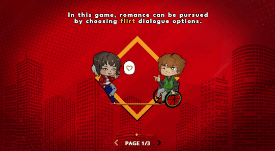
(Pictured: a preview of where we're gonna end up)
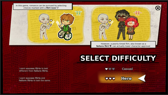
It all began on... August 2021?! Yowza, two years ago! When I posted a poll on tumblr and on itch about how I should handle flirt indicators. The votes were split 50/50 between two popular options, and I was able to surmise that yall would really, really love an option to toggle between the two.
It didn't take me long to figure out how to implement the toggle itself.
The following year (September 2022), I came up with the idea of putting in an illustrated tutorial on how my flirt indication system works - after all, poll participants had told me that they loved the idea and had never seen it before in other games. I was on a treadmill at the time, so I quickly doodled the idea on my phone. It looks like this:
Then when I got home, I did a rough pen draft to solidify the idea...
I worked on the digital version over the next 2-3 weeks, and asked my friends for help with editing the text to ensure clarity.

.... Then I took a looong break from the infographic to, uh.... write, edit, playtest the game, draw expressions for Griffin CG, draw expressions for the landlord, work on a new Clammy Lady sprite, playtest the game again, make all the characters blink, make the first glowing animation for Jade's powers, code in Griffin's CG expressions, stress about paypal making changes in my country, do concept art for upcoming npcs, write some more, playtest some more, draw a birthday picture for Dart, write devlogs every single week, make sure all my files were safely transferred to my new laptop before my old one completely died... etc.
So it was February 2023 by the time I came back around to try implementing the infographic in code :')

... It was functional, but no matter what I tried, I didn't like how it looked with everything crammed into one page.
... Then I got really sick... but after I recovered and did some more work (drawing, writing, playtesting, etc) I came back to the infographic with the intention to learn how to code pages in renpy.

Still didn't look phenomenal, but there's a whole lot more breathing room! This was in April 2023.
I took another "break" (worked on a million other things) and then... FINALLY... in late August 2023, just a few weeks ago, I had an art breakthrough!
I had garnered a better understanding of color and poses, and as a result my chibis became a LOT cuter! I was able to redraw most of them without too much hassle - whereas when I first started, it would take me all day to draw a single one.
I also drew custom heart icons (a plain heart, a golden heart, and a broken heart), figured out how to make text buttons look more fun and intuitive..
And here's where we're at now!!! I still need to draw eyes for Dart.... but I researched and absorbed a lot about screen compositions, and had a rather late realization that I could re-use backgrounds and assets I already have in the game.
That's it for the special edition. I'll update with more soon!
Stay safe and keep warm,
Wudge.
#herotome update#herotome highlights#interactive fiction#indie game#oelvn#otome#visual novel#otome game#english otome#indie#chibis#anime
49 notes
·
View notes
Text
Here *throws random and actually much more important than I realised at first OC redesign at you after two and a half years since the OG*

Meifeng, Ming-Hua’s cousin! I just randomly remembered that she exists while putting together my OC family tree and since the only art I have of her is… nearly 3 years old and mediocre at best, and Kat and I have recently spent so much time focusing on Red Lotus siblings, I thought “Hey, why not redraw her? Just because she’s a cousin and not a sister doesn’t make her any less special than Lien-Hua, Summiya, Aiza or Haya!” (On that note… Nia give someone a brother challenge. The only one that counts is Aiza and she’s only a brother half the time)
Some headcanons about her, both new and old (the old copy-pasted over and slightly edited to save everyone the second hand embarrassment of going to look at my old art), which will go under the cut because this has gotten LONG:
Old:
Older than Ming-Hua by around 10 years
Her dad is the older half-brother of Ming-Hua's mom who’s… not the most fond of their side of the family
Has never left her home in the Foggy Swamp Water Tribe
Master healer, specialises in children. Can't have any of her own because of the high pollution levels in the swamp which is why she puts all those motherly instincts into teaching and caring for kids
Got a scar on her leg while saving Ming-Hua from some wild swamp creature when the latter was a child who was absolutely convinced she could handle everything herself and never listened to anyone. Ming-Hua still insists she had everything under control that day
She tried to understand Ming-Hua's perspective on things, she really did, but ultimately tribe mentality and fear for her cousin’s safety, believing her not to be nearly as capable as she claims to be, won over
Attempted to stop Ming-Hua from running away but was, obviously, unsuccessful
Was the one consoling Nuying after Ming-Hua left
Helped Suiren learn waterbending and held genuine affection for the girl, although she ultimately refused when Suiren begged for the chance for her and Midori to escape from Haya and live with the tribe. She thought that while Suiren would most likely adjust well, Midori was simply too Gaoling to survive in a place as dark, damp and isolated as the Swamp. She regrets that decision every day since she found out Suiren became an assassin
Mourned Ming-Hua more than anyone else in the tribe when informed of her death
New:
Was the one who babysat Ming-Hua a lot when Nuying was going through one of her depressive episodes after Cadeo left, and Ming-Hua actually enjoyed spending time with her because she was a lot less overbearing and protective than her mother. Was the first person to start calling her Ming. Sometimes Ming-Ming, but Ming-Hua had a tendency to deliver a very hard kick to the shins every time she tried that
Never left Nuying’s side when she got sick in the years following Ming-Hua’s disappearance, no matter how much everyone, including her own father, told her to stay away, there’s nothing she can do to help her. In her final moments, Nuying was delirious with fever and called out for Ming-Hua. Meifeng didn’t have the heart to remind her that her daughter left so instead let her hair down, covered her own hand in water and told Nuying that she was “right here, mom. I’m right here” and stayed like that until Nuying passed
When Ming-Hua returned, Meifeng was the one to break the news to her. Later, when Ming-Hua asked how and when it happened, she couldn’t quite stop herself from snapping at her because she should have been there, Meifeng shouldn’t have had to pretend to be her so her mother could die without worrying about where her daughter was. Their relationship never really fully recovered after that fight
Still, she had met Suiren when she was little on the rare occasions when the Red Lotus passed through the Swamp and Ming-Hua chose to take her daughter to visit the tribe. She never met Midori, but she did see Ming-Hua pregnant with her once
Didn’t know about Ming-Hua’s imprisonment until an 11-year-old Suiren told her because world news don’t reach into the heart of the Swamp. She just thought they had decided to stop visiting. The news crushed her but… a part of her couldn’t help but go “you should have fucking listened to me when I told you to stay, then this wouldn’t have happened”
Her teaching Suiren waterbending involved mostly the basics of combat (she herself doesn’t know much of it since she’s a healer), plantbending and healing. Suiren reached her level of mastery and proficiency as well as figured out icebending on her own through sheer determination and spite (she’s so much like her mama 🥹🥹🥹)
Is the only one from the tribe Suiren had ever confessed to about being an assassin. That knowledge broke her heart and she spent all those years absolutely terrified that Suiren would meet Ming-Hua’s fate. When Suiren stopped visiting at one point (when she left for her mission to kill Kuvira, got injured, recovered at ATI, reunited with her parents, broke Kuvira out and started living with her, etc etc) she had assumed that it really did happen, until Suiren randomly showed up one day with Kuvira in tow (Meifeng did not approve bc of the whole spirit vine thing 😅)
Absolutely reunited with Ming-Hua at some point and it was an extremely emotional moment
Ripped Cadeo a new one when he suddenly appeared looking for his daughter after 45+ years after it became common knowledge that the RL are all alive and no longer wanted by the law
All in all… quite an interesting character that I really should do something with at some point, bc how come Ming-Hua’s family is the only one to get 0 attention in our discussions?? #justiceformeifeng2024
#my art#artists on tumblr#the legend of korra#original character#seeds of the red lotus#sotrl meifeng#she doesn’t actually appear in any of my works. let alone sotrl. but she exists in that verse#and it’s the verse in which she plays the most major role so… that’s what her tag is now#anyway#it doesn’t seem that way but she really is a very emotionally conflicting character for me#because she was in the position to get Suiren and Midori away from Haya only four years after they were left with her#which would have left them with 75% less trauma#but she didn’t. coming up with quite a bullshit excuse#yes Midori would have missed the sun and everything but the swamp is still miles better than Haya#meifeng must have seen his skittish Suiren is. how skinny. how bruised#and yet she did nothing. yet another adult whose inaction led to tragedy#ugh. imagine a UtOS-style au where she does take them in and while the biggest obstacle is the trauma#Midori does have an insanely hard time adjusting#she’d probably spend most of her time by the giant tree because the sun gets through there#and maybe one day.. she’d run into one cranky old earthbender#who takes her up as a protege for old times’ sake#(and later hooks her up with her granddaughter– WHO SAID THAT??)#and Suiren would grow up to be a swamp warrior who decides to go after Kuvira when she harvests the spirit vines#I’m a fucking genius#Kat if you’re reading this. look at what fun new branch of the multiverse my brain just spat out!! come yell about it with me!!!#but okay. that is currently besides the point. back to meifeng#you know…#‘oh my art has really stagnated I feel like I haven’t improved in years’#BITCH THIS YOU?? look at the OG version and look at this and TELL ME you haven’t improved#my self hatred may be intense but even I can admit that I’ve gotten much better at drawing. in the character design department at least
4 notes
·
View notes