#inkscape
Explore tagged Tumblr posts
Text

Watch out! They're doing, something!
ID: Gif of pink cartoony bunny art being stretched and rotated in 3D space
This is the final result of some pixel art I made being run through an algorithm (Kopf-Lischinski) which turns pixel art into vector art > rasterization via Inkscape > application to a 3D plane in Blender > animating the 3D plane. Original art and conversion below the cut


23 notes
·
View notes
Text
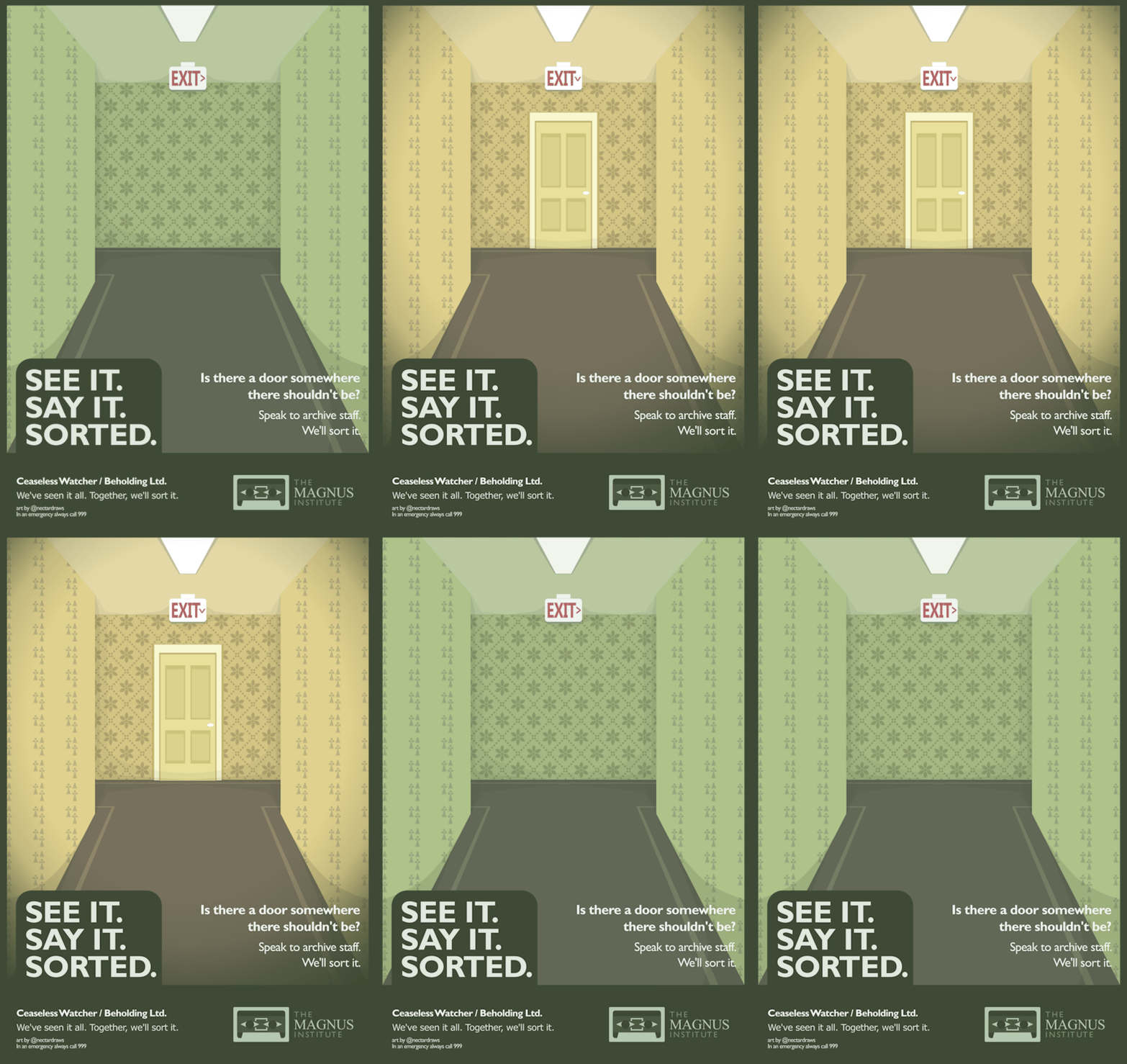
michael awareness poster
#see it say it sorted#lets hope tumblr doesnt horribly compress this#flash warning#the magnus archives#tma#tma podcast#tma fanart#michael shelley#helen richardson#the distortion#the spiral#ceaseless watcher#surreal#surrealism#dark surrealism#poster#vector art#vector illustration#inkscape#gif art#digital art#digital illustration#artists on tumblr
19K notes
·
View notes
Text
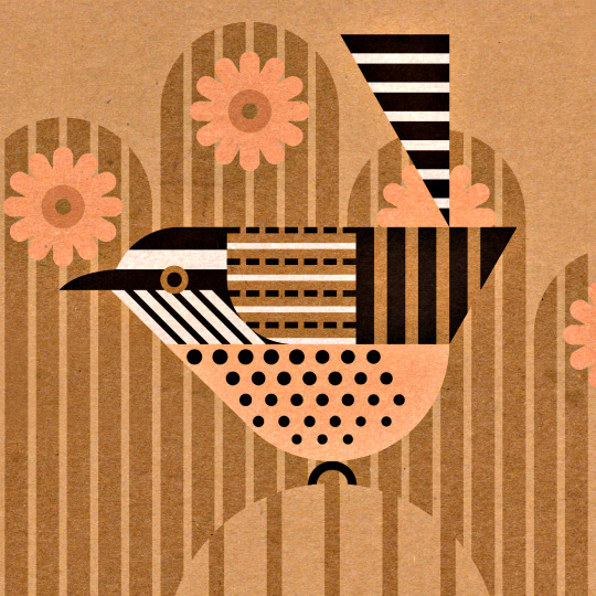
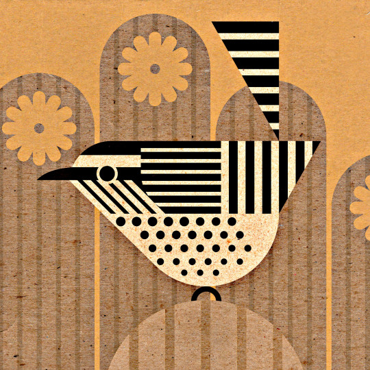
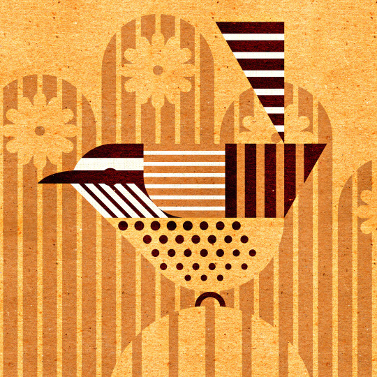
Cactus Wren, Campylorhynchus brunneicapillus, versions
498 notes
·
View notes
Text
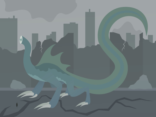
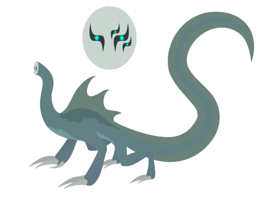
It’s Leviathan! I know this isn't totally canon-accurate, as it's more in line with how I originally imagined him while reading through arc 8.
- The description of Leviathan’s face as “flat” made me think of a perfectly smooth disc. (Apparently @bogleech had a similar idea.)
- The eyes are shaped like the Hebrew letter “ל,” which is used in the Hebrew spelling of “Leviathan.”
- The sail and tail fin are based on the crested newt.
- The markings on his belly and back are countershading, a form of camouflage often seen in marine life.
- The biggest influences on this design are depictions of prehistoric marine reptiles in early paleoart. Inaccurate though they may be, you can’t deny that they have an appeal to them!
- When running bipedally, I imagine him moving like a basilisk lizard, which is known for its ability to run on the surface of water. It does look a little goofy when the lizard does it, but it’s probably a lot less funny when it’s an endbringer charging at you with murderous intent.
#worm#vector art#inkscape#wormblr#worm web serial#worm parahumans#worm spoilers#Endbringers#kaiju#kaiju art#creature art#creature design#monster art#monster design#Wildbow worm#Wildbow#worm fanart#parahumans
272 notes
·
View notes
Text

AVENGE ANGEL'S VENTURE
AVENGE MORADESH
SAVE SUPER EARTH
#my art#art of krafto#helldivers 2#helldivers#lineless art#inkscape#super earth#helldivers illuminate#illuminate#propaganda#blue#purple#planet#planets#black hole#meridia#moradesh#angels venture
97 notes
·
View notes
Text

also working on Dazzle's very own villain too :3
#anthro#cartoon#furry#oc#furry art#cute#anthro art#art#fantasy#furry character#wip#sketch#vector#vector art#inkscape
75 notes
·
View notes
Text


"Tedesco was the only one who laughed."
goffredo tedesco, younger and older
#the bearbulldog has a nasty grip on me#kms for fun and sport#goffredo tedesco#cardinal tedesco#tedesco#sergio castellitto#cardinal goffredo tedesco#fanart#conclave#conclave fanart#my fanart#digital#digital art#digital illustration#digital drawing#digital painting#inkscape#sketch#sketches#scruffy baby i will get you and i will fix you
73 notes
·
View notes
Text

#my art#digital art#vector#inkscape#hermitcraft#tango tek#tangotek#hc s9#decked out 2#dungeon master tango#i have computer graphics final tomorrow#i gonna cry#this teacher made me hate digital art#mcyt fanart
396 notes
·
View notes
Text

this looks like ass sorry
146 notes
·
View notes
Text

2023-12-24
156 notes
·
View notes
Text

just made this!! so hyped!!
#brennan lee mulligan#collegehumor#fantasy high#d20 fantasy high#dimension 20#d20 fanart#d20 art#d20#adaine abernant#fig faeth#fantasy high sophomore year#dropout#dropout tv#art#design#graphic design#artwork#illustration#inkscape#logo
580 notes
·
View notes
Text

Visit sky islands today!
203 notes
·
View notes
Text

"Light"
---
The Character above belongs to @lumiere-angel-90. If one has not yet seen their blog, I would very much recommend doing so! It has a wonderful art style which is always a joy to see.
A few brief thoughts below the break, but otherwise- happy New Years!
Admittedly, it was only until recently that I realized that "Lumière" is French for "light" [Or at least, this is what Bing/Google has informed me] and thus, it seemed a title of a similar name should follow.
Above all else, I Fear I did not do justice to the wings for this character- especially since I have not included what seems to be a standard count of at least 15 pinions in the wing, whereas here there is only seven. Up until the above incarnation of this post, there were about seven other wing variations which were considered, but were ultimately done away with. Alas, my skill is not up par!
Nevertheless, I am hoping that 2025 will be a productive year - here's to hoping that I can one day return to this and improve.
For those all reading- cheers!
45 notes
·
View notes
Text
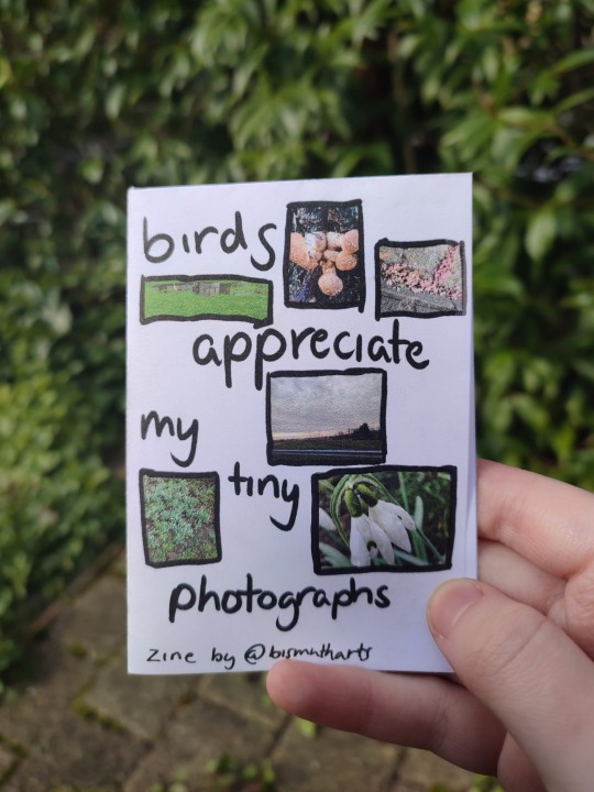
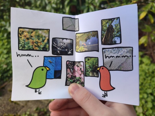
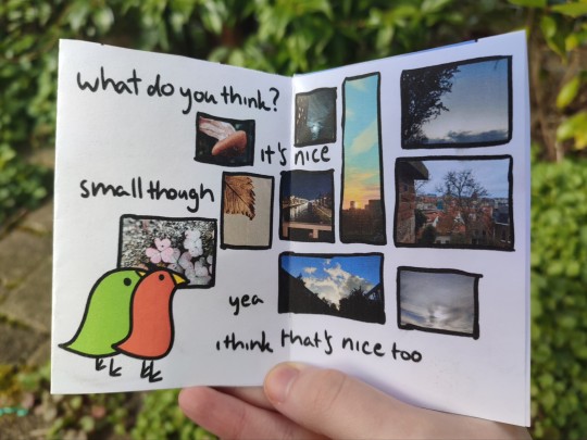
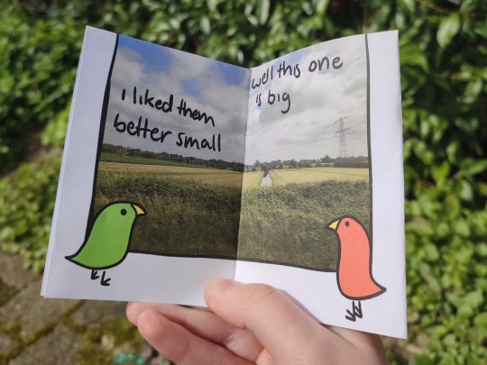
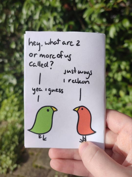
image description applying to all images: pictures of a small (a7) booklet featuring two birds, one green and one orange, talking to eachother, photographed in front of some plants and garden tiles. end ID.
i'd already made some art of this post by @jennythebot but the image it conjured in my mind was so delightful to me i decided to make a whole zine. this is my first printed zine! new skill unlocked!
in conclusion:
birds appreciate my tiny photographs! why is nobody talking about this?
#art#zine#my zine#my zines#bis arts#bird art#inkscape#digital art#8 page zine#long post#1 sheet zine#zinecraft#artists on tumblr#my art#my photos#image described#bis speaks#printable zine#silly#fun#wugs#wug#bonus linguistics joke#inspired by a post
205 notes
·
View notes
Text
how to make neon signs in inkscape!
I lost my mind and spent a large amount of hours yesterday perfecting my methods and figuring out how to do this, so if you're interested in making something like this:

here's how to do that!
step 1: cover your workspace in a dark grey rectangle, and lock that layer down.
I've been using 80% or 90% grey - you want this so you can see your neon effect, but you don't want it entirely black at this stage, or you won't be able to see your shadow layer.

step 2: create some text!
pro tip: rounder sans-serif fonts look the best for this, because think about what a neon sign is made of - it's tubes, bent into shapes! so if your font or design looks too sharp and pointy, it'll feel unrealistic when you make it neon.
(this is, of course, a perfectionism thing on my end, so feel free to ignore any and all rules in order to make the thing that you want to make. as with all art, you can do whatever you want forever!)
bonus pro tip: if you, like me, have over 1400 fonts installed and programs tend to lag when you browse through all of them, nexusfont is a great free software that lets you sort your fonts into categories, search them, and preview what any text looks like in different fonts! I love it. it is my best friend
now I'm going to do this with a few different fonts, so that you can see how it works with them. so today, I'm picking Futura Round, Harlow Solid Italic, and then to challenge myself, Beauty School Dropout and Block

make the text white, and also select the text and go to Paths -> Object to Path, because some things don't work right if they're not paths.
let's start off easy with Futura Round!
Step 3: duplicate your text layer
now bear with me here. but you need to take the text you're working with, and either right-click duplicate or copy/paste the layer until you have seven total copies of the text you're working with.

arrange them like this, making sure the top one is the first layer on the list (and so on), and then in the layers tab, label them like so:
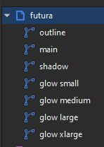
pro tip: if you don't have the layers tab open, go to Objects -> Objects and Layers, and that'll pop it right up
Step 4: blur time!
switch to the Fill and Stroke tab, and make these changes to the paths:
glow small: 15% blur, 100% opacity
glow medium: 20% blur, 90% opacity
glow large: 50% blur, 70% opacity
glow xlarge: 70% blur, 70% opacity
your workspace should now look like this:

this is good!
pro tip: these numbers are just loose guidelines! at the end, mess around with everything to make sure that the glow looks right to you! nothing is an exact science
Step 5: shadow and outline
for the shadow layer, make it solid black, and then change the opacity to 50%
for the outline layer, we're doing something fun and weird. so right now it's a fill object, but we want it to be an outline instead! so let's hit the X in the lower left to make it empty, and then shift-click on...for the sake of this, let's say blue. to make our nice blue outline.
now's the weird part
now. use the align tool (Objects -> Align and Distribute), select the outline layer and the main layer, and align them so the outline text is exactly centered on the main one.
then go to Paths -> Path Effects, and when the tab opens, select just the outline layer, then click the drop-down arrow in the Path Effects tab and select Offset
here's our goal right now:
we want to offset the outline until it fits inside the text underneath it, and also mess with the stroke layer settings until you have a nice thick outline that doesn't overlap itself.
mess around with the plus and minus buttons. there are no exact numbers here; you just have to know when it looks good! but for me, the settings were a -0.34mm offset, with a stroke width of 0.700mm
this is roughly what you want it to look like:
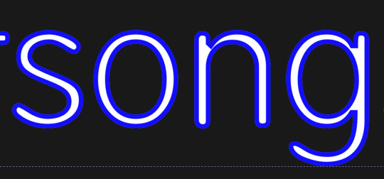
now, with the outline layer still selected, blur it out just a bit until it looks fuzzy, and like the white center is a highlight rather than a separate layer. for me, the right number was about 8.3% of blur, to get a result like this:

Step 6: layering and changing colors
okay! at this point your work should look something like this:

you now want to select every layer except the shadow layer, and use Align to center them all on top of each other.
pro tip: make sure to untoggle "move/align selection as a group", otherwise this will not work.
you should now have something that looks like this, with the shadow layer sitting all by itself somewhere off to the side
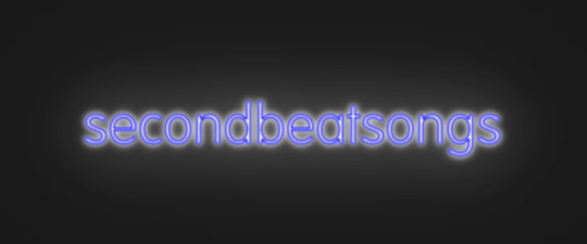
now's the fun part: colors!
since we've decided that this neon light is going to be blue, it's time to change the glow to reflect that!
here's what it looks like when you change all of the glow layers to be that same, #0000FF blue as the outline layer
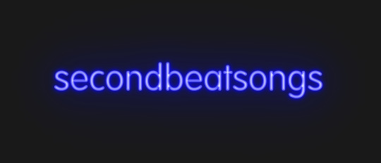
and here's what it looks like when you take the glow small layer and make it just a bit lighter (#4343FF) using the stroke and fill tab

in general, mess around with the layer colors until you like how they look! I find that it generally looks better if the glow small layer is a bit lighter, and the glow medium layer is as dark as the original color. everything else is fair game.
also the main layer can stay white (if you want it to seem very bright), or you can make it a very very light blue if you want it to be a bit more subdued.
Step 7: final steps
take your sad, neglected shadow layer, and move it slightly up and to the right of your main layer, so that it works...well, basically like a drop shadow.
then take your original rectangle, and switch it to 100% black.
now. gaze upon your masterpiece

that's a good neon sign if I've ever seen one.
but now. now's when we lose our minds
Steps 8-??: perfectionism and nonsense
so let's move the Futura one aside (and hide it! inkscape lags if there are too many blurry layers visible at once, so hide anything you're not using!), set the rectangle back to grey, and move on to Harlow Solid Italic.
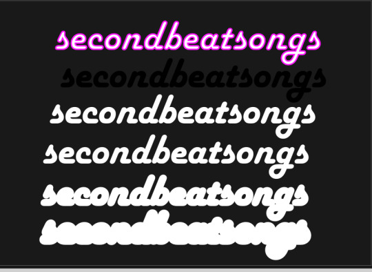
I've sped through a few of the steps here (out of order) so you can see what I'm doing. I've added outlines to the large glow and xlarge glow, and bumped them up a bit so they'll have a larger glow area in general
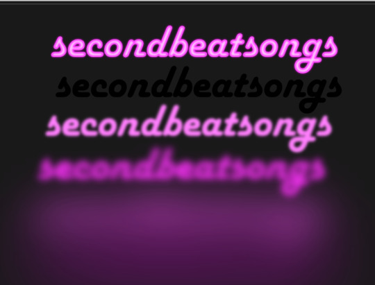
this time I've made the large glow a little bit lighter than the xlarge glow and medium glow, and made the main layer a very pale pink instead of just white. I also blurred the outline layer just a bit more, because this font needed a bit more fuzz to make it look good.

hell yeah. this rocks.
now, one detail for perfectionism: in neon signs IRL, if you look closely, there are wires attaching them in the back, often connecting each letter to the next. so...let's do that!
get your pen tool, set it to spiro path, and then make little droopy lines connecting each letter.
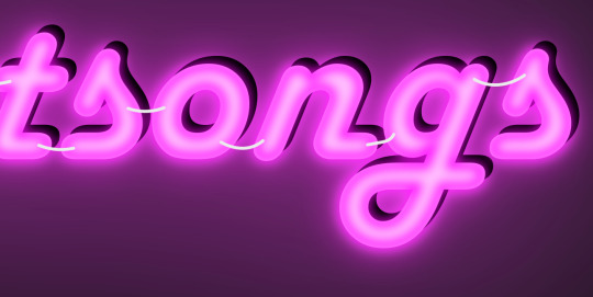
make these thin, 100% opacity, and a very light (almost white) grey color. then group all of them together, and move this group under the small glow layer
pro tip: some of the cords might go mostly through the shadow layer. if this is the case, just put the cord group one layer above the shadow layer instead, and then it'll be fine. but you might make the cord color a pale-greyish pink to make it look like there's glow hitting it.
ultra advanced technique: duplicate the cord group, make it black and 50% opacity, position it slightly up and to the right of the original, and then move it one layer below it. you've got cord shadows babey!
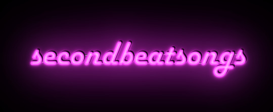
lookit that. stare at that beautiful perfection. I love it. this brings me joy.
and now: the one that will be the most work
let's gooo Beauty School Dropout!
this one I'm using as an example for what to do with a font that's a bit too pointy to look realistic

this font is really fun and bendy, but the ends of the letters are flat instead of rounded, and the corners are a bit too sharp. so...let's fix that!
now, there are several ways we can do this (after doing Object to Path ofc).
one way is to edit the path yourself, going slowly, and making sure everything is perfect, editing the nodes individually.
or, you could select the text layer using the node tool, then click the button in the top bar labeled Add Corners LPE, and then drag the little circles and triangles around to smooth out the corners
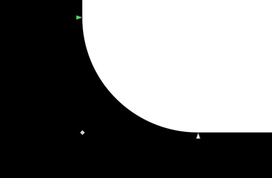
I've decided to do the LPE method, but the problem here is that if you apply the LPE effect before making sure all of the corners look good nodes-wise, it's hell to try and fix it. so before LPE-ing, look at all the spots that you're going to apply the effect, and make sure each has one point at each sharp corner, with no weird overlapping bits. okay? okay.
also for the line beneath the text, it looks like it's made up of a bunch of different segments

and since I want to keep this line because I think it looks cool, we're going to have to deal with that, and make sure that it's all one solid piece, otherwise the outlining won't work. so I've gotta delete all the extra segments, and then move the points on just one of those segments until it's the full original line width, before rounding those corners as well.
basically I've got my work cut out for me here, this will all take a bit.
...aaand an episode and a half of Supernatural later, here's this!

look at how nice and round that is! perfect for the rest of the neon process
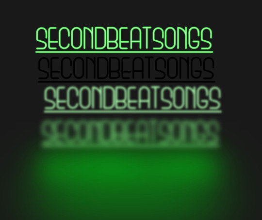
and with cords, shadows, layering, etc

hell yeah.
more things: it's block font time
let's make an outline-style neon sign!
my seven layers:

for all but the last two, I've not used the fill option with them at all - I have simply used the stroke outline.
now don't be worried! the stroke-to-path still works just the same way even using an outline to begin with! so it's easy to get an outline of an outline, and do the offset thing just like you did before
however, because this font is more complex-looking, there will probably be some errors when you offset it

for example, it didn't fully outline the second half of the Os, so I just copied the left halves, mirrored them, and replaced the right half with the complete left half
pro tip: keep in mind that you have to re-apply the offset to any bits that you add to the outline layer!
doing the same steps as last time, editing the glow blurs as I see fit, once again we end up with beauty and perfection.

another thing you can do: turn off the lights!
I'm going to use Beauty School Dropout and Harlow for this, but after making your beautiful neon signs, here's how to make it look like a turned-off sign, for if you want to make...idk, a gif of a light turning on and off, or a burned-out sign, or something like that.
so start with (ideally, duplicated copies of) your neon signs:
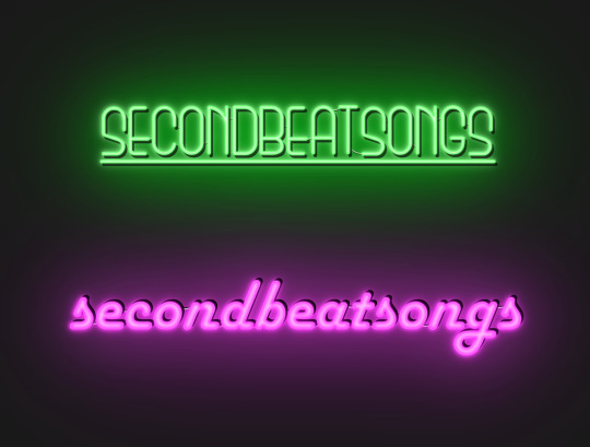
and then simply delete every glow layer, change the outline layer to 90% grey and your main layer to 70% grey, change the cords' color to a darker shade of grey than whatever it already is, and lower the opacity of the shadows by about 10-15%.
doing that, you end up with this

bam! lights turned off!
last thing: logos and other stuff
you can make neon signs with images as well as with text! the steps are essentially the same, though you may have to do more editing to make it look good, and use simplify on the path if it's too detailed.
and if you're using anything besides an .svg, you first go to Paths -> Trace Bitmap to turn your image into a vector! but unfortunately I've already used 29 images in this post, so here, just look at this Keith Haring thing I made as an example:

is it messier than the text? yeah for sure. does it have some pointy bits I could smooth out more? definitely. but, I've watched three episodes of Supernatural today, and that is more than enough time spent on this. so this is what you get.
but yeah, that's how I make neon signs in inkscape! I used to do it in GIMP, but this works much better, and looks so nice and clean! <3
(man, graphic design really is my passion)
#tutorials#inkscape#reference#neon#graphic design#tbh this is definitely for my own reference too because I know I will eventually forget this process#but I want it to also be useful to other people#so here!#inkscape tutorial#enjoy#graphic design is my passion#tutorial
136 notes
·
View notes
Text

“The Earth is hungry. Its heart throbs and demands cleansing. The Earth is also thirsty."
Boo tomato tomato, also first post on tumblr WOOO
#art#my art#digital art#artists on tumblr#vector#vector art#illustration#inkscape#postal#postal 1997#postal 1 dude#postal 1 fanart#postal game#running with scissors#postal dude
52 notes
·
View notes