#i feel like a lot of my designs have horns
Explore tagged Tumblr posts
Text
have been drawing so much recently i just want to sketch things...


my wrist hurt after i finished the first one, but i still forced myself to sketch watobu because they're back and i missed them <3
#☆ my art .#☆ unstable universe .#princezam#wemmbu#wato1876#mutiny duo#cant decide on horns or no horns still for wemmbu#i feel like a lot of my designs have horns#anyway#there was so much reunions im going insane#and yet still no mutiny duo deep sigh#one day.... they'll come back....
143 notes
·
View notes
Note
PLEASE PLEASE PLEASE I URGE YOU TO TALK ABOUT THE SEASON 6 CHARACTER DESIGNS. Mostly cus i wanna hear the salt, but also because as someone who's designed many outfits for these characters over the course of multiple years, you more than anyone have your place to talk
Honestly the episode was just *okay*, so the designs are really the only place I'm particularly heated (I mean I still have my complaints on the episode, but nothing as anger inducing as Season 5):
So I'll start with the heroes:

I'm not mad about cutting off Bunnix because nothing's different.
Viperion - I like what they did with the mask and the deeper color contrast is delicious, but the suit feels like such a downgrade from the old design.
Carapace - I guess this is the Season of the Mask Facial Hair? Viperion is encroaching on this, but Carapace's little chin bit looks like a Soul Patch. Otherwise, it's a good design and I like the additions!
Vesperia - At least it looks like they fixed the weird root issue she had with her bangs from the old model. From what I can see here, I don't dislike this, like, full inversion making the top yellow and the pants black. Dunno what the ring around her thumb is though, and why does she hold her weapon like that??

Rena Rouge - it feels like they made changes to her because they thought they had to? I'm not mad at the differences, just...they sure are there. My only complaint about her is that they colored her tail as if she has two tails but she only has one? Like...just give her two coattails.

At least they ditched the corset U_U
Rooster Bold - The pose makes it hard to see, but he looks pretty cool to me! LOVE the new mask and his bitchy heels. Didn't like the mohawk then, still don't like it now.
Ryuko - this^ picture doesn't show her off, so here's her from the episode:

The suit is still nothing amazing, but I like the scale texture and shoulders, I LOVE the bigger horns, and her hair is fire~!

Miss Hound - yikes on this picture, thank god she cameo'd in the episode:

She's cute! ...Honestly anything was an upgrade, she was just wearing a recolored version of her outfit in Season 4-5, so the fact this is it's own thing is instantly better.
King Monkey - yikes the lighting on this is scary. Anyway, I can't really glean anything from this and the only thing that stands out is the horns on the circlet. I'll pend judgement for now.
Pegasus - Similarly to KM, there's not much I can note here? He's got longer hair so that's...something, but I like that now the visor is a full visor and not a floating pair of glasses. And we'll have to see it in an episode because here I like the contrast between the browns, but the old suit also had that contrast in promo material and then lost it in the episode.

Caprikid - Loooove the fur on the pants for some reason, and I die for the boots little hooves~ Bold choice to go bigger on the horns when there was some controversy about them, but hey. At least they fixed the problem with his white mask.
Minotaurox - aww what a cute widdle hammer. It really looks stunted, a lot of the weapons here look skinnier and weaker actually. I don't think I like the yellow on the horns, but I like that we can actually SEE the details on his suit now. And I like the hoodie/hair.
Argos - yep. That's Argos.

Purple Tigress - Okay, she looks dope AF! No notes, she looks awesome.
Pigella - And on the other hand...yikes. There so much going on here, and in fairness I can't fully understand what I'm looking at. This is not what I meant when I kept adding pig ears to my Pigella design!
Polymouse - Okay, no lie, I DID like her in this still image, but uhhh she's in the episode and um...

Girl no. What's with these LED strips?! WHY is your HAIR going THROUGH you hoodie?! And I know in comparison to the other characters she's still "plus sized" but this still feels...bad.
I won't talk about Ladybug and Chat Noir, they're good. Not exciting not bad just good.
Sooooo the humans.... Mostly I'm bothered by how some are so drastically changed and some are just...not. At all.

Alya - her new Mom lewk. Idk, I just feel like they could've gone harder. She looks fine, I actually like her hair when I watch the animation in motion, it's just...she looks 25 now.
Alix - uh, yep that's Alix. Wait, did her pony tail switch sides...?
Zoe - She's found her 2000s emo girl aesthetic and is clinging to those crusty shoes. I don't like it, her dumb tshirt was really my biggest problem with her old design so of course that's the part hey keep. She just looks...disjointed. I'll hold on judgment of her hair for now.
Kagami - love the hair, hate the crop jacket. It makes her skirt look reeeeeally short.
Sabrina - AH! NO! BAD! WRONG! Hate the hair, hate the pants, I don't even think I like her new glasses. This is a chop, a CHOP!
Juleka - I don't...hate the hair. I just weep for what we lost. I DO hate her new boring-er blouse which is just a weak imitation of her old top. Her hair is so wild so why did her clothes get more boring?
Rose - Season 6 Rose can't hurt you, Season 6 Rose can't hurt you, Season 6 Rose can't hurt you-!!
Mylene - I like her new outfit, it feels like the natural next step for her! I can't get a good look at her new hair though, so I'll reserve judgement.

Nino - Damn, finally a full glow up. Nino looks good! This is probably how I would have designed him the first time around, so, yay!
Felix - you fucking loser, you didn't change here either?! Are SentiBoys just stunted?!
Kim - His big change is...getting sleeves. And his roots are more visible? I guess??
Max - Why this nerd got a smolder all of a sudden? I think he'd look good if they just finally ditched the suspenders, or had them hanging down and not in use.
Nathaniel - Have...have I drawn him in this? I feel like there's a Scarlet Lady version of this. I guess that tells you I like it, right?
Ivan - Hell yeeeeees! GLOW UP! He's like "oh, I gotta wear this nose ring all the time? Better make it ALL WORK TOGETHER!!" I didn't know he had it in him, good job!
Luka - uhhh, is he wearing a different jacket, or is that his old jacket in the new animation style? At least he stopped advertising his own father on his chest. His shirt being tucked in...it disturbs me...
Marc - ...I can't tell if he even got a hair cut because it might just be the new style.
So yeah, I have quibbles but they're overall okay.
If you really want nightmare fuel, you see the kwamis.

#sorry for the jumpscare at the end#after I saw the kwamis the humans were all forgivable because wtf?!#season 6 spoilers#ml spoilers#ask zoe
503 notes
·
View notes
Text
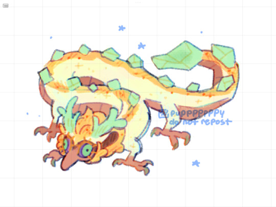
Wyrm on a string
#it was supposed to be a tiny doodle but I just kept on yo-ing#I like her colors a lot hehhehehe#I like how they made her dragon design different from the golden trio. like she has a different shaped snout antlers and smaller ears#like I know the devs want us to know hey this is what zelda would look like as a dragon but following the zonai were descendants of gods/#dragons and zelda is a descendent of the zonai it just feels narratively pleasing to me lol#raurus hair looks similar to the dragons manes with the same undertones and everything. and he has horns where dragon horns would be#makes me wonder if the golden goddesses were incarnated as zonai this time around and they turned into dragons. that would be interesting#I don’t really know if that would make sense bc I’ve never played ss so j don’t have much background on the golden goddesses#totk#tears of the kingdom#totk spoilers#tears of the kindom spoilers#totk zelda#totk light dragon#my art#myart#doodles#loz#loz zelda
6K notes
·
View notes
Text


anyway i'm going to buck the trend here and say i specifically love these guys way more because of their teeny little arms and feet. ten out of ten design choice, very dainty and endearing
#flight rising#i also think it goes a long way towards de-cluttering their silhouette#which is sorely needed! these things have a lot of doodads!#i think i like all the design elements a lot. only thing i'm not sold on is the horn#still figuring out how to make it work with everything else they've got going on#anyway i really don't see the people complaining these don't feel like light dragons#they're long they're dainty they're vaguely insectoid#they have big horns and lots of frills. their antennae are shaped like filigree!#i think it's just that the art kinda undersells all these features because of how messy it is#okay that's probably the right mix of sugar and salt in the tags. aaand post#my sketches
498 notes
·
View notes
Note
seeing all those sheep/goat vaschete asks inspired me to draw these (they got a bit more lazy as i went on but it's whatevs)
i like to imagine that machete could be a long haired goat breed which would give him his signature floof! couldn't choose which one to settle with tho ^^"
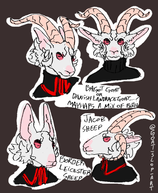
.
#aaaa these are so charming#I'm having trouble deciding which one I like the most#the goats have the floof and impressive horns#but the two sheep are also really appealing from character design standpoint#border leicester is one of my favorite breeds of sheep they have such excellent shapes#intense roman noses and big rabbit ears#and it's kind of comical how little Machete's face changes when you switch from dog to this specific sheep#and jacob sheep are simply iconic in their own right#these are lovely#thank you!#gift art#sloppygoaty#Machete#own characters#you have a lot more faith in his capability to grow a pair impressive horns than I do#I feel like his would either be kind of unremarkable#or he would have them removed entirely to look more sheeplike
383 notes
·
View notes
Note
white uniform erik or magenta/red (aka original colors) uniform erik?
The classic called The Classic for a reason .. ima big lover of the red + purple ….
#snap chats#kinda funny cause i own a lot of red + purple things but neither are my fave color💀#i mean they both have special value to me Reds Lucky In General but also it makes me think of my sis#and my bros fave color is purple. the one like. OBJECTIVELY favorite thing he has#his reason is so funny tho he says purples his favorife cause ‘no one likes purple and i feel bad’ LMAO#i still like both colors tho … theyre still my top faves just not My Fave#my fave’s emerald green :) or black. if hues count.#evolution rogue was designed for me……. so now that im totally off topic dnOWSNKSK#yeah i like his classic look the most :) i love his lil pointy horns…#the ‘horns’ looking more like a magnet is cute on his krakoa helmet tho#also the red + purple gives more wwe vibes and i live for imagining erik drop kicking and pile driving people#its just more dramatic ..
17 notes
·
View notes
Text
It's too hot to do anything. I only have random sketches of designs.

Chrysalis redesign with mantis-like shapes and a mane like swamp seaweed. She's a real queen ngl.

Very quick sketch of my reimagine of Shining Armor, because I've always been confused by the fact that he was named armor, but he never reminded me of armor?? My bro deserves to live up to his name for once in his life. I like to think that the entire Sparkle family is of Marwari breed, or at least partially with Marwari roots. His horn is supposed to remotely resemble a sword, but I honestly don't know how to do it in a way that doesn't look silly. Anyway, it's the best I could come up with.

Reimagine of Flurry Heart, but I changed it a lot because I honestly don't feel a strong connection to the original. She is now Cupid Heart and resembles the appearance of a cupid statue. I think it suits her because her parents also look like Venus, goddess of love, and Mars, god of war. Her appearance symbolizes great love, which again reminds me of cupid. But she's not a boy like God Cupid. BUT I think she looks and will look androgynous in the future /It doesn't make any deep sense, I just like androgynous characters/ I had to remove her horn by the way, because it just didn't fit the character.
#art#artists on tumblr#fanart#redesign#mlp redesign#mlp#my little pony#mlp fim#mlp g4#queen chrysalis#mlp shining armor#flurry heart
4K notes
·
View notes
Text
Well, I did it

Megatron - I love his tfp design. Probably one of the best iteration of Megs. He is huge, heavy armoured, his face covered with scars… He doesn’t looks like an ordinary military leader who is only capable of giving orders, but like real warrior who can destroy any enemy with his bare hands.
So, in the WOF version, he definitely shares some features with Princess Burn, not only because of his might, but also because of his horns shape and dirty-dark scales (that absorbed blood of his enemies)

Starscream - Boy, I hate him so much 🤣… but in the good way, trust me! In my opinion, when the show's creators make you feel such strong negative emotions towards a villain, it means they've done a great job. Also, I think that his animation in the show was absolutely incredible, because even though he's a 3D model, he still manages to move like a 2D character, which is amazing!
I feel that in my design he still looks more like a skywing, than an icewing (which is kinda logical)
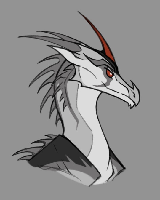
Soundwave - This one was tricky. I couldn't figure out what his mask would look like, so I just made his face a really dark color. I think Soundwave has both gifts of the nightwings, and he’s equally great at telepathy and a future vision. So he doesn't really need equipment to predict enemy movements, which makes him an ideal communicator in the WOF setting. His Laserbeak is part of the armor enchanted by Shockwave, and it might also allow him to open portals (but I'm not sure with this one)
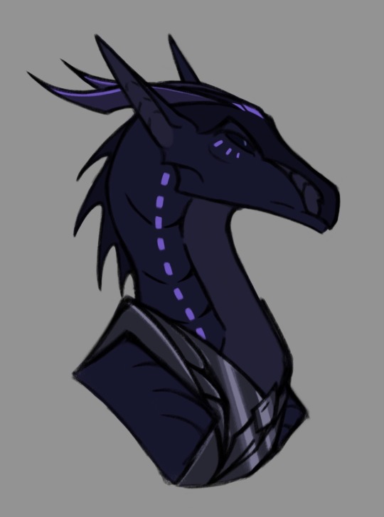
Shockwave - My favourite evil genius. He would definitely have animus magic and mind reading. I think Shockwave is the only one who has advanced the study of magic so far, precisely because he combined it with scientific knowledge and created safer methods of using it, that don't damage the mind. It's like if a Mastermind got animus magic in books.
I also like to think that he didn't heal the damaged part of his face just so that his enemies would fear him more)
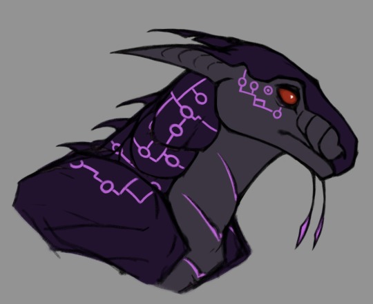
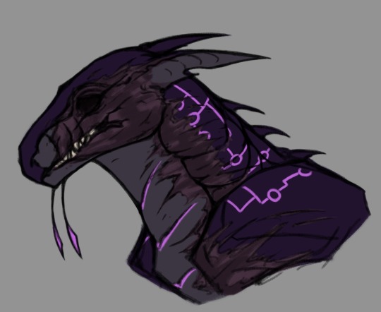
Dreadwing - This man deserved better! It's really a shame that he was removed from the show so quickly due to financial problems. It would be great if his arc got a proper conclusion in season 3.
Considering that I didn't want to make him a hybrid, it was difficult to choose a suitable color palette. So let’s just say, that I tried my best😅
I don’t think that he would have any nightwing powers, but honestly it doesn’t even matter - this guy can make a bombs, what else does he need to be cool
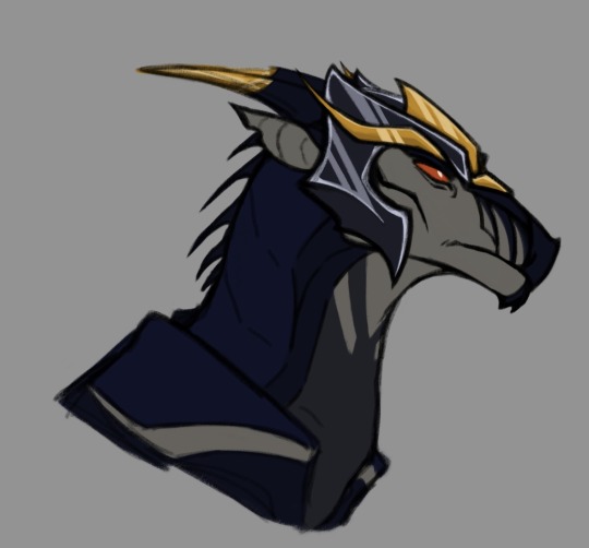
Arachnid - Did anyone even doubt that she would be a hivewing? Damn, she even got her own “Othermind” virus. Her design was the easiest to work with - just a little poisonous ass (suspiciously similar to Maleficent).
Just like Starscream, I hate her, but in a good way. She's one of the creepiest characters in the entire series, who’s acting like a fucking heartless monster, especially with Arcee, but even so, there's always was something mesmerizing about her. I just really like strong female villains
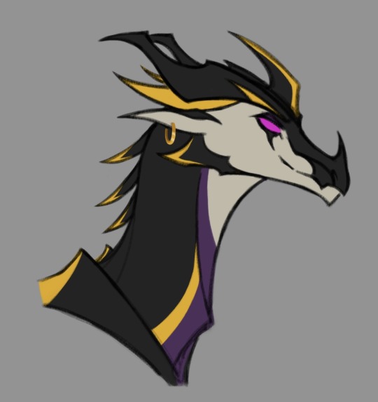
Knockout - Wery bright and charismatic guy, definitely one of my fav cons!
I tried to draw him as handsome as possible. Worked a lot on the face shape and coloring, and as for me it turned out pretty nice (finally).
Most decepticons think Knockout is as stupid and lazy as all the other rainwings. And it's not like he completely disagrees with that. Of course he’s not stupid and lazy, but if it’s means less dirty work on the battlefield, well, he’ll continue act like a tipical rainwing
(I also believe that Megatron keeps him as an “art”)
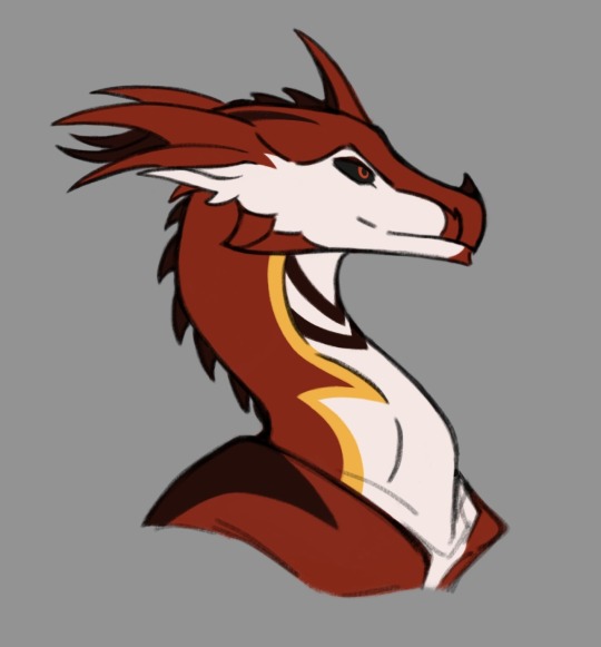
Breakdown - Fun fact: "Operation Breakdown" was the very first thing I saw in this series. And it was an interesting experience for 8 year old me. Maybe that's why I'm so scared of eye gouging scenes in movies now…
I think that he didn't have any siblings initially due to his parents nature, and even after meeting Bulkhead, he felt uncomfortable among the other mudwings. And this is why he later chose the side of the decepticons. And maaaaybe because of one cute rainwing influence)
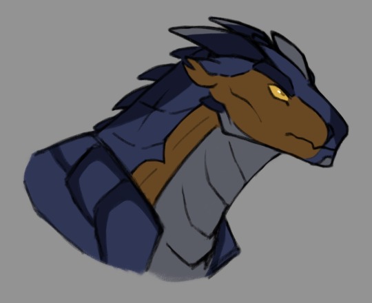
P.s.
I think that, being mostly nightwings and icewings, the decepticons are much more concerned about purity of their blood and rarely accept half-breeds into their ranks.
During the war, there were many animus dragons among decepticons, which is why they have so many artifacts that allowed teleportation and communication at a distance. But, honestly, I still can't imagine what Nemesis would look like in this AU
#tfp#transformers#transformers prime#tfp megatron#tfp starscream#tfp soundwave#tfp shockwave#tfp dreadwing#tfp arachnid#tfp knockout#tfp breakdown#megatron#starscream#wof#wings of fire#wof crossover#wof icewing#wof nightwing#wof rainwing#decepticons
1K notes
·
View notes
Text

My take on rainwings!! Rainwings are my favorite tribe overall bc I’m a basic bitch and I like me colors :]
I made them really longgg and tiny cuz I love them. ( I prob won’t actually draw their bodies this long, it’s just rlly exaggerated ^^* )
They are literally the most op snakes- like they are both a venomous and constricting snake with their fucking acid teeth spittle and their prehensile tails, and I feel like everyone just ignores their tails unless they are hanging upsidown. Like they grip onto things without them even realizing it, they have no control. They can literally hold objects like an extra talon and no one uses that!!
I also love giving them 2 pairs of horns and snake heat sensors!! They have a lot more snake features overall. I also give them bird-like back feet and hooked claws for climbing! And their frills are connected to their ears and r rally loooong and big and poofy outy and I love the so much-😭 ^^
What’s ur favorite tribe? What do you think of rainwings? How do you like my design? I’d love to hear ur guises opinions!
#my art#digital art#wings of fire#wof design#wof#rainwing#rainwings#ilovetjemsomuchomlhelpme#snake like rainwings#long rainwings#rainwing design#rainwing headcannons#banana rainwing
490 notes
·
View notes
Photo
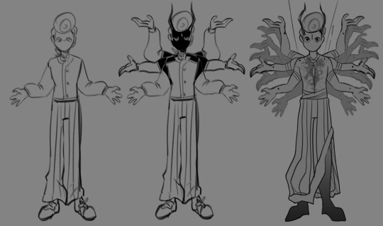

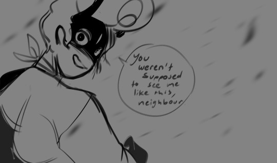
DEMON WALLY DESIGNS! im still working out his design but here’s a general vibe hehehahe as well as some thought provoking sketches... HUUUGE infodump about the design & demon wally au below!
below i explain my choice of representing hindu designs as opposed to christian ones! if you want to skip to the relevant information pertaining to the actual au, jump to the big bold JUMP HERE paragraph!
alright, to address the elephant in the room: no, this isn’t the typical demon/devil design you may be used to! i was originally going to keep within the red-horned pointed tail kind of mythos that generally stems from christianity/christianity aligned concepts, but then i realized i honestly don’t know much about that stuff and don’t really feel qualified to handle it in a narrative. i also know that, especially within the welcome home fandom itself, a lot of people have religious trauma that generally tends to be from various branches of christianity, so i thought this would be an interesting solution: seeing as i know a fair amount about hinduism, wally’s design is inspired by concepts about demons in hindusim in general! that way, it’s easy to write and hopefully refreshing/non-triggering to the audience! also it’s fun!
JUMP HERE: Wally’s design in the demon AU is inspired by Asura in hindu mythology! That’s why he’s got like a billion hands- I’m looking at adding jewellery/a tail/other stuff, but it’ll fall in that general theme. in terms of lore relevancy: asura in hindusim were not strictly evil, which you will find reflected in my story. wally isn’t evil per say; the neighbourhood is his turf, and he will protect it from outside threats. that being said- he is generally self-serving for now and may not always have the best intentions for his fellow neighbours. what his overarching goal is and who exactly his enemy is (as well as Home’s relevancy to the story) is being left to you to discover as the comic goes on! themes of puppetry, where wally darling ends and the asura begins, and stuff like that is left ambiguous for now! puppetry will also play a role in the story, as well as self-awareness and meta themes. hinduism and religion WILL NOT play a role in the story itself. anything i think might need contextualizing will be contextualized in the description of every update; honestly im just pulling the asura elements for Wally’s design and part of his character! this will still be a very accessible comic to people of all backgrounds. if you have any questions or concerns please don’t hesitate to send them to my askbox or leave them in the comments!
#welcome home demon au#welcome home fanart#welcome home comic#welcome home au#welcome home wally#wally darling#wally darling fanart#my art#infodump#hope this isnt too much guys i feel very corny rn HAHA#this isnt really anything serious! just a fun comic i wanted to give context to#i dont see myself doing any more longform info posts like this in the future either btw!#welcome home arg
7K notes
·
View notes
Note
omg i love your work!! if posisble, can you do a part 2 to touching their wings and stuff with the dateables or maybe other characters? thank you and take care :D
touching their tails/horns/etc. pt 2

includes: diavolo, barbatos, simeon, mephisto, raphael x/& gn!reader (no pronouns mentioned)
wc: .5k | rated t | m.list | pt 1
a/n: i took a lot of creative liberties with this one, either because their forms haven't been revealed or just because i wanted to so just assume most of this is not canon at all lol
please reblog and like <33

➳ diavolo laughs as you poke at the gilded ends of his wings, taking in the intricate design. “it’s real gold,” he says before you can ask, gesturing to the tips of his horns, “as are these. it’s a birth present to children of our family, laced with magic that let’s it grow and change along with is. it’s a symbol of our wealth, our status.” you reach up to touch his horns, and he leans into your touch, happy to let you explore as you wish. “sometimes i think they’re a bit much, and then i remember who i am,” he continues, and you chuckle, making him laugh again too.

➳ barbatos’ tail twitches as you run your hand along it, obviously surprised by the texture. “that feels good,” he says mildly, and you give him a grin, twisting the end of each forked part between your fingers gently. if it keeps you occupied he’s happy to let you play with his tail for as long as you want. only because of that, obviously. not because he can’t remember the last time, if ever, someone’s touched him like this. or because your touch is soothing something inside of him he hadn’t known needed soothed.

➳ mephisto bows his head for you, letting you feel over the nubs where his horns should have been. “they never grew in quite properly,” he explains, sighing as you scratch gently at his scalp around them, “which is why i don’t often reveal my demon form. it’s a bit embarrassing, isn’t it? of course, my parents offered to have false horns inset, and lord diavolo knows we had the money for it, but, well, that just sounded like a bother.” you press your fingers to hs head, eyes steady, and he’s glad to see you’re not thinking of him any differently.

➳ raphael unfurls his wings, and you catch your breath. he’s often been told that his wings are beautiful, richly colored like a peacock’s, and your reaction goes on to support that opinion. “you can touch, if you’d like,” he offers, and you don’t hesitate, burying your fingers in the downy feathers near where they connect to his back. his head falls back, and a quiet peace goes over the two of you as you stroke your way from base to wing tip, then back, soothing actions putting him on the verge of sleep.

➳ simeon wakes up to the feel of your touch on his wing, soft and hesitant. sometime during the night, he’d transformed into his angel form, wings splayed out and over the bed, almost covering the whole thing in their enormity. they certainly cover you, like a warm, live, down blanket. he twitches instinctively, and you pull your hands back. “no, no,” he says sleepily, “you can keep going. it feels good when you touch me.” he sees you smile and smiles too, even though he’s already being lured back into sleep by your soft strokes across the top of his wing, where the feathers are smooth and packed together.

leviathans-watching's work - please do not copy, repost, or claim as your own
#obey me#obey me game#obey me shall we date#shall we date obey me#obey me x reader#obey me x you#obey me x mc#obey me x y/n#diavolo obey me#obey me diavolo#simeon obey me#obey me simeon#barbatos obey me#obey me barbatos#raphael obey me#obey me raphael#mephisto obey me#obey me mephisto#diavolo x you#diavolo x reader#barbatos x you#barbatos x reader#simeon x you#simeon x reader#raphael x you#raphael x reader#mephisto x you#mephisto x reader#anon ask#answered asks
3K notes
·
View notes
Text

*🌊 Champion of The Undersea 🌊*
My personal Gillion Tidestrider design! I haven’t finished the podcast but I’ve been working on him for a few days already :)
Design notes!
I really think he would be pretty Leopard Seal like and actually a mammal so his humanoid appearance makes a bit more biological sense
I took a lot of liberties with his clothing and accessories as I feel his canon ones don’t really capture his personality and are very similar to surface clothing despite him being from a mainly underwater civilization, so I wanted to change it up by taking inspiration from non-western cultures like the Maasai, Akan, Plains + Northwestern First Nations, and many others!
He wears his Orca mask whenever fighting! Whales, Orcas as well as colors such as black, silver, blue and purple are heavily tied to the moon and the deep, and channeling this though a mask gives him more strength as well as intimidation!
The orange and pink circles on his loin cloth represent the relationship the sea and krill have :]
Rough Biological Changes:
Tritons do not have gills and cannot truly breath underwater like a fish :[ however they can hold their breaths for extremely long amounts of time and poses very strong muscles around their nose that can seal them shut to prevent water inhalation!
Tritons do not lay eggs but instead have live births like seals and will also nurse their young for a time, they often have 2-3 guppies, but it’s not uncommon for some to not survive birth or adolescence
Tritons have very short, bristly fur as well as curly, protective hair to maintain water when above the surface
Theres a very low chance for a triton to be born with a “coral crown” however this is actually a bone that behaves like horns!
Rough cultural changes:
A bit of a name change! Tritons have a True name and a Surface name due to how differently sound travels through water and air. His surface name is Gillion Tidestrider but his True name translates to First Champion of The Deep Moon From The Tidestrider Ice sheet (Moon’s Champion).
Tritions travel to the South Pole give birth due to their main food sources migrating! Guppies are born on the surface (on ice sheets) as they don’t have the ability to hold their breath for a sufficient time at birth, and until they are able to migrate and make the journey back north they’re raised communally with the other guppies on that particular icesheet. Once they are named, they will take the name of the ice sheet as a last name to avoid potential inbreeding
Most Tritons are actually polygamous! It’s common for one triton to have various partners whether platonic or romantic. Unfortunately this makes it generally hard to tell which guppy is sired by who. To avoid inbreeding, any guppies born on the same ice sheet as you are automatically deemed a sibling (or more specifically and ice-sibling) and it is therefore taboo to have romantic affiliations with them.
Tritons are a very musical species! Being vocally talented (underwater) is a large priority in all of their cultures and is considered a very desirable trait in a mate.
Fighting is also a large aspect culturally as well! It’s not necessarily fighting to the death that’s important or attractive, but rather being able to do so in more dancer-like way, fighting but remaining beautiful, composed and thoughtful. It’s common for there to be competitions for this type of traditional dance-fighting during holidays and celebrations (gill is great at this)
Their religion is based on the currents of the ocean where as certain directions represent physical things, phenomena, concepts, deities and teachings! I will go into further detail at a later date as I haven’t finalized anything yet
That’s all I got for now I fear but I’ll probably more about them as well as the other crew :]
#just roll with it#jrwi fanart#jrwi show#gillion tidestrider#jrwi gillion#worldbuilding#character design#digital art#artists on tumblr#dnd#seal
231 notes
·
View notes
Text
So i see this tweet
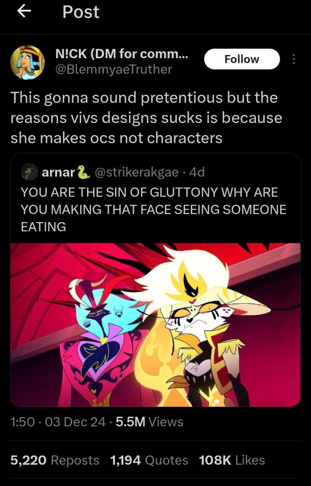
And it dawned on me, this made sense, this is the answer why character design inside The Hellaverse feels weirdly not fitting, out of place if you will.
OC stands for Original characters its a character you made yourself.
Every character is an oc but not all oc meant to be a character, at least narratively.
Viv wants to tell a story about hell, so naturally she will make characters that befit this title and their lore.
But she didn't.
A character design has to tell a story, especially since there is a narrative that shaped them.
I didn't say that she can't make a good character design, i actually loved a few consistent design details such as the imps horn, the motif of envy residents being underwater creatures and many more.
But a lot of other characters especially the main characters have this problem
Take Beelzebub as an example, you will never guess shes the sin of gluttony because her character design didn't fit that at all.
Or Lucifer's design didn't scream "king of hell" for me.
Naturally with a premise as interesting and ambiguous as the concept of hell itself there are many rooms for unique character design that tell their respective story.
So, Heres a few tips to make your ocs feel like characters
Establish design details that will be consistent with each character. maybe even their faction, their ring, their backstory. But do not overdesign them to the point of clutter.
Make combination colours! Think about complementary colors that will look good on a character.
Create details that every character has uniquely on themselves!
And make sure the character stands out from the background! make a contrast between scenes, maybe even wrap the background according to the characters emotions
And most importantly, create backstory, motivations, and flaws for your character to make them compelling, create relationship charts to keep track of how they interact!
Remember to have fun when creating a character, ocs whatever, this is just my thoughts
Thats my rambling haha
346 notes
·
View notes
Text

Okay, I think I’m FINALLY done with these designs. Well okay, I said Megatron might need some reworking, but shush, I’ll do that another time
I was not expecting this to take as long as it did. Apparently I started making this at 9 in the morning, and it is now 9:30 at night. Optimus, I am almost certain this is your fault
Anyways, as mentioned prior, the idea here was to give the Earthspark Cybertronians protoform designs like the Terrans, what they might look like when they were in this stage, because I haven’t seen anything to claim Cybertronians in this series don’t also have this stage, unless I’m wrong
I mean theoretically, Cybertronian protoforms could look entirely different from Terran protoforms, but we don’t know at this juncture, so I used the Terrans as my main references
Pretty much the main thing was trying to turn their blocky features smooth, while also taking out a bunch of their little details, like their antenna and horns
Honestly I still think Elita turned out the best, which is maybe a bit sad considering she was the first one I finished, but oh well. I don’t think everyone else was horrible, but I think she just looks best
I think Bee’s design is fine, and it was honestly refreshing after struggling so much with Optimus, but I can’t help but feel like his eyes are still wonky
Like I’ve said, by the end of things I think Megatron came out the worst. He was the second one I did, so I wasn’t sure, but by now I think he is. The real struggle with him is that his entire helmet is comprised of angles, when I need curves. And then there’s his side things, which I still do not know how to translate here. The idea I was trying to go for here is the top half goes around his head, while the bottom half is attached at the ends, but it’s the bottom half that looks weird. But ah well, hopefully I can fix it later
And then there’s Optimus. The majority of the time I’ve spent on this was him. It was mostly the struggle of his vents and trying to make them un-blocky. It was getting really frustrating particularly because I couldn’t think of anything new to do with them to change them, drawing the same thing over and over
But then I remembered, this Optimus was once Orion Pax, a fact I was planning to omit. But that meant I had something else to draw on
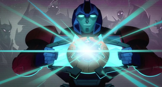
And it’s what finally got my brain to make his side things into the curves you see now. It’s also why his middle thing is solid black, like how it seems to be in the picture above
But yeah, I wouldn’t rate his design as the absolute best, but it’s serviceable and I’ll take what I can get
But aside from trying to change their designs, I think I had fun. I noticed by the end of it that they all have different face and eye shapes, and that’s pretty fun
Speaking of which, I notice with this how small Optimus’ eyes are here. They may not look it in my drawing but they’re a lot smaller than the others in the show. Is that one of the reasons his design looks so off? Like I know it looks weird, I just can’t place how exactly
But yeah, take these designs, the culmination of my drawing abilities for the day. I’d like to do more with them, I just don’t know what. Best I can think of is like, a fic premise where the Cybertronians somehow get reverted back to these protoform stages, and the Terrans now have to help them out
#yeah the more I look at Megatron the more I want to rework him#but I should probably stop for the day#I accomplished what I set out to do today#and my loan situation I think is mostly sorted out so that’s cool too#also if you notice Elita and Megs look a bit smaller than OP and Bee#that’s because the former two were made when the canvas was 500x500#while the latter two were made when I changed it to 600x600 and I could upscale their sketches more#I tried to keep it more consistent with Bee but I didn’t care much when I got to Optimus#anyways I think that’s about it for miscellaneous comments#transformers#transformers earthspark#protoform#optimus prime#Megatron#elita one#bumblebee#my art
181 notes
·
View notes
Text
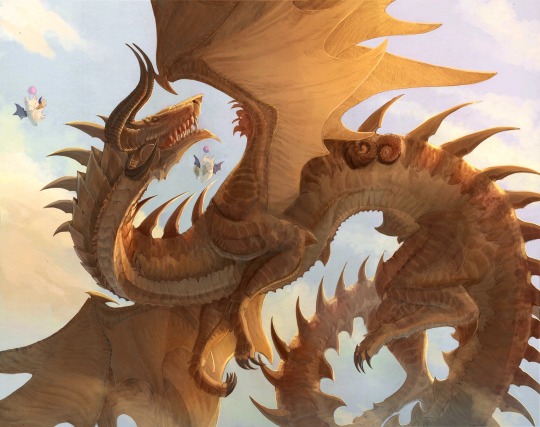
Finished Ratatoskr!
Ratatoskr was one of the tricker members of the first brood to draw since there are only three images of her officially associated with ffxiv and two of those are very stylized. I added design notes and thoughts below the cut for anyone curious. They're nothing too crazy since a lot of her design is very similar to other members of the first brood, but I did think about her a lot while working on this piece and wanted to share where I pulled a few elements.
As a base, I gave Ratatoskr the spikier build of Nidhogg and Tiamat based on those images but with some modifications to to match her image in the first brood concept art:
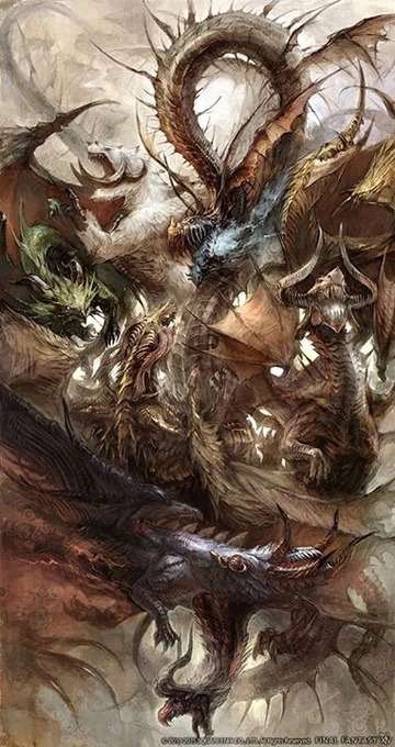
As a result, she has fewer horns and spikes than Tiamat or Nidhogg. The spines along her back are thinner than her siblings’ also to match the concept art and to make her feel a little closer to Midgardsormr.
I also wanted to keep the thick frill(?) of reverse scale plating around her neck from her concept art because it reminded me of Vishap’s more literal neck frill. I liked the idea that some descendants of the first brood might have incorporated elements of her form into their own evolutions. It didn't end up appearing as prominent in my drawing because I had a little trouble wrestling with proportions and the neck bend, but it's there! In pervious drafts I gave her frill identical to Vishap's but I had a little trouble getting it to feel like it fit her design so I stuck with thick scales instead.
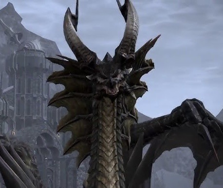
Her head shape was based directly on the two stylized images of her from the game. I really enjoyed the strong shape of these. It felt almost shark-like to me:
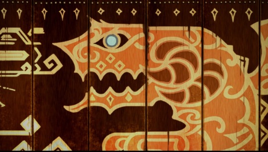

I don’t usually include other characters or props to my first brood drawings, but I wanted to add the moogles after thinking about Ratatoskr’s history, her dungeon, and her Encyclopedia Eorzea entry which describes her as a bearer of dragon songs and one of the friendlier dragons. I like the think the moogles loved to complement her songs with their own instruments. Working on this piece as a whole made me really appreciate Ratatoskr and legacy all the more and I'm eternally sad that we'll (likely) never get to meet her in game. I think she would have been a wonderful friend. Her design is a little non-standard for a child of Midgardsormer in small ways, but I feel like she was probably a little non-standard as a traveler, songstress, and friend to man.
Lastly I want to give a little shoutout to the site Tales from Dragonstar which was put together by @/ahzuvi-txt and which made my reference hunt a ton easier. It has a lot of wonderful information about the dragons of Eorzea. It's also got an interesting guide to dragon language that I want to dig into soon. I definitely recommend checking it out!
Thanks for reading! Bahamut will be my next and final first brood piece to cap this series off. :)
#ffxiv#ff14#final fantasy#final fantasy 14#final fantasy xiv#the first brood#ratatoskr#heavensward#madbrakedraws#fantasy art#dragons#dragon art
372 notes
·
View notes
Text
sooo about lamb's clothes....

i knew for a while now that my lamb whould start wearing more than just a fleece after ascention and designing clothes is my absolute forever and ever favourite part of drawing so i finally can do it for my cotl au😩😩😩. references and what went into the design (including lore stuff) are under the cut as always


the aestetic choices
they stop wearing the collar and always leave their neck open so the scar and subsequently the evidence of their immortality is always visible
i changes the red-and-white of the default fleece to red-and-gold cause it looks more regal and important and more suitable for a new god
i keep their silhouette feminine cause personal preference ahah. their dresses are mostly very light and loose because anything firmer probably feels awful on wool
i didn't do it justice cause frankly it's time consuming but imagine a lot of intricate embroidery there (because, again, a new god, they have the right and the want to be show-off-y)
the lore stuff (the crown and the symbols mainly)
i could go on longer but in a nutshell – even while being a vessel lamb already started rewriting history a bit. their cult consists exclusively of victims of old faith or reformed believers, so "oh guys we're actually worshiping one of the bishops" shit wouldn't really fly. so the cult if for The God of Death (not bishop mind you) so when narinder theoretically is freed he gets a new start as a deity, plus any mention of him was already erased by his siblings (that's my way of explaining why there's literally no narinder imagery anywhere in the cult, and crown doesn't count like narinder imagery)
when freeing narinder doesn't go as planned lamb continues with "this is not like the old faith guys" even harder. they started wearing the crown not in it's crown form, all of the crown imagery slowly disappeared, etc. they don't go by title of a god even, they're "The Promised Liberator of the lands of The Old Faith" or like just liberator or saviour or wtv
HOWEVER they still borrow a shitton from the old faith, even in aesthetics. the headpiece they turn the crown into? based on bishops' cross-like headpieces, but more horn-shaped (the eye of the crown can be seen only by those meaningfully touched by divinity, so, ratau, desciples, old faith siblings). all of the symbols they use in embroidery? also old faith
they're doing the same thing old faith did to the old gods. "they call their faith old but they're just a bunch of heretics". lamb is a heretic to the old faith, they make it seem like they're different but it's just a new coat of paint
important!! the desiphered meaning of the symbols belongs to @itislils2004. they did an insane amount of work putting together cotl lore, i highly recommend going through the google doc in their pinned post, it's a wonderful read (and a wonderful watch, their art is amazing)
#cult of the lamb#cotl lamb#cotl#my art#with death comes peace au#i want to do at least two more outfits for them#then it's nari's turn#and belial's#im having sm fun you don't even know#also the lore stuff is copipasted from my yesternight's talk with joffy#everyone say thank you joffy <3
174 notes
·
View notes