#i don't normally redraw old art
Explore tagged Tumblr posts
Text
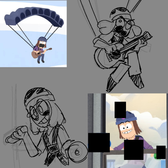

#suction cup man#piemations#some more old art#from like MONTHS AGO this time!?!#god time flies fast#i don't.. draw him like this anymore#he looks so bad here ngl#okay onto why i drew this#i headcanoned that the rig puppet animation that's used is just part of his anatomy#so thats why his limbs aren't normal#i wanted to try out drawing him like that and ended up having fun :))#might redraw this soon if i have the time
9 notes
·
View notes
Text
okay so it's been a bit... sorry about that??? ^-^; here's a quick doodle dump to make up for it with a brief (for me) explanation of where i've been at the end <3
some things that were meant as ask responses but i never felt like posting
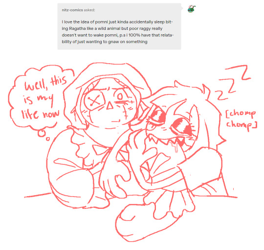
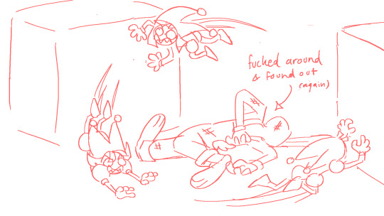
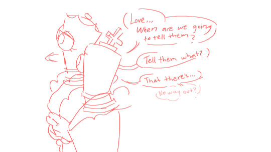
scattered bits from a lore headcanon comic i have no plans of finishing... set when jax first joined and ragatha was still new, before shit happens (queenie abstracts) and things got worse for them...
idk i like thinking about the possibilities and i like it when characters start out hopeful and get it beaten out of them so i'm giving jax and ragatha that treatment in my head :)

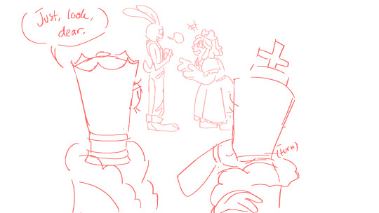
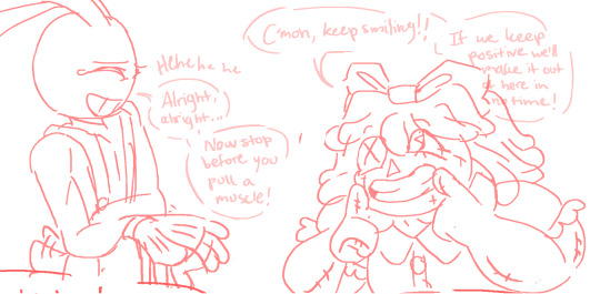
here's the "behind the scenes" stuff i mentioned in the second of my raggedy ann tadc crossover posts
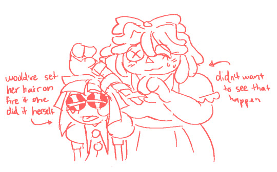
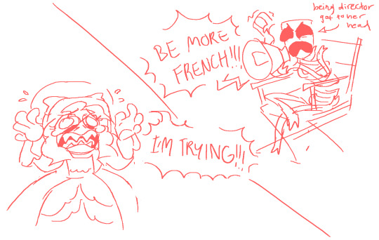
and here's me giving pomni varying levels of a hard time
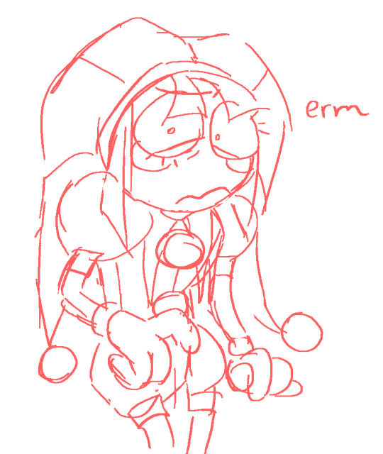
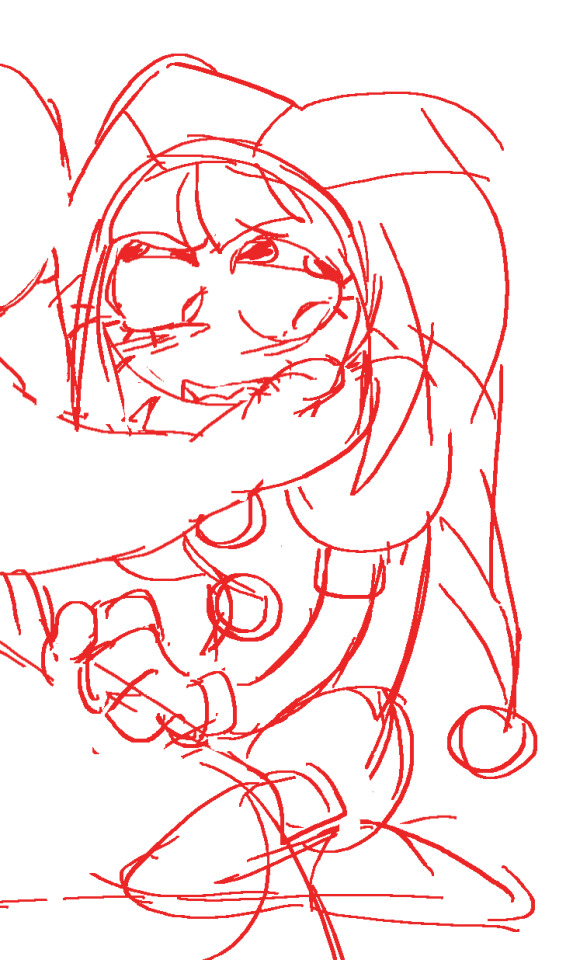
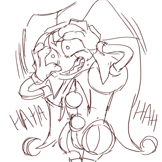
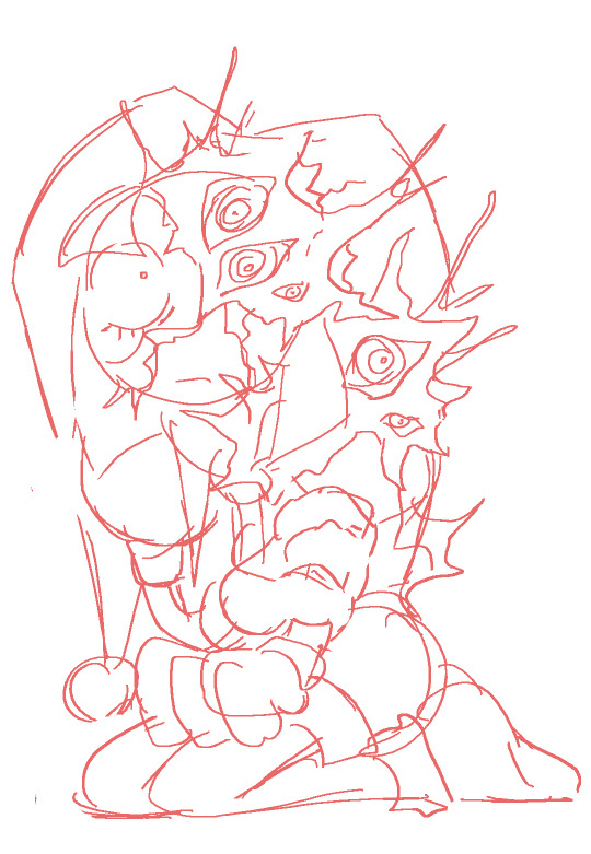
old aggie board stuff
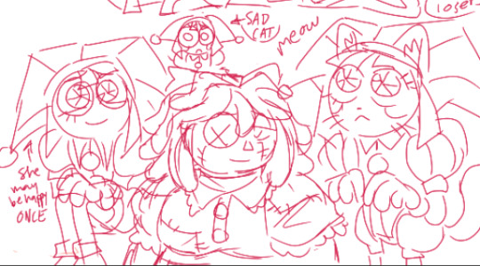
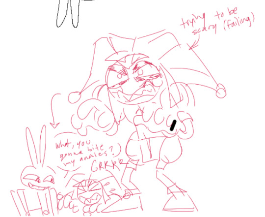
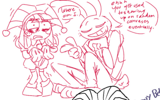
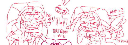
one of my first ragatha and pomni drawings on the left (nov 2023) and a lil redraw on the right.... (mar 2024) pls... don't mind my old ragatha design i didn't know what i was doing

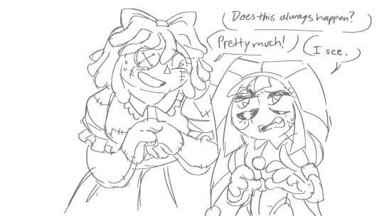
and for those who like my sona, doodles inspired by the mafia roleplay/au(?) that's been around... not actually part of it, but i was part of a mafia roleplay myself back in 2020 so idk, consider it an acknowledgement of my roots :D
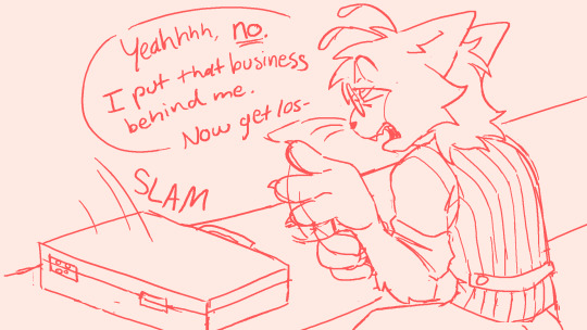
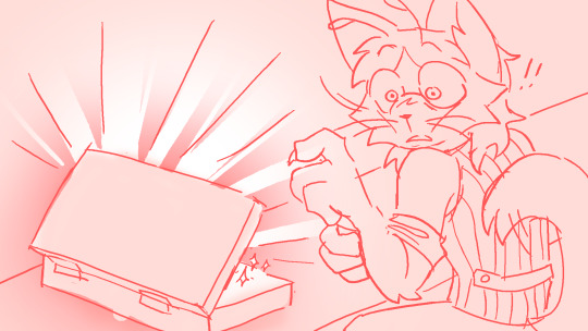
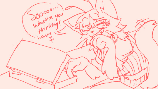
OKAY so where i've been... well at first it was a normal break, but then i figured i'd extend it until finals were over so i wouldn't get distracted! probably should've given some warning but ehhh i got busy fast and getting to go off grid for a bit was relaxing :)
anyway i'm all done so i'm back more or less??? still fatigued from studying for weeks straight so idk when i'll pick up the pen again but that'll be soon i hope... and bc i drafted this before it was posted YES i've seen the episode 2 trailer!!! very cool i'm very excited!! gonna try and get ep 2 hype art out before it drops!! :D
#missed you silly people in my computer i hope you are well :)#the amazing digital circus#tadc#pomni#jax#queenie#kinger#ragatha#sona art#my art#chompni#checkmates
819 notes
·
View notes
Text
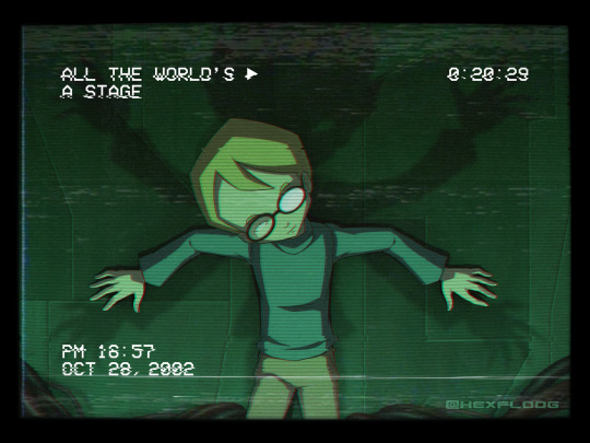
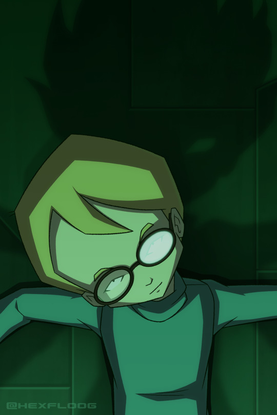
i am sooo thematically consistent actually lmfao
My final contribution to Repostober 2024 :) Loose "redraw" of this sketch that I posted last year. Scan and words below the break.
I know the phrase "rewired my brain" gets thrown around a lot in fandom but I honest-to-God think Ghost Channel really did it. If it's not THE formative thing in my taste for horror, it imprinted pretty damn hard on my little babby brain. To this day, the memory of watching it for the first time stands out as my earliest experience where I've needed to pick my jaw off the floor and then marinate for a bit.
For those not in the know, Ghost Channel is an episode late into season one of Code: Lyoko. It is freely available to watch online, but if you're even a little interested in watching it, I highly recommend watching it in sequence, despite the episodic nature of S1.
Original scan, from 2009ish:
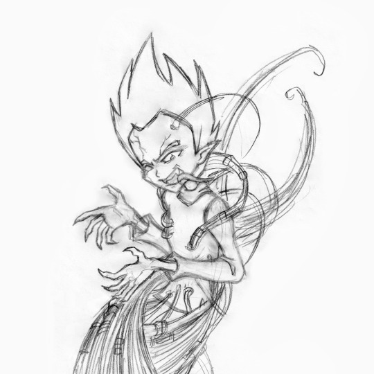
I'm sure I've mentioned it, but before I realized the importance of archiving my art I threw away virtually everything I had relating to CL >___< Later, I thought it might be fun to redraw some pillars from my childhood fandoms and this sketch happened. I've posted a few things for Repostober so far that were products of this same effort.
Reinterpreting this in 2024 was a challenge. My taste in horror hasn't changed much over the years, but the way I enjoy it definitely has. The 2009 scan reads as an in-your-face tribute to the episode (to me, at least), but these days I'm a much, MUCH bigger fan of subtlety and the power of implication. Redrawing it 1:1 bugged me a little since I didn't feel it'd meet my current standards or do the episode justice. I'm a firm believer in "less is more" so I spent a loootttt of time grappling with a good 'redraw' that 2024 me would accept while still passing as... well... a redraw xD I suppose it is still conceptually the same.
Jeremie is easily my favorite in the CL gang which definitely has nothing to do with the fact that I seem to have a proven history of latching onto the prodigal child with glasses and I've always found it crazy poetic that one of the only (or maybe the only?) big bad's true manifestations in the show is in his image. Something something thematic parallels, you love to see it >:) CL already has this habit of depicting shit that I would normally attribute to the modus operandi of a supernatural, demonic force so of COURSE I was gonna get in on this LMAO
Unfortunately, unless I find a hidden stash of old CL fanart somewhere... or enough time passes for me to draw this again... this is probably my last CL art for a while </3
On a more technical note for as much time as I gave myself for this I really popped off, especially on the background o___o Code Lyoko BG art goes super hard in general though, I don't think I would have settled for anything less. Had tons of fun with the VHS effects, learned lots of new little tricks to distort images for future projects.
Also this piece is called "ENDKAMPF" in my files lol
#art#code lyoko#jeremie belpois#jeremy belpois#ghost channel#repostober#repostober 2024#redraw#draw this again#queue
96 notes
·
View notes
Text
Redid some old art again.
2005 vs 2024


Pose of the redraw is from @adorkastock
I... do have some thoughts about my colour choices. Namely that the yellow roses were a stupid idea and that I should've kept it the original colours of red, white, and pink. Or maybe leave out the white because it wouldn't have worked really with the background, but... yeah, the yellow roses with the yellow hair, not a great idea. I managed to pump up the contrast a bit with the white outline, but the problem still remains with the background.
I DO like how the background came to be. It was my original thought back in 2005 to have her lie in petals, but back then I was way too lazy to draw all these petals. This time, I just painted them with a brush and different shades of red/yellow, and I think it came out nicely.
Don't think I've improved too much on the roses though |D'
I am pretty happy with the dress. I was inspired by Nashimanga to use my gouache colours and I'm not gonna lie, it felt nice to be painting again. Blending the colours and such. The skin came out pretty flat though, with shading that doesn't really make that much sense, but alas. I'll need to improve on that.
Long story short, I mostly like the new one, but now my back hurts from sitting like a shrimp, and my hand hurts from the death grip of doom. Idk why I can't just hold onto my brushes normally T_T'
141 notes
·
View notes
Text
My Watercolor Process
Thank you for 1000 notes!!!
As promised here's a post on how I made this painting and the materials I use (. ❛ ᴗ ❛.)
Also commissions are still open!!! If you have ideas I will help you bring them to life <3 Please see my pinned post!!
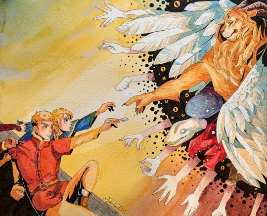
Process info under the cut vvvvv
First some materials!
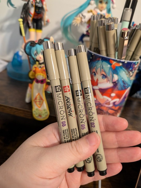
Line art: I use Sakura Pigma Micron pens for line art. The ink in these pens are waterproof after they dry, which is very nice if you want clean line art. Usually I do my line art with a 005 size tip, and then I come back through and thicken lines and add shadows with a 03 size and brush tip. I'm still learning new ways to do lineart, but this is my current go-to.
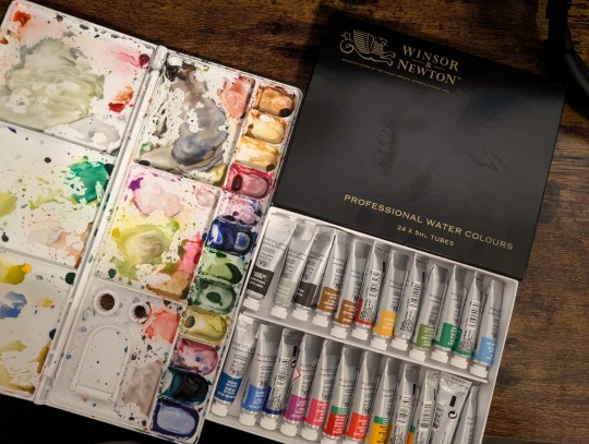
Paints: I use Windsor and Newton paints. I haven't really tried others, and I have a few mixed feelings about some of the colors and how well they mix with others... Especially cuz this was an expensive set. Thinking about trying a new brand eventually but that's what I'm using for now!
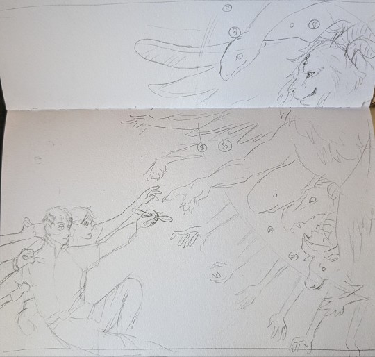
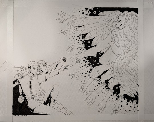
If I'm doing a bigger project I usually brainstorm it first in my normal sketchbook. Here's the brainstorm for this one. Sometimes I feel like certain aspects of the initial sketch look better than the final piece, haha. After this I normally will free hand redraw it onto watercolor paper, I don't like to trace things over. Then I'll do the line art, allow the ink to dry entirely, and erase the pencil underneath
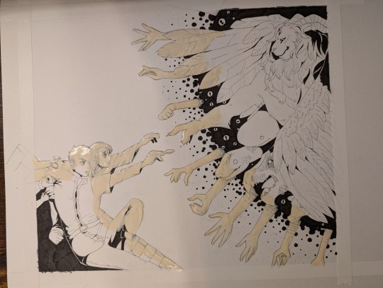
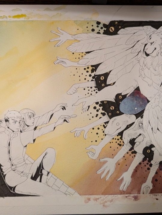
If I'm doing a big or complex background normally I'll lay down some masking fluid. This essentially seals the paper in some rubber so no water or color gets in, and then you can rub it off when you're done with the background. My masking fluid is really old and nasty so it's hard for me to get clean edges with it, but it does the job well enough!
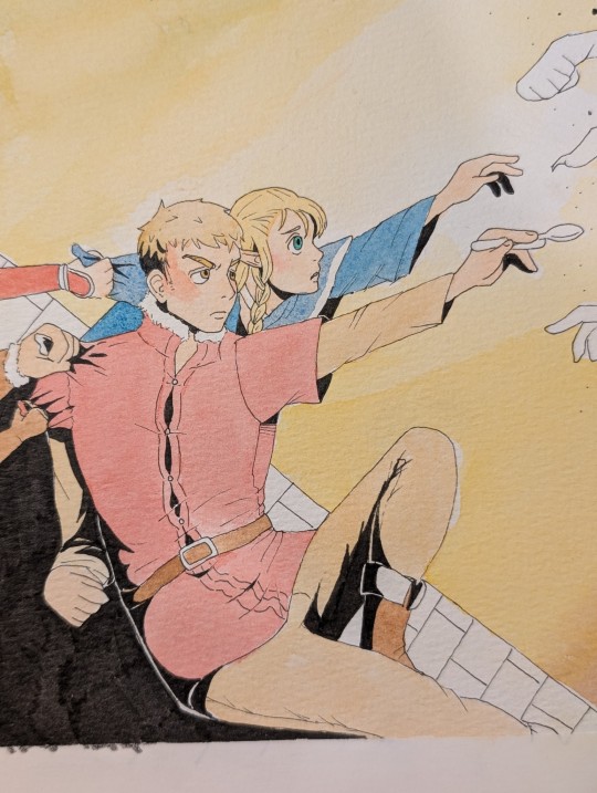
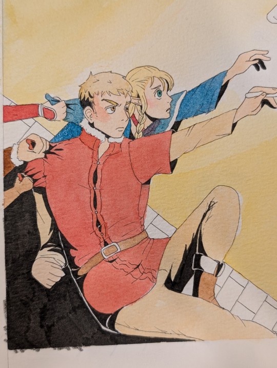
Something really important to watercolor if you want vibrant colors: layering or using less water! In this case I did layering. Here is a side by side of Laios and Marcille with one layer of paint vs. two layers. The important thing when it comes to layering watercolors is to allow the first layer to dry completely before the second. Otherwise the paint may create strange textures and uneven color.

Something else important to creating vibrant colors with watercolor: taking risk with shadows!! On a whim I chose blue to use for shadows on the Lion's wings. You can really see the difference in visual impact between the blue shaded and unshaded wing. Generally speaking it's recommended to do shadows using blue or purple in watercolor, but I find this isn't always a solid rule. Sometimes it depends on what your base color is and what kind of impact you want. It's taken quite a bit of trial and error to figure out what looks good for me, and even then I'm still out here guessing.
I hit my image limit so I'll cut it off here! If you have any questions feel free to ask (:
#thank you again for the notes!!#my art#traditional art#watercolor painting#watercolor process#traditional anime art#dungeon meshi#dungeon meshi spoilers#laios touden#marcille donato#dunmeshi#winged lion#commissions open#open commissions#art comms open
104 notes
·
View notes
Text
MY NEXT TTRPG: Must be Tuesday 2nd Edition!

On October 31st this year, I'm gonna be putting out the preliminary edition of my next TTRPG, Must be Tuesday: Revived Edition! This version will be rules and text complete, but may or may not have all the art just yet (the PDF will be updated for free when the art's finished, then the final version will be available in print).
In this d6 driven, lightweight roleplaying game, you play as teenagers who are monsters (but I repeat myself) struggling to be normal through all the stresses of being a teenage monster-fighters, carefully balancing the two halves of your being so you don't end up the Monster of the Week or the Victim of the Week.
The game is very lightweight and makes for an excellent first RPG, designed for rotating GMs and short-to-medium length campaign 'seasons'. It has rules covering magic, artifacts, relationships, and baddies, all plugging into a simple system of dice pools, keyword talents, and a slider between squishy, well-adjusted mortal and terrifying, evil monster you need to walk.
It's basically an RPG that simulates Buffy seasons 1-3 in an easy to pick up and learn format, with a lot of guidance for GMs, a ready-to-use setting if you need it, twenty-five pairs of premade students and monsters, and additional campaign inspiration.

It's also a remake of my first ever published game, ten years on, as an excuse to redo old rules, redraw old art, and give it a fun new layout. It's the same game, just much, much better.
A notable expansion is splitting player characters across three kinds of monster Natures, each interacting differently with the game's mechanics to create different play incentives. There's the classic Selfish monster who shifts by fulfilling the desires of each half, the spiralling Self-Destructive monster who can keep sacrificing to stay in a fight, and the unstable Impulsive monster that swings wildly and easily between extremes. We even added more detailed support for playing regular humans, complete with their own dedicated Nature.
The game will be available on the 31st on DriveThruRPG and Itch.io!
#tabletop#ttrpg#rpg#fantasy rpg#roleplaying#roleplaying games#must be tuesday#buffy#buffy the vampire slayer
51 notes
·
View notes
Text

I was asked so! Here are my silly lil prompts for my personal month challenge thing!!!
NOTE: This is not a official thing or what have you, I was just asked to share the prompts for my lil self challenge, so I am! This is my own personal little challenge because I've had these prompts since 2019 and I want to use them
I'll put under a readmore because it is... like. 30 things lmao
Day 1: First Askblog OC The first blog OC you made! Day 2: Most recent askblog OC Can be a side or main character, just the most recent OC you've made for a blog! Day 3: The Modsona Draw your modsona! Self love n all that Day 4: Redraw a silly/funny askblog panel Find a old silly/funny or shitpost panel from one of your blogs and redraw it! Day 5: Evolution scene Draw your OC evolving! Can be past event, future event or something that already happened for a silly redraw! Day 6: Blog Swap Draw one of your blog OCs as a character on one of your other blogs! If don't have more than one blog, switch up their role with someone else on your current blog! Day 7: Favoritism wins Draw your absolute favorite OC from your blog! Indulge a little Day 8: "Nothing bad happens" What would your OC look like if their plot had nothing bad happen Day 9: Redraw a sad panel Redraw a old sad panel! Last prompt was too cheery, redraw that angst with your updated abilities! Day 10: Favorite Magic Anon Blast from the past, relive that glorious magic anon Day 11: Easiest OC to draw Draw that easy fellow, relax a little! Day 12: Difficult OC to draw Back on that grind, draw that one guy who is the absolute most difficult for you!! Day 13: Redraw your least favorite panel We all have that one panel that just, didn't come out right. Try again! Maybe it'll be nice to see your improvement.. or maybe you'll hate it again. Anyways, chop chop Day 14: Injury Draw that dramatic/important injury your character went through. Past, present or future! Day 15: Beach episode What it says on the tin, we love a filler episode. Can be plot relevant but hey, they deserve to relax too Day 16: Favorite blog Draw some fan art for your favorite blogger! Whether they are a friend, inspiration or what have you! Extra challenge: redraw some old fan art you did for them Day 17: Plot Changer That one moment... the thing that made everything twist. That really hit a hard turn in your storyline! Can be past, present or possible future! Day 18: Scrapped Idea What was that scrapped concept again? Or was it a character.. or even something as silly as a slight design change? Day 19: What's a God to a Blogger Most of us have that one god. That one important guy in the sky... or the ocean.. or under a truck... man pokemon is weird. Day 20: Canon Compliant Stylization is so interesting and unique!... but strip that away. Be close to pokemon canon. Day 21: Shiny Beam A easy one... make that little guy shiny!!... Oh they are already shiny?... well then undo that. Silly. Day 22: Dream interaction What's a interaction with your characters that you would really love to see or are excited for? Can be within your own storyline or a interaction with someone else Day 23: Real World Sighting Draw your OC(s) in a real life photo! Bonus points if its a photo you took. Take this chance to go for a nice walk and take some pretty pictures!.... touch grass. Day 24: A spoiler that.. wouldn't make sense to others That's right. Be vague. Spoil a little bit in the most vague manner. It's always fun to see others speculate. Day 25: In blog ship Draw your favorite ship within your own blog! Friendship/romantic ship/hate ship... Just whatever one makes you smile Day 26: Out of blog ship Same prompt as 25.. But with your OC and someone ELSE'S! again, friendship/romantic ship/etc etc! Day 27: Different Art Medium! That's right. Draw/sculpt/etc your OC in a different art medium than normal. This will either be fun or horrifying for you Day 28: The Inspiration VS the OC Draw your OC with their inspiration! Can be the storyline that inspired them... or the character that desired them! Etc etc Day 29: Song drawing Yeah that's right. Draw your OC/Blog with the song that you associate them with! As a treat Day 30: Redraw first blog post / Thank you Cliche ending alert!! Redraw your first ever askblog panel you have ever made. Not the first post on a more recent blog.. no. THE FIRST ONE. EVER. Or be corny and draw a heartfelt thank you to all of your friends and followers you made Or hell.. maybe even both
61 notes
·
View notes
Text
November 2024 Escher Girls Updates & Patreon Thank You!

Hi everybody! It's November, so it's time for a monthly update and to thank all our wonderful Patreon subscribers!
For a quick update about Tumblr, if you've been following the blog you probably noticed that in late September/early October, the Escher Girls Tumblr ran into the infamous "shadowban" bug, which is not actually a shadowban but just a bug that happens to random blogs on Tumblr (more info here). After bugging Tumblr about it a few times, they finally fixed it, which means everything is back to normal and I can send and receive DMs and messages as normal on Tumblr (just in time for the Caption Contest which was handy for giving out prizes to the winners!)
I appreciate everybody who helped me figure it out and especially @haveievermentioned who messaged me to let me know that they weren't getting updates from the EG Tumblr! In the future if you run into any issues with Tumblr or the main site, please don't hesitate to let me know!
Also, if you missed it last month, I've been fixing up the main site and I updated the submission guidelines and also the submission form which now lets you choose a name to submit with and also let me know if it's okay for me to reply to your email address if I need more info about your submission. The new and improved form can be found here: https://eschergirls.com/form/submit-content
And, all new posts on EscherGirls.com now link to the corresponding Tumblr post so site users can easily navigate to the Tumblr cross-post and see what Tumblr users are saying. And when I fix up old posts, I'm now fixing up the Tumblr version as well and adding a cross-post link. It's twice the work but given that many people still view the site on Tumblr, I figure it's worth it to everybody. :3 There are some posts without a Tumblr cross-post link because the Tumblr post has been deleted/hidden because of Tumblr's mercurial algorithmic flagging which can't tell the difference between stuff like a coloured body suit and nudity.
As usual I've spent a lot of time this month working on fixing up old posts, restoring broken images or finding higher res versions of old images, and fixing broken links, etc, also fixing all the formatting of older posts and finding sources.
Here are some of the posts I fixed up this month (for any that want to check them out, the links to the Tumblr versions are included in every post):
This "How To Draw" book depicting women's waists as a ball joint (which explains a lot about why artists think women can just swivel around like rotor blades), and an associated post with that infamous Jennifer Blood cover
The infamous "muscleboobs" how to draw page depicting women's breasts as muscles
Two different Soul Calibur posts: one with Talim in a boobs and butt pose (and a redraw fix of it), and another with Xianghua, Talim and Ivy in various states of rubberization
Black Canary described by my friend as a miracle of modern plumbing
War Goddess giving up War Goddess-ing and instead going into the butt-selling business
The infamous Glory/Avengelyne cover (the first time I posted Liefeld on this blog after the first 800 posts without him to prove a point that it wasn't just him putting out the insectoid women art) and an associated post
And a caption contest with Avengelyne and Ravyn in pretty hilarious poses and also the winners of that contest
And now I want to give a big thank you to Escher Girls' Patreon subscribers for October!
Thank you so so much to:
Anne Adler Cat Mara Chris McKenzie Em Bardon First Time Trek Greg Sepelak Ken Trosaurus Kevin Carson Kim Wincen Kristoffer Illern Holmén Leak Manuel Dalton Mary Kuhner Max Schwarz Michael Mazur Miriam Pody Morgan McEvoy randomisedmongoose Rebecca Breu Ringoko Ryan Gerber Sam Mikes Sean Sea SpecialRandomCast Thomas
And a very very special thank you to JohnnyBob8 for buying me a coffee on Ko-Fi!!!
Thank you so much for helping to keep the site running! The Tumblr technical issues and algorithmic flagging are reasons why Escher Girls has a dedicated self-hosted site, and why I appreciate the support on Patreon and Ko-Fi so much as it helps me pay for hosting, domain costs, and site upgrades and keep the site running.
And thank you to just everybody, all of you interacting with the blog on both Tumblr and on the main site, and who participate in caption contests, and submit things to me, or just generally send me kind words. Thank you all! You make running the site so worth it. :)
Ami
PS: As a reminder, we added a button that links to the Escher Girls Tumblr and to our RSS feed for those who want to follow that way. (For newbies, RSS stands for Really Simple Syndication and is basically a feed you can read using an RSS reader. Simply copy and paste https://eschergirls.com/rss.xml into an RSS reader and it will keep you up to date on Escher Girls!)
Make sure it is eschergirls.com and not eschergirls.tumblr.com, as that is Tumblr, and not the self-hosted site.
If you have any issues with the site or suggestions to improve it, please do not hesitate to contact me and let me know!
If you wish to support Escher Girls, you can subscribe to our Patreon at: https://www.patreon.com/ami_angelwings or donate through Ko-Fi at: https://ko-fi.com/amiangelwings.
23 notes
·
View notes
Text

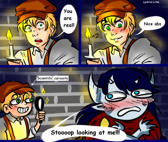
Timbern AU Beauty and the Beast:
Before continuing I must say that the original idea of this cartoon belongs to @0rbis-art (Tumblr), Orbis.art (Facebook) and Orbis_Art (Twitter), I redraw it with a few modifications to adapt it to my Au, because his cartoon was super funny and it fitted curiously with my thoughts. But from then on, my au doesn't take anything else from his Beauty and the Beast Comic idea. (The original idea of Orbis-art had no dialogues)
__________
So, if you're still interested in reading the AU, here it is:
Like, Well, I thought Tim was some kind of Duke of the Drake family, everything was fine, his parents had died but he was taken in by the royal family (Wayne) and after a few years he had returned to his family lands to do his duty with his people, when a Fae who visits their castle proposes (demands) marriage him. Tim says no, and the fae claims unlike him, no one else will want him no matter what he is, a claim Tim rejects. So he's obviously is cursed.
The curse turns him into a dragon-type beast and erases the memories of all the people who loved him (family and friends), intended to force him to find a person who loves him without knowing who he is in order to break his curse before he reaches the age of 23 years old (he was 15 when he was cursed), if he doesn't make it, he will completely turn into a dragon and the evil fairy will make him his pet. Obviously people are afraid of him and some try to hurt him, so he hides in his mansion, losing hope.
Bernard enters who is a normal guy from a nearby village who is super obsessed with magical creatures and monsters and dedicates himself to studying them even though people believe they are lies (not many people have contact with magic), he investigates all the rumors about creatures that can even though it has never amounted to anything. One night a terrified traveler comes to the tavern where he works, claiming that he was attacked by a lizard-like beast in the ruined mansion in the mountains and Bernard HAS to investigate.
He packs a small suitcase with travel things and goes to the mansion, where after investigating for a while, he meets Tim, who tries to intimidate him into leaving (he just wants Bernard to not trying to hurt him) but Bernard is fascinated (it's the first time he finds something of truth) and does not go away. No matter what Tim does, he don't let go.
Tim is dressed in rags because his dragon features grow out of control and rip all his clothes off and his hair is long and ripped because a nobleman doesn't have a damn idea how to cut his own hair or repair clothes. He has started referring to people as "humans" because he has started to feel like a monster as time goes by and he loses even more hope of being helped.
The fairy (yes, it's Ra's) sometimes sends servants with food and stuff for Tim, but he always turns them down because accepting their gifts would be accepting their courtship, and Tim wants nothing to do with the idiot who cursed him, so he has been living on what he can find in the woods.
In exchange for allowing Bernard to stay in his castle, he promises to help Tim break the curse (Tim can't tell him how). And well, that's where the adventure of these two would begin.
#tim drake#timber#bernard dowd#red robin#tim x bernard#timbern#robin tim drake#my art#tim drake x bernard dowd#Beauty and Beast au#dc#batfam#batfamily#batkids
275 notes
·
View notes
Note
YOU ENDED UP GETTING ME INTO NEOPETS NOW SO WHAT R UR THOUGHTS ON JETSAM(S)? IM A SUCKER FOR SHARKS LOL SO IM RLY HOPING TO GET ONE AT SOME POINT

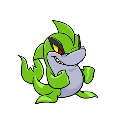


Jetsams are sharks, and are meant to be kind of a counterpart/natural predator to the dolphin-like Flotsam; to the point where the two looked near-identical. Nowadays there are more differences, with the Jetsam sporting two fins, sharp teeth, slightly different markings, and an upright posture. Personally, I like to think of these two as a case of mimicry, with the Jetsam having evolved to trick Flotsam from a distance.

Visually, the Jetsam has a nice tough look to it that gives it a lot of personality, and the way it sits upright plus the two fins gives it a bit more uniqueness so it isn't just a normal shark. My only issue with it is that the gray underbelly is a bit too dark and low-contrast. Gray as the accent color is fine; it just needed to be a lighter tint.
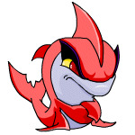
The Jetsam benefited quite a bit from customization, as its old art was starting to get very dated and needed a redraw anyway. The new Jetsam looks a little less tough, but the smile is nice as it shows off their teeth, and it gives them a fun kind of mischievous look. The overall look didn't change much, but the head has been changed significantly to have a much better, less wonky shape to it, and the markings now stop above the mouth instead of near the eyebrow. The shape of the hind fins have also been improved, and they're one of the only pets who can make the customization fists look good.
Favorite Colours:
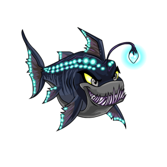
Maraquan: How do you make an underwater version of something that already lives in the water? Make it into a deep-sea fish, obviously! The overall design is easily recognizable as a Jetsam, but its been given a horizontal posture with bioluminescence and an angler fish light/teeth. The palette is great, using neutral browns and greys for the body and bright neon blues for the accent color. My only nitpick with it is that the teeth feel a bit busy and don't quite make sense if you look at them too long, but overall, this is a great design.

Pastel: The pastel Jetsam is just plain pretty, using a soft pink and turquoise palette. What really makes it work is that instead of using flat colors, it employs subtle gradients so the turquoise becomes blue in areas and the pink gets some subtle highlights. On top of that, it's also given a sunlight-under-water ripple texture, with a few small speckles on areas like the eyebrows and tail. A lot of effort went into this design compared to your standard pastel pet, and it really paid off.
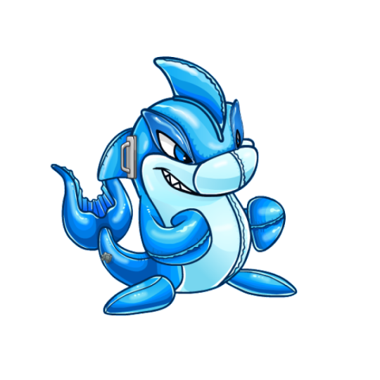
Toy: Alright yeah, this one's just fun. The pool floatie idea is a great concept that works perfectly for the colour, and the execution is also really solid, including lots of raised plastic ridges, seams, and plenty of highlights to give it that plastic look.
My only issue with it is that weird handle on the side of the head. I guess some shark toys have these, but I've never seen one personally and it honestly just looks distracting and kind of out of place. Also, I do wish it was semi-transparent (think like the good Jelly-coloured pets), but that's not a big deal. Still a really good colour regardless.


BONUS: The robot Jetsam has a mostly red and white palette with a few black accents, and it works really well for this pet. I love the visor, and the patterning on the fins is really neat. Both versions are fine; the UC/styled version looks a bit more robotic, but the customized version reads a bit better overall.
27 notes
·
View notes
Text

I've mentioned this height chart a couple times before so I thought I may as well share it! I want to add more characters to it for sure but I think its looking cool so far! The template is by "Inthenameofsweden" on DA, though I stretched it out and added the checkerboard pattern as I felt like it needed some extra texture.
Tower is actually the only one that was drawn traditionally, the rest were drawn digitally. I had the genius idea of taking a picture of him and then drawing the others on the same canvas so they would already be sized relatively correctly (and the art wouldn't be too distorted when I resized them for realsies here)
Normally Tower/Sy are the tallest characters that anyone else interacts with. The Daydreamer is technically taller (around 7'), but they almost never leave the library so barely anyone sees them unless they're in there. Cavi is...not the shortest person ever but he is otherwise considered pretty small. Like he is actually at risk or being blown away by large gusts of wind.
In an ideal world I would have liked to include a bunch of meme redraws to explain these guys but I don't have the bandwidth at the moment; feel free to hold me to it in the future though LOL. I did manage to dig up a couple old ones (not completely fossilized yet) so I'll stick them under the cut as bonus content!
Sy discovering Cavi was actually a sion and not just a normal guy for once (redraw of an Umbrella Academy meme)

These next two have less than ideal image dimensions for tumblr so I'll lump them together -
Torch refusing to acknowledge anything especially stupid that Tower and Cavi are doing ("I pretend I do not see it" meme), plus
Cavi having a bad day ("WHAT THE HELL IS GOING ON" screenshot redraw of Alex YIIK doing the line in YIIK: A Postmodern RPG)


Tower (pre-cheek scar) legitimately calculating a bunch of probability math in his head (Confused Math Lady meme redraw...he just looks Like That)

If I were to dig up the fossilized memes it would be clear that Sy is a particularly huge memelord so be thankful we are not going there....for now
#my art#behold! my art#character art#Arrow's ocs#my ocs#character height chart#zzzz sorry the general rule for my posting slowness is because my brain has decided to really get cooking on something#worldbuilding related and do a lot of text based things rather than regular art#despite having a lot of that in progress#(also being on vacation this week doesn't actually help anything LOL)#Arrow's ocs: Torch#Arrow's ocs: Cavi#Arrow's ocs: Tower#Arrow's ocs: Sy#I do want to do a quick updated ref for the Daydreamer sometime cause I had a slight redesign idea
8 notes
·
View notes
Note
Hello! I saw this blog the other day, and I wanted to see if you could redraw my OC? Anyway, this is Melanie, a character in my AU who is the daughter of Greg and Black Diamond/Carbonado. I used a base by Artistic-Raven on DeviantArt that was derived from a piece by dreambigstars, since I can't draw worth a damn. I hope that's okay!

As for color references:
Hair and Eyes: Same as Steven's
Skin: A little darker than Greg
Gem: Black
Shirt: Basically Greg's old Mr. Universe shirt (black with a yellow star)
Pants: Navy blue
Shoes: Black converse
A little more about Melanie:
She is Steven's older half-sister by exactly two years.
Unlike Steven, Melanie aged normally, which is why she looks like a normal 16 year old.
She's about the same height as Lapis.
Her weapon is a chakram.
In Future, her hair is now in a pixie cut, her shirt is now a deep purple, and she has a denim jacket tied around her waist.
If you are unable to do it, I understand. Thanks in advance!
• By submitting a gem I assume you have read the rules and agreed for me to judge •

The base was traced by someone else other than the original artist right? I'm not sure if the artist consented to that, and I assume no. Consider this one done out of pity I guess? Because the whole "I can't draw" some people do is just tiring.
Do you think every artist starts drawing and starts drawing perfectly, do you really think art works like that? I started drawing veery poorly and if I didn't continue, I would not be able to draw this piece for you. Consistency and learning is important in something so subjective like art and if you get stuck on "I draw bad" you'll never get around.
A good idea is still a good idea regardless of the style, and the execution of that idea matters. If you excuse yourself on that, you'll never start. We have more information/help than ever before, people who do bases for free and tutorials!
A negative mindset is a snake that never stops biting itself. I wanna draw > I draw > It looks bad > I don't wanna draw. Art is a way to express yourself, not to repress.
You need to focus on what makes you happy. You don't wanna share it because you think it looks bad? Then don't. Keep it to yourself until you think it looks better and you're proud to share it. Wanna learn how to draw? Look of tutorials, seek help and information and DRAW.
Or if you don't wanna draw, then just commission artists! There are so many choices!
#ask#banners-wolfy-fangirl#gemsona#su#su future#sketch#steven universe#su gemsona#others art#im sure i was too tough on this. and at the same time whats the excuse on tracing when theres plenty of bases#submission
14 notes
·
View notes
Text
Was talking on the twits about how "not mine" isn't a source, and how you shouldn't be posting other people's art in general but definitely shouldn't be posting other people's art without at least linking back to them, and thinking about the most egregious example of this that I have personally experienced. I haven't really talked about it to anyone because it seems almost petty compared to the rest of the related situation, but bothers me more every time I think about it.
I think most of the people who know me are aware of my old in-character askblog, @askvincentvalentine; I'm redrawing all entries to eventually release as a solo anthology, but I have a lot of anxiety about it and it's going very slow. I think this hesitation (I might even call it apprehension) is in large part connected to this unspoken experience, and maybe finally talking about it will help.
A month or two before we broke up, I found out that my abusive ex had reposted every Ask Vincent Valentine entry to his personal Facebook, starting years before we really met, never linking back to Vincent's blog or to mine. He'd reposted a lot of my art, actually, and treated this like a totally normal thing, saying it wasn't a big deal since we didn't know each other at the time.
Looking back, it's a little...creepy. We met properly in 2020, but I remember him showing me a screenshot of a post he'd made in like 2015 where he reposted a piece of mine drawn in 2005, posted on my original dA account, under a different handle that is pretty much completely unconnected to my current online identity. I'm not saying he was stalking me for years or anything (I'd seen his fanfiction on AO3 for ages so it's not like we were unaware of each other's existence), but it still feels really fucking weird.
On top of that, by reposting it to that particular platform, he allowed my work to eventually be scraped to train multiple gen/A/I models without my consent. As if he didn't mistreat me enough during our relationship, he'd apparently been taking advantage of my work for years before that.
The more I think about it, the more it bothers me. Like...what the fuck, honestly. I don't have any other way to quantify it other than "what the fuck."
Just...why would he do that? And he didn't tell me about it until years into us knowing each other. When I said (as gently as possible) that I didn't like it, he said that he couldn't ask me back then because he didn't know me, so it was okay—and it would have been okay by now anyway, since we were in a relationship, so it wasn't like I was gonna tell him to take the posts down.
I don't know. It's bothering me a lot recently. Reposting other people's art without even trying to credit is bad enough, but this just feels like some next-level bullshit.
13 notes
·
View notes
Text
Old Sonic sketches(Plus extras)
Found some old sketches I had on DA & wanted to show them. Some sketches have the date I scanned them in the corner of the image because the date changes if I edit them & I had to edit them cause they're all bmp files along with needing editing to be darkened. It's there to show how old they are & cause I found it interesting, if the image doesn't have the date I'll list mention a date that's mentioned in the DA post or something related. Not all the images are in order of date.


The image on the left was posted November 8, 2012 while the one on the right is from August 27, 2013
These were some wedding sketches I drew with the one on the right being a pic I made for a teacher I had in high school.(Graduated 2014) The pic on the left was a Sonadow & Silvaze wedding with Tails catching Sonic's bouquet while Cosmo(who was revived at some point) giggles.(tfw When you might end up marrying next thanks to a moment at your older brother's wedding & your girlfriend knows too)
Shadow & Sonic's rings(on the wrist) was inspired by a comic by Segamew on DA were Shadow used one of his inhibitor rings to propose to Sonic.(Fun fact at the time I didn't know what his rings did past the fact Shadow wore them, I only learned about the reason recently) I use a different idea for mobian wedding items now.
I find it semi funny(semi cause it looks cringy) that when I posted this to DA I was like "I'm using Shadonic instead of Sonadow so fuck you" to be honest this came from past Naruto shipping were ship names go by who is tops. I've gotten over it by now but if I'm not using ship names I still put the top first.

This was drawn in 2015
The top images are Monoko from Yume Nikki & Sonic as nightmarens from the NiGHTS series. I might redraw/redesign these one day but dunno. The little mini doodles between them are an old design for my self-insert Sonicsona & Monoko next to me. I don't know the context for them.
At the bottom is Reala(nightmaren this time instead of my OC Reala the hedgehog), Jackle & my nightmaren OC Halldis dressed up. Next to them is Pinkie Pie semi Rayman style.(By that I mean floaty limbs)
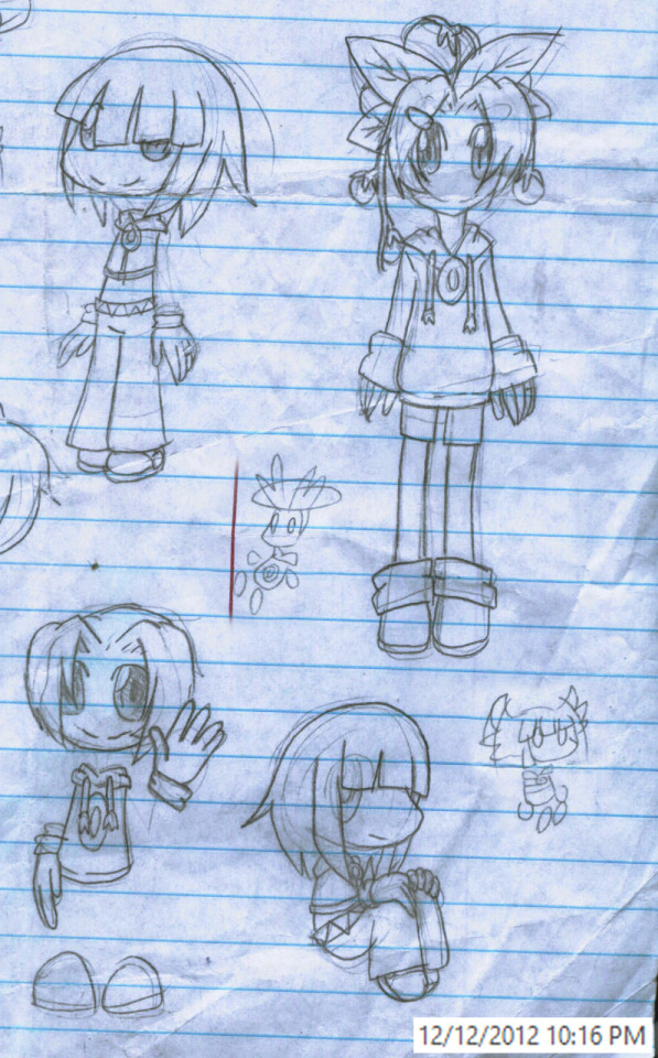

The one on the left is cropped cause you don't really need to see my old Raymesis/Dark Rayman(Who is turned over a new leaf, also thought they were the same person back then) x Rayman stuff. Funny enough two images were edited into this from the cropped side cause they're semi related.
Left image:(Added in mini pics at the bottom of list)
Left to right, top of page to bottom of page
Rayman Sonic that I didn't put much effort in past hair & outfit
Rayman as a seedrian, this was made before learning that male seedrian look very different from the girls. He's a plum plant from the Rayman series.
Normal Rayman waving
Rayman!Sonic sitting down
An attempt to draw mini Rayman & Rayman!Sonic flying using their hair. Rayman obviously with helicoptor bangs, Sonic flapping like he's a bat/bird.
Right image:
Left to right, top page then middle page then bottom page
Older Rayman with kids
Rayman!Shadow & Rayman!Sonic, these are their old designs with Shadow's being inspired by Kanda from D.Grayman's hair & mitarashiarts's past design for gijinka Shadow. I guess I gave him Raymesis style eyes given how I drew them.
Rayman!Sonic in a Rayman version of Sonic after being blinded by Eggman(context my version of Sonic at some point in the future was blinded by Eggman)
Rayman!Sonic wandering around & hiding that he's Sonic & injured
A scene of old design Shadow finding Sonic after he was heavily injured & almost drowned in Rayman style
Random doodle of Sonic in a random art style
An old prototype design idea for revived Cosmo, two versions of her as a plant based deer. I ended up going with a plant based chipmunk in the end.(With help from a friend when I mentioned some suggestions)

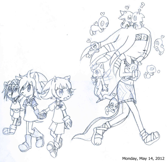
I don't fully remember the context behind the pic on the left I just know it was a scrapped idea. I think the idea was Silver visiting the past as a kid & helping Sonic after the reboot or after the reboot in Sonic 06 he was born in the past & made friends with Sonic.(The middle pic is meant to be them before the re-boot) I'm guessing this was before the paper towel comic I made.
The right image is meant to be Sonic walking with his siblings as they unknowingly pass by the spirit of Tikal with a bunch of Chao(plus Sonadow chao) & Chip. Sonic notices him & Chip waves to his future friend. From what I understand the idea is Chip some how got a chance to see Sonic in the past after the events of Sonic Unleashed.(Likely way on DA I named this "Meeting again before I knew you") No idea how Sonic can see them without his glasses on since Underground Sonic is blind without them. According to DA this image didn't need much fixing up.

Here's a pic I drew on one of my folders for school(2011 was my first year of high school)
I had to grayscale this because the folder is yellow & it'd look stupid

Left to right
-Sonic as a young child with his adopted dad after they decided to go frog hunting for the first time
-The idea behind this was Sonic returning to where he grew up before going to live with Uncle Chuck after helping his siblings & mom rebuild the kingdom after defeating Robotnik. I think the idea was that Sonic still met/took in Tails at some point cause there was an idea of Tails bringing Amy, Shadow & the others to meet his older brother.
Version 1 was meant to be Sonic having become more like he use to be before the trauma of losing his adopted parents & losing his confidence thanks to bullying(for being different) & the stress of the war. He's happily being Sonic in the woods he was raised in. Version 2 is just Sonic as I depicted him at the end of Sonic Underground were he has gained confidence but is still slightly timid & very sweet.(No idea why it says "Southern bell-ish" I'm guessing this was the only description I could think of)
-Sonic dressed in his adopted mom's outfit
-Sonic before losing his adopted parents & being taken in by his uncle. Sonic was a happy & energetic, he loves exploring the woods & learning to play music. He's a kid that hasn't fully learned that the world is full of things to fear despite knowing the dangers of going too close to areas everyone knows is Robotnik's territory.(I guess think of Robin from the game The Path were she didn't realize it's dangerous to fall out of a shopping cart nor jump on a werewolf)
The poor kid is in for many horrors when he made the poor choice of hunting for frogs near one of Robotnik's bases.

Posted to DA May 28, 2014
Classic Rayman as a puffball, Sonic as a puffball & anime Kirby as whatever Rayman is

Posted to DA June 24, 2019
Why I can't draw Sonic's eyes like they're meant to look

Adding another pic last minute, this is an old sketch dump of Sonic & his siblings from my old Sonic stuff that went on to lead to my Lost Prince AU
Left to right
Top:
The sight Uncle Chuck saw when he got home. Thanks to having enough of the bullying while struggling to deal with losing his adopted parents Sonic chopped his hair/quills off to look more normal.
Sonia fixing Sonic's hair while Manic finds it funny she used a bowl to cut Sonic's hair
Sonic meeting his siblings for the first time as they hide somewhere after managing to run into each other. Moments later they're told what they're meant to be doing.
Middle:
Sonic amazed, I think this was inspired by Ojamajo Doremi/Magical Doremi some how
Old design modern Sonic holding plushies I use to give him when he was a kid, lion & lamb plushies, I don't remember the context I think this was when he was living with his dad
Sonic laying on the ground with the plush dolls
Another old design modern Sonic
Bottom:
The triplets managing to sleep in a proper bed after some traveling
#my art#old art#sonic the hedgehog#sonic au#rayman#shadow the hedgehog#sonadow#shadonic#silvaze#miles tails prower#cosmo the seedrian#sonic underground#tikal the echidna#blaze the cat#silver the hedgehog#kirby#kirby au#rayman au#nights sega#jackle the nightmaren#reala the nightmaren#oc#chip the light gaia#manic the hedgehog#sonia the hedgehog#yume nikki#monoko yume nikki
17 notes
·
View notes
Text
I did more art today! But first, a show of improvement in art style (again)! (Warning! Fake blood!)
This is Hands (the first design):


The show of just his mouth without the mask is the only part of his design that I loved. He used to be a Sonic OC, and still is, just... without the killer tentacles. I think I drew him in 2022, November 8th (it was apparently a Tuesday, but I didn't write the year). He's a 13 year old dormouse that is mute, though the tentacles used to be why he didn't talk (couldn't open his mouth or they'd come out and stab everyone over the age of 10. Idk why).
But here's the redesign:

The mouth stayed the same, but the changes are obvious (yes, I drew on green construction paper. The pink sticky note's there bc I messed up his body too many times). He's got some fur, that one ear isn't torn for no reason anymore, and he's shaded! Also, the tentacles are gone. He's still 13, so he's just my son. This time, his eyes will be a more obvious Heterachromia than the pink and magenta I did the last time.
Whole page:

Drew my favorite character from one game and my second favorite from another. If you don't know who my second favorite is, just know the goat in that game is my favorite, I just didn't draw him.
Close-ups (of Sebastian and Lamb[ert]):


(I messed up Sebastian badly the first time, so I covered it with a sticky note and started over. Lambert's fine. I fixed his crown when I realized the eye isn't sideways no matter how cool it would be if it was)
Not sure if it's my first time drawing a character without a nose or not, but it turned out fine thanks to some reference photos I used. And I really felt like shading today. I don't normally shade my sketches because it doesn't look right 90% of the time, and also bc I'm lazy and don't like taking two minutes to add shadows.
(This post was brought to you by Cat Skeleton. M and Kat are fighting over what a good joke is...)
...
If y'all draw my OC, can you tag me? I'd love to see it! Remember: you're the only one that thinks your art is bad. It's our brains way of getting us to either give up or work harder. You see my improvement? It gets better! Keep going! Learn your style and build on it! Push boundaries! Redraw old art that makes you cringe! You'll see the improvement, I promise!
#artists on tumblr#oc#oc art#oc art dump#old art#new artwork#cult of the lamb#cotl lamb#cotl fanart#cotl#sebastian solace#roblox pressure#sonic oc#sonic original character#dormouse#anthropomorphic#anthro#cat posted#tw blood#cw blood#cw bl00d#tw bl0od
5 notes
·
View notes
Text
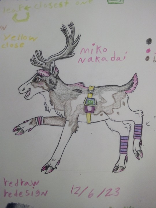
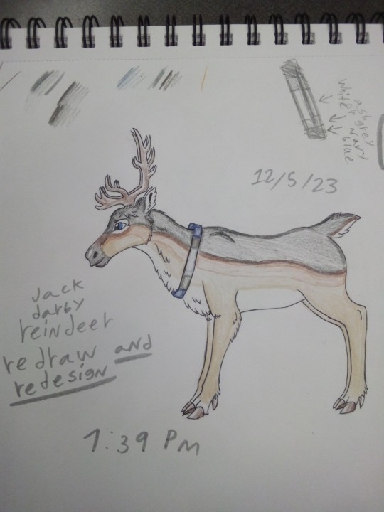
Allright here are my redraw redesigns of the tfp kids as reindeer
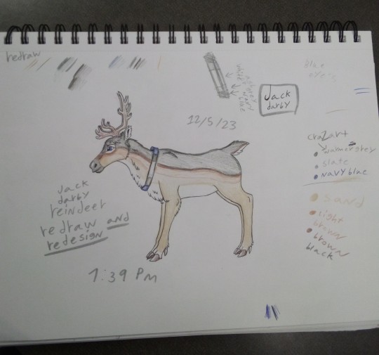


I personally think out of the three my favorite one was Miko I thought I did the other designs well but she kinda stole the show.
She also as you can tell drove me insane trying to find close or similar colors so oof I also had to simply her design a lot because I couldn't figure out how to include other things into her reindeer design.
My second favorite was raf because his was just kinda chill I feel like it could have been better but I really struggled with finding similar colors because I have a limited amount of colors to choose from .
Jack was my least favorite but that doesn't mean I don't like him I just hadn't finalized how I was gonna plan on how the clothing was gonna work so as you can tell with Jack I first thought to use the colors of his clothes on a collar of sorts but later with the other designs I went with bags because I thought the collars made them feel more like normal deer which I decided when designing Miko that instead of that they were turned into reindeer for some reason.
I am still finalizing on how and why this happened in my head.
So because of that when or if I get to it I will probably do something different for Jack like giving a bag or something that makes sense for him.
But other than that I'm satisfied
I also had Miko be a piebald reindeer and I think that really fit so yeah.
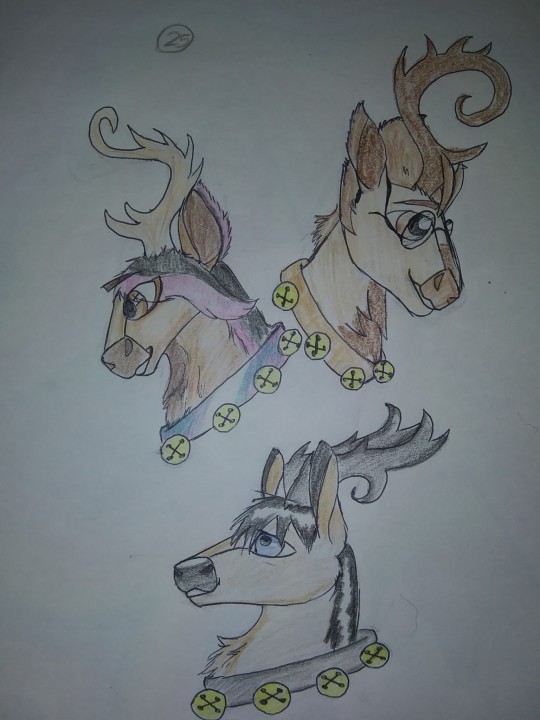
When Look at my old tfp kids reindeer drawing above it's honestly really fascinating seeing how I differ in my thought process when it came to how designed things I still have a bit of a soft spot for them but I really feel like I improved on my art.
Up close on the new designs.

#tfp#tfp kids#transformers#miko#raf#jack#miko nakadai#raf esquivel#jack darby#tfp jack#tfp raf#tfp miko#reindeer#tfp reindeer#redraw kinda ?#redesign#maccadam#my art#my post#transformers prime
19 notes
·
View notes