#i did some clipping redraw for this
Explore tagged Tumblr posts
Text


hitting it off
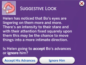
they chatted a lot outside of their apts before this. idek why but he's the only person from the whole floor that's easy to chat with (please pretend that i decorated his apt, i didn't know they'll like each other this much)
#ts4#ts4 gameplay#m#i did some clipping redraw for this#WITH A MOUSE#this is the first time i put in this much effort for a ss lmao#helen&bo
2 notes
·
View notes
Text

Talk to me, dad.
#a screencap redraw I did as a wind down to sort of relax!#something a little different than what I usually do lol#tgm#top gun#top gun maverick#top gun fanart#top gun rooster#bradley rooster bradshaw#bradley bradshaw#fanart#screen cap redraw#art#illustration#digital art#artists on tumblr#clip studio paint#csp#drawing#also the screen cap was on Pinterest and it was pretty blurry so this was good practice!#some parts of his helmet i was just like...hmmm..let me pull up a previous drawing i did with his helmet and look at that instead lol
283 notes
·
View notes
Text

Joker Persona 5
This is a redraw! The first was in 2020, the second in 2022. We're going for a two year gap on this one I suppose.
Original

Second

#art#artists on tumblr#digital art#artist#clip studio paint#digital aritst#original art#persona#persona 5#persona 5 fanart#joker persona 5#persona 5 protagonist#persona 5 royal#persona 5 strikers#ren amamiya#akira kurusu#p5r#atlus#atlus games#atlusfaithful#atlus fanart#atlus persona#persona series#shin megami tensai persona#goofy guy#Theres some stuff I wish I did the same from the second redraw to now#But I do prefer the most recent#he feels a lot more like himself and Arsene has a slutty little waist you can't see
23 notes
·
View notes
Text
found an old redraw of that durarara ending that used to be popular for drawing characters over while i was trying to find an oc reference…
this is dated january 2020 according to my archive notes!


#january 23rd to be specific!#i’m posting this so i can have it in my bembly tag bc i do want to redraw it at some point#once everyone has gotten proper redesigns & outfits#it’s worth noting also a couple of the charas in this one have been written out atp so LOL. i’ll rearrange it eventually#had to draw it in pieces bc of space…….. since i did it traditionally……. well thankfully now i have Clip Studio Paint™#one thing to note also is that this might’ve been one of my last pieces before i started drawing five fingers on hands! i started in 2020#but most importantly (points) ELIJAB SPOTTED ‼️‼️‼️‼️‼️‼️‼️‼️‼️‼️#bembly
1 note
·
View note
Text

the robaaa... yapping about her design below :3
RAHHH OKAY SO im trying to draw the main bunch in my style,, dalv is last as much as i adore him bc i wanna redraw the first uty drawing i did but with an updated style and different designs!
so Ceroba's first!! Well. Clover and the fallen humans were first but i digress. I know I wanted to add more details, especially to the clothes. There's nothing wrong with her inital design but I like details and there wasn't much detailing to work with there.
I looked up references of kimonos bc i believe her outfit is based on em? All the refs were pretty long, down to like their feet whereas ceroba wheres these big knee-high boots and a much shorter one. I stuck with that and just went along with the idea. Kimonos typically have patterns and I was gonna do some of the more like?? active ones?? the ones that show up most like cranes and such but I decided to look through kitsune symbolisms and the like.
A lot of kitsune things revolved around clouds and lots of swirly lines, especially on the masks themselves. I implimented that. her sleeves have a thin line of swirls around the ends and her kimono has lots of clouds.
I added more details to the boots because they felt so plain with that design I had so I went for a pointed shape with more pink and a gold line along the sides to it in. I also went with a pointed shape because?? I see a lot of like. crystal shapes with kitsune stuff? like diamond shapes so I figured it was a subtle nod. Her staff felt bland and boring now so I added the ends of the ribbon/loose parts and tied it around the staff into a bow. It was just to give it more flair.
The insides of her sleeves have this ombre of orange like a sunset almost is what i was aiming for. Kept the sleeves long bc it was typical with kimonos. I gave her this dark undershirt that goes to her wrists and up to a bell collar. In her sprite she has this yellow on her neck that matches the bells she wears but i never see art of her with a bell collar??? I dont think a lot of people notice.
I dont think in the years her and Starlo have known eachother that he wouldnt give her something to wear as an accessory. I think it could have started as a little pin or a clip for her hair before she put it on the bow on her kimono. Not much else changed aside from I darkened the tips of her ears and added dots to blend it in, her hair is naturally pink-tipped but ofc it becomes a fiercer brighter shade in her fight in true paci, and her bow in her hair has a clasped end with another smaller bell.
im so happy with design i hope you like it too :3
#serv0z art#undertale yellow#undertale yellow art#undertale yellow fanart#uty art#uty fanart#uty#uty ceroba#uty ceroba ketsukane#ceroba ketsukane#undertale yellow ceroba#undertale yellow ceroba ketsukane#art#fanart#reference sheet#ceroba uty#ceroba undertale yellow#ceroba ketsukane uty#ceroba ketsukane undertale yellow#undertale fangame#ut#artists on tumblr#digital artist#digital art
156 notes
·
View notes
Text
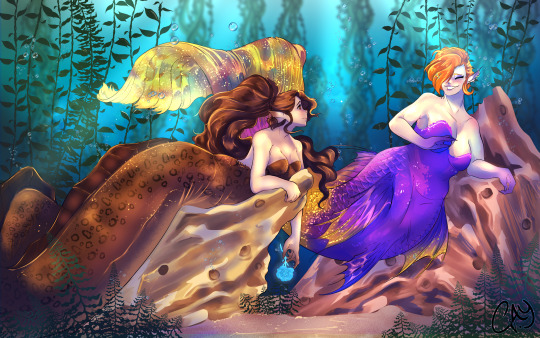
Absolutely smitten... A redraw of some fanart I did a long while back before I got into Clip Studio. ...happy (belated) bday to my awesome fren @mothiepixie who has been a inspiration teehee.
Was gonna add some easter eggs, but may do sketches instead cause I'm tired after this one, whew...
Motti belongs to Mothiepixie Lex belongs to me.
#my art#caycantdraw#motti mothiepixie#motti belongs to mothie#lex belongs to me#lexverse#lex fanart#siren!lex#sirenau!lex#mermay art#cause why not#two beautiful sirens/mermaids#one of my favorite colorful pieces so far#so beautiful ough#mothie is cool as fuck#bff#the sea version of an echo flower is sea's echo.instead.#idk it makes a great gift
167 notes
·
View notes
Note
Hii you're so talented!! i wonder if you could explain how you did this gif effect with the squares? and do you have any tips on colouring because yours is always top notch <3333
heyy thank you so much 🥹 and of course! i've never really done a tutorial before but i'll try my best to explain it in a way that makes sense 😅
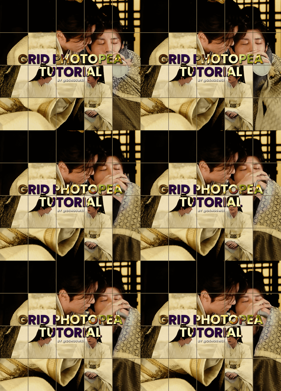
so i start off with making my two gifs seperatly and colouring them as i normally would, once i've done that i load both gifs into the same project and once i've done all that i started on the grid part:
now go to view -> add guides and this window should pop up:
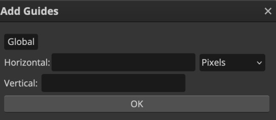
(it's was so daunting at first when i saw this i was like ????? and started putting in random numbers and was like oh that's how this works 🤣)
here's the settings i used for my gif which is 540px x 500px in size with 5 squares x 4 squares: (if you want more or less you just have to play around with it)
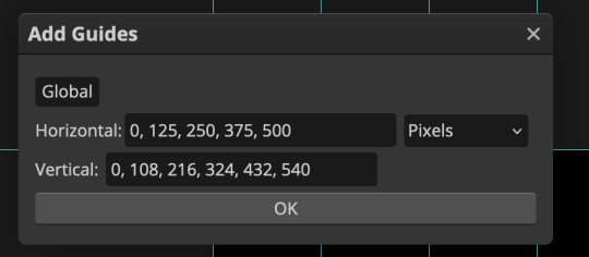
once you've done that it should look something like this:
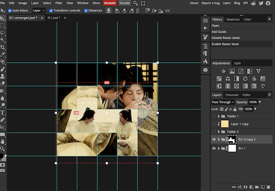
now the next part is really up to preference again: add a vector mask onto the gif that's above the other one like this: (ignore the name of my folder that is irrelevant 🤣)

and then i used the rectangle select tool (this is because the rectangle select should lock onto the grid squares making it easier to erase certain sections) + a black brush tool to erase the squares to show the other gif that's underneath (you can reposition both gifs to your liking which is what i did)
before & after:
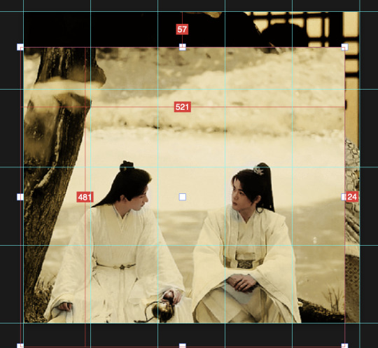

so my vector mask looks like this afterwards

(you don't have to do the squares so close together like i did it was just how i liked it & because of the scenes i had chosen that mine turned out this way)
now onto the grid lines: i used the line tool with these settings

just like with the rectangle select tool the line tool should lock onto the grid line you want to redraw, do this for every line that you want/have for your grid & once you're done go to view -> clear guides and it should look something like this: (added a version with just a black background so it can be seen a little easier)

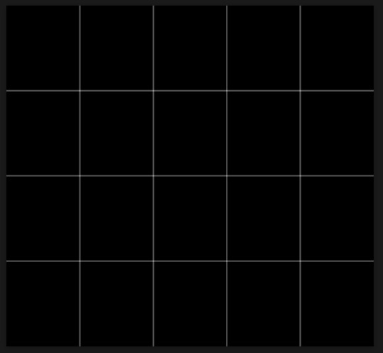
(i'm ngl idk why my lines ended up kinda faded and not white 🤣 i think it might be because i used a white fill instead of white stroke but it doesn't really matter to me because i got my ideal outcome anyway 🤣)
bonus step: you can stop here if you'd like but i wanted my lines to match my colouring & my intended typography so i put all my line layers into a folder and set the mode to difference & added a yellow fill layer with a clipping mask, like this:
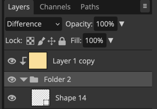
and it should look like this:
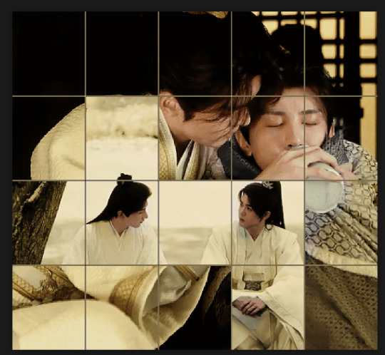
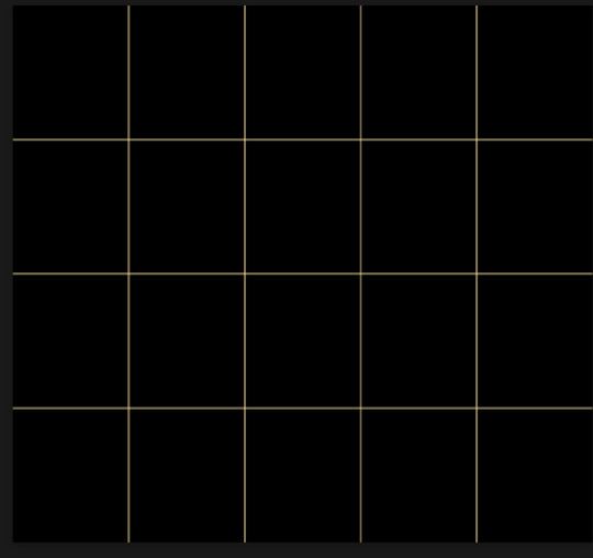
you can also play around with the opacity of the lines too which is what i tried out but i prefered for my set the lines being at 100% opacity but it's really up to you with what you want to play around with
now once you're happy with everything merge those layers together (make sure they have the same amount of frames first before merging them) and either save as it is or add some typography like i did and you should end up with this:

for tips when it comes to colouring it really depends on what you're colouring, if you want to manipulate the colours as much as i do i recommend choosing a colour within the scene so you're not having to change too much, or finding scenes that have colours that can be manipulated more easy (any colour that aren't skin tones, unless you're working with red or yellow like i did here, i chose yellow because one of the outfits in the gif was yellow toned and it looked better with the gifset being yellow than my original colour which was blue), also looking for scenes were the people in it don't move as much also is a big help!
i hope this helps :) feel free to ask more questions if you didn't understand or want some more tips i honestly don't mind!
#replies#mrmalcolmslist#photopeablr#tutorials#photopea tutorials#completeresources#usergif#mine | tutorials#gif tutorial#photopea#resources#gif resources#gifmakerresource#i hope i didn't forget anything aksjdskds#photopea tutorial#tutorial#gif tutorials
173 notes
·
View notes
Note
i wanna hear your thoughts on the fence challengers: long shot preview pages if you want to share!
oh mAN I have so many and they are all over the place!!
The first one is a little thing, but I bet Seiji had a crush on Marcus Washington when he was a kid--Nick's horror, Harvard's teasing, and Seiji's indignant blush imply as much.

And a fun fact, Jo posted a mini preview of baby Seiji to Patreon on February 14th...maybe I'm reading into it too much, but that's nothing new XD
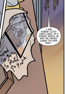
Next couple of things are about the scene with the trophy case. It was really interesting and fun to see side-by-side redraws of Robert! It really illustrates the way the style has evolved, and also I gOTTA say it feels like Jo is more invested in Robert based on the level of detail she put in--like it's not just a style comparison, it's also just obvious a lot of attention was put into these shots when a) she could have just reused old shots (which she's done before, so I know it was an option), or kept it more simplified like she did when drawing the original shots.


I also think it's sweet that the redraws have Robert looking much more like Jesse than the originals.
And I am sure I will get flack for this, but I have incredible second-hand embarrassment from Nick leaving his newspaper clipping + note in the trophy case jfhdasl like bestieee noooo anyone can see that shit now oh my god please stooop


Onto some Nichoji thoughts! I love that Seiji's been confirmed as a before-bed reader! Him having a Kindle makes sense for the sheer efficiency of it too lmfao. Of course it's also adorable to see him in reading glasses <3 And then my favorite detail is Nick's stupid nightlight...notice where it is?

Rather than illuminating Nick's side of the room, it's peeking around the curtain and lighting up Seiji's reading, which is beyond adorable and sweet. I wonder whether Seiji stole it or Nick put it there knowing Seiji likes to read before bed, and I love both scenarios.
Also, it's fucking adorable that as soon as Nick mentions their date appointment, Seiji takes off his glasses and lowers his Kindle because it's got his full attention and investment.

And a quick pitstop to the locker rooms!

I like the visual metaphor here with Aiden and Bobby both very casual about changing and both literally having their shirts open; meanwhile, Seiji's straightening the cuffs on his button-down, which is already neatly tucked in and complete with his tie. It just highlights how Seiji's a lot more closed off than the others, and I think this was a neat trick to remind us of that.
In regards to plot, I'm still...really disappointed in the pacing. I know most people feel like it's a slowburn/it's taken a long time to develop, but if you waited to read Fence at all until it was complete and then read it all in one sitting, I think you'd see how unbalanced it is. Williams says that their first match will be in three weeks back right after tryouts:

which means everything between issue 12 and CHALLENGERS has happened in 3 weeks. Seiji and Nick's relationship is so sweet and cute, but it went from resentful rivalry to puppy love overnight with very little 'screen time' dedicated to the actual transition from resentment to friends (which I could write a whole essay on but this is not the post for that lmfao). Furthermore, the fact that it's the first match of State Championships rather than first match of the season is crazy to me. I'll admit, I didn't fence in high school--it wasn't even an option because we didn't have a team. And despite hours of research, the structure of high school team fencing is not entirely clear to me. However, I do know that typical high school sports go through the season, facing every other team in their division or whatever. Based on performance in those matches, they can qualify for state, and then their win ratio determines their seeding order for the state championships that happen in like 1-2 days. Seeding order is who you go up against in a bracket, so it's what this diagram is, basically:
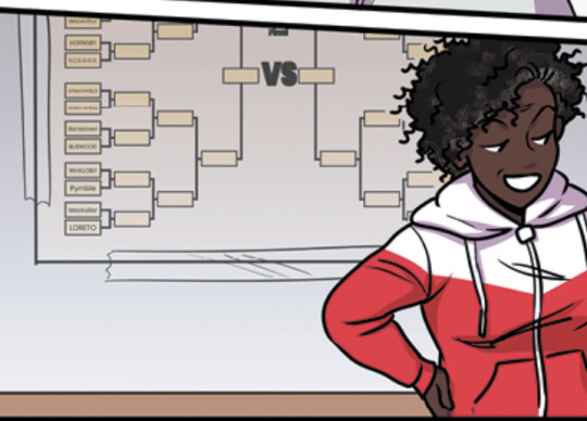
(side note, but it appears there are 24 schools competing at state). Again, fencing could be different, but it kinda seems to me like we skipped over the season and went right to State Championships, which just cuts out so much development and build-up. It's like we're speed-running the entire story to get to the end faster. We cut out showing the development in the romance, and now we're cutting out the development of the plot. There's still plenty that we can do at state, of course, but imagine how much more it would mean to see Nick fencing in front of Robert if we'd built that up more. I just don't understand how we spent 12 issues on try outs, 4 on a practice match, 8 on camp, and none on the fencing season. It feels so abrupt and unbalanced. Tryouts and camp were my favorites arcs because they felt pretty well-paced as self-contained pieces of the story. I just feel like we needed waaaaay more relationship development between those two arcs to be satisfying, and I feel like there should be waaaaay more build up during the fencing season between camp and State Championships.
and now, the moment you've all been waiting for: my devastation over Eugene's role (???) in the story. I honestly question why he's in the story at all--at this point, it would have made more sense to have him flat-out not make the team. Except that keeping him this long lowkey backs up the theory I've had on his role since Striking Distance/RIVALS: Eugene is here to make everyone else look better/cooler/more impressive. The very first thing that struck me when reading the first look was this:

The dialogue here suggests that only one reserve actually gets to be on the team in the end, and the reserve is Nick. And, worse, everyone expected it to be Nick. Sure, it's sweet that Seiji thinks Nick's the better fencer, but all I can think about is how hard Eugene's worked for ten years trying to make the team as opposed to Nick's three months of fencing. Now, I love an underdog story. But it's interesting because Pacat stated in an interview (I'd have to go find where for the specific quote) that he always feels bad for the person who's been working to be #1 their whole lives only to be knocked out of the running by an upstart underdog--which I've always assumed would influence the path taken in Fence...and it seems like we may well let Seiji and Jesse remain above Nick in skill (or at least it seems like we won't be dethroning Seiji, even if we go for Jesse), but Nick's overcoming smaller obstacles. And those smaller obstacles hurt worse to see crushed because Eugene almost made the team in a way that mattered, only to have that taken away. It would have been less cruel to him and his fans to let Nick take the reserve slot back in issue 12, but instead we brought Eugene along to serve as a means to make Nick out 'secret weapon' and elevate his story.
I will say though, this page is one of my favorite Eugene moments because I see the character I selfishly want Eugene to be in it. From the context of the panels above, this page is likely Williams telling them that only one will be fencing in State Championships, and this is their reaction. Eugene's immediate concern for Nick and the comforting hand on his shoulder followed by a bright smile and a thumbs up--he just cares so much about other people and it so used to smiling through his own pain/disappointment and comforts Nick through being positive (and as seen back in issue 12, up playing his competitiveness) and acting like it's no big deal.

Eugene deserved better, but if this is where he goes out, I think I can live with it. Better to see him go now than continue to be a means to uplift the rest of team by being less than. but, man, I was really hoping we were turning it around after his moment in REDEMPTION being the only KR boy not to lose his bout
anyway, thank you sm for listening to my rambles!!! <33
#jackshit#fence comic#fence challengers long shot#fence challengers#seiji katayama#nicholas cox#eugene labao#fencessay#thanks for the ask!! 💜#fence asks#eugene defense squad#to be clear; there are a lot of things I'm excited for--ill just never get over how much better it could have been if the stars had aligned#and fence could have been picked up for its full run and given all the development and attention i have to assume was the original intent
72 notes
·
View notes
Note
All right I take the bait. Why do you believe Manel should have accompanied Pacifica at the party
AHHH THANK YOU IM SO EXCITED TO EXPLAIN MYSELF (in reference to this post)
ok. northwest mansion mystery is a great episode obviously. but HERES why i think the episode would've been even better if mabel was in dippers spot!!!!!! its kinda a lot so i put it under a read more
so this episode is sort of the middle-ish of season 2 i think, right before the ford reveal!! its not a super long show anyway so theres not a ton of pacifica appearances, anyway. BUT in EVERY SINGLE OTHER PACIFICA EPISODE, her energy has been bouncing off of mabel!!! from their meeting in double dipper, to irrational treasure, to golf war; they have been established as the main dynamic here. golf war is especially important here, because this is the very first step in pacfica's redemption arc! mabel saves her in this episode, the pines give her a ride home, and it seems like pacifica is going to start being a little more understanding of mabel because she had misjudged her, hence why she was treating her so poorly. it looks like theyre gonna establish a friendship between them!
and then. they dont. they basically never interact again. because the next time we see pacifica, she goes straight to dipper in northwest manor mystery. the cold open implies that the northwests wanted dipper specifically because of his knowlege of how to deal with the supernatural but IN MY OPINION that DOESNT EVEN MAKE SENSE because we NEVER see dipper fighting these monsters on his own? hes ALWAYS with mabel. at the very least, i think it shouldve been BOTH of them??? we see a brief shot of a newspaper clipping where dipper is fighting a vampire bat or something and i just. when did this happen. where is mabel
that would be a fine argument for it being both of them instead of just mabel so heres one of my bigger points thats gonna come back a lot in this breakdown: dipper. does not like pacifica. he STRAIGHT UP HATES HER. every single interaction theyve had has been negative!!! its even massively negative at the beginning of this ep!!!! though mabel often dislikes pacifica, she TRIES REALLY HARD TO LIKE HER. mabel has a lot of love in her heart, and if she could, shed want to be her friend!!! its always been pacifica whos been rejecting those advances!!! golf war was the start of pacifica understanding that about mabel, and it nmm wouldve been the PERFECT time to wrap up that arc, rather than leaving it!!!
and i would argue that could STILL LEAD INTO A DIPCIFICA ARC, if thats what the showrunners/fans wanted? most of why dipper hates pacifica to begin with is because shes so terrible to mabel. he only agrees to go to the party in canon because MABEL wants to!!! imo, i think the lead in to them being a couple would be a million times better if that massive problem in their relationship was solved first
i dont PERSONALLY like dipcifica but im trying to stay unbiased about this if you cant tell
i would also argue that like. dipper just seems really out of character. the reason i picked some of the scenes i did for my redraws, was because they were scenes that i think his behavior would fit mabel a lot better. examples:
why do the northwests have a suit in dippers size anyway. he literally doesnt even like wearing it sjkfhkj in a potential re-write of this ep, i considered that mabel would come in wearing her super extravagent home made dress, and it would 'violate dress code', so she would be forced to wear one of pacificas we could still have that cute dress-up expo scene that we do AND have some fun commentary/symbolism about pacifica being nervous about having her in the dress because its NICE and TOO GOOD FOR HER and she looked FINE BEFORE ANYWAY
mabels empathy is a recurring theme in the show. shed WANT to give pacifica the benefit of the doubt, and would be VERY betrayed when finding out her and her family already knew about the ghosts and knew what he wanted. i understand that dipper was so upset because it seemed like pacifica was changing for the better just to find out that she wasnt, but i think this fits so much better with mabel, because shes always WANTED to believe that shes secretly a good person. she would be glad to see her turn a corner, and would be upset when finding out she was 'wrong', and that she really was mean deep down. whcih would obviously lead to her comforting her later/finding out the truth about her etc etc. on the other hand, dipper literally never believed she had good in her. from the first interaction we see of them, he thinks shes as terrible as her family. he ISNT as interested in giving her the benefit of the doubt and if it wasnt a life or death situation i dont think he wouldve forgiven her. IDK i just think its more in character for her
the dancing scene!!! honestly this works fine as is (i can see both dipper and mabel being excited to make a mess on a fancy carptet) but idk i just think it carries so much more weight if its these two girls. silly moments for mabel!!!! pacifica getting to really be a kid and not just a sparkly prop!!!!!!! pacifica finally indulging in her sillyness that she mocked in irrational treasure!!!!!!!!!!!!!!!
ok moving on. one of the bigger things that bother me about it being dipper here instead of mabel is one teeny tiny (honestly really irrational) scene at the party. in it, dipper is confronted by fiddleford, who tells him he has big news about the author/the laptop and the towns in danger and its vitally important and dipper just. shrugs him off???!!?!?!?! i cannot even IMAGINE. in alex hirschs words "the first season is about dipper being in love with wendy, and the second is about him being in love with the author" meaning that. those are the TWO things that dipper is completely and totally obsessed with. hes clearly not over wendy (as we see in later episodes) and this is not long after sock opera/society of the blind eye so youd THINK hed be more depserate for answers than ever!??!?! this child was willing to sell out his great uncle and raise the dead and stay up for several nights in a row for answers, and the second he is offered some (from a man who WORKED WITH THE AUTHOR btw) hes like like 'whatevr'?!?!?! it is so out of character and it drives me fucking nuts every time. i know hes starting to like pacifica now but as we see in the comics (if you chose to think those are canon) HE DOESNT EVEN SEEM TO LIKE HER THAT MUCH!??!?! hes STILL convinced shes vain, and mean, and selfish!!!! he DOES start to have a little arc with her but jksdfjksf IDK i just cant in a million years see him passing up the chance for answers to the biggest mystery in gravity falls to hang out with a girl he tolerates
but yknow who i CAN see doing that? MABEL!!!!!!!! mabel would be concerned when mcgucket comes up to her, and starts talking like this!!!! i can totally see her suggesting that he relax for a little while and enjoy the party like dipper did, and then forgetting to come back to talk/not running into him later!!!! ESPECIALLY since i can see mabel WANTING to spend time with pacifica where dipper just. really doesnt seem to want to MOST of the time
ok ill admit that this last one is sort of a personal opinion. but i just. i really dont like the B plot of this episode with mabel and the girls. IDK its just so annoying and pointless to me to have a plot where its just a bunch of girls turning against each other over a guy. im not gonna say its mysoginistic bc i know little girls can be boy crazy but i just. dont see why there was a need to make them fight/turn against grenda briefly??? even when they rekindled and it was all ok in the end its just. in comparison to the A plot its so. Nothing.
in my head i have a rewrite of this episode and how it goes is that pacifica approaches dipper and asks for help and he turns it down (like he does in canon). mabel suggests that they do it anyway, but he refuses, as he wants nothing to do with her. when dippers gone, mabel agrees to help (and pacifica begrudgingly accepts bc it seems like the only option) and so she steals the journal when dippers not looking. she goes to the party, and events go pretty much the same?? only major difference i can think of is that the B plot is replaced by one where dipper realizes mabel and the journal are missing, so he sneaks into the manor/sneaks around the house trying to find he rand get it back (and its so massive he has no luck). the reason i think THAT works is because we can even still have the scene where dipper turns to wood like shifty prophesied!!!! and i would even argue it makes more sense this way because wasnt shiftys warning that "if you keep digging so deep into the secrets of gravity falls, this will be the last form youll ever take" ?
OK IM SORRY THIS WAS SO LONG im probably forgetting points too so i might edit it later but THANKS FOR ASKING
tldr: pacifica and mabels friendship plotline was left on a total cliffhanger after golf war and if mabel replaced dipper in nmm it would've been a good resolution to it
edit: check the reblogs if youre still interested! i added another list of reasons i think this (mostly in response to people disagreeing)
#Gravity Falls#gravity falls analysis#gravity falls essay#mabel pines#pacifica northwest#northwest mansion mystery#northwest manor mystery#gravity falls nmm#nmm#mabcifica#mabifica#i wanna add that. it is fine if you like dipifica SJHKDFJHKDLS I KNOW ITS CANON i personally Do Not Get It but to each their own#but also while saying that i want to add that . im not trying to argue that mabcifica should be canon#in fact i do not think it should be#when i say i think mabel should be in this episode i am specefically saying that it doesnt NEED romantic undertones to be good#they can jut be buddies#cloudysrants#northwest mansion mabel au
393 notes
·
View notes
Text

I FINALLY FULFILLED MY GOAL!!
Second half of Genderbend Tristan platoon (Tristan and Jade) as promised!!!
The second I realized I would post Tristan and Jade’s designs together I realized I had to redraw this scene from the anime. I did really change their height difference, Tristan’s really just taller though (thank you Elizabeth) for all those curious Chion’s height is like somewhat between them and Isolde is just… jack up the really insane height difference.
For the rest of Genderbend 4kota designs here’s what I’ve done so far: Isolde + Chion and post-timeskip Chion (not a lot but hopefully there will be more)
If I continue with this next update is probably gonna be either more Jade or Chion art, Aged up versions of platoon, or Donny and Edlin
I haven’t put this anywhere but if anyone wants to ask about the Genderbend characters and stuff my ask box is open. If you want to request a specific sds/4kota character’s Genderbend design I might do it, just expect it to probably take a while and it will probably be done in traditional art.
Design rambles about the art as well as some Genderbend Tristan Platoon (emphasis on Tristan) lore below the cut
Jade’s hair was a pain to design yall don’t even kno T-T I like the design better in traditional art but I wanted to post the digital version of the design for consistency.
What made Jade’s design so hard was that how to give her wing like hair to kinda come through, og she was going to have a middle part, then I thought maybe something like Arlecchino’s design from Genshin but I thought Jade would have short hair so I ditched that. So she ended up with this and I tried to keep the wing design there with the shape of her hair.
Tristan’s design was not what I initially had in mind but here’s kinda my thought process behind it: her hair looks more like what I imagine fem Meliodas would look like, and she’s wearing a full suit of armor cuz… do u really think Mel and Elizabeth are letting their daughter go out WITHOUT A SUIT OF ARMOR?! I don’t think so.
Neither of their clothes were what I initially imagined, Tristan was either gonna wear gold or silver and red, but then I put her in dark blue and I got a thought:
Since Jade, Chion, and Tristan tend to match I put them all in various shades of cyan/blue. Chion has light cyan, Tristan has dark blue, and Jade has both for Monochrome reasons.
Also when Jade dies her jewelry is then worn by each member of the Tristan Platoon. Tristan gets the choker and Isolde and Chion get the hair clips.
Also Jade’s hair clips and choker are made of actual jade (gifts from Chion and Tristan respectively)
Quick Fun Facts about them:
They are both tomboys
At some point Tristan had a crush on Jade (she was going through her romance phase yall and Lance was off on missions and stuff what’s a girl gonna do?)
Tristan really likes holding sleepovers (she has tried to do a full Tristan Platoon one but Mel and Elizabeth won’t allow it for Isolde)
My personal hc is that Tristan always wanted a younger sibling when she was younger and kinda projects that fantasy onto Chion. So from her perspective they kinda have an idealized older/younger sister dynamic.
To elaborate further: Tristan kinda sees Chion as this girl that she takes under her wing and dotes on and what not. This leaves her with a pretty wrong overall interpretation of Chion. She very much just sees the “Tristan (platoon)-exclusive part” which is very kind, very helpful, and someone that she needs to protect/look out for.
I love Chion but u see the problem with that interpretation of her
It’s also the reason why I’m on the fence if Chion’s hair is still getting burned off by Gawain if only cuz Tristan and Isolde 100% would throw hands (and I don’t wanna give Chion a hair cut pre timeskip too much work)
Additionally Tristan really likes Chion’s long hair and likes to braid it and play dress up with her at the sleepovers
Tristan gets a lot of flack for how she presents herself, lots of people think that a princess shouldn’t act that way and stuff
Tristan and Jade have a very similar dynamic to canon. Tristan sees Jade as her best friend. And Jade sees Tristan as… a girl she secretly hates… you’ve read her death scene
Tristan was the one who gave the hair bow to Isolde still, but after seeing how much he liked it Jade gave him some of her old girly things she wasn’t really into, and Chion “just happened” to pick up some new accessories and gave them to him.
Idk why I wanted to do this but here’s all there types(romantic)
Tristan - she’s into more masc women or more feminine men (there you go Trislance and Trisolde shippers)
Chion - says she’s into masc women but it’s not really a factor for her. Wants someone bold, and kinda like a knight in shining armor, prob reads Isolde’s romance novels
Isolde - wants cheesy romance, does not care if he is romancer or romancee he wants cheesy rom com romance
Jade - wants someone who needs her/relies on her since she struggles with feeling unwanted
Another random romantic thingy there are so many romcom hijinks with this platoon there are so many misunderstandings with who is and isn’t a couple:
People of Liones think that Chion and Isolde are a couple. Isolde was heavily convinced that Tristan had a crush on Jade (right conclusion but at the wrong time). Tristan was convinced that Jade and Chion were dating at one point. Tristan was convinced Chion had a crush on Lancelot at one point (I may actually write a fanfic on that for comedy reasons).
As for actual crushes: Chion likes Jade. Jade likes Isolde. Isolde likes Tristan. Tristan likes Lancelot
#4kota#4koa#7ds#four knights of the apocalypse#nanatsu no taizai#nnt#sds#seven deadly sins#4kota chion#chion#tristan liones#tristan platoon#female Tristan liones#4kota jade#jade 4kota#genderbend#4kota isolde#isolde 4kota#trislance#lancetris#chion x jade#trisolde
37 notes
·
View notes
Text

So today I just drew a whole page of my old character Vanilla Powder Cookie
I was on the page with Snow Fungus, and one of the characters there was Vanilla Powder, with her design seen in the top left there. I was looking at it, and I was like “I’m not sure it makes her look like a proper small child”, and since I’ve been trying to figure out how to make a character look distinctly like a child, I decided to redraw her on a new page just for her
And surprisingly, for once I actually finished one of these
So now I feel like listing some things about her, some of which isn’t exactly new, but I still feel like reiterating
So as you can tell, she’s Pure Vanilla’s daughter, one that he had before he got his Soul Jam and his kingdom was founded. She was a baby or toddler when it was founded, so she spent almost her entire life as the Vanillian princess. In addition, she’s the direct ancestor of the Custard family (though I don’t know what her kid’s name would be). However, she unfortunately is not around during current day, as she was baked up to a thousand years prior to current day, so she crumbled a long time ago. Though she lived a long life and simply died of old age, so things didn’t go that bad for her
Oh, also I feel like I should show the original version of Vanilla Powder, just for posterity

She looks entirely different, I think for the better
The younger version of her is mostly just based on the previous version, with an entirely new outfit. I feel like the outfit looks closer to something a kid would wear, but I’m not sure
Then I decided to finally give her a proper adult redesign, and I think I did quite well, much better than the original
I mostly used this one picture from a development commentary for her outfits
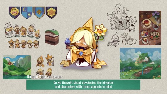
Her three cones were because I wanted to convey her status as the princess in some way. They were originally all next to each other, but I felt like they didn’t look particularly special like that, so I instead but the side two further down on her head. But then they reminded me more of hair clips like what Saiki K has, so now I’ve decided they’re possibly magic things that help her control her magic. And also they come off when she uses it. She probably got them as a teenager
Also her eyes are now brown since it fit better with vanilla extract (aka what I think Pure Vanilla is supposed to be), and also because while she’s the Custard ancestor, she’s from long before them, so she doesn’t have to keep the same blue eye color as them. Also, I’ve now decided that Vanilla Bean, aka my OC that’s Vanilla’s dad, has brown eyes. Though I do wonder if I should have given her blue eyes, to break up all the browns and yellows. That’s what the blue on the page is for
Edit: so I ended up changing her eyes to that blue. It’s not PV’s blue because I didn’t really think his light blue works on her. I think it looks nice
Also in her original design, she was going to have a design that looked ambiguously like she could be a purelily kid, but by this point she’s mostly just based on Pure Vanilla, the hair style’s really the only thing somewhat similar to White Lily
I think that’s about it for her, I hope you like her!
#cookie run#cookie run kingdom#pure vanilla cookie#cookie run oc#vanilla powder cookie#my ocs#my art#redesign
79 notes
·
View notes
Text
(Cracks knuckles) Alright folks I remember how to draw
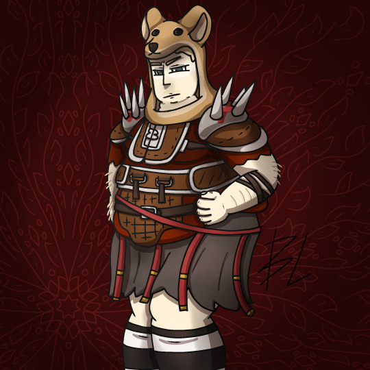
Fat fuck Vulpes by yours truly, Blaze Lander. Inspired by the lovely drawing by @yourmateyoya ,egged on by @legions-top-dog , and because i force you to deal with all my shitty drawings, @noomycatz
Yes, once again, i have put too much effort into a shitpost. Roughly 2 hours as I reused a canvas on ibis paint for a 5th drawing lmao
Yall can burn me at the stake later lol
Process below hehe i like to ramble
And just because i like to talk about my drawing process for characters with complex outfits, this is how my lobotomy brain does it:

First i do silly fun colored sketch. I use different colors to differentiate the "skeleton" from the, euh, fleshy bits, and the clothing. You can see lots of lines that would not be shown in the final product so it makes it confusing to look at.
Next i do a clean sketch.

This is where i clean up everything before doing the final lines. I use one color and a thin brush to make it easier to line over. Here i add any extra bits (like the top football armour) and "render the physics" as i call it, so properly drape cloth and the uhhh squish of stupid fat fuck vulpes' boobs and stomach. I also will balance the drawing here by flipping it and redrawing or using the drag tool.
Next is lining.

For this drawing, i used a 9.0 digital pen with a taper. Its my standard :þ. I kept my pen at the same size for this piece. Sometimes i line the outside darker to make the drawing stand out more. I decided not to as i wanted to give the drawing a more "serious" tone. (How serious can this be though lol-)You may notice on the arms little bits of the lines are missing, thats because i gave him some arm hair. I like make little details like that show over the lines. But since the one shading technique i used works with clipping masks, i had to but the arm hairs on a layer lower than the line art. Next is colour:

I colour in the drawing with midtones. Simple as. I tried to stick with warm colours besides his eyes, which are grey blue. Idc if they arent, im too lazy to google it. I mostly use flat colors but i did make his shirt a gradient. Next is do simple cell shading:

Depending on how i feel i shade with or without the colours in the back. I went with a sorta "non decrepit" light source here. Didnt want too much intensity. I used a deep marronish orange on a multiply layer on 45% opacity. Soft shading/lighting next:

I get intense with the soft shading. I use the airbrush with a deep maroon to add dark gradient and airbrush with a light pink to add a bit more depth. I usually use less light and more dark because im evil i like the intensity. I keep the layer the same amount of opacity and multiply it with the darks and soft light for the lights. Next are the shine highlights:

I use the dip pen hard with a taper to add light highlights of white on shiny bits like metal and eyes. I uses pure white, set the layer to 25% opacity, and use normal blending.
I also shade the lines because it makes the lines softer. I use a clipping layer on the line art, set the whole thing to a dark grey, and airbrush in darker and lighter parts. (I felt like a picture wasnt needed cuz its hard to notice.
For the background, i used a dark red i stole from the cell shaded layer, drew a vine pattern with the kaleidoscope ruler, and added a vignette. Vignettes are my cheat code for background hehe~ it makes the subject stand out while keeping suave, seriousness and formality. To make a subject pop out more, put the vignette behind the character but in front of the background. For more intensity but it on top of both.
Also- I usually draw with a level 10 stabilizer (i got shaky hands) but i drew with a 2 stabilizer so im surprised it came out so smoothly-
Also i gave him goggle tan lines because if i have to have them from playing tennis with sunnies, so does he.
#fallout#fnv#new vegas#drawing#digital art#fallout new vegas#vulpes inculta#shitpost#i put way too much effort into this#dont ask why i draw this type of shit good i swear i will blow up in a million pieces and cry if you do
21 notes
·
View notes
Text
my first ever animatic- and its gay lawyers. you know how it is.
siblings of mine who will see this! maybe dont watch yet? i know you guys havent seen the full trilogy and i dont wanna spoil it for you- i know i showed aloe the sketch version but thats bc i forgor and it also wasnt super legible so its fine probably.
uhhh spoliers for phoenix wright, ace attorney trilogy (including the last case of the third game. so be warned!!!)
a little bit of info about the process below, i guess?
this project was a bitch to work on, and yet i somehow made it in less than a month. i drew a rough draft on paper (ft: chibi phoenix and edgeworth lmao) before moving it into clip studio, where i dont have the ability to animate for more than a few seconds, so i drew each picture seperately, with 4 frames per layer, then slapped it into an editing software and cropped it so it was just one frame visible, then slowly matched the frames to the lyrics.
and then i decided "actually i wanna refine this more" and went back into clip studio and refined the sketches a lot more. and then i decided to color it. and that took a while. and then i had to replace each frame in my already edited version (that hadnt been exported yet thank goodness) and then i added subtitles.
this sucked to make but im like. okay with how it turned out tbh. im proud of it i think. i did get better at drawing these two nerds so- thats a plus! they change throughout the animatic because i made this over the course of a few days, and i changed how i was drawing them midway through, but i didnt wanna redraw them for some scenes, so the two frames before the last one look a lil wonky and the last frame doesnt match them at all but like its fine! i had fun and thats what matters.
i did it poorly but i did it. and thats what matters.
#undescribed#im so sorry for not making a description for this.#ace attorney#phoenix wright#miles edgeworth#wrightworth#narumitsu#can be read as platonic. i might think theyre gay as hell but you dont have to lmao#cabinet man colors#animatic#ace attorney spoilers
55 notes
·
View notes
Text
FAQ Behind The Curtain
How do you draw so fast?
I'm currently double majoring in Animation and Creative Writing. I'm built different and also just, not trying very hard on most of these drawings. Drawing fast is kind of the backbone of animation and I've noticed coloring everything makes most people assume whatever line quality or level of finish on the outlines is a stylistic choice rather than laziness. What program do you use? I used Clip Studio Paint until about #021 when I picked up after haitus and used Procreate out of comfort and convenience. Do you use stock backgrounds or make them as you go? Every time I decide a scene needs a new background I draw it out in it's entirety and save it to my collection of backgrounds to use. So yeah, I'm not redrawing the background every single time it appears, I'm basically building out the meteor one room at a time in hopes of one day not having to draw backgrounds anymore. Where do you get the space photos? NASA's Hubble Space Telescope team has politely made all of the telescopes published photographs public domain, I imagine as a service to the planet as the intersection between photographers and people able to go that far into space is understandably zero. Font/Handwriting questions I stopped handwriting for most panels as I realized my best handwriting is all caps and it would be a shame if Karkat was the only character anyone could understand. I still use handwritten text for "special speech" which is whispers, and shouting, anything that's supposed to feel or sound radically different from the rest of the yapping. It did take me a while to settle on a font, I found a really good one for Dave that didn't have apostrophes and gave everyone else a typewriter font for a while, until I found the alternate version of the font I used for Dave that had all the special grammar symbols and numbers I could ever need. It's called the Atari font in the actual file but I have no idea if Atari ever actually used this version of it. Does the ask box ever close? When will my question be answered? It doesn't close and I have more questions than I'll probably ever answer. Some are confused about canon, others have had the core idea of their question asked multiple times already and I just didn't feel like collecting them all as screen shots. And some I just don't have answers for. Some get deleted because I don't like the tone, don't get the joke or found a typo particularly difficult to parse. No biggie. Questions will be answered if and when I feel like drawing a comic for it. Some questions are a better starting point for a comic than others, don't take it personally. Can the characters still talk to John and Jade? Can they run into them in the dream bubbles? According to canon, no. According to this blog, also no. Do you take magic anons? No. While I've gotten flimsy on the vlog framing device in order to make a more entertaining comic overall, the truth still remains that anything beyond messages in a digital inbox from some far off unspecified rift in paradox space would have some pretty immersion breaking implications on the setting overall. I know I answered a question offering Dave some clothes but the clothes were not given to him, I used it more as a prompt for him to take the clothes he already had out of the dryer. Is this blog safe for minors? This blog contains canon typical violence and themes, however when it comes to sexual content (the one thing minors absolutely CANNOT legally interact with) this blog is rated T for teen. Think like The Big Bang Theory or How I Met Your Mother. Sex can be implied and a frequent topic of conversation but never occurs on screen. Ultimately it's up to you and maybe your parents to decide if you can handle the blogs contents as you are responsible for curating your own online experience. TLDR if you're old enough to be on tumblr you should be fine.
How do I address the author?
My name is Sky, she/her pronouns exclusively. Please don’t try to hold conversations via the ask box. Just DM me.
Where do I send questions and comments for the author?
@meteor-crew-after-dark
35 notes
·
View notes
Text


Maria - Rosewater (Redraw)
Drew Maria from Silent Hill 2!
Redrew an old fanart of Maria I did back in 2018! 💕
I’ve been having my dad play through the Silent Hill series and it’s been a total blast! He’s been really enjoying them and it’s been a lot of fun watching him play some of my all time favorite games ✨☺️✨
I was inspired by the song Null Moon by Akira Yamaoka (Silent Hill 2 OST) while working on this piece. Do I even need to mention how much Akira Yamaoka’s music means to me? 🥰
Akira Yamaoka - Null Moon
Done with Clip Studio Paint EX October, 2023
#art#fanart#Silent Hill#Silent Hill 2#Maria#Silent Hill fanart#maria silent hill 2#sh2#maria sh2#horror games#survival horror#horror game fanart#Dead by Daylight#SketchMeNot#my art#redraw#art redraw
116 notes
·
View notes
Text
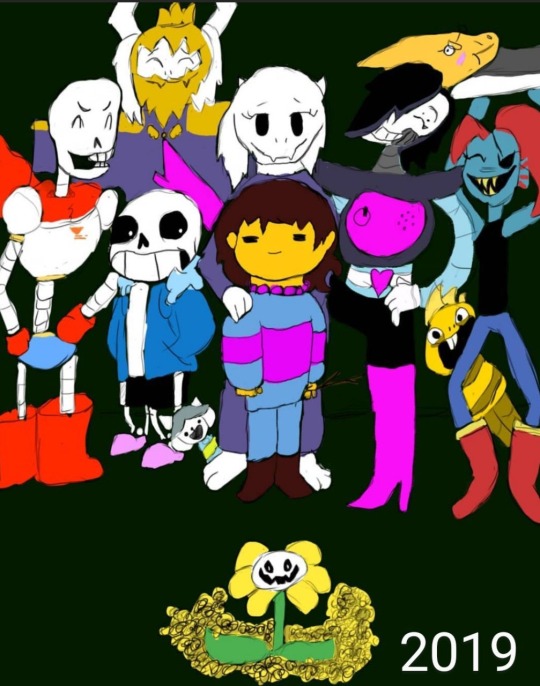
Four years ago, I drew my first ever finished digital art piece, using a Huion 420 tablet off of Amazon, and Krita. I was so proud of it, I showed it off to my friends and family on instagram, and I didn’t think I could get any better than this. Fast forward to the next year, and I drew it again, just to see how much better I could make it.

This time I used a Wacom tablet with Krita. It was one of the cheaper ones, but still an upgrade. I was even more proud of this one, but I wasn’t really that happy with it. I didn’t like how Papyrus turned out, and it seemed so awkwardly spaced and posed. I knew I still had more to learn, and I rushed it, since I didn’t think I could do any better. I then decided to redraw it again the next year.
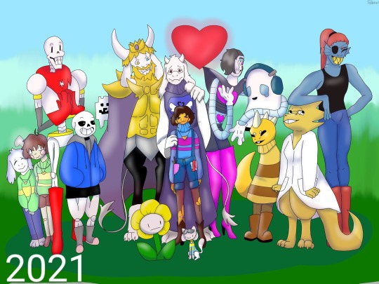
This time I used Ibis Paint X and a small stylus on my phone. I was ecstatic with how this came out. I thought this was the absolute best I could ever do, but I still had little nitpicks about it. Again, I struggled a lot with drawing Papyrus, but this time I was also unhappy with the colors and shading, and how Sans was drawn (I have no idea why I made him thicc). But again, I redrew it the next year.

This one was a huge confidence booster for me. I had just gotten a brand new laptop from my parents: A Lenovo Yoga, with a Wacom bamboo ink stylus. It was the best gift I ever received, but on top of that, they got me Clip Studio Paint PRO. So I was ready to make some good ass art. This time I sketched everything out on paper, then finished it in CSP. I even attempted a background, which didn’t come out too bad. Papyrus doesn’t look horribly off model, and the poses and composition overall was just better. I used a clean sketch for the lineart, since that was a big struggle with my previous versions, and I used colors other than black and white for shading. After I made this, I felt like I didn’t need to continue redrawing it, because I thought I was at my peak.
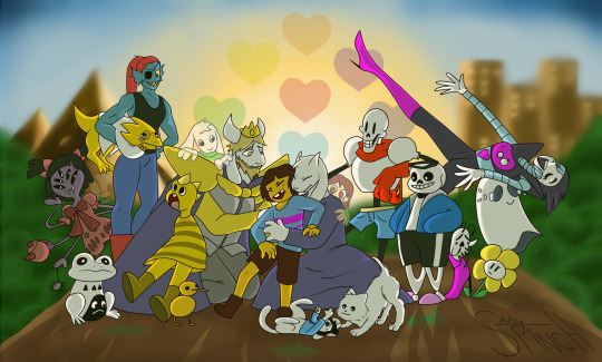
I redrew it this year.
I used my Lenovo Yoga, but this time I had a Wacom bamboo plus, and Clip Studio Paint EX. I added more characters, and took a little bit more inspiration from the original, but I mostly wanted it to feel more alive. I finally perfected how I draw Papyrus, and Toriel, Asgore, and Frisk aren’t statues anymore. I showed off what I’ve learned about lighting and shading, did actually clean lineart, and I even did a full background! I’m so proud of this, and so happy with how far I’ve come as an artist, and I can’t wait to see what my future self draws next year.
#art#digital art#artist#artwork#digital artwork#art progress#art process#undertale#undertale fanart#undertale anniversary#sans undertale#mettaton#napstablook#frisk#toriel#asgore#papyrus#muffet#undyne#alphys#froggit#whimsun#flowey#temmie#annoying dog#toby fox#wd gaster#asriel#chara#monster kid
88 notes
·
View notes